By Peter Ramsey
18 Jan 21
A more private WhatsApp?
Elon Musk, Jack Dorsey and Edward Snowden are just 3 of the influential advocates for Signal—a messaging app that’s like WhatsApp, but with more of a focus on privacy.
And when WhatsApp announced changes to their data-sharing policy, Signal exploded.
But this rapid growth has introduced a UX complexity: the app is now being used by a much broader group of people.
Signal may be more private than WhatsApp, but if they ever want to rival their 2 billion users (yes, you read that correctly), then they’ll need a product that’s just as easy to use.
The golden question is this: when the hype dies, will people be able to convince their lazy friends, who don’t care about internet privacy, to sign up?
The answer to that depends on a number of factors, one being how easy the experience of migrating from WhatsApp to Signal is. So let’s take a look.
Summary
🧙
Some Harry Potter UX magic.
🔒
How Signal could improve their PIN creation process.
😍
What a ‘beautiful error’ looks like.
🗺
The art of discovery.
💬
Why friction may be tethering referrals.
5 UX takeaways
1. Contexto patronum (🧙⚡️)
Context is essentially UX wizardry.
It converts confusing and awkward tasks into things that people do on autopilot, without hesitation. For example, imagine if someone asked for a copy of your passport:
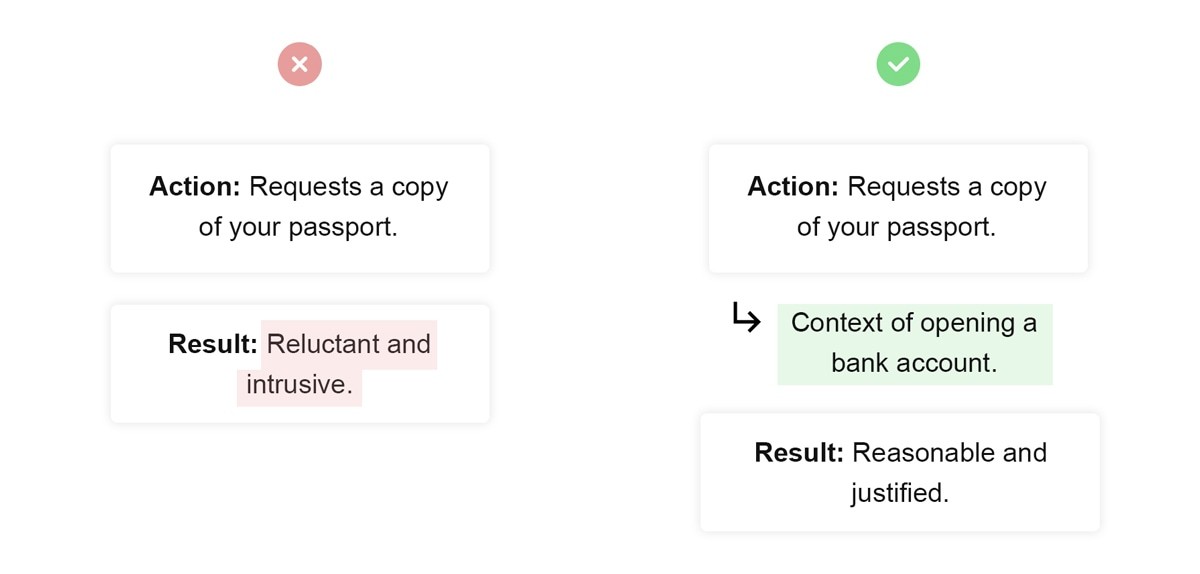
With that in mind, it’s ironic that an app which so heavily forces the conversation of privacy, also asks for access to sensitive information entirely out of context, twice, during the account creation process.
📋 What Signal asks for
💡 Missing context (i.e., when to ask)
Access to all of your contacts.
This is the first thing you’re asked for, before even providing your name.
When you try to start a new conversation, prompt the user that they can find other Signal users from your contacts.
Access to other devices in your house.
This is asked immediately after creating an account, with no real explanation why.
When the user is trying to transfer their Signal account to another device, prompt the user to search for nearby devices.
Here are a few questions to ask yourself while designing permissions modals:
1: Is it obvious why this information is required? (i.e., is the benefit specific).
2: Is the user currently trying to do a task that would benefit from this?
In Signal’s case, the answer to both of those is no.
2. You failed, try again
I often find myself repeating the following: if you’re asking the user to set a password, tell them all the password rules.
At this point it’s a well-versed ‘Built for Mars sin’. But there’s a more frustrating version of this: failing a password rule, and still not being told what the rule was.
And frustratingly, this is what Signal do while setting a PIN number.
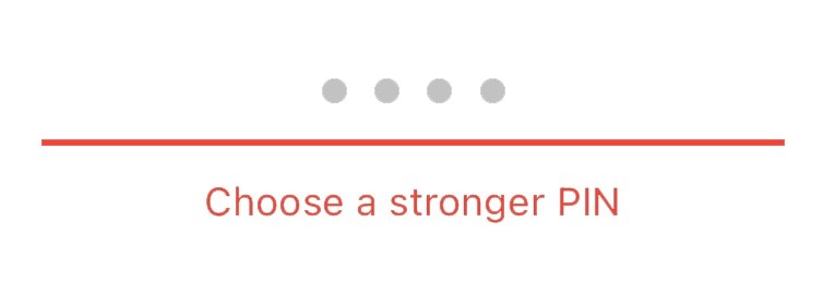
That’s it, that’s literally all you’re given, which is problematic for a few reasons:
1: What makes a PIN code stronger?
2: How much stronger does my PIN code have to be?
But if we step backwards for a moment, you can see why this may not have been a problem up until now. Those who were motivated to sign up to Signal presumably had an interest in internet privacy, and probably also had at least a basic understanding of what makes a strong password.
But as people migrate from WhatsApp to Signal, their ‘average user’ has changed. And what’s there today is no longer self-explanatory.
There are a few ways that they could tackle this:
👩🏫
1. Teach the user more generally about passwords
i.e., a link to learn more about what makes a password ‘strong’.
👩✈️
2. List specific rules
i.e., “must not be a series of the same digit 4 times”.
☝️
3. Show tips for a strong password
i.e., “you can make this password more secure by using up to 6 digits”.
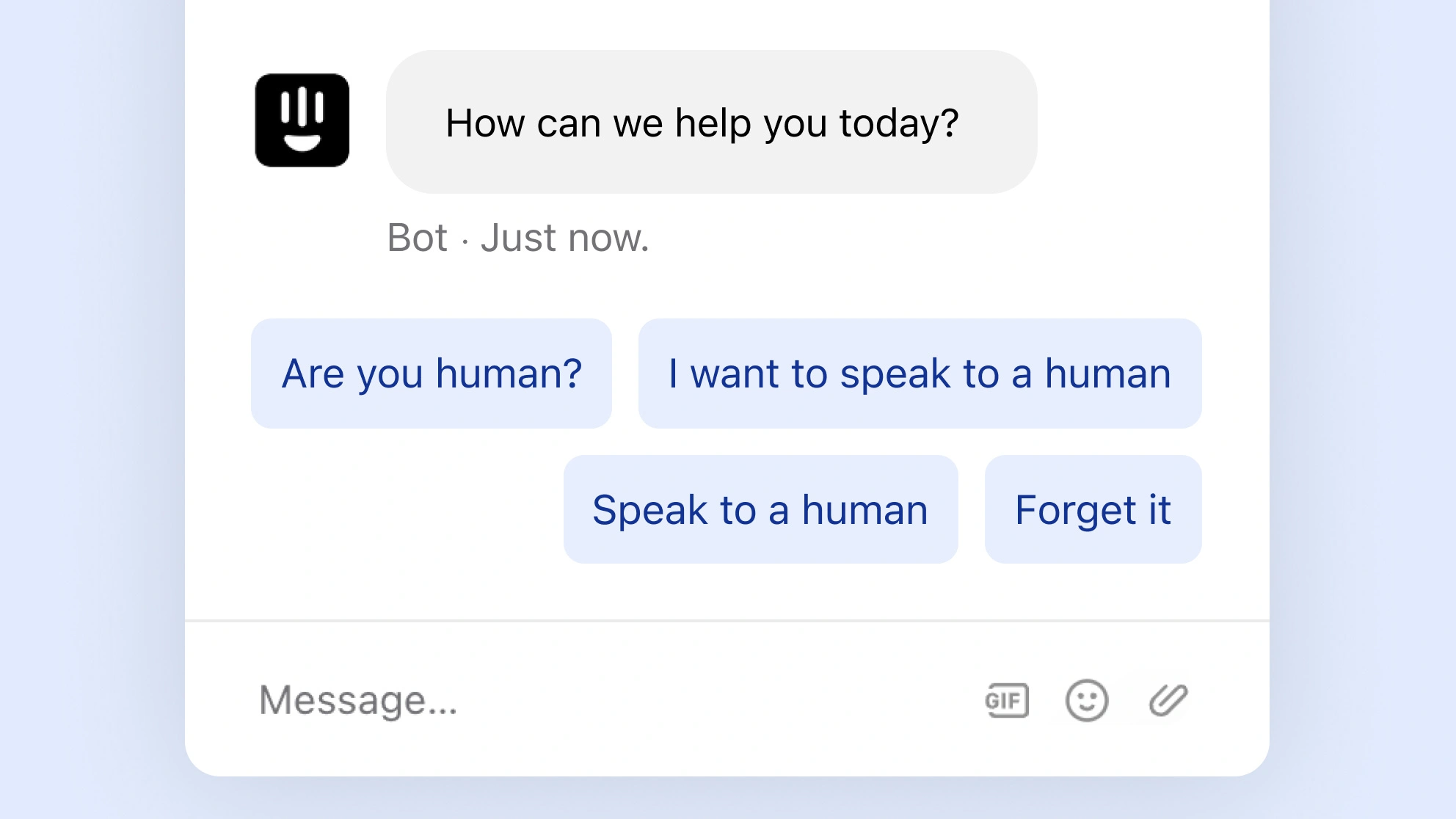
3. The beautiful error
And after that validation issue, I submitted a new PIN and… Signal errored. I later found out that the flood of new users may have been the cause of the problem.
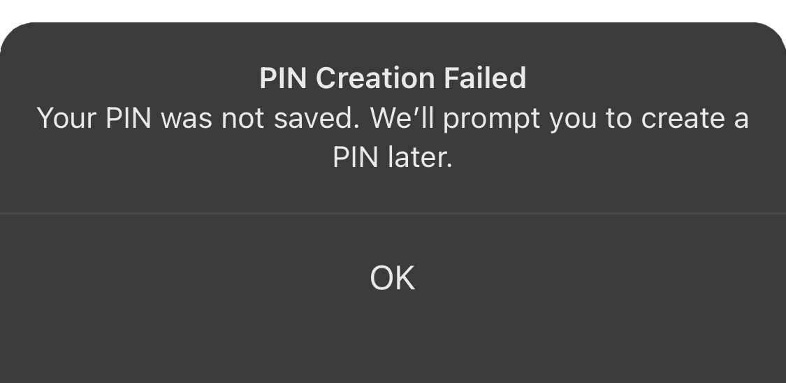
But I’m not even mad, because this error handling was beautiful.
To understand why, let’s dissect it into 4 parts.
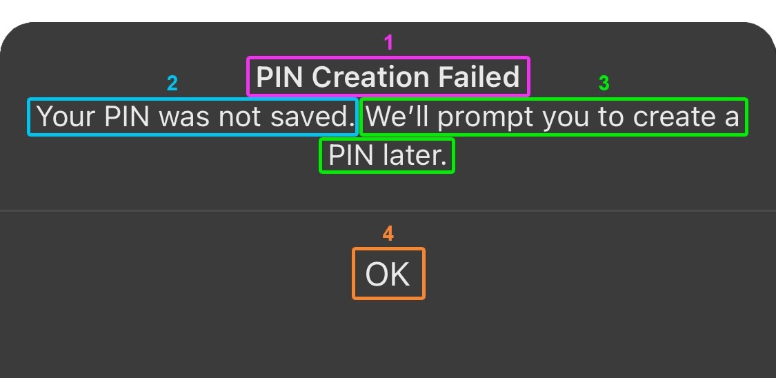
1: What just happened — it’s clear right away what the error was (in plain English, not an obscure code).
2: Why this affects you — this is the result of that error, and why you should care.
3: What happens next — this is how the error will be handled. Without the promise of this automatic reminder, the user may be anxious about having to remember to set a PIN in the future.
4: Here’s the next action — this gives the user a clear next action, and lets them continue using the app as normal.
Most of the time when designing software, people don’t remember (or don’t want to invest the time into) good error handling.
I see this (left) all the time:
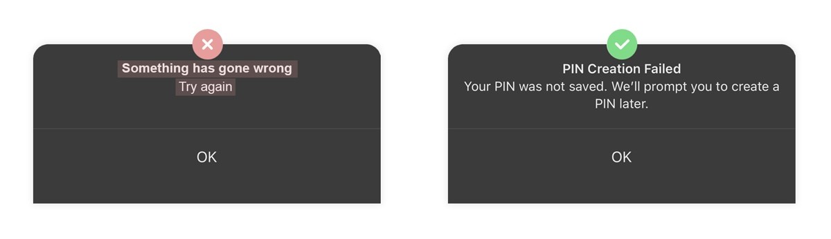
Tip: if you’re building software, it’s worth the investment to handle errors well.
4. The art of discovery
There’s an onboarding strategy which can be difficult to get right, often backfires if done incorrectly but has the potentially to be immensely rewarding: encouraging discovery.
The feeling of using an app and stumbling upon a ‘hidden’ feature is enjoyable and addictive. It gives depth to a product, that otherwise might have appeared quite shallow, and taps into the psychology of a 🎰 Variable Reward.
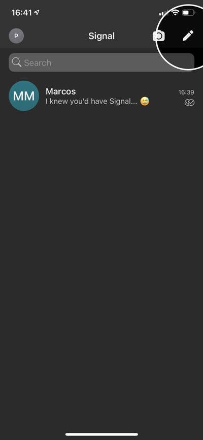
Great UX is built on these moments of discovery, and Signal nailed it with their ‘Note to self’ feature.
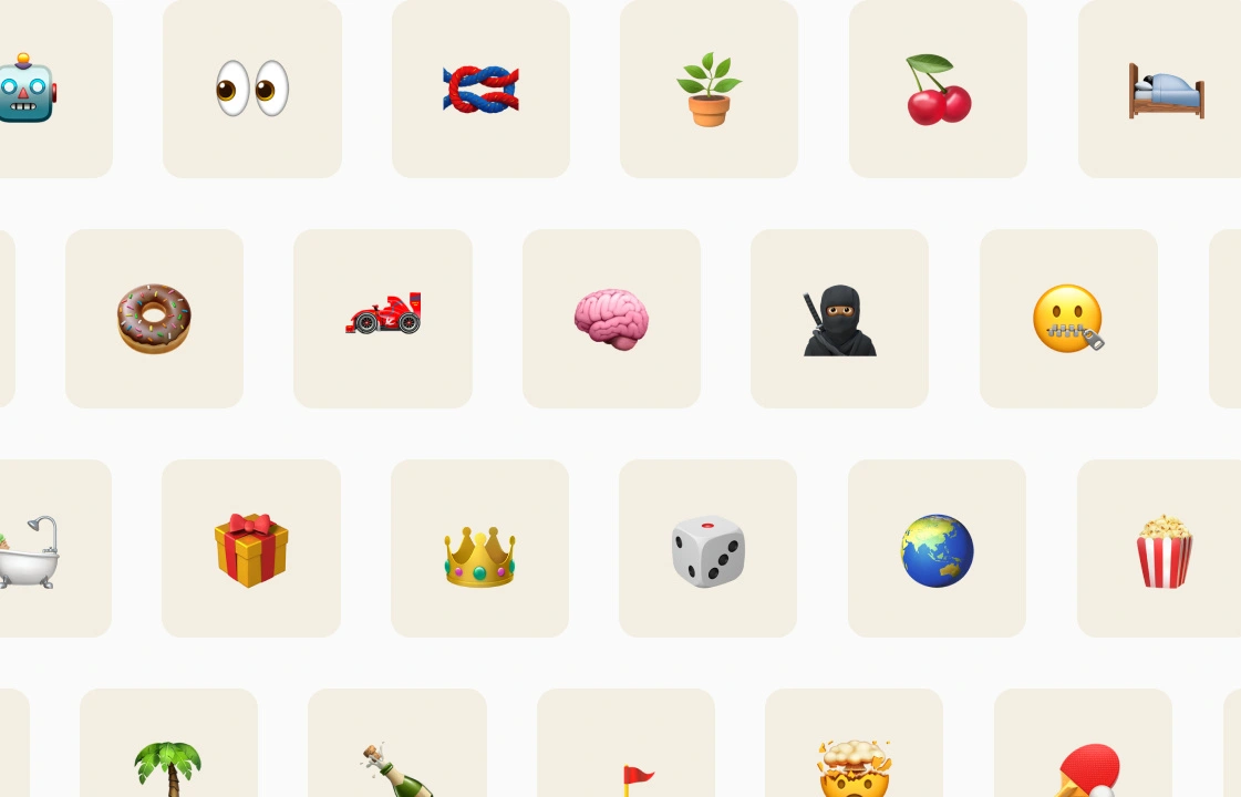
If you go to start a new message, and search for ‘S’…
New message
Search 'S'
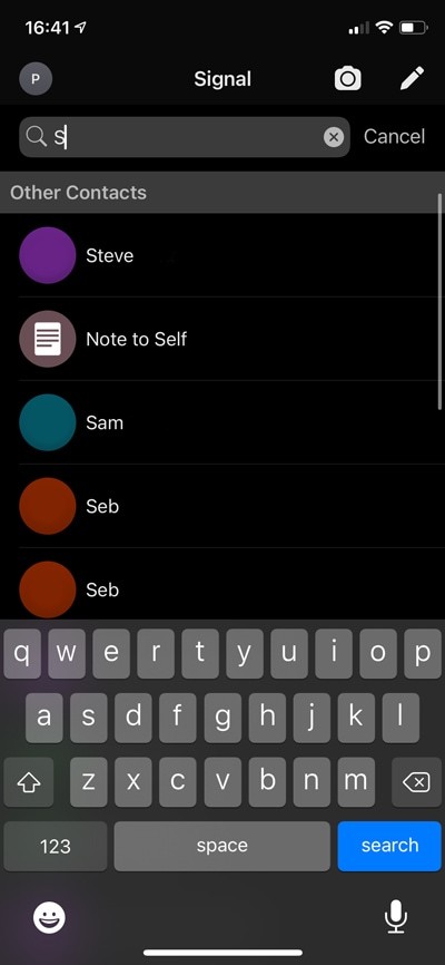
Boom
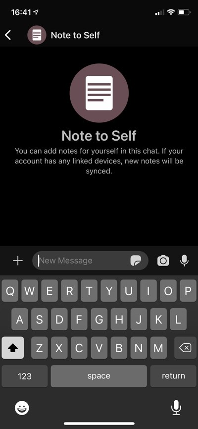
You can now privately send messages to yourself—and yes, it’s very similar to the ‘your space’ feature on Slack.
But the point isn’t that it’s innovative, it’s that Signal took a ‘hands off’ approach, and let the user stumble across this in their own time.
✅ When this technique works
❌ When it doesn’t work
Additional features which aren’t required to get the core value from the product.
Core features which need to be understood immediately.
Features that would be used infrequently, or have a relatively low ‘value’ to the user.
Features that would make their experience considerably better (it’d be annoying to find a game-changing feature after using the product for a year).
The nuance here is to know when to proactively teach someone how to use a feature, and when to let them discover it on their own.
5. Friction is your Achilles heel
Here are two reasons why word of mouth is so important to Signal:
👩🏫
1. WhatsApp and Signal are substitute goods
i.e., most people probably won’t routinely use both in the long term.
☝️
2. The network effect
i.e., they both get more valuable when more people in their network also have them. For Signal to be as useful as WhatsApp, you also need your friends to switch.
Which introduces a UX challenge: how can you design an experience which maximises the number of new users that then bother to invite all of their friends?
Certainly an influential factor is how much effort it takes to create an account (people are more likely to share things that they thought were easy to do).
Signal should be designing a process that gets the user to a point where they feel like they’ve replaced WhatsApp, in as few steps as possible.
That means removing anything from the initial onboarding experience that doesn’t directly help the user get to that milestone.
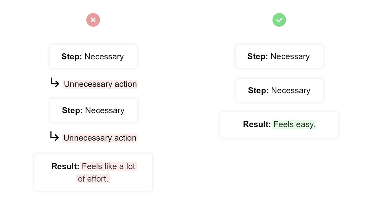
And yes, having to decide whether or not to give Signal permission to access all the devices in your house does take effort.
It’s not just the physical action of reading the modal and then clicking a button, but the cognitive attention required to make a decision—i.e., 🛌🏽 Decision Fatigue.
Conclusion
I spent about 40 hours using, analysing and writing up my experience of using Signal, and—in addition to the privacy angle—there’s certainly a lot to like:
1: Some of the error handling was great.
2: I was delighted to stumble across the ‘Notes to self’ feature.
3: The core product is very similar to WhatsApp, which is a good thing.
But there’s still a lot of work to do, and dare I say it; the UX wasn’t as good as WhatsApp’s.
I created a new WhatsApp account to test the most recent version, and I don’t think anybody can deny that their product is world-class.
Signal could get there, and to start they should improve the following:
1: For an app so focused on privacy, they do a really poor job of asking for permission to access your stuff. It’s often totally out of context.
2: Some of the error handling was really poor.
3: Remove any unnecessary steps, so the process of replacing WhatsApp feels easier.
When the hype around Signal dies down, and people are trying to get all their friends to migrate from WhatsApp to Signal, it’ll be the UX that makes all the difference.