The experience of being an Uber driver
Most of you will be familiar with the experience of either riding in an Uber, or having food delivered by one—the convenience is enchanting.
Watching a tiny car bounce around a map as the driver makes their way to you is a UX delight so powerful, that it's been copied across many verticals.
But my experience of the driver-side app had been limited to me watching the driver's docked iPhone navigate us to our destination, during a ride. I didn't know what happened before or after.
So, I joined 4 million others, and became an actual Uber Driver.
I then immersed myself in the role; going online at different times of the day, completing deliveries, cancelling orders and hovering outside KFC waiting for my next ride.
Let's get to the point: the UX is surprisingly awkward.
Case study
Let's look at the experience of making my first delivery on Uber Eats.
A deeper dive into the UX
👇 What are these? Below are UX issues mentioned in the presentation, but that I felt were worth discussing in more detail. These are worthwhile conversations to have internally, and consider if they impact your product or service.
1. "I didn't even want pancakes"
Imagine that you're being served in a restaurant, and you're asked what you'd like to order. As you're reading the menu, you say "Oh, the pancakes look great, do they...".
Immediately—before you've even finished your sentence—the chef walks to your table with the pancakes, places them in front of you, and walks off.
It may sound trivial, but let's digest why that would feel uncomfortable:
🤐
1. You accidentally made a decision
i.e., you didn't realise that your actions constituted a decision.
😳
2. You now feel regret
i.e., did you even want the pancakes after all?
Accidental decisions carry the burden of regret, because they often feel like they were made against your will.
You want your users to feel like they made a decision, not that a decision was made for them. And in most instances, you can substitute 'decision', for an 'action'.
i.e., clicking on a CTA is both an action, and a decision.
As you saw earlier, I accidentally accepted my first order, when faced with this modal:
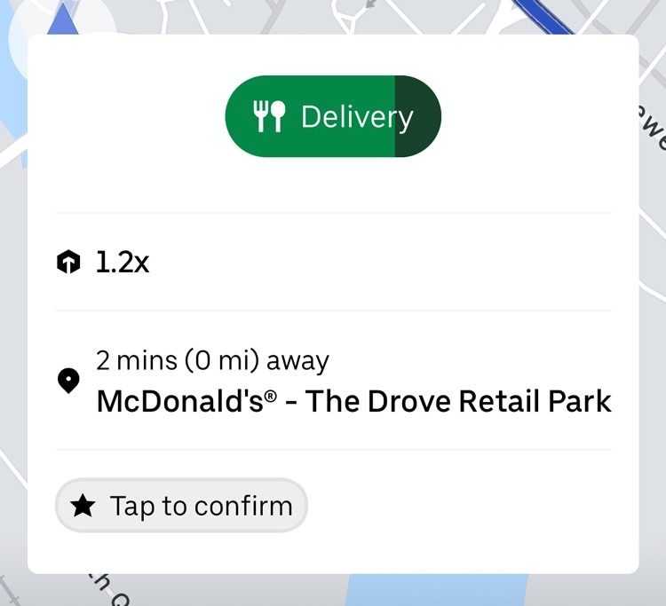
From a data perspective, Uber are probably happy with their conversion rates: a very high number of drivers will accept their first order—but it's a misleading metric.
It's undoubtably an awkward design, and I wonder how many drivers start their Uber careers by accidentally accepting an order, and then just rolling with it.
In short: every action should be intentional, and fake CTAs are almost never a good decision.
2. The knowledge gap
There's another decision-making issue with Uber: new drivers starting deliveries prematurely.
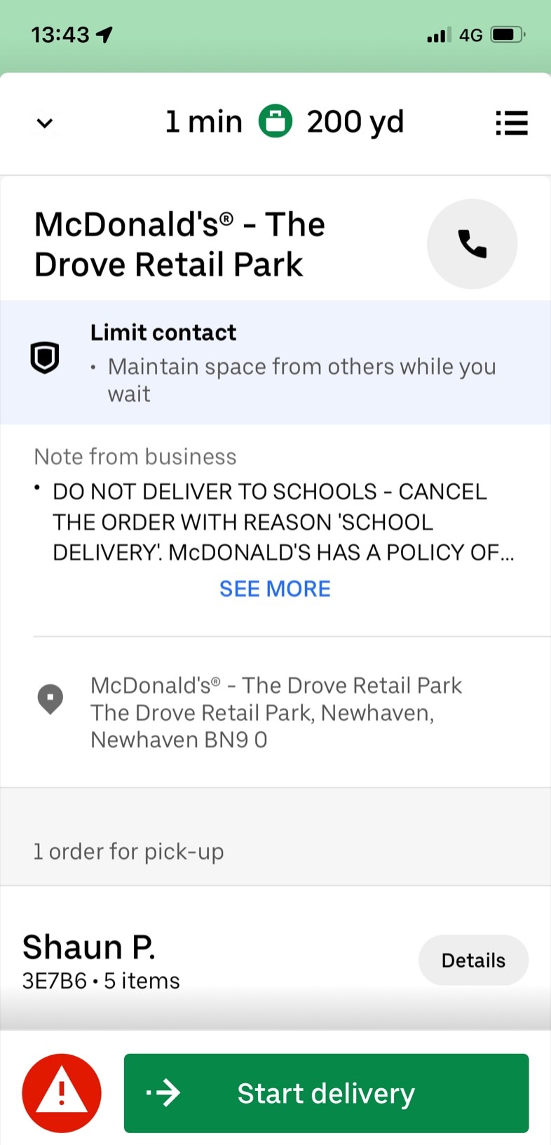
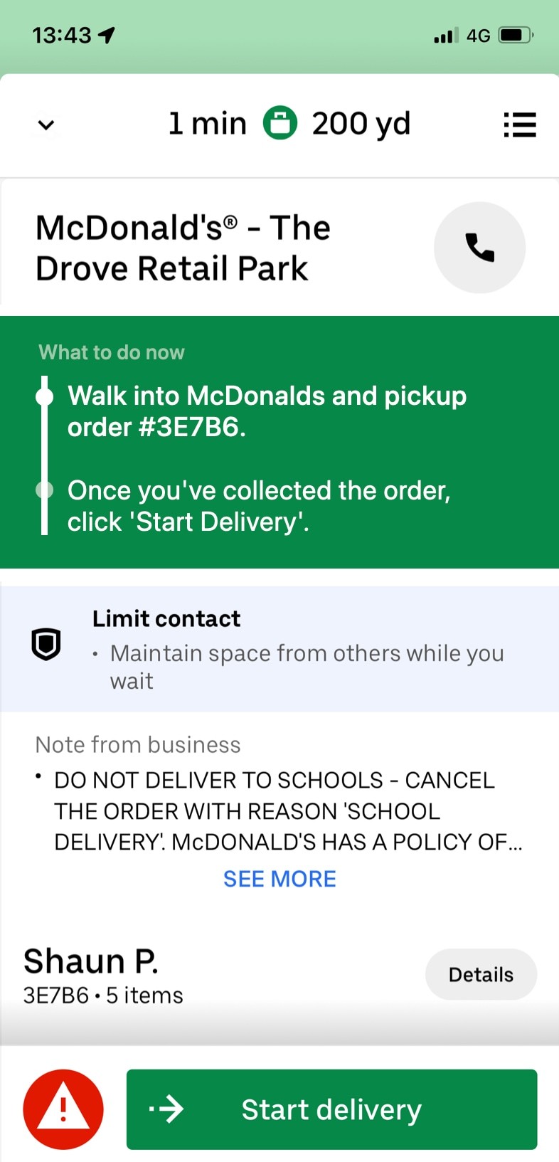
In the study, I tapped 'Start delivery' when I was sat outside McDonalds, not when I had collected the order—an error that could probably be eradicated with a clearer design.
Remember: there's essentially no in-app onboarding or education.
Original
Revised #1
Revised #2
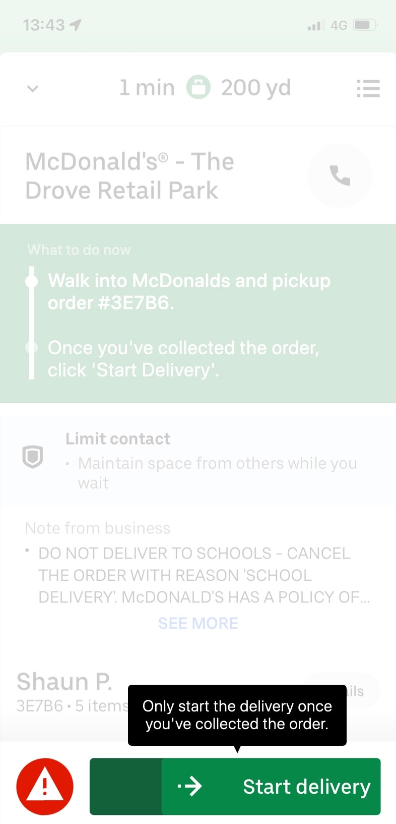
This type of error is extremely common, and we call it a 🚧 Knowledge Gap.
This is where the app is optimised for returning users, but fails to educate new ones.
A powerful UX exercise is to imagine what a human representative would say if they were physically sat next to a new user, whilst they were learning to use the app.
In this instance, I'm convinced that they would say: "Okay, now go and collect the food, and then when you're back in the car, press this button".
And if you believe that a human sat next to you would feel the need to say something, your app should be screaming it at you.
The context that you need to collect the food first is what was missing here. That may have been predictable after a simple knowledge gap exercise.
3. Split-concentration
Navigation apps (e.g., Google Maps, Waze, native in-car navigation) re-orient your map automatically, when your view is deemed no longer useful.
i.e., you'd zoomed into a particular junction, and now you're half a mile down the road.
The Uber Driver app doesn't, and it renders the navigation fairly useless.
To make this worse, the 're-centre' button was hidden behind a sticky footer.
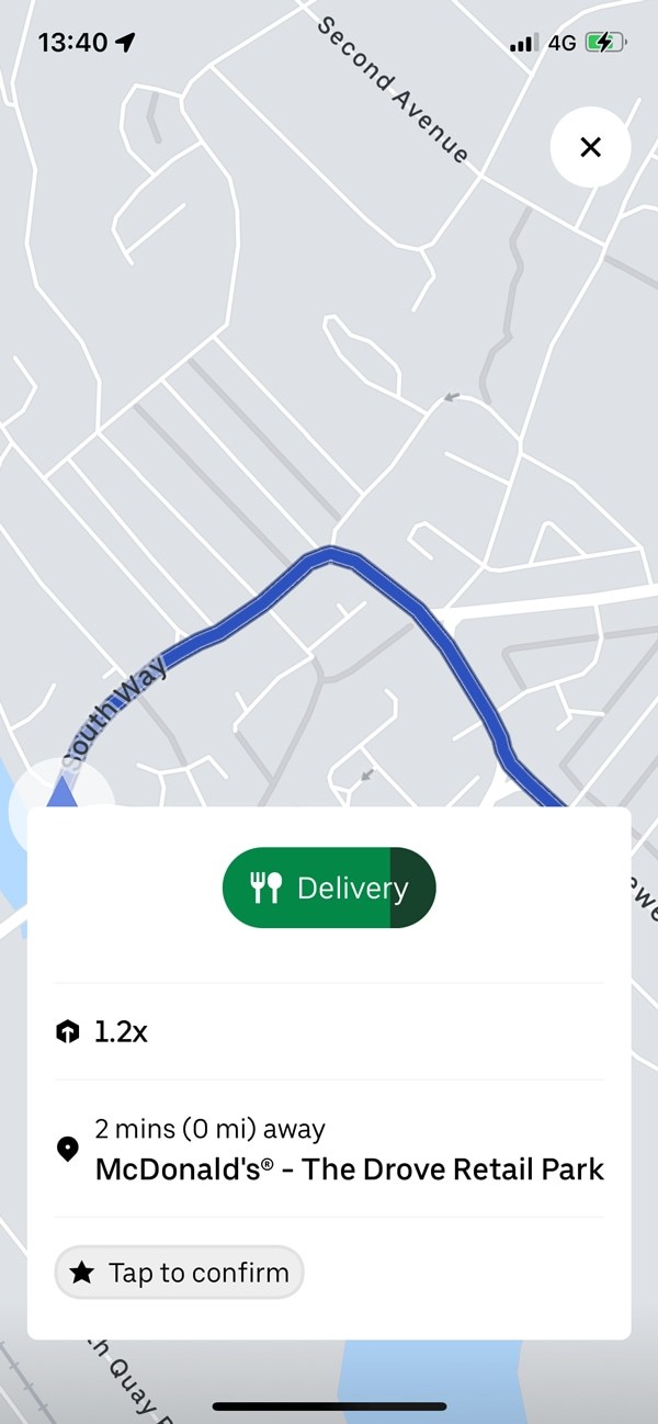
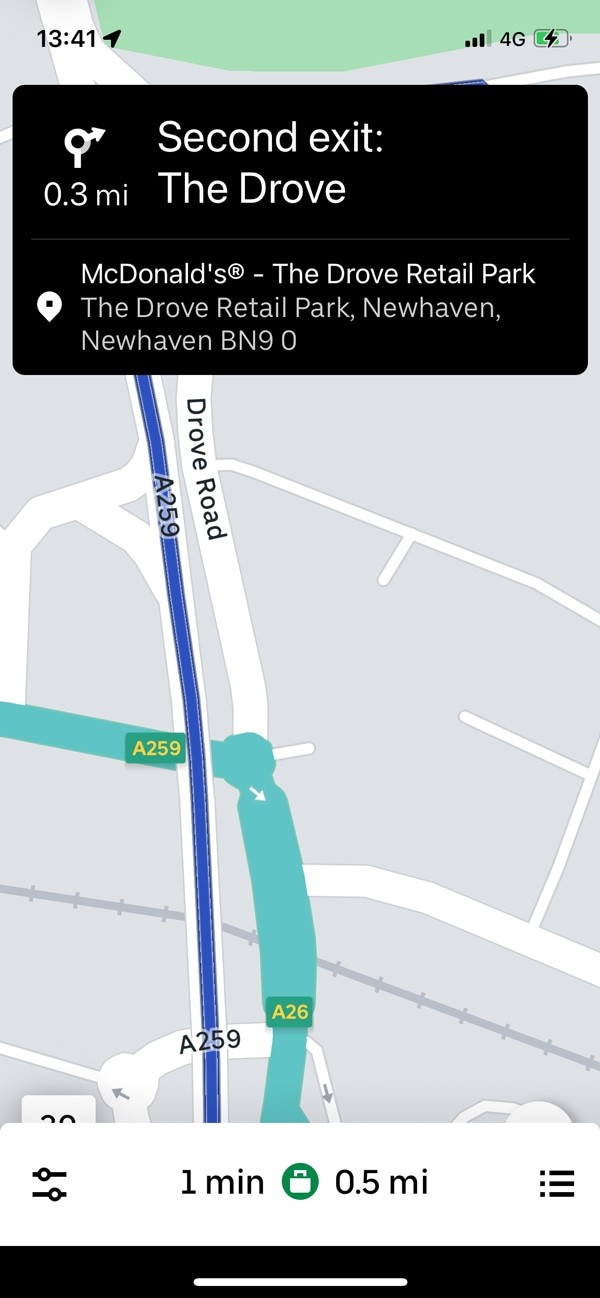
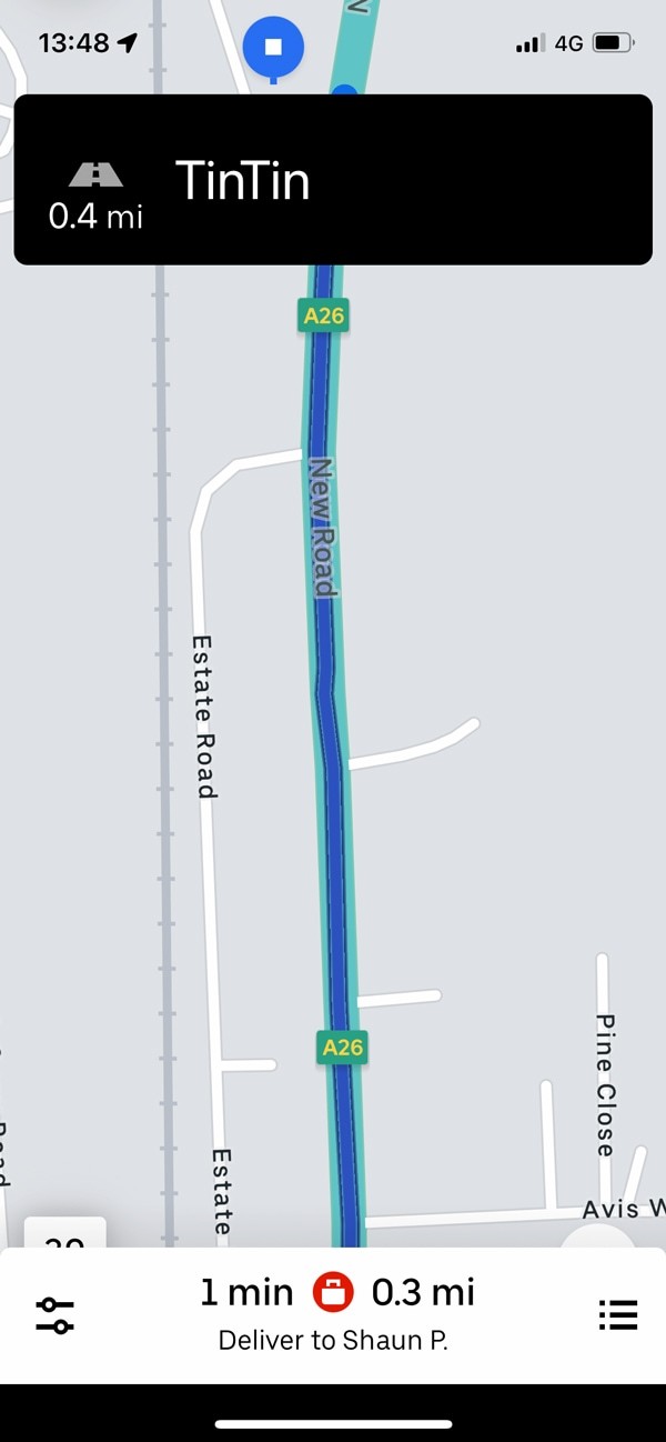
This is an example of a task with split-concentration (i.e., split between driving the car, and using the app).
In a laboratory environment, the Uber Driver app may perform perfectly. But in reality—and when the user has a split-concentration—it fails.
Split-concentration isn't common enough to feature in a UX course, and designers rarely talk about it—but it does happen.
For example, using the Spotify app while running on a treadmill.
In these instances, you need to simplify the UI, and really focus on making things easy to use while completing another task.
Summary
Having used both the Uber Rider, and Uber Driver apps, it feels like they've invested most of their attention into the consumer experience.
Perhaps drivers are more willing to put up with bad UX, as they're earning money and have already invested time into the platform.
But a consumer has more choice—and is paying for the service.
So, despite this possibly being a rational trade-off in the short term, it's certainly a lacklustre user experience for the 4 million Uber Drivers worldwide.
🔥 The biggest UX takeaway from this study:
Try the knowledge gap exercise with your team: walk through the process of someone using your product for the first time, and imagine that you're sat next to them as they do it.
What do you feel the need to say to them? Which knowledge gaps are you filling with your voice? Most of these will feel intuitive—write them down.
