By Peter Ramsey
24 Jun 21
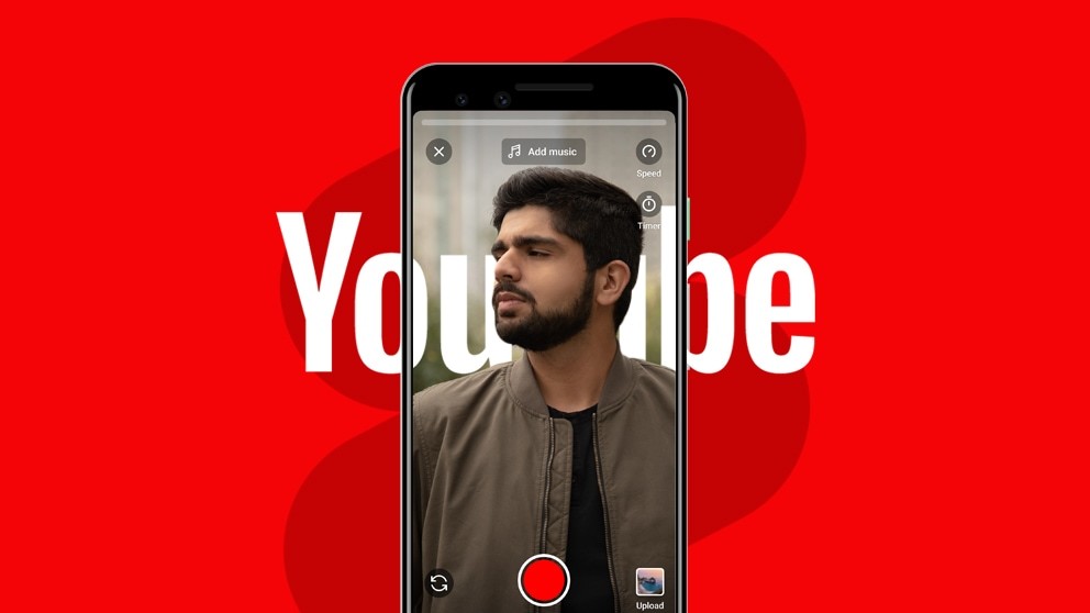
YouTube Shorts: a clone of TikTok
YouTube has a history of releasing features which sound promising, but after a lack of sustained engagement, are either killed off, or just fade into irrelevancy.
YouTube Red, YouTube TV, YouTube Premiere, YouTube VR, to name a few.
But after seeing the explosive growth of TikTok, YouTube reacted, launching an almost identical concept under the title of YouTube Shorts.
But to convince creators to invest time into this new format, YouTube will need to generate serious engagement.
So is the user experience of YouTube Shorts as good as TikTok? Is it intuitive enough to convince people to use it?
Summary
🧠
The importance of selective attention
🤣
How YouTube is pranking their users
⚡️
The power of a live search
💡
How to avoid frustration with a simple message
🍩
Why you should always close reward loops
5 key takeaways
1. Selective attention
Like computers, the human brain can only process a limited amount of information at once. So in a world full of stimuli, how do you know what's important?
Psychologists call it selective attention—the automatic and subconscious method of selecting what to pay attention to.
👀 Selective Attention is necessary for survival. It's what helps us focus on traffic while crossing the road, or to listen out for the rustle of a predator while foraging.
And that's where UX design comes into play: to help your automated processes focus on what's really important.
Or rather, when designing products, you need to be aware of where a user's attention will be—and often more importantly, where it isn't.
For example, below are two screenshots, one before adding music into your video, and one after.
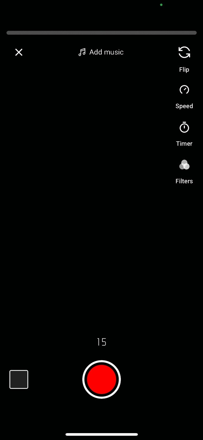
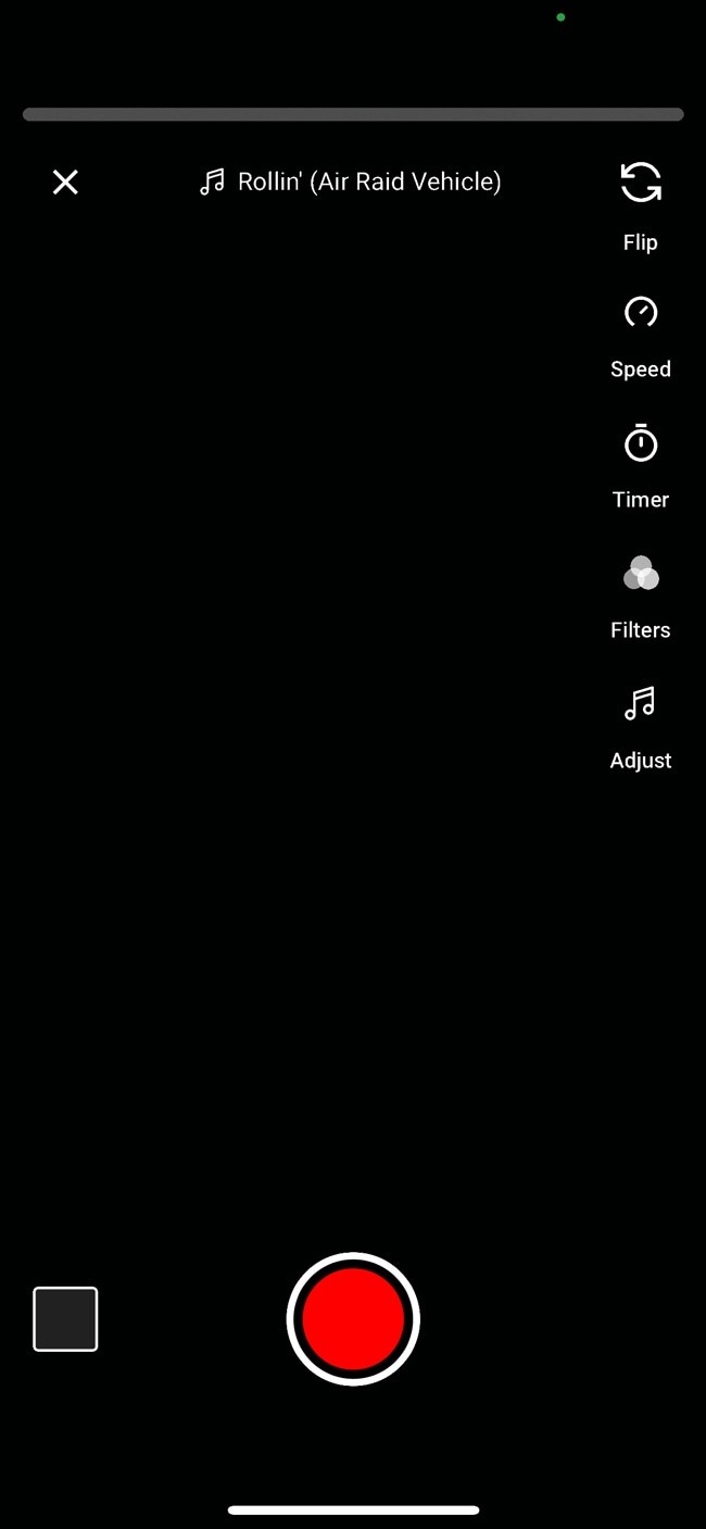
Notice how the 'Adjust' tool appears in the right menu after adding music. This is how you change the part of the song that's playing.
But many people won't notice this new tool, because they're not looking. They'll have assumed that nothing has changed.
This is for a few reasons:
🧑🤝🧑
The pages generally look similar
It's not immediately noticeable that anything has changed.
🙇♂️
They're not expecting a change
They've already seen that page, and there's no reason why you'd expect there to be a new tool.
👀
The change is subtle
The specific change is very subtle and blends in with the existing design.
In this situation, YouTube would likely increase the use of this tool by providing the user with a prompt. Something to trigger the automatic part of their brain into thinking "wait, something has changed, we should pay attention".
2. A sticker of a button
A few years ago, a prank where people stuck images of power outlets onto walls in public spaces went viral.
People would see them from a distance, and without thinking, attempt to plug in a charger.
Someone would be secretly filming, and catch the disappointment and confusion wash over the victim's face.
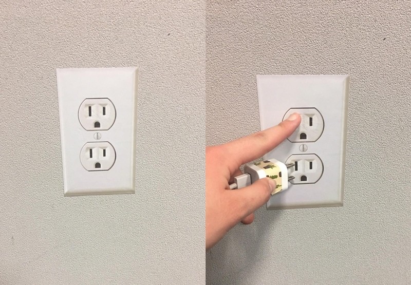
This worked so effectively not because they looked so realistic, but because people weren't paying attention.
i.e., people see what looks like a plug socket, and they just assume it is a real one.
Note: this is similar to the selective attention bias above, but the point I'm making is slightly different. I could have used this example to demonstrate both concepts.
YouTube are accidentally playing a similar prank on their users, because once you've added music to a video, the button goes slightly more transparent and inactive.
It essentially turns into a sticker of a button. You even get this circle appear where you've tapped—which acts as a focus for the camera.
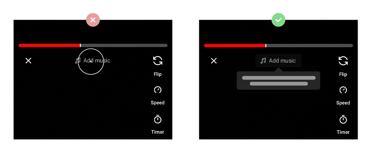
Instead, the button should still exist, but tapping it should do something that explains the context behind why it's inactive.
Without this, how would you know the difference between an intentionally disabled button, and a broken one?
3. Live search
When implementing search functionality, there are two main approaches:
☝️
Static search
When you need to press a button to initiate a search.
⚡️
Live search
When results start appearing while you're typing the query.
And despite the occasional infrastructural benefits of a static search, the user experience of a live search tends to be considerably better.
One reason for this is that with a static search, the user has to make two decisions: what to search for, and when to click search.
Note: An example of where a static search would be better is if the process of searching literally slows the user down—i.e., if hitting the server with loads of queries has a noticeable impact on the front end speed.
Let's look at the experience of adding music to a Shorts video, as an example:
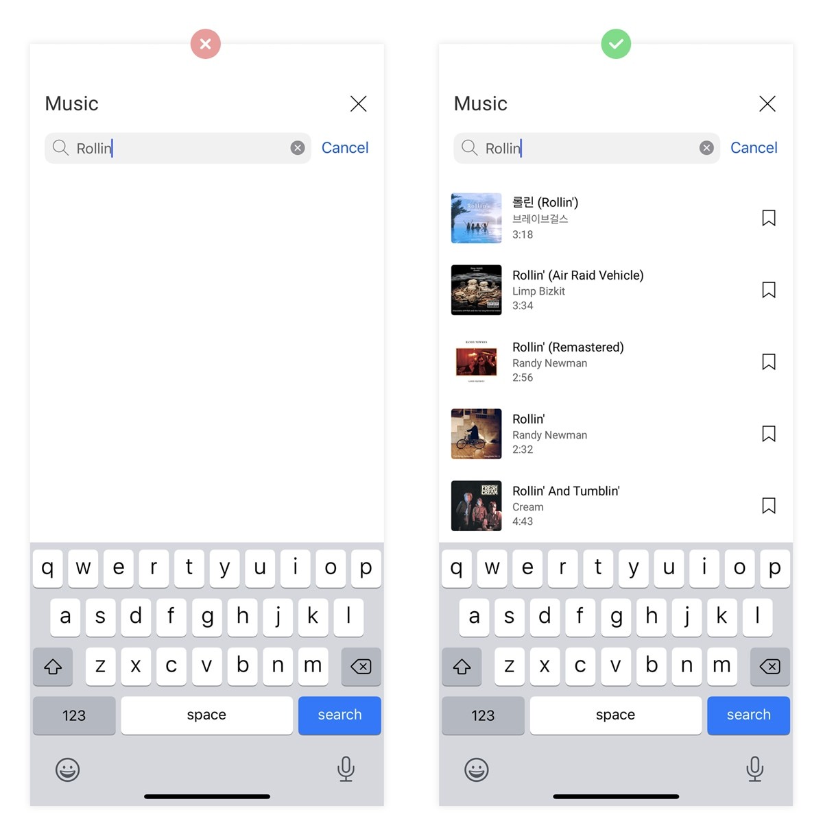
Imagine that you had a song stuck in your head, but couldn't remember the exact title.
"Oh, it's 'rolling in the dark', or 'riding in the dark', or maybe 'riding in the deep'".
It's possible that none of those searches will show the result that they wanted; 'Rolling in the Deep', by Adele.
But if this were a live search, they'd have a higher chance of finding the correct result, and do so with much less effort.
Plus, in the instances where a live search is more efficient at showing users their desired results, it'll also be more enjoyable to use, and likely see higher engagement.
4. Deleted without warning
Imagine that you've just recorded a rare moment on camera—say, a baby's first steps—and you want to record a second clip of your reactions.
You go to press the record button, but in your excitement you miss by a few pixels, and accidentally delete that first clip forever.
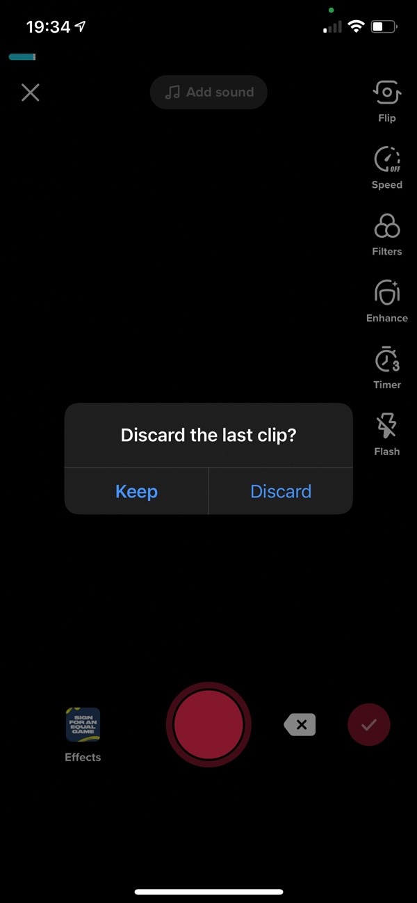
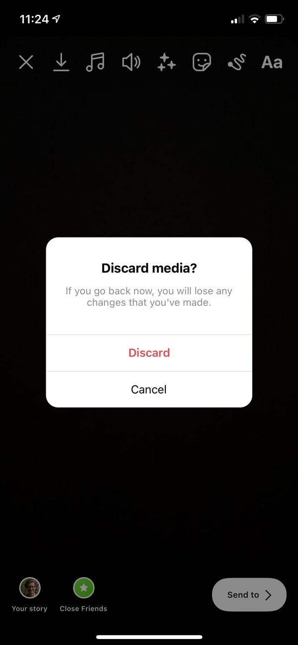
This scenario is entirely possible on YouTube Shorts, because the delete button is perilously close to the record button, and there's no 'are you sure' modal.
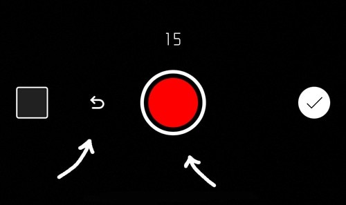
This could easily be avoided by adding an 'are you sure' message, like TikTok and Instagram do.
TikTok
If they want people to capture original, moving and engaging content, then don't make it easy for people to mistakenly and irreversibly delete all their hard work.
More generally, when building products you need to be aware of where the points in the process are that people can accidentally lose data.
For example, if clicking 'back' during a sign up form will clear all the fields that they've already entered, you need to warn them.
5. Completing the reward loop
The journey of uploading content to YouTube Shorts is likely to be:
🧠
Deciding
Creating the concept of what to film.
🎥
Filming
Actually filming those scenes.
😬
Editing
Adding effects and filters.
☝️
Uploading
Naming the video and clicking upload.
🏖
Reviewing
Watching it back live.
That final step may sound arrogant, but content-creators know that this is an important part of the process.
Aside from checking that it has uploaded correctly, and that it looks good, it completes the reward loop.
It's the end of their natural journey, and the content that they created is out in the world.
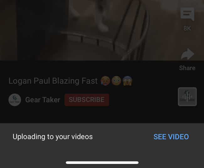
Which is why I'm surprised that YouTube don't immediately take you to your own video after uploading it.
Instead, they take you to someone else's content, and then display a banner asking you if you'd like to watch your own video.
This is a perfect example of how data can be misleading. The immediate conversion rates of this process will be unaffected by this annoyance—because the user has already uploaded the content.
But, if they found the experience less rewarding, then it's possible that they'll not feel as incentivised to upload more content in the future.
And tracking that hypothesis between platforms will be difficult, given the many other variables (i.e., audience size, content length, monetisation).
One thing is for sure; a rewarding loop is addictive, and the YouTube loop doesn't feel as gratifying.
In other words, by never completing this reward loop, uploading to YouTube is probably less addictive than uploading to TikTok.
Closing thoughts
In my opinion, YouTube Shorts is considerably less addictive than TikTok, both as a viewer and as a content-creator. And that's a problem for YouTube.
Shorts may still succeed, but if it does, it's down to the sheer size of the YouTube community, not because the experience was world-class.
TikTok isn't perfect, as I demonstrated in my TikTok case study, but they've undeniably created a product that people love.
If you've used both YouTube Shorts and TikTok, you may get a vague feeling of one being better without being able to put your finger on why.
This is why—it's a perfect example of how impactful thoughtful UX can be.