
By Peter Ramsey
22 Feb 24
Which is better; Zoom, Teams or Meet?
Zoom, Microsoft Teams and Google Meet—three conferencing tools that are objectively very similar, but that trigger a cult-like preference.
And it's worth highlighting an unusual dynamic: the person who creates the meeting, decides which tool to use. It's rarely a mutual decision.
Your preference as a host, subjects every person you meet to a 'guest experience', that as you'll see, is often dire.
It's time to consider the consequences of starting a meeting, where the other person has just suffered through a few minutes of random updates, installations, errors and creating accounts they didn't want.
So let's try and answer this question through the lens of UX: which is better?
Case study
Benchmarking & UX takeaways
1. Dark patterns
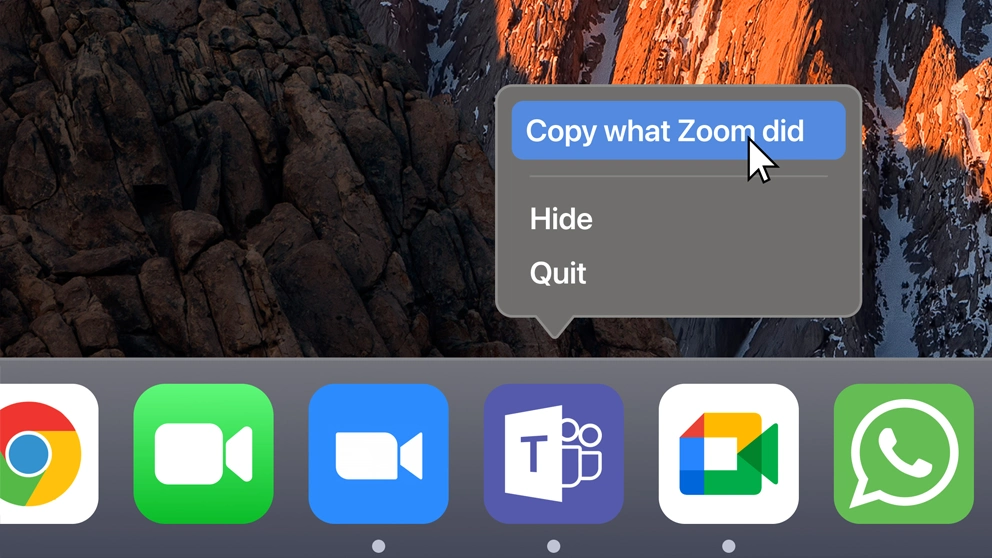
It'd be hard to argue that when opening a meeting link, Zoom aren't intentionally hiding the 'join from your browser' option.
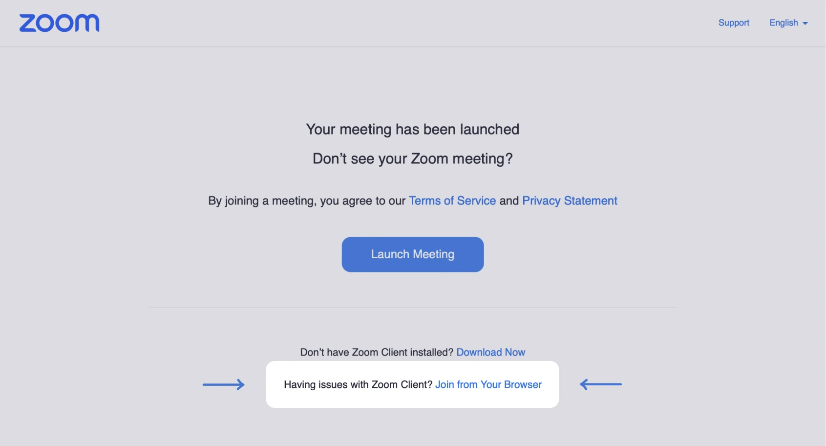
I suspect that most customers (the host of the meeting), won't care if a guest has an account or not—they just want a frictionless call.
As a product, you want non-users to realise how simple your tool is, without any unnecessary incumbence.
And framed in this way, Zoom doesn't stack-up well against Teams or Meet.
Clicks to join a call via browser


Clicks
Something that I don't believe Zoom are optimising for, is the sensitivity of this moment.
The guest is running late, or perhaps they're nervous about a presentation. In highly-emotional situations like this, any kind of friction is magnified, and the service that you're using may be unfairly blamed for the frustration.
"I'm late to this meeting because Zoom sucks and made me install their app, then I had to find my meeting ID again. It's not my fault, it's Zoom's".
These services are used daily, by hundreds of millions of people. This moment in time should be an optimised Rolls Royce of comfort—but it's not.
This pre-call anxiety explains why errors like the examples shown below, feel compassionless.
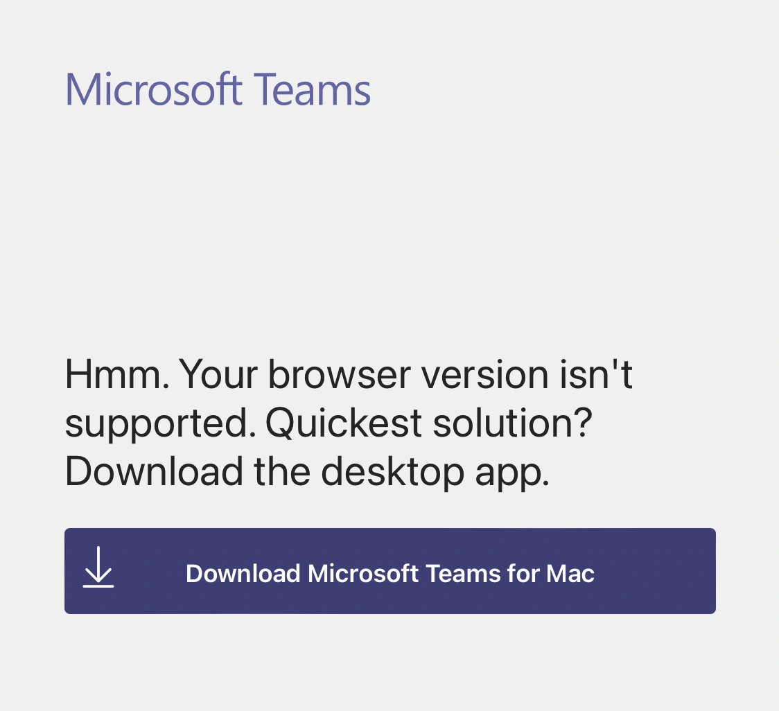
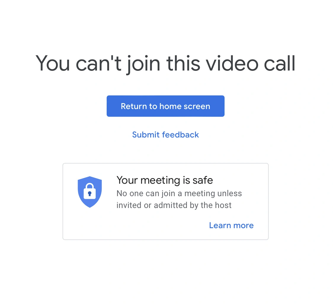
The takeaway here is that your product may be subject to ambient or circumstantial anxiety, which in the long term, has the potential to damage your core metrics.
i.e., guests may be less likely to use Zoom again, because it ruined an important meeting once.
Here are a few examples of circumstantial anxiety:
📈
Spending analysis
You're stressed about finances, and find your bank's transaction analysis particularly frustrating to use.
📅
Missed calendar events
You're angry that you forgot about a meeting and blame your calendar for not reminding you in a more obvious way.
🏚
Airbnb complaints
You've arrived at a disgusting Airbnb, you're exhausted, and get extra annoyed by necessary 'account security' steps, which are there to protect you.
2. In-call friction
As these services are relied on daily, by hundreds of millions of people, you'd expect that they'd have identified these regular moments of friction, and built experiences that reduce tension.
But at times, the exact opposite feels true.
Here are two examples.
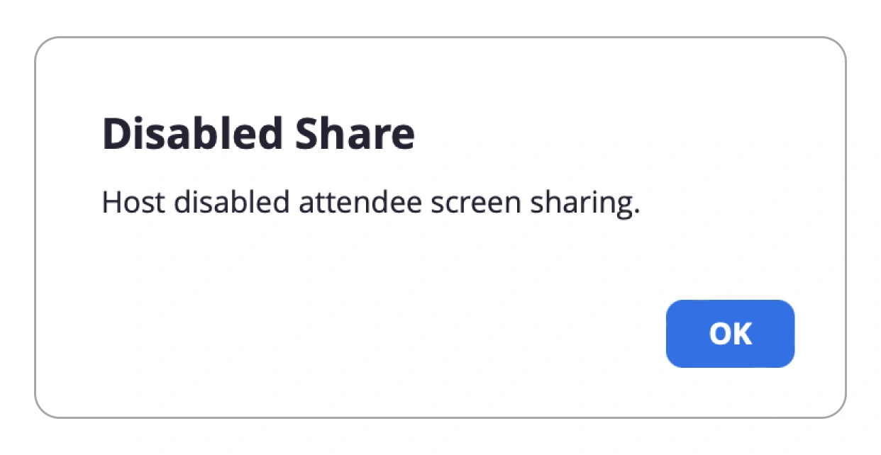
Firstly, on the default settings, when a guest attempts to share their screen, they're met with an error.
"Okay, I'll share my screen"
"Sure"
"Oh it's not letting me, you need to change the settings somewhere"
"Do I? Okay. Do you know how?"
Zoom
Teams
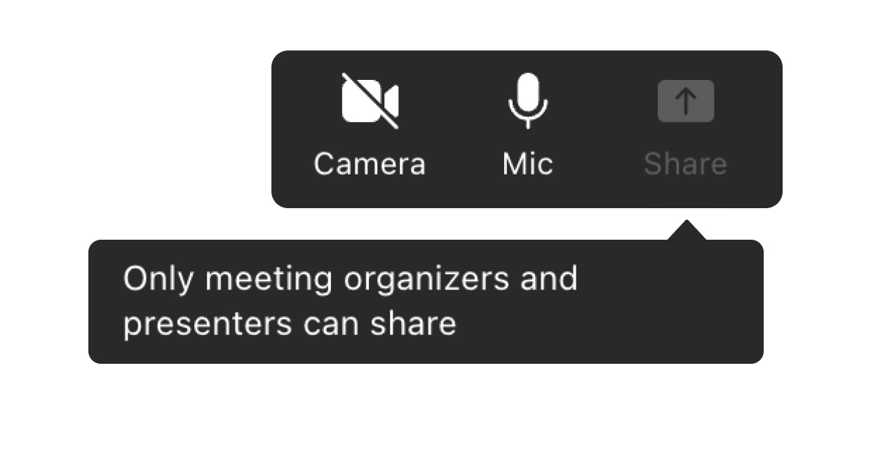
The issue isn't the default configuration of the settings, it's that the interface handles it like an error, rather than something that the host and the guest probably mutually want to do.
In these instances, the host isn't even notified that someone is trying to share their screen—it literally relies on having that conversation above.
A better experience would be for the host to immediately get a single-click "allow screen sharing" prompt.
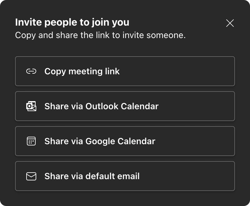
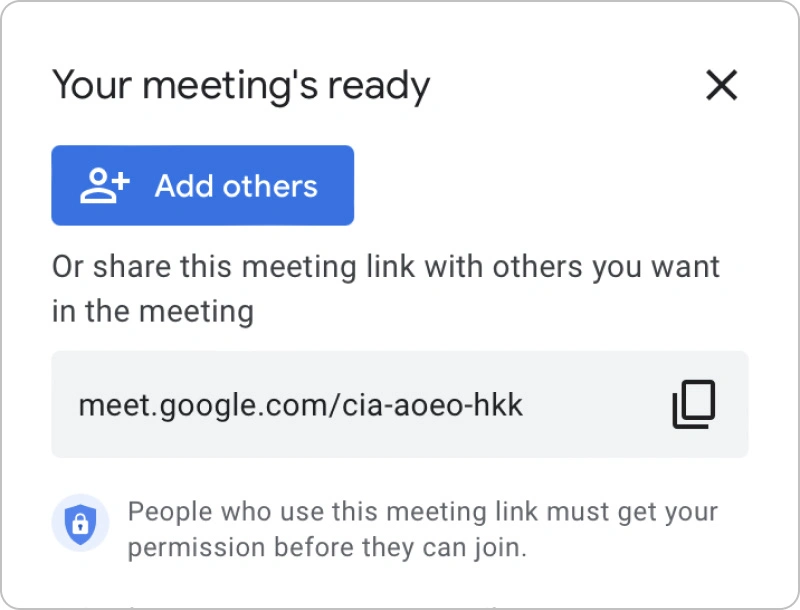
Let's take an even more crucial feature: inviting people to your (currently empty) meeting.
Both Teams and Meet recognise that the meeting is empty, and proactively suggest multiple methods of inviting participants.
Teams
Meet
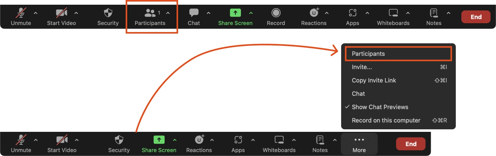
Not only do Zoom not do this, but on smaller screen sizes, the 'Participants' menu item is actually hidden behind a 'more' link.
How is the 'Reactions' item more important than the 'Participants'? There's nobody in the call.
3. User's intent
You may have noticed a theme: these big 3 conferencing services do a relatively poor job of optimising for the user's intent, accounting for the messiness of the real world.
Or rather: it feels like the people building these tools, never use them outside of a single organisation.
Nowhere is this more obvious than the lack of effort put into Zoom's 'join using a browser' option, which isn't even responsive.
They have 300 million daily active users, and yet you need to horizontally scroll this screen to enter your name.
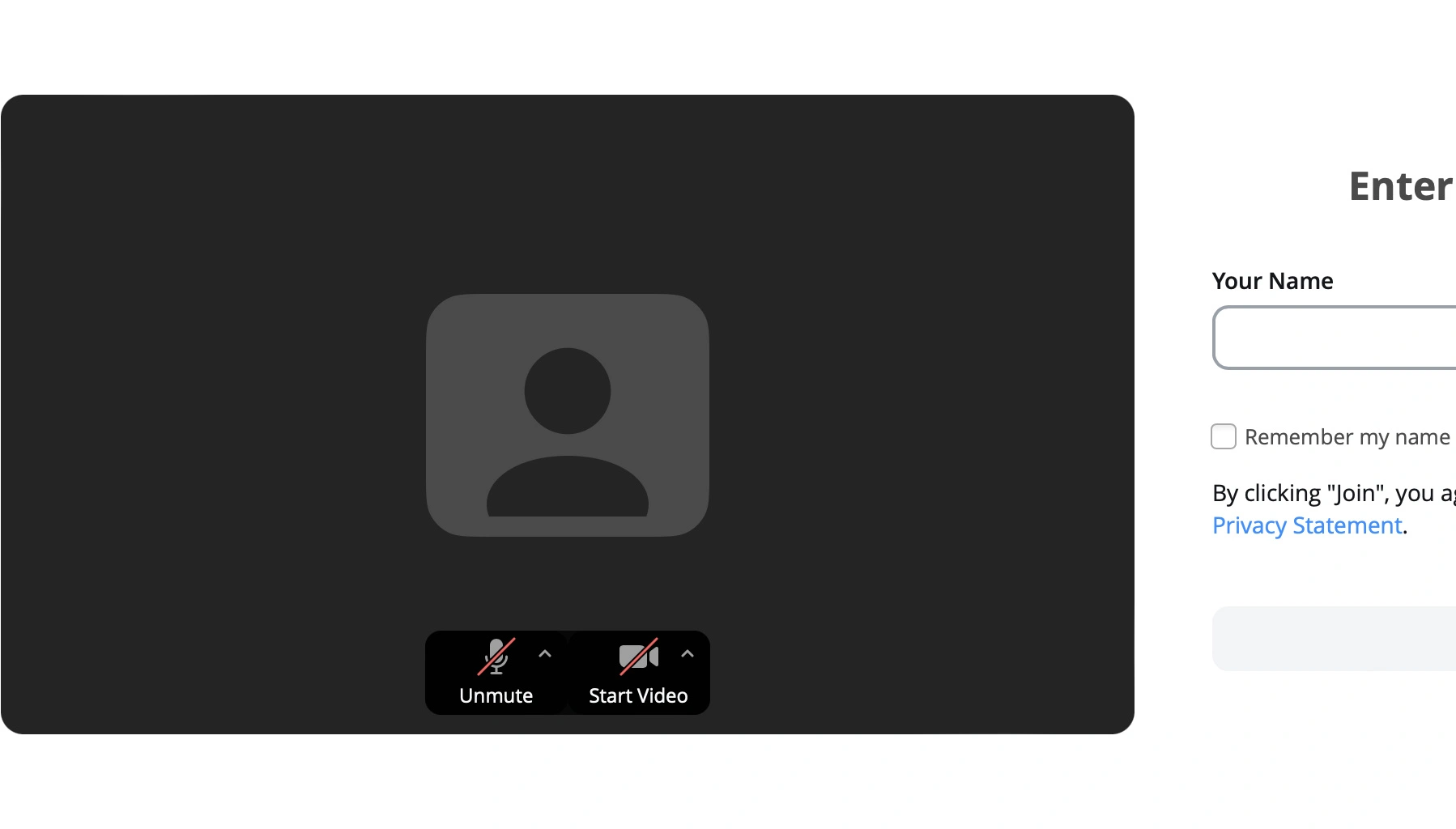
Even worse, if you run into a problem, it doesn't even tell you that there's been an issue, it just opens a ticket to report a bug.
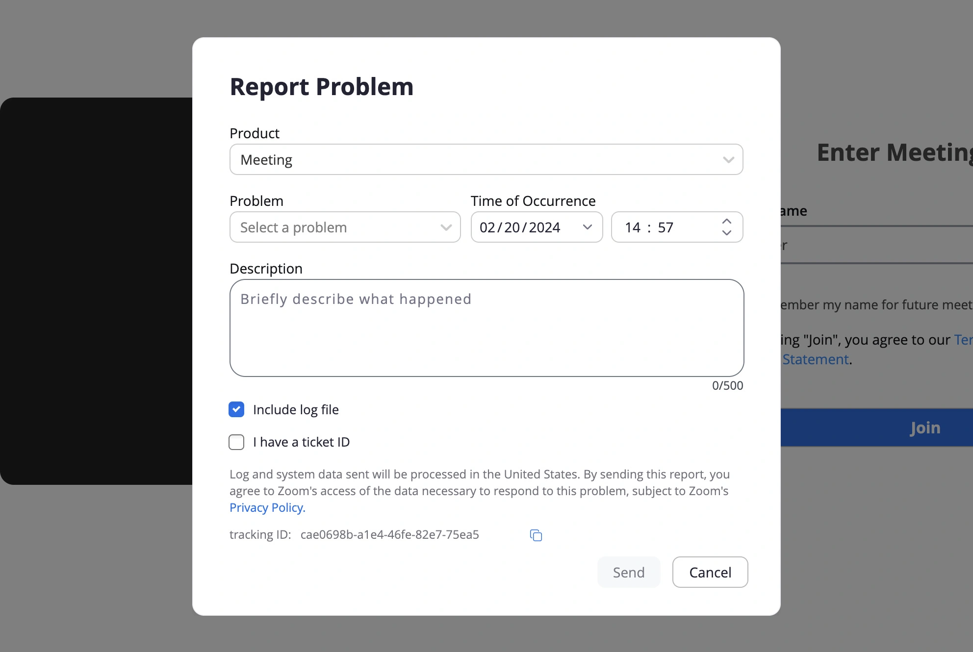
Not only is it lacking any kind of status, but it ignores what the user wants to do: to join the meeting.
The guest doesn't even know that the call has ended—why would they risk being even more late, to thoroughly complete a bug report?
And as a reminder, the host may not know the guest's preference, or if they're inadvertently forcing this experience on people they meet.
Challenge yourself (beta)
Now it's your turn. BFM+ members can now participate in UX exercises and quizzes, all about product psychology, design concepts and more.
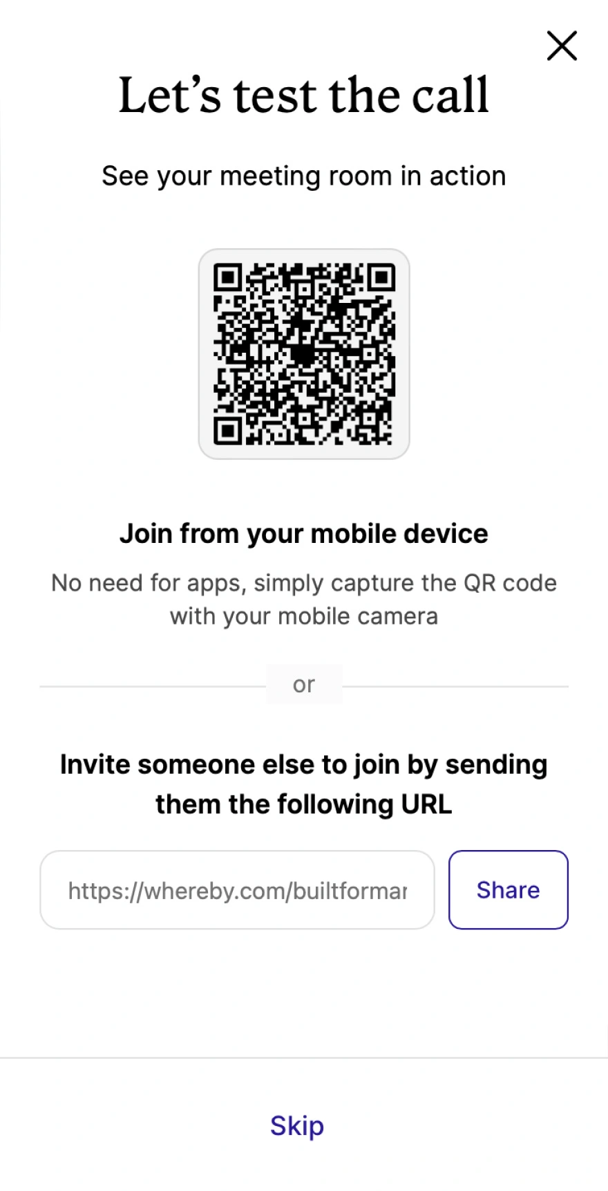
Whereby lets the host test their room before inviting guests. But what's the UX magic of this design?
📊 Note: this feature is in Beta right now, and everything is being tested (to see what's best for you).
Really, this is the first step, and there are limited exercises available today. Until they're more embedded on the site, you can find more exercises here, and continue your streaks.