The imperfections of Gmail

Gmail has more than 1.8 billion active users, with 44% of Americans opting to use it as their email solution—in other words; it's huge.
And whilst Gmail is generally a great experience, the vast majority of your on-screen exposure will be after the initial set-up.
But what is the set-up experience like? It's Google, so you'd expect it to be world-class, right?
And ultimately, what can product-builders like us learn from their mistakes?
Case study
A deeper dive into the UX
👇 What are these? Below are UX issues mentioned in the presentation, but that I felt were worth discussing in more detail. These are worthwhile conversations to have internally, and consider if they impact your product or service.
1. Pop-up problems
I'll often ask product managers to list every screen in a particular user journey—an exercise that sounds simple, but is difficult in practice.
People always forget about all the ancillary pop-ups, despite users having to persevere with them.
For example:
💬
Live chat pop-ups
📝
Surveys
👨🏼🏫
In-app education
🍪
Cookie notices
🔇
IOS permissions
💸
Adverts
🌱
New feature announcements
Typically, one team will design what they believe to be an optimal user journey, but then over time stuff gets added into the product without care.
To be clear; this is an operational problem for most companies, because different departments / roles have influence over the same product.
i.e., developers may add in a cookie notice at the last minute, or the customer support team may request that a live chat be added in, which causes an imbalance elsewhere.
That's how you end up with a 5-pop-up-sandwich like Gmail:
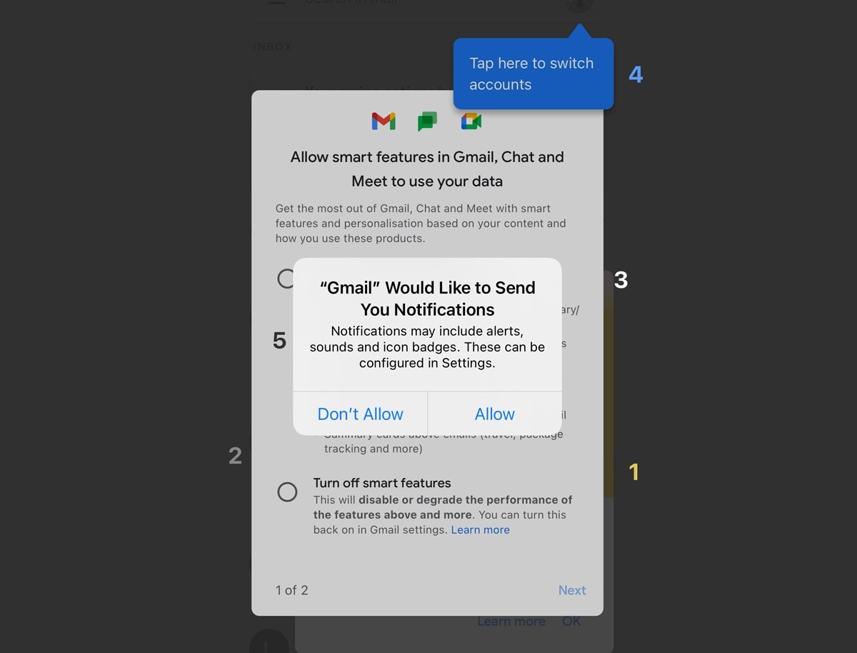
The preventative measure here is to be aware of these additional steps, and try to reduce the noise wherever value isn't added.
Fundamentally, it's a lack of oversight.
2. The FITD effect
There's a persuasive technique often referred to as the 'foot-in-the-door' effect.
See: 👞 FITD Effect.
In short; agreeing to a small request increases the likelihood of agreeing to a second, larger one.
This is obviously effective in sales, but the same principle can be subtly utilised in product design.
Google employ this technique, to encourage you to share your data broadly amongst their other products and services.
As I demonstrated in the case study, they first ask you if you'd like to turn on 'smart features'—an easy yes.
Then, they immediately pose the second, more significant question.
Easy
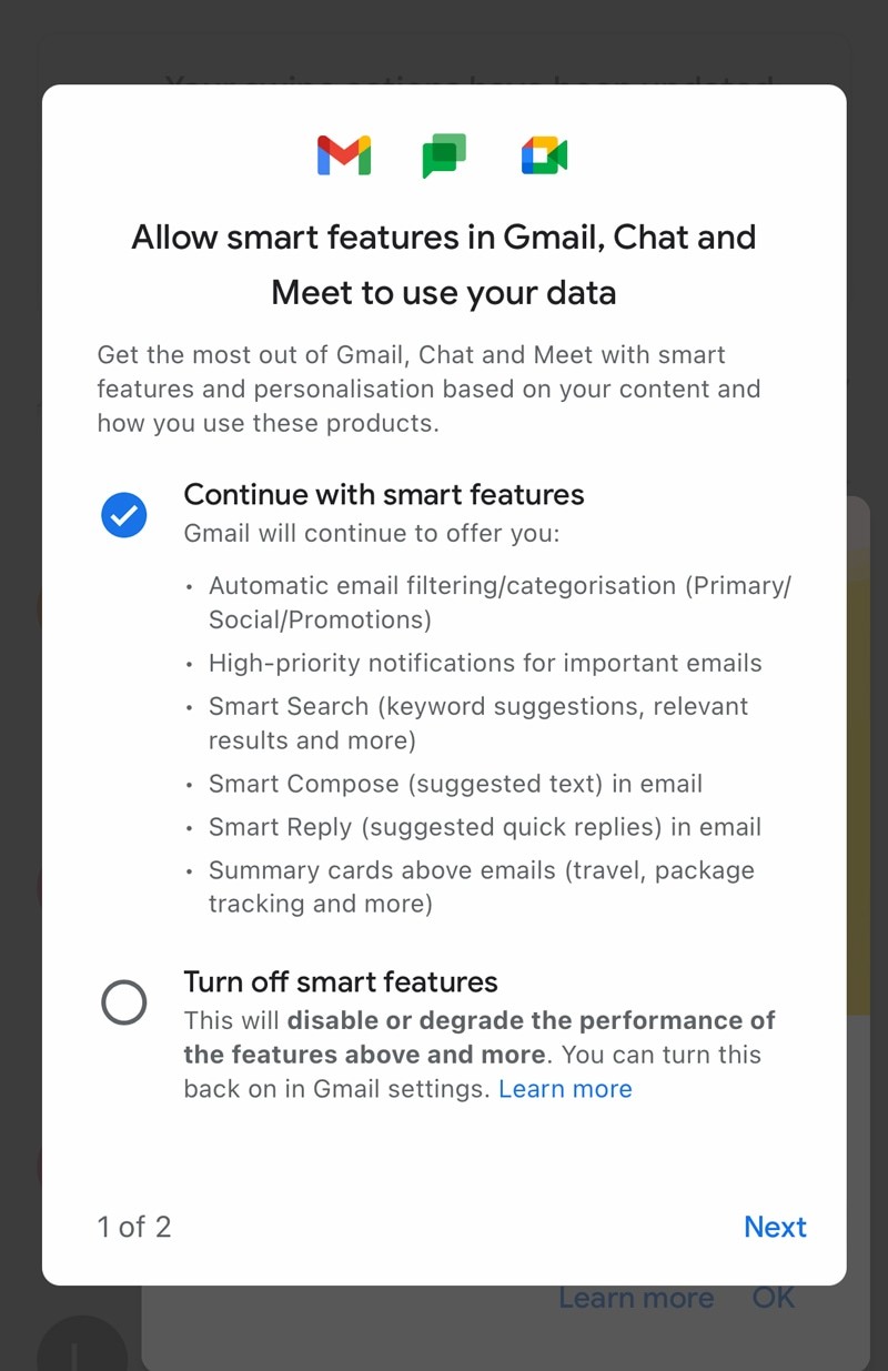
Harder
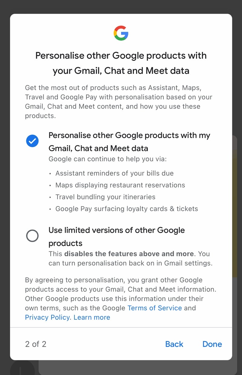
Although there's a moral dilemma when utilising this behavioural nudge, it's not always a nefarious act.
You may use a similar technique to keep users motivated to complete a process or series of tasks.
3. Faux features
In the case study, I described how the 'undo email' button didn't actually undo anything, and is really just a UX technique to give the illusion of an action.
This is also exactly how the Twitter 'undo' button works—currently a paid feature.
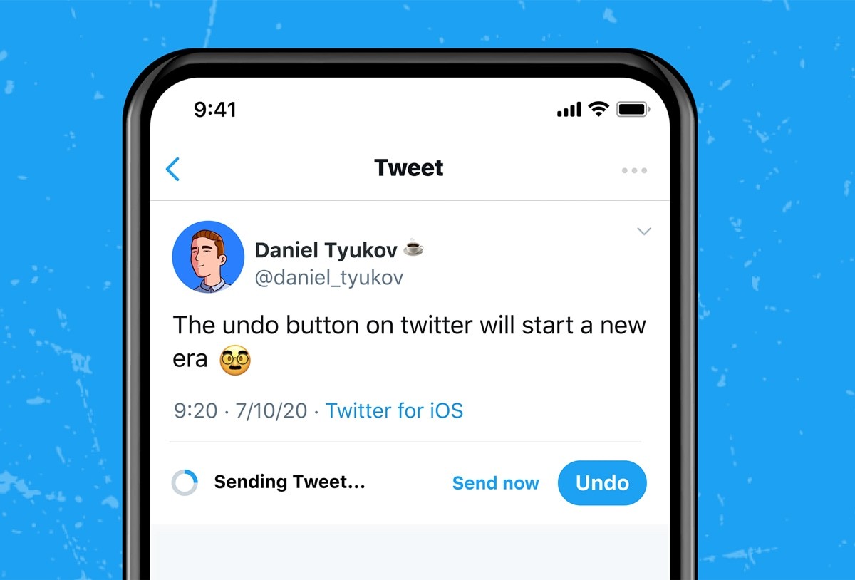
If you were to lift 'under the hood' of your favourite products, you'd probably be surprised how often things exist purely to benefit the user experience, and have no technical merit at all.
As an example, look at the following 3-step spinner:


This is fiction, but that third step may only exist to reassure you that your account is still secure.
Technically, nothing is happening, but the user perceives that a valuable action is happening.
Any negativity from the few seconds of additional latency are offset by the comfort of being reminded that everything is still okay.
In reality, you're watching a spinner that does nothing. But it doesn't feel like you are.
I know many financial services that utilise this technique to great effect. Once you know what to look for, faux features are everywhere.
4. Progressive education
It feels like the de facto method for educating users is this: show them how to do it once, and then assume they'll remember it for life.
When phrased like that, it sounds obscene—yet I'd guess that 99% of all onboarding happens this way.
There are many reasons why this may be an ineffective means of educating users:
🧠
Difficulty of task
i.e., impossible to learn with only one exposure.
⏱
Frequency of repetition
i.e., only using the feature once per year.
🤯
Cognitive overload
i.e., the user is already bored and unable to learn more
👋
Lack of willingness to learn
i.e., the user doesn't see why they should learn it, so doesn't.
There are alternatives: here's a beautiful example of a more progressive type of education.
While composing an email, you can swipe to accept suggested content. But instead of just telling you about this feature, they show you a 'swipe' prompt, until you've actually used it twice.
Then, the third time you go to use it, they hide the prompt.

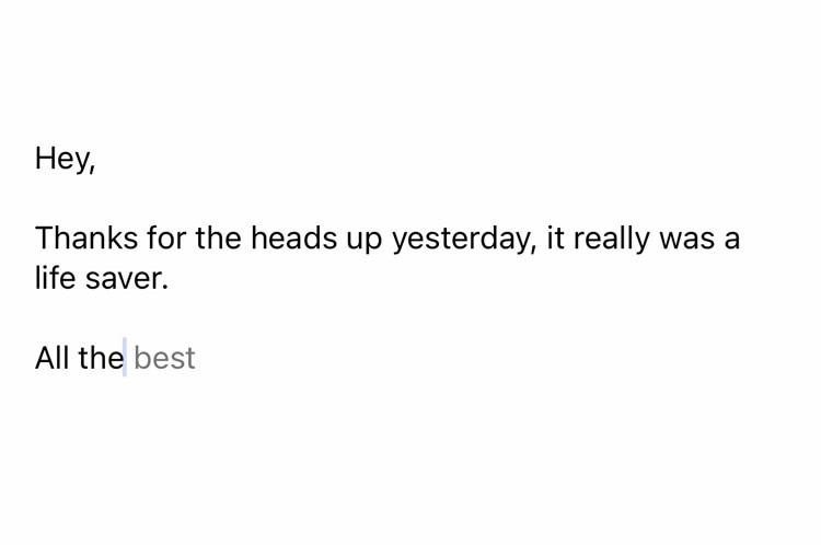
A nuance here worth noting is that the progression is tied to usage, and not exposure.
Or rather: as you use the feature more, they take the stabilisers off.
Monthly UX exercise: 🤟
Catalogue every step in a particular user journey (including pop-ups). How many of them were you either unaware of, or routinely forget about when considering that journey? Literally write them down.
Then, with the oversight of these additional steps, consider if you can simplify the experience? i.e., does Intercom need to pop-out on that certain page?
