🕶
Content Blindness
When exposed to similar or identical content, people will subconsciously pay less and less attention to it.
Featured in 6 UX Bites
Similar psychology:
Likely impacts:
Last updated: 03/11/2026
How to utilise this in your designs
When a list fills up with similar tasks, you could cycle different icons for the same topic, so each entry doesn't look identical and get skimmed past.
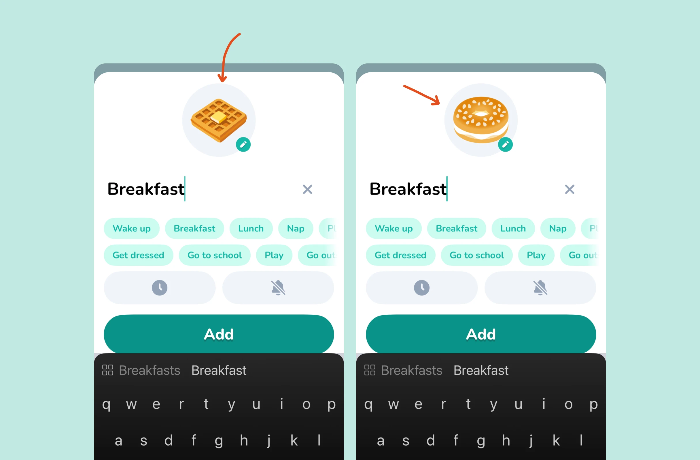
Example from Lil Planner
Try giving a new filter a slight shake the first time people see it, so it stands out on a frequently visited screen people have learned to skim.
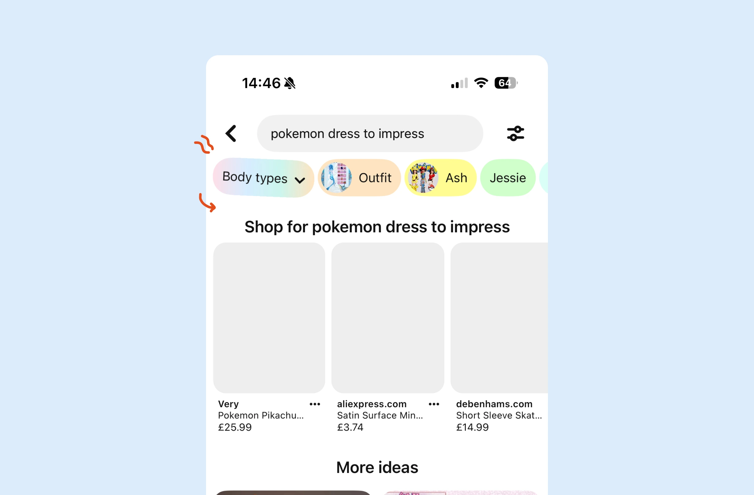
Example from Pinterest
In a long feed, one option is to show already-read thumbnails in black and white, so new content is easier to spot as people scroll past familiar items.

Example from The Athletic
Where people see the same items on every visit, consider routinely changing cover art and title fonts, so content blindness is less likely to set in on familiar items.

Example from Netflix
If someone has only seen the first slide of a carousel, it may help to refocus on an unseen slide when the feed refreshes, so the post feels new rather than already seen.
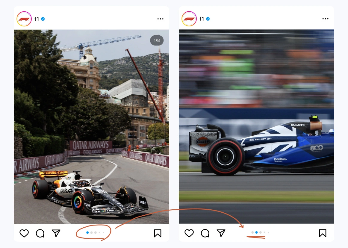
Example from Instagram
Possible impacts
Varying how repeated content looks, or adding subtle motion to new elements, could help hold users' attention for longer, before content blindness has them skimming past.
If critical warnings look different from routine ones, users may read them properly rather than dismissing every alert on autopilot, which could lead to fewer mistakes.



Written by Peter Ramsey
Published: