UX Content
  • Case Studies
  • UX Bites
  • Cheatsheets
  • Psychology
BFM+
  • Instant Feedback
  • MCP
  • Figma Plugin
  • Tiers & pricing
  • Free newsletter
  • Log in
Other
  • Archive
  • About
  • Help
  • Changelog
Services
UX audits

A complete audit of your user experience, delivered in a format that you can't ignore.

Book an audit

Built for Mars Ltd is a company registered in England and Wales (Company No. 12731987).

Account
  • Log inAccess your library and activities
  • SubscribeUnlock all features and access to the library
Learn from the best companies in the world

A library of content that even non-designers find interesting.

Subscribe todaySubscribe today
Structured learning
  • UX BootcampEnroll in a 5-week bootcamp
  • PathwaysCreate custom learning Pathways to work towards any goal, industry or topic
  • CollectionsBrowse Case Studies by key topics
  • QuizzesTest your knowledge
Explore the library
  • Case StudiesSlideshows that are packed with research
  • UX BitesReal examples of design magic
  • CheatsheetsQuickly level up in a particular area
  • Product PsychologyLearn the essentials
  • NewsletterGet research straight to your inbox
  • CompaniesBrowse by company
Learn from the best companies in the world

A library of content that even non-designers find interesting.

Subscribe todaySubscribe today
Tools to help you
  • AI InsightsUpload screenshots of your design, and get instant feedback from our AI
  • MCPAccess the entire library from your favourite agent
  • Figma pluginAccess our AI tools, and our entire library, directly from Figma
One-to-one help
  • UX AuditsThe fast-track for growth
Includes tools that help you ship better products

Learning never stops, but sometimes you need a little more.

Subscribe todaySubscribe today
Log inSubscribe today
Home
UX Glossary
Visible Lifeboats

🛟

Visible Lifeboats

The presence of a feature can be reassuring, even if the user doesn't use it.

Featured in 11 UX Bites

Similar psychology:

Tribalism
Curiosity Gap
User Delight

Likely impacts:

Feature Usage
Anxiety
Discomfort & Frustration
Last updated: 03/11/2026

How to utilise this in your designs

At the end of a journey, try showing a clear prompt to contact the driver about a left-behind item, so users can see there's a lifeboat if they need it later.
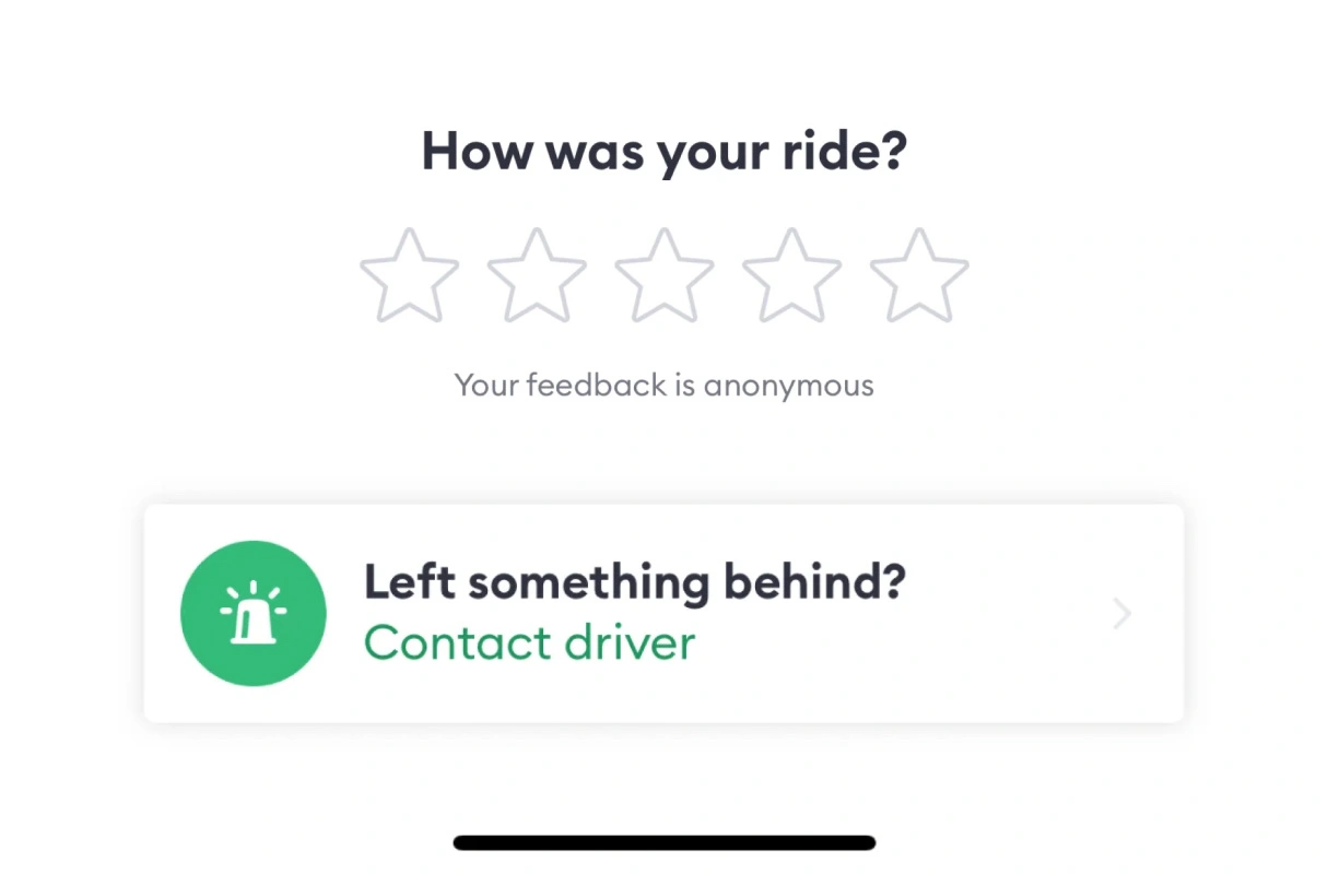
Ride confirmation screen. Below a "How was your ride?" anonymous star rating, a card asks "Left something behind?" with a "Contact driver" link, offering a quick way to recover lost items after the trip.
Example from
Bolt logo
Bolt

After an order is placed, you could offer a short window to cancel without penalty, so committing feels less risky because there's a visible way back.

Order tracking. "Cancel Order" explains orders can be cancelled within 30 minutes of being placed; tapping it opens "Want to cancel your order?", noting it's free of charge, with "Cancel Order" and "Go Back" buttons.
Example from
Nike logo
Nike

When someone goes to cancel a free trial, consider promising a reminder before it renews, so they can stay without worrying about a surprise charge.

Subscription cancellation screen. "Going so soon?" reassures the user they'll be reminded 2 days before the free trial ends, with a prominent "KEEP PLUS" button and a less prominent "PROCEED TO CANCEL" link.
Example from
Duolingo logo
Duolingo

One option is to explain that a hidden item can still be found later through search, so hiding feels reversible and people are more comfortable doing it.

Streaming browse page. Choosing "Hide this movie" from a title's overflow menu replaces its tile with "Hiding this movie, but you can still search for it." and an "Undo" link.
Example from
Amazon logo
Amazon

It may help to offer a quick way to live chat with a trained agent when something unexpected happens, e.g., a journey going off route, so help feels close at hand.

Ride tracking. An "Auto-detour detection" safety card leads to a check-in pop-up when a ride goes off course: "Do you need help?" with "I'm fine, I stopped on purpose", "Emergency assistance" and "Call the Uber safety line".
Example from
Uber logo
Uber

Possible impacts

A visible way back, e.g., undo or a note that hidden items can still be found, could help users feel safe trying features they'd otherwise avoid.

As seen in:
Amazon logo
Amazon
Context about hiding

Safety nets shown at the anxious moment, like a cancel window or a clear route to support, may reduce users' anxiety, even if most never use them.

As seen in:
Bolt logo
Bolt
Did you leave anything in the car?
Duolingo logo
Duolingo
Reminder before their subscription renews

If something does go wrong, a visible lifeboat like an easy way to contact support could ease users' frustration, as they already know where to go.

As seen in:
Bolt logo
Bolt
Did you leave anything in the car?
Nike logo
Nike
30 min cool down
Profile photo. A circular headshot of a smiling young man with short tousled hair and round glasses, suitable as an author avatar or user profile picture. No interface elements are shown.

Written by Peter Ramsey

Consultant to 100+ companies

Published: 19/08/2023