UX Content
  • Case Studies
  • UX Bites
  • Cheatsheets
  • Psychology
BFM+
  • Instant Feedback
  • MCP
  • Figma Plugin
  • Tiers & pricing
  • Free newsletter
  • Log in
Other
  • Archive
  • About
  • Help
  • Changelog
Services
UX audits

A complete audit of your user experience, delivered in a format that you can't ignore.

Book an audit

Built for Mars Ltd is a company registered in England and Wales (Company No. 12731987).

Account
  • Log inAccess your library and activities
  • SubscribeUnlock all features and access to the library
Learn from the best companies in the world

A library of content that even non-designers find interesting.

Subscribe todaySubscribe today
Structured learning
  • UX BootcampEnroll in a 5-week bootcamp
  • PathwaysCreate custom learning Pathways to work towards any goal, industry or topic
  • CollectionsBrowse Case Studies by key topics
  • QuizzesTest your knowledge
Explore the library
  • Case StudiesSlideshows that are packed with research
  • UX BitesReal examples of design magic
  • CheatsheetsQuickly level up in a particular area
  • Product PsychologyLearn the essentials
  • NewsletterGet research straight to your inbox
  • CompaniesBrowse by company
Learn from the best companies in the world

A library of content that even non-designers find interesting.

Subscribe todaySubscribe today
Tools to help you
  • AI InsightsUpload screenshots of your design, and get instant feedback from our AI
  • MCPAccess the entire library from your favourite agent
  • Figma pluginAccess our AI tools, and our entire library, directly from Figma
One-to-one help
  • UX AuditsThe fast-track for growth
Includes tools that help you ship better products

Learning never stops, but sometimes you need a little more.

Subscribe todaySubscribe today
Log inSubscribe today
Home
UX Glossary
Pattern Matching

🧤

Pattern Matching

Your brain is wired to seek shortcuts by trying to match patterns.

Similar psychology:

Specificity
Delegated Decisions
Reactive Onboarding

Likely impacts:

Productivity & Efficiency
Attention & Interest
Effort & Motivation
Last updated: 03/11/2026

How to utilise this in your designs

If a shortcut breaks the pattern people know from elsewhere, you could show a tooltip when they use it the familiar way, e.g., pressing CMD+K on highlighted text.
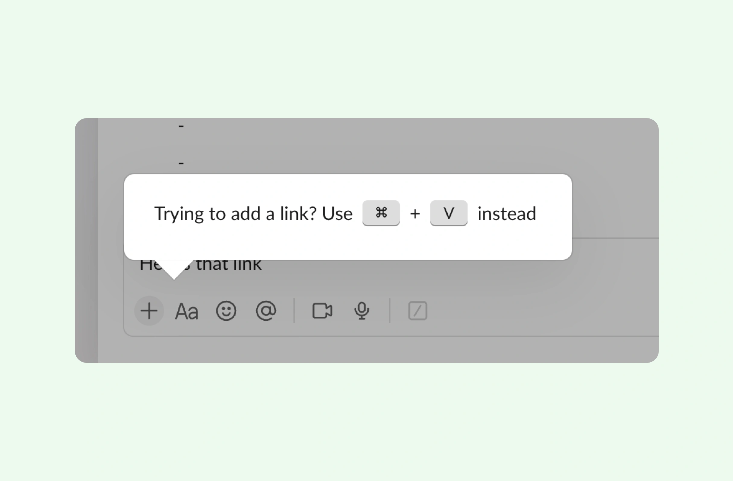
Chat message composer. After typing about a link and pressing the "+" attachment button, a tooltip suggests a faster route: "Trying to add a link? Use ⌘ + V instead", teaching the paste shortcut in context.
Example from
Slack logo
Slack

Try putting familiar brand logos inside filter buttons, so people can pattern match by sight rather than reading every label.
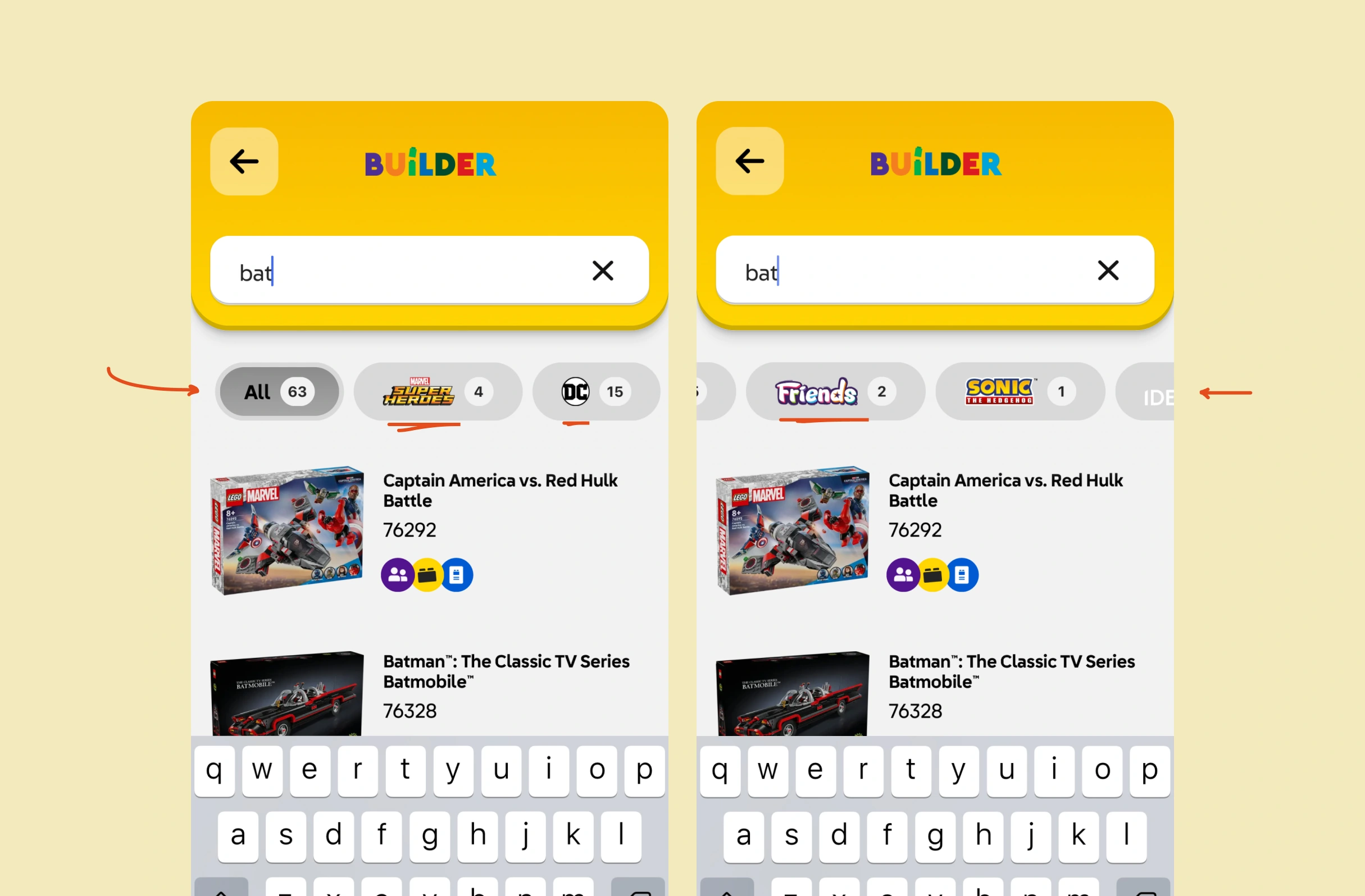
Search results. A horizontally scrolling row of theme filter chips appears below the search bar, each showing the theme's logo and a result count, from "All" to niche themes with only one or two matches.
Example from
Lego logo
Lego

When several tasks share the same topic, consider cycling different emojis for each one, so the list doesn't look identical and items stay easy to tell apart.
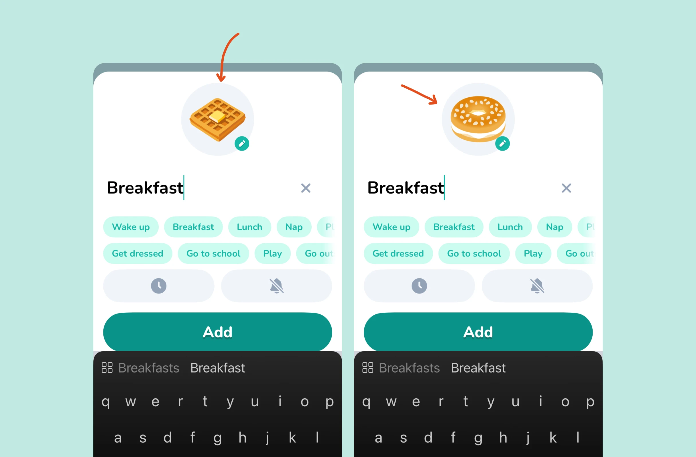
Form for adding a routine task. Typing "Breakfast" automatically assigns a matching icon above the name, which changes from waffle to bagel, with an edit button to swap it, alongside quick-pick suggestion chips.
Example from
Lil Planner logo
Lil Planner

One option is to spot familiar workarounds and convert them, e.g., turning a page named "-----" into the real separator line someone was trying to make.

Design tool sidebar. Renaming a page in the "Pages" list to "------" turns it into a visual divider line, letting users separate groups of pages.
Example from
Figma logo
Figma

It may help to change the CTA label on templates someone has already used, so a familiar-looking item isn't mistaken for something new.

Template preview page. An unused template shows a "Use template" button, while a template that's already been added shows "Add again" instead, signalling it's already in the workspace and can be duplicated.
Example from
Notion logo
Notion

Possible impacts

Keeping components consistent lets users pattern match instantly, which could help them complete tasks faster with fewer wrong clicks.

As seen in:
Slack logo
Slack
Onboarding incorrect shortcuts
Figma logo
Figma
Understanding user intent

Deliberately breaking a familiar pattern with a new colour, layout or interaction might draw attention to an important change users would otherwise skim past.

As seen in:
Lego logo
Lego
Recognisable logos
Lil Planner logo
Lil Planner
Cycling breakfast emojis

Familiar logos, shapes and icons let users recognise options instead of reading them, which may reduce the effort needed to find what they're after.
As seen in:
Bitepal logo
Bitepal
Select your mascot's tone
Granola logo
Granola
This is better with your work email
Profile photo. A circular headshot of a smiling young man with short tousled hair and round glasses, suitable as an author avatar or user profile picture. No interface elements are shown.

Written by Peter Ramsey

Consultant to 100+ companies

Published: 26/10/2023