Search

A recent study found that 80% of people prefer to book travel on a desktop, even though the vast majority (70%) start the research on their mobile phone.
When consumers do attempt to make a booking on their mobile, 91% will abandon their cart (the eCommerce average is between 65-75%). When asked why, consumers cited the main reason as 'a bad customer experience'.
There are a few obvious non-UX influences here. For instance; they may start the research while out with friends, and book it at home, days later.
But let's be clear: these lousy mobile experiences are a big part of the problem.
To demonstrate how bad they are, I searched for the best-rated US airline (Delta), and attempted to book a flight.
Strap in, it's about to get bumpy.
Clicking external links on social media apps will usually load other websites inside the social media's own in-app browser.
As an example, here's how the Delta site loads in the default Safari app, Facebook and Twitter:
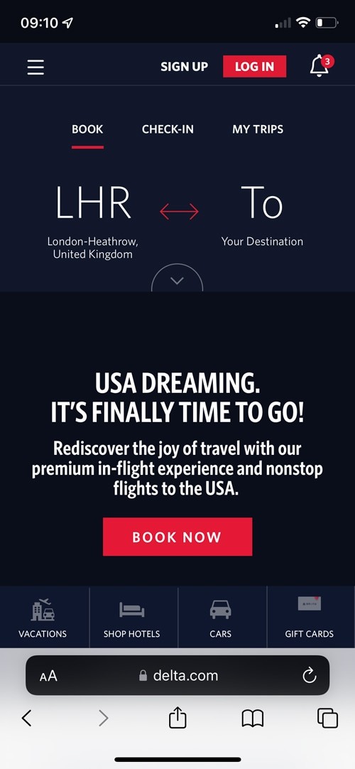

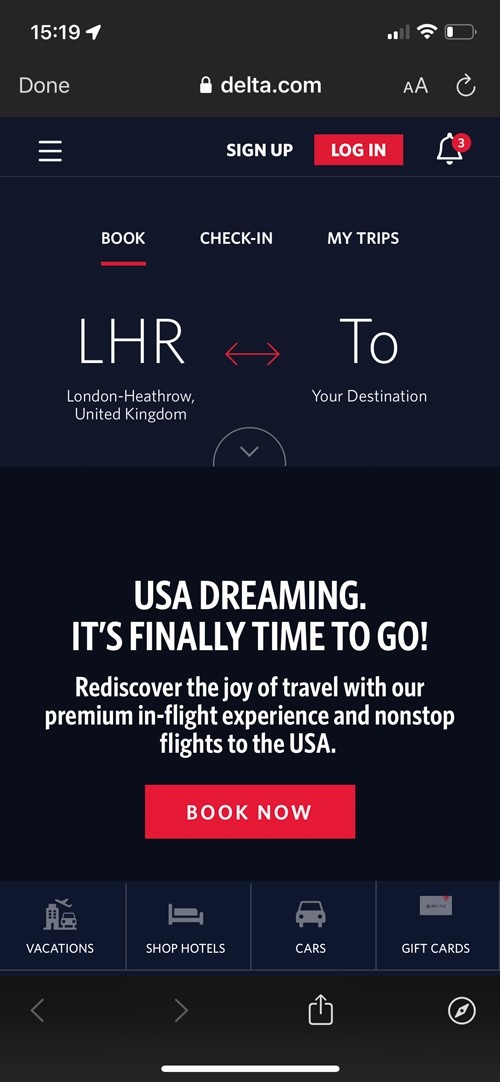
Not only can performance vary, but they also have different interfaces—notably, removing the ability to have multiple tabs.
Once you close this window (i.e., to go back to Twitter or Facebook), you lose all progress inside your tab, and cannot get back to where you were.
And you know what's really helpful when booking travel: having multiple tabs open, and having tab-persistence.
Because this is a facet of the web that you can't easily change, it's tempting to ignore it completely. In some circumstances, doing nothing is quite literally wasting your advertising budget (i.e., through churn).
The execution to mitigate this is dependent on the product—and very situational. But here are a few principles and broad ideas to consider:
🐠
Introduce a hook
i.e., an easy way to email yourself a specific flight, or search results. This allows the user to re-enter your funnel later.
👏
Mitigate the need for tabs
i.e., if the user has to Google something (e.g., terminology), they can't, and may just leave. Be overly helpful and add rich context.
📊
Be open with pricing
i.e., in some contexts, you may want to display your competitor's prices next to yours, to reduce the perceived incentive for shopping around.
A reliable symptom of a poorly-functioning product team, is the persistence of a major bug that will be affecting a large cohort of users.
Bugs happens to even the best teams. But you don't often see Shopify or Airbnb releasing product-breaking code, that isn't fixed with urgency.
On Delta, the core booking experience is broken on Safari—the second most popular browser.
It's hard to convey quite how bad this is with screenshots, so here's a sped-up recording.
What you're about to watch is this:
In their defence, the complexity of testing a product grows exponentially faster than the product itself, especially with mobile devices.
i.e., adding an extra 4 features may require an additional 40 'routine tests'.
There are the complexities of screen sizes, browser types (including, as we've seen, in-app browser variants), device types and a world of device-specific quirks.
My point is this: too often I see teams underestimate the importance and complexity of testing at this scale.
One suggestion I often make to teams is to literally test your product for a few minutes, on a handful of common devices, routinely.
It's not a replacement for automated testing, but helps to identify obvious major issues like this.
Designing a product for desktop isn't necessarily easier, but because you have more screen real estate to play with, it can be more forgiving.
Teams often find great conflict in deciding what—if anything—should be removed, hidden or replaced in the mobile design.
But the discipline to remove the fat is necessary for smaller screen sizes.
To help you visualise the difference, this desktop example below has around 5x more pixels 'above the fold', than on an iPhone.
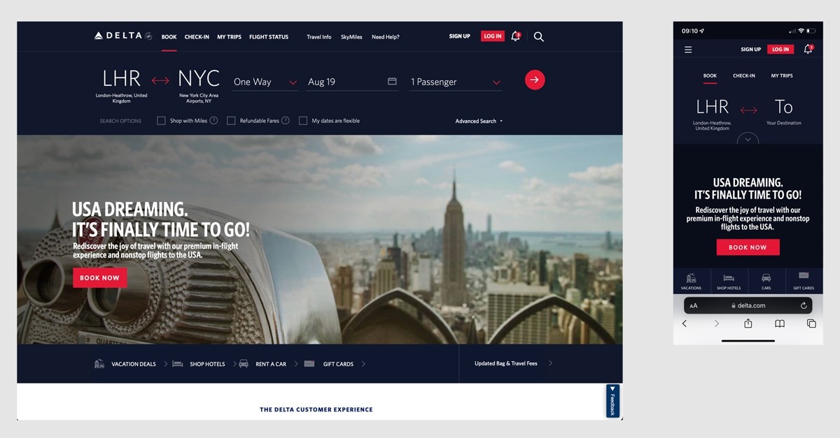
Delta decided to remove some menu options, and hide the flight details from the main search. Fine, whatever.
But look at the screen below and ask yourself this: what do you press to search for flights?
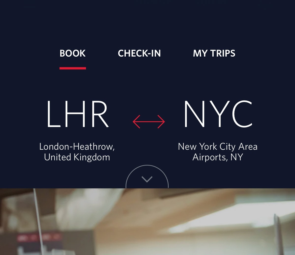
The search button is only visible while you have the 'more options' menu open. Instead, the only visible CTA takes you to a blog post about New York.
This would be a tough trade-off to justify. They would need to really value that article highly.
Or—and this is more likely—they're not getting together as a team to discuss the trade-offs. Once upon a time, someone said they wanted a hero banner, and now they're finding things to put in it.
Mobile web experiences are difficult to design, awkward to build and tend to be much worse than both the desktop and native app experiences.
For example, here's the view after clicking 'create' on Mailchimp—a product which I believe broadly has a great UX.
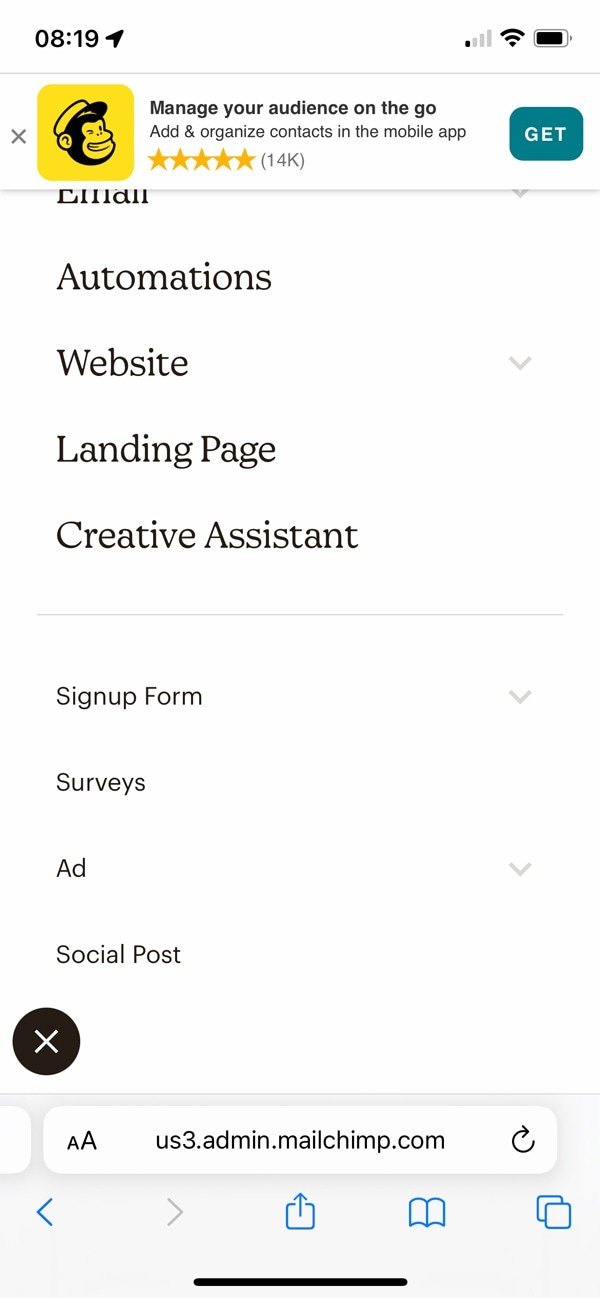
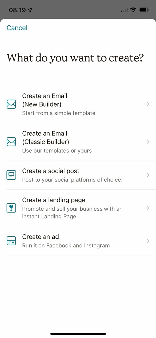
It's obvious; the web version is objectively worse.
Mobile UX doesn't have to be bad though. And as you've seen, Delta have some really low-hanging fruit to fix.