UX Content
  • Case Studies
  • UX Bites
  • Cheatsheets
  • Psychology
BFM+
  • Instant Feedback
  • MCP
  • Figma Plugin
  • Tiers & pricing
  • Free newsletter
  • Log in
Other
  • Archive
  • About
  • Help
  • Changelog
Services
UX audits

A complete audit of your user experience, delivered in a format that you can't ignore.

Book an audit

Built for Mars Ltd is a company registered in England and Wales (Company No. 12731987).

Account
  • Log inAccess your library and activities
  • SubscribeUnlock all features and access to the library
Learn from the best companies in the world

A library of content that even non-designers find interesting.

Subscribe todaySubscribe today
Structured learning
  • UX BootcampEnroll in a 5-week bootcamp
  • PathwaysCreate custom learning Pathways to work towards any goal, industry or topic
  • CollectionsBrowse Case Studies by key topics
  • QuizzesTest your knowledge
Explore the library
  • Case StudiesSlideshows that are packed with research
  • UX BitesReal examples of design magic
  • CheatsheetsQuickly level up in a particular area
  • Product PsychologyLearn the essentials
  • NewsletterGet research straight to your inbox
  • CompaniesBrowse by company
Learn from the best companies in the world

A library of content that even non-designers find interesting.

Subscribe todaySubscribe today
Tools to help you
  • AI InsightsUpload screenshots of your design, and get instant feedback from our AI
  • MCPAccess the entire library from your favourite agent
  • Figma pluginAccess our AI tools, and our entire library, directly from Figma
One-to-one help
  • UX AuditsThe fast-track for growth
Includes tools that help you ship better products

Learning never stops, but sometimes you need a little more.

Subscribe todaySubscribe today
Log inSubscribe today
Home
Design Examples
Personalisation Examples: Real Product Recommendations
Design Examples

Personalisation Examples: Real Product Recommendations

See how companies like Wise, LinkedIn, Petbarn and Shop personalise referral pages, search bars and permission prompts, with annotated examples from our UX Bites library.

Real world examples:

Updated: 23/09/2026, view all 1,482 examples

Examples on Built for Mars include
  • Wise names the referrer to lift conversions

  • LinkedIn says why it recommends each page

  • Shop previews alerts using your real orders

UX Bite:
Washington Post logoWashington Post

Personalised referrals

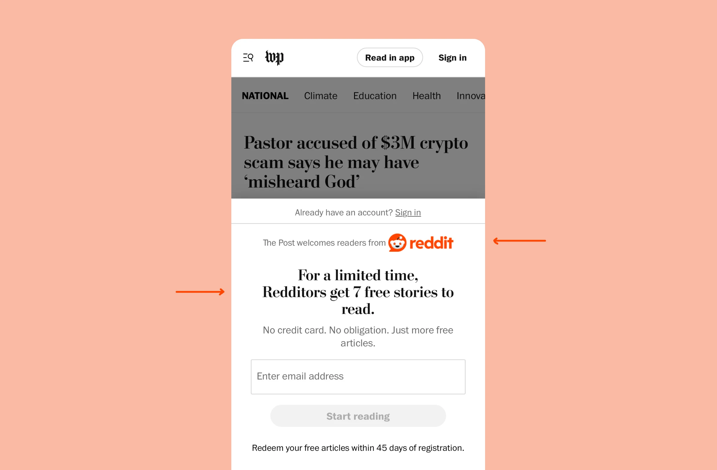
When opening links from inside Reddit, Washington Post will show personalised offers.

Personalised referrals

More context:

This kind of personalisation might make the referral stickier.

#411
View UX Bite
UX Bite:
LinkedIn logoLinkedIn

Specific LinkedIn recommendations

When recommending pages or groups, LinkedIn will often show you why they think you may be interested in it.

Specific LinkedIn recommendations

More context:

This feels obvious, but is usually not done because social graphs can be really complicated, and there often isn't any one single reason why it's recommended.

#98
View UX Bite
UX Bite:
Petbarn logoPetbarn

Personalising the search bar

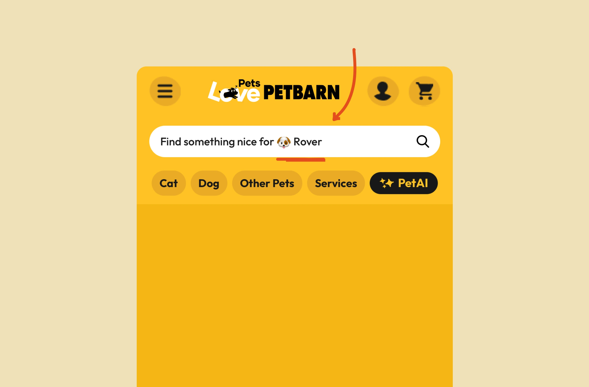
After completing your pet's profile, Petbarn will personalise their search bar.

Personalising the search bar
#953
View UX Bite
UX Bite:
Shop logoShop

Leveraging your previous orders

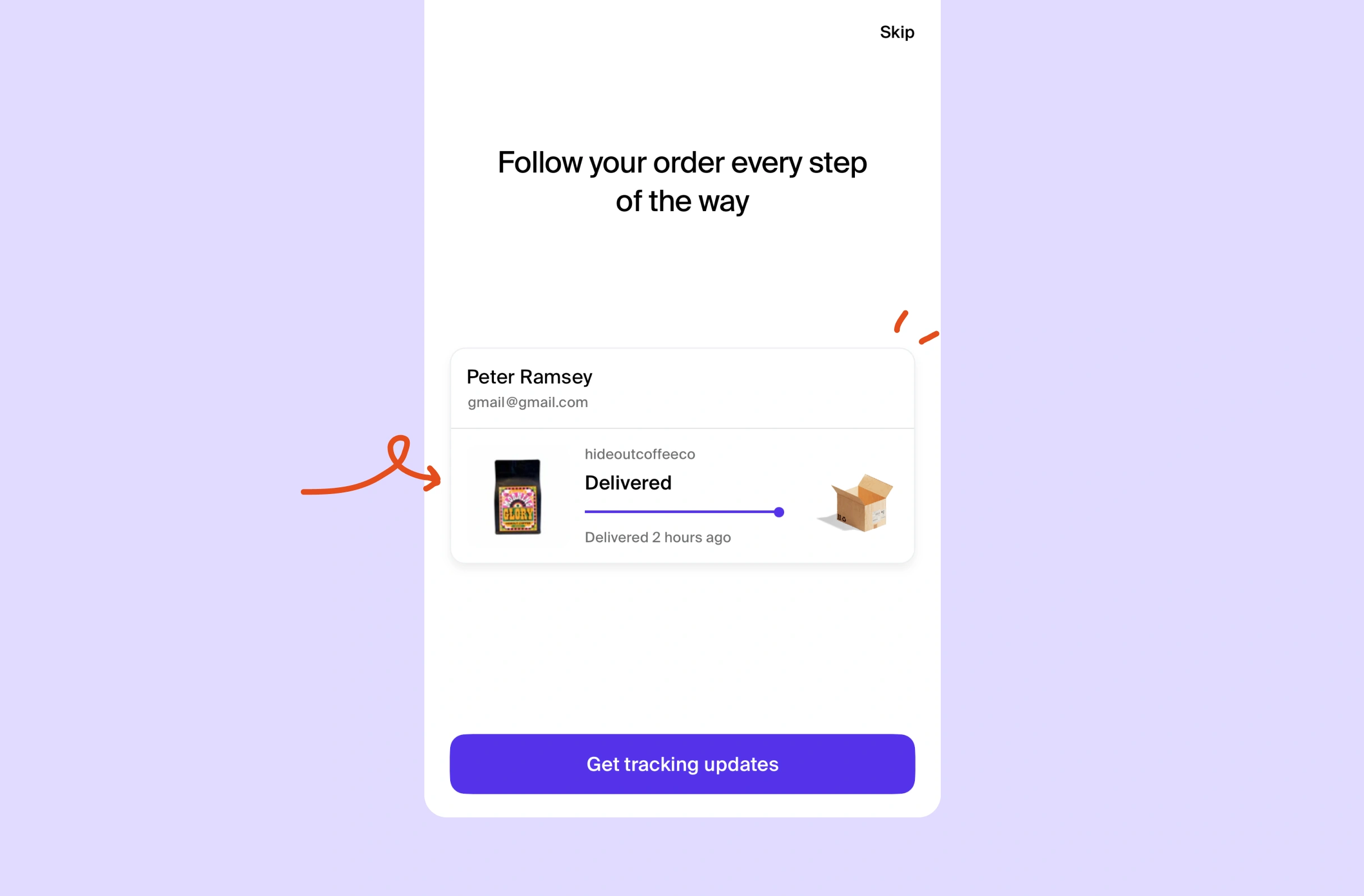
If you've not given Shop notification permissions, they'll use one of your recent orders as an animated example to demonstrate how notifications are used throughout the process.

Leveraging your previous orders

More context:

i.e., this is a brilliant use of historical data, and by making it personalised to you, you're more likely to pay attention.

It benefits from the Endowment Effect: you feel like that's your order.

#887
View UX Bite
UX Bite:
Etsy logoEtsy

Dynamic suggestions

When entering gift mode on Etsy, the main search box will dynamically show themes and ideas, with matching background art.

Dynamic suggestions

More context:

Similar to Pinterest, this helps you think of ideas, and break some "urrrm, what do I search for" paralysis.

#723
View UX Bite
UX Bite:
Balance logoBalance

Personalised learning

Subscribe to unlock this example
Plans start from £8 per month
Subscribe to unlock#321
Preview
UX Bite:
Wise logoWise

Personalised referral links

Subscribe to unlock this example
Plans start from £8 per month
Subscribe to unlock#1233
Preview
The UI displays a large white "S" centered on a solid purple-blue background, with no additional text, logos, or interface elements visible.The UI shows a stylized "M" logo with teal, cream, and red color blocks on a dark blue background. No text or markings are highlighted or underlined.The UI features the bold white "wp" logo in Old English font on a black background, representing The Washington Post branding. No other UI elements visible.

There are more than 1400 UX Bites like this

Subscribe to BFM+

If features can be coded in minutes, thoughtful design is what wins

  • Unlock the entire library
  • Create custom UX courses
  • Access our AI tools
£8/monthbilled annually
See the benefits
or, wait for the free stuff

Join the free newsletter

Get the free content when it's released, straight to your inbox, no account required

"An exceptional resource for learning how to build habit-forming products that people love."

The UI contains the yellow book cover "HOOKED" by Nir Eyal in the bottom right, with black text in a white box with blue borders stating "COMPLETELY REVISED AND UPDATED."
Nir EyalAuthor of Hooked

"I’d never met anybody who looks at usability and UX the way I do until I met Peter. Only he’s smarter."

Photo: site-map sketches with pen annotations, yellow sticky notes and folder of labeled cards, black phone cord, red book cover reading "DON'T MAKE ME THINK".
Steve KrugAuthor of Don't Make Me Think

"The completest view of the psychological underpinnings of human behaviour that I’ve ever seen."

Circular avatar: smiling man, navy jacket, blue‑checked shirt, blurred green bg. Overlays: red EA badge lower-right; black square with white up‑left arrow.
Bing GordonKleiner Perkins & EA

"What a nice idea! Christopher Alexander would be proud to see patterns collected like this."

Profile picture of a man with medium-length hair and stubble wearing a grey hoodie and dark jacket. Two app icons overlay bottom right: yellow Asana and blue Miro.
DHHHey! & Basecamp

FAQs

Is personalisation worth it if it doesn't lift same-day sales?

Some personalisation is about building a relationship, not driving an immediate purchase. For example, Petbarn changes its search bar to 'Find something nice for Rover' once you complete a pet profile. It's unlikely to raise that day's basket size, but it can increase long-term spend from that customer.

How do you personalise a landing page for referred traffic?

Match the page to the source or the sender, so the offer feels real rather than generic. As an example, Washington Post tells visitors arriving from Reddit that 'Redditors get 7 free stories', which may make the referral stickier.

Why use a user's own data in a notification permission prompt?

A real example removes the need to imagine what a useful notification looks like, so the value is obvious. This is what Shop does, animating one of your recent orders through each delivery stage. The Endowment Effect adds to it, because it feels like your order rather than a demo.

Does personalisation have to change the actual content to work?

Not always, because the aim is often to make users feel heard. For instance, Shop's preference screen highlights images as you pick 'Men's' or 'Women's', even though none are clickable products. Balance shows an icon after post-meditation questions to signal your experience is getting more personalised, a small reward that encourages more engagement.

Why are LinkedIn's recommendation reasons harder to build than they look?

Social graphs are complex, and there's rarely one single reason a page is recommended. LinkedIn still picks a specific, readable reason, e.g., 'People who work at Citadel also follow these pages', which gives the suggestion credibility.

How can a search box help users who don't know what to search for?

Rotating themes inside the input gives people a starting point and breaks blank-search paralysis. For example, Etsy's Gift Mode cycles through ideas like 'plants', 'crafting' and 'the great outdoors', each with matching background art.