Search

Gamestop—the previously dominant brick and mortar store—is going through a transformation. With new leadership, no company debt and a war chest of more than a billion dollars in cash, their focus is now largely on technology and eCommerce.
Mainstream stock market pundits would have you believe that Gamestop is already dead, and that their only sign of life has been gifted by Reddit and retail investors, but that's not true. They're alive and kicking.
There is a pretty fundamental question to be answered though: can Gamestop beat Amazon?
You may dislike Amazon for a number of reasons, but it'd be hard to argue that the experience as a customer is anything other than incredible. In many cases, they've reduced the purchasing process down to a single click.
This UX analysis may be about Gamestop, but more generally it covers common pitfalls of eCommerce. How do you make shopping online feel intuitive?
🍪
How not to do cookie notices
🏞
The importance of image resolutions
⛽️
Why users need to understand the 'engine'
🌪
The annoyance of loading
Imagine if every time you walked in a physical store, someone immediately approached you, asked you to read a 1000-word legal document and to sign your name on a clipboard. Only after doing that, were you allowed to see what items they sold.
Not only would you not actually read the legal text, but it'd also be incredibly frustrating.
This is essentially what happens with cookie notices on the internet right now.
But despite all cookie notices being annoying, some are more annoying than others.
There are two main rules to follow here:
👀
Be concise and load everything above the fold
i.e., the user should never have to scroll.
☝️
Make it a single-click action
i.e., one click to accept and dismiss, no scrolling.
Although there are many variants of cookie notice, as long as they follow these two rules, the negative impact is minimised.


But Gamestop don't do this—they have a triple-action process. You need to scroll, click and then click again.


It's unnecessary, frustrating and dampens the immediate experience of using their website. This would absolutely be a 'quick win' for them to improve.
There's a compromise to understand about high-resolution images: the larger the file size, the longer it'll take to load—which then has many knock-on effects to search engine results, conversion rates and bandwidth.
Most people don't realise how significant this issue is, because the platforms they use automatically compress their files.
For example, I uploaded an image to Twitter, then re-downloaded it, and it had silently been compressed to 26% of it's original size.

And whilst the computation that goes into compression is complicated, from a UX perspective one thing is clear: the images should be in focus.
Frustratingly, Gamestop's website is littered with poor imagery. This includes inconsistent image resolutions, often a lack of retina support and images displaying at incorrect scaling ratios.
The end result, is that most of the images looks blurry.

What I often see in large companies, is that the website content is handled by a marketing department—who've not been trained in image compression, and probably don't even know the native size that each image will be displayed at.
When that happens, a key component of the user experience has fallen outside the scope of the designers.
What looked pixel-perfect in Figma, derails into an accidental smorgasbord of image resolutions.
UX tip: This is why image templates and guidelines are so critical for content teams—a set of rules that find a good balance between page speed and image quality.
To build an intuitive eCommerce experience, customers need to be able to reliably (and predictably) find products.
Or rather: is it obvious how to get to a specific product when I need it.
This is just one of the reasons why using Amazon feels so easy, despite not having the most aesthetically imaginative design.
The nuance here is that the intuitiveness of Amazon is a byproduct of how predictable their website is.
Gamestop needs this predictability. They need people to understand how the product architecture of their site works, and be efficient at finding the items that they want to buy.
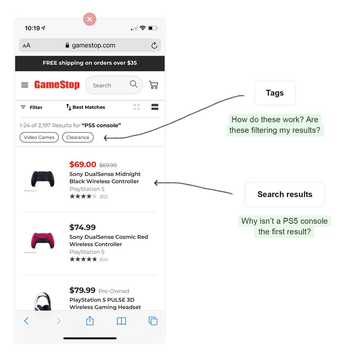
But currently, it's not. For example, when making a search for 'PS5 console':

There's no doubt that finding products on Gamestop is more awkward than it needs to be.
The category tag system on mobile works poorly too. You can only ever seen the next immediate category options, and not the sub-categories within them.
This is a 'must-fix' for Gamestop.
For example: if you search for 'PS5 console', you'd need to select the 'Video Games' category, wait while the page loads, then you'll see the 'Playstation 5' sub-category. If you click and wait again, you'll see super-sub-categories.
When a webpage loads, all of items—like images and widgets—need to be loaded individually. It doesn't all happen at the same time.
Often, this causes elements to bounce around the page as they, and everything else around them, load.
This is terrible UX for a few reasons, mainly:
🤷♂️
Uncertainty on the final state
i.e., it's not obvious when it's finished loading.
🎯
Inaccuracy of interaction
i.e., you may think that it's loaded, click something, just for that button to be replaced by another.
🌪
Disorienting
i.e., you'll keep readjusting to key elements as they bounce around.
This is an example of when back-end development and UX meet—everything should load in its correct place, either by having fixed containers, or lazy load placeholder content.

During development, often the gap between 'Figma design' and 'real product' is left to the discretion of the back-end developers.
In other words, nobody has specified what should happen while everything is loading.
Is the eCommerce experience of Gamestop as good as Amazon? No, right now it's not even close.
Amazon is far more intuitive than people give them credit for, and the current Gamestop website is fairly poor by comparison.
But Gamestop are in the middle of a rapid transformation, so that could change any day.
People's expectations about how an experience should feel have grown significantly in the last 5 years.
Gamestop will need to invest in their UX in the same way that they have been with their distribution centres, technology and customer support.
Become a BFM+ member to track your progress, create a library of content and share learnings within your team.


When it comes to onboarding, it's often more effective to do just one thing (really damn well).

Discover the art of setting a goal and then using that to immediately create the perception of success.
As the underlying technology improves, interfaces like ChatGPT get harder to use. Does this explain the strategy for Apple Intelligence?