UX Content
  • Case Studies
  • UX Bites
  • Cheatsheets
  • Psychology
BFM+
  • Instant Feedback
  • MCP
  • Figma Plugin
  • Tiers & pricing
  • Free newsletter
  • Log in
Other
  • Archive
  • About
  • Help
  • Changelog
Services
UX audits

A complete audit of your user experience, delivered in a format that you can't ignore.

Book an audit

Built for Mars Ltd is a company registered in England and Wales (Company No. 12731987).

Account
  • Log inAccess your library and activities
  • SubscribeUnlock all features and access to the library
Learn from the best companies in the world

A library of content that even non-designers find interesting.

Subscribe todaySubscribe today
Structured learning
  • UX BootcampEnroll in a 5-week bootcamp
  • PathwaysCreate custom learning Pathways to work towards any goal, industry or topic
  • CollectionsBrowse Case Studies by key topics
  • QuizzesTest your knowledge
Explore the library
  • Case StudiesSlideshows that are packed with research
  • UX BitesReal examples of design magic
  • CheatsheetsQuickly level up in a particular area
  • Product PsychologyLearn the essentials
  • NewsletterGet research straight to your inbox
  • CompaniesBrowse by company
Learn from the best companies in the world

A library of content that even non-designers find interesting.

Subscribe todaySubscribe today
Tools to help you
  • AI InsightsUpload screenshots of your design, and get instant feedback from our AI
  • MCPAccess the entire library from your favourite agent
  • Figma pluginAccess our AI tools, and our entire library, directly from Figma
One-to-one help
  • UX AuditsThe fast-track for growth
Includes tools that help you ship better products

Learning never stops, but sometimes you need a little more.

Subscribe todaySubscribe today
Log inSubscribe today
Home
Design Examples
Filter & Search UX: Real Design Examples
Design Examples

Filter & Search UX: Real Design Examples

See how companies like Airbnb, Netflix, Perplexity and Starling design search and filters, including our UX Bites on near-match results, empty states and loading copy.

Real world examples:

Updated: 23/09/2026, view all 1,490 examples

Examples on Built for Mars include
  • Instagram's placeholders show what to search

  • Airbnb shows near-matches to grow inventory

  • Starling teaches search in its empty state

UX Bite:
Plane Finder logoPlane Finder

Clarifying search types

Before making a search, Plane Finder both rotate example searches, and contextually give you tips.

Clarifying search types

More context:

This is important because of how specific the search options can be.

For example, searching for a specific flight number might not be something you'd try, unless you were told that you could.

#1051
View UX Bite
UX Bite:
Instagram logoInstagram

Dynamic search suggestions

Instagram will show a selection of different placeholders, showing a variety of ideas.

Dynamic search suggestions
#893
View UX Bite
UX Bite:
Airbnb logoAirbnb

Removing one filter

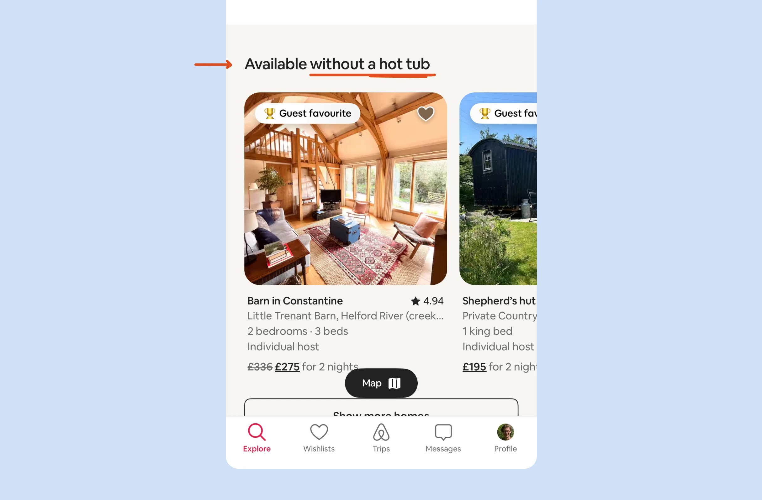
When filtering results, Airbnb will occasionally show you popular listings that don't match one of your filters, showing you fantastic options that almost match.

Removing one filter

More context:

i.e., "similar dates" or "without a hot tub".

#1320
View UX Bite
UX Bite:
Airbnb logoAirbnb

Quickly removing filters

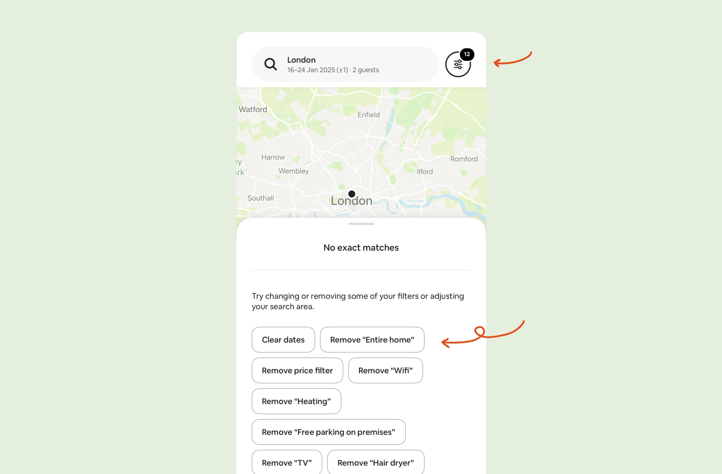
If Airbnb has no results to show you, they'll suggest removing specific filters with a single tap.

Quickly removing filters

More context:

i.e., you don't need to click into the main "filters" tab, to then remove something.

#767
View UX Bite
UX Bite:
Netflix logoNetflix

Demo it, without thinking

Inside the Netflix feed, they’ll promote their new way to search with clickable examples.

Demo it, without thinking

More context:

This increases the likelihood that people actually try it, because they don’t need to actually think of something to search.

#1291
View UX Bite
UX Bite:
Perplexity logoPerplexity

If you just keep typing...

Subscribe to unlock this example
Plans start from £8 per month
Subscribe to unlock#894
Preview
UX Bite:
Google Maps logoGoogle Maps

Searches = Loading

Subscribe to unlock this example
Plans start from £8 per month
Subscribe to unlock#957
Preview
The UI displays a large white "S" centered on a solid purple-blue background, with no additional text, logos, or interface elements visible.The UI shows a stylized "M" logo with teal, cream, and red color blocks on a dark blue background. No text or markings are highlighted or underlined.The UI shows the FlyDelta app icon: a white airplane silhouette centered on a blue gradient background with a green quarter-circle in the lower left corner.

There are more than 1400 UX Bites like this

Subscribe to BFM+

If features can be coded in minutes, thoughtful design is what wins

  • Unlock the entire library
  • Create custom UX courses
  • Access our AI tools
£8/monthbilled annually
See the benefits
or, wait for the free stuff

Join the free newsletter

Get the free content when it's released, straight to your inbox, no account required

"An exceptional resource for learning how to build habit-forming products that people love."

The UI contains the yellow book cover "HOOKED" by Nir Eyal in the bottom right, with black text in a white box with blue borders stating "COMPLETELY REVISED AND UPDATED."
Nir EyalAuthor of Hooked

"I’d never met anybody who looks at usability and UX the way I do until I met Peter. Only he’s smarter."

Photo: site-map sketches with pen annotations, yellow sticky notes and folder of labeled cards, black phone cord, red book cover reading "DON'T MAKE ME THINK".
Steve KrugAuthor of Don't Make Me Think

"The completest view of the psychological underpinnings of human behaviour that I’ve ever seen."

Circular avatar: smiling man, navy jacket, blue‑checked shirt, blurred green bg. Overlays: red EA badge lower-right; black square with white up‑left arrow.
Bing GordonKleiner Perkins & EA

"What a nice idea! Christopher Alexander would be proud to see patterns collected like this."

Profile picture of a man with medium-length hair and stubble wearing a grey hoodie and dark jacket. Two app icons overlay bottom right: yellow Asana and blue Miro.
DHHHey! & Basecamp

FAQs

Why do users only search for the obvious things?

Often they don't realise the search supports anything else. For instance, few people would try a flight number unless told it works. This is why Plane Finder rotates placeholders like "B738" and "Heathrow" and lists tips for searching by route, callsign or registration, giving examples of both specific and broad queries.

What's the fastest way out of a zero-results search?

Let people drop the filter that's blocking results, right there on the page. For example, Airbnb's "No exact matches" screen lists single-tap options like "Remove 'Entire home'", so nobody has to reopen the full filter panel to undo one choice.

Is it worth showing results that don't fully match a user's filters?

Yes, if each one is clearly labelled with what it's missing. Strong options stay hidden because of a single filter, and a label like Airbnb's "Available without a hot tub" gives a concrete reason to relax that requirement.

How do you get people to actually try a new search feature?

Remove the need to think up a query. As an example, Netflix promotes its new search inside the feed with clickable example searches, so one tap shows how the feature works.

How should a search input handle both 5-word and 50-word queries?

Adapt the field as the query grows. For instance, Perplexity shrinks the font size and eventually hides suggestions, so short questions don't look lost and long ones don't disappear out of view.

Does loading text during a search really matter?

Specific copy reassures people they're waiting for the right thing. Google Maps shows "Searching for Fast Food..." when a query matches a known category, rather than a generic "Searching...". The text still needs to stay short, or people won't read it.