UX Content
  • Case Studies
  • UX Bites
  • Cheatsheets
  • Psychology
BFM+
  • Instant Feedback
  • MCP
  • Figma Plugin
  • Tiers & pricing
  • Free newsletter
  • Log in
Other
  • Archive
  • About
  • Help
  • Changelog
Services
UX audits

A complete audit of your user experience, delivered in a format that you can't ignore.

Book an audit

Built for Mars Ltd is a company registered in England and Wales (Company No. 12731987).

Account
  • Log inAccess your library and activities
  • SubscribeUnlock all features and access to the library
Learn from the best companies in the world

A library of content that even non-designers find interesting.

Subscribe todaySubscribe today
Structured learning
  • UX BootcampEnroll in a 5-week bootcamp
  • PathwaysCreate custom learning Pathways to work towards any goal, industry or topic
  • CollectionsBrowse Case Studies by key topics
  • QuizzesTest your knowledge
Explore the library
  • Case StudiesSlideshows that are packed with research
  • UX BitesReal examples of design magic
  • CheatsheetsQuickly level up in a particular area
  • Product PsychologyLearn the essentials
  • NewsletterGet research straight to your inbox
  • CompaniesBrowse by company
Learn from the best companies in the world

A library of content that even non-designers find interesting.

Subscribe todaySubscribe today
Tools to help you
  • AI InsightsUpload screenshots of your design, and get instant feedback from our AI
  • MCPAccess the entire library from your favourite agent
  • Figma pluginAccess our AI tools, and our entire library, directly from Figma
One-to-one help
  • UX AuditsThe fast-track for growth
Includes tools that help you ship better products

Learning never stops, but sometimes you need a little more.

Subscribe todaySubscribe today
Log inSubscribe today
Home
Design Examples
Loyalty Program Design: Real Examples That Work
Design Examples

Loyalty Program Design: Real Examples That Work

See how companies like Slopes, Peerlist and Octopus Energy design loyalty schemes, including merch for multi-season tracking and streak rewards tied to power features.

Real world examples:

Updated: 23/09/2026, view all 1,482 examples

Examples on Built for Mars include
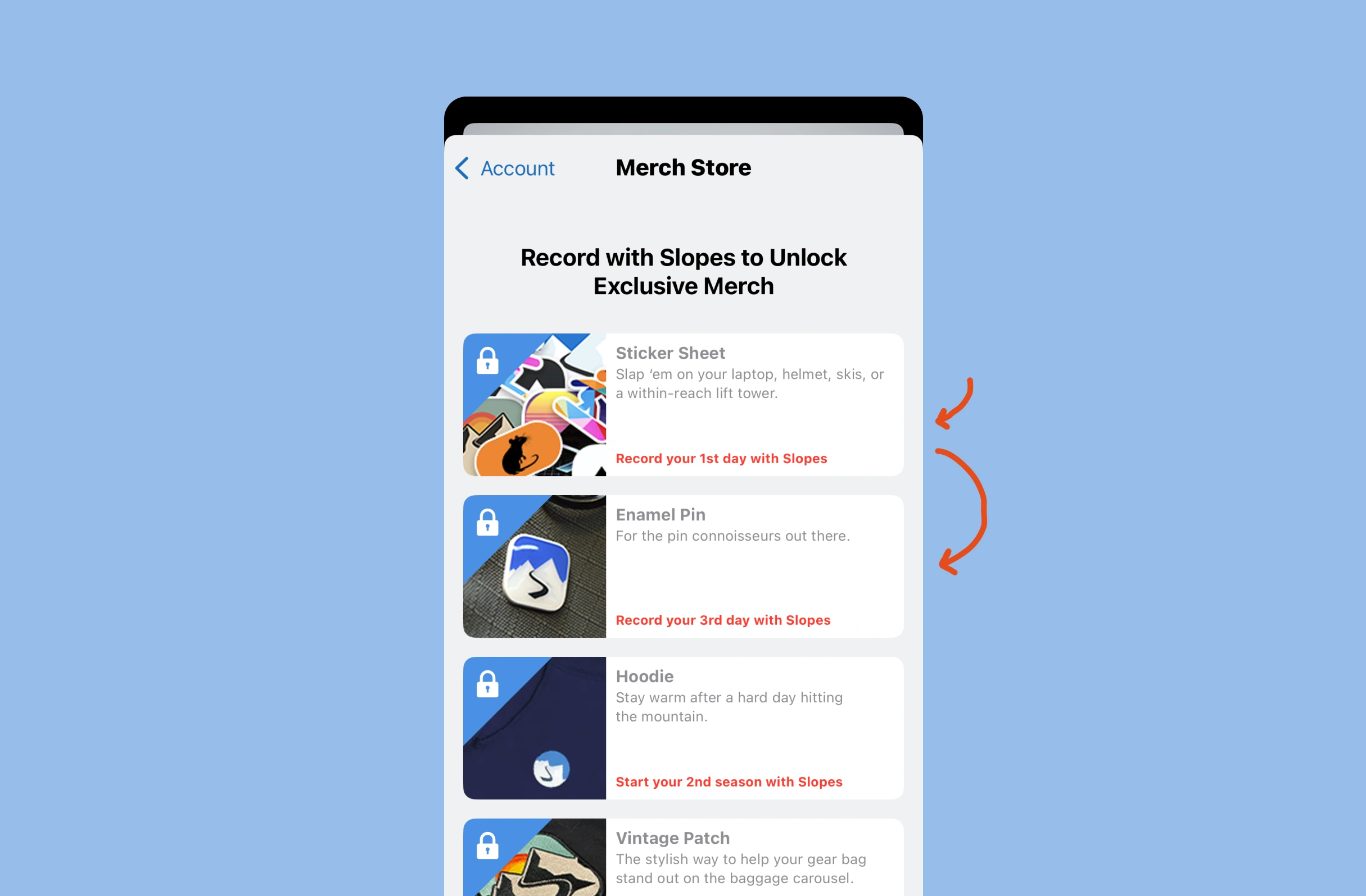
  • Slopes gives free merch for 2nd-season use

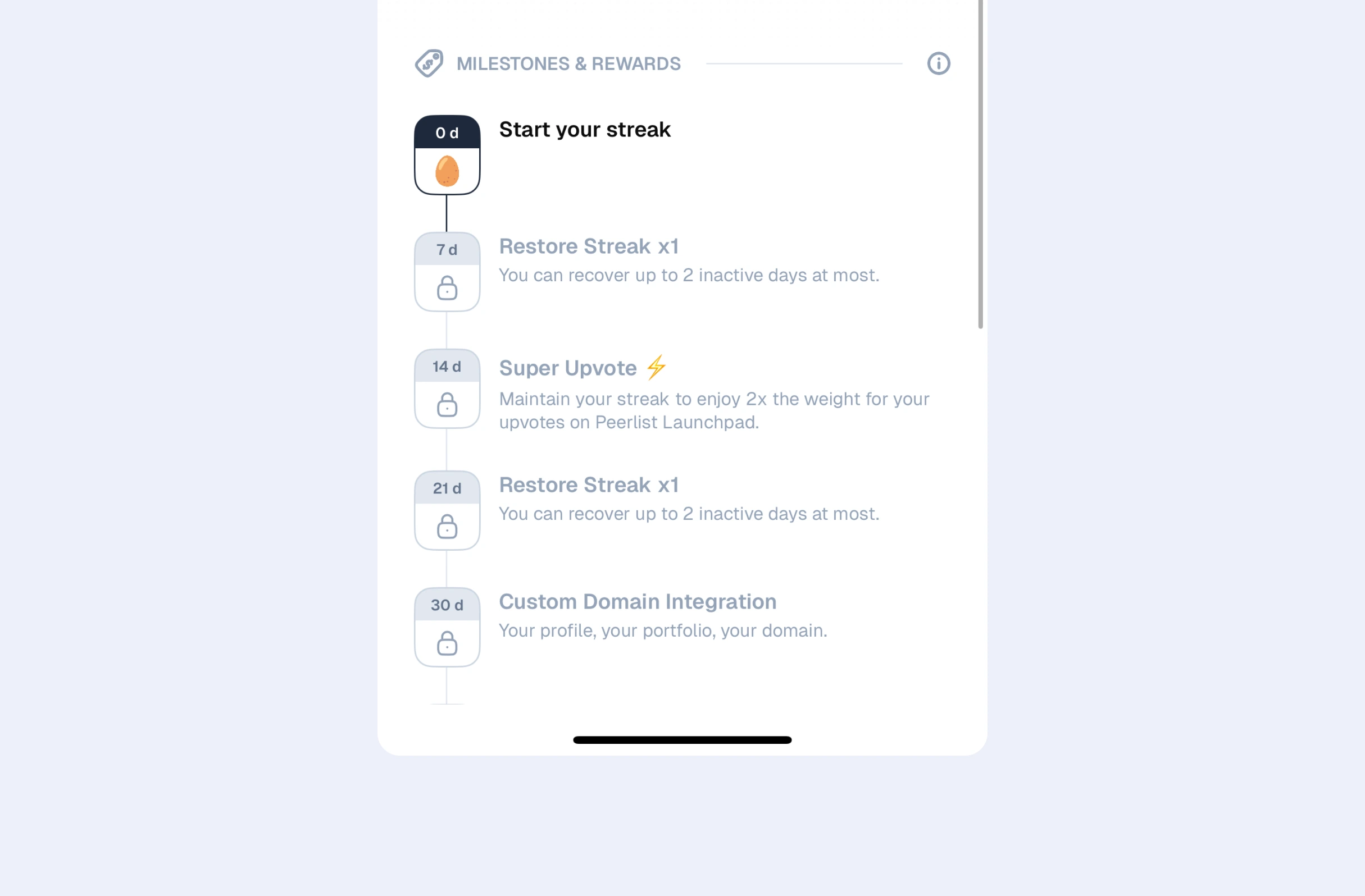
  • Peerlist streak rewards improve the product

  • Octopus Energy points reward meter readings

UX Bite:
Slopes logoSlopes

Merch to incentivise retention

To encourage people to track ski activity in the app, across both multiple days and multiple trips (boosting retention), you'll unlock merch for doing so.

Merch to incentivise retention

More context:

This is brilliant, because a free hoody for simply tracking your activity feels like a valuable gift. But you need to track multiple seasons.

i.e., they're encouraging retention with branded merch. 

This also gets them through their trial period, so may have an upsell benefit too.

#837
View UX Bite
UX Bite:
Peerlist logoPeerlist

Reward-based streaks

Peerlist encourage streaks by rewarding the user with power features after they've hit milestones.

Reward-based streaks

More context:

What I like about this, is that that the rewards are mostly tied to power users.

e.g., unlocking "more influence" or "better profiles".

It leverages the Endowment Effect, as people they value their profile more. 

#952
View UX Bite
UX Bite:
Loops logoLoops

Showing social "proof"

To make their social proof more specific and effective, Loops will show how long they've been customers for when hovering over their logos

Showing social "proof"
#1068
View UX Bite
UX Bite:
Shop logoShop

Leveraging your previous orders

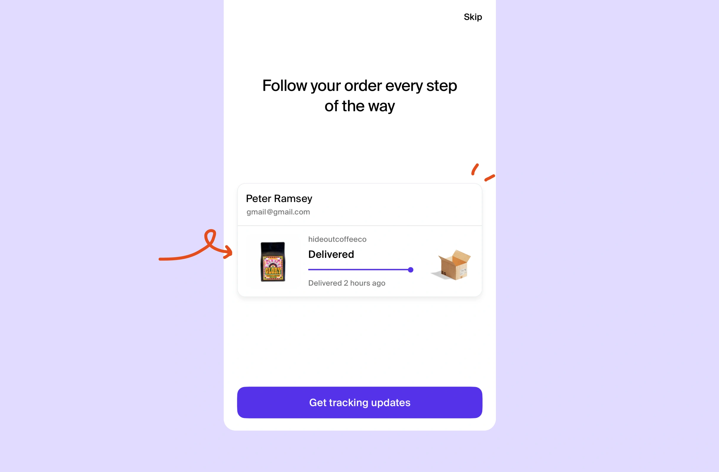
If you've not given Shop notification permissions, they'll use one of your recent orders as an animated example to demonstrate how notifications are used throughout the process.

Leveraging your previous orders

More context:

i.e., this is a brilliant use of historical data, and by making it personalised to you, you're more likely to pay attention.

It benefits from the Endowment Effect: you feel like that's your order.

#887
View UX Bite
UX Bite:
Octopus Energy logoOctopus Energy

A utility loyalty scheme

Octopus Energy will let you earn Octopoints for completing habit-forming actions (like submitting meter readings), which you can then redeem for credit.

A utility loyalty scheme
#551
View UX Bite
UX Bite:
Etsy logoEtsy

Etsy's loyal customers

Subscribe to unlock this example
Plans start from £8 per month
Subscribe to unlock#174
Preview
UX Bite:
Google Maps logoGoogle Maps

Motivating social proof

Subscribe to unlock this example
Plans start from £8 per month
Subscribe to unlock#959
Preview
The UI displays a large white "S" centered on a solid purple-blue background, with no additional text, logos, or interface elements visible.The UI shows a stylized "M" logo with teal, cream, and red color blocks on a dark blue background. No text or markings are highlighted or underlined.The UI shows a stylized mountain with a black winding path on a blue sky background. No text, logos, highlights, pen marks, or arrows are present.

There are more than 1400 UX Bites like this

Subscribe to BFM+

If features can be coded in minutes, thoughtful design is what wins

  • Unlock the entire library
  • Create custom UX courses
  • Access our AI tools
£8/monthbilled annually
See the benefits
or, wait for the free stuff

Join the free newsletter

Get the free content when it's released, straight to your inbox, no account required

"An exceptional resource for learning how to build habit-forming products that people love."

The UI contains the yellow book cover "HOOKED" by Nir Eyal in the bottom right, with black text in a white box with blue borders stating "COMPLETELY REVISED AND UPDATED."
Nir EyalAuthor of Hooked

"I’d never met anybody who looks at usability and UX the way I do until I met Peter. Only he’s smarter."

Photo: site-map sketches with pen annotations, yellow sticky notes and folder of labeled cards, black phone cord, red book cover reading "DON'T MAKE ME THINK".
Steve KrugAuthor of Don't Make Me Think

"The completest view of the psychological underpinnings of human behaviour that I’ve ever seen."

Circular avatar: smiling man, navy jacket, blue‑checked shirt, blurred green bg. Overlays: red EA badge lower-right; black square with white up‑left arrow.
Bing GordonKleiner Perkins & EA

"What a nice idea! Christopher Alexander would be proud to see patterns collected like this."

Profile picture of a man with medium-length hair and stubble wearing a grey hoodie and dark jacket. Two app icons overlay bottom right: yellow Asana and blue Miro.
DHHHey! & Basecamp

FAQs

Why do some loyalty rewards retain users better than credit?

Rewards that improve the product give users a reason to stay, because each milestone makes their experience better. Credit sits outside that loop. For example, Peerlist's streak milestones grant features like more influence or better profiles, and the Endowment Effect makes users value that upgraded profile more.

How do you design a loyalty scheme for long-term retention rather than short bursts?

Place the most valuable rewards behind milestones that take months to reach. This is what Slopes does: its hoodie requires tracking a second season, which carries users past the trial period and may open an upsell too.

When does showing users their contribution stats backfire?

Stats only motivate when the number is impressive. As an example, Google Maps reminds reviewers of their 1,503 review views before they rate new places, whereas 'You've had 3 views' would put people off. With small numbers, a different metric such as minutes saved can work better.

How can customer loyalty double as social proof?

Evidence that customers keep coming back is more believable than a single purchase or a logo, since it rules out one-off buyers who churned. For instance, Etsy shows a 'Loyal customers' badge on sellers with returning buyers, and Loops shows how long each company has been a customer when you hover over its logo.

What should happen when a user is about to reject an offer?

Ask for the reason, then adjust the offer to address it before they leave. Breethe does this with its free trial, extending it from 7 to 30 days if someone says a week isn't enough. The answers also give the business data on why people churn.