UX Content
  • Case Studies
  • UX Bites
  • Cheatsheets
  • Psychology
BFM+
  • Instant Feedback
  • MCP
  • Figma Plugin
  • Tiers & pricing
  • Free newsletter
  • Log in
Other
  • Archive
  • About
  • Help
  • Changelog
Services
UX audits

A complete audit of your user experience, delivered in a format that you can't ignore.

Book an audit

Built for Mars Ltd is a company registered in England and Wales (Company No. 12731987).

Account
  • Log inAccess your library and activities
  • SubscribeUnlock all features and access to the library
Learn from the best companies in the world

A library of content that even non-designers find interesting.

Subscribe todaySubscribe today
Structured learning
  • UX BootcampEnroll in a 5-week bootcamp
  • PathwaysCreate custom learning Pathways to work towards any goal, industry or topic
  • CollectionsBrowse Case Studies by key topics
  • QuizzesTest your knowledge
Explore the library
  • Case StudiesSlideshows that are packed with research
  • UX BitesReal examples of design magic
  • CheatsheetsQuickly level up in a particular area
  • Product PsychologyLearn the essentials
  • NewsletterGet research straight to your inbox
  • CompaniesBrowse by company
Learn from the best companies in the world

A library of content that even non-designers find interesting.

Subscribe todaySubscribe today
Tools to help you
  • AI InsightsUpload screenshots of your design, and get instant feedback from our AI
  • MCPAccess the entire library from your favourite agent
  • Figma pluginAccess our AI tools, and our entire library, directly from Figma
One-to-one help
  • UX AuditsThe fast-track for growth
Includes tools that help you ship better products

Learning never stops, but sometimes you need a little more.

Subscribe todaySubscribe today
Log inSubscribe today
Home
Design Examples
UX Writing Examples: Real Microcopy
Design Examples

UX Writing Examples: Real Microcopy

See how companies like EE, Medium and AO write microcopy, with annotated examples including in-context setup steps, dynamic social proof and intent-based tooltips.

Real world examples:

Updated: 23/09/2026, view all 1,490 examples

Examples on Built for Mars include
  • EE turns internet speeds into TV streams

  • Medium matches social proof to the article

  • AO intercepts copying with a price checker

UX Bite:
EE logoEE

Specific examples

When testing your internet speeds on EE, they’ll try and contextualise what the speeds mean.

Specific examples

More context:

The specificity of the examples is important here—it's memorable. You can visualise 8 TVs streaming Lord of the Rings.

#1163
View UX Bite
UX Bite:
eBay logoeBay

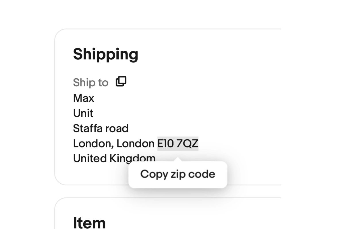
Quick action to copy address

eBay make it easy to copy someone's address with 'click to copy' prompts.

Quick action to copy address
#169
View UX Bite
UX Bite:
Manus logoManus

Tiny AI thumbnails

While Manus AI is working through your request, it’ll dynamically show small thumbnails of what it’s doing.

Tiny AI thumbnails

More context:

You obviously can't see the detail of what's happening, but it's just enough that you can work out when it's looking at a webpage (for example).

This helps both build confidence in what it's doing, and makes the wait more bearable.

#1125
View UX Bite
UX Bite:
AO logoAO

Comparing prices on hover

If you hover over the price name (i.e., to copy it), AO will show you a price comparison of other retailers.

Comparing prices on hover

More context:

In other words, they're noticing a moment of intention (you're about to copy the name to paste it somewhere else), and intercepting it to keep you on the page.

#1197
View UX Bite
UX Bite:
Claude logoClaude

Pasting items on Claude

If you paste more than 600 words into Claude, it’ll add it as an attachment instead of putting it all into the input field.

Pasting items on Claude

More context:

This helps to keep the input section clear for your actual question (i.e., they’ve assumed your pasting something to read / process, and not a question itself).

#1203
View UX Bite
UX Bite:
Grammarly logoGrammarly

Embedding iOS instructions

Subscribe to unlock this example
Plans start from £8 per month
Subscribe to unlock#1365
Preview
UX Bite:
Reddit logoReddit

Using Reddit at work?

Subscribe to unlock this example
Plans start from £8 per month
Subscribe to unlock#101
Preview
The UI displays a large white "S" centered on a solid purple-blue background, with no additional text, logos, or interface elements visible.The UI shows a stylized "M" logo with teal, cream, and red color blocks on a dark blue background. No text or markings are highlighted or underlined.The UI shows the EE logo with two yellow circles and blue dot-patterned "E"s on a teal background; no text boxes, highlights, or arrows present.

There are more than 1400 UX Bites like this

Subscribe to BFM+

If features can be coded in minutes, thoughtful design is what wins

  • Unlock the entire library
  • Create custom UX courses
  • Access our AI tools
£8/monthbilled annually
See the benefits
or, wait for the free stuff

Join the free newsletter

Get the free content when it's released, straight to your inbox, no account required

"An exceptional resource for learning how to build habit-forming products that people love."

The UI contains the yellow book cover "HOOKED" by Nir Eyal in the bottom right, with black text in a white box with blue borders stating "COMPLETELY REVISED AND UPDATED."
Nir EyalAuthor of Hooked

"I’d never met anybody who looks at usability and UX the way I do until I met Peter. Only he’s smarter."

Photo: site-map sketches with pen annotations, yellow sticky notes and folder of labeled cards, black phone cord, red book cover reading "DON'T MAKE ME THINK".
Steve KrugAuthor of Don't Make Me Think

"The completest view of the psychological underpinnings of human behaviour that I’ve ever seen."

Circular avatar: smiling man, navy jacket, blue‑checked shirt, blurred green bg. Overlays: red EA badge lower-right; black square with white up‑left arrow.
Bing GordonKleiner Perkins & EA

"What a nice idea! Christopher Alexander would be proud to see patterns collected like this."

Profile picture of a man with medium-length hair and stubble wearing a grey hoodie and dark jacket. Two app icons overlay bottom right: yellow Asana and blue Miro.
DHHHey! & Basecamp

FAQs

How do you explain technical data to users who don't understand it?

Translate the numbers into a scenario people can picture. For example, EE describes speed test results as how many TVs could stream Lord of the Rings at once, rather than leaving users to interpret Gbps figures. The more specific the scenario, the more memorable the benefit.

What makes social proof feel credible without extra explanation?

Specific job titles and company names carry credibility on their own, so there's no need to explain who each person is. Relevance matters too. As an example, Medium changes the members shown on its premium prompt based on the article being read, so a web development reader sees roles at companies like Google or Meta.

Where should setup instructions go if users have to leave the app?

Put them at the point where the action actually happens, not in a separate help page. This is what Grammarly does by adding keyboard activation steps at the bottom of its iOS settings page, since users have to go there to allow the keyboard anyway.

How can microcopy respond to what a user is about to do?

Watch for a small behaviour that signals intent, then show copy that answers it. For instance, AO shows a 'Quick & easy price checker' when someone hovers over a product name, a likely sign they're about to copy it and compare prices elsewhere. The tooltip keeps them on the page instead.

Is it worth writing microcopy for places most users never see?

Hidden spots reach a small but very specific audience, which makes a targeted message more effective. For example, Reddit's web console shows 'Using Reddit at work? Work for Reddit.' with a careers link, aimed squarely at developers inspecting the site.