Search
Popular Filters
Popular Filters

Popular Filters
Popular Filters
By Peter Ramsey
4 Feb 22
18 months ago I published an analysis of 12 of the most popular banks in the UK, which demonstrated just how far ahead of the competition Monzo and Starling were.
But whilst their core products are incredibly strong, the cracks start to appear when you get even deeper into their experiences.
This month I've been re-evaluating the UX of these two banks specifically, and highlighted a few things that we can all learn from.
So, is the experience of getting an overdraft better with Monzo, or Starling?

👇 What are these? Below are UX issues mentioned in the presentation, but that I felt were worth discussing in more detail. These are worthwhile conversations to have internally, and consider if they impact your product or service.
Starling asks you how much you want to borrow, before completing any kind of assessment about your eligibility.
Plus, you can only make one request every 3 months, piling on the behavioural psychology and anxiety in a circumstance that's reminiscent of a gameshow.
But without knowing the maximum amount that you can borrow, it's almost impossible to minimise regret.
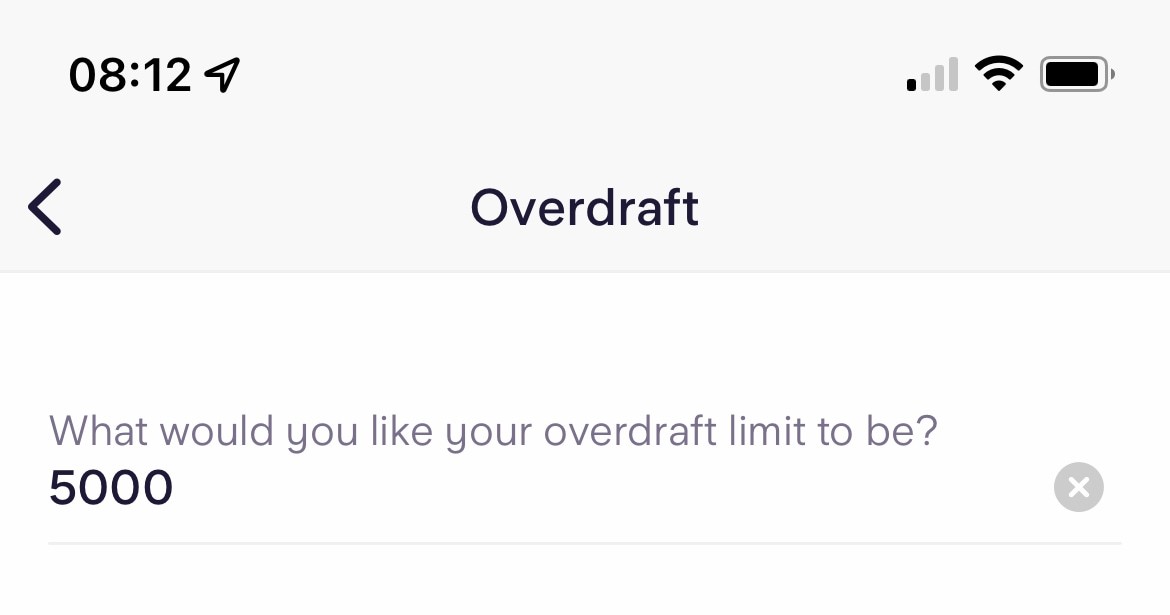
i.e., if you're offered the overdraft, you'll wonder if you could have asked for more. If you're rejected, then you'll regret aiming so high.
Even if they happened to stumble exactly on their eligibility limit, and had maximised their overdraft allowance, they wouldn't know that they had.
Product makers need to craft experiences in a way that consciously minimises the opportunity for regret.
Regret is a difficult emotion to avoid entirely. For example, some people may regret signing up to your service simply because it wasn't very good.
But here are a few examples of UX features that can help mitigate the risk:
💾
Auto-saving
i.e., regret typing so much, if it logged you out and didn't save.
📃
Waiting lists
i.e., regret entering all your details, if you're not eligible to use the service today.
📖
Content previews
i.e., regret investing your time into content, if it turned out to not be what you were expecting.
💸
Money back guarantees
i.e., regret making a purchase, if it turned out to not be what you needed.
⚠️
'Are you sure' modals
i.e., regret clicking on the 'X' in the corner, as you've now lost all your progress.
In this instance, Monzo's execution was more effective, because it ran an eligibility check, and then displayed the parameters.
You can walk away from Monzo feeling confident that you maximised your Overdraft allowance.
"We need it to be simple and clean, but also full of context and information."
I'm often asked how to reconcile these two goals, because intuitively they feel like opposing forces. But they don't need to be.
One technique, which Monzo execute brilliantly, is to selectively hide content behind specific actions.
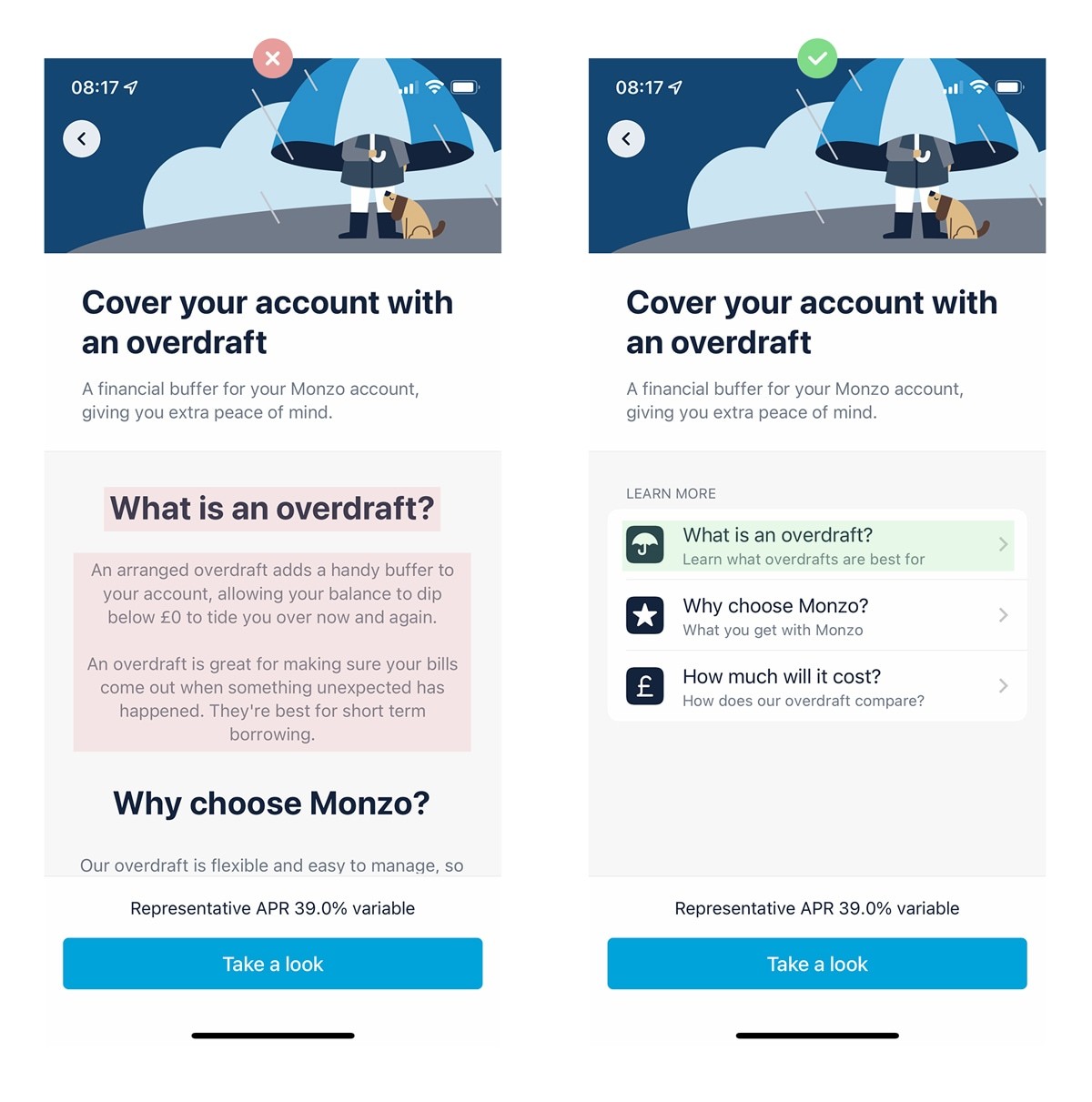
When you see it, it looks obvious. But there's a nuance to executing this well: specific content needs to be grouped, and hidden behind a clear and specific action.
Specific content. Clear action.
An analogy that may help illustrate this point is to imagine organising your loft.
🖨
1. Individual items
Over the course of a decade you just continuously place individual items on the floorspace. At first it works well, but over time it becomes a cluttered mess.
📦
2. Boxes
So you put everything in boxes, which improves the aesthetics, but then finding items becomes laborious. You can't predict what's inside each box.
🗂
3. Specific labels
But by adding clear labels to every box, you make it significantly easier to find items. And the more specific you are, the better.

The point is this: UX works in largely the same way.
The more specific the labels (on both the loft boxes, and the actions) the more confident you can be what's inside, and therefore the better you'll feel about opening the box (or clicking the link).
Ponder this: what's the purpose of the label inside a CTA?
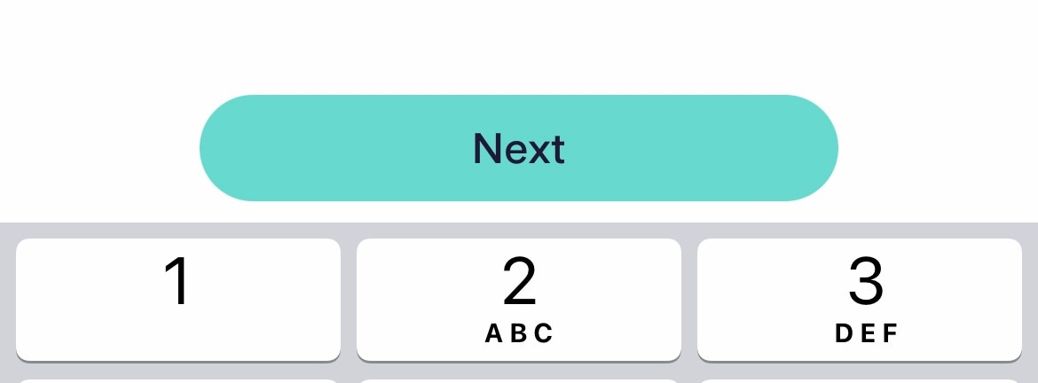
For example, if you removed the text 'login' from the CTA below, would you be unable to guess what it did?
Most of us would agree that even without the content inside the CTA, we'd still be confident that it was a button to 'log in'. This is possible because of the context surrounding the action.
i.e., it's predictable given the limited scope of its context.
Okay, now what about this one?
This is more difficult, borderline impossible. So I'll repeat my rhetoric again: what is the purpose of the content inside a CTA?
In short, the label provides an explicit description of the action that happens when you interact with it.
As products and services get more complicated (e.g., with additional features), the number of on-screen actions increases. As a result, each CTA typically has less context.
In other words; product complexity creates context-dilution.
And in a similar vein to the 'boxes in the loft' example, the more specific the label, the more confident the user can be in the action.
The user feeling confident almost always translates into a better experience.
If we compare the screens where you set your overdraft amount:
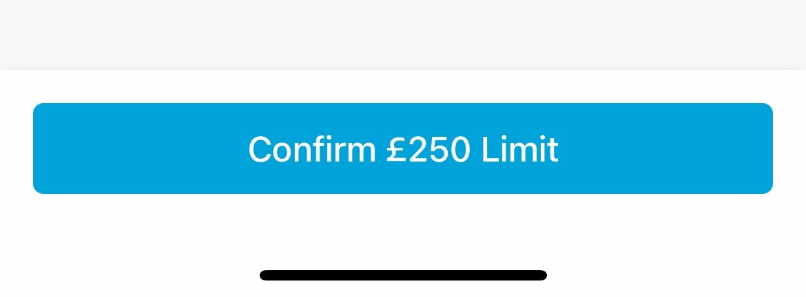
Starling's is generic, Monzo's is specific—which do you think is clearer?
When done well, a specific CTA label can actually be empowering. The user intuitively knows exactly what will happen next, and that feels very similar to being 'good at something'.
People feel happy using products that make them feel good, it's often as simple as that.
Starling is typically world-class, but in this instance, they've dropped the ball. Requesting an overdraft was not a great experience.
But Monzo's is great, and kudos to them. They've crafted a beautiful and delightful experience, once again.
🔥 Simple UX exercise:
Go through your product and consciously try to make your CTAs more specific.
"Send" = "Send Invoice",
"Pay" = "Pay £30.00",
"Continue" = "Continue to checkout".
Simple techniques to increase feature usage, retention and ultimately alter how users perceive the value of your product.
The techniques that Slack have used to create an effortless onboarding flow, and why you might not want to copy them.
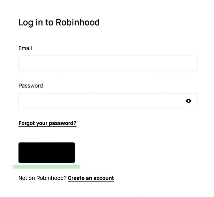
The product psychology behind why Robinhood offer new users $7.08 of free stock, and not $10.