By Peter Ramsey
6 Oct 22
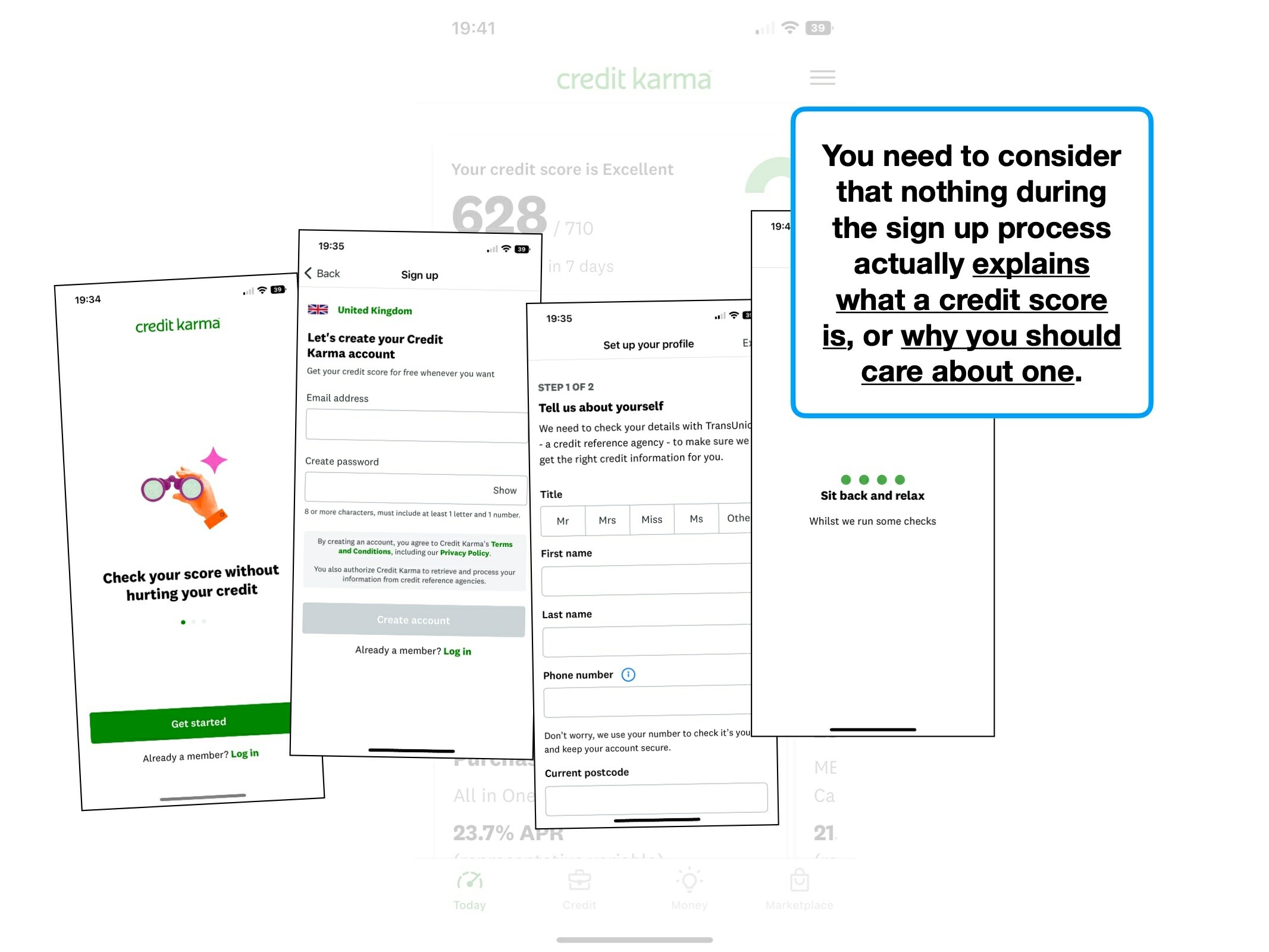
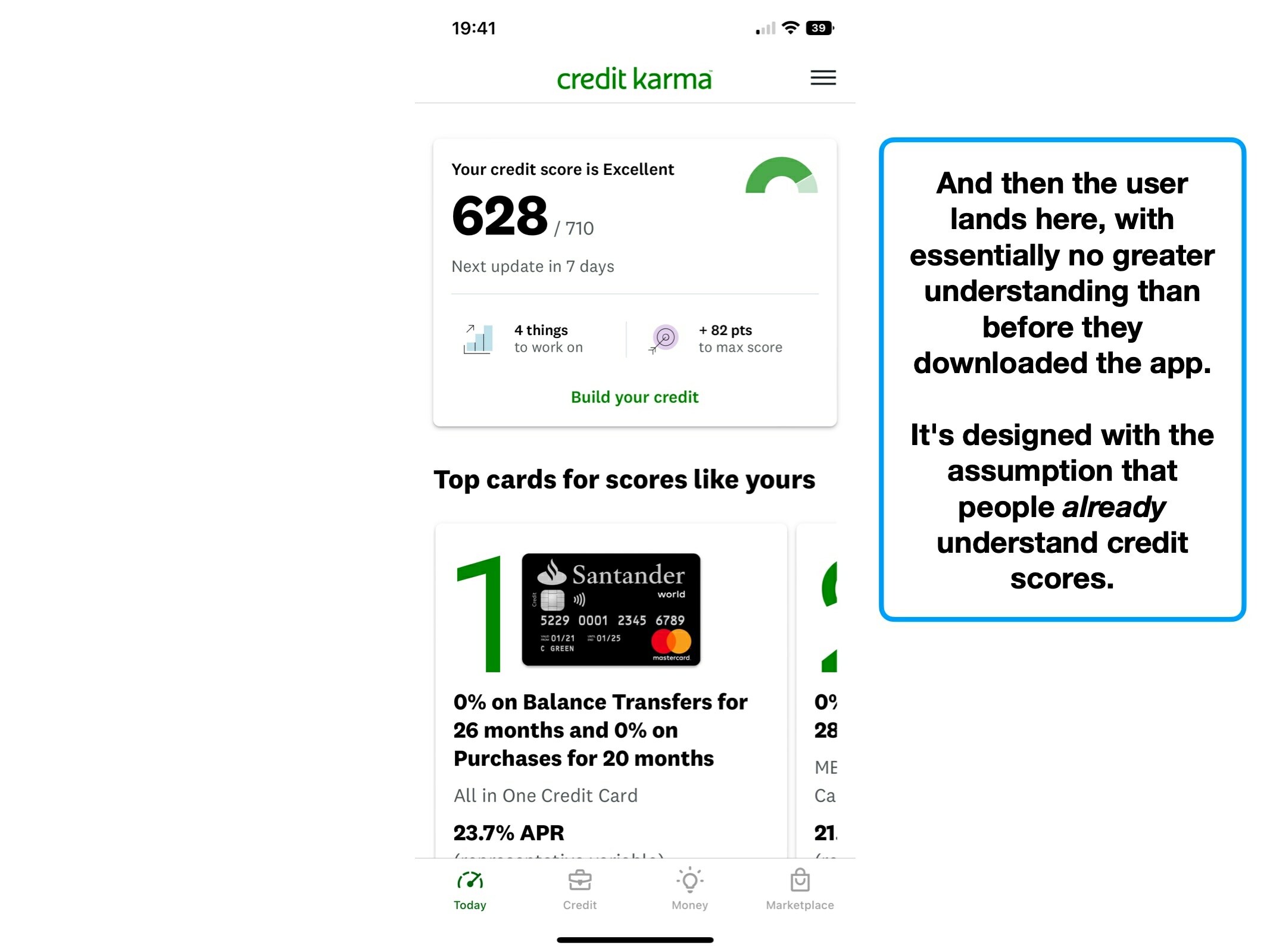
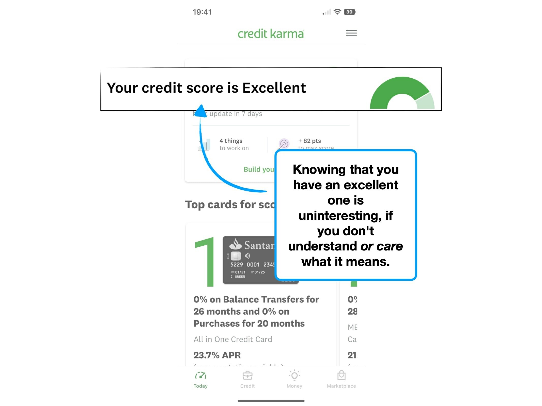
The complexity of credit scores
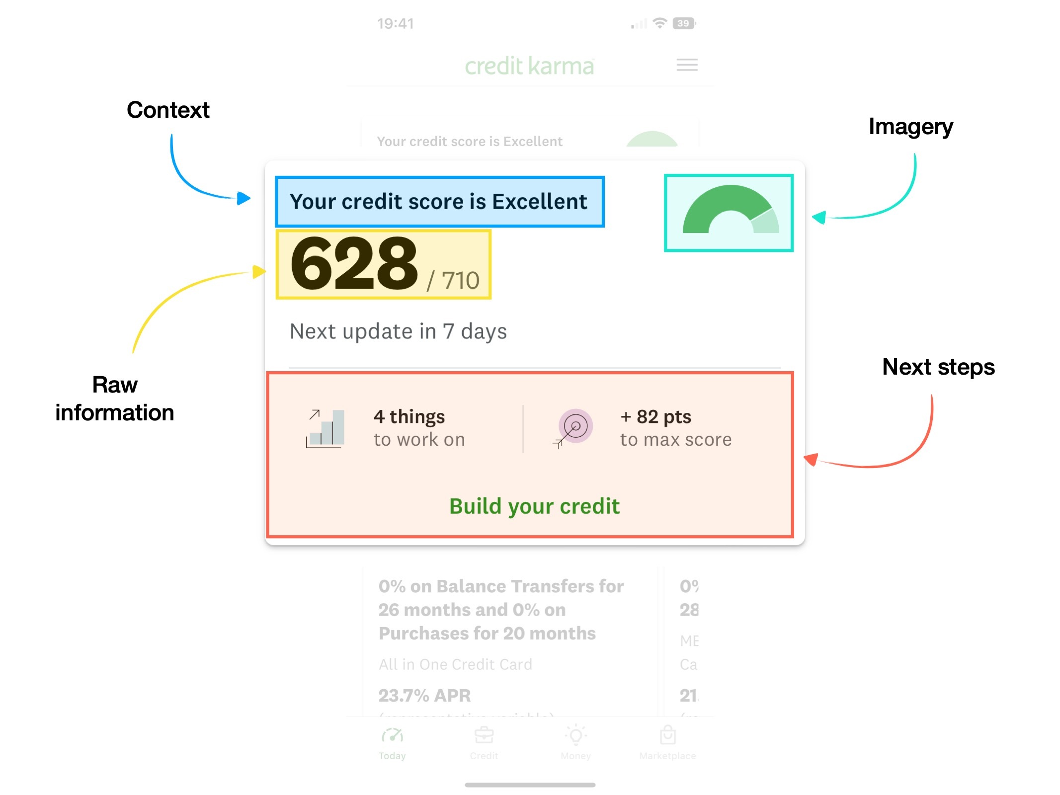
Credit Karma distills many datapoints of your financial life into a single score.
But not only is the calculation confusing to truly understand, it's a boring enough subject that many people struggle to find an incentive to try.
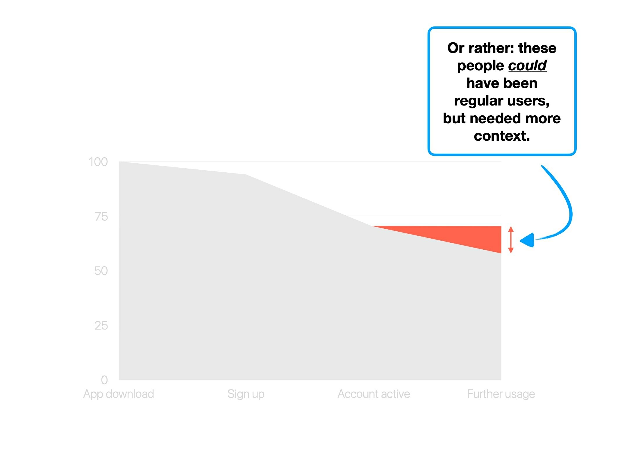
That is, until a major borrowing event—like getting a mortgage.
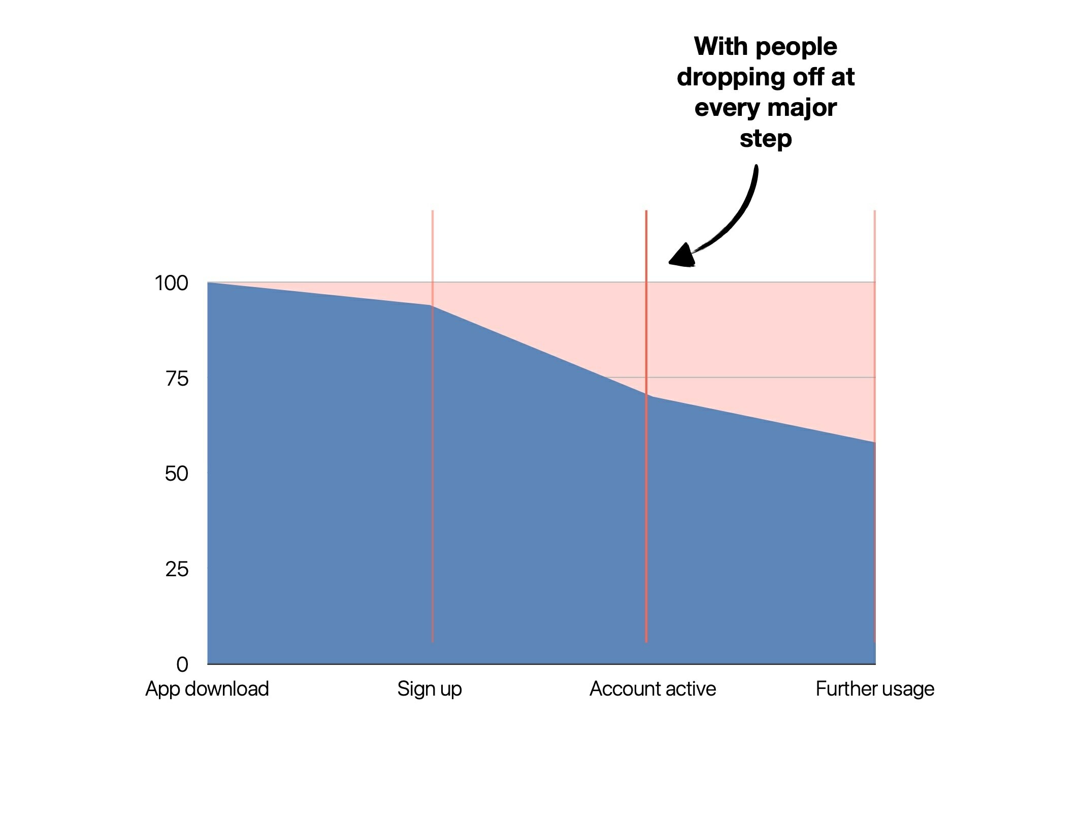
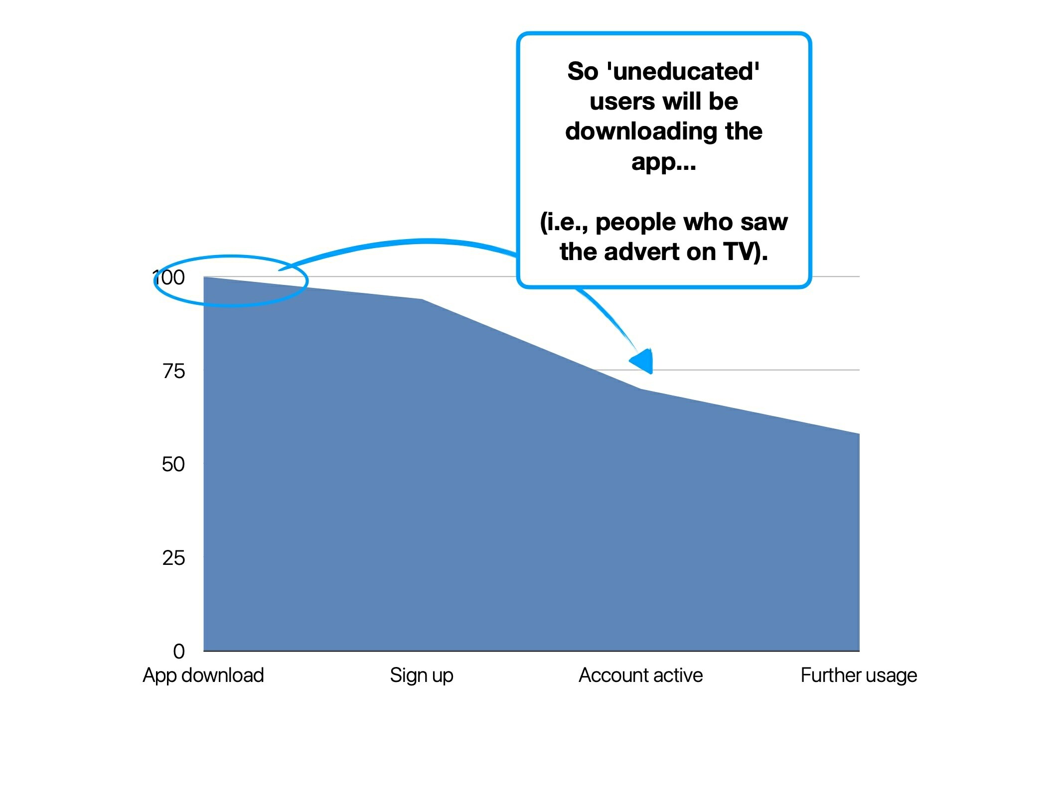
According to a poll, 44% of Gen Z'ers (1997 → 2012) don't know their credit score, with 25% admitting that they didn't know how to find out.
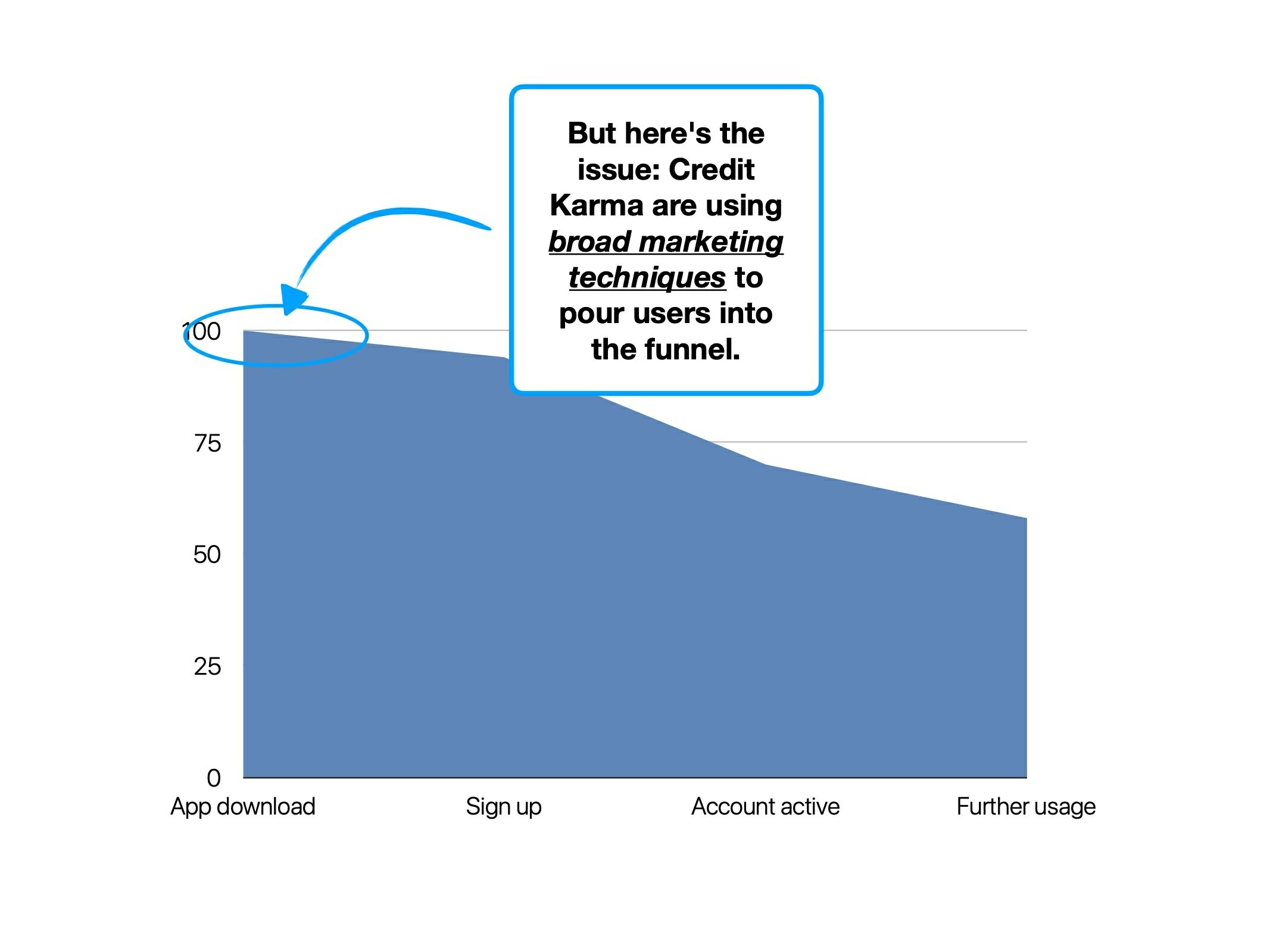
This screams one thing to me: a huge cohort of untapped potential users (18-25 year olds).
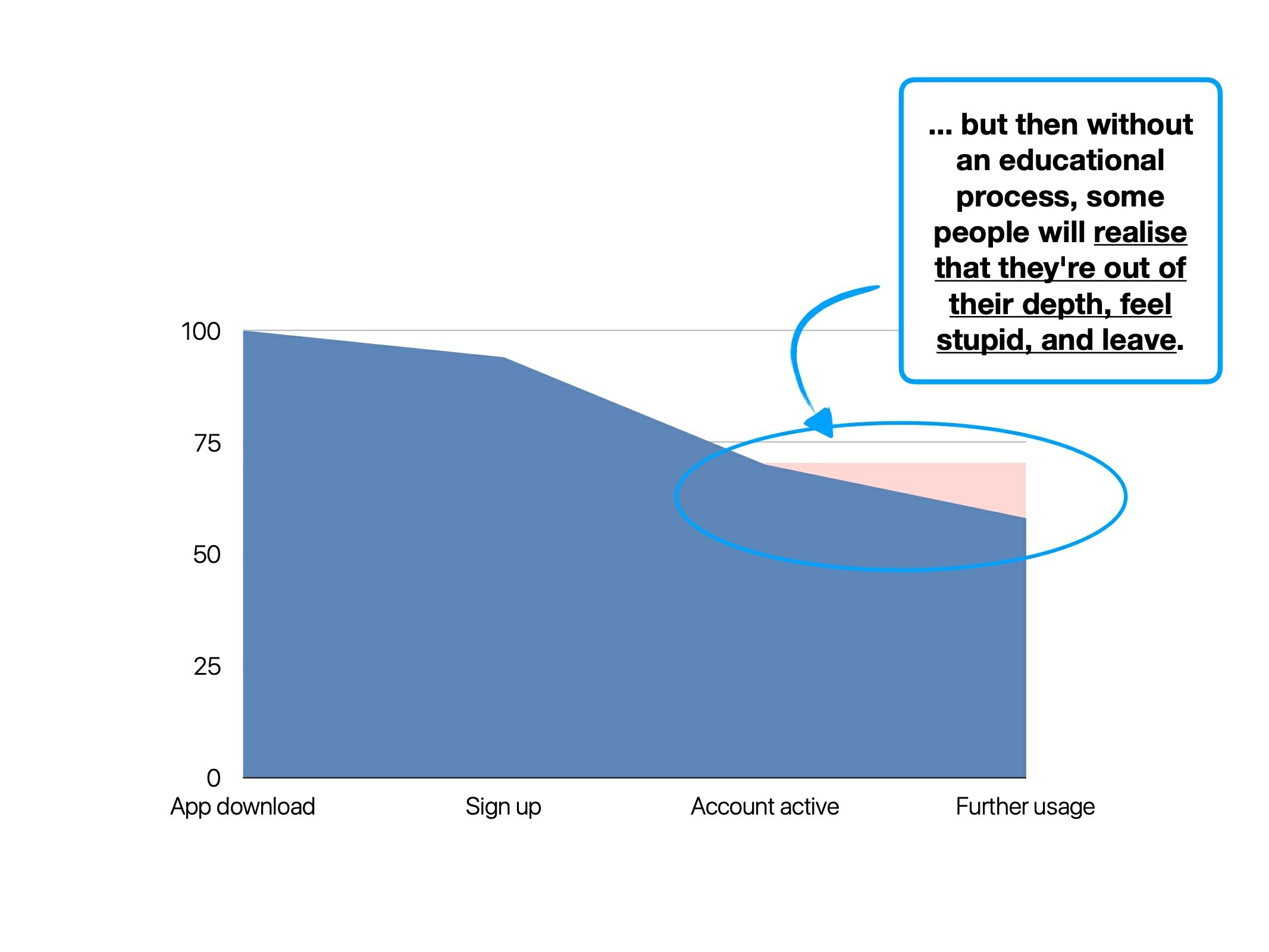
Credit Karma claims to have more than 100 million users worldwide, but are they providing suitable education to convert that additional cohort?
In short; no, they're not—here's why.
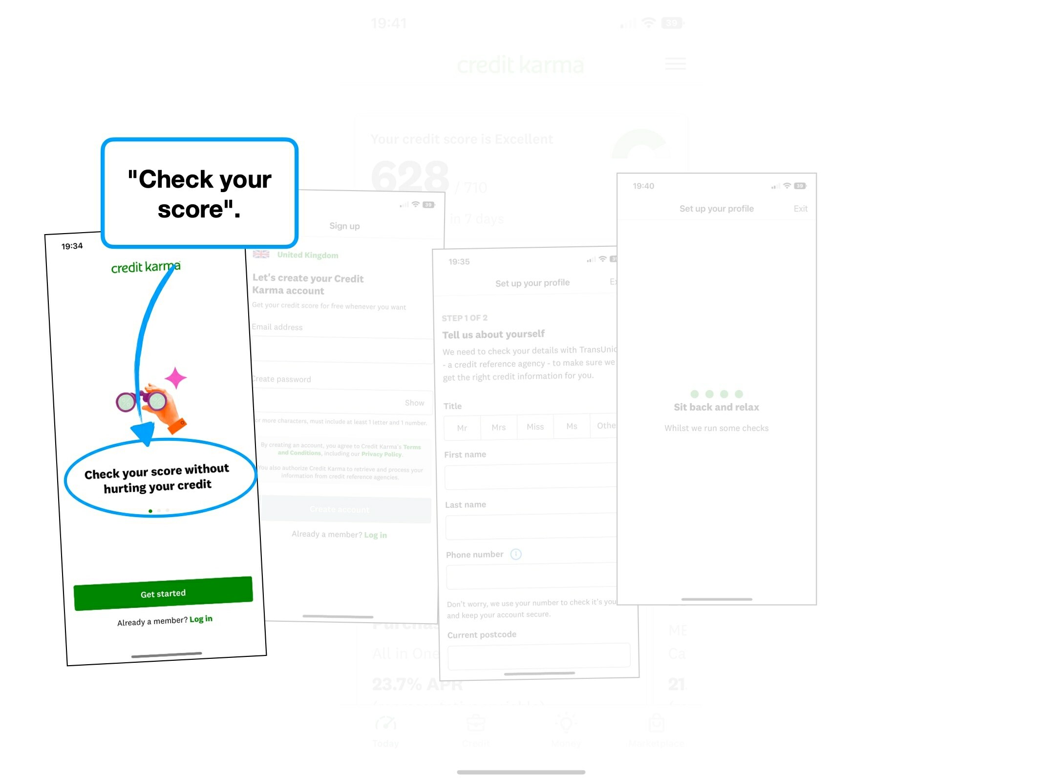
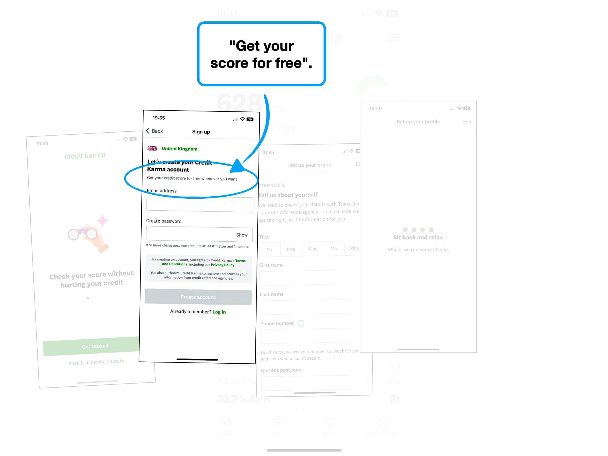
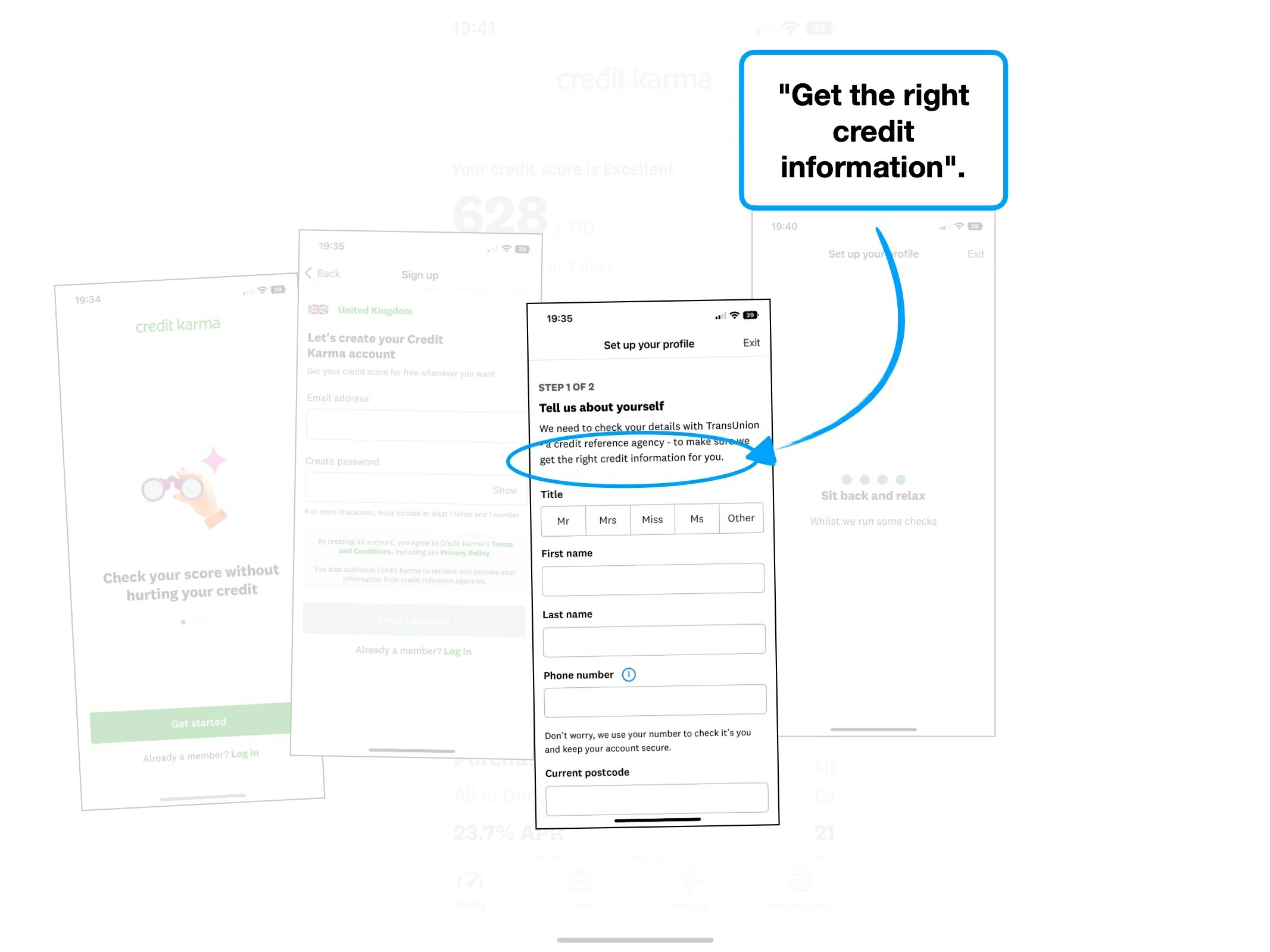
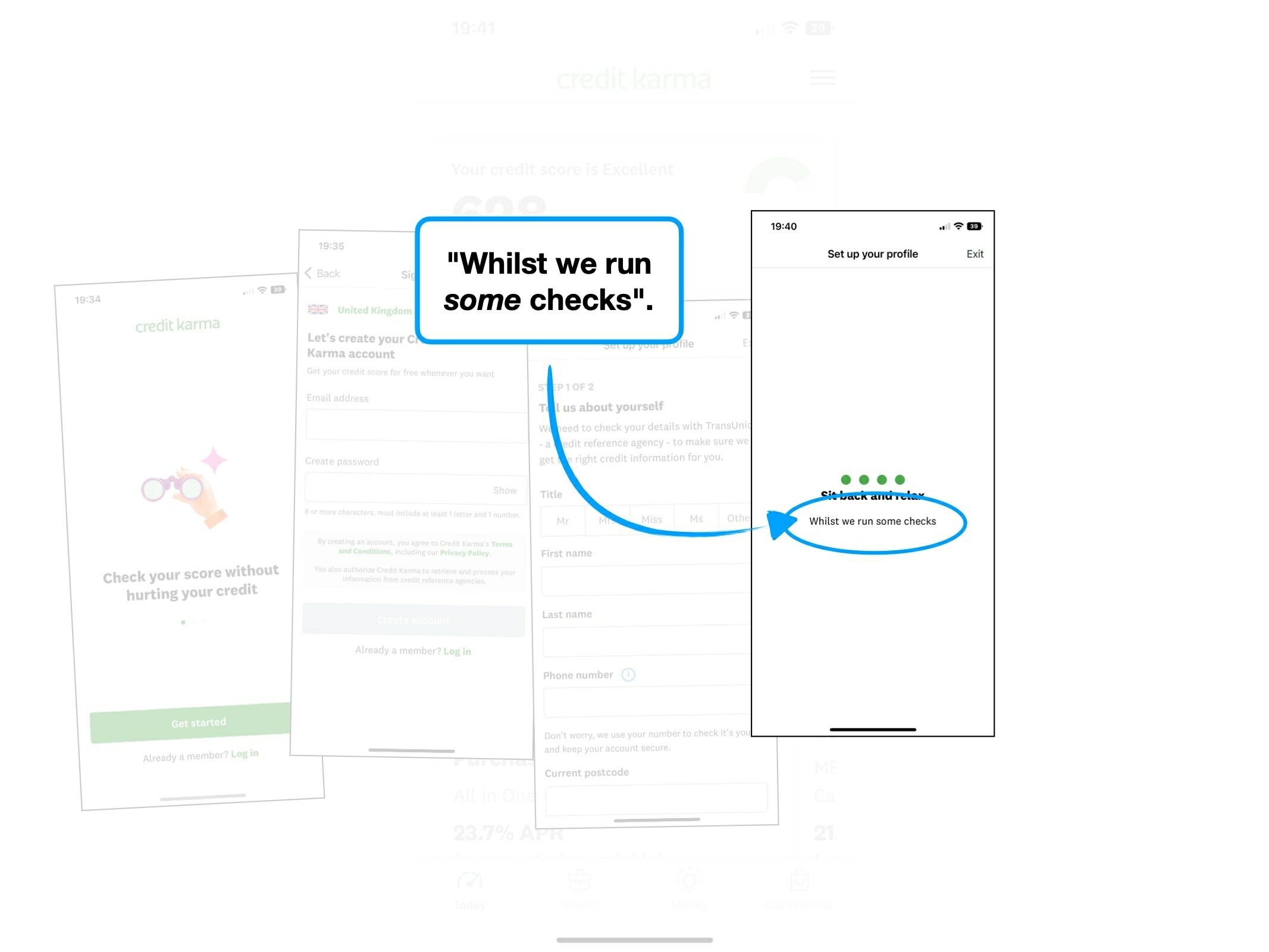
Case study
Please rotate your device to view this slideshow
Note, this won’t work if ‘rotate: lock’ is on in your device settings.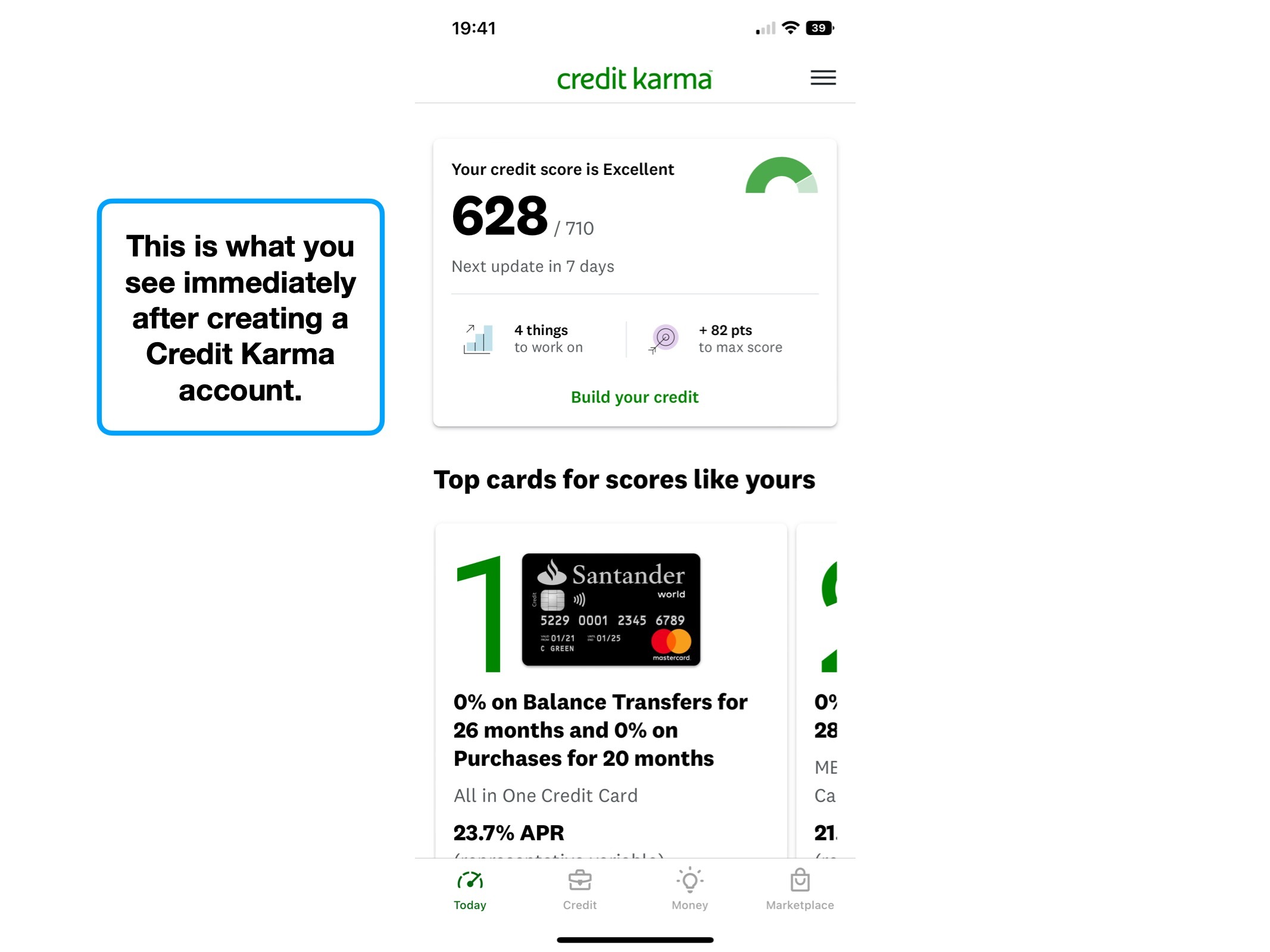
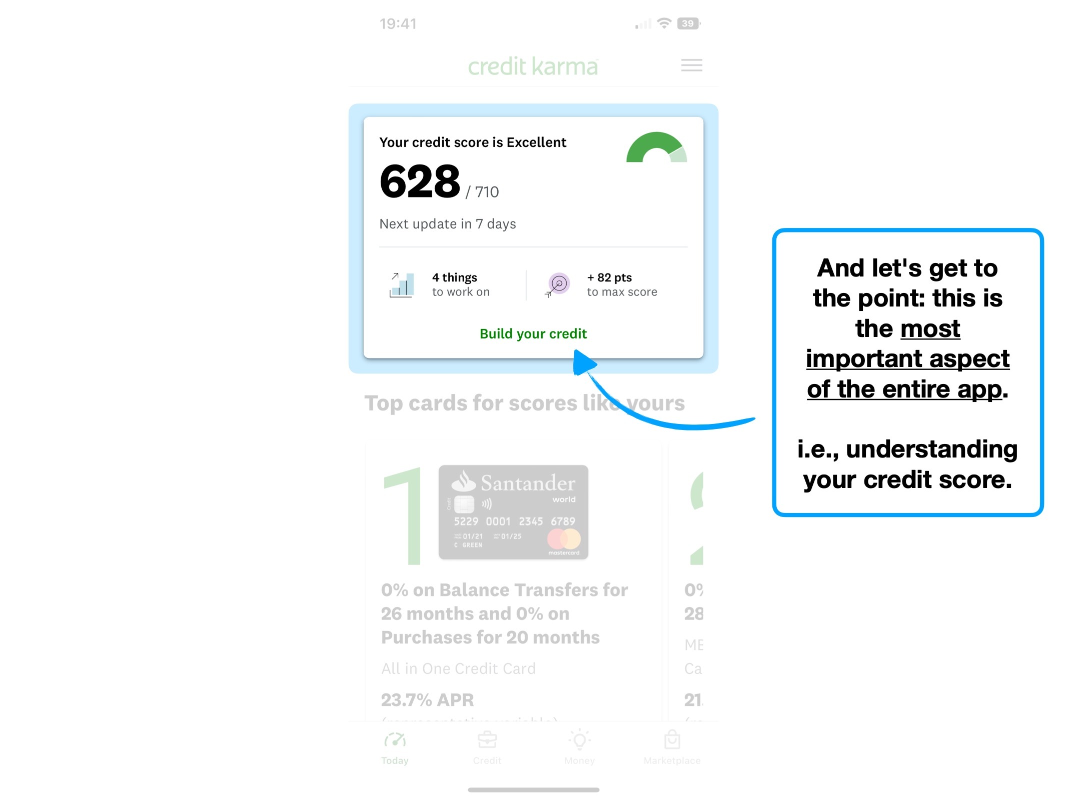
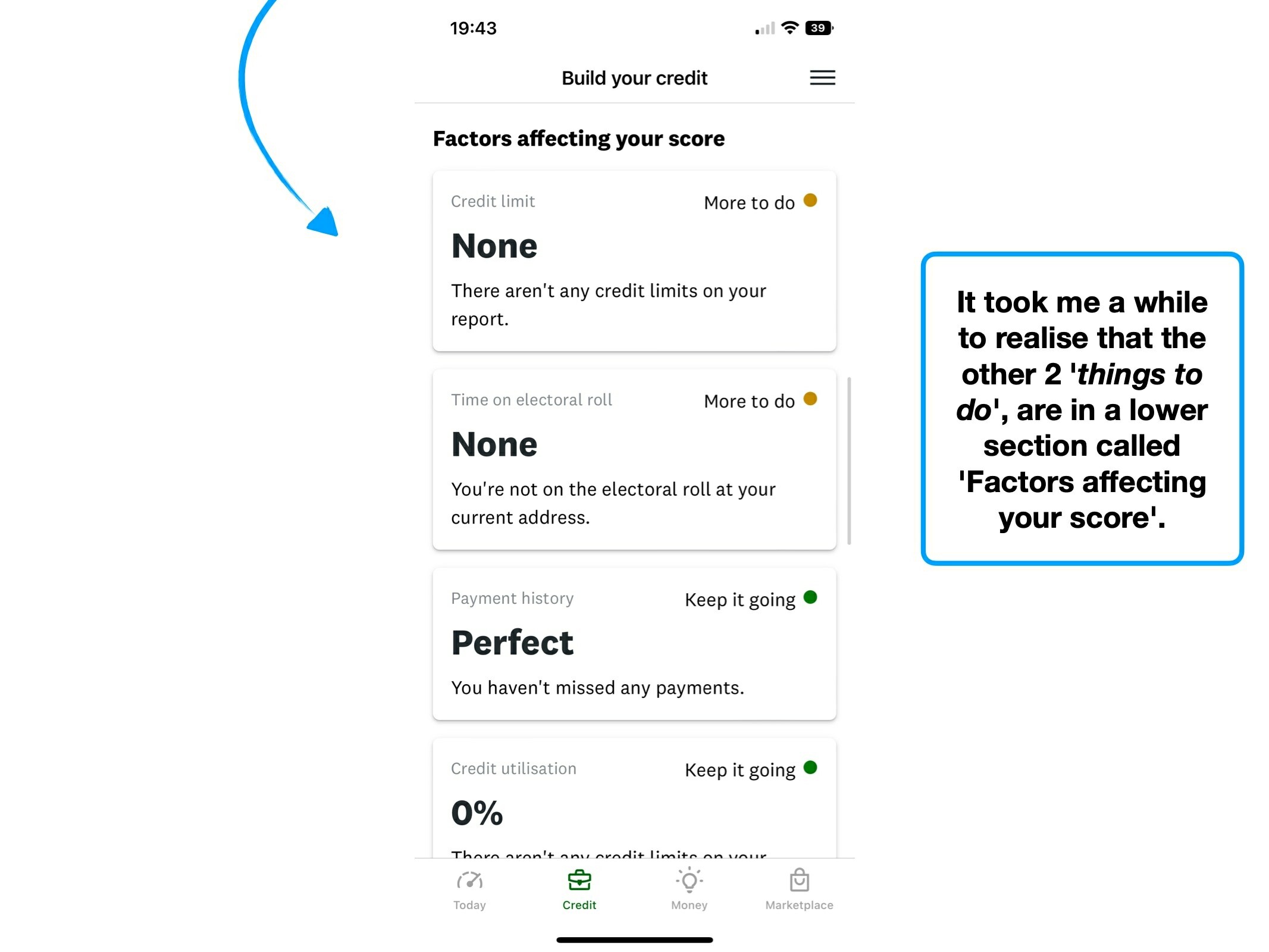

Key UX takeaways
1. Pull to refresh
One reason why UX is a constantly evolving practice, is that popular products create new habits, which—with a little help from the ⌛️ Recency Bias—becomes expected from other services.
One recent example of this is the 'swipe up' mechanism for browsing content on TikTok. YouTube Shorts, Instagram and many others have since lent into this habit.
TikTok has been so popular that swiping horizontally to go between videos would now feel uncomfortable.
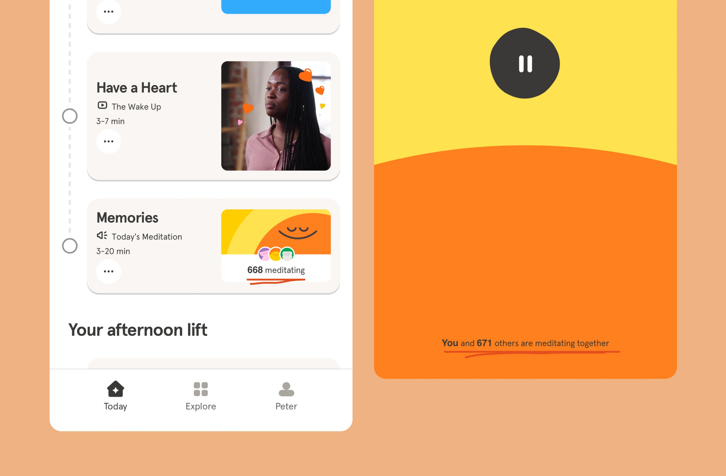
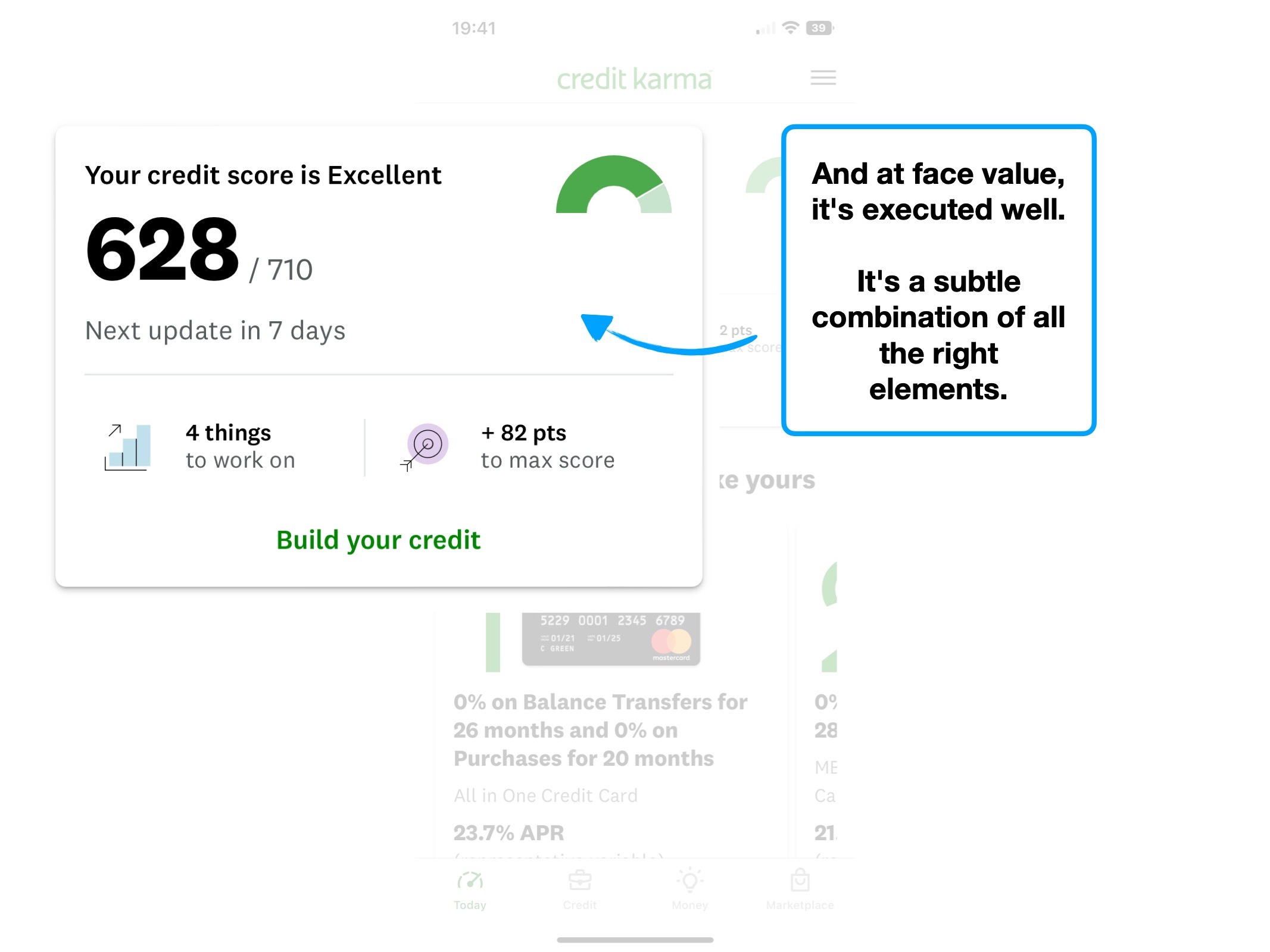
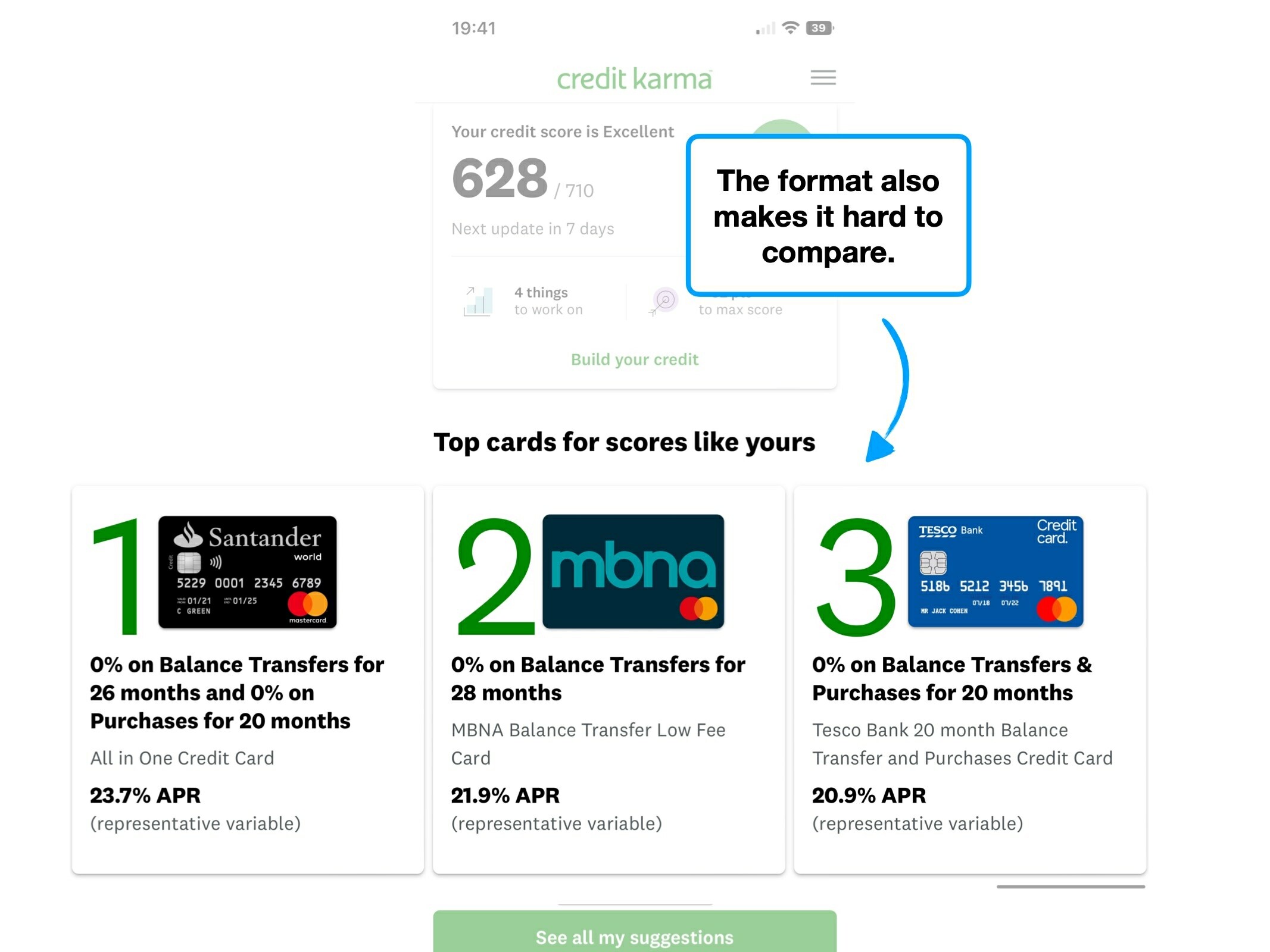
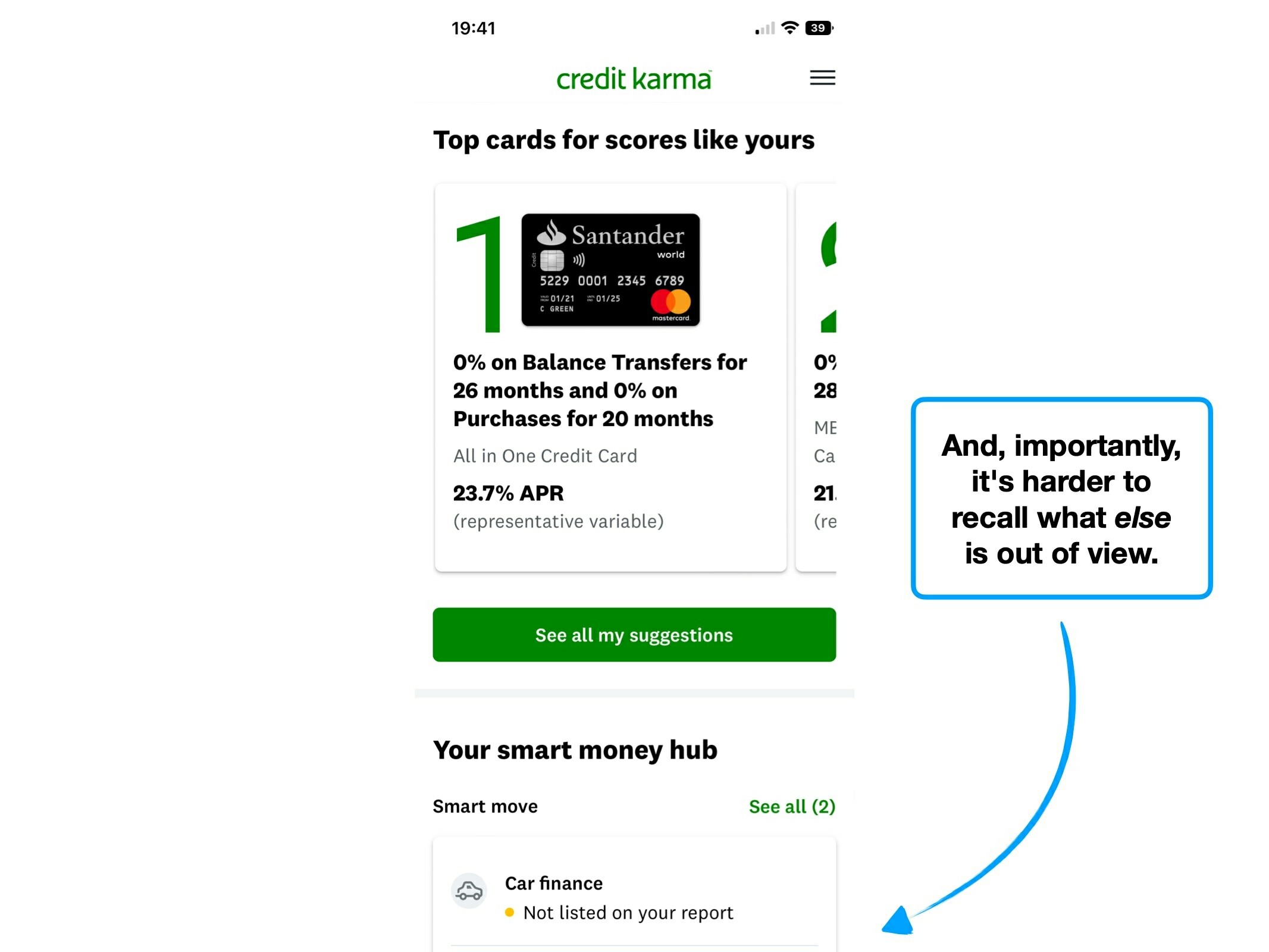
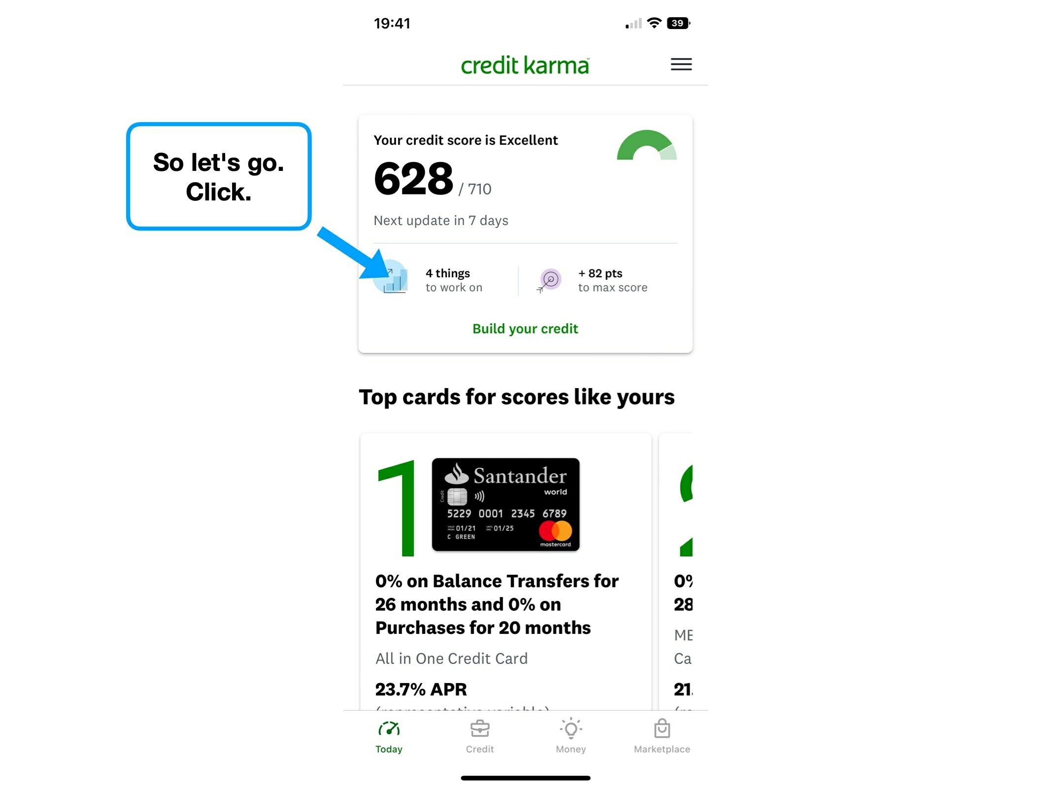
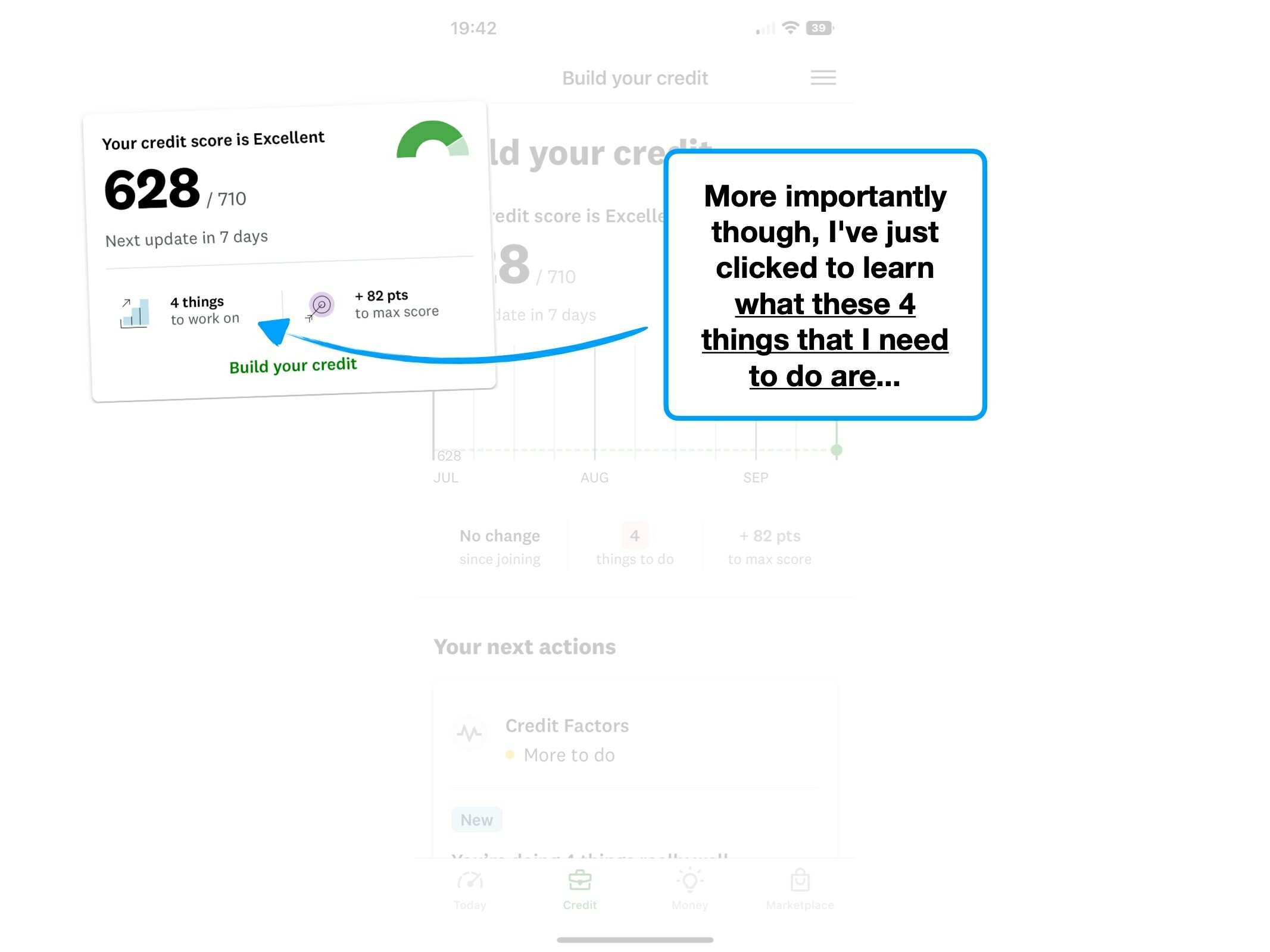
Now consider apps that have 'scores', like the two examples below. Instinctively, how would you refresh these scores?
It's very likely that you’d pull down the screen. This is usually how you'd refresh an app or website.
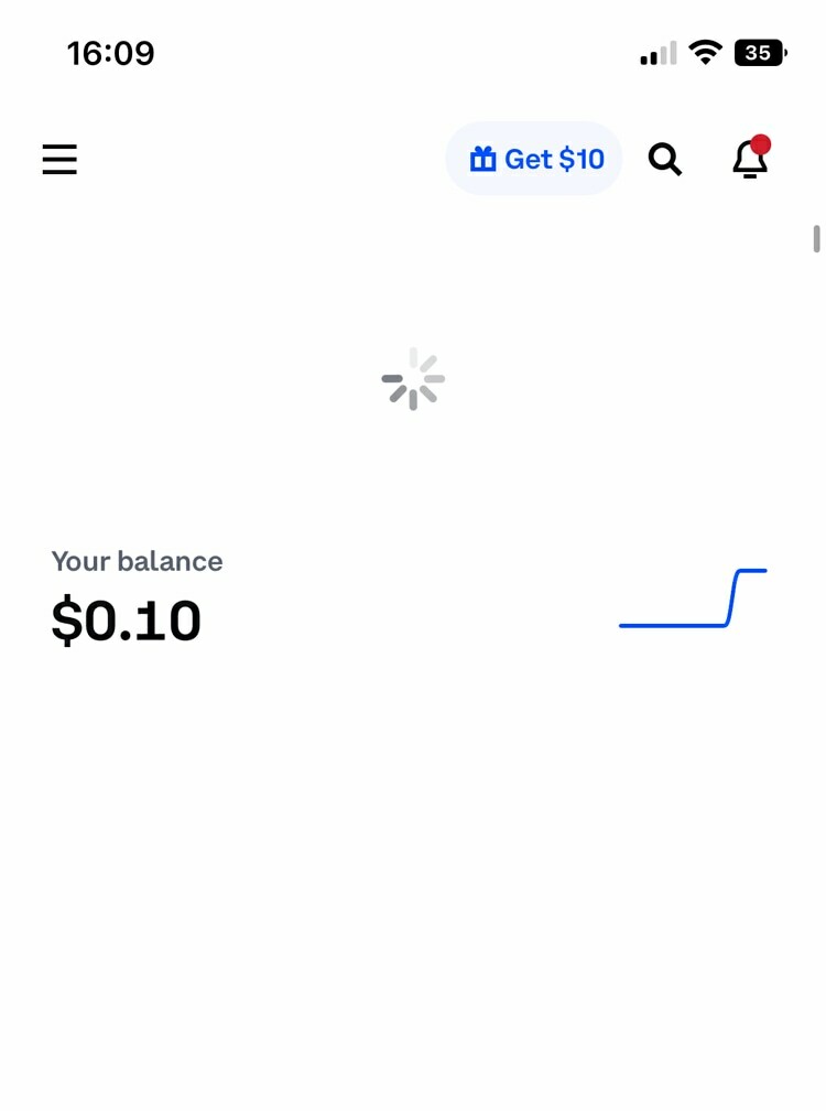
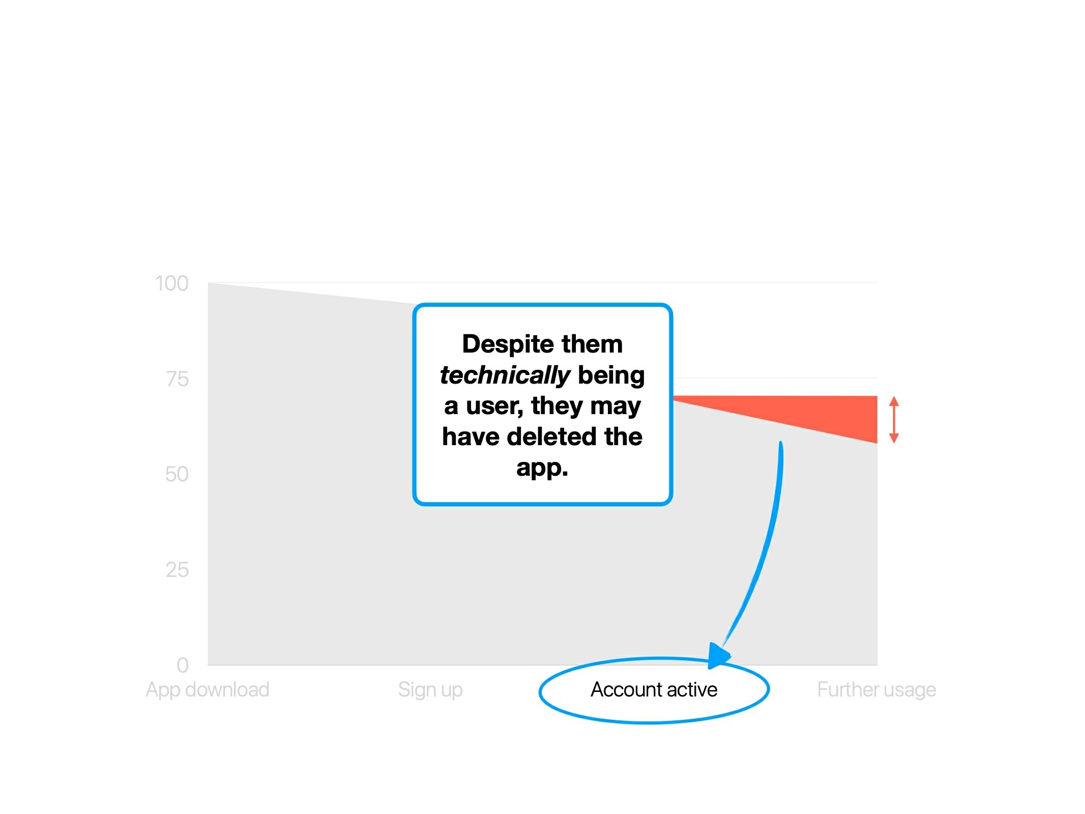
Here's the problem: the Credit Karma score, which you’re encouraged to take actions to modify (i.e., improve), isn’t updated in real-time—it updates every 7 days.
Pulling down would technically do nothing.
But, UX often fights in the realm of perception, not technical limitations.
It doesn’t matter that the user can’t actually update the score immediately, they’ll try anyway.
Figma is a great example of what to do: it auto saves—there’s no reason to manually save the file. And so from a factual perspective, there’s no reason to have a CMD⌘+S shortcut (which is commonly used to save a file).
This is what they show:

It’s not confirmation of an action happening, its sole purpose is to intercept a common habit, and remind the user of it's irrelevance.
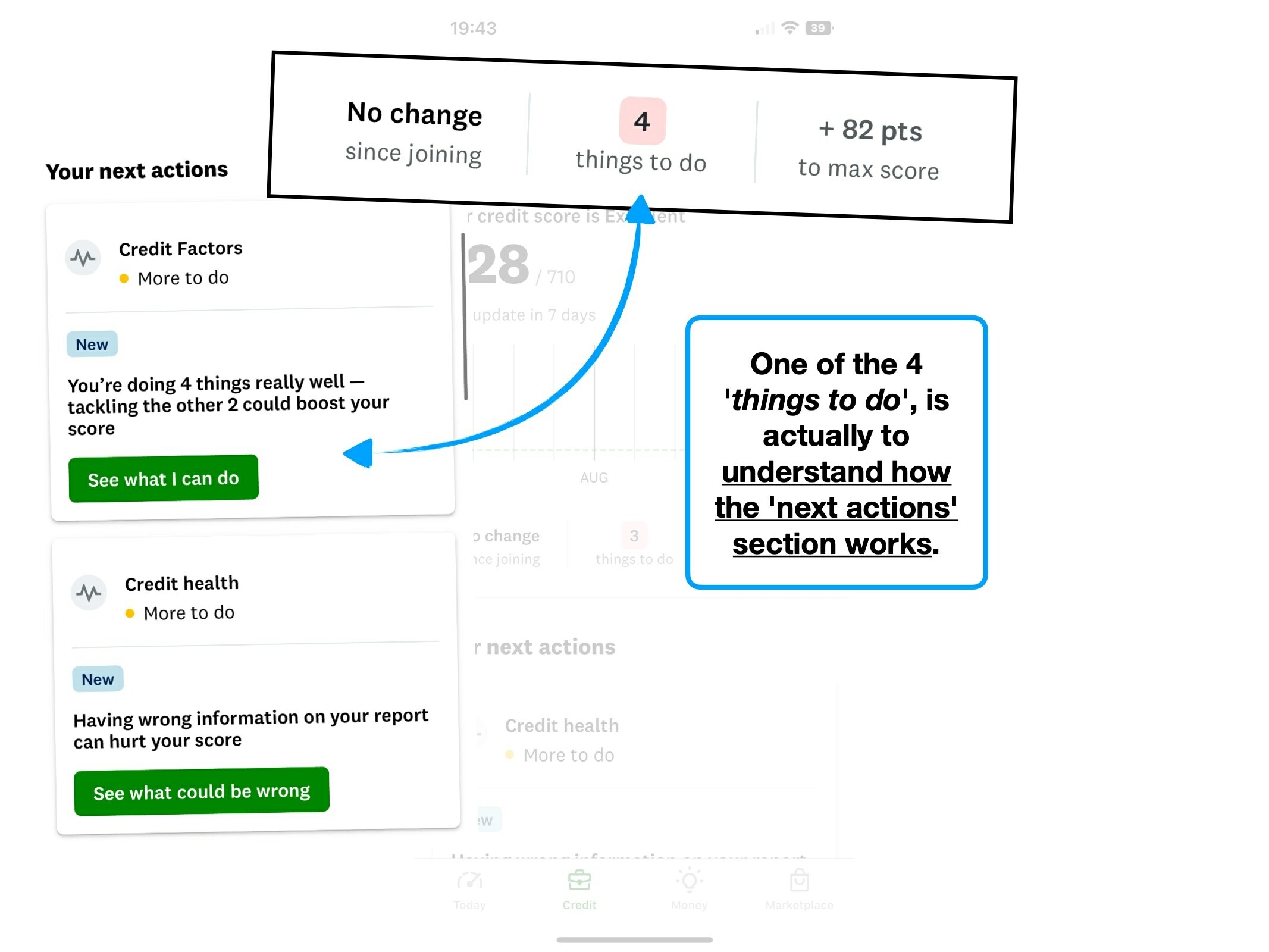
2. Types of task
Imagine that you’ve been sent to the supermarket with a list of things to buy:
- 6 Oranges
- 2 pints of milk
- Discover new culinary preferences
That third one would probably trip you up: how can you achieve that right now? Does this require trying a new food every day?
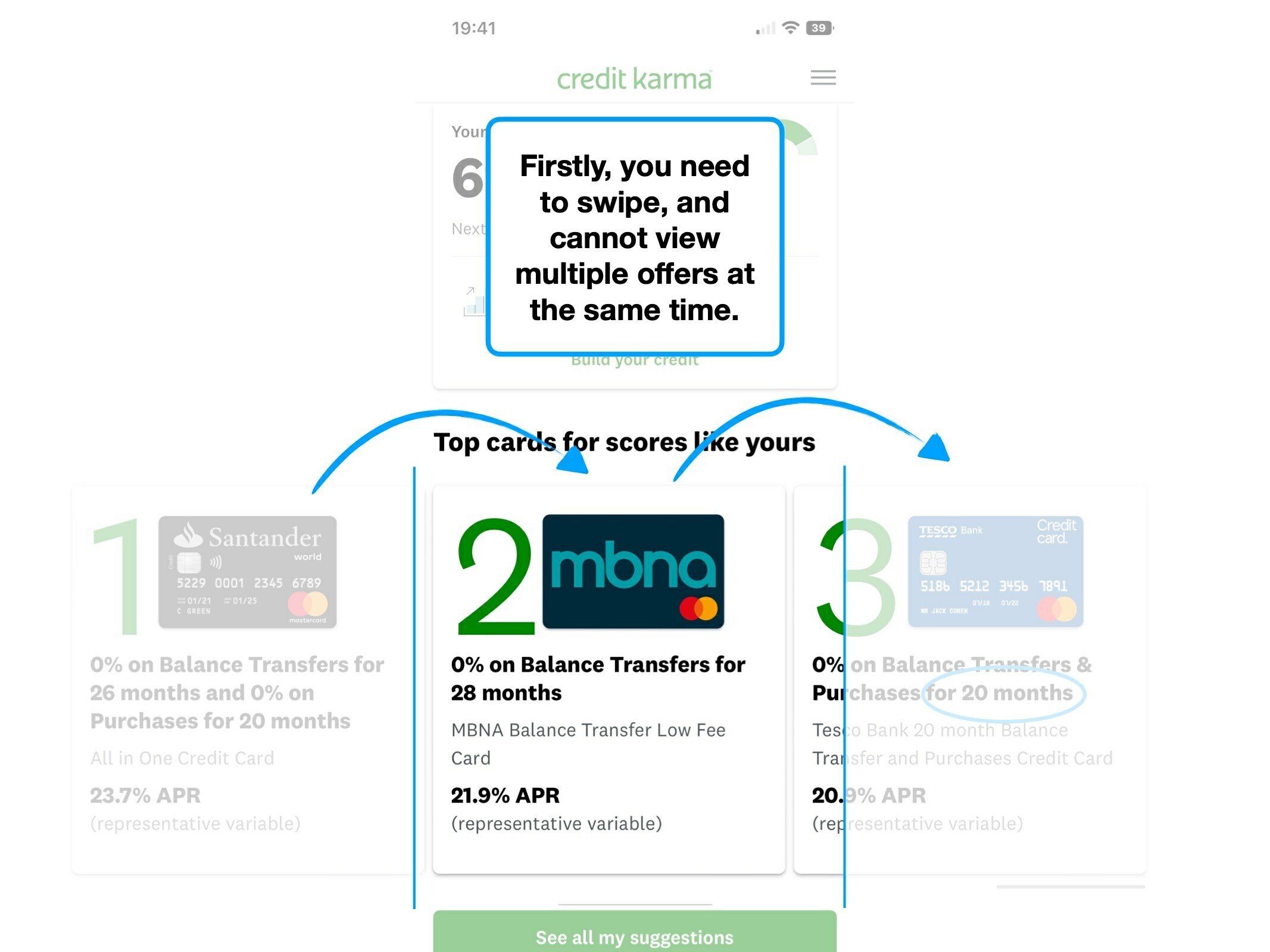
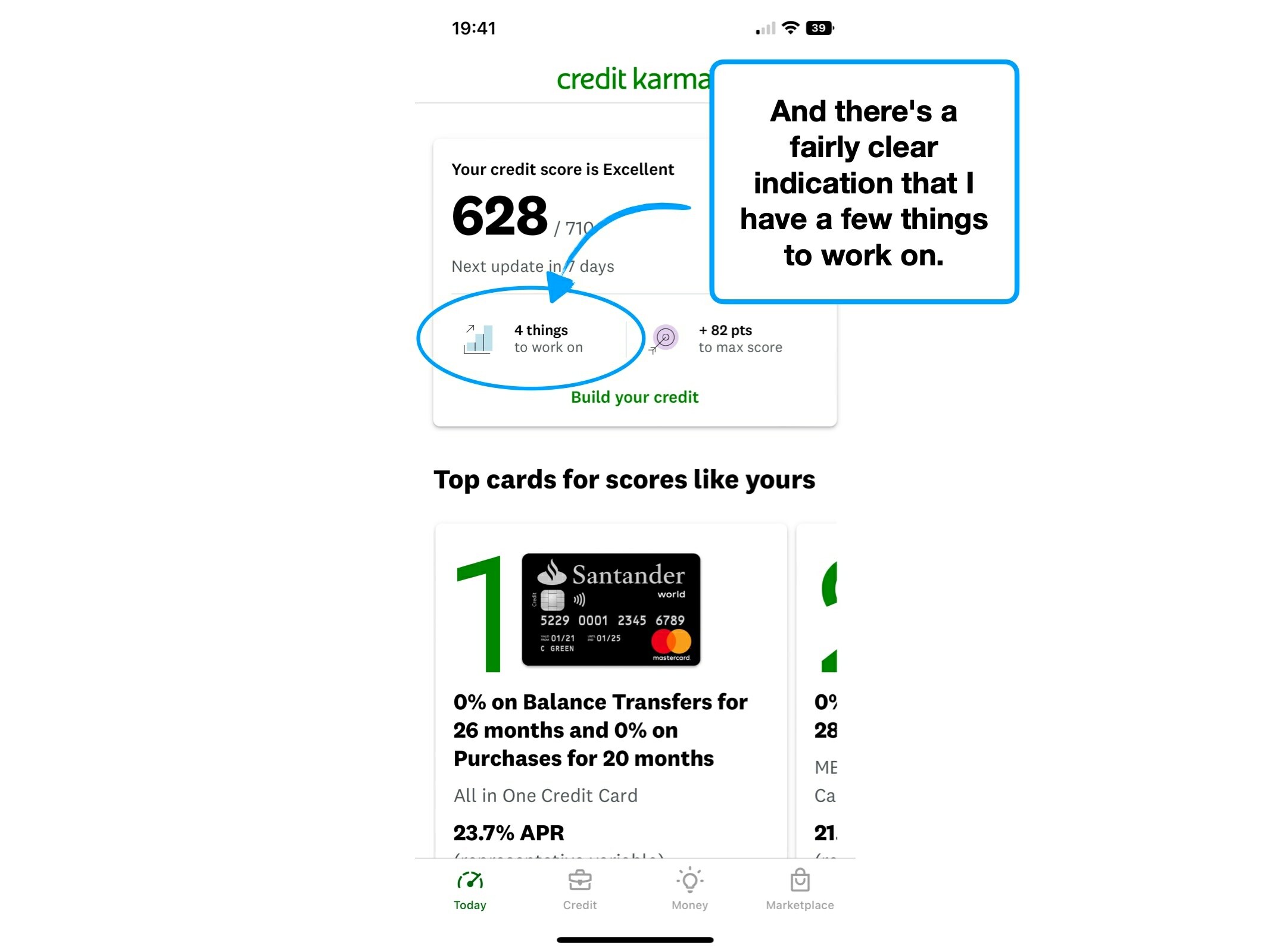
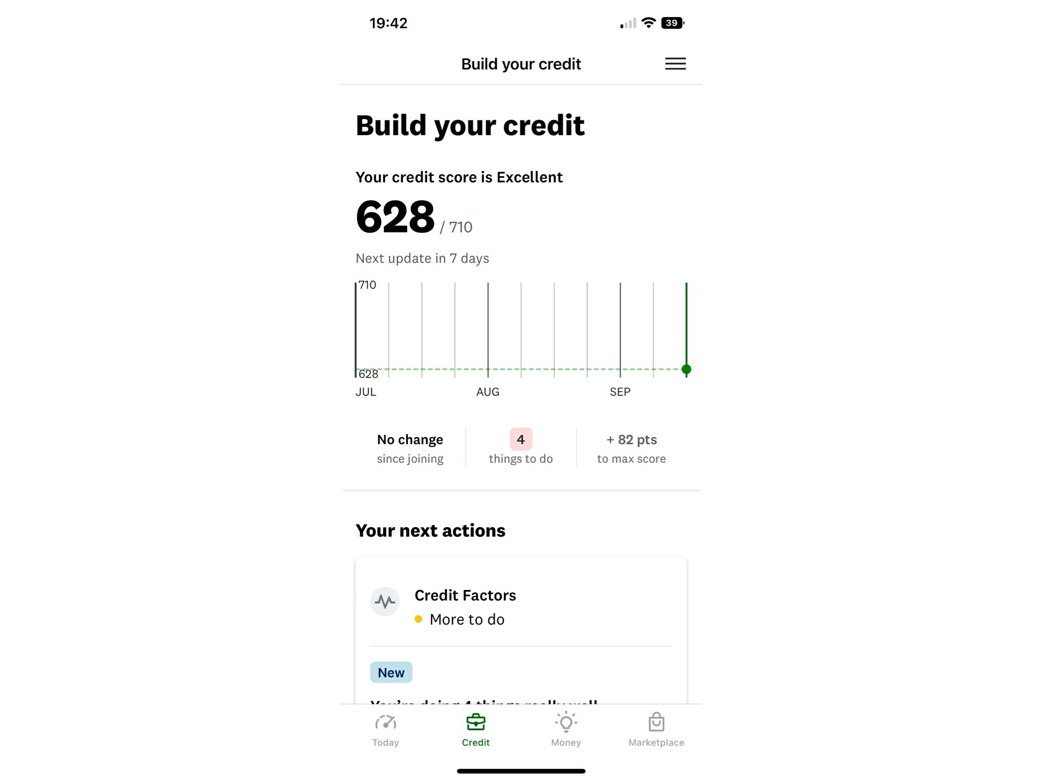
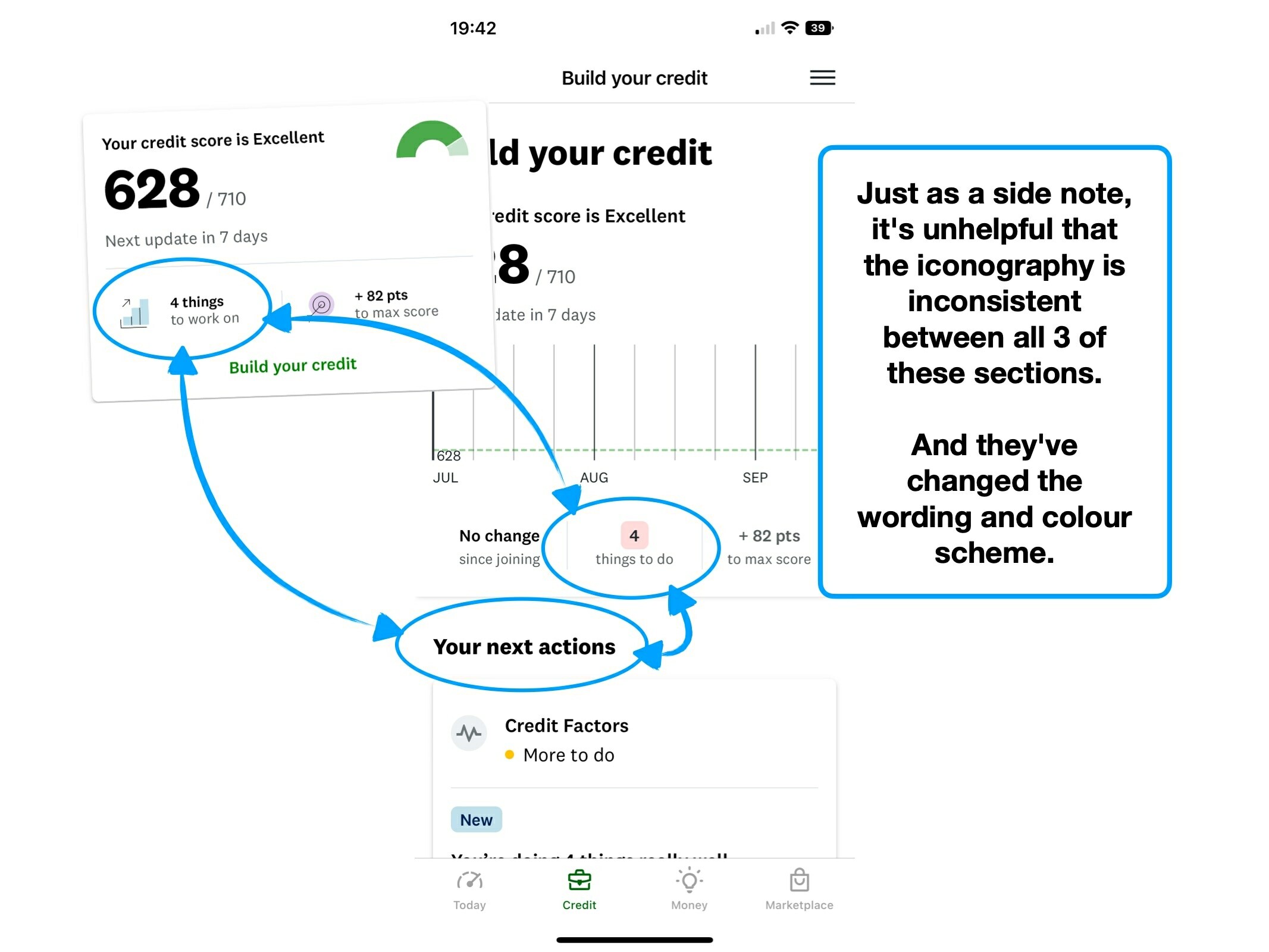
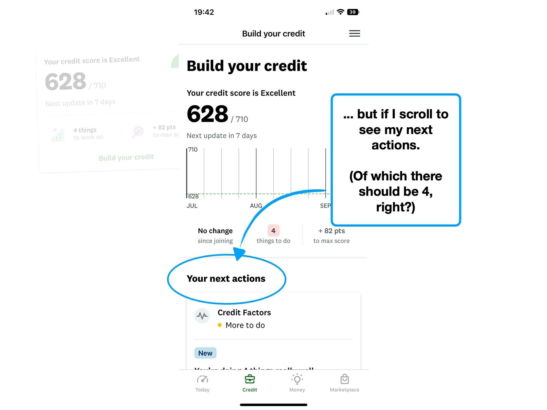
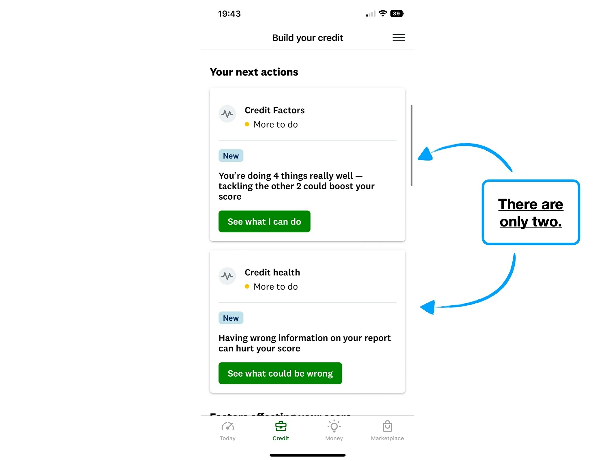
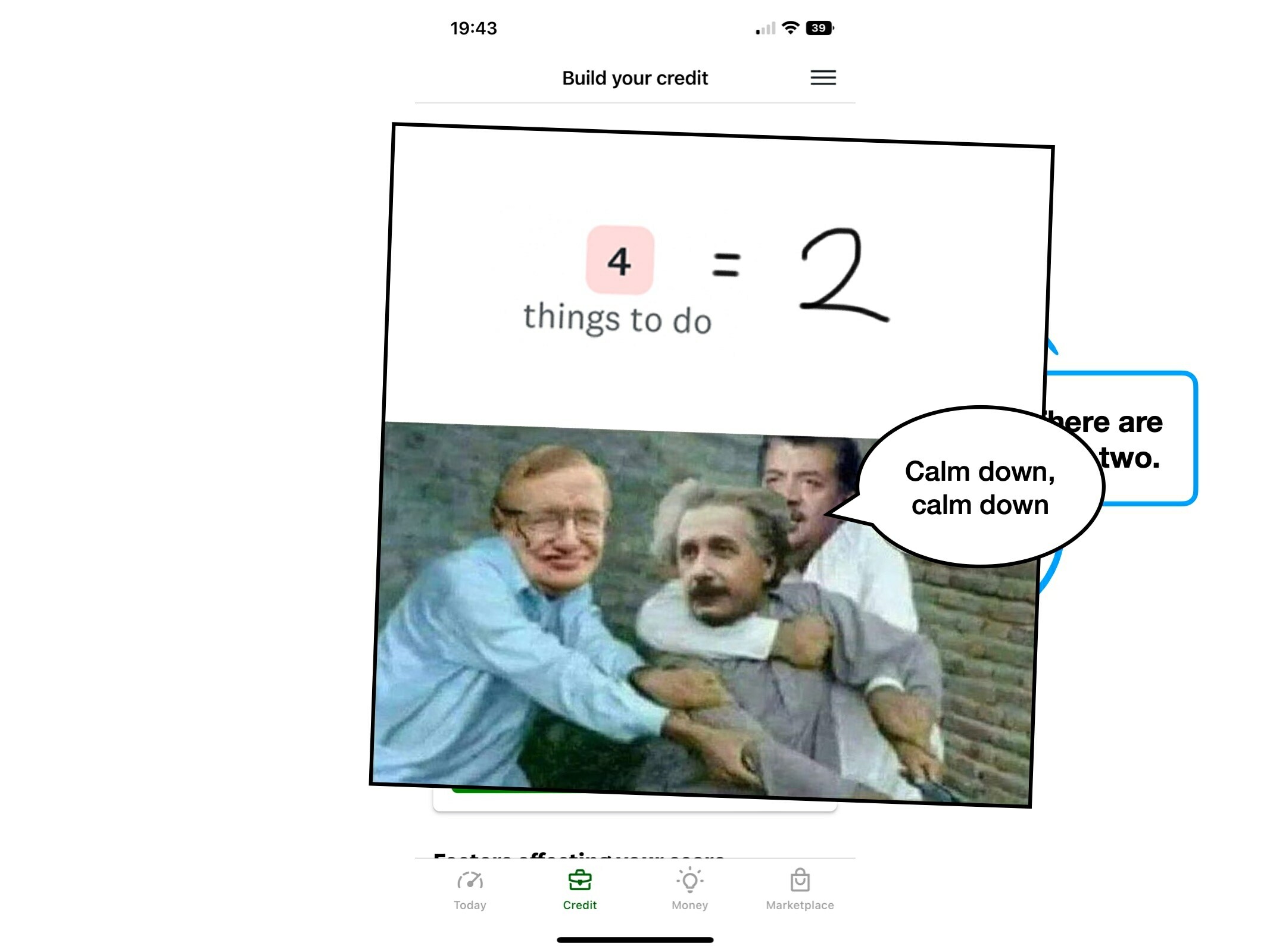
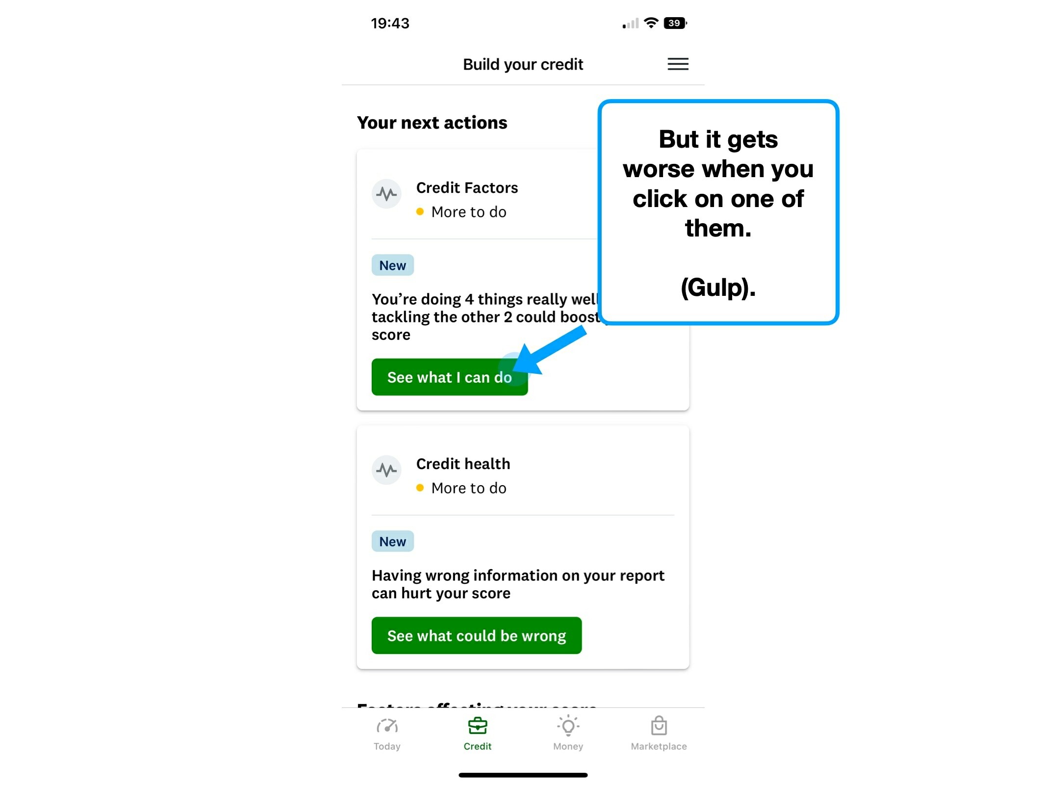
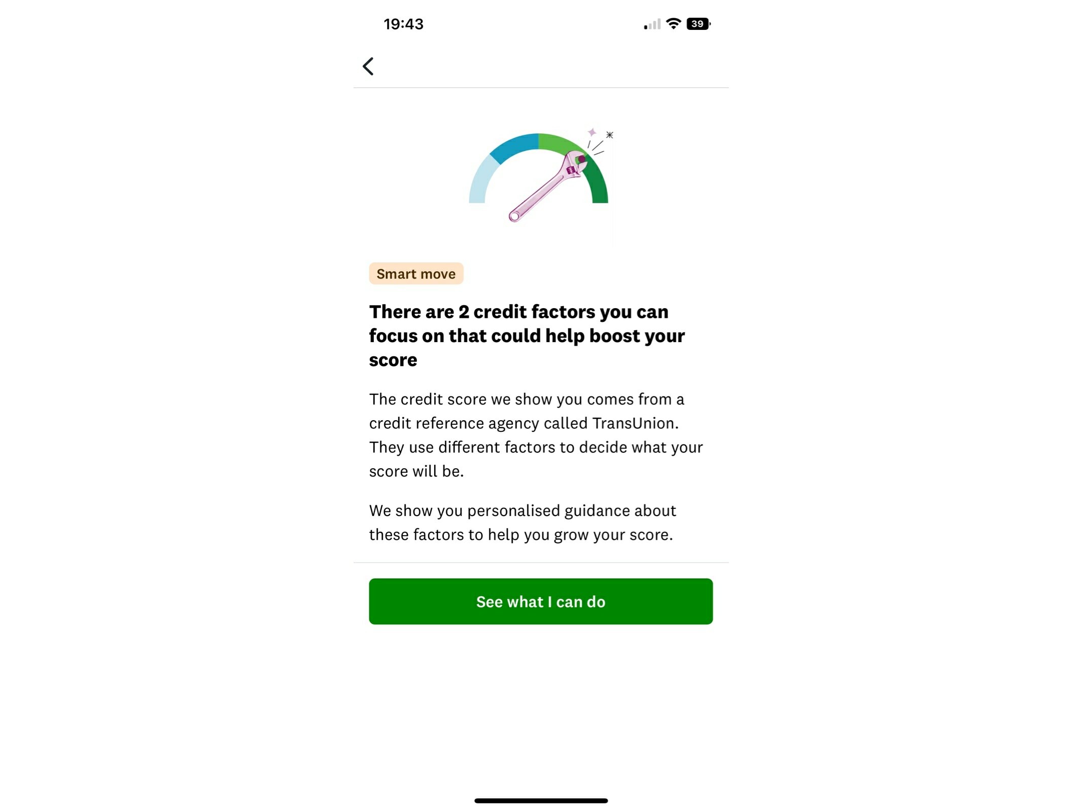
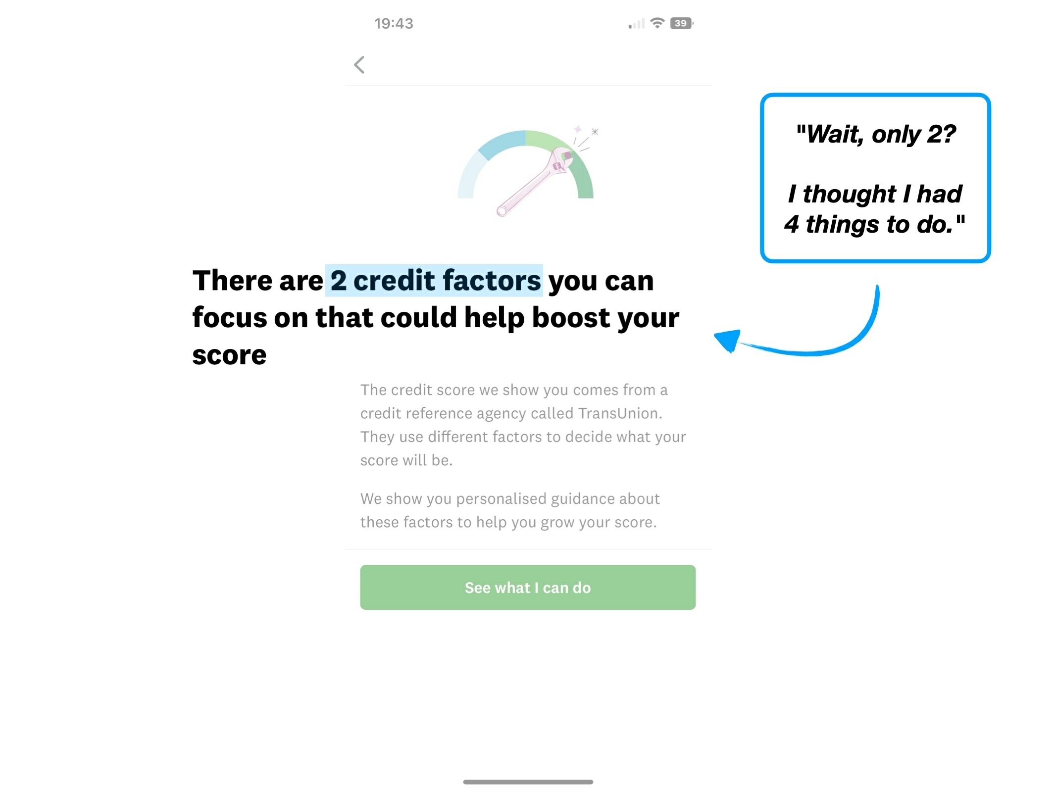
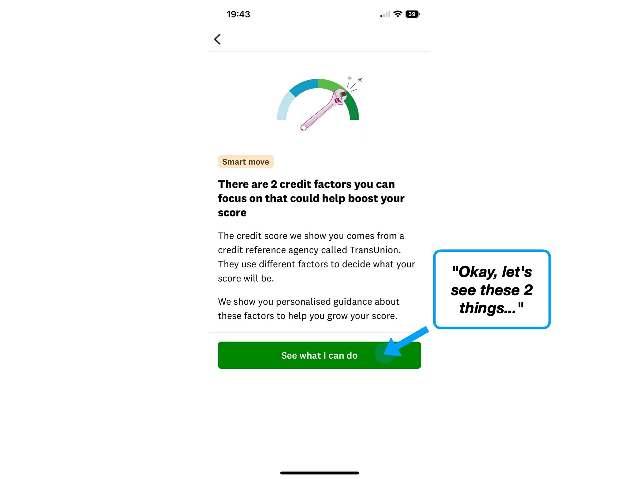
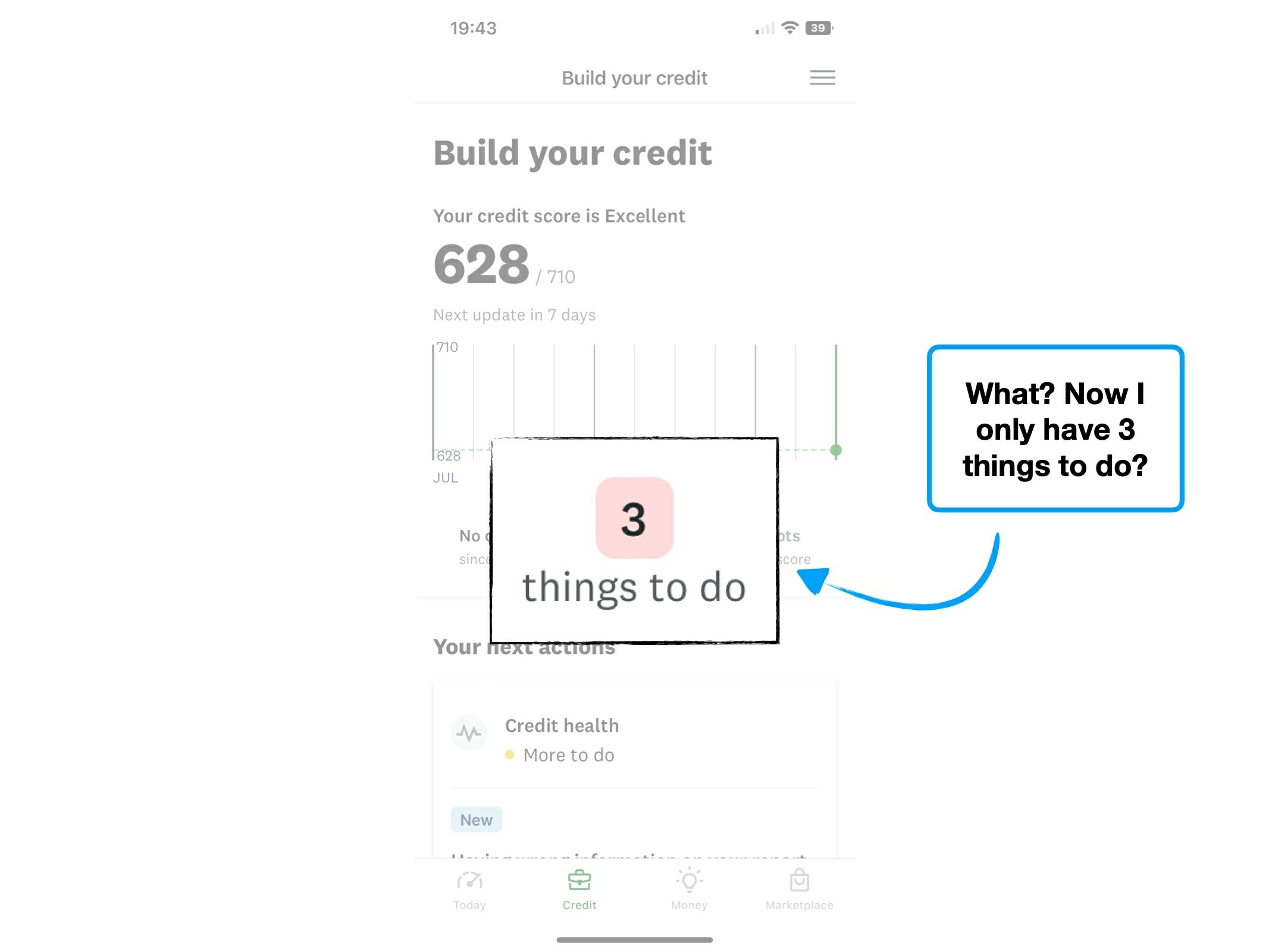
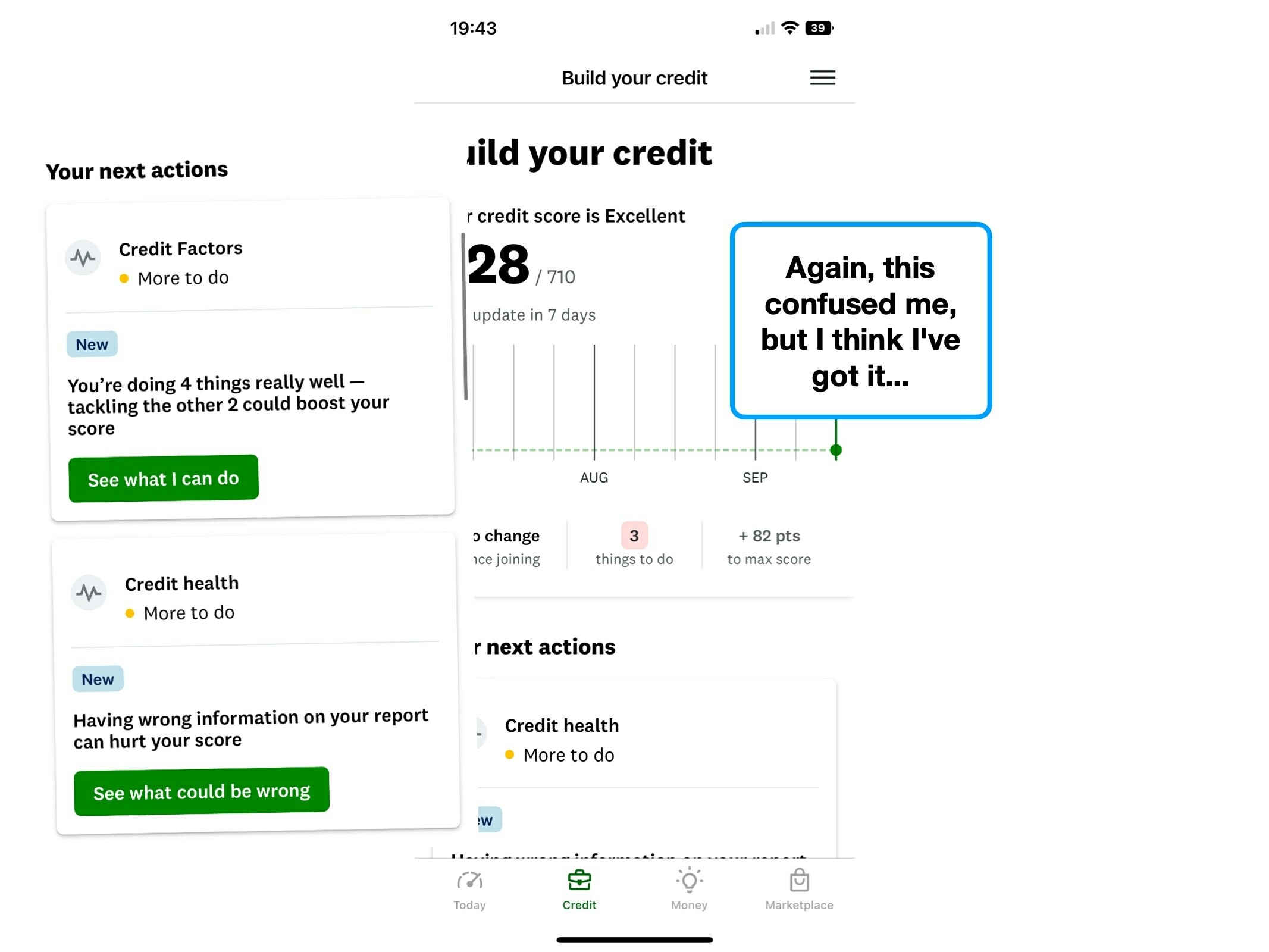
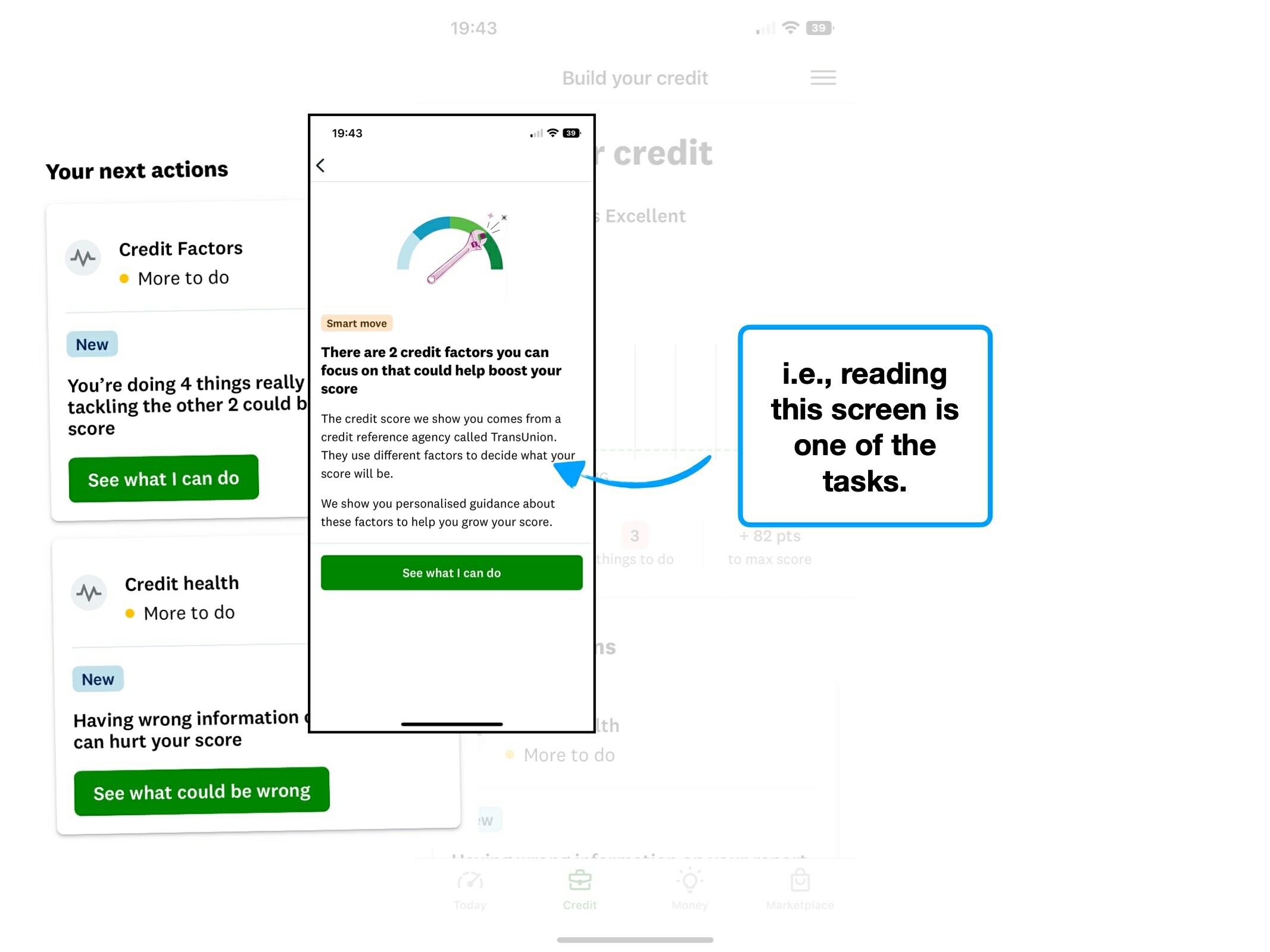
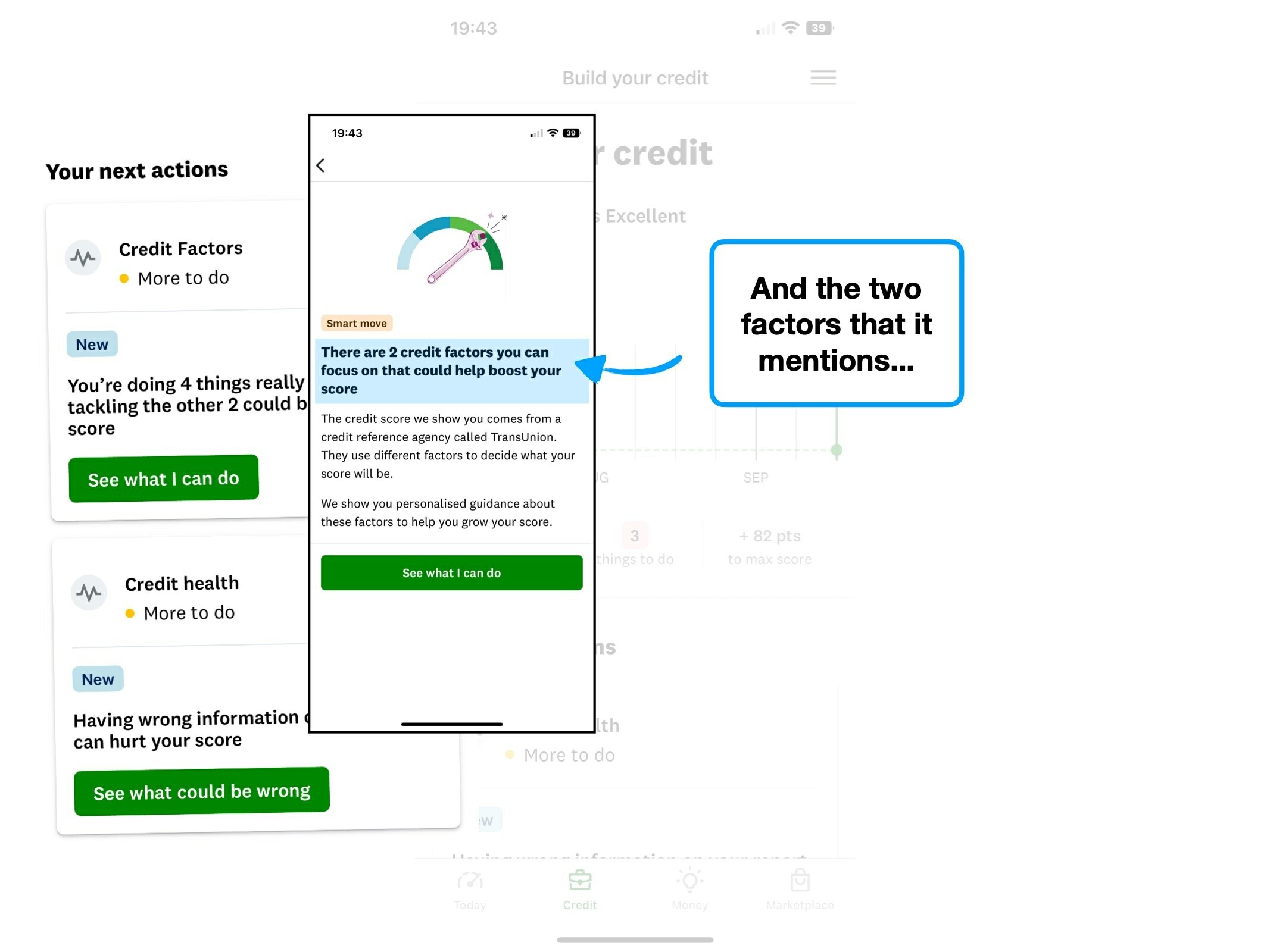
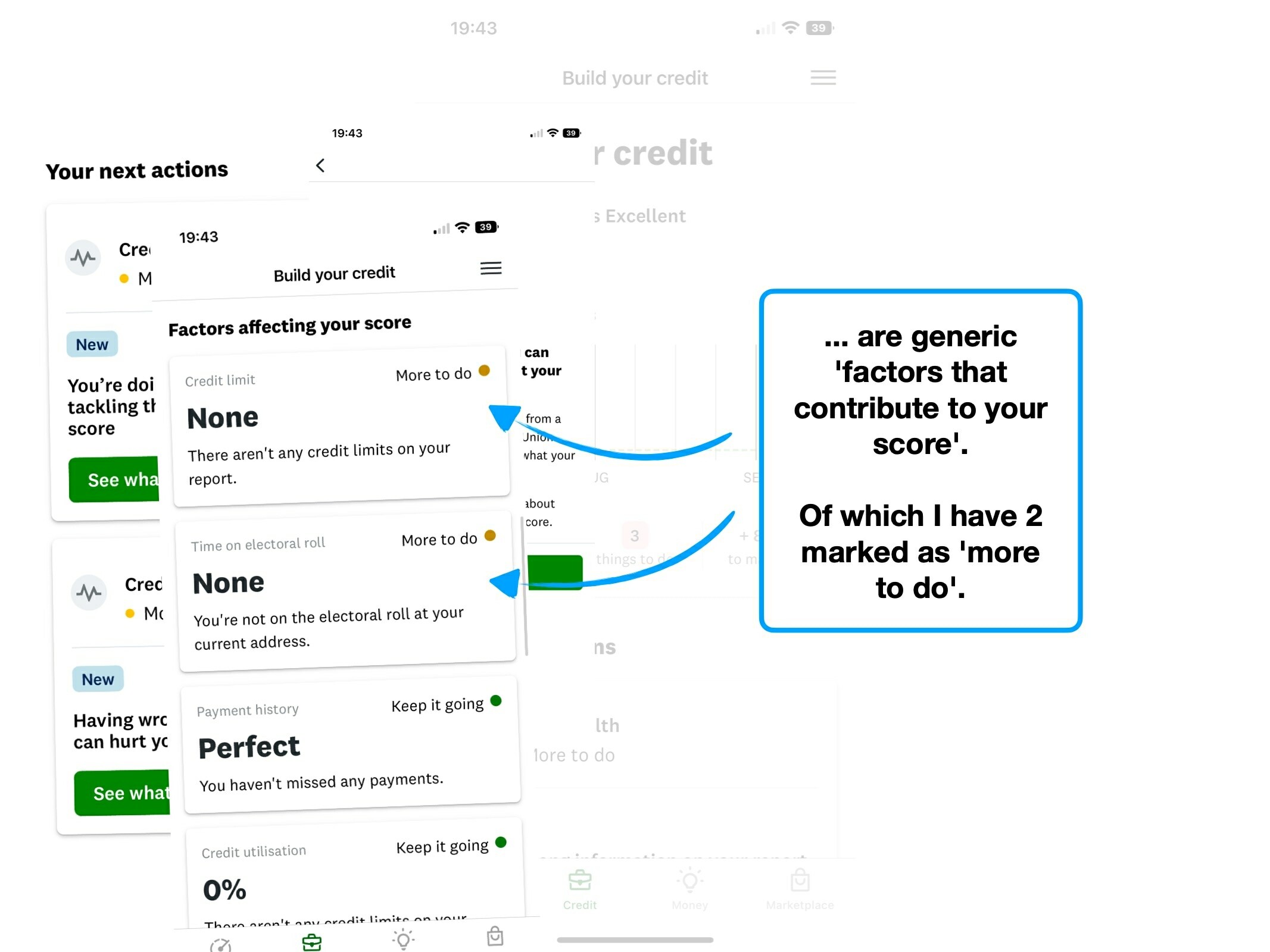
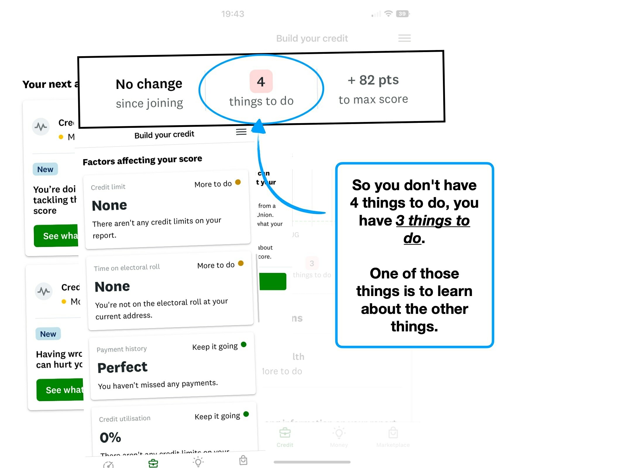
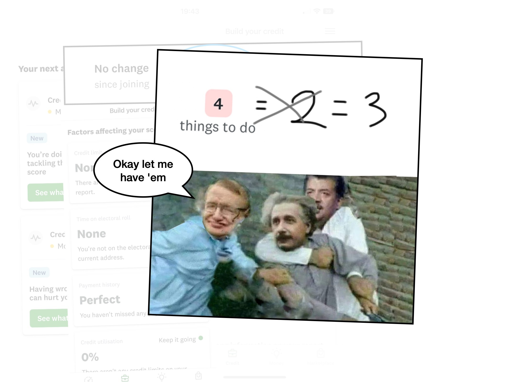
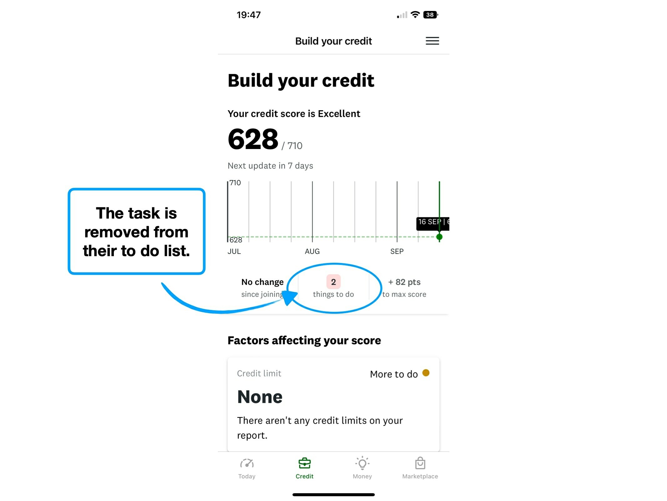
On Credit Karma, “4 things to do” is positioned as a to do list.

But it’s perhaps too crude to bucket everything together, because there are actually two distinct types of action available:
☕️
Completable task
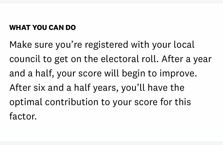
A specific action that you complete once, like registering on the Electoral Roll.
🧠
Habitual change
An ongoing change of behaviour, such as paying your credit balance on time.
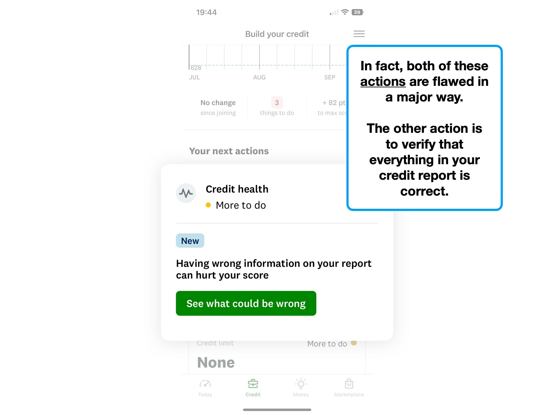
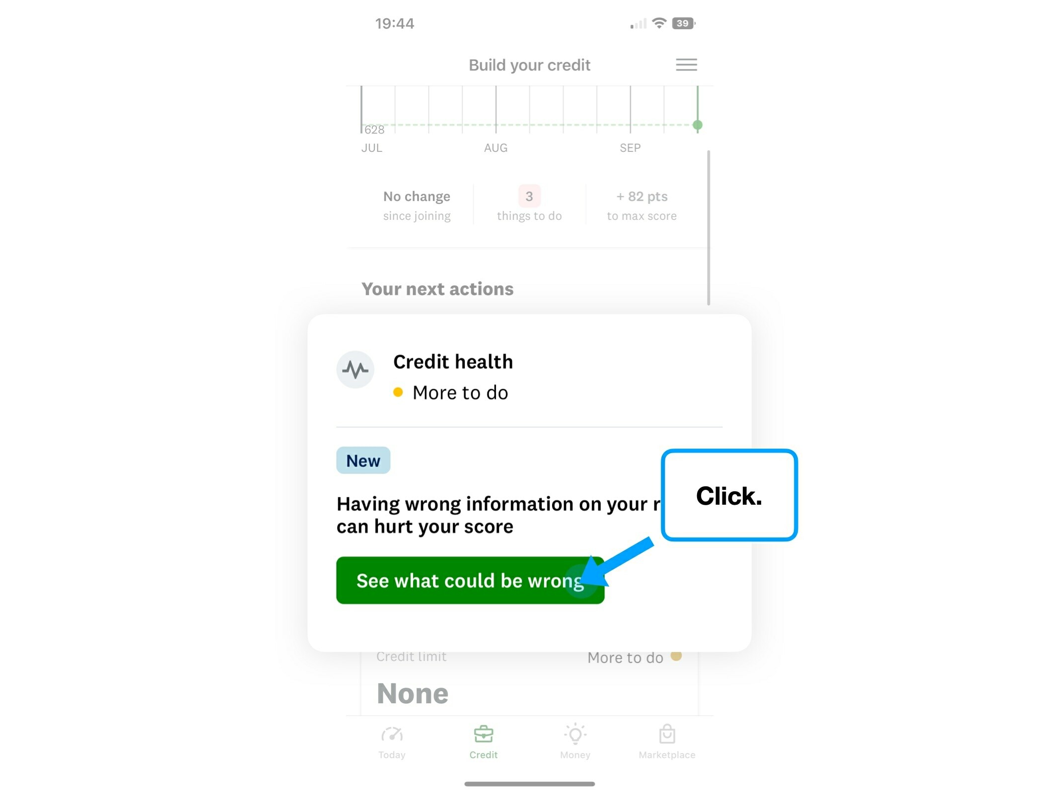
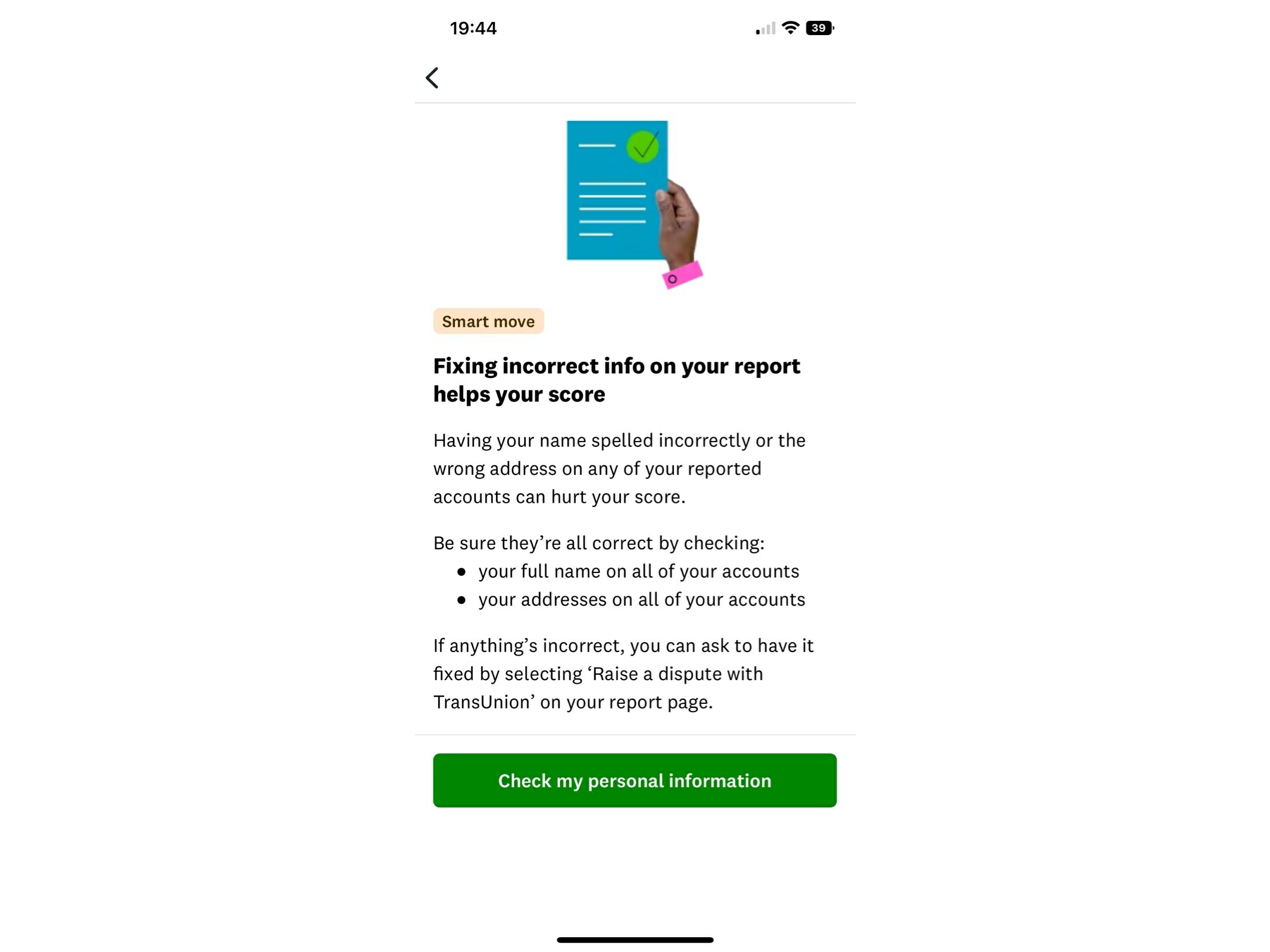
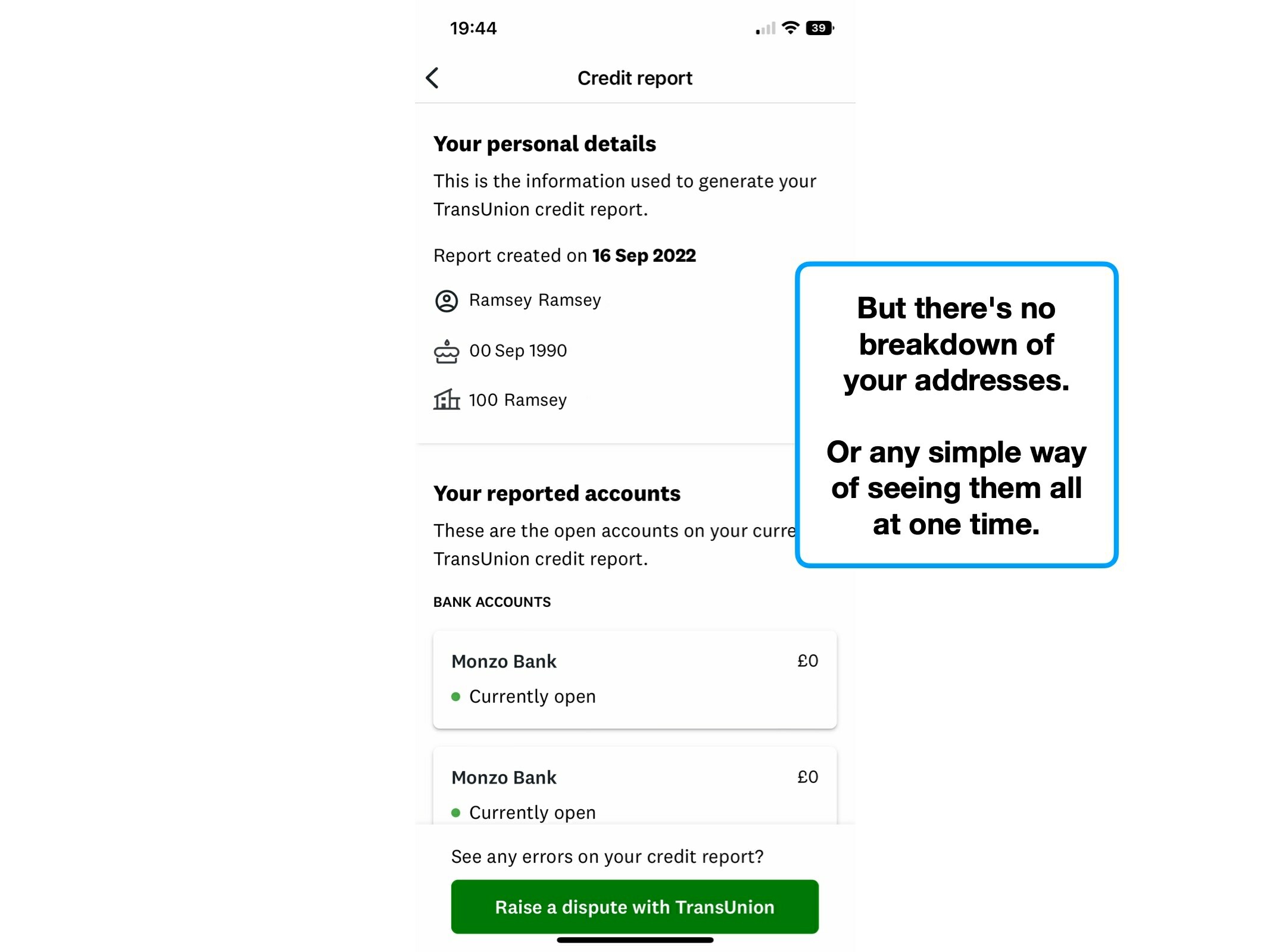
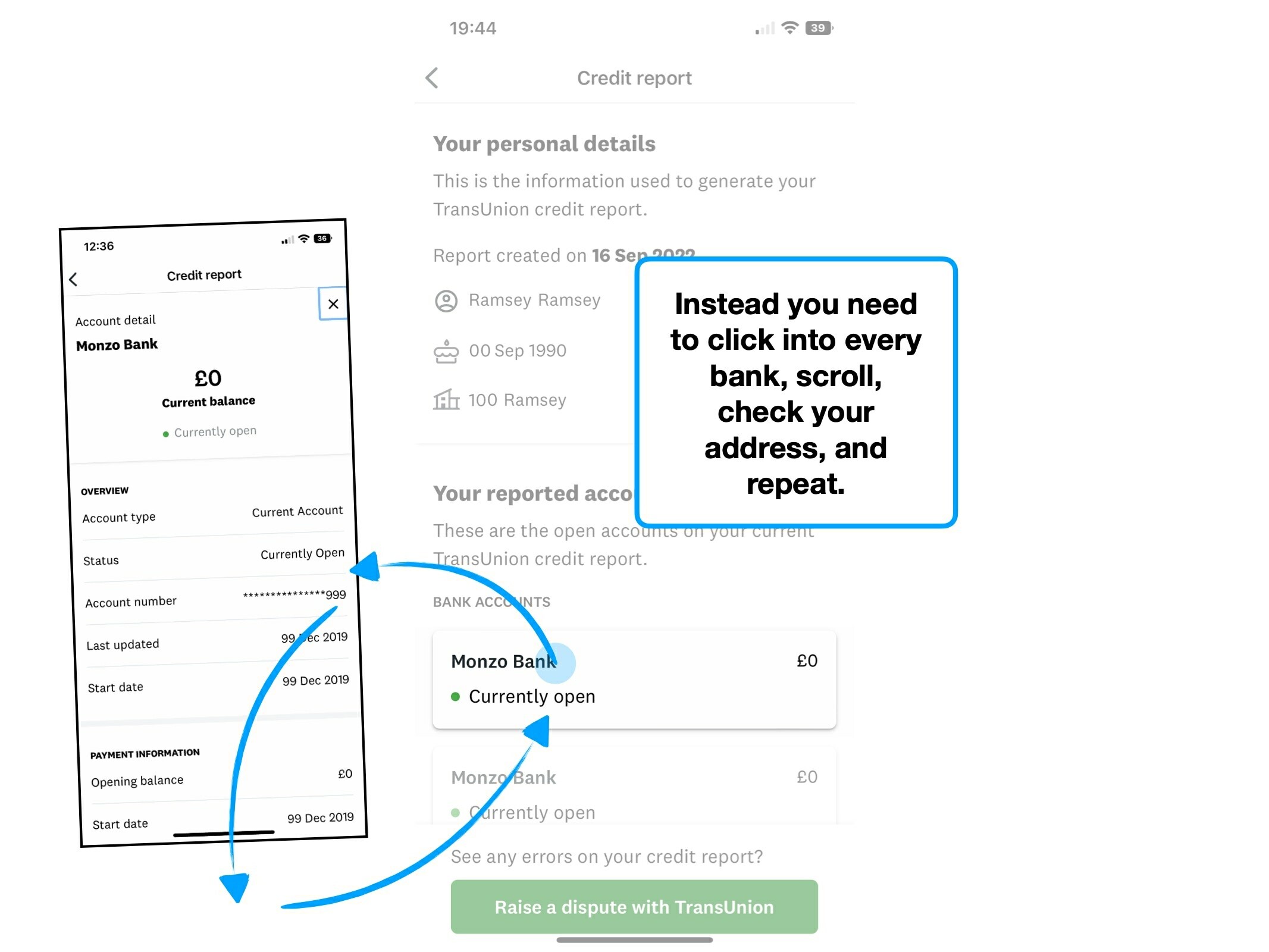
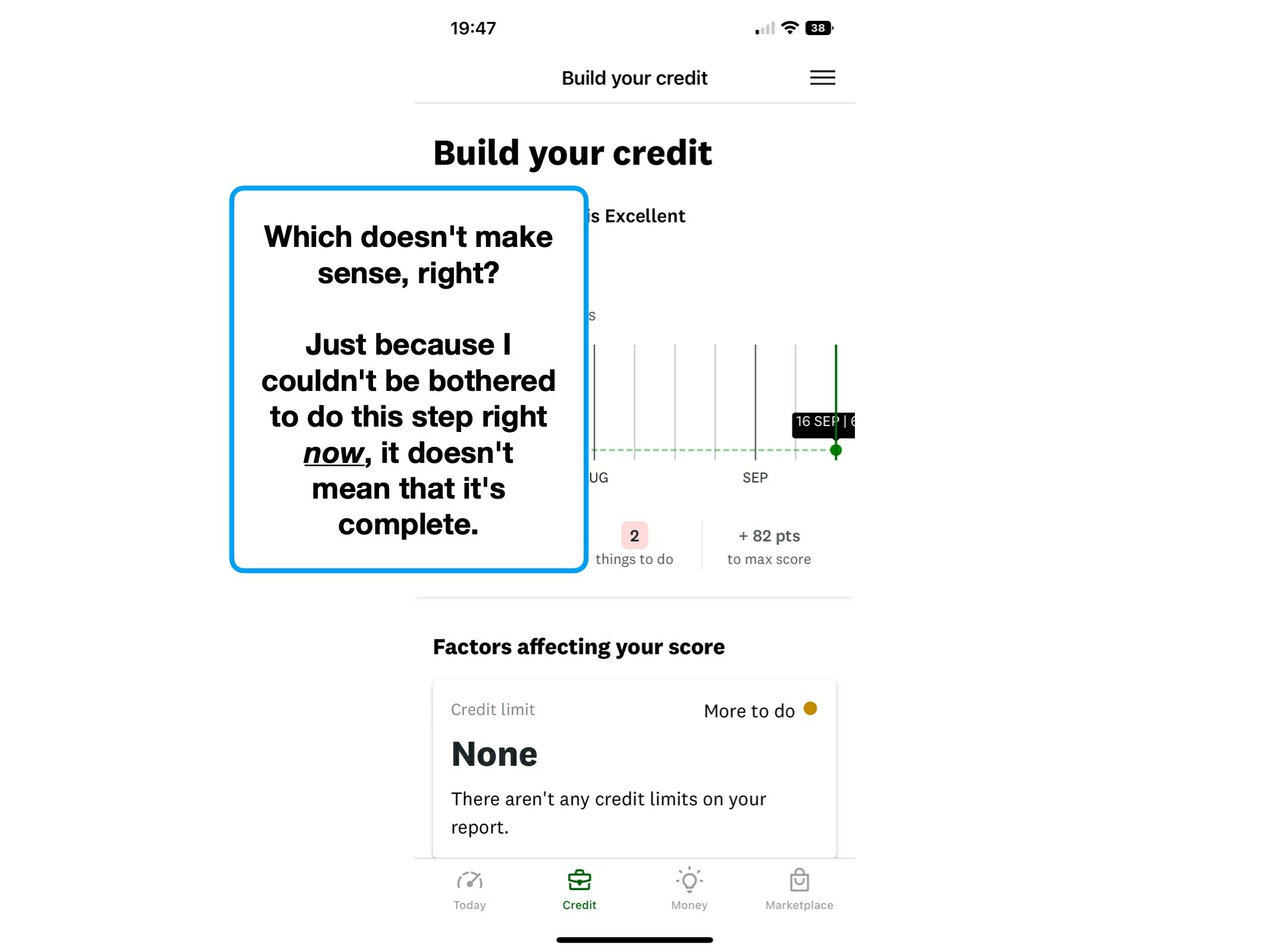
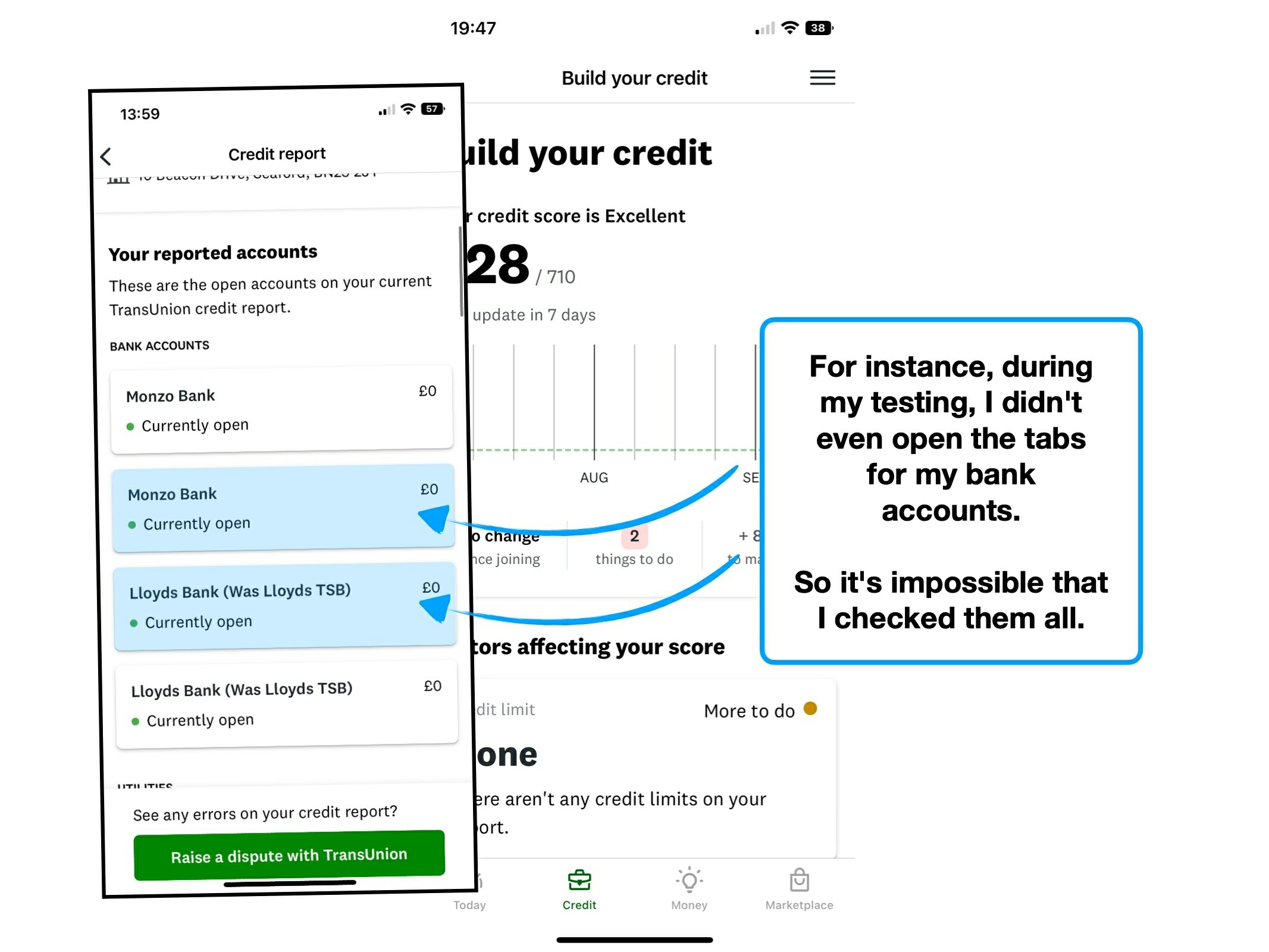
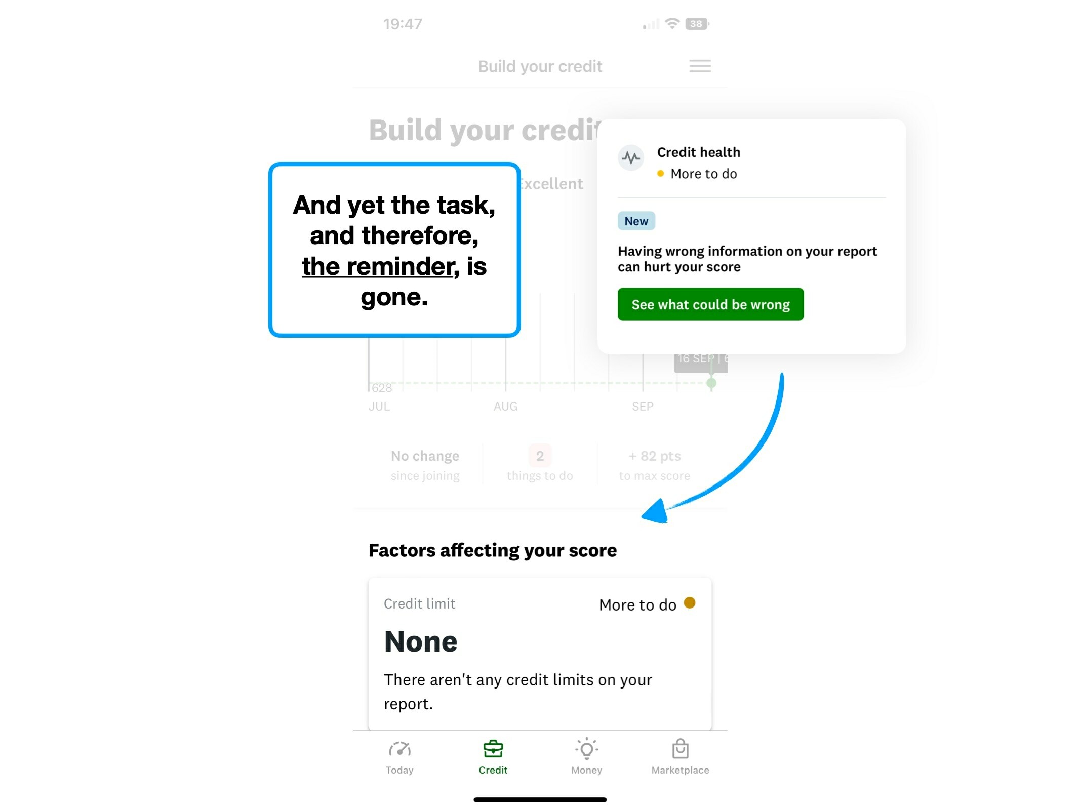
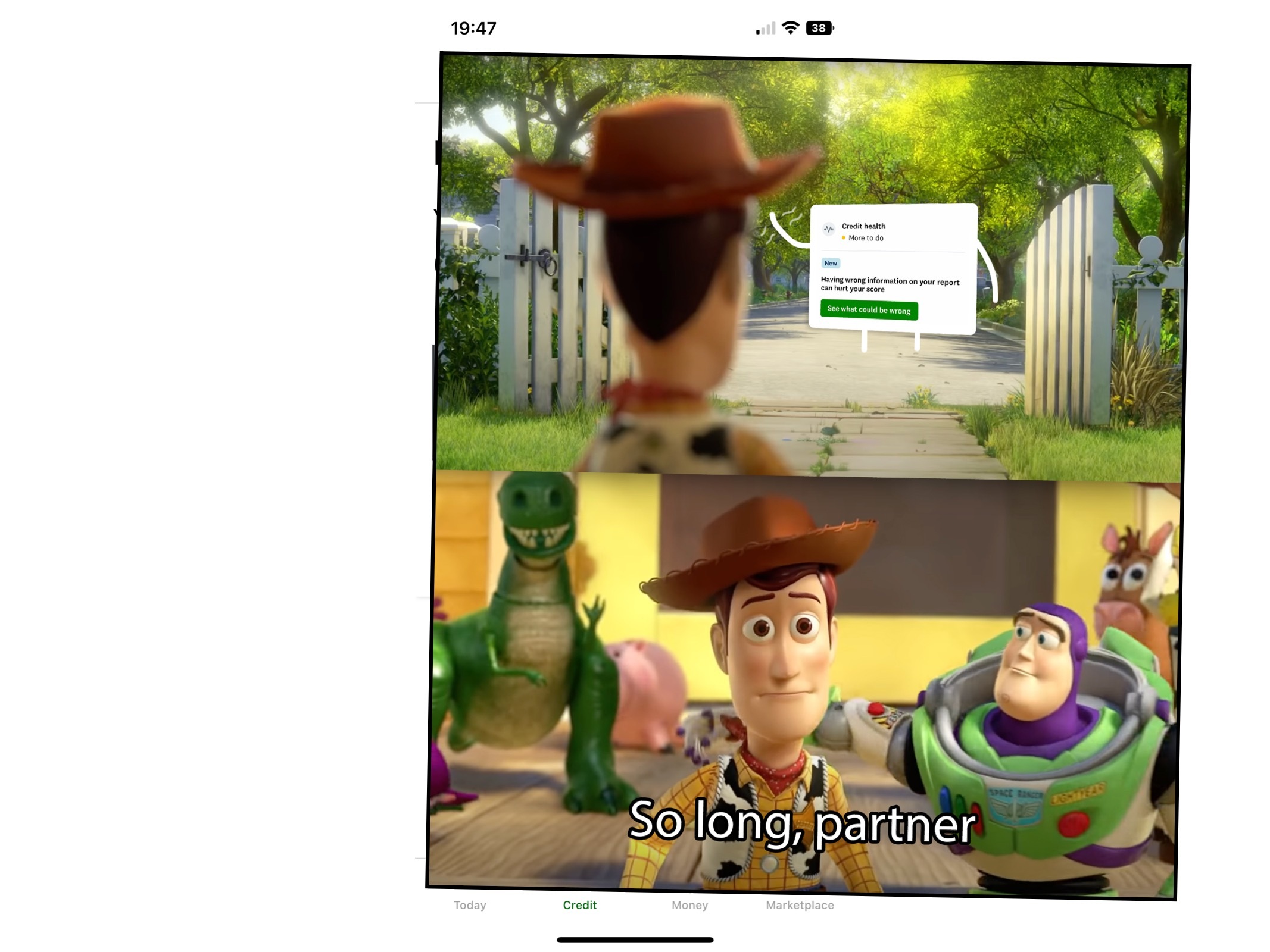
Not only does this make it difficult for someone to ever feel like they’ve truly completed their to do list, but it trips over itself when the tasks disappear.
e.g., when the “check your addresses are correct” task disappeared, without me even opening all of the tabs that'd be required to complete the task.
If it were up to me, I’d separate these into more distinct buckets:
- 2 things to do today.
- 2 new financial habits to adopt.
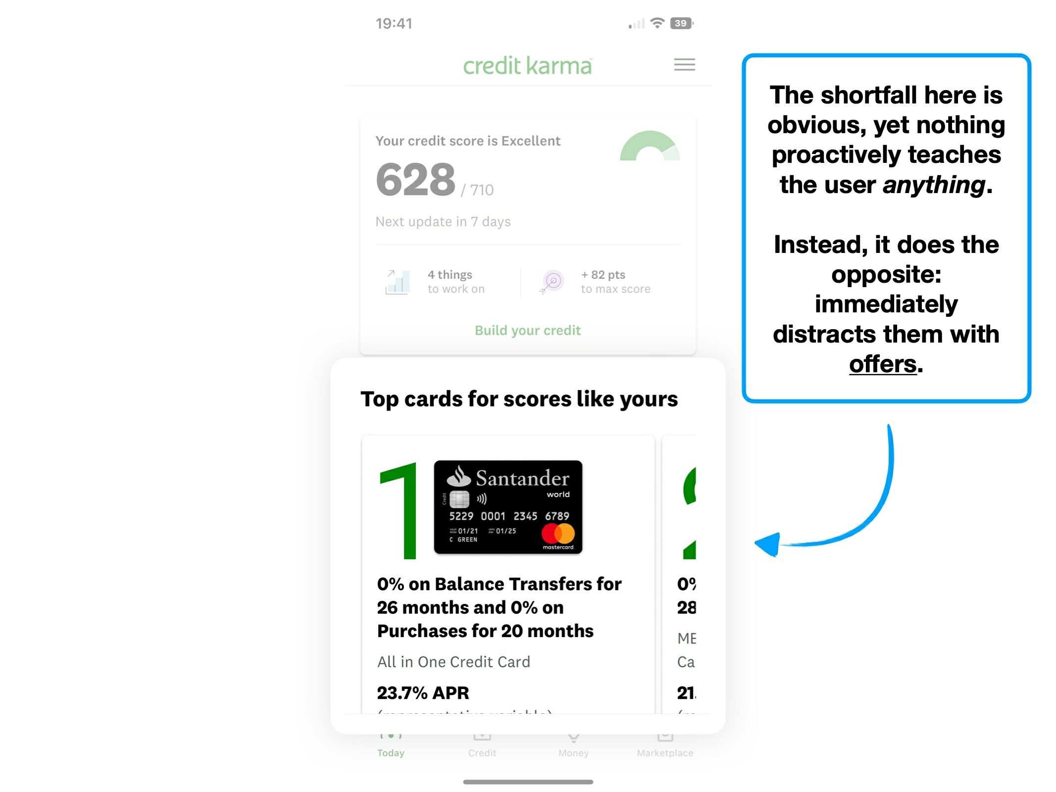
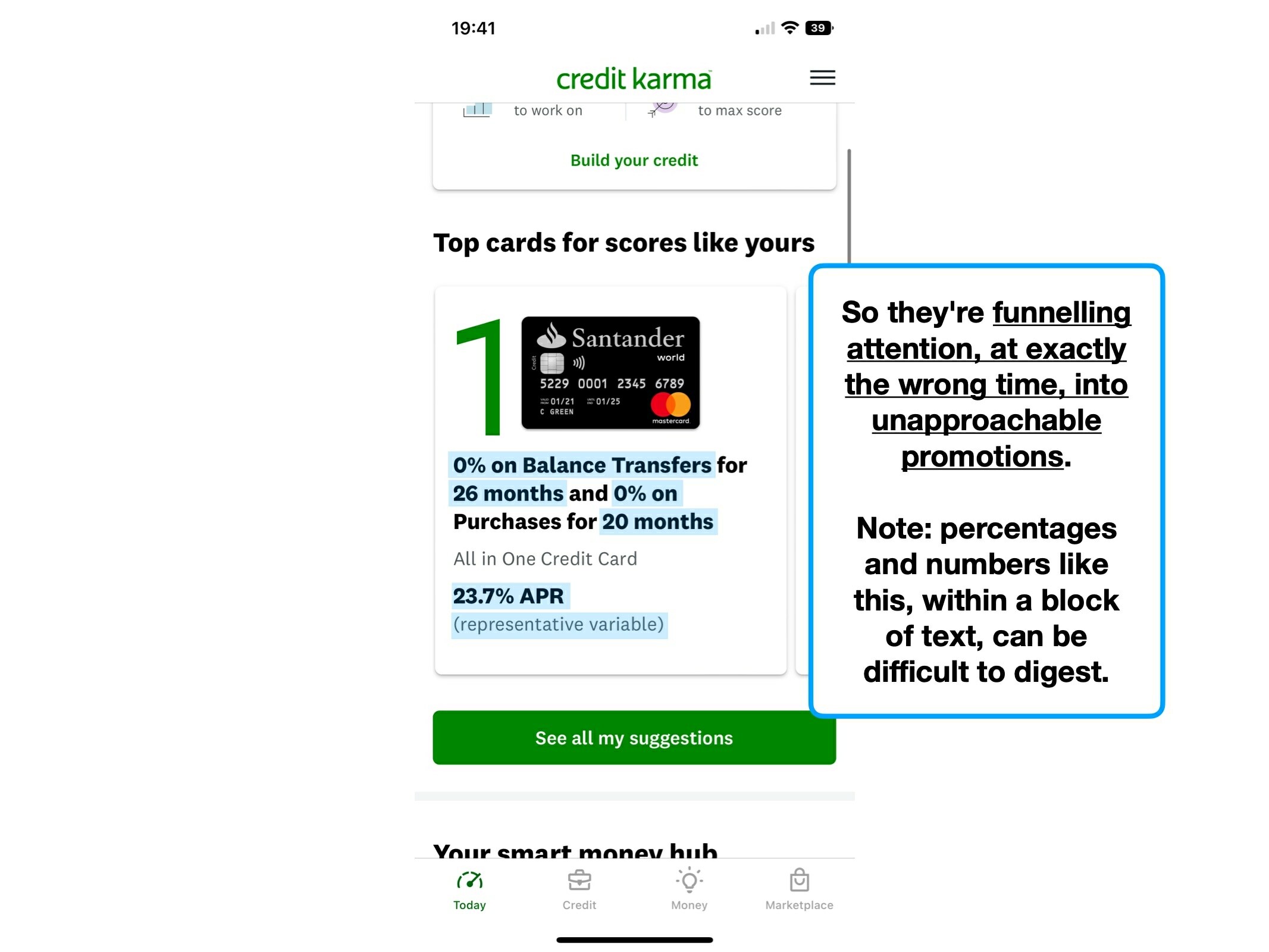
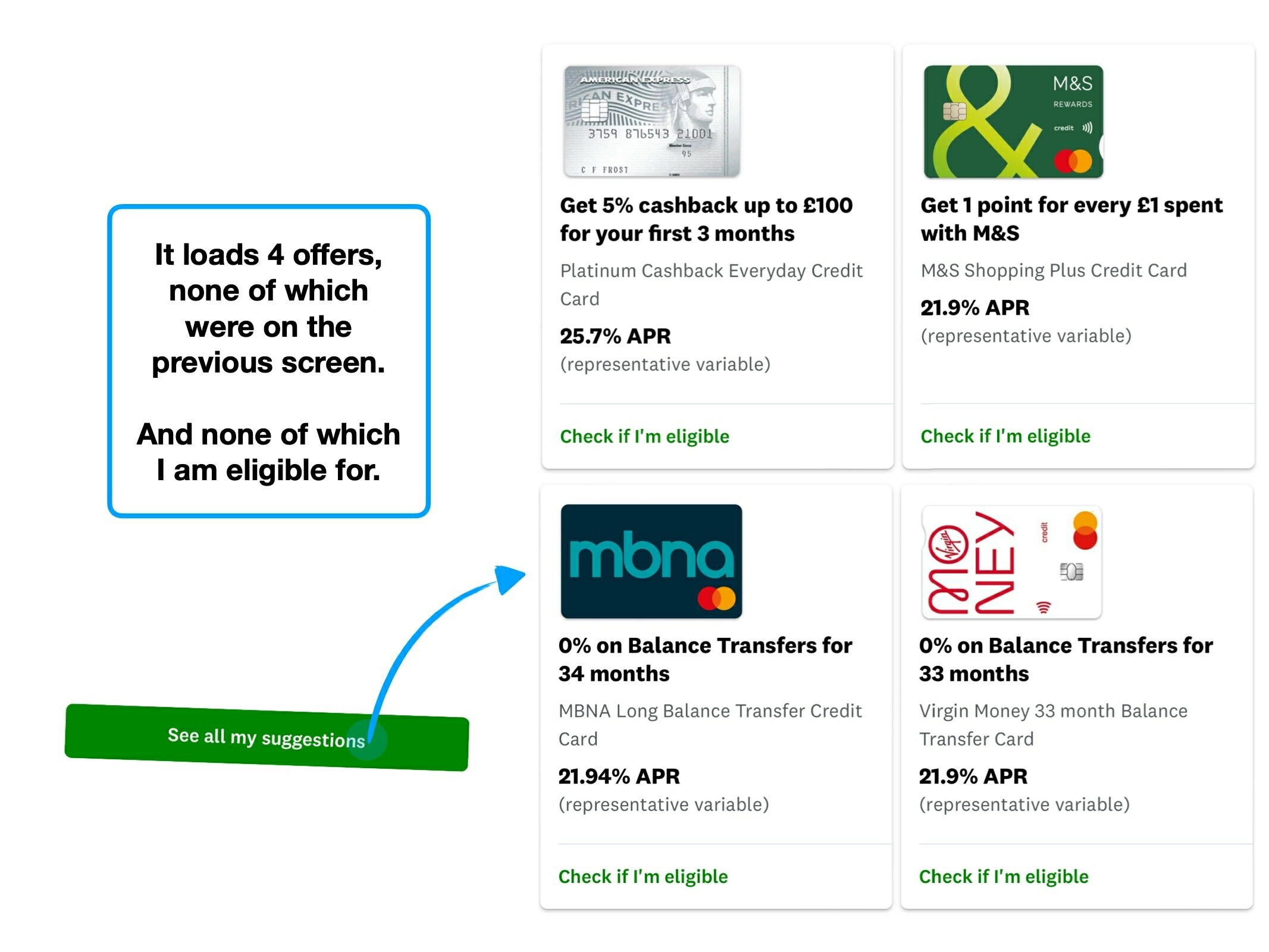
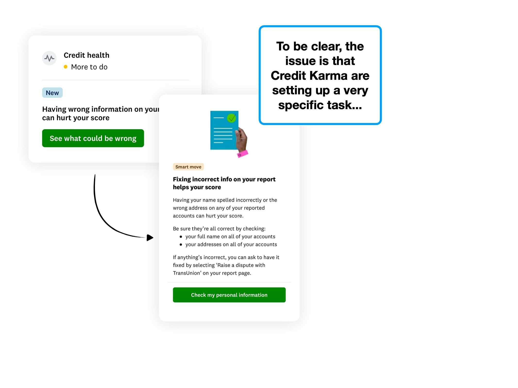
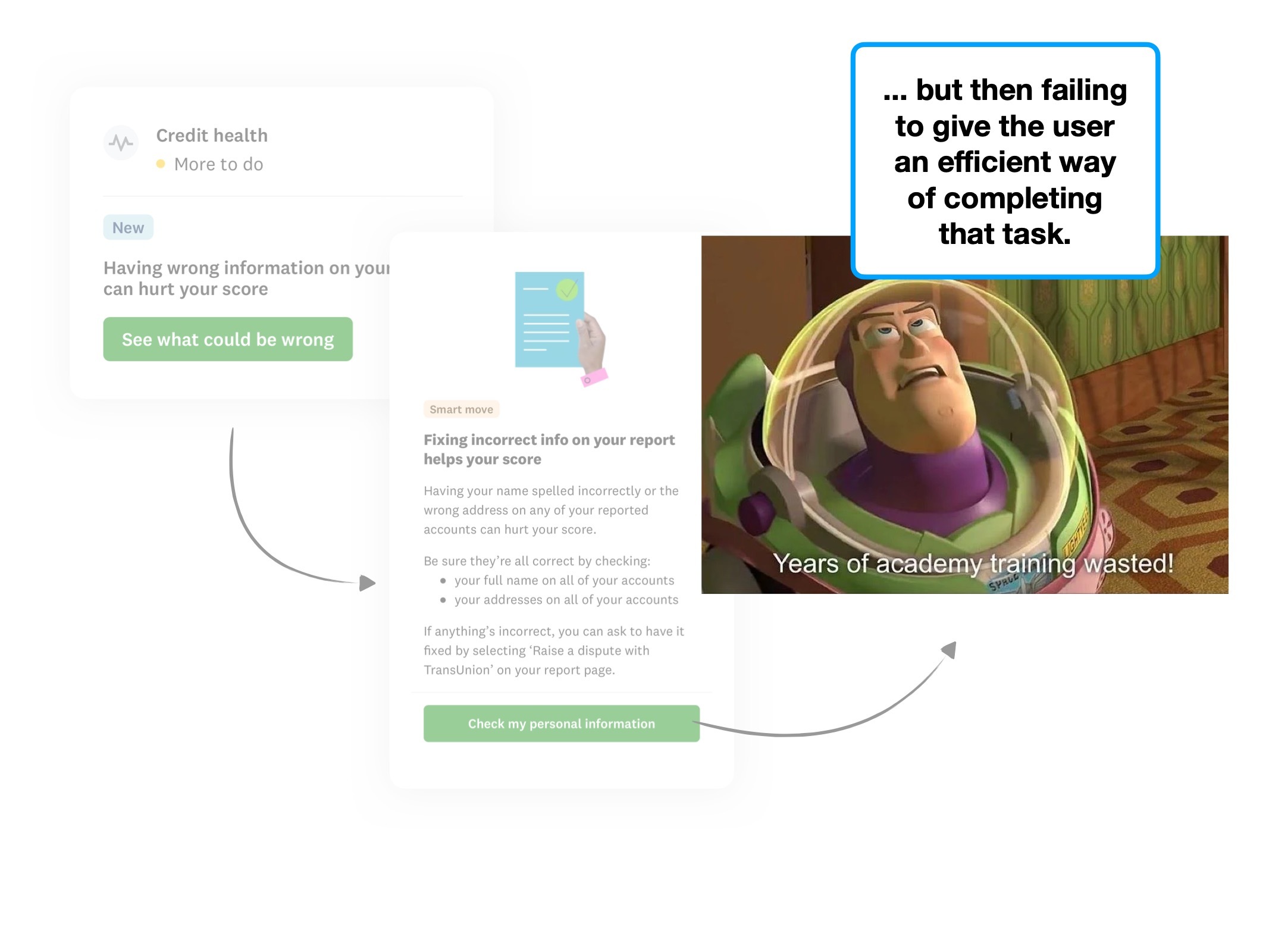
3. Not just a CTA
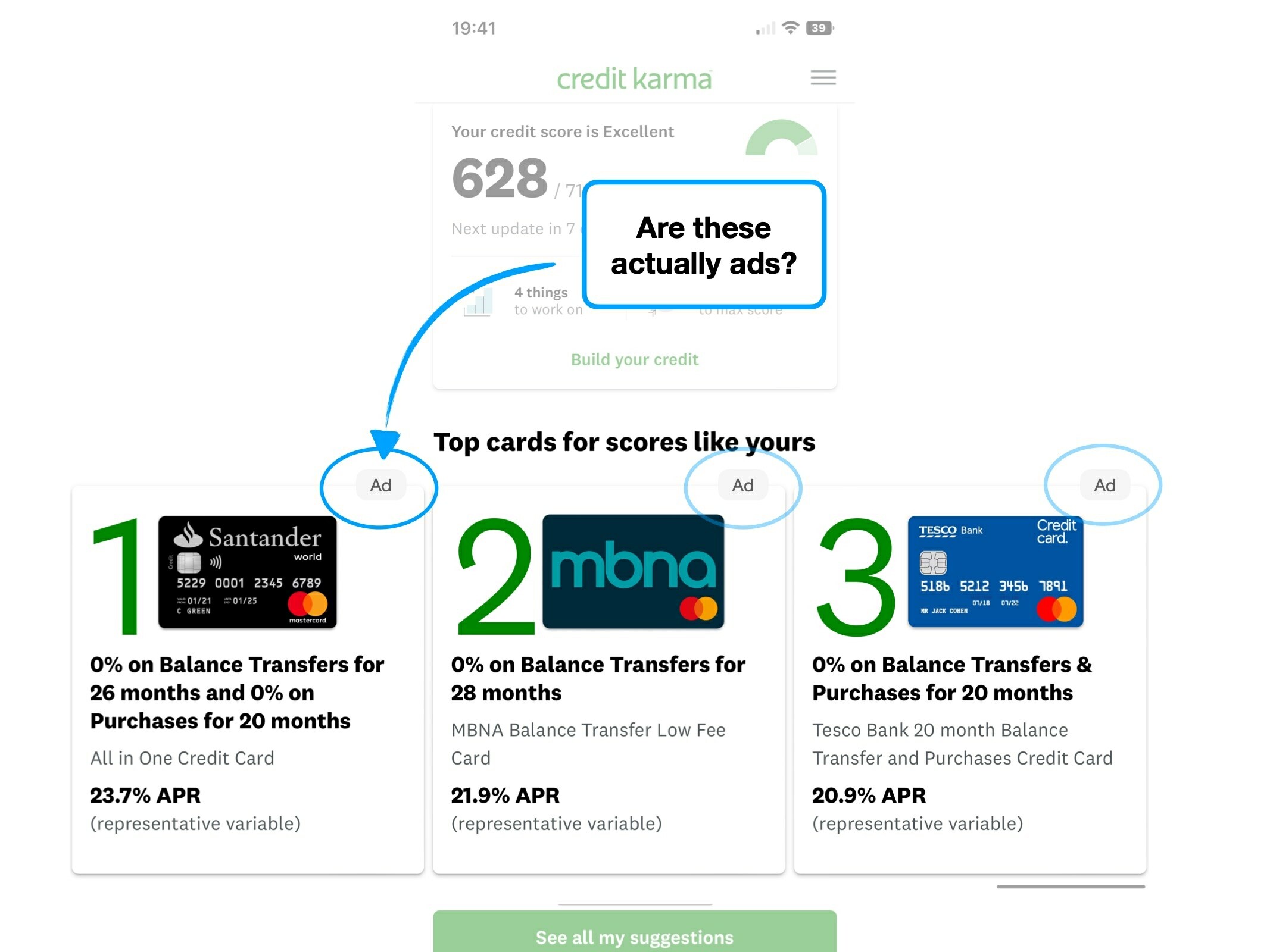
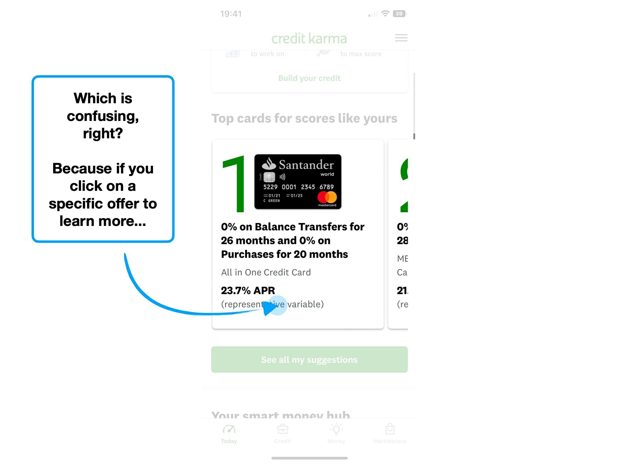
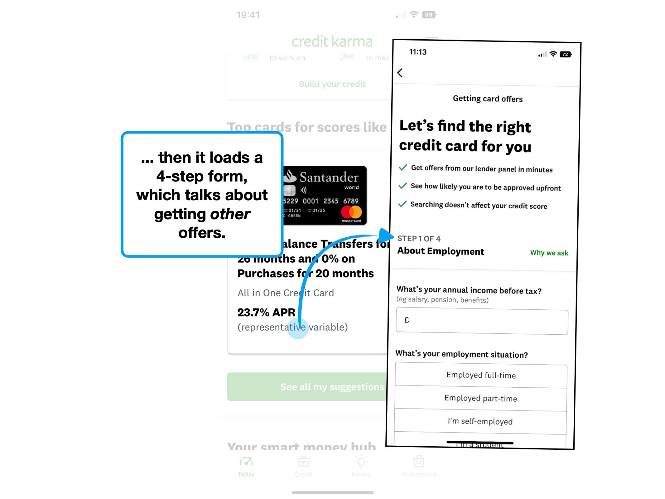
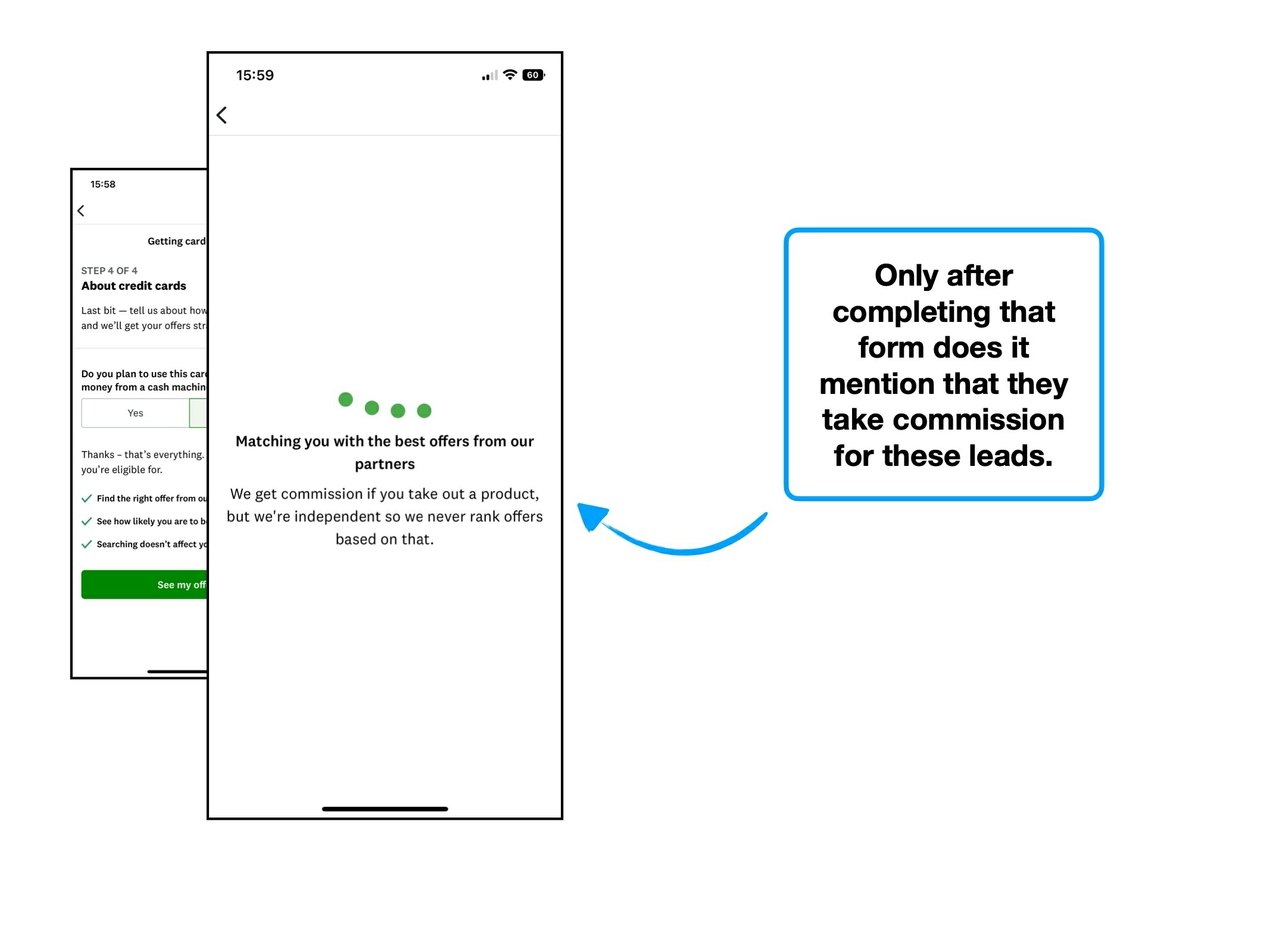
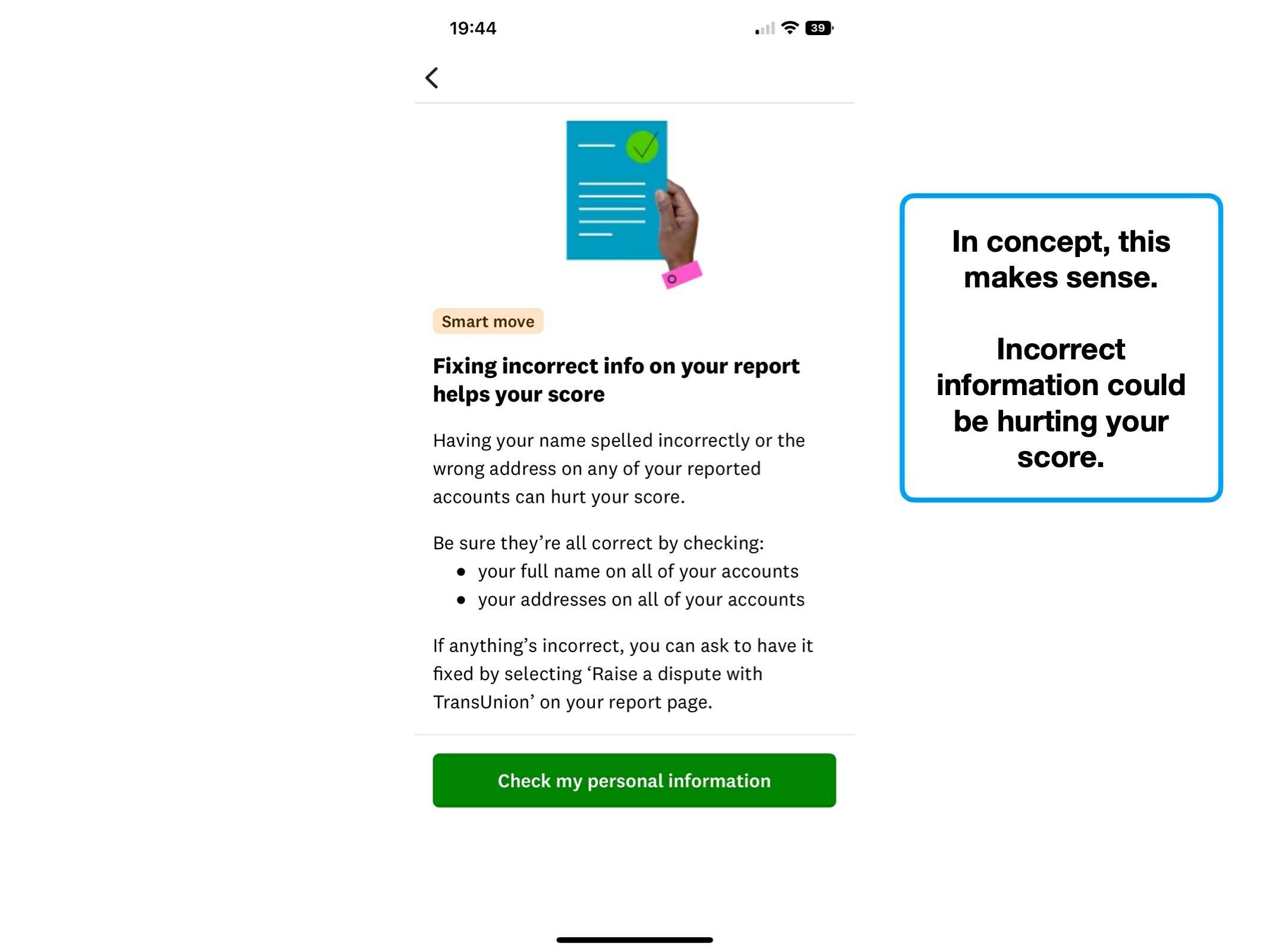
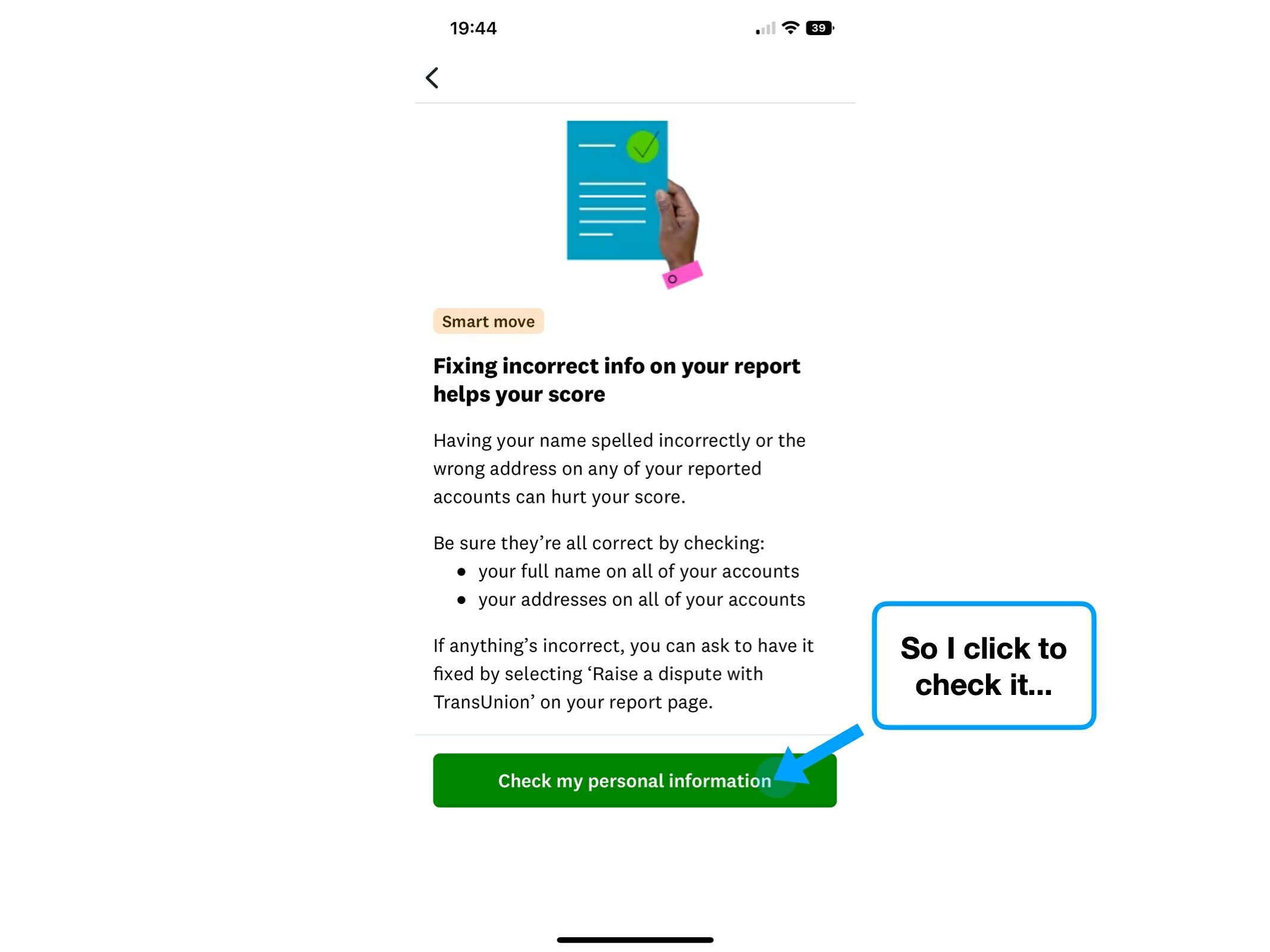
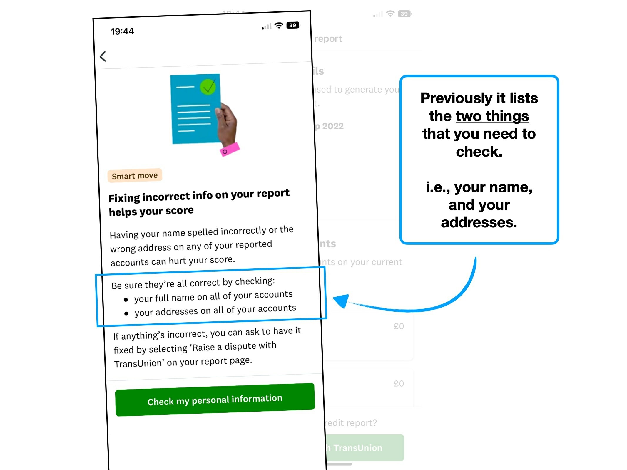
Credit Karma highlights registering on the electoral roll as a 'high impact' task. And, it's relatively easy in the UK—you can do it all online.
It's almost the cardinal rule of UX: if you want the user to complete a boring task, then remove as much friction as possible.
So why doesn't Credit Karma provide you with a link to start the process?
It's a confusing omission, and one that rivals Clearscore picked up on.
Credit Karma
Clearscore
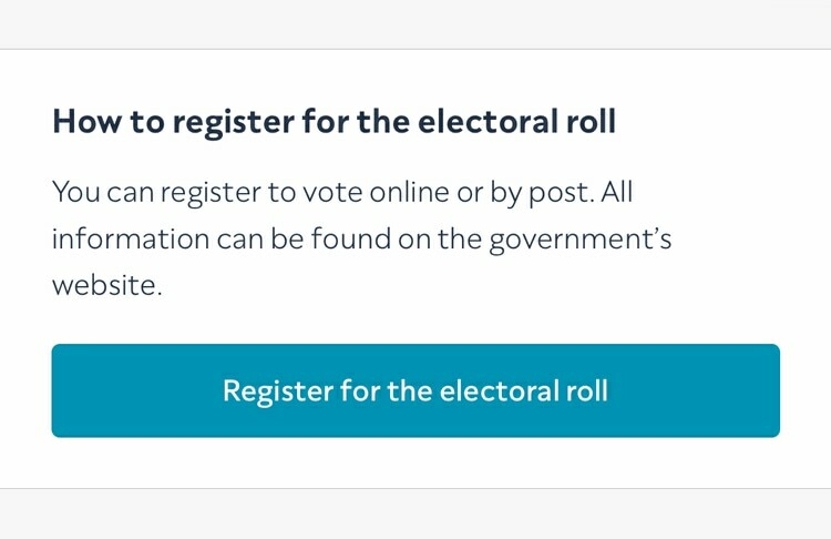
But there's an important lesson here: it's not just a shortcut (to the Gov.uk website), it's a means of starting the process.
And it's been reliably demonstrated that once a user has started a journey, they carry a willingness to continue. The act of clicking the button is self-motivating.
💡 Why is this motivating? One reason is that people dislike contradicting themselves, and once they've self-identified as someone who will complete that task, they have a tendency to lean into that role.
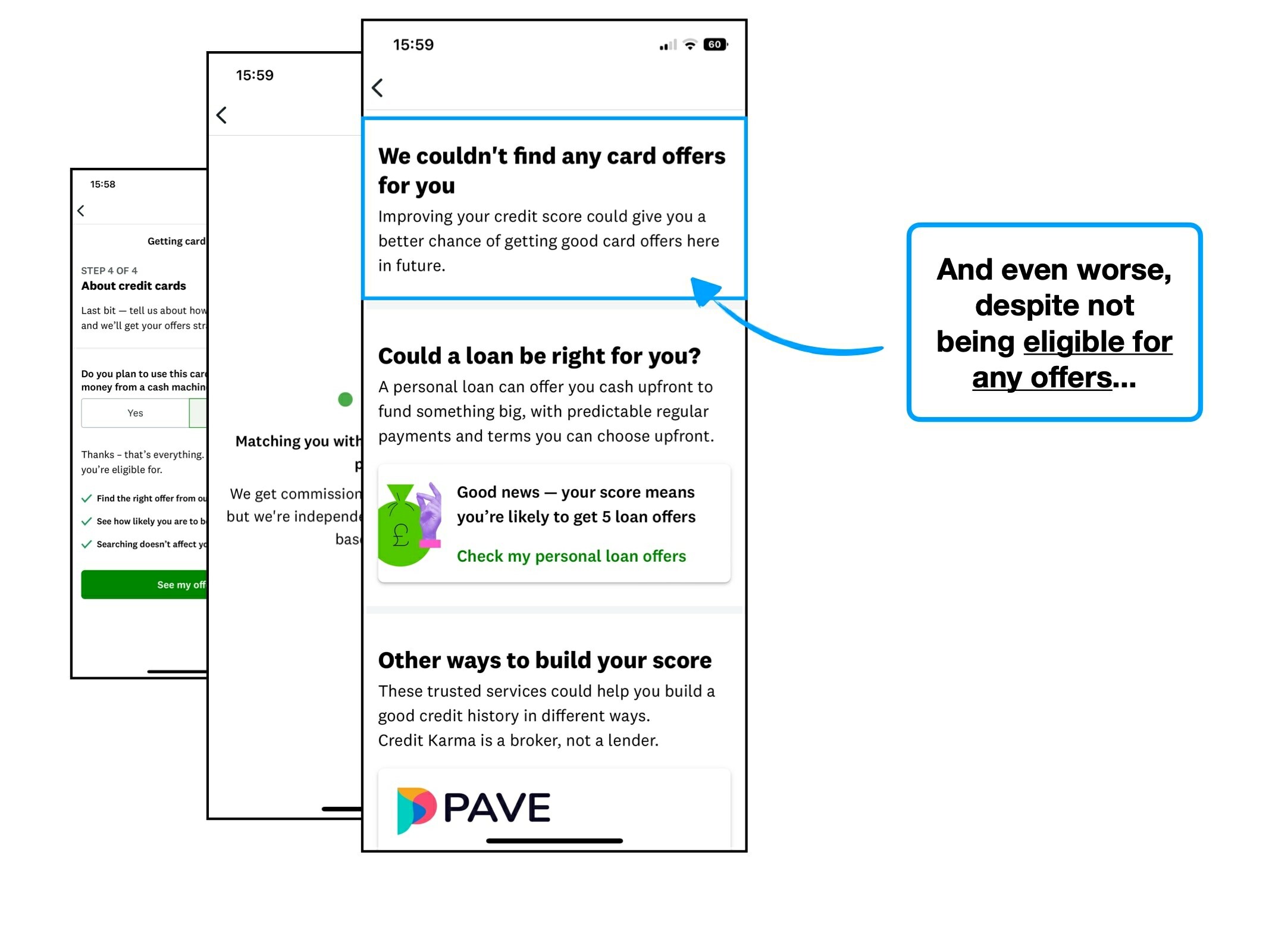
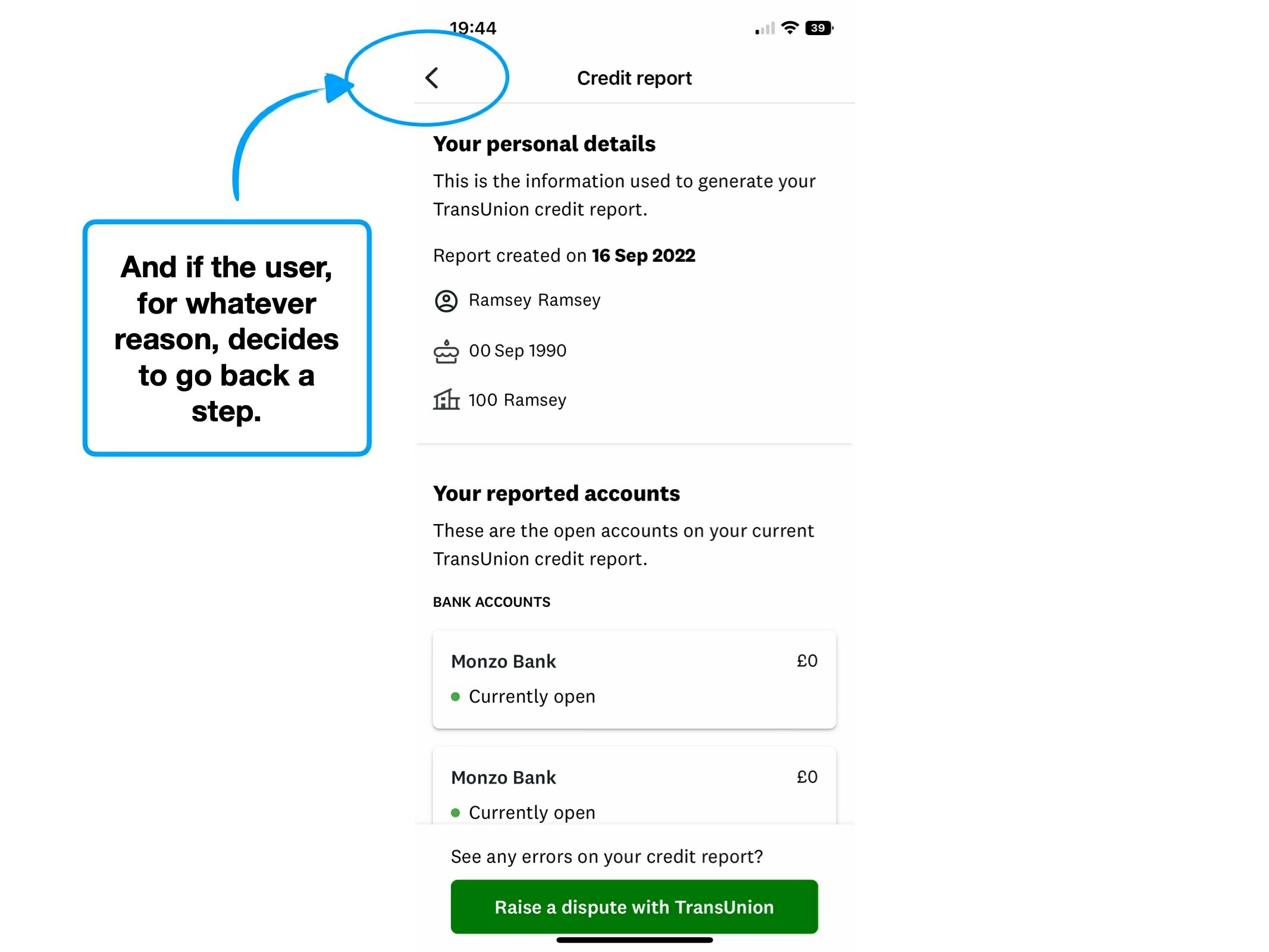
4. Facepalm architecture
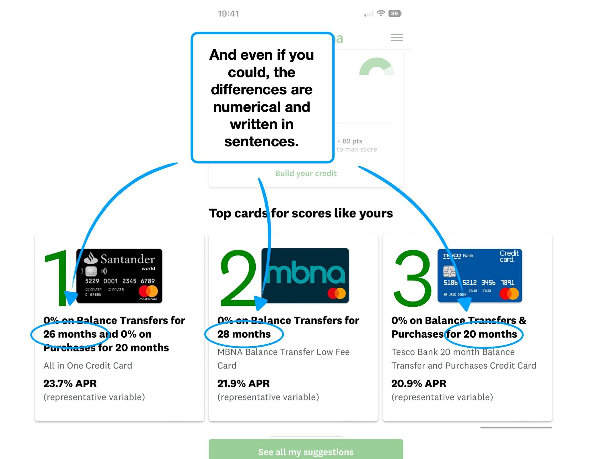
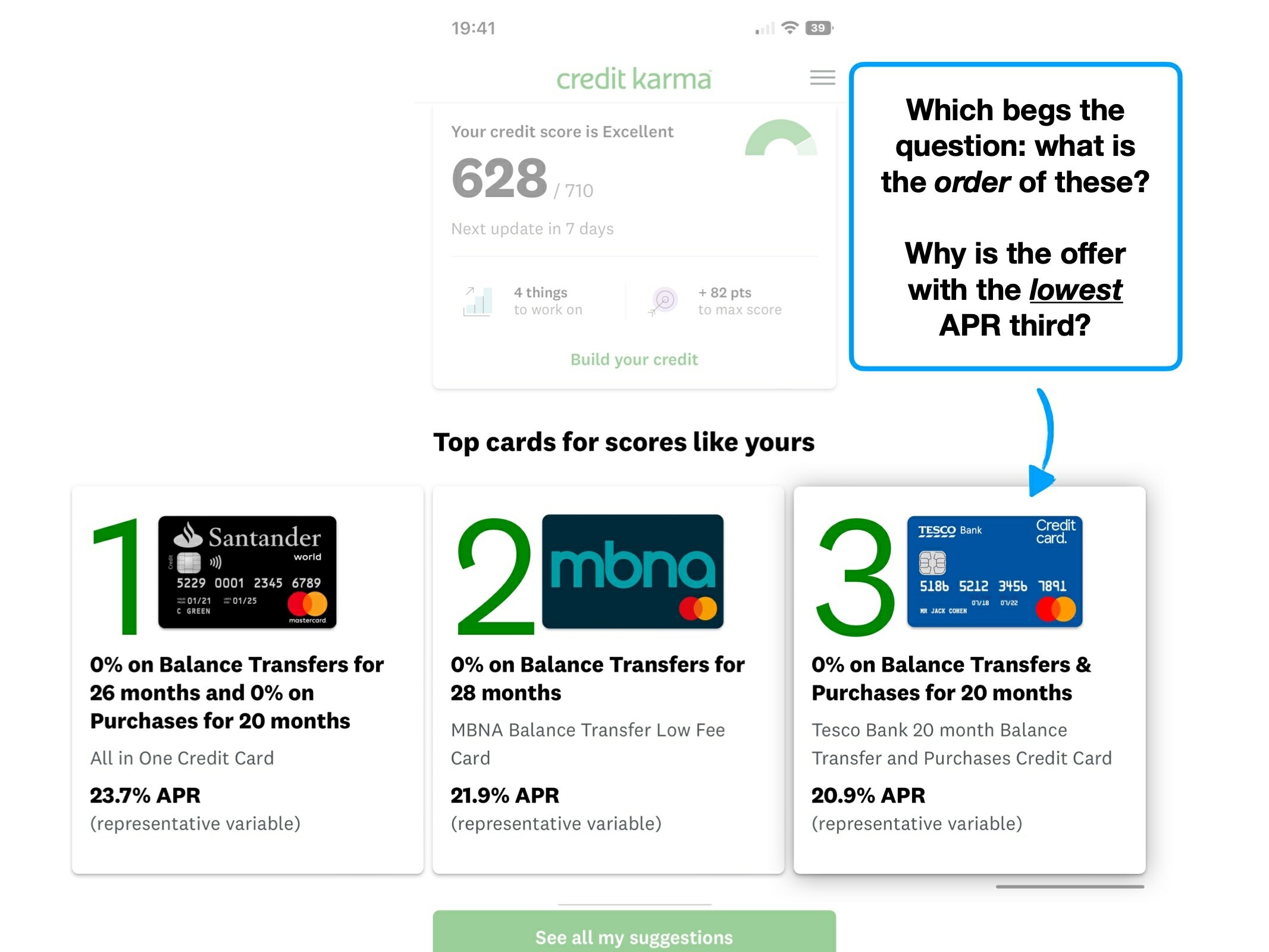
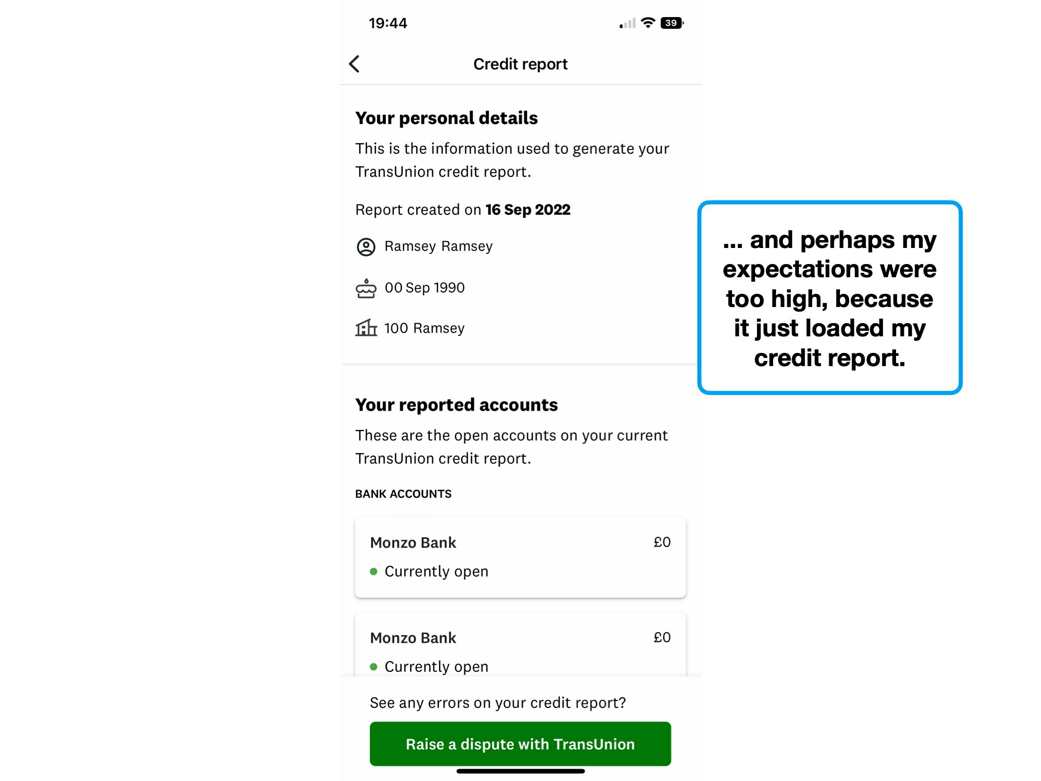
When browsing through your credit report, you can click to view a detailed breakdown of your individual banks.
Below is a screenshot of that individual bank summary, and I have an experiment to try—during which I want you to rely on your intuition.
Looking at this screen, how would you go back to your credit report summary?
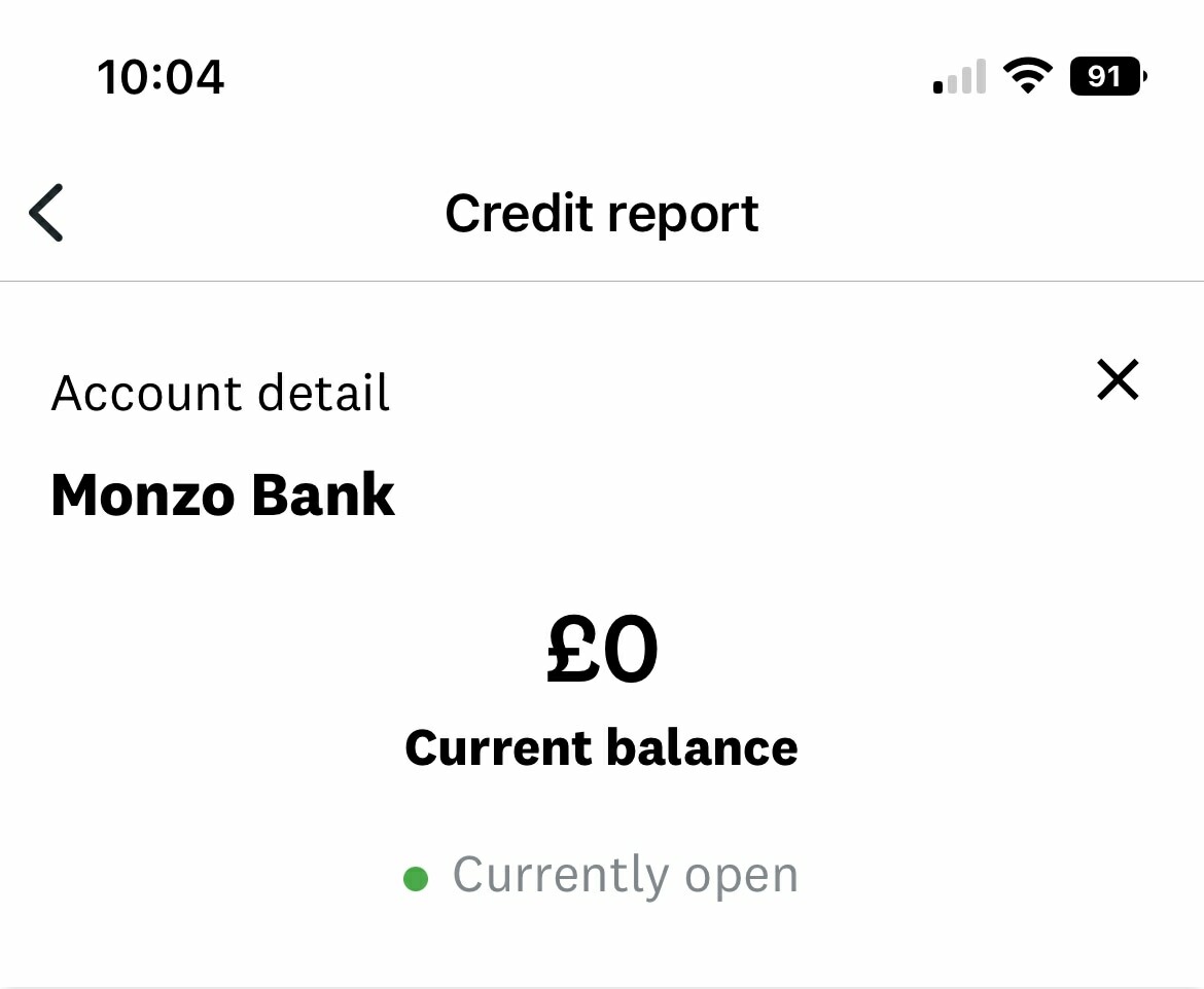
Throughout testing, I kept hitting the backwards arrow in the top-left corner. As you may have guessed, this was incorrect, as it takes you back two pages, to the main 'credit' tab.
It totally breaks convention, and therefore expectation.
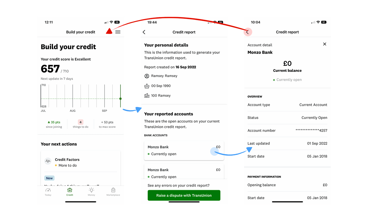
Frustratingly, it's the cross on the right-hand side that you need to press.
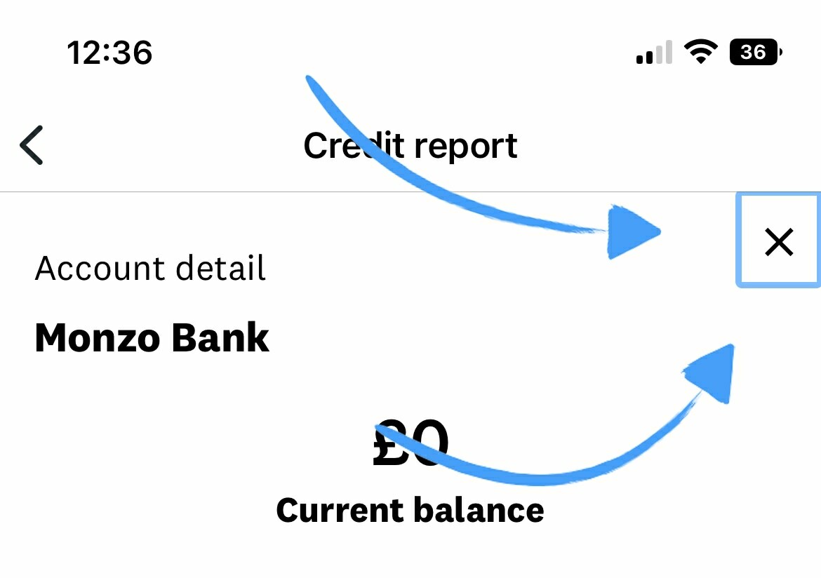
To be clear, the lesson here is not that crosses always need to be in the top-left, but rather that by having two levels of 'back' in one view, you'll create frustration.
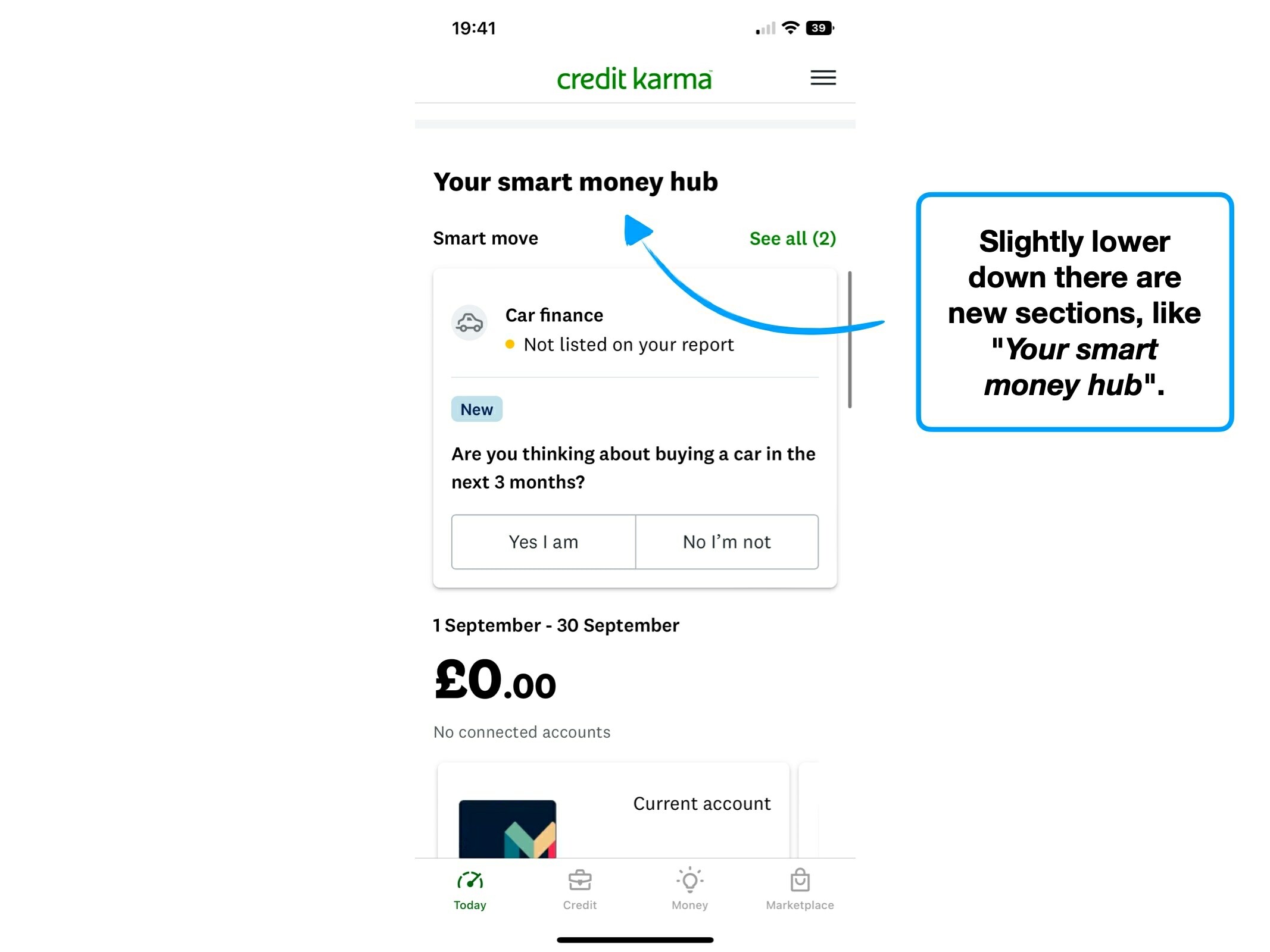
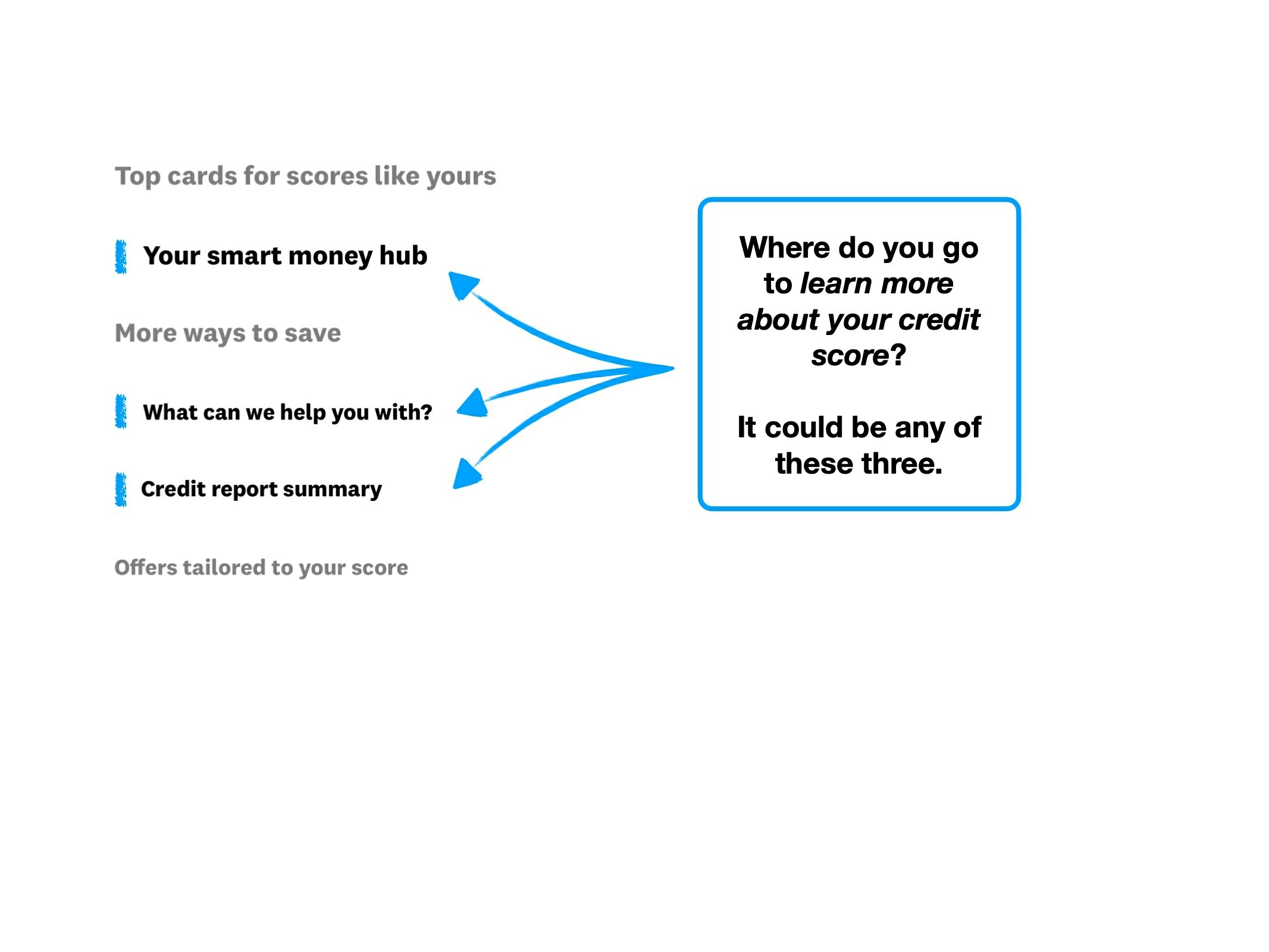
5. Conversational titles
Imagine that you've been sent to an unfamiliar supermarket again, but this time with a very clear list of things to buy.
You glance down one of the isles, and see the following:

Most people would find this disorienting. Why are the canned foods in the same isle as a 'bucket of stuff'?
And what is that bucket of stuff? What lives under 'Ketchup and savings'? Is that savings only for Ketchup, or does it include other items?
Despite being an exaggerated example, it demonstrates a potentially dangerous trend: overly-conversational content.
In an attempt to appear more human, product teams will often add personalisation into their app.
For instance, here are 5 different variations of the same instruction:
✏️
Default
Enter your email address.
✉️
Less friendly
Enter email address.
👋
Friendly
Hey Peter, enter your email address.
❤️
Too friendly
Great to have you around Peter, firstly, what's your email address?
⚓️
Other personality
Yaar welcome aboard Peter, what's ye email address sailor?
Having a unique tone of voice is great, but when taken too far, it whiplashes into friction.
i.e., as you trade clarity for personality, things get harder to digest and understand.
It's more difficult to be consistent, when embellishing instructions and headings with personality.
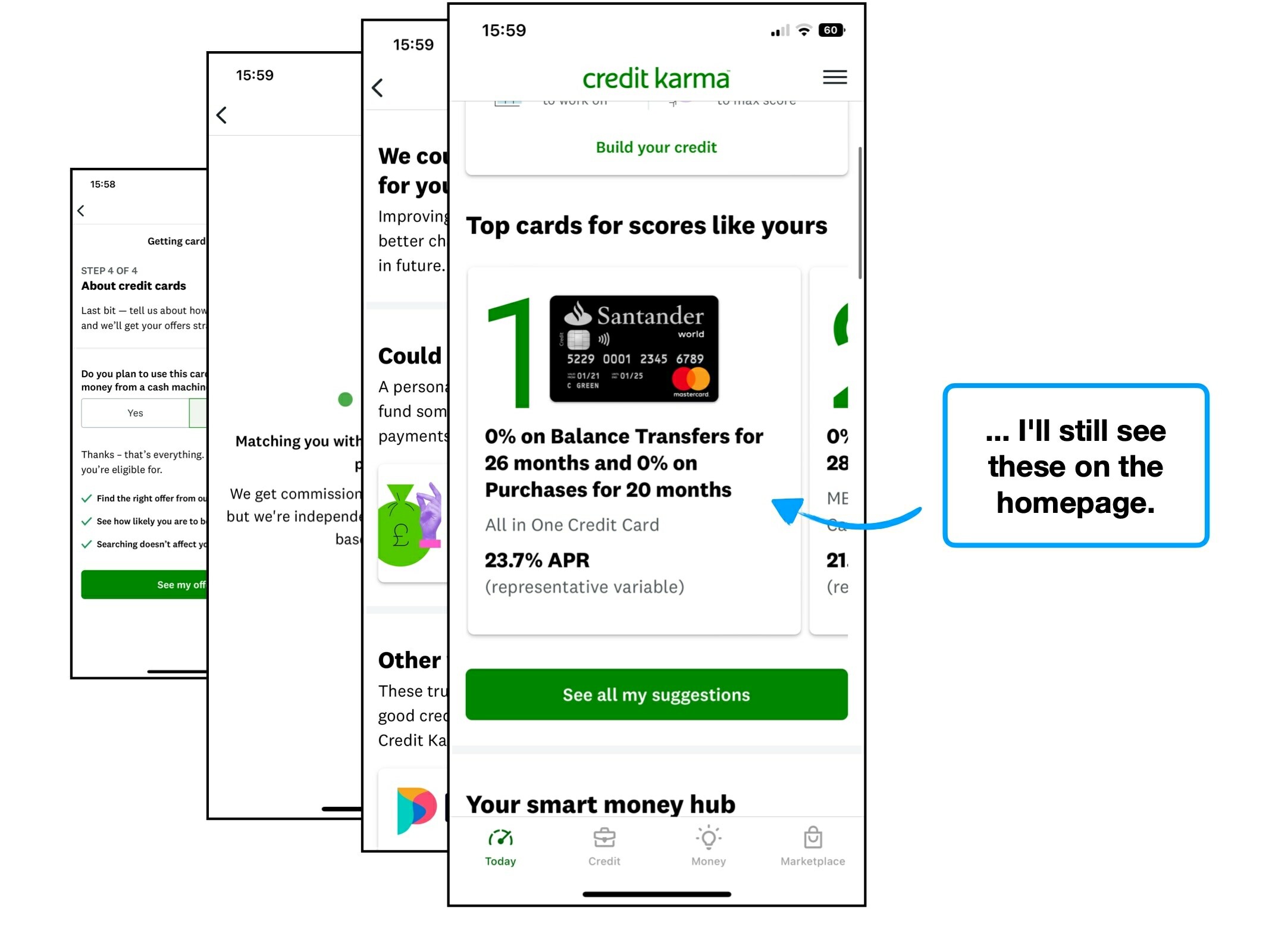
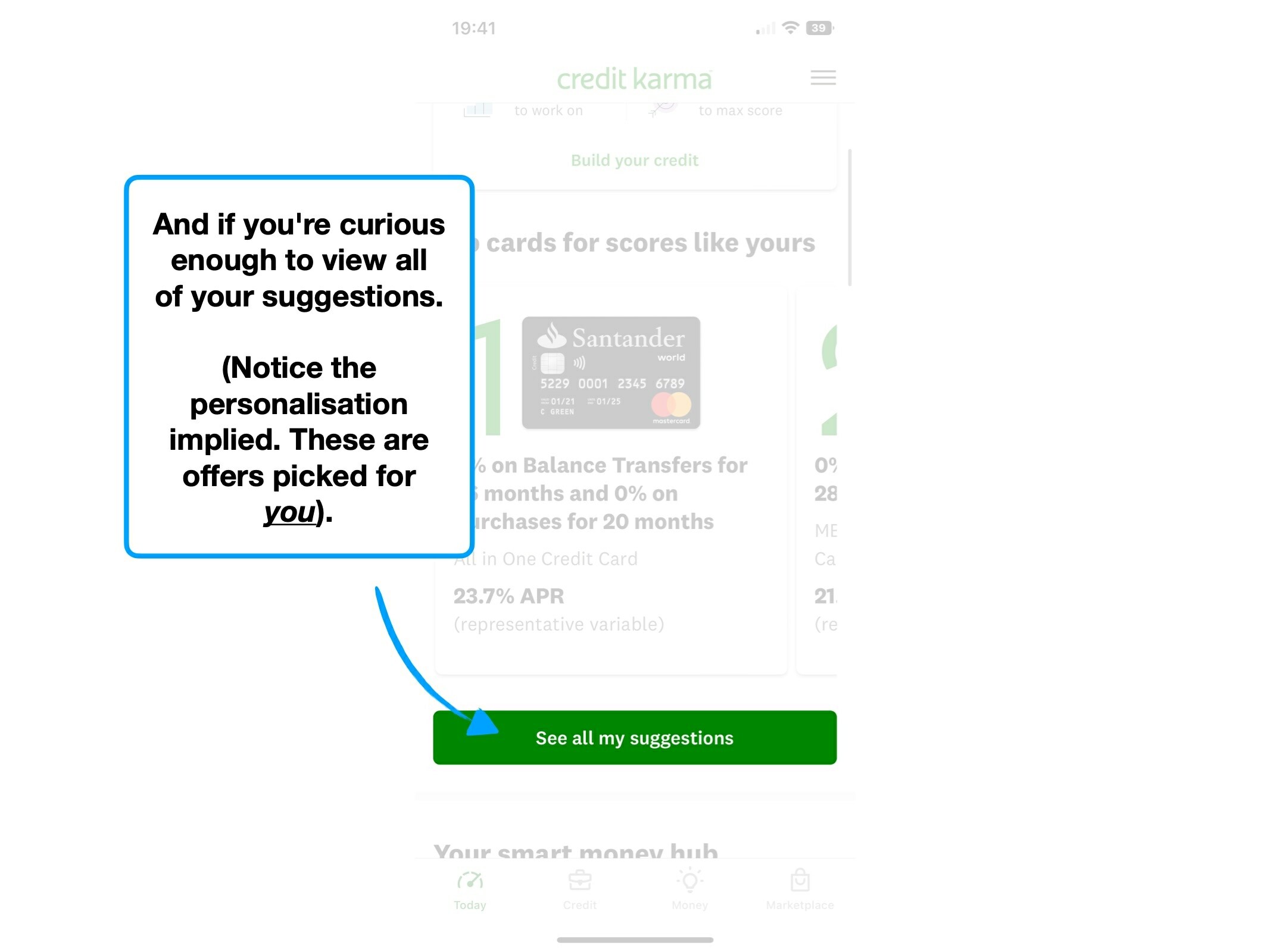
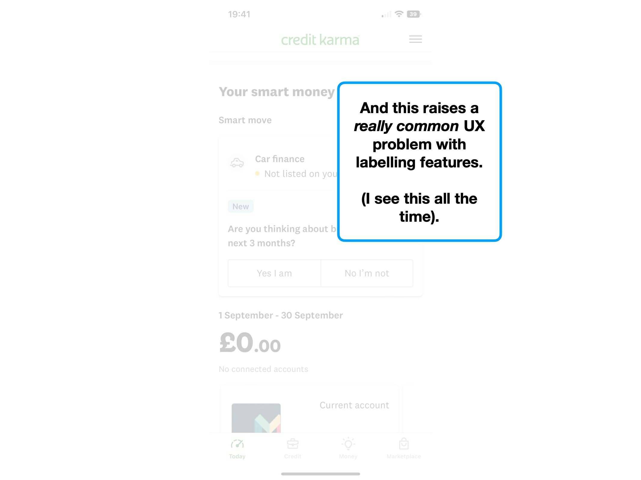
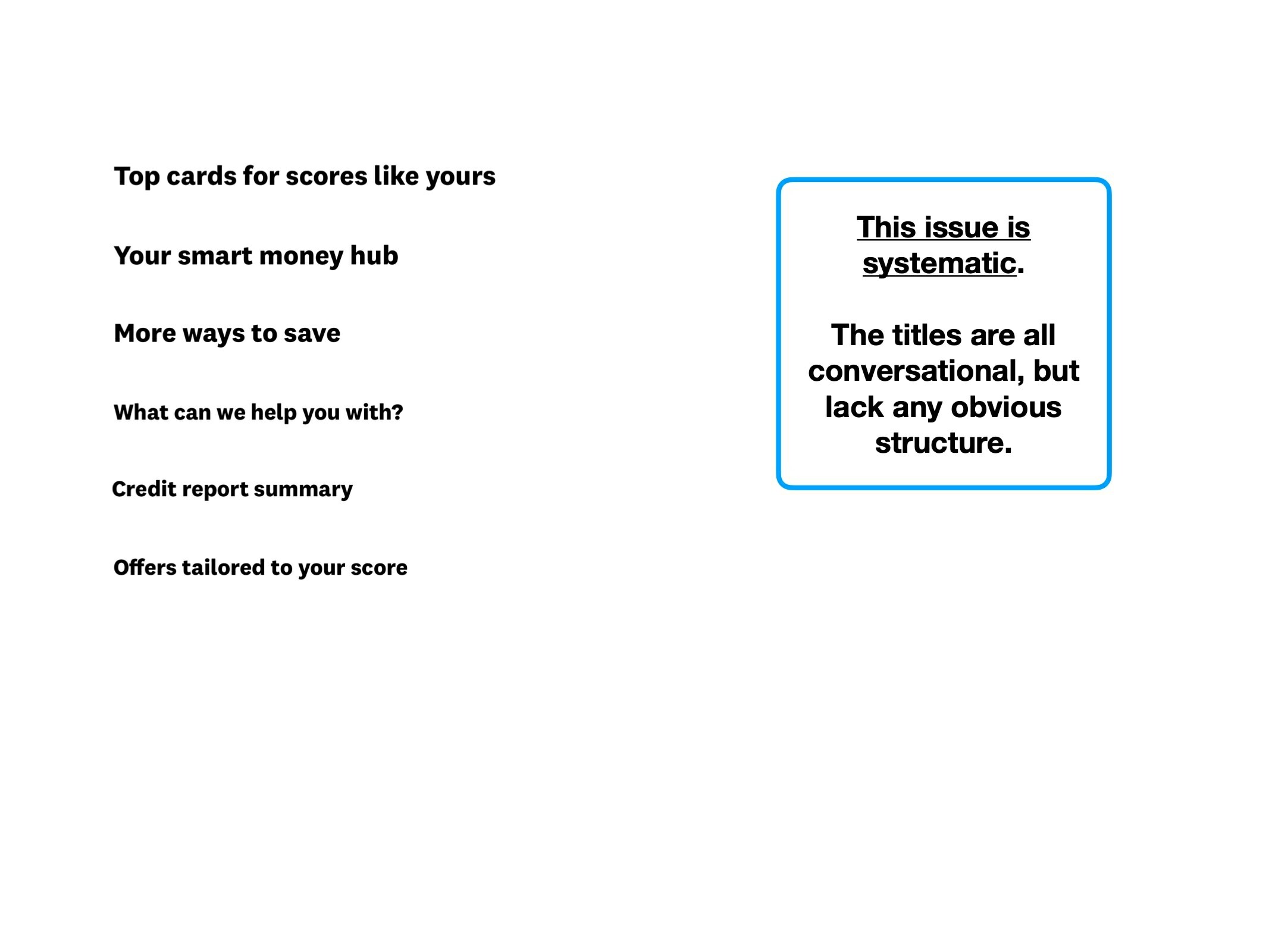
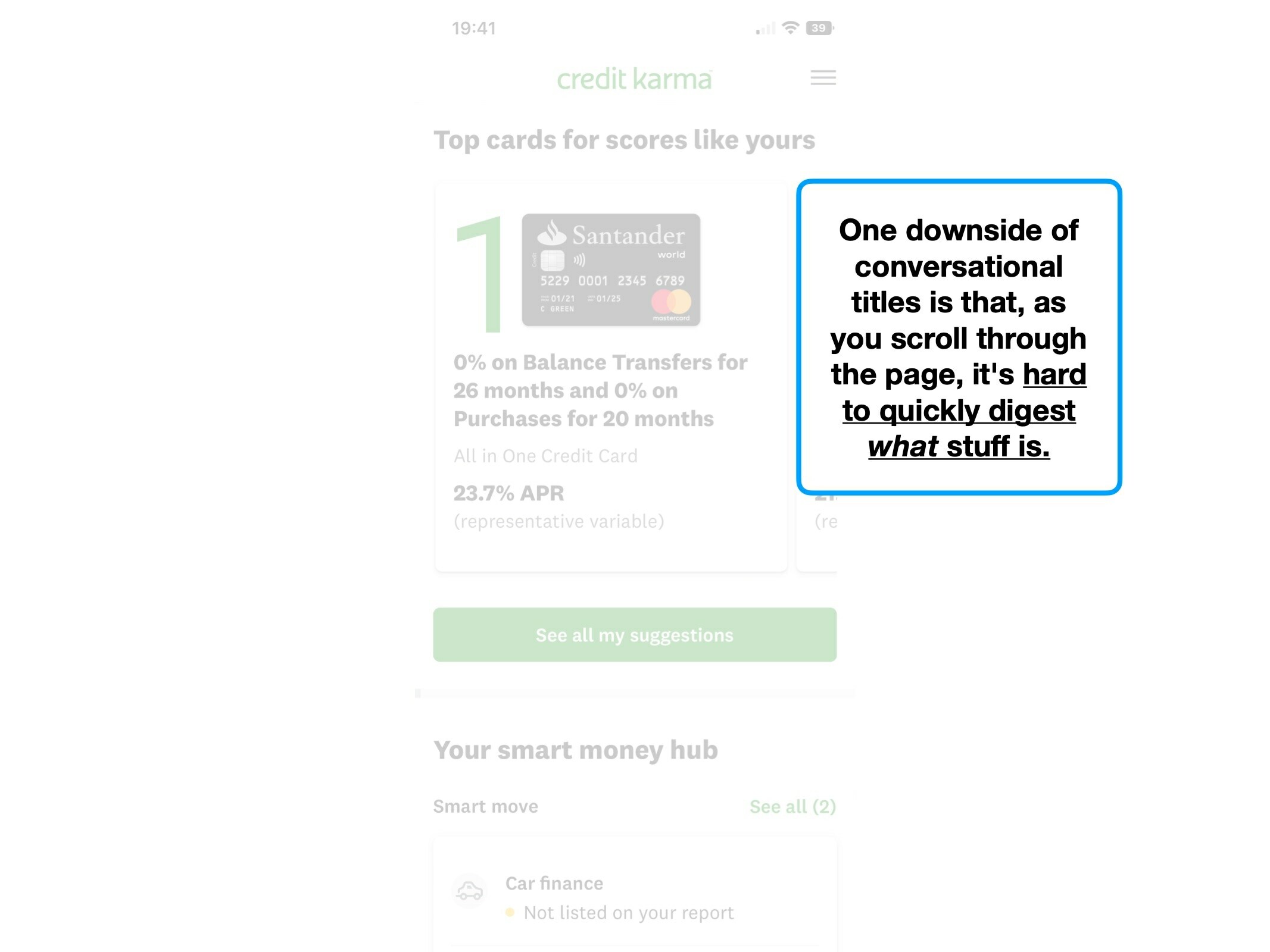
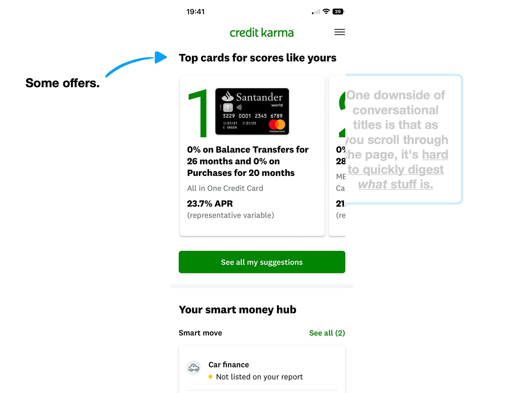
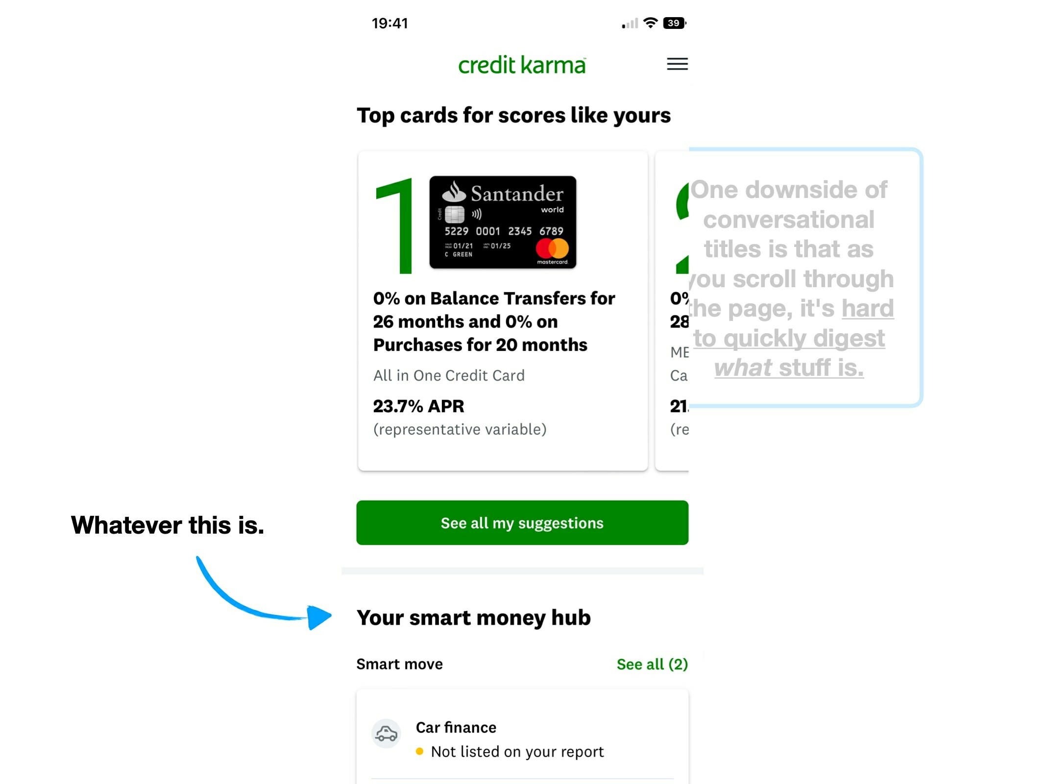
And this is something that subtly increases the 🧠 Cognitive Load when trying to learn how to use the Credit Karma app. For example:
💬 Conversational titles
👀 Decoded explanation
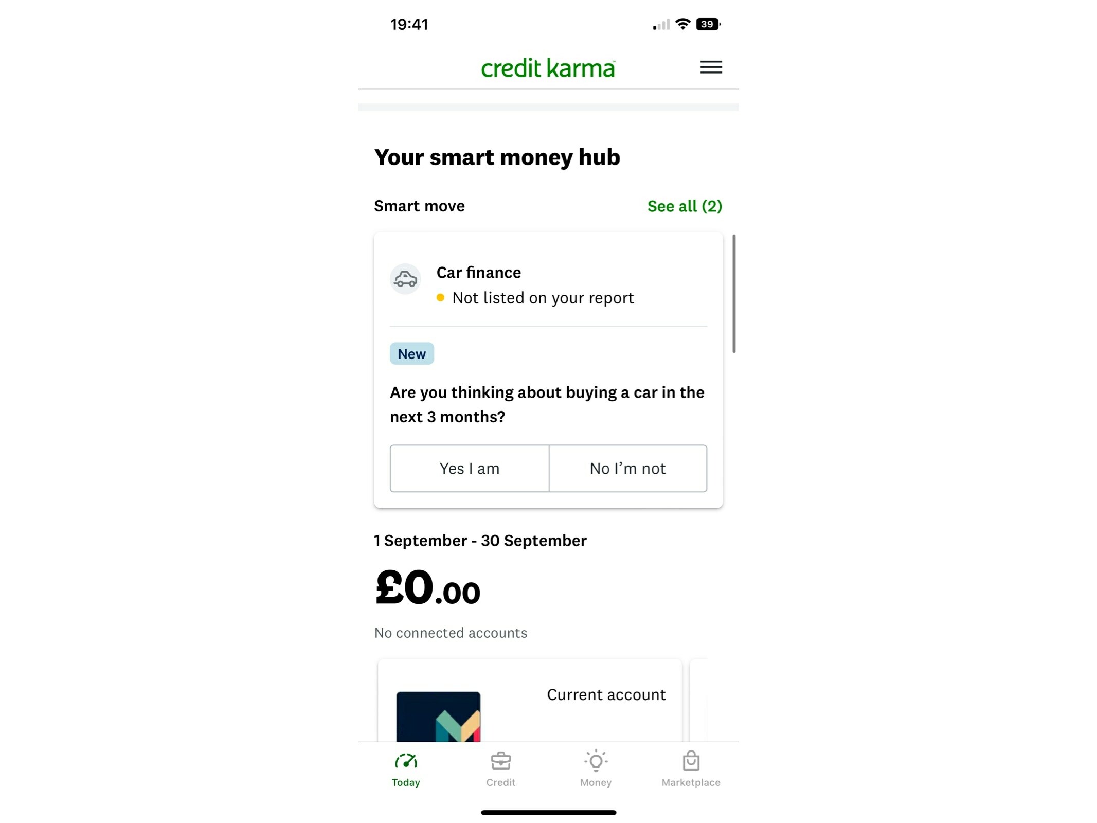
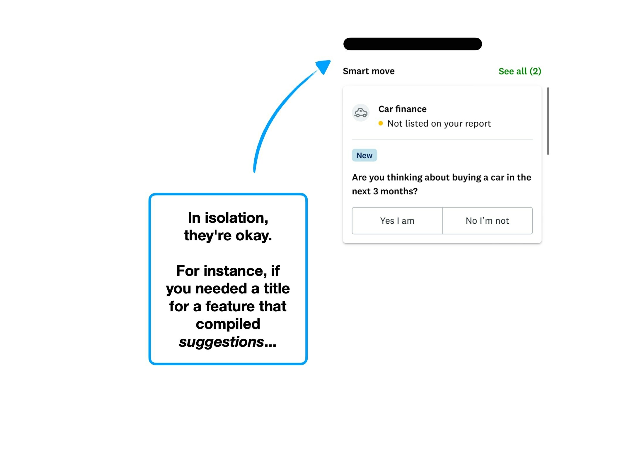
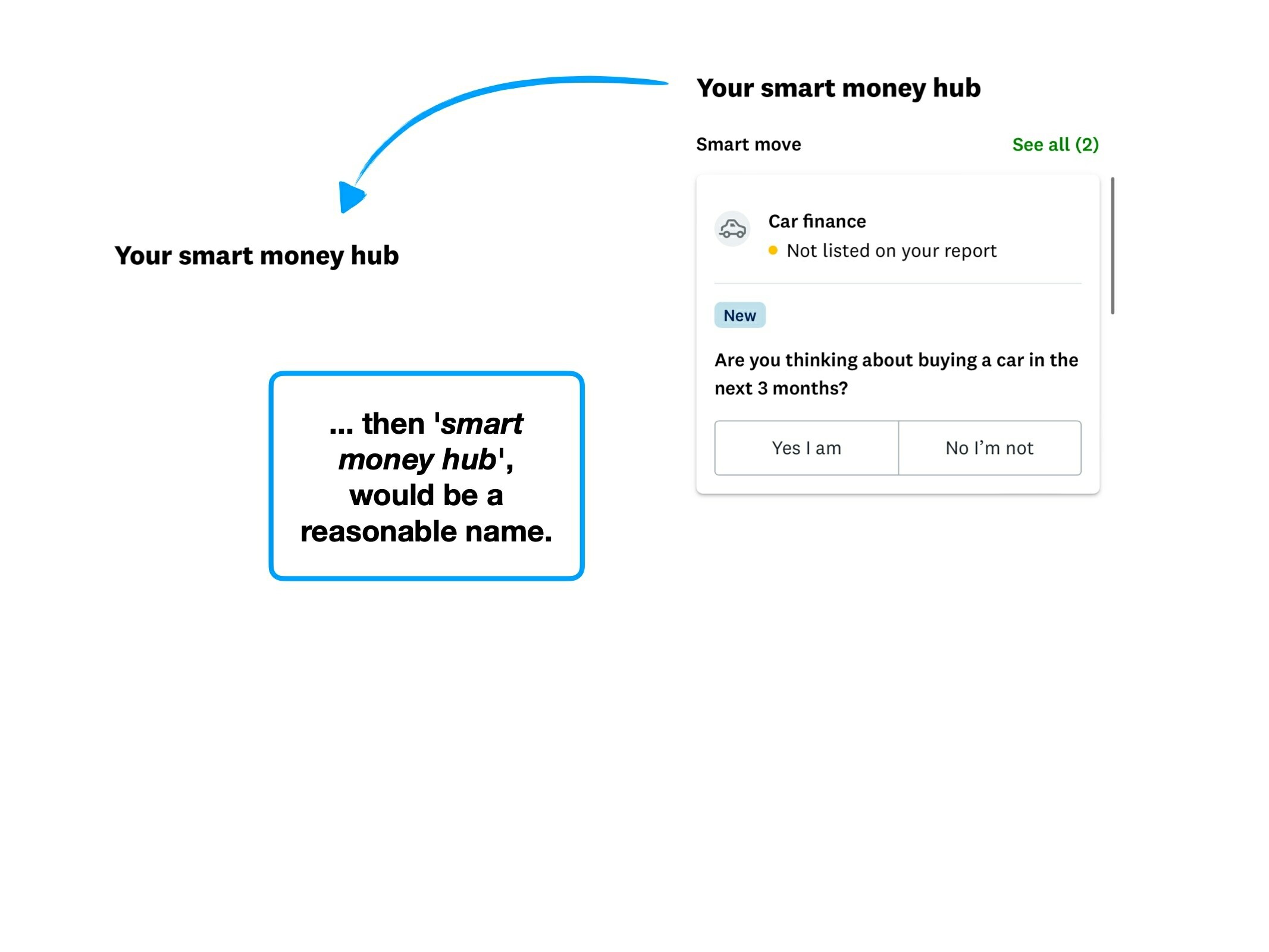
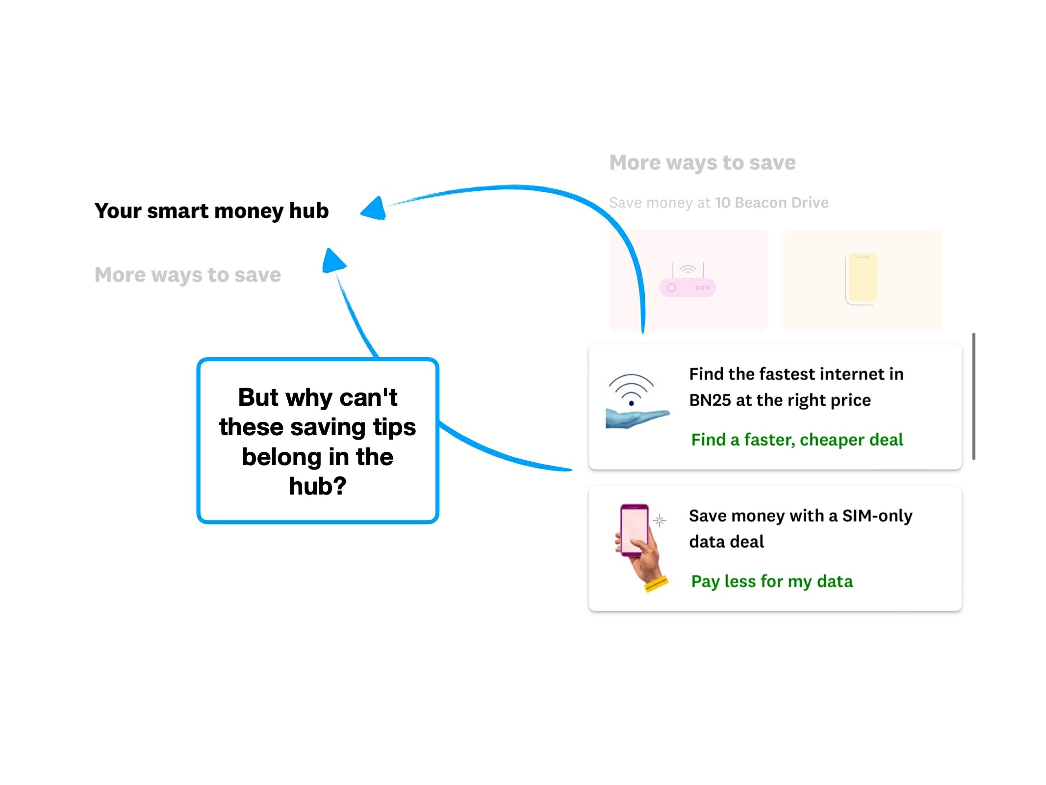
Your smart money hub
The hub for suggestions of how to save money, such as switching expired phone contracts.
Smart moves
Suggested tasks to save money, like above (notice how it's called Smart Moves, not Smart Money).
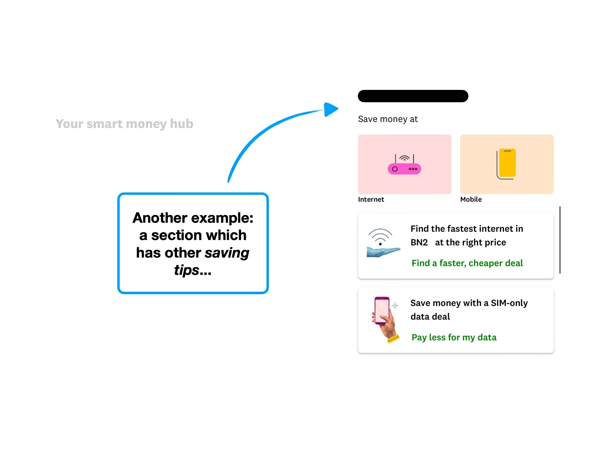
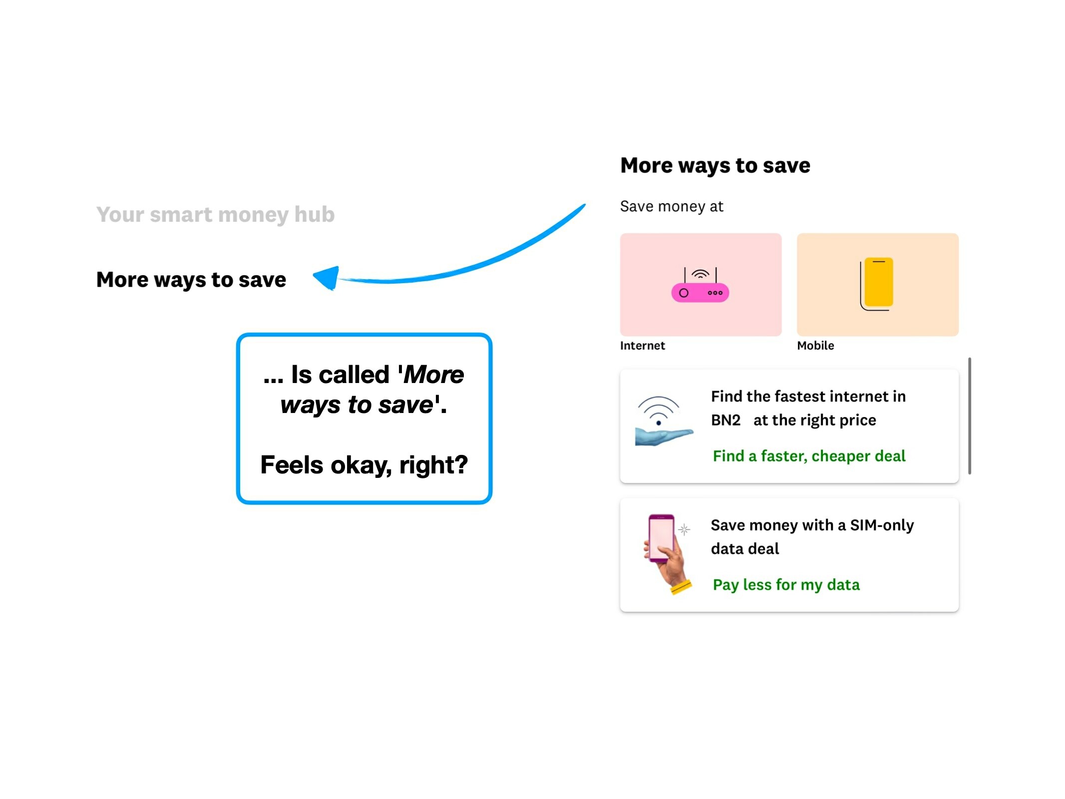
More ways to save
Saving tips related to your property (internet and phone).
What we can help you with
See long-term goals, such as paying off debt or building your credit score.
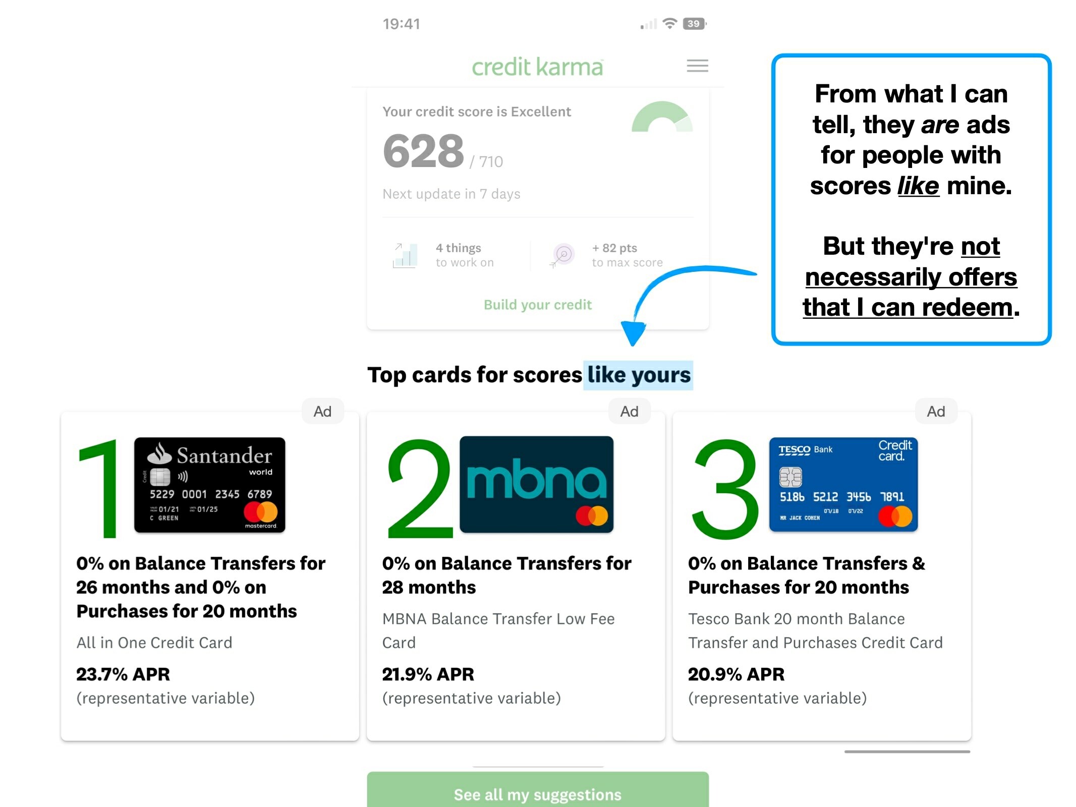
You could get better rewards
Offers and promotions based on your score.
Why users are ignoring your features
Simple techniques to increase feature usage, retention and ultimately alter how users perceive the value of your product.
Hiding complexity to create effortless onboarding
The techniques that Slack have used to create an effortless onboarding flow, and why you might not want to copy them.
The secrets of a $7.08 welcome bonus
The product psychology behind why Robinhood offer new users $7.08 of free stock, and not $10.