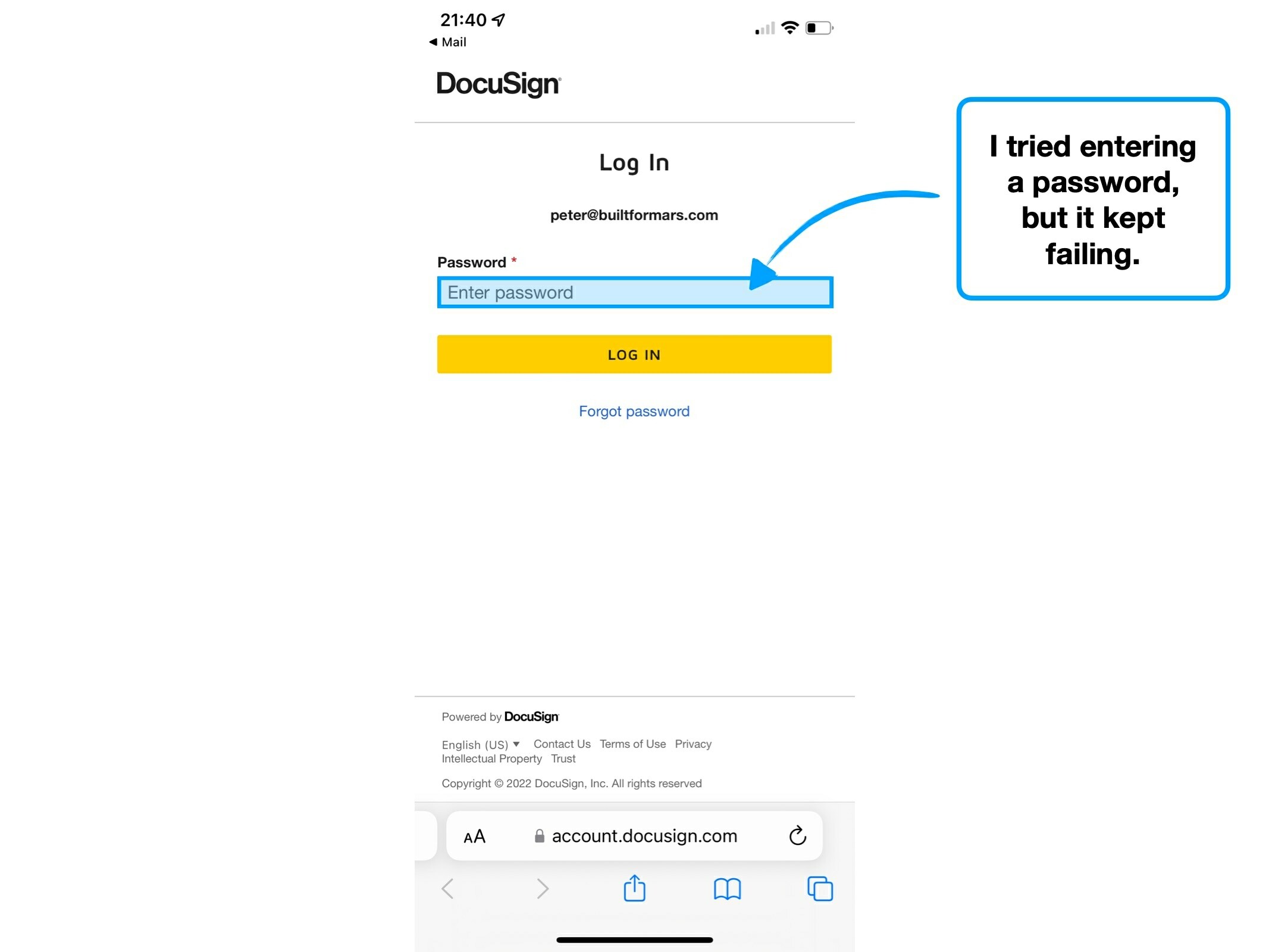
One billion signatures
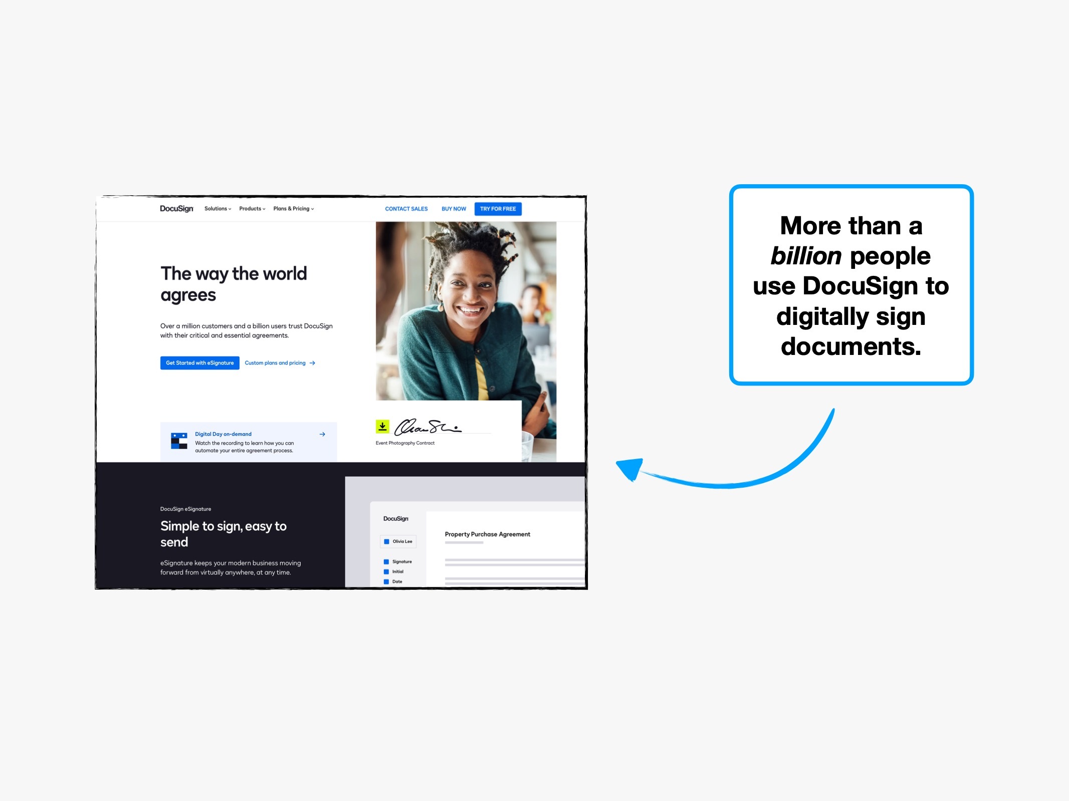
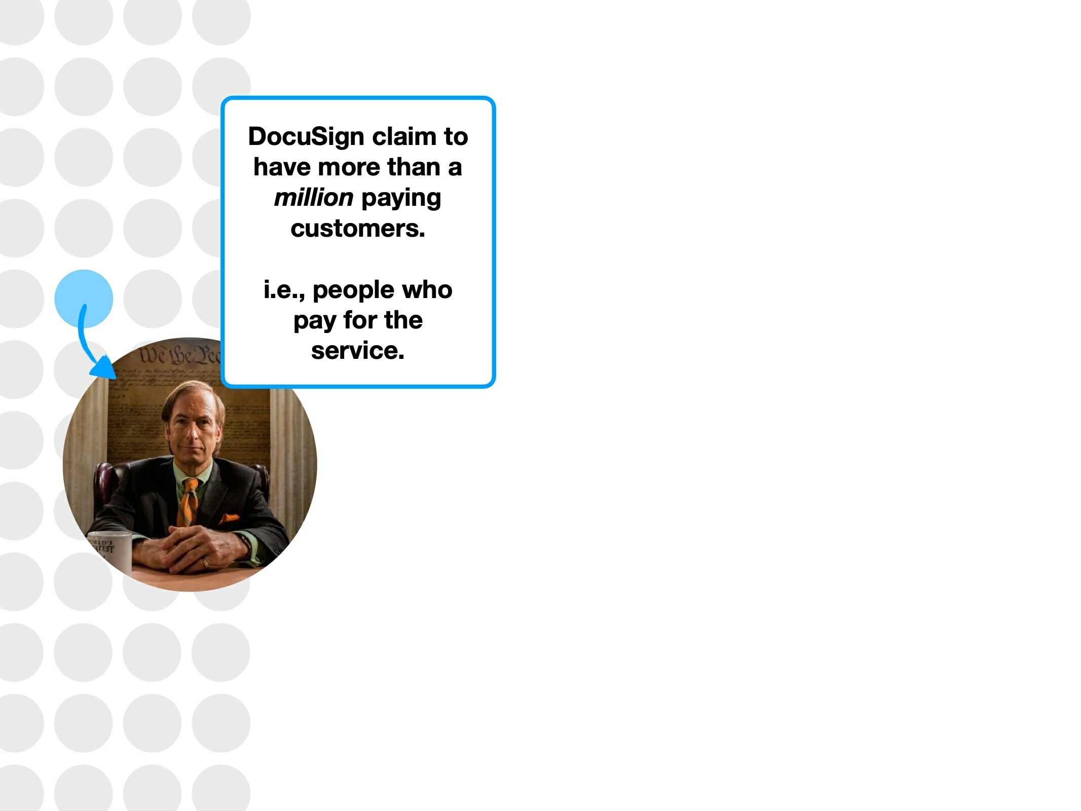
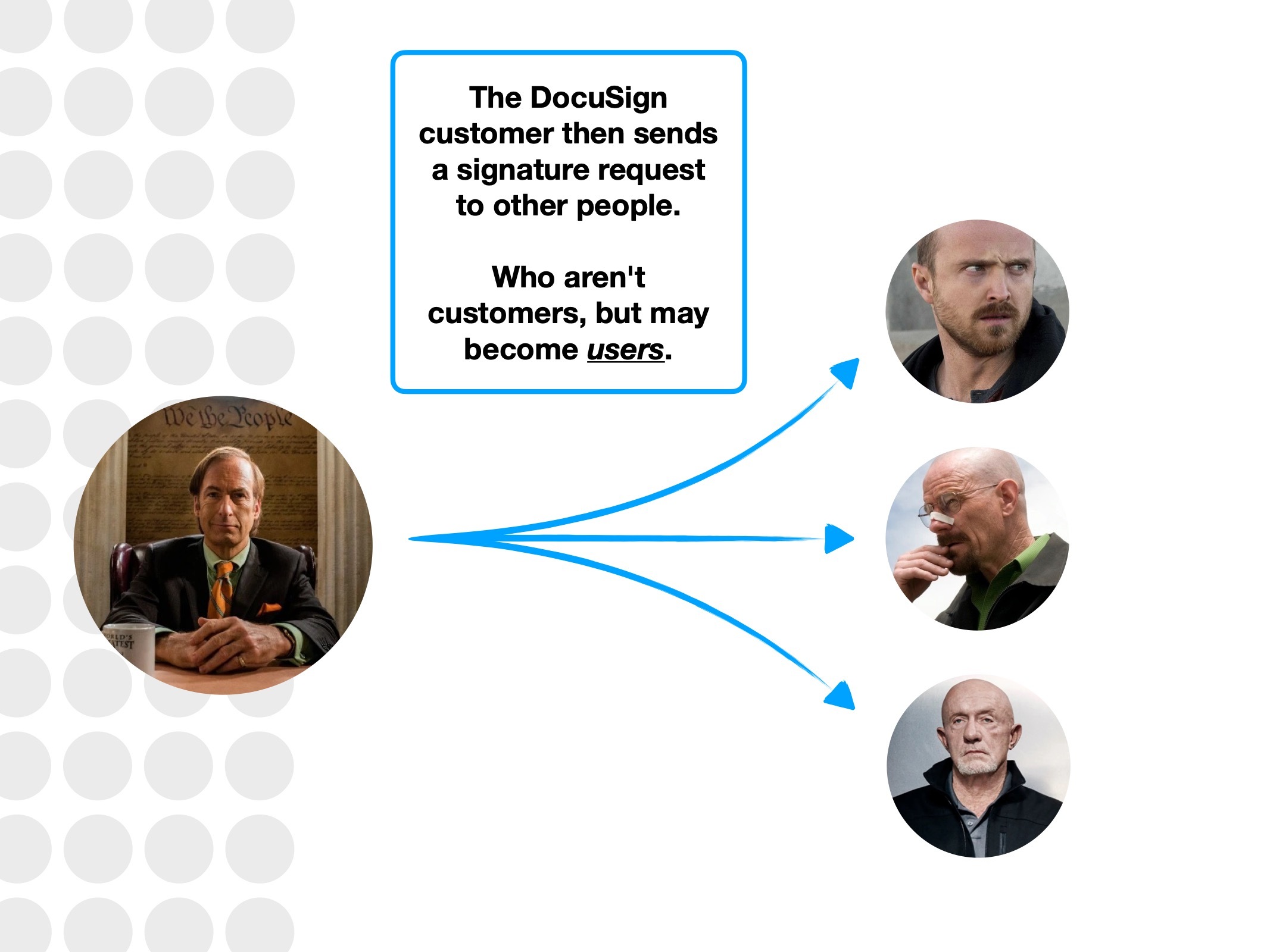
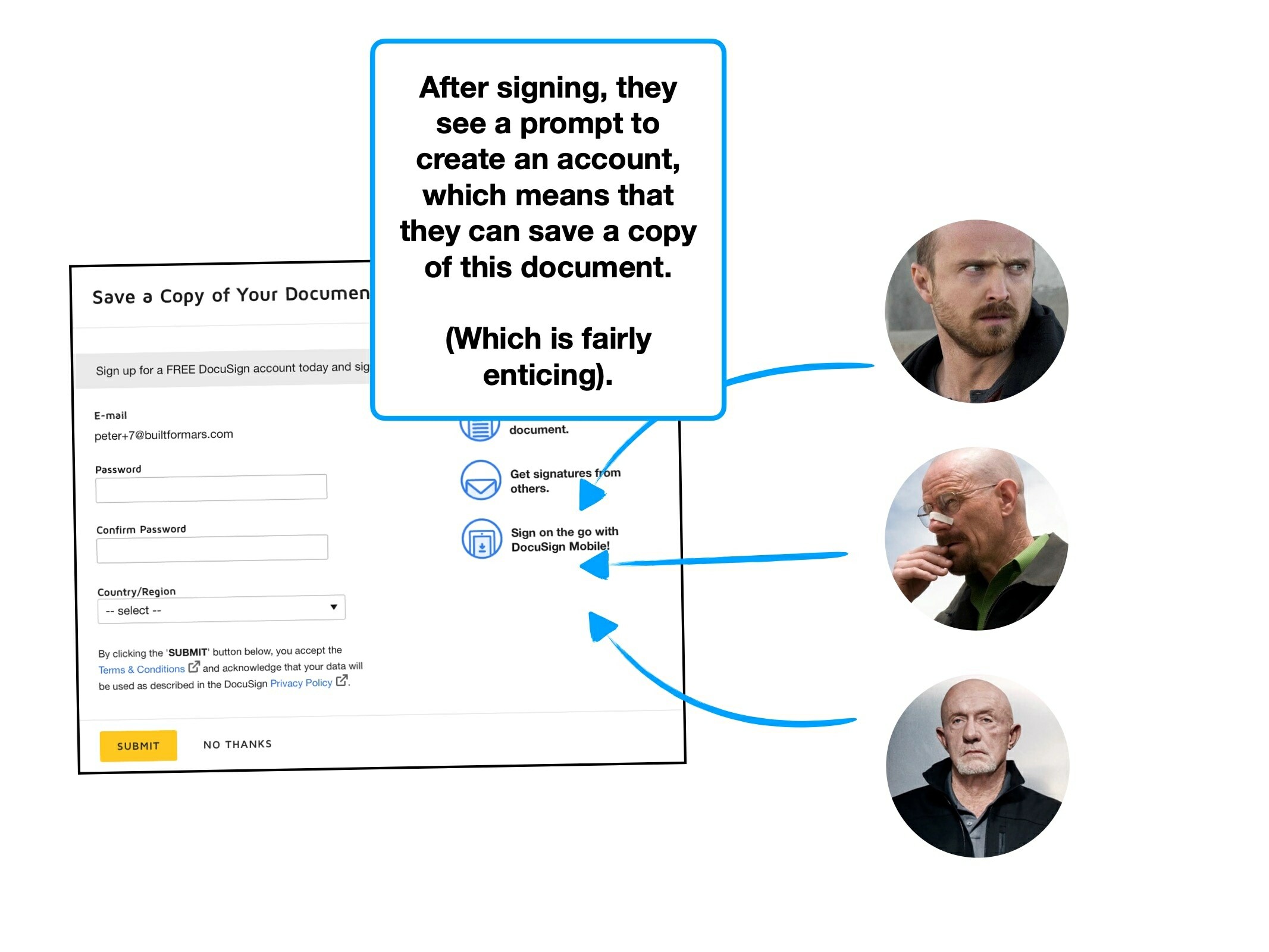
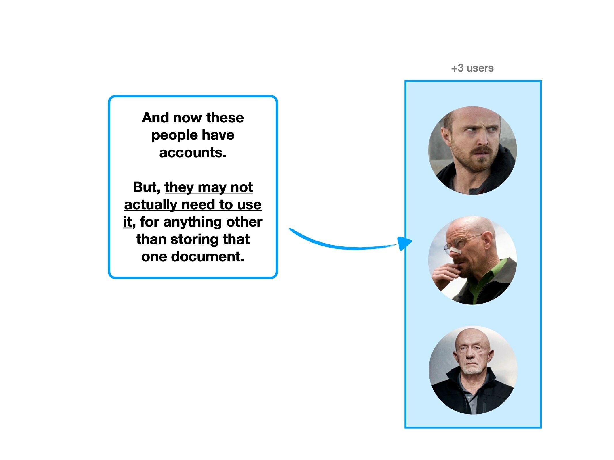
DocuSign, the e-Signature service, holds many impressive statistics—including their headline numbers: 100 million customers, 1 billion users, spread across 180 different countries.
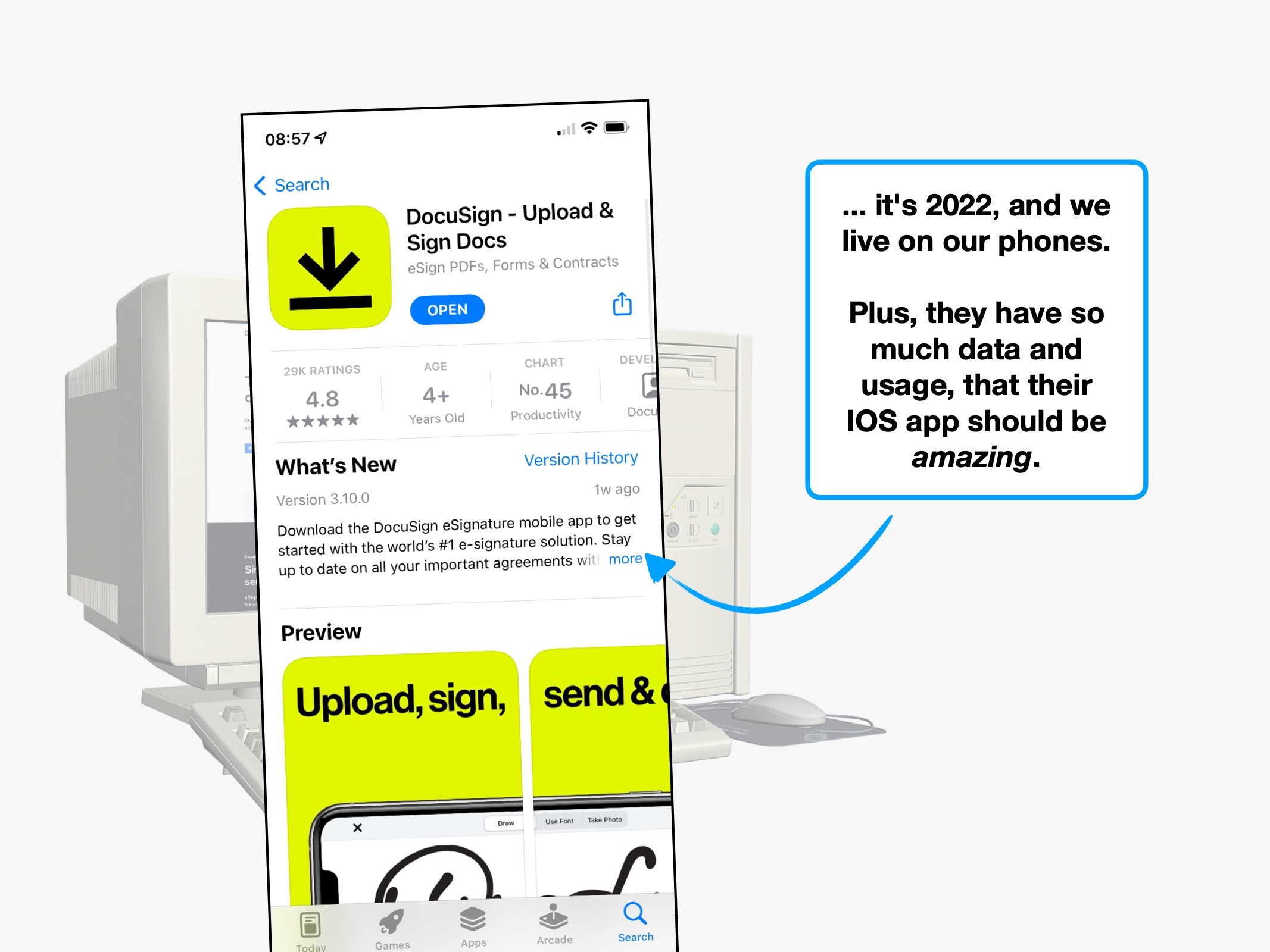
Even more remarkably, the IOS app has maintained a 4.9 star score over 500,000 ratings.
It'd be hard to deny that they're great product builders, and we can draw two conclusions from the data: people like the service, and DocuSign have surplus feedback about their apps.
The multi-billion dollar question: what are they doing so right? What's their secret sauce?
And, is it fully-optimised, or can they improve the experience?
That's what I set out to answer.
Case study
Key UX takeaways:
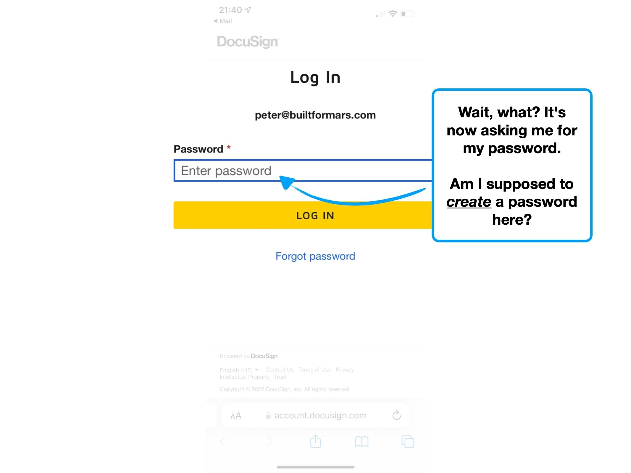
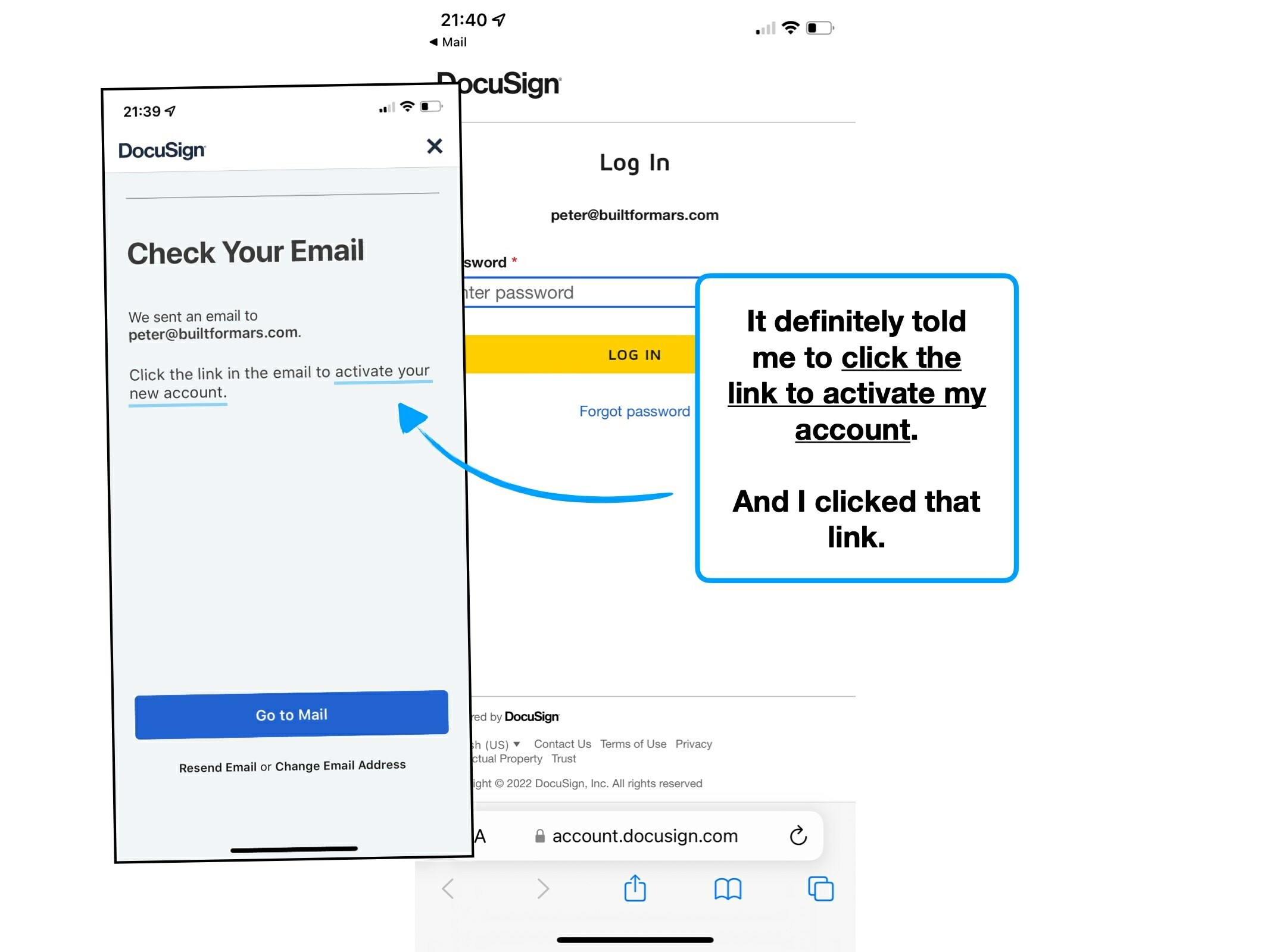
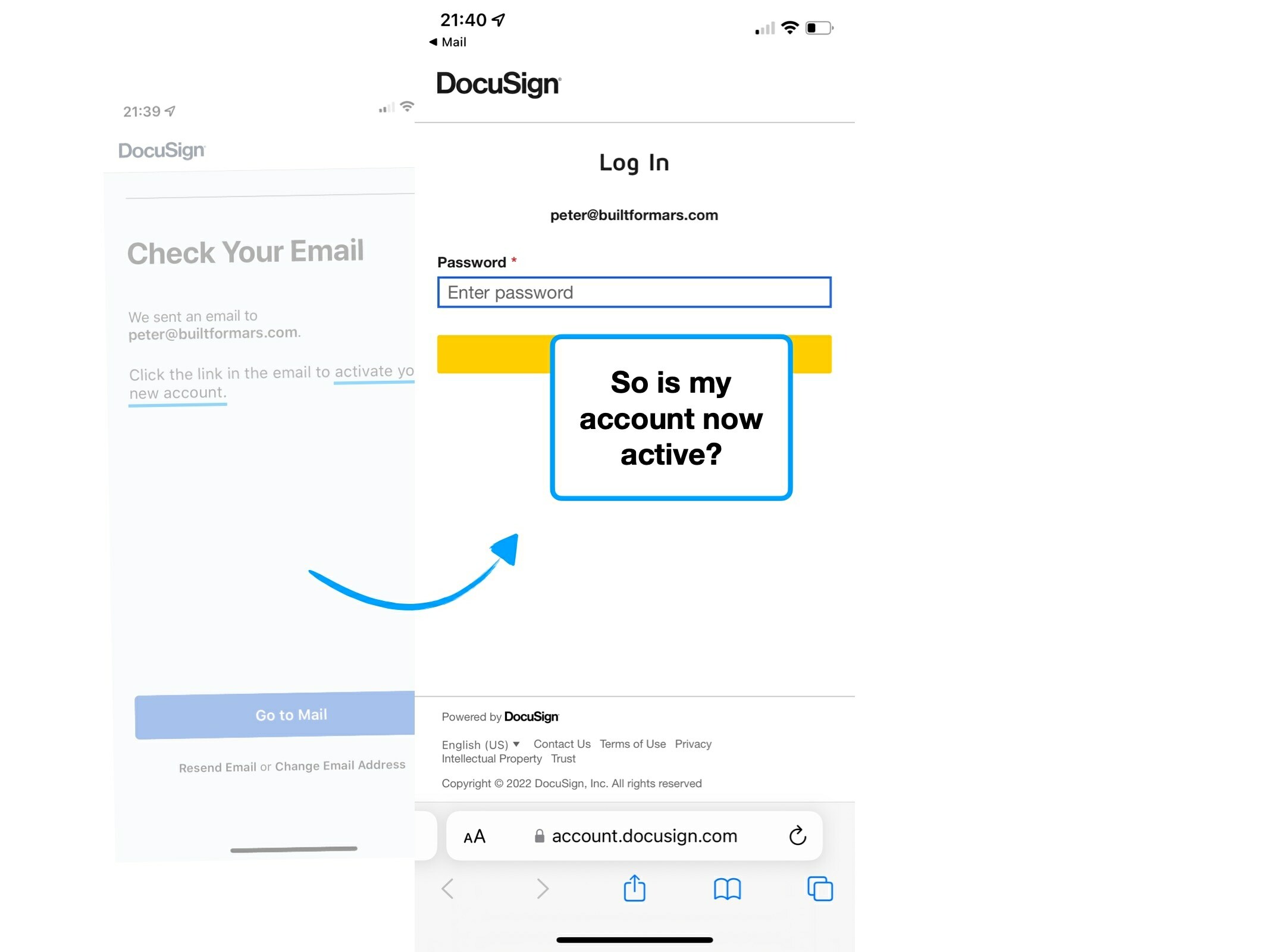
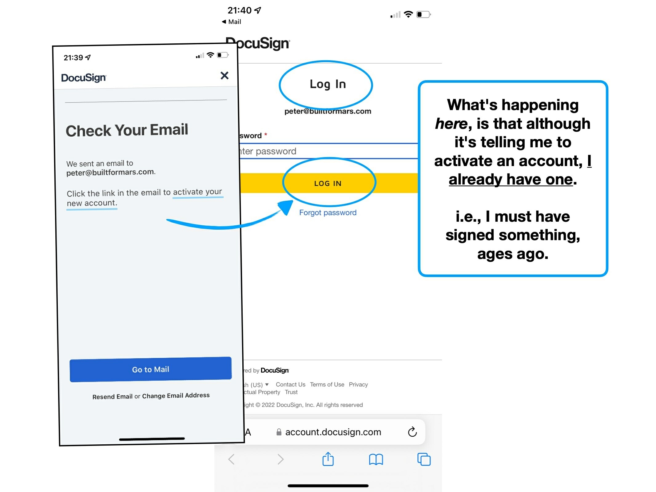
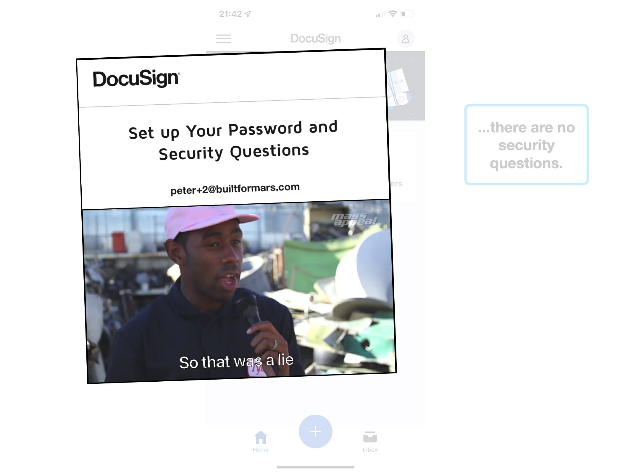
1. That account already exists
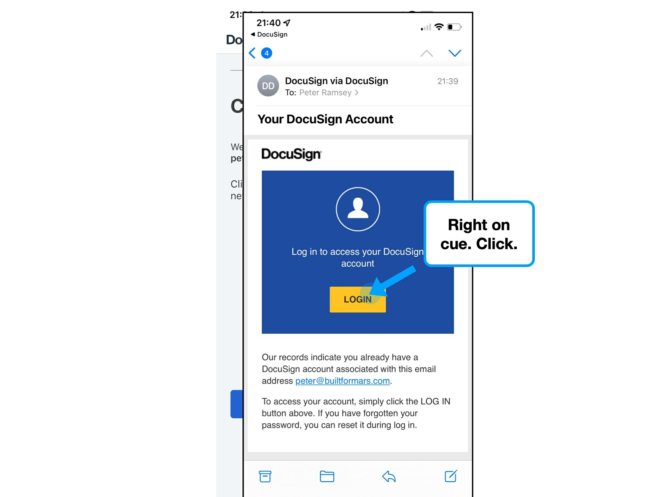
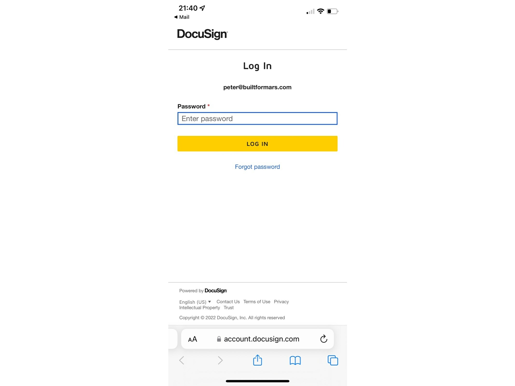
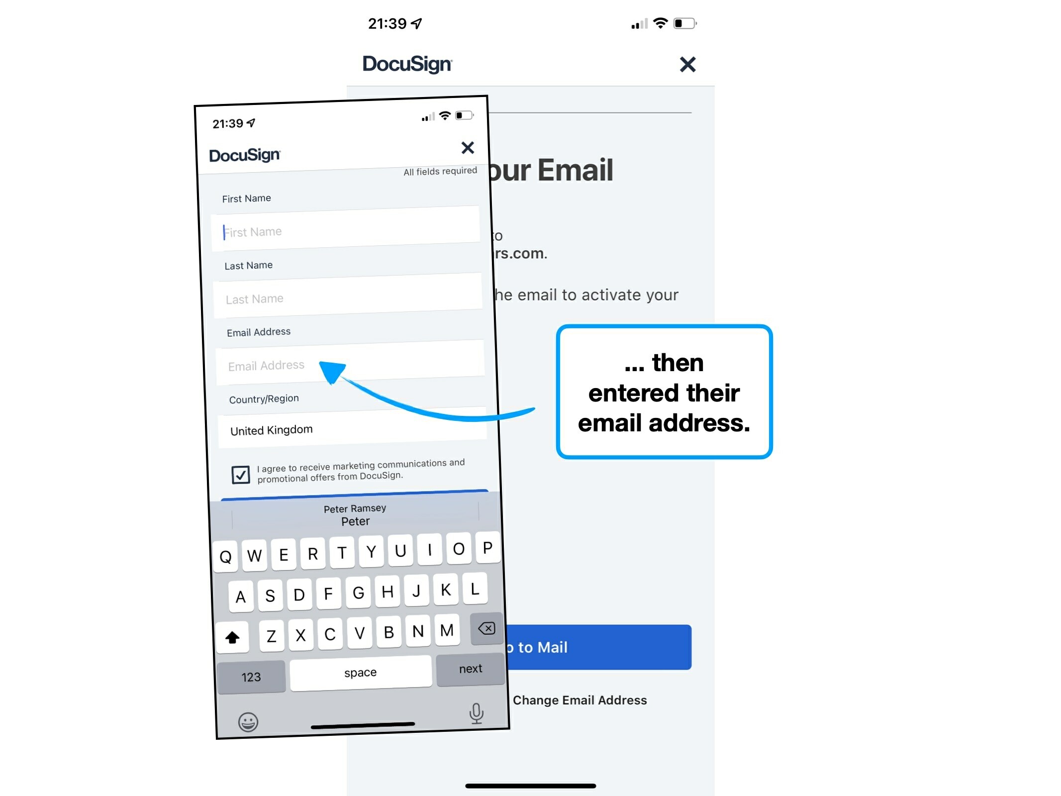
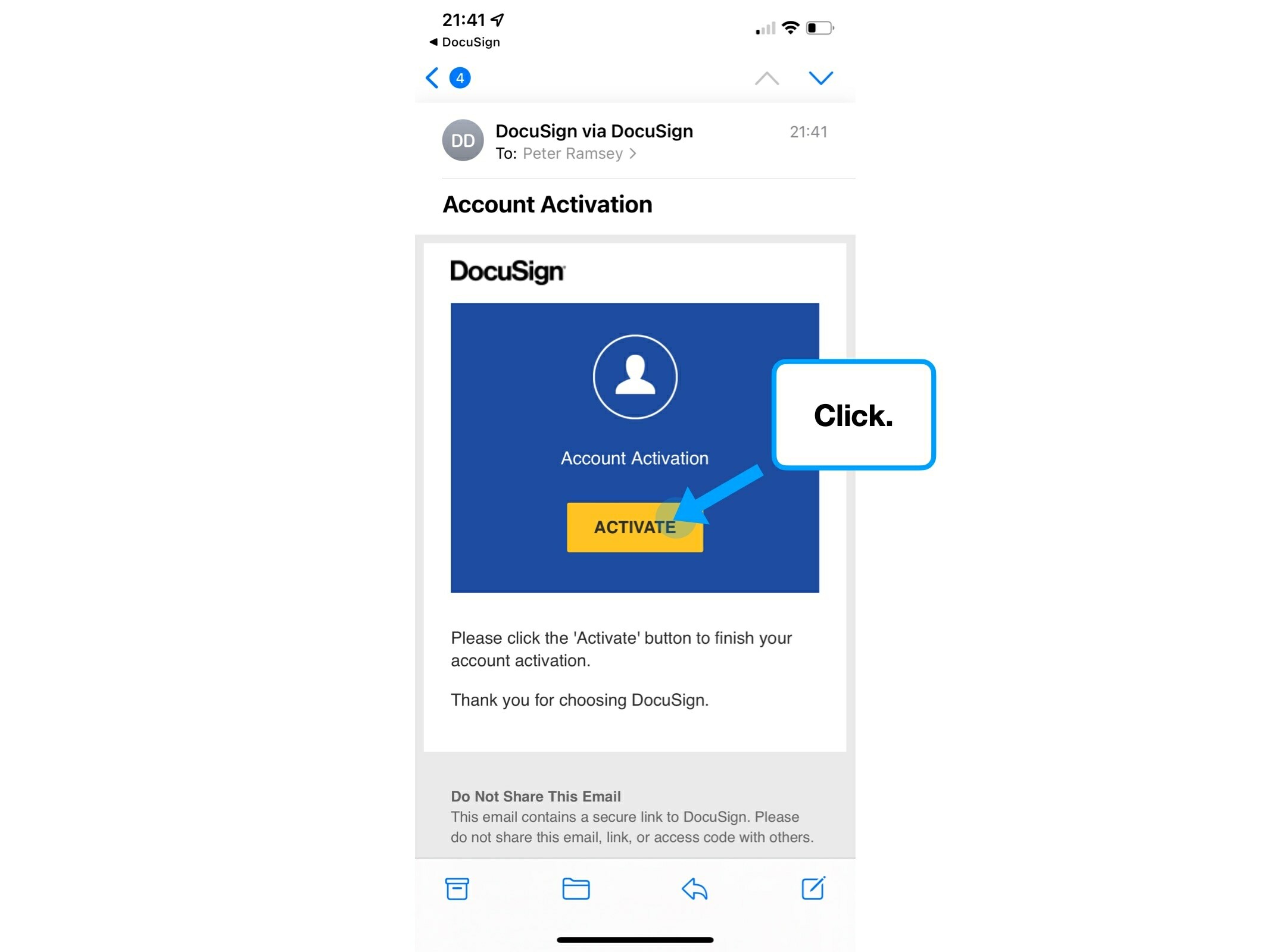
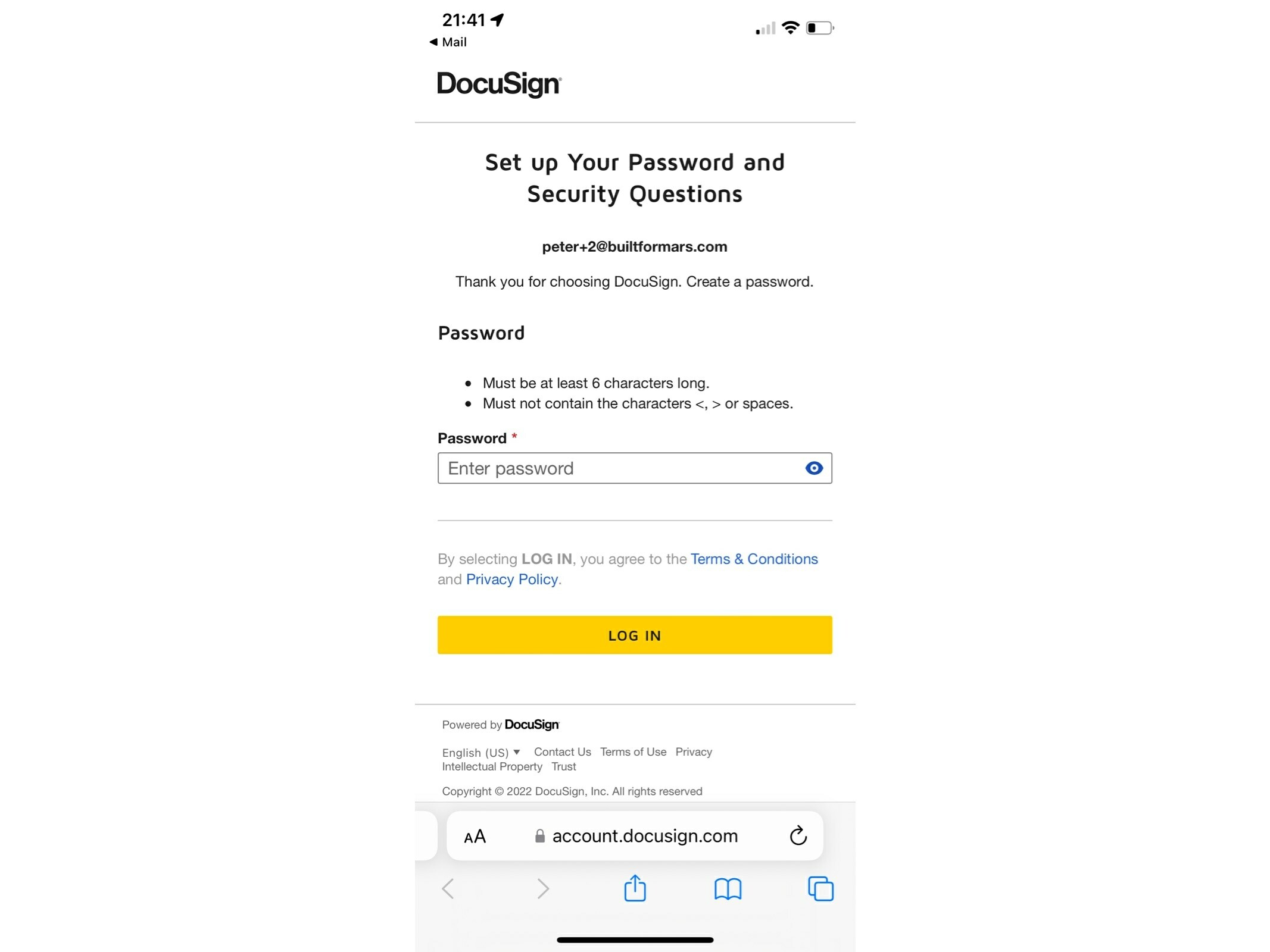
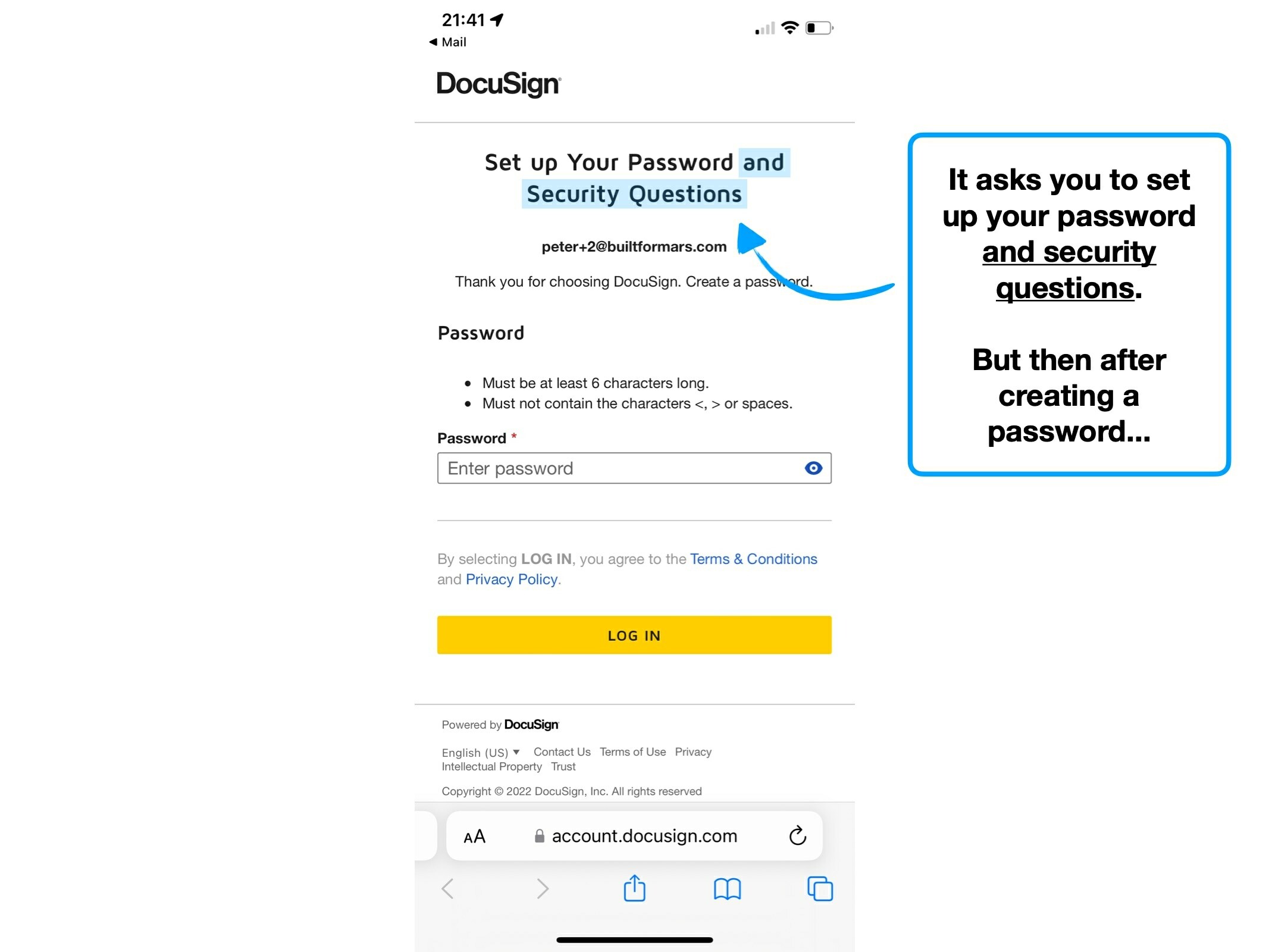
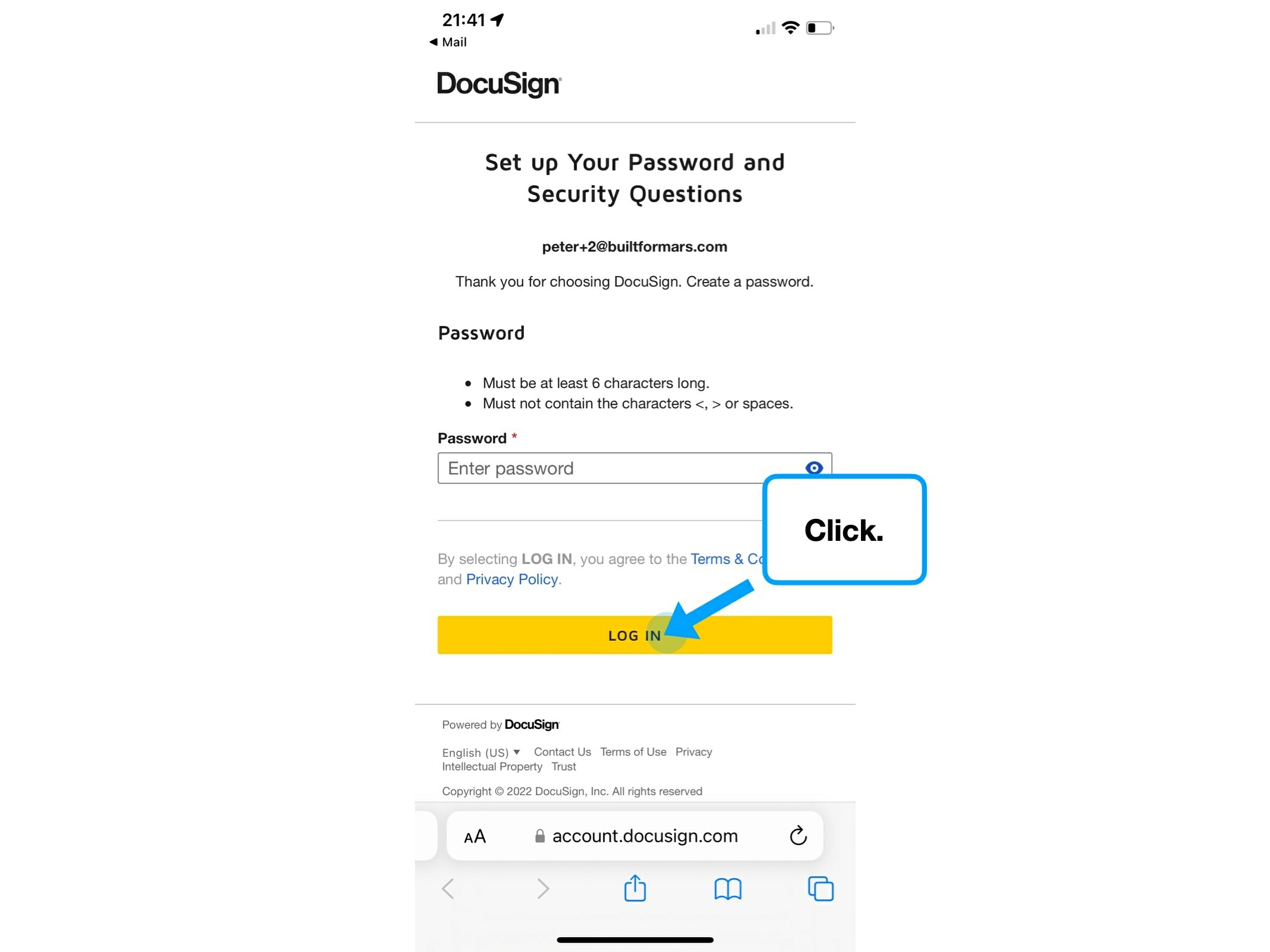
If you try to create an account with a service that you're already registered with, you'll often be automatically redirected to a specific flow.
For example, if you already have an Airbnb account, you'll be prompted to log in instead of creating a new one.
There are two flows, both starting from a single email address field.
Log in

Create account
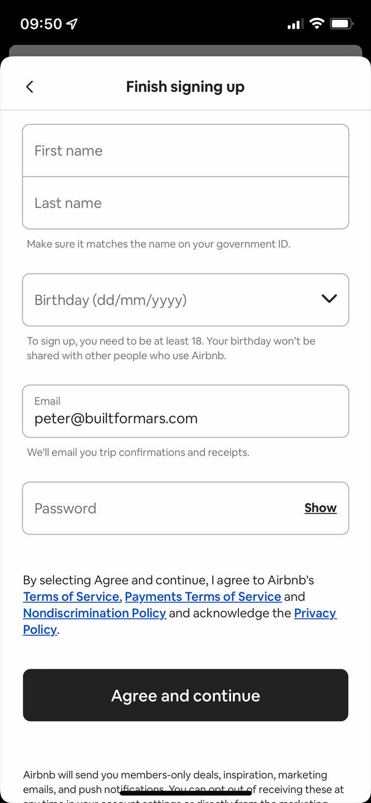
From a UX-purist perspective, this type of automated decision-tree undoubtably removes ambiguity. In theory, this would be beneficial to the hundreds of millions of inactive or dormant DocuSign users.
But, there's a security trade-off that may not be obvious: the clarity allows potential hackers to see which email addresses have associated accounts.
i.e., somebody could enter finance@apple.com, get confirmation that there is an associated DocuSign account, and be more targeted with a cyber attack.
It's clear that Airbnb are optimised for experience. But is it possible to have both a good UX and be (extra) secure?
To clarify the dilemma: how do you warn the user that they already have an account, without having any on-screen differences?
(Because, even the subtlest nuance could be noticed by a bot).
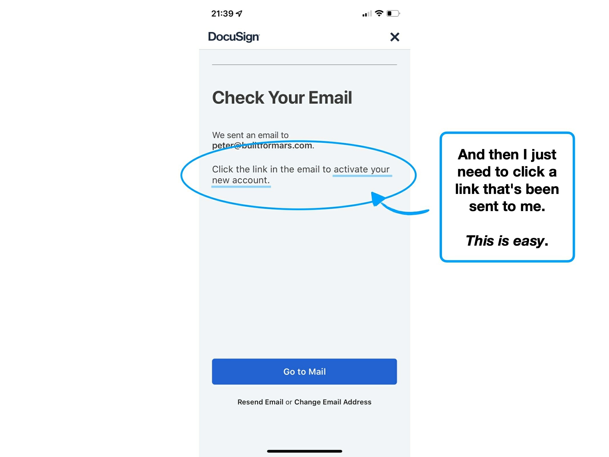
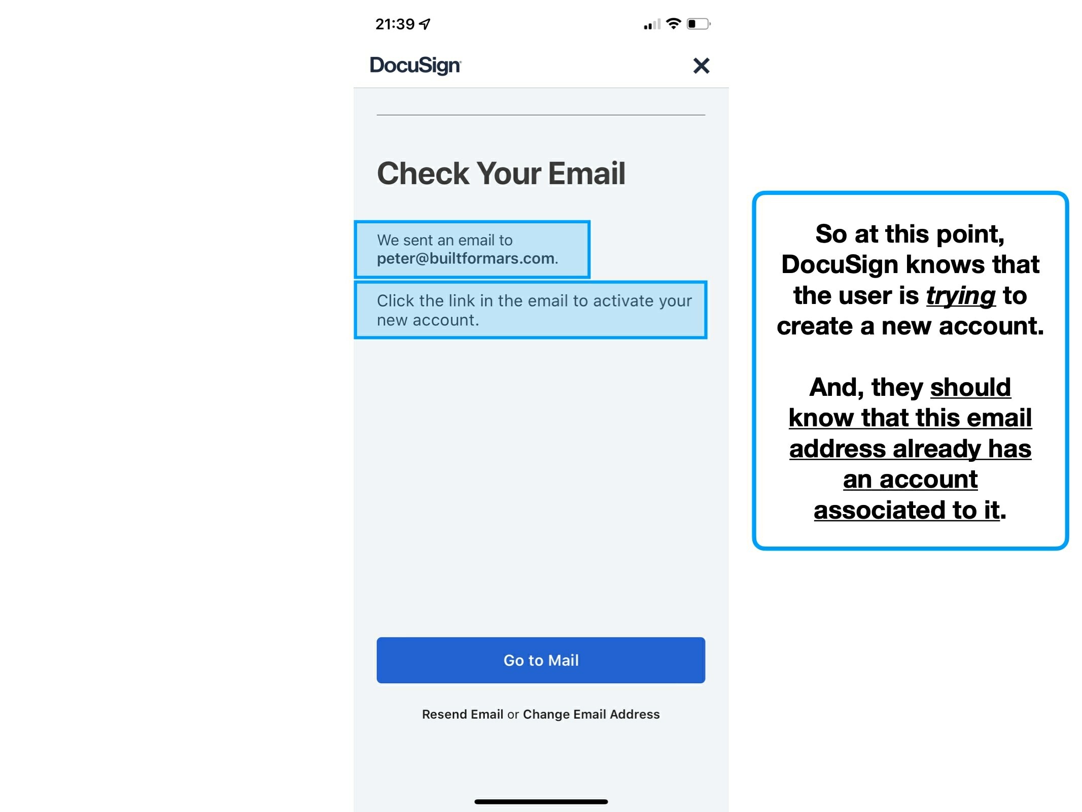
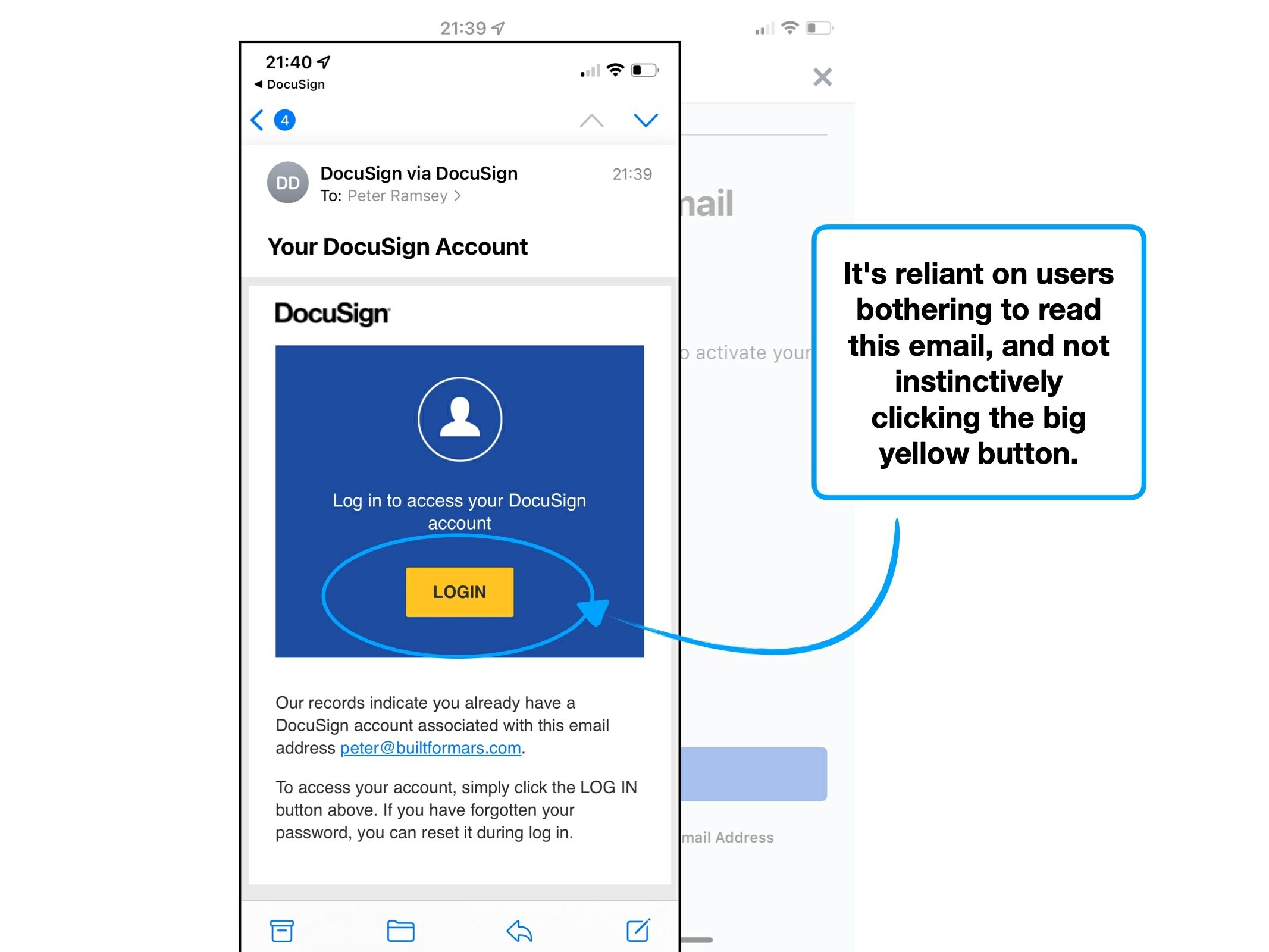
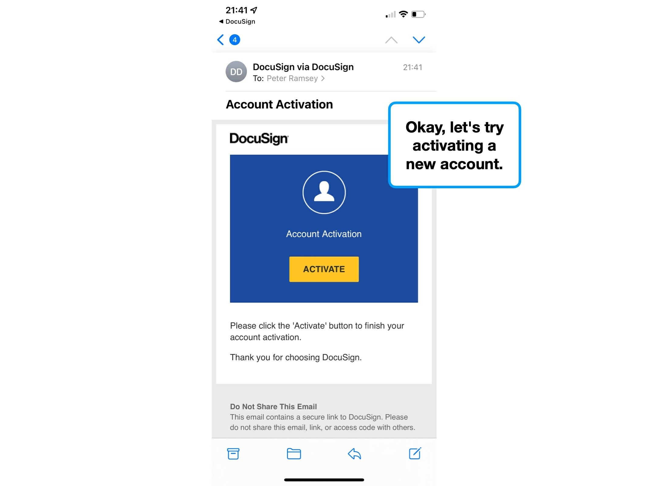
Ironically, DocuSign could remove some ambiguity by being vaguer. Their problem is that they're so specific about creating, and activating an account, that the notion of potentially already having one isn't considered.
Too specific ❓
Better alternative ✅
Click the link in your email to activate your new account.
We've sent you an email, click it to either activate your account, or login to an existing one.
If multiple paths exist, being too specific can create confusion, as it suggests certainty.
2. Considering limitations
It's common for founders to believe in an open ocean of possibility—where they can sail their product in whichever direction they please, inhibited only by factors within their control.
Frustratingly, this is a mirage. In practice, there are cultural, logistical and habitual limitations.
These forces can be both a light headwind, and at times an impassable storm. The key is that they aren't ignored, and instead product teams consider them in their designs.
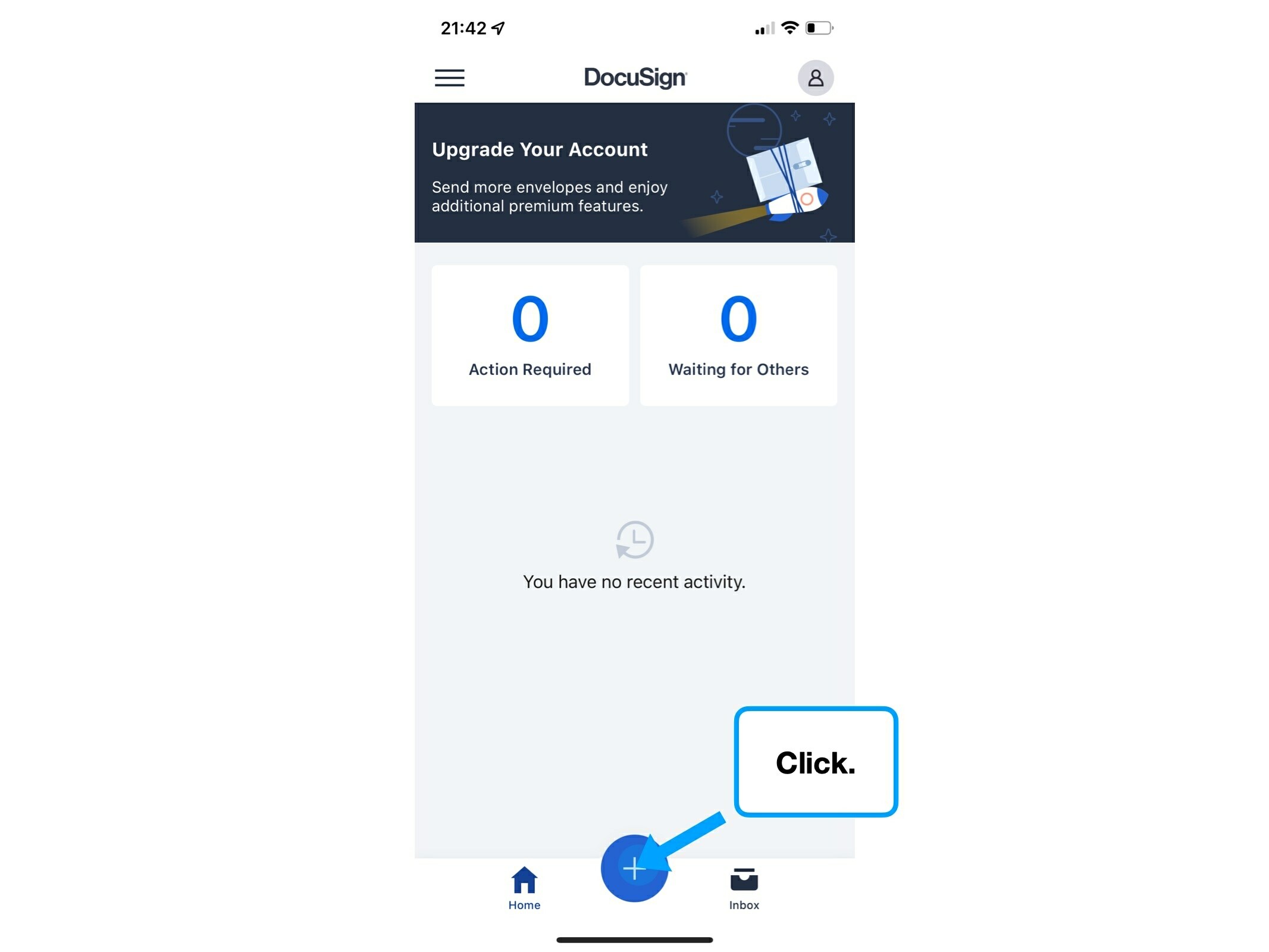
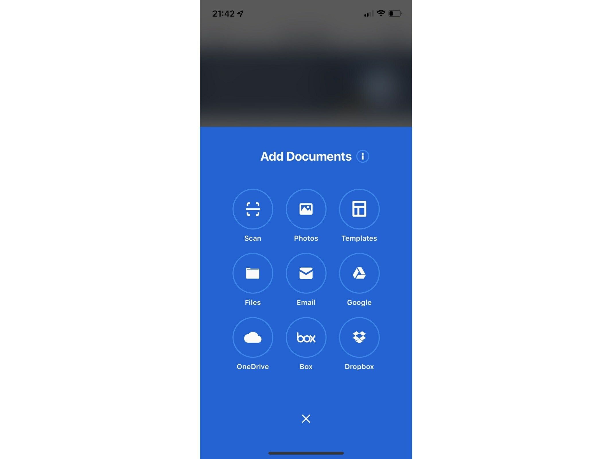
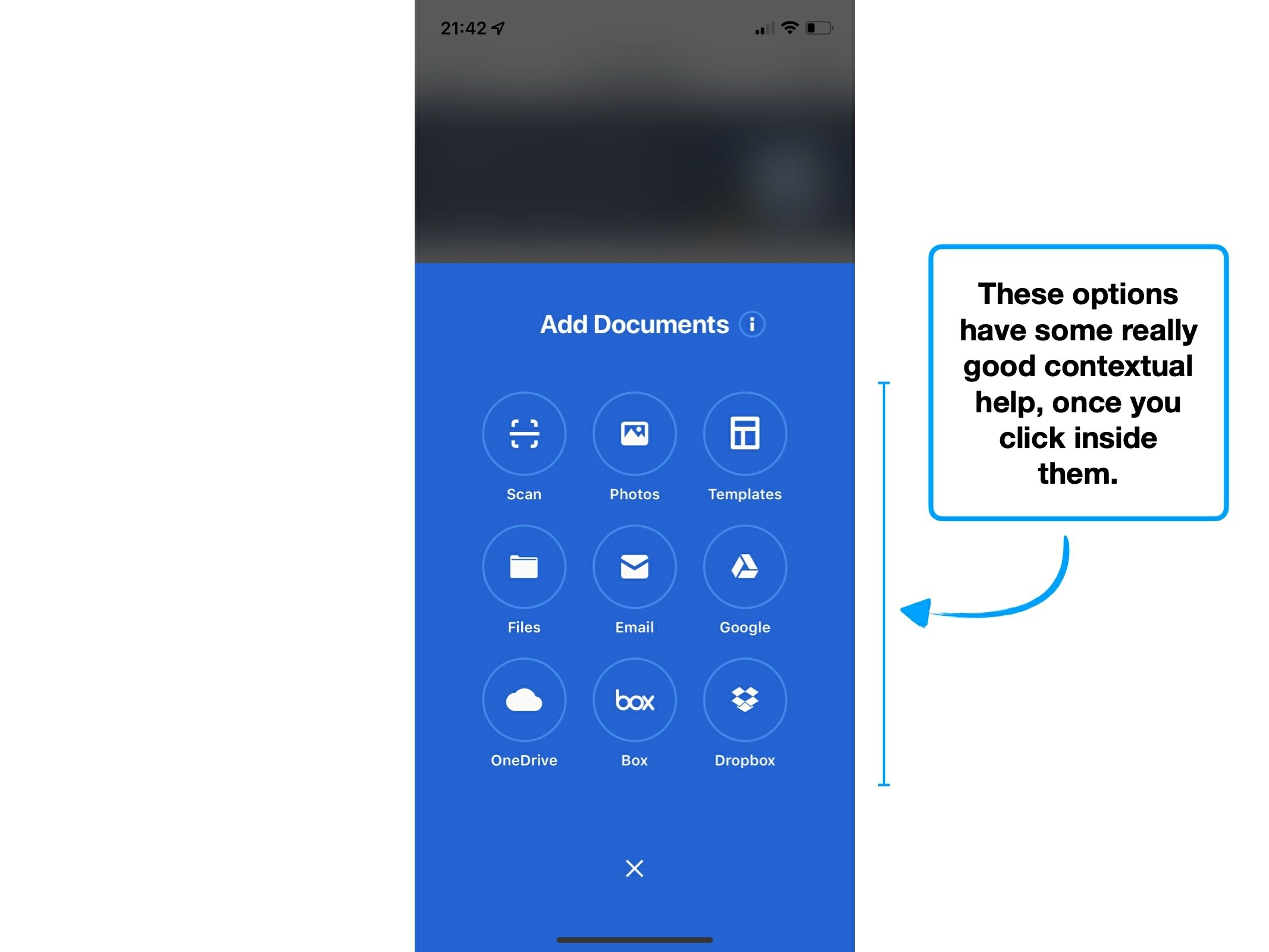
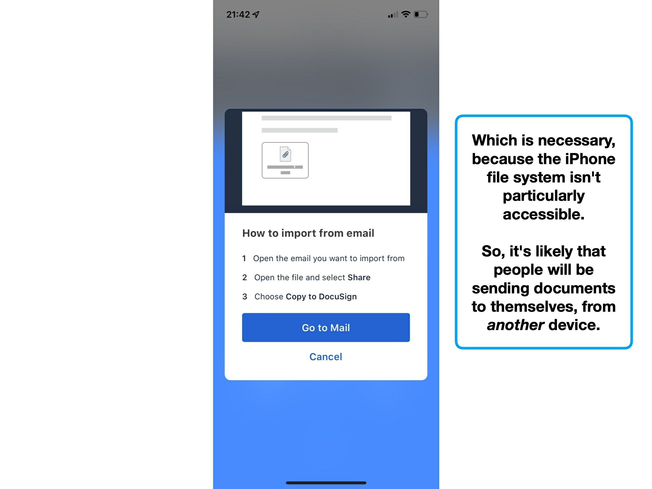
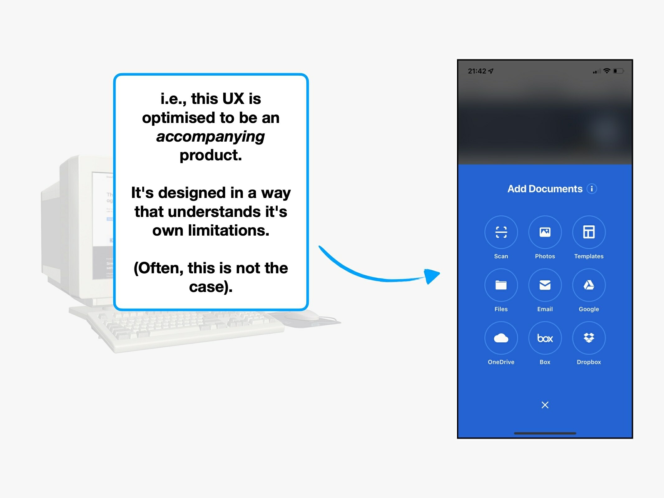
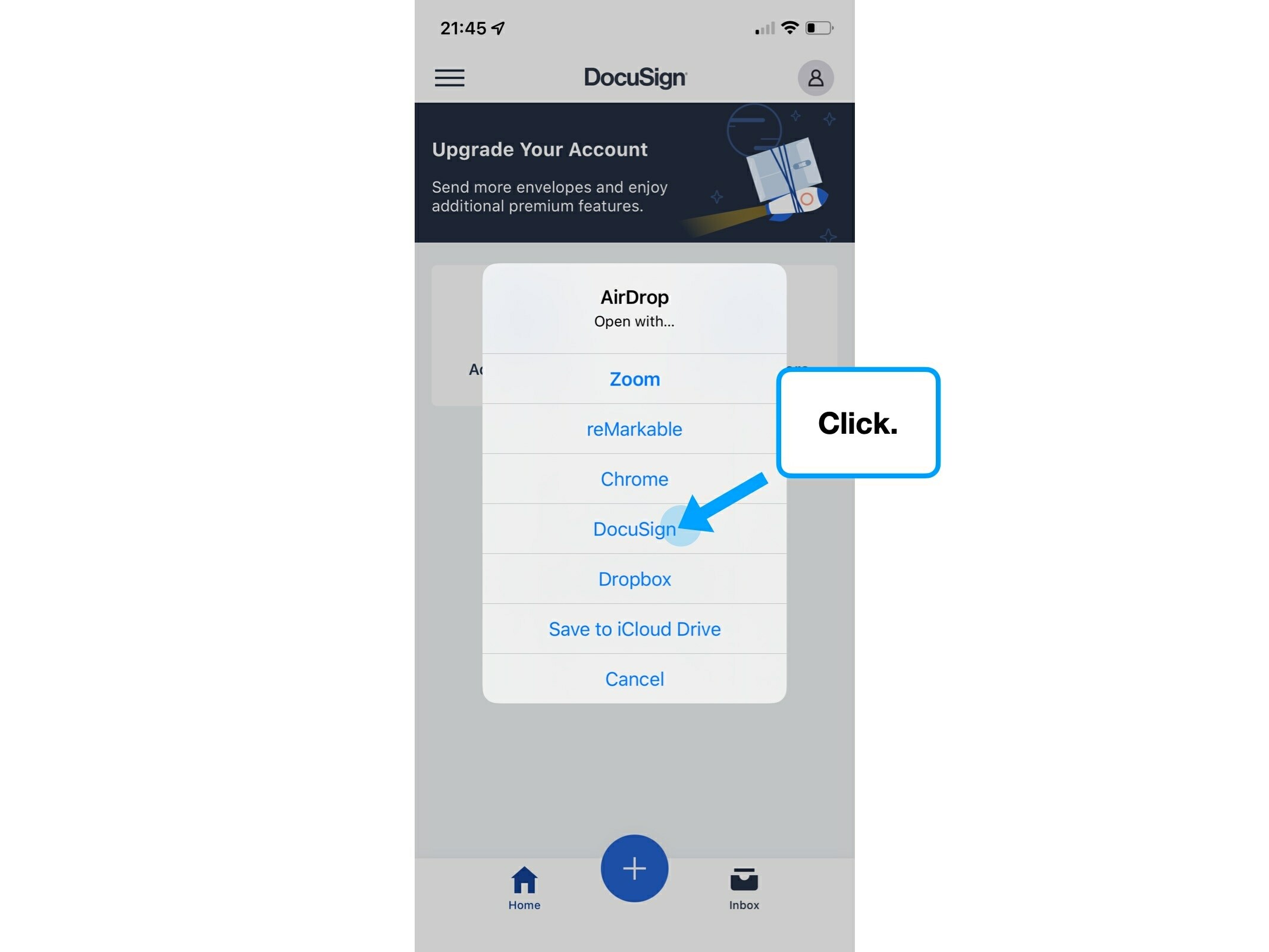
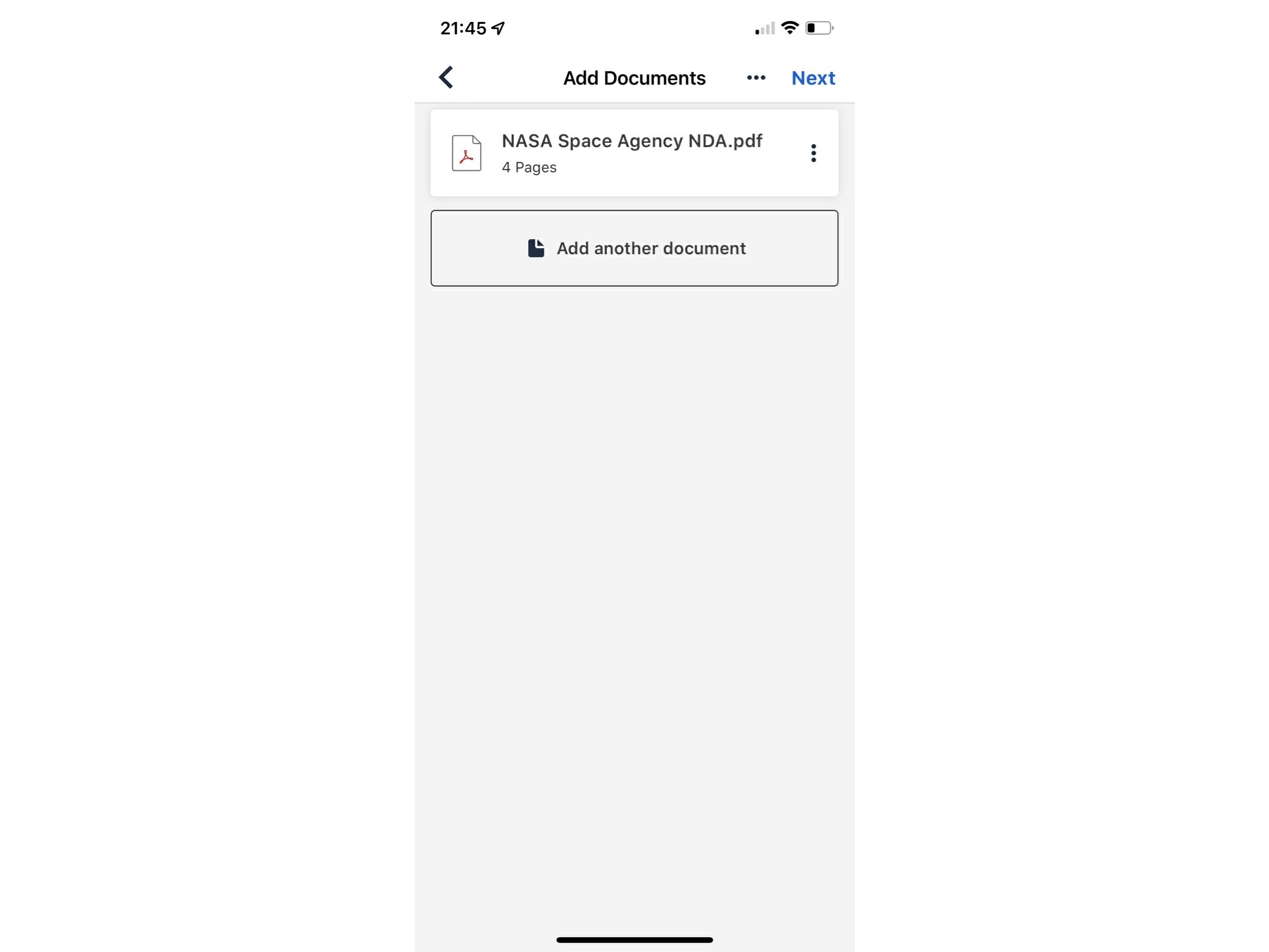
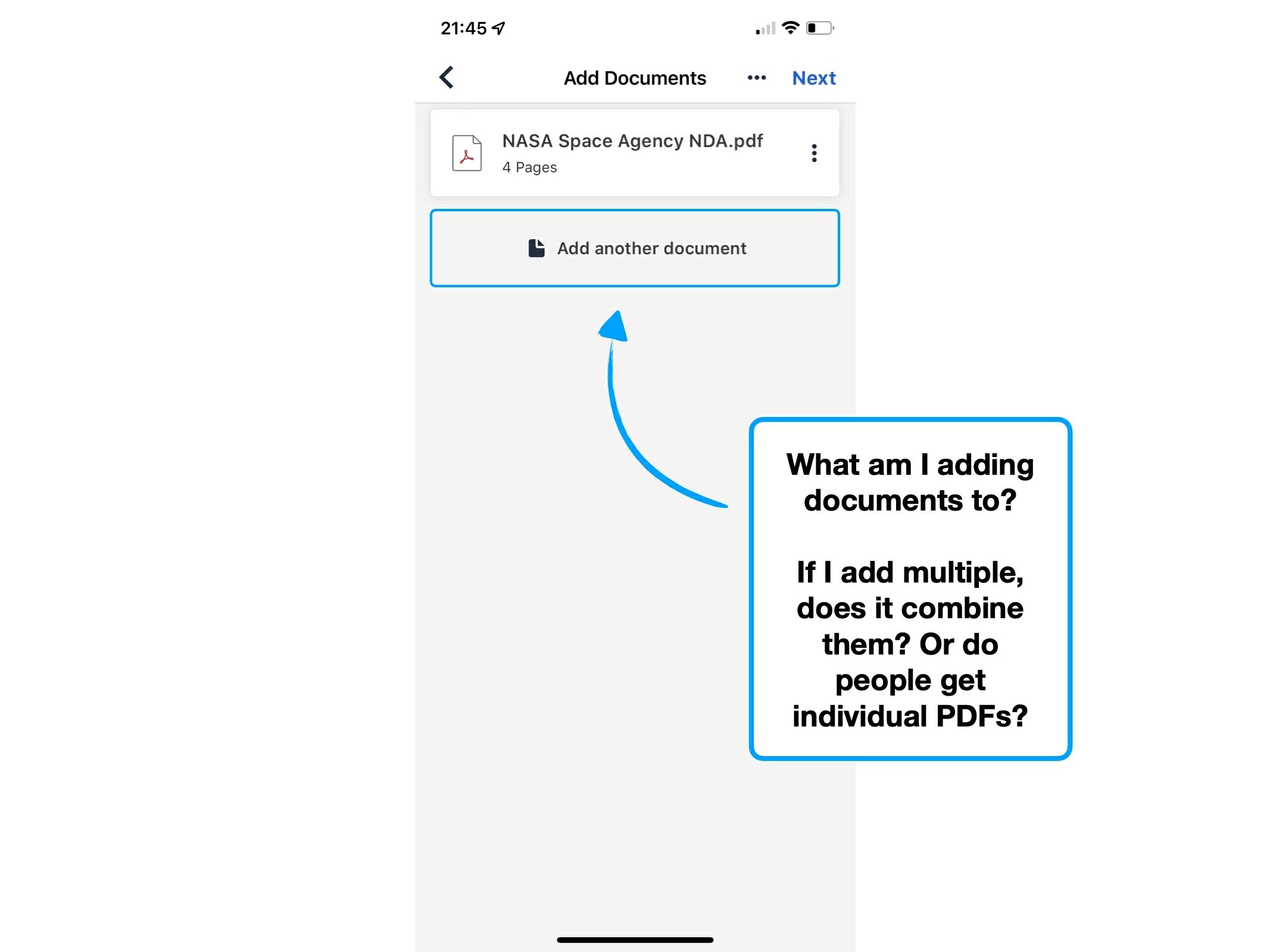
For example, no matter how innovative DocuSign's IOS app could theoretically be, it is (currently) tethered by the limitation that people tend to create legal documents on a desktop device.
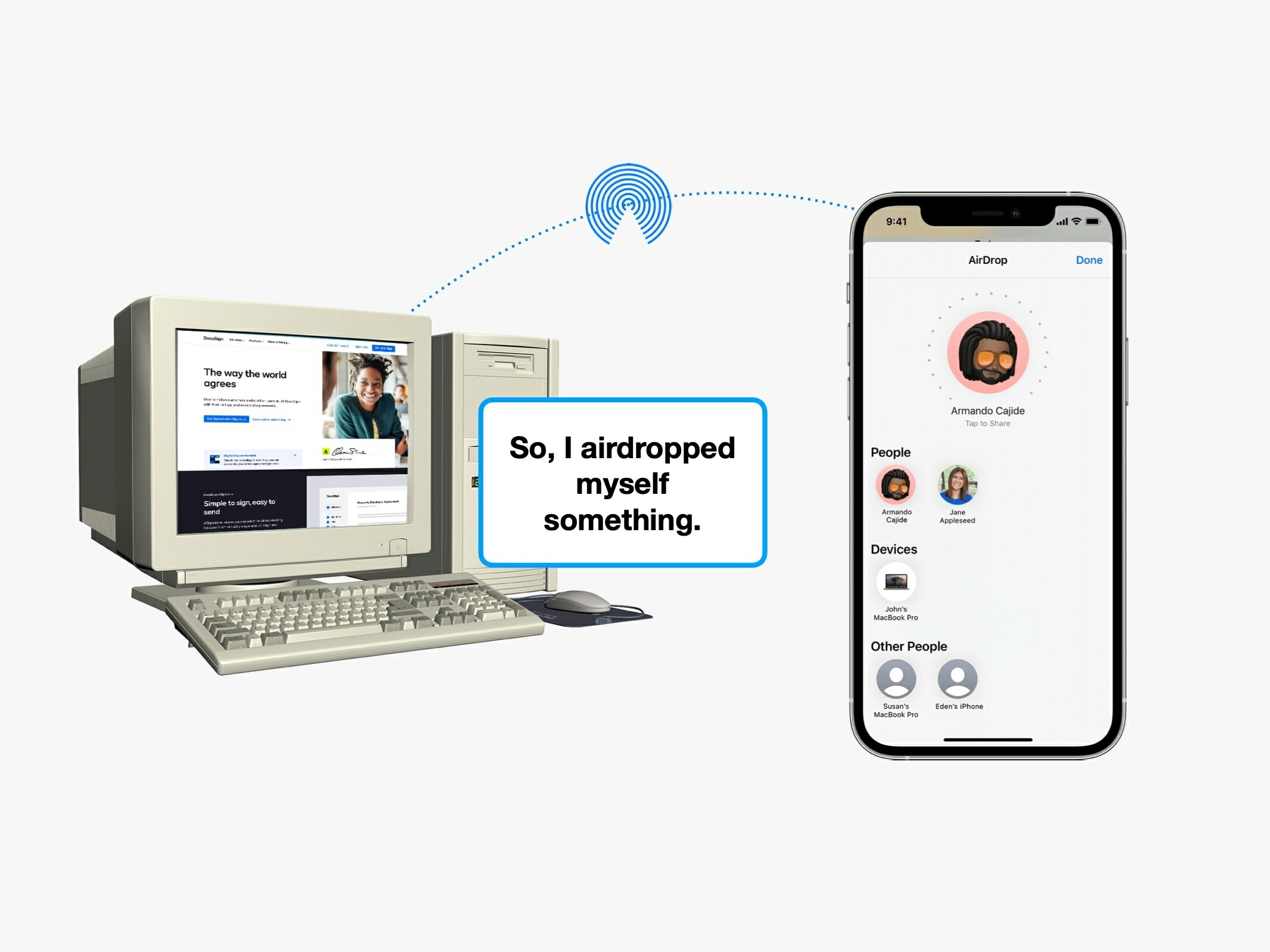
i.e., the mobile experience requires transferring documents from one device to another. It is not the origin of the journey.
This isn't a technical limitation, but rather habitual, because it's based on how people like to do things—and it's hard to change habits.
📱
Mobile
Optimised for easily transferring files onto the device.
🖥
Desktop
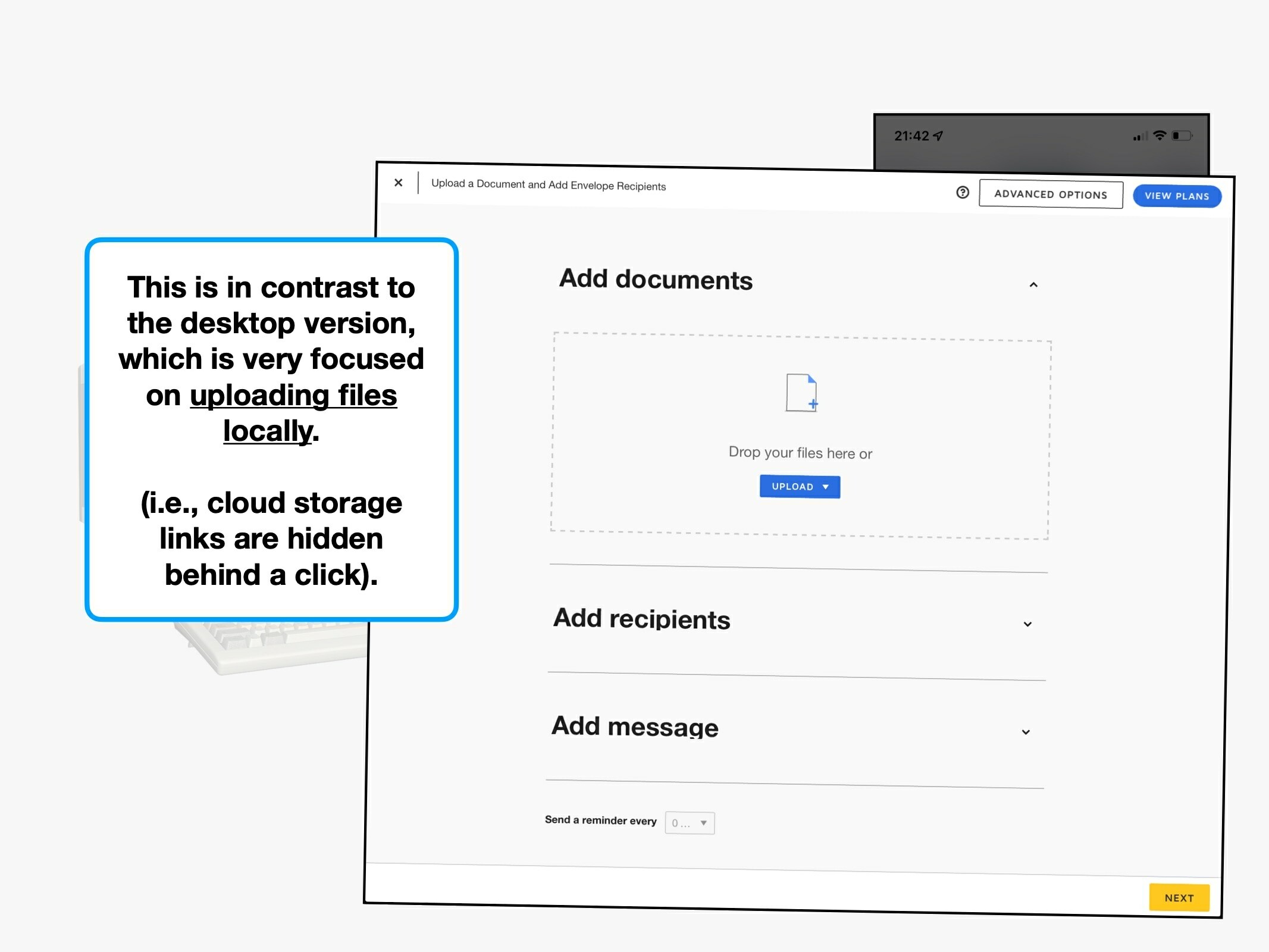
Optimised for uploading local files—cloud integrations are hidden behind a click.
This nuance presents itself in the desktop view—which you can see is hyper-focused on uploading documents from that device's storage.
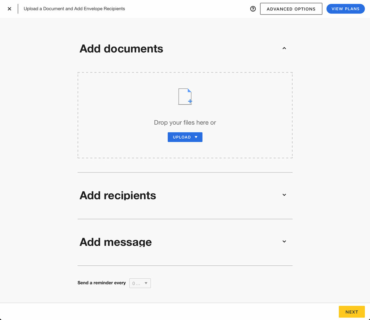
The point is this: DocuSign have done a great job of understanding and reacting to their external limitations. The app is intentionally different, because it has unique requirements.
They avoided the temptation to simply make the desktop experience responsive for smaller devices—which is extremely common.
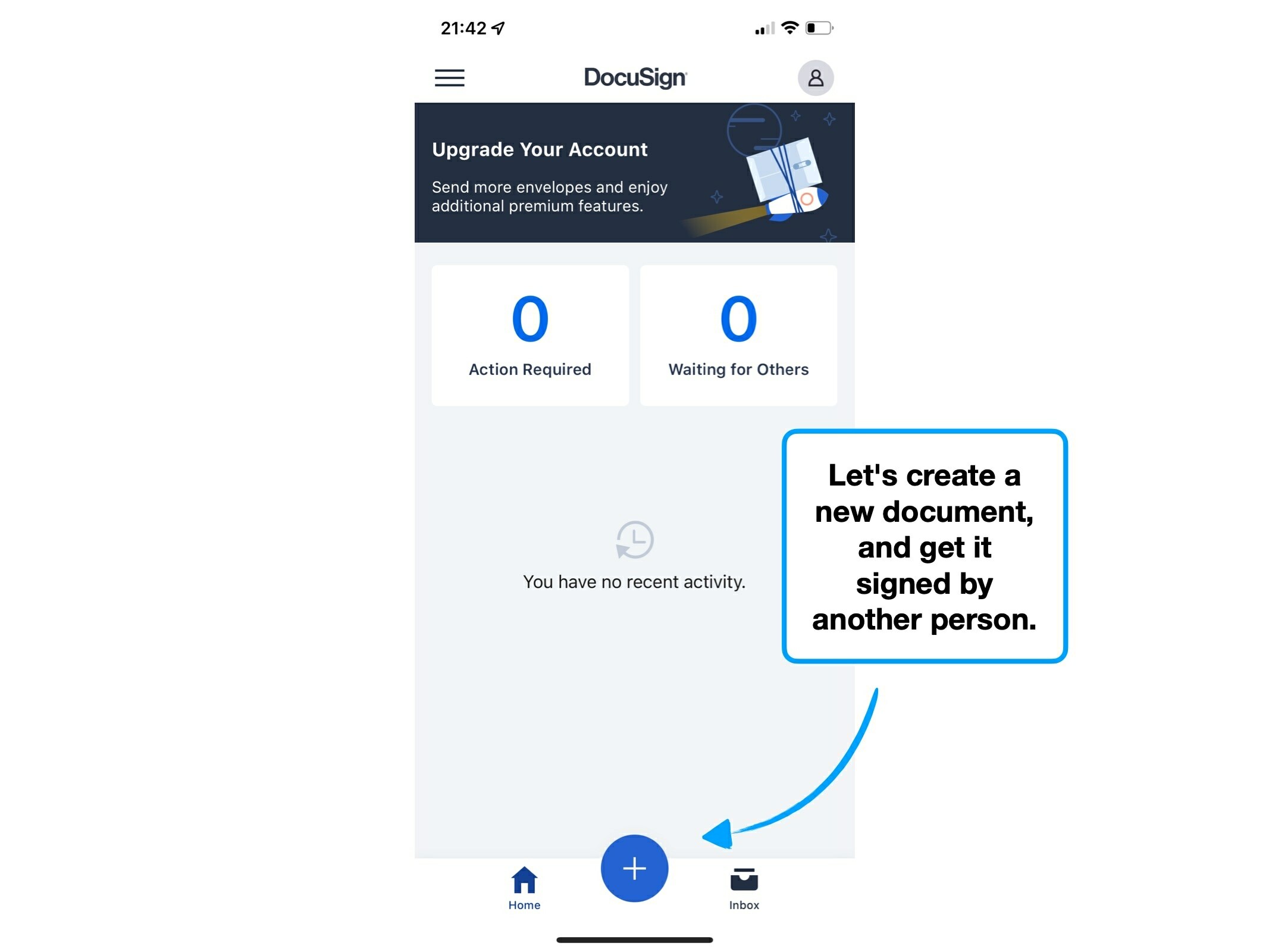
3. Free account*
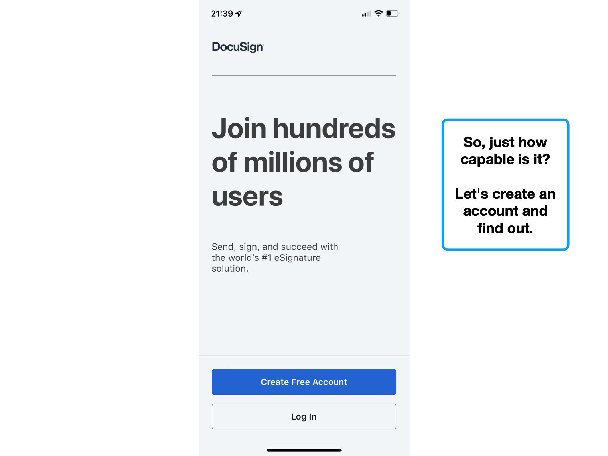
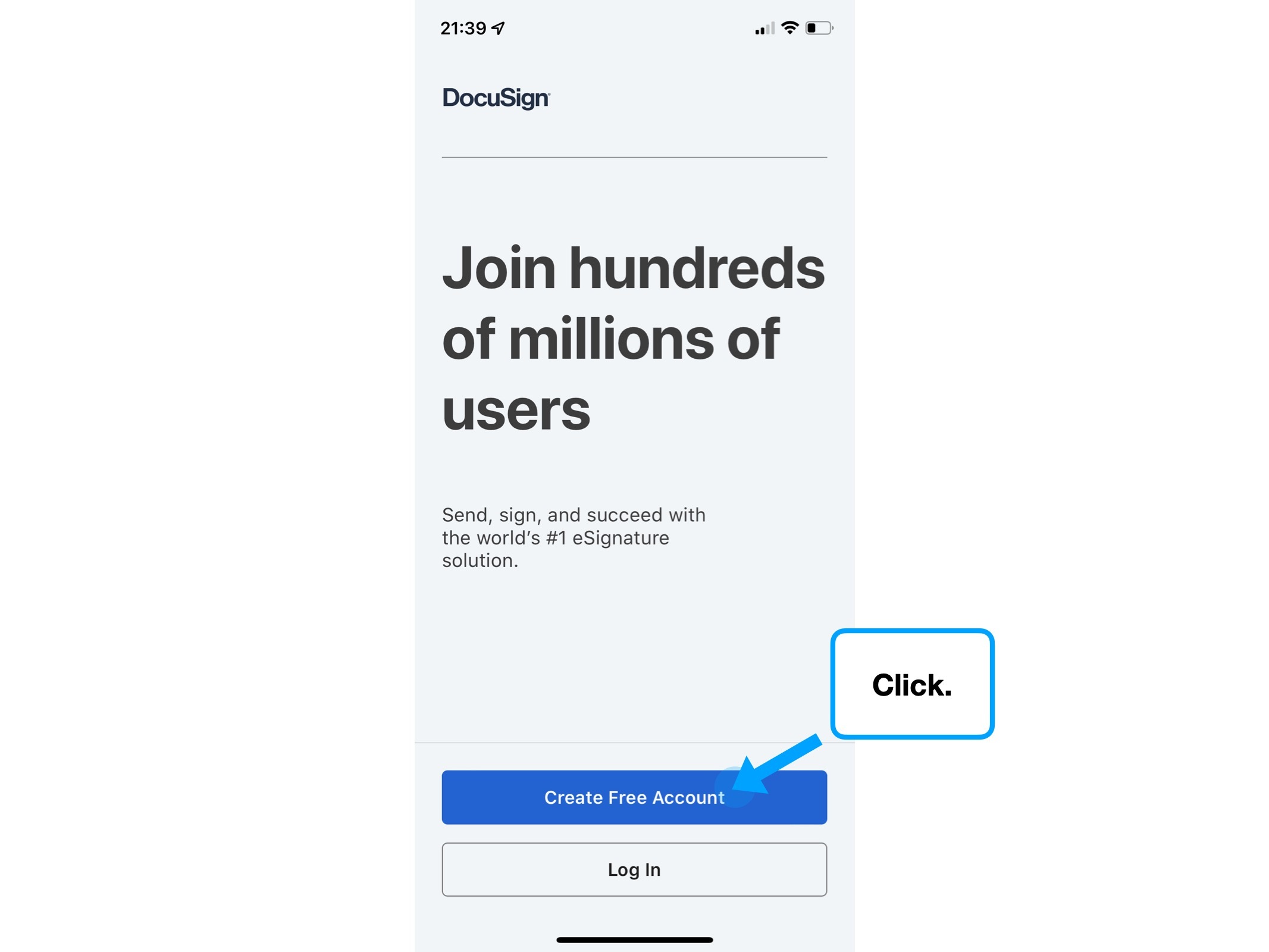
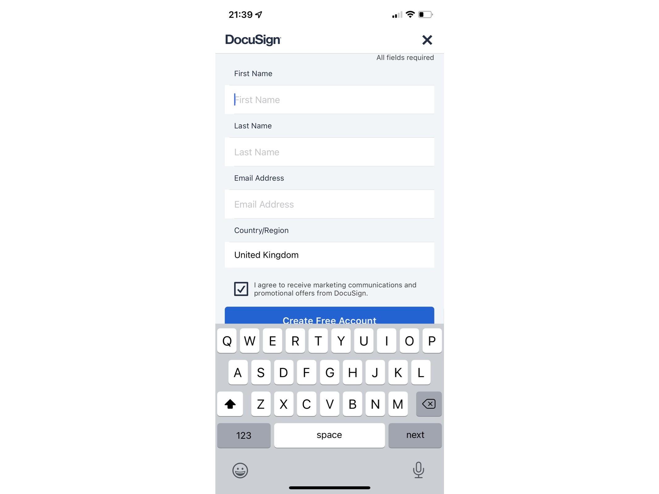
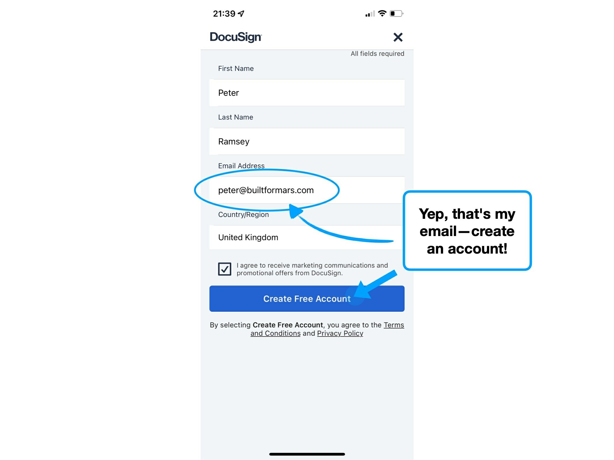
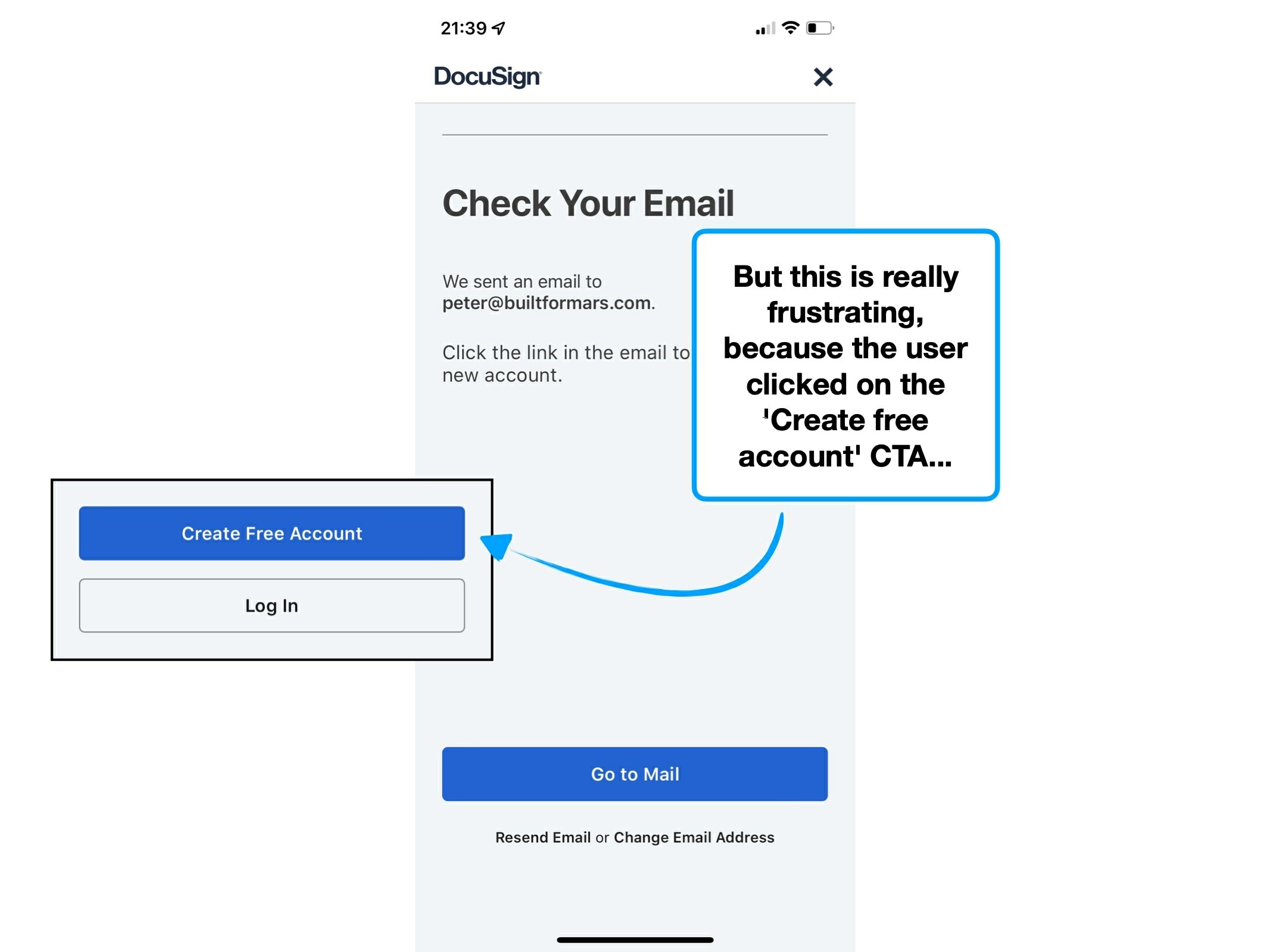
When signing up, you click a CTA that's labelled; Create Free Account.
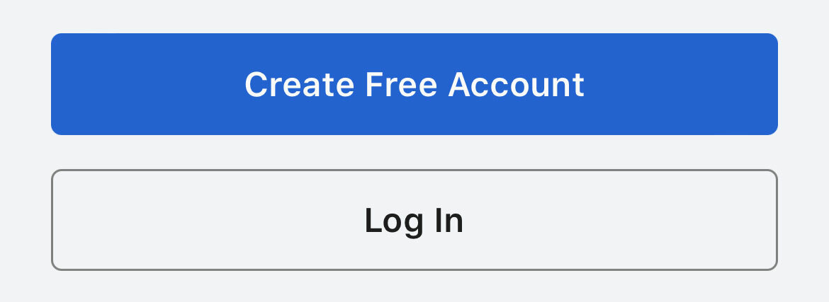
Then, you're able to create, send and sign documents—there's no mention of a trial or account limitations. A reasonable and rational assumption is that this is a free account.
But after sending your third 'envelope', you find out that you're out of 'sends'.
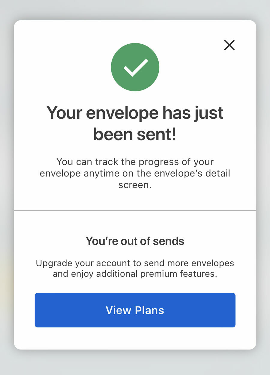
Despite the perception of a free account, new users are actually signing up to a trial of DocuSign, and are only given 3 free sends. After which, they need to pay to unlock more.
Objectively the outcome is the same, regardless of a broader understanding, but the perception of that trial period is what matters.
Imagine if you could be Spiderman for a day—knowing that it's only for a limited amount of time (or web-slings), will reframe your experience.
It'll help prevent the feeling that the user has had something unfairly taken away from them.


The psychological tendency to want to 'keep stuff', is called the 🎁 Endowment Effect, and it's essentially why free trials of anything are so effective.
It's true that by being upfront with the limitations of the trial, a small cohort may not bother investing their time into using the product.
But, by staying silent, and deferring all of that friction into a single moment, you're almost guaranteeing a major point of frustration, or worse; a sense of deception.
Remember, the best (purest) user experience may not be the best converting one.
An obvious example: adverts. These knowingly worsen the UX in exchange for revenue.
Despite that, it's my opinion that DocuSign should educate the user about these limits, before and whilst they engage with the product.
This perception-shift would allow the user to plan their experience, and prioritise the 3 sends that generate the most value.
i.e., it'd be annoying if I didn't know that my trial was limited to 100 Spidey-swings, and I used them all trying to sling my socks into the washing machine.
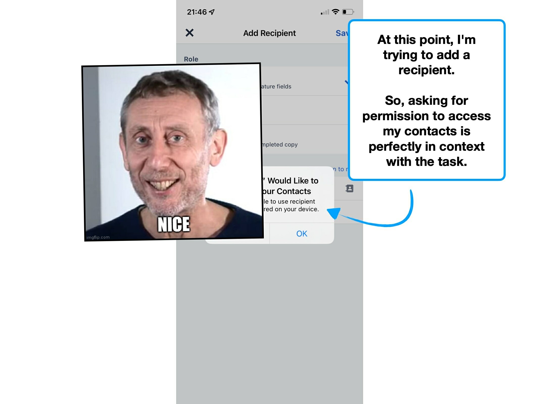
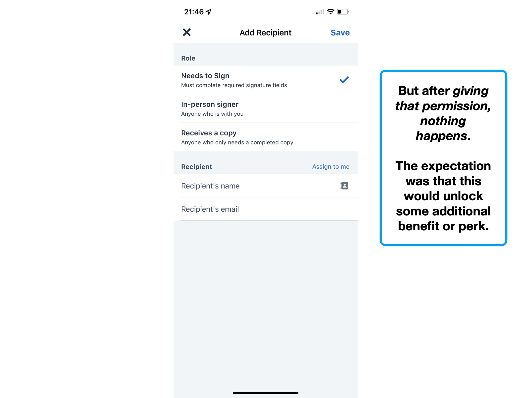
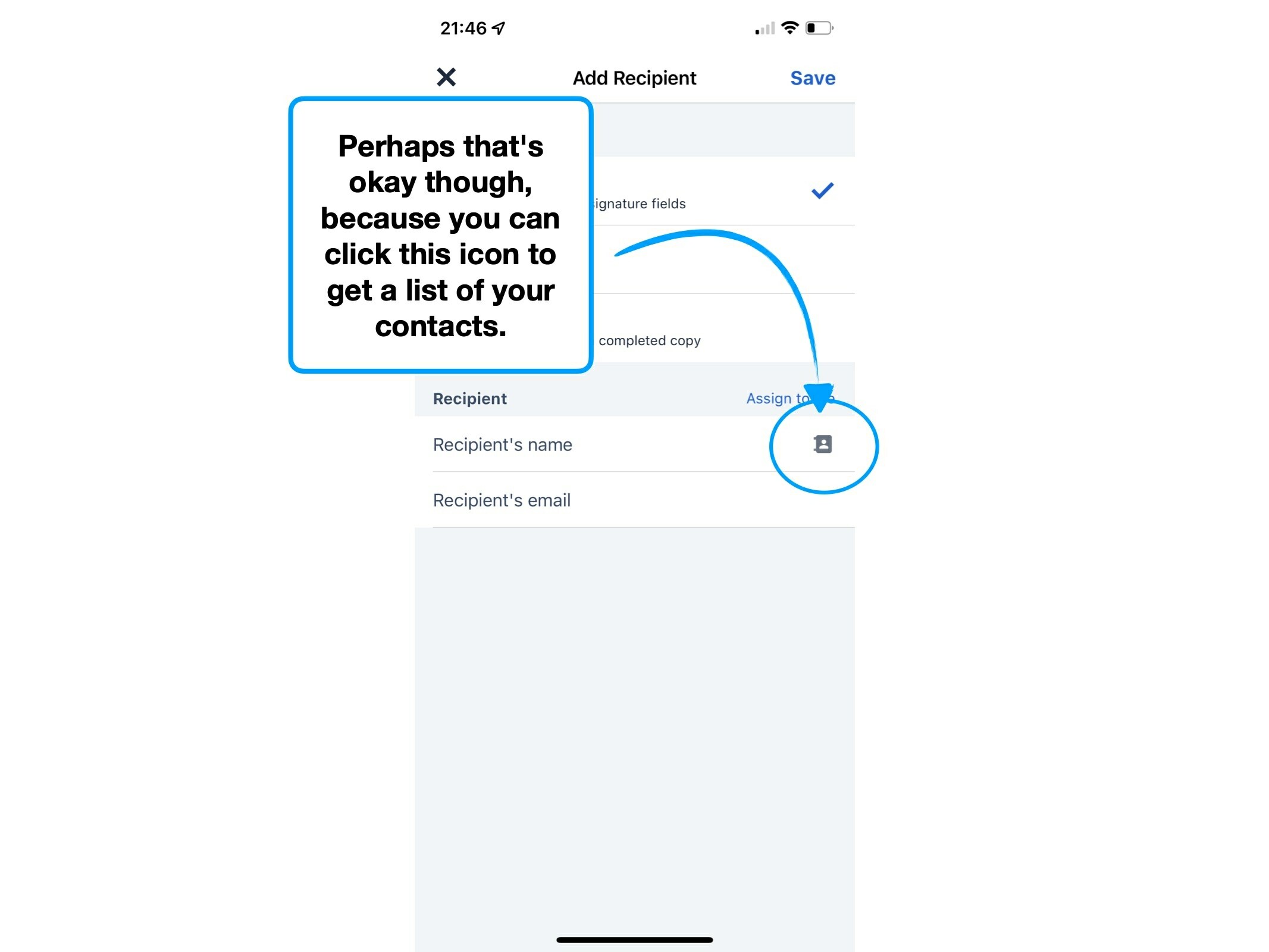
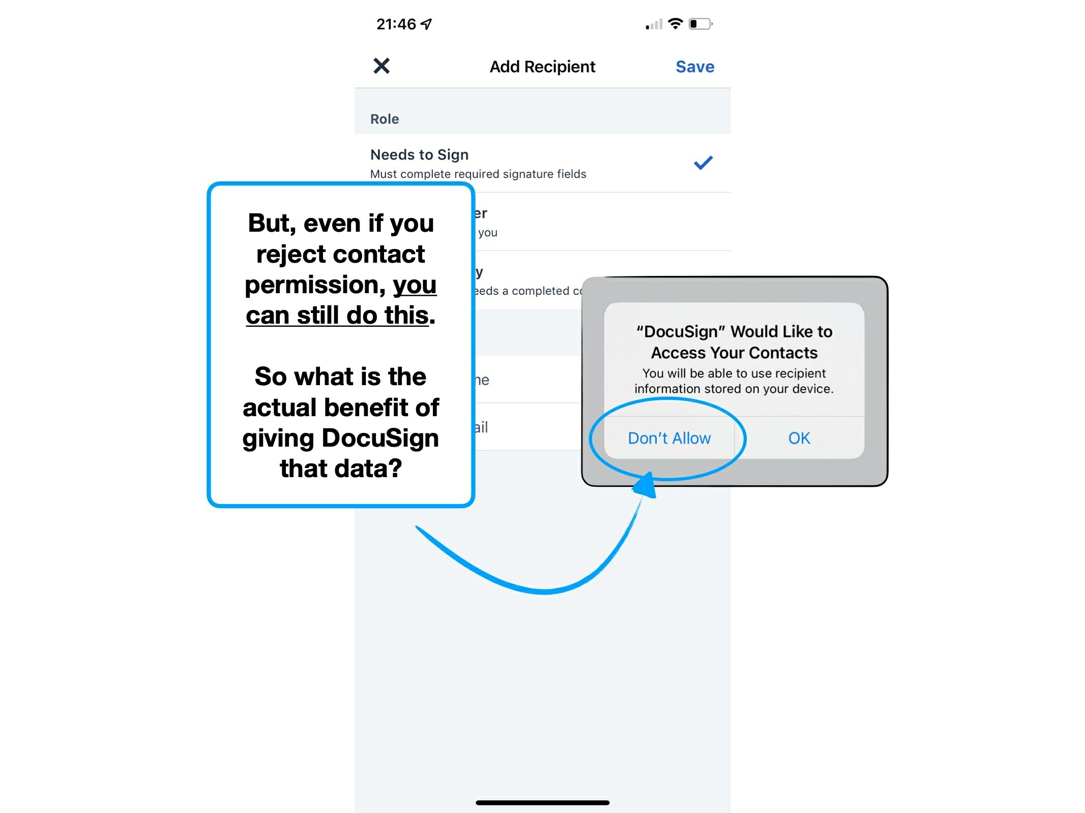
4. you@gmial.com
Imagine that you've created a purchase agreement, added multiple recipients, their data fields, and then clicked 'send'.
But, as you wait for the signatures to start rolling in, you notice an error:
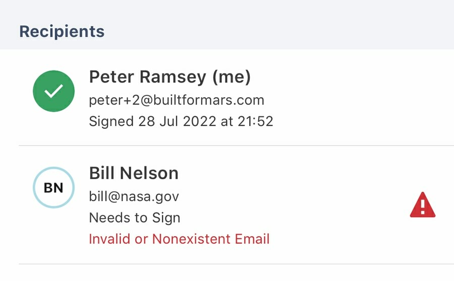
Instinctively you'd expect to amend their email address, and just resend it in a few clicks. Except you can't do that, you need to start again.
You cannot modify the envelope once it has been sent. Your only option is to void it and start the process from scratch—which would count as another 'send' in your trial.
Now, let's assume that there's some nuanced regulatory or security rationale for the lack of this function—here are three UX tricks that DocuSign could (and should) implement:
💬
Messaging
Clear warnings and prompts, that once sent, you cannot modify a recipient's details.
🌱
Duplicate draft
Make it easy for users to void the existing envelope, and create a duplicate version, with editable contact details.
❗️
Inline validation
Prevent the user from sending envelopes to obviously-mistyped addresses (i.e., @gmial).
That last point is face-palming preventable.
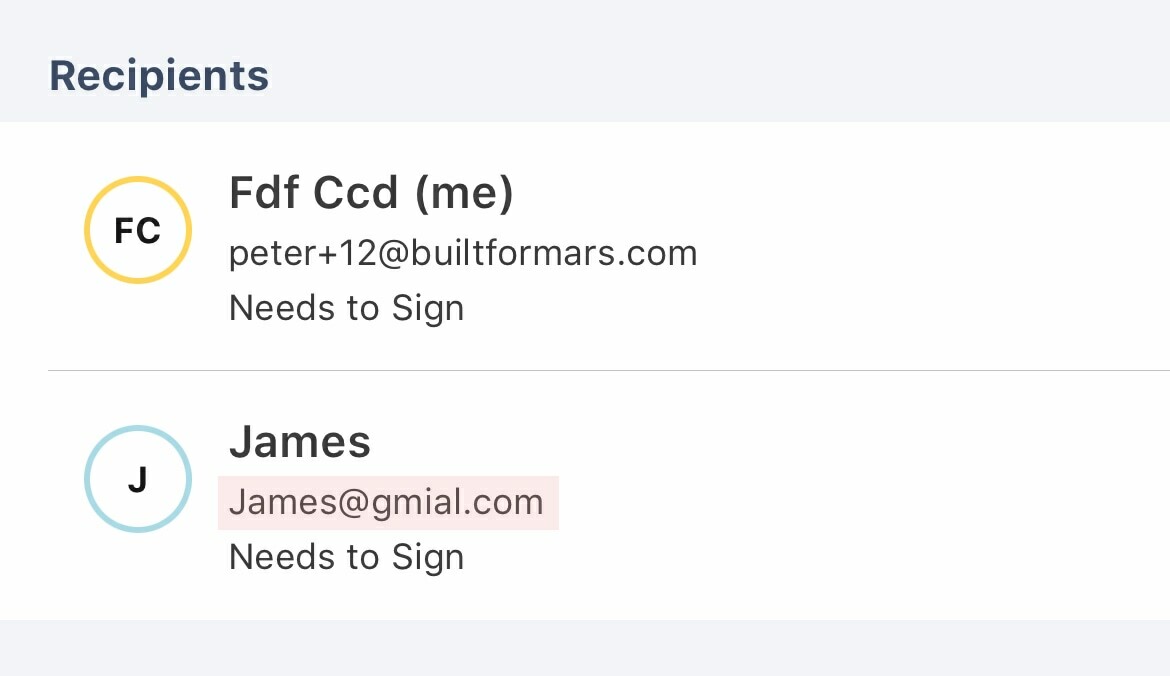
And this is something that almost every service would benefit from: users should be warned before sending documents, referrals, invoices or adding contacts with obviously-mistyped email addresses.
🚧 Implementation tip:
There are services that will validate an email address via an API for a small fee, but a free alternative is just to manually build rules for common and obvious typos.
e.g., @gmial, @gmail.co, @yahho, @outloook...
5. emailpreviews
Punctuation (and spelling) is seldom noticed, unless used incorrectly.
When verifying my email address with DocuSign, I received the following:
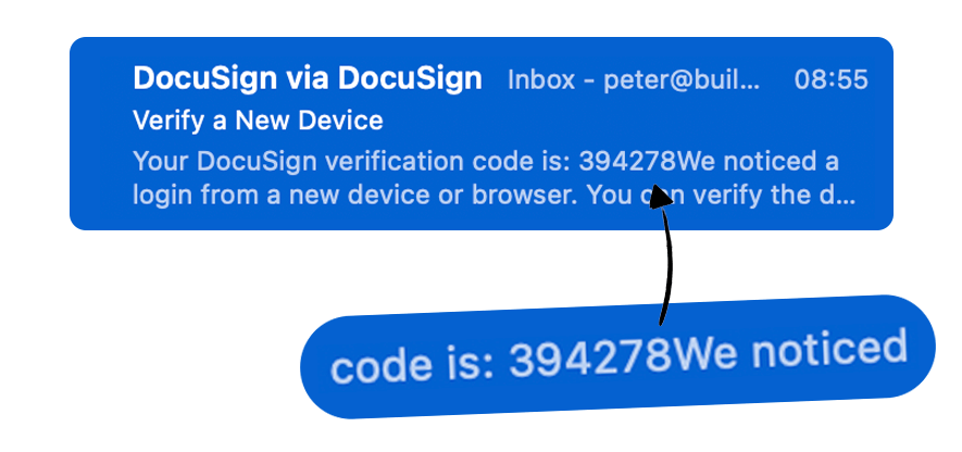
Is the code 394278, or 394278WE?
It's not a major issue, and I doubt it's hurting conversion rates. But it's an annoyingly common issue, that unnecessarily adds friction.
And if nothing else, it sets a bad impression.
Here's another variation of the same issue.

Words, sentences and codes have been mashed together, in a seemingly random fashion.
This happens because the preview is being automatically generated from the content.
i.e., it'll take the content, line by line, and fill the preview. The lack of punctuation is caused by the missing punctuation inside the email itself.
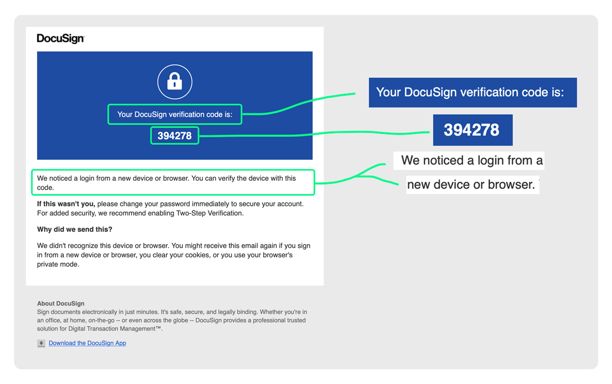
Luckily, the fix is easy—people just forget to do it.
Possibly because product teams use third party clients to send emails, and so it's obfuscated slightly from their day-to-day workflow.
But, by adding content that is invisible to humans (through CSS, not magic), but visible to your inbox, you can specify what appears in the preview.

Mail clients like Mailchimp and Sendgrid allow you to do this from inside the application.

