
By Peter Ramsey
10 Oct 23
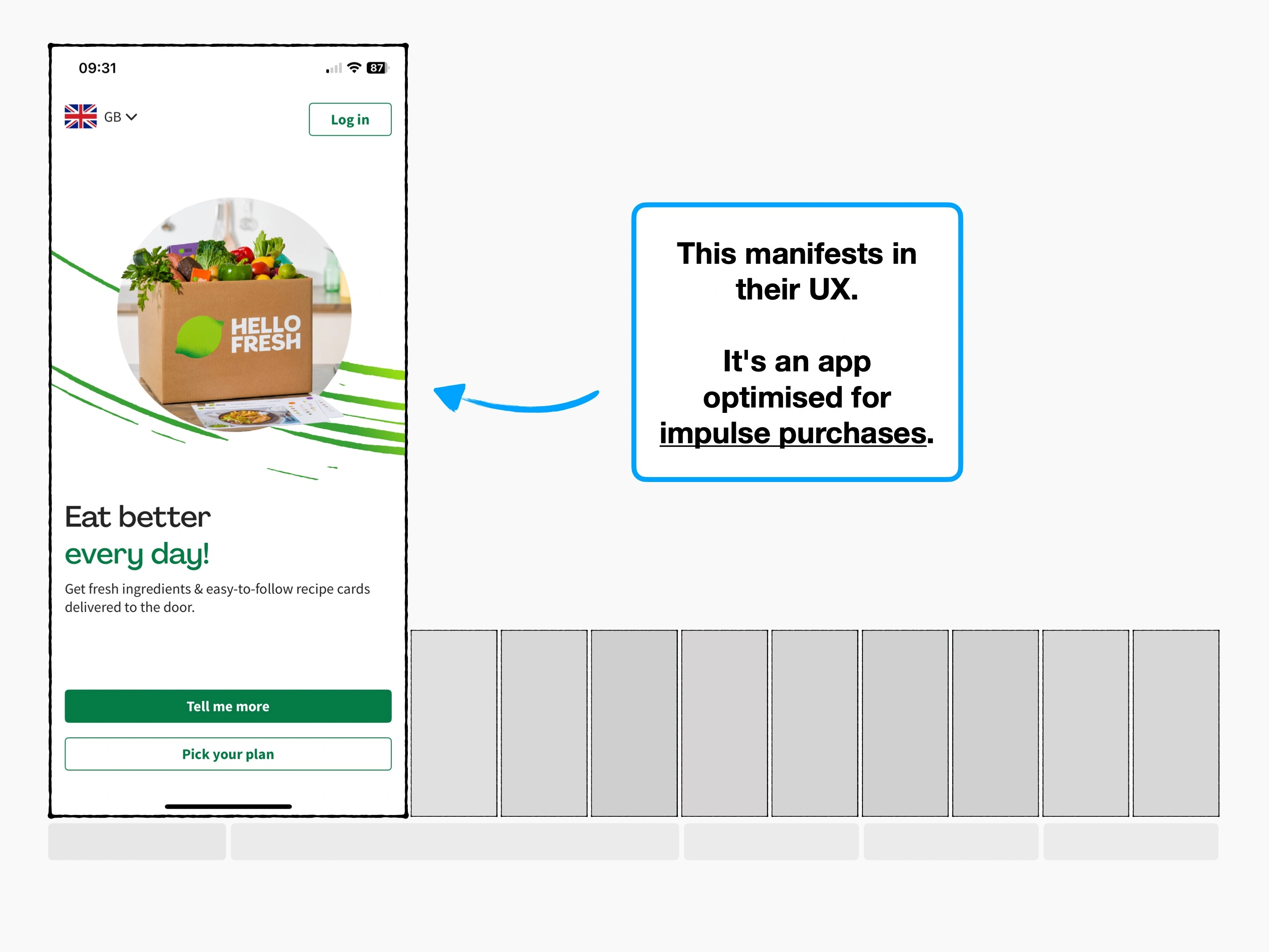
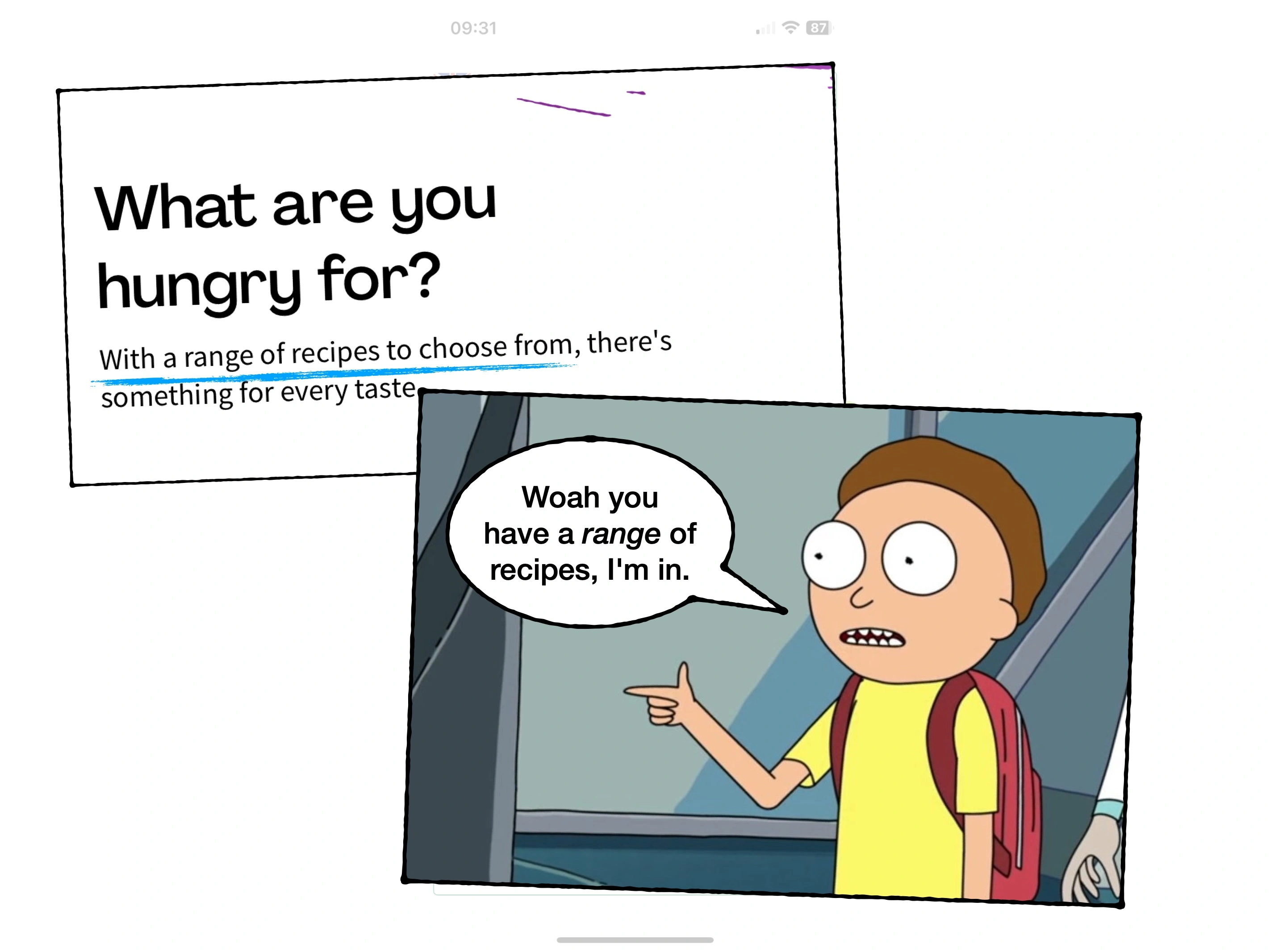
A checkout designed for impulse purchases
HelloFresh are one of the most popular meal-kit providers in the world, serving more than 7 million customers every month.
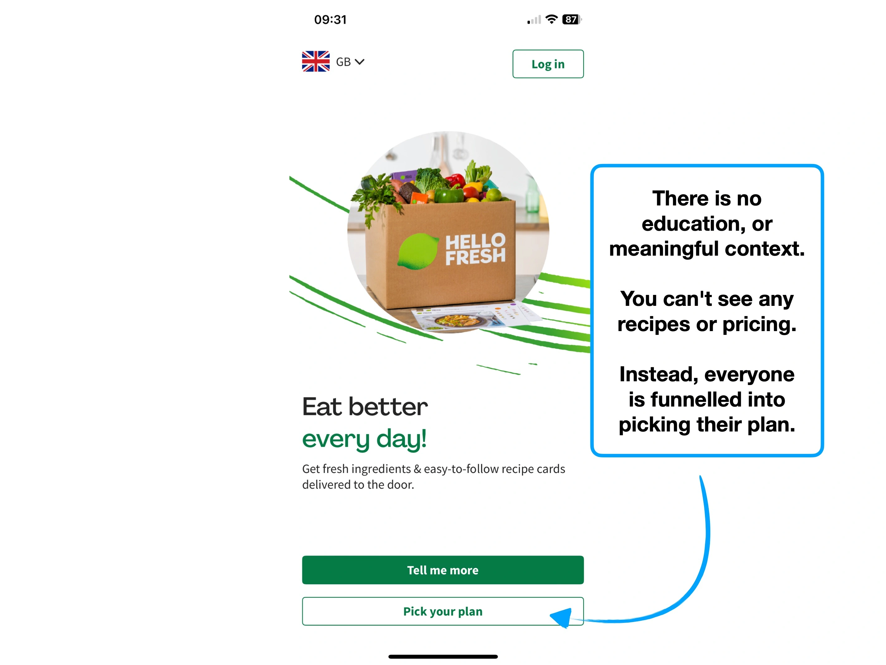
Their checkout is clearly designed for impulsive decision-making, frequently adopting dark patterns and nudging potential customers towards commitment.
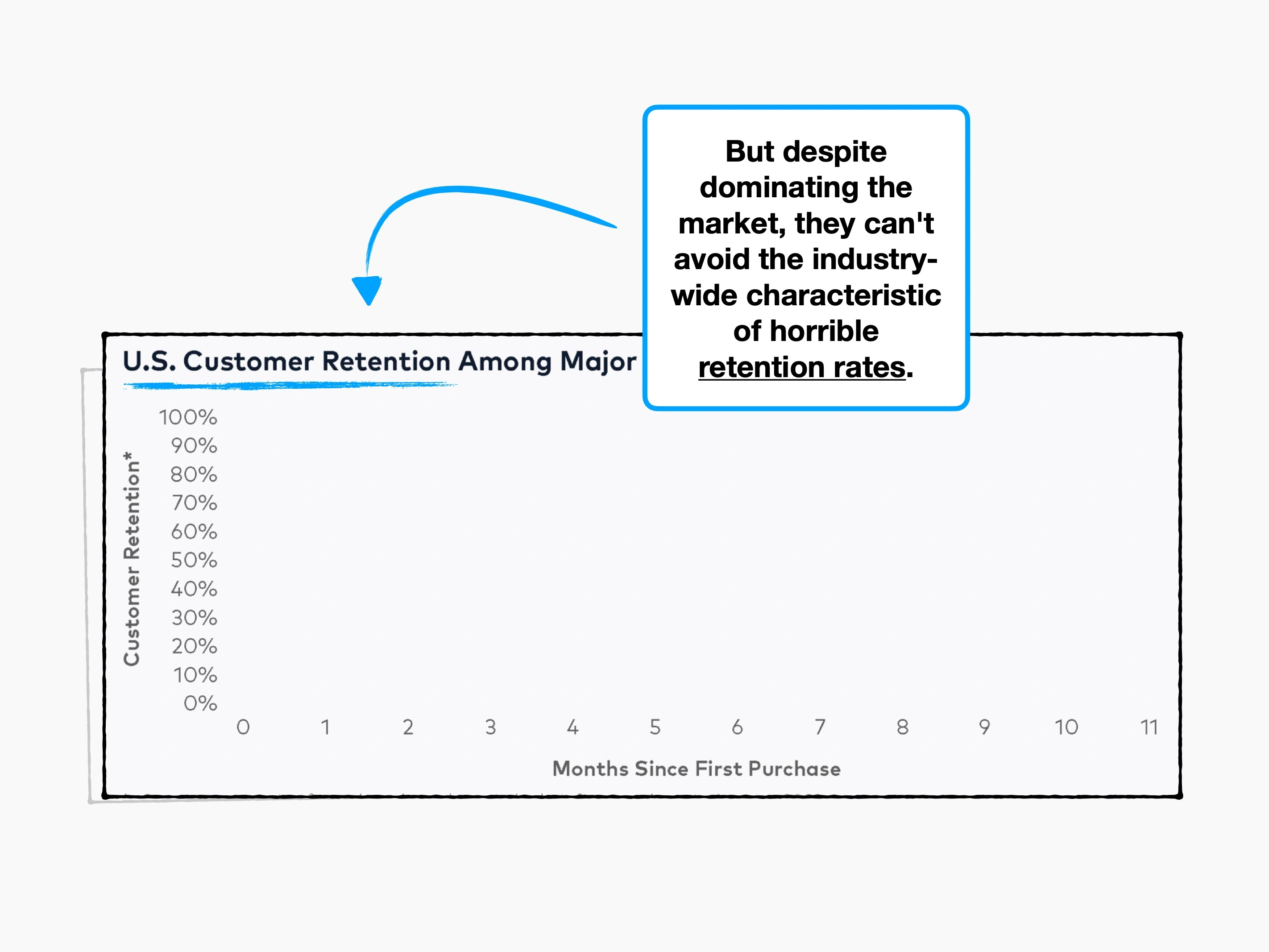
And yet, they're leaving so much on the table.
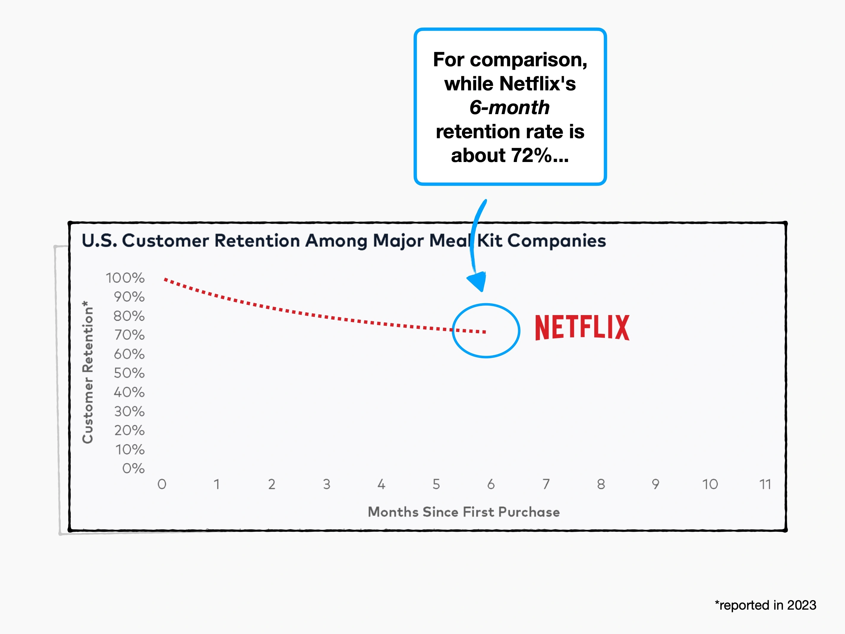
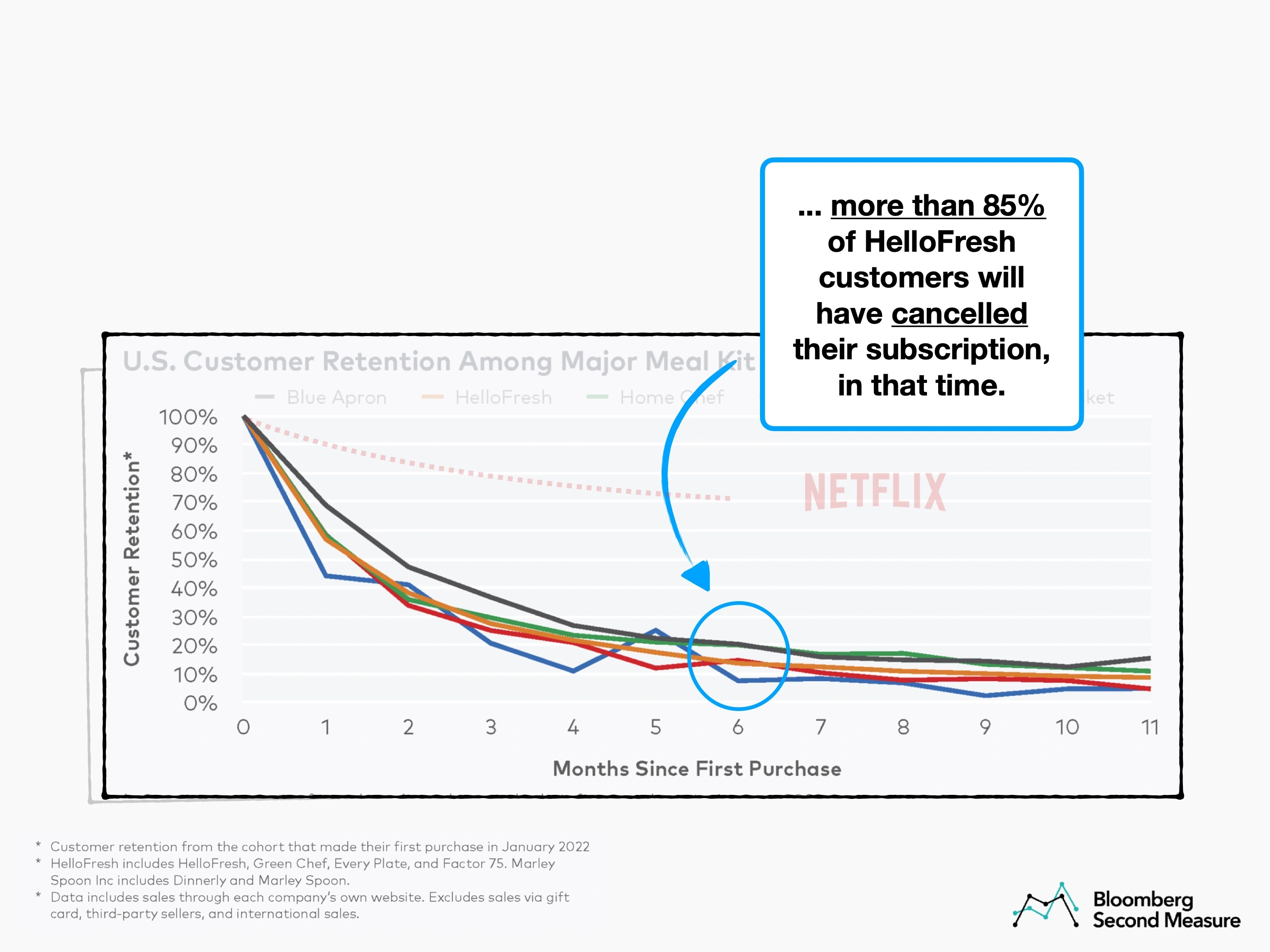
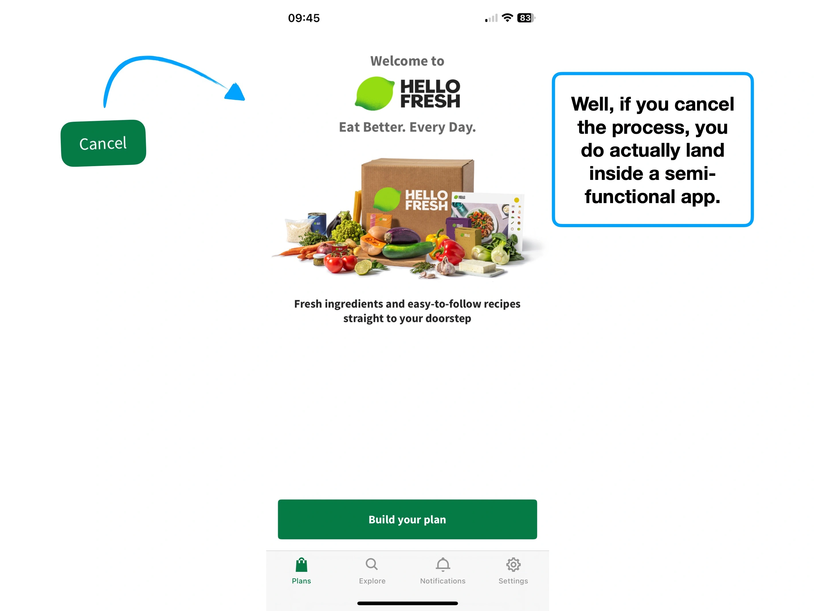
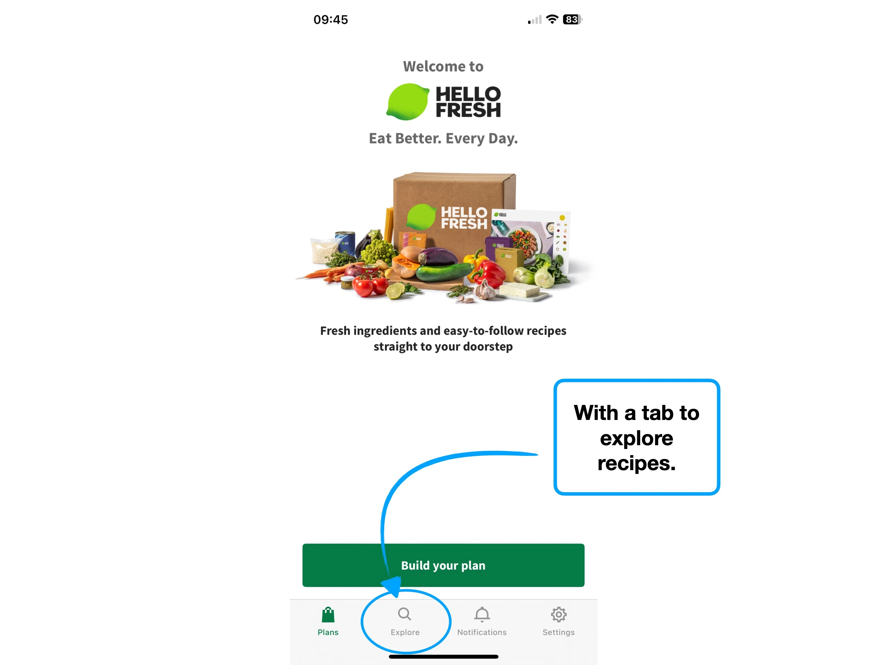
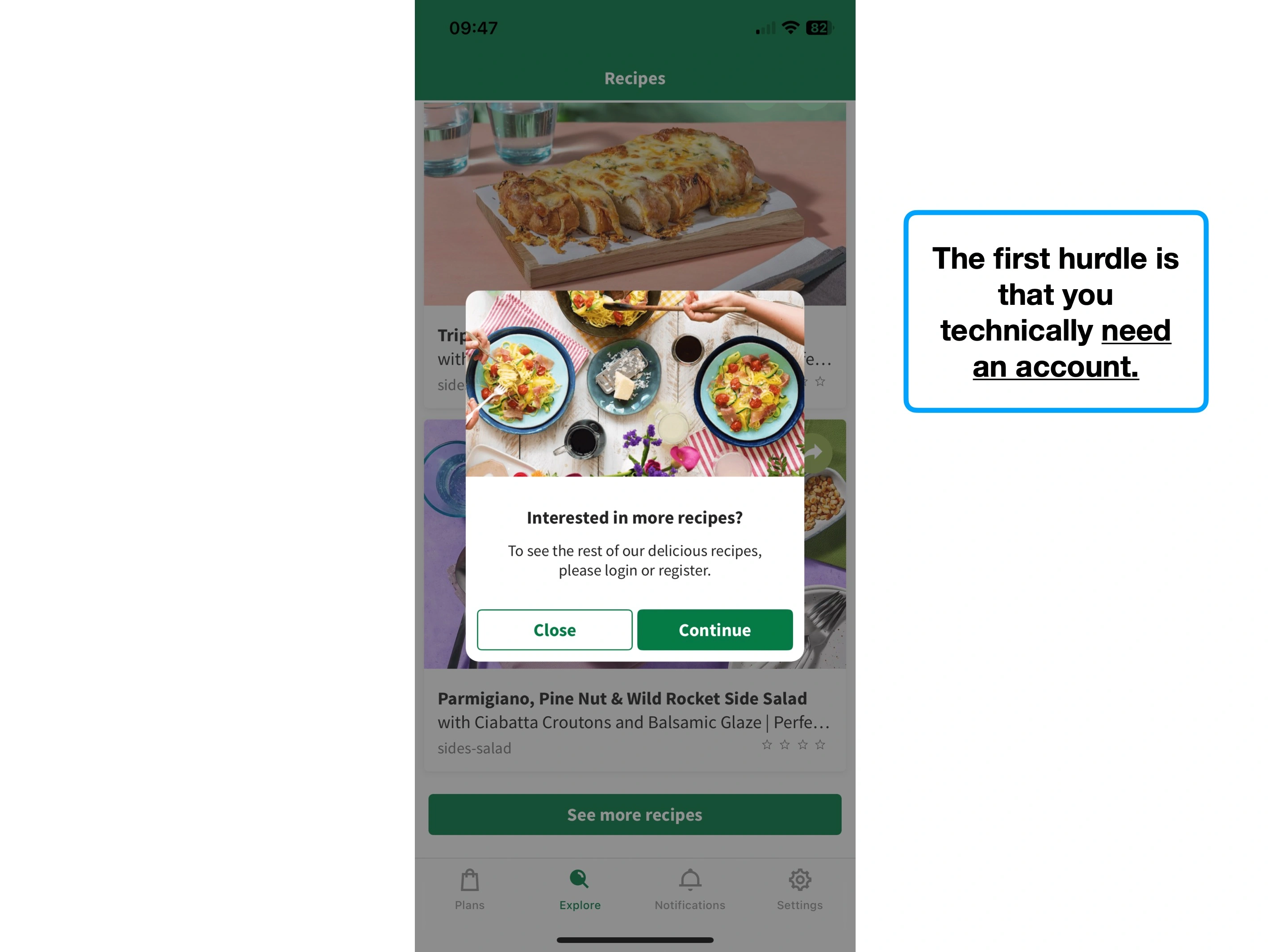
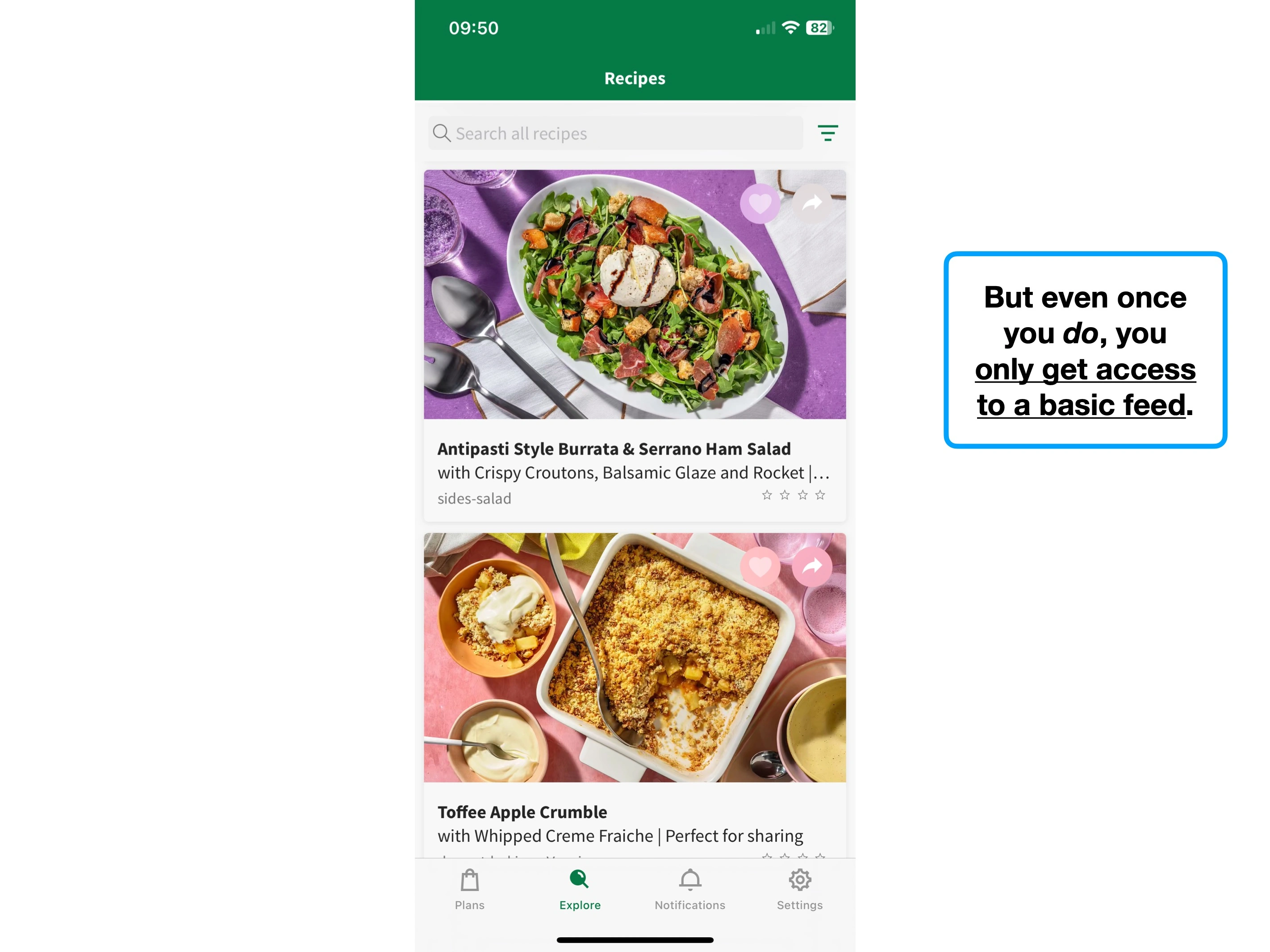
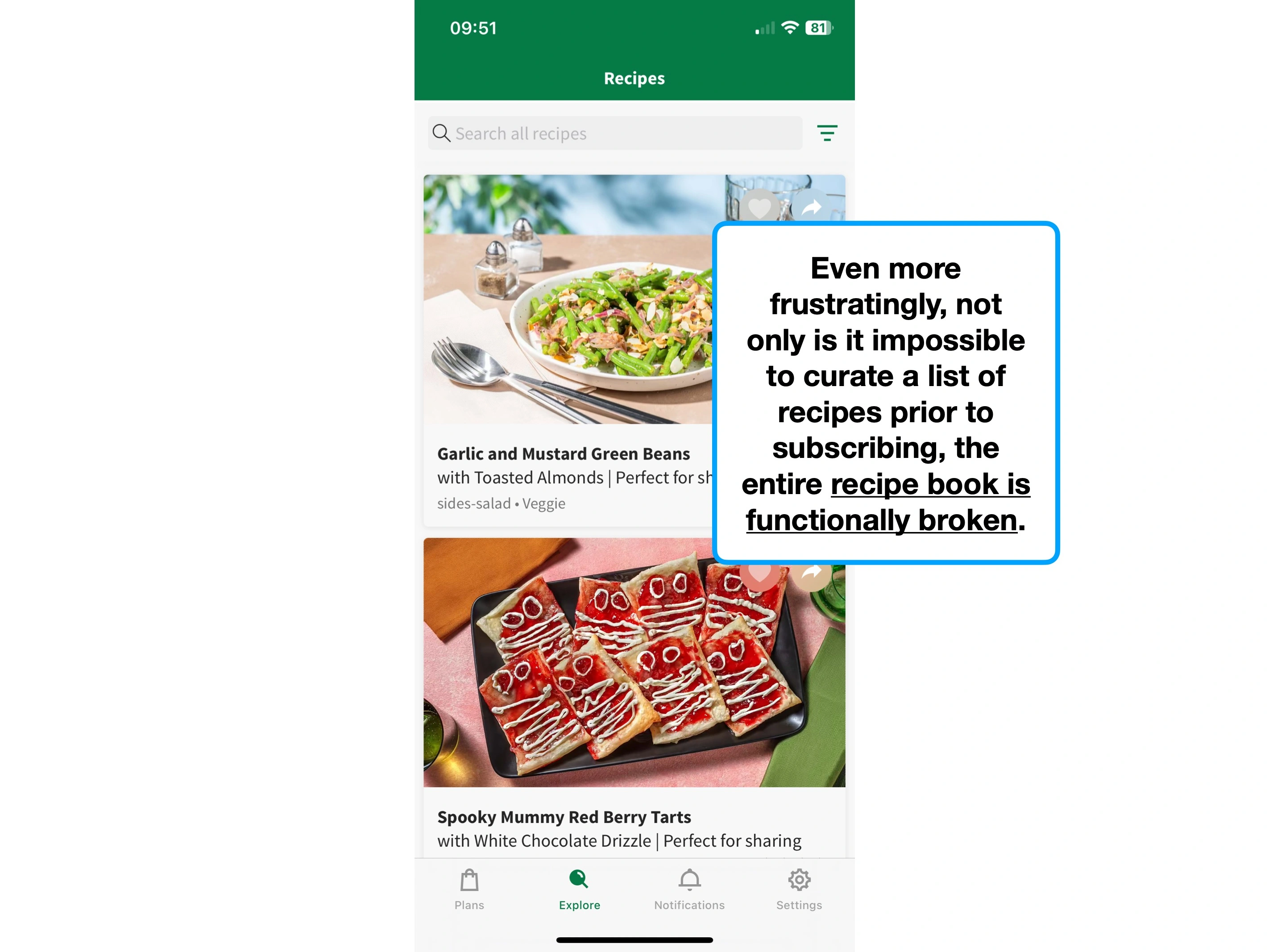
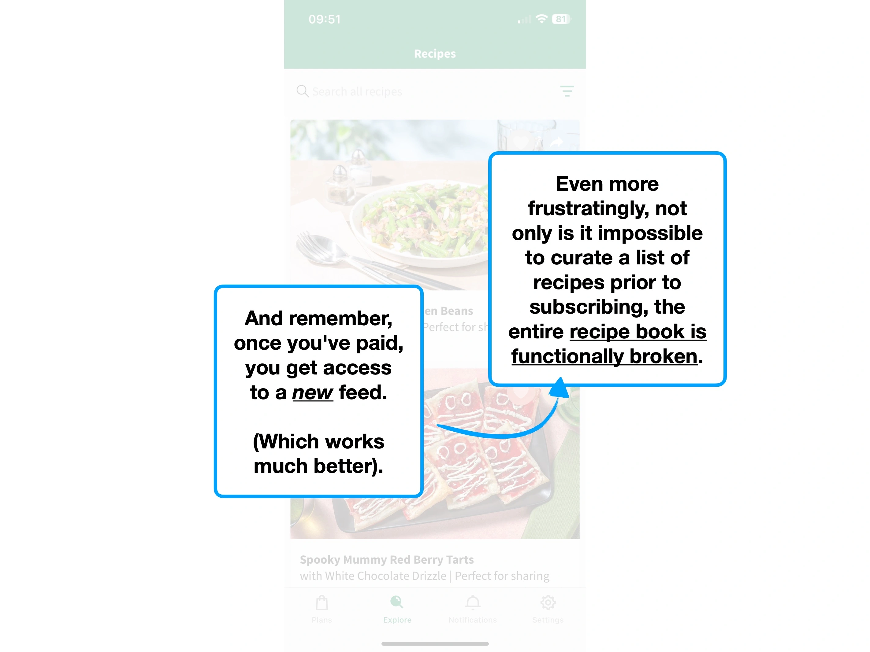
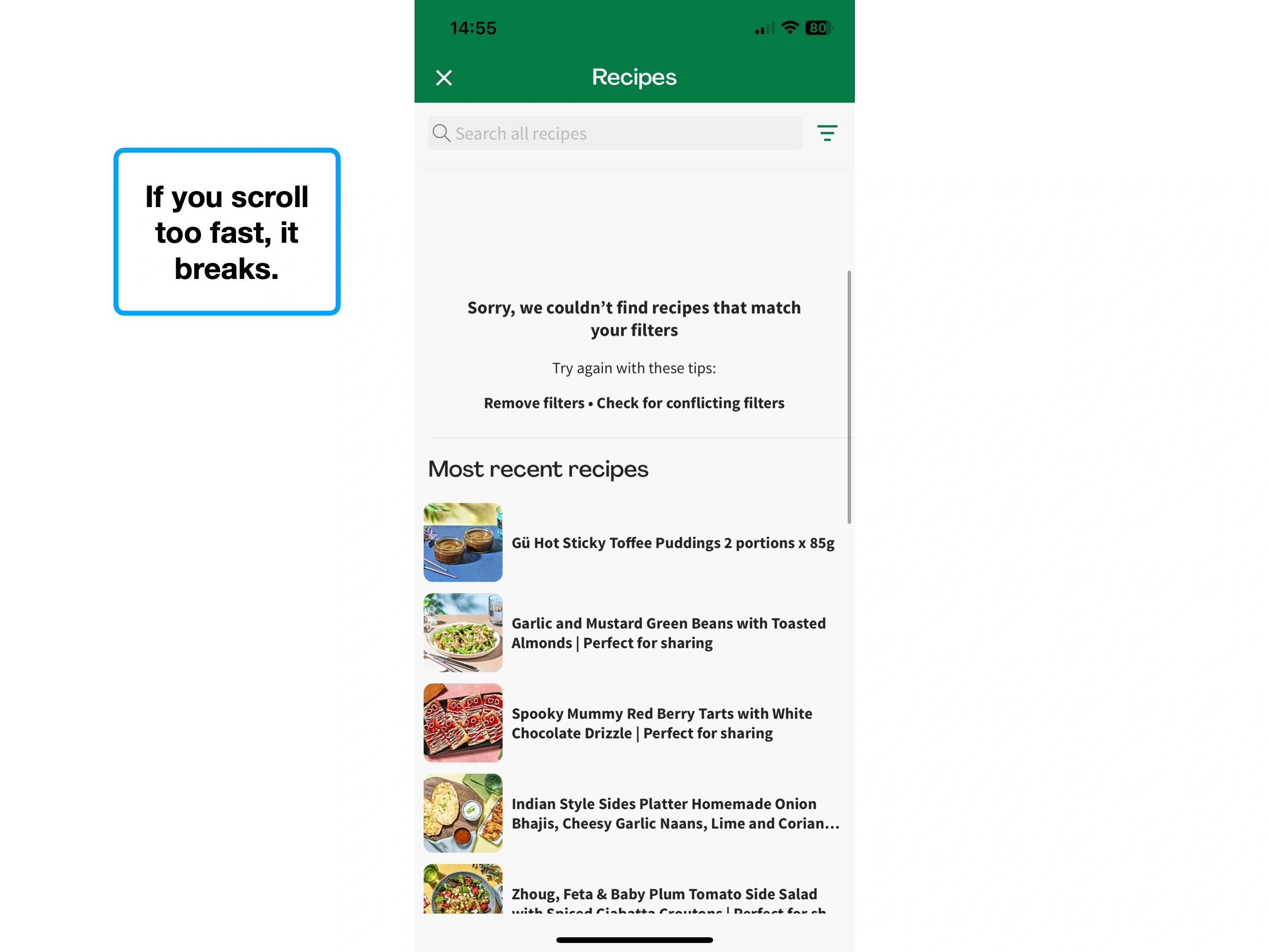
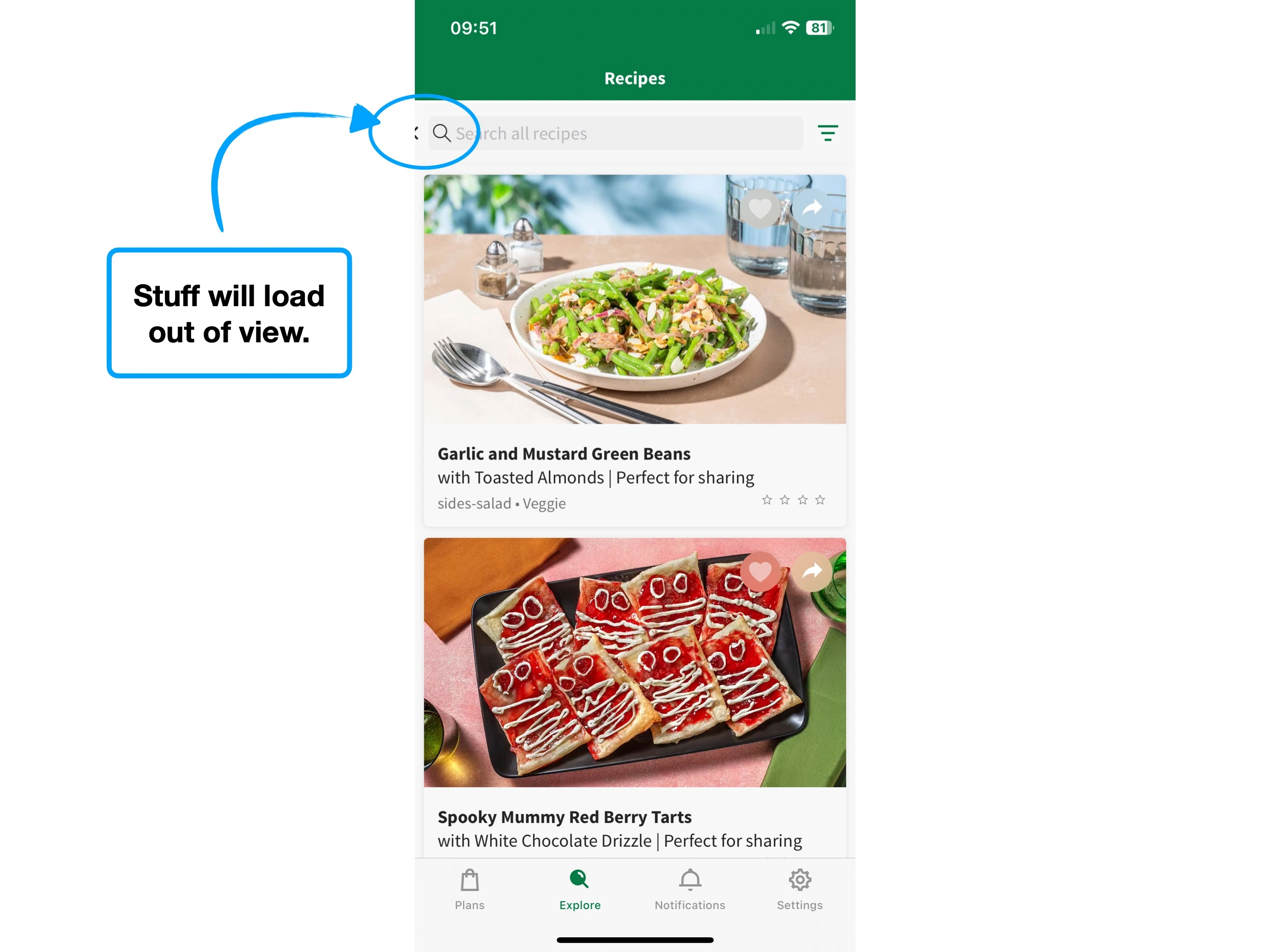
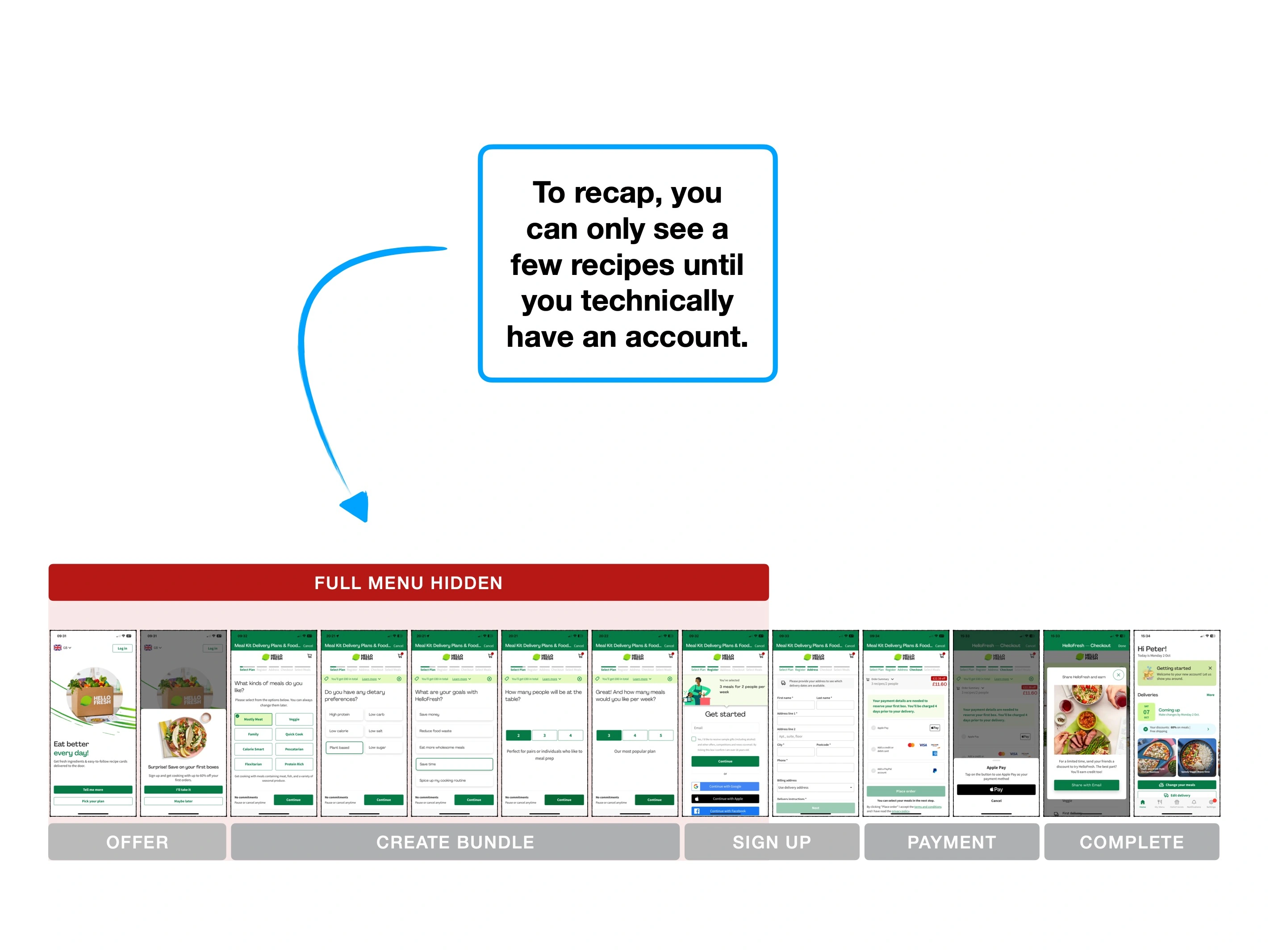
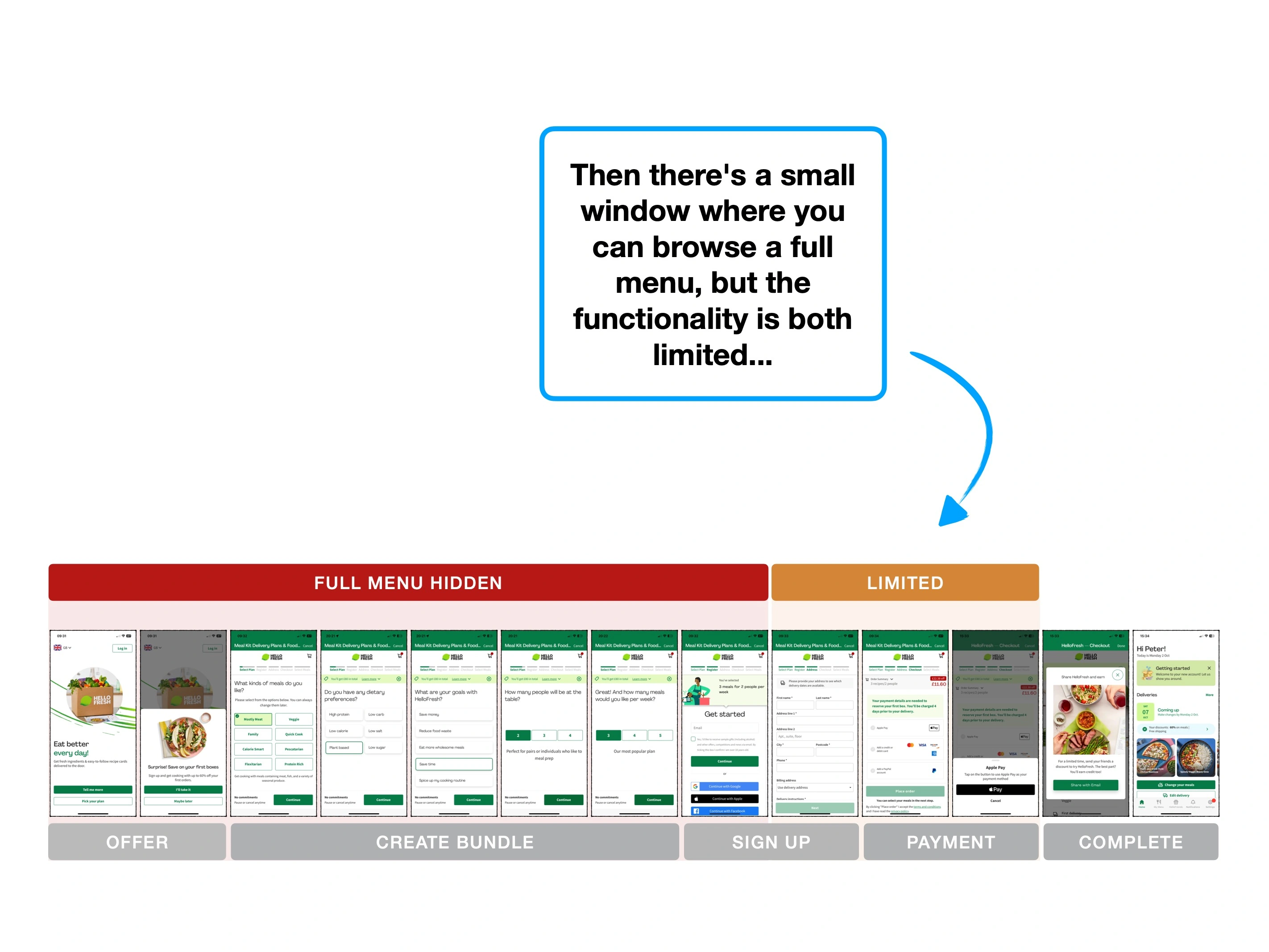
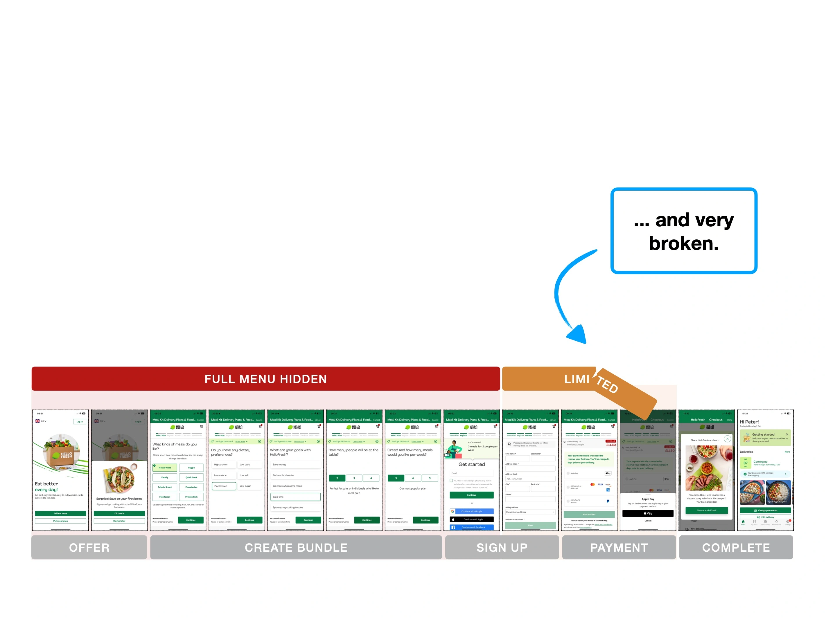
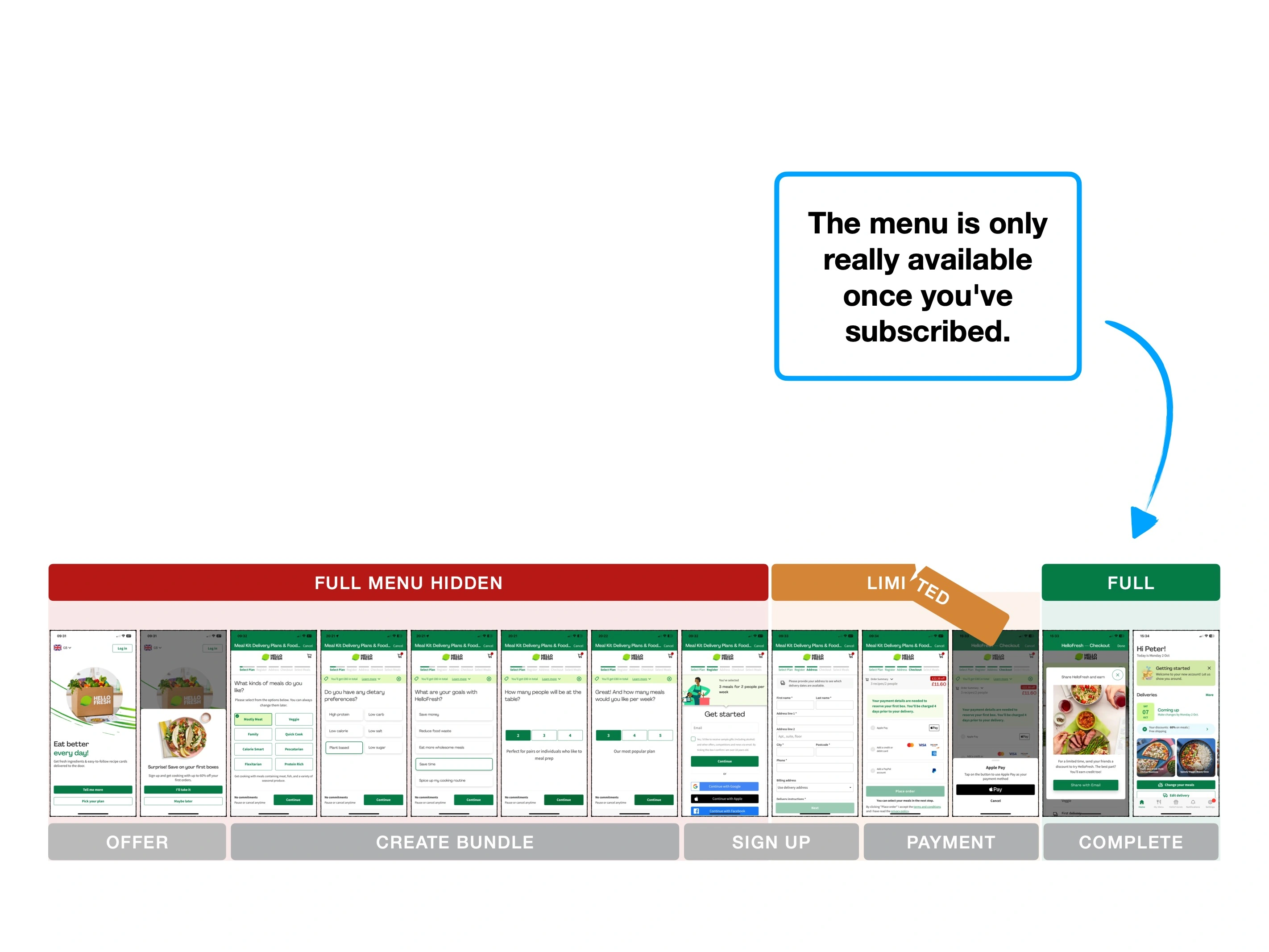
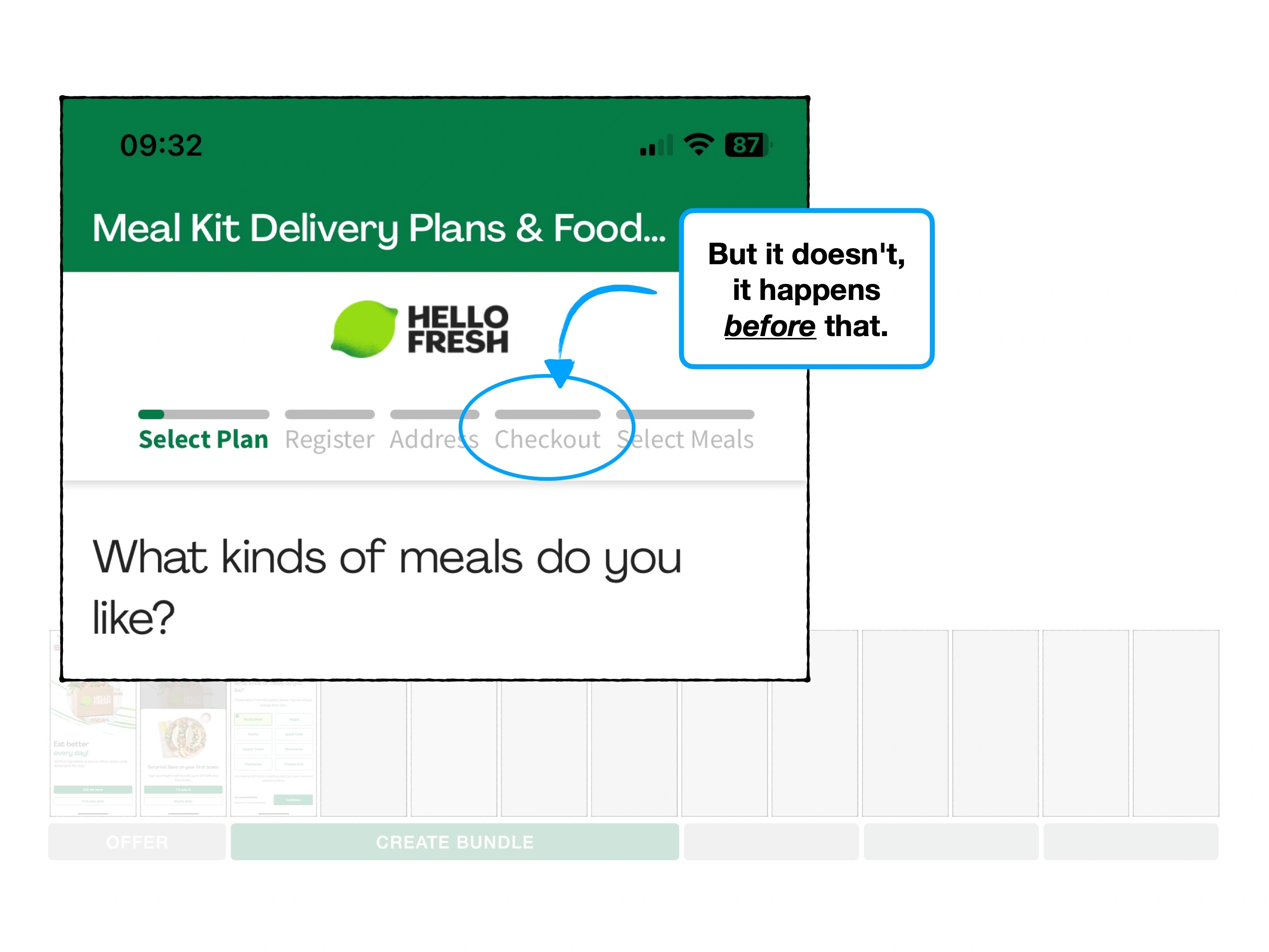
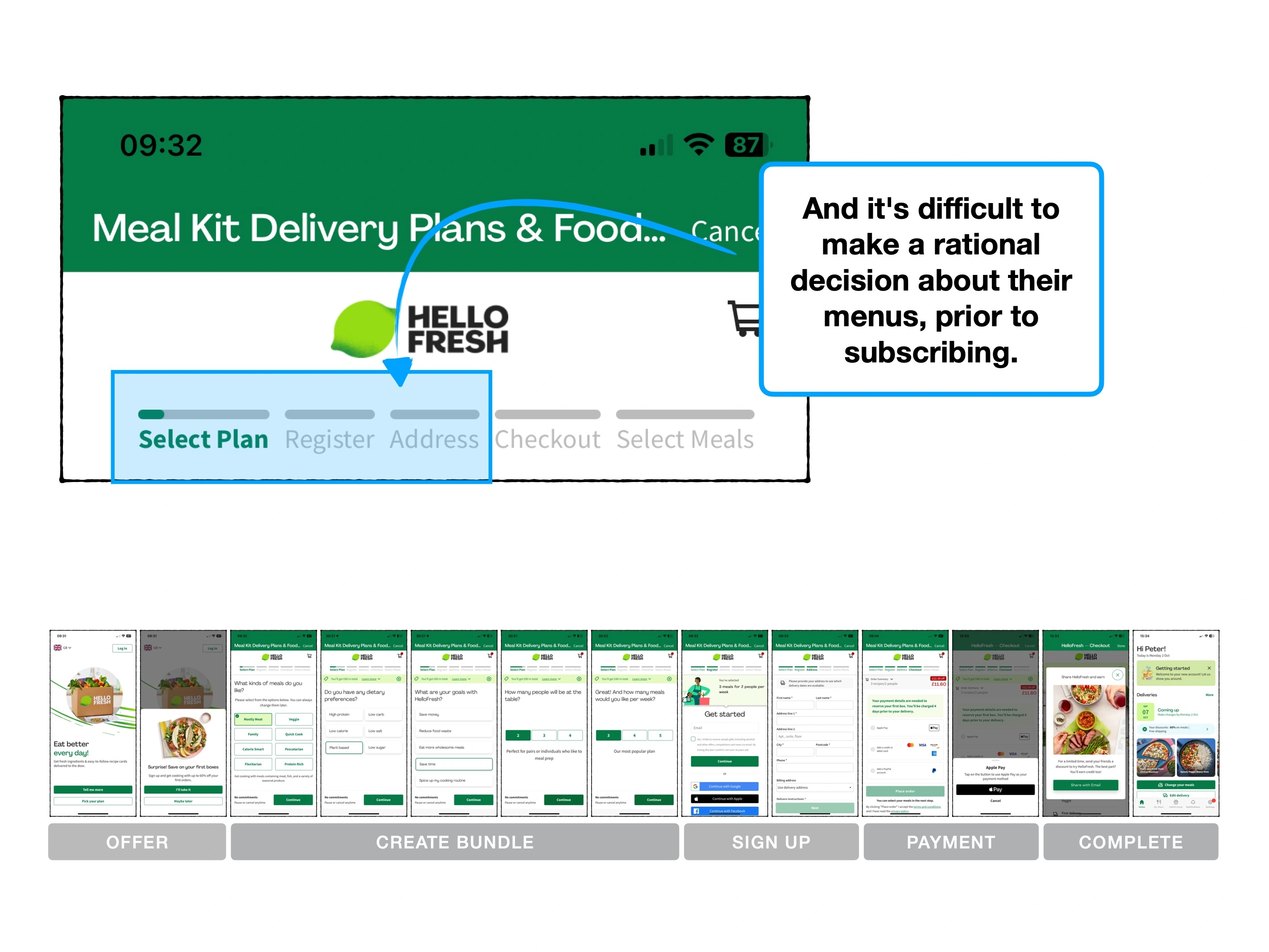
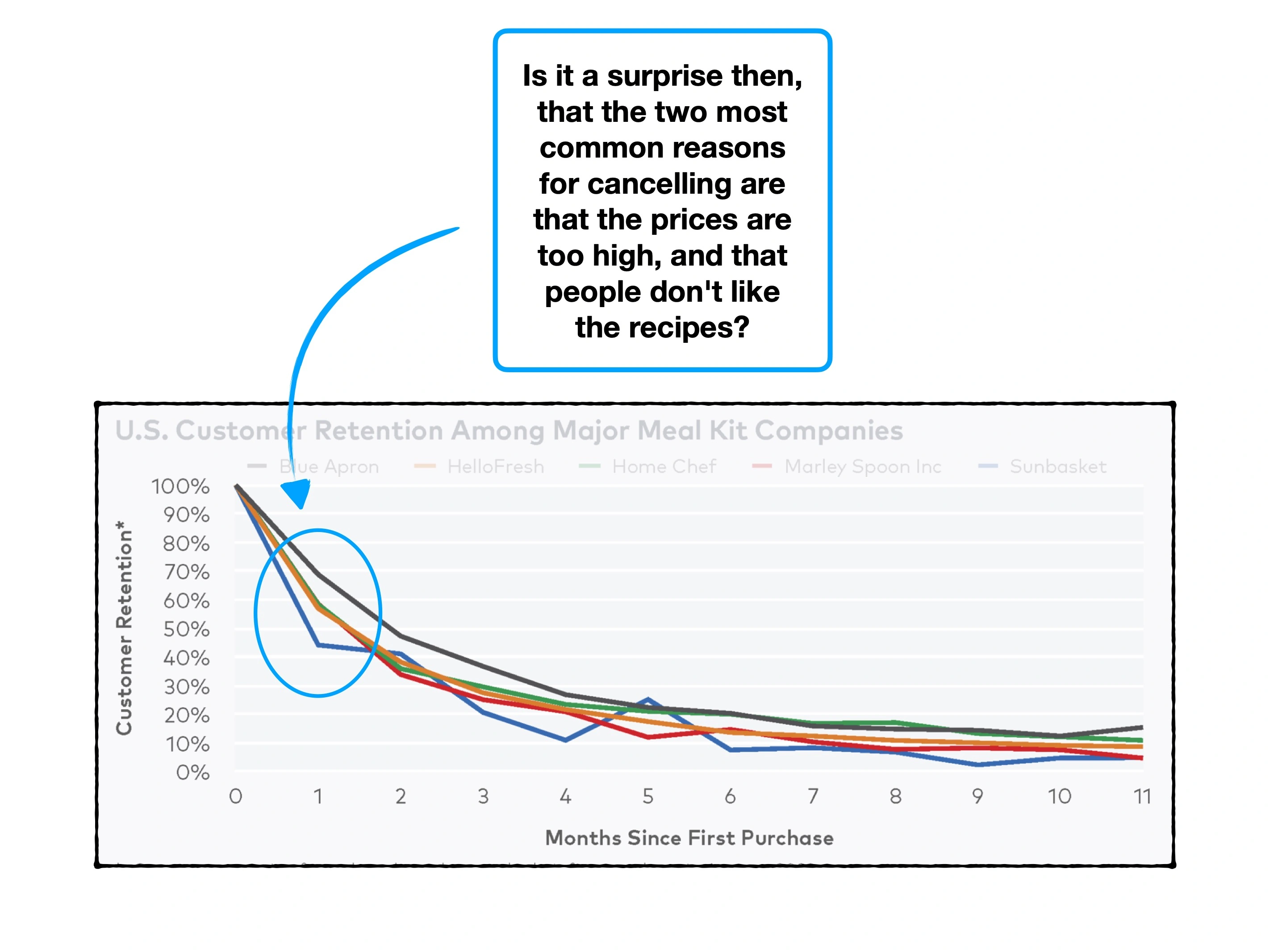
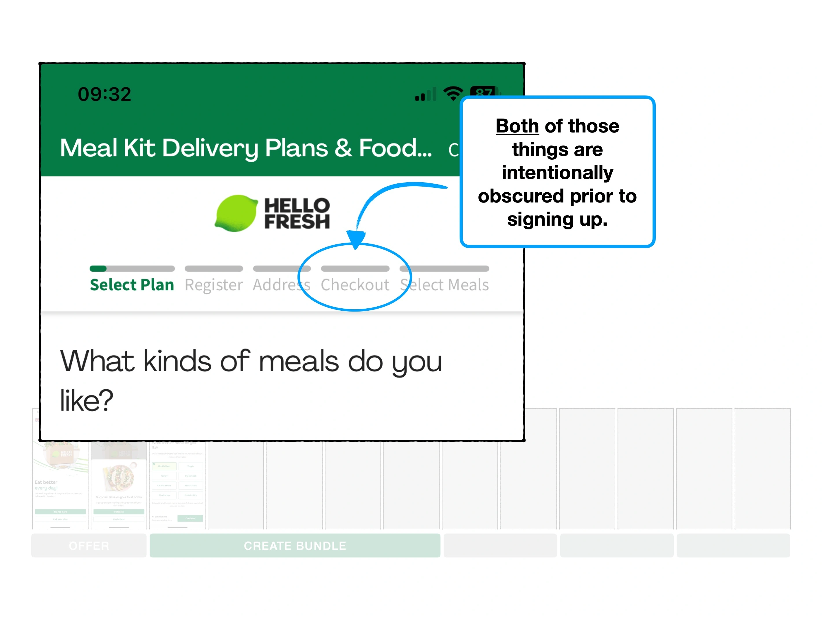
Not only do the vast majority of people cancel their subscription within a few months, but I imagine that their pre-sale funnel is leaking heavily.
Here's how HelloFresh could save more of their customers.
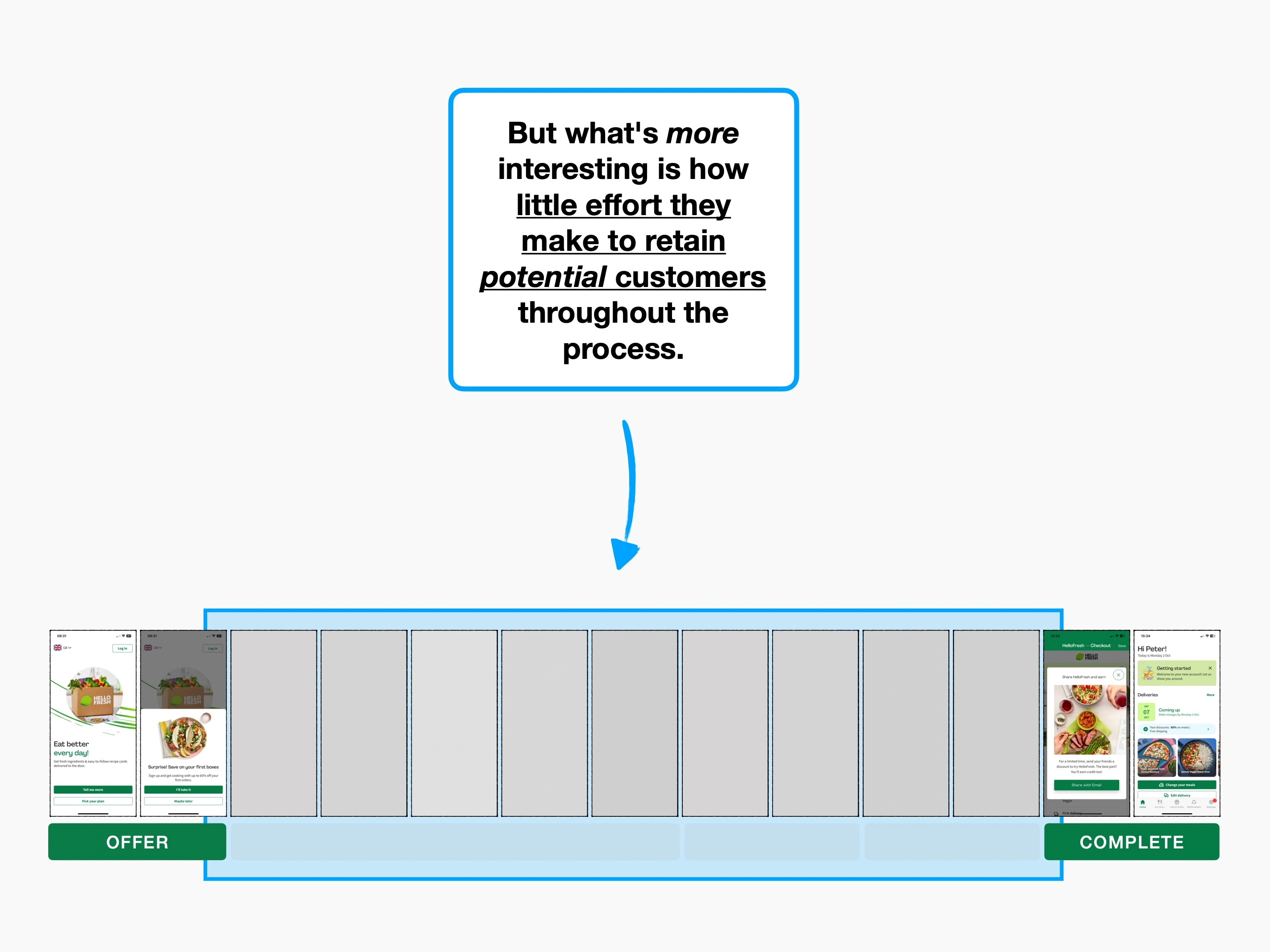
Case study
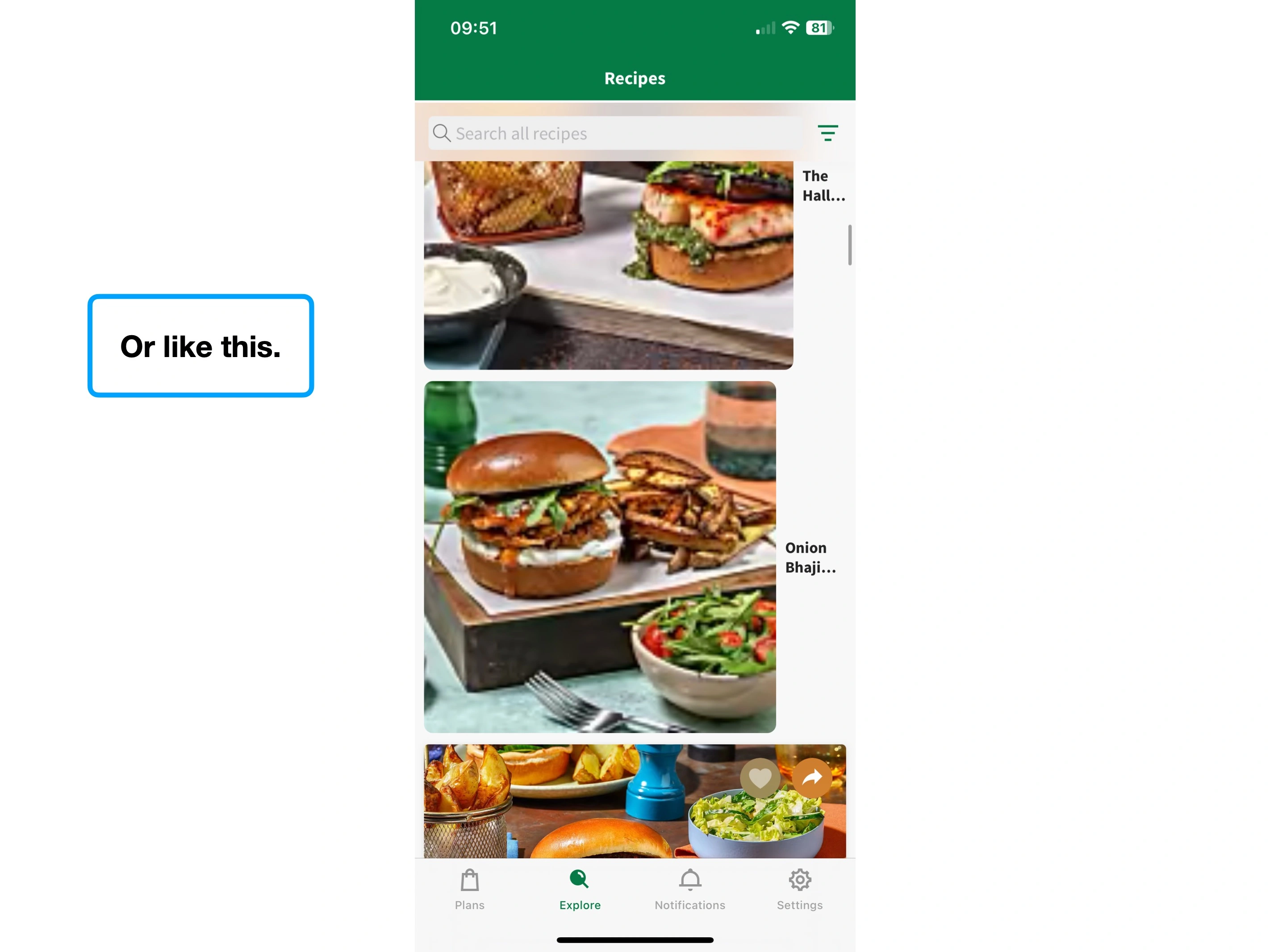
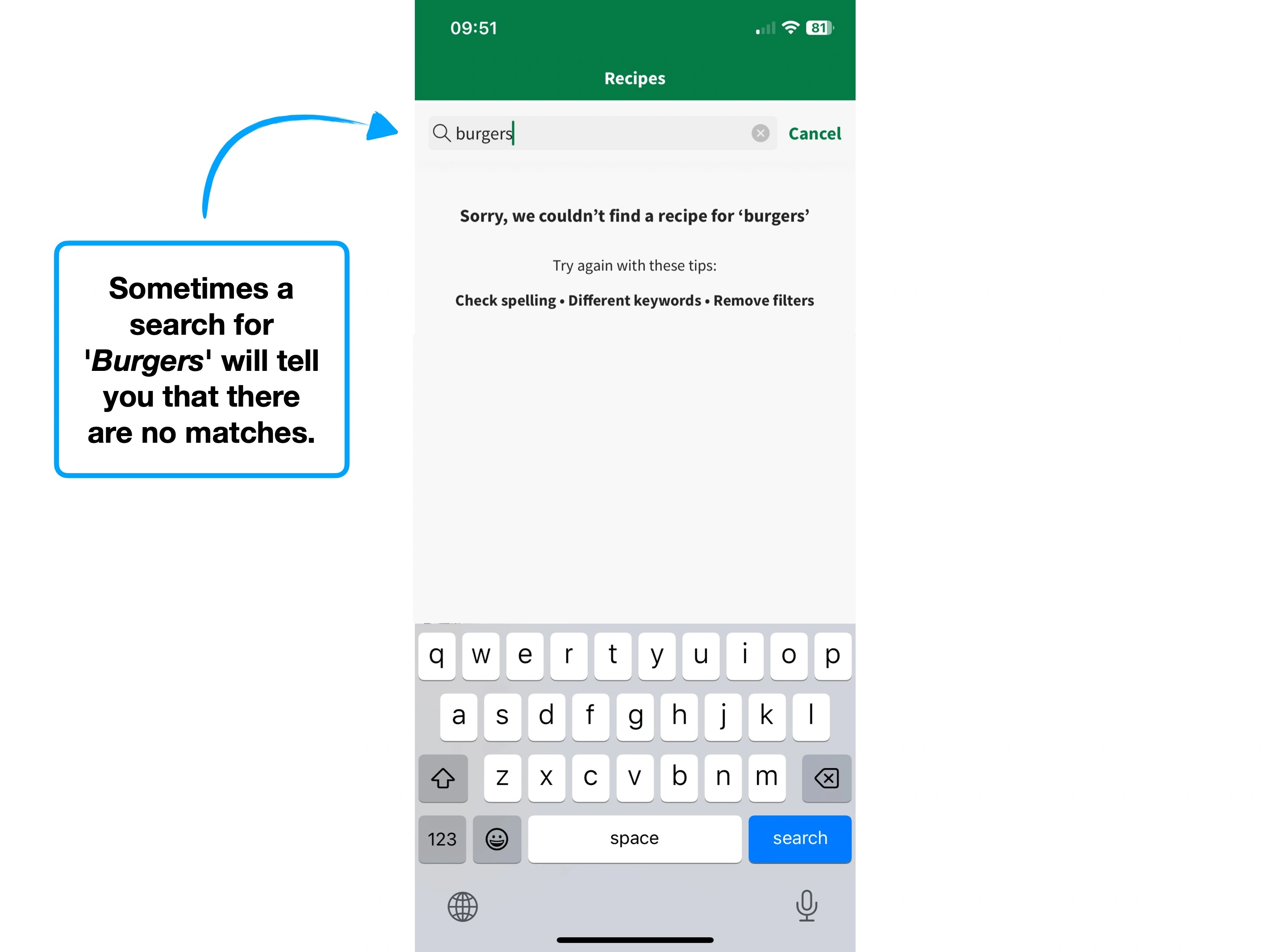
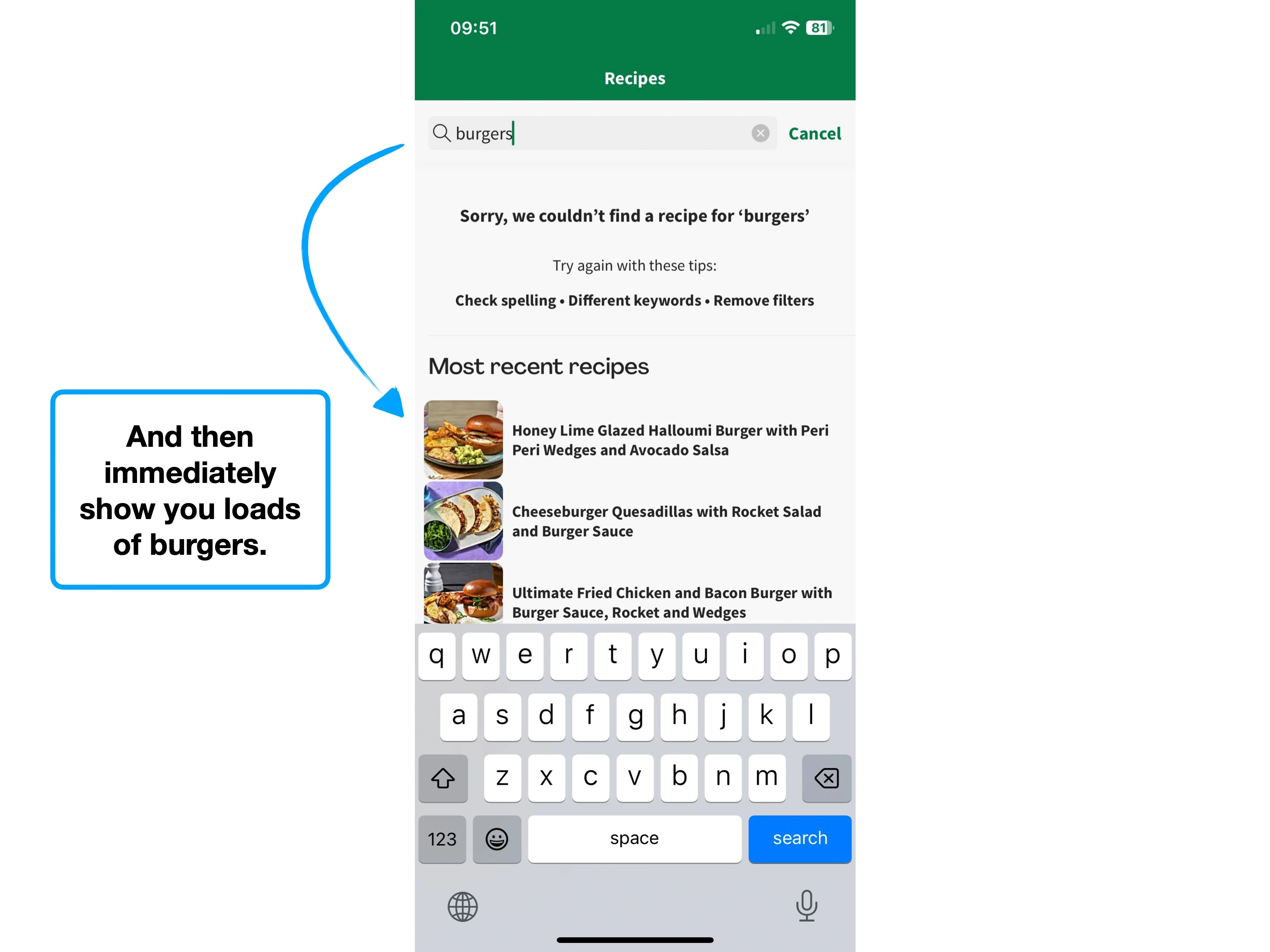
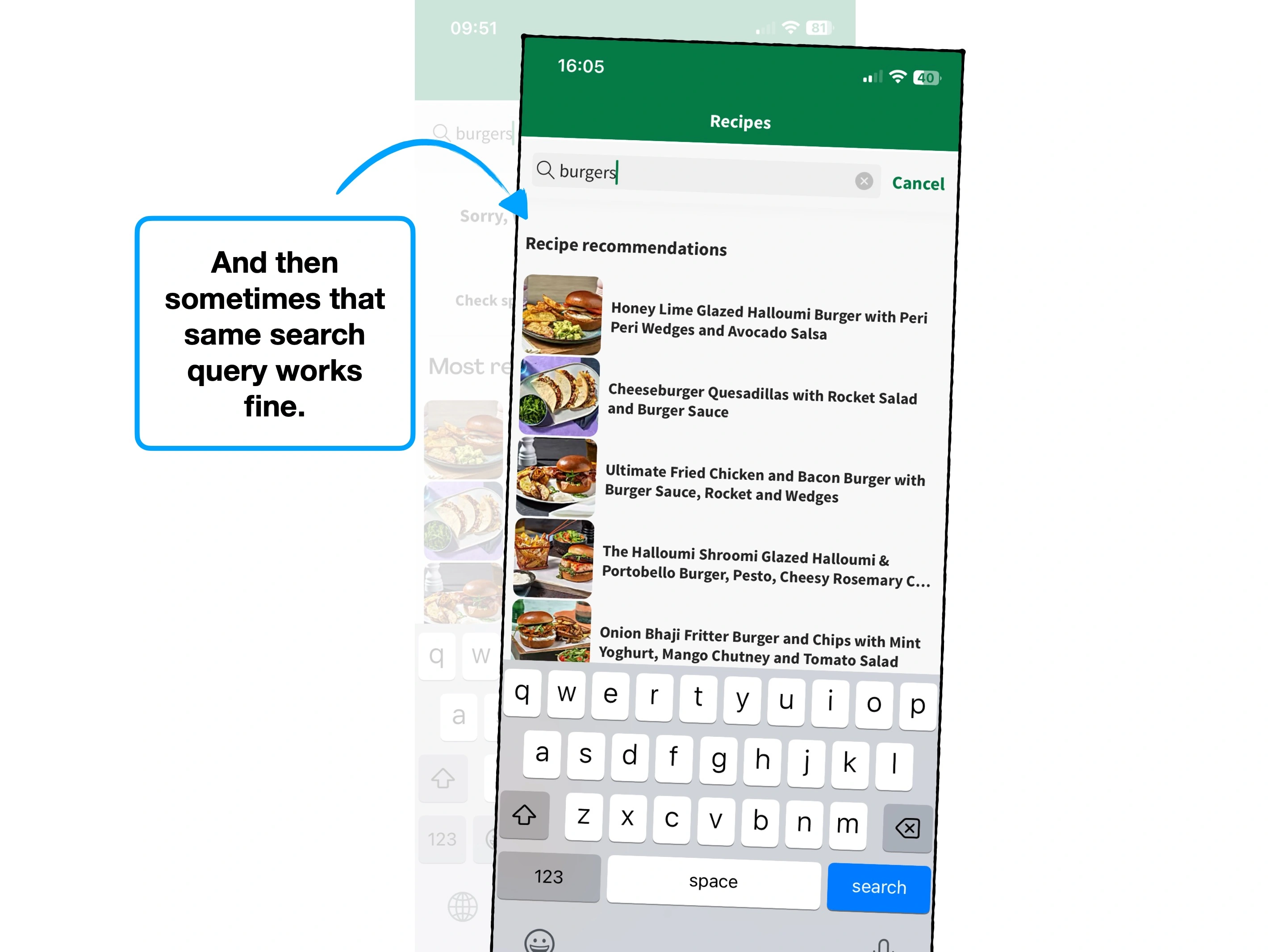
Please rotate your device to view this slideshow
Note, this won’t work if ‘rotate: lock’ is on in your device settings.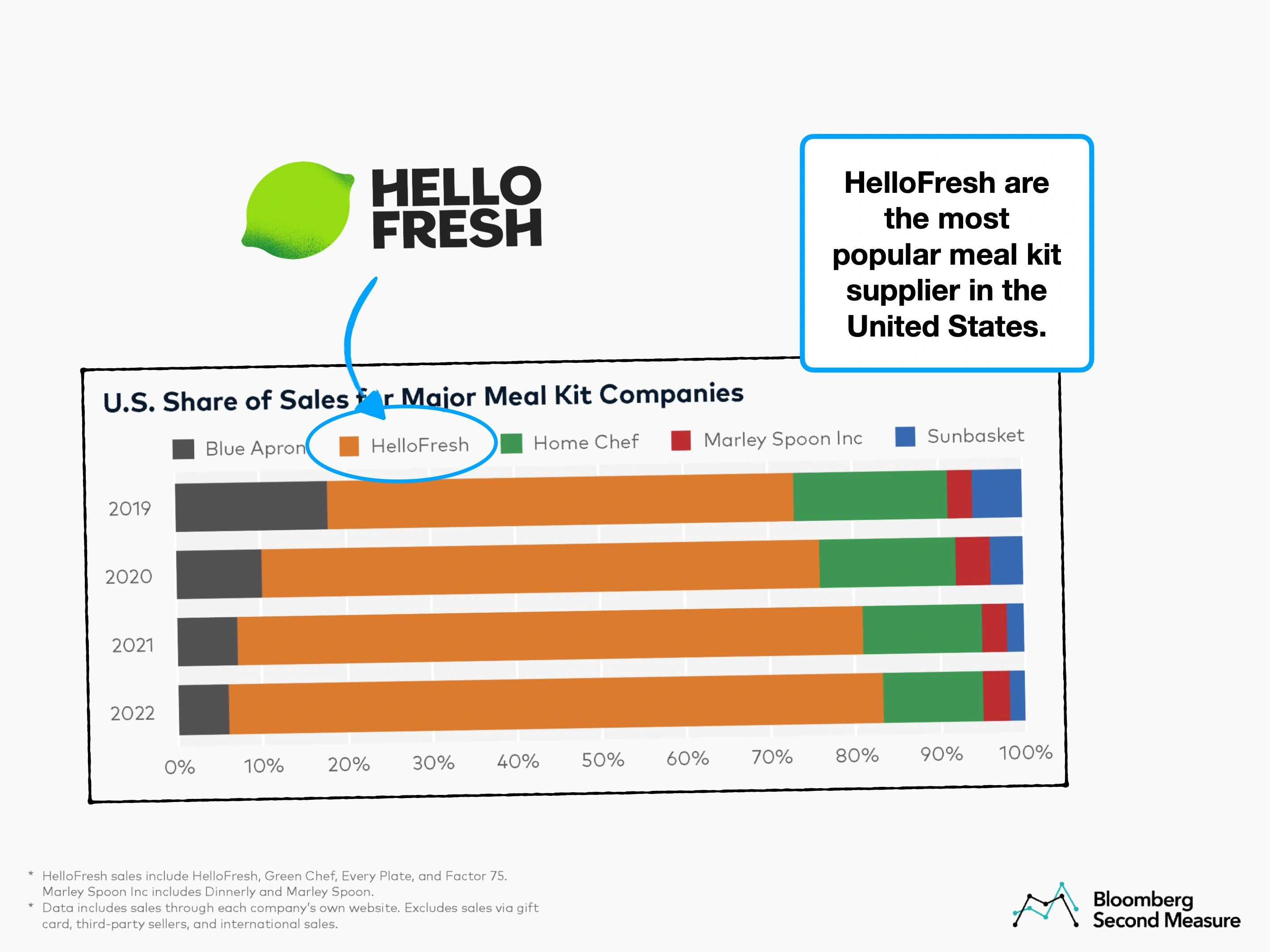
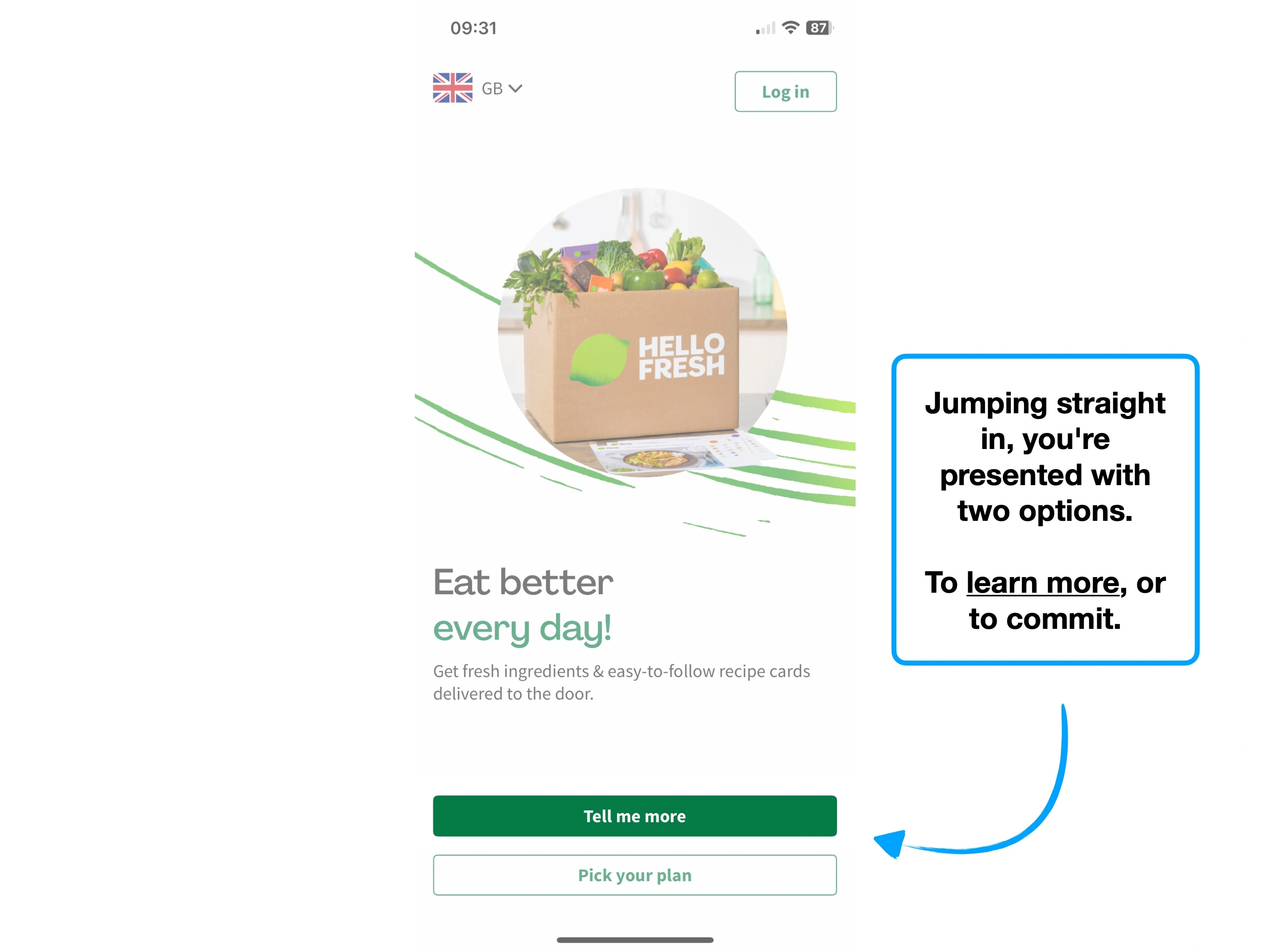
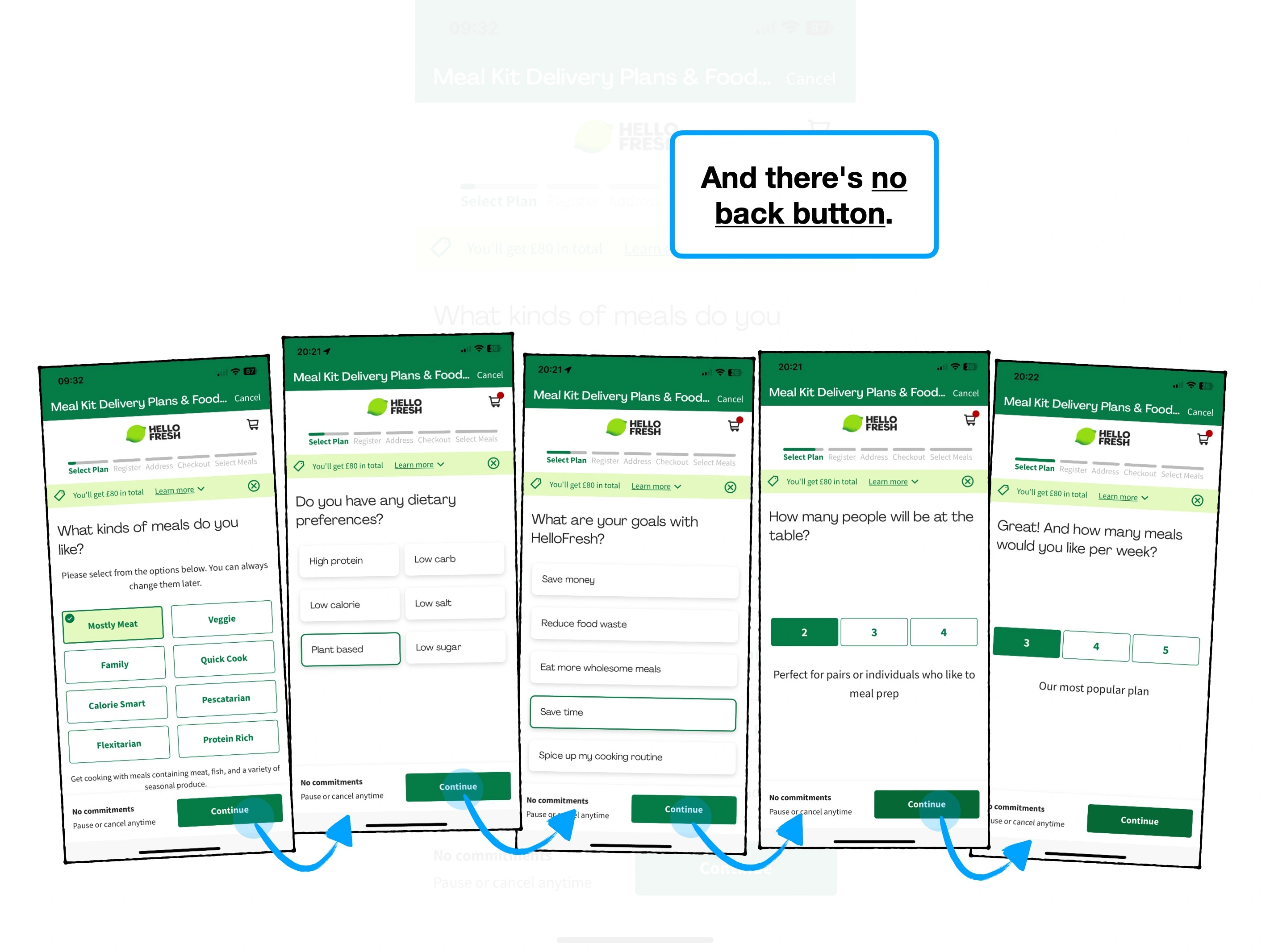
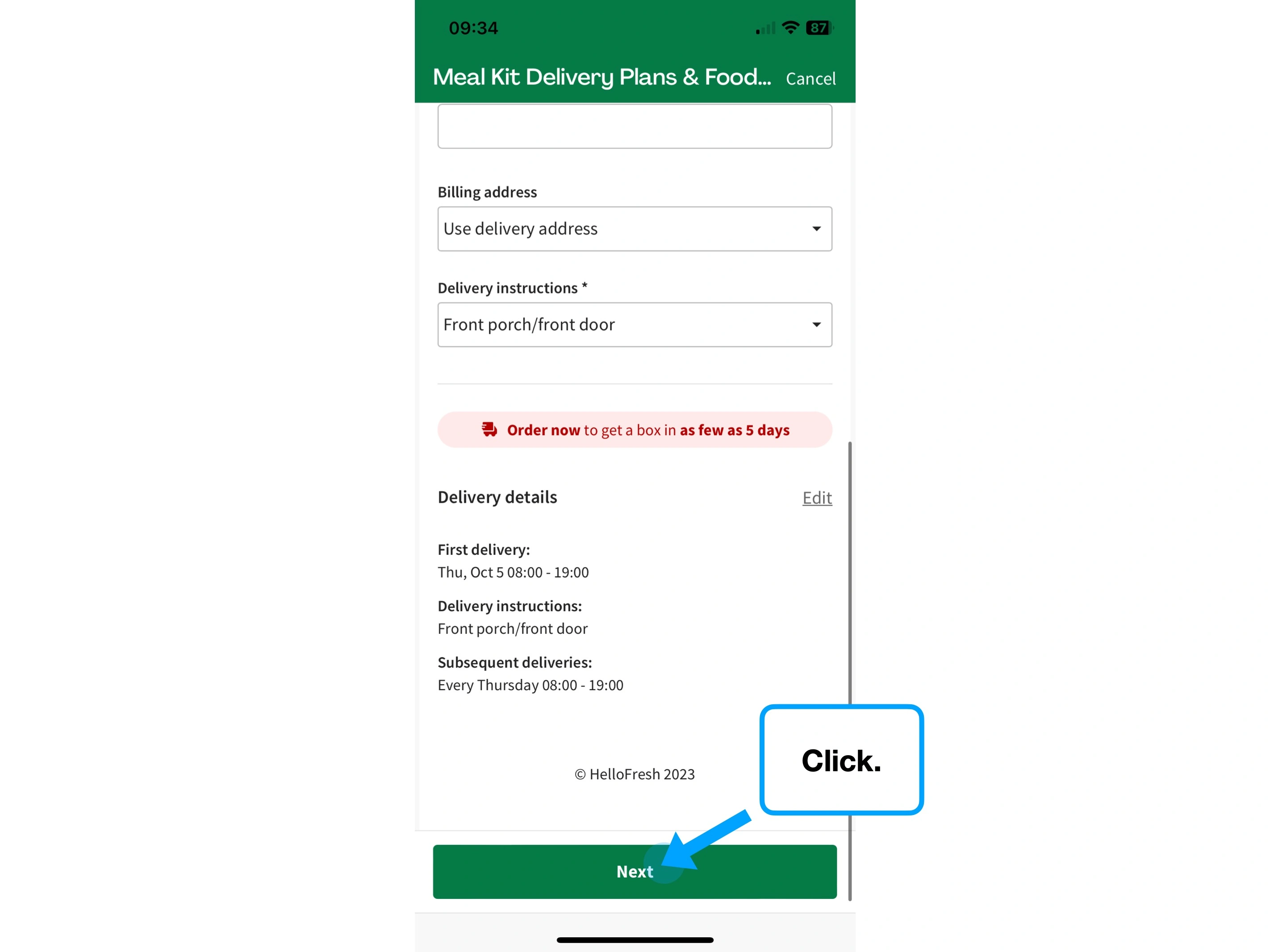
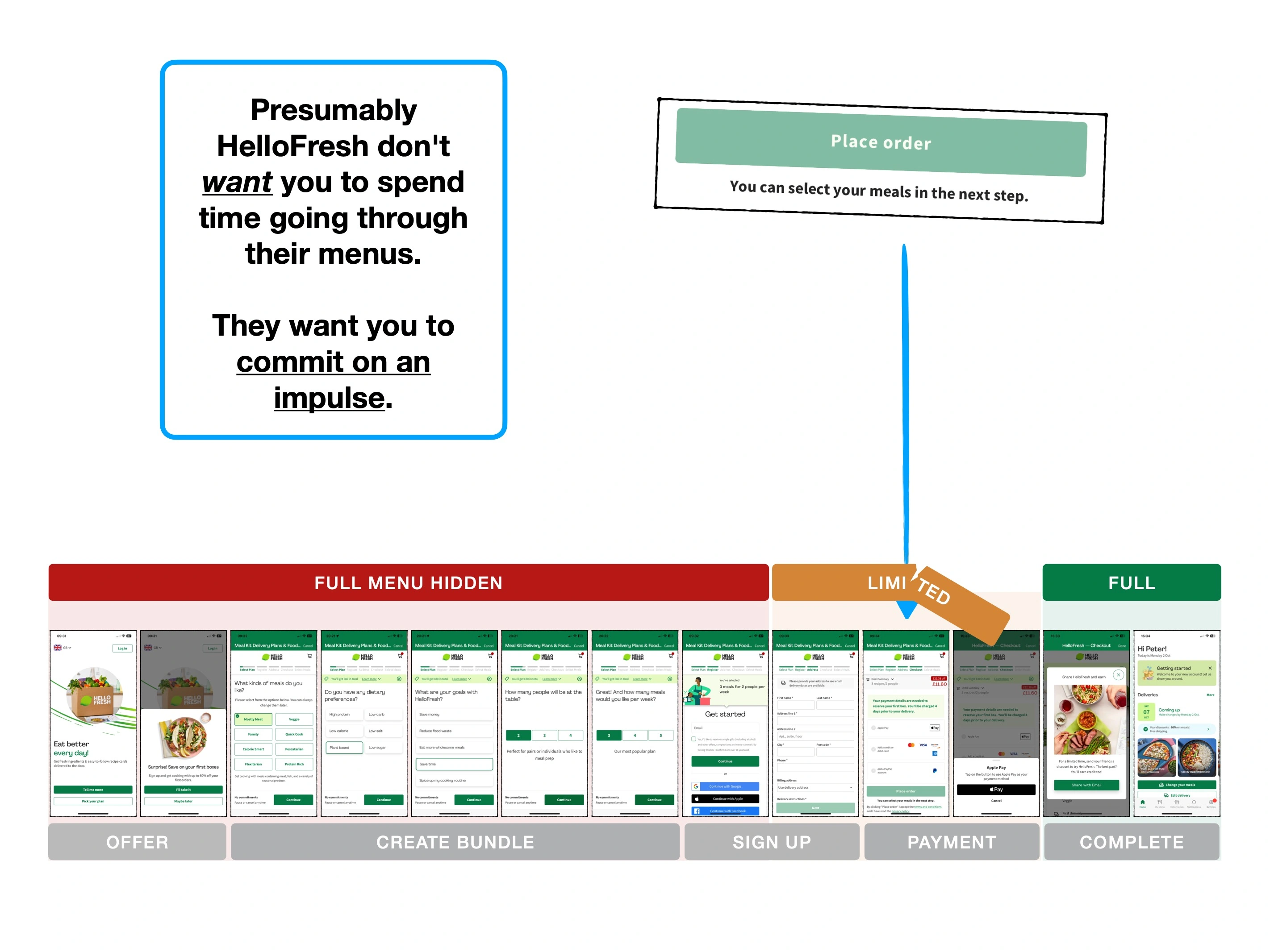
1. Snowballing compliance
The concept of 👞 The FITD Effect, is that small acts of compliance can snowball.
There are other names, like the Spark Effect, but in short: agreeing to one small thing, makes agreeing to a second slightly more likely.
It could be agreeing to a favour, answering a street-seller's introductory question of "Excuse me, do you like dogs?", or even tapping a button on an app.
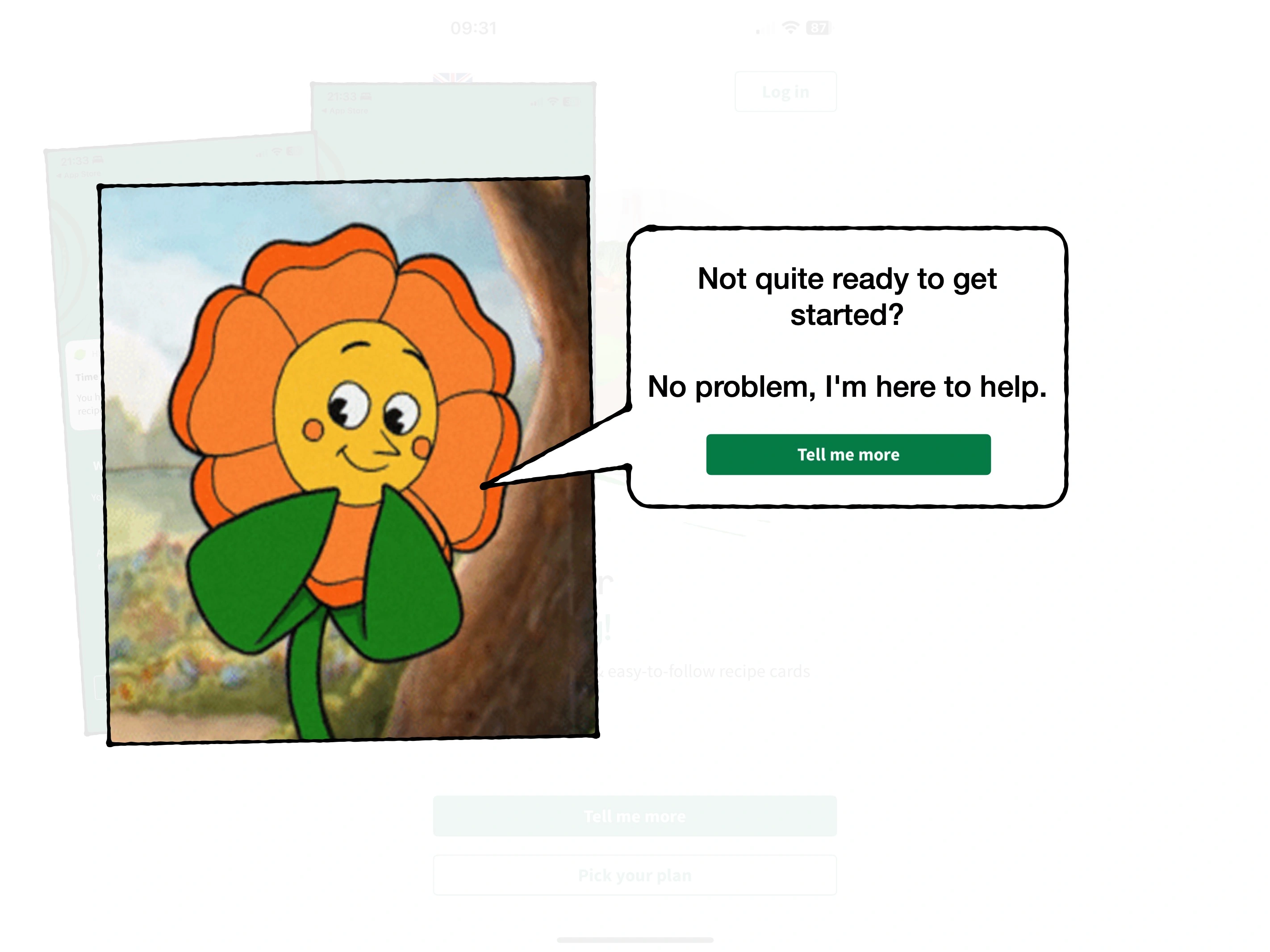
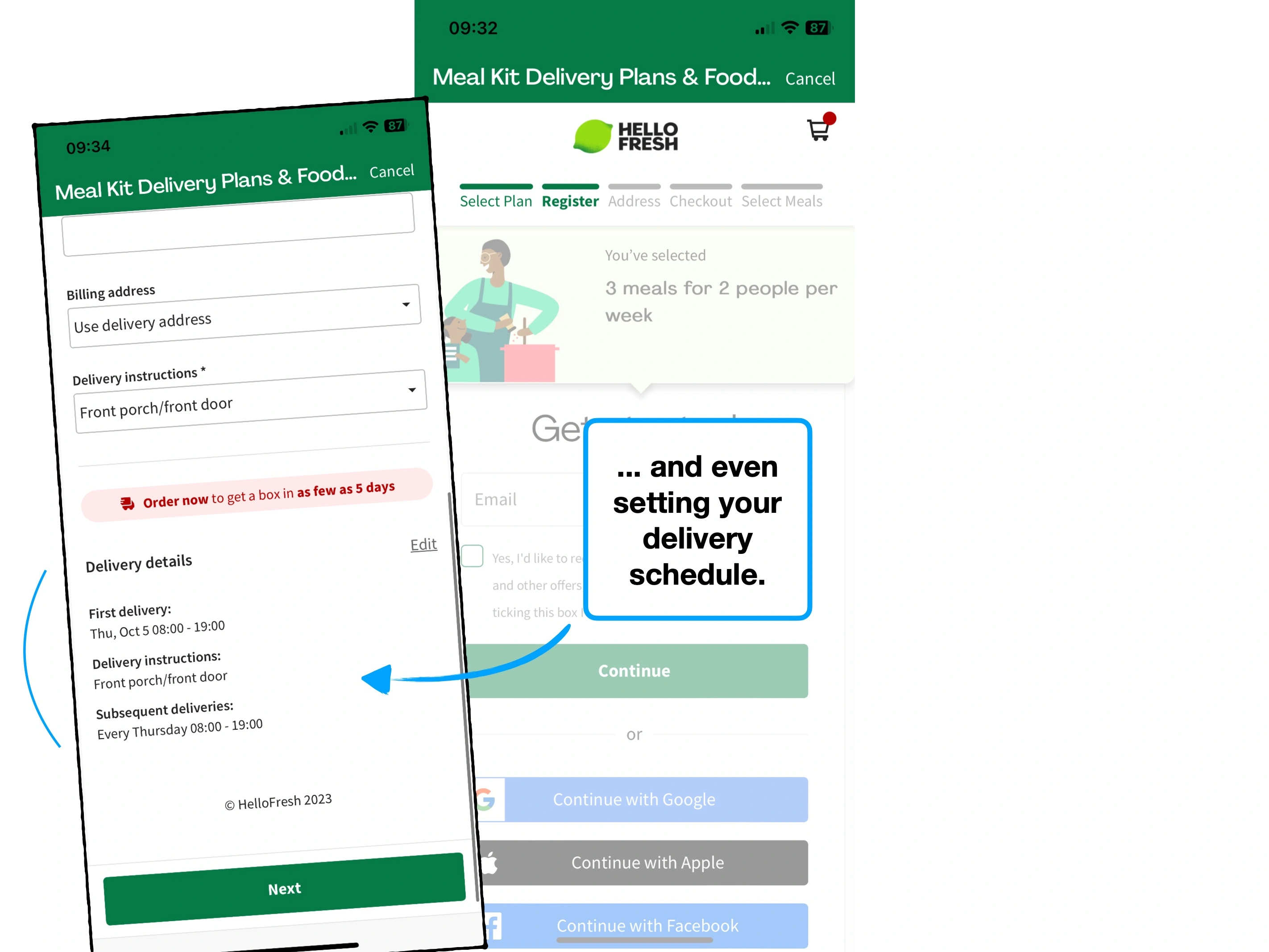
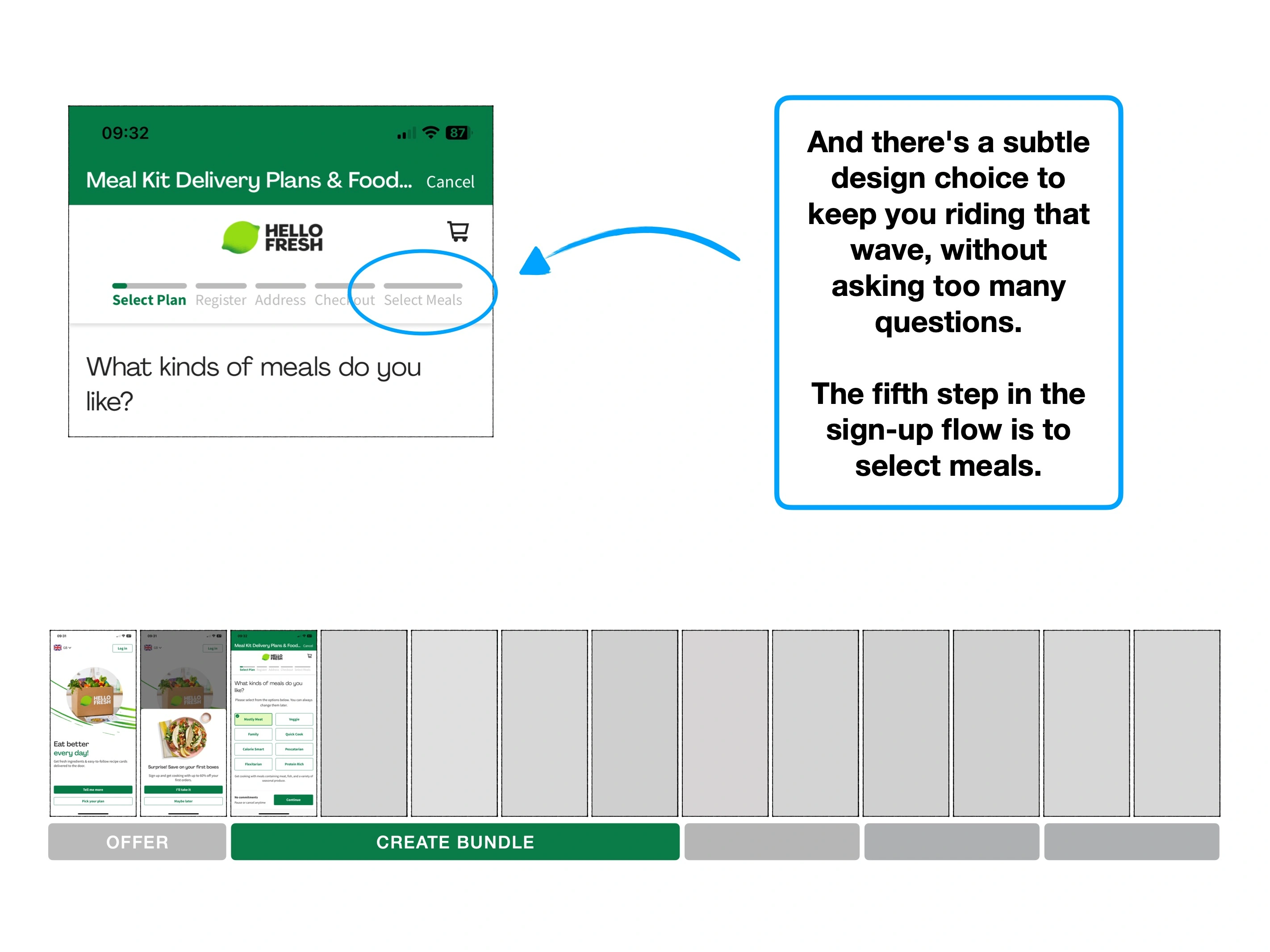
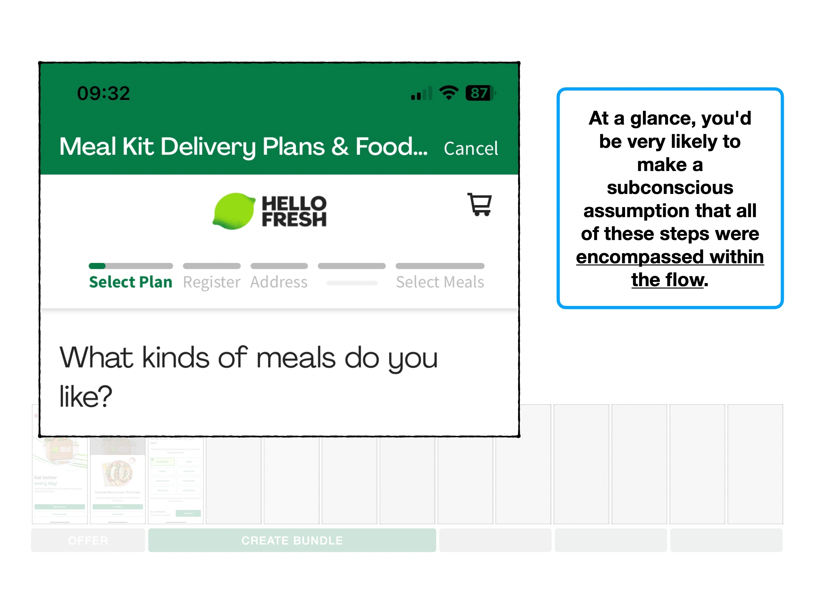
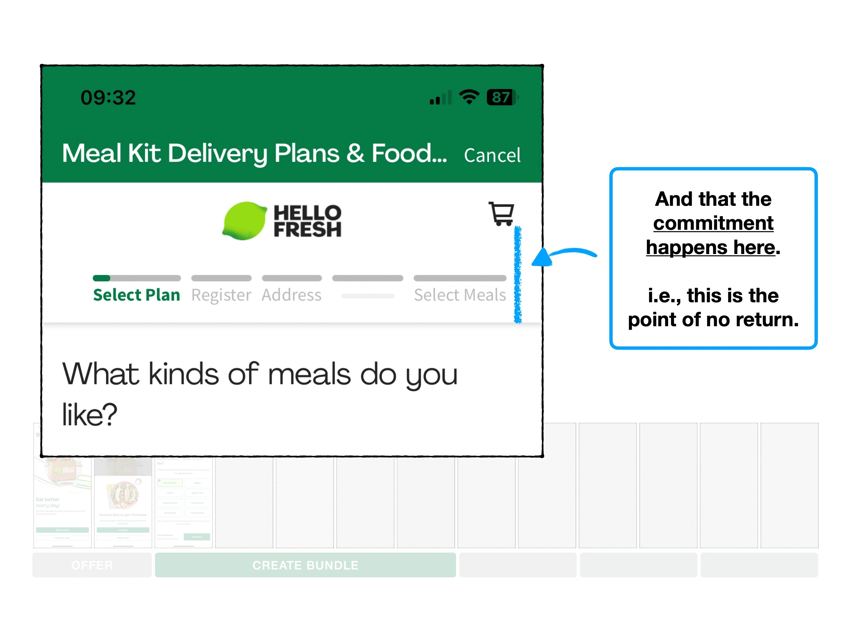
With that in mind, here's why the first two clicks of HelloFresh's iOS app, may be the equivalent of pushing a pebble down a snowy mountain.
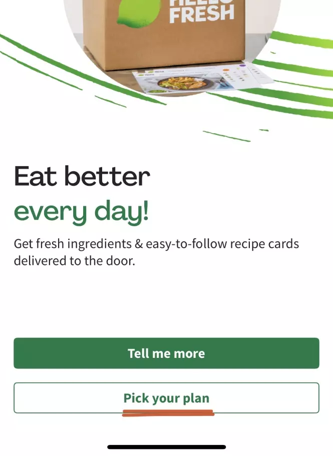
The subtle brilliance of the CTA labelling, is that they both signal that the user is going to do something.
And to be clear, this commitment is all internal. It's the customer persuading themselves that they're going to do it.
🌽
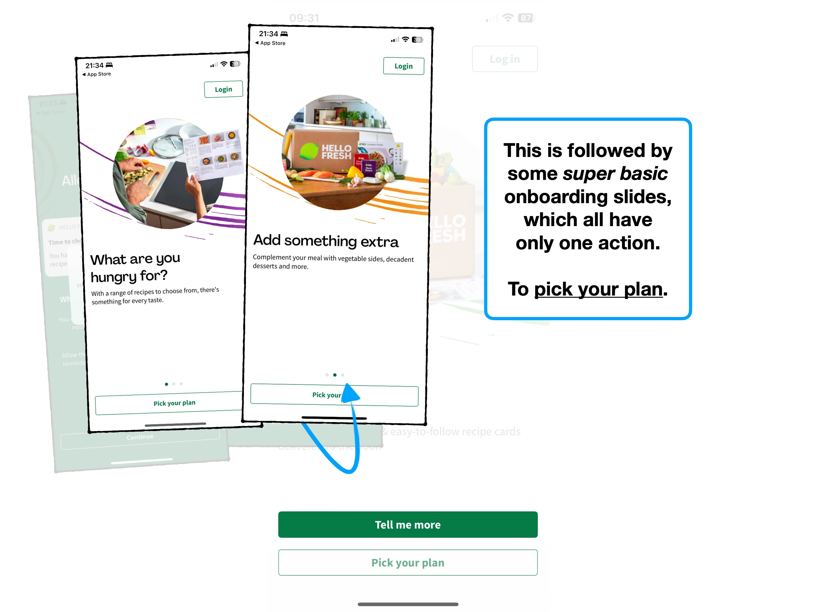
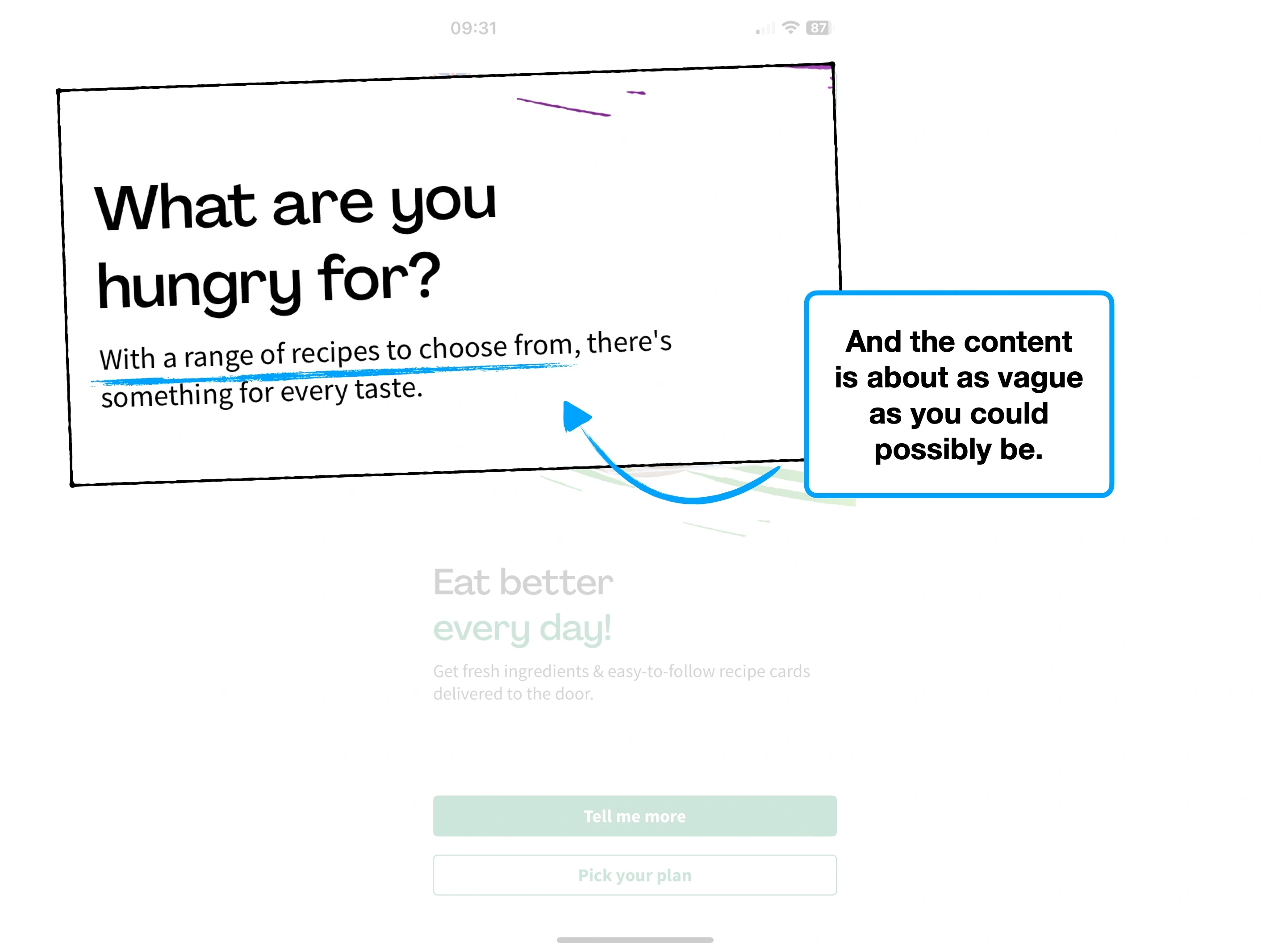
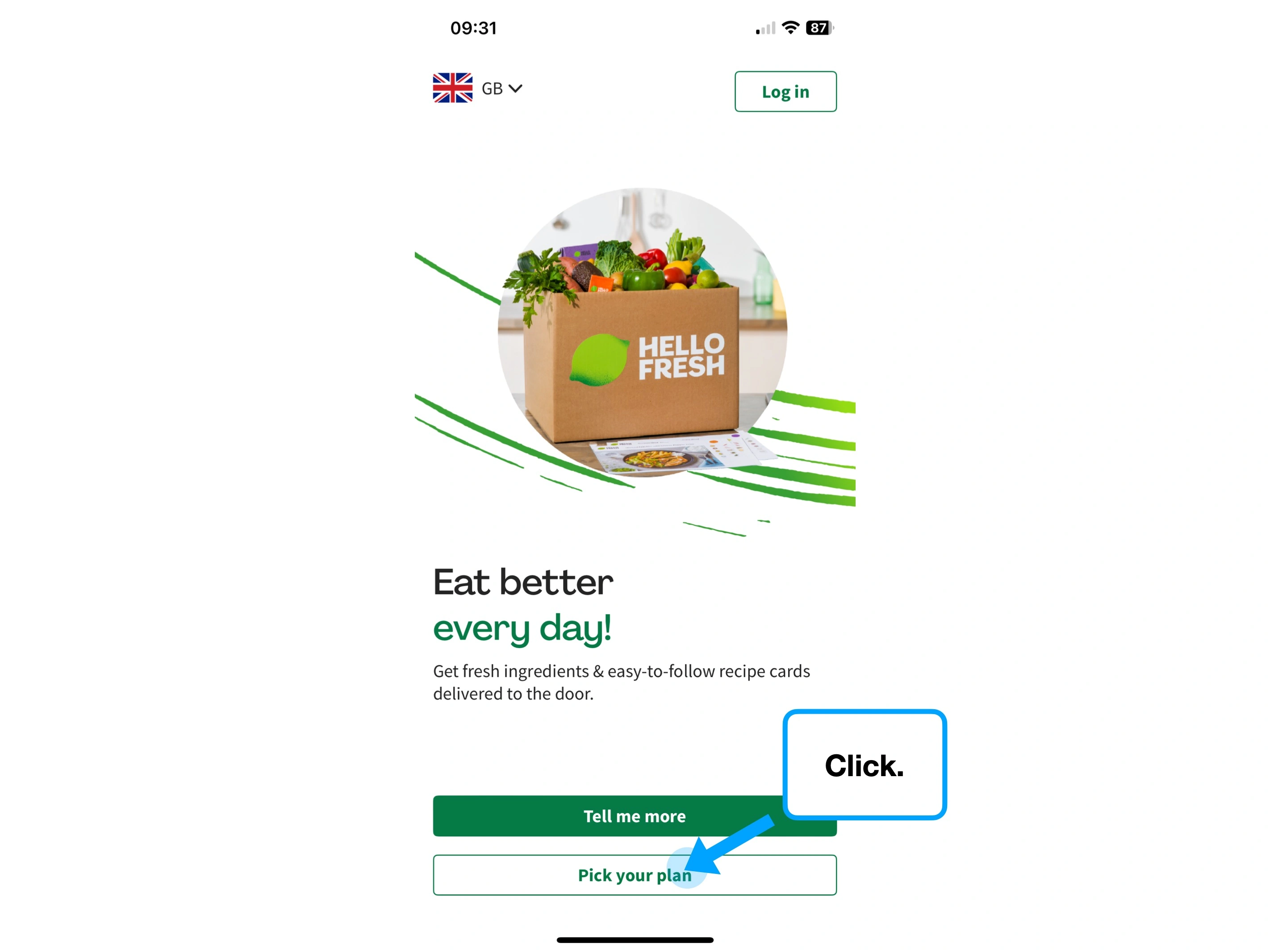
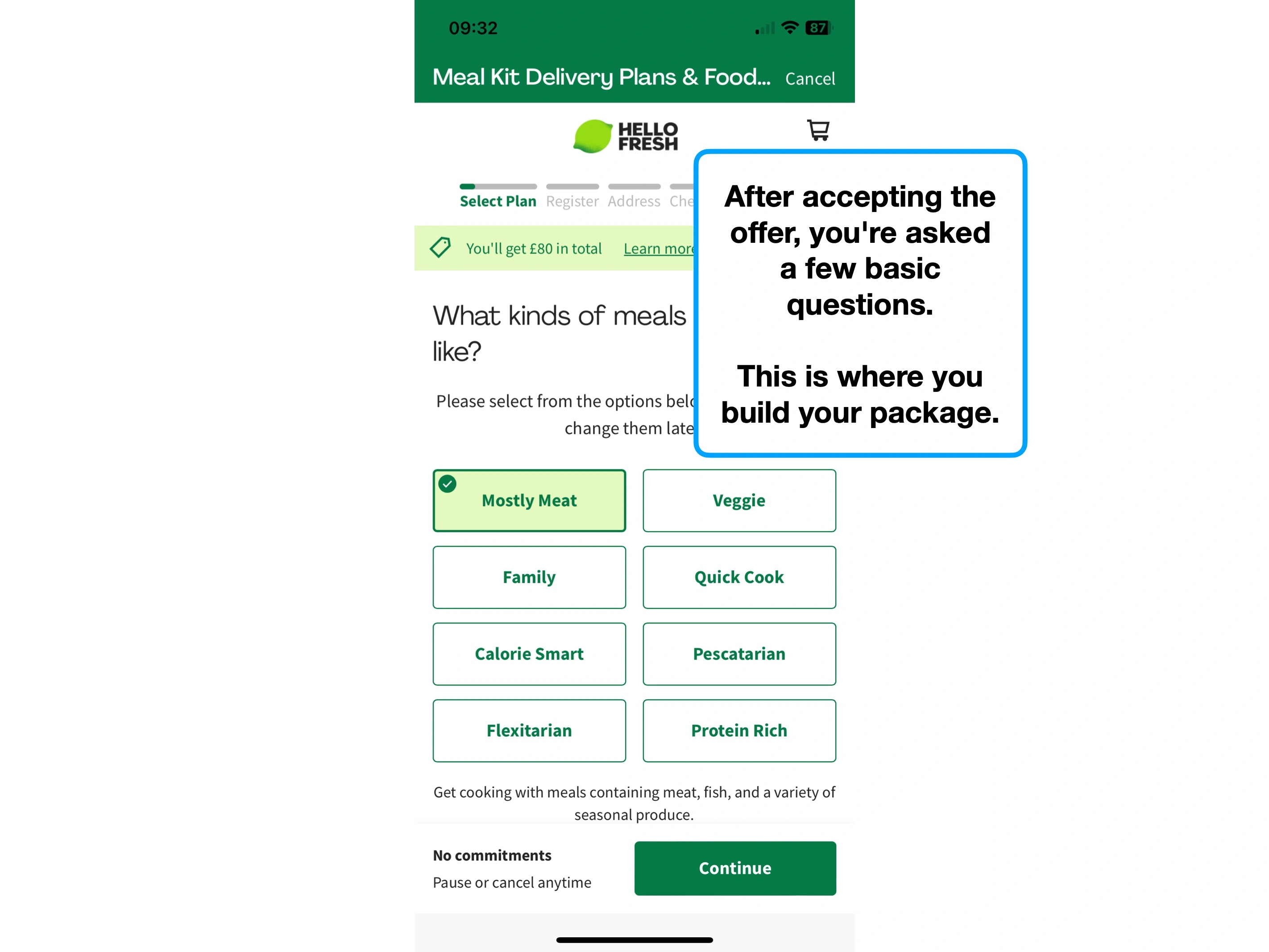
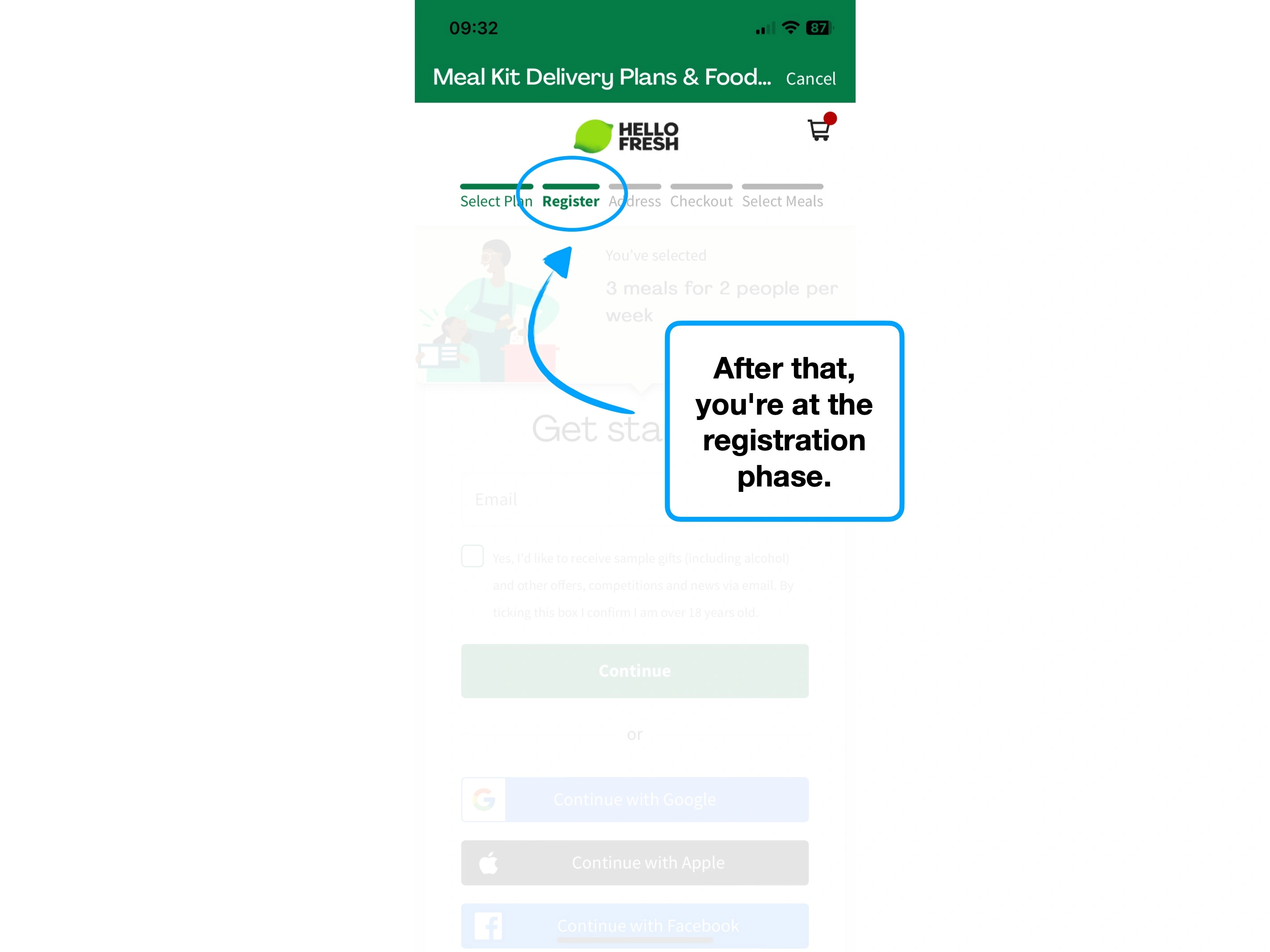
1. Commitment to picking a plan
i.e., the action of selecting, not an uncommitted "learning" or "viewing" plans.
📦
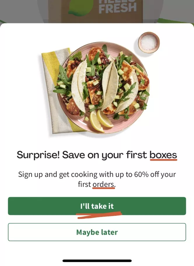
2. Committing to multiple orders
i.e., saving on multiple boxes and orders (plural).
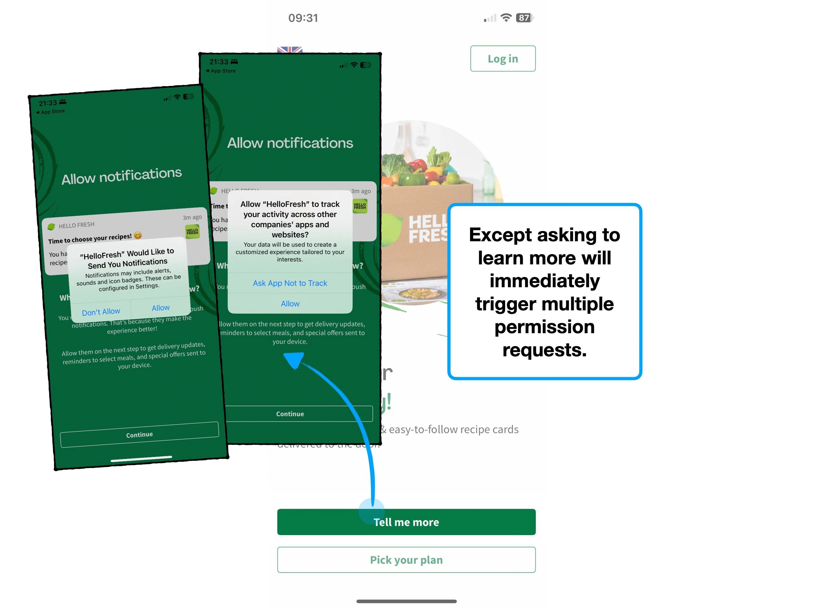
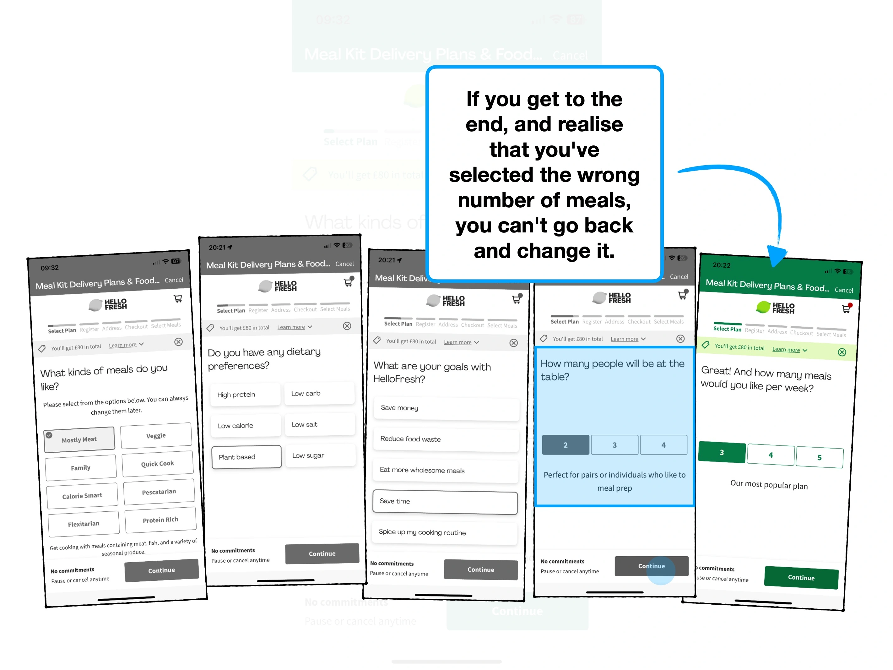
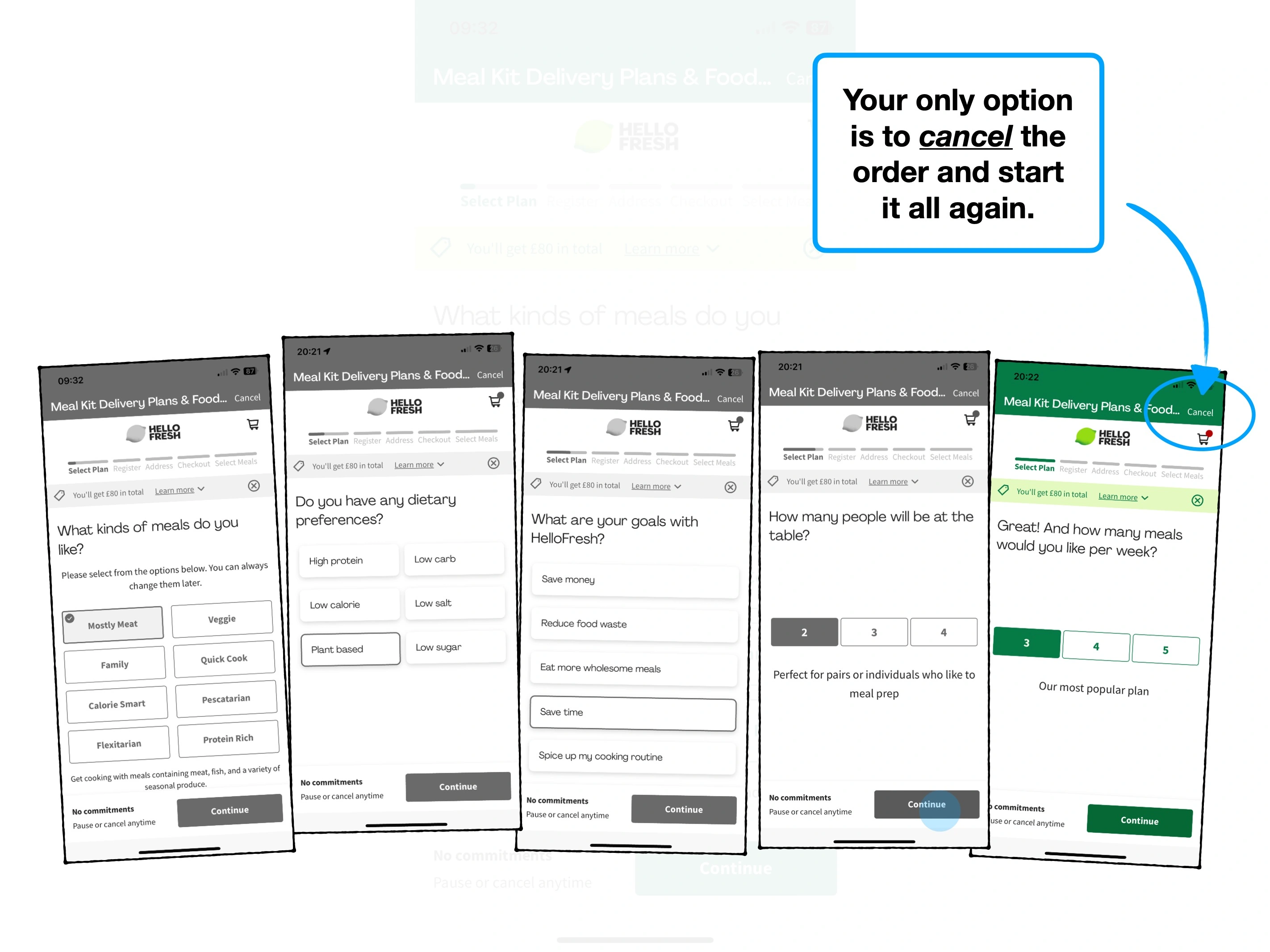
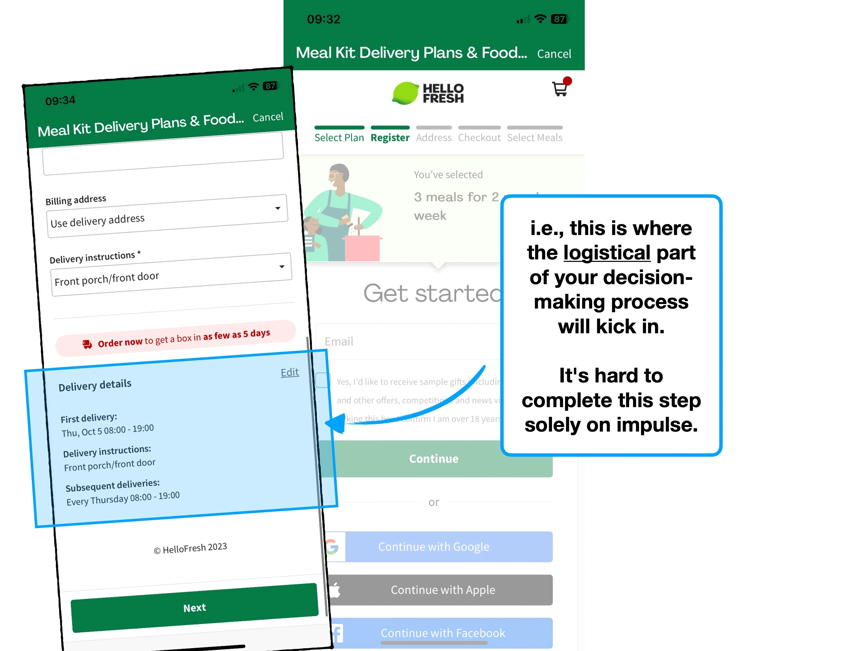
Obviously, there are risks to increasing the level of implied commitment.
If the user isn't ready to make that commitment, then they may churn.
For example, consider the four CTAs below, which could theoretically do the same action.
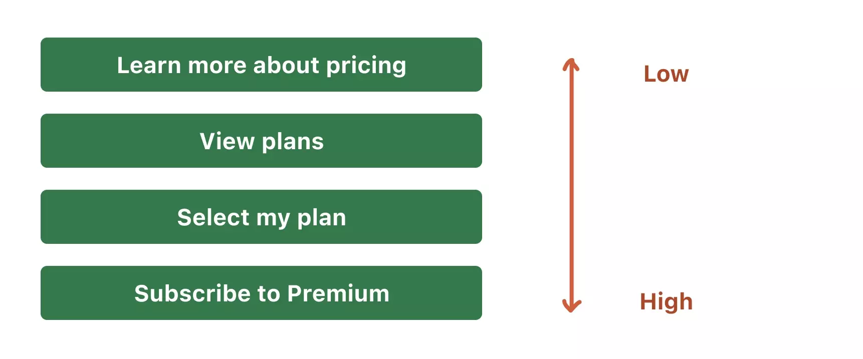
The key to utilising this bias effectively, is experimenting on your audience, and testing how large their appetite for commitment is.
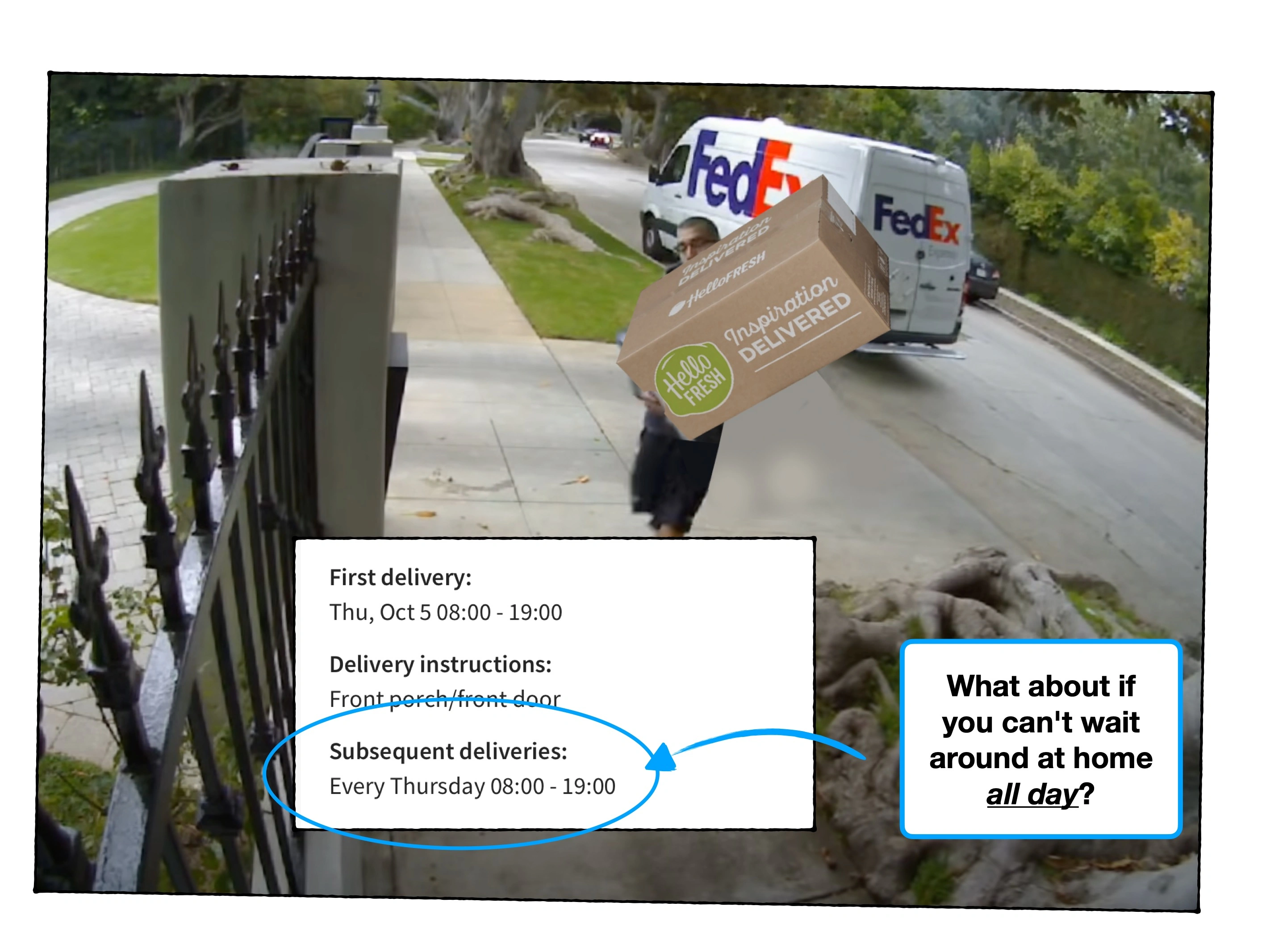
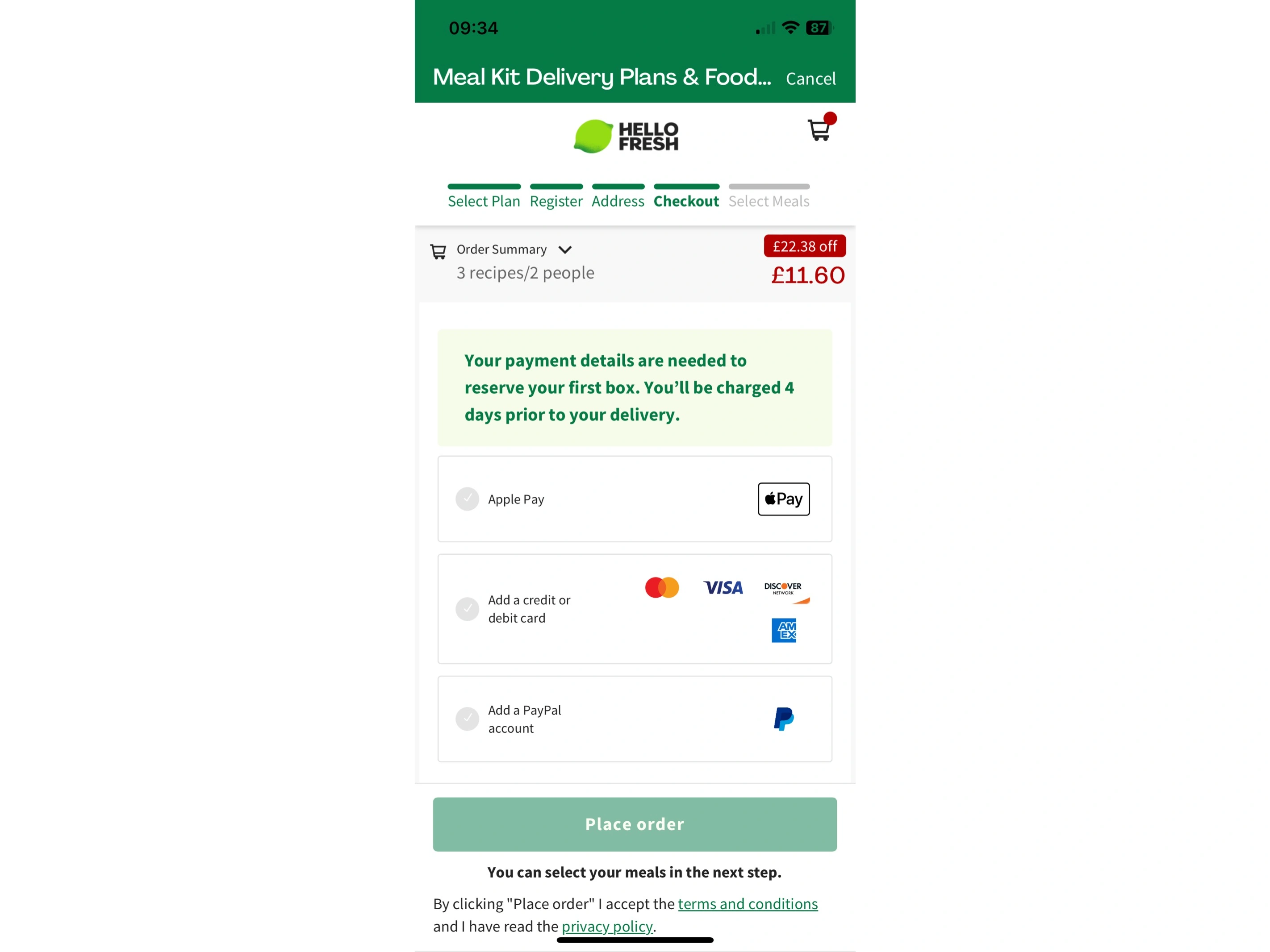
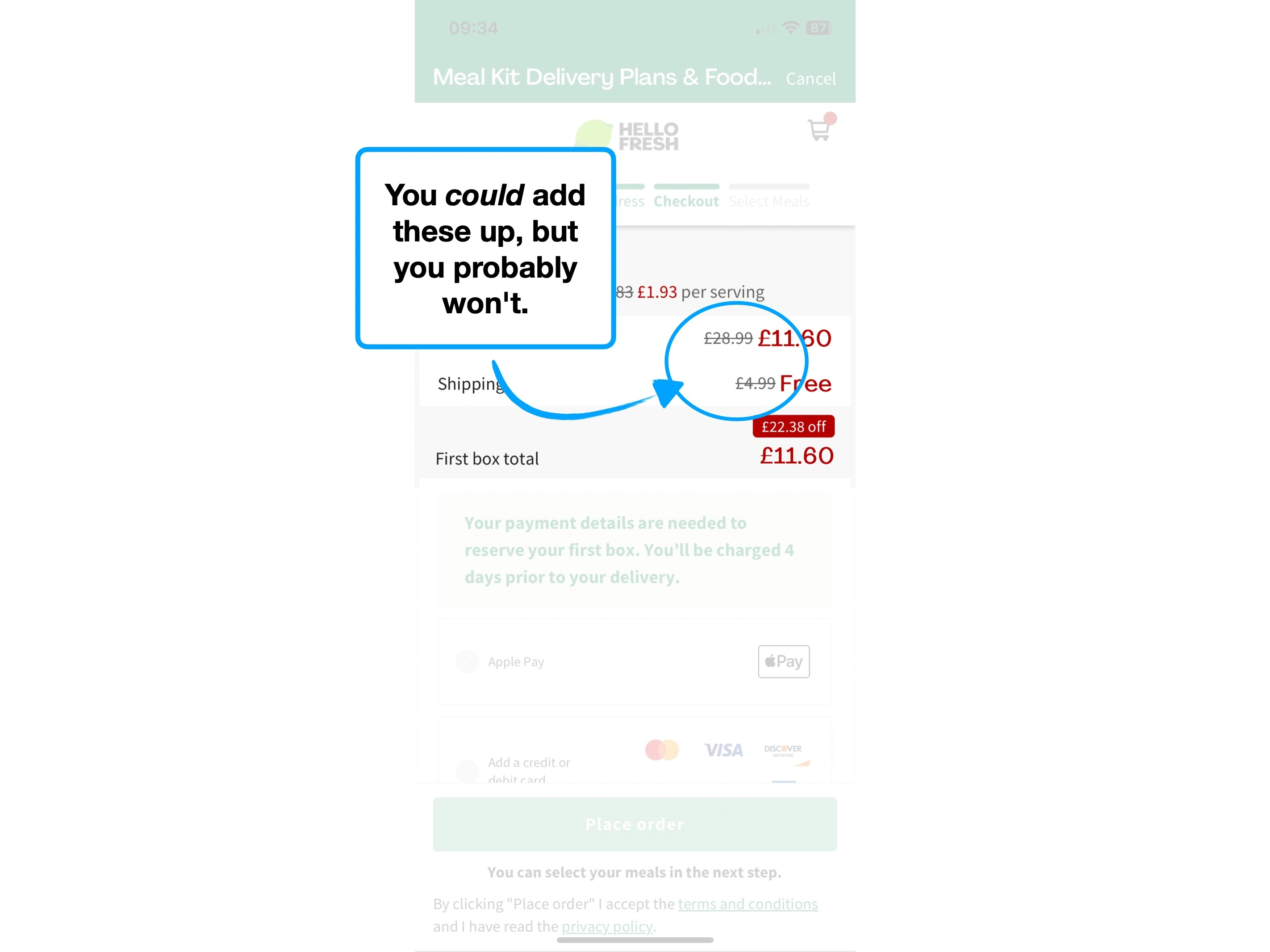
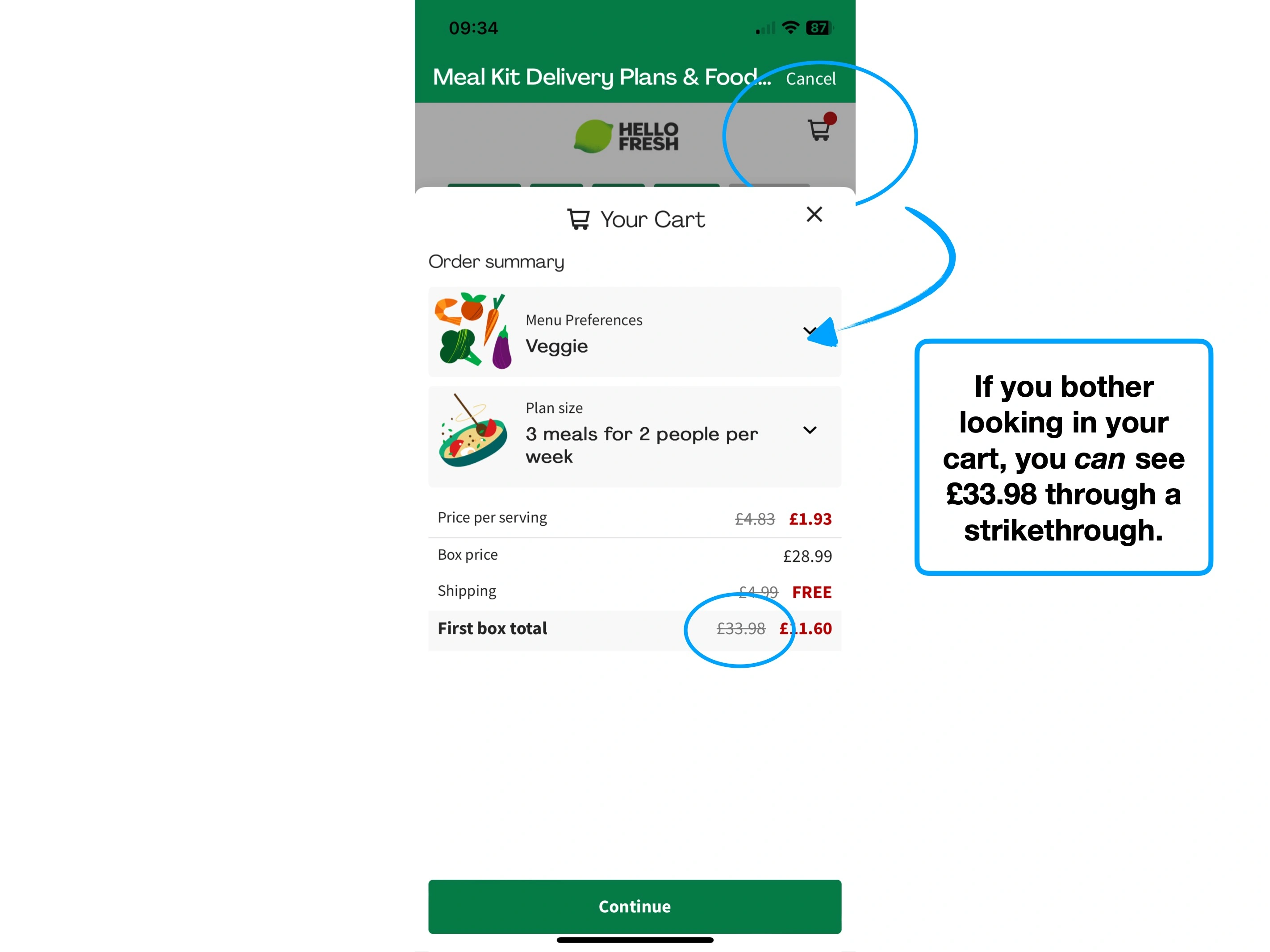
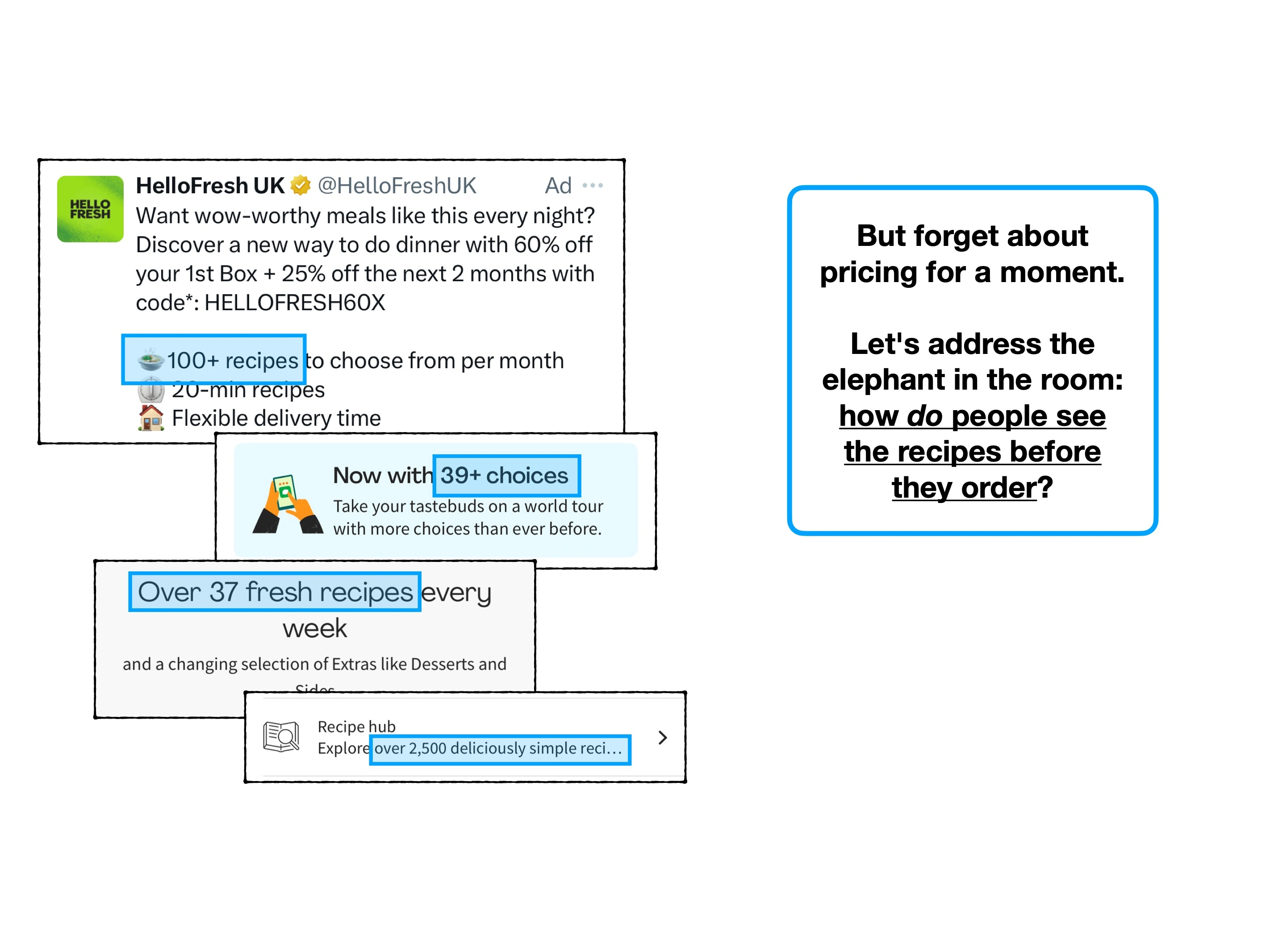
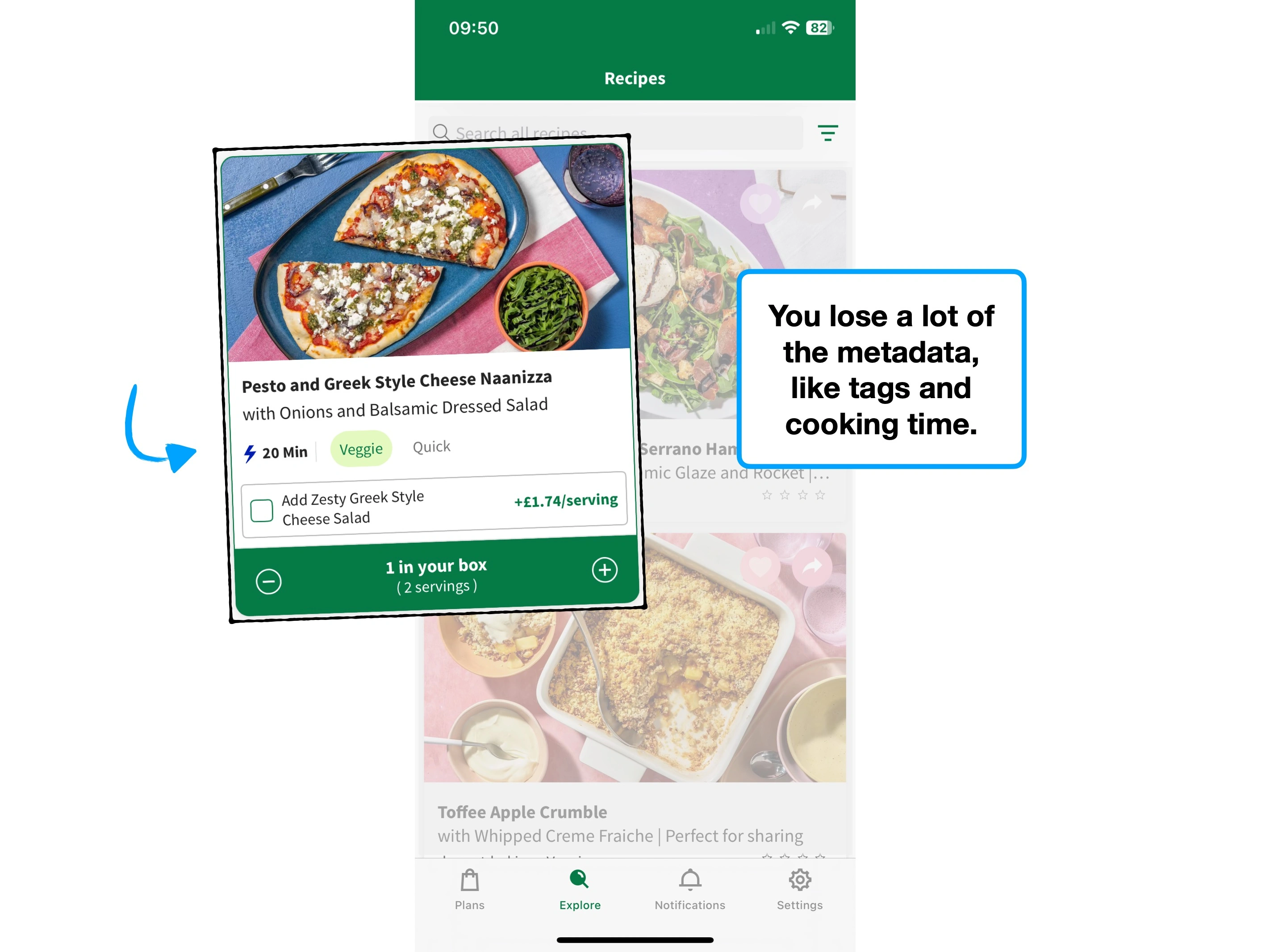
2. Price per meal
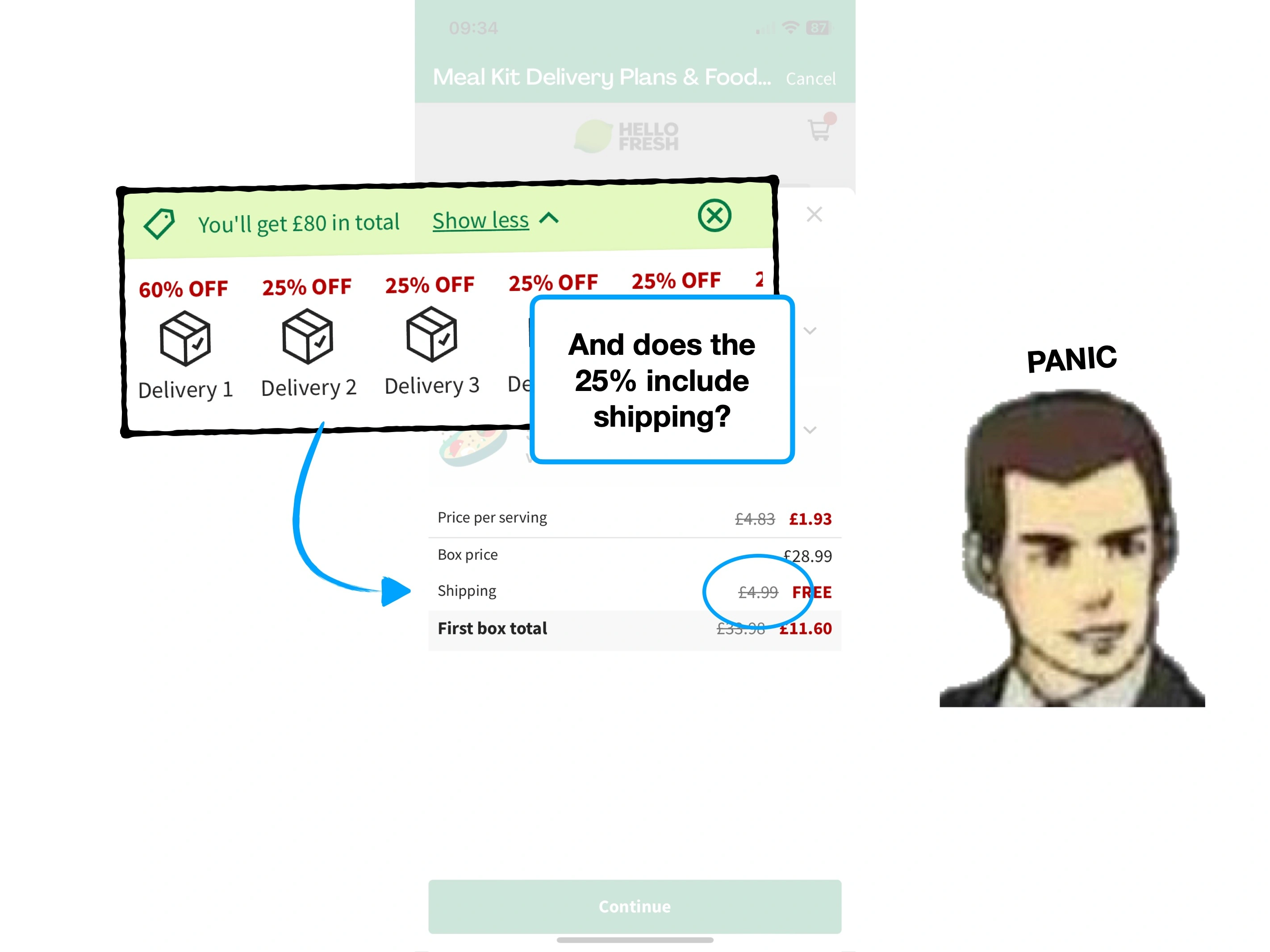
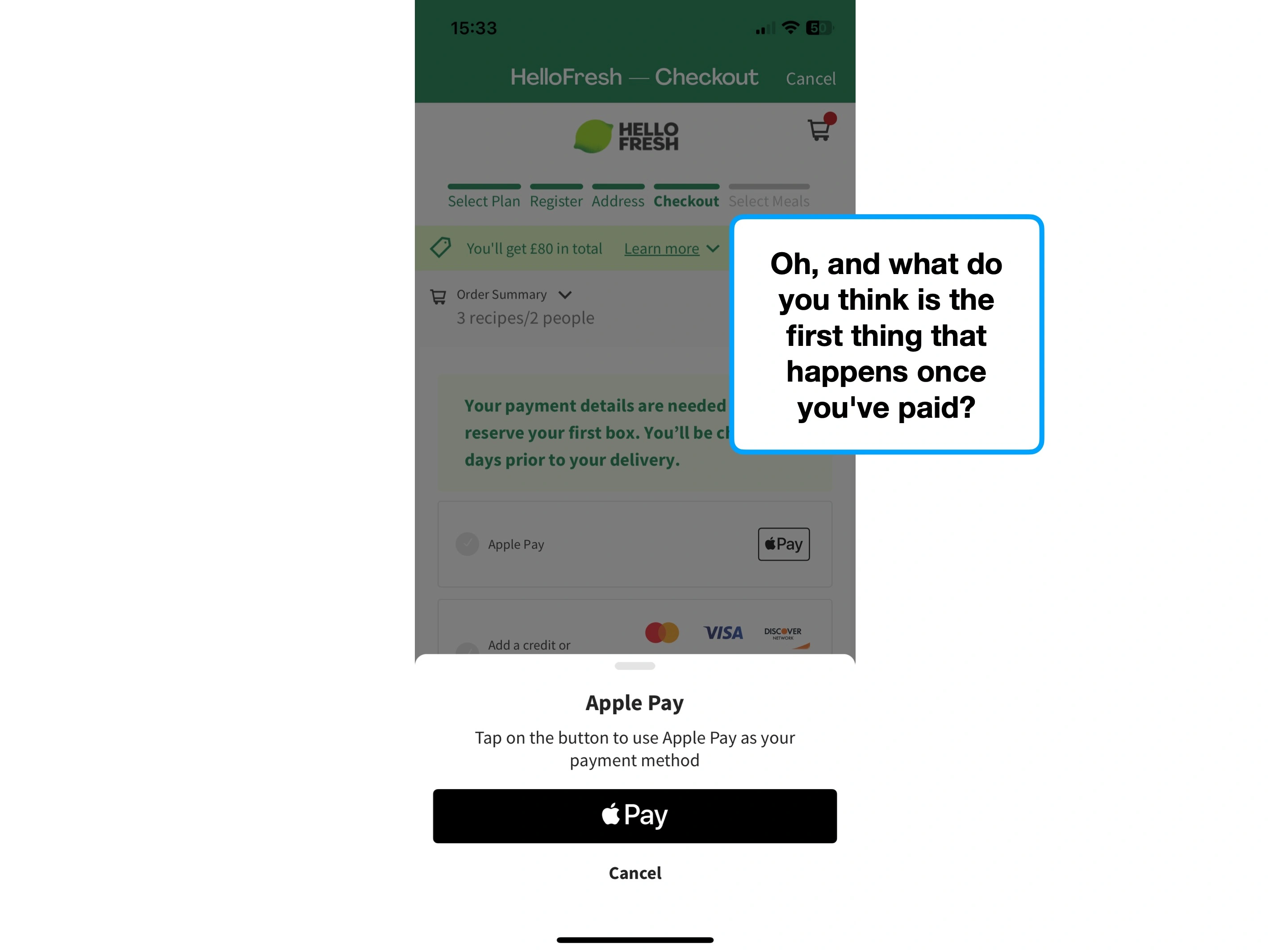
Imagine that you've created your HelloFresh bundle, and the weekly price is £35. You're likely to do some napkin maths.
"Okay £35 per week, that's... £140 a month. Wow, £140 for just 3 weekly meals, and I still need to buy everything else. Ouch."
The inherent problem, is that the ingredient cost for home-cooked food is difficult to price. People have a sense that it's cheaper than takeaways, but no accurate benchmark.
They're subject to the ⌛️ Recency Bias of their last few food shops.
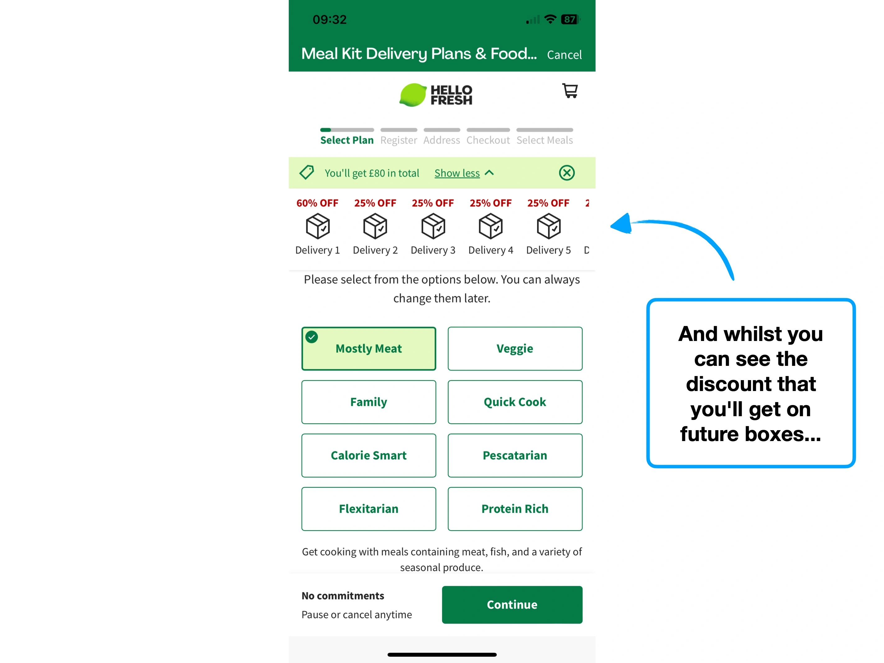
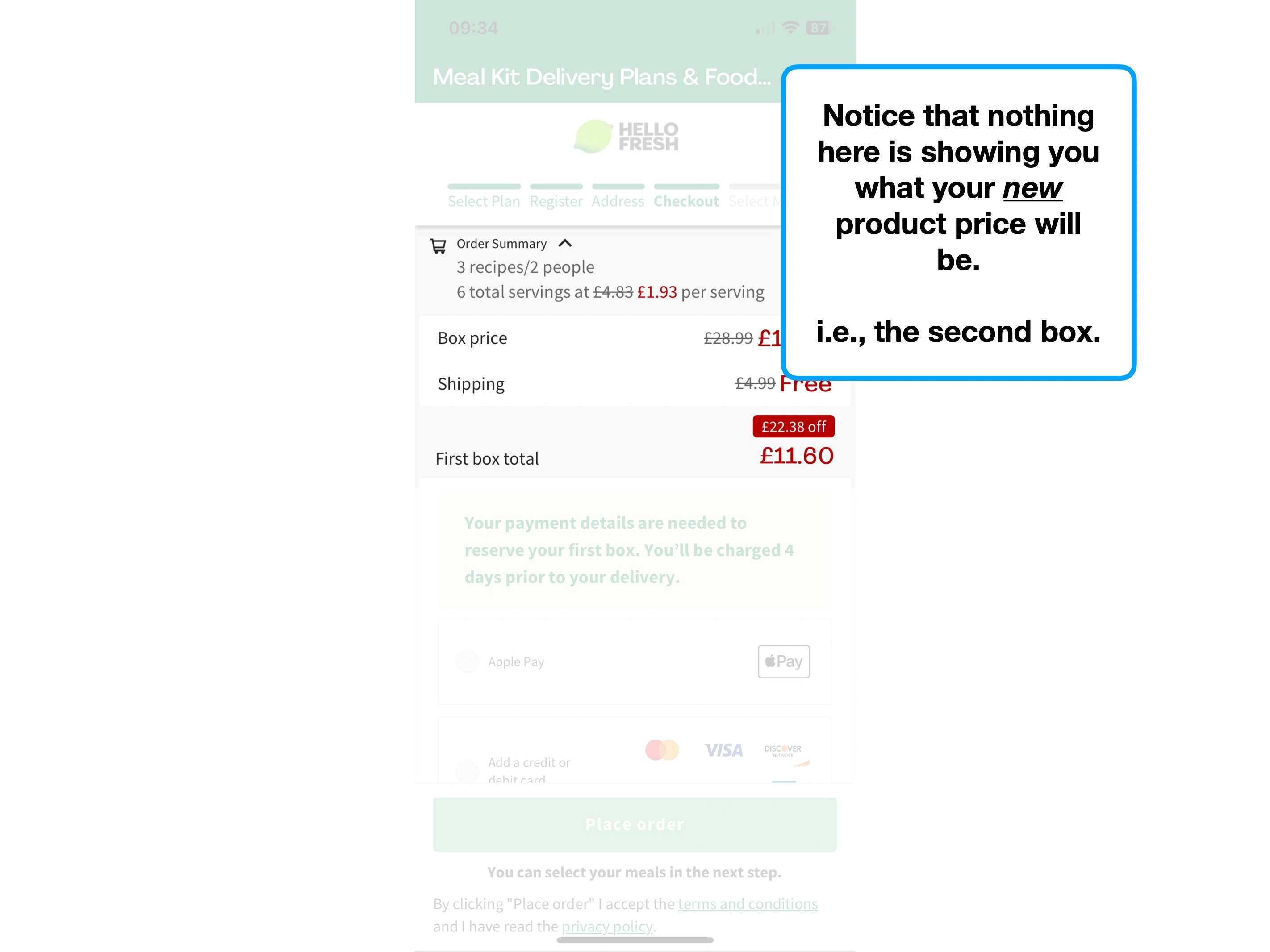
To counter this, HelloFresh display the cost of their plan per serving.
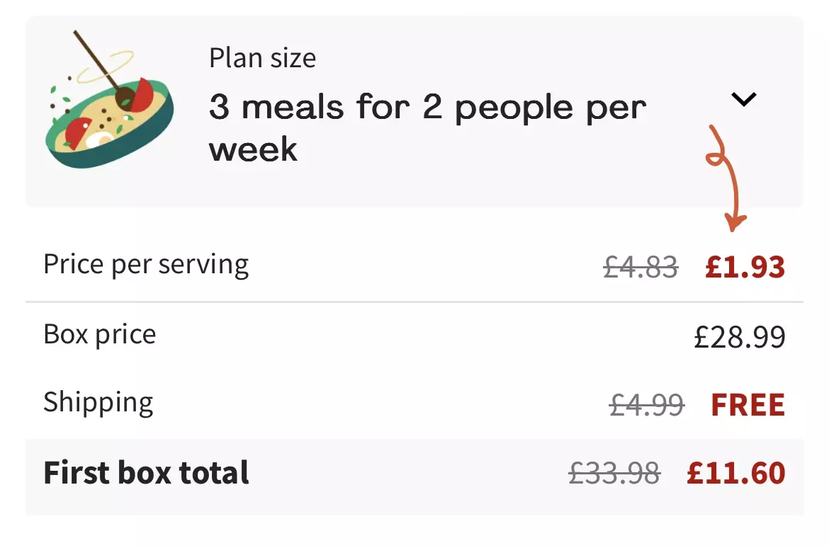
This 🖼 Framing allows the customer to try and reverse benchmark the cost of homecooked meals.
i.e., can you produce a tasty home cooked meal for £1.93 per serving?
My (incorrect) instinctive judgement is that I can't—and therefore this is a great alternative.
Even though HelloFresh is still more expensive than grocery shopping, it feels like better value than it did, because there's now a frame of reference.
The ambiguity of how much you currently spend on groceries is what makes this so effective.
This, perhaps, is one reason why they don't go a step further and compare it to the average price per serving of a home cooked meal.
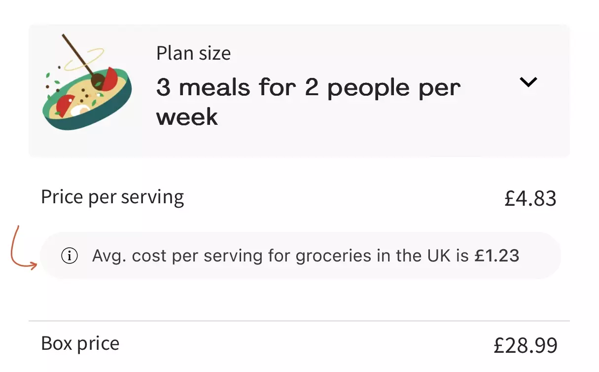
The effectiveness of framing isn't about giving all the information, but giving that which gives you the best perceived value proposition in comparison.
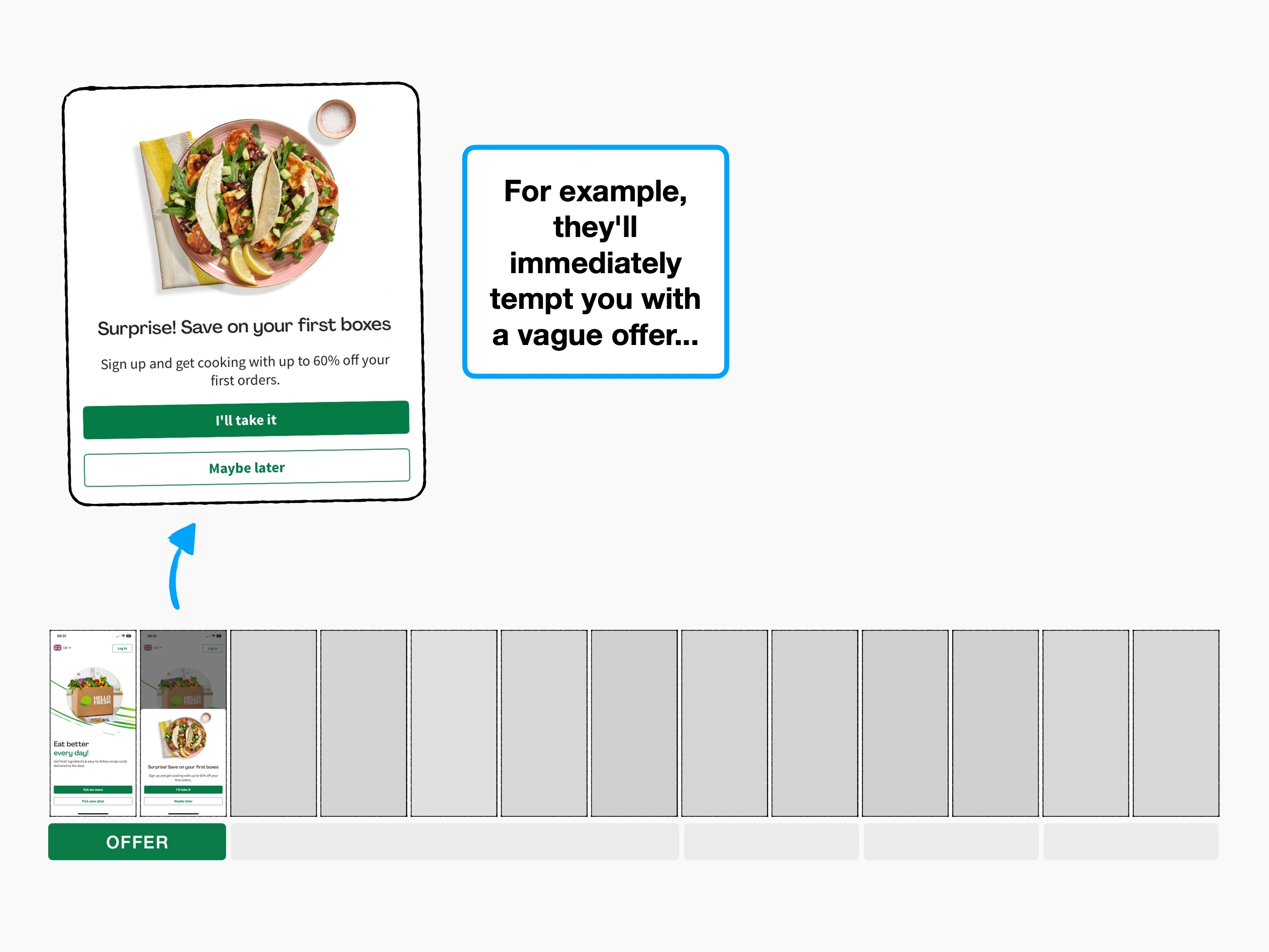
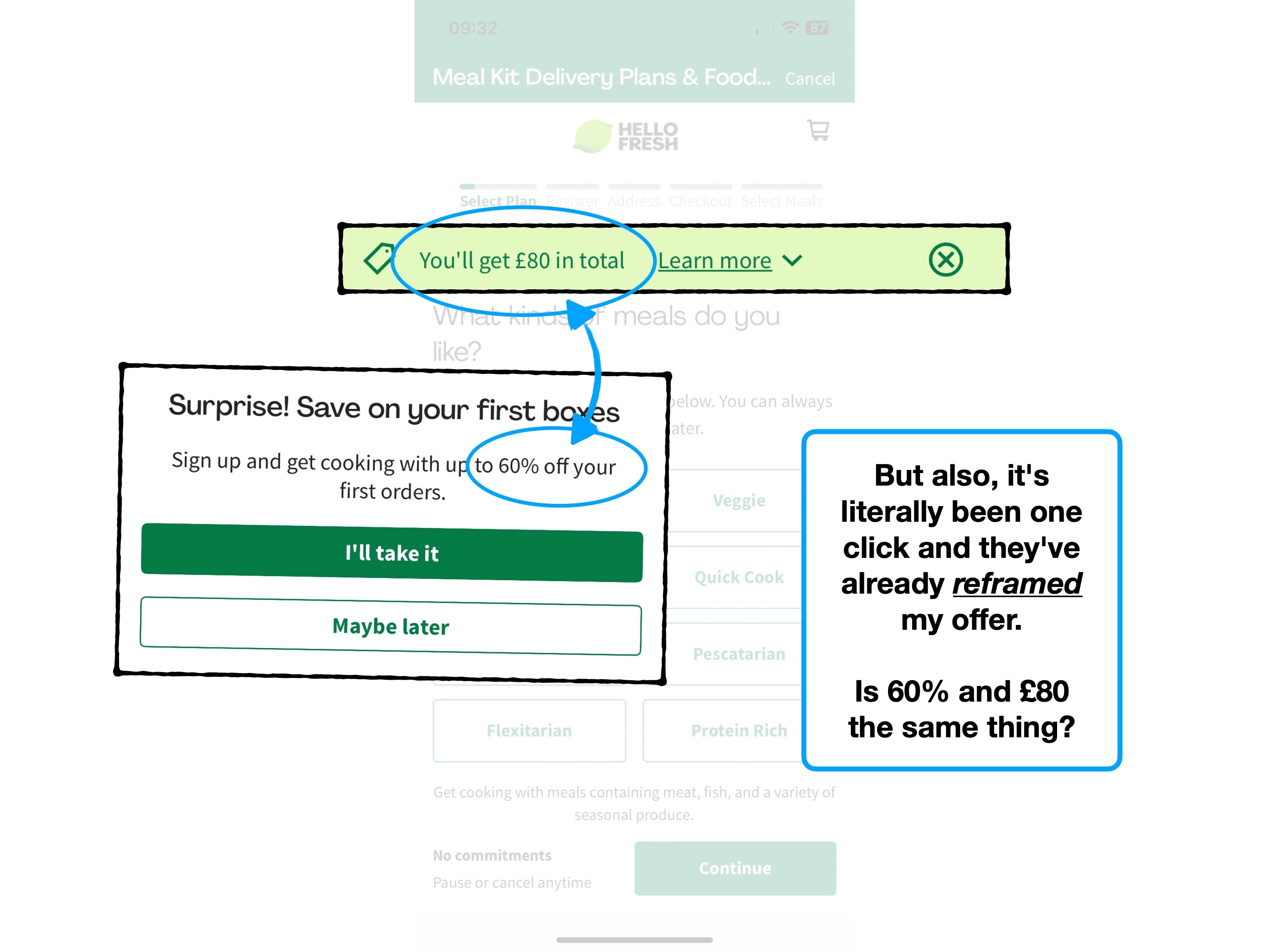
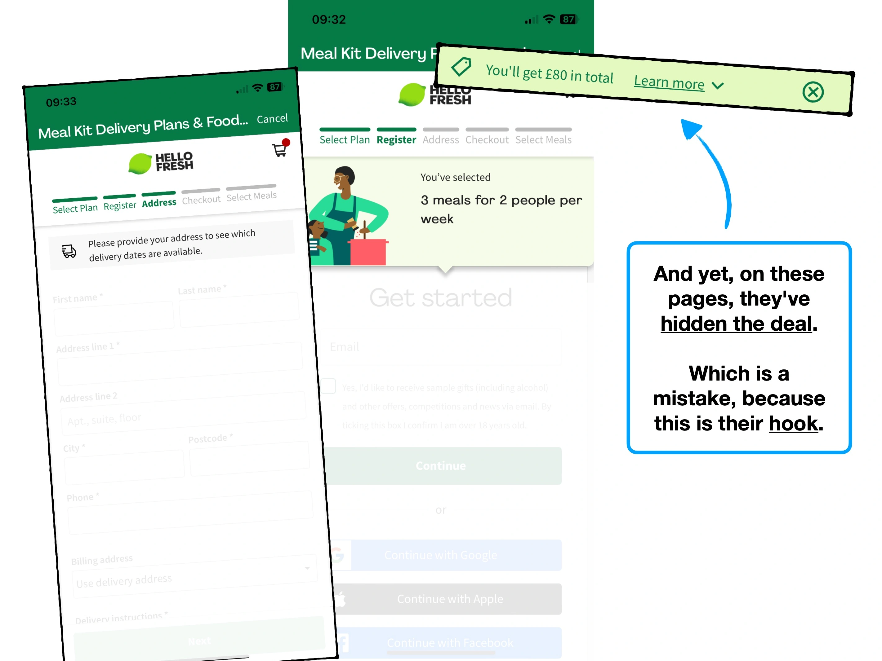
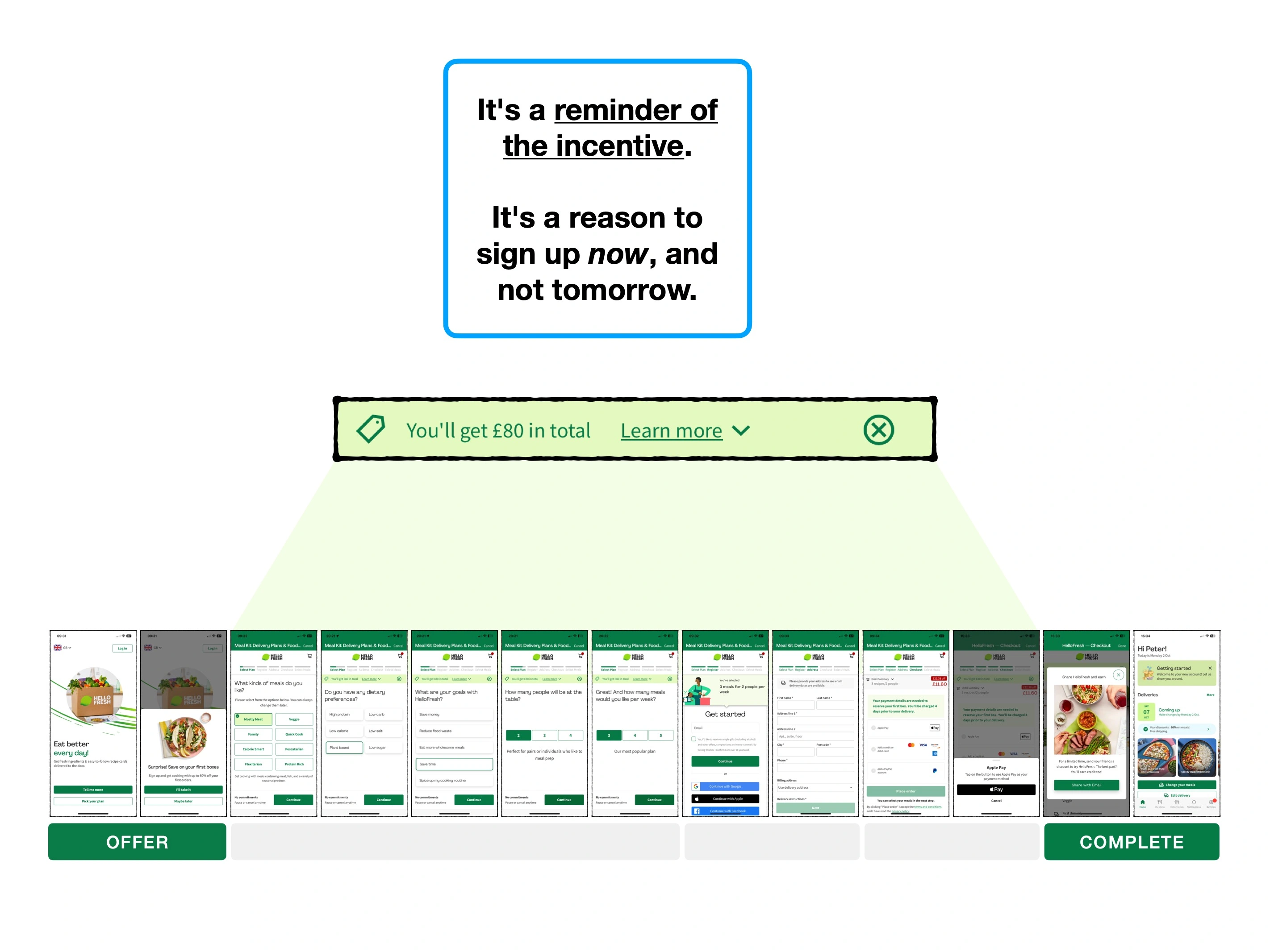
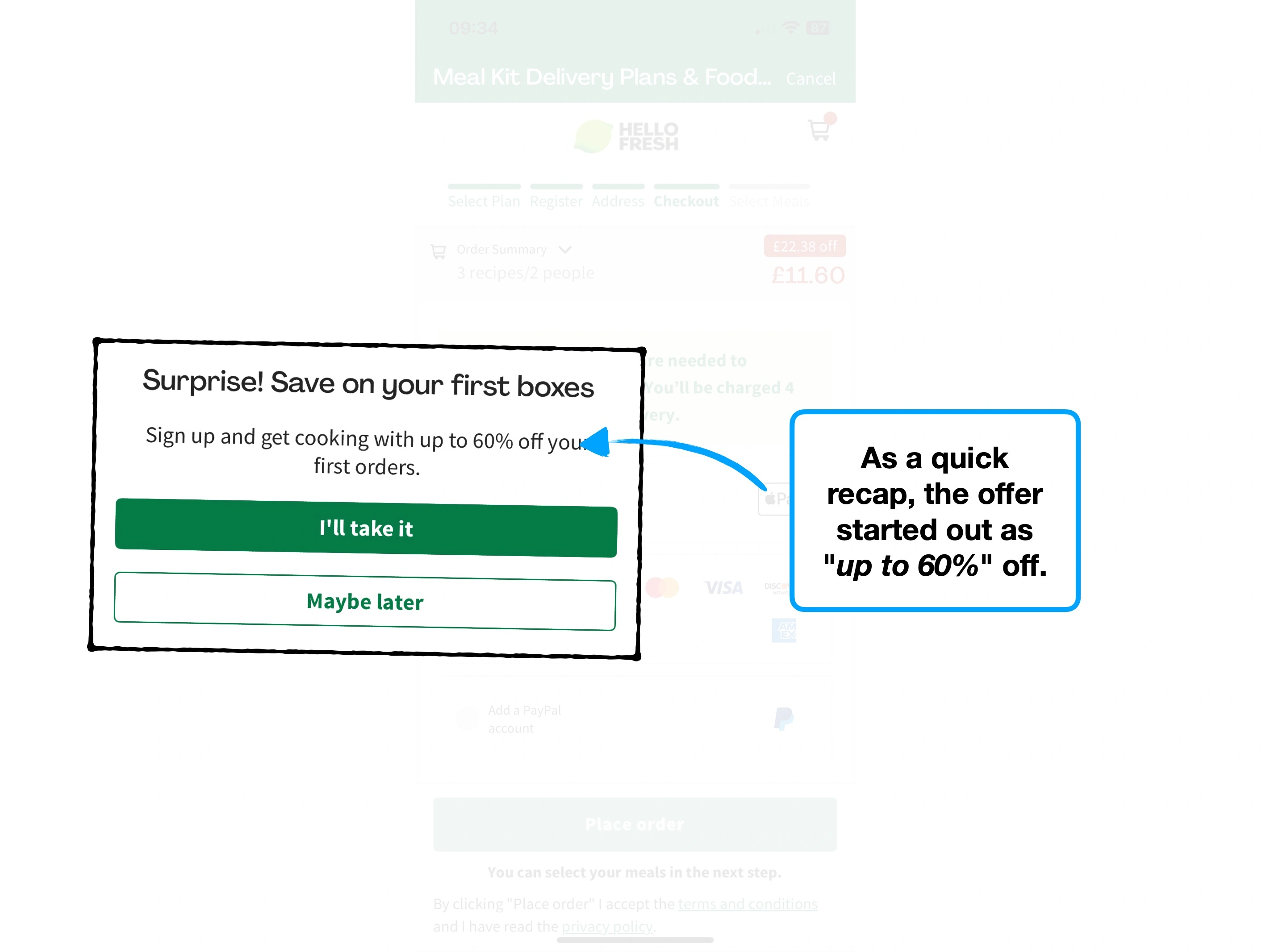
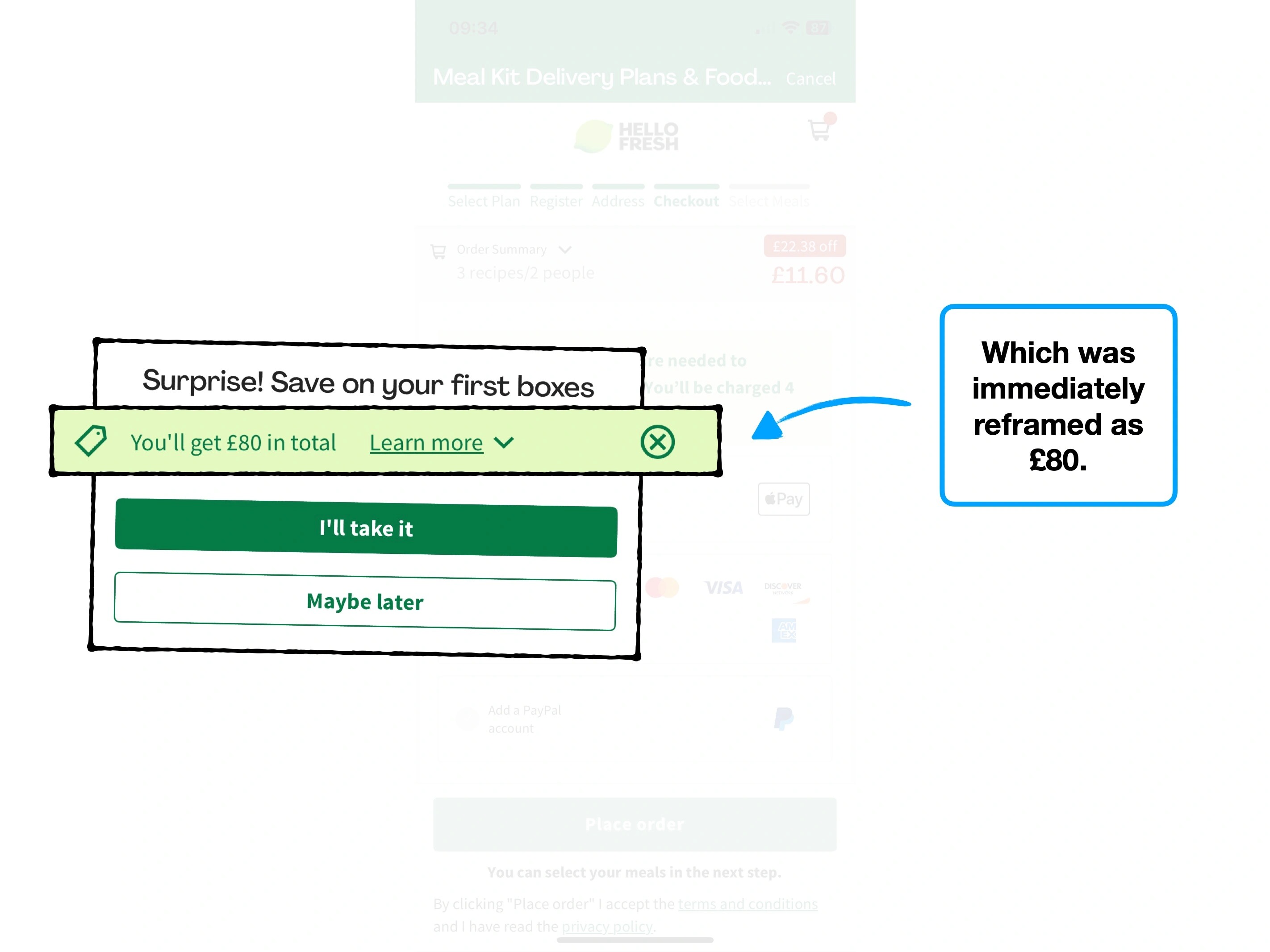
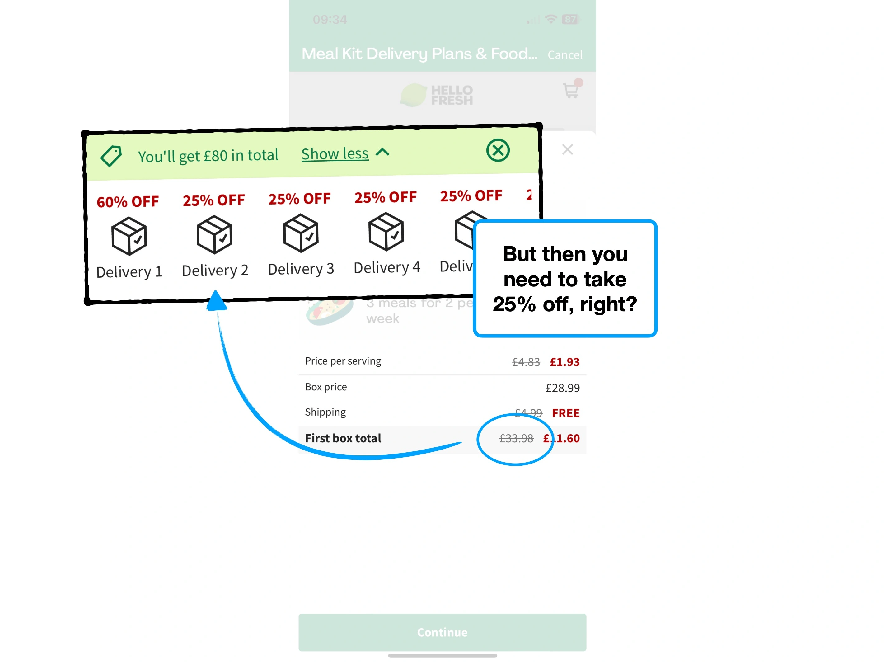
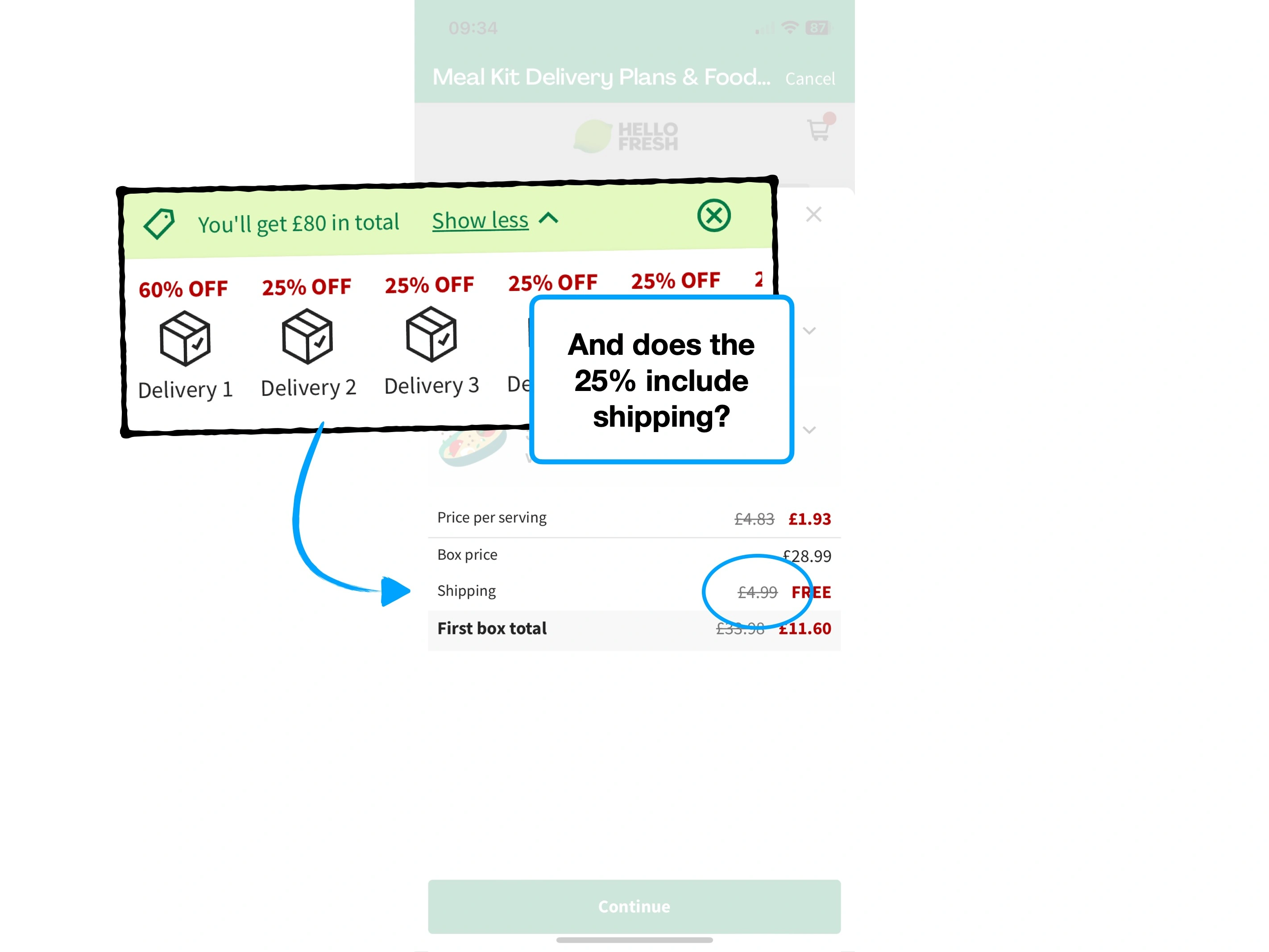
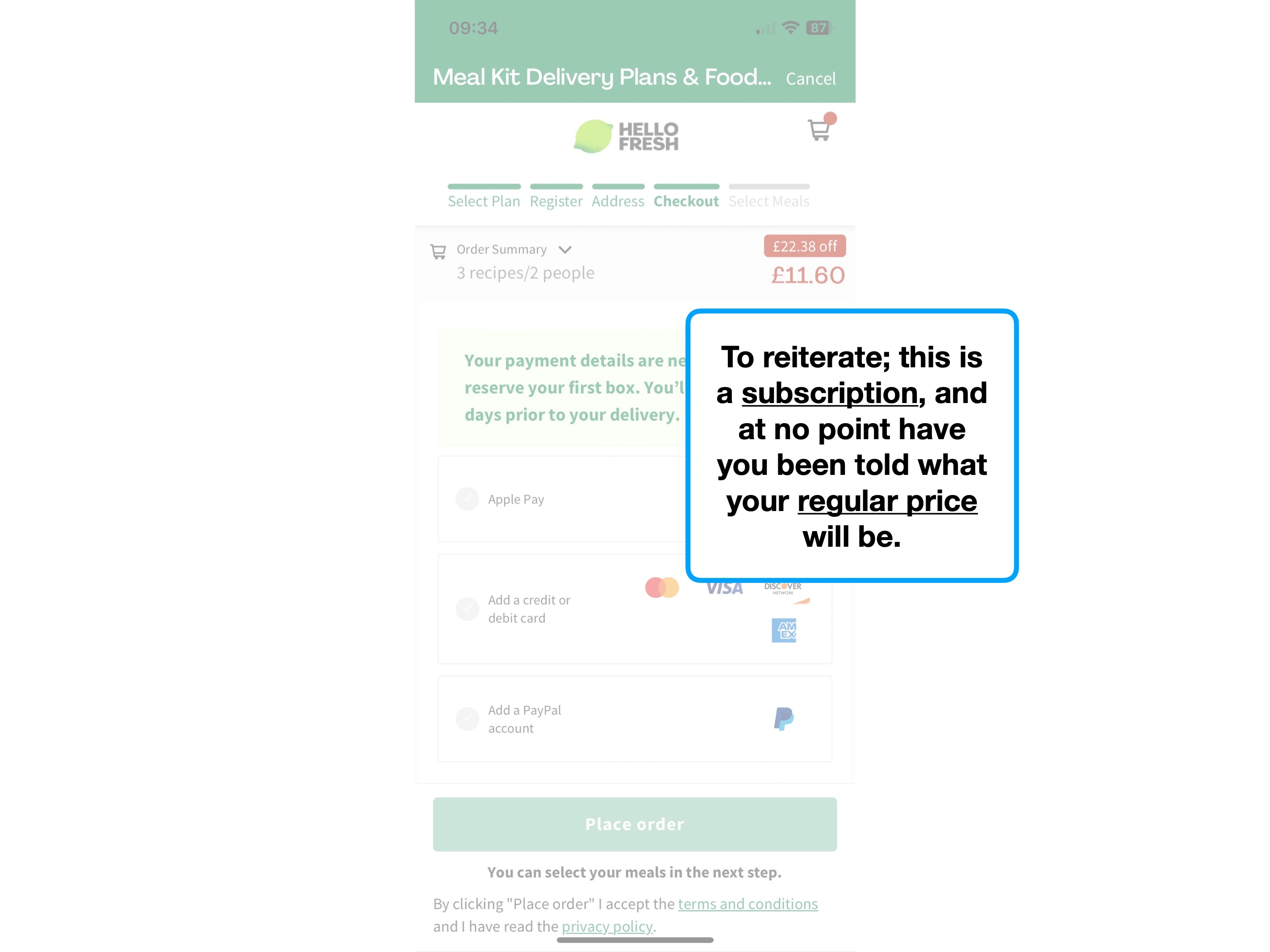
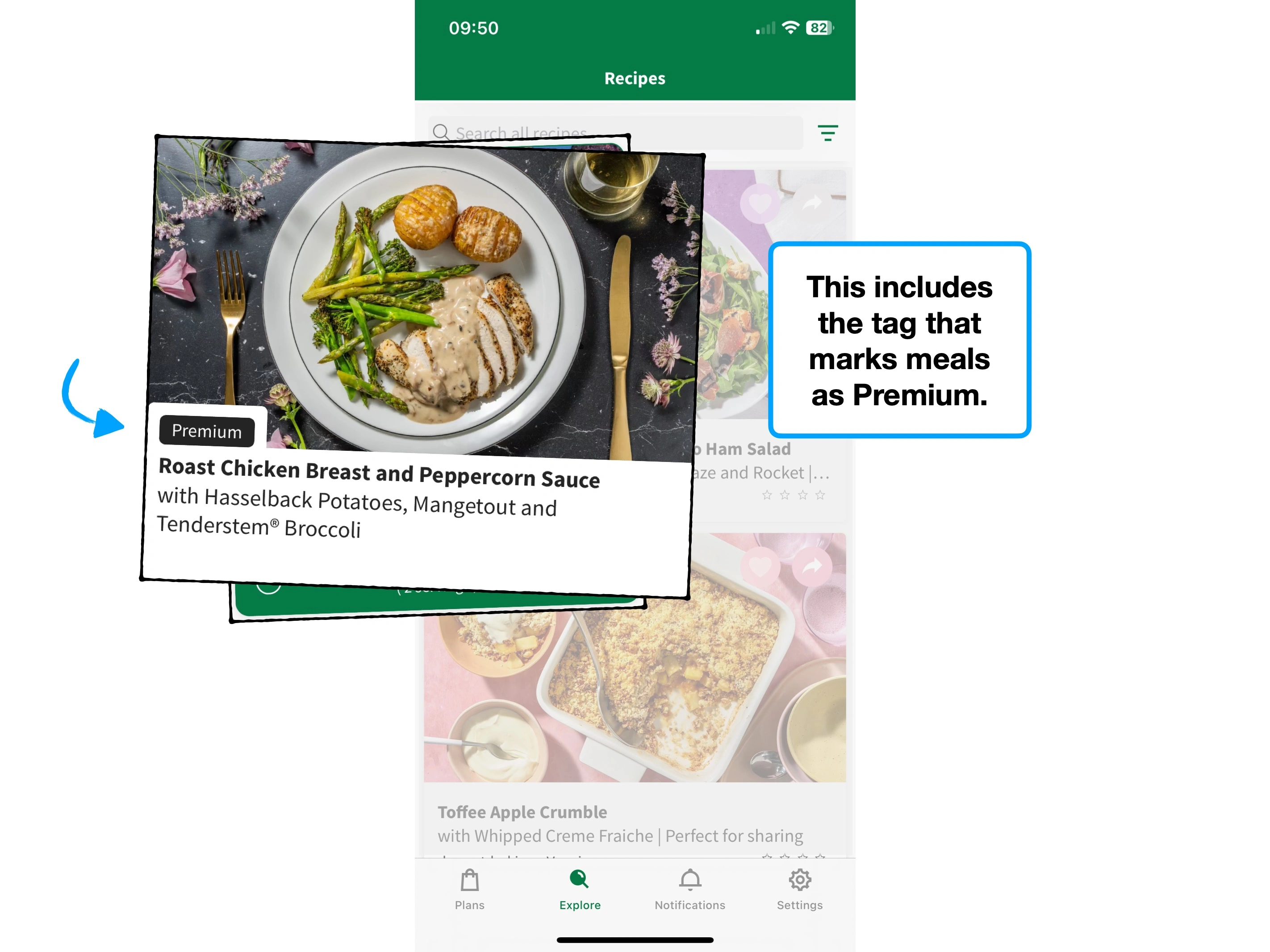
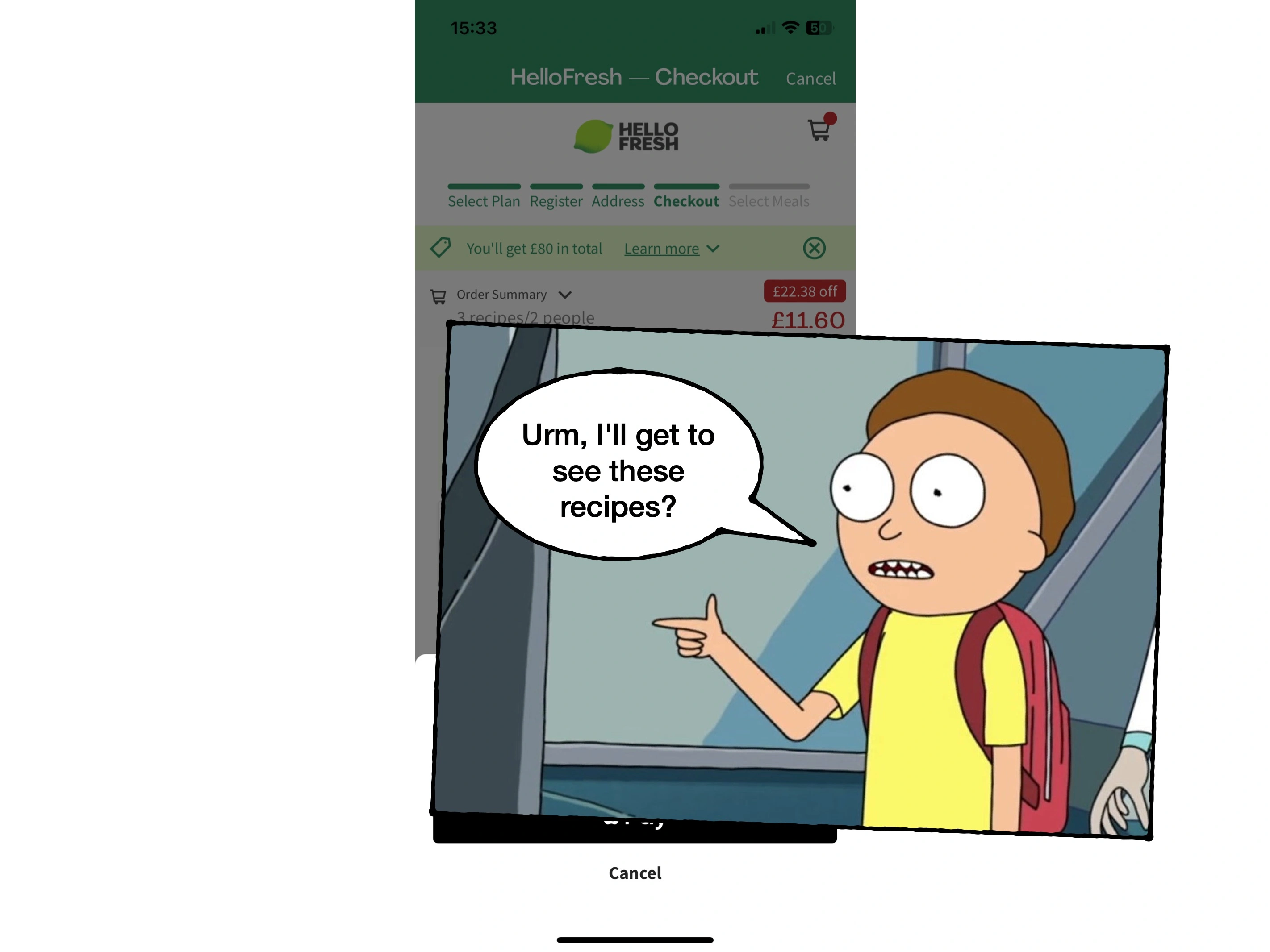
3. Applying deals
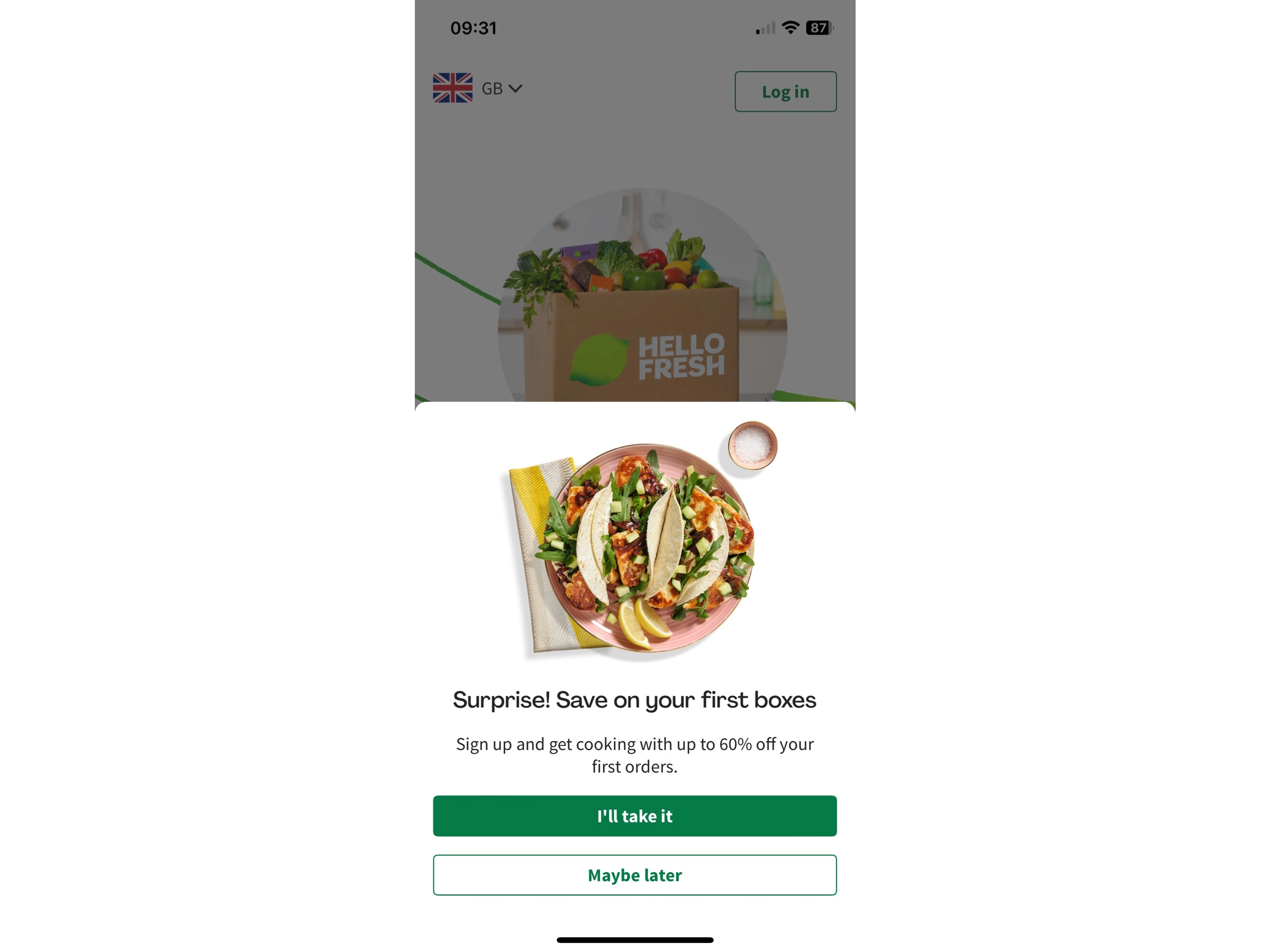
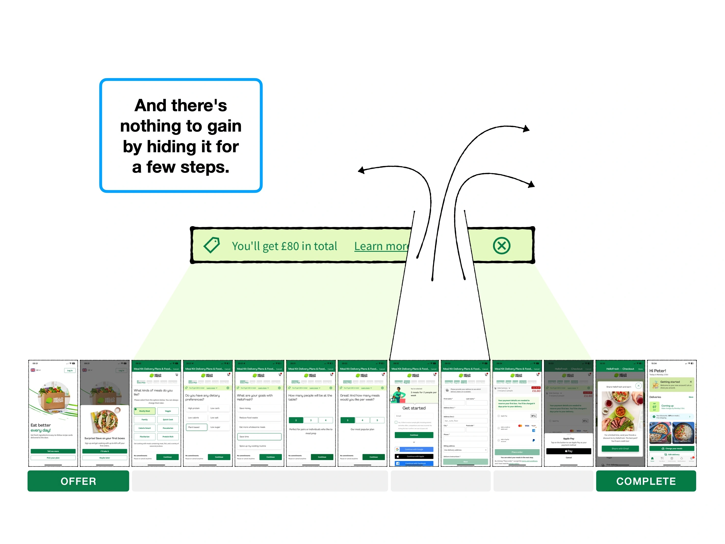
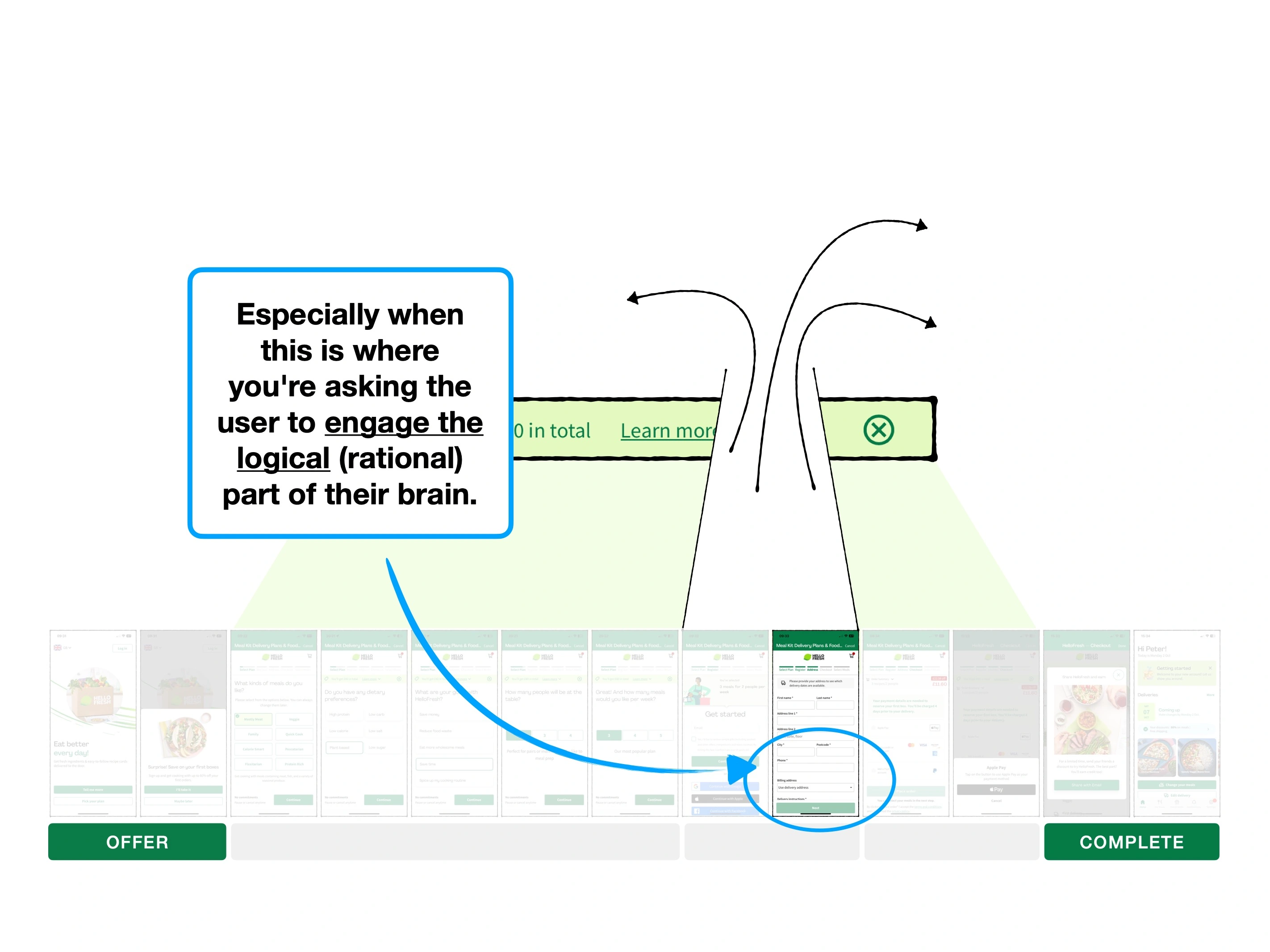
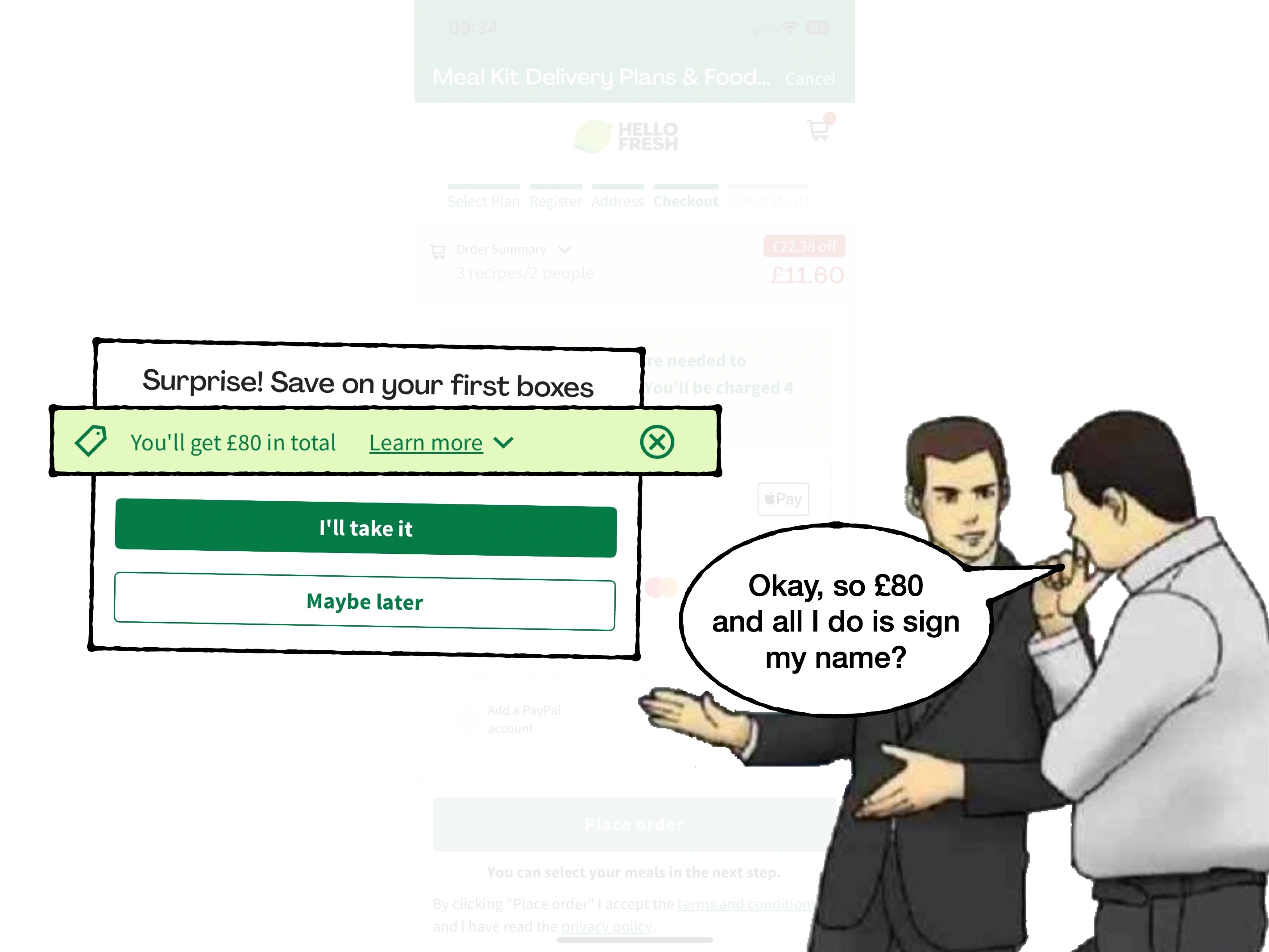
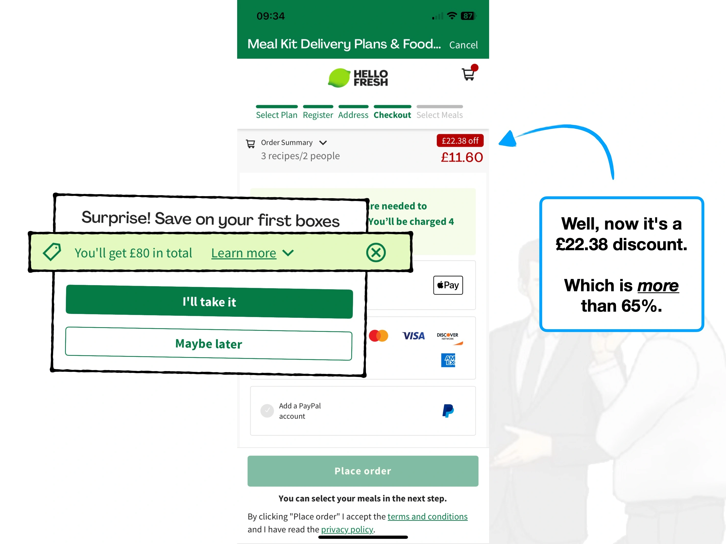
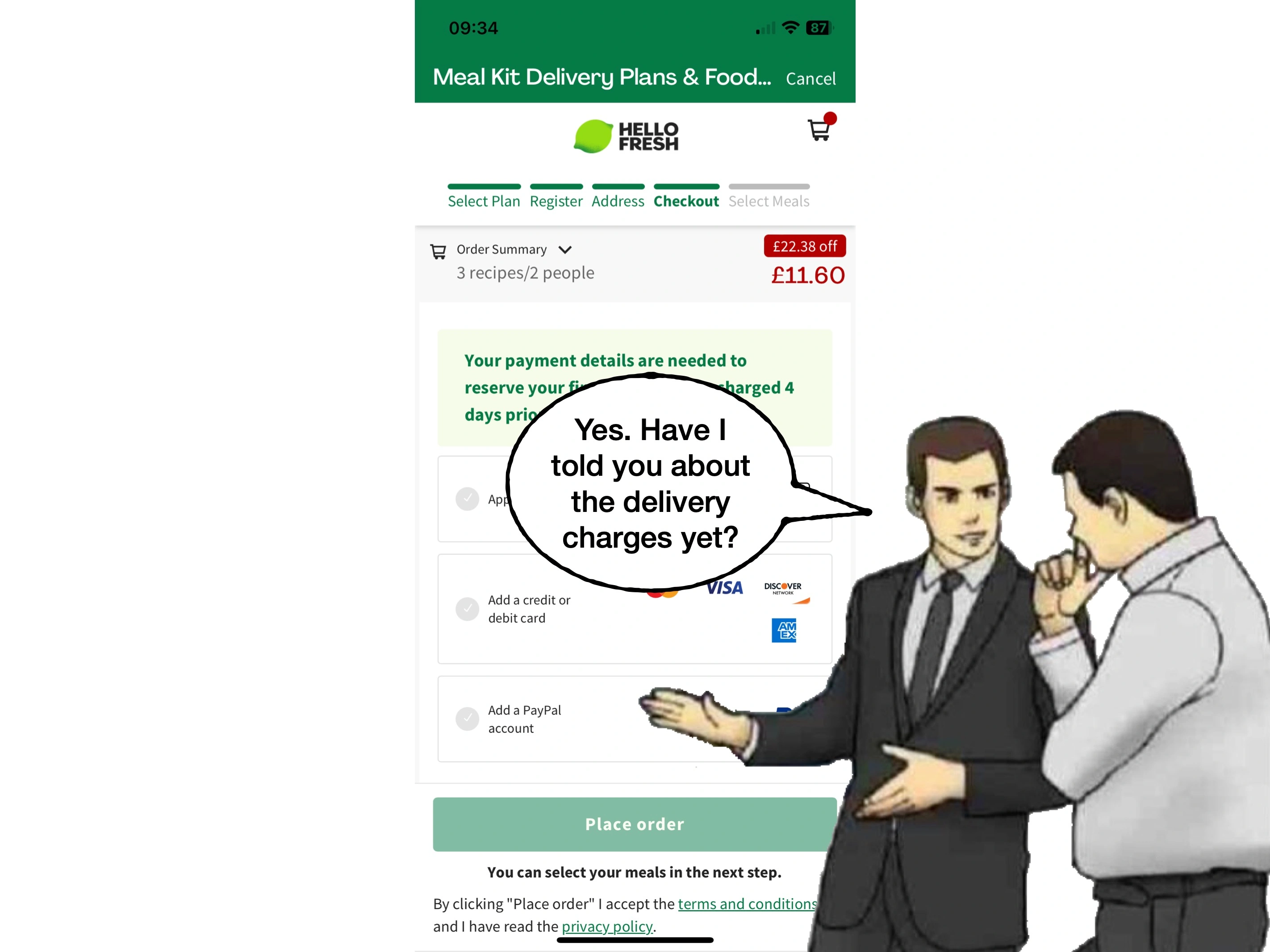
You'll often encounter pop-ups while shopping online, offering a discount off of your first order, if you join the merchant's newsletter.
But at that stage, you might not know if they have anything that you want to purchase. The trade-off may actually have a negative expected value.
i.e., not only might you not buy anything from that store, but then they are going to spam your inbox with emails.
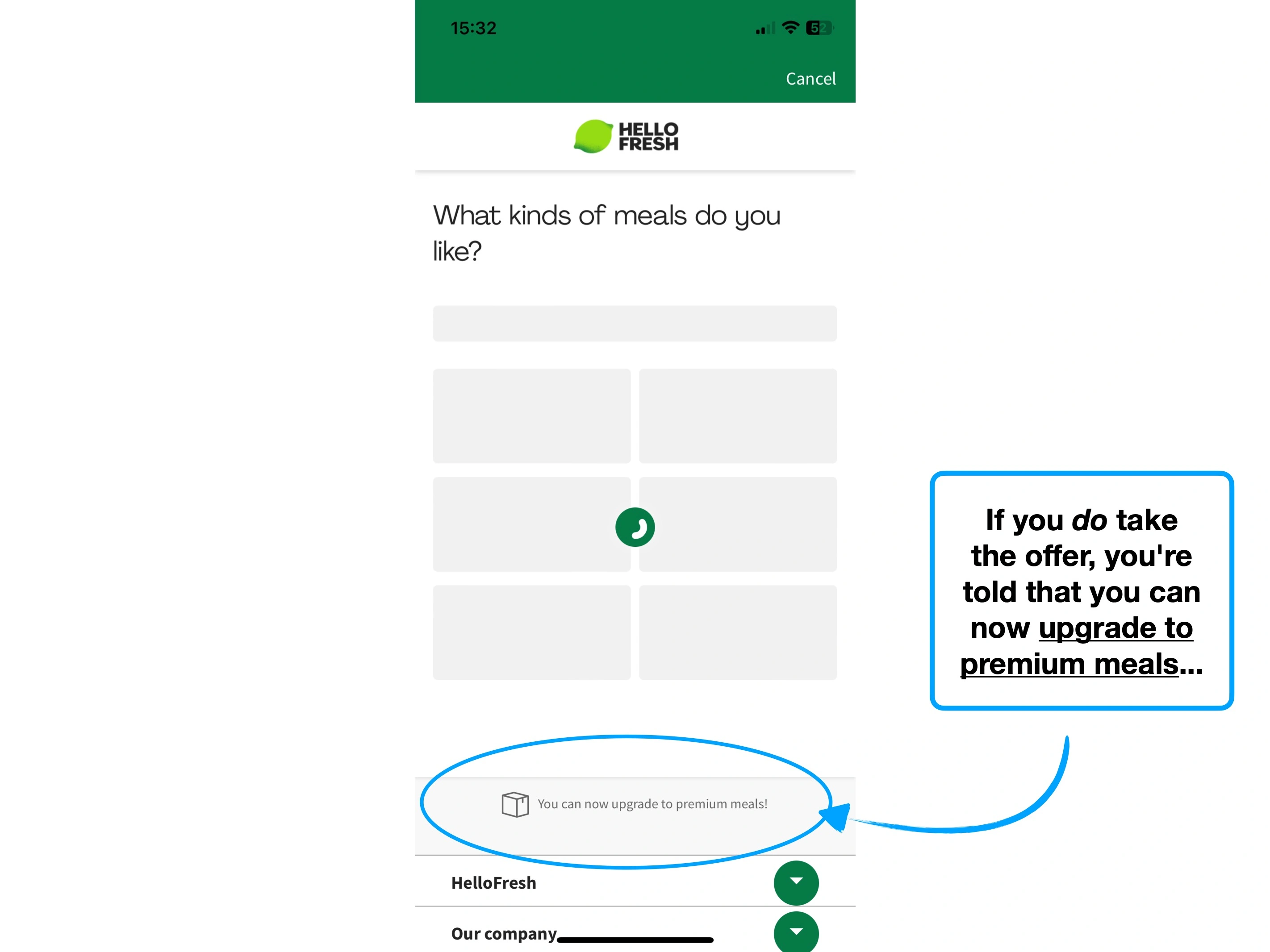
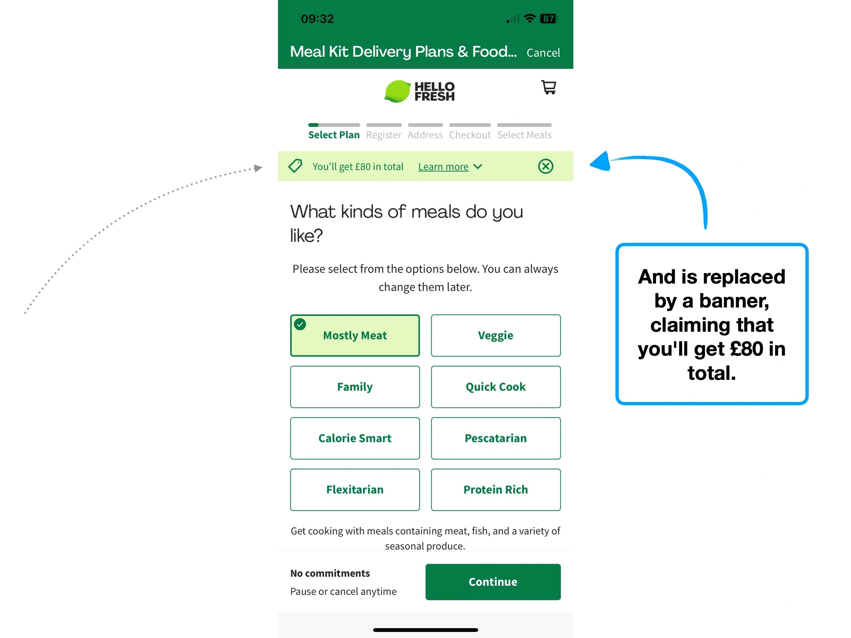
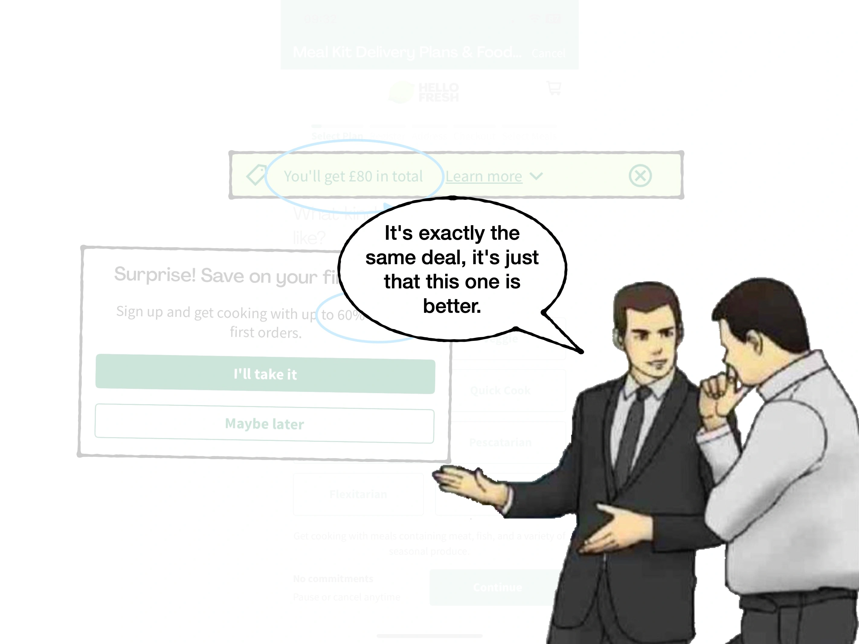
However, when you're ready to place an order, you'd be very unlikely to turn that same discount down.
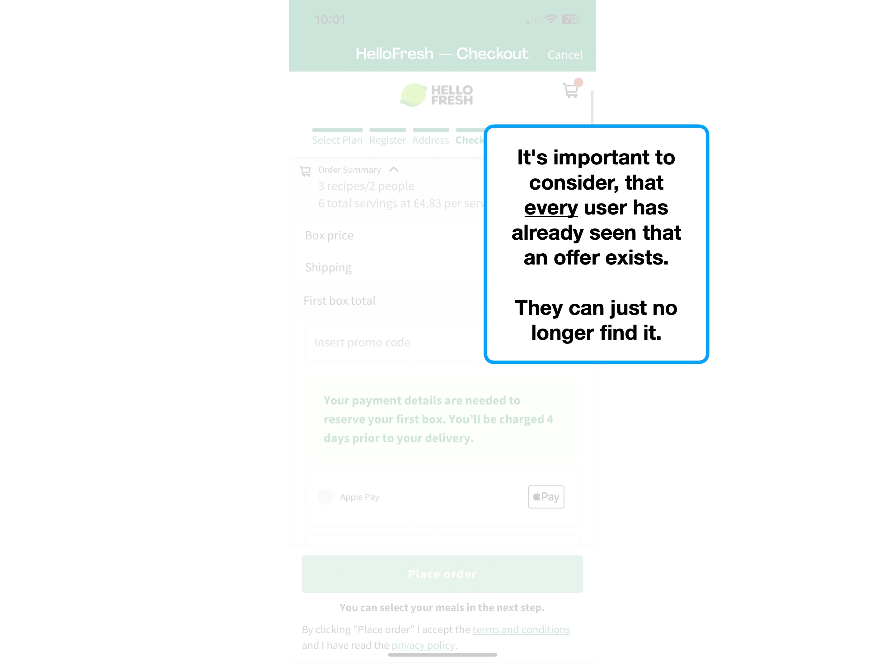
And if you cannot find that offer again, you may be less likely to continue with the purchase.
In other words, being aware of an offer that you could have had, but don't, is excruciating.
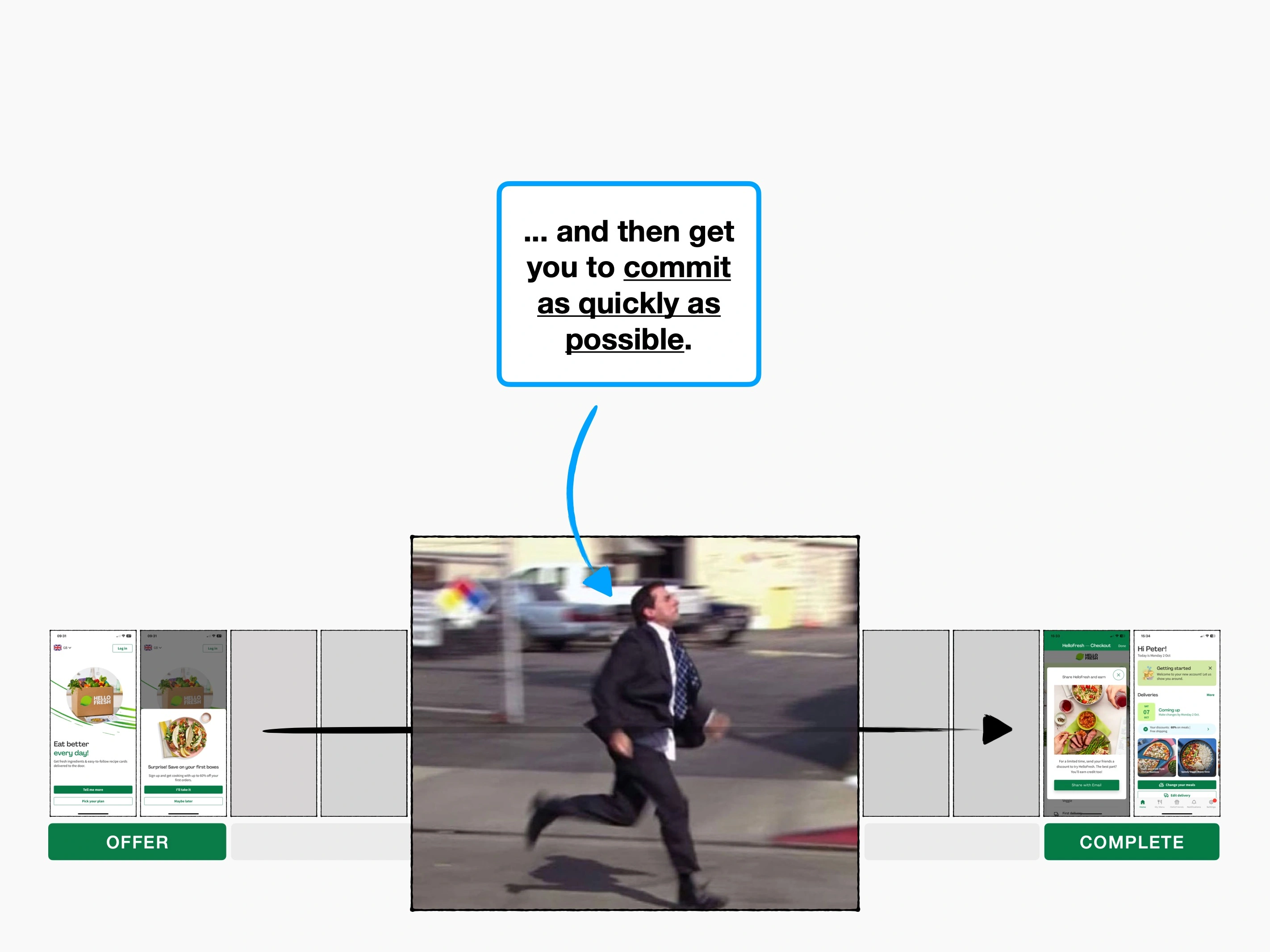
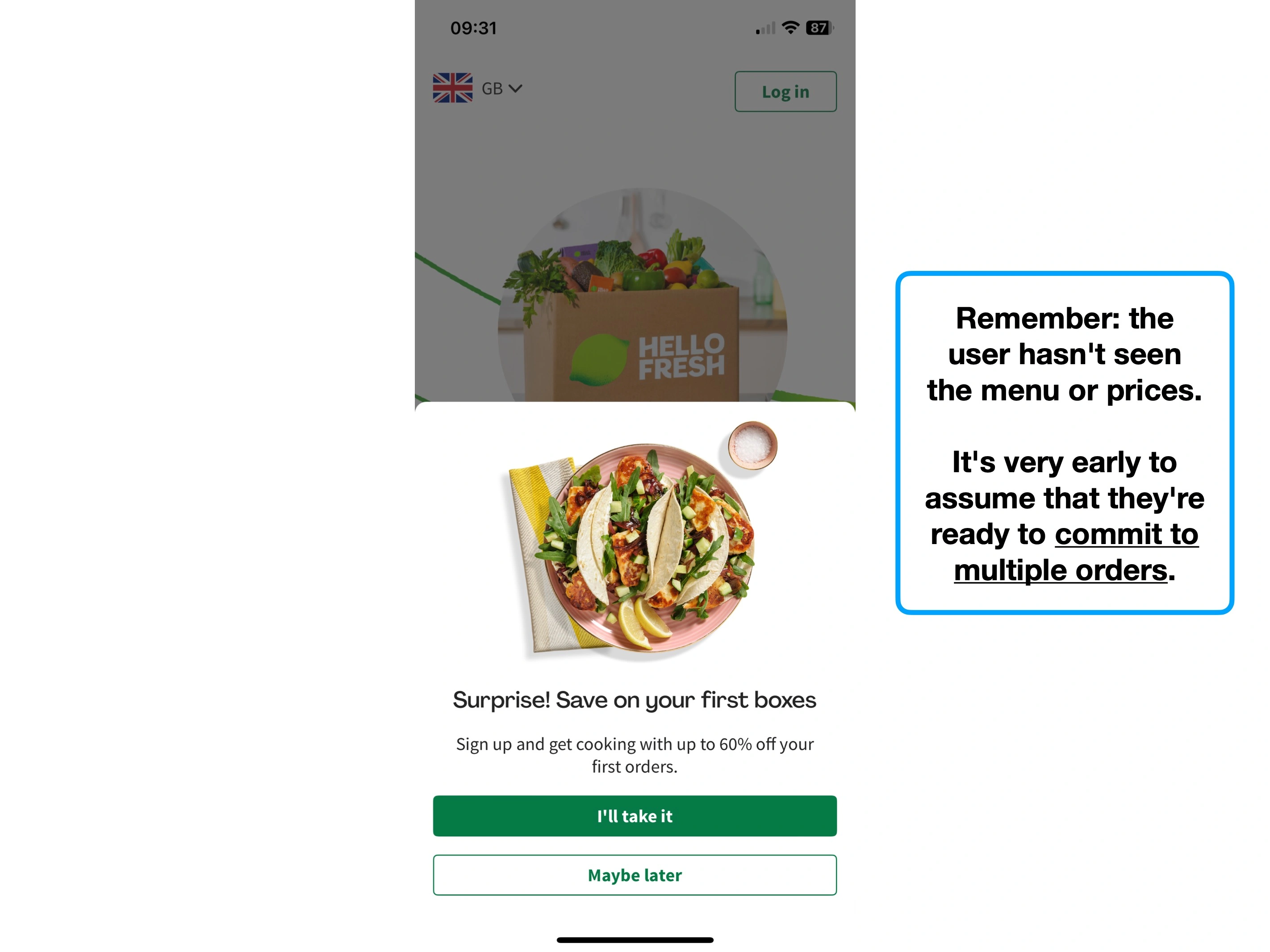
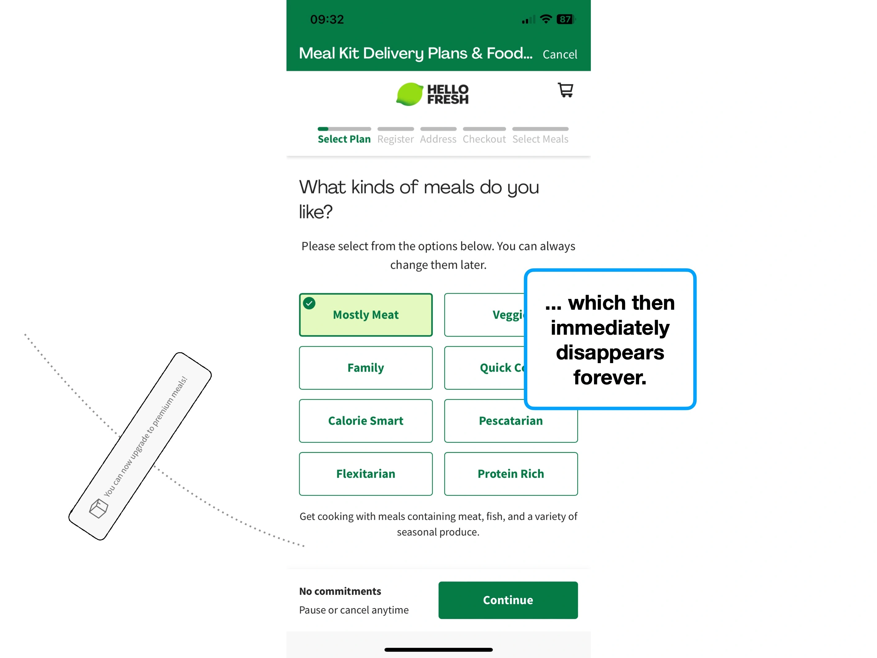
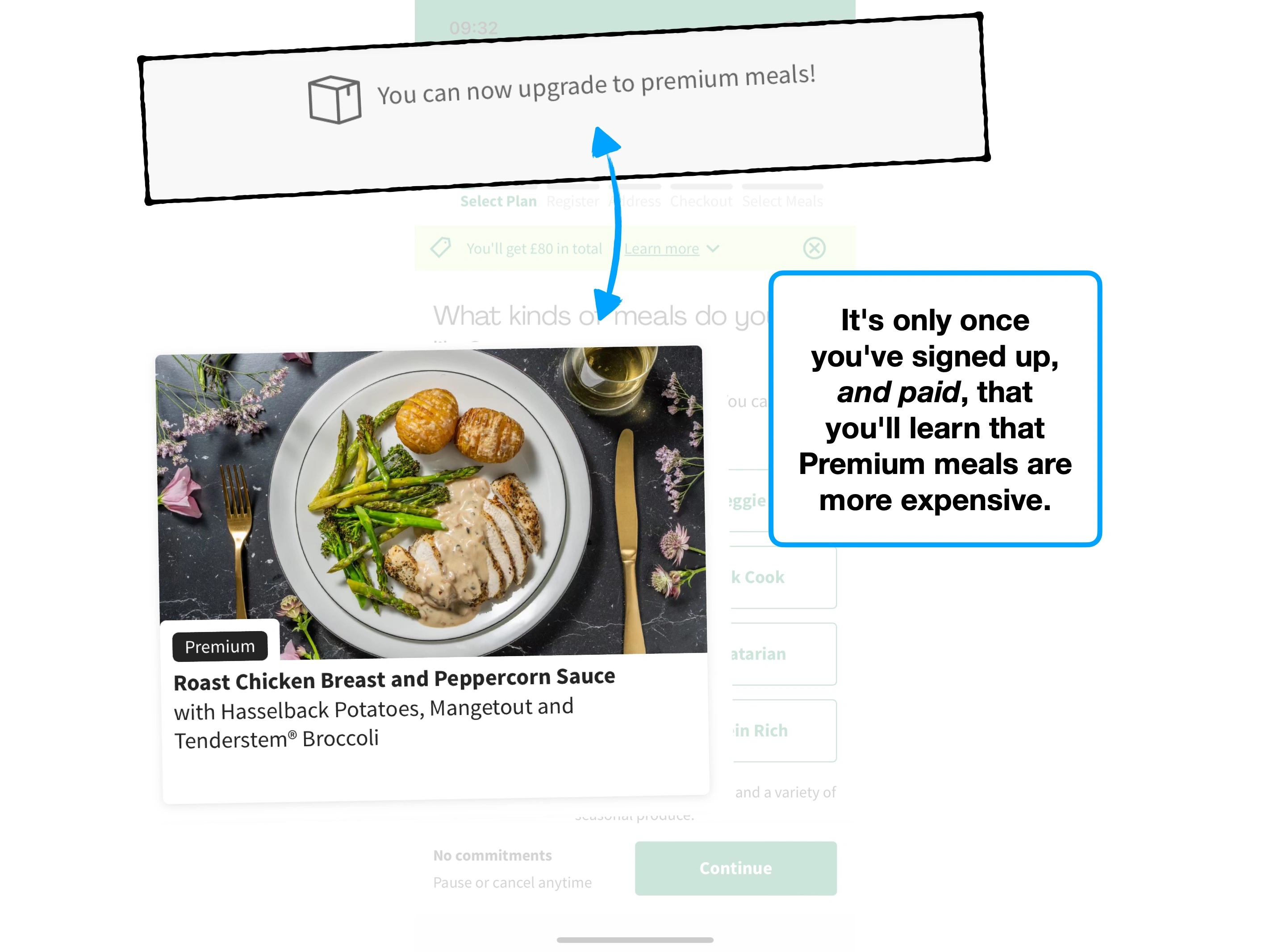
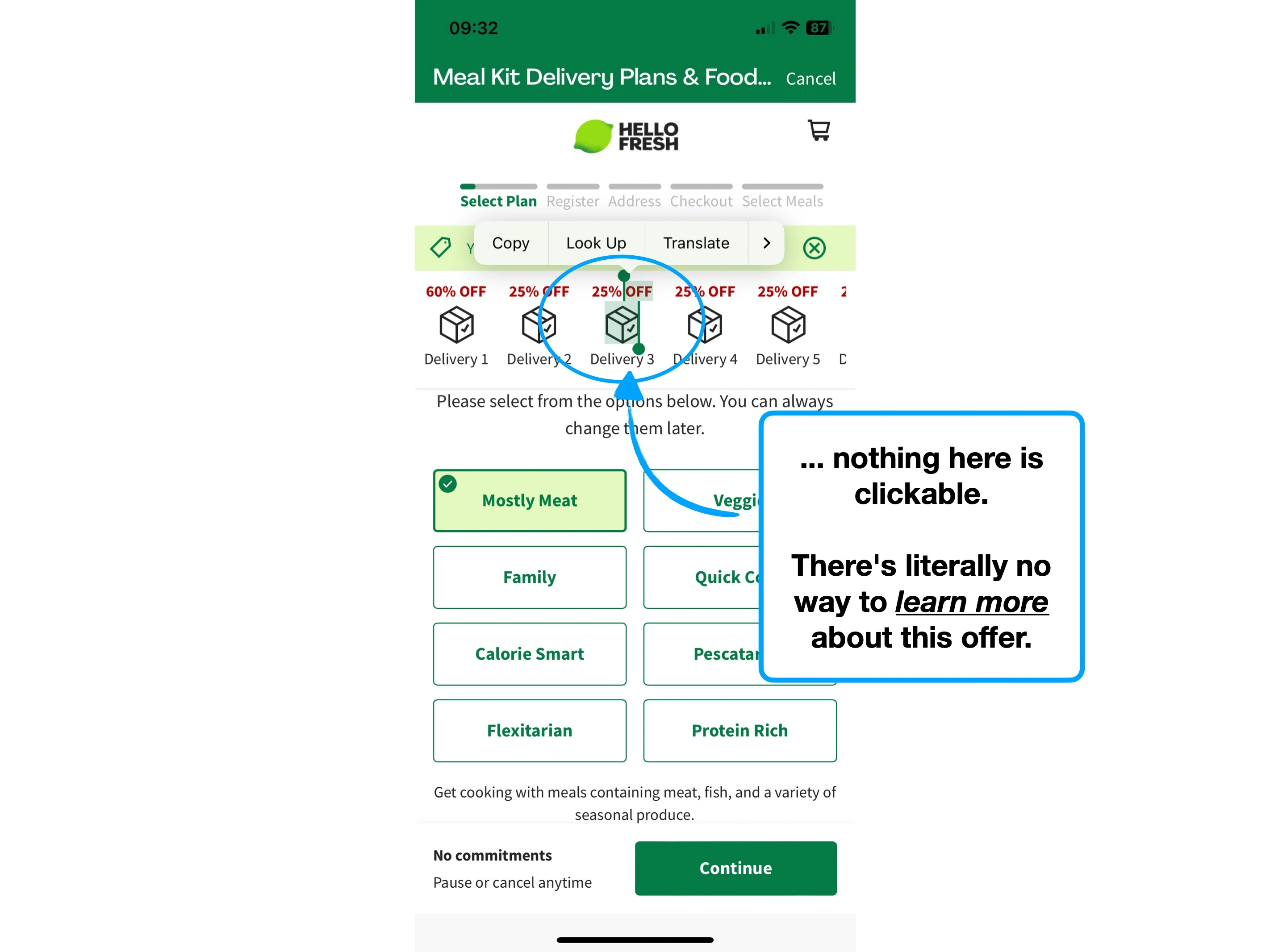
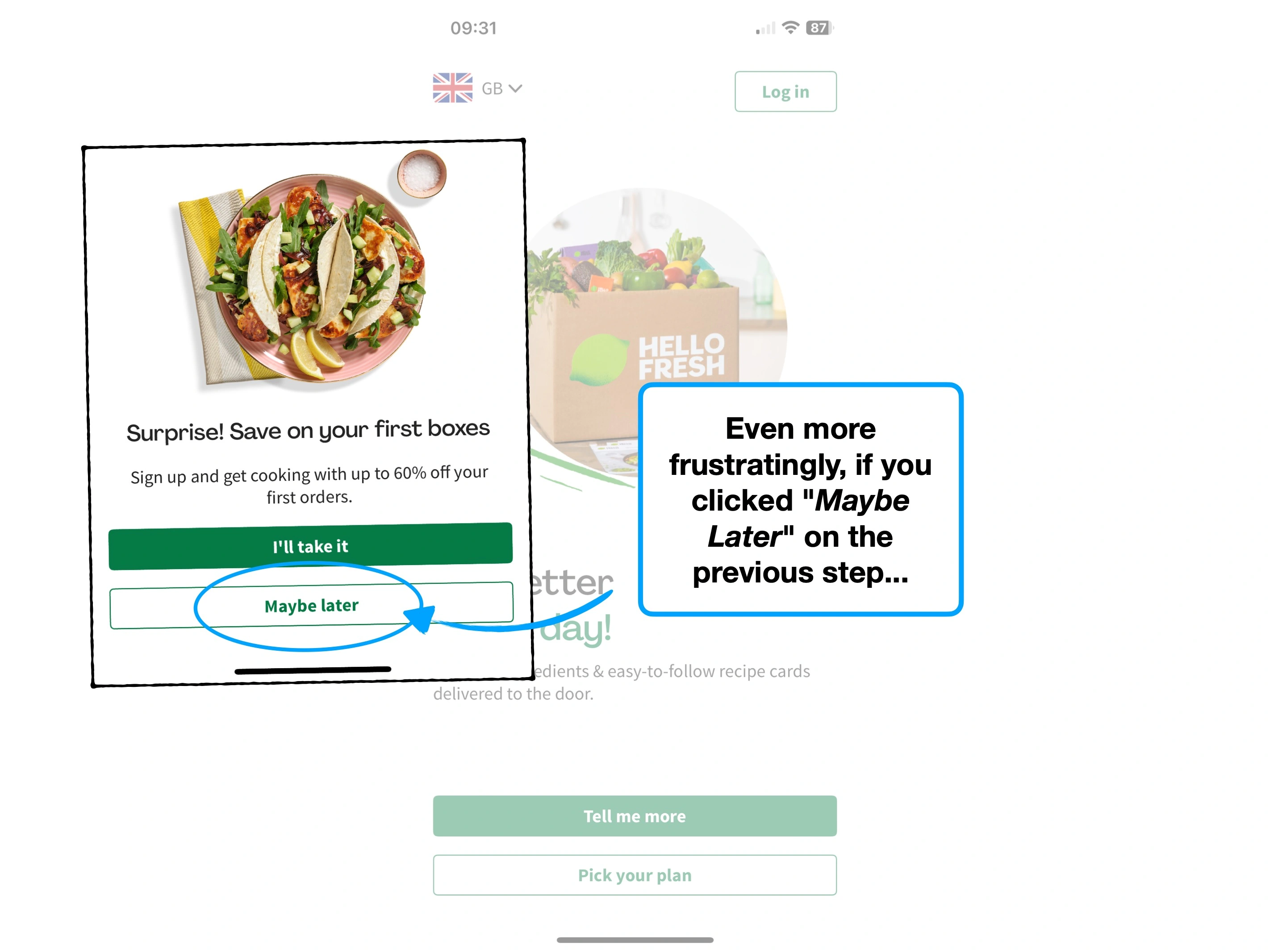
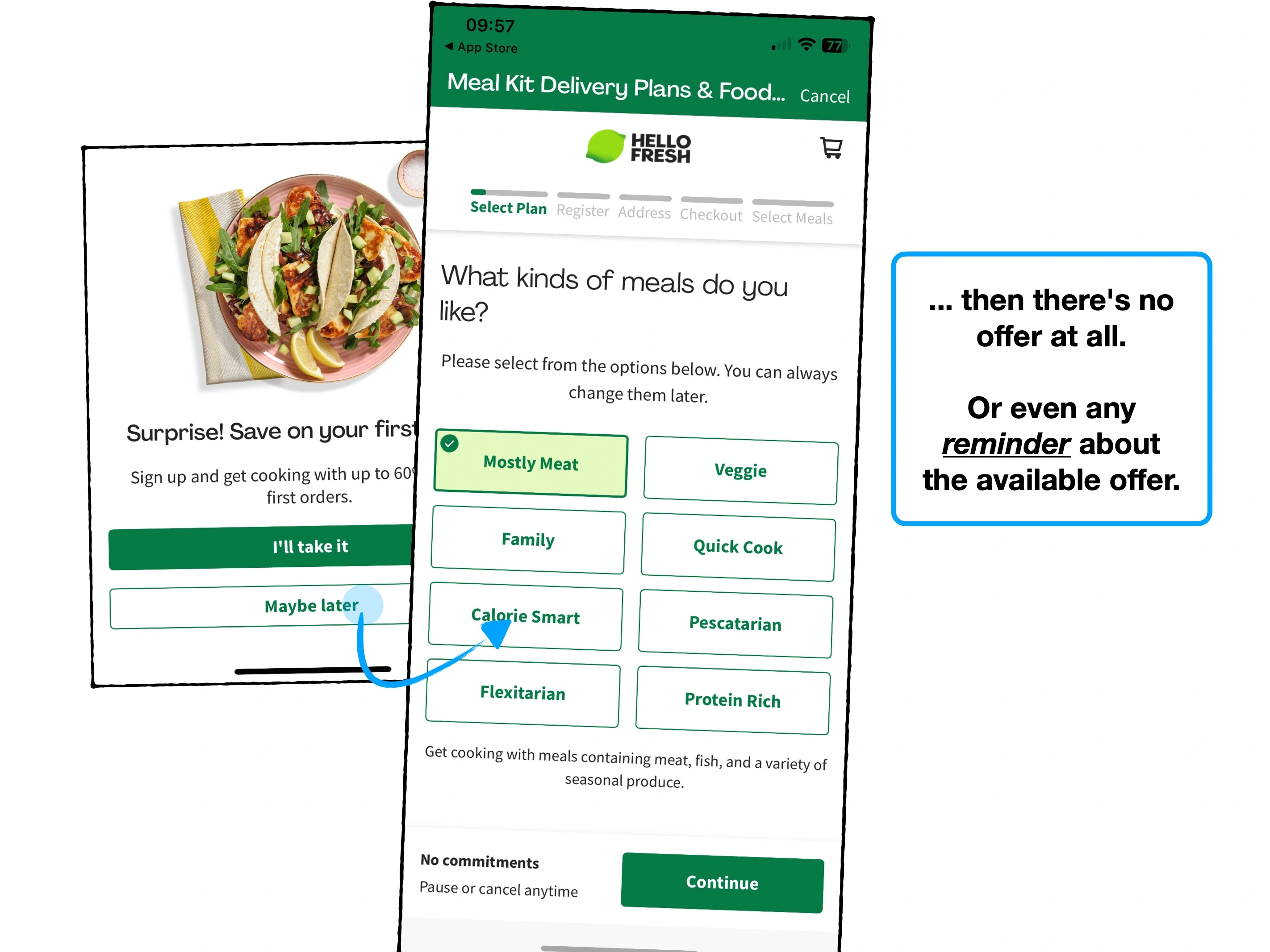
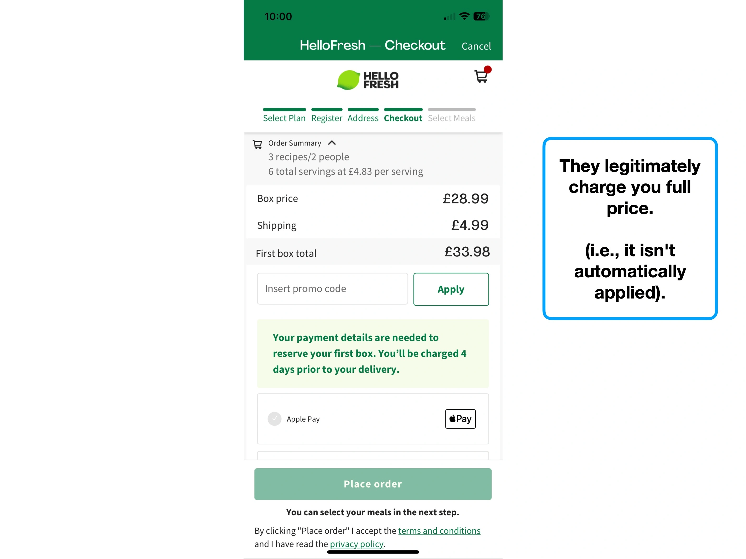
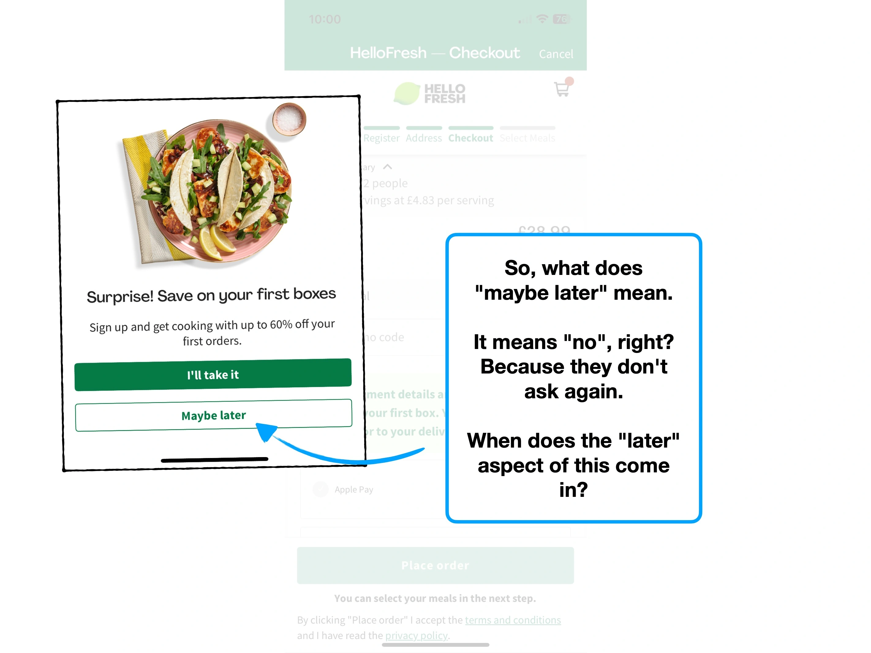
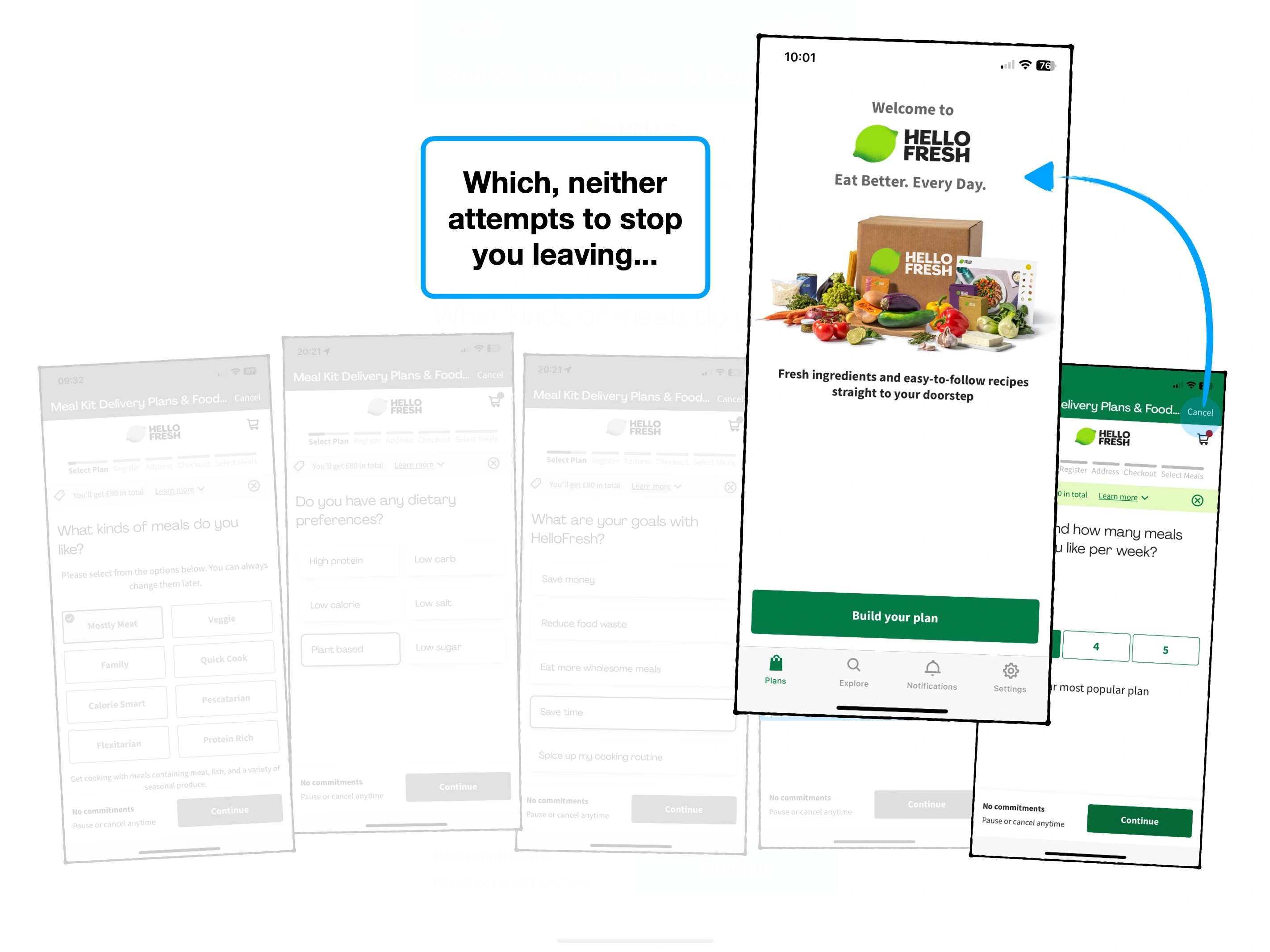
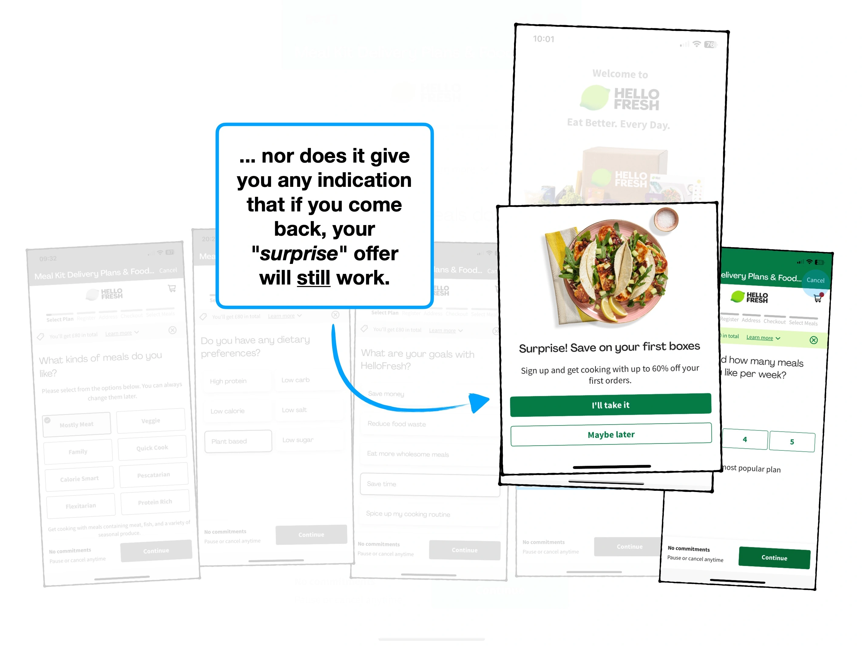
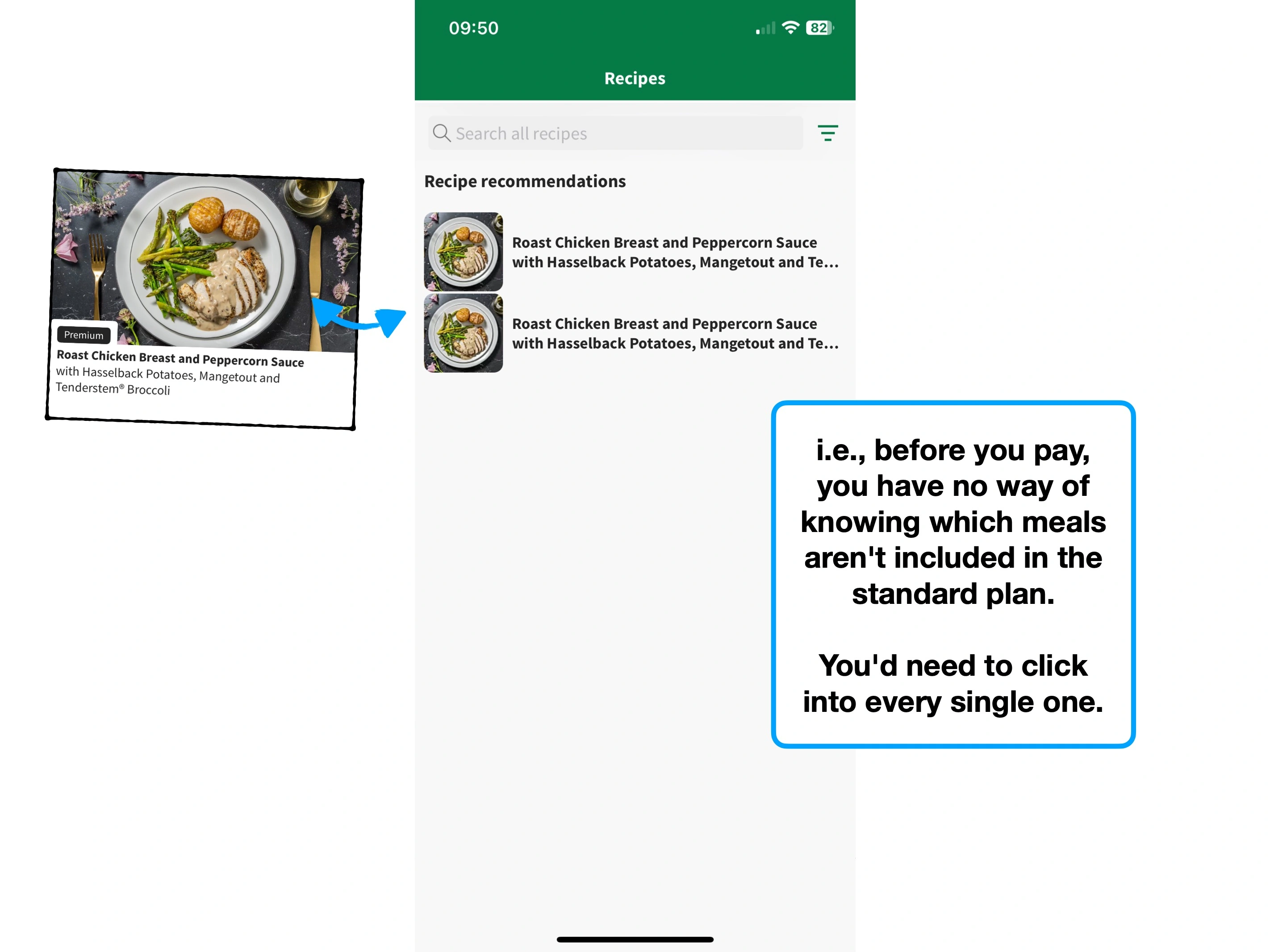
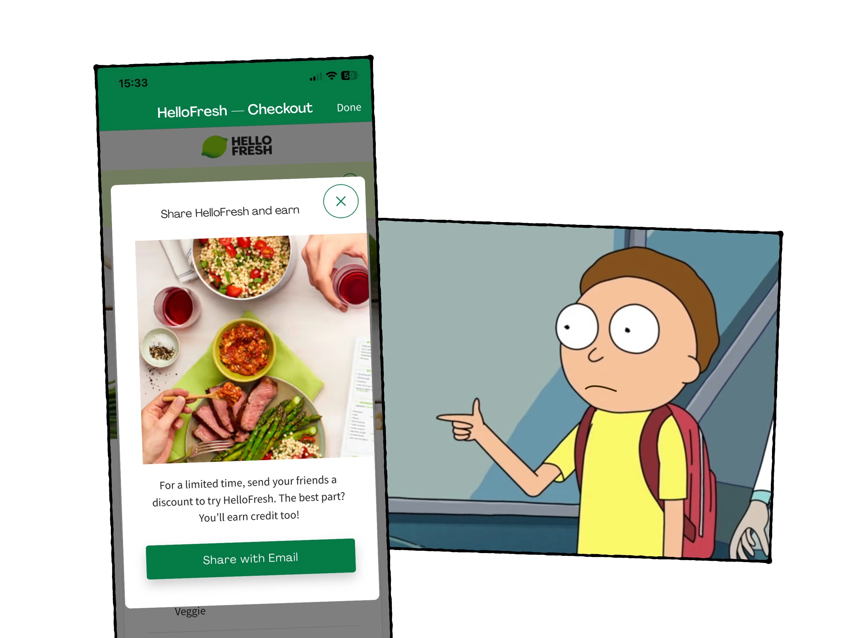
This is exactly what HelloFresh do, immediately when you open the app.
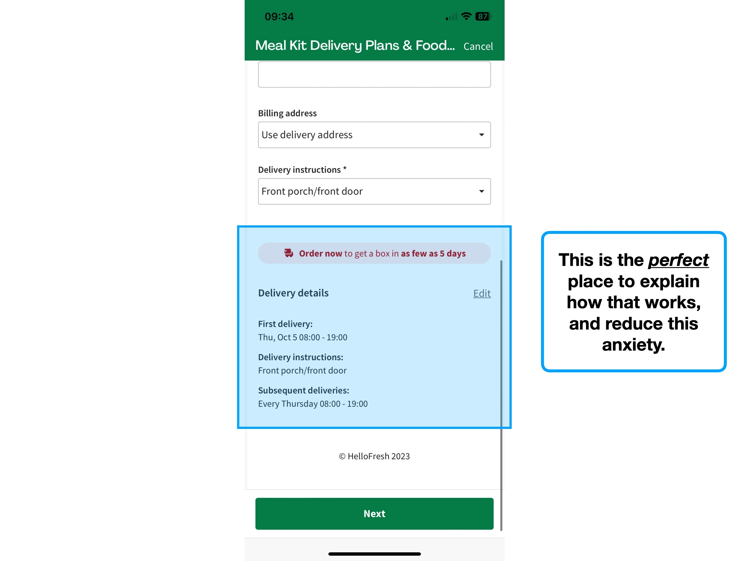
If you don't accept it, you'll then be charged full price, 8 screens later.
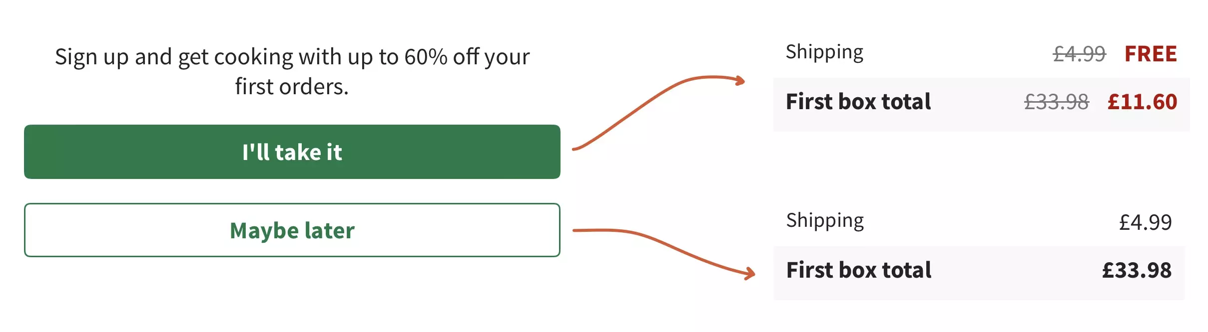
Notice how the user didn't even decline the offer—they simply said "maybe later".
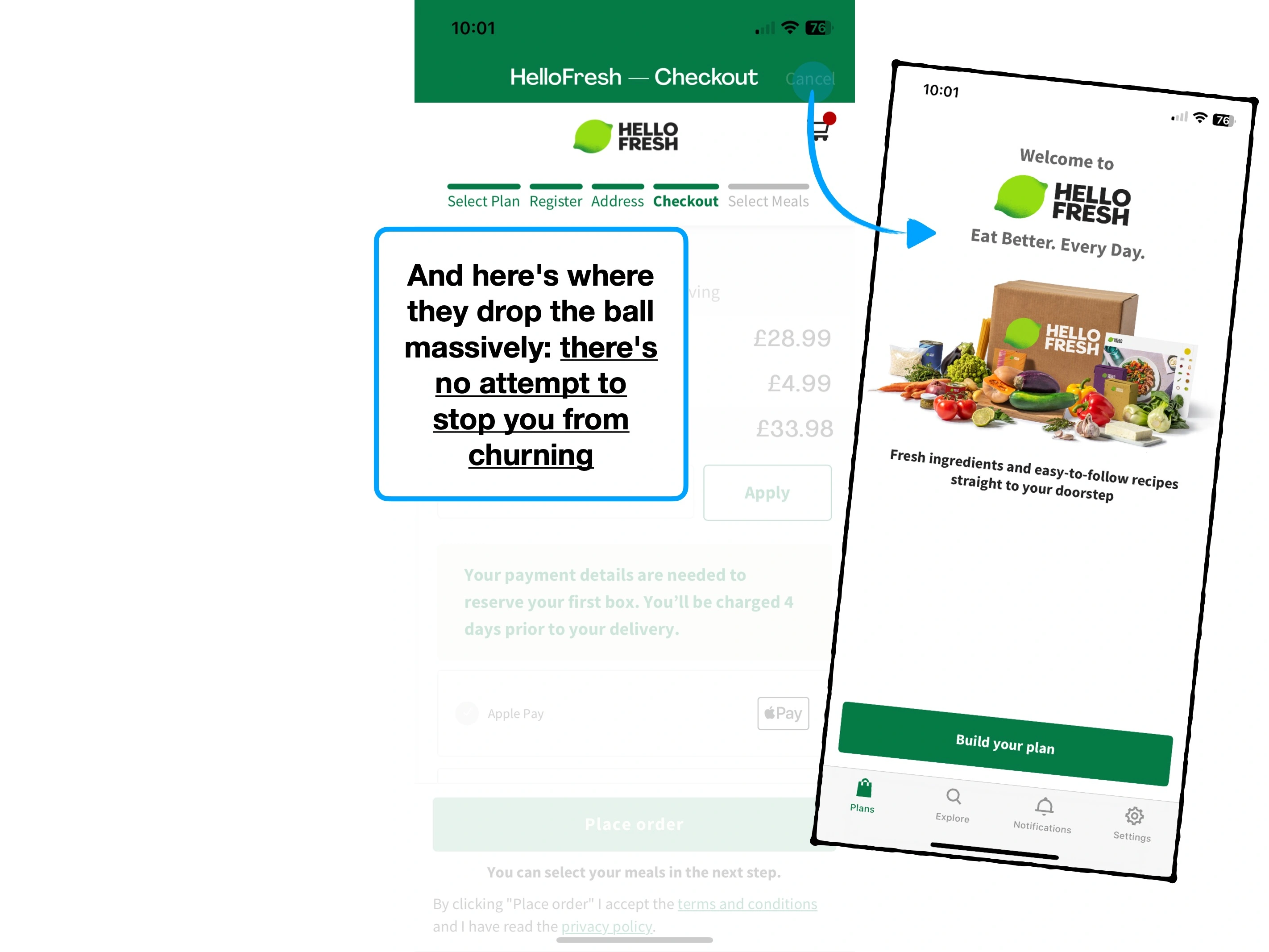
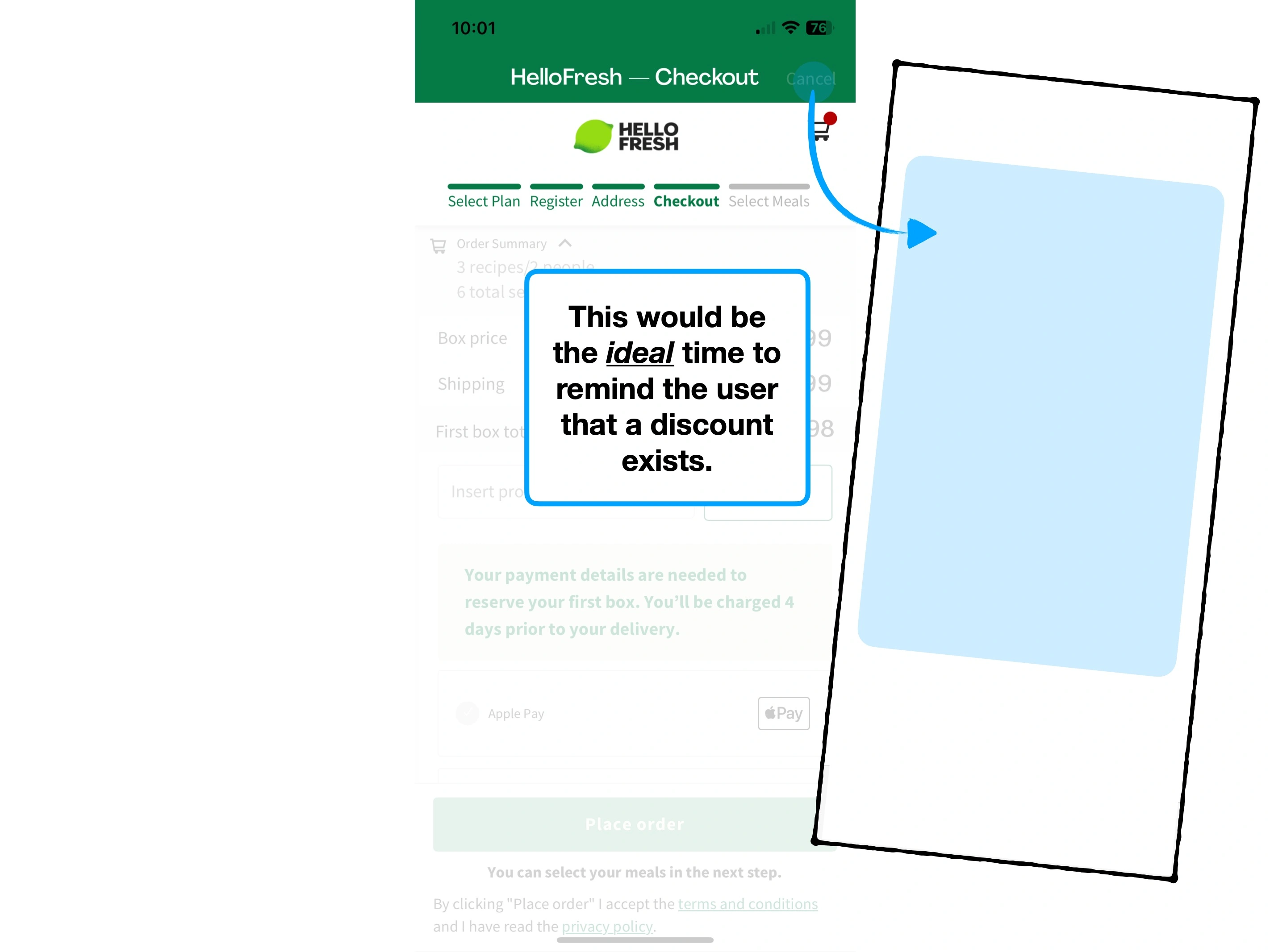
They're incentivising people to abandon their carts, by cancelling, and trying to re-trigger the modal.
Instead, checkouts should automatically apply welcome deals—especially if it's one that the user has already seen, but arbitarily not accepted.

Why users are ignoring your features
Simple techniques to increase feature usage, retention and ultimately alter how users perceive the value of your product.
Hiding complexity to create effortless onboarding
The techniques that Slack have used to create an effortless onboarding flow, and why you might not want to copy them.
The secrets of a $7.08 welcome bonus
The product psychology behind why Robinhood offer new users $7.08 of free stock, and not $10.