Search
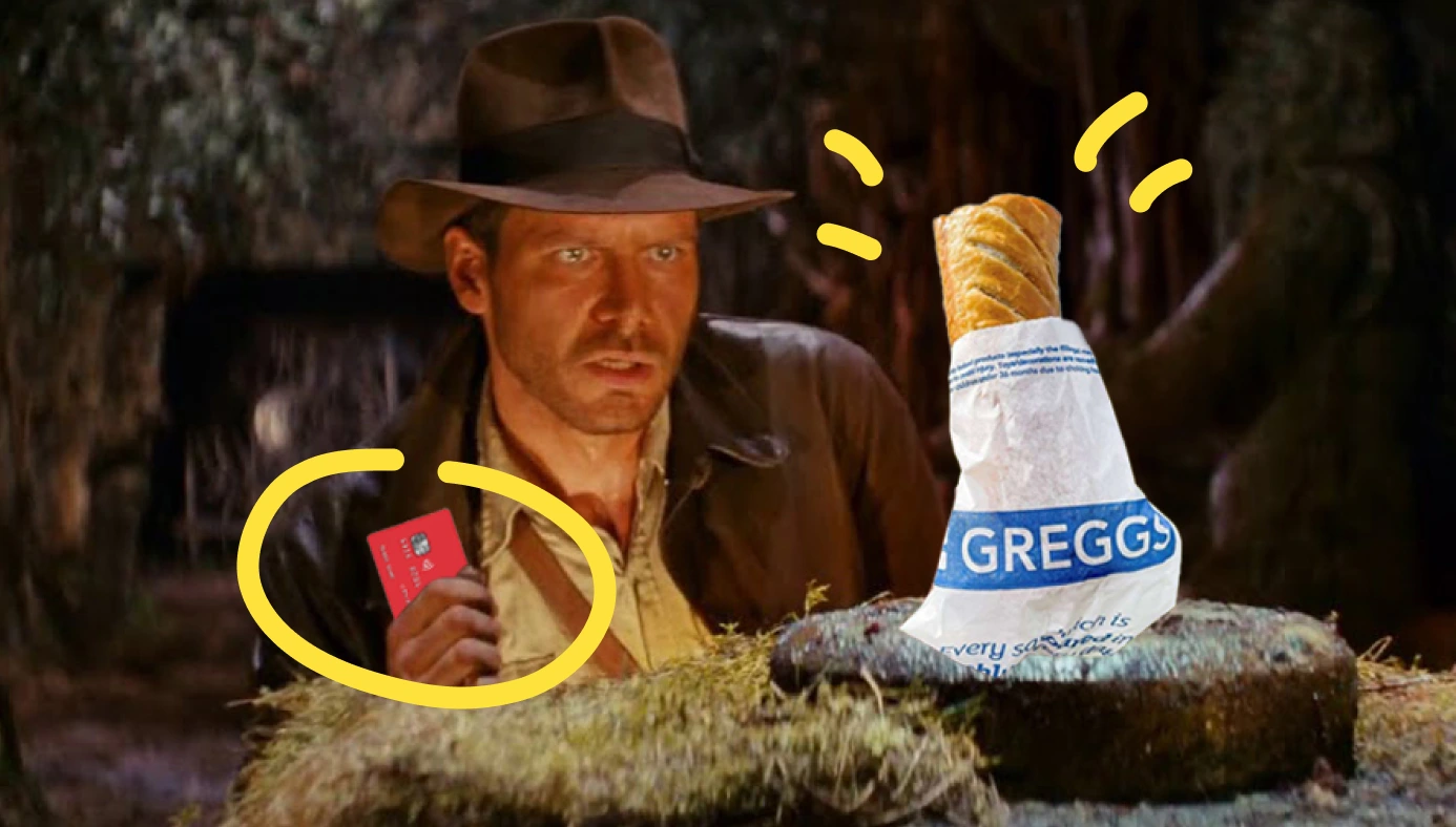
Premium dating subscriptions, VPN access and weekly sausage rolls—what has happened to banking?
Instead of a single and clear value proposition, premium bank accounts are mostly bundles of loosely connected features and perks.
It's difficult for any individual to browse through a tier comparison table, and assign an expected value to each option. They don't know what they'll use, or what it's worth.
A similar disconnect happens all the time in software (with features), making it much harder to onboard and retain new customers.
Companies grow, they add functionality to appeal to a wider audience, and over time create experiences that feel bloated, unfocused and incoherent.
Perks go unnoticed, users don't perceive features as being relevant or valuable, and the companies are left scratching their heads.
Yes, this is a case study on Monzo, and their unusual pastry giveaway.
But it'll also demonstrate techniques that I've used, in many industries, to increase feature usage, retention and ultimately, alter how users perceive the value of your product.
Without a predictable or immediate value anchor, onboarding is hard. Retention is even harder.
But that's the reality for most software.
Start-ups design features to solve very specific problems, for a niche audience. This acts as a context wrapper for the product itself—features feel valuable because they're so specific.
i.e., when operating in a niche, the shared characteristics of that cohort often is the 🖼 Framing for everything else.
At the other extreme, in enterprise-level software, as you move down the food chain (i.e., a self-serve model), smaller customers crave context, because they have to configure a deep and complicated set of features.
The result usually ends up being a product that's somewhat useful for everybody, but specific to nobody.
It's why products like Salesforce, Monday and Hubspot can feel so daunting.
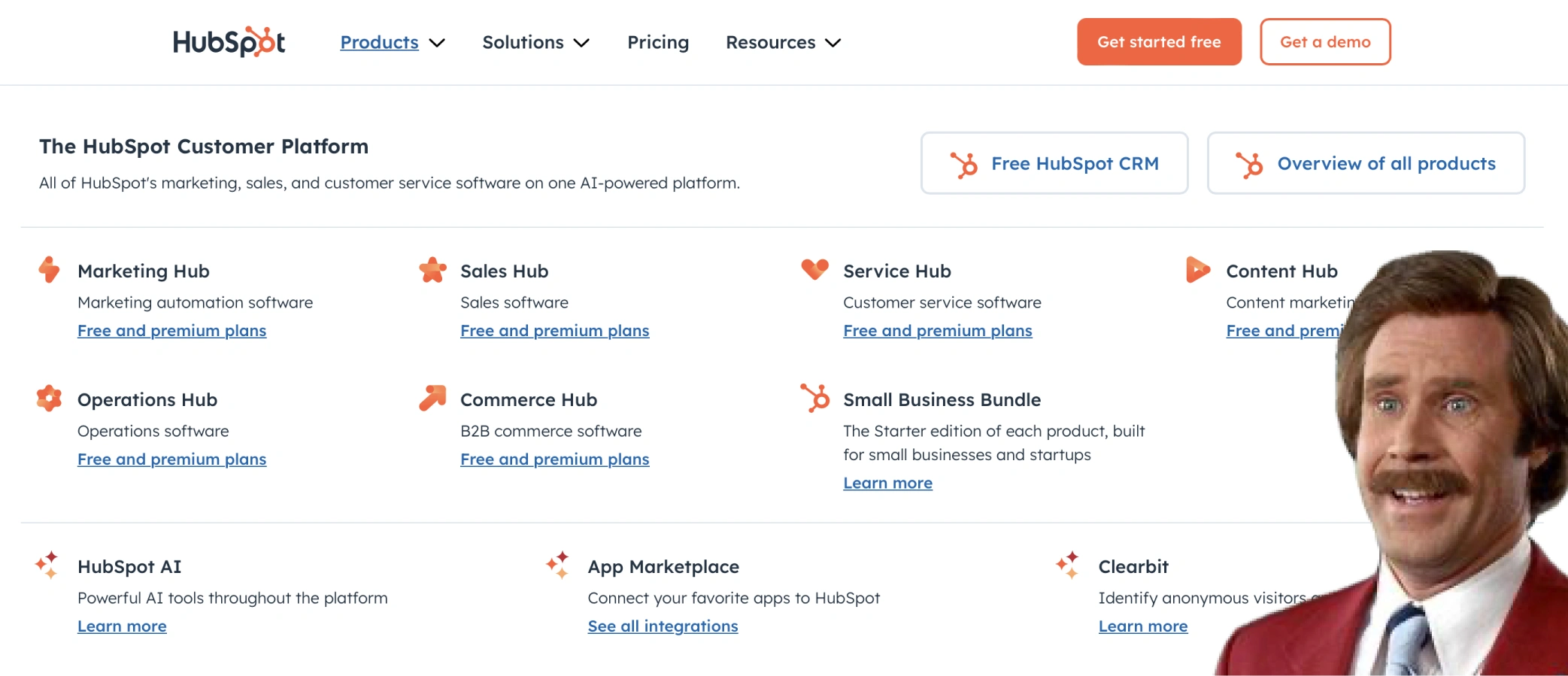
If you only take one lesson away from the slides above, let it be the power of reframing and prioritising. It's how small companies win.
Let's assume that you have genuinely valuable features, the role of UX is to learn about your customer, and as quickly as possible explain how you solve their specific problem, better than anybody else can.
Practically, you can do this by:
⛳️
Dynamically changing content
This can be text and images. It should be framed to align with their goal.
🔀
The order that features are introduced
During onboarding, prioritise the things they'll actually want to use.
👀
Hiding irrelevant features
If there's something you know they're unlikely to use, turn it off by default.
Remember, this is most important when you don't have a clear value anchor.
And so to leverage 🎯 Specificity effectively, you can't just guess what your users want—you need to ask.
A VPN might notify you if your data leaks online, but if (and until) that event occurs, they're just selling peace of mind.
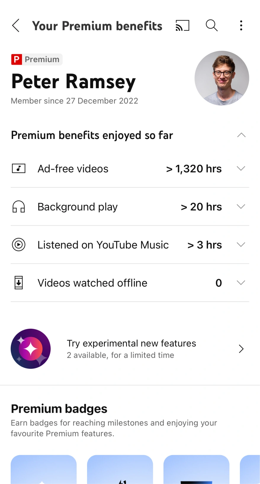
Similarly, how can YouTube continue to frame the benefits of an ad-free experience, if by design, the user is paying to not see something?
You rarely perceive something as valuable, if you've forgotten that it exists.
Which is why you may have to create a specific environment, in order to frame these benefits, and remind people how to use them.
This is what Monzo, Uber, YouTube and many others do. It's essentially a "perk hub".
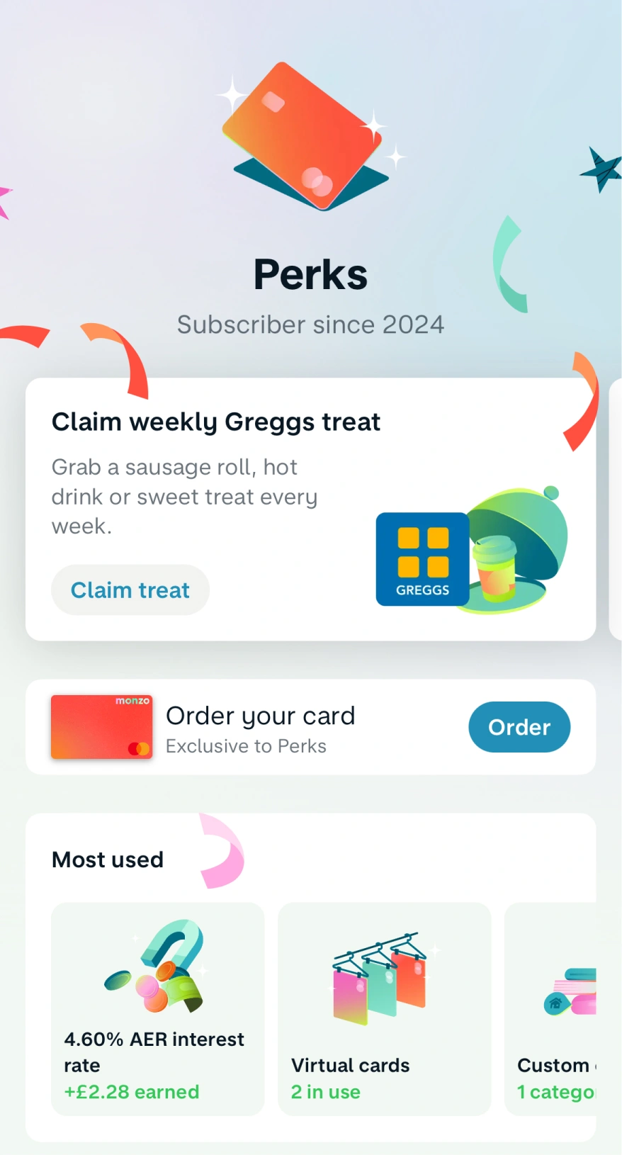
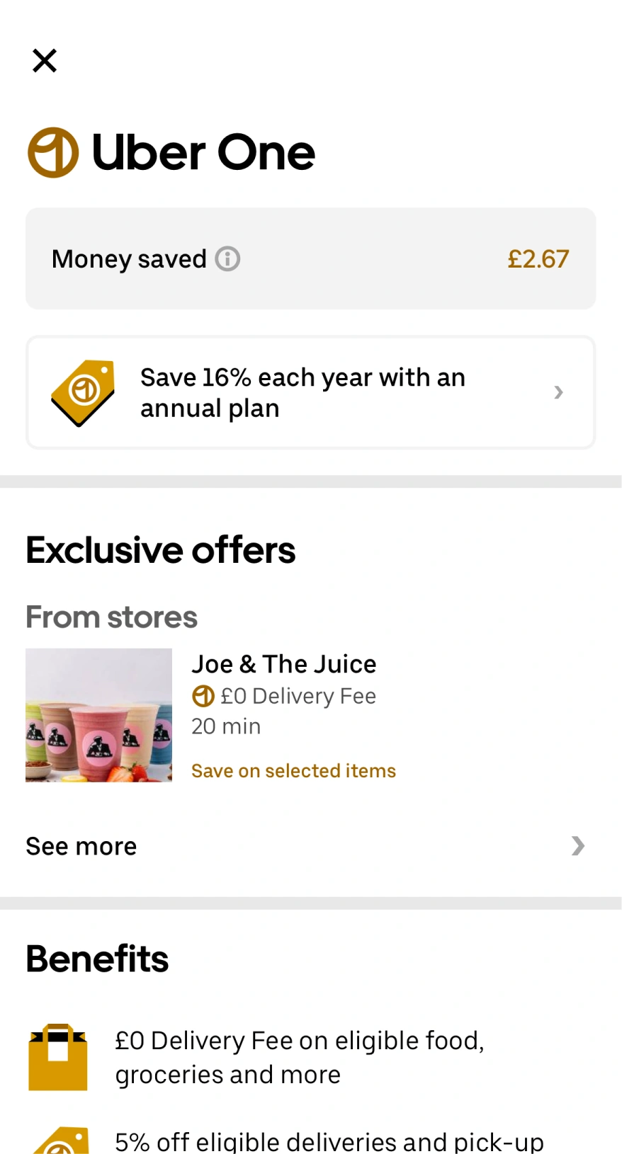
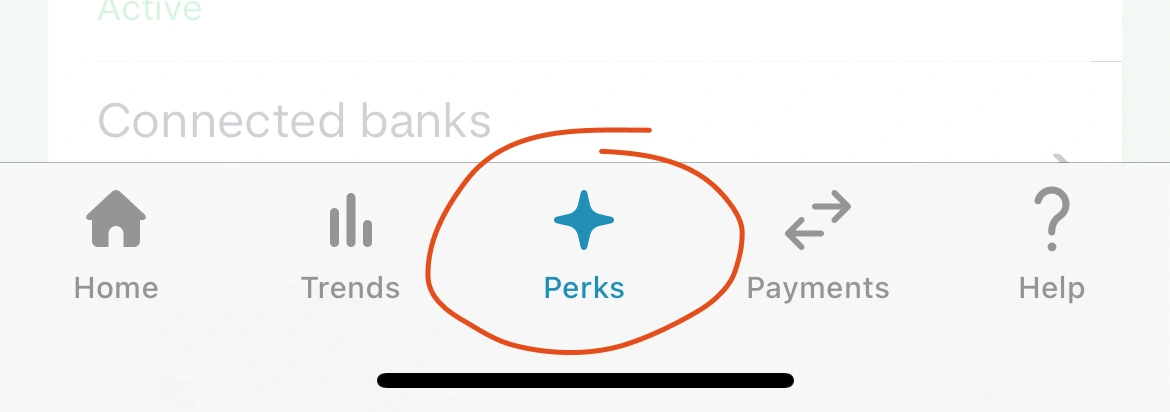
It's so important that the user is routinely reminded about these features, that Monzo have added it into their main navigation—front and center.
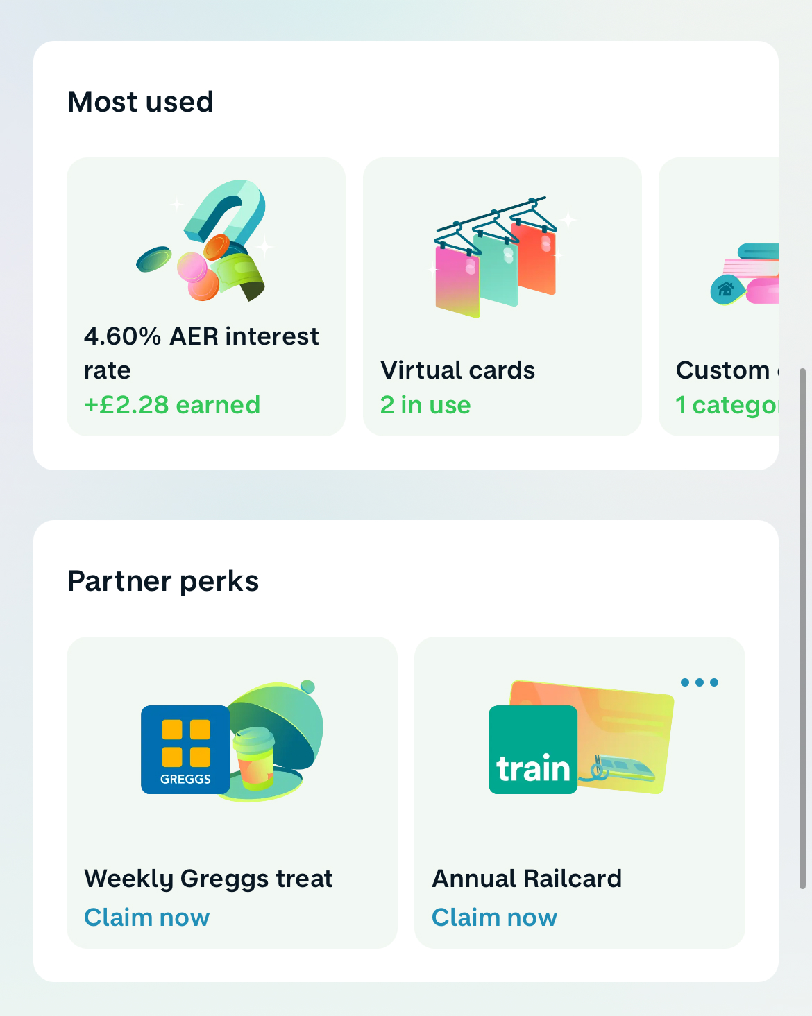
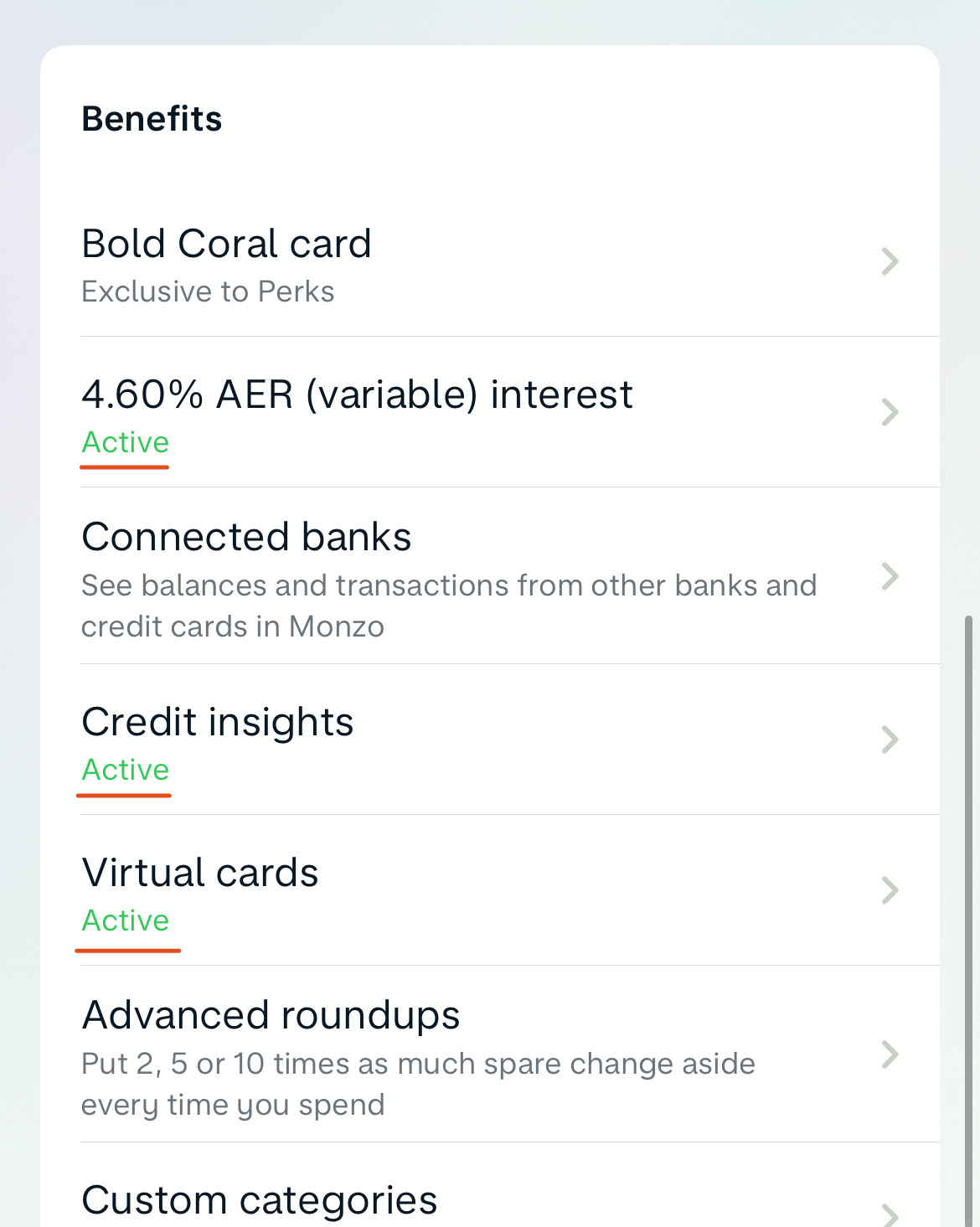
Inside the hub, Monzo will both present key lifetime metrics (like interest earned), and provide a literal list of all your perks.
This is great because it identifies which features you're using, and shows a single line of context for those that you're not.
If you've done something great, don't let it go unnoticed.
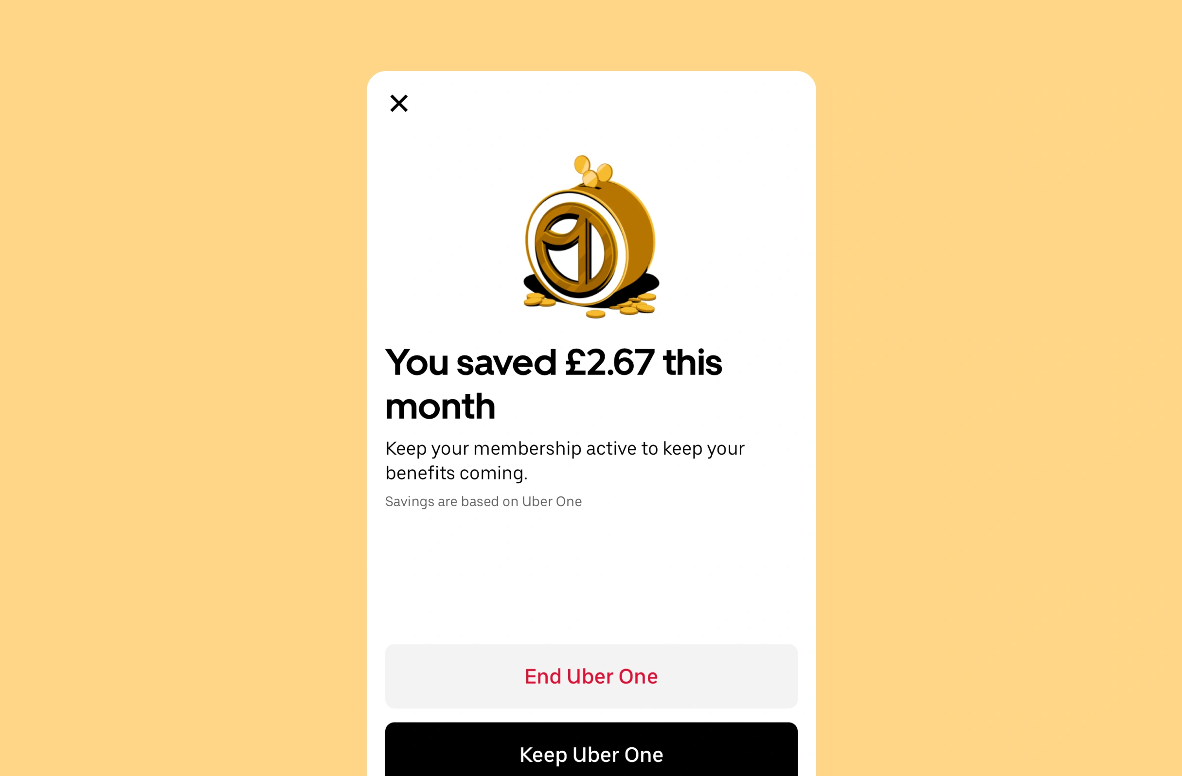
Uber One's value anchor is that you can save money on delivery fees, but they also offer a special guarantee that food will be delivered on time.
So when this criteria is met, and you're about to put your phone away to enjoy your meal, how can they seize the moment?
Well, by immediately reminding you, and reframing why you get to enjoy warm chips.
Let's finish with another example: redeeming your free Greggs sausage roll.
After brushing the flakey crusts of pastry off your lap, you could easily forget that it was free.
To maintain the association, Monzo keeps the component in view (in your perk hub) even after a redemption, but updates the status.
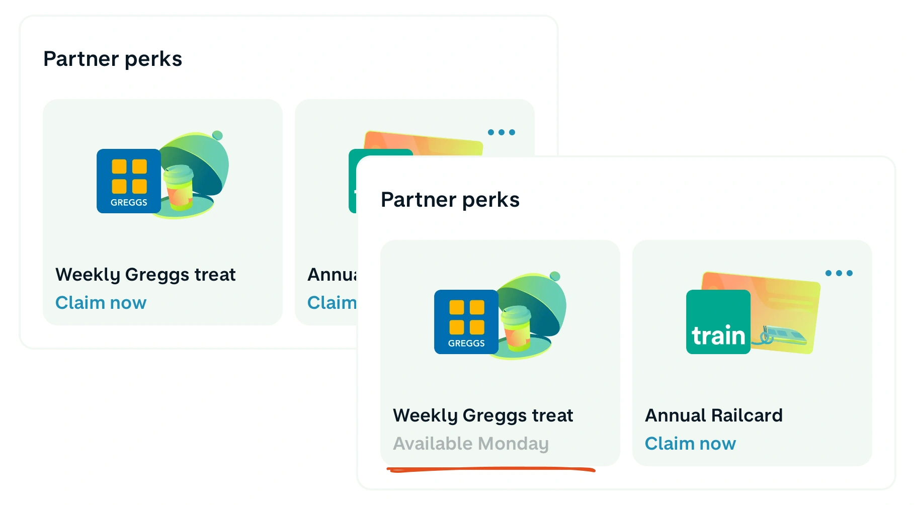
The nuance here is the permanence and the intent of the reminder—this isn't a task to complete and then dismiss.
Clearly, these are great user experiences, built by product experts, using framing, reminders and receipts to influence how people perceive and attribute value to their features.
But let's be honest; this would be considerably better (and easier for the companies), if those perks were actually somewhat related to banking.
Become a BFM+ member to track your progress, create a library of content and share learnings within your team.

Discover the art of setting a goal and then using that to immediately create the perception of success.

As the underlying technology improves, interfaces like ChatGPT get harder to use. Does this explain the strategy for Apple Intelligence?
How to create a flywheel of discovery, purchase and satisfaction that leads to repeat purchases.