900 days of progress
More than 900 days ago, I published a series of case studies called the UX of Banking. These benchmarked and compared the user experience of 12 banks in the UK.
It was a forensic process: logging, timing and cataloging everything on their mobile apps.
Those 6 chapters from 2020 demonstrated how far ahead the challengers (Monzo, Starling and Revolut) really were, compared to most of the high street banks.
And now we have a unique opportunity to re-benchmark them, and highlight what 900 days of product development looks like.
Has the gap widened? Which of the legacy banks are actually chipping away at the deficit? And ultimately, which are stale experiences that consumers should avoid?
1. Fixing issues
Over time people demand better user experiences from mainstream apps. Having a great UX is no longer a unique selling point—in most industries it's a necessity.
My intent, two and a half years ago, was to publish literally hundreds of reasonable suggestions and then quietly track the changes.
Some of these were obvious bugs, many were highlighting missing context, and all of them resolvable to a meaningful degree.
To be clear, building complicated products rarely follows a linear path of progression. But over a multi-year span, the ability to resolve these issues, and innovate around technical limitations is key.
Here's how they got on:
Note: the three 'challengers' have been grouped at the top of this chart for clarity.
It's worth noting that 100% here isn't necessarily the 'perfect' outcome. Some of the issues might already be the best implementation around an obscure limitation.
But, for example, it's hard for Santander to claim that they're focused on improving their user experience, when 95% of those problems are outstanding more than 2 years later.
This suggests that the narrative of the 'legacy banks catching up', is largely false.
Rather, I suspect that the challenger banks are accelerating away from everyone else at a greater pace.
There's another clearcut datapoint to dispel this idea: the frequency at which they update their apps.
The banks are in the same order below:
Aside from what I believe are a few outliers, a correlation is noticeable (and obvious, in retrospect): product teams that are capable of updating frequently, fix more issues.
On average, the challenger banks deploy updates 4.6x more frequently than the incumbents.
The point is this: new banks innovate faster, and are better equipped to solve issues. Moving quickly is in their company DNA.
The user experience of many of these high street banks hasn't really improved in years.
2. The core experience
I was surprised in 2020 to find that most of the banks didn't let you create an account via their app. Instead, they pushed you to their website (which were largely horrible experiences on mobile).
Since then, only Natwest have added the functionality to create an account through the app.
Barclays
✅
Co-op
❌
First Direct
❌
HSBC
❌
Lloyds
❌
Metro
❌
Monzo
✅
Nationwide
❌
Natwest
✅ (🎉)
Revolut
✅
Santander
❌
Starling
✅
As before, some of them let you apply for one through their app, but then you couldn’t create your online banking credentials unless you log in through their website—frankly, it's a mess.
If core functionality is still missing, what about the performance of the apps?
i.e., have the incumbents resolved the legacy debt problems that they were drowning in?
Albeit imperfect, I ran a series of tests, timing the 'boot up' speed of each app, and averaged (mean) the results. This represents how long it takes from tapping the app icon, to being able to interact with your dashboard.
Although waiting 11 seconds for an app to load is painful, and obviously detrimental to the UX, there's also a wild number of page transitions and state changes.
Here's a side by side comparison of Monzo and Santander—watch carefully and you'll see 7 transitions for the latter (i.e., spinners or states).
From my experience, this latency is usually a manifestation of a company's technical limitations.
Look at the new banks who're unburdened with debt and building in newer (faster) coding languages—the experiences are noticeably better.
Monzo, Starling and Revolut boot up nearly 4x faster than the Santander app, and typically twice as fast as most incumbent banks.
There's a psychological concept at play here, which is one of many that should be stapled to the monitors of every product designer: 🏎 Cognitive Drift.
It describes the process of people getting bored when technology takes too long to load.
But because banking is integral to our lives, it's unlikely to create a high drop-off rate. Instead, it's silently plaguing every single interaction with unnecessary friction.
i.e., it's silent because unless you're good at getting customer feedback, the data will lie to you, and make it appear that people don't mind waiting.
Luckily for us, as part of a regulatory requirement, IPSOS routinely ask 1000 banking customers a broad range of questions.
These are then compiled into a ranking and score, as shown below:
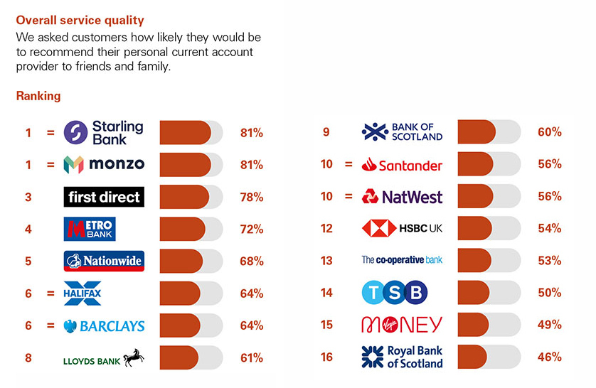
If we take these results, but order them by the boot up speed, we can start to see the relationship between performance, experience and satisfaction play out.
The apps that load faster, seem to perform better in these independent broad satisfaction surveys.
Load time is a real challenge for design teams, as often they’re burdened with existing technical debt or pushback from developers with entirely valid retorts.
When you can’t see (or easily track) something, it’s much harder for stakeholders to agree to prioritise a resolution.
I'm not suggesting that this is the key metric to unlock customer satisfaction, but rather that over an extended period of time, it's directionally indicative of how efficient their product teams are at navigating the process.
3. Fees
Clearly, cost is a major factor in overall user experience—and whilst the accounts themselves are all free, making international payments are not.
One of the most shocking findings from the 2020 release was the true cost of sending money abroad.
As a reminder, there are three fees to consider:
📦
1: Sender fees
What your bank charges you to send money abroad.
⚖️
2: Exchange rate fees (FX)
The cost of converting your money into another currency.
📬
3: Foreign bank charges
What the recipient's bank charges for handling the payment.
That third fee is often optional, and the sender fee is usually advertised—or at least, it's somewhere on their website.
The FX fees are more hidden: banks take their exchange rate, and then add a fee. It’s essentially the same as how currency exchanges in airports make money.
This 'real cost' was a combination of the two 'sender' fees, and I've got bad news: broadly nothing has changed.
Grey bar is the comparative cost in 2020.
In other words, despite the rise of crypto, new (and cheaper) ways to send money abroad and the popularity of challenger banks, the incumbents aren't budging.
In 2023, your bank may still be charging you more than £28, to send £100 abroad.
But it gets worse, because another factor to consider is how late into the payment process the user has to be, before they learn about these costs.
Are the banks upfront with the fees, or is it revealed towards the end, once the user has invested time into the process?
Below the banks are ranked by 'true cost', but with overlaying data on how far you are into the process before you've see those fees.
The trend is clear: the more expensive the fees, the later into the process you'll learn about them.
These banks might be able to justify their fee structure, if the experiences were better—which they're not.
And having tracked these banks for two and a half years, I ran a query to see which banks have actually been updating their international payment experience.
Again, I've ranked this by the true cost of sending money abroad:
The banks that charge the most, are generally less transparent, and are leaving their experiences to stagnate.
Although we'll cover this in much more detail in a later chapter, here are two examples to help illustrate my point:
HSBC
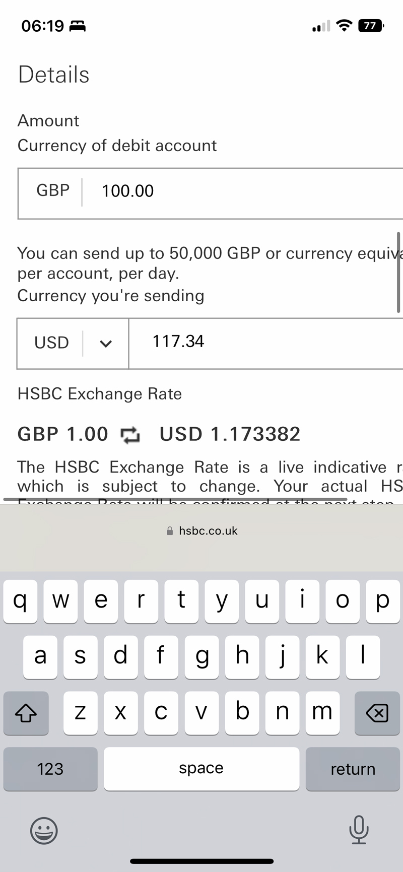
Santander
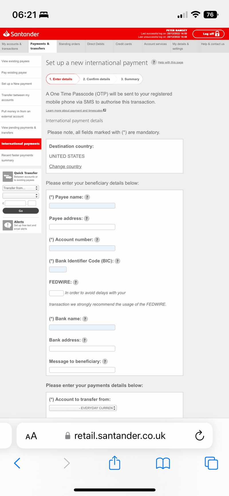
Many of the mobile experiences would fail basic accessibility criteria, and I suspect would be largely unusable for elderly or disabled users.
It's surprising to me that for such a highly-regulated industry, and apps that we're essentially reliant on working, are able to innovate and fix issues at such a slow pace.
What's to come
This has been a recap of the last 900 days, and lays the context for what's to come.
The next 3 chapters will cover specific aspects of the mobile banking experience—highlighting exactly where the mistakes are made, in excruciating detail.
The next chapter is all about cards: managing, re-ordering and freezing.
Finally for today, I want to explain why Co-op Bank may not feature much in the final chapters: they've locked my account for 'fraud'.
According to their customer services, a transaction that I made recently (to myself, for about £50), has forced them to restrict my account, without access to my money, and are unable to provide a timeline for a resolution.
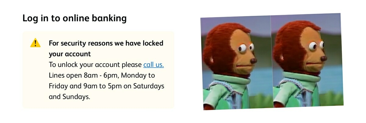
Ironically, because the transactions I made were intentionally universal with all of the banks, and nobody else flagged it as fraud (because it's not), this is a datapoint in itself.

