Search

Popular Filters
Popular Filters

Popular Filters

Popular Filters
By Peter Ramsey
22 Jun 23

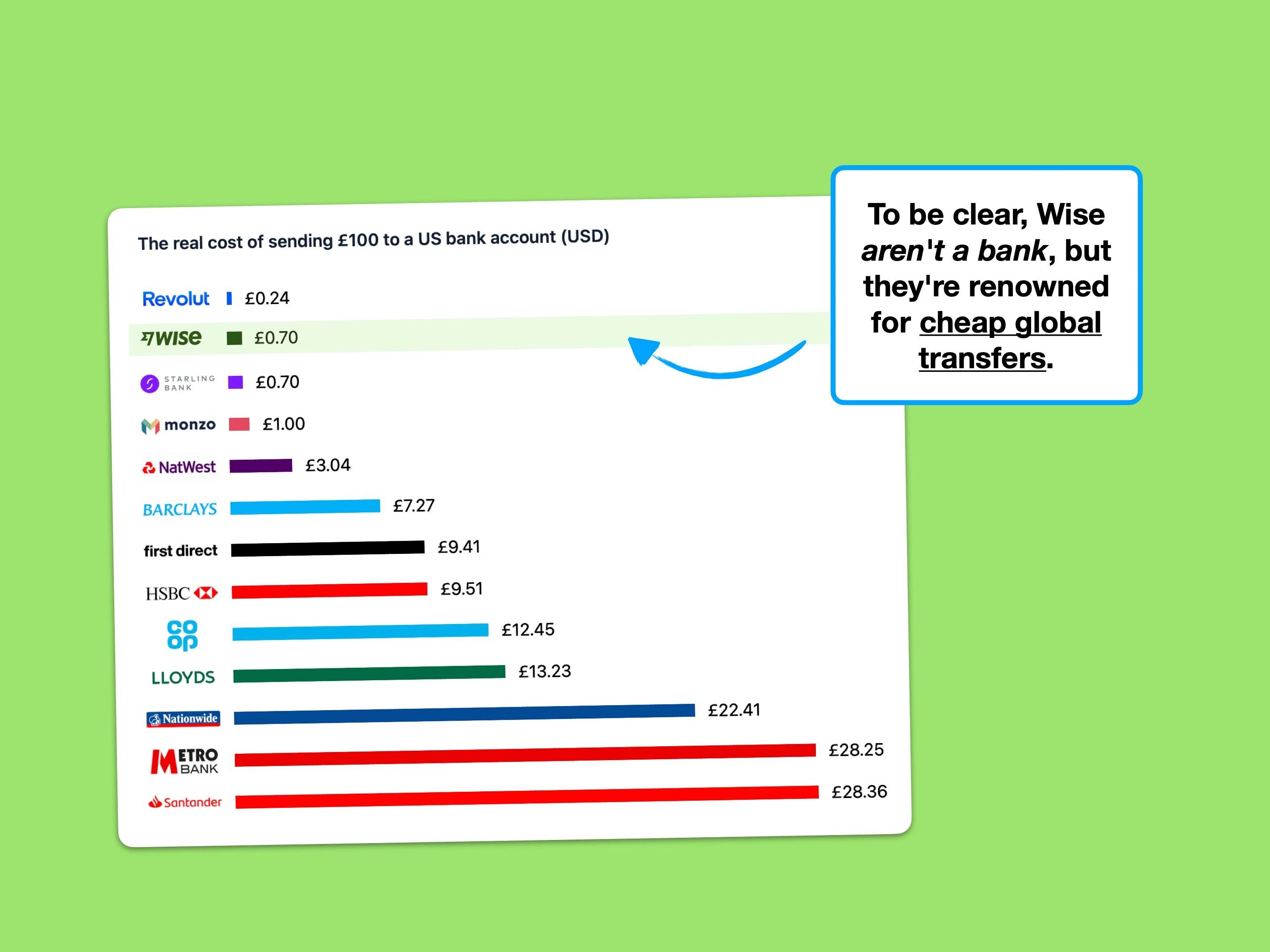
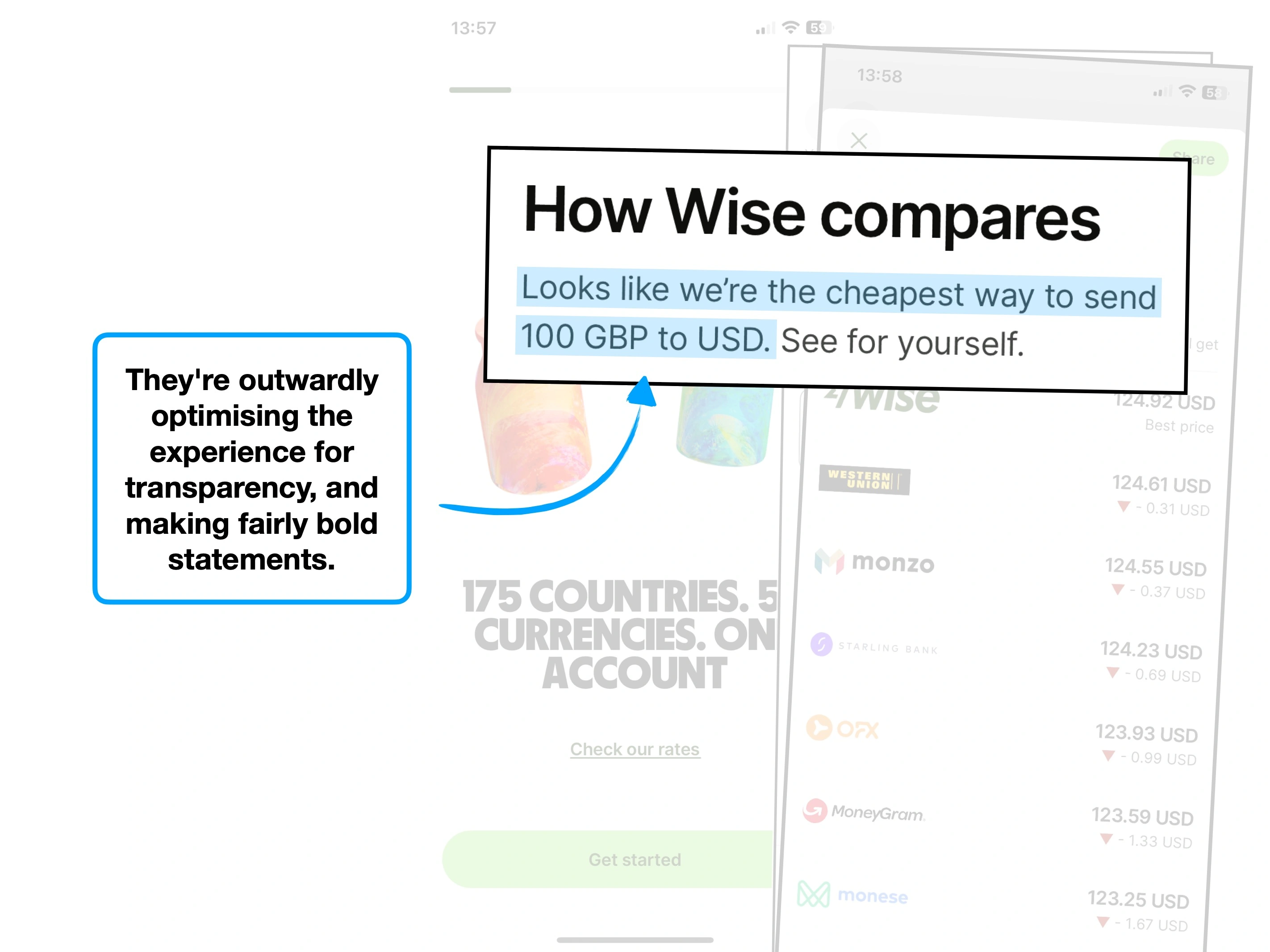
Wise is not a bank, despite sharing many features of one.
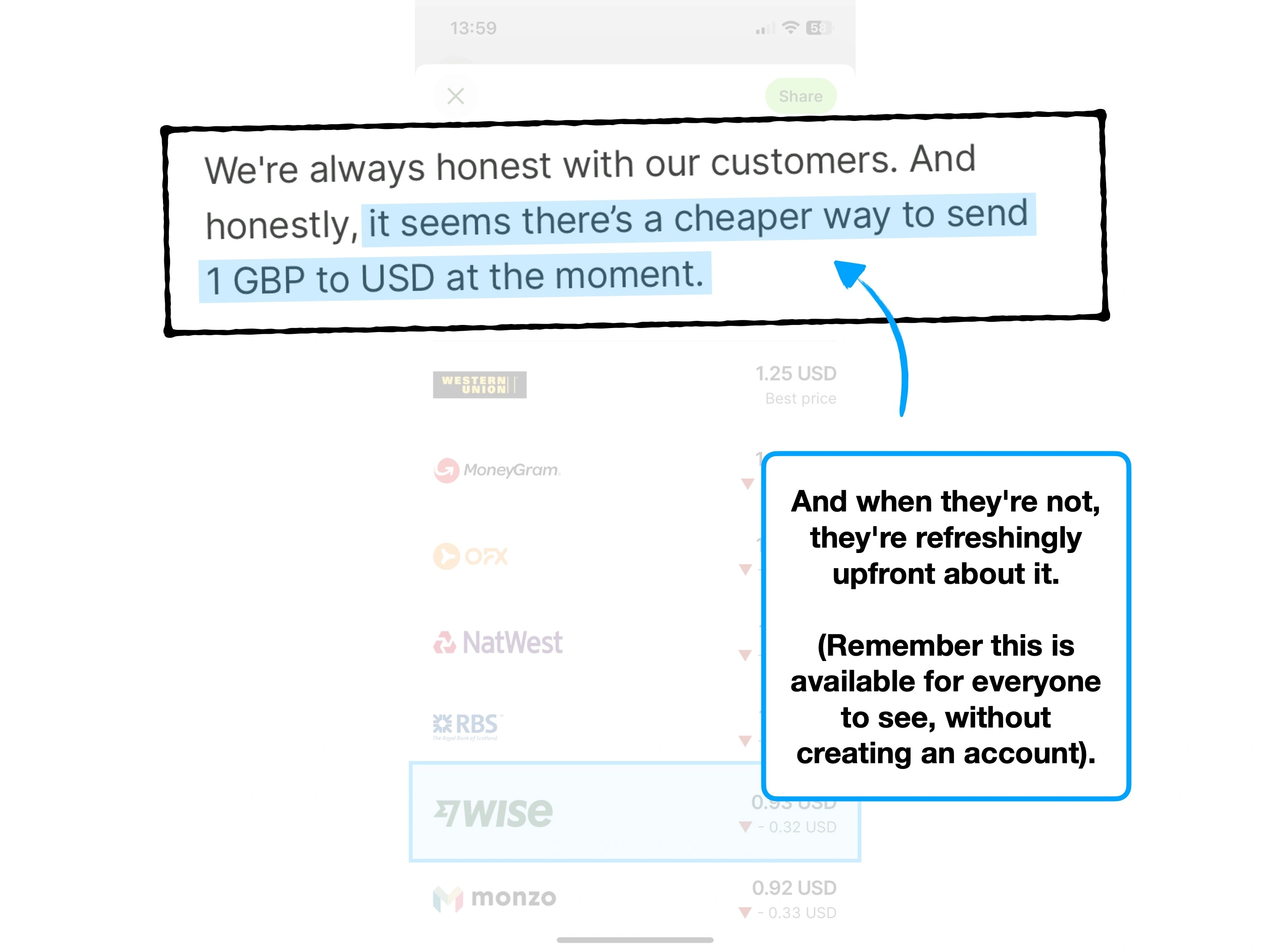
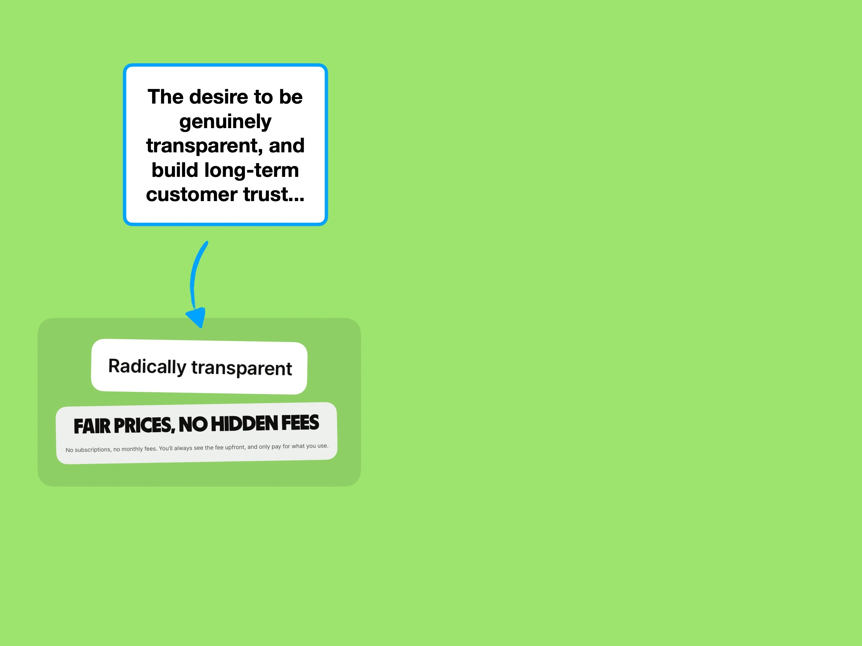
They're a multi-currency financial service that, during the age of incumbent banking, earned success with their radical transparency.
In short: they make international transfers easier, and often cheaper.
But the world has moved on, and Wise now face fierce competition from services like Revolut and Starling.
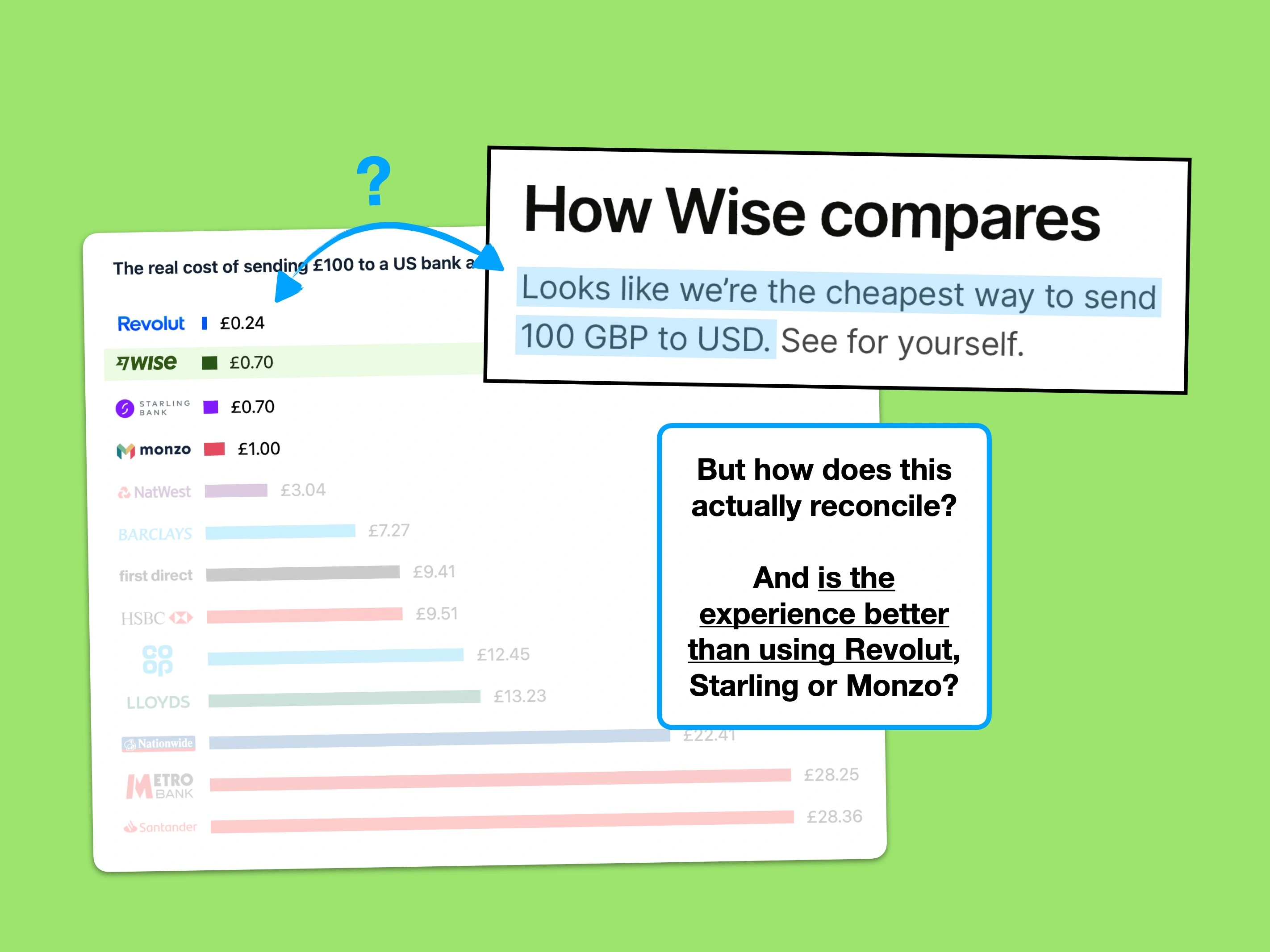
To demonstrate my point, here are the comparative costs of sending £10, £100 and £1,000 to the US (including any FX markups).
Note: for a deeper dive on international payments, read the UX of Banking.
Sending £10 (fee + FX)


Sending £100 (fee + FX)
Sending £1,000 (fee + FX)
In GBP, includes FX markups
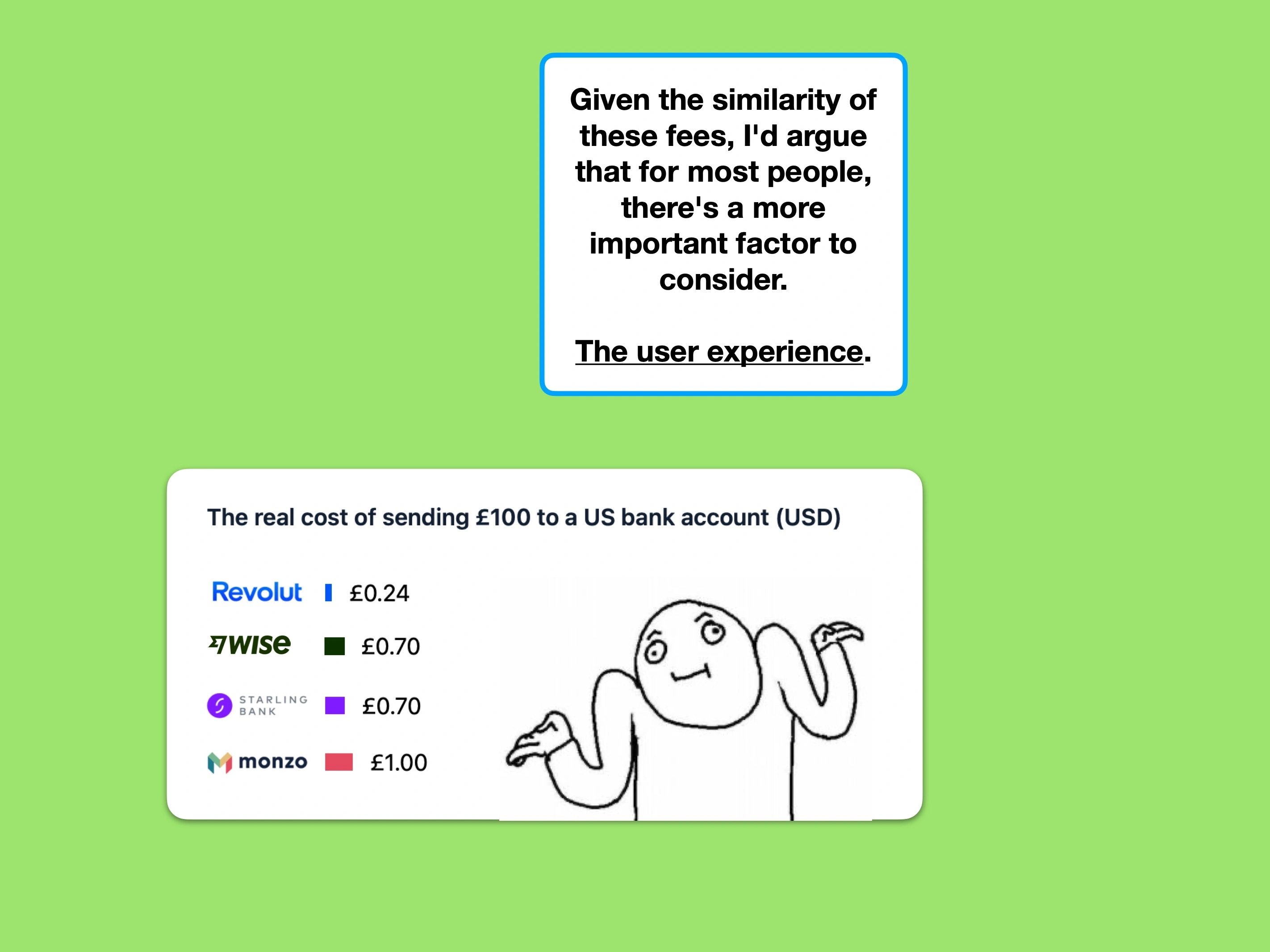
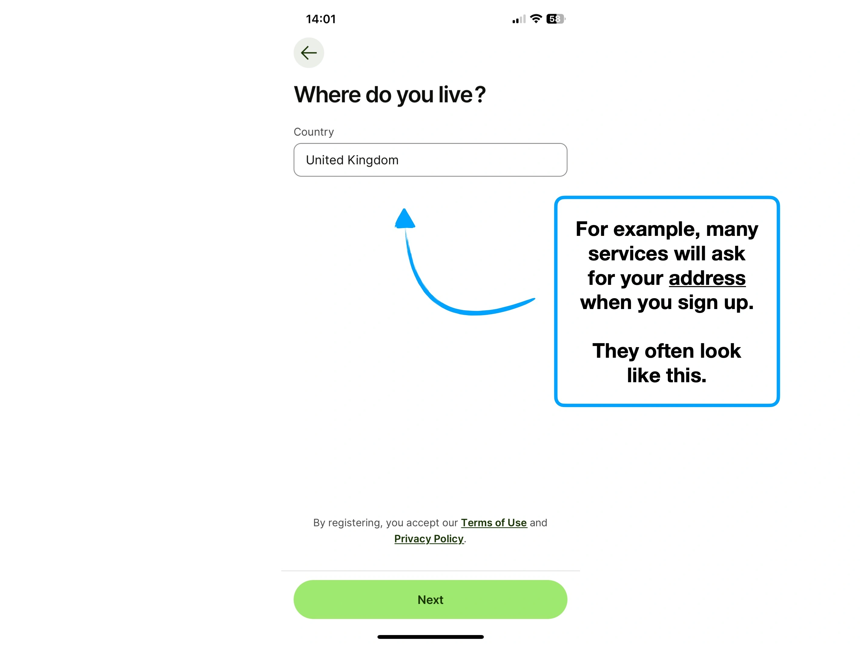
Millions of people in the UK already use at least one of the challenger banks. If your current account already offers similarly-priced transfers, what's the incentive to switch?
Let's take a look.
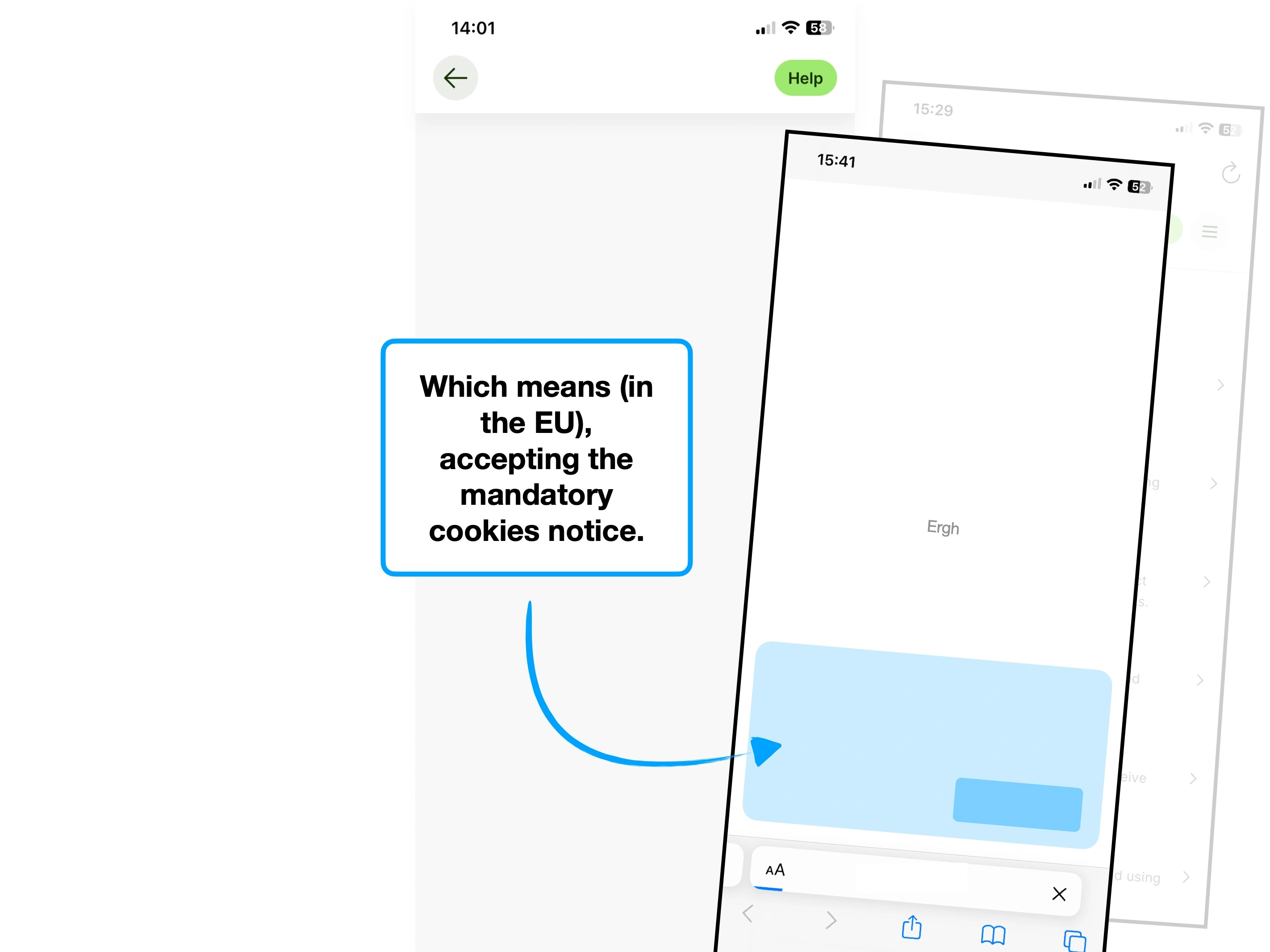
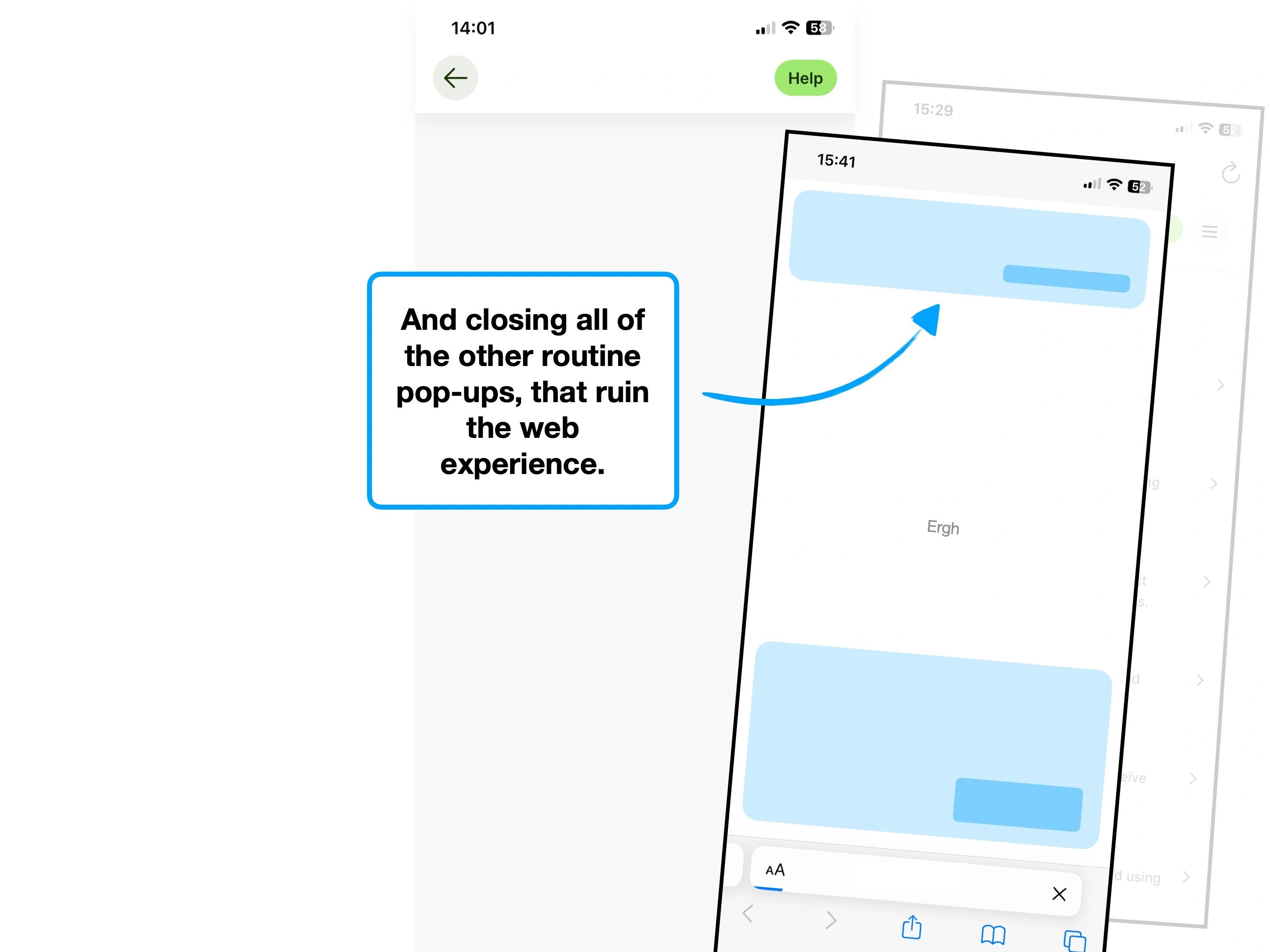
Please rotate your device to view this slideshow
Note, this won’t work if ‘rotate: lock’ is on in your device settings.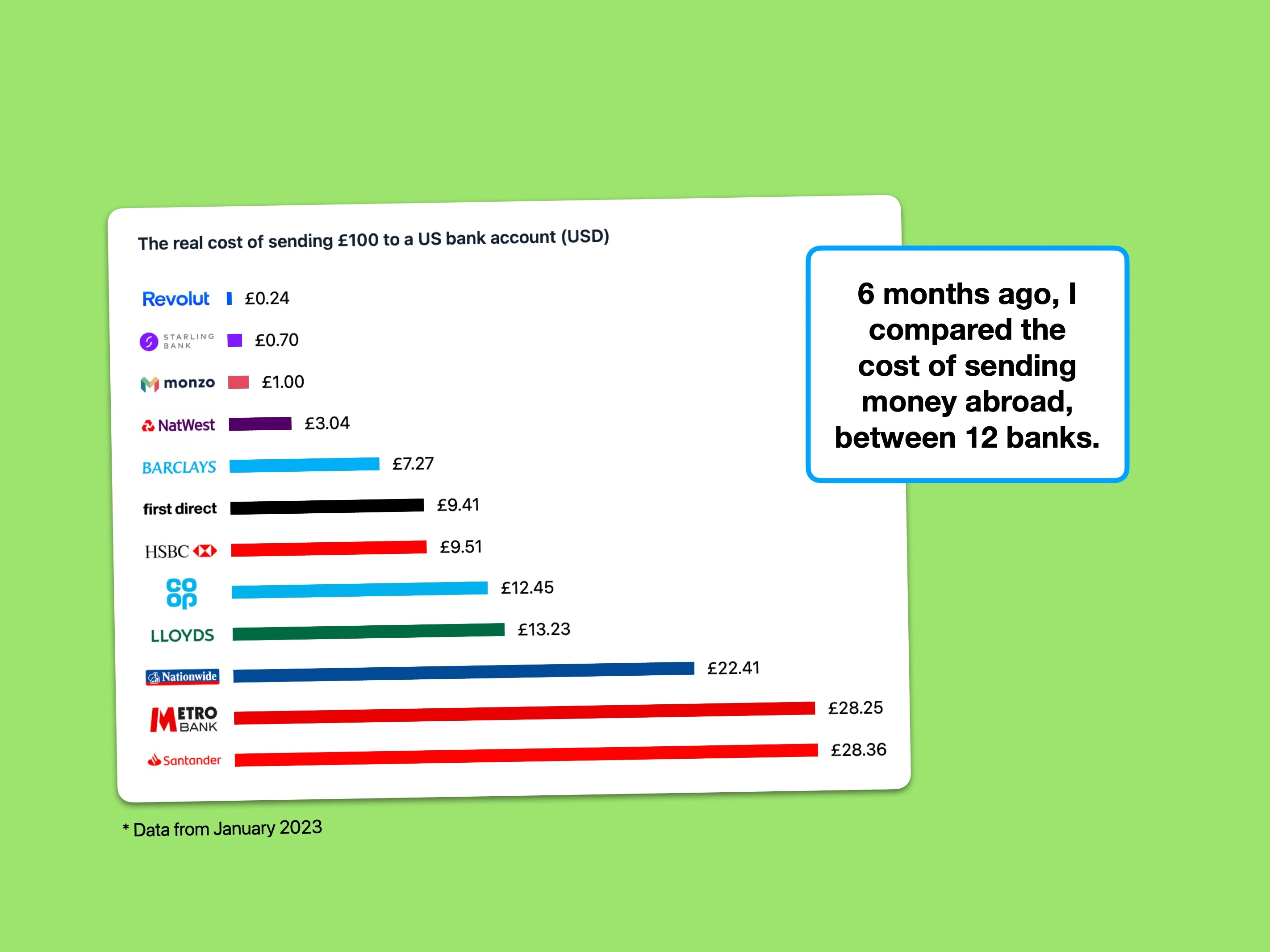


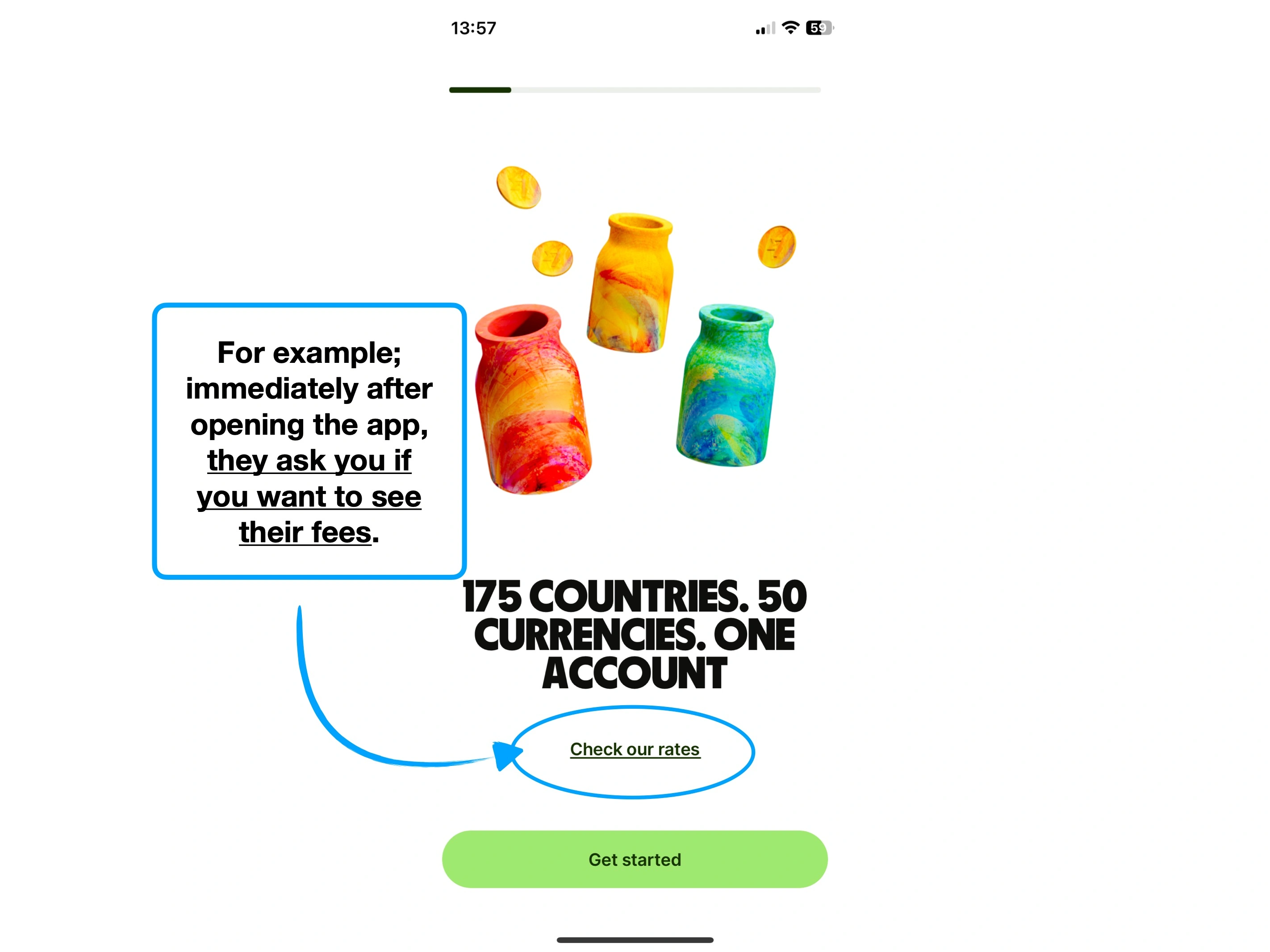
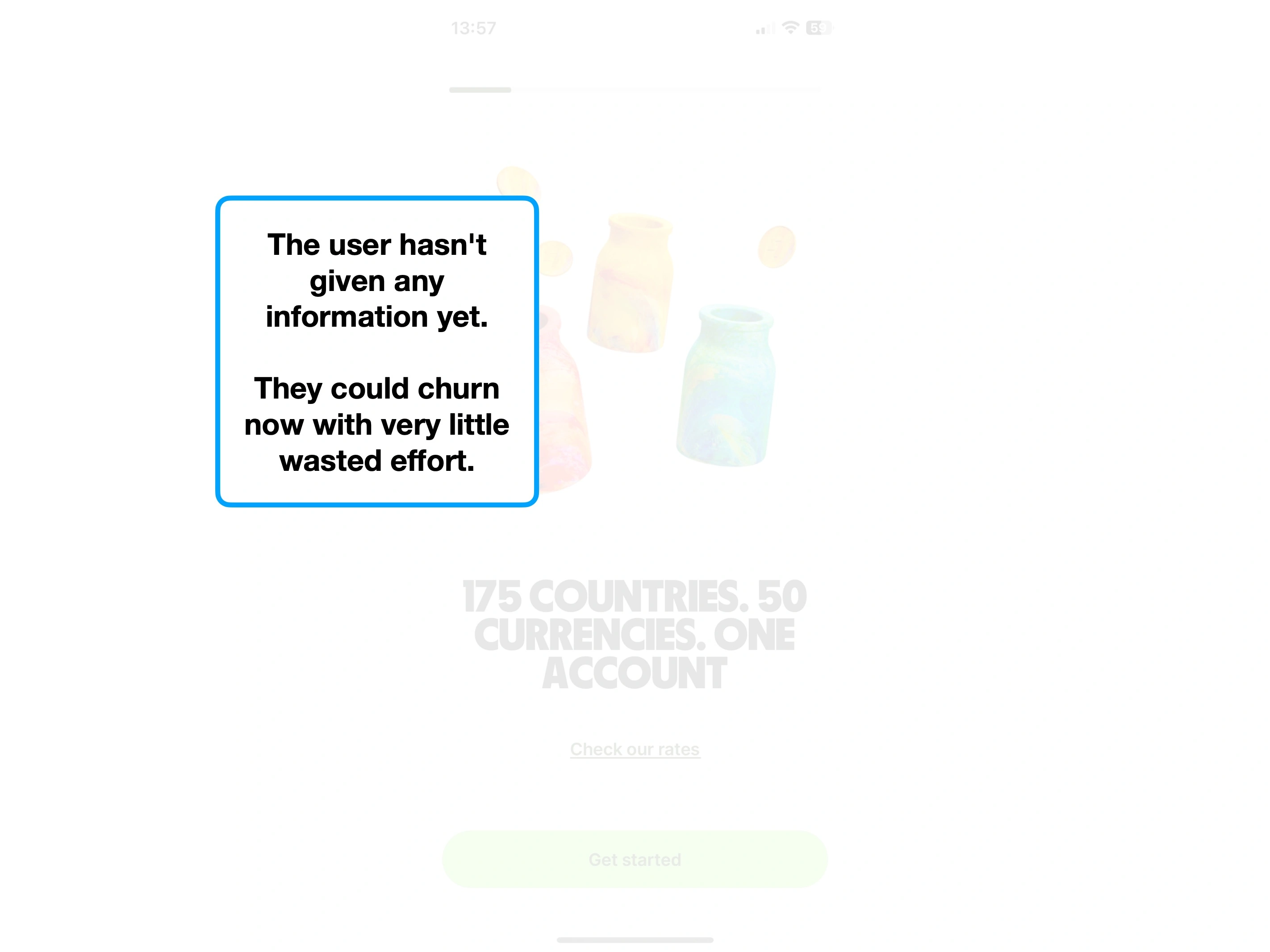

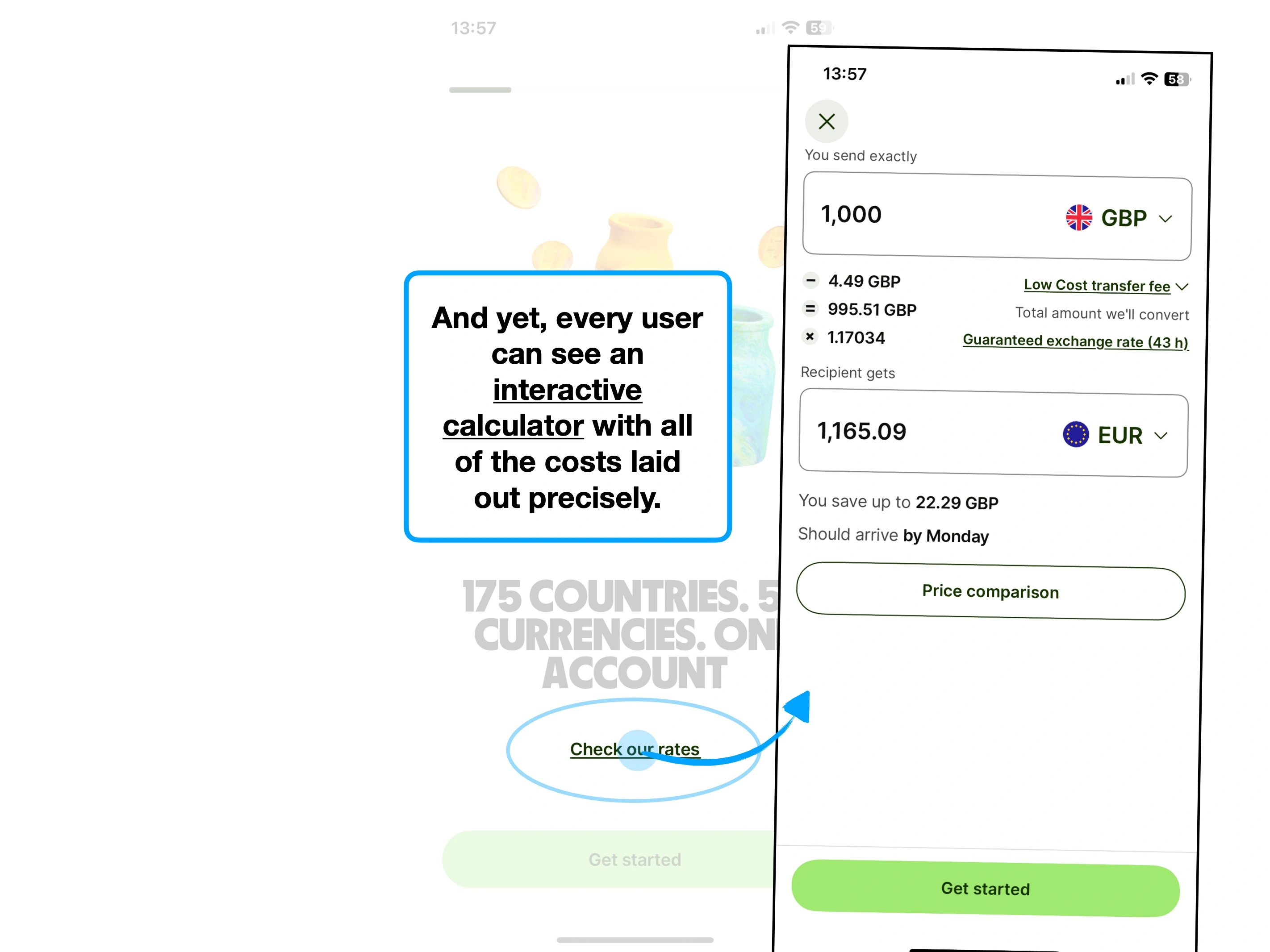
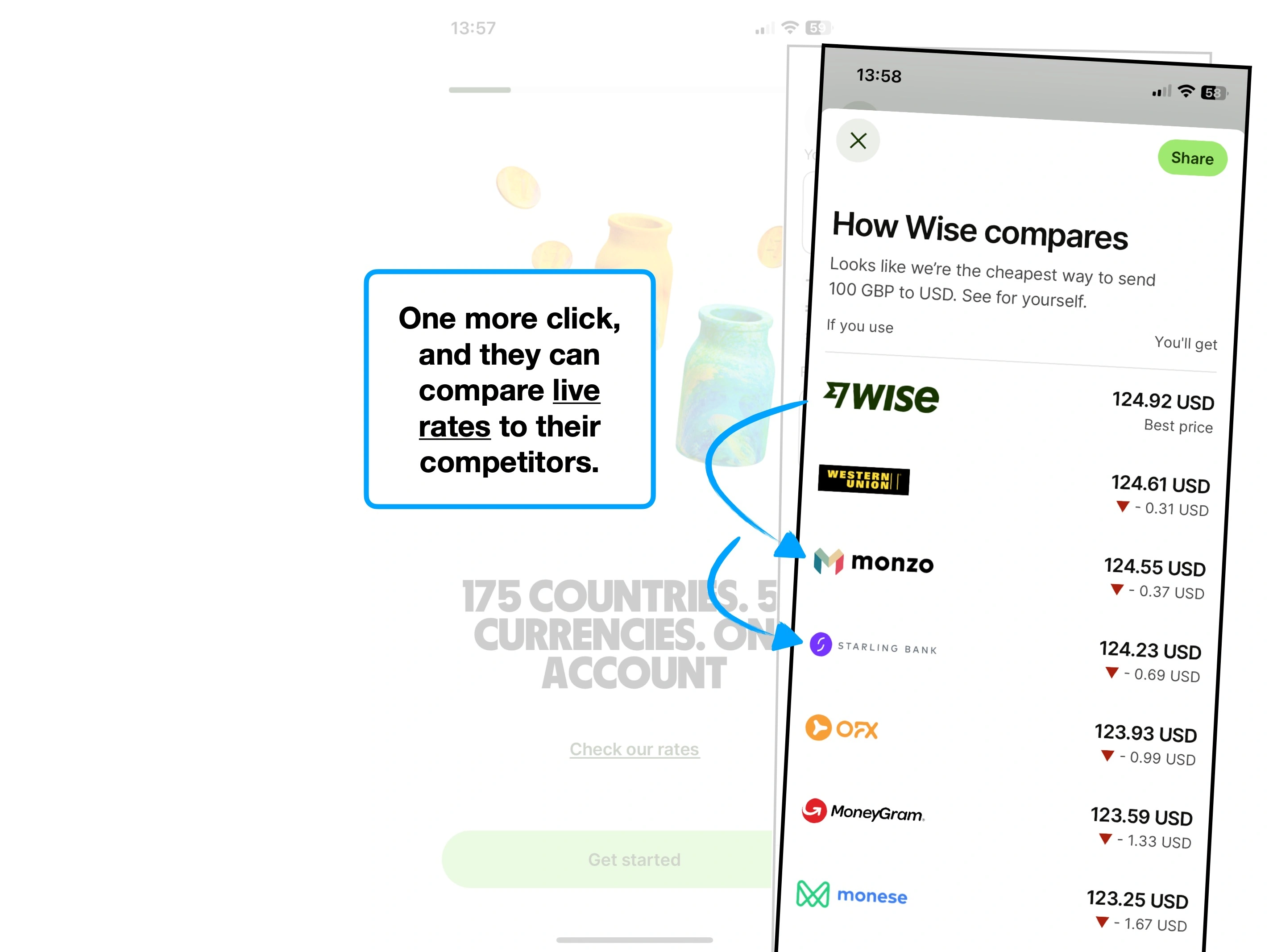
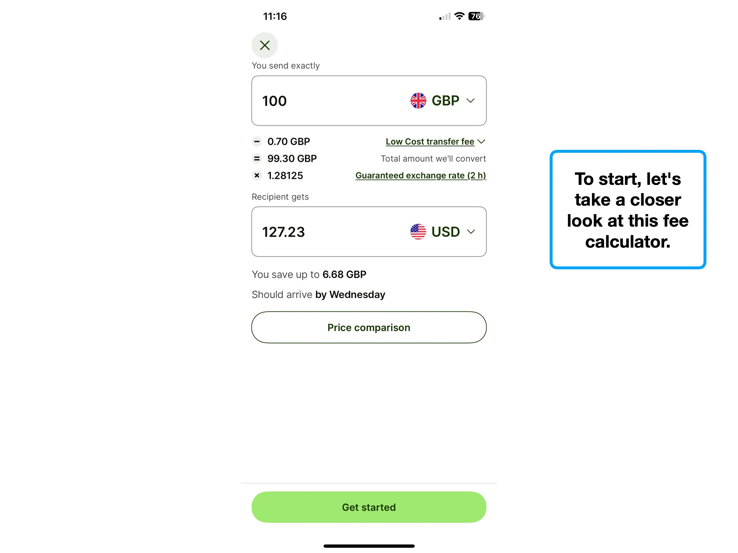
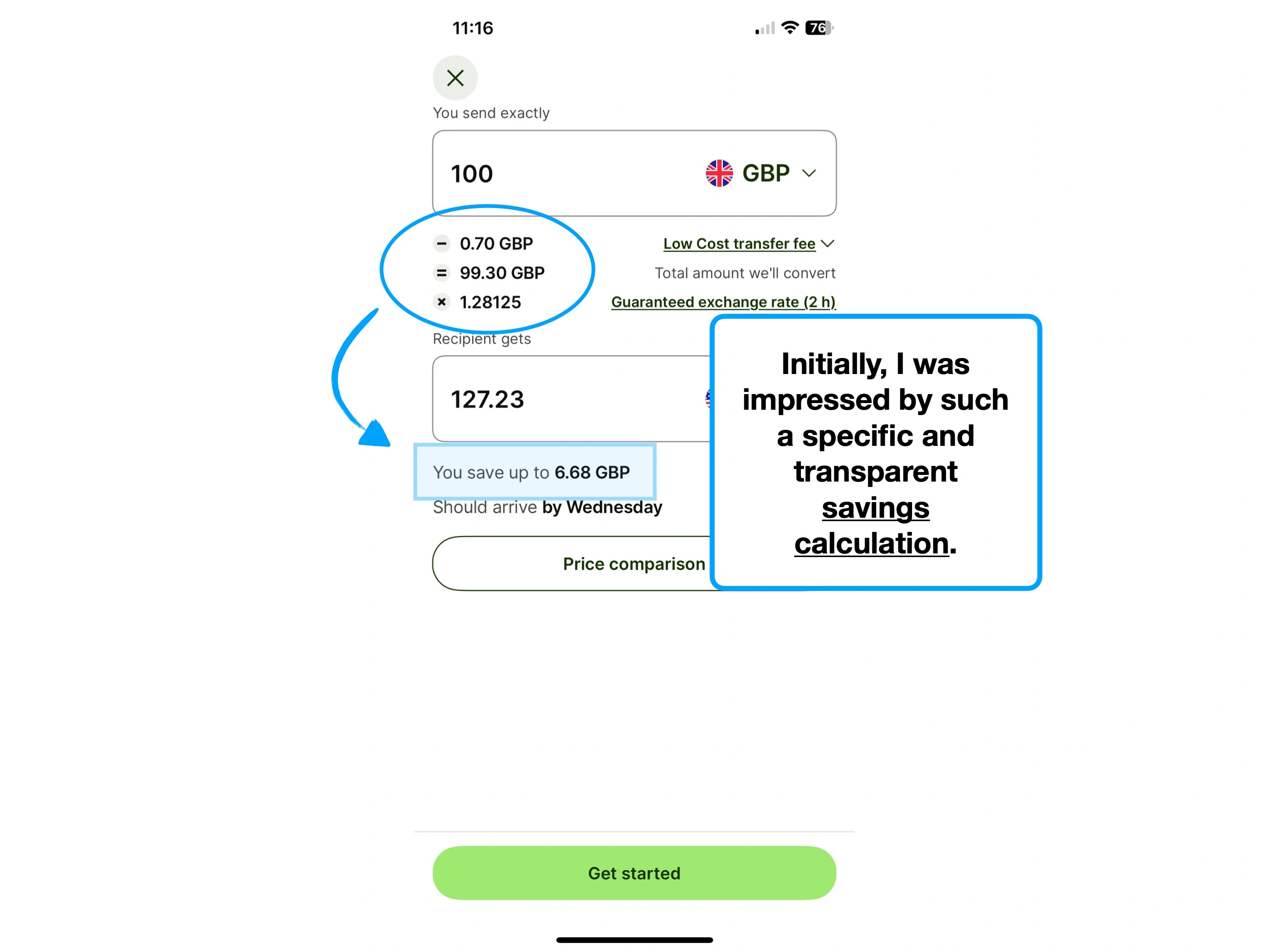

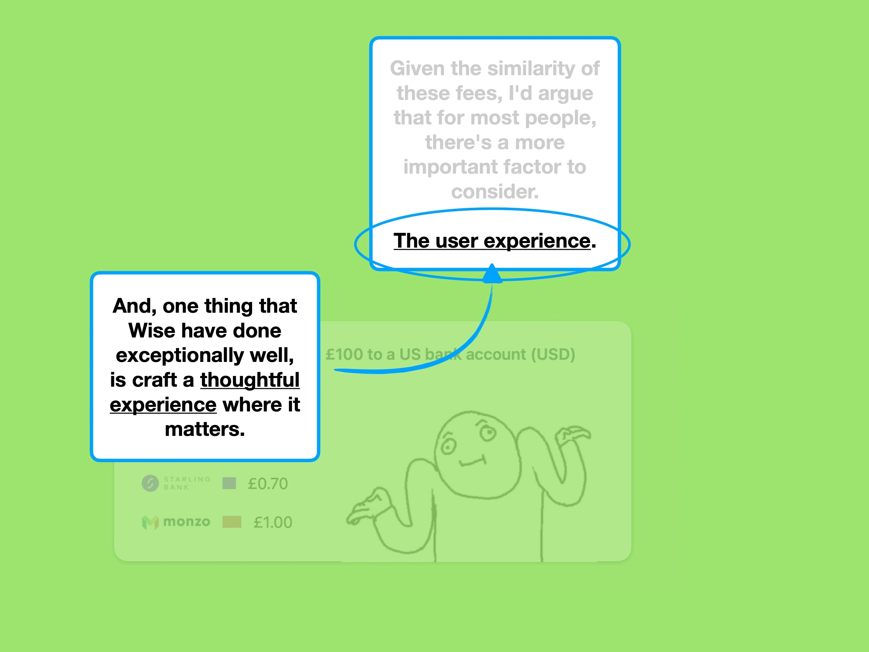
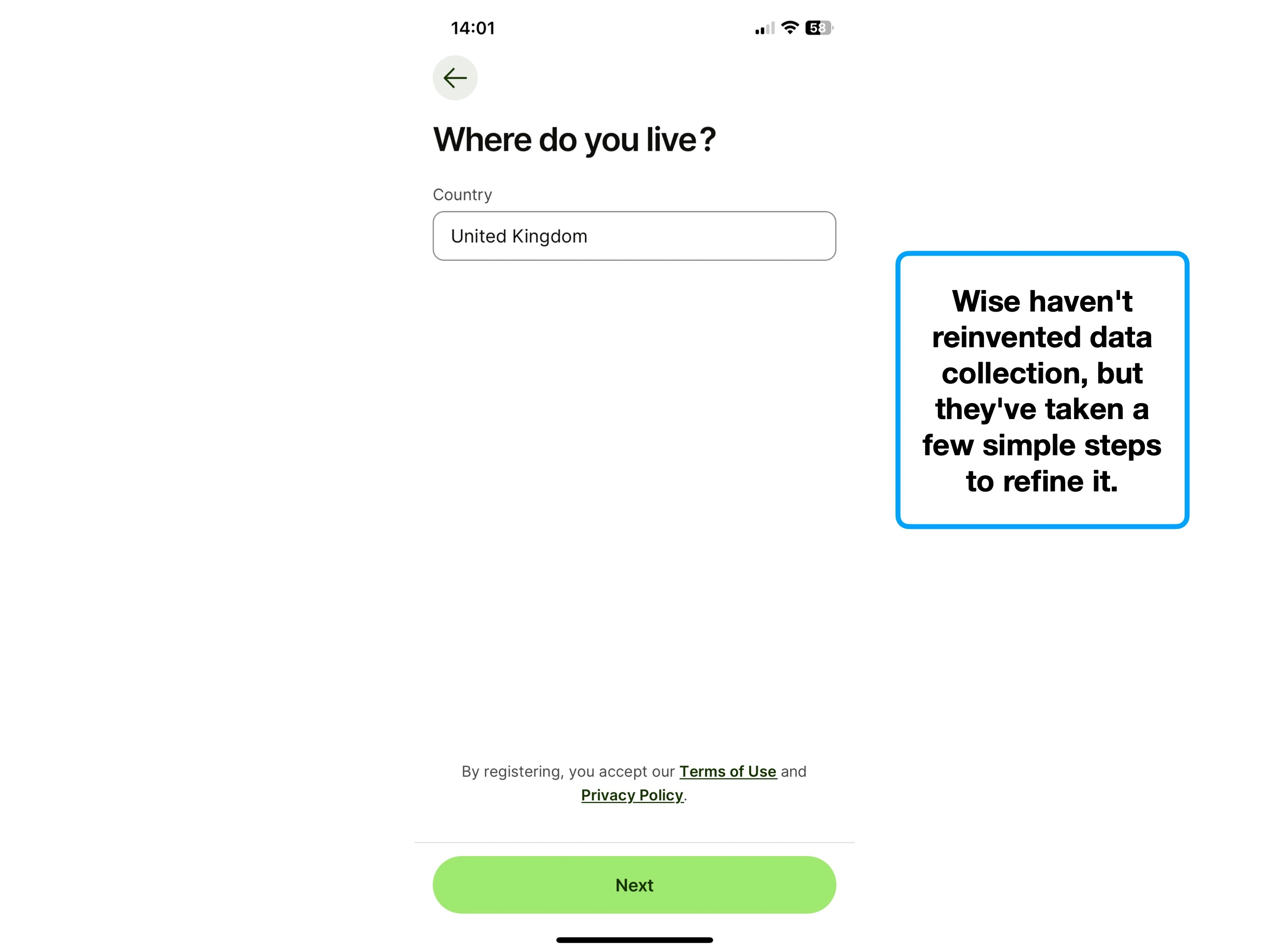
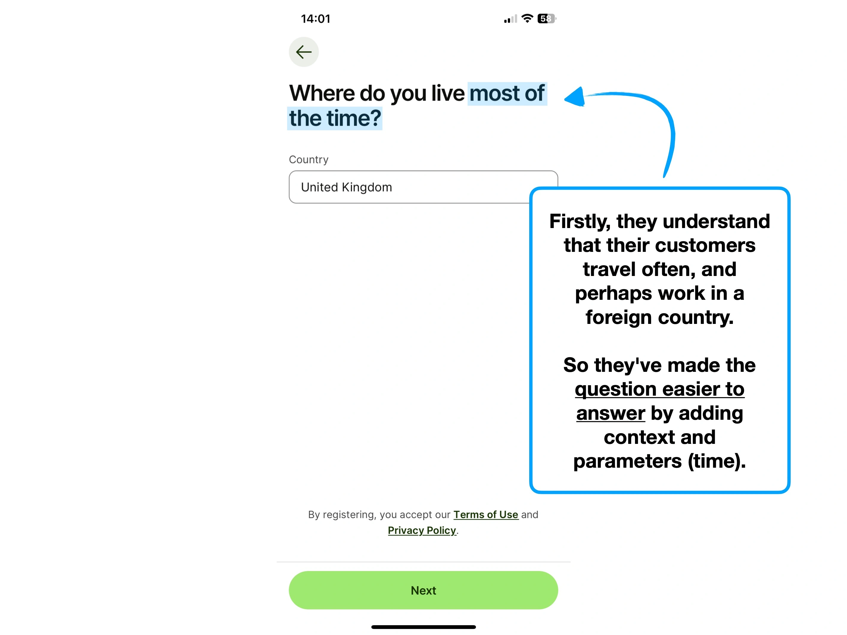
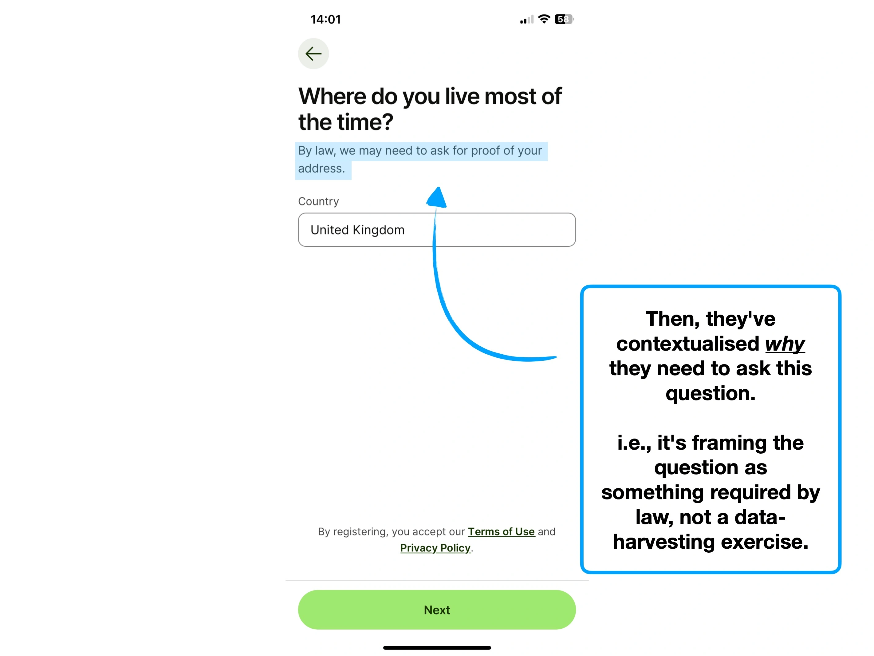
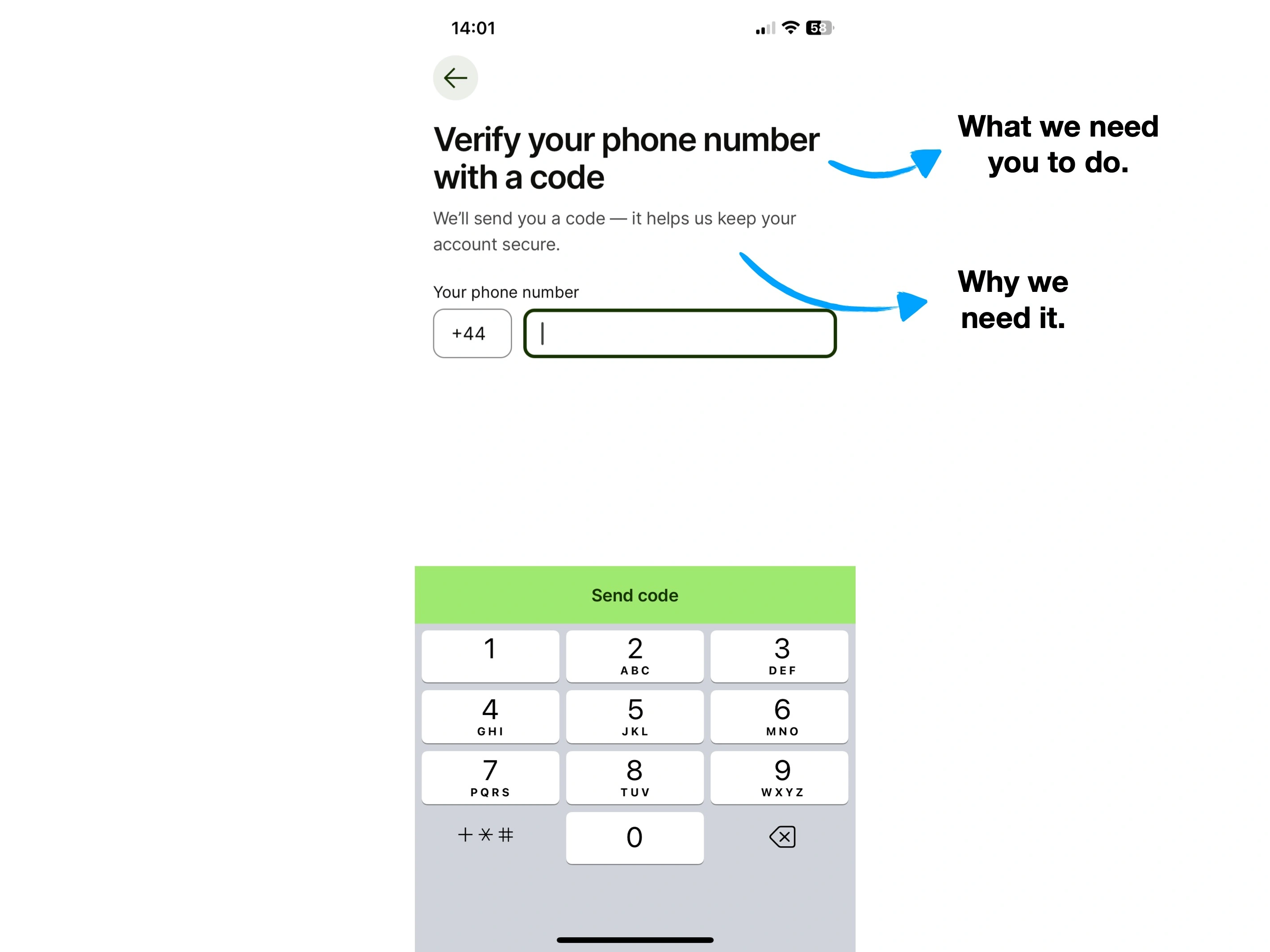
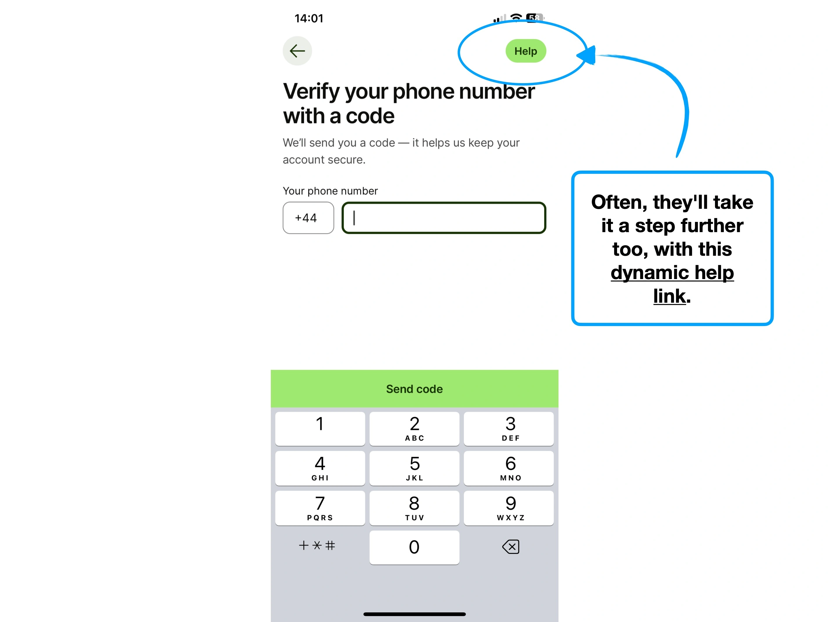
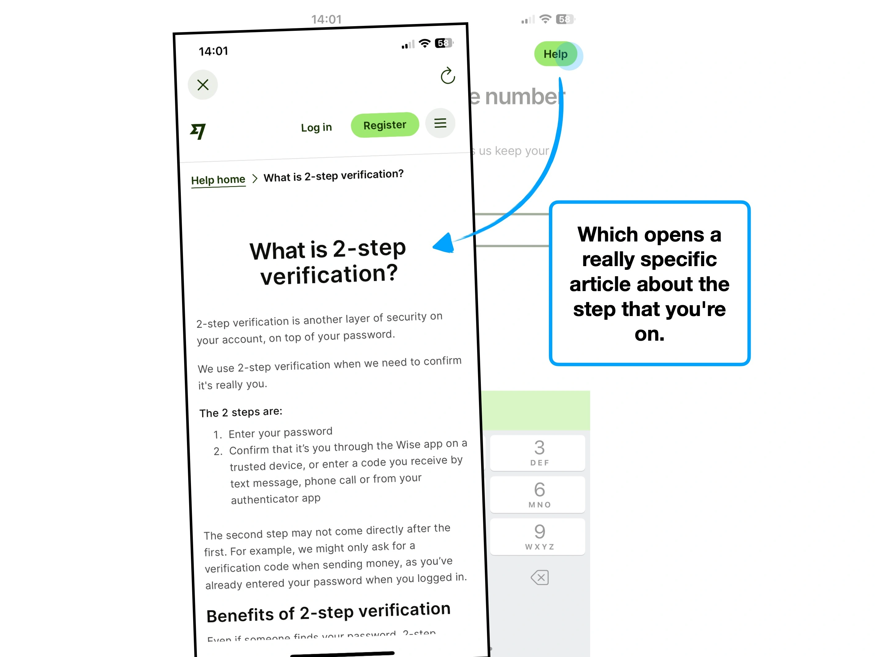
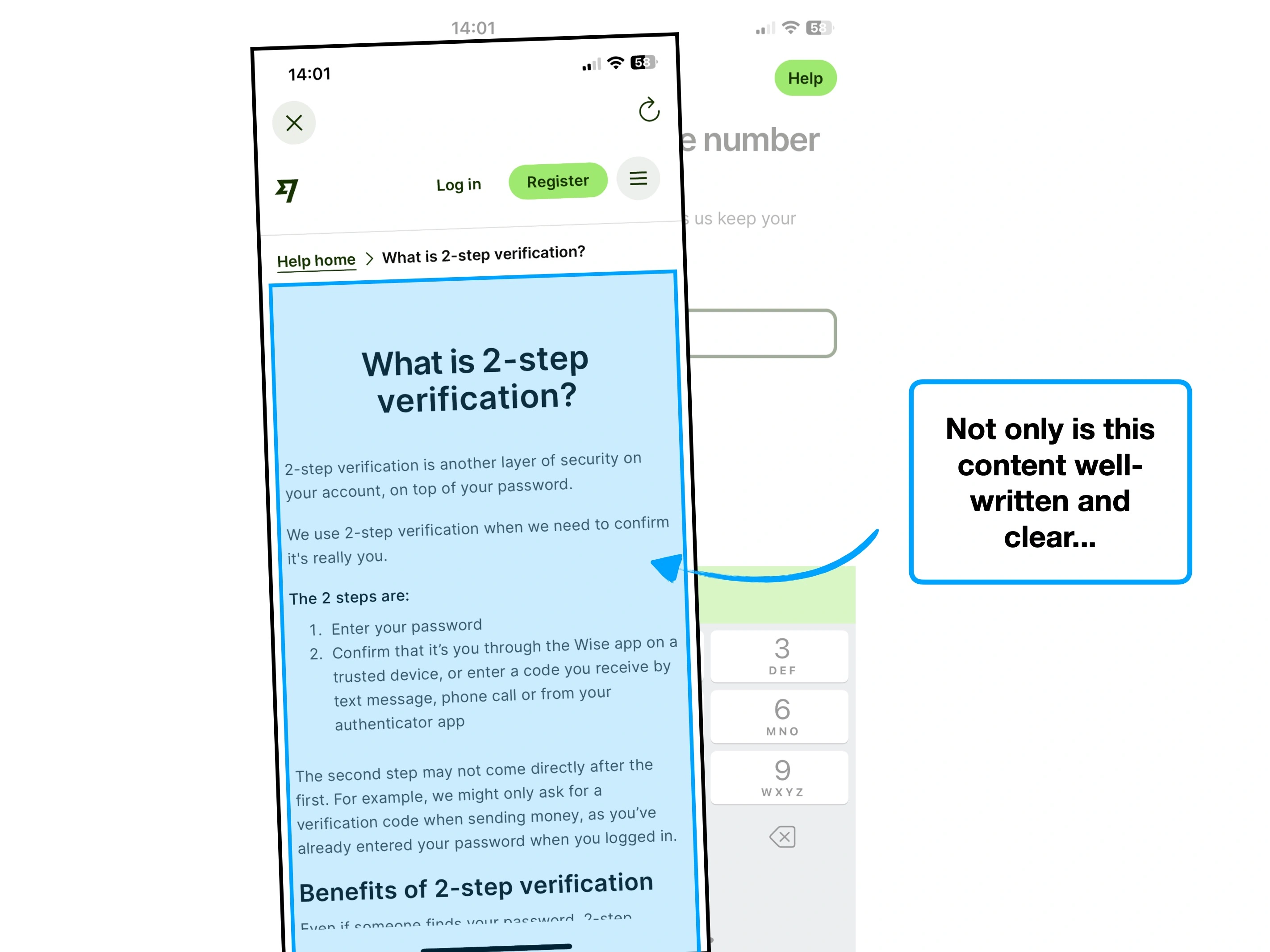
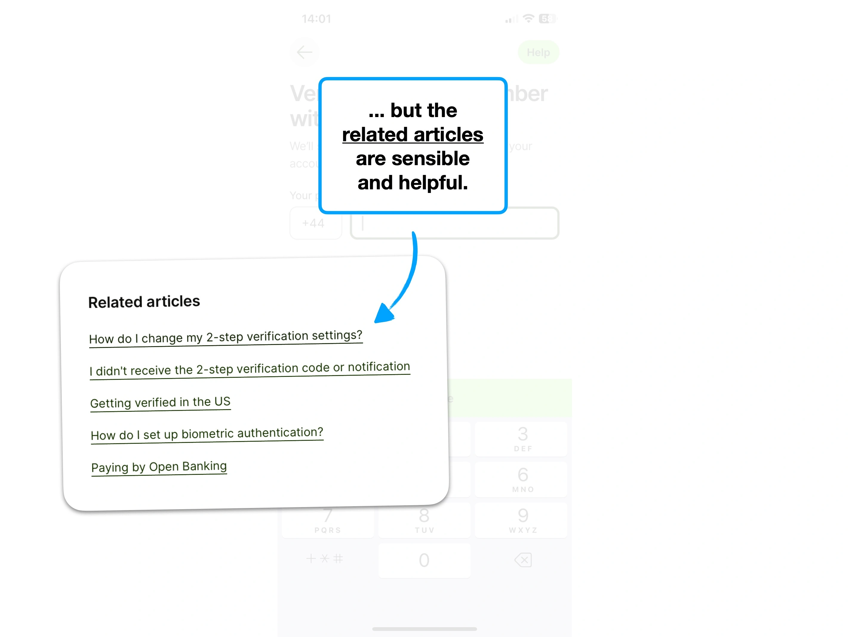
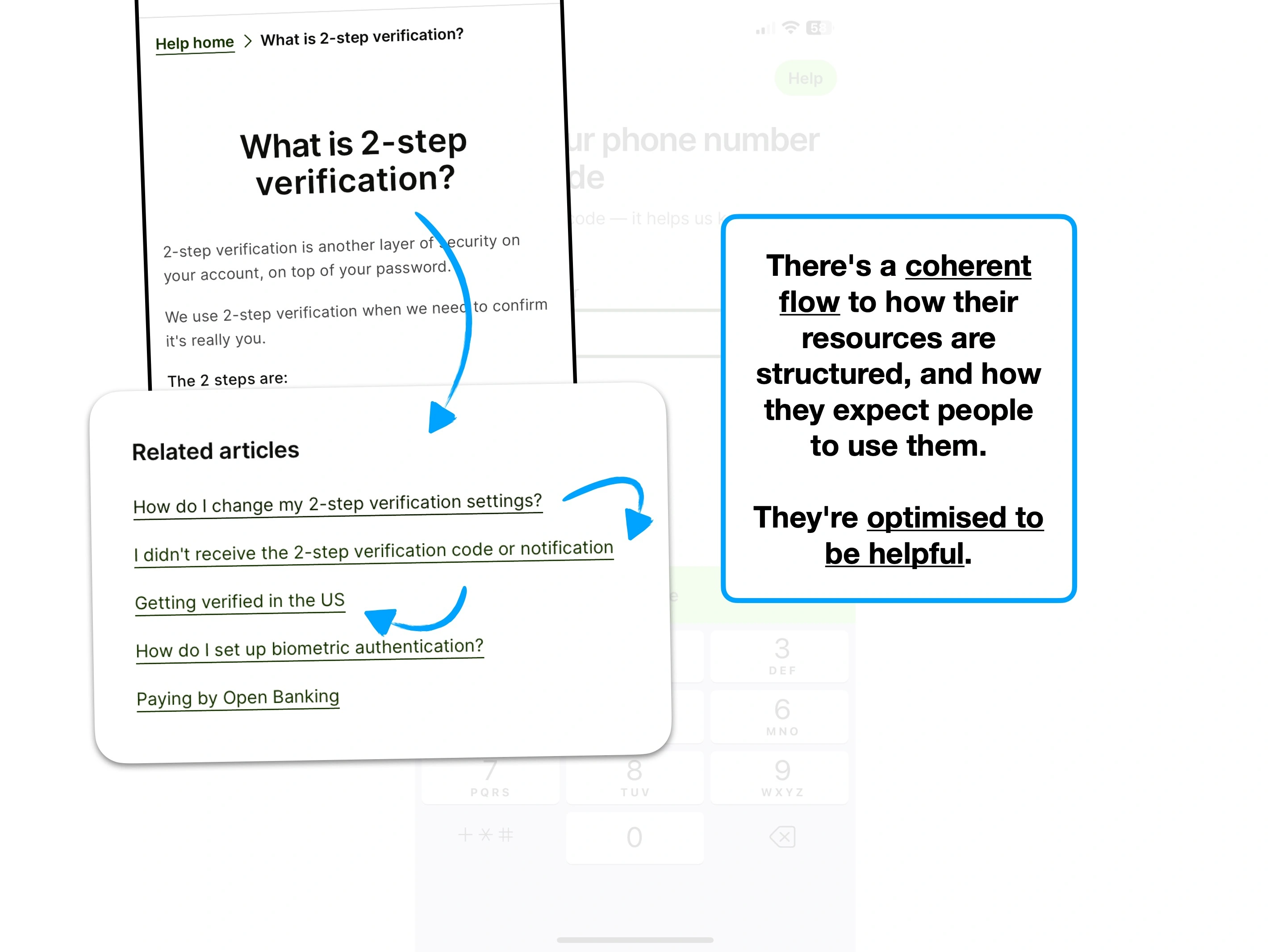
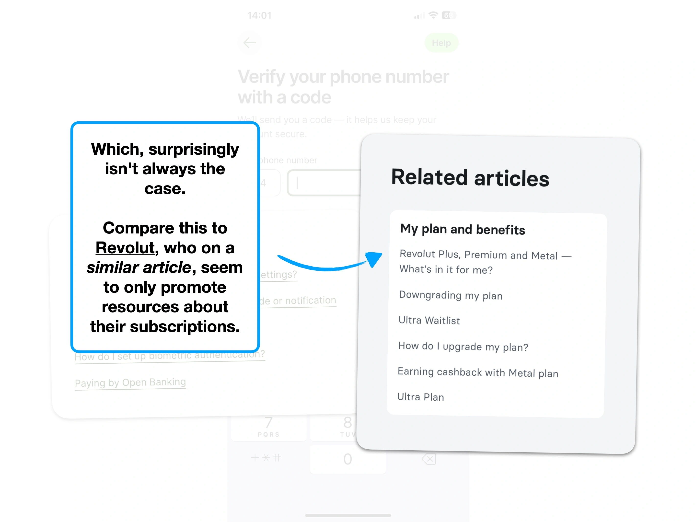
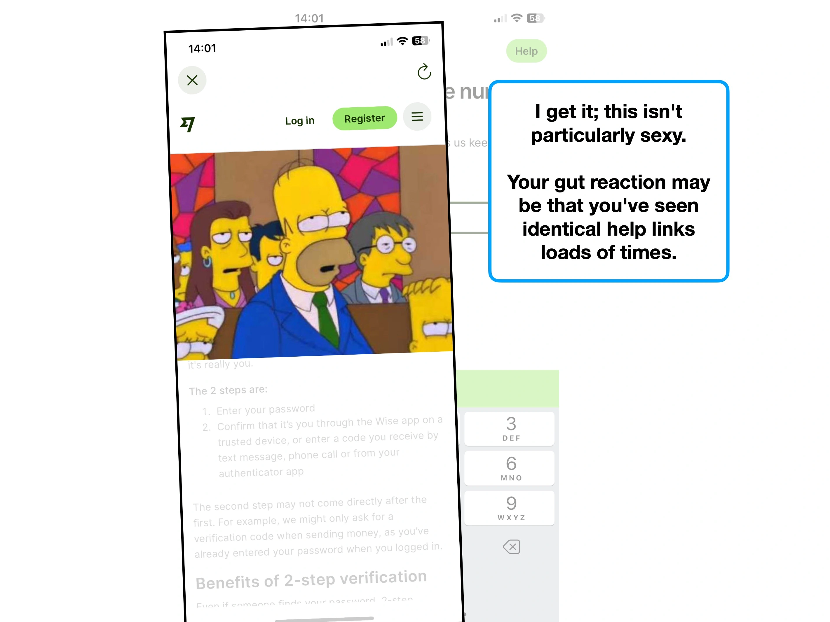


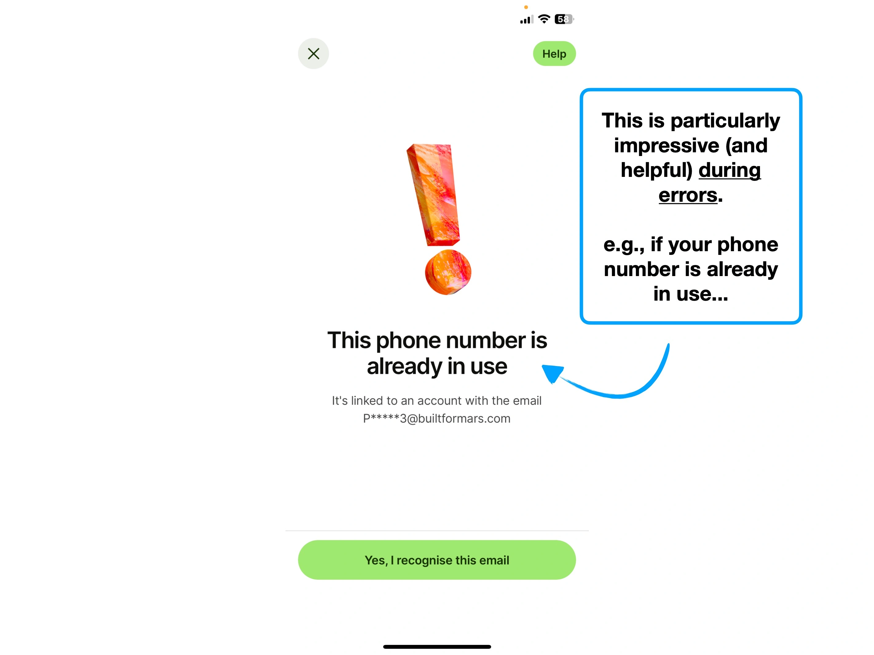
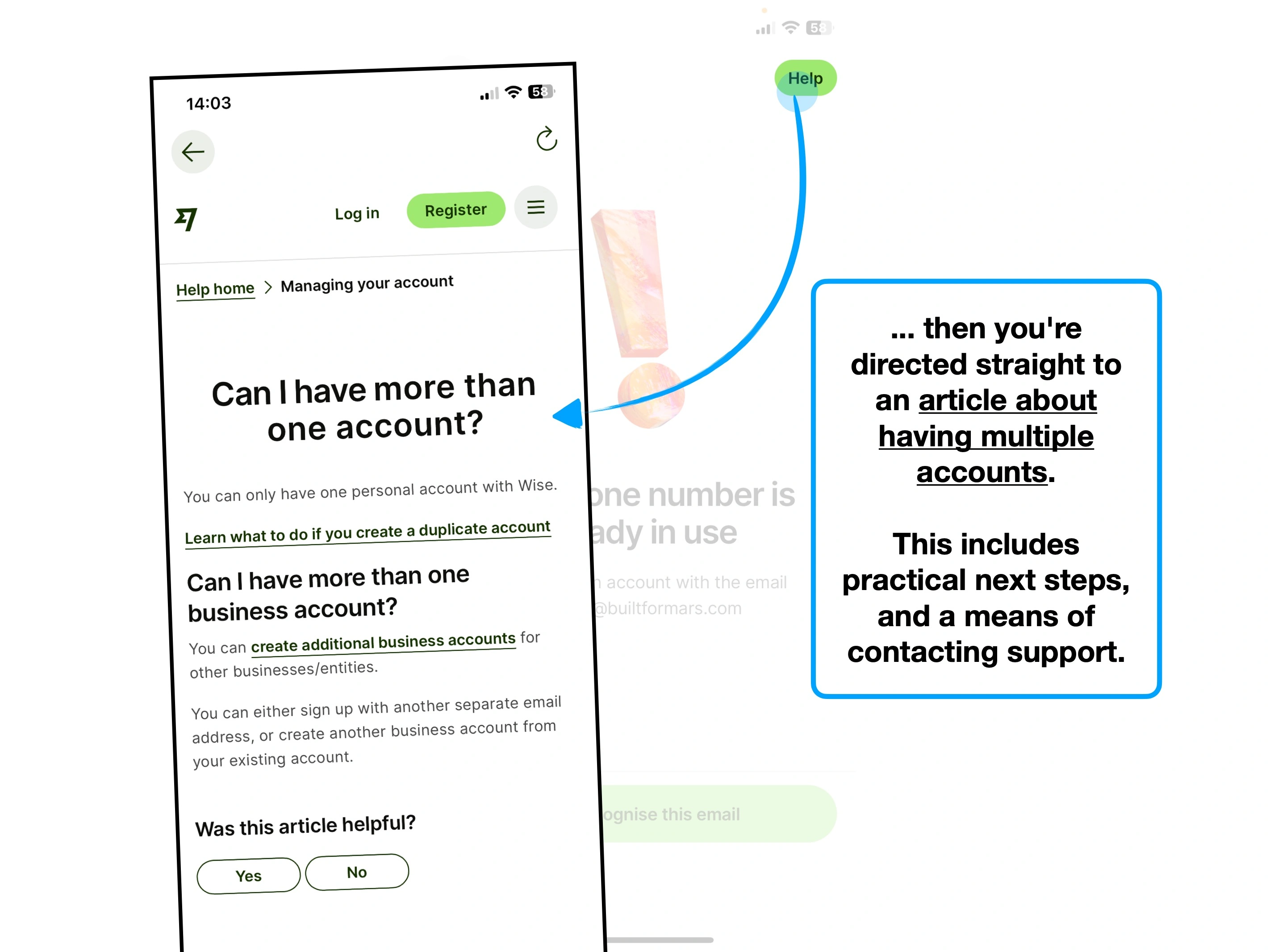
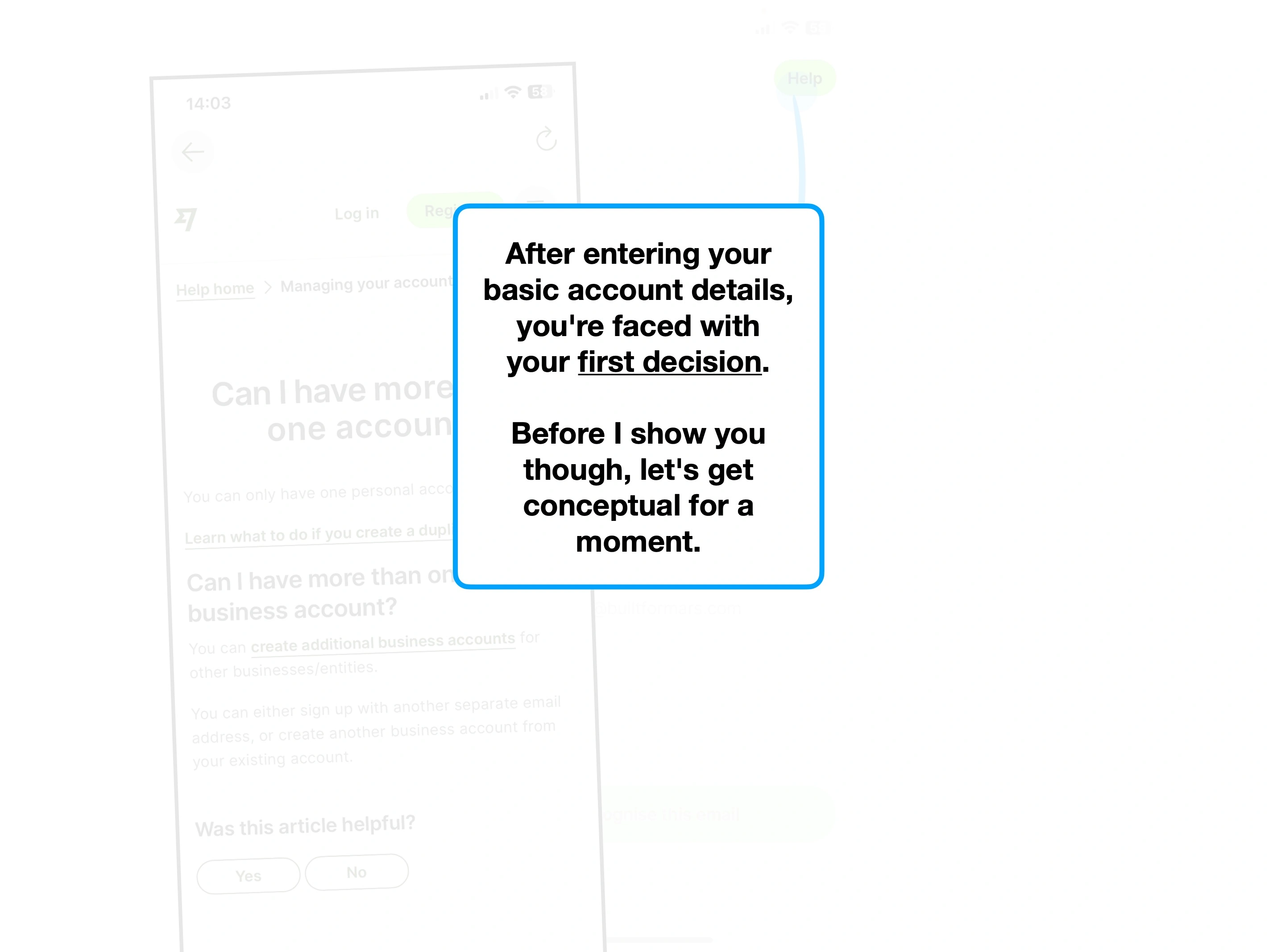

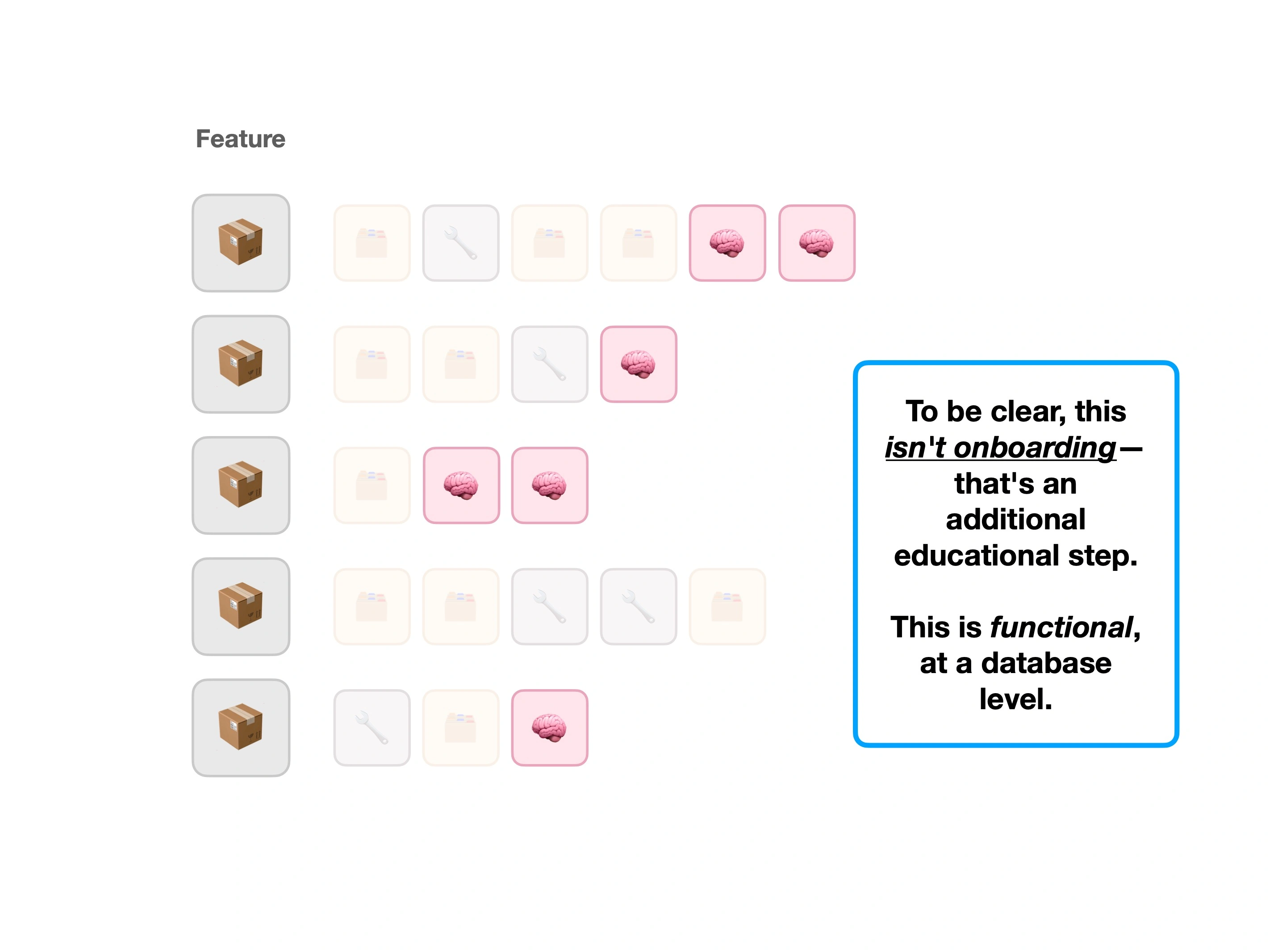

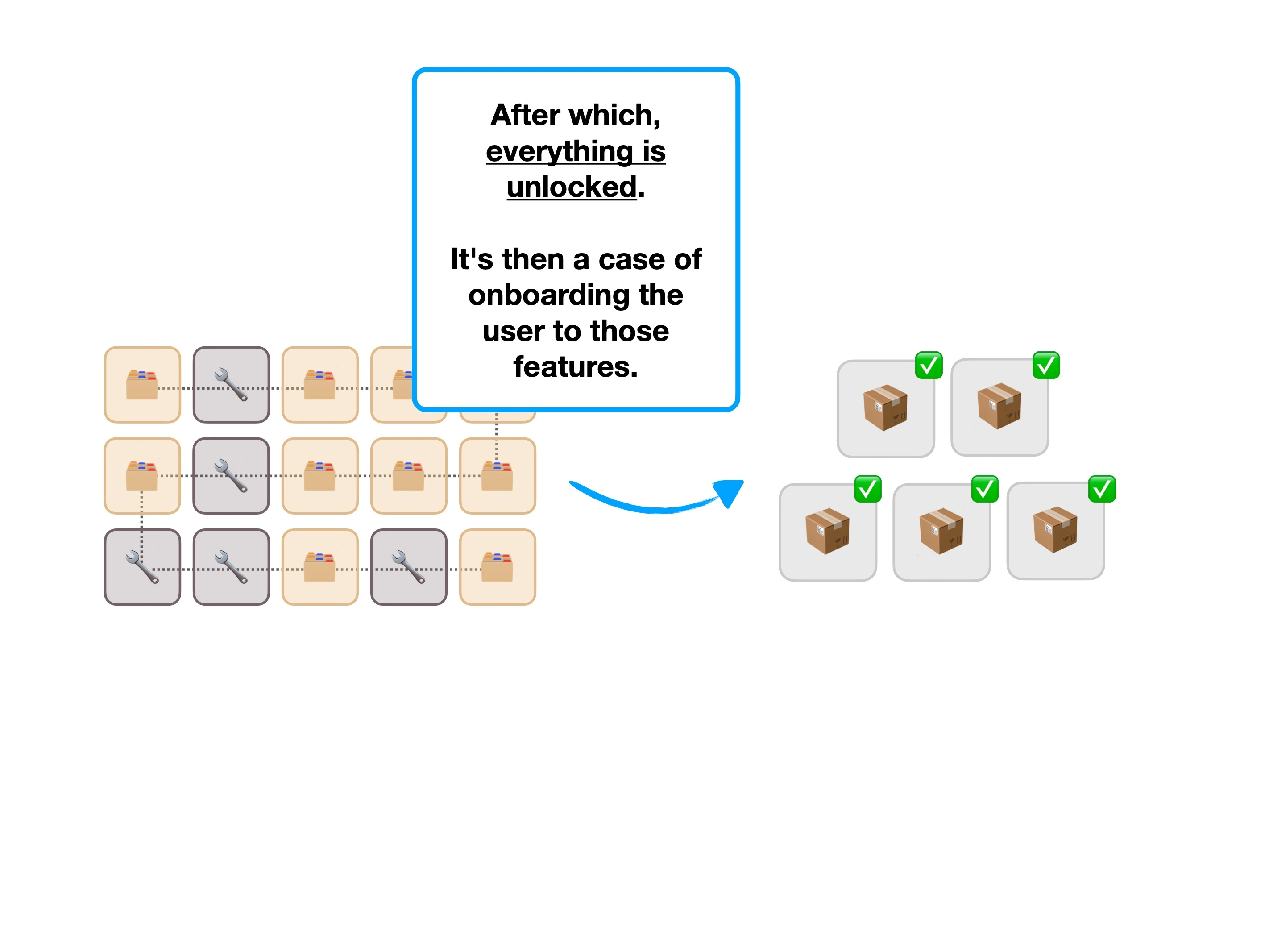

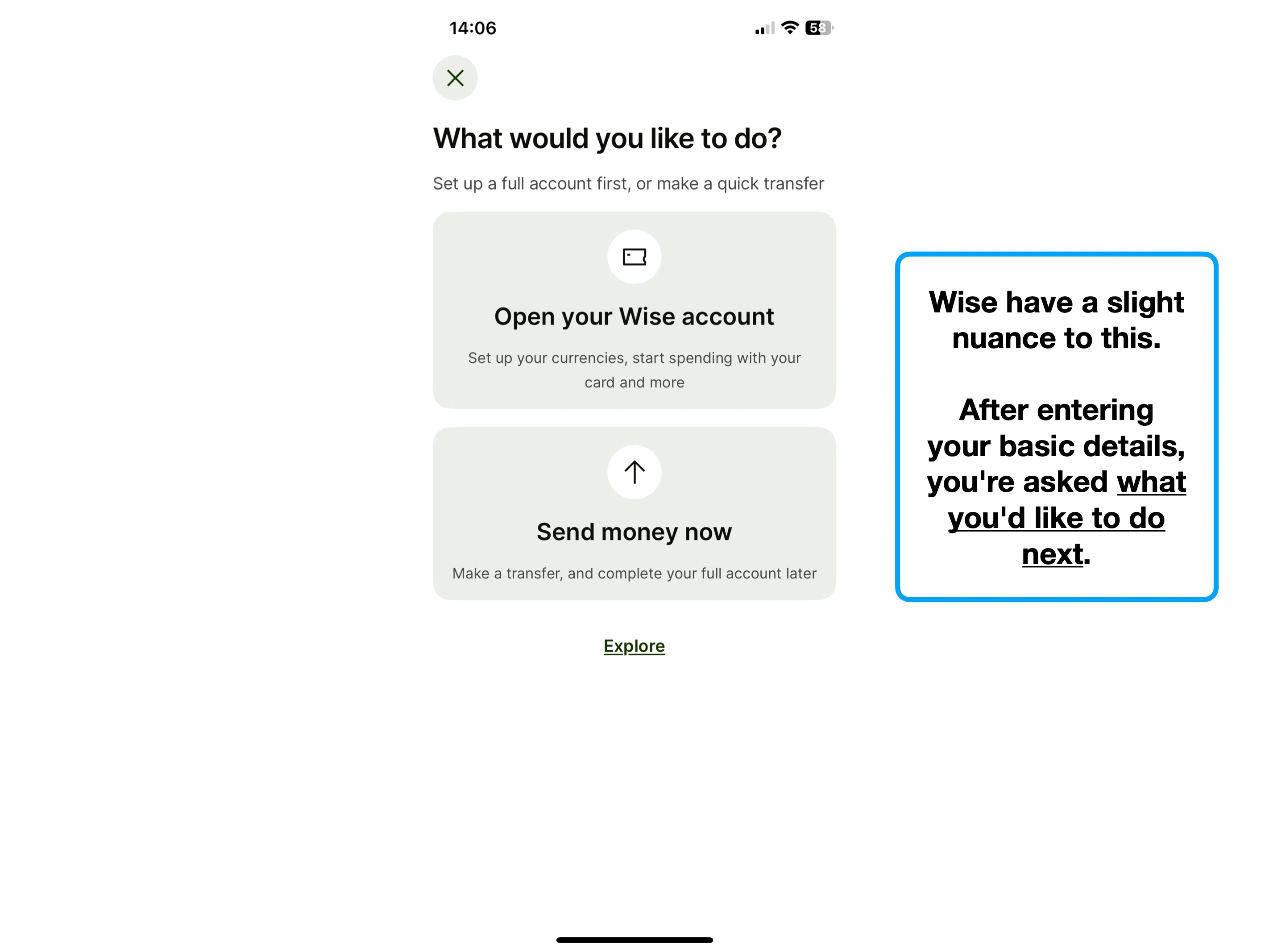
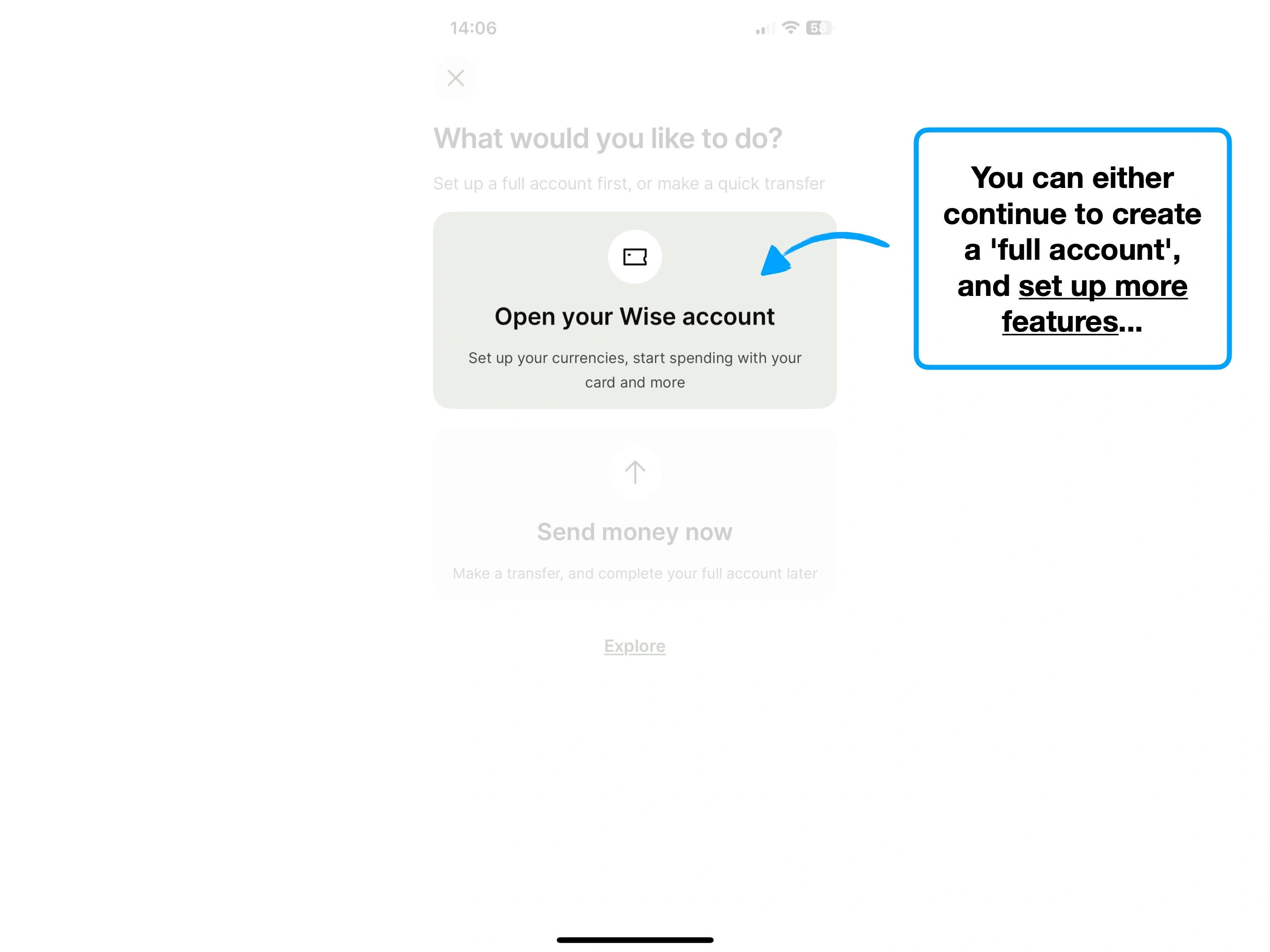
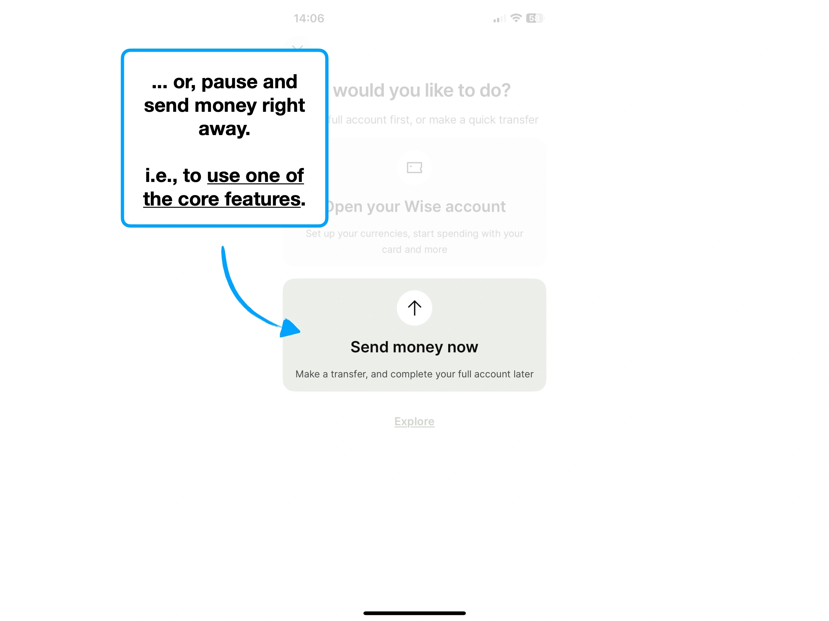
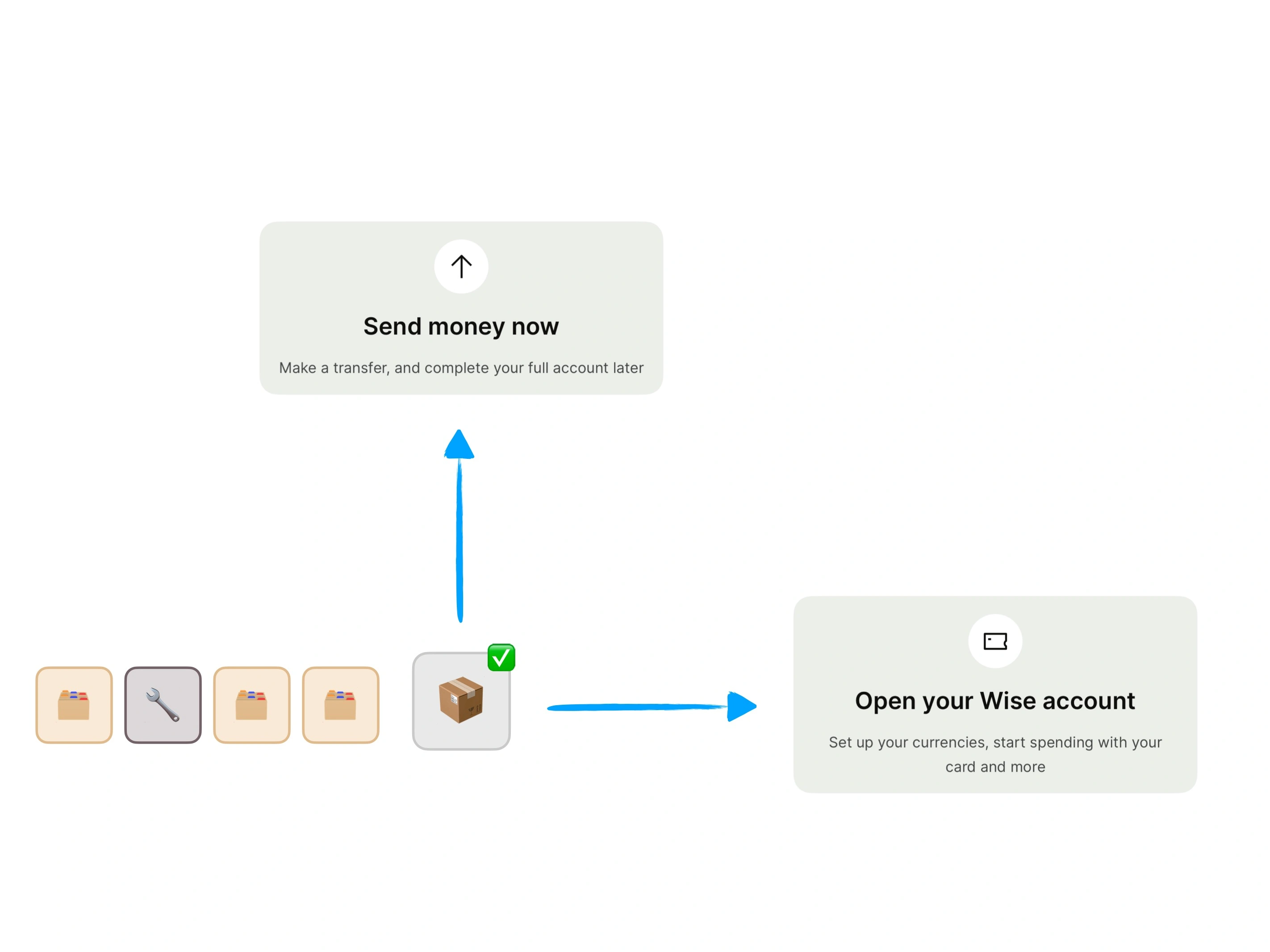
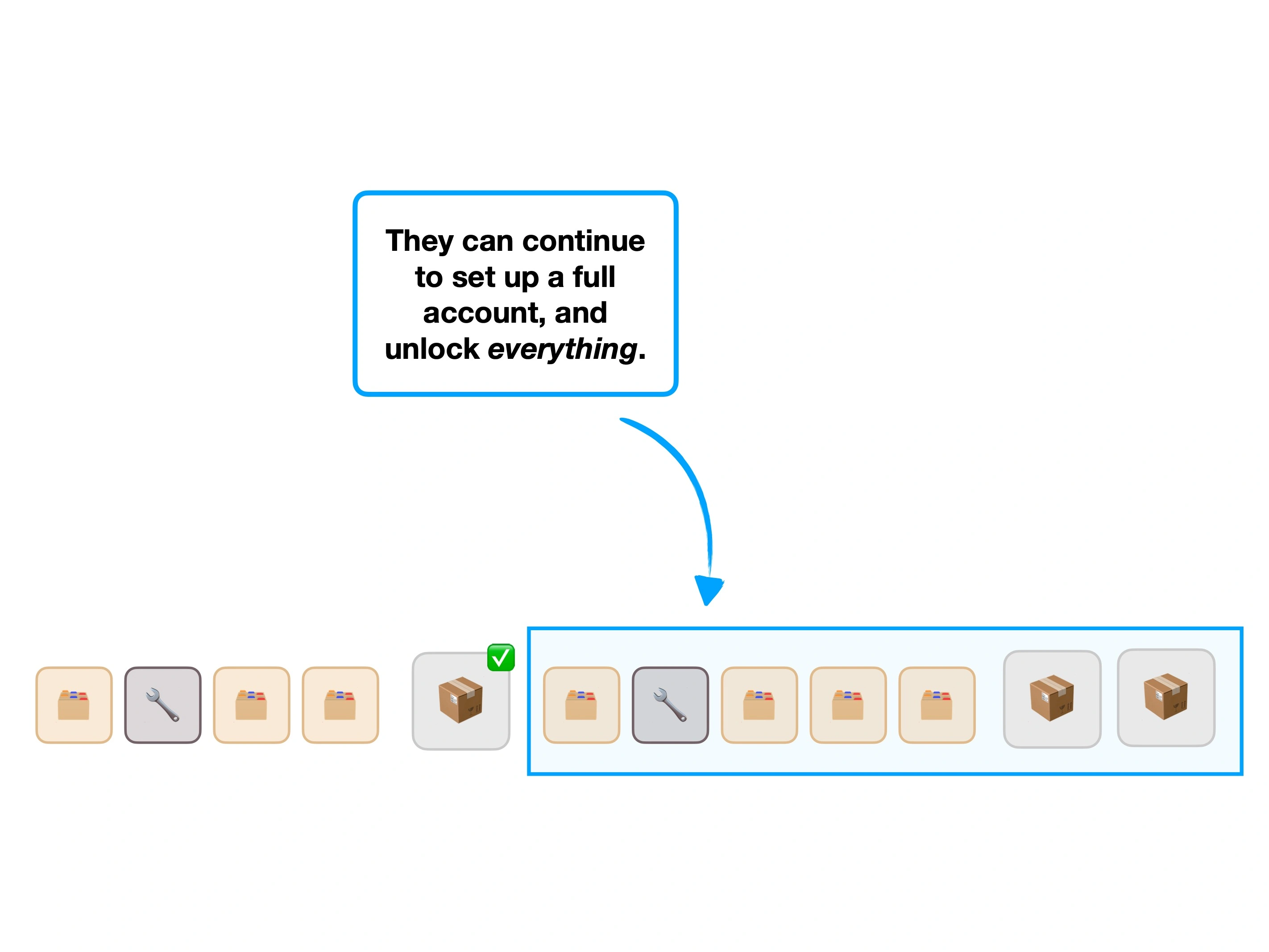
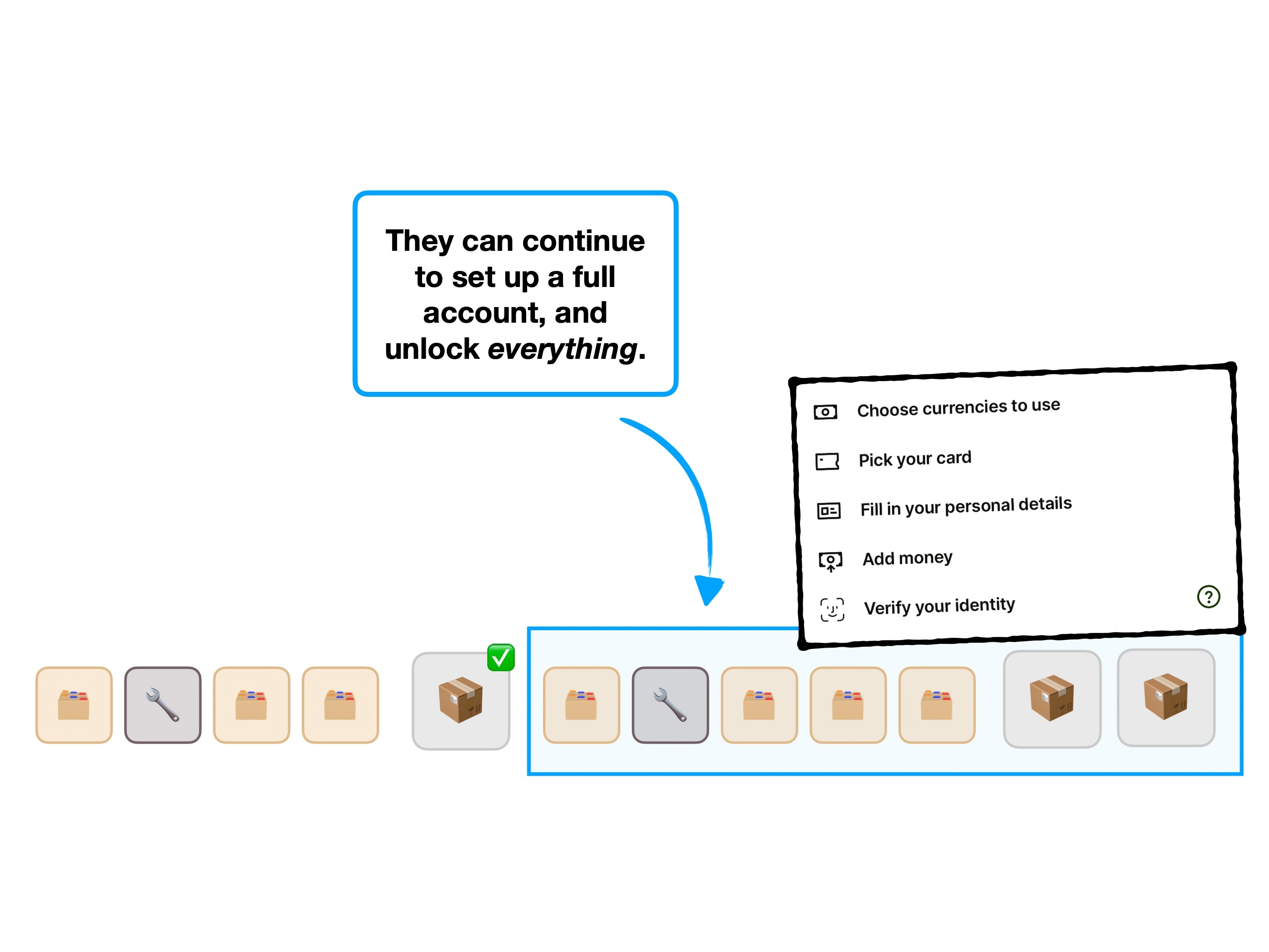

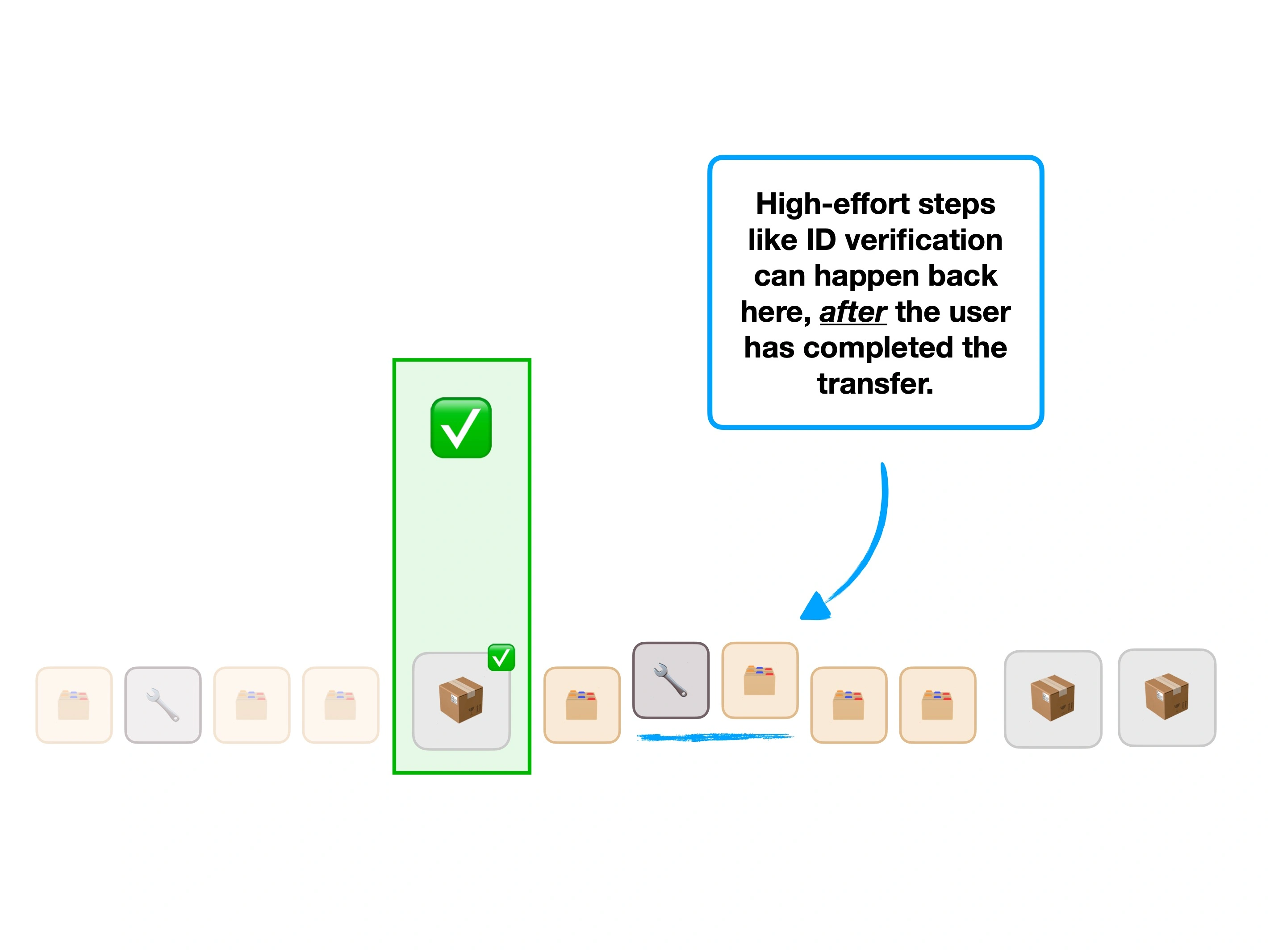
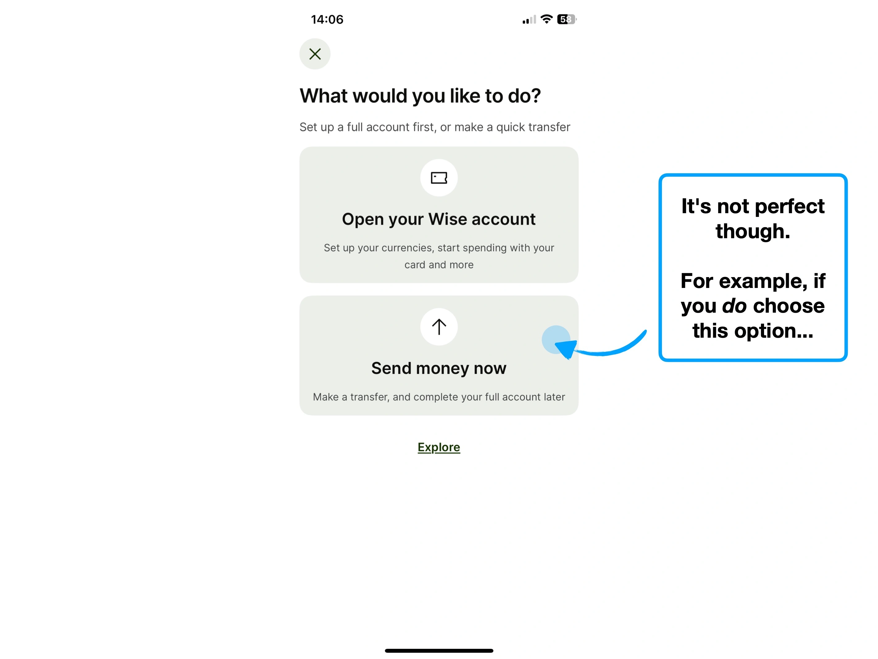
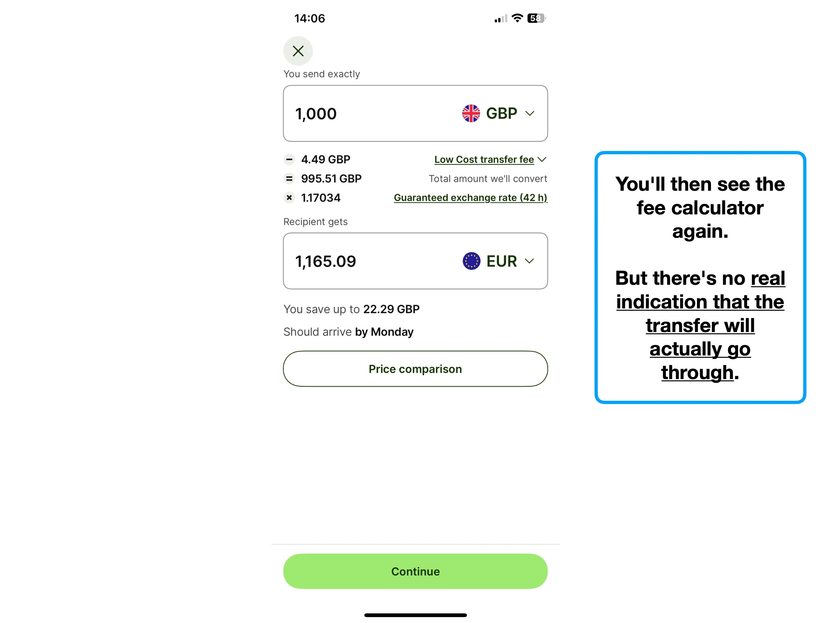
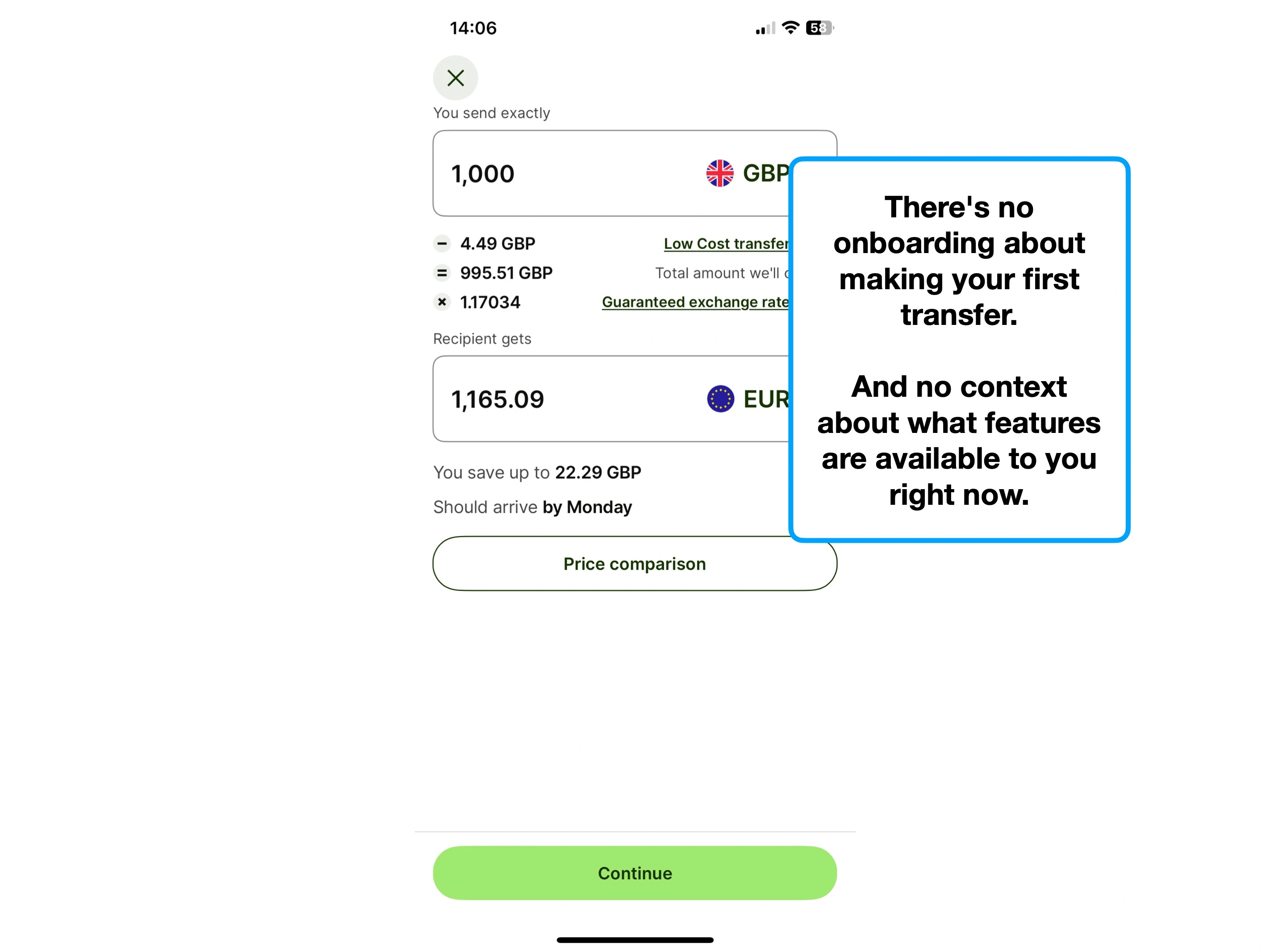
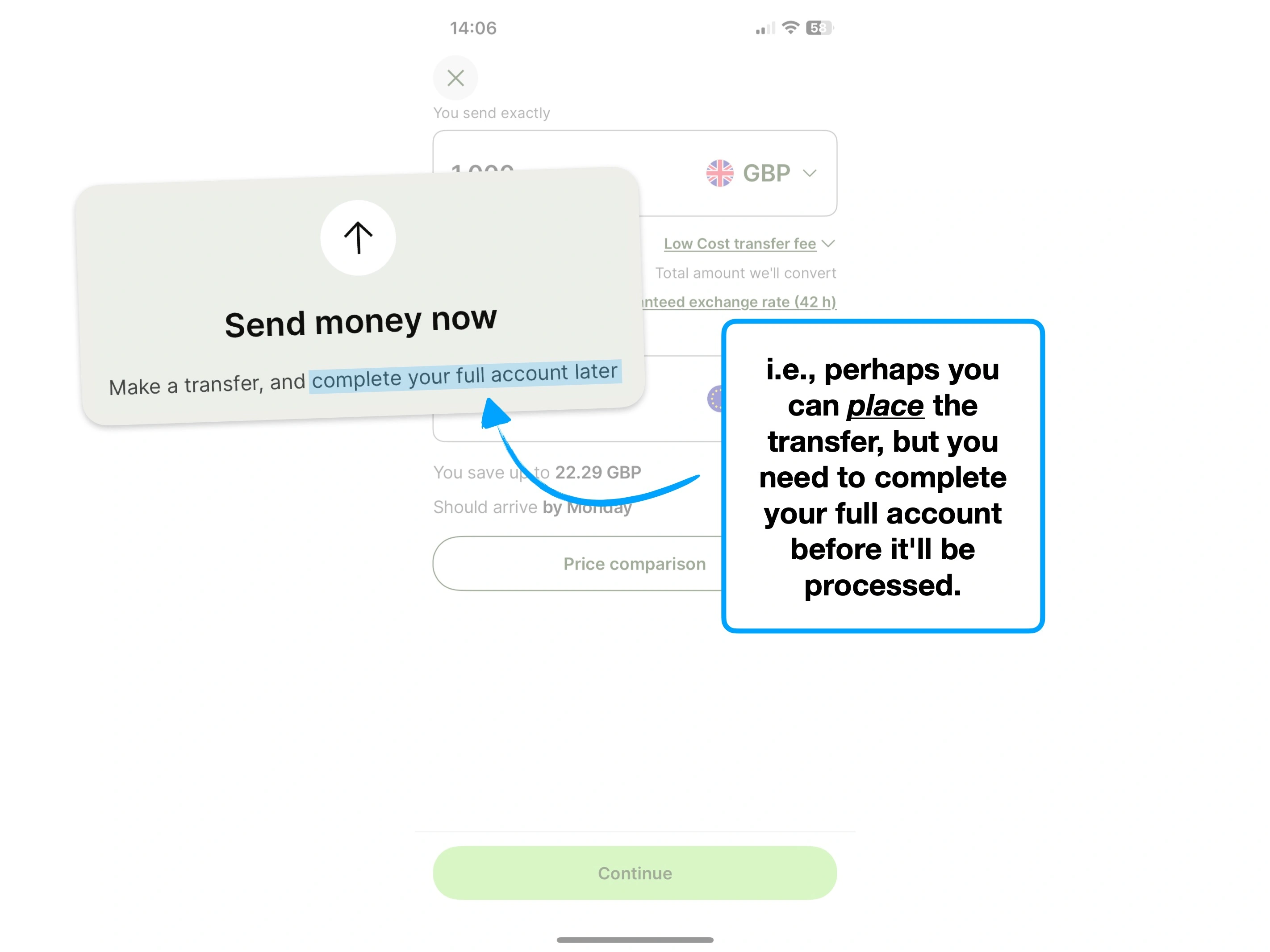
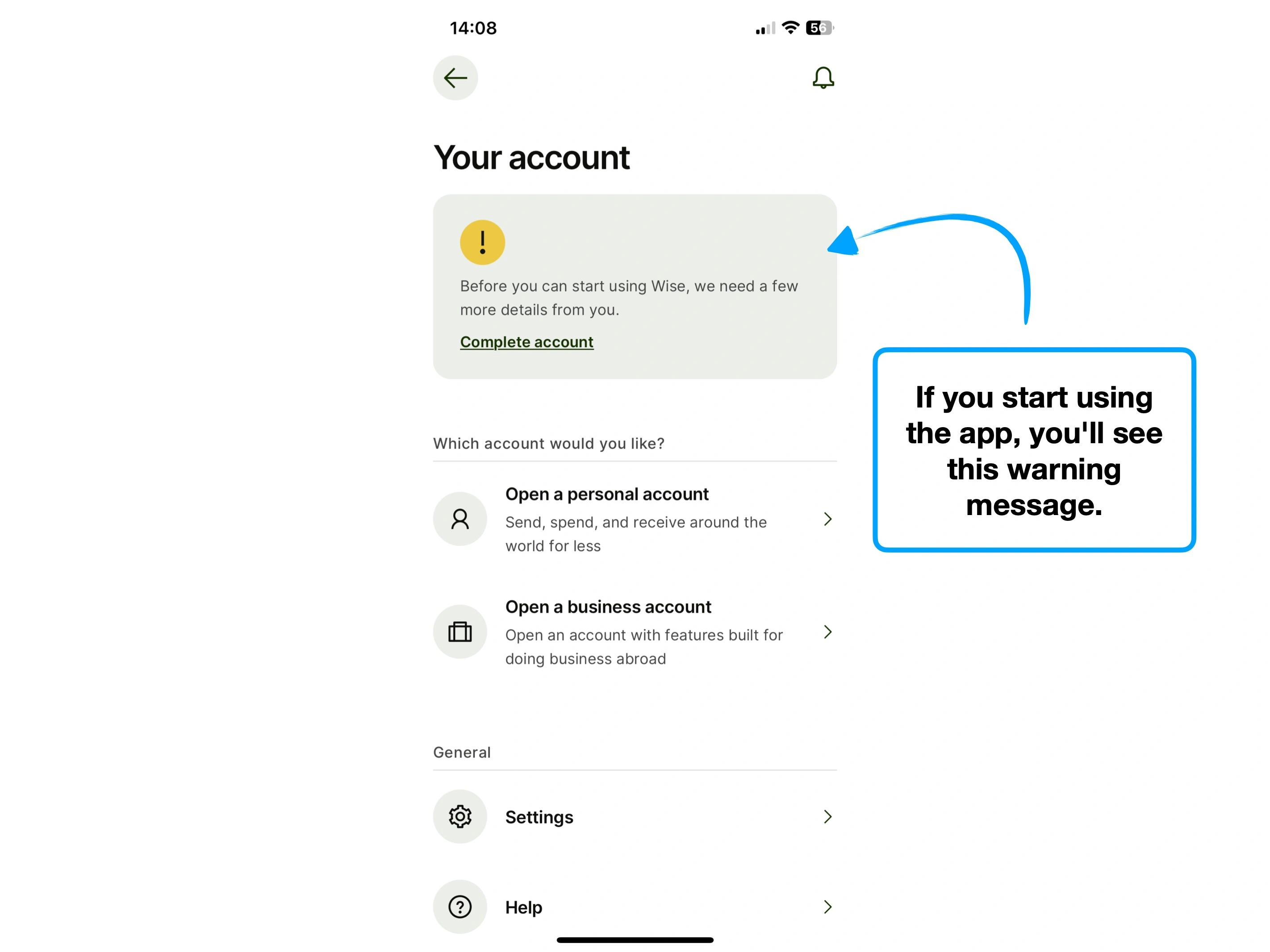
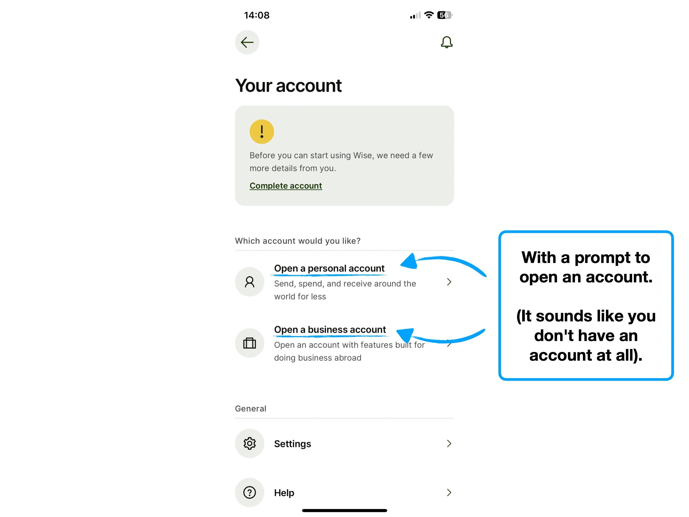
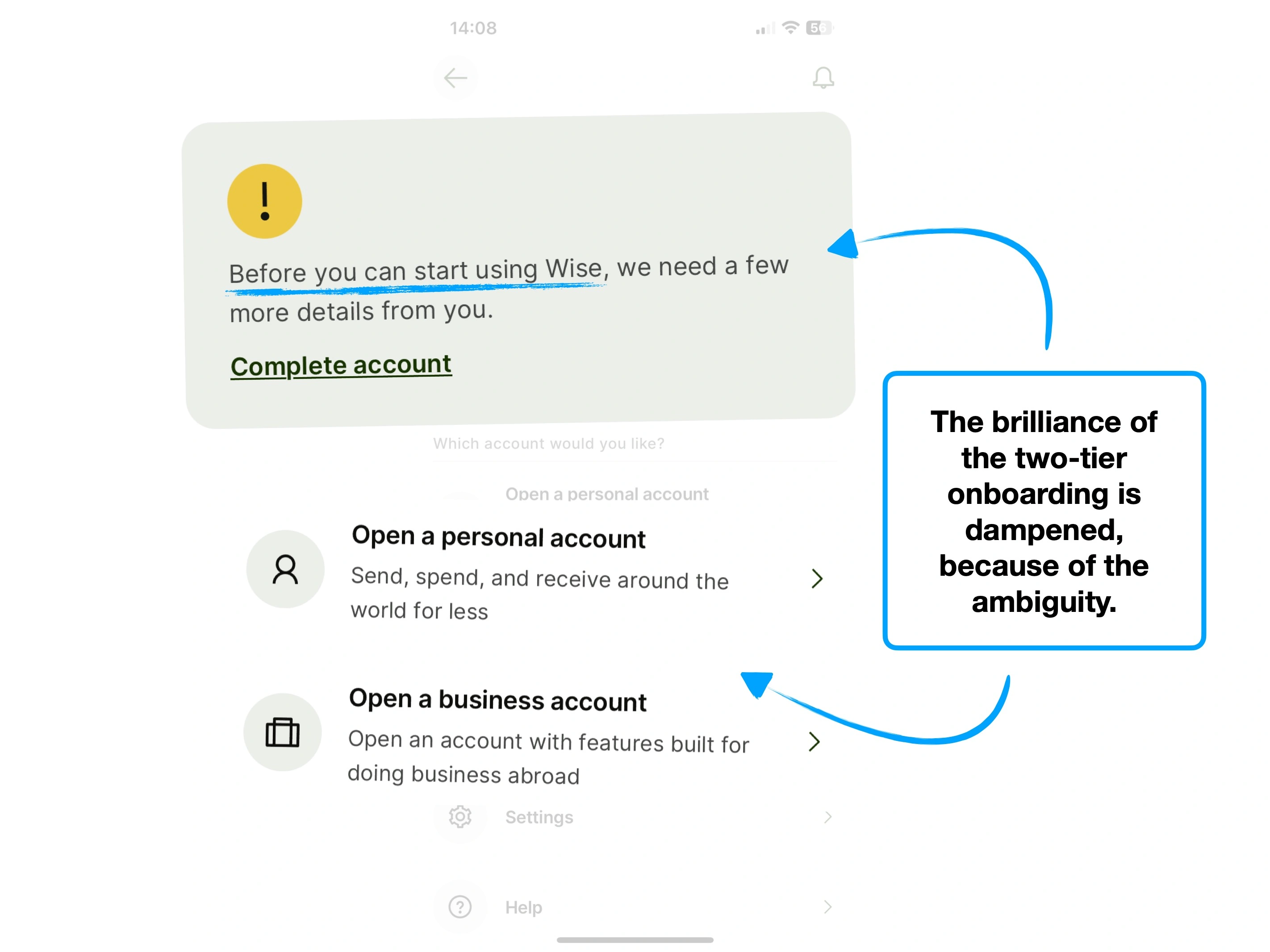
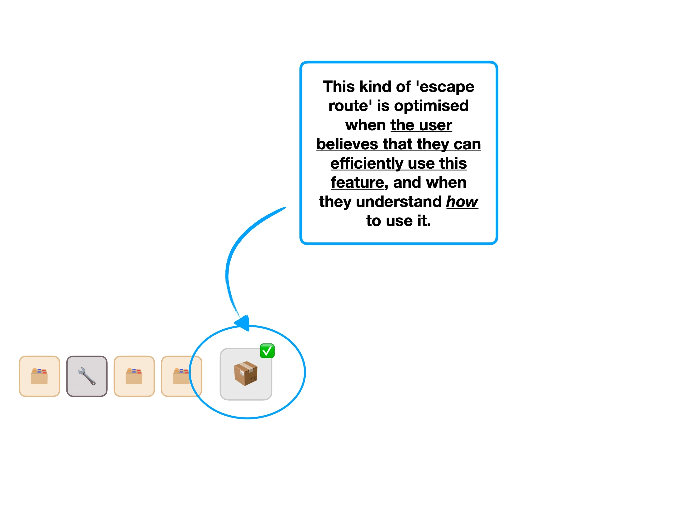
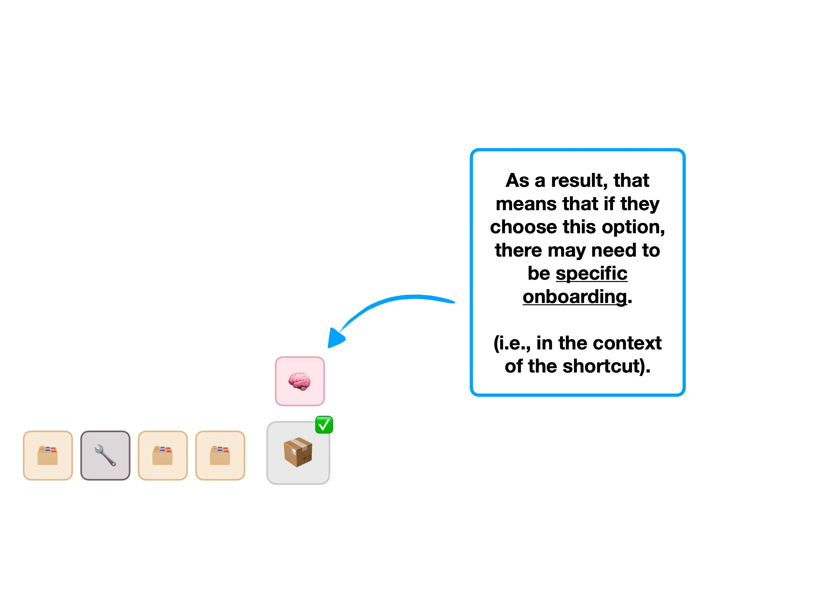
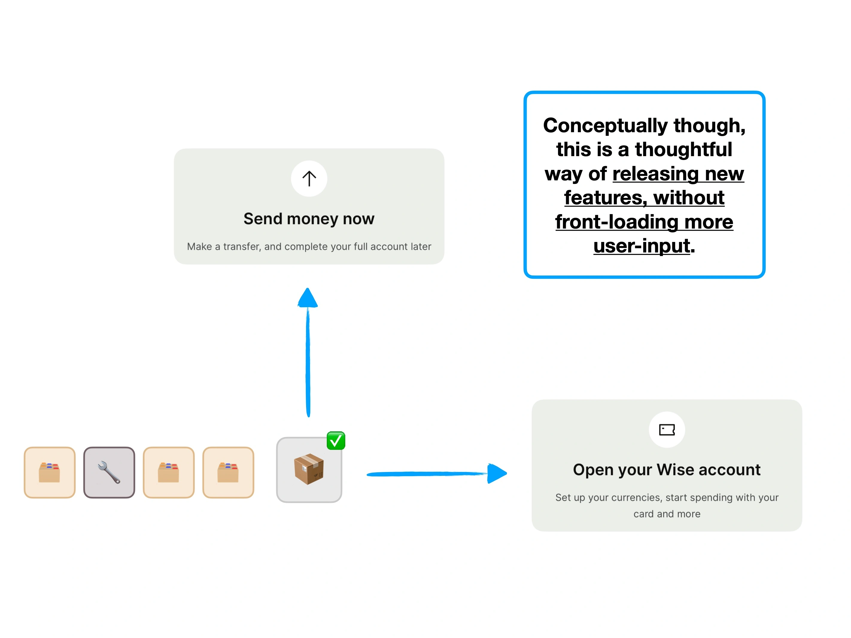

As you saw in the case study, Wise have channeled the user's intent to optimise the journey.
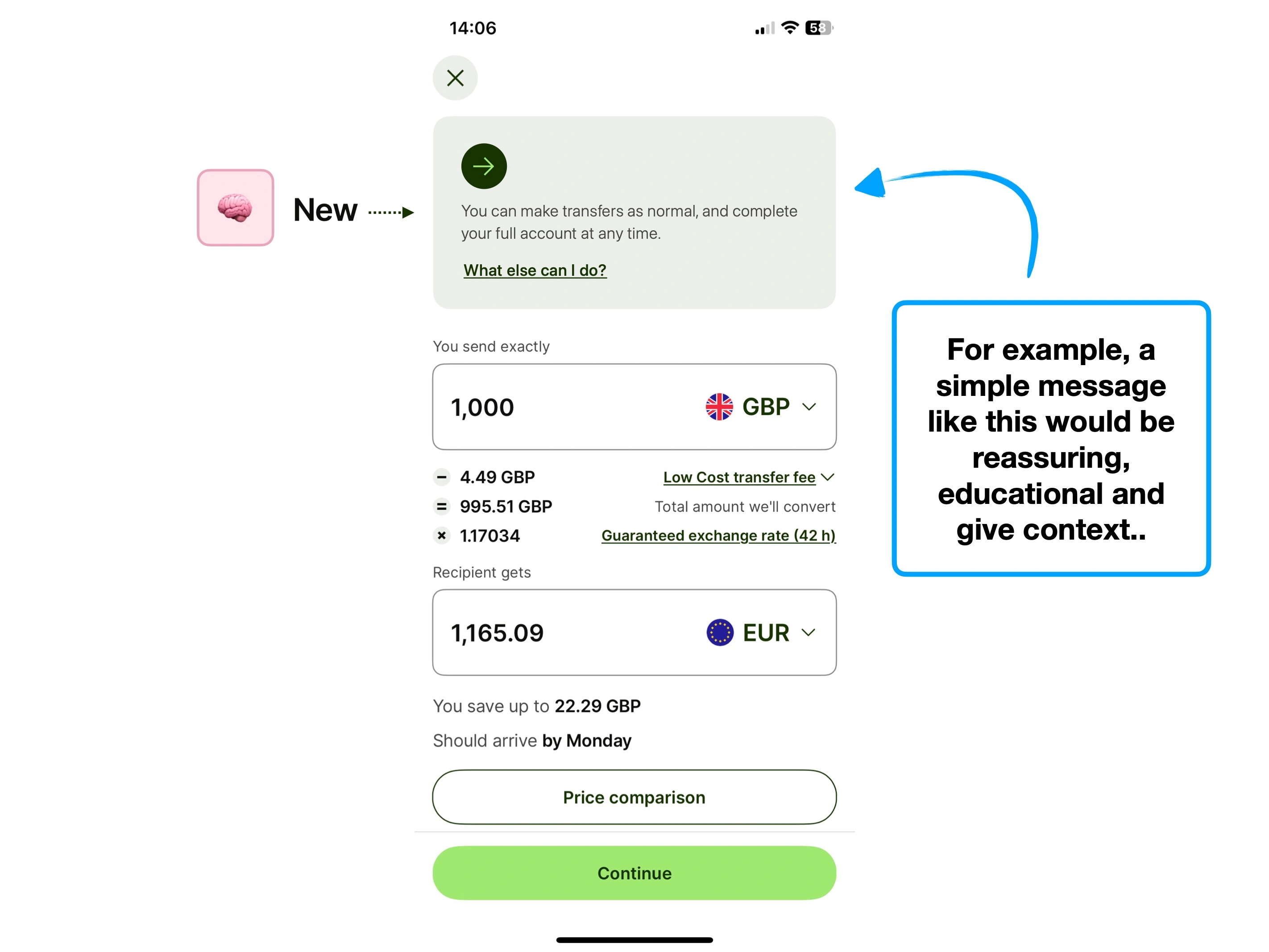
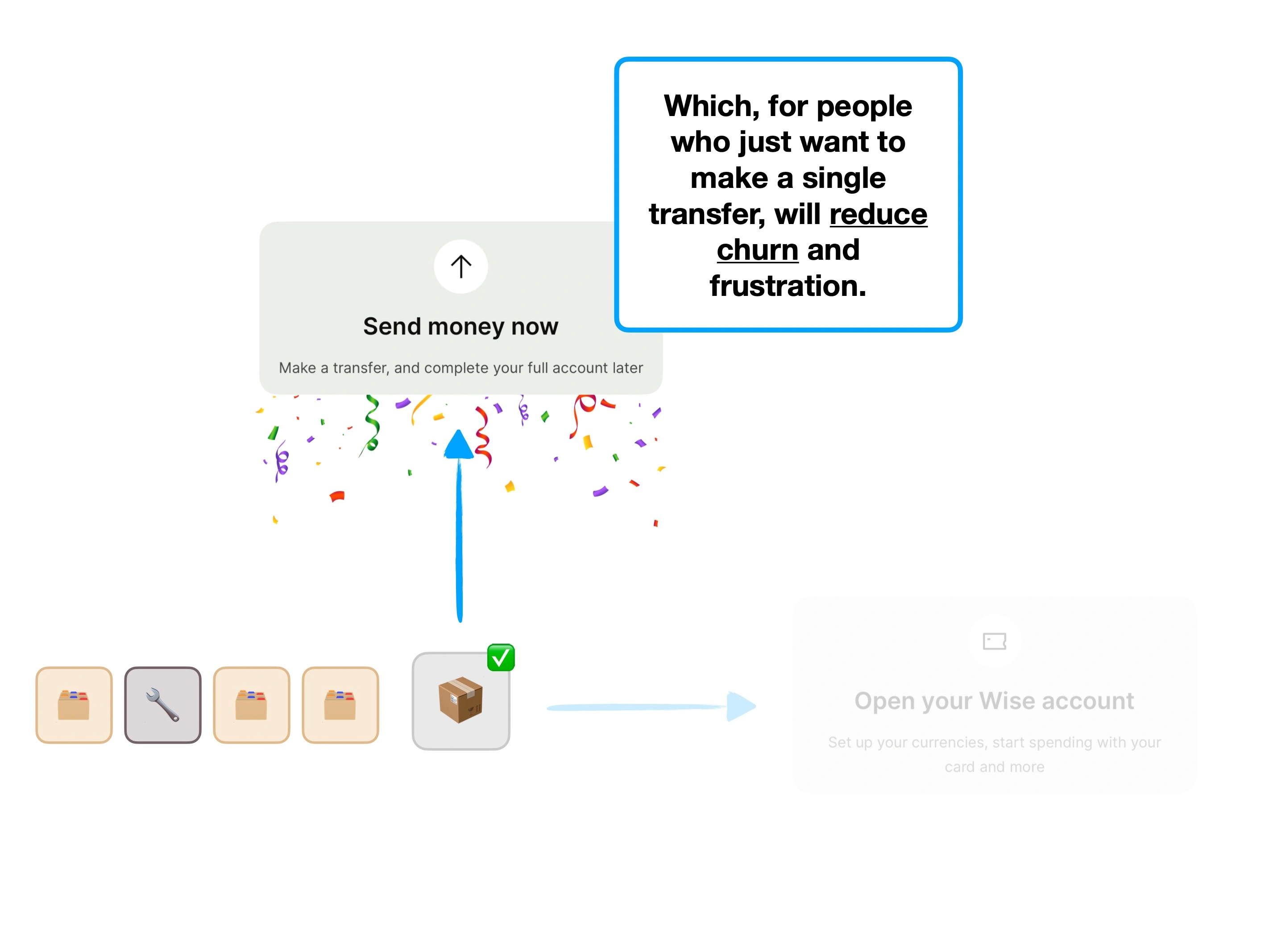
For those who want to make a single transfer, the experience is lightweight and unencumbered by unnecessary verification steps.
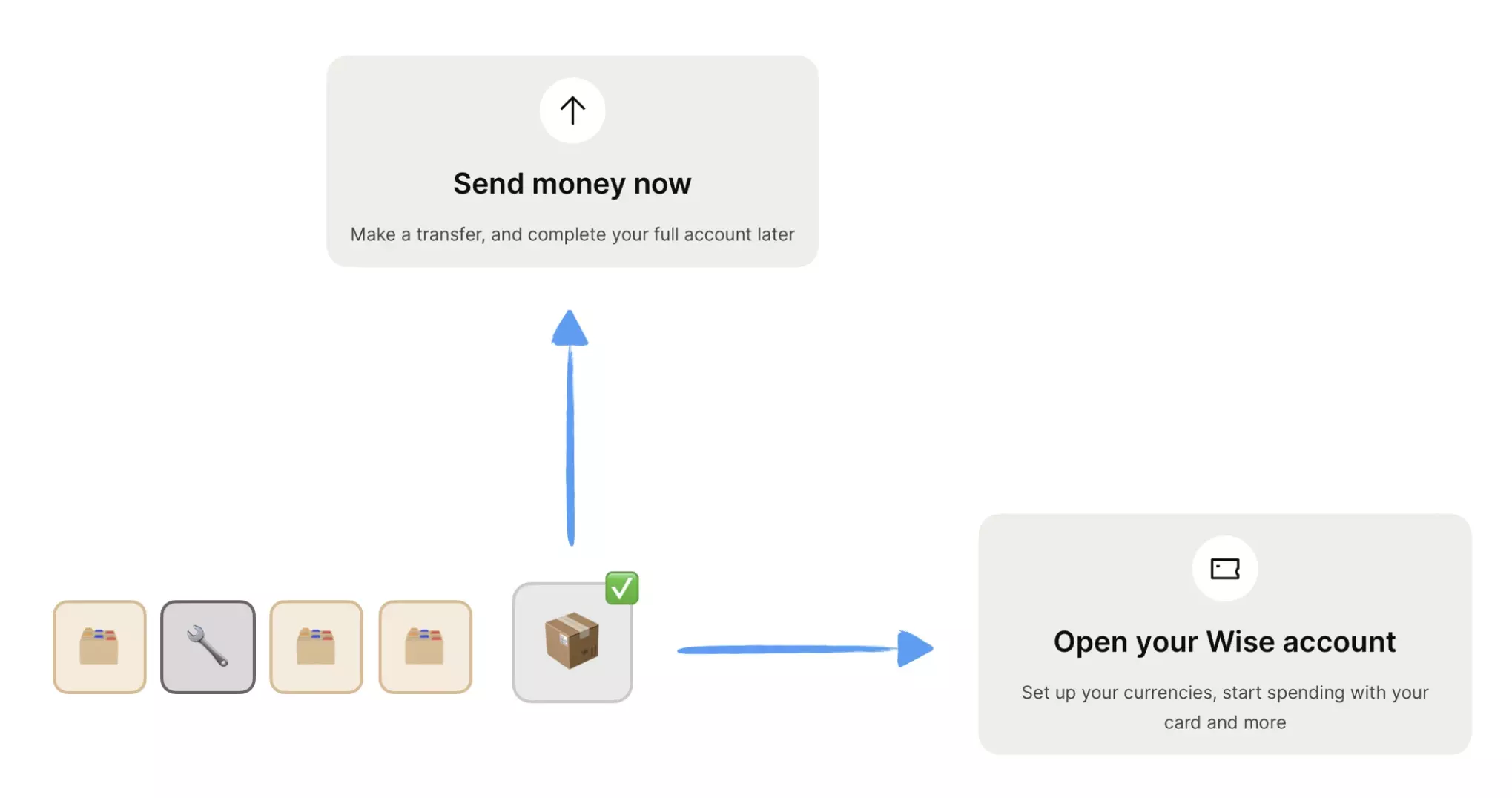
Executing a dynamic sign-up this well, is hard.
But conceptually, it can be applicable across a wide variety of products, and should be a longer-term strategy for capable product teams.
🚴♀️
Strava (cycling)
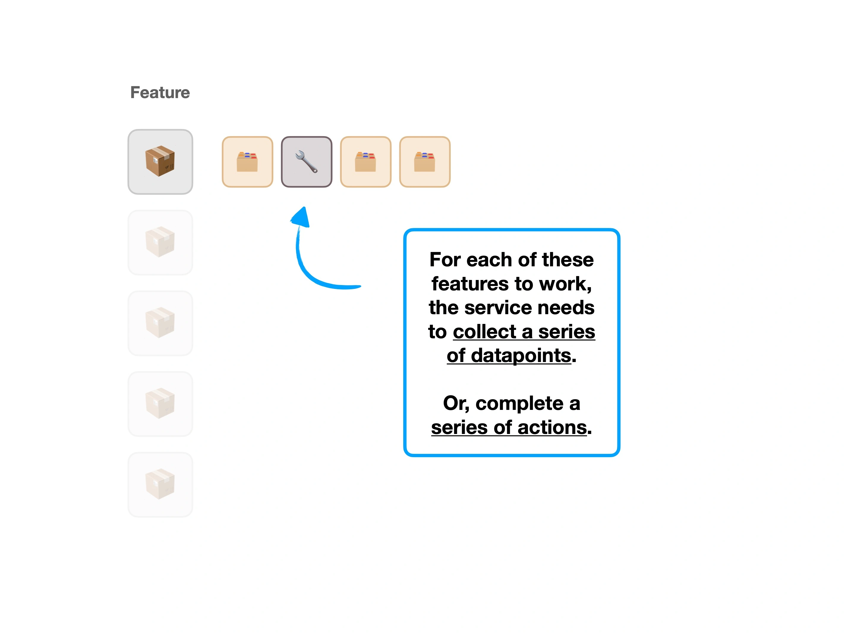
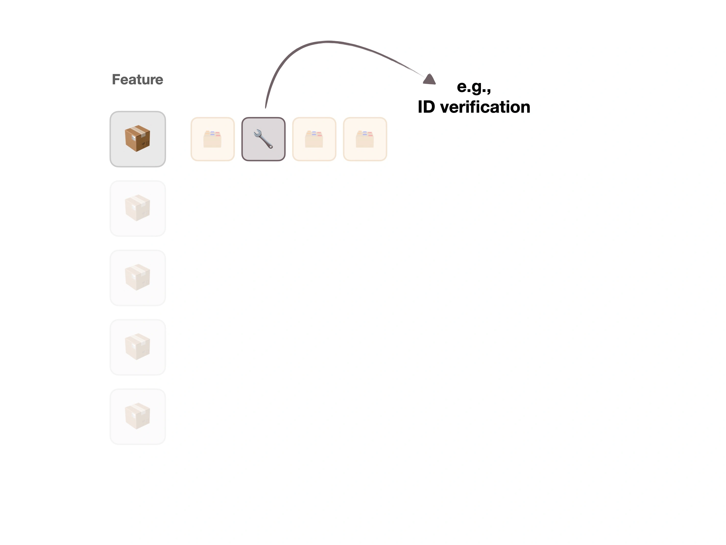
Riders might want to hop on their bike before completing their account (i.e., adding a profile picture, or setting long-term goals).
🎮
Gaming
People may be desperate to jump into a single-player mode, before creating an online profile (and completing verification) to play with friends.
📒
Audible
Listeners may have a specific book that they want to listen to immediately, before inputting previous books into a recommendation engine.
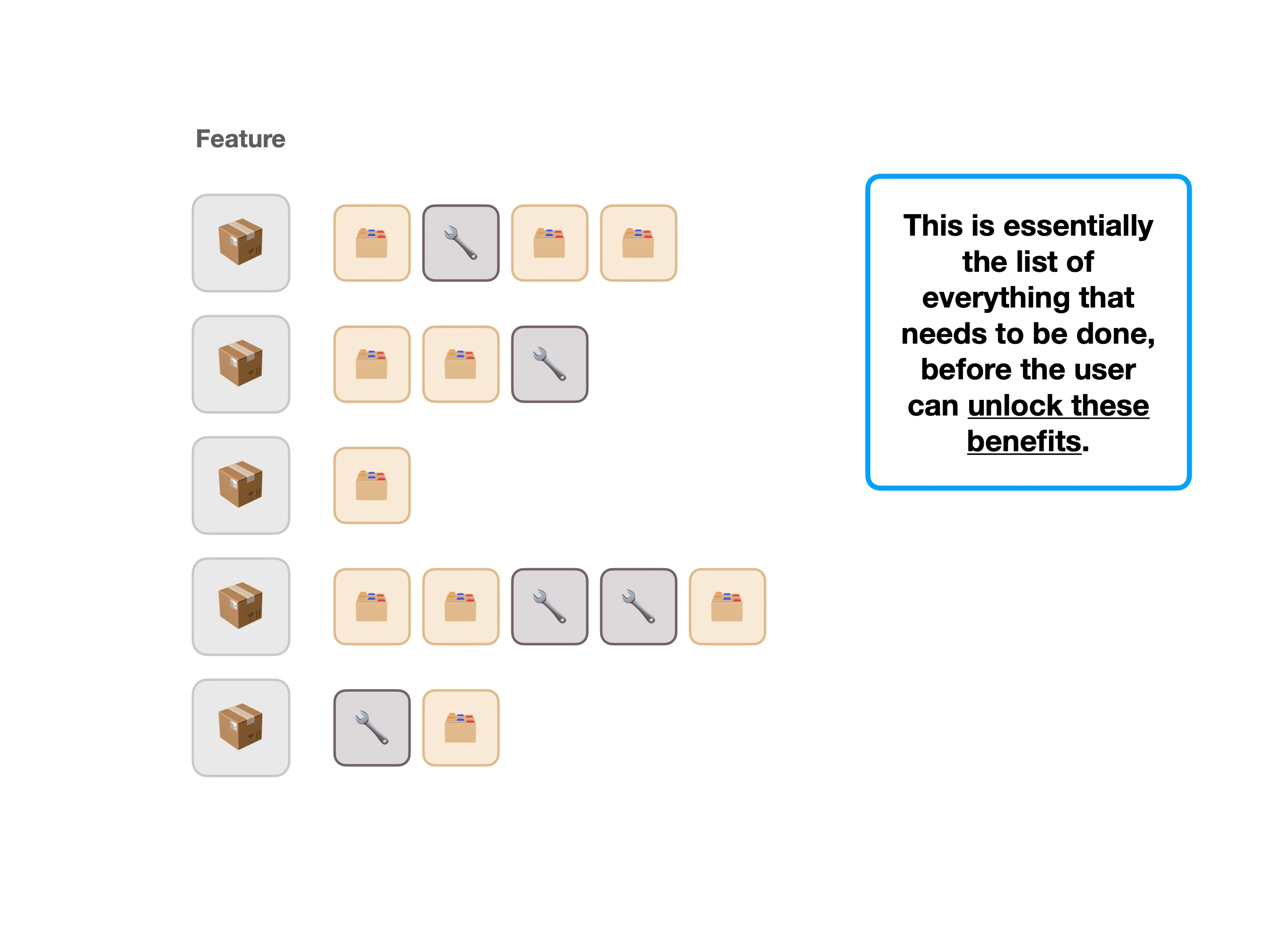
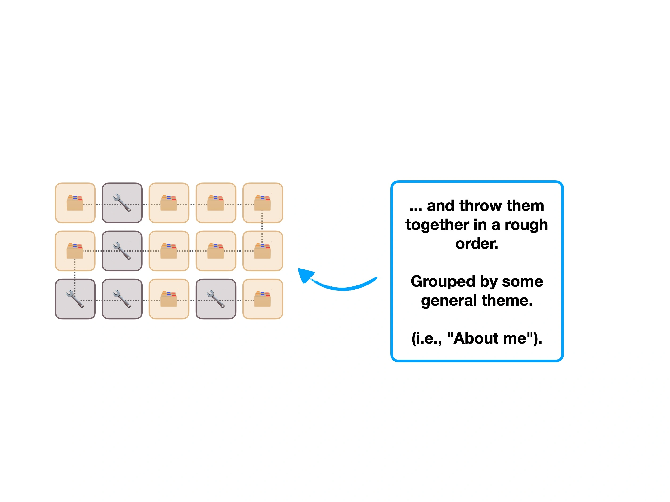
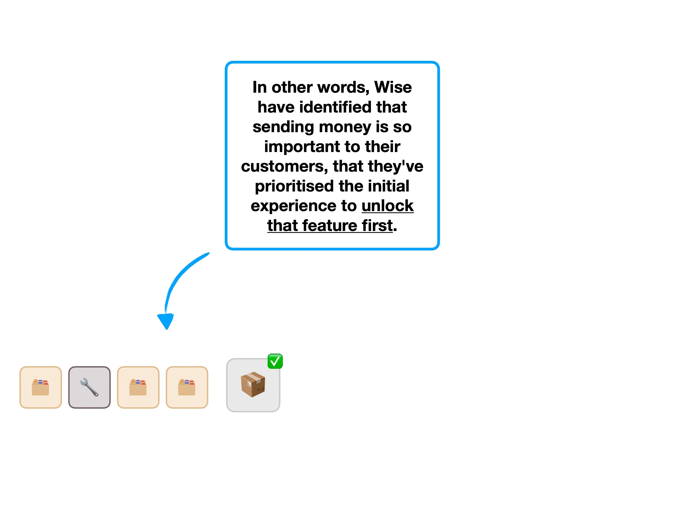
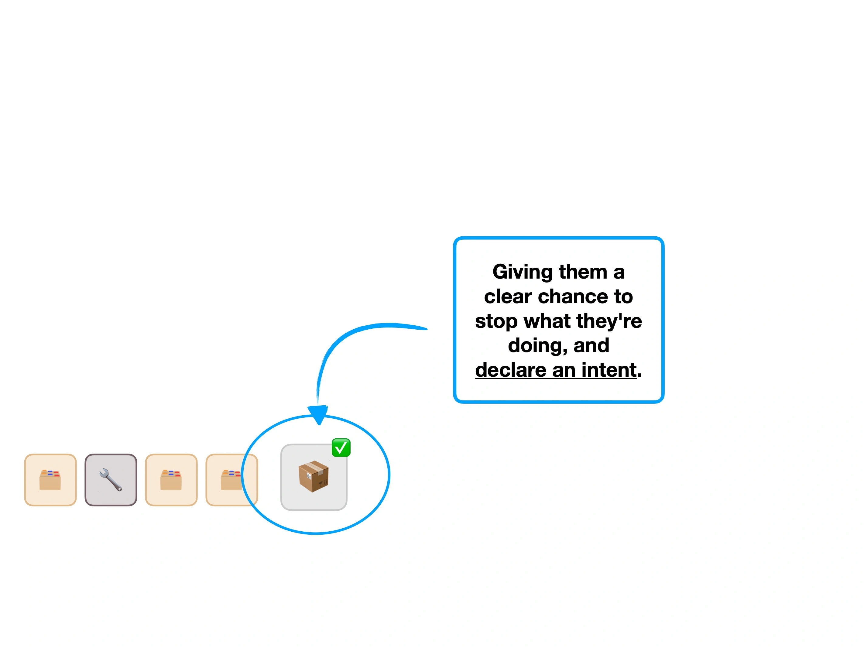
It's not that the second-order features are even less interesting, but rather that some users will be using the service with a clear intent.
It's about delivering value, and reaching that 🎉 Aha! Moment as early as possible.
It's easy to overlook the benefits of a comfortable flight that lands on time.
You may reach your destination without paying much attention to the service that you've received. e.g., the lack of a delay means that you now get to enjoy the day as planned.
How would an airline that specalised in on-time flights, remind desensitised customers that being on-time is still a perk, and not just industry norm?
Wise (and many others) have a similar challenge with the speed of their transfers.
If the fees were transparent, and the recepient received their money, it's easy to overlook the fact that the transfer was almost instant.
Their solution: to give you a precise measure of how quickly the transfer was completed, in your automated confirmation email.
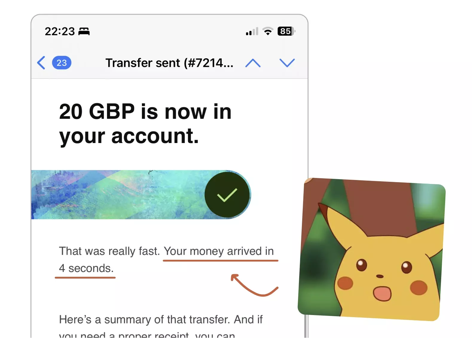
I asked Wise, and I'm told that this isn't an arbitary number, but is actually how fast that specific transfer was.
This subtly encourages the user to reflect on a benefit they've received, after the event has happened.
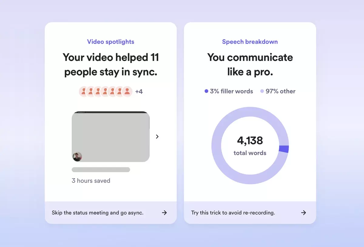
It may help to look at one more example, from a different industry.
Loom also utilise this strategy, by reminding you how many hours you've saved as a team, by not having a meeting.
One of the most impressive elements of the Wise rebrand, has been the integration of personality into otherwise dull actions.
For example, this is their 'pull to refresh' screen:
And, after creating a virtual card, you'll see an animated icon:
"They're cool, but what's the point?"
It's partly brand-building and setting an impression, but also an exercise of 😍 User Delight and trying to create a moment.
In this instance it's unlikely to improve conversion rates, or decrease churn. It's certainly not a reason to leave your current payment provider.
Instead, it's like putting a 'go faster stripe' on your car.
Confetti cannons at the end of a theatre performance didn't make the acting or story any better—it's showmanship.
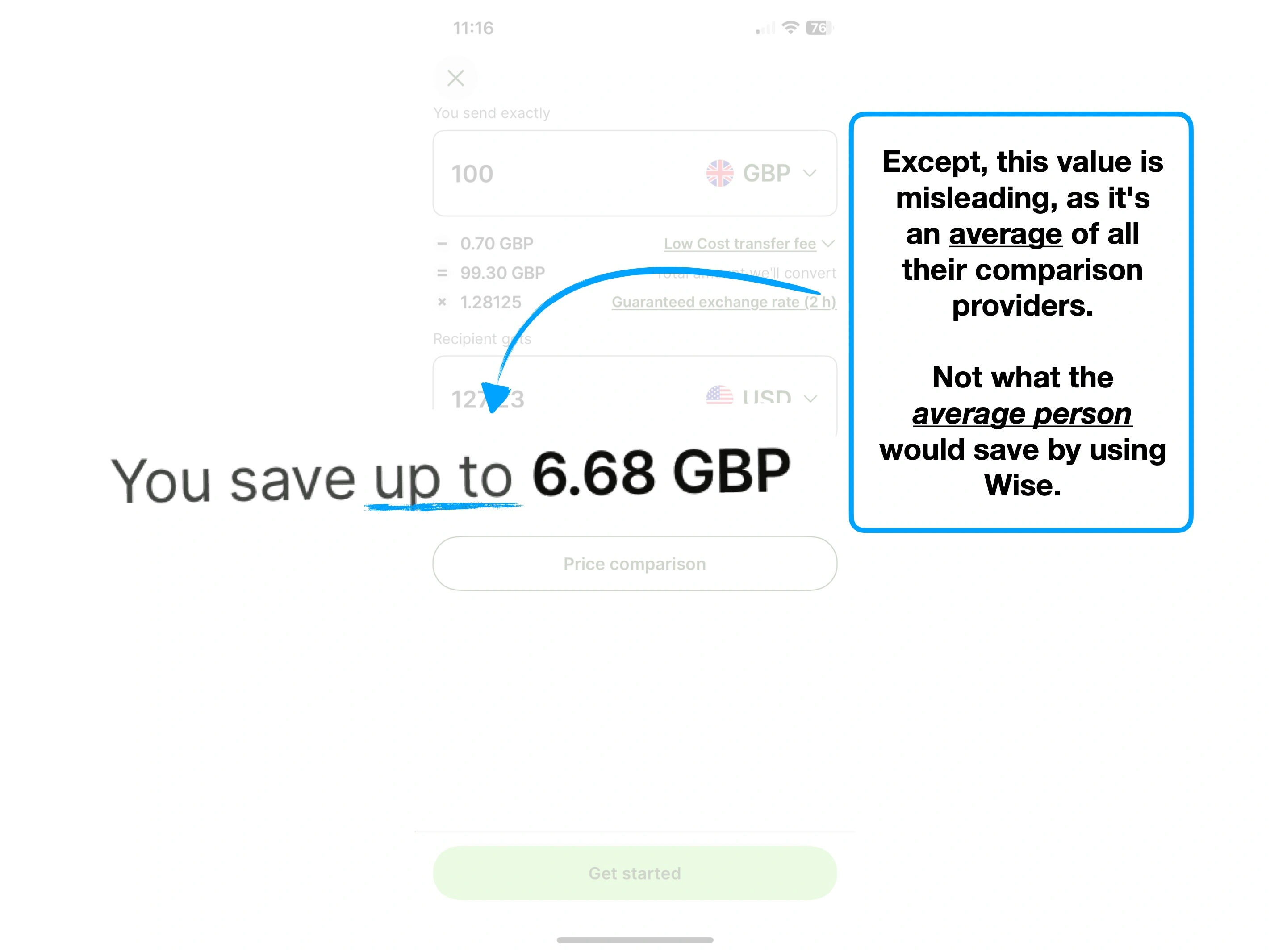
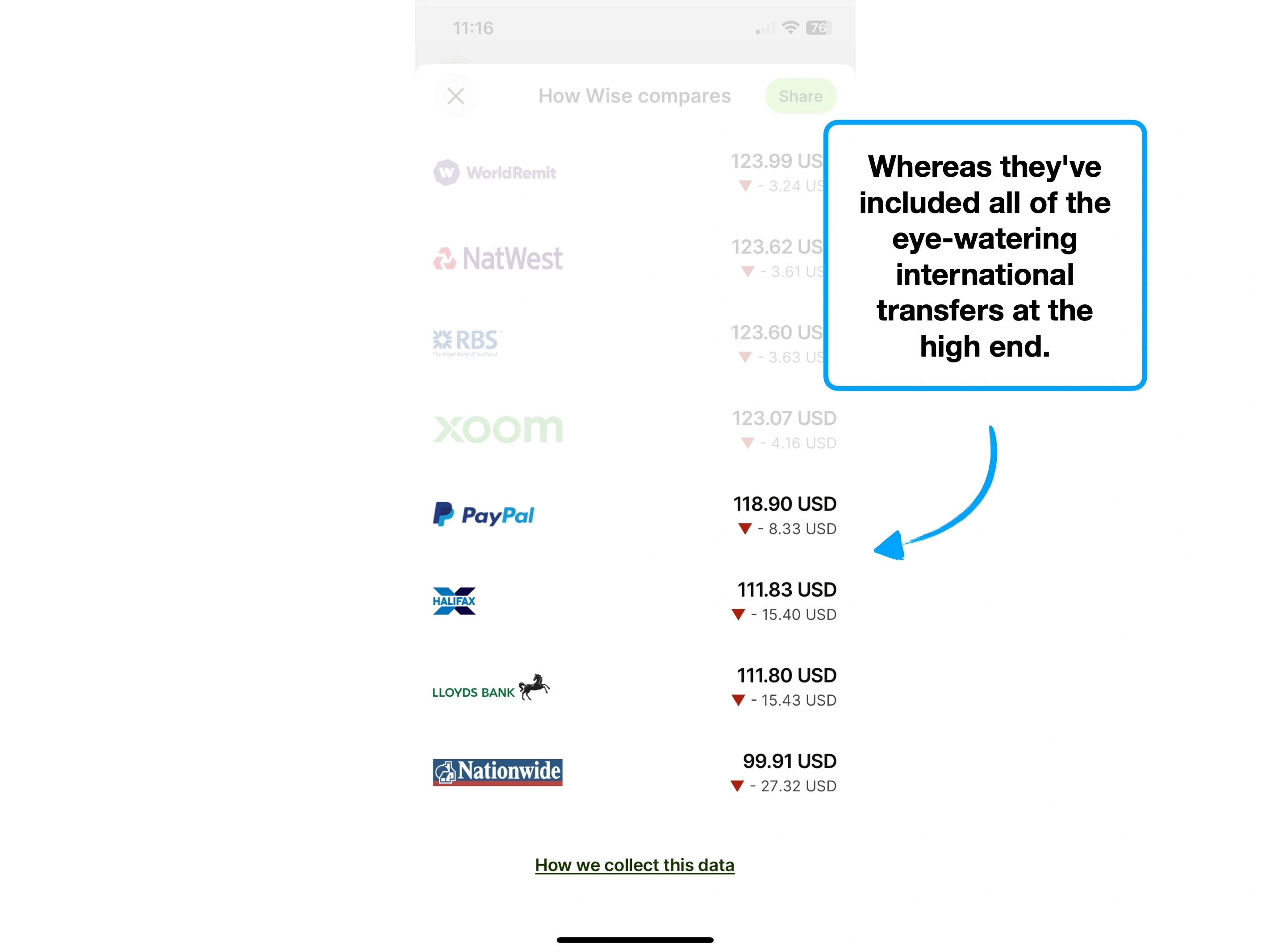
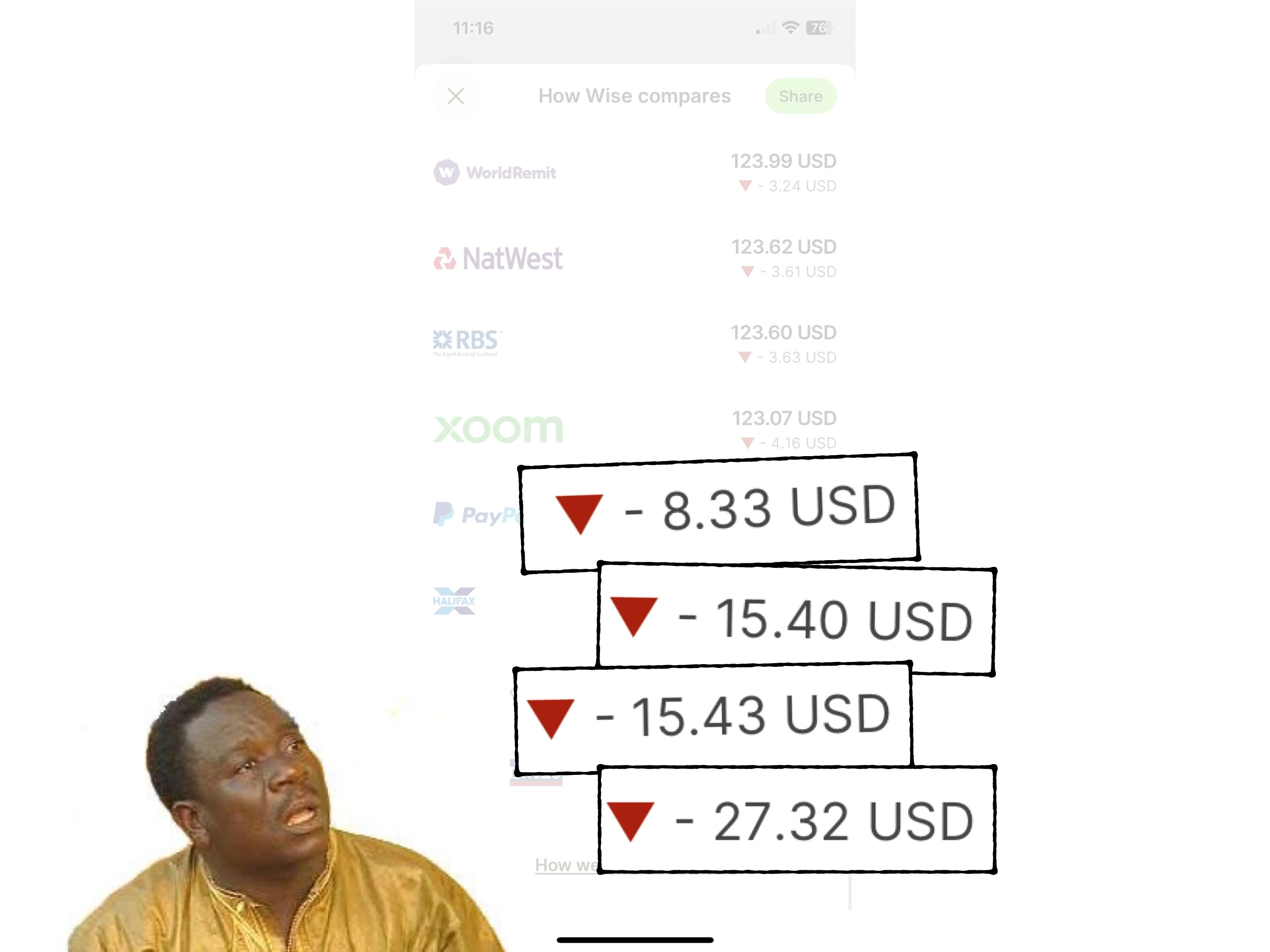
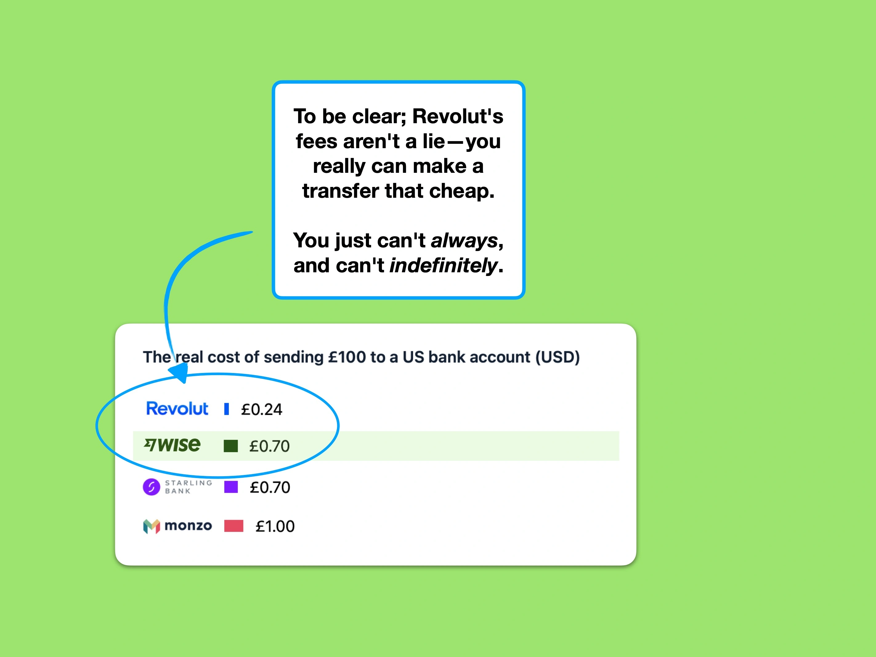
Although I've routinely compared the cost of sending money internationally, it's worth noting that I've simplified the benchmark down to a few specific scenarios.
The messy truth, is that the cost of sending money with these providers depends on currencies, amounts, methods and the combination of fixed and variable costs.
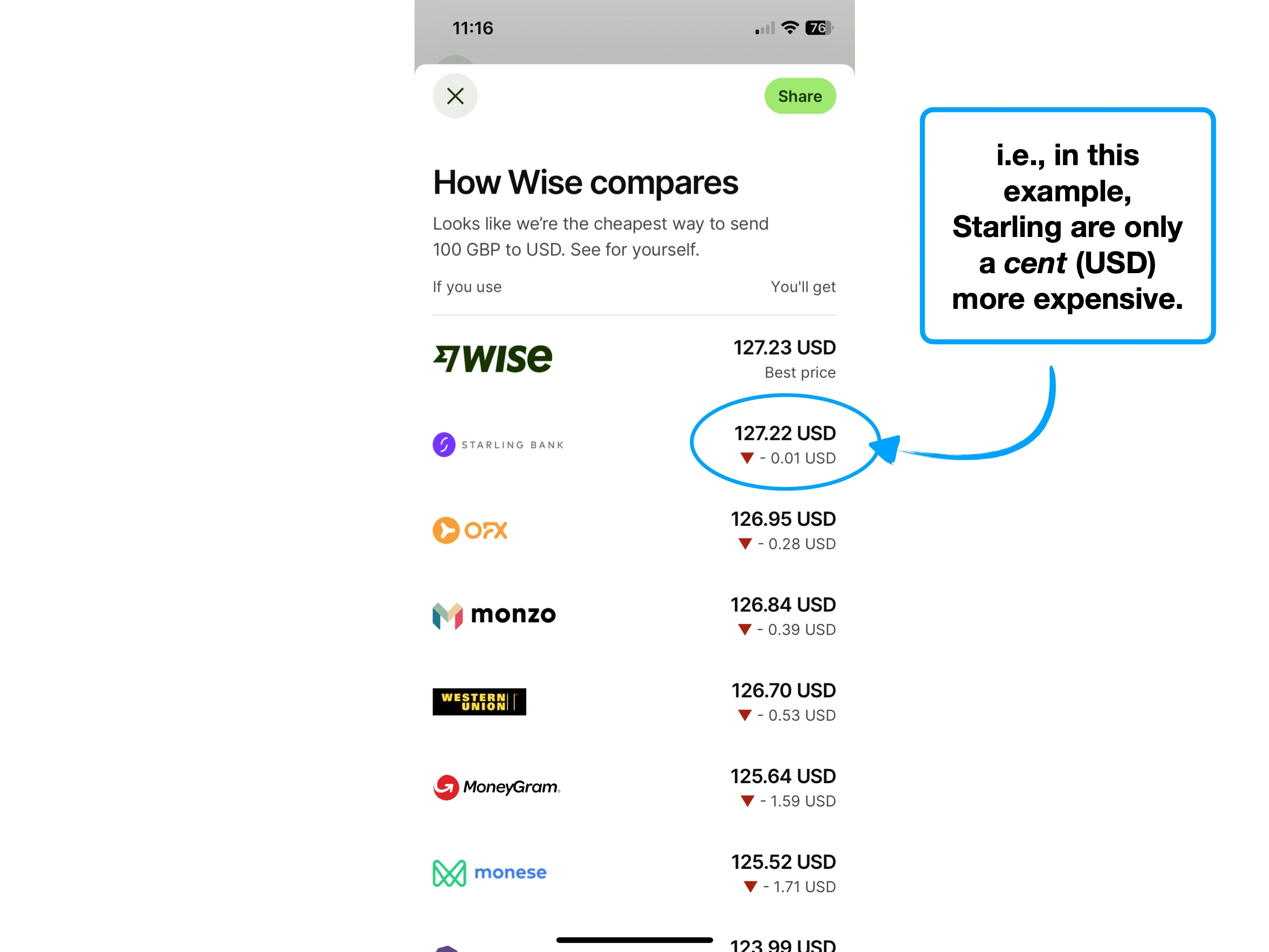
For instance, here are some other charts I could have used, which paint a more nuanced picture:
Sending £10,000 (fee + FX)
Sending £25,000 (fee + FX)
You can see how, in these two examples, Wise are considerably cheaper as the value of the transfer increases (i.e., only changing the parameter of value).
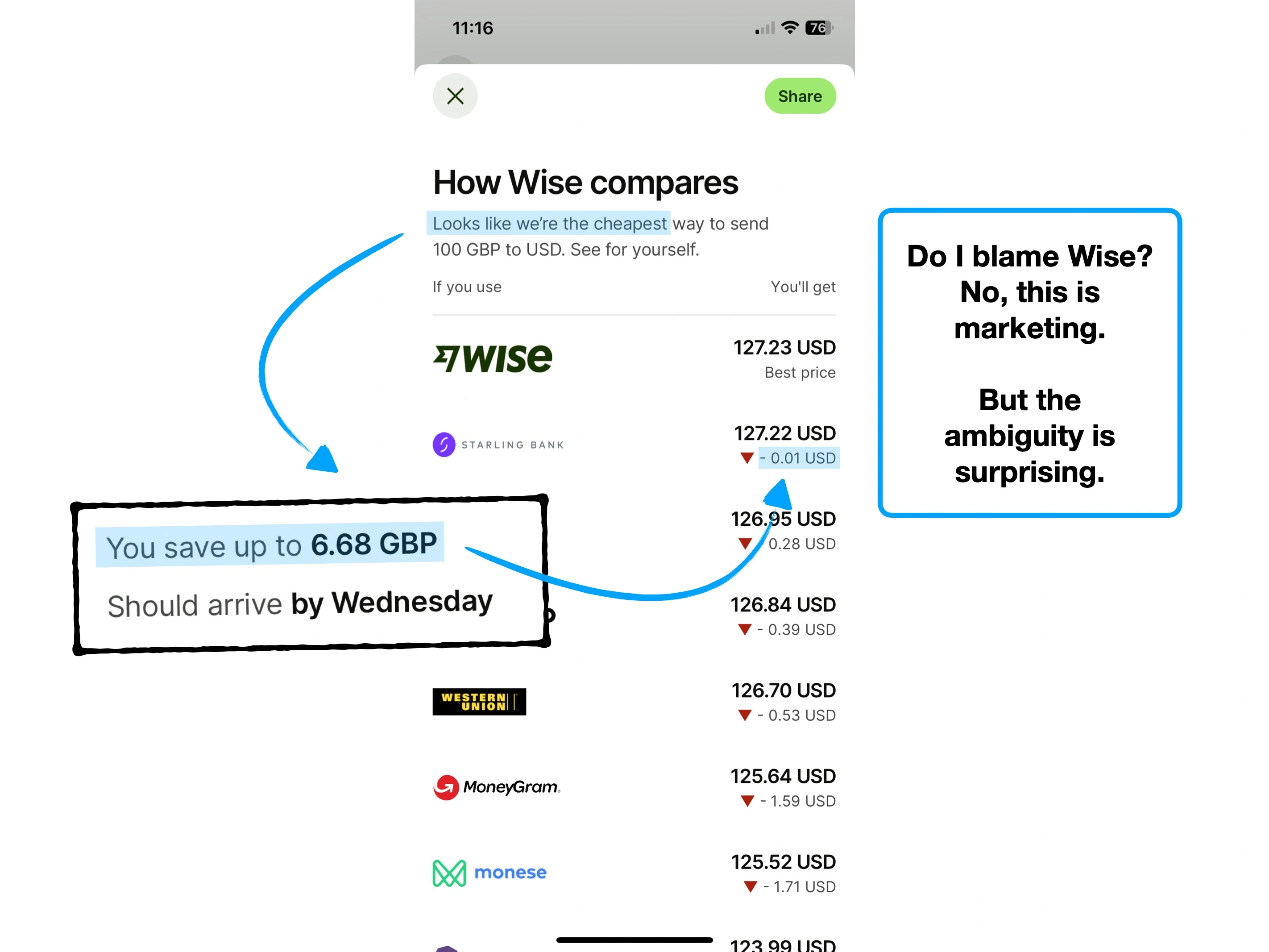
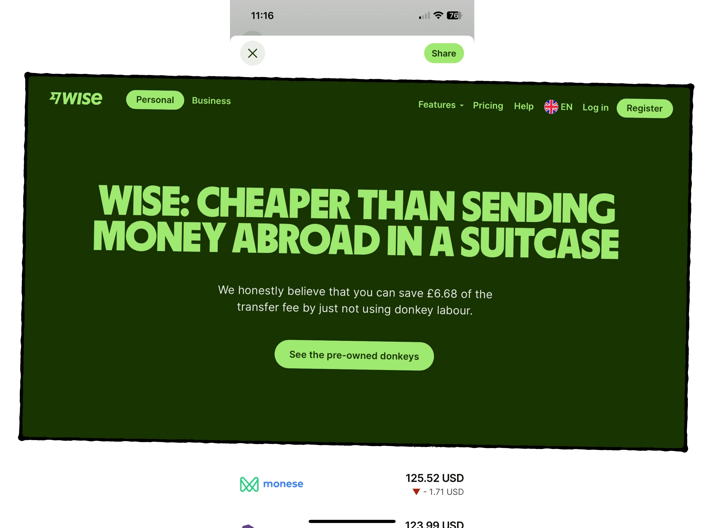
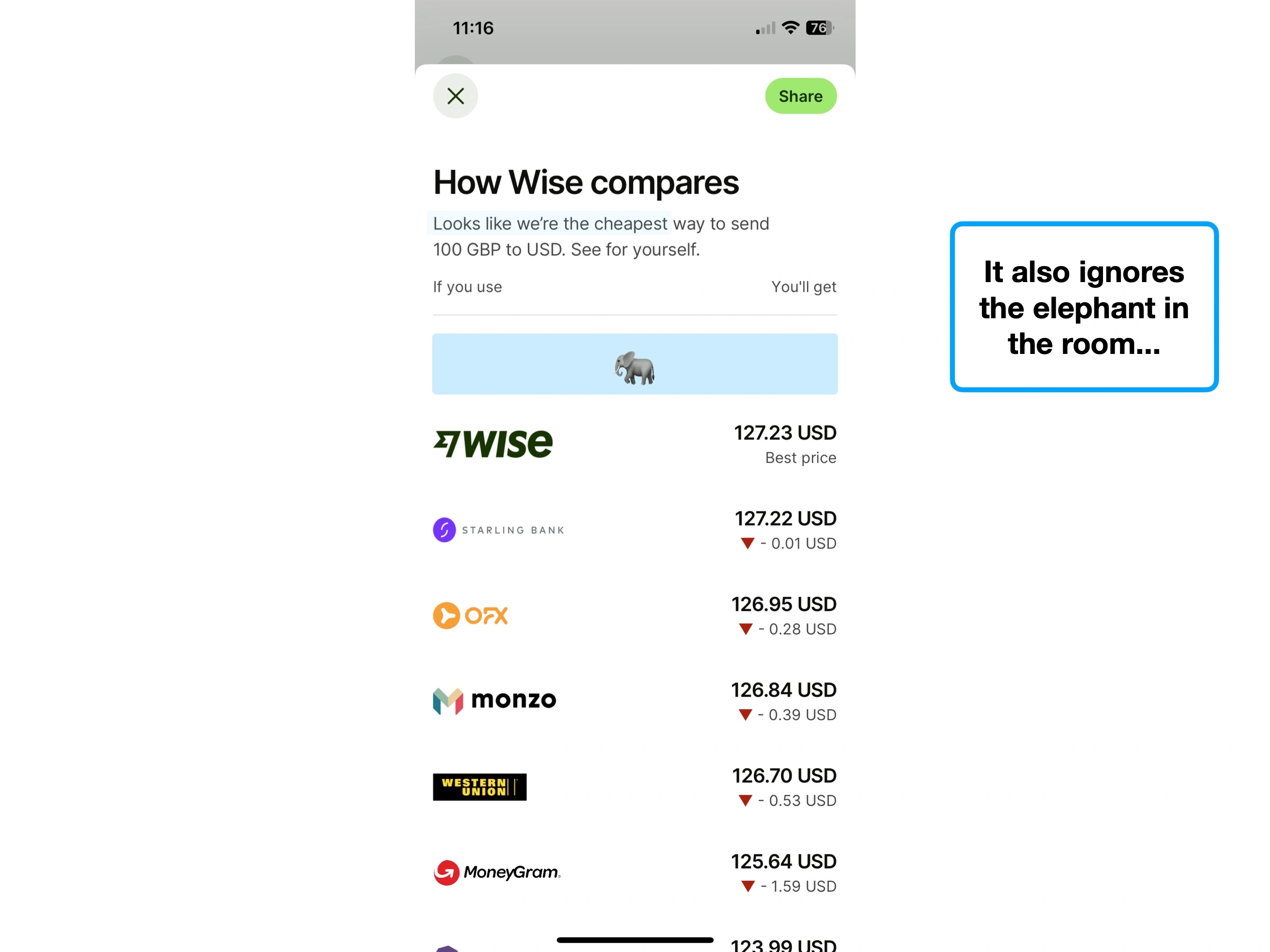
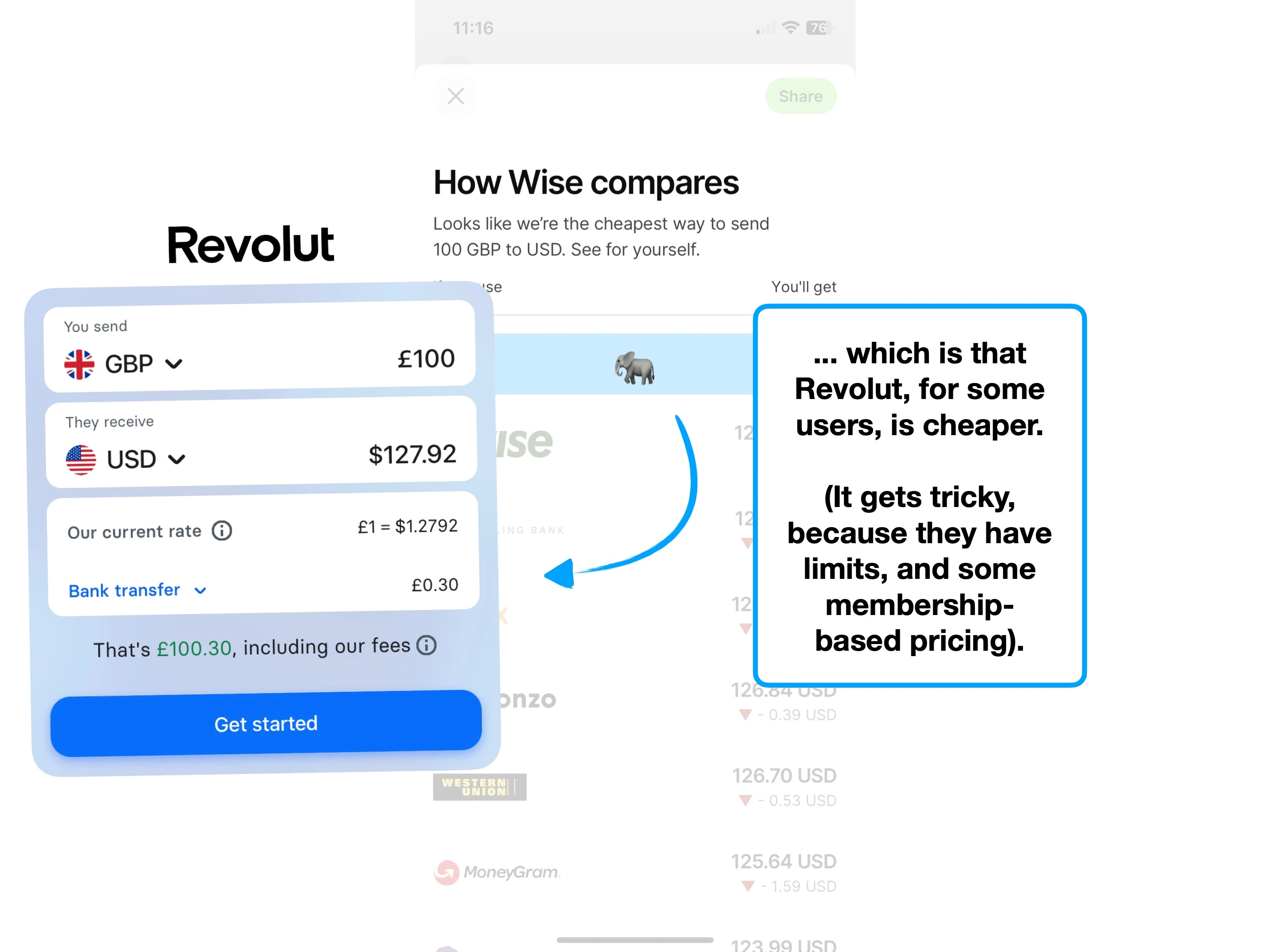
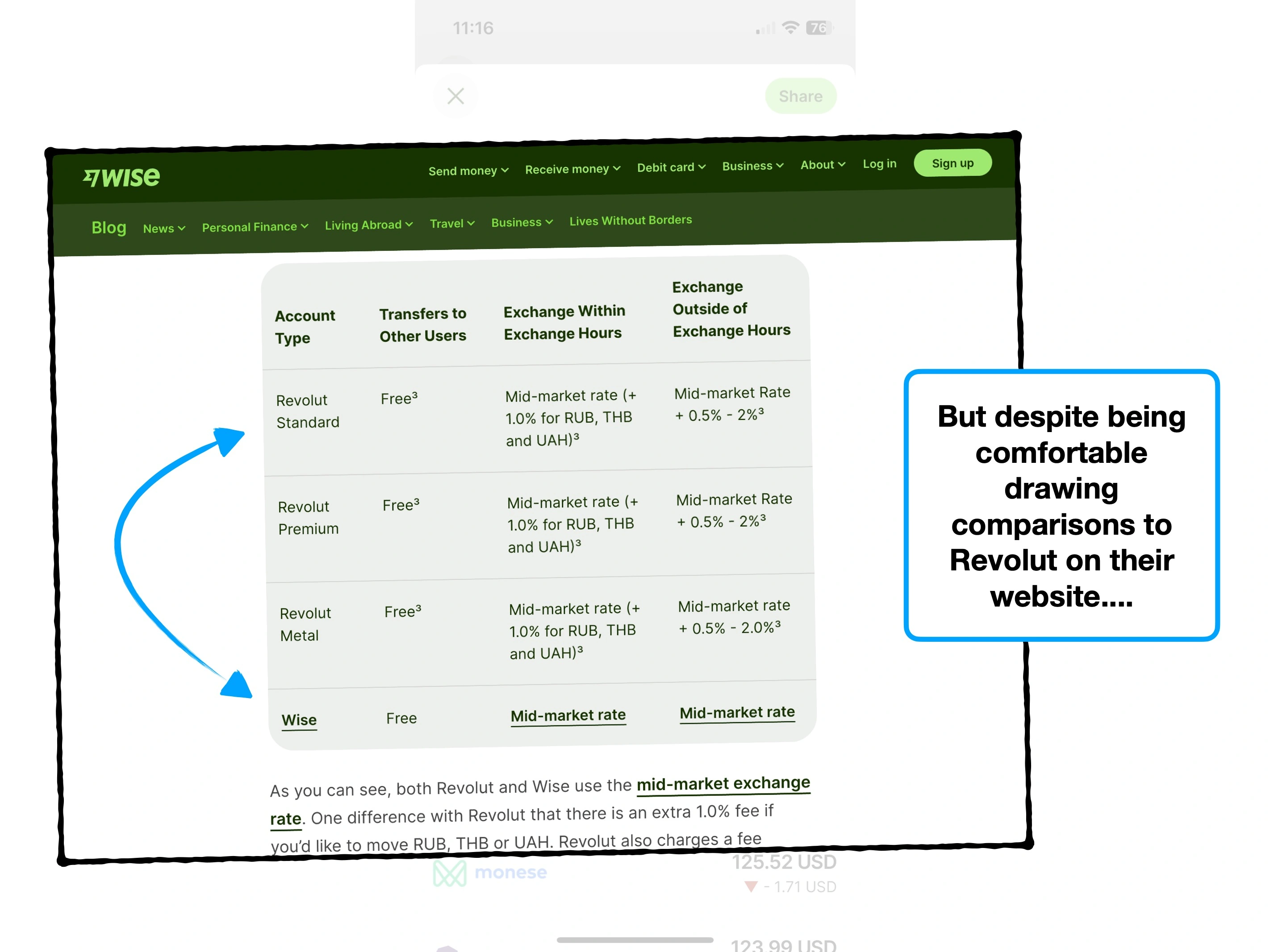
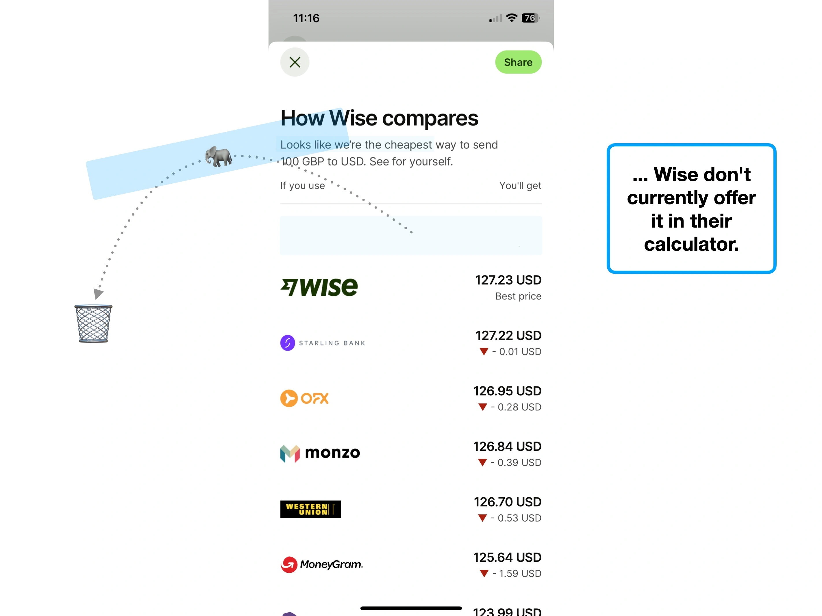
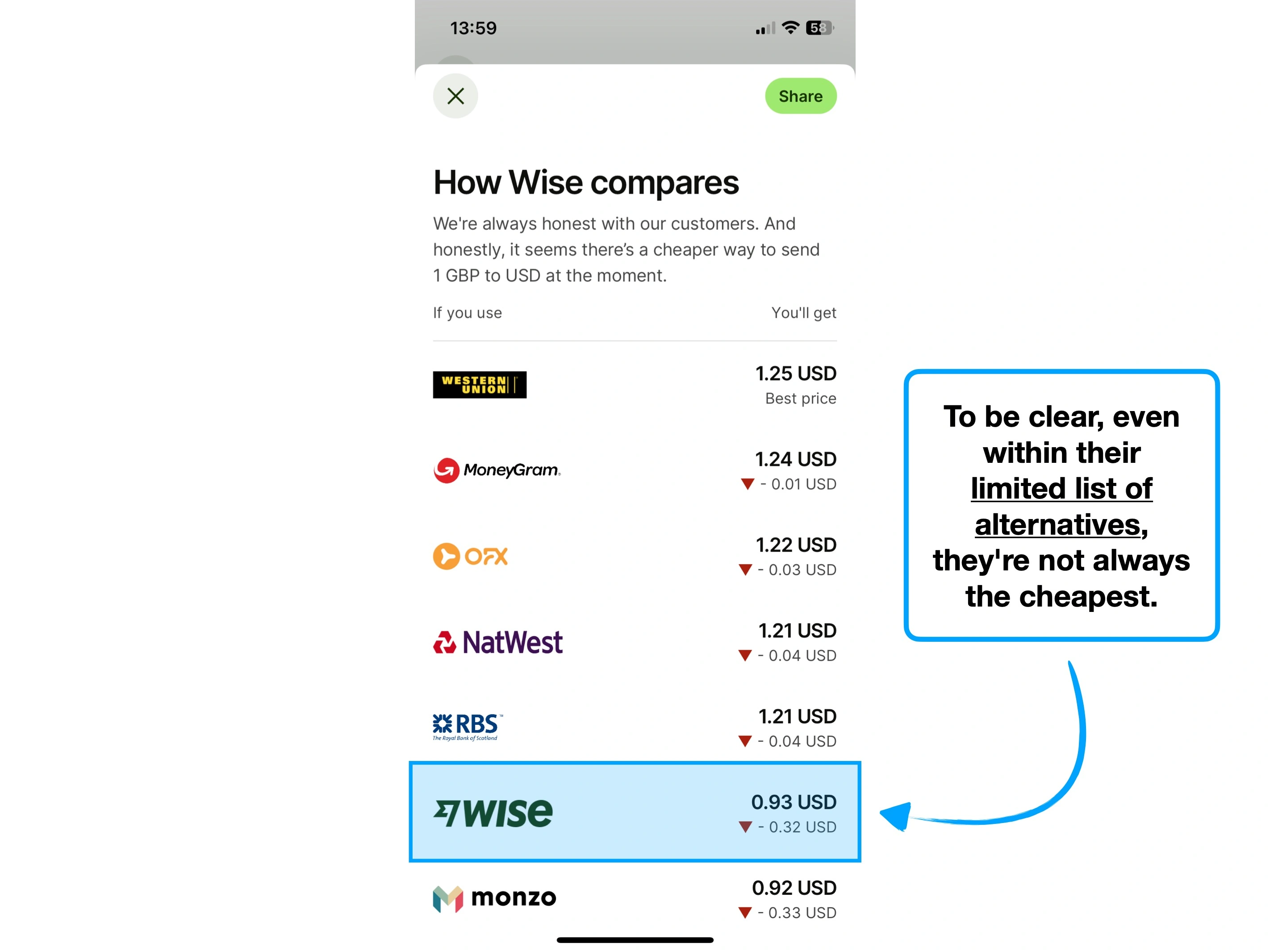
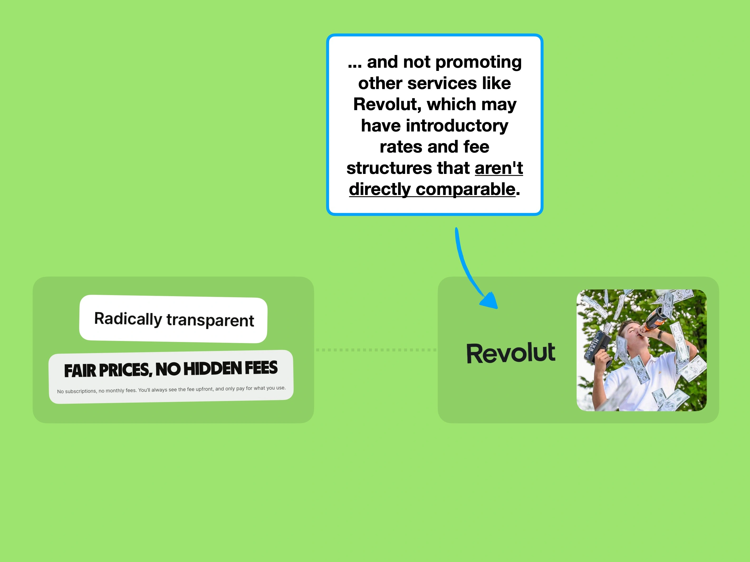
Also, a few days before publishing this analysis, I reached out to Wise to ask the most obvious question: why don't you include Revolut in your comparison table?
Partly, I'm told it's because Revolut offer multiple membership options, which make comparing individual transfers harder. Whatever the reason, they've told me that they're now working on adding Revolut into their calculator—i'll edit this study when they do.
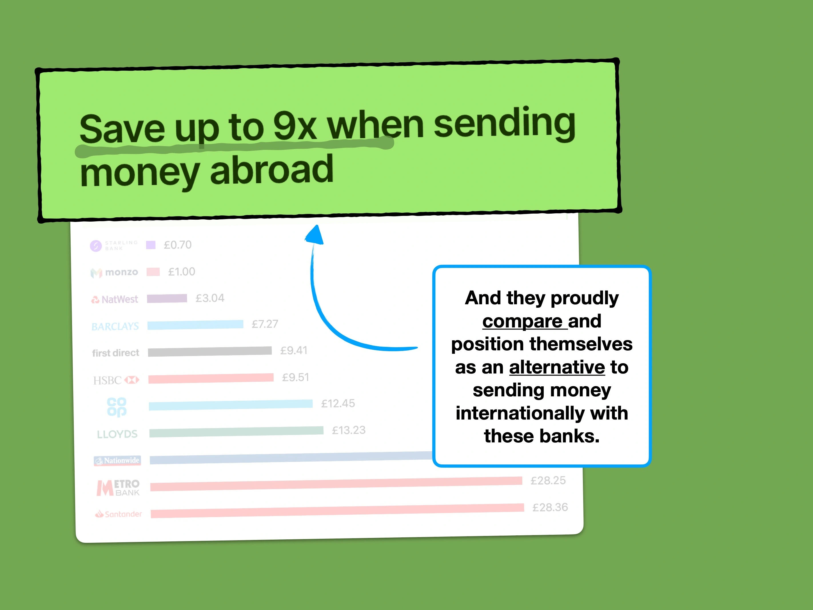
If you take nothing else away from their experience, it's hard not to admire their mission-driven transparency.

Simple techniques to increase feature usage, retention and ultimately alter how users perceive the value of your product.

The techniques that Slack have used to create an effortless onboarding flow, and why you might not want to copy them.

The product psychology behind why Robinhood offer new users $7.08 of free stock, and not $10.