Search
Popular Filters
Popular Filters
Popular Filters

Popular Filters
By Peter Ramsey
5 May 22
Paywalls may be a necessary annoyance in journalism—without it, content platforms could be reliant on advertisers, and influenced by their motives.
In 2021, approximately 20% of Americans paid for news in some format, more than double the 9% of Britains. The worldwide average appears to be ∼20%.
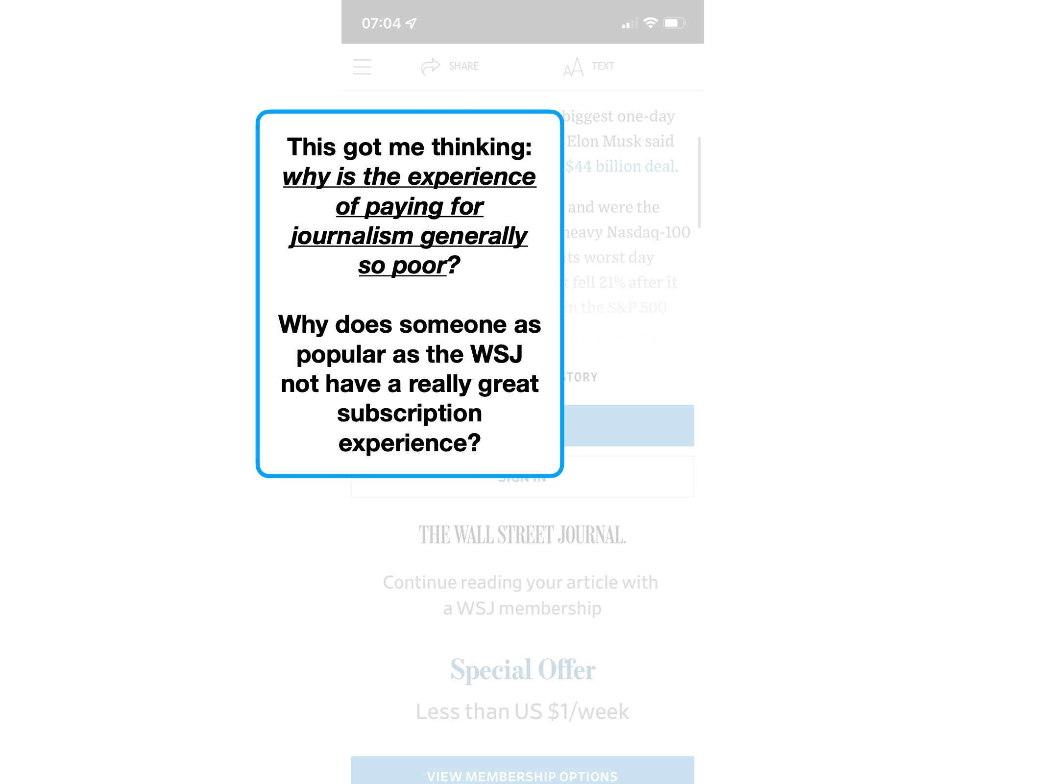
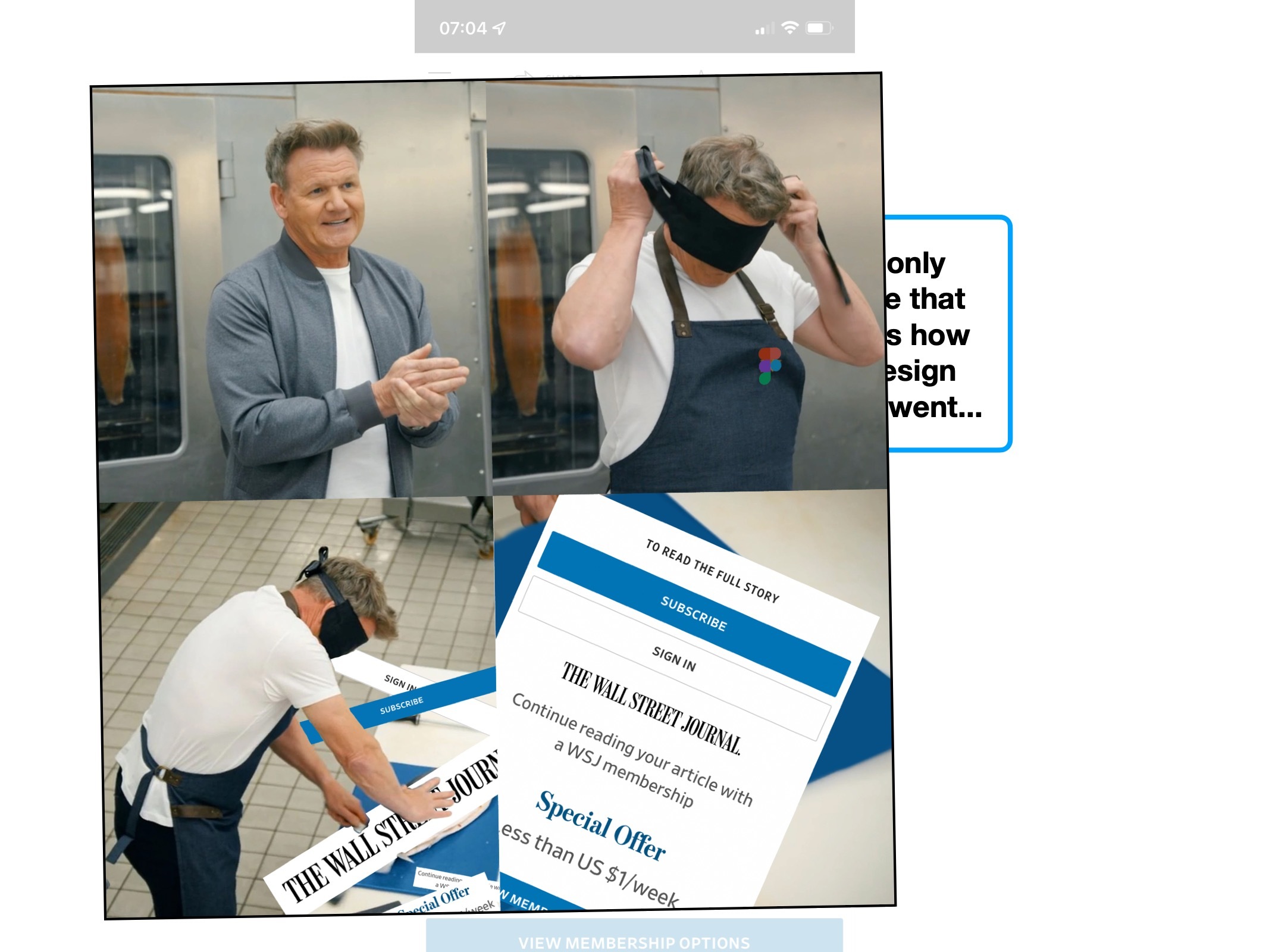
I support paying for journalism, but why does the experience have to be so uncomfortable?
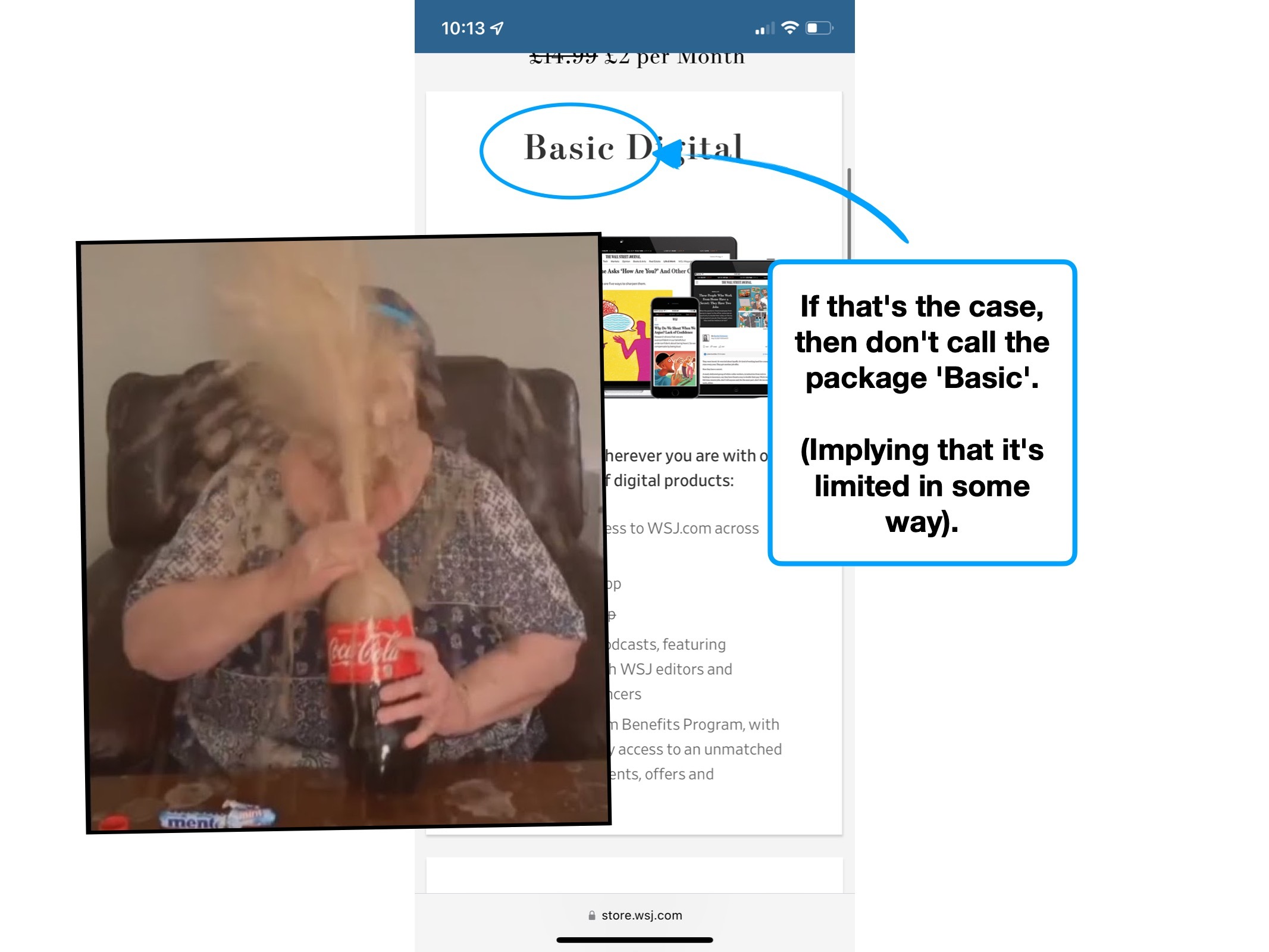
The plans can be confusing, there are introductory rates which silently shoot up 1000% after 3 months, and cancelling can be a nightmare.
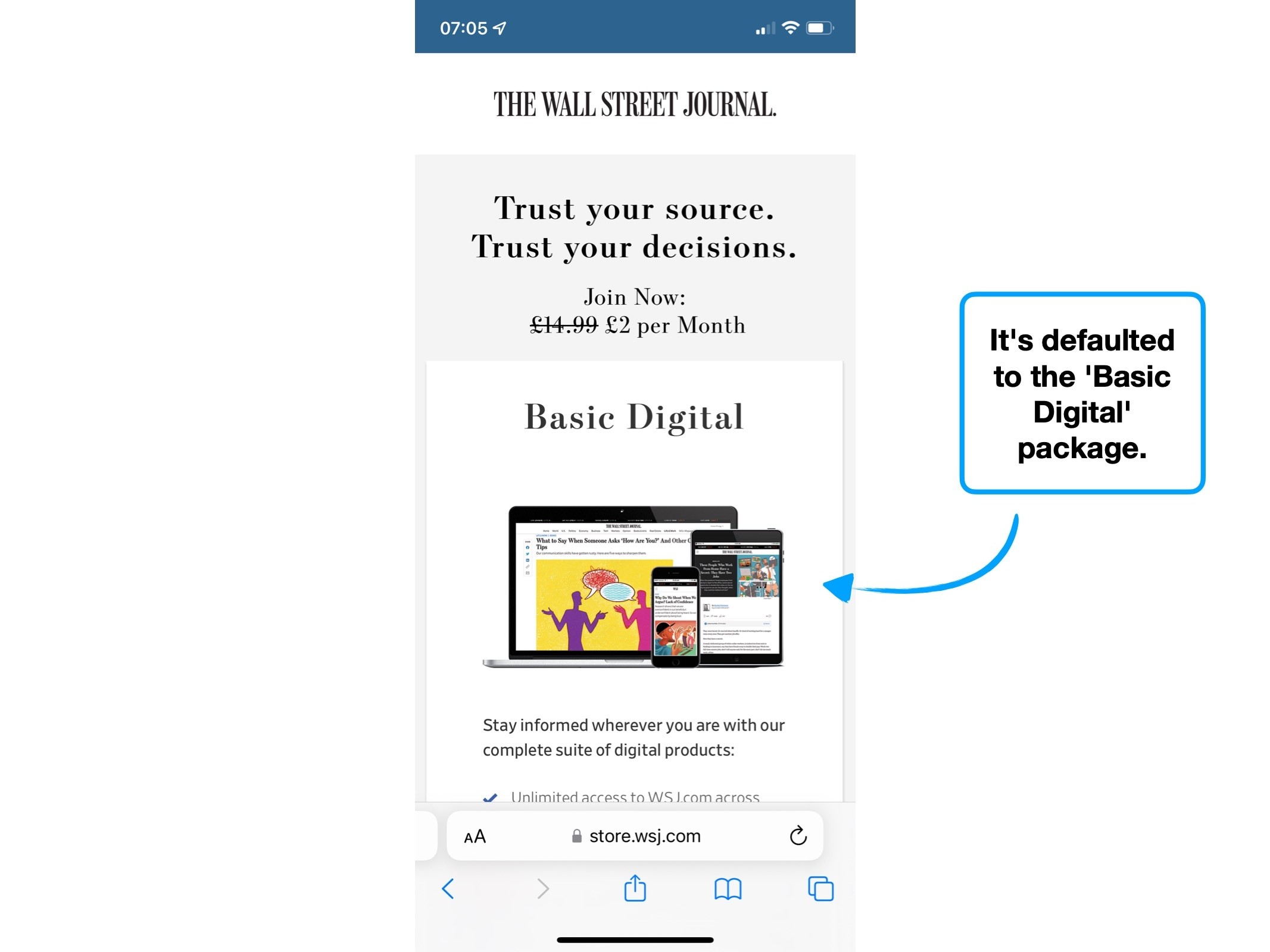
The Wall Street Journal (WSJ) is a prestigious outlet, and with 3 million paying subscribers, has been one of the most successful at converting eyeballs.
So why does it take more clicks to subscribe to the WSJ, than it does to open a bank account?
Snorkels on; let's dive in.
Please rotate your device to view this slideshow
Note, this won’t work if ‘rotate: lock’ is on in your device settings.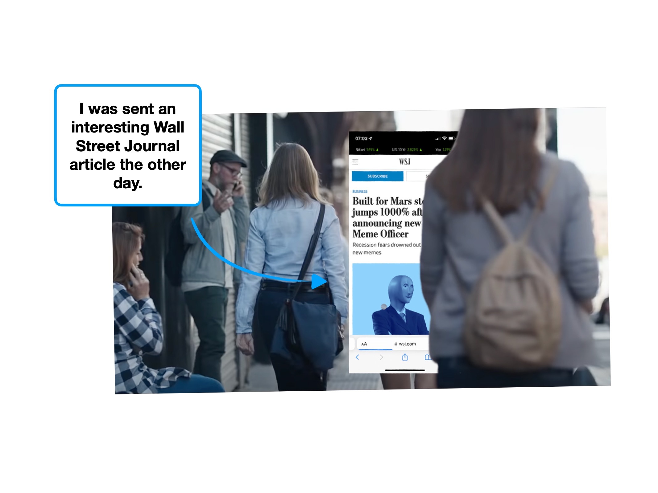


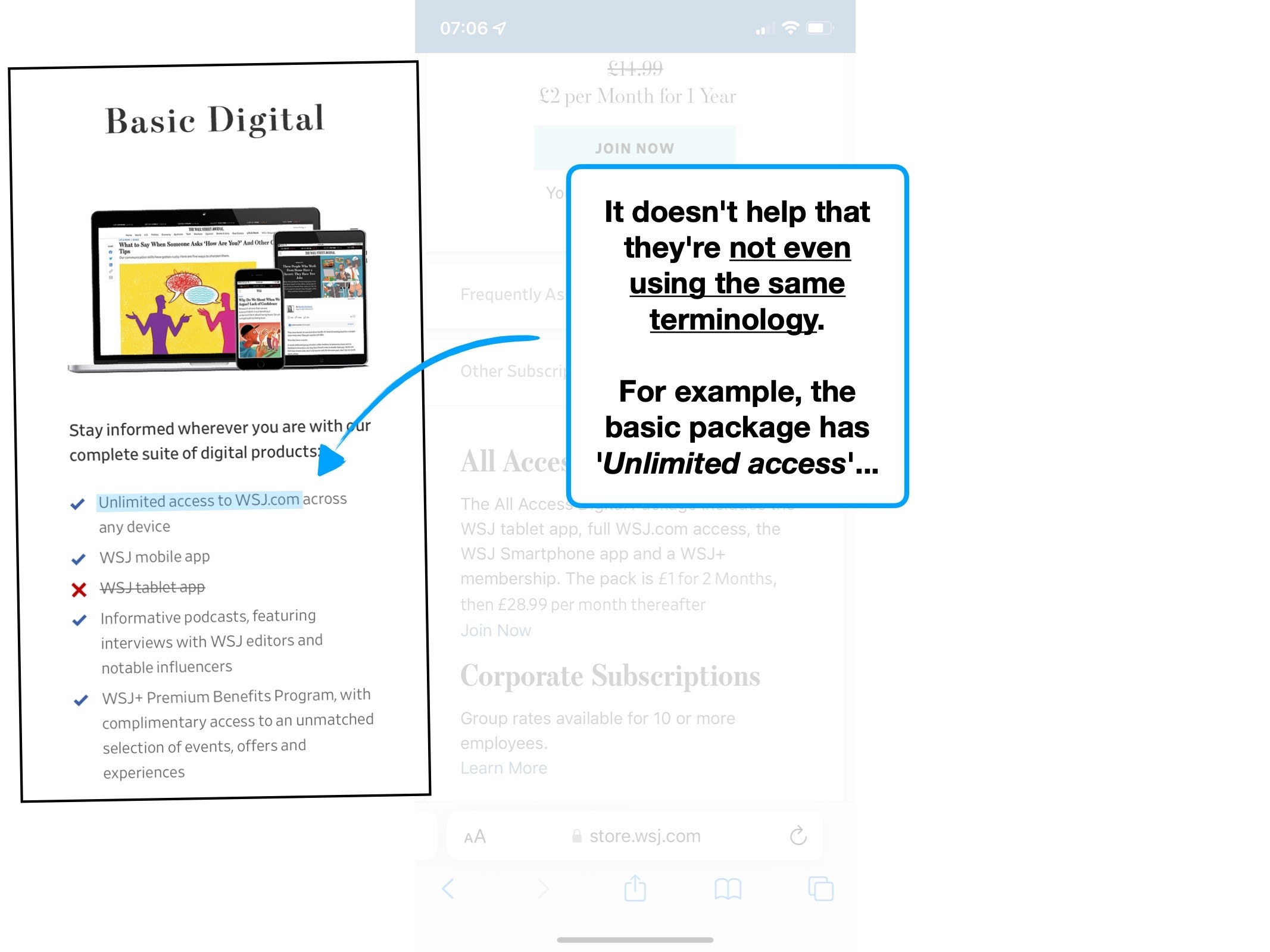
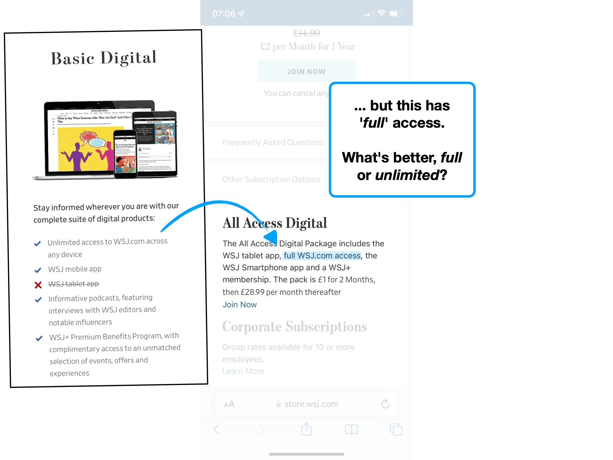
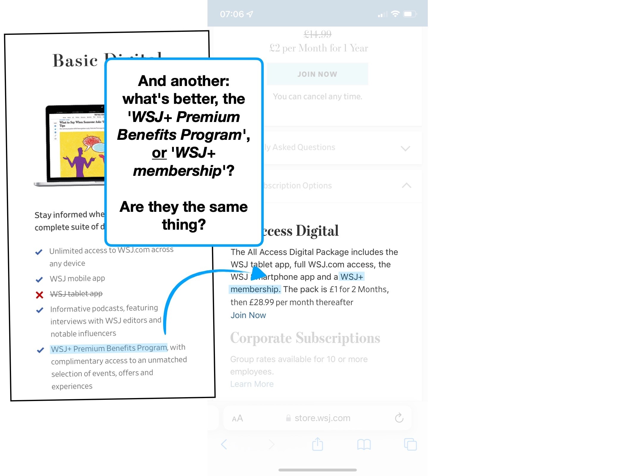
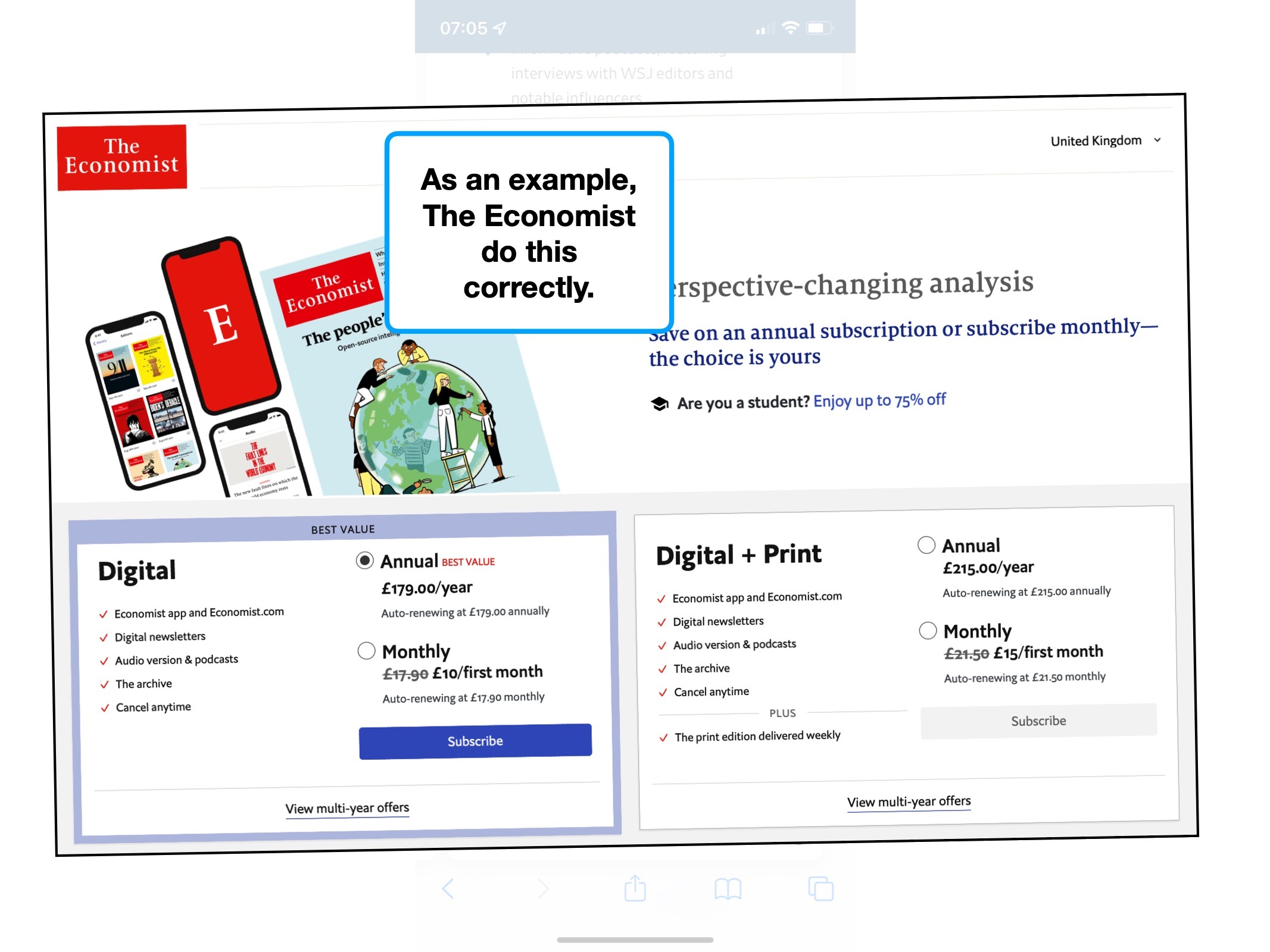


👇 What are these? Below are UX issues mentioned in the presentation, but that I felt were worth discussing in more detail. These are worthwhile conversations to have internally, and consider if they impact your product or service.
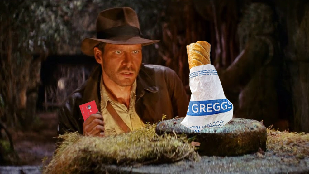
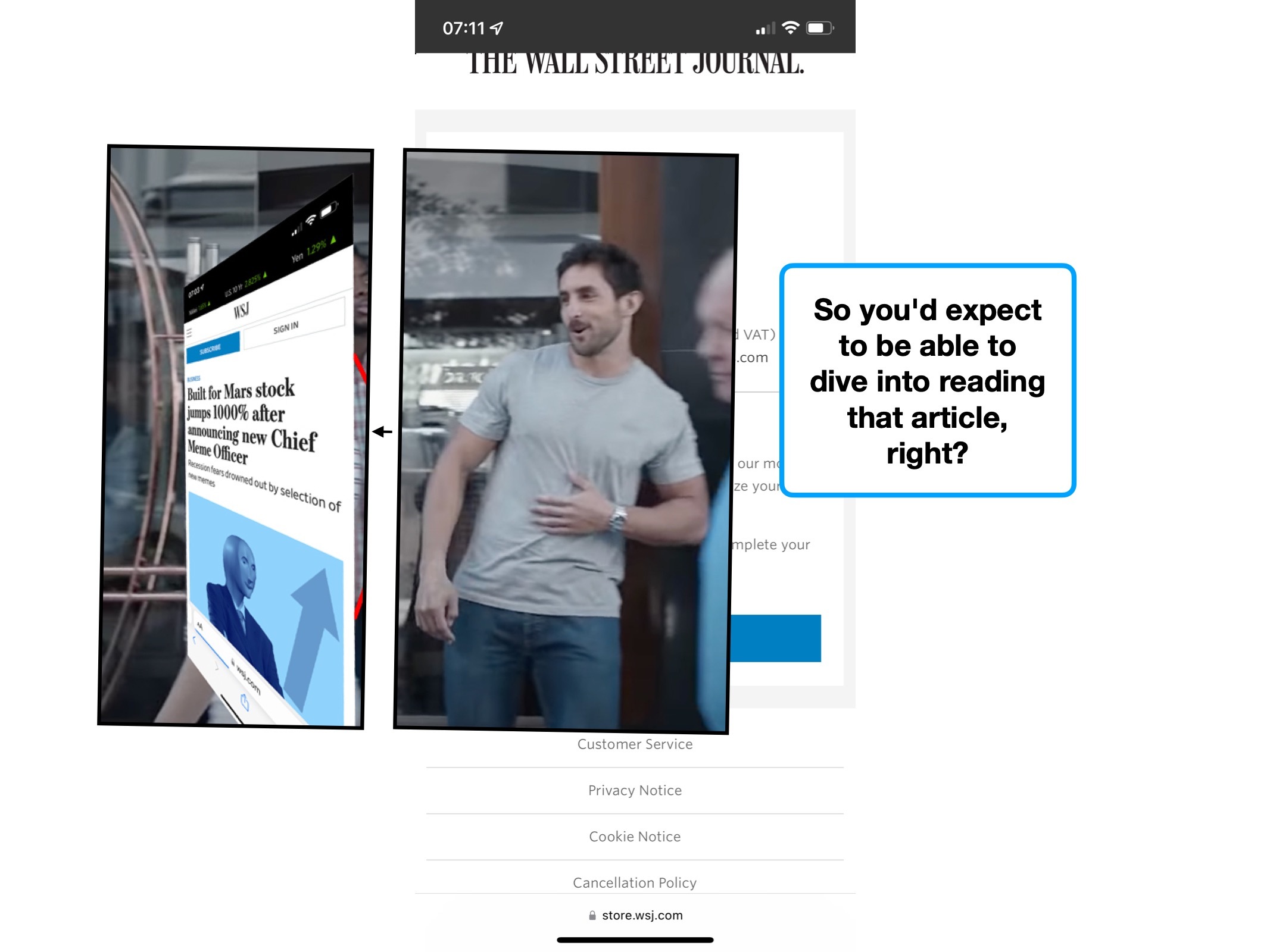
Imagine that you've run into a pharmacy for some paracetamol, trying to soften your pounding headache.
You pay, the pharmacist motions to give you the box, but pulls back; "oh, before I can give you these, I need to talk you through a few offers and discounts".
Now, even if you politely listened for the next 60 seconds, it'd be intuitive to most people that you're unlikely to be receptive to the deals.
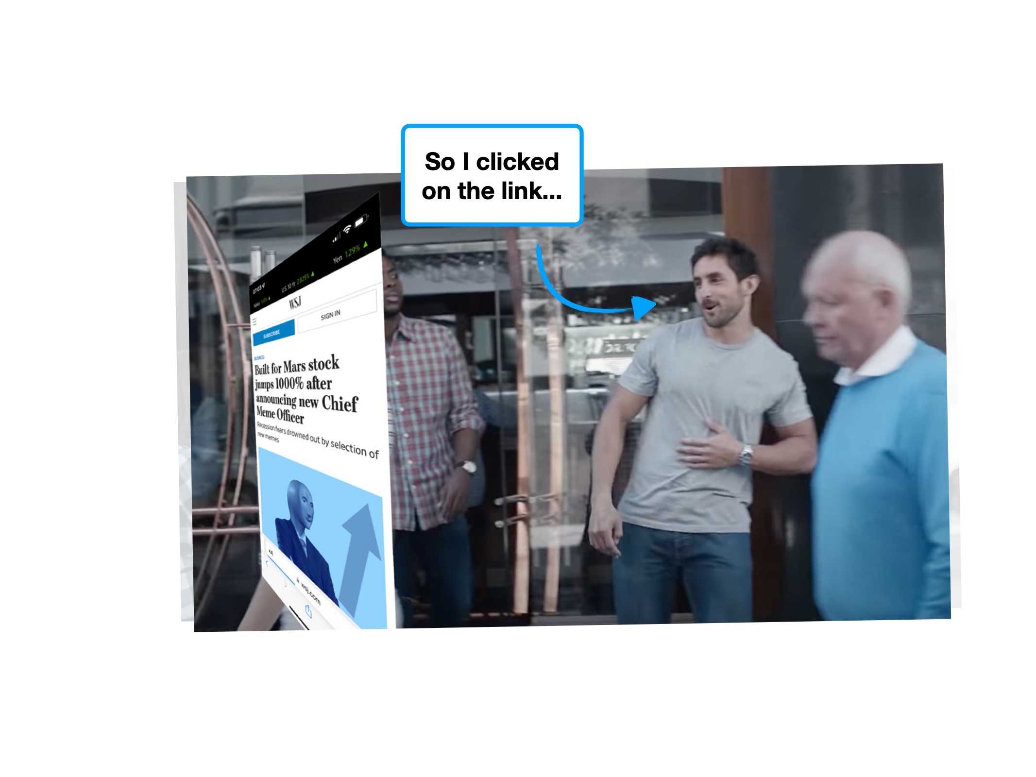
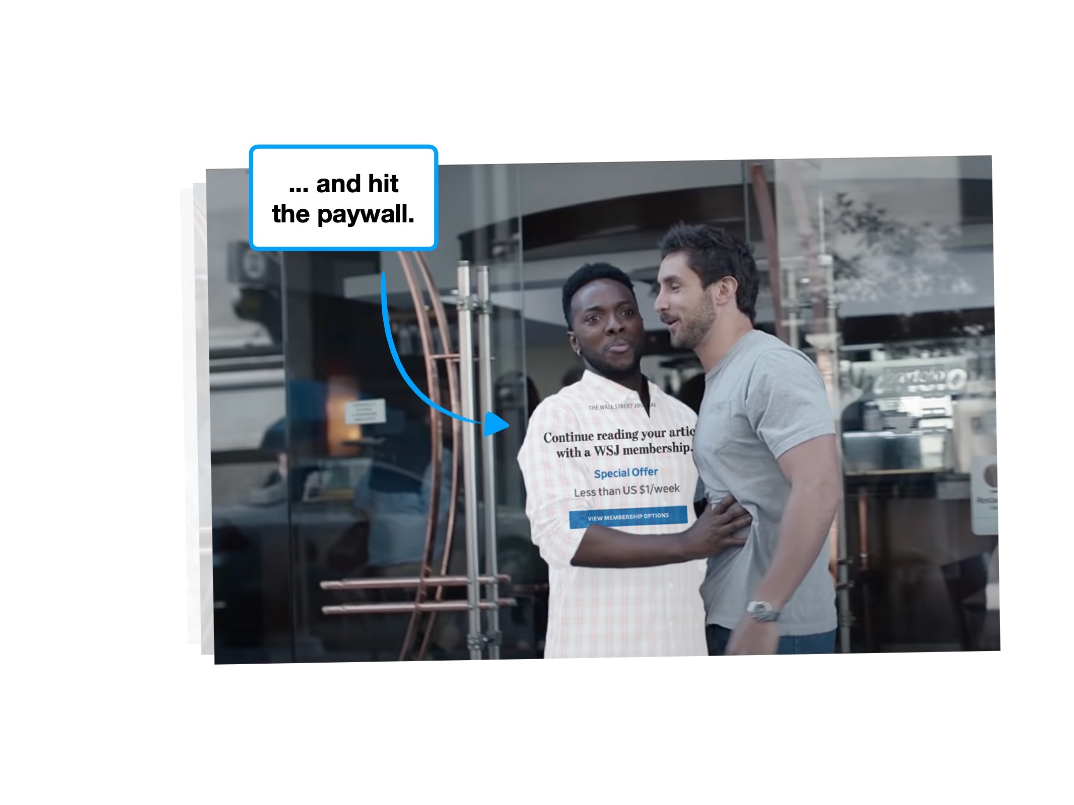
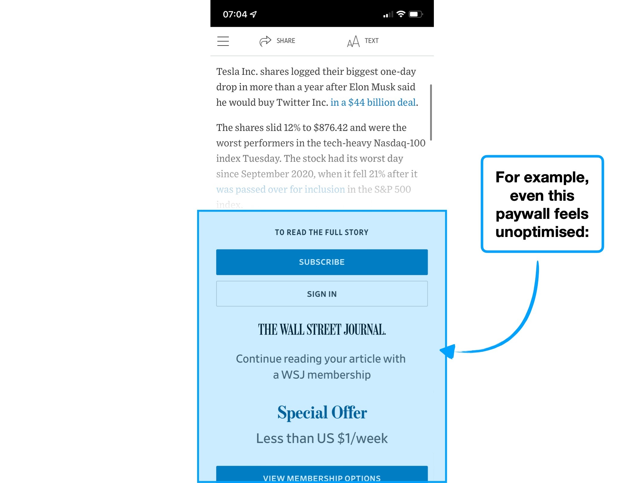
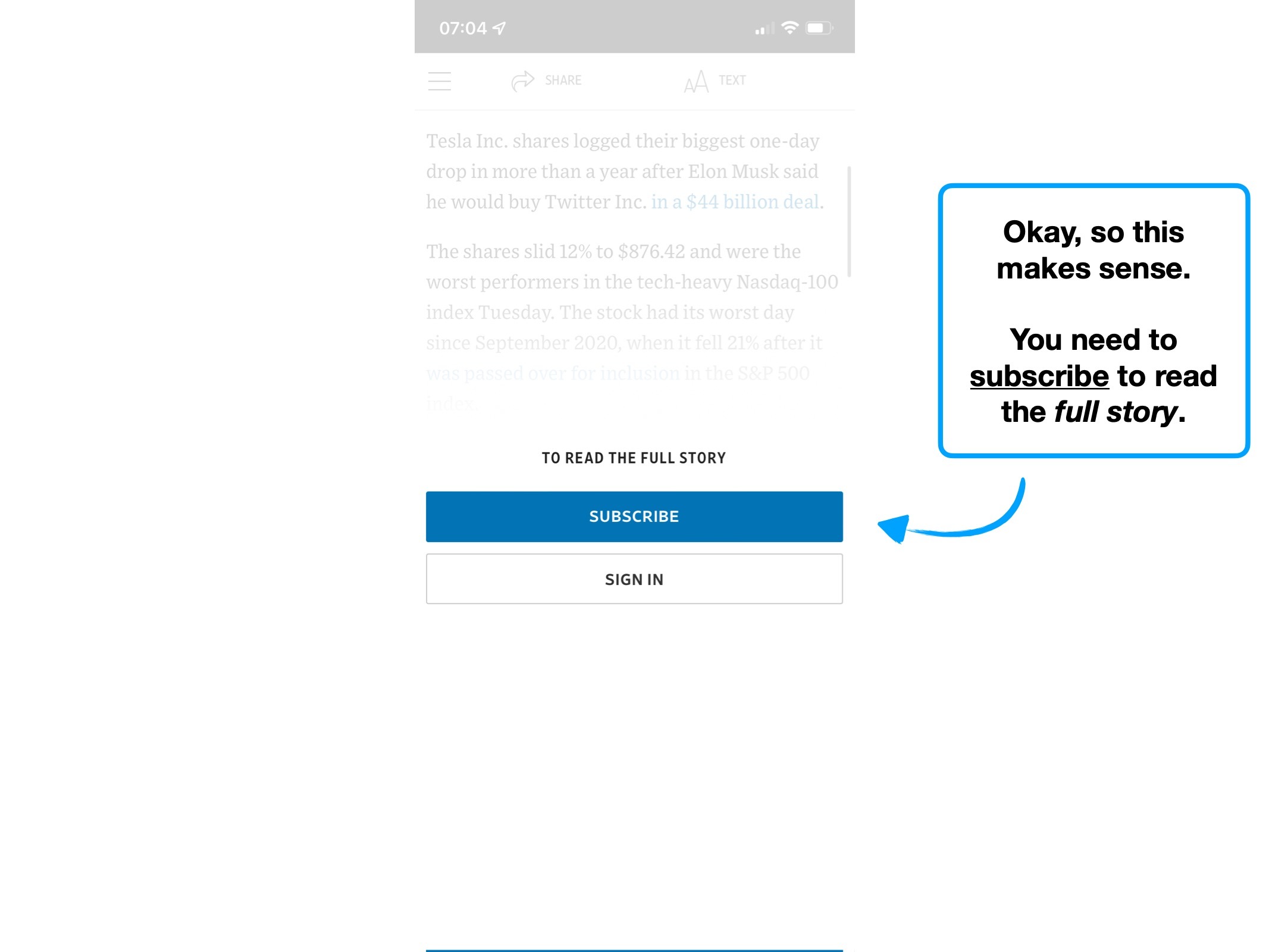
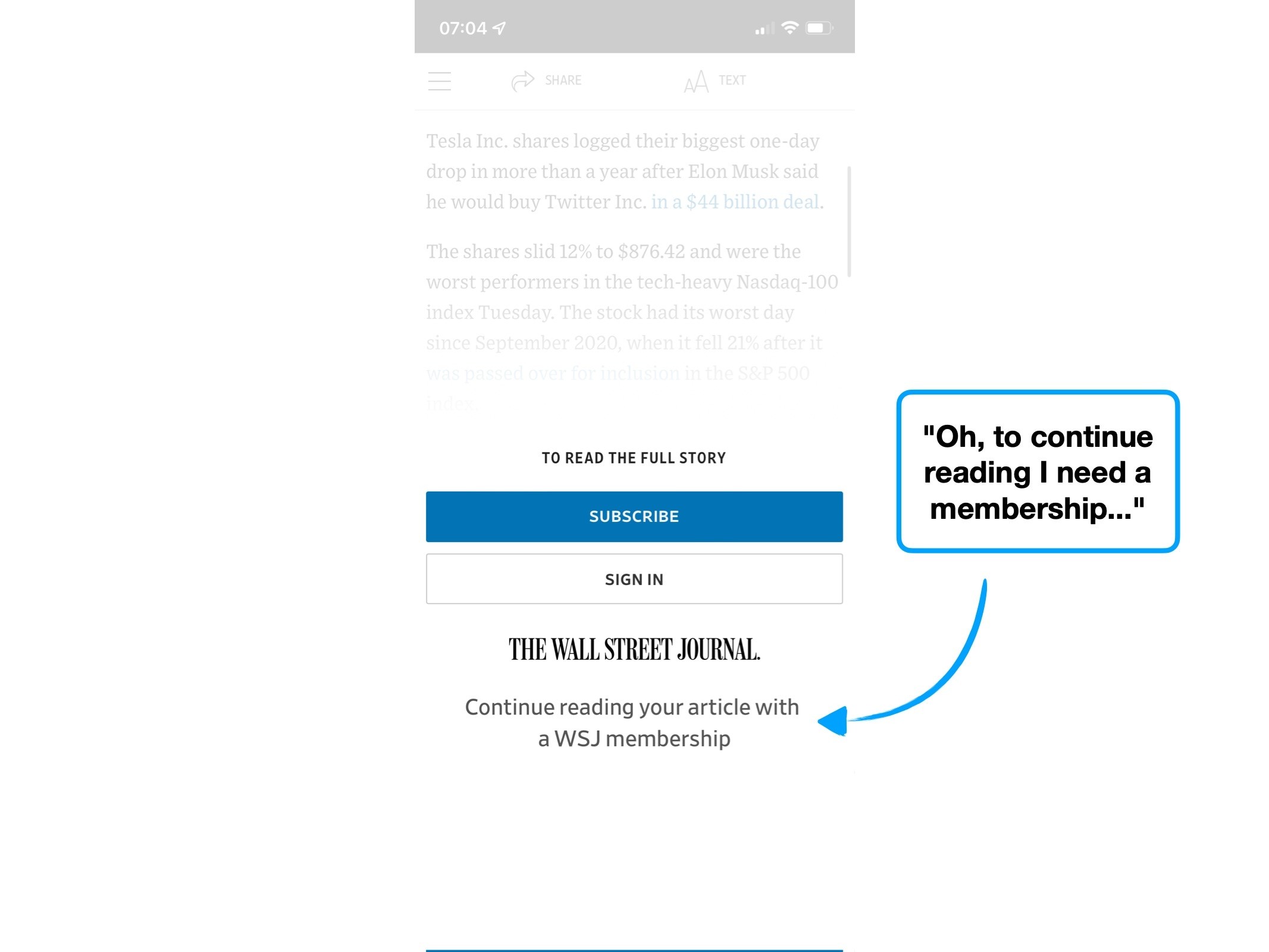
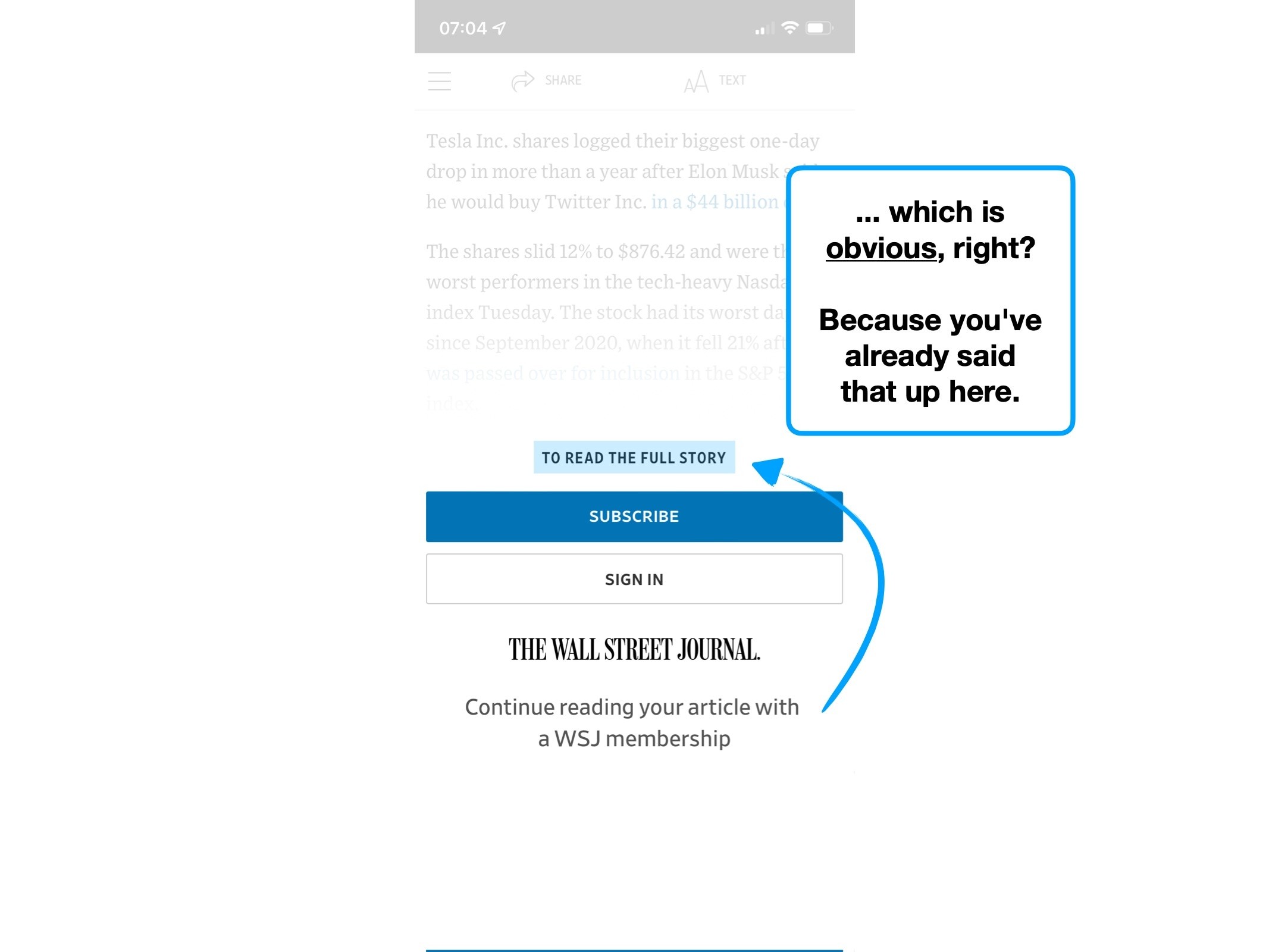
i.e., there's urgency and conviction in what you want to do—like, when you're halfway through an article, and hit a paywall.
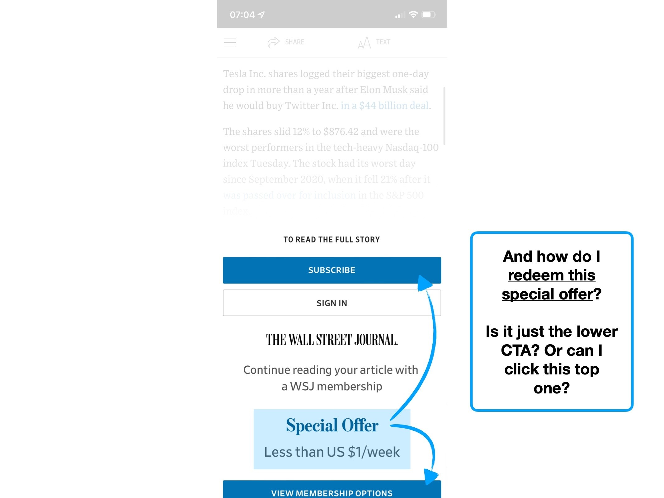
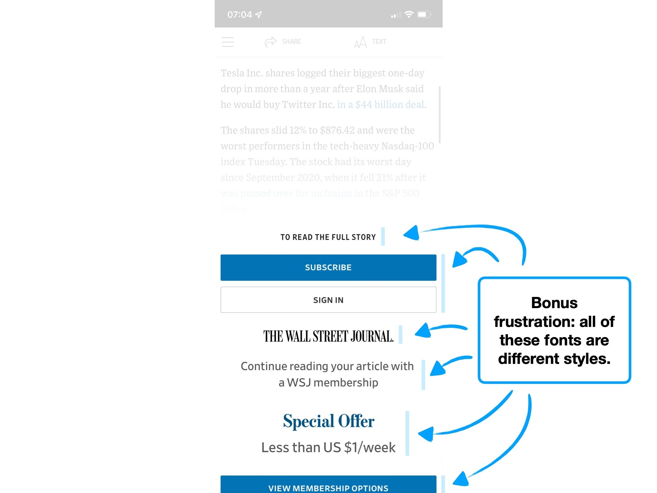
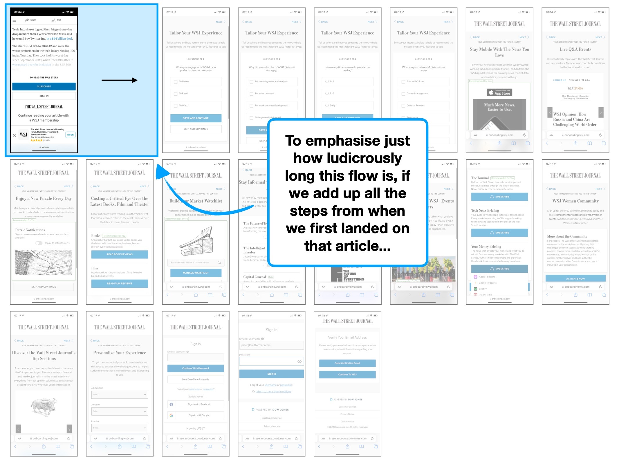
By design, the article summary aims to give you just enough that you're hooked on the story, but no more.
In circumstances like this, it's favourable to put the user straight back into what they were trying to do, and streamline the onboarding.
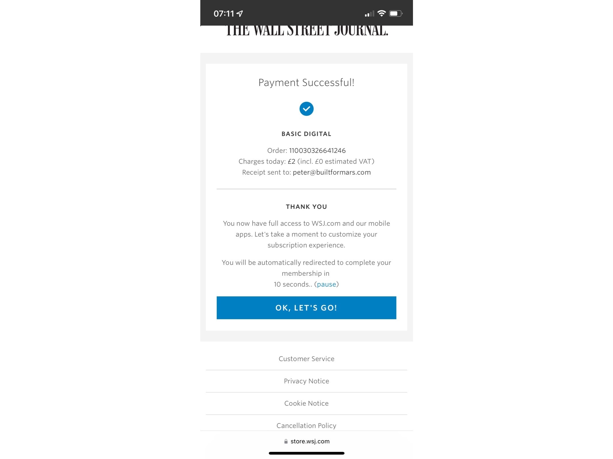
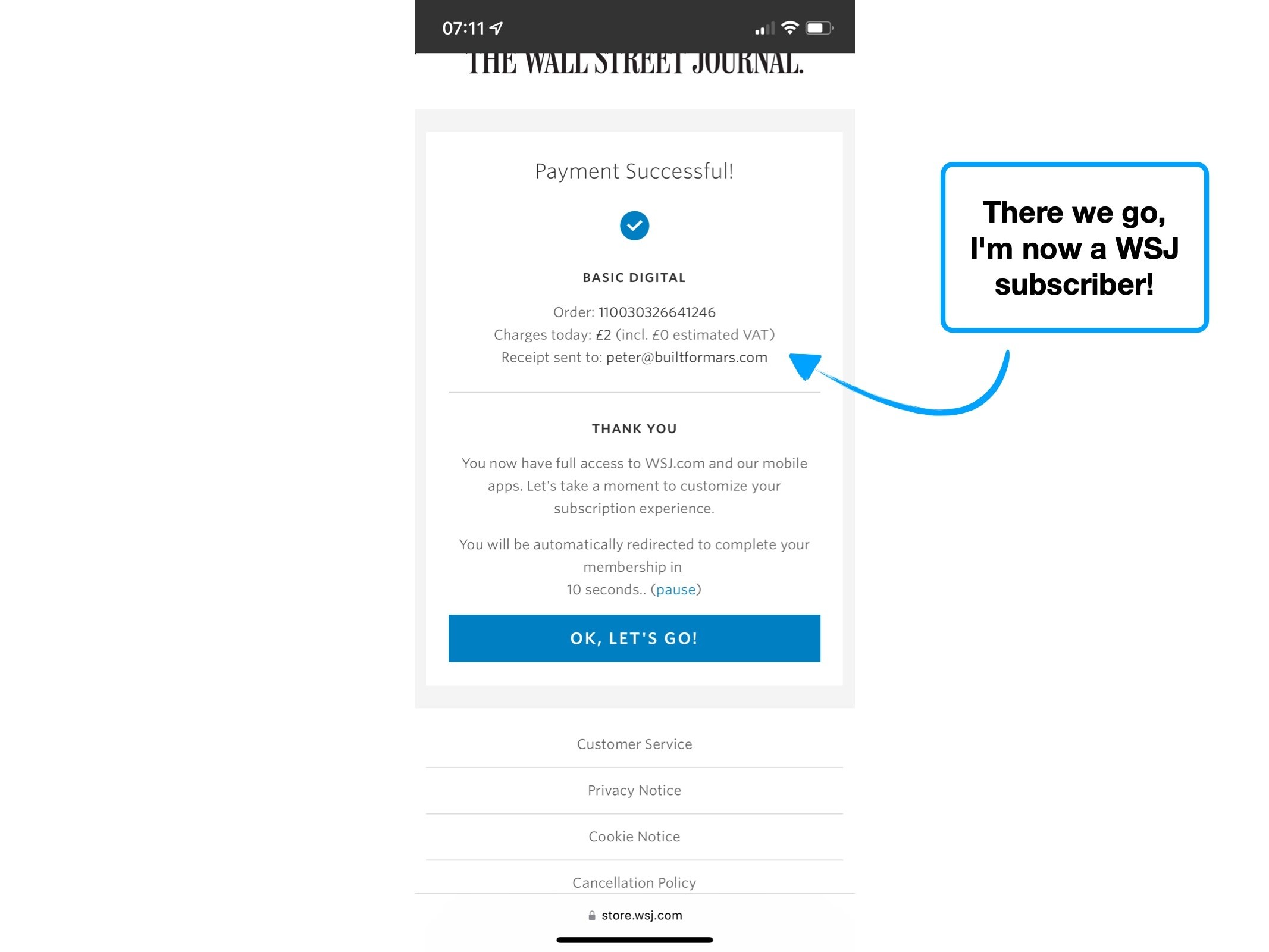
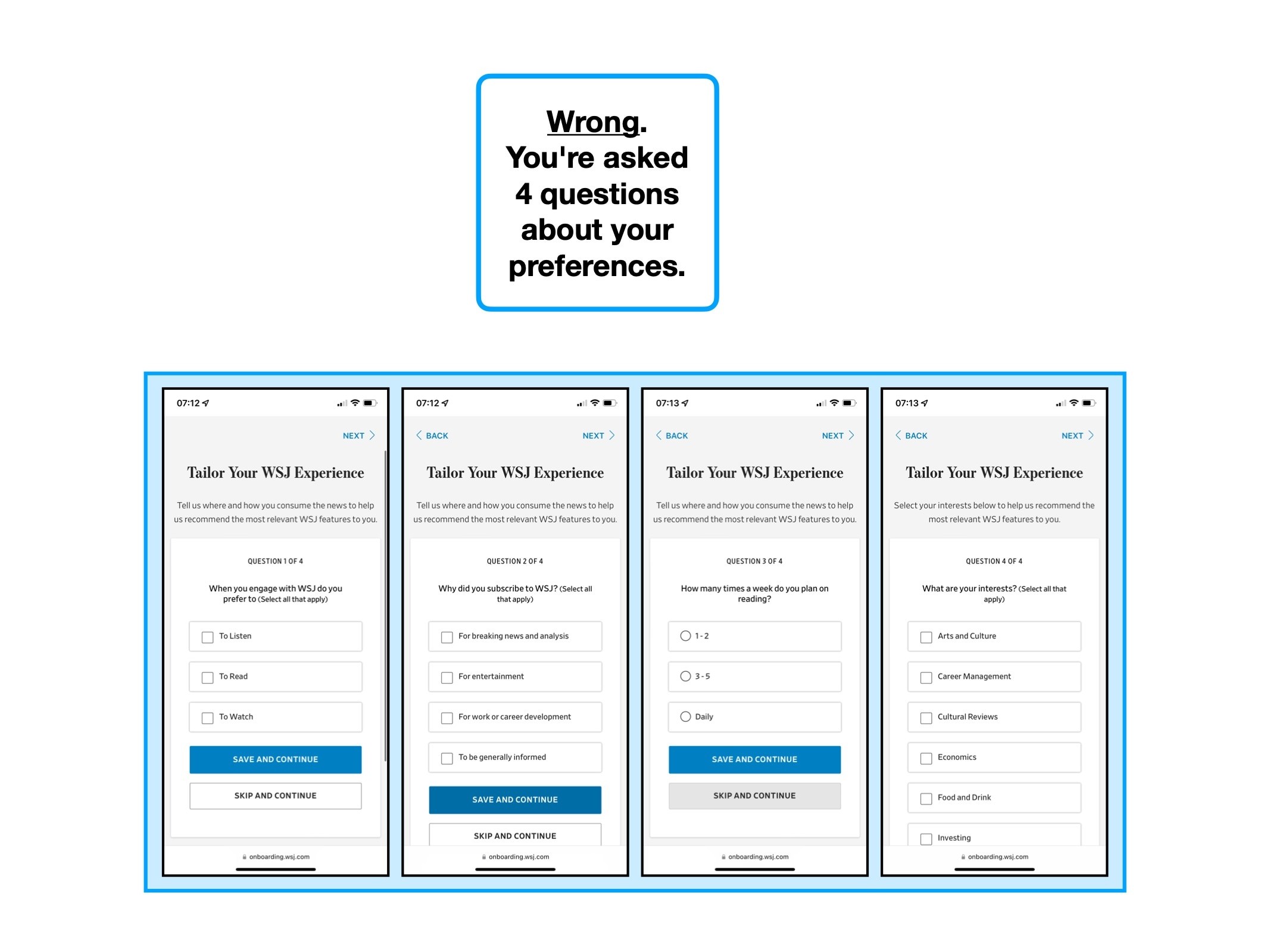
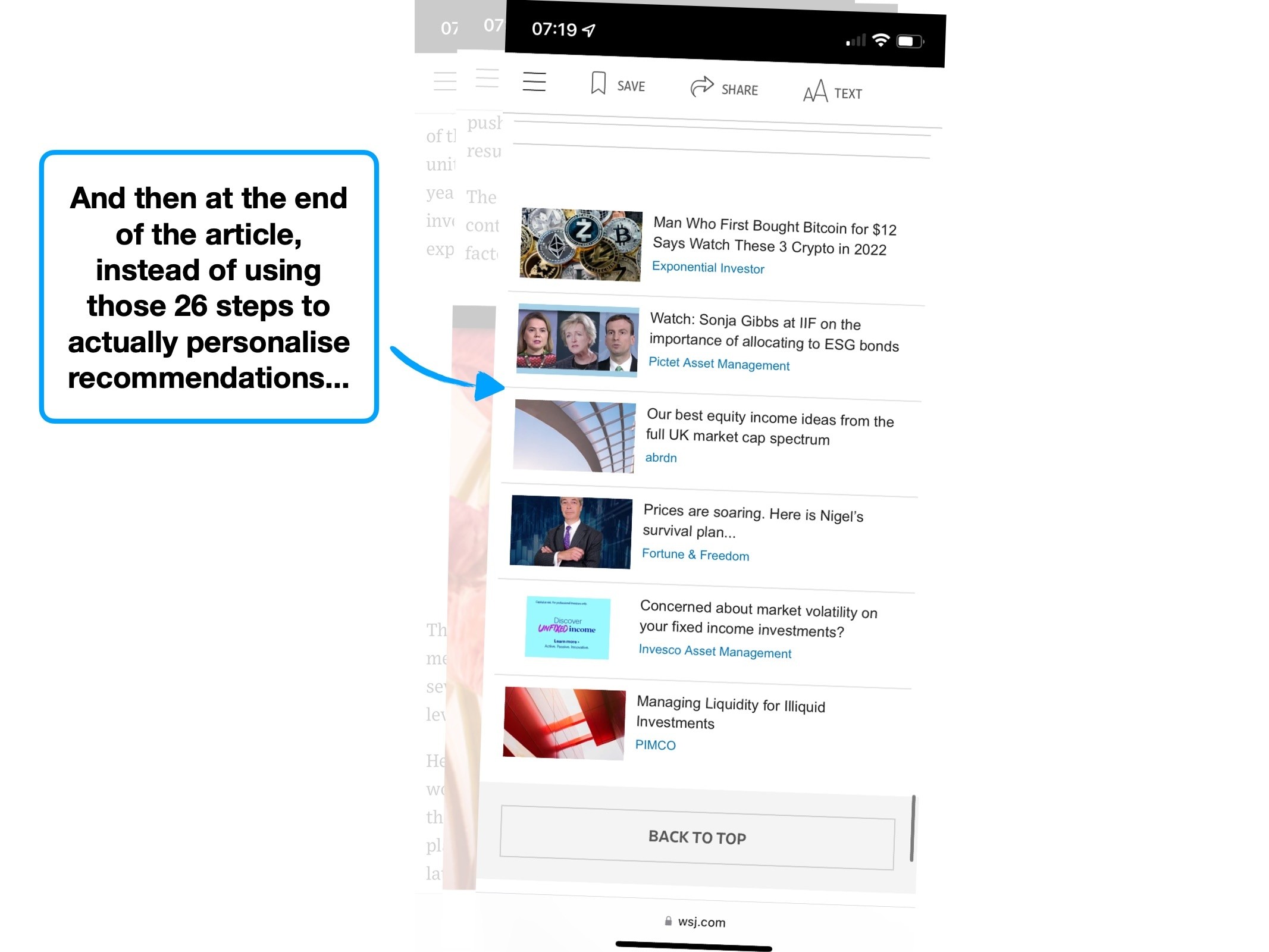
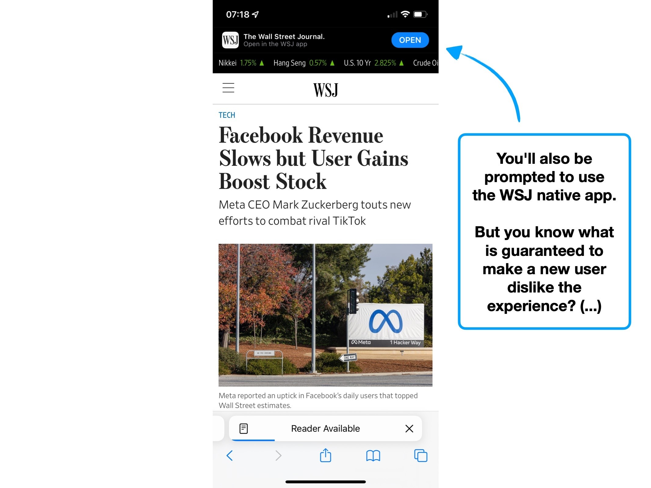
Instead, the subscriber—who has already paid—is immediately bombarded with offers, newsletters, events, watchlists and more.
There is a skip button, but there's no context about what they're ignoring. This fear-of-missing-out creates an uncomfortable dilemma, where they can't win.


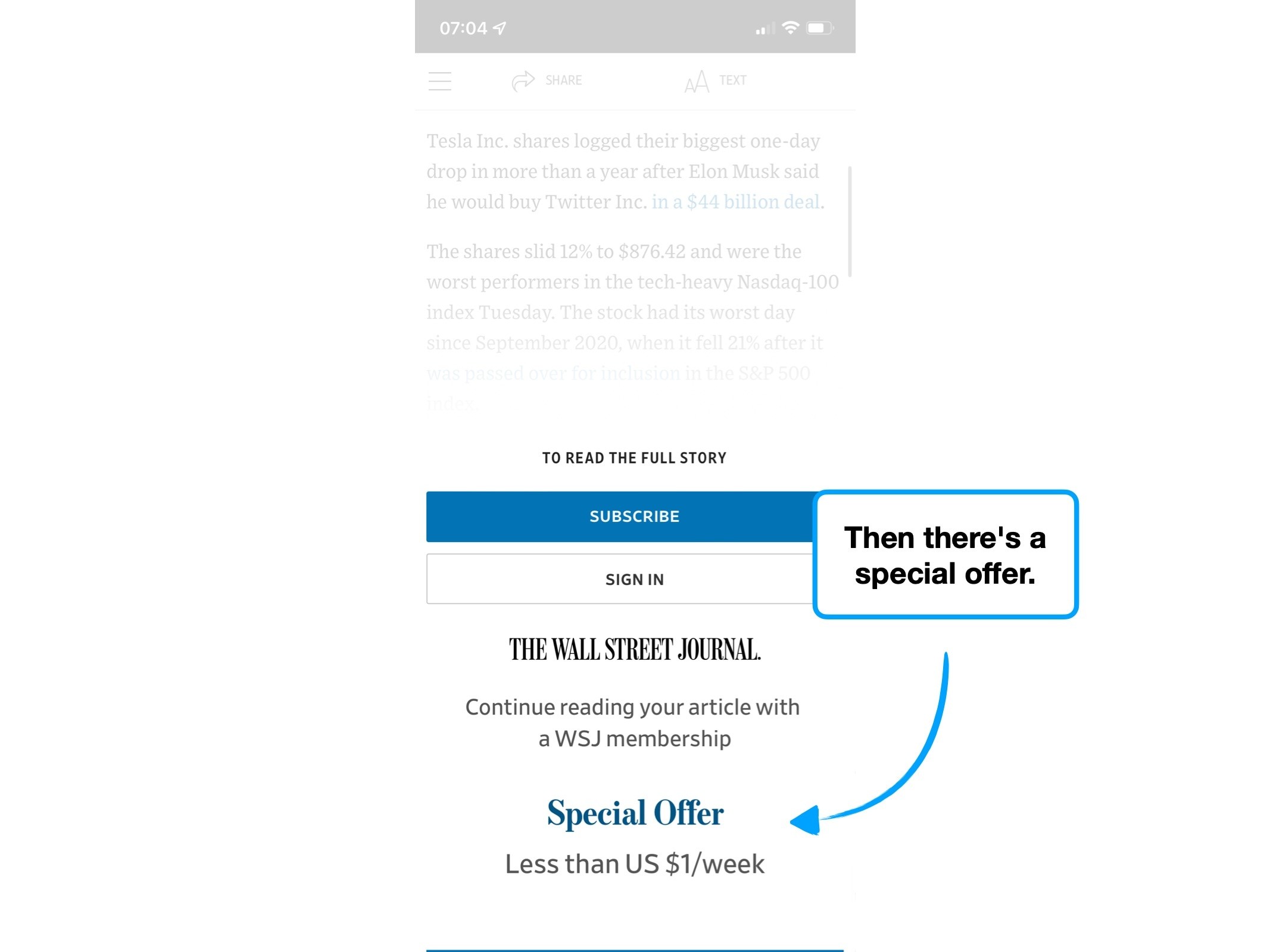
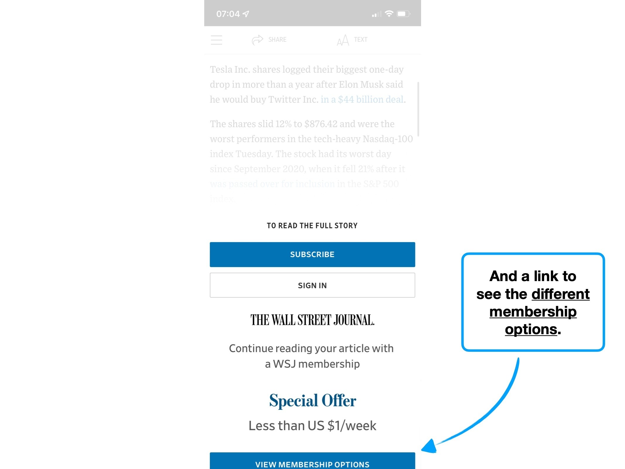
It's overwhelming, but also demonstrates a thesis: upsell at all costs.
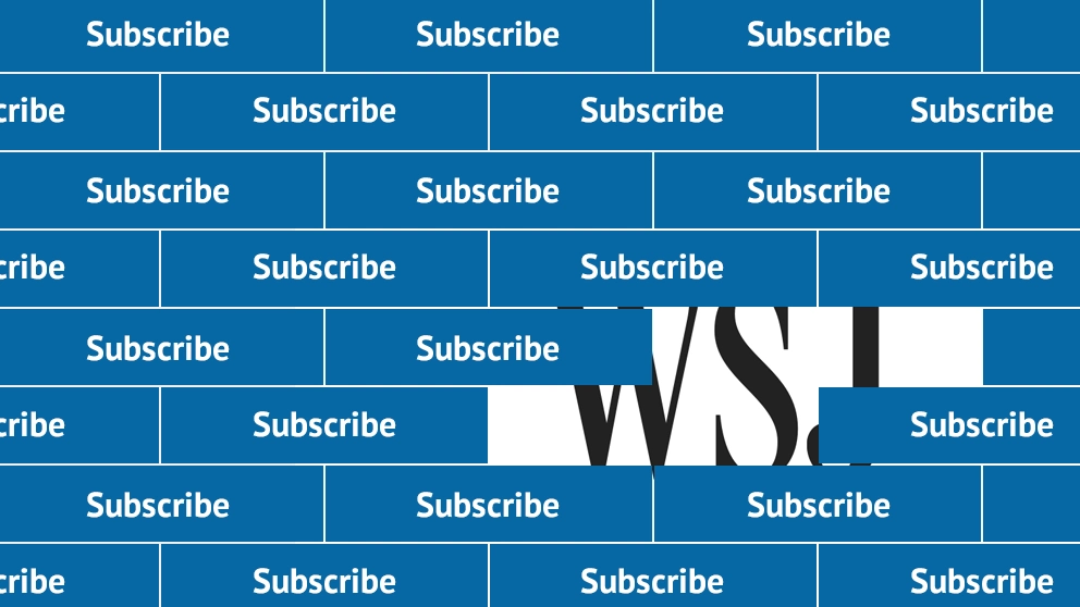
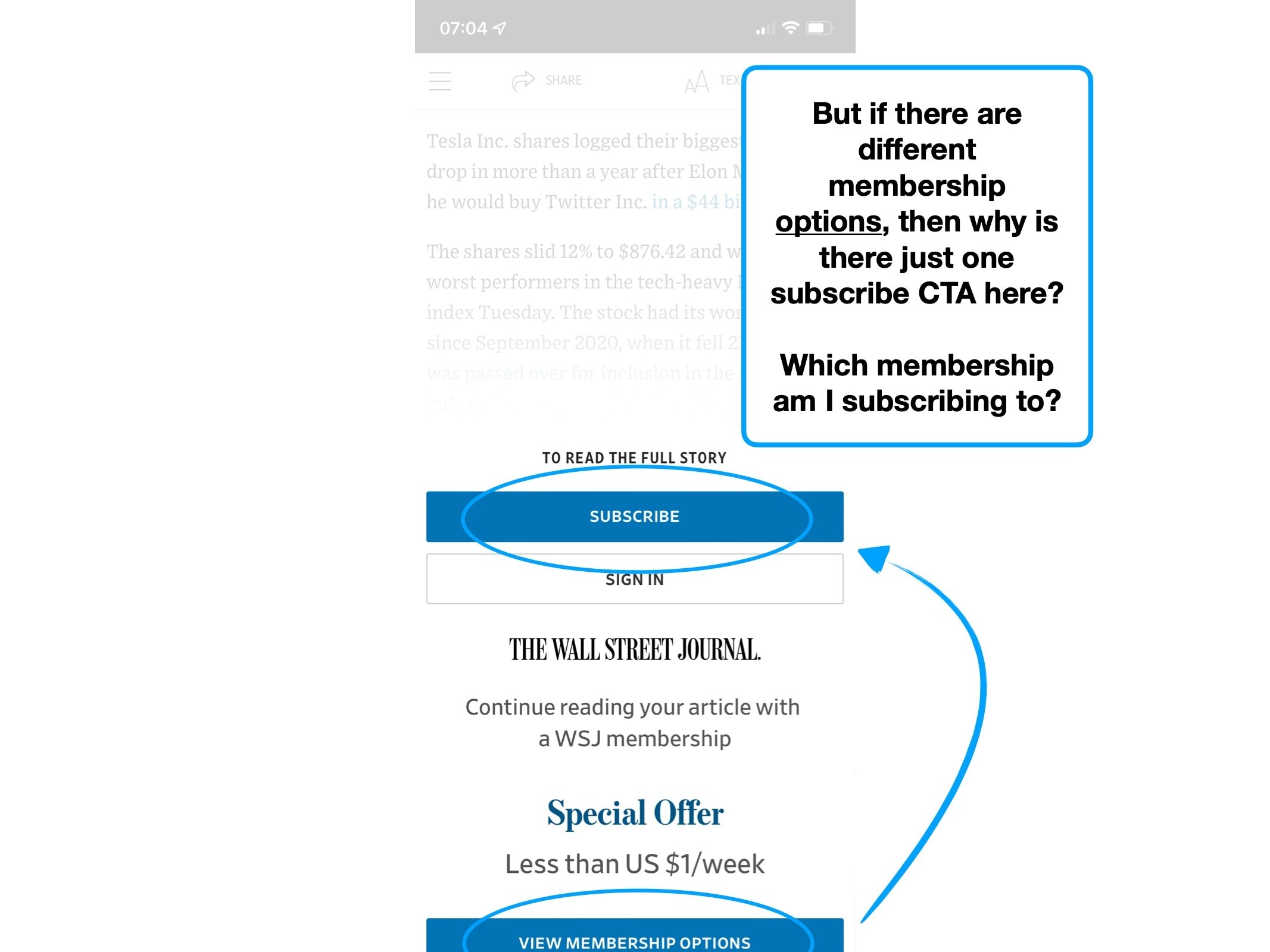
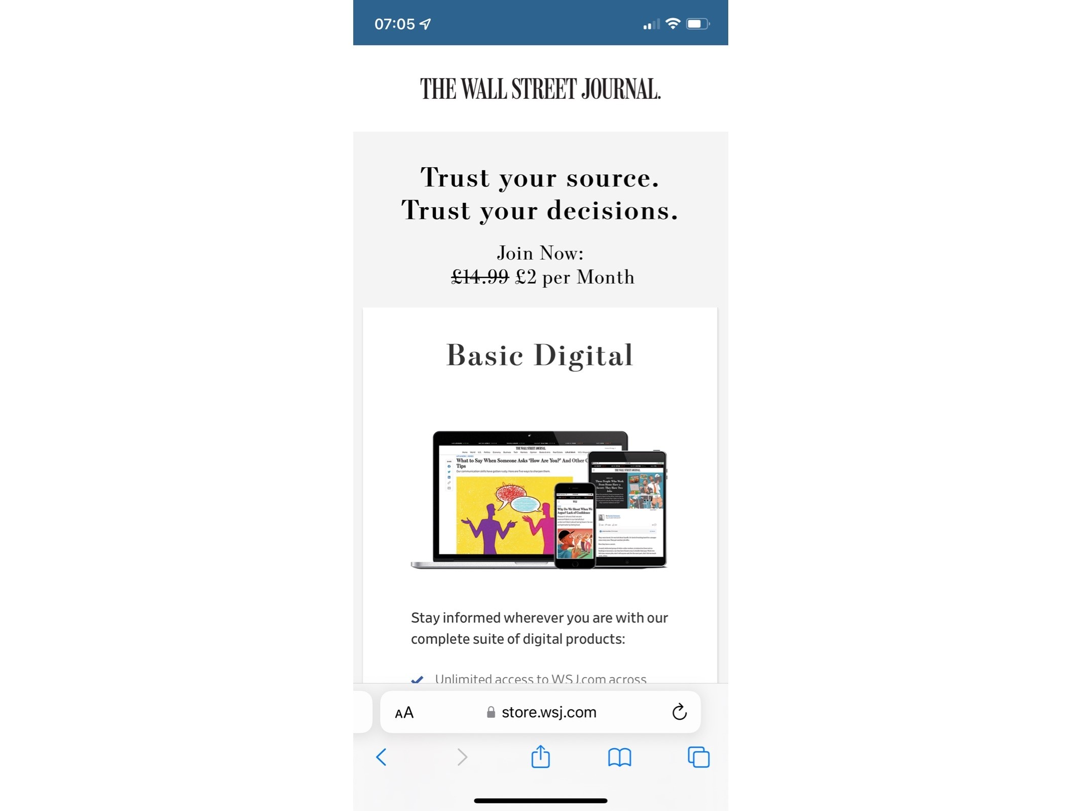
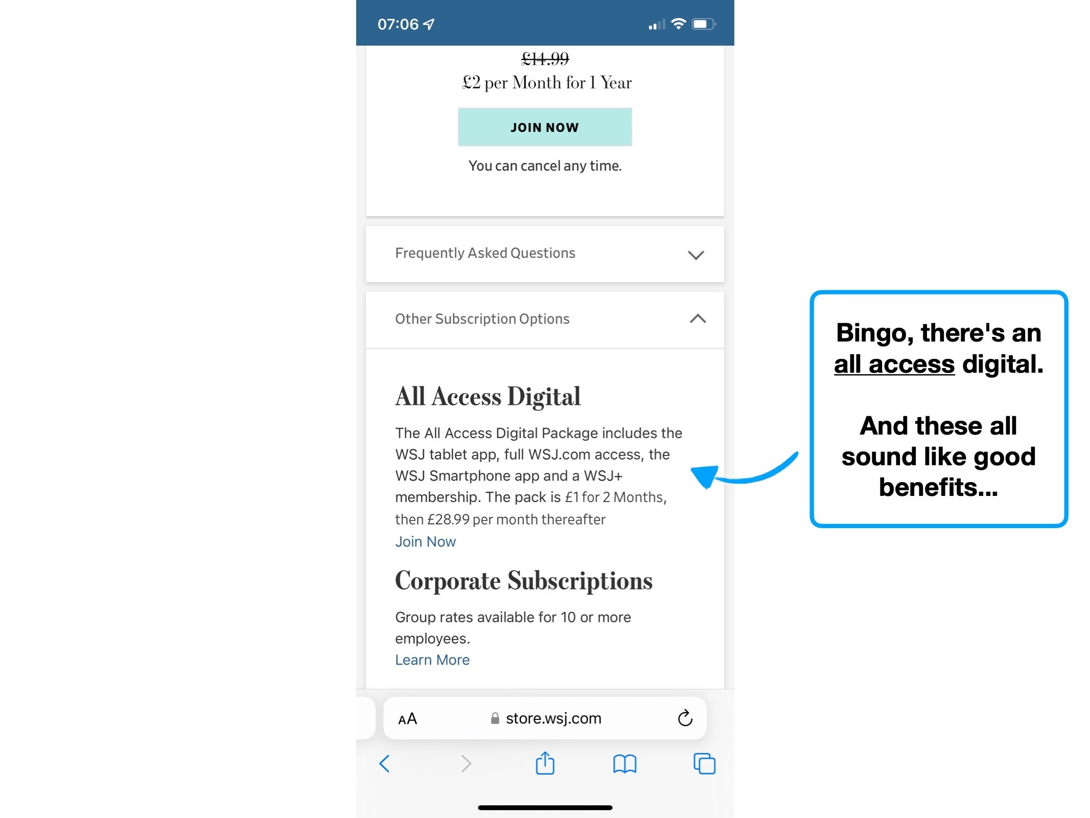
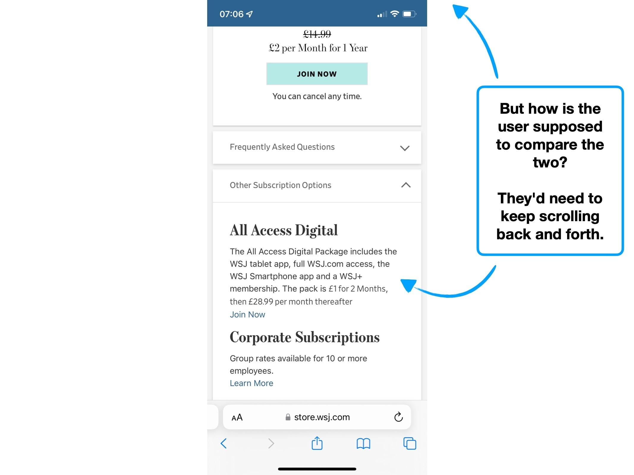
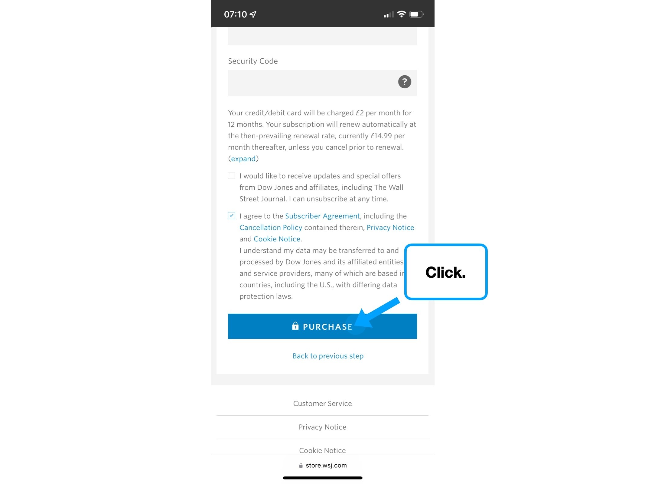
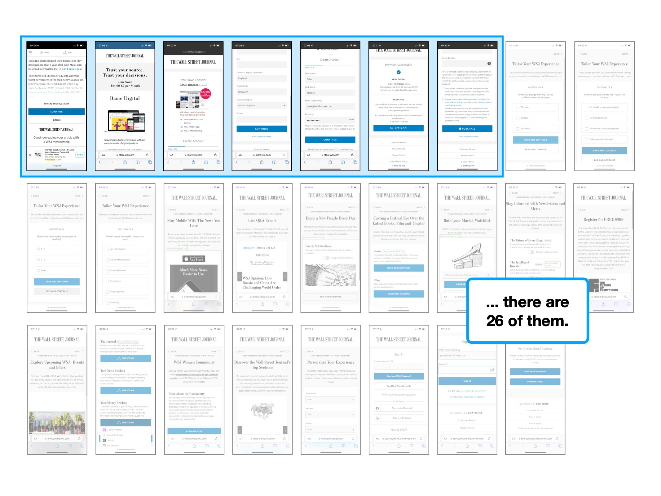
In fact, there are 26 screens in the WSJ subscription flow, and approximately 42 clicks. To put that in perspective, that's actually more than it takes to open a real bank account.


Clicks
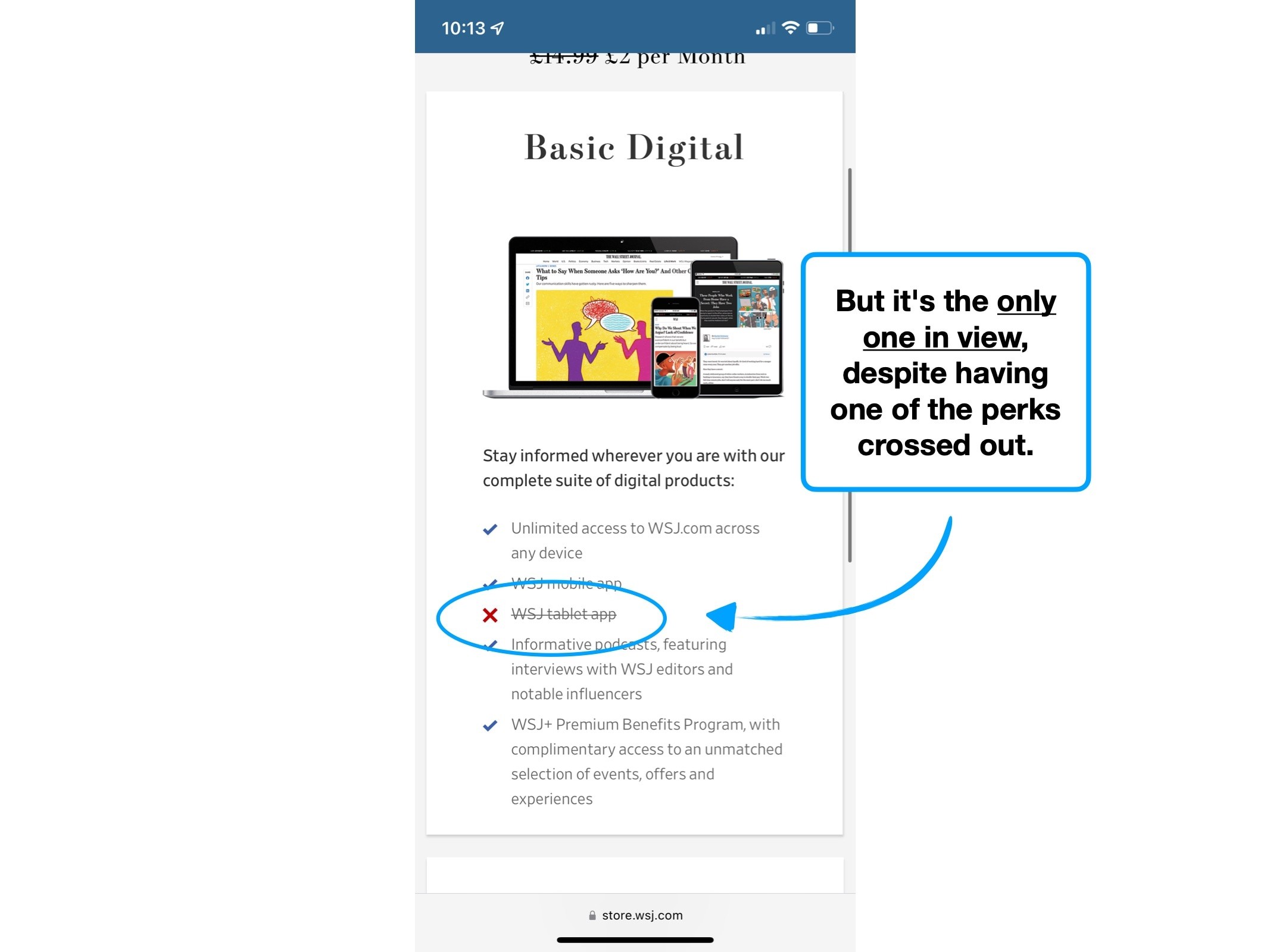
Of the 26, I'd argue that only 6 are necessary, and 16 of them could be fairly classified as further offers or promotions.
i.e., more than 60% of the entire process is post-purchase upselling.
Halfway through the onboarding—after you've likely already lost patience, and have resorted to skipping every question without reading—you're asked if you'd like to subscribe to any newsletters.
The list has clear toggles, which are well-labelled, and defaulted to off (i.e., to not subscribe).
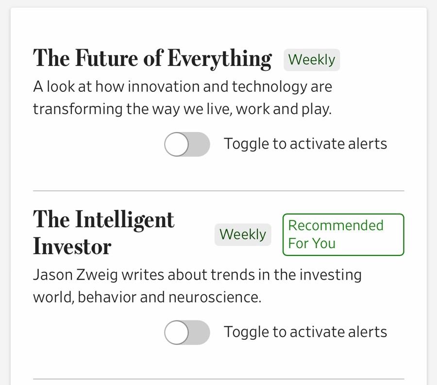
But then at the very end, is another newsletter, which is automatically toggled 'on', and if you skip the step, will confirm you as opting-in.
Notably:
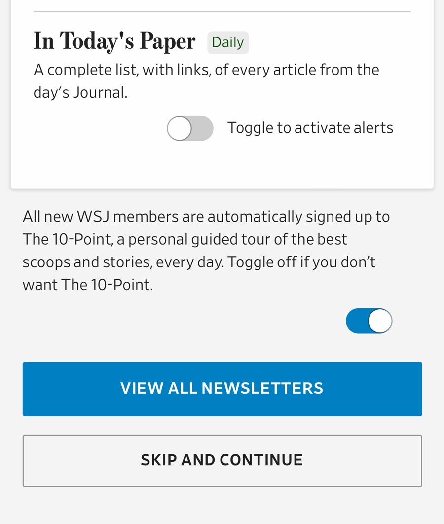
Presumably the WSJ have calculated that any annoyance caused by this is a worthwhile trade-off, but they may not have considered the impact on the UX.
Great experiences build trust throughout a process, helping the user feel in control.
And for the cohort of users who do notice, and opt-out of this newsletter, that trust may be broken. They may now feel obliged to scour through every page.
Note: see the ⛳️ Default Bias.
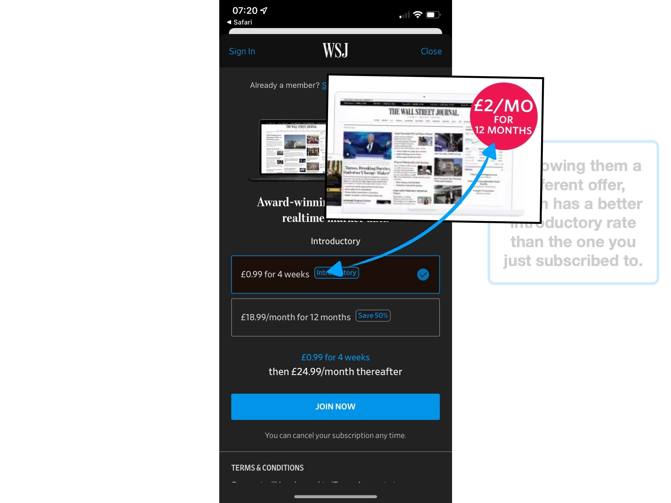
Often, when I start a free trial, one of the first things I do is look to see how I'd cancel my subscription, if I wanted to.
I can't fully explain the psychology behind it, but anecdotally I know that I'm not alone. It's a weird quirk—especially true for subscriptions that have low introductory rates, which increase in price automatically.
i.e., I want to check how, and when, I need to cancel, if I want to avoid paying 1000% more for the 4th month.
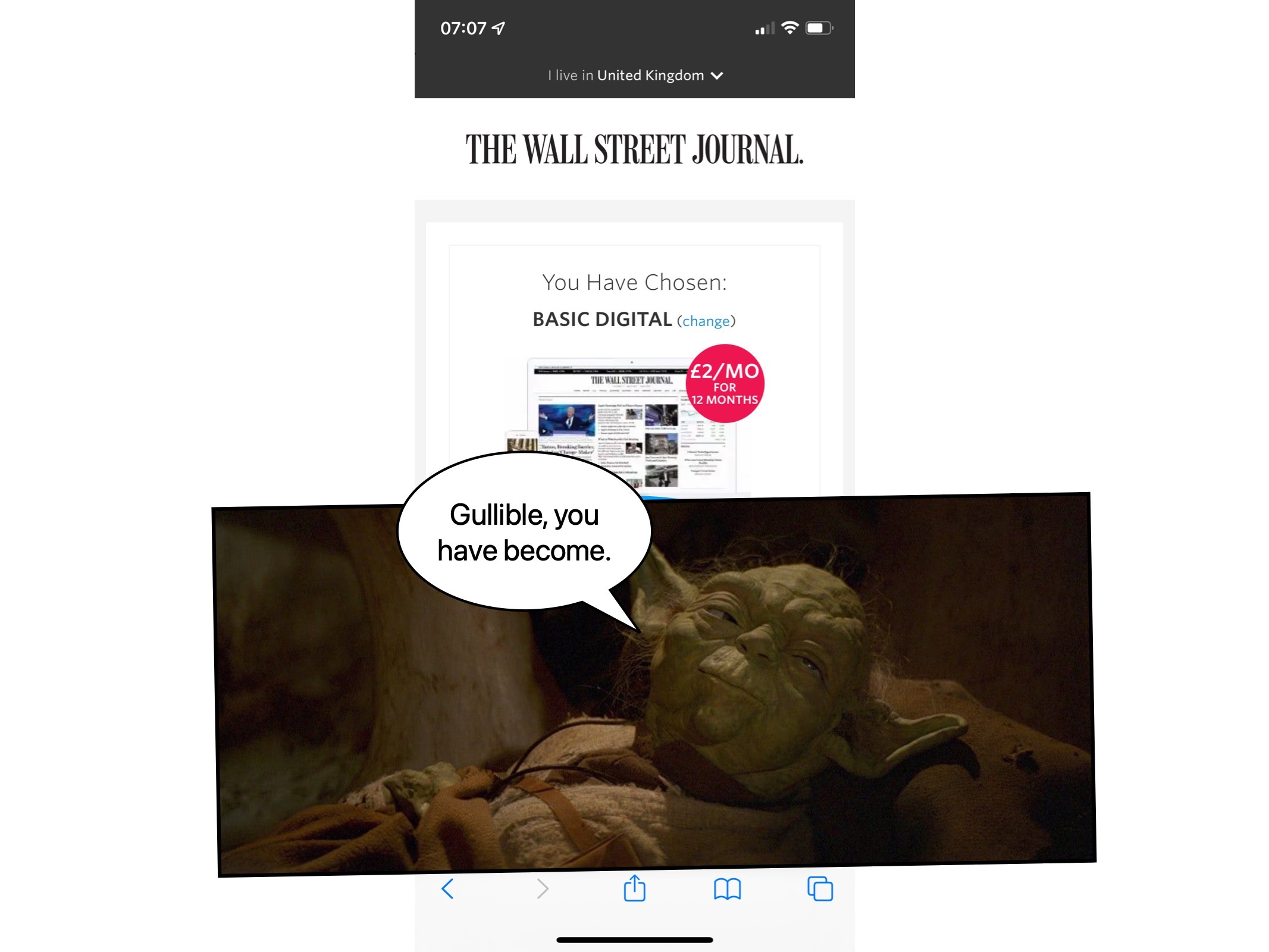
Before you pay, the WSJ promise you that cancelling is easy.
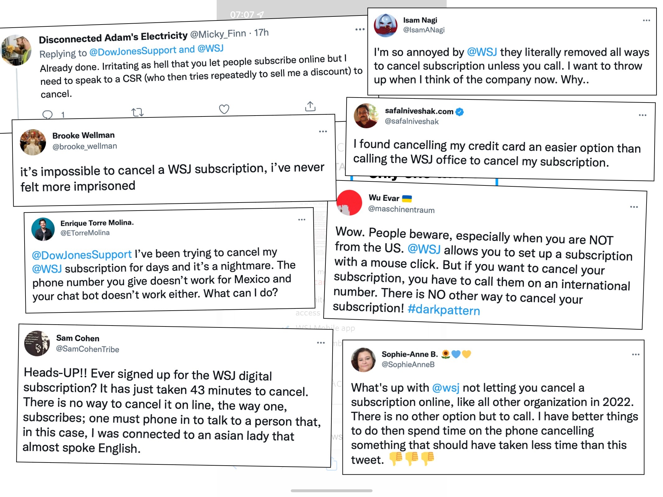
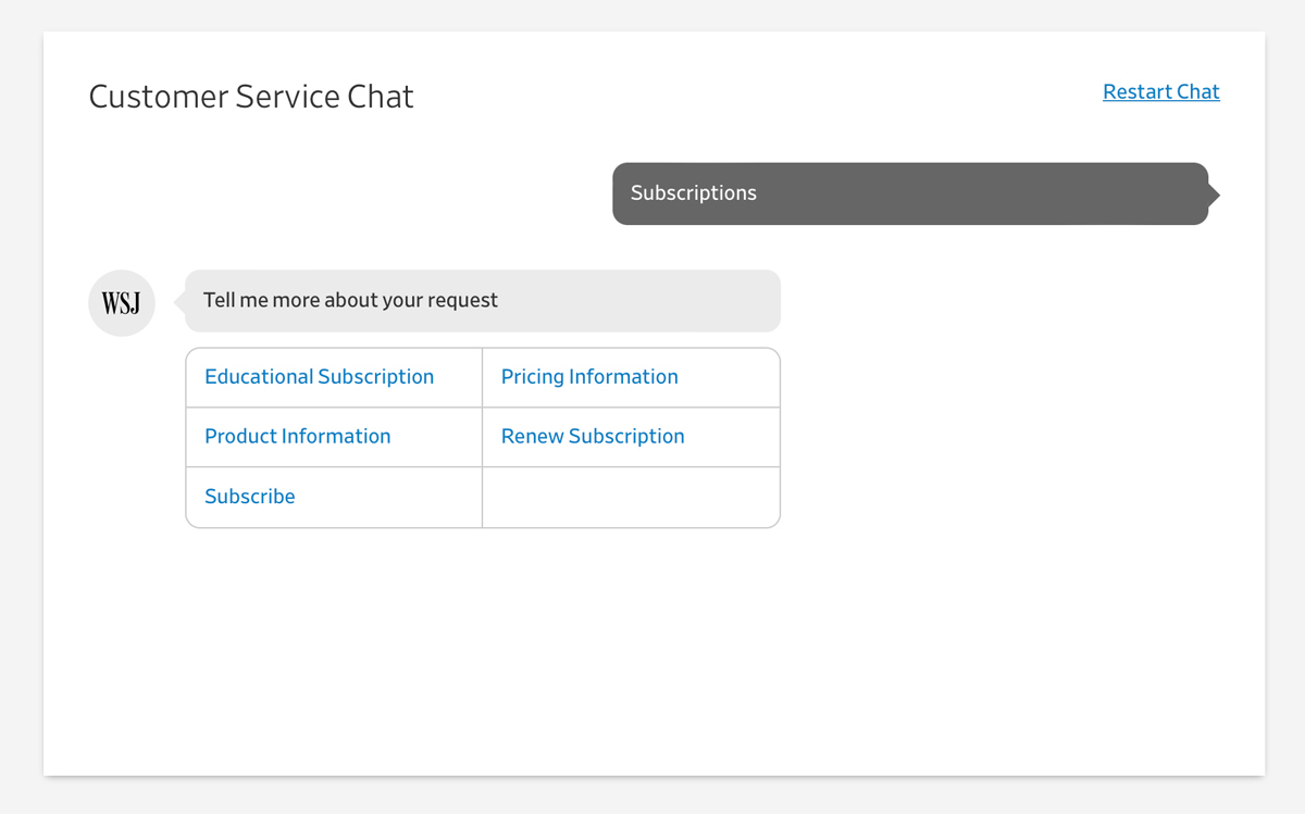
Except it's not—you can't do it online, or via email. You need to pick up the phone and call customer services.
Who do you speak to? Someone working in the retentions team, who continues to upsell you on the benefits and sweetens the deal. They're well-trained, and barely take "no" for an answer.
But first, to even find the toll-free phone number, you need to navigate their chat bot, which coincidentally will never suggest 'cancel subscription' as an answer to a question.
There's also an 'auto-renew' toggle on your dashboard, that is automatically turned on, and which you cannot disable.
I'm not an investigative journalist trying to expose shady business practices—I care about one thing; the user's experience.
And let's be clear; the WSJ is intentionally adding friction into their cancellation process, in order to retain customers.
This subscription experience is a tour-de-force of upselling at every opportunity, and then retaining customers at all costs.
It's the opposite of creating a meaningful and thoughtful experience.
Simple techniques to increase feature usage, retention and ultimately alter how users perceive the value of your product.
The techniques that Slack have used to create an effortless onboarding flow, and why you might not want to copy them.
The product psychology behind why Robinhood offer new users $7.08 of free stock, and not $10.