UX Content
  • Case Studies
  • UX Bites
  • Cheatsheets
  • Psychology
BFM+
  • Instant Feedback
  • MCP
  • Figma Plugin
  • Tiers & pricing
  • Free newsletter
  • Log in
Other
  • Archive
  • About
  • Help
  • Changelog
Services
UX audits

A complete audit of your user experience, delivered in a format that you can't ignore.

Book an audit

Built for Mars Ltd is a company registered in England and Wales (Company No. 12731987).

Account
  • Log inAccess your library and activities
  • SubscribeUnlock all features and access to the library
Learn from the best companies in the world

A library of content that even non-designers find interesting.

Subscribe todaySubscribe today
Structured learning
  • UX BootcampEnroll in a 5-week bootcamp
  • PathwaysCreate custom learning Pathways to work towards any goal, industry or topic
  • CollectionsBrowse Case Studies by key topics
  • QuizzesTest your knowledge
Explore the library
  • Case StudiesSlideshows that are packed with research
  • UX BitesReal examples of design magic
  • CheatsheetsQuickly level up in a particular area
  • Product PsychologyLearn the essentials
  • NewsletterGet research straight to your inbox
  • CompaniesBrowse by company
Learn from the best companies in the world

A library of content that even non-designers find interesting.

Subscribe todaySubscribe today
Tools to help you
  • AI InsightsUpload screenshots of your design, and get instant feedback from our AI
  • MCPAccess the entire library from your favourite agent
  • Figma pluginAccess our AI tools, and our entire library, directly from Figma
One-to-one help
  • UX AuditsThe fast-track for growth
Includes tools that help you ship better products

Learning never stops, but sometimes you need a little more.

Subscribe todaySubscribe today
Log inSubscribe today
Home
Design Examples
UX Tips for App Download Screens
Design Examples

UX Tips for App Download Screens

See how companies like Figma, Claude and Logitech prompt app downloads, with examples of QR code handoffs, email reminders and product showcases in place of spinners.

Real world examples:

Updated: 23/09/2026, view all 1,482 examples

Examples on Built for Mars include
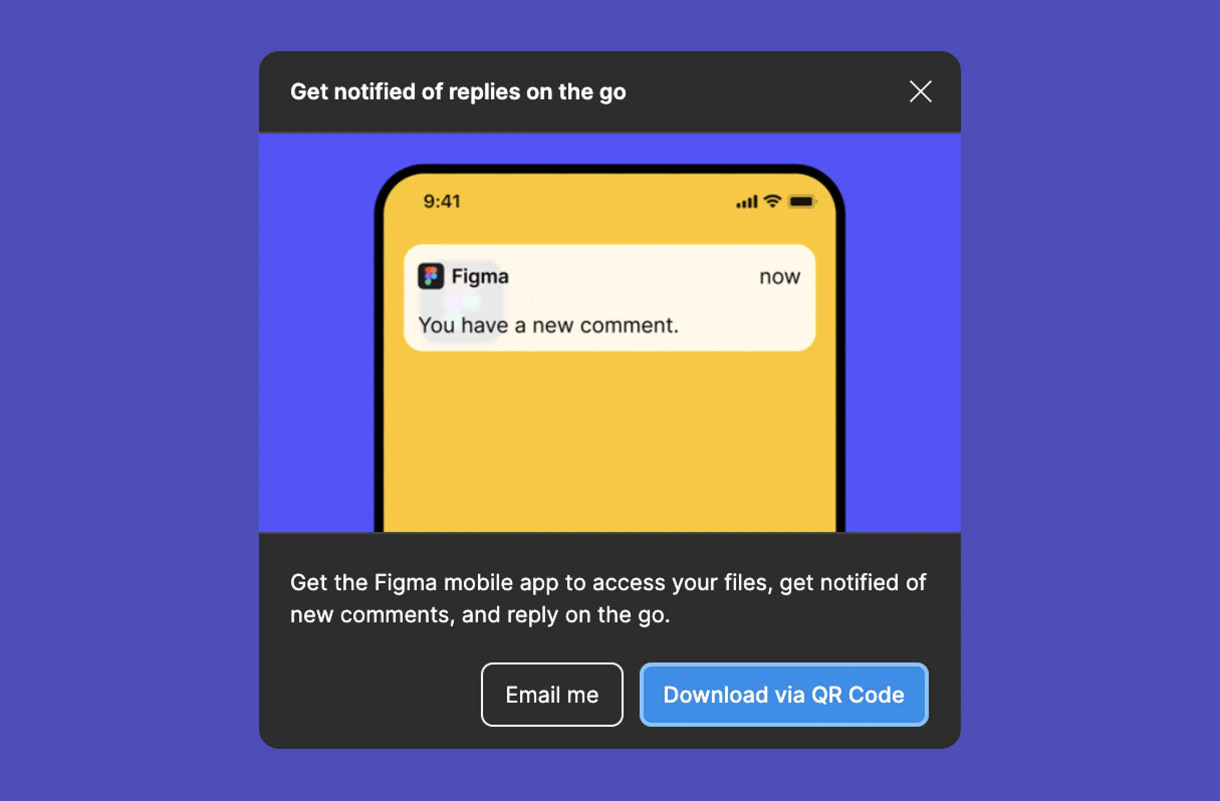
  • Figma sends app links via QR code or email

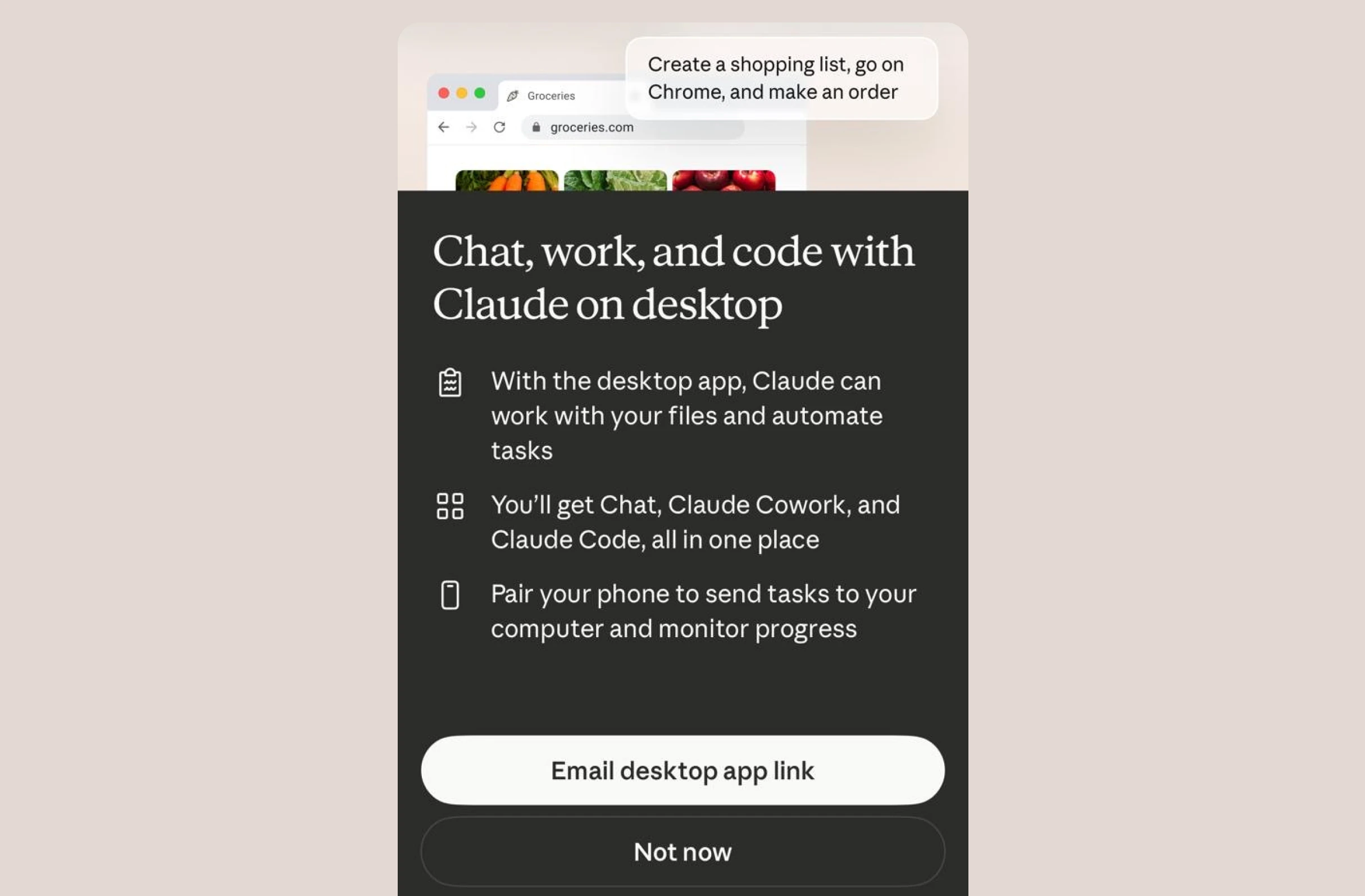
  • Claude's emailed link doubles as a reminder

  • Logitech fills download waits with products

UX Bite:
Figma logoFigma

Introducing the mobile app

After commenting on the Figma app, you'll be prompted to download the mobile app to be notified if anyone responds. Even better, they'll show a QR code, or email you a link.

Introducing the mobile app

More context:

This is a two-step benefit.

1. It progressively onboards a feature (the app).

2. It makes it easy to send instructions to another device (as you're on your laptop).

#437
View UX Bite
UX Bite:
Manual Camera logoManual Camera

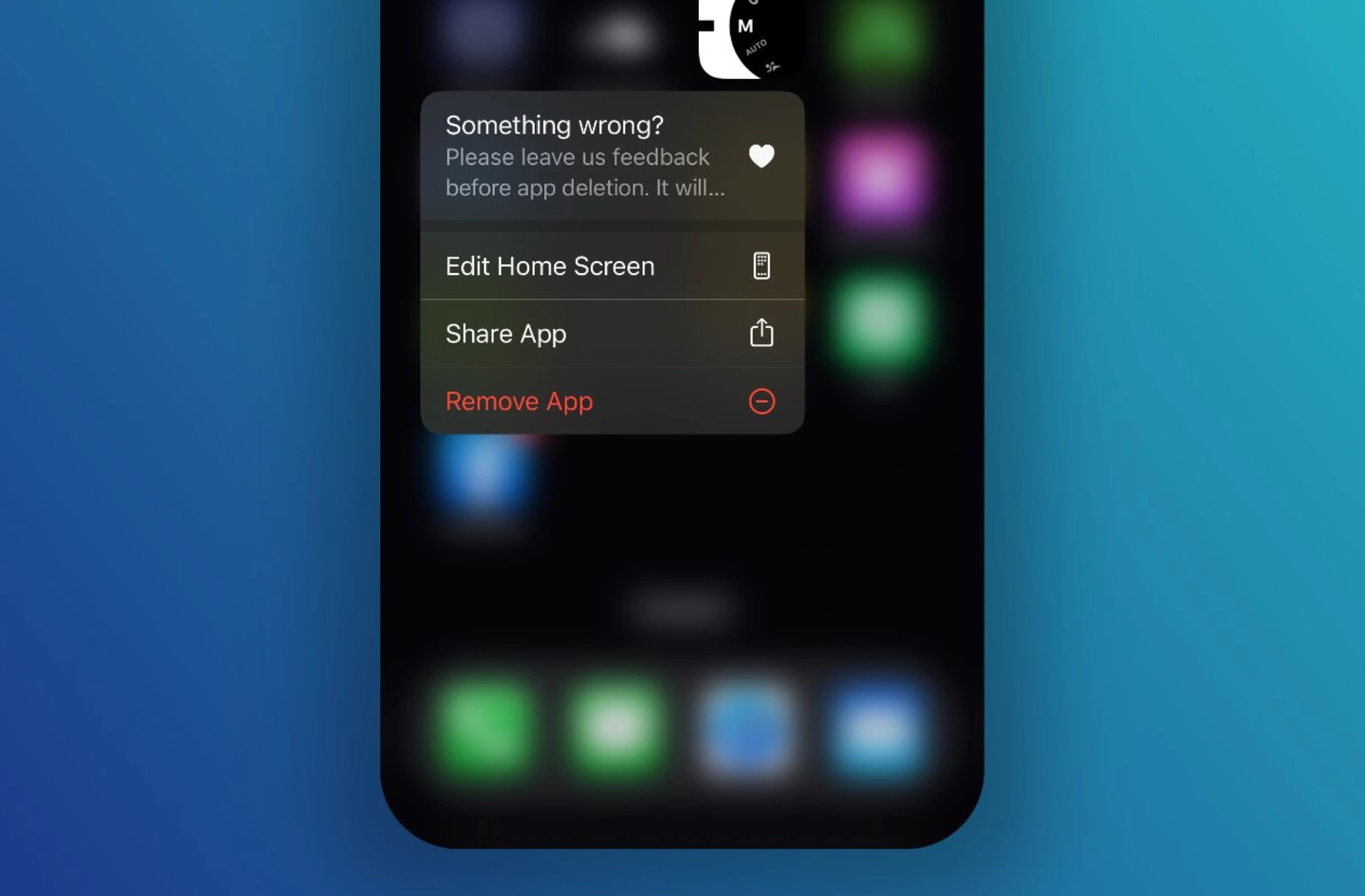
Requesting feedback when deleting app

If you long tap to delete the AsaTools iOS app, there's a "quick feature" and a prompt to give feedback before deleting it.

Requesting feedback when deleting app
#246
View UX Bite
UX Bite:
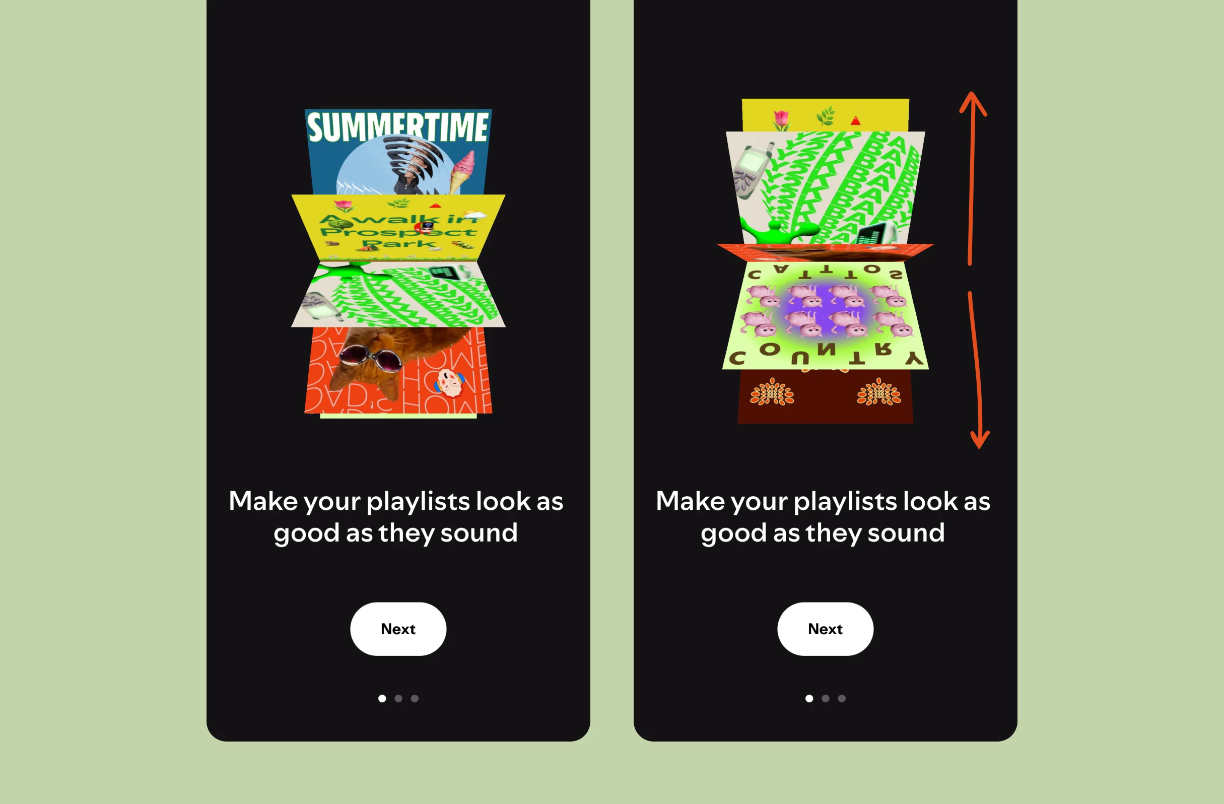
Spotify logoSpotify

A digital record collection

During the onboarding of Spotify's custom thumbnail generator, you can swipe through a carousel of examples.

A digital record collection
#1413
View UX Bite
UX Bite:
Apple logoApple

Apple's starter pack

During the Apple Arcade onboarding, you'll be asked to select four categories that you're interested in. They'll then present you with a "starter pack" of items to download.

Apple's starter pack

More context:

Importantly, this component is then shown on the homepage feed. You can download all four in a single tap.

#738
View UX Bite
UX Bite:
Claude logoClaude

Remind me later

When promoting the Claude desktop app to mobile users, they've got a one-click to email the download link to yourself.

Remind me later

More context:

They don't want to interrupt you, plus, they know that you're on your mobile device. This gives you a reminder later.

#1420
View UX Bite
UX Bite:
Logitech logoLogitech

Better than a spinner

Subscribe to unlock this example
Plans start from £8 per month
Subscribe to unlock#1417
Preview
UX Bite:
Endel logoEndel

Intercepting a share

Subscribe to unlock this example
Plans start from £8 per month
Subscribe to unlock#954
Preview
The UI displays a large white "S" centered on a solid purple-blue background, with no additional text, logos, or interface elements visible.The UI shows a stylized "M" logo with teal, cream, and red color blocks on a dark blue background. No text or markings are highlighted or underlined.Figma logo on black background with four rounded shapes in red, pink, purple, blue, and green vertically aligned in a grid pattern. No text or highlights.

There are more than 1400 UX Bites like this

Subscribe to BFM+

If features can be coded in minutes, thoughtful design is what wins

  • Unlock the entire library
  • Create custom UX courses
  • Access our AI tools
£8/monthbilled annually
See the benefits
or, wait for the free stuff

Join the free newsletter

Get the free content when it's released, straight to your inbox, no account required

"An exceptional resource for learning how to build habit-forming products that people love."

The UI contains the yellow book cover "HOOKED" by Nir Eyal in the bottom right, with black text in a white box with blue borders stating "COMPLETELY REVISED AND UPDATED."
Nir EyalAuthor of Hooked

"I’d never met anybody who looks at usability and UX the way I do until I met Peter. Only he’s smarter."

Photo: site-map sketches with pen annotations, yellow sticky notes and folder of labeled cards, black phone cord, red book cover reading "DON'T MAKE ME THINK".
Steve KrugAuthor of Don't Make Me Think

"The completest view of the psychological underpinnings of human behaviour that I’ve ever seen."

Circular avatar: smiling man, navy jacket, blue‑checked shirt, blurred green bg. Overlays: red EA badge lower-right; black square with white up‑left arrow.
Bing GordonKleiner Perkins & EA

"What a nice idea! Christopher Alexander would be proud to see patterns collected like this."

Profile picture of a man with medium-length hair and stubble wearing a grey hoodie and dark jacket. Two app icons overlay bottom right: yellow Asana and blue Miro.
DHHHey! & Basecamp

FAQs

When is the right moment to prompt a mobile app download?

Right after an action the app would improve, so the download has an obvious reason. For example, Figma prompts you to get the mobile app just after you leave a comment, so you'll be notified when someone replies. The app is introduced as a feature in context, not a generic banner.

How do you promote an app for a different device than the one someone is using?

The friction is moving the link from one device to the other, so the prompt should do that work. A QR code or a one-click 'email me the link' button both solve it. For instance, Claude lets mobile users email themselves the desktop app link, which avoids interrupting them and lands in their inbox as a reminder for later.

What can a download progress screen show instead of a spinner?

A download is a captive wait, so the screen can keep people engaged or surface other value. As an example, Logitech shows high-quality images from its product catalogue while Logi Options downloads, alongside the progress bar, remaining size and speed.

How can you get users to download several items in one go?

Asking about interests first makes it possible to bundle relevant downloads together. This is what Apple Arcade does: you pick four categories, then get a 'starter pack' of games to download in a single tap, and the same component reappears on the homepage feed.

Why prompt people to share a link when they take a screenshot of an app?

A screenshot gives the recipient nothing to act on, whereas a link lets them open or download the app directly. For example, Endel detects a screenshot and prompts you to share the app instead, turning a passive share into an actionable one.

Is it worth asking for feedback when someone deletes an app?

The delete moment is often the last chance to learn why someone is leaving. For example, the AsaTools iOS app adds a 'Something wrong?' feedback option to the long-press menu, right alongside the 'Remove App' button.