UX Content
  • Case Studies
  • UX Bites
  • Cheatsheets
  • Psychology
BFM+
  • Instant Feedback
  • MCP
  • Figma Plugin
  • Tiers & pricing
  • Free newsletter
  • Log in
Other
  • Archive
  • About
  • Help
  • Changelog
Services
UX audits

A complete audit of your user experience, delivered in a format that you can't ignore.

Book an audit

Built for Mars Ltd is a company registered in England and Wales (Company No. 12731987).

Account
  • Log inAccess your library and activities
  • SubscribeUnlock all features and access to the library
Learn from the best companies in the world

A library of content that even non-designers find interesting.

Subscribe todaySubscribe today
Structured learning
  • UX BootcampEnroll in a 5-week bootcamp
  • PathwaysCreate custom learning Pathways to work towards any goal, industry or topic
  • CollectionsBrowse Case Studies by key topics
  • QuizzesTest your knowledge
Explore the library
  • Case StudiesSlideshows that are packed with research
  • UX BitesReal examples of design magic
  • CheatsheetsQuickly level up in a particular area
  • Product PsychologyLearn the essentials
  • NewsletterGet research straight to your inbox
  • CompaniesBrowse by company
Learn from the best companies in the world

A library of content that even non-designers find interesting.

Subscribe todaySubscribe today
Tools to help you
  • AI InsightsUpload screenshots of your design, and get instant feedback from our AI
  • MCPAccess the entire library from your favourite agent
  • Figma pluginAccess our AI tools, and our entire library, directly from Figma
One-to-one help
  • UX AuditsThe fast-track for growth
Includes tools that help you ship better products

Learning never stops, but sometimes you need a little more.

Subscribe todaySubscribe today
Log inSubscribe today
Home
Design Examples
Error Message Examples from Real Products
Design Examples

Error Message Examples from Real Products

See how companies like Lovable, Amazon and Slack design error messages, including promo code rescues at checkout, soft typo warnings and themed error pages.

Real world examples:

Updated: 23/09/2026, view all 1,490 examples

Examples on Built for Mars include
  • 'Lovable has been notified' builds trust

  • Bloom & Wild swaps invalid codes for 10% off

  • Slack warns of email typos without blocking

UX Bite:
Lovable logoLovable

Creating confidence from errors

When Lovable errors, they'll make it clear that the logs have been sent somewhere internally.

Creating confidence from errors

More context:

This gives you confidence that they're attending to errors—perhaps boosting brand trust.

#1072
View UX Bite
UX Bite:
Amazon logoAmazon

The Dogs of Amazon

On error pages, Amazon will sometimes show a dog from their “Dogs of Amazon” list.

The Dogs of Amazon
#1187
View UX Bite
UX Bite:
Bloom & Wild logoBloom & Wild

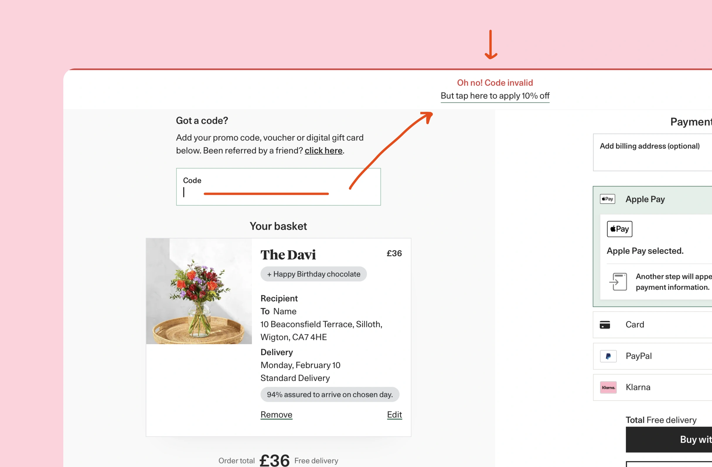
10% to avoid disappointment

To save disappointment (and stop you from Googling better codes), Bloom & Wild will give you 10% off if you enter an incorrect discount code.

10% to avoid disappointment

More context:

They don't want potential customers searching for discount codes, or they might find one for their competitors.

So instead, they're prepared to give you a one-click 10% off, to save you from the disappointment of trying expired ones you find online.

#874
View UX Bite
UX Bite:
Dominos logoDominos

Providing an alternative promo code

If you enter an incorrect code into Dominos, they'll present you an offer from their library.

Providing an alternative promo code
#39
View UX Bite
UX Bite:
Cineworld logoCineworld

Cineworld's error messages

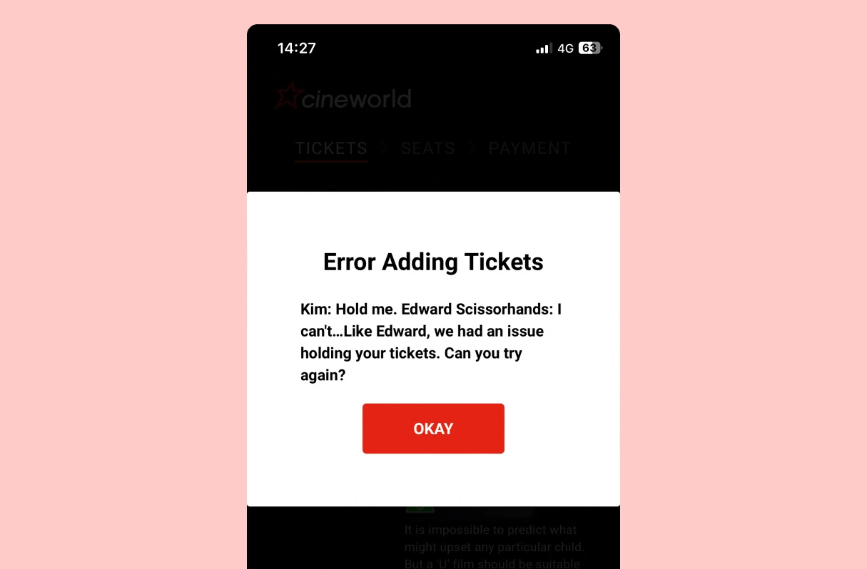
If you run into an error while booking cinema tickets, you'll see a themed movie quote.

Cineworld's error messages

More context:

To be clear, I think this execution is poor. The styling is off, and it's awkward to read. 

But conceptually this is a decent way of reducing some of the frustration of hitting an error.

#193
View UX Bite
UX Bite:
Mimo logoMimo

Mistakes = learning

Subscribe to unlock this example
Plans start from £8 per month
Subscribe to unlock#604
Preview
UX Bite:
Airalo logoAiralo

Double purchases

Subscribe to unlock this example
Plans start from £8 per month
Subscribe to unlock#690
Preview
The UI displays a large white "S" centered on a solid purple-blue background, with no additional text, logos, or interface elements visible.The UI shows a stylized "M" logo with teal, cream, and red color blocks on a dark blue background. No text or markings are highlighted or underlined.Spotify logo in gradient heart shape showing orange, red, blue, and green colors on black background, with no text or UI elements visible.

There are more than 1400 UX Bites like this

Subscribe to BFM+

If features can be coded in minutes, thoughtful design is what wins

  • Unlock the entire library
  • Create custom UX courses
  • Access our AI tools
£8/monthbilled annually
See the benefits
or, wait for the free stuff

Join the free newsletter

Get the free content when it's released, straight to your inbox, no account required

"An exceptional resource for learning how to build habit-forming products that people love."

The UI contains the yellow book cover "HOOKED" by Nir Eyal in the bottom right, with black text in a white box with blue borders stating "COMPLETELY REVISED AND UPDATED."
Nir EyalAuthor of Hooked

"I’d never met anybody who looks at usability and UX the way I do until I met Peter. Only he’s smarter."

Photo: site-map sketches with pen annotations, yellow sticky notes and folder of labeled cards, black phone cord, red book cover reading "DON'T MAKE ME THINK".
Steve KrugAuthor of Don't Make Me Think

"The completest view of the psychological underpinnings of human behaviour that I’ve ever seen."

Circular avatar: smiling man, navy jacket, blue‑checked shirt, blurred green bg. Overlays: red EA badge lower-right; black square with white up‑left arrow.
Bing GordonKleiner Perkins & EA

"What a nice idea! Christopher Alexander would be proud to see patterns collected like this."

Profile picture of a man with medium-length hair and stubble wearing a grey hoodie and dark jacket. Two app icons overlay bottom right: yellow Asana and blue Miro.
DHHHey! & Basecamp

FAQs

What makes an error message build trust rather than frustration?

Saying the team has already been notified shows that errors are monitored, which builds longer-term confidence that the product will improve. For example, Lovable adds a single line, "Lovable has been notified", beneath its "Something went wrong" message.

Why offer a discount when someone enters an invalid promo code?

A rejected code often sends people to Google in search of a working one, where competitors bid on those keywords. Offering an alternative on the spot keeps them in the checkout. For instance, Domino's surfaces an offer from its own library, while Bloom & Wild gives a one-click 10% off, a tactic worth testing when checkout abandonment is high.

Do playful error pages actually help?

Personality can take the edge off hitting a bug, but only if the message stays easy to read. As an example, Amazon shows photos from its "Dogs of Amazon" list on error pages. Cineworld uses themed movie quotes when ticket booking fails, although awkward styling makes them harder to read.

When should validation warn rather than block?

If the system is only guessing that an input is wrong, a soft warning avoids blocking valid entries while still catching mistakes early. This is what Slack does at signup. It asks whether "gmial" or "yaho" is correct but still lets people continue, so typos surface before anyone waits for a confirmation email that never arrives.

How can a first mistake be turned into part of onboarding?

Framing the error as expected behaviour lowers the sting and creates a natural moment to explain a mechanic. For example, Mimo tells learners that "a first mistake is part of learning" and uses that moment to introduce hearts, which are needed to complete lessons.

When is adding friction the right way to prevent errors?

A confirmation step is justified when an accidental action is costly and hard to undo, such as a duplicate payment. For instance, Airalo shows a modal when someone tries to buy the same item twice in quick succession and asks them to confirm before purchasing again.