Temporary tooltips
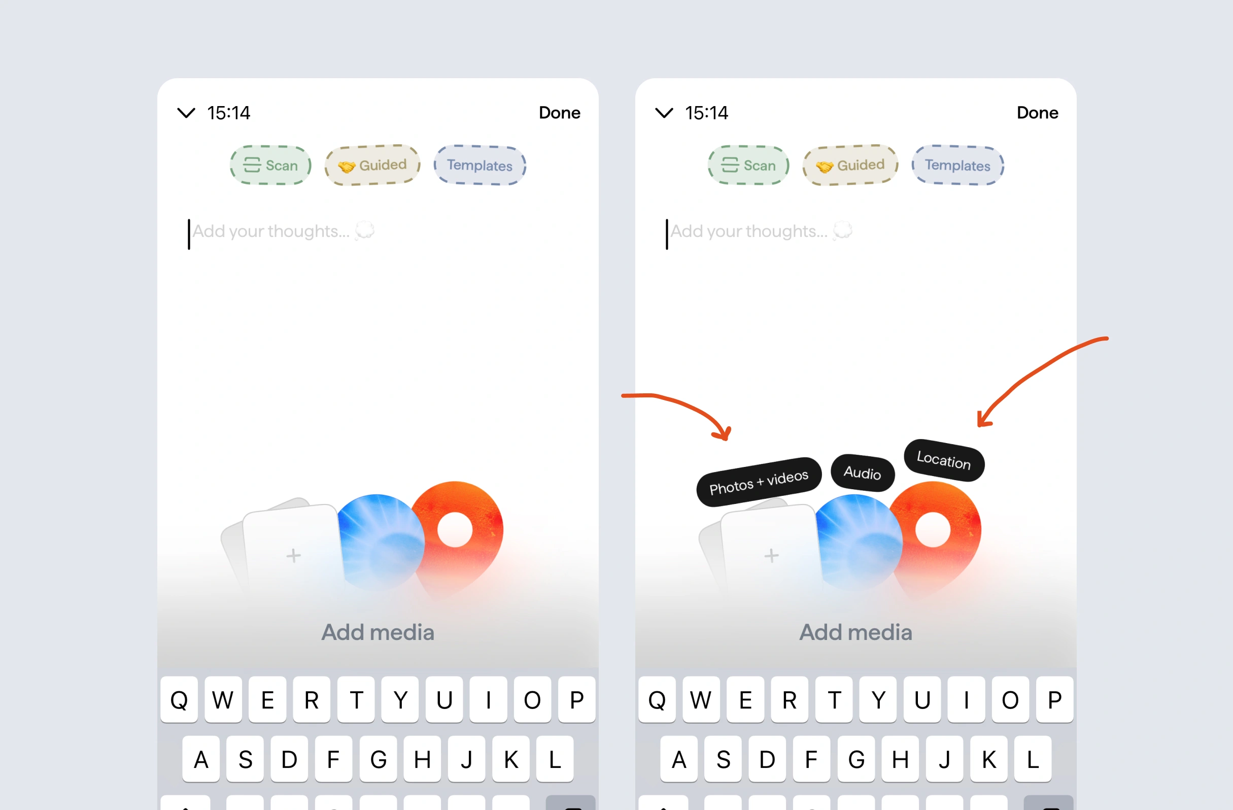
When you go to leave a journal entry, ABY will show these tooltips for a few seconds, which then disappear to remove the distraction.
See how companies like Slack, Revolut and Nike time their tooltips, including auto-hiding hints, reactive onboarding and referral nudges, with our annotated UI examples.
Updated: 26/10/2026, view all 1,496 examples
Revolut teaches card recovery after deletion
Slack retrains users who misuse CMD+K
PostHog adds exact dates to relative filters
When you go to leave a journal entry, ABY will show these tooltips for a few seconds, which then disappear to remove the distraction.
If you make a major change to a custom shoe on Nike, they’ll show you context about what that change actually means.
After deleting a card in Revolut, and then going back to view them all, they’ll show a tooltip showing how you could get that card back.
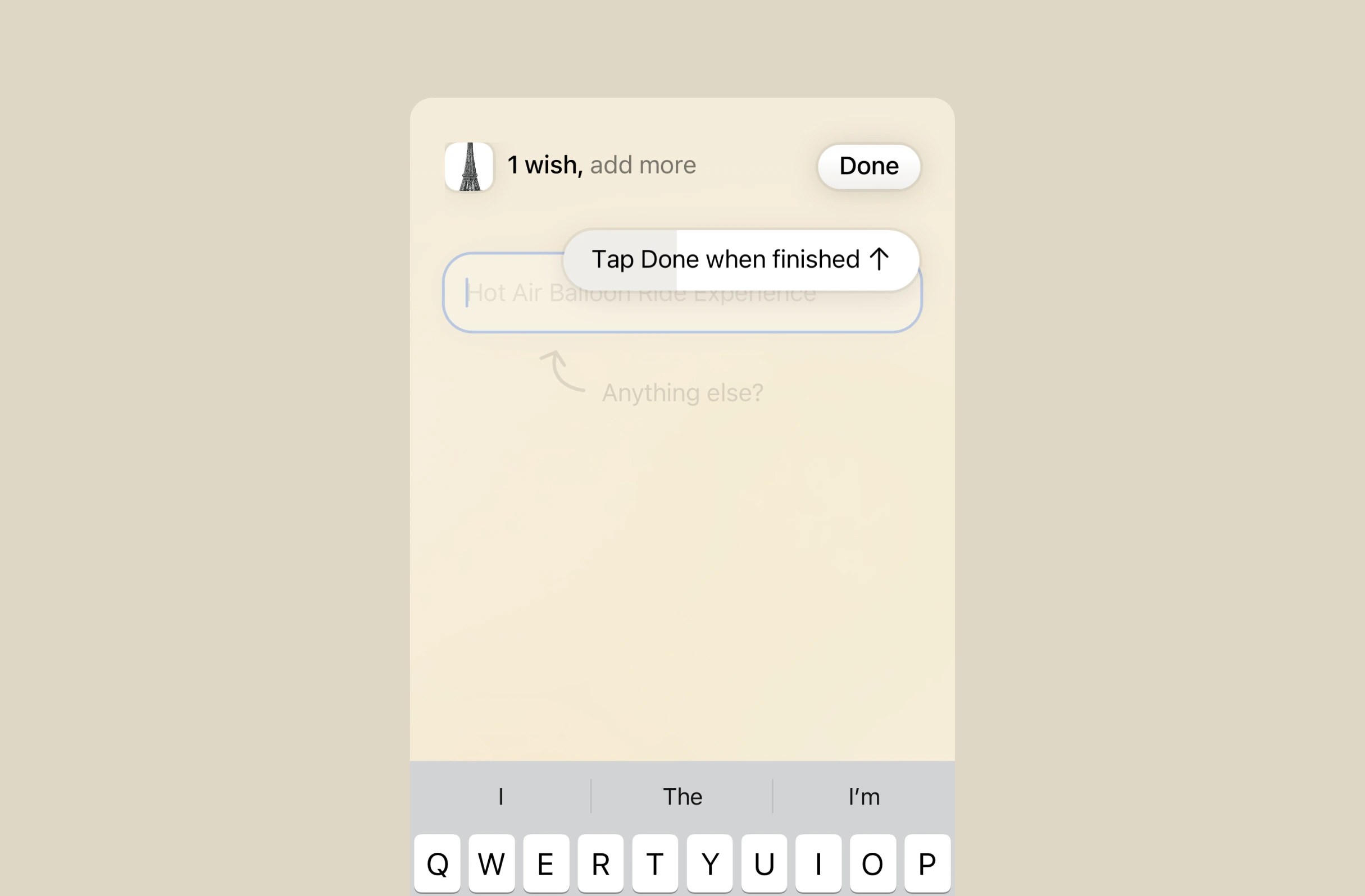
When pointing out key features, Spoil Me will show a tooltip that automatically hides after a few moments.
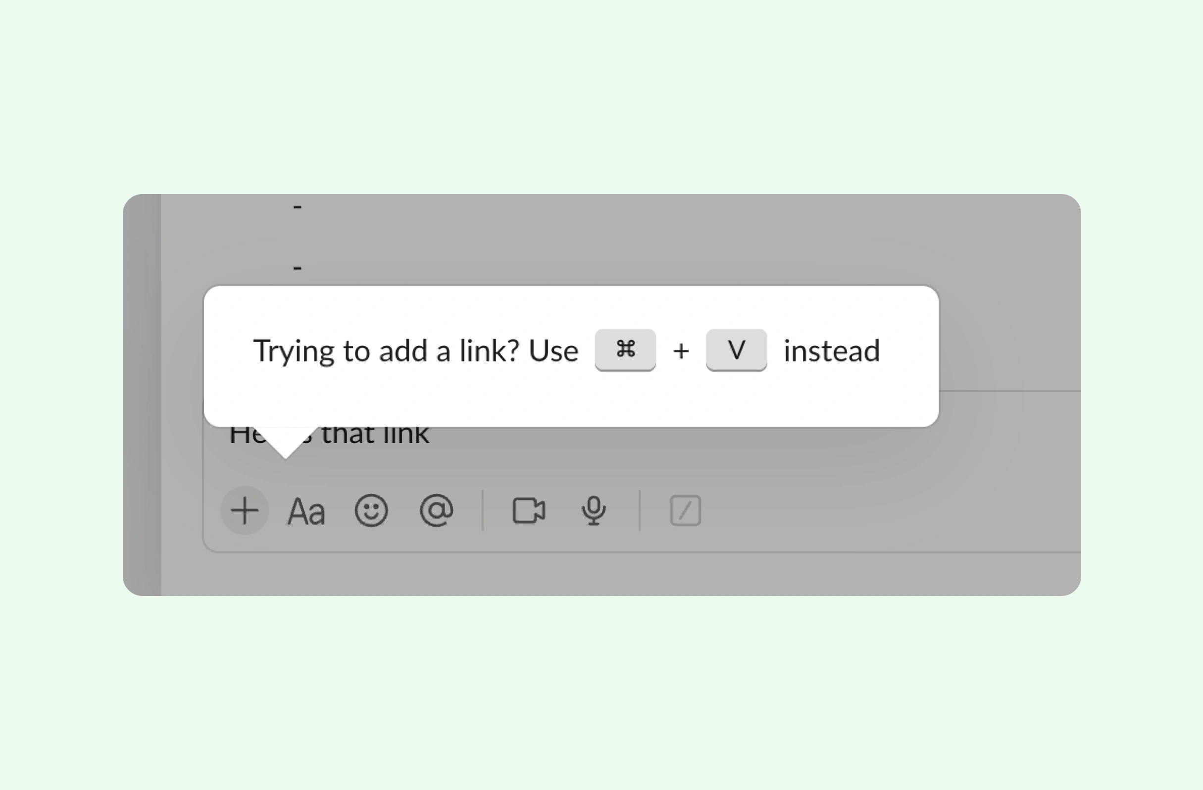
Usually, CMD+K is a shortcut to add a link, but Slack uses it for opening the search. To teach you this difference, they'll show a tooltip if you press CMD+K whilst highlighting text.
If features can be coded in minutes, thoughtful design is what wins
Get the free content when it's released, straight to your inbox, no account required
"An exceptional resource for learning how to build habit-forming products that people love."

"I’d never met anybody who looks at usability and UX the way I do until I met Peter. Only he’s smarter."

"The completest view of the psychological underpinnings of human behaviour that I’ve ever seen."

"What a nice idea! Christopher Alexander would be proud to see patterns collected like this."