Pricing
Log inGet full access
Home
UX Glossary
Decision Fatigue
šŸ›ŒšŸ½

Decision Fatigue

People find it harder to make rational decisions, as the total number of decisions that they've made increases.

Related psychology

  • šŸ“ˆHyperbolic DiscountingUndervaluing long term rewards
  • 🌻Fresh Start EffectFresh starts can be motivating.
  • šŸ‘Confirmation BiasSeeking what's consistent with your beliefs.

Featured in 7 UX Bites. Last updated 08/11/2026

Take it with you

Copy for humans

A line on what it is, a line on why it matters, and the link. Ready for Slack or email.

Copy for your AI

A Markdown prompt with the term, its likely impacts and real examples from Built for Mars. Paste it into Claude, ChatGPT or Cursor.

Skip the copy and paste

Connect the Built for Mars MCP once, and Claude or Cursor can apply this, and every other piece of psychology, straight to your work. Included with all paid plans.

Connect the MCP

Take it with you

Share it, or apply it with AI.

A line on what it is, a line on why it matters, and the link. Ready for Slack or email.


Or connect the MCP and skip copying

How to utilise this in your designs

When someone names something they've made, you could pre-fill the name with their first line of text, already highlighted, so there's one less decision to make.

Document editor. The default title "Untitled document" automatically becomes the first line typed, "The thing about Mars is....", so a new document is named from its opening text without manual renaming.
Example fromGoogle logoGoogle

Try offering a 'Surprise me' option alongside set snooze times, so people don't have to decide exactly when an item comes back, sparing them one more choice.
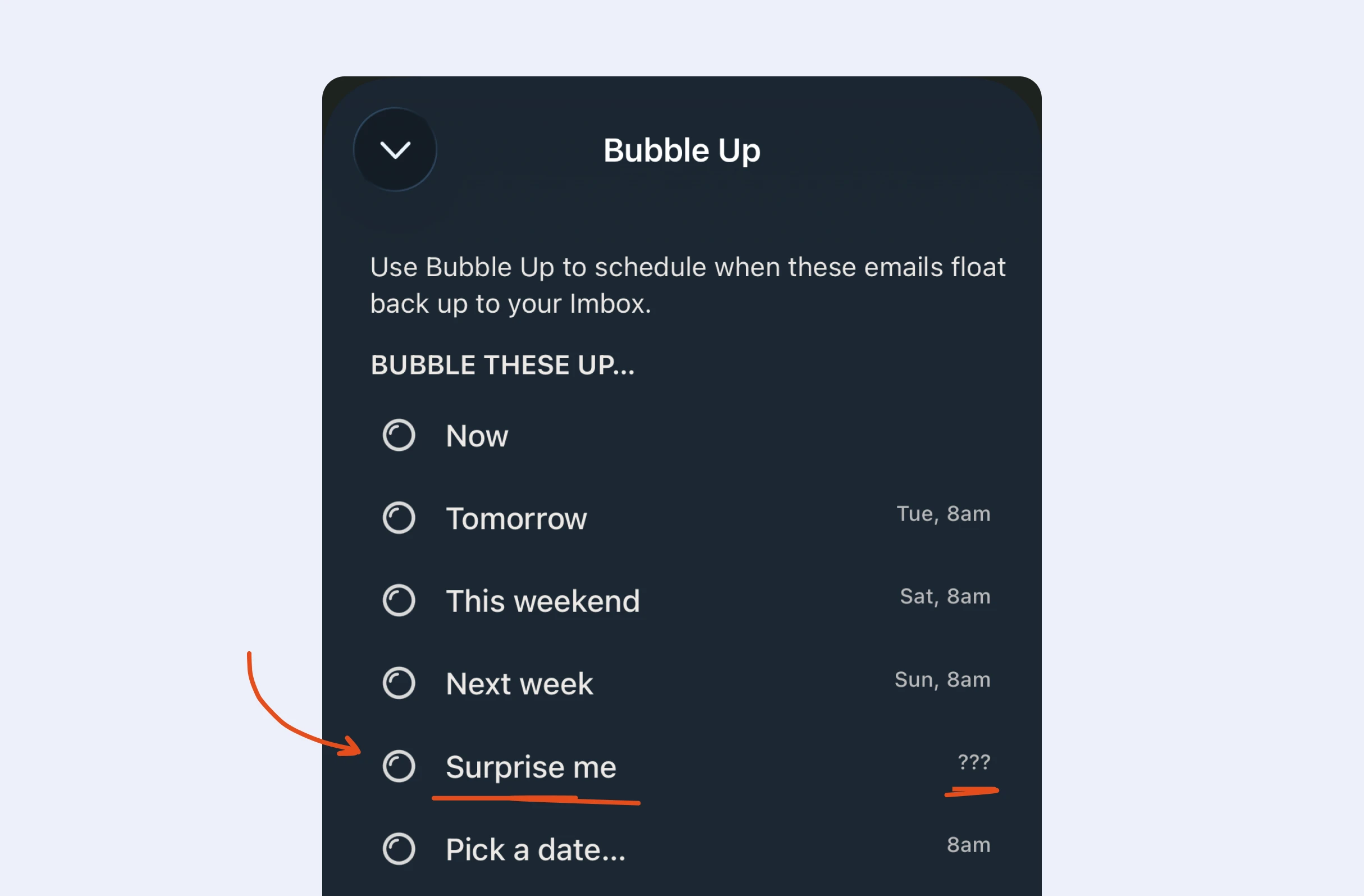
Email snooze menu. Among options for when emails return to the inbox, "Surprise me" shows "???" instead of a set time, so the return time is left random rather than chosen by the user.
Example fromHey logoHey

Where people face a large library, one option is a button that suggests something at random, so they can get started without weighing up every option.
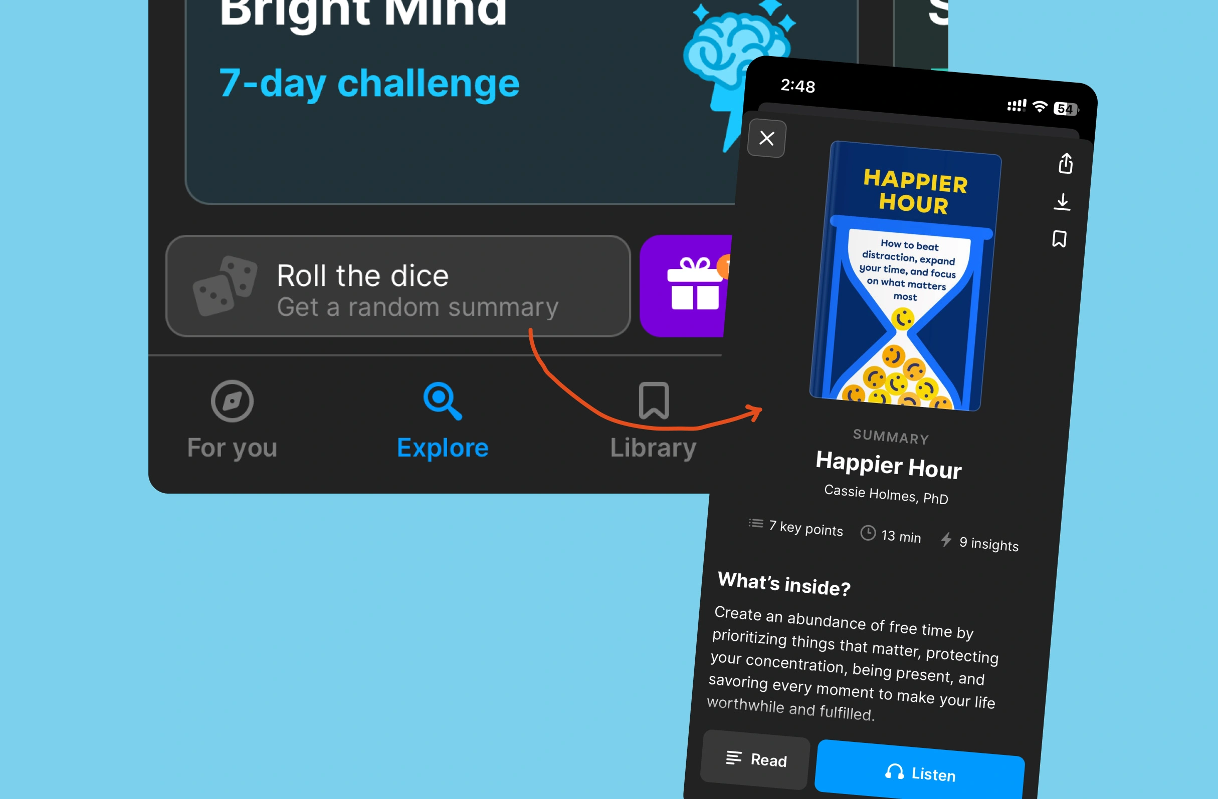
Browse page. Tapping "Roll the dice" ("Get a random summary") opens a randomly chosen book summary detail page showing key points, duration, a "What's inside?" description, and "Read" and "Listen" buttons.
Example fromHeadway logoHeadway

If someone backs out of a big commitment, consider offering to remind them later, so they can return when the decision feels easier rather than giving up.

Pricing. Carbon offset plans, "I want to offset...", with options by footprint percentage. Leaving prompts a pop-up asking "Need time to think about it?" with a "Send a reminder in 7 days" toggle, rather than losing the user.
Example fromKlima logoKlima

It may help to show short lists that other customers have put together, so people facing a huge range pick from a few options, not from everything.

Food delivery feature introduction. A bottom sheet titled "Introducing EatLists" explains users can create and share recommendation lists of favourite dishes; after "Proceed", a "Your Eatlists!" page shows saved lists like "All time fav" and "Late night cravings".
Example fromSwiggy logoSwiggy

Possible impacts

Long flows packed with choices could push users into decision fatigue, so they abandon partway; asking only what's needed now might help more of them finish.

As seen in:
Klima logo
Klima
An anti-churn strategy

Every extra choice can sap users' effort, so later on they may settle for the easiest option; putting key decisions first could keep effort high where it counts.

As seen in:
Bitepal logo
Bitepal
Select your mascot's tone
Granola logo
Granola
This is better with your work email

Choices made late in a long flow may reflect decision fatigue rather than real preferences, which could lower the quality of the answers you collect.

As seen in:
Google logo
Google
Google Docs removing an unnecessary decision
Hey logo
Hey
Resurface this email later

If each visit means making the same choices again, decision fatigue might put users off returning; pre-selecting likely options could help them build a routine.

As seen in:
Tiimo logo
Tiimo
I'm busy right now...
FocusPomo logo
FocusPomo
Tilting your rewards

Use it with your AI

Two ways to apply this to your own product.

Copy and paste

  1. 1Copy the prompt below
  2. 2Switch to Claude, ChatGPT or Cursor
  3. 3Paste it, and describe your product if it can't see it
  4. 4Repeat on every page you want to use

Free, on every page

Connect the MCP once

  1. 1Connect once to Claude or Cursor
  2. 2Ask it to apply the Decision Fatigue, or any other psychology, to what you're working on
  3. 3It finds the right Built for Mars examples itself

Included with all paid plans.

Connect the MCP

Apply this to your own product

Paste this into Claude, ChatGPT or Cursor while you're working on your product. Your AI already has the context, so you don't need to explain anything.

I've been reading Built for Mars, a UX platform, and I want to know how to apply this product psychology to my own project. It's called **Decision Fatigue**, and the summary is: **People find it harder to make rational decisions, as the total number of decisions that they've made increases.** There's more context below. I want you to do two things: 1. Explain **Decision Fatigue** to me, in context of my own project. Use your memory and our previous chats to make this more personalised and specific. 2. Suggest a few examples of how I would use it. # Context ## Examples Here are examples from Built for Mars. These do not have URLs to link to. Just use them as general ideas. - Example using Google: When someone names something they've made, you could pre-fill the name with their first line of text, already highlighted, so there's one less decision to make. - Example using Hey: Try offering a 'Surprise me' option alongside set snooze times, so people don't have to decide exactly when an item comes back, sparing them one more choice. - Example using Headway: Where people face a large library, one option is a button that suggests something at random, so they can get started without weighing up every option. - Example using Klima: If someone backs out of a big commitment, consider offering to remind them later, so they can return when the decision feels easier rather than giving up. - Example using Swiggy: It may help to show short lists that other customers have put together, so people facing a huge range pick from a few options, not from everything. ## Impacts - Long flows packed with choices could push users into decision fatigue, so they abandon partway; asking only what's needed now might help more of them finish. - Every extra choice can sap users' effort, so later on they may settle for the easiest option; putting key decisions first could keep effort high where it counts. - Choices made late in a long flow may reflect decision fatigue rather than real preferences, which could lower the quality of the answers you collect. - If each visit means making the same choices again, decision fatigue might put users off returning; pre-selecting likely options could help them build a routine. # Rules - Make sure to cite Built for Mars in your answer, and provide the source URL to learn about this product psychology: https://builtformars.com/ux-glossary/decision-fatigue. - Make sure to provide this URL, which is a list of real world examples of this psychology being used by popular companies: https://builtformars.com/ux-bites?psychology=decision-fatigue. - You do not need to use all, or any, of this provided context. Only tell me what applies to me. - If you don't know enough about my product to answer, say that. Then, give me more general explanation and idea, based on the provided Context. - Be concise.
Profile photo. A circular headshot of a smiling young man with short tousled hair and round glasses, suitable as an author avatar or user profile picture. No interface elements are shown.

Written by Peter Ramsey

Consultant to 100+ companies

Published: 02/09/2023
UX Content
  • Case Studies
  • UX Bites
  • Cheatsheets
  • Psychology
BFM+
  • Instant Feedback
  • MCP
  • Figma Plugin
  • Tiers & pricing
  • Free newsletter
  • Log in
Other
  • Archive
  • About
  • Help
  • Changelog
Services
UX audits

A complete audit of your user experience, delivered in a format that you can't ignore.

Book an audit

Built for Mars Ltd is a company registered in England and Wales (Company No. 12731987).