Similar psychology:
Likely impacts:
Last updated: 03/11/2026
How to utilise this in your designs
While a booking is processing, try naming specific details, e.g., the destination, in the loading and success messages, so people can tell it's the right booking.

Example from Trainline
When an input goes over a limit, consider saying exactly how many characters to remove, not showing a general error, so people know precisely how to fix it.

Example from Miro
One option is to tie a notification request to something people have just done, e.g., placing an order, and name the specific updates they'll get.

Example from Etsy
When someone searches for help with a particular task, it may help to show details relevant to that specific task, so the options feel made for their problem.

Example from Taskrabbit
You could change a button's label based on whether someone has used that item before, so it says specifically what happens next, e.g., resuming rather than starting.
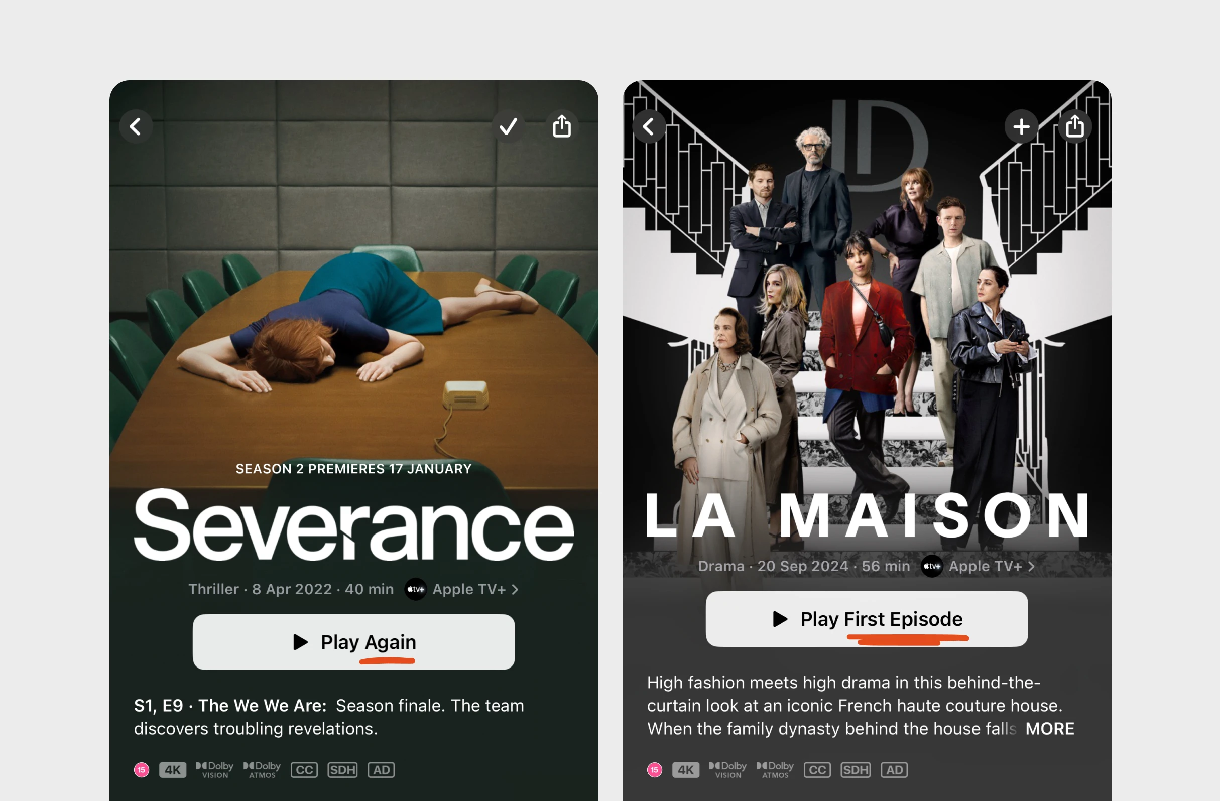
Example from Apple
Possible impacts
Labelling buttons and loading states with specific outcomes, e.g., the amount or destination, could reduce anxiety, as users know exactly what will happen next.
Framing benefits around a user's specific goal or task, rather than making generic claims, might catch more of their attention, as it's clearly meant for them.
Error messages that say specifically what's wrong and how to fix it may improve input quality, helping users correct their entries first time rather than guessing.



Written by Peter Ramsey
Published: