By Peter Ramsey
18 Apr 23
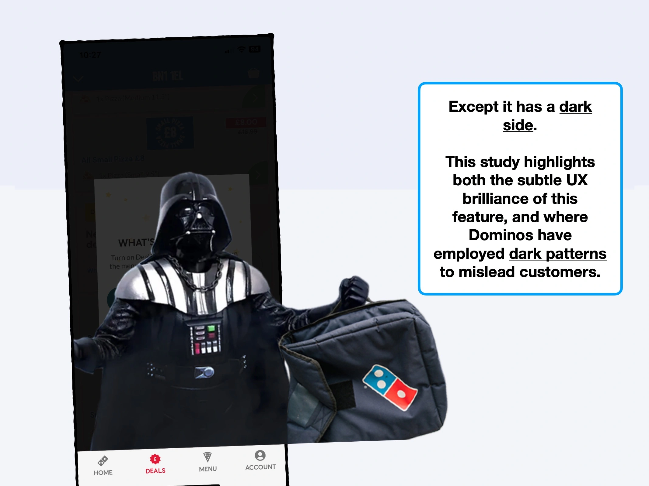
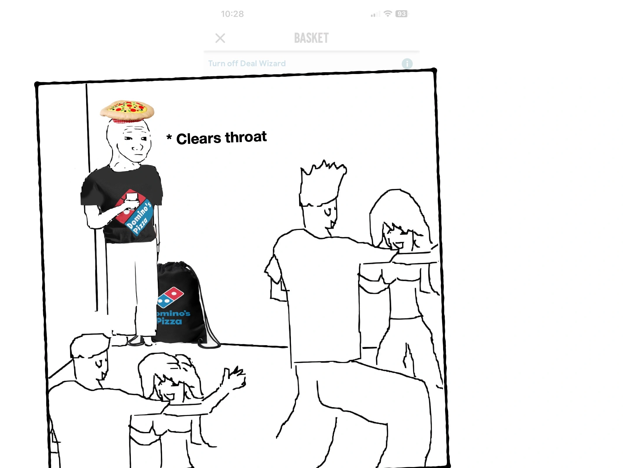
Using dark patterns to overcharge for pizza
Dominos is really a technology company, that just so happens to sell pizza.
Although their stores seem to be everywhere, more than 90% of their sales are online. In other words; they're basically an online pizza retailer.
And, whilst creating a case study praising their subtle UX brilliance (this one), I stumbled across a darker side of their empire.
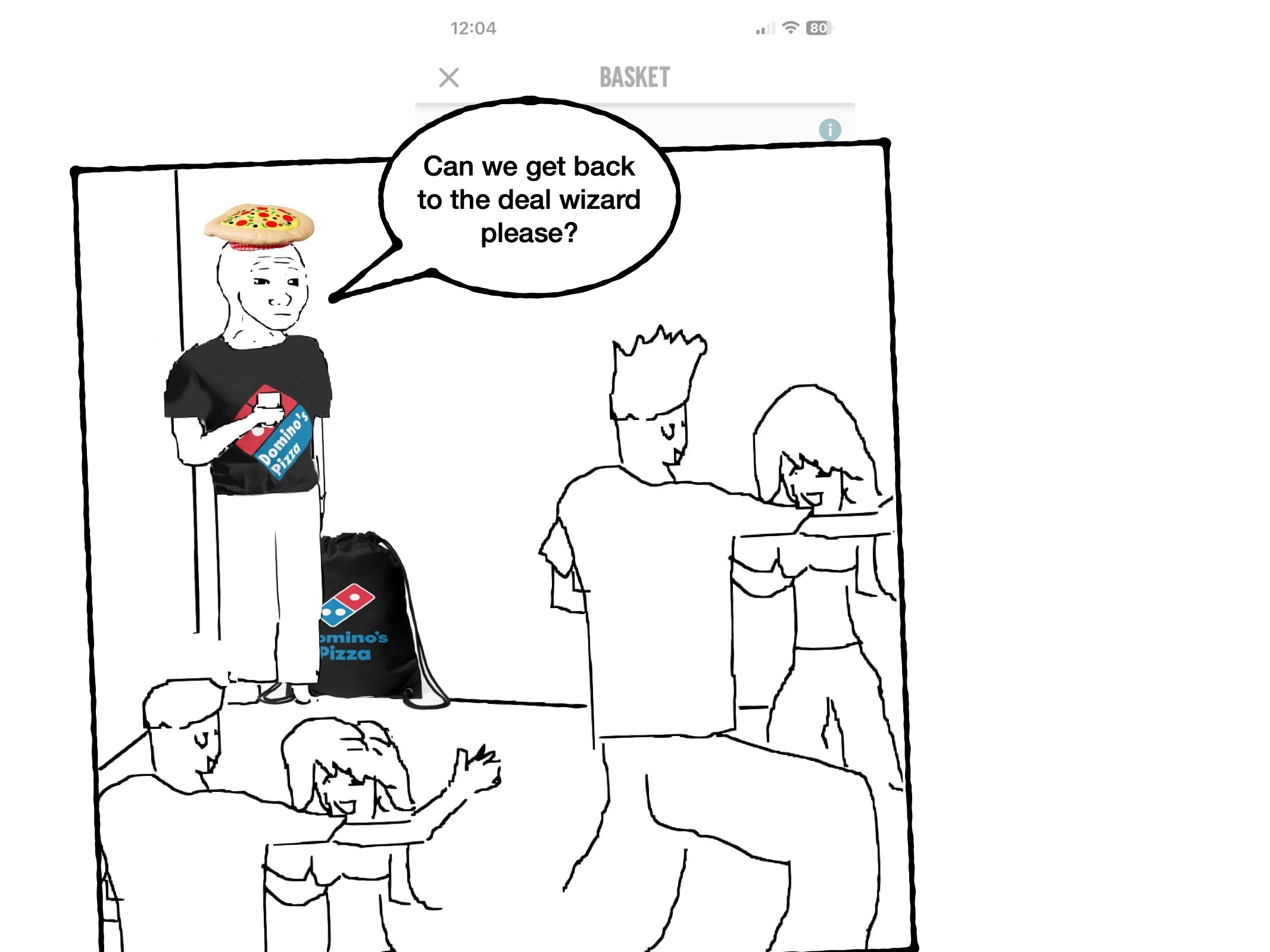
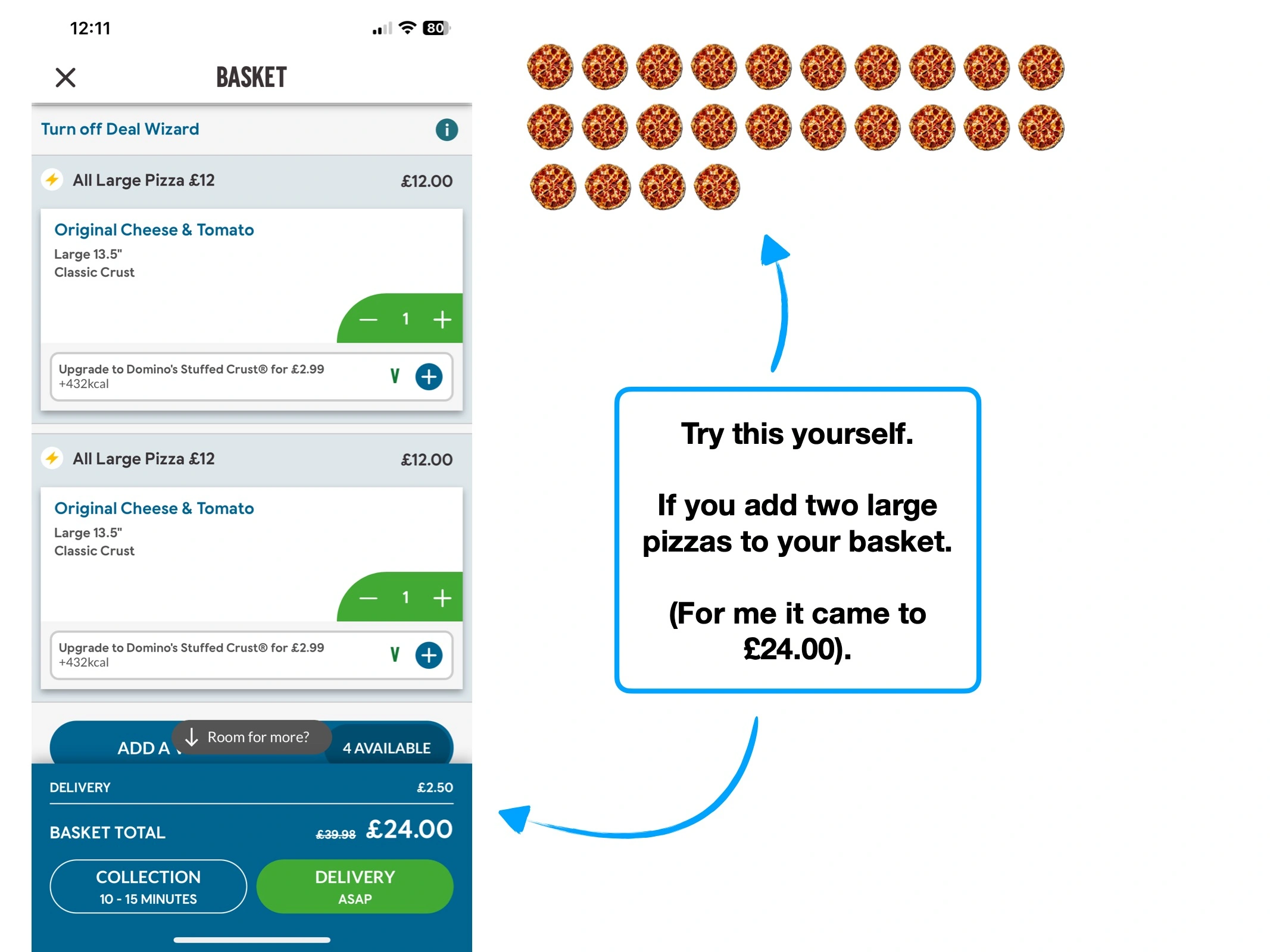
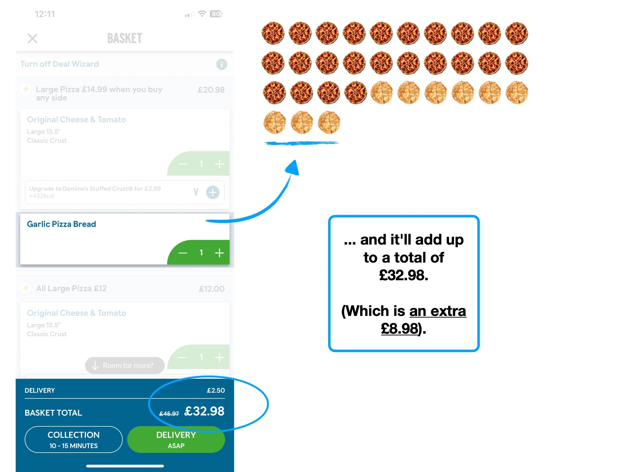
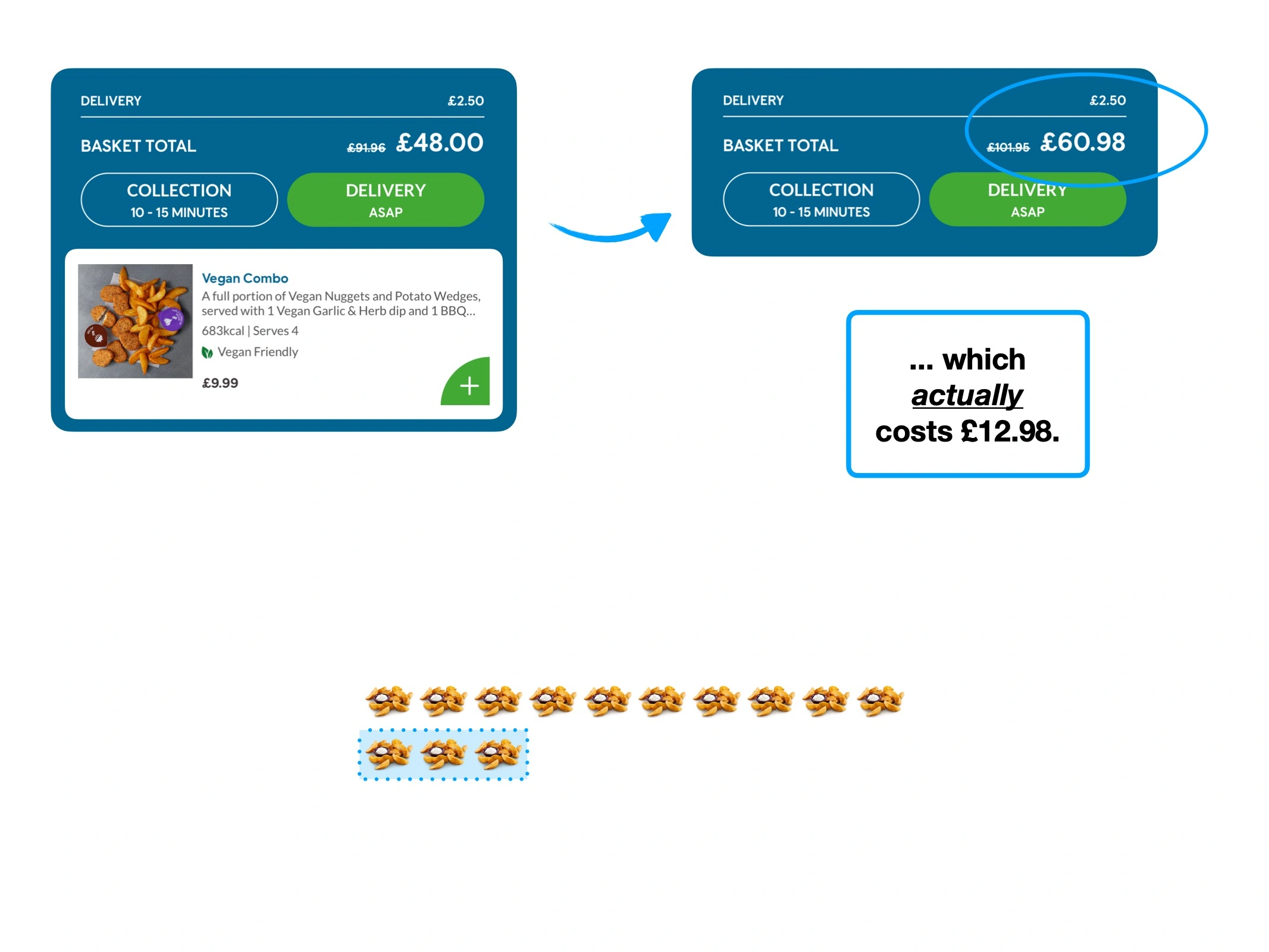
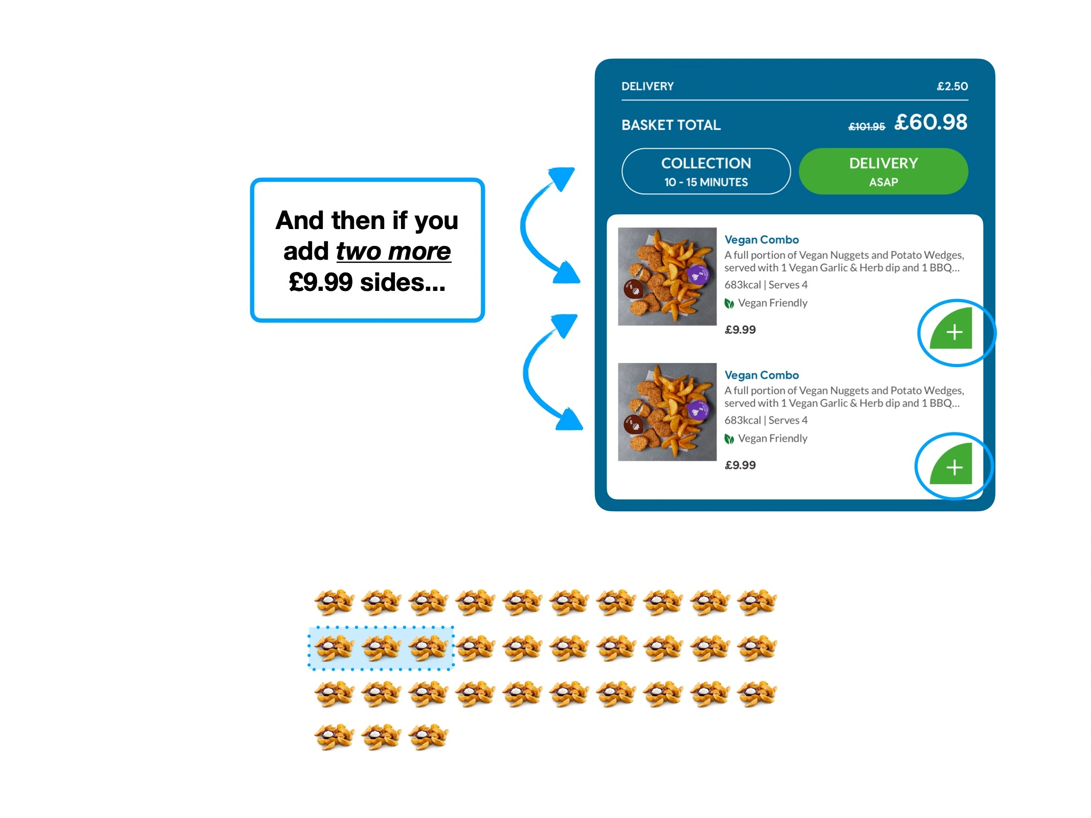
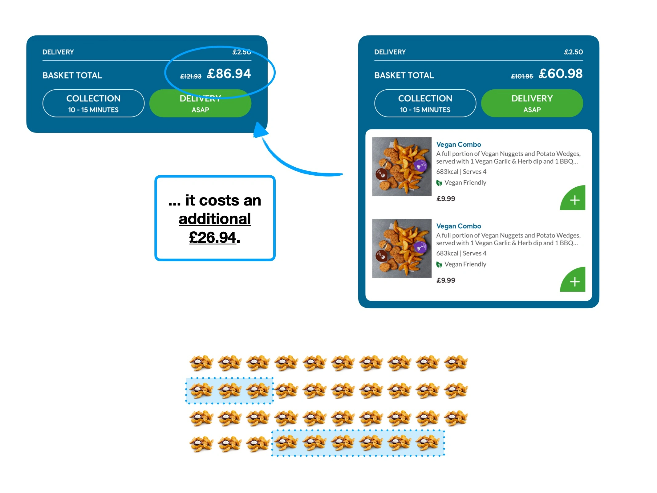
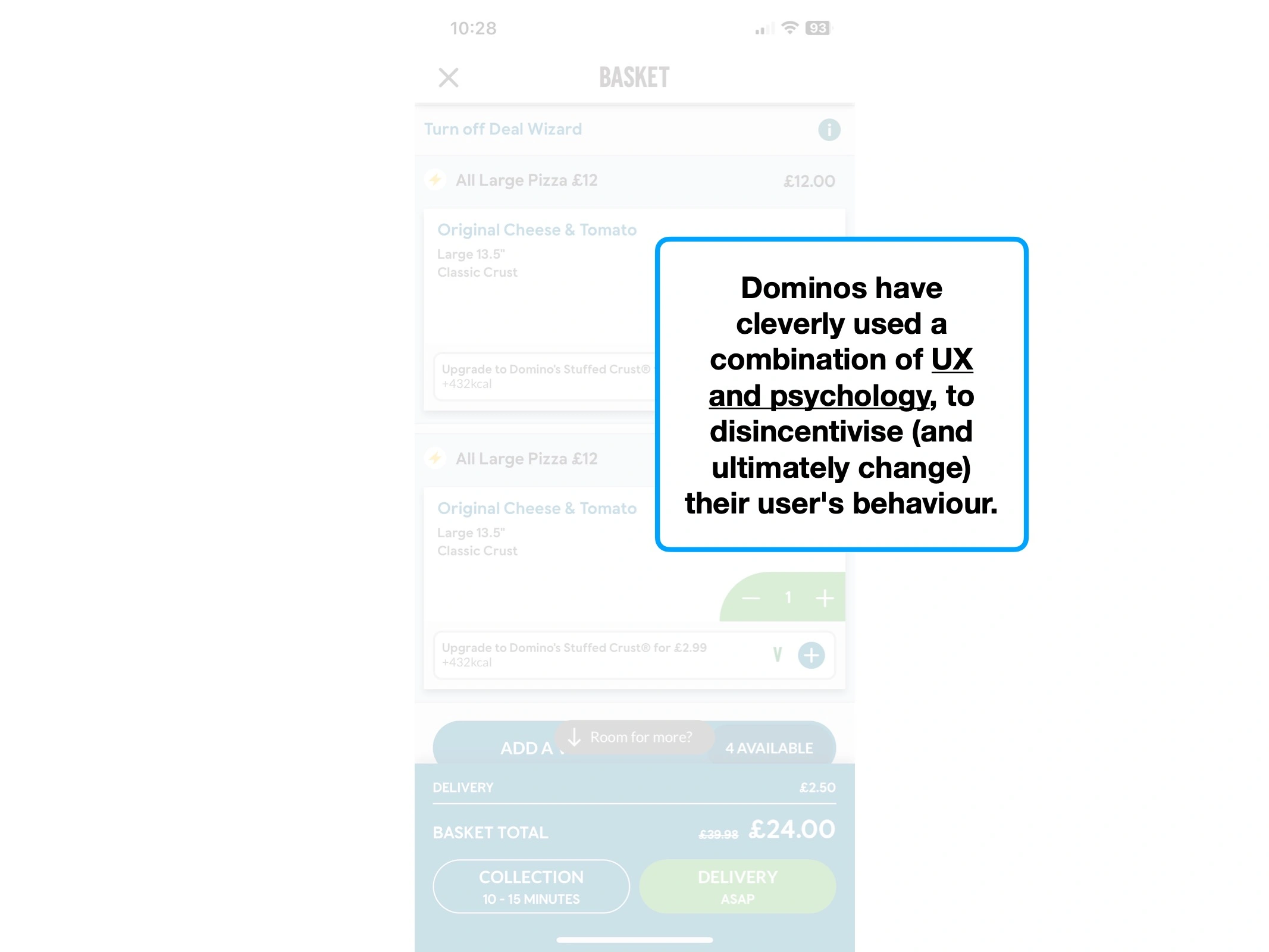
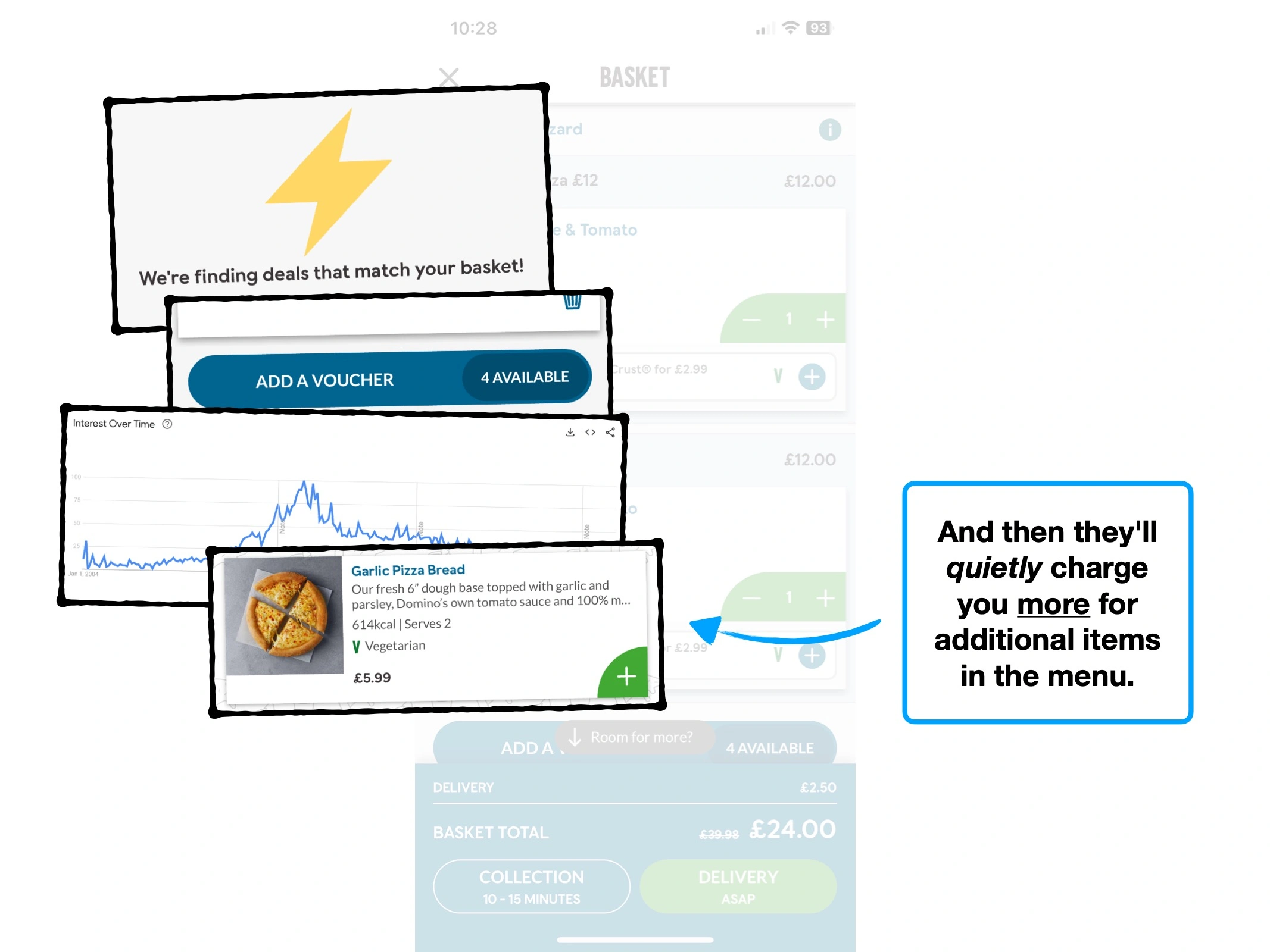
Dominos (and Pizza Hut) use dark patterns, UX tricks and design psychology to overcharge customers.
Forget 'Big Pharma', I'll demonstrate how (and why) 'Big Pizza' do the following:
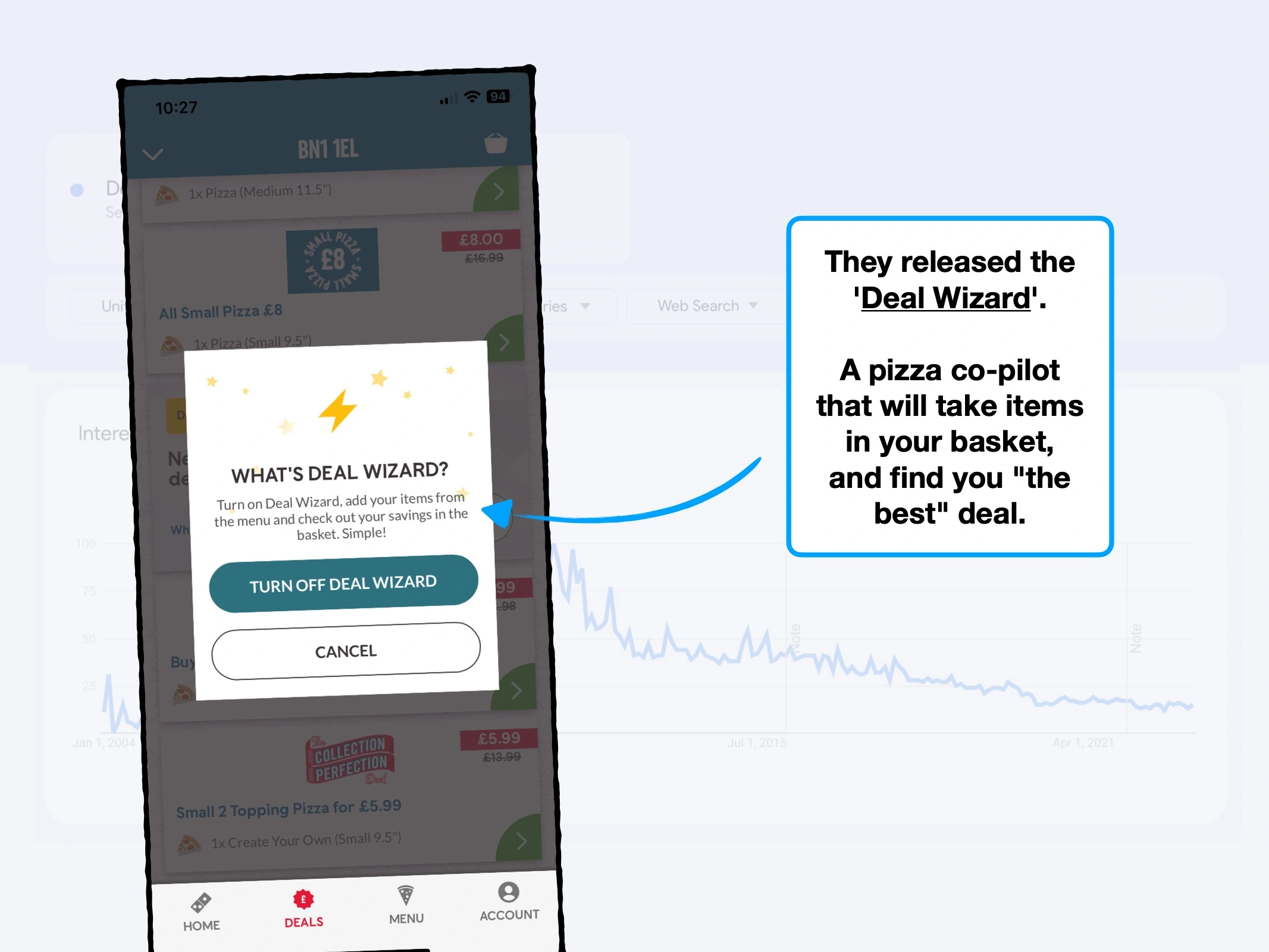
- 1. Use a 'Deal Wizard' to build trust
⚡️
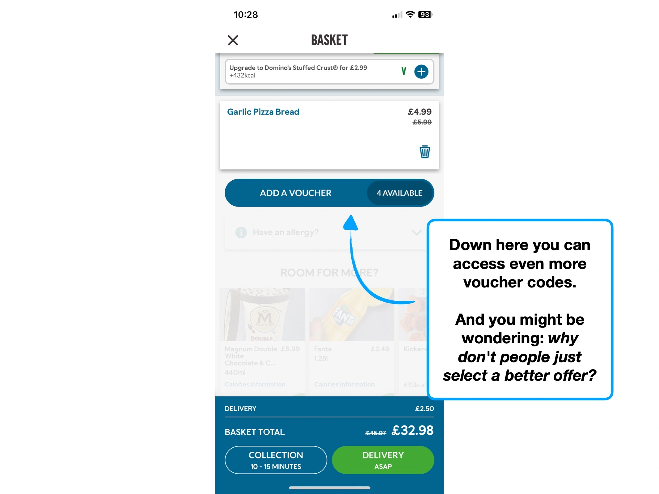
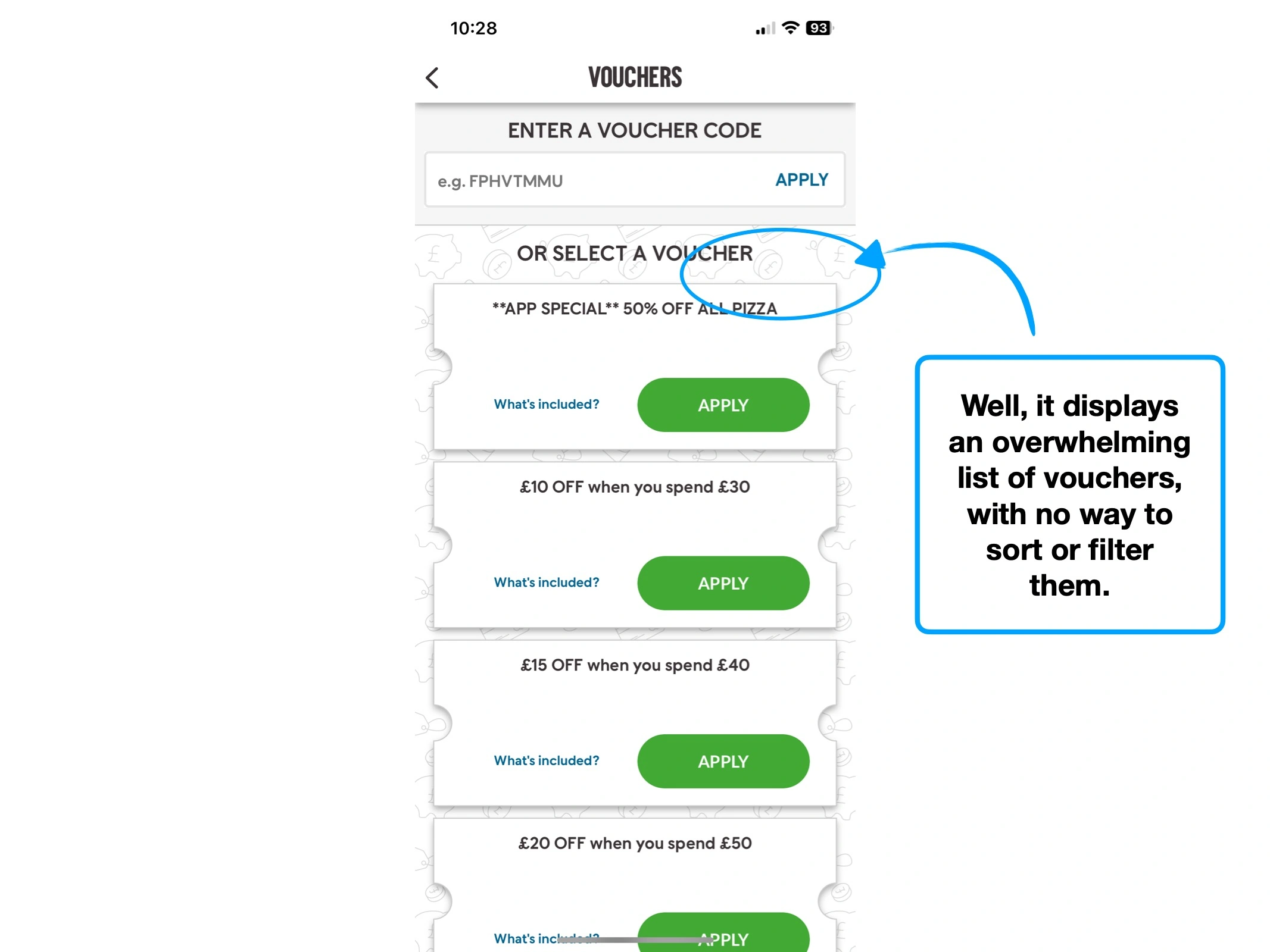
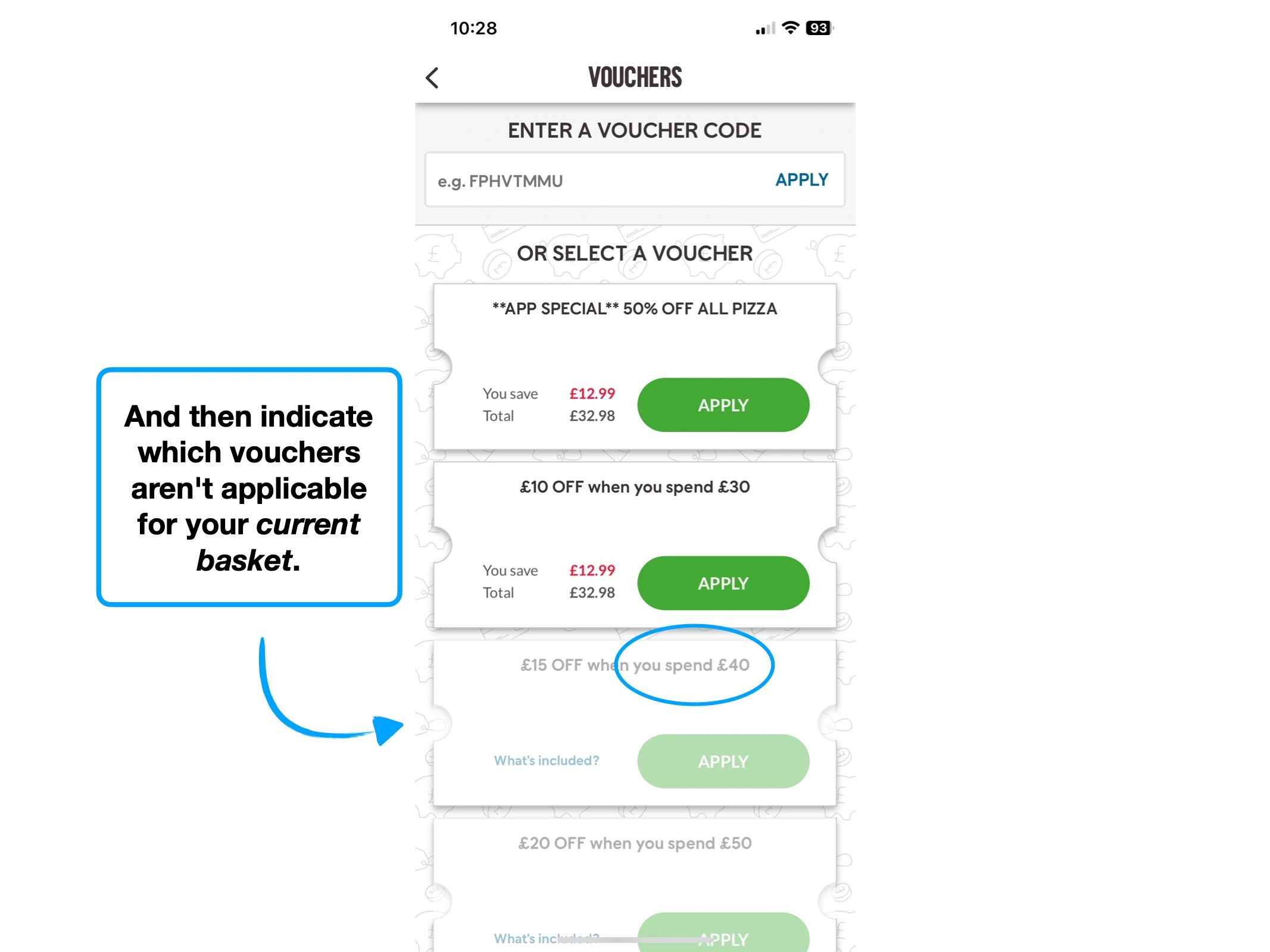
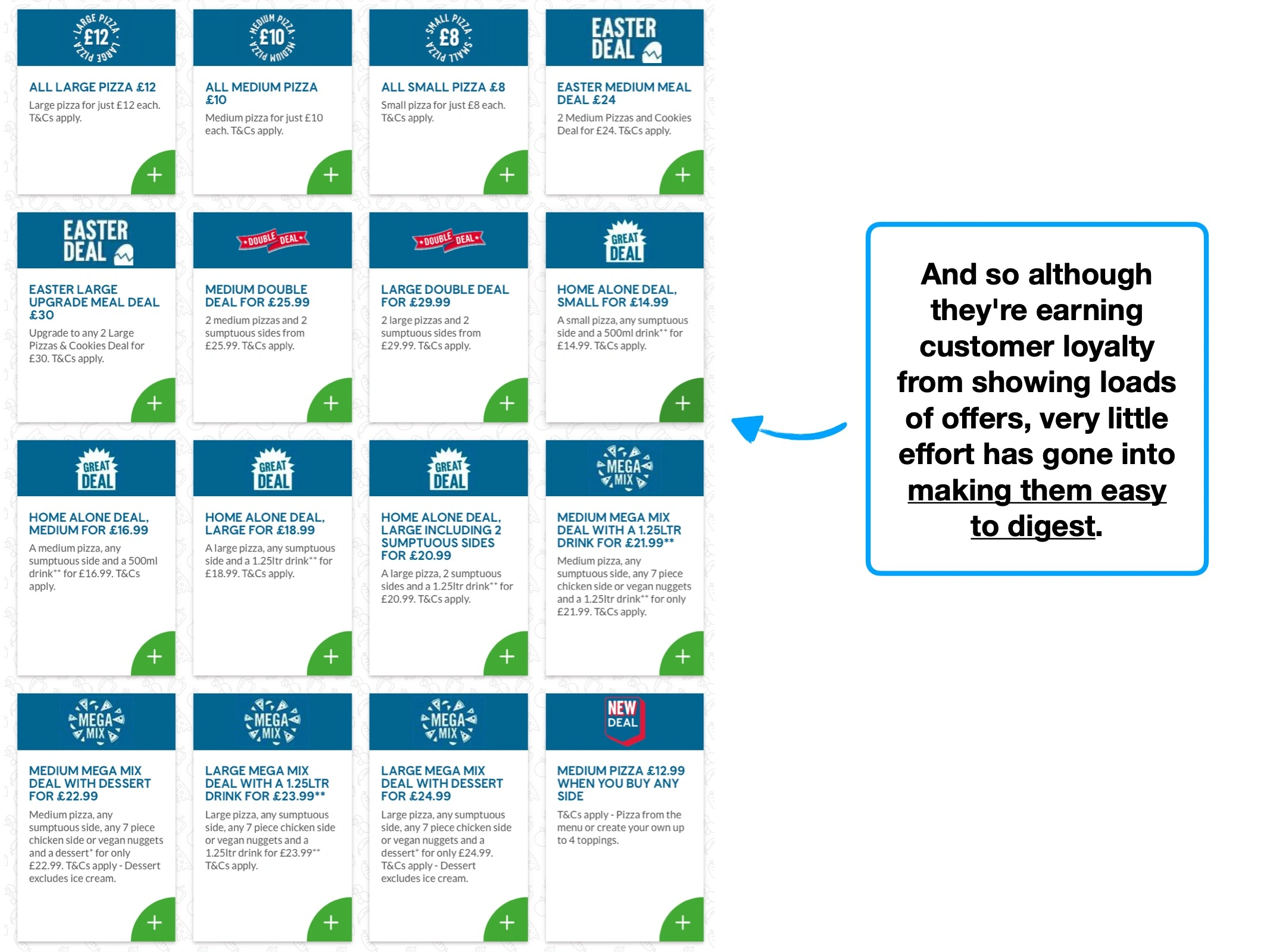
- 2. Overwhelm you with vouchers
🤯
- 3. Leverage UX psychology to change your behaviour
🧠
- 4. Quietly overcharge you
💸
Get ready for a slice of deep UX analysis.
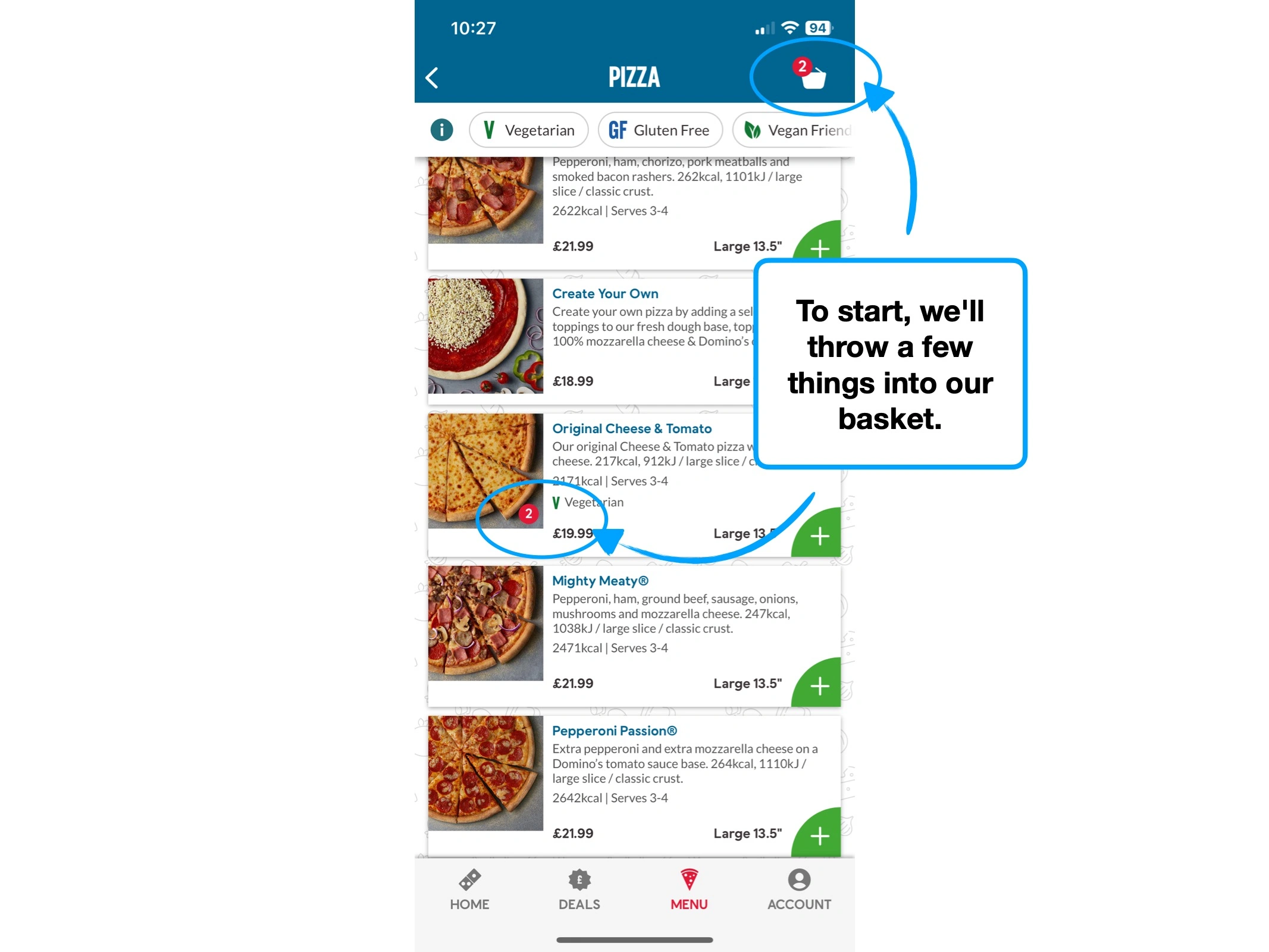
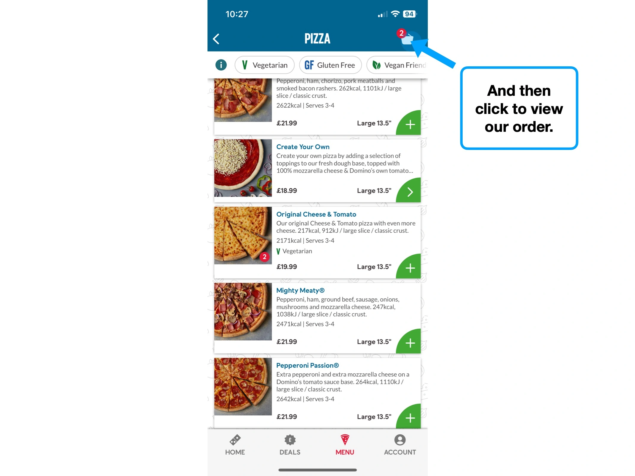
Case study
Please rotate your device to view this slideshow
Note, this won’t work if ‘rotate: lock’ is on in your device settings.
More UX takeaways
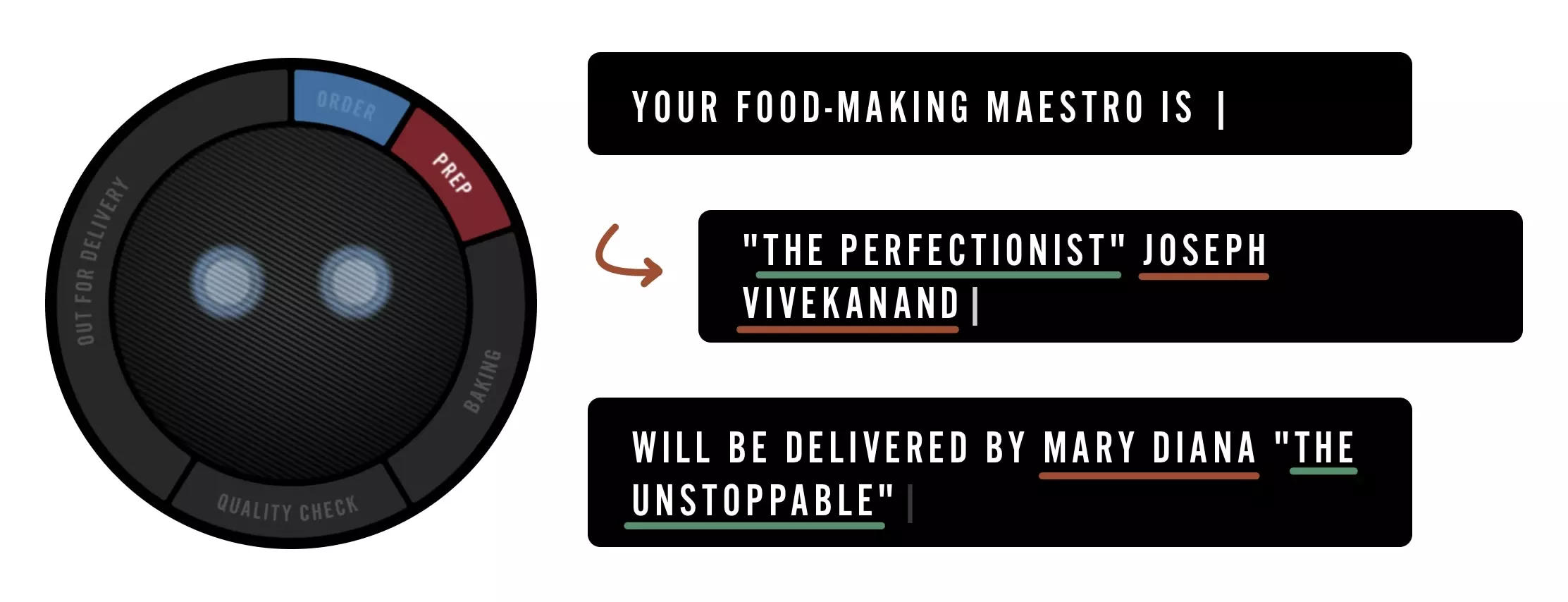
1. PizzaGPT
Dominos have done an excellent job at (perhaps unintentionally) using design psychology as a tool to change their customer's behaviour.
Here are three examples:
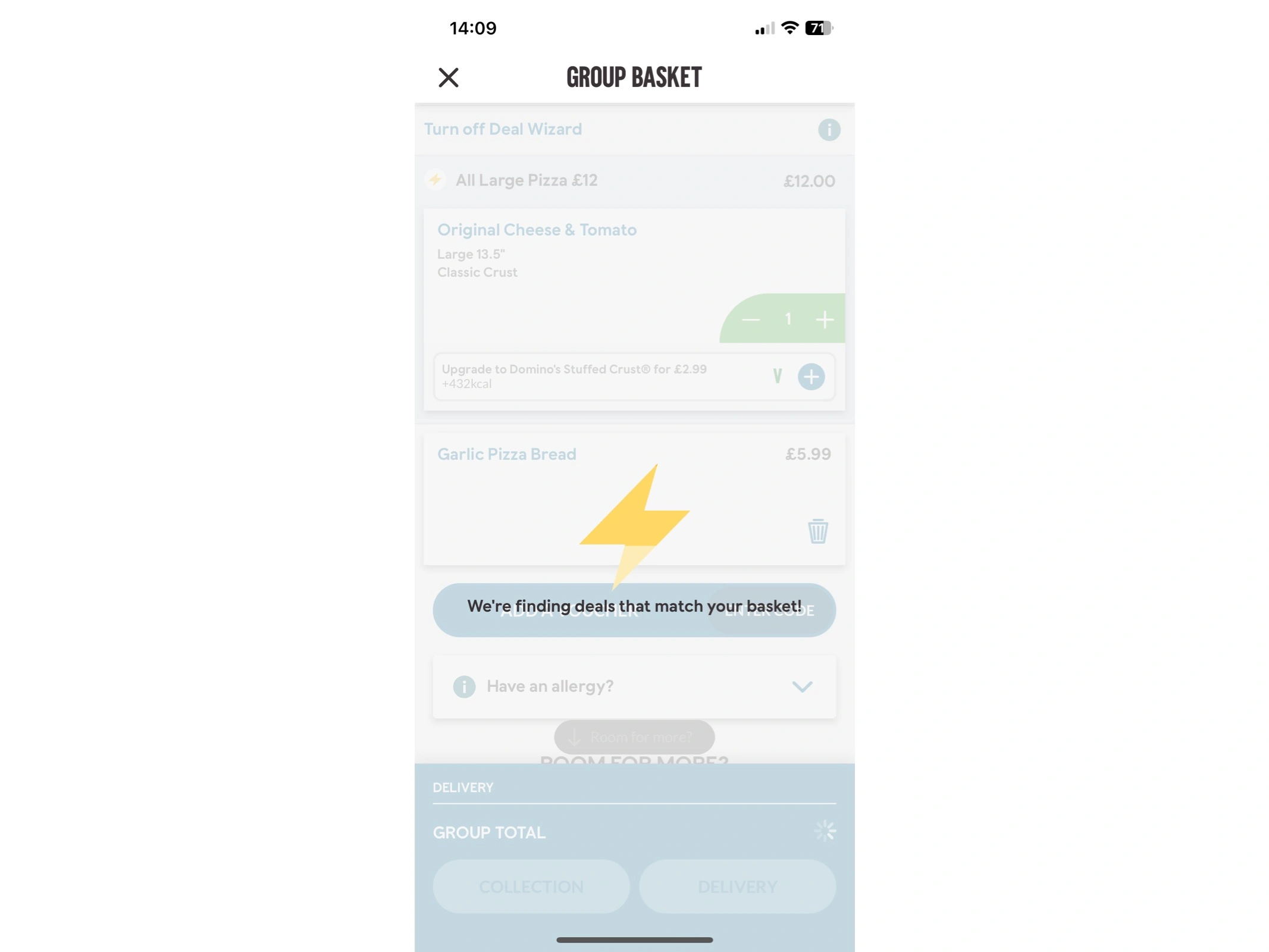
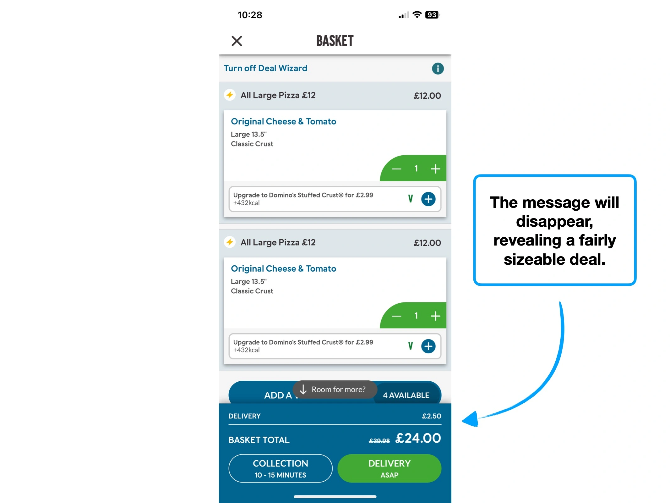
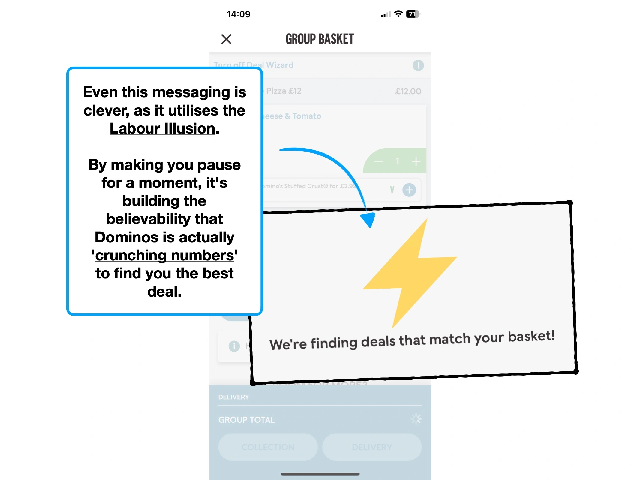
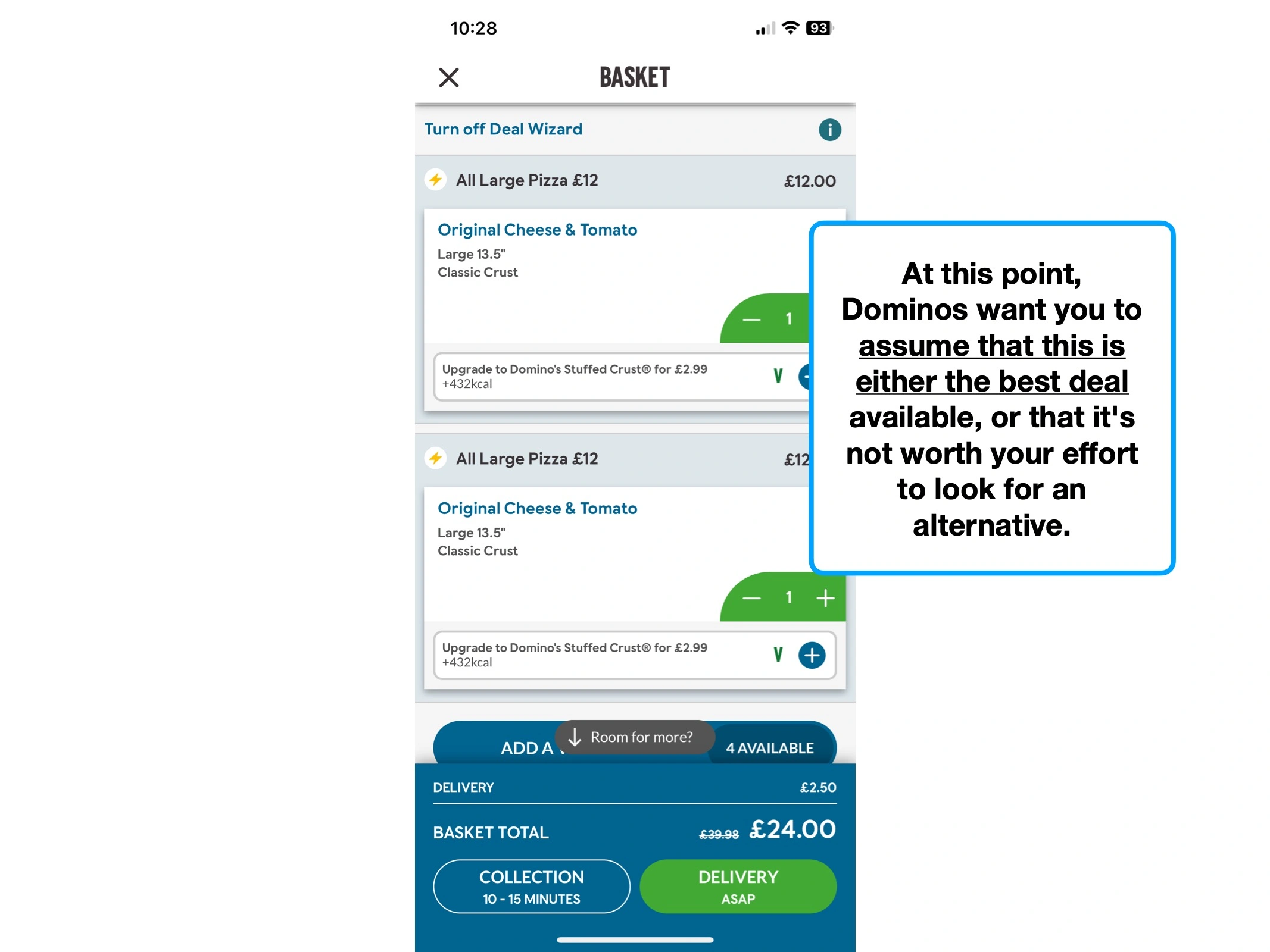
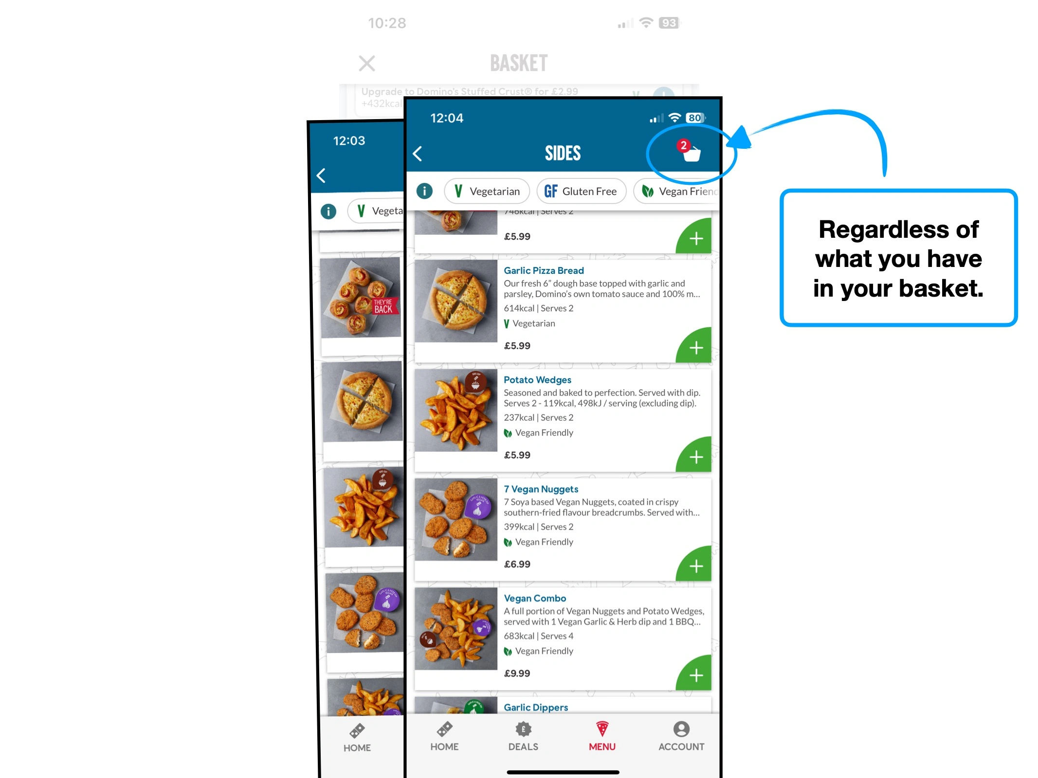
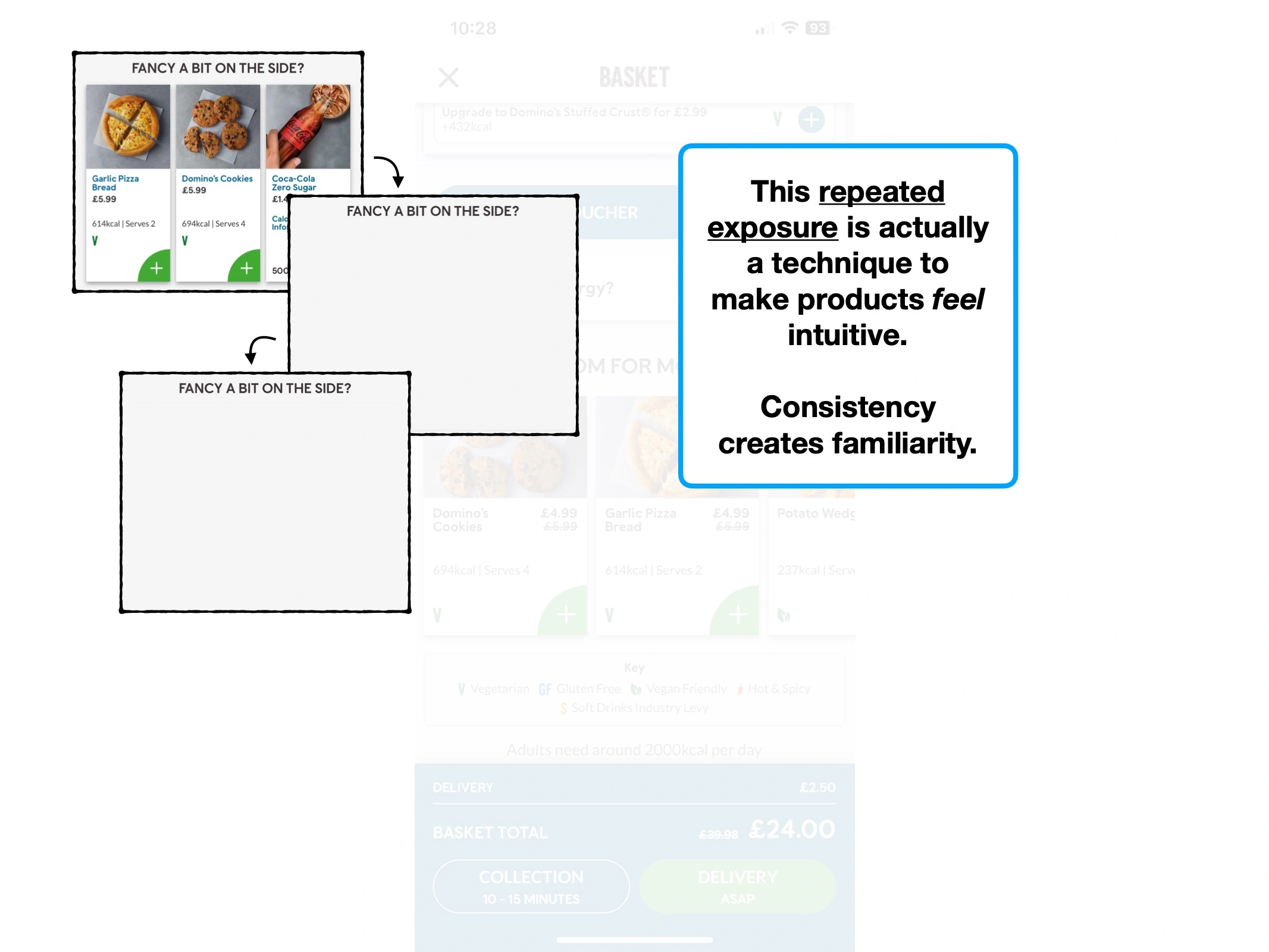
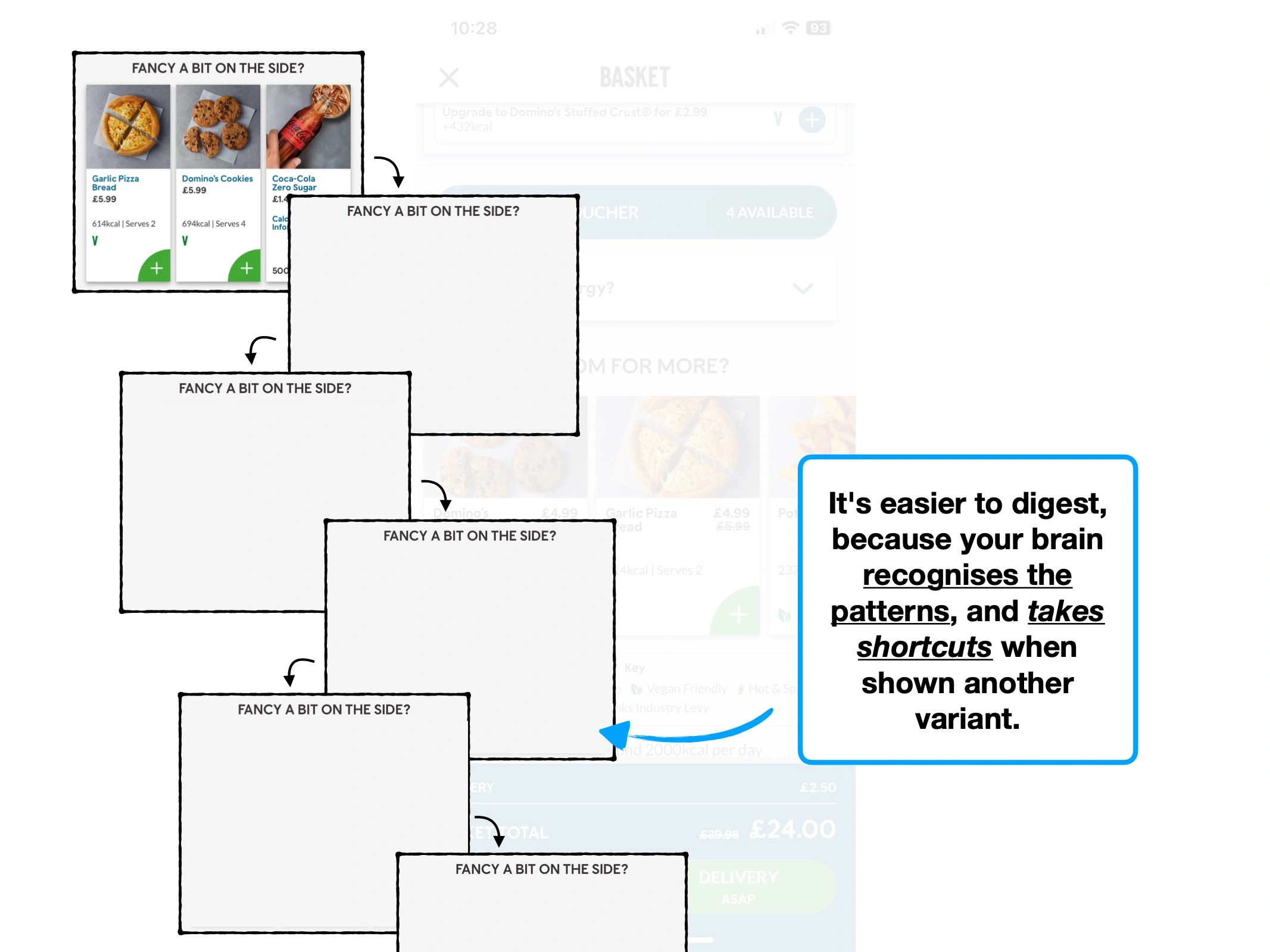
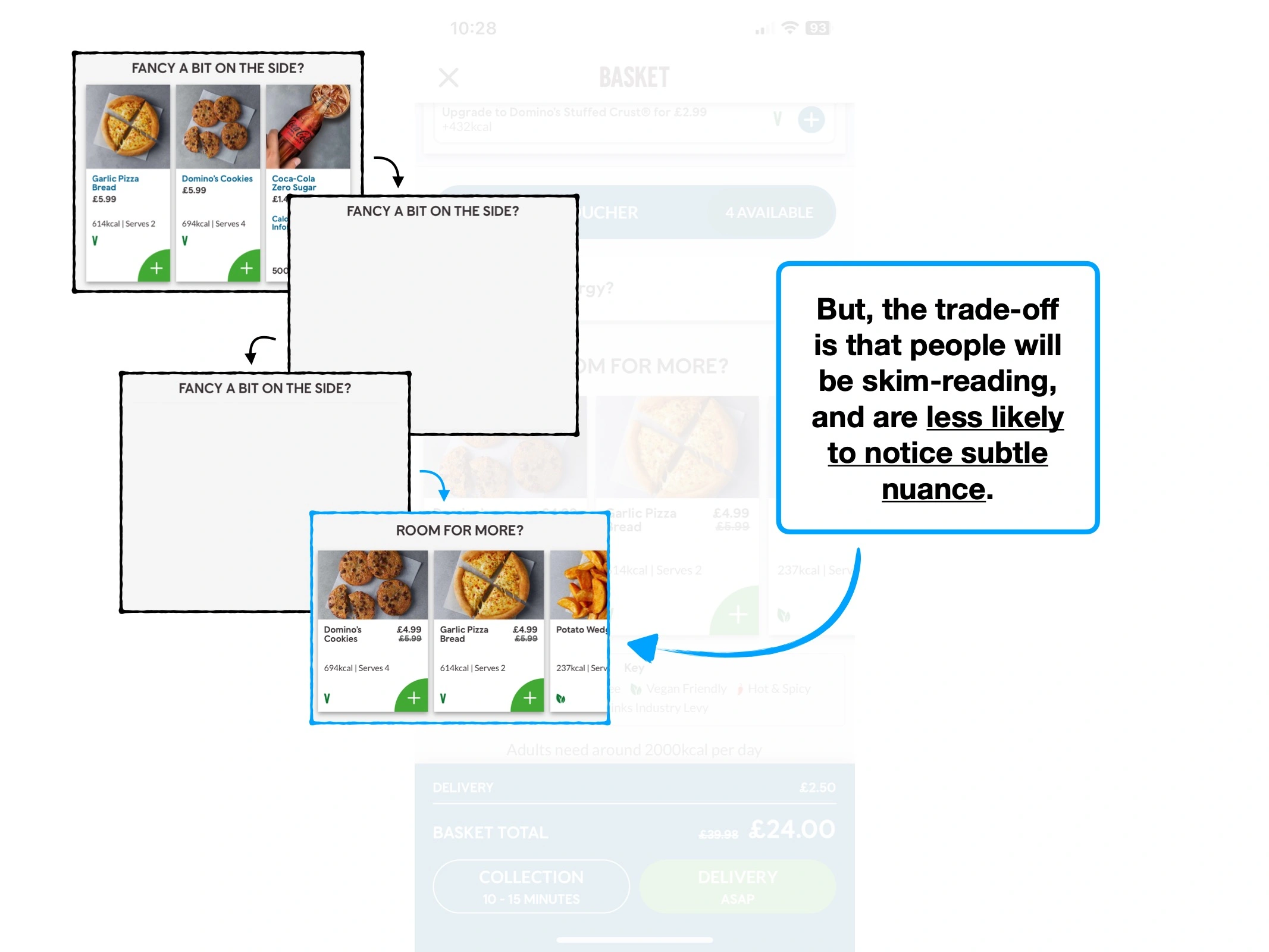
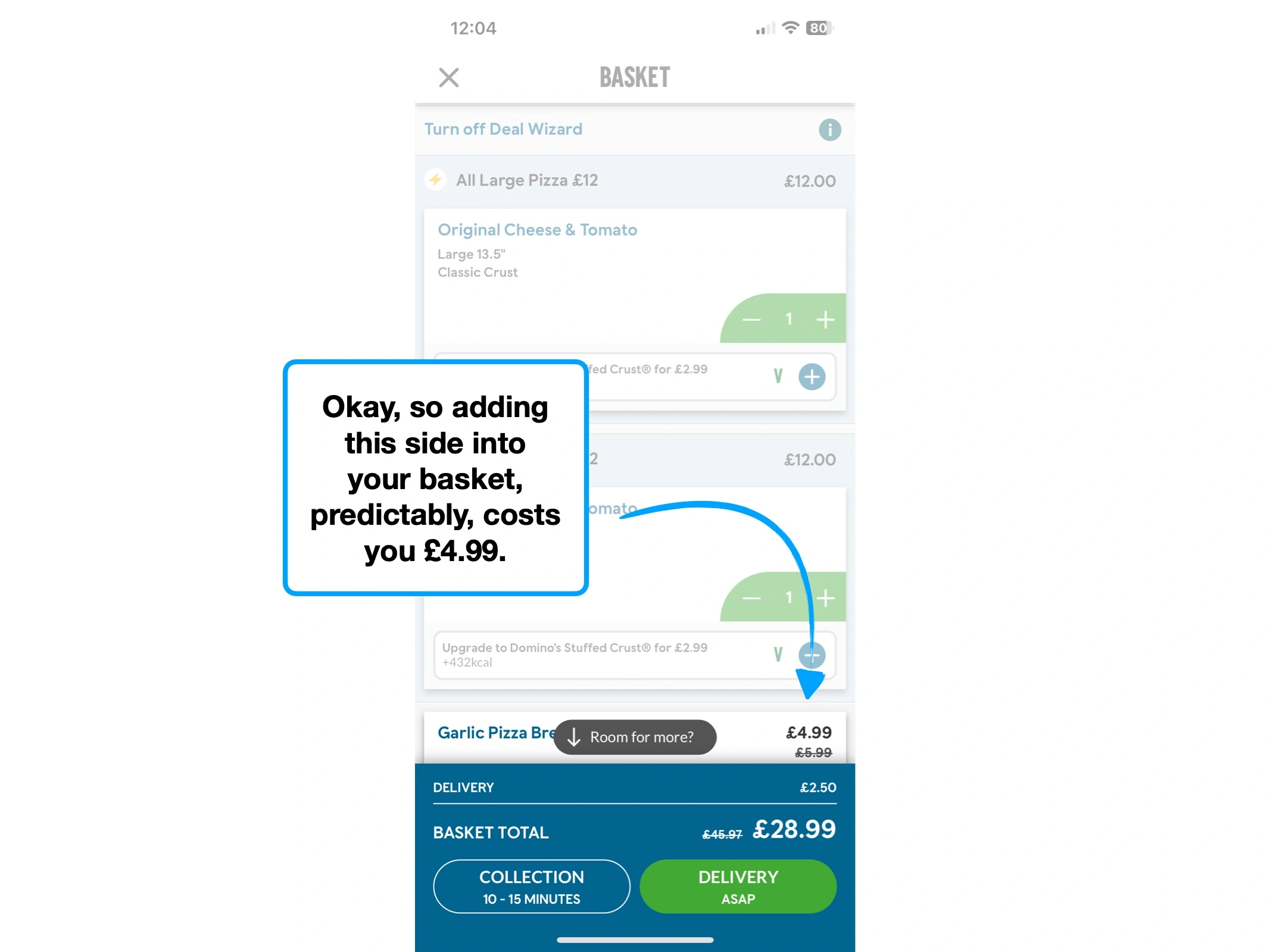
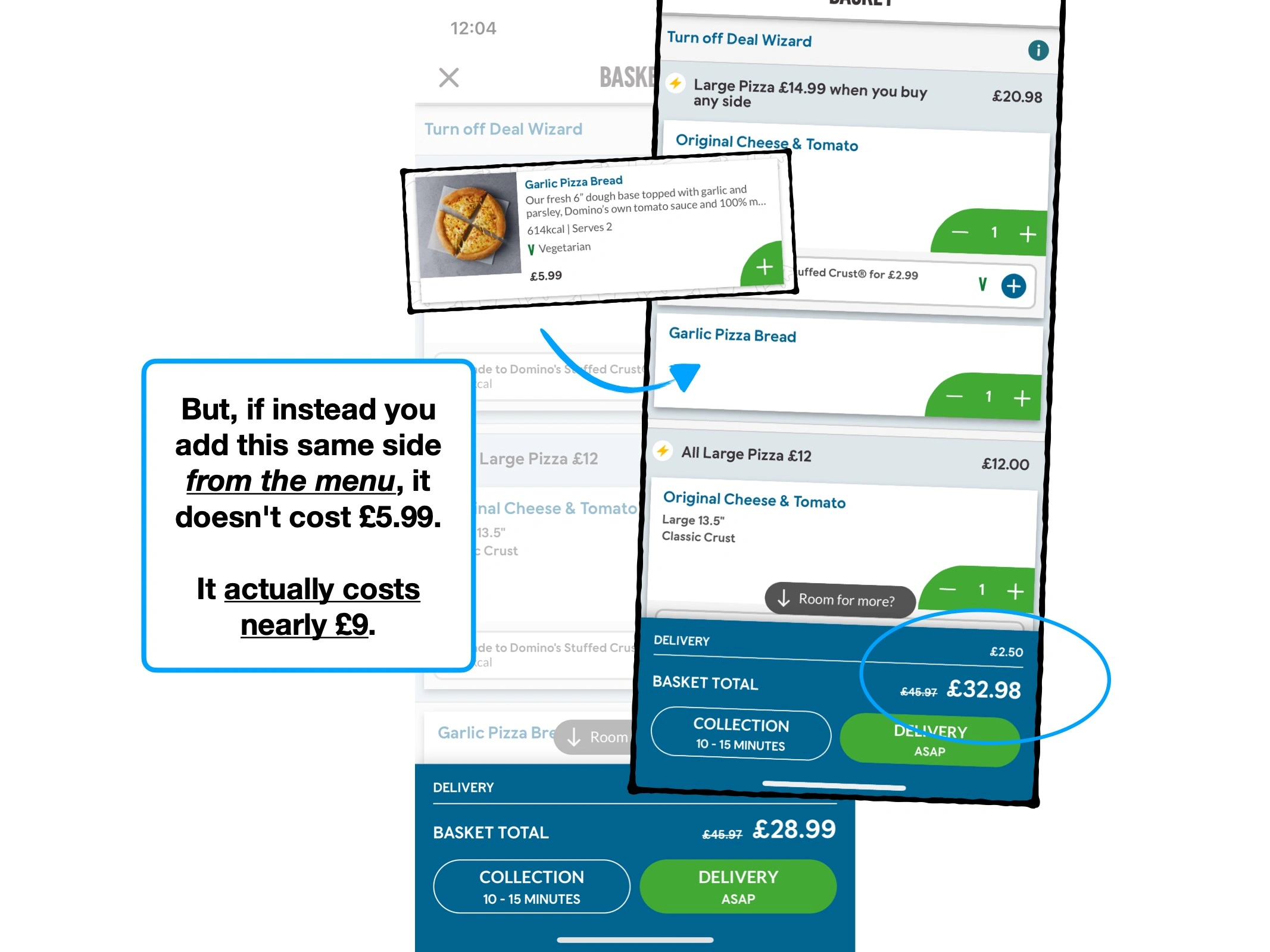
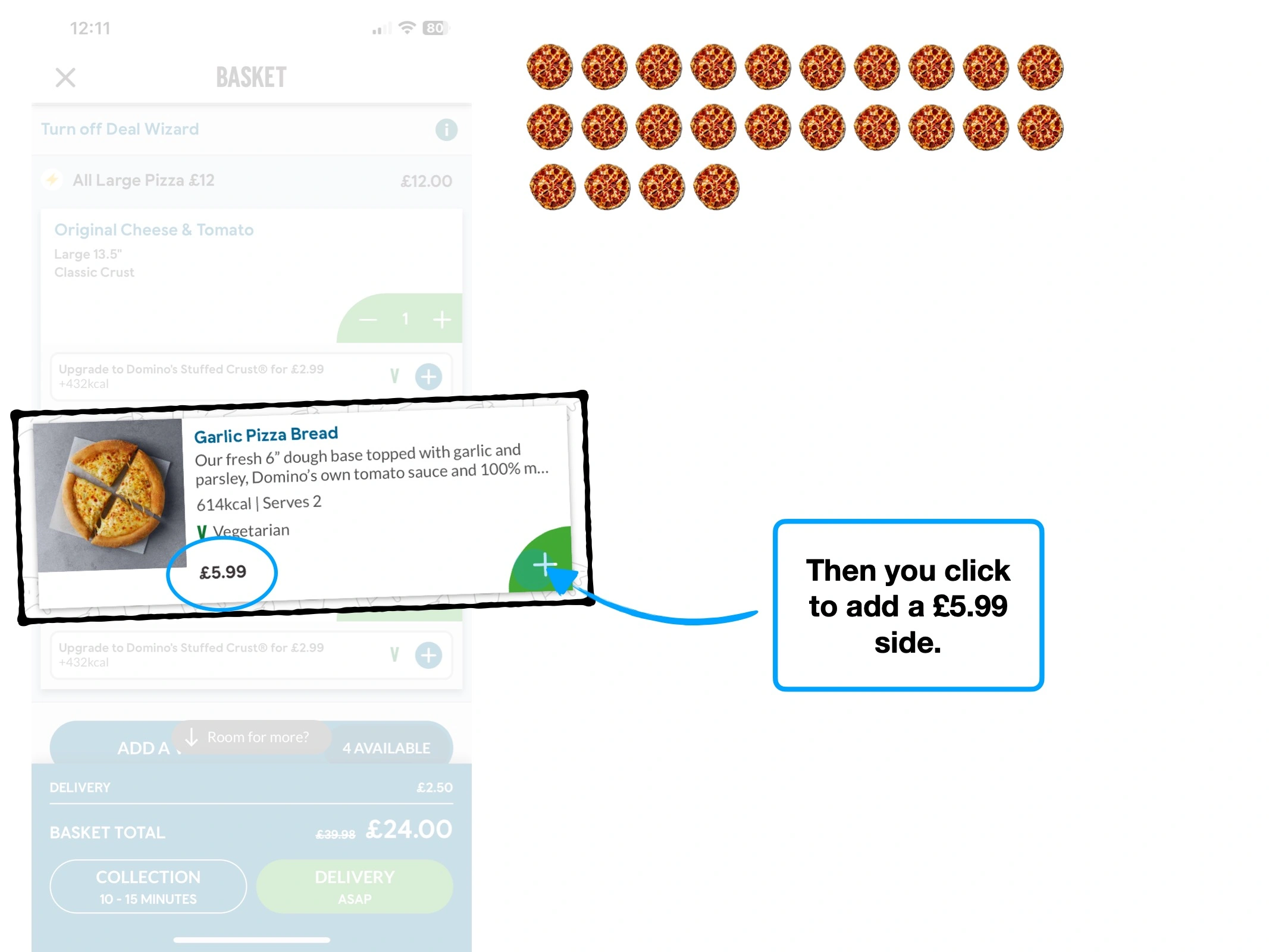
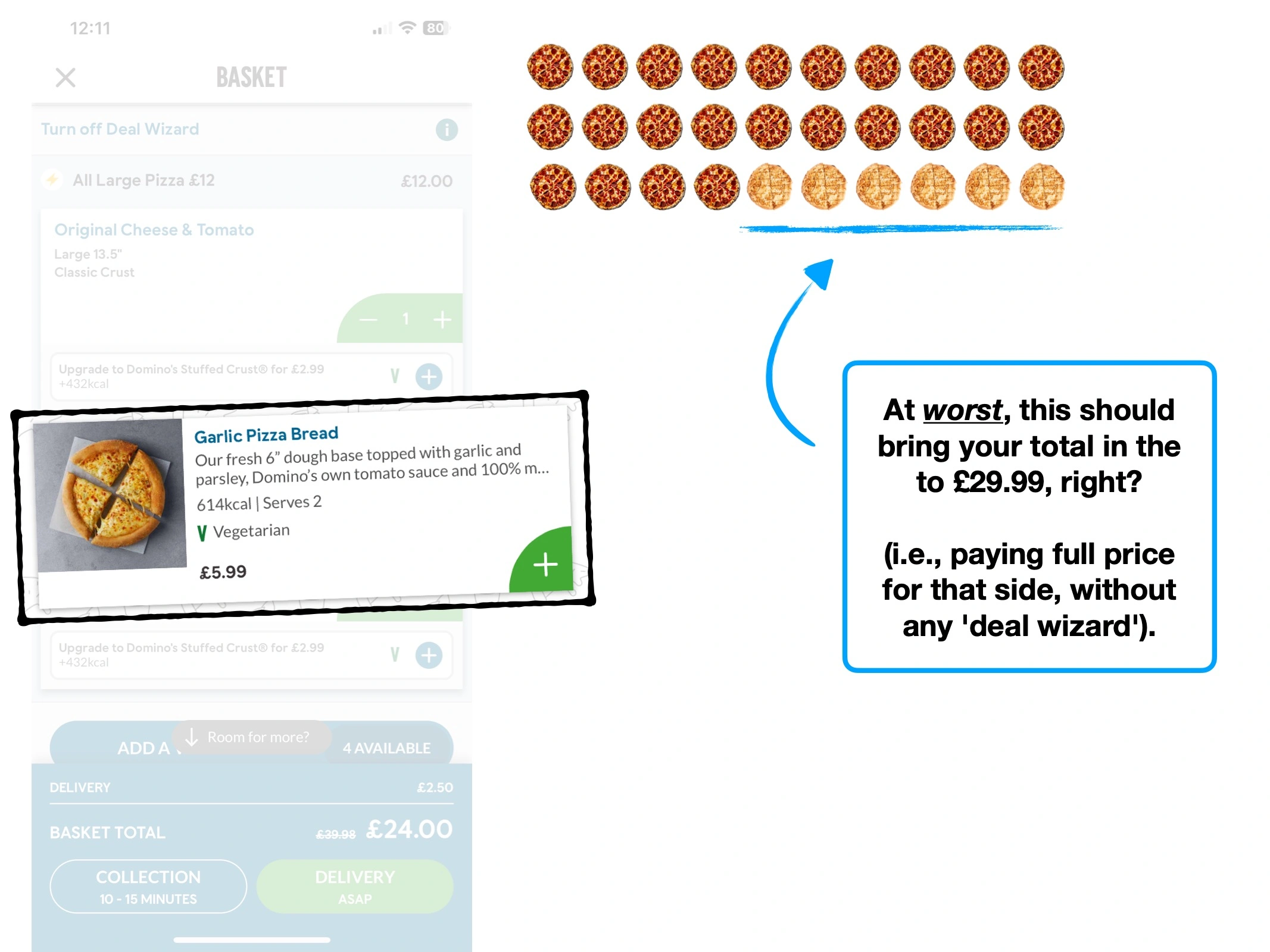
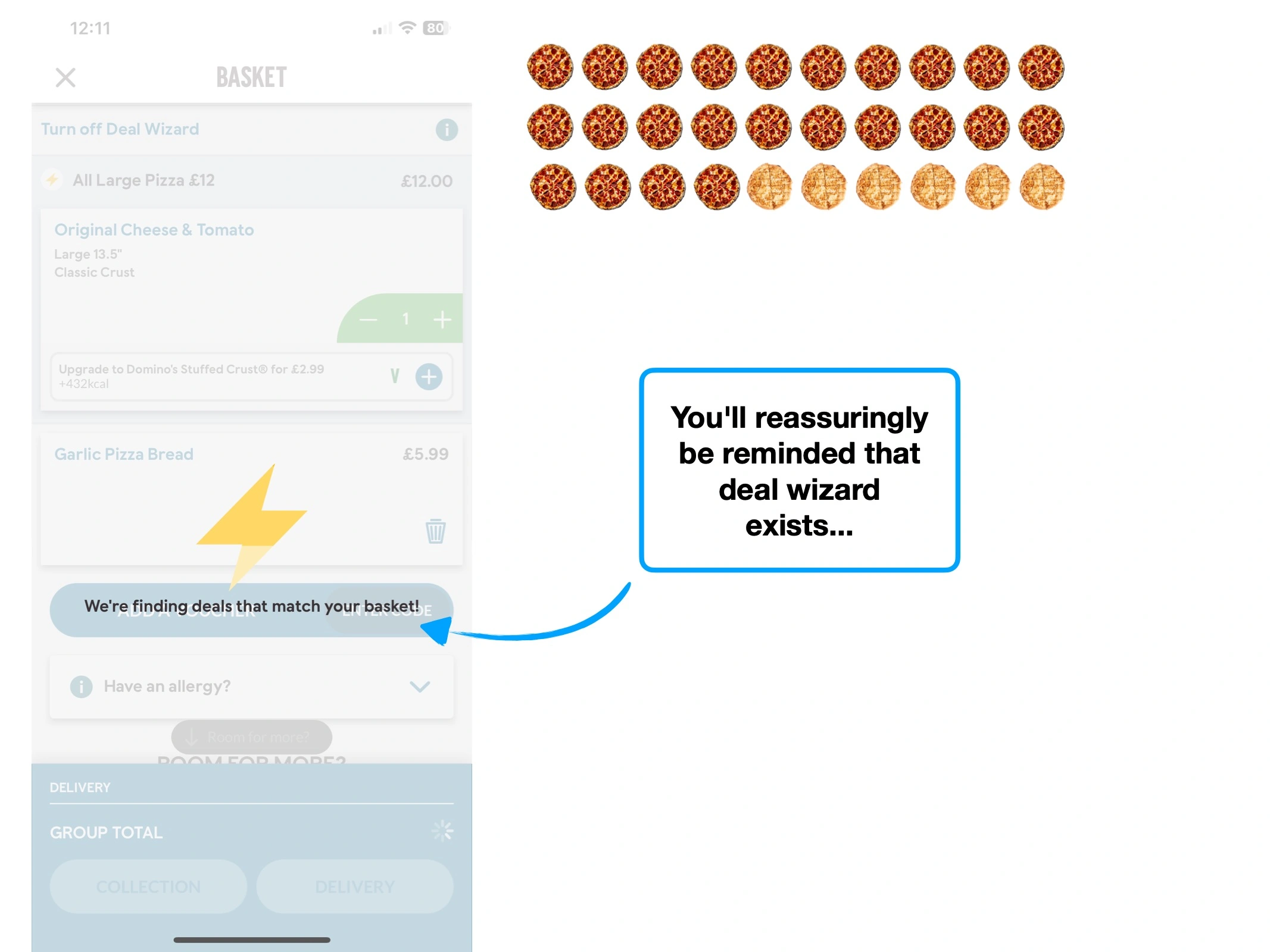
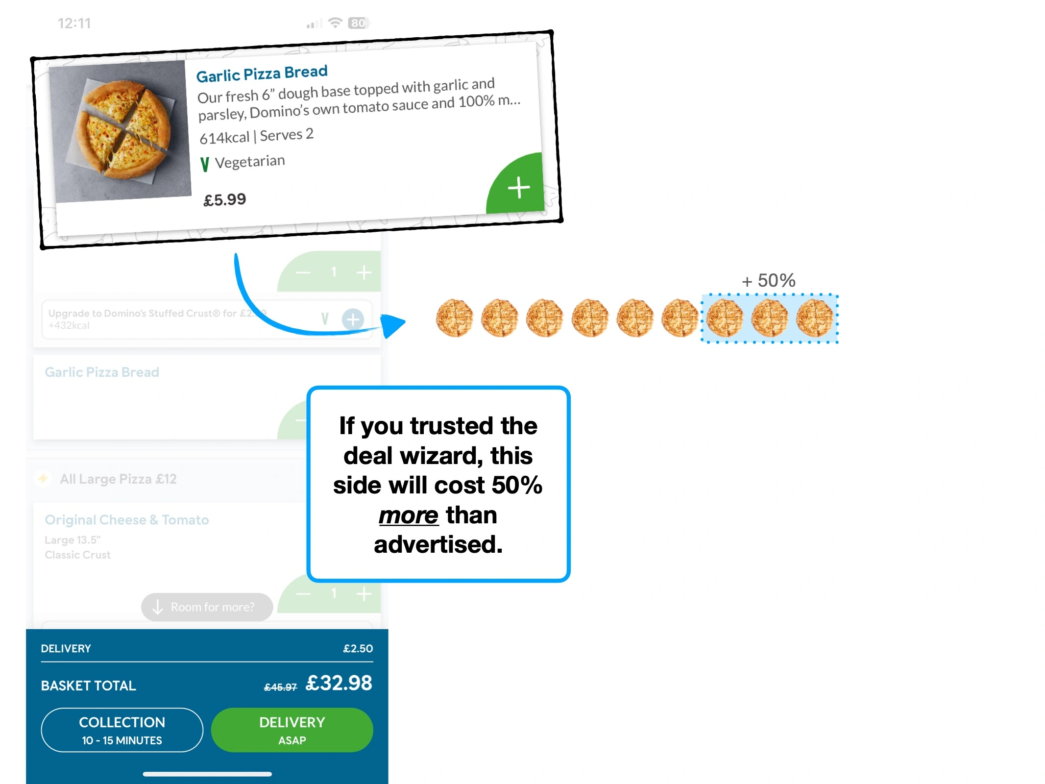
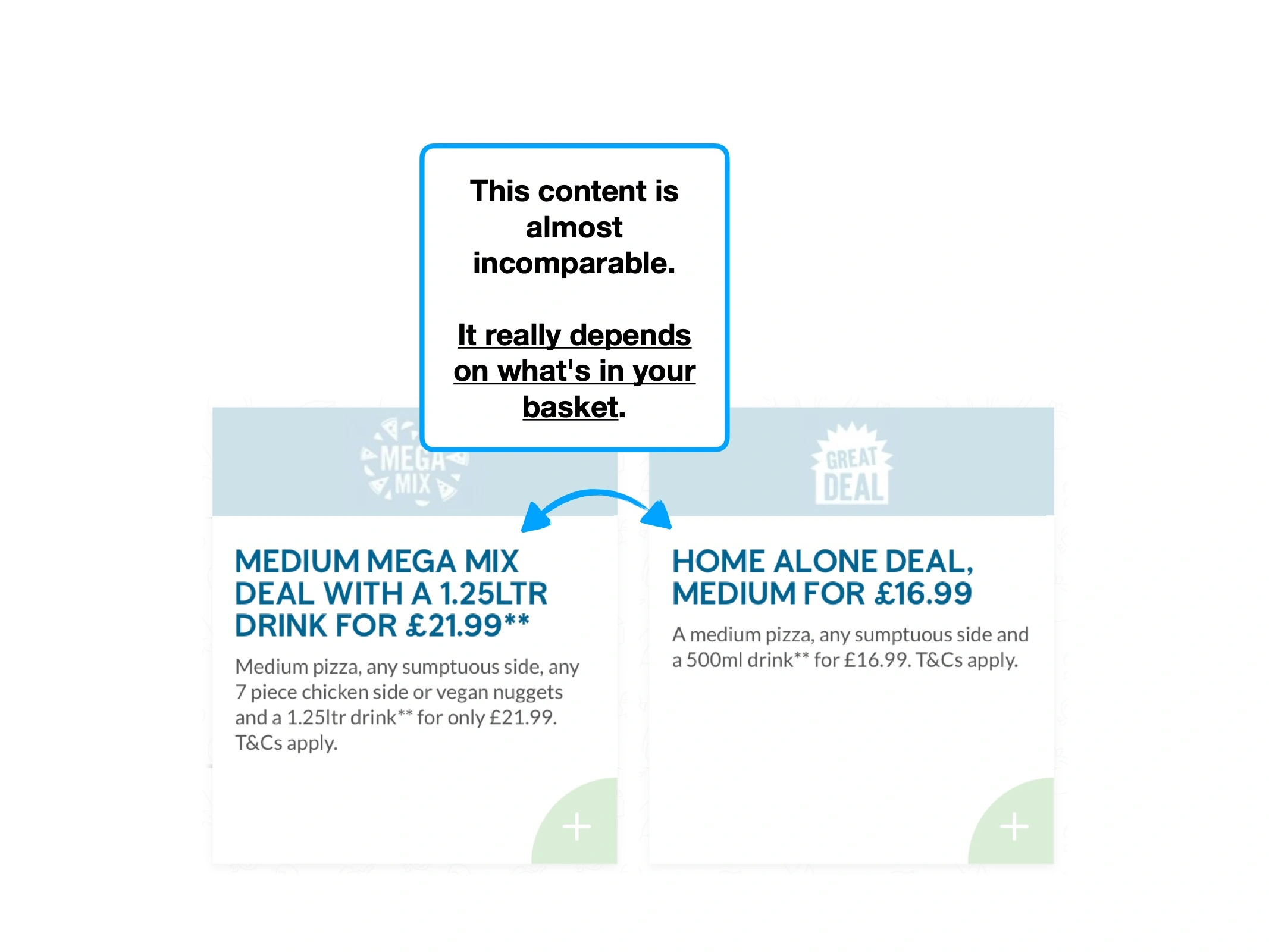
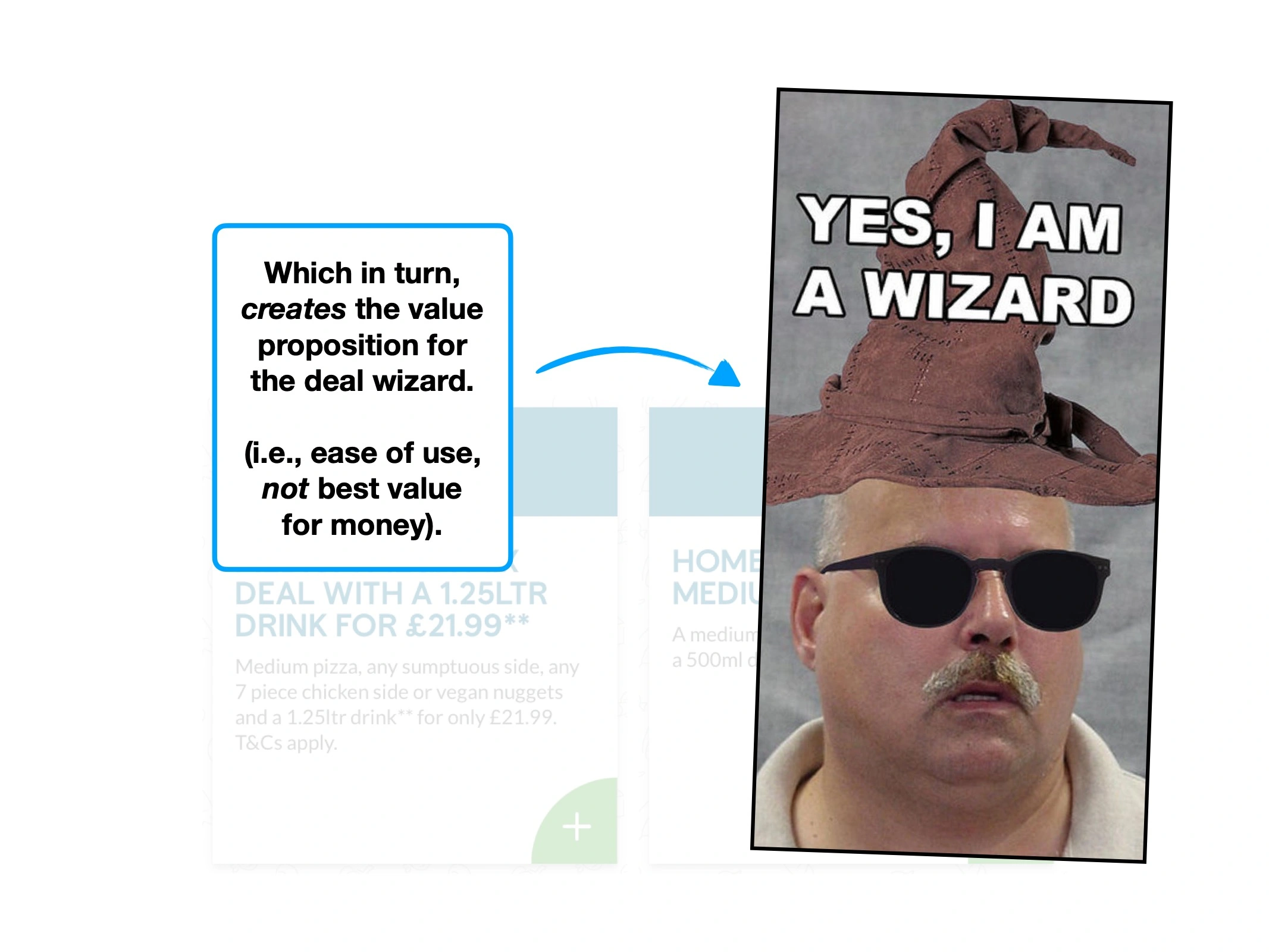
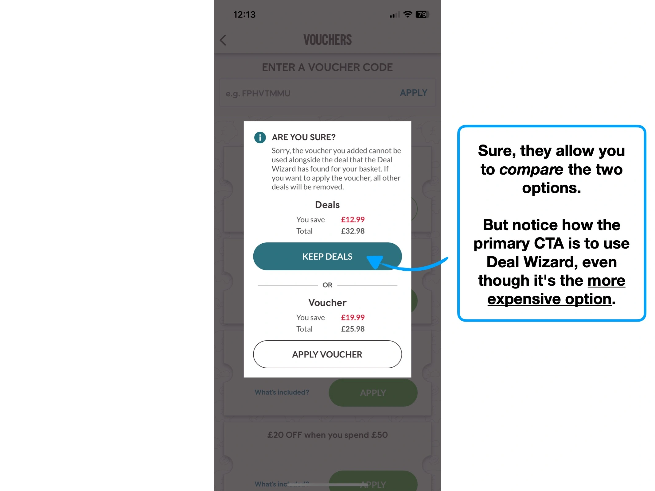
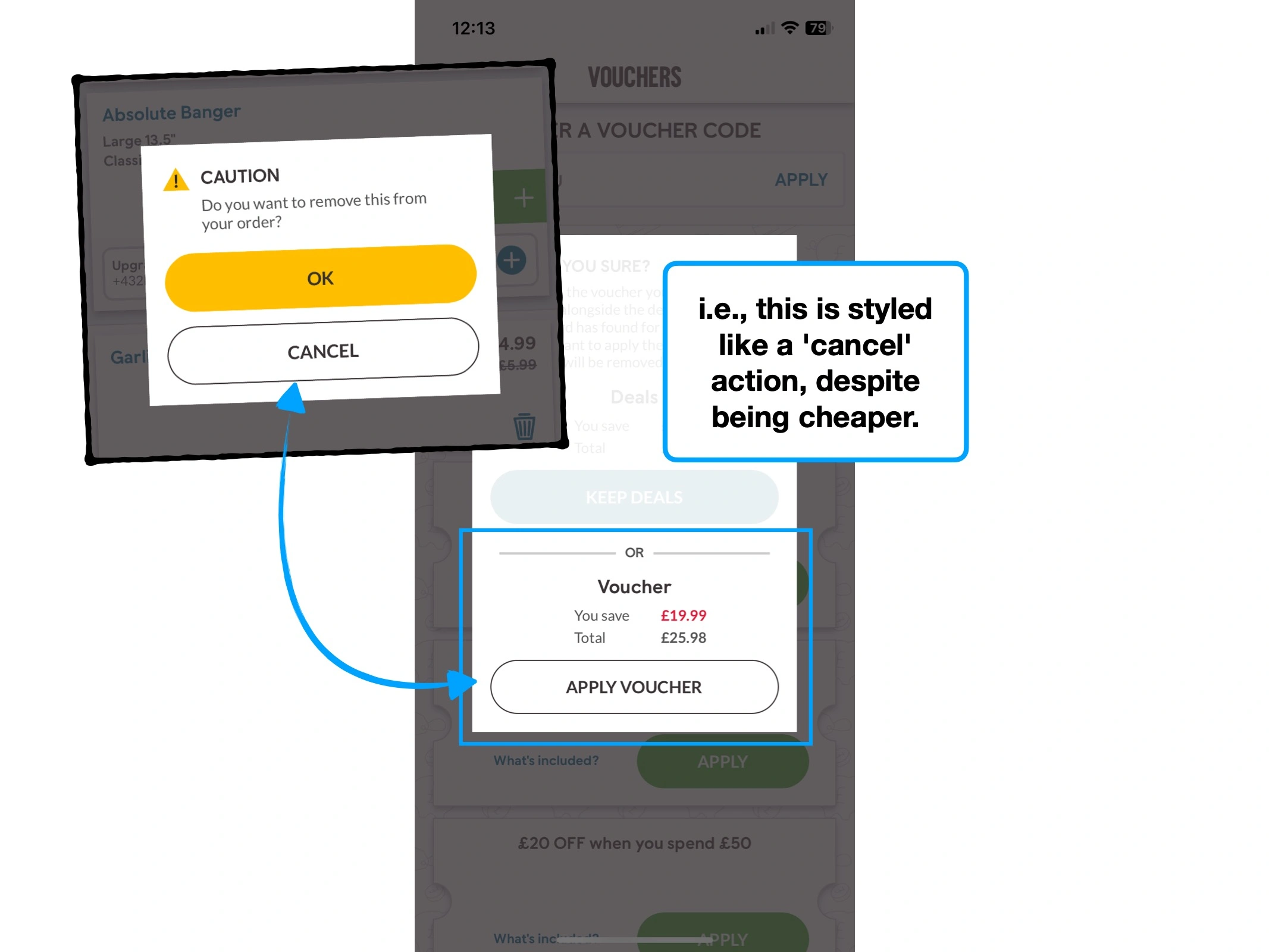
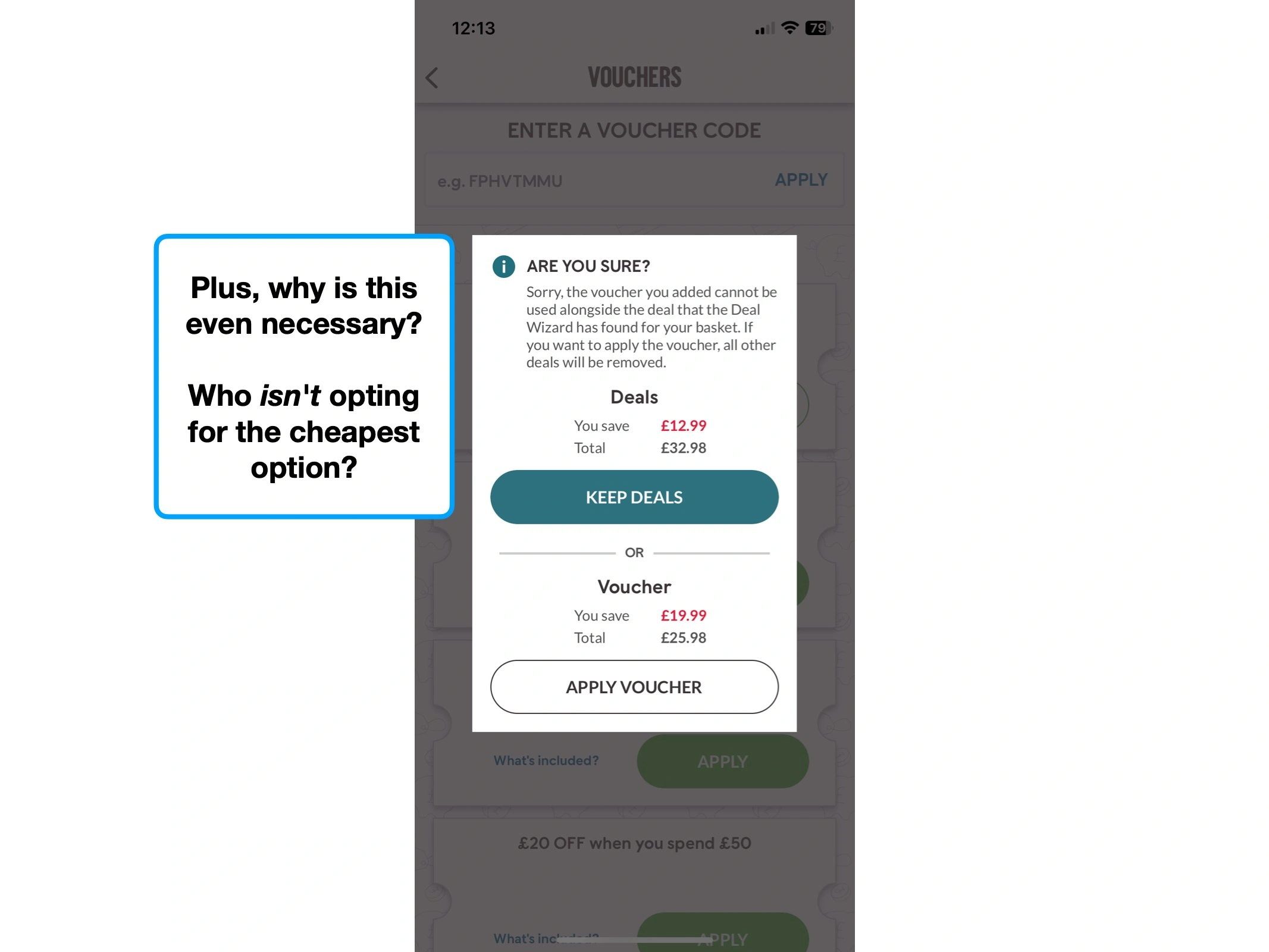
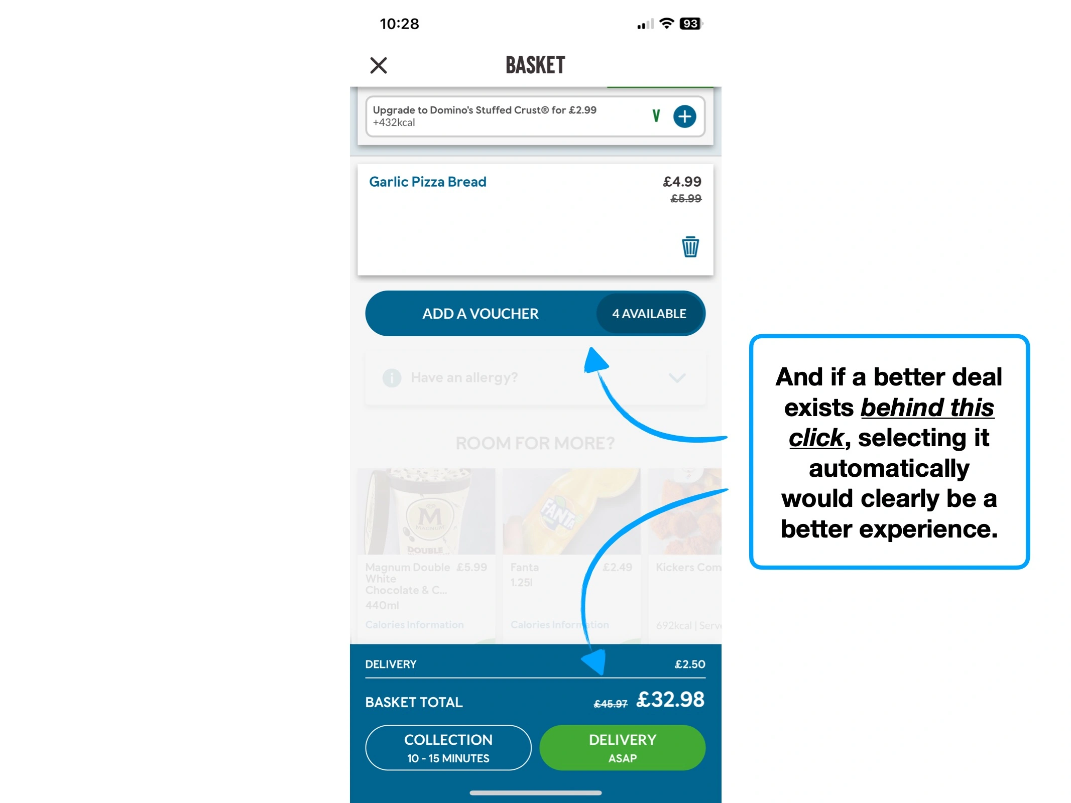
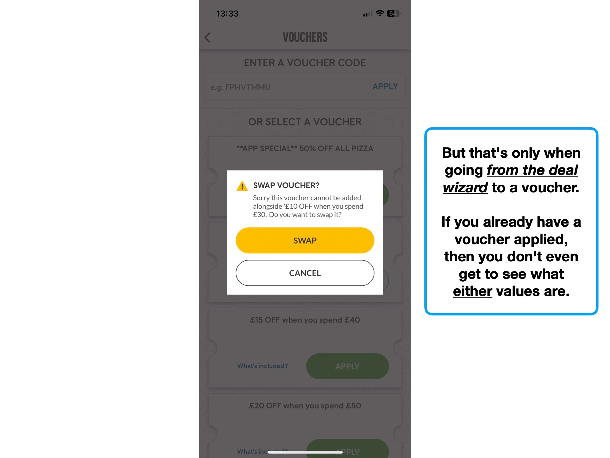
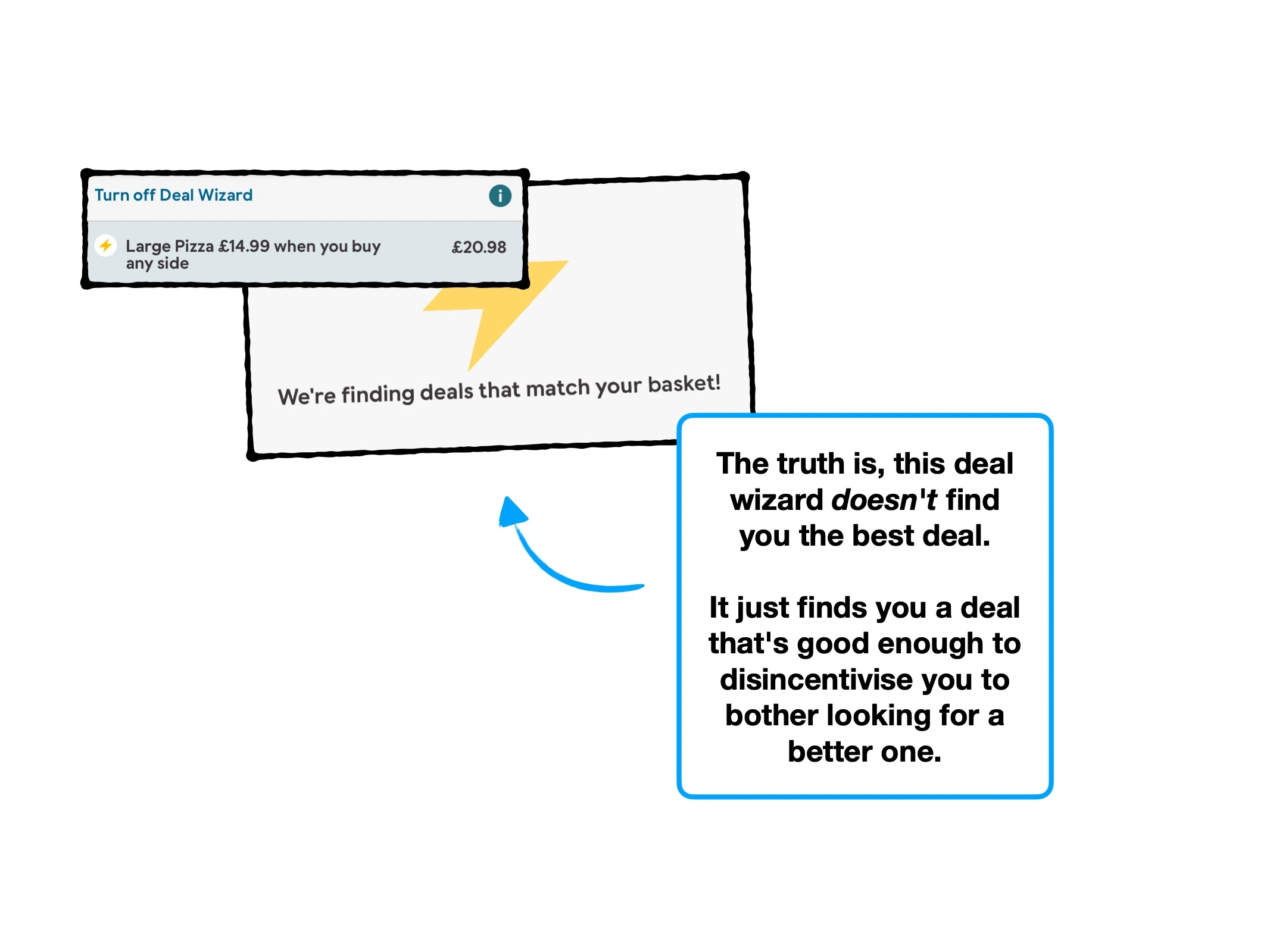
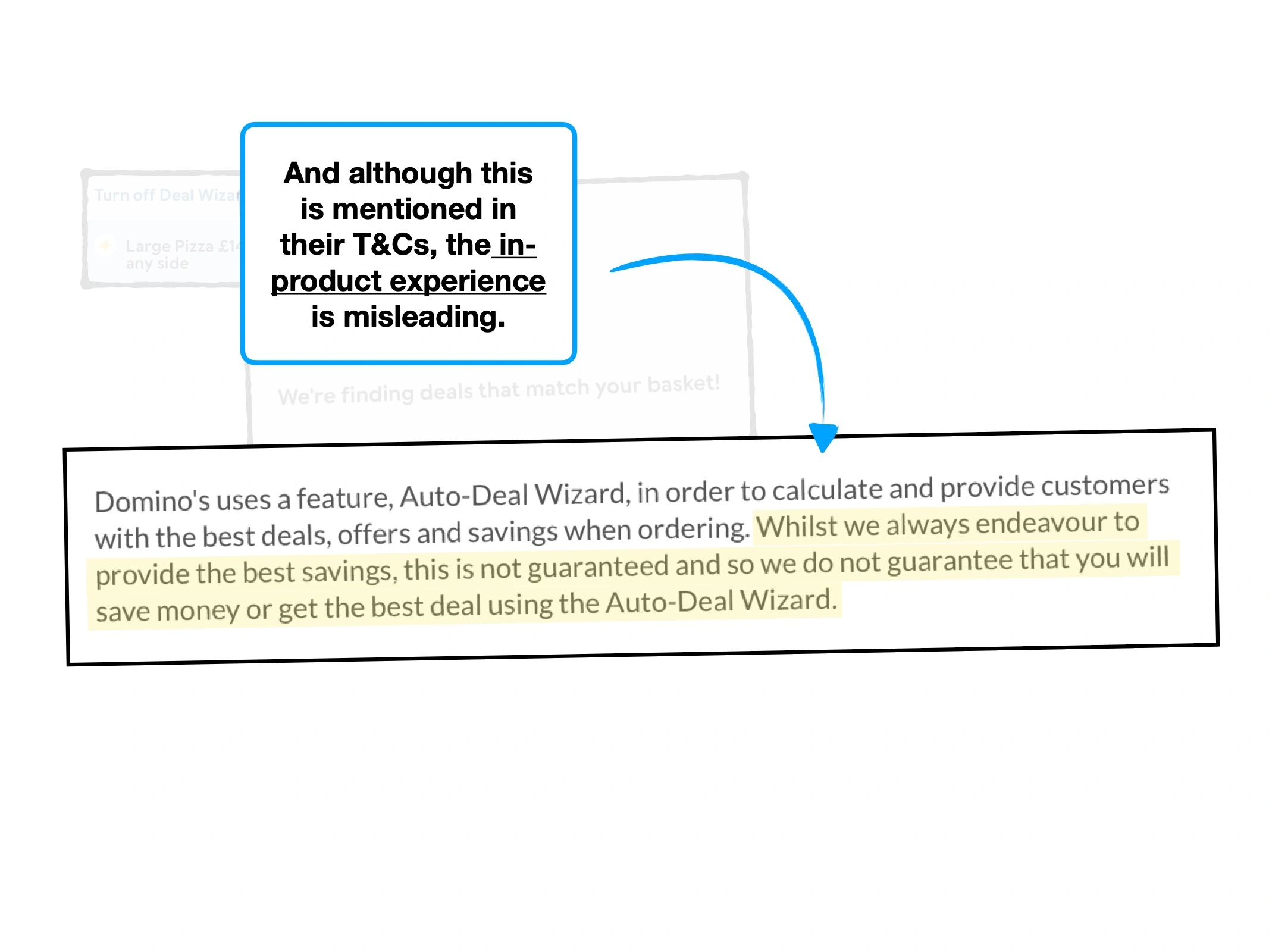
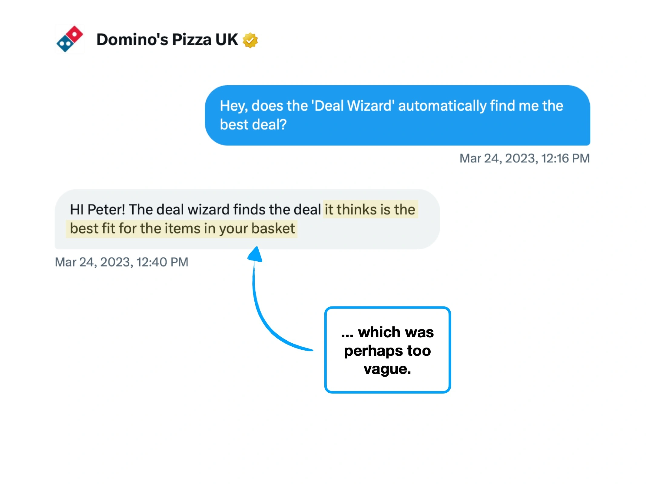
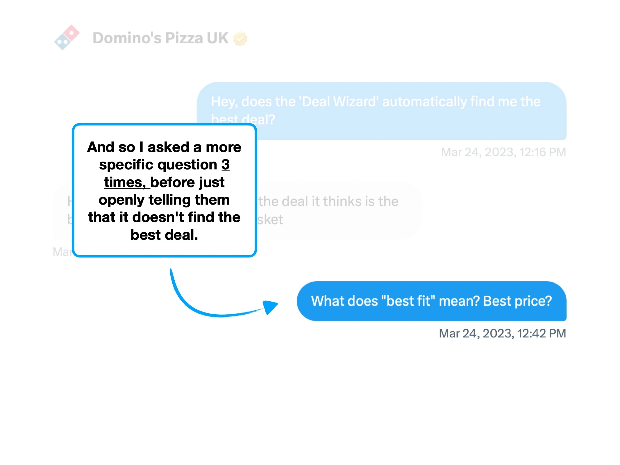
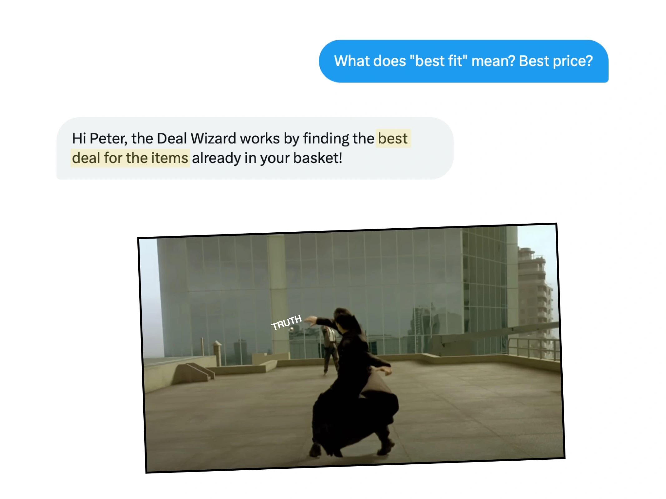
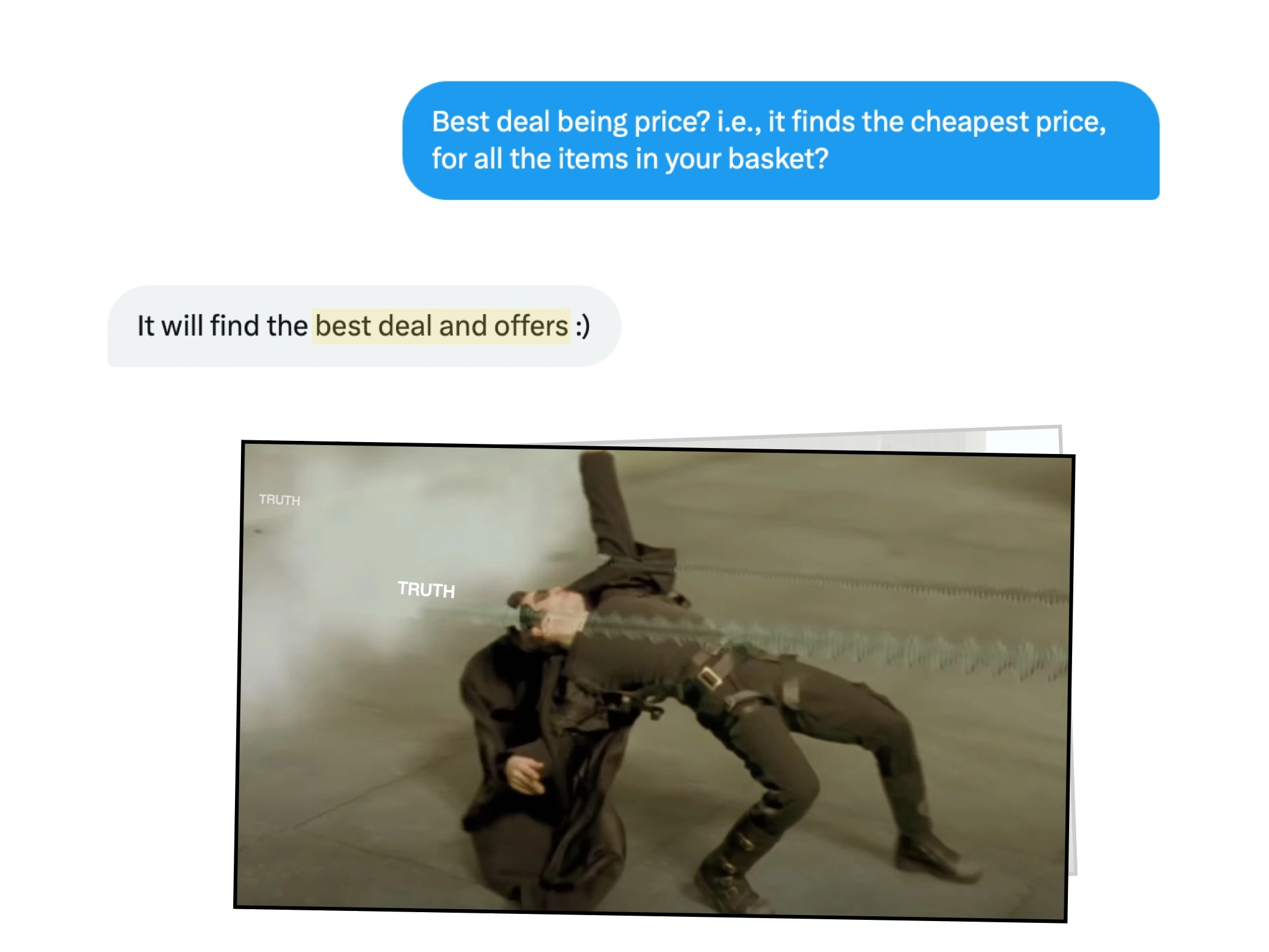
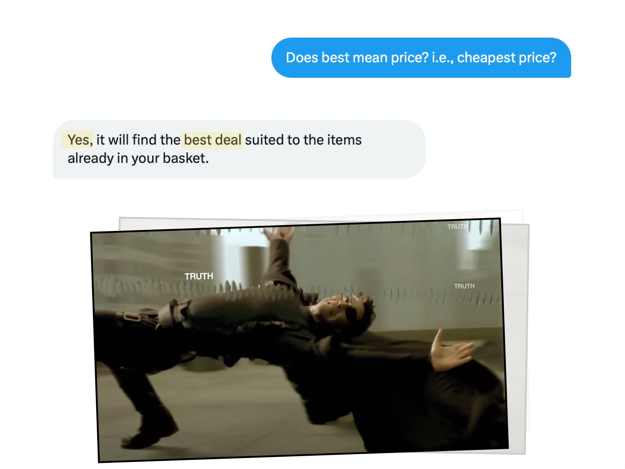
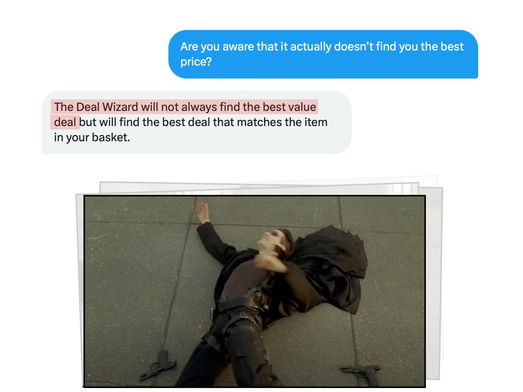
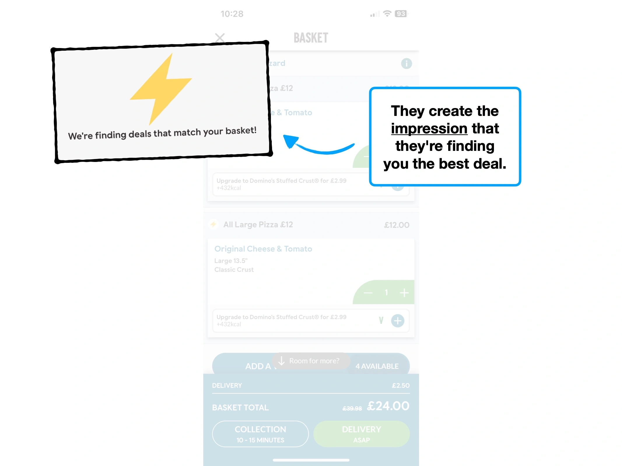
- 🏋️♀️ The Labour Illusion — creating the impression that the deal wizard is really finding you the best deal, through some 'smart' algorithm.
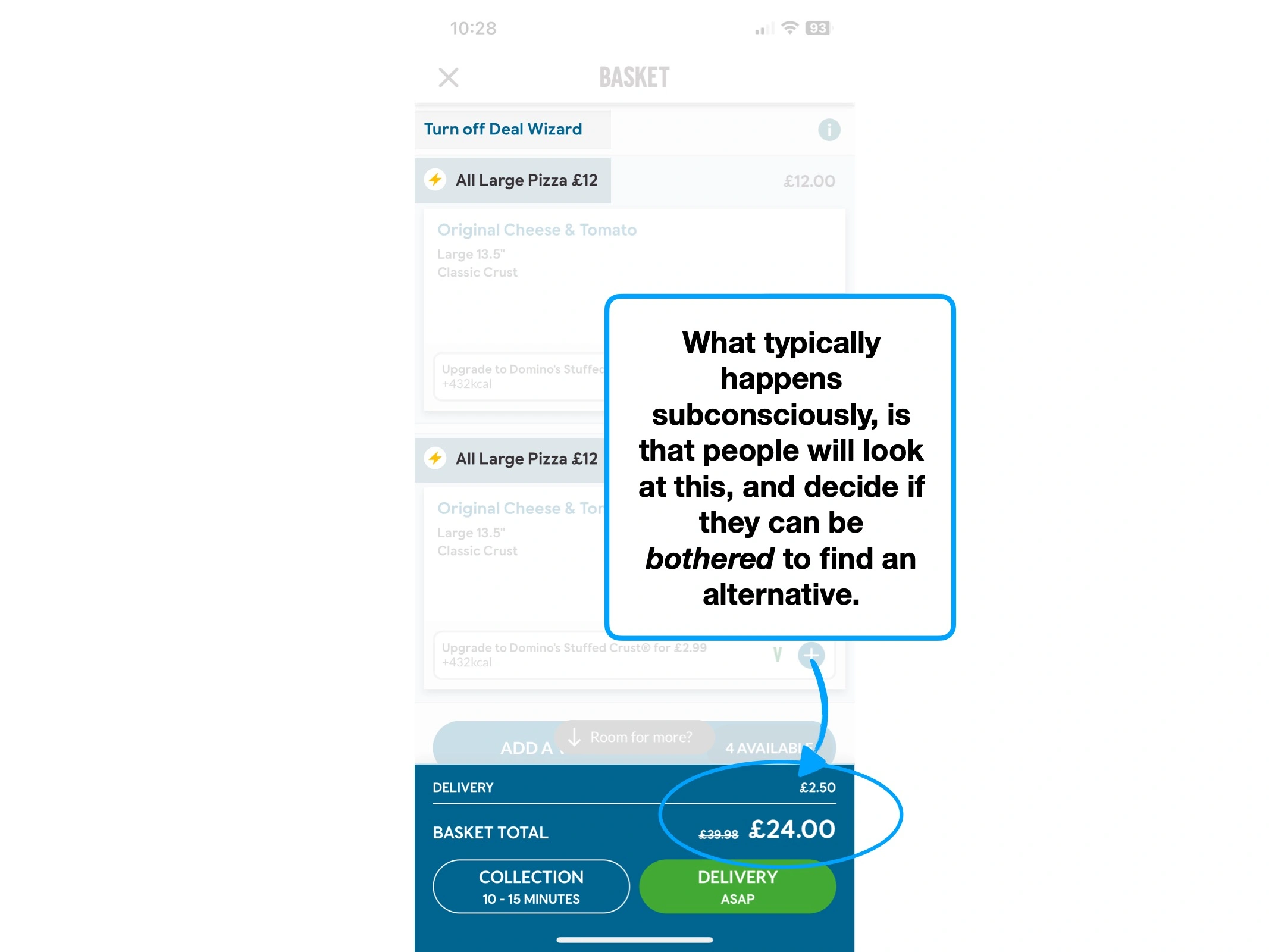
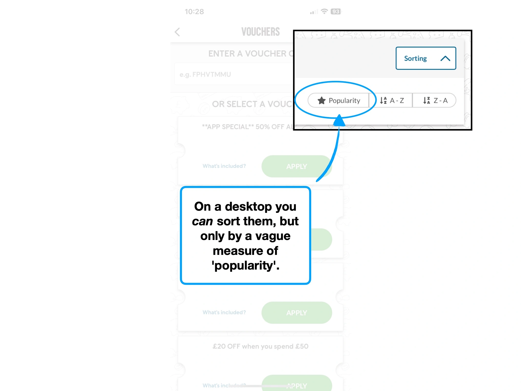
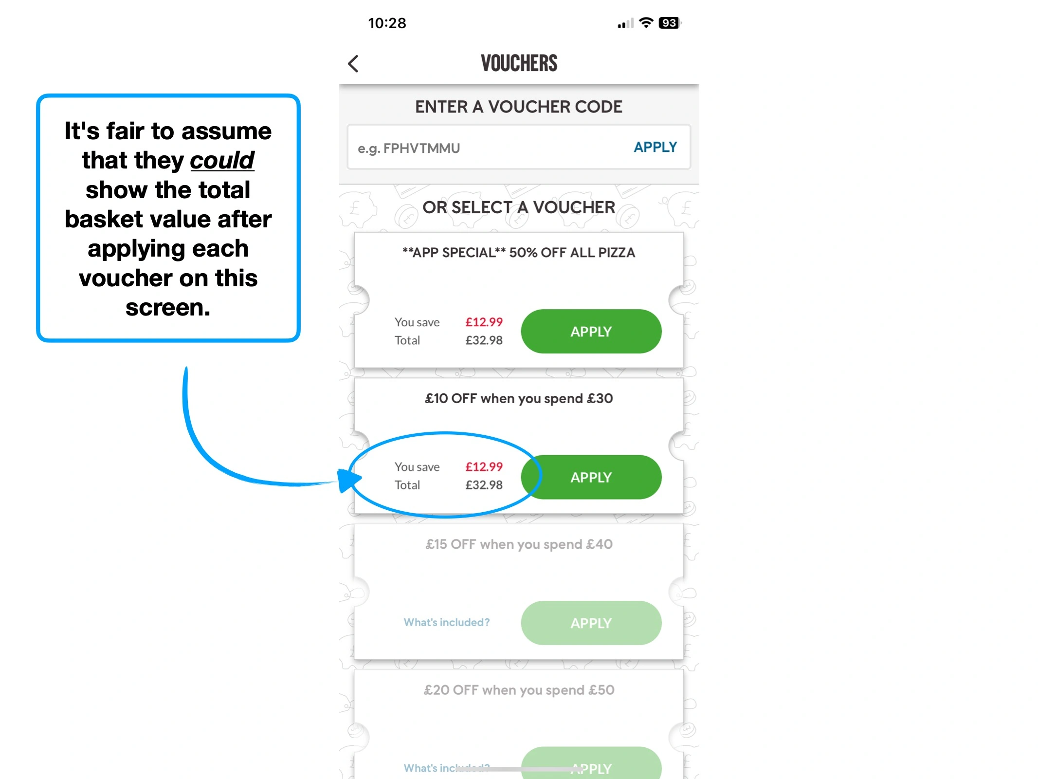
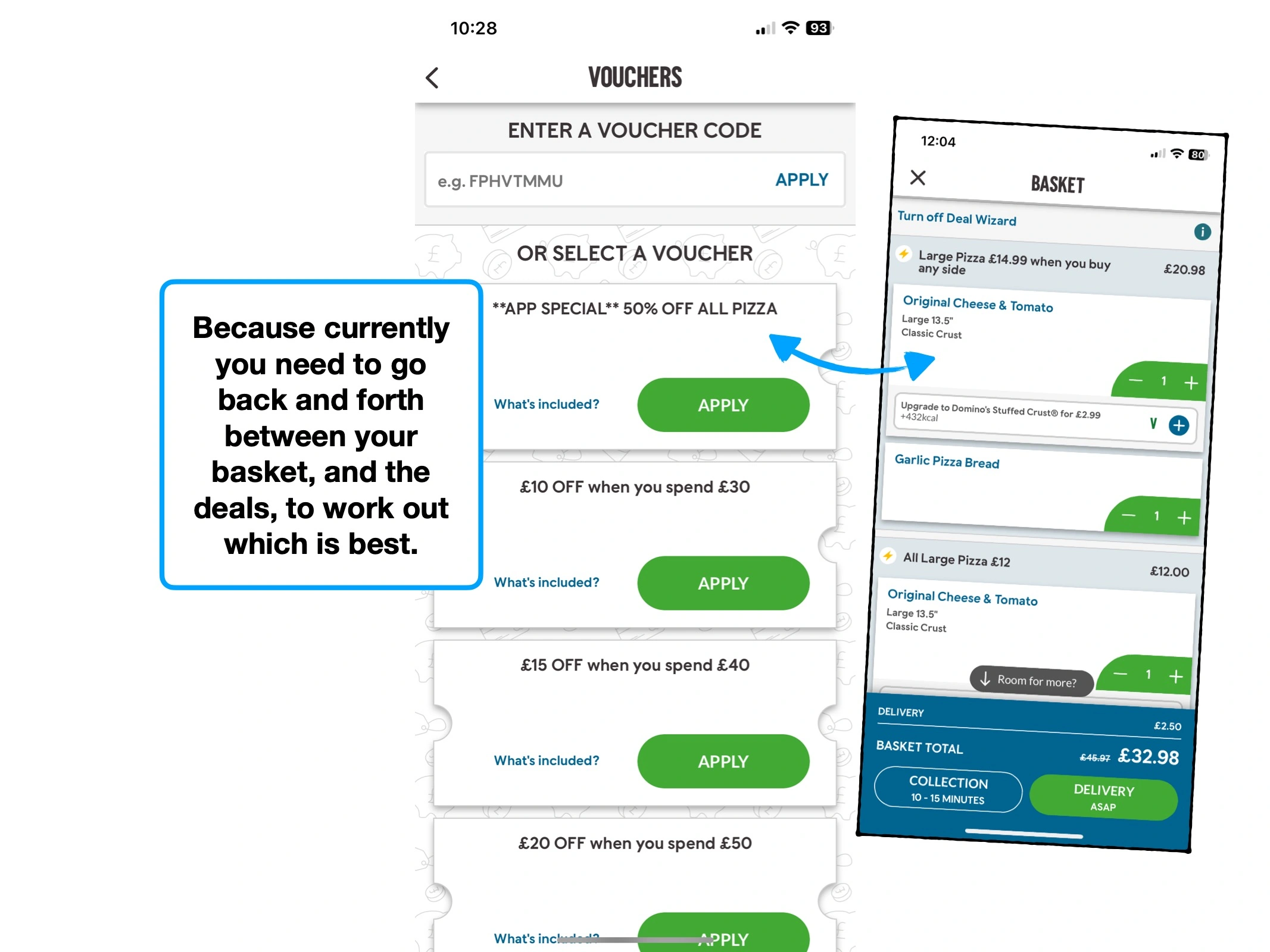
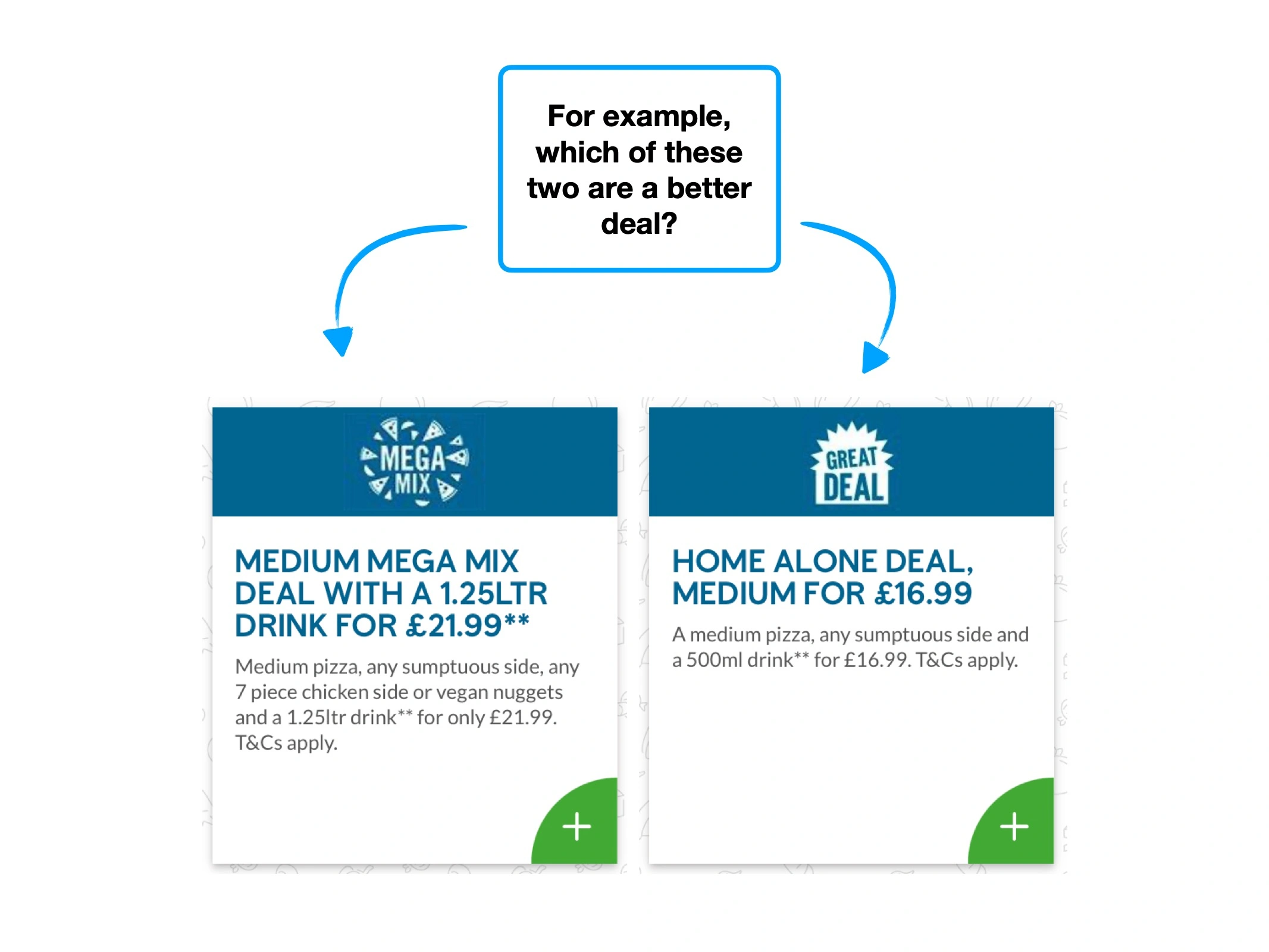
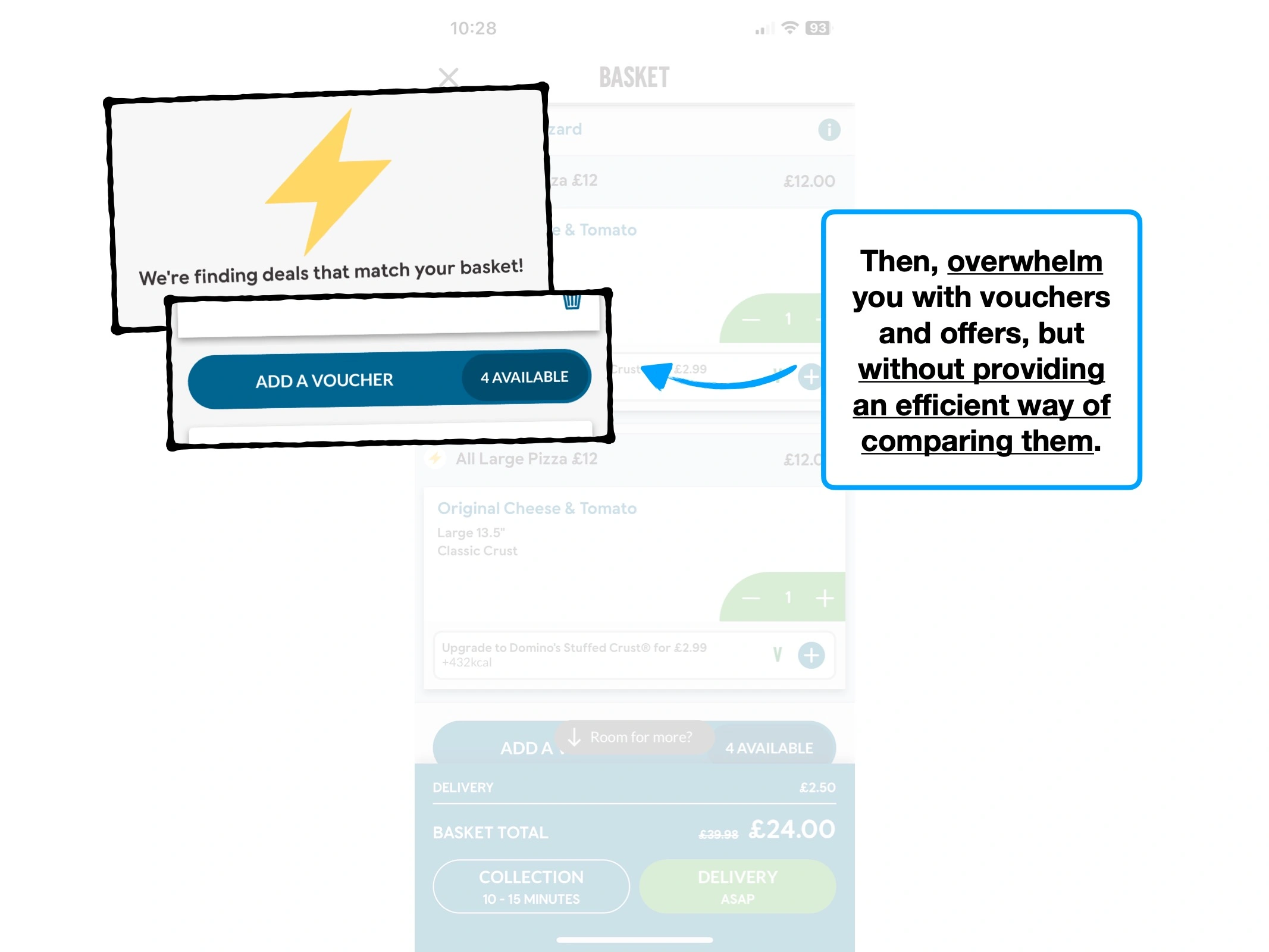
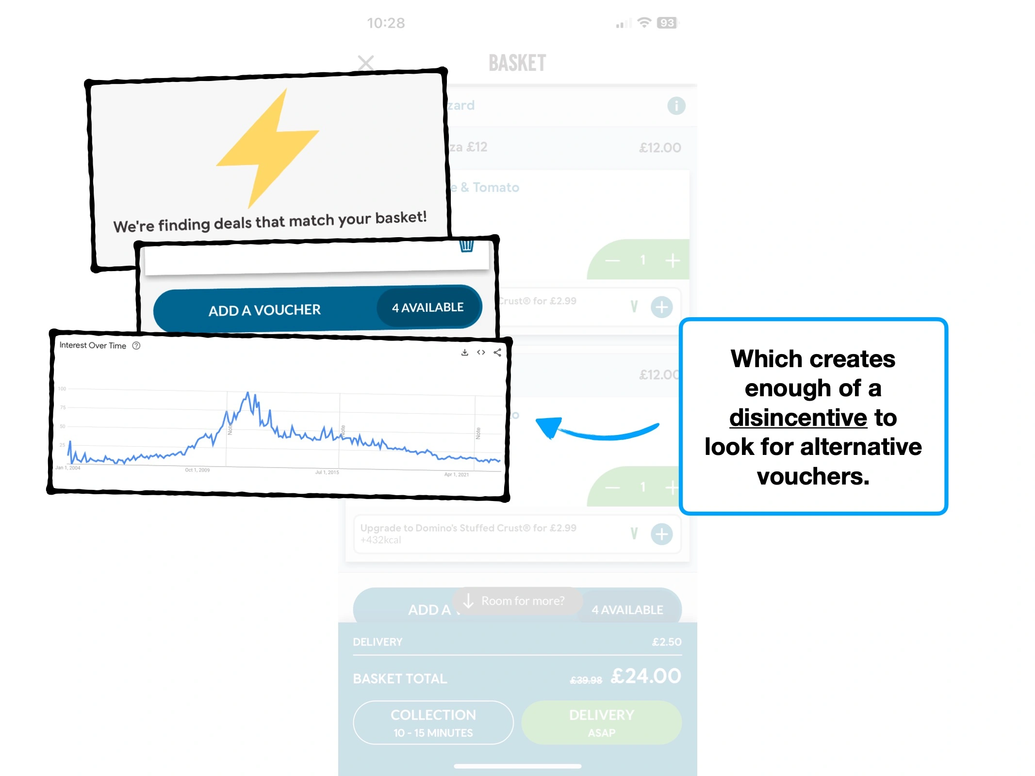
- 😳 Hicks Law — making it harder for people to quickly choose 'the best' voucher, due to both the quantity, and how difficult it is to compare the options.
- ⛳️ The Default Bias — encouraging people to use the Deal Wizard because it's easy, and already turned on.
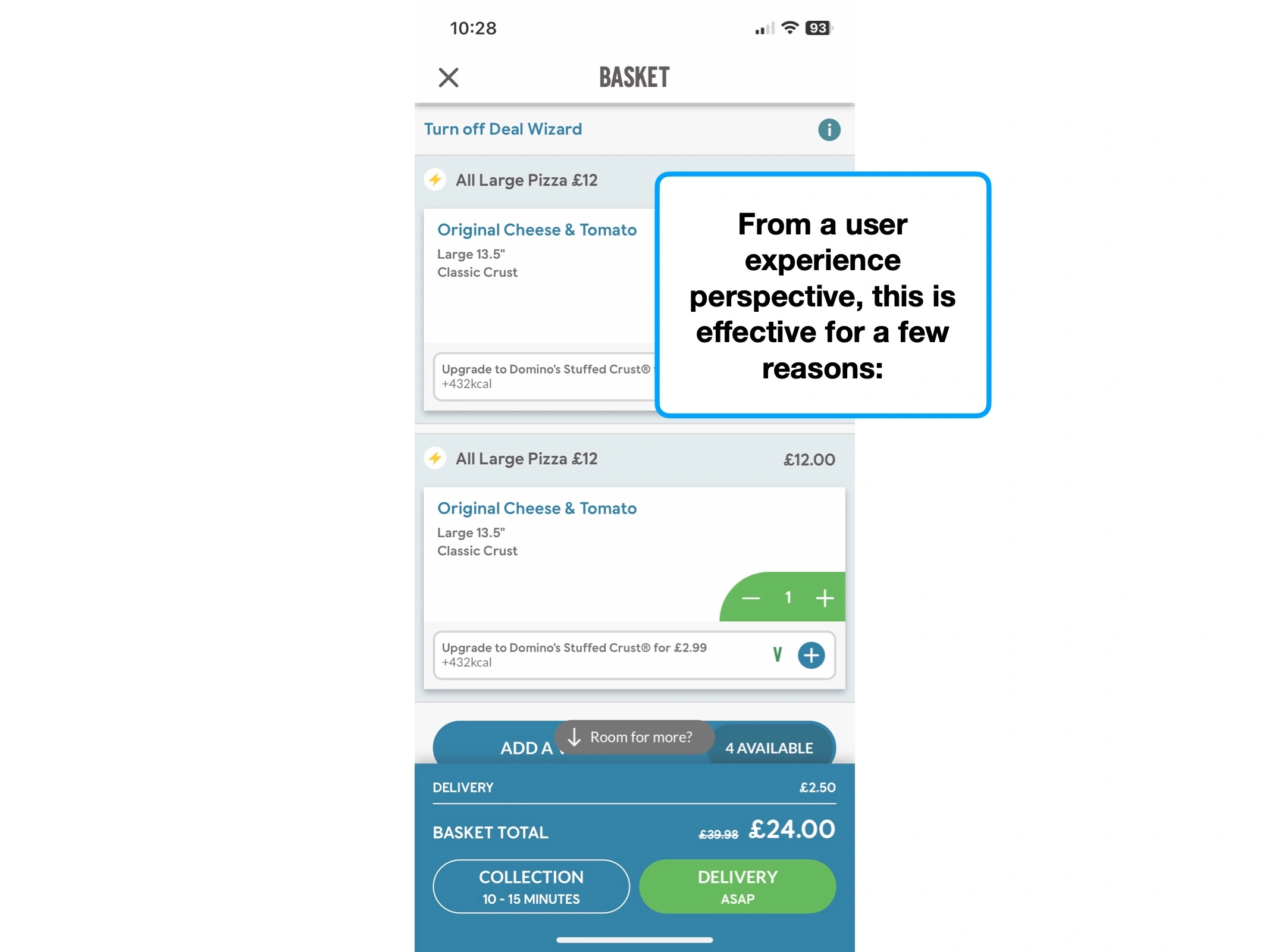
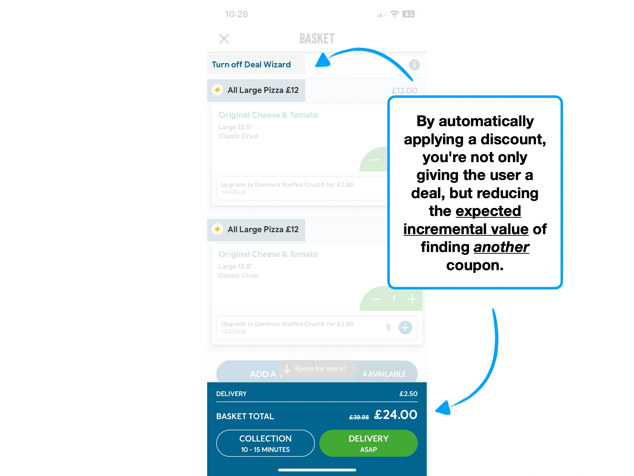
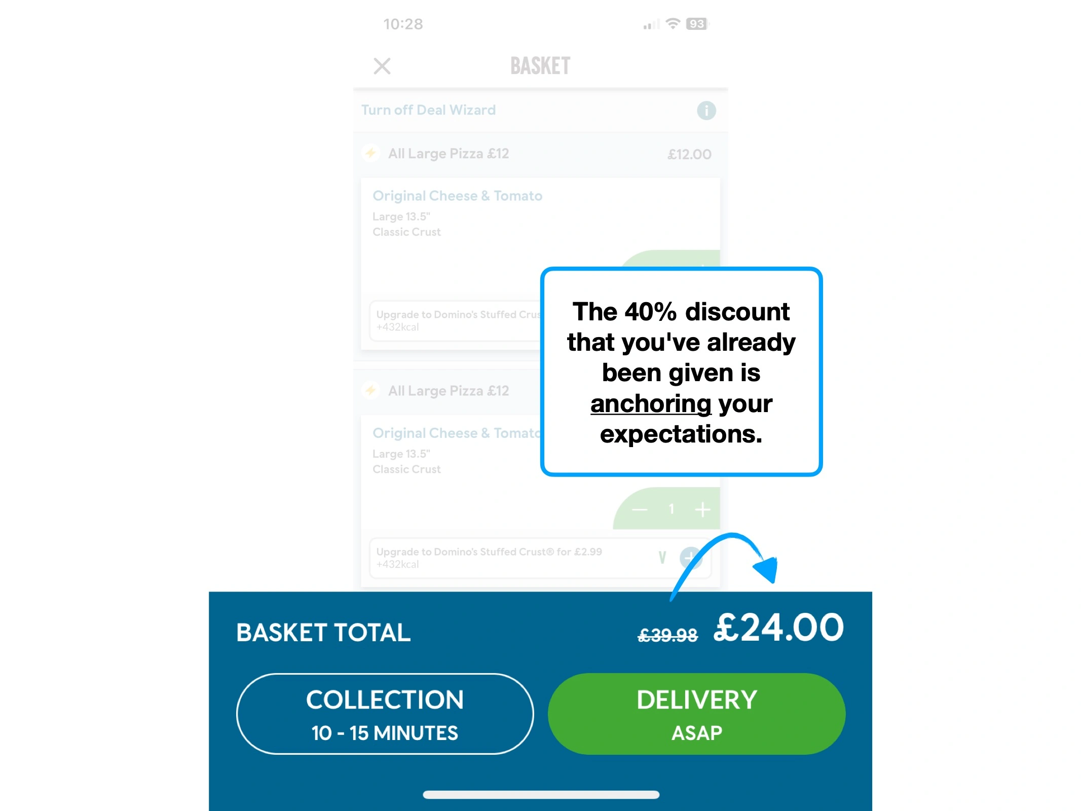
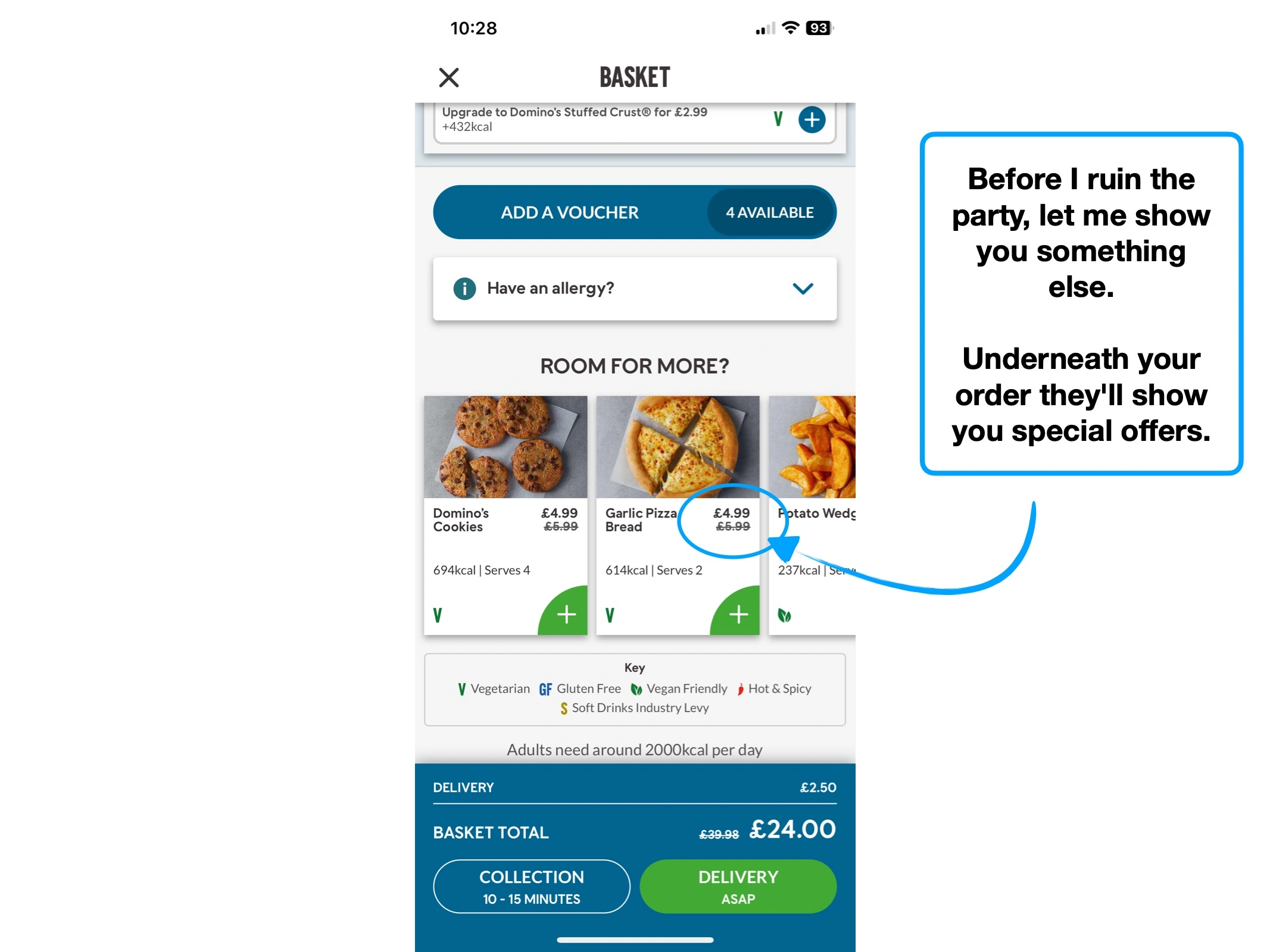
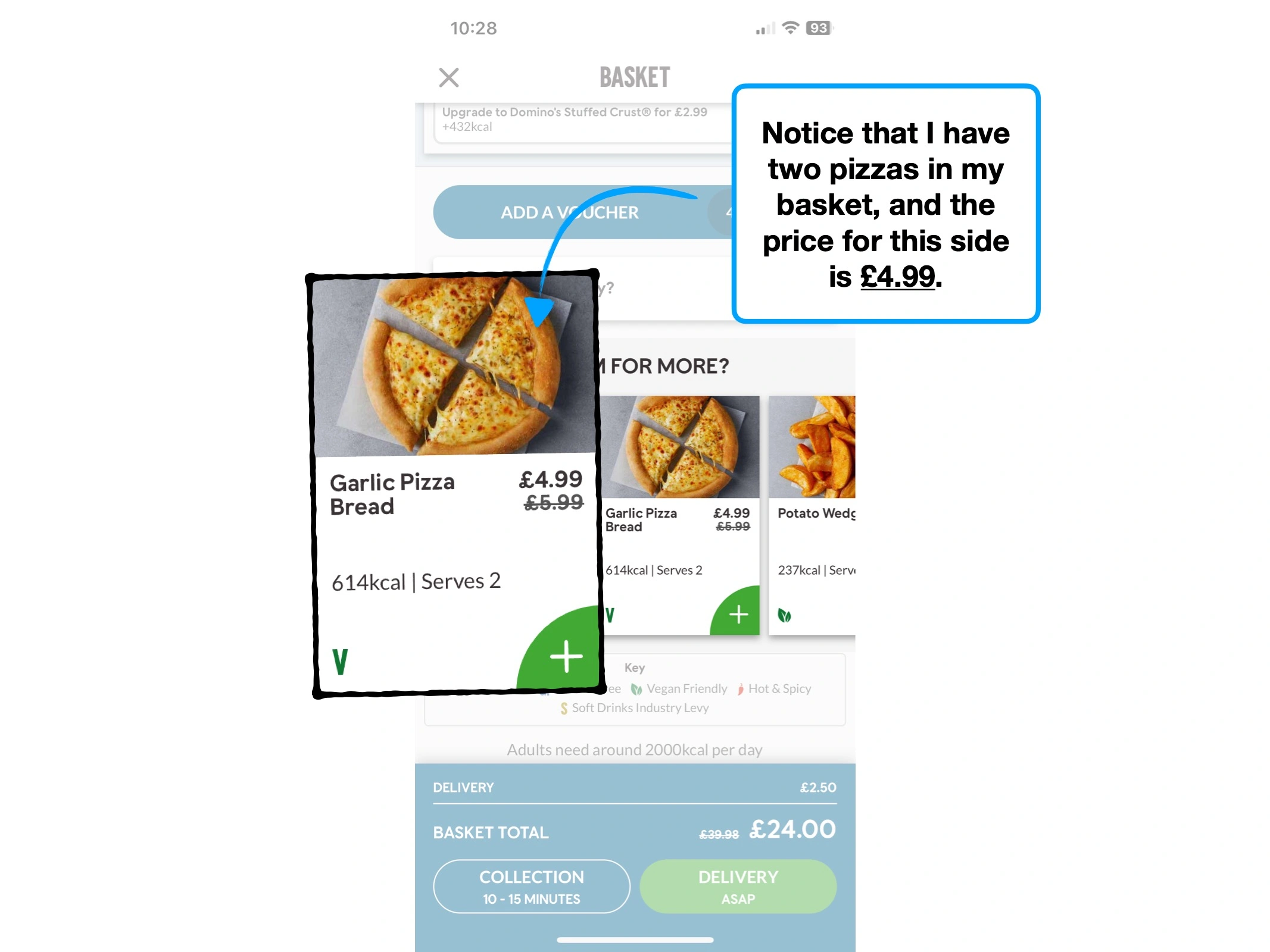
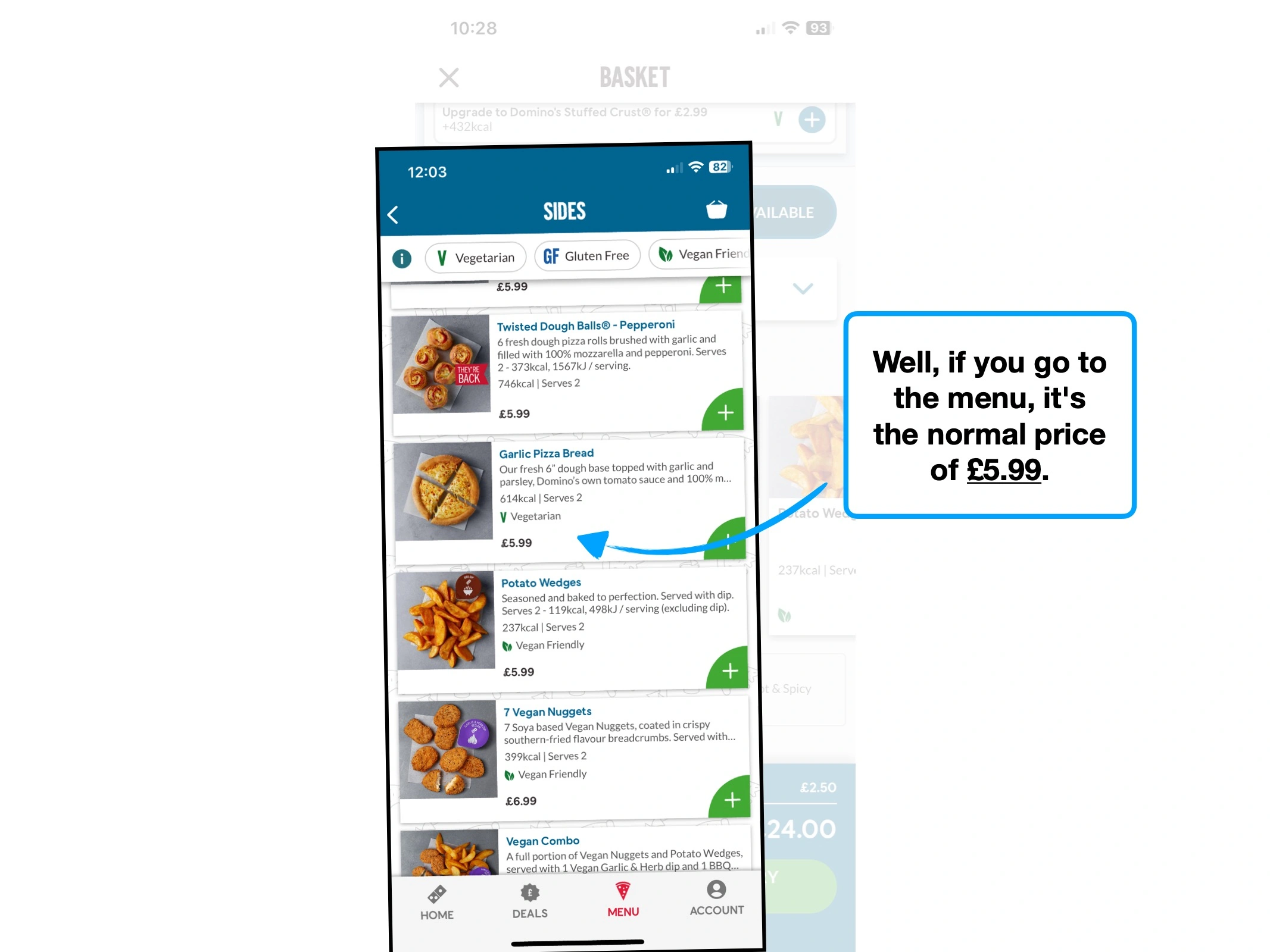
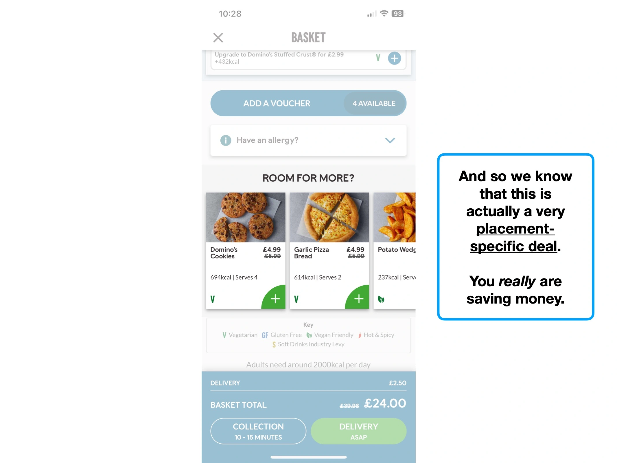
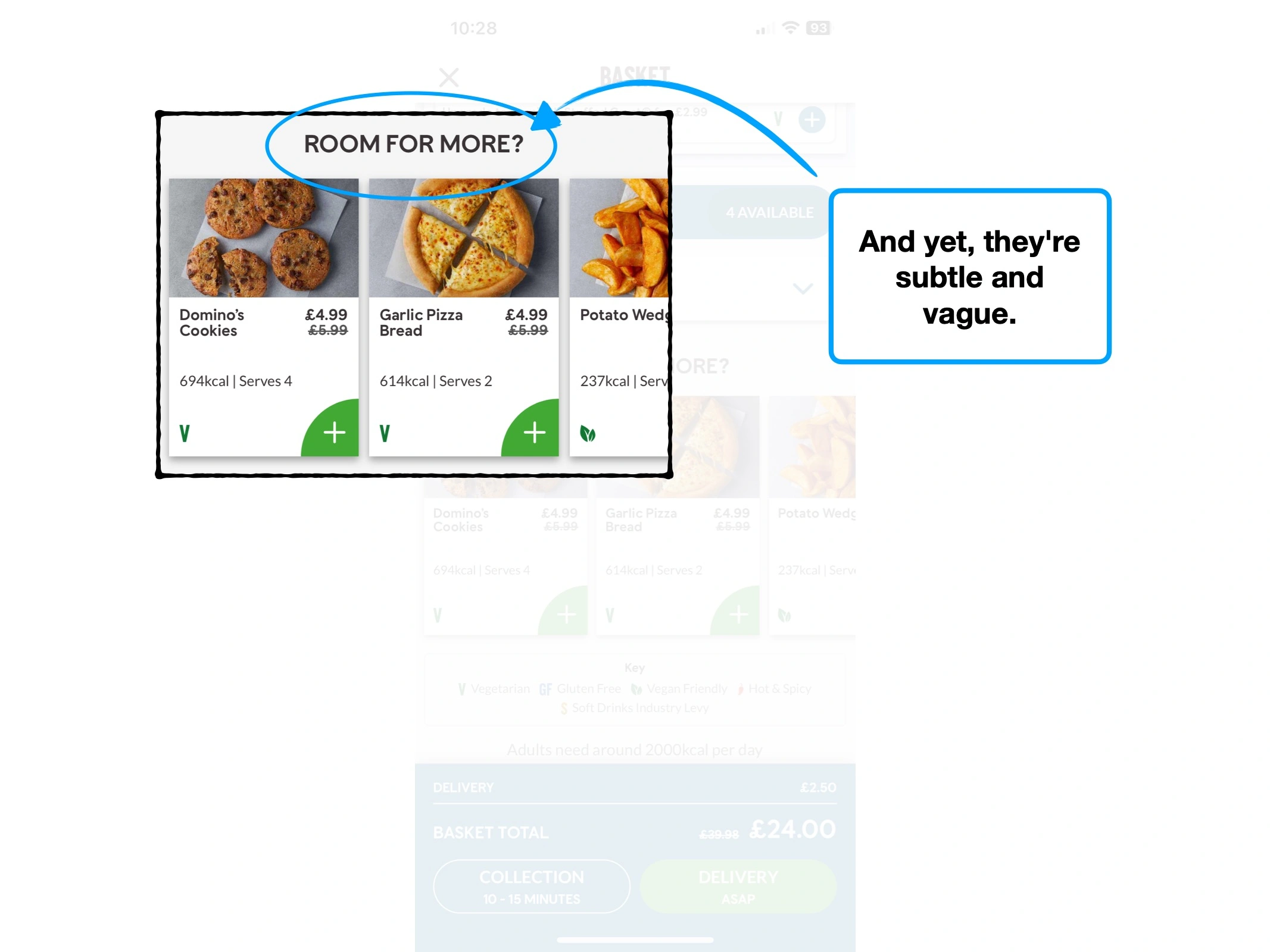
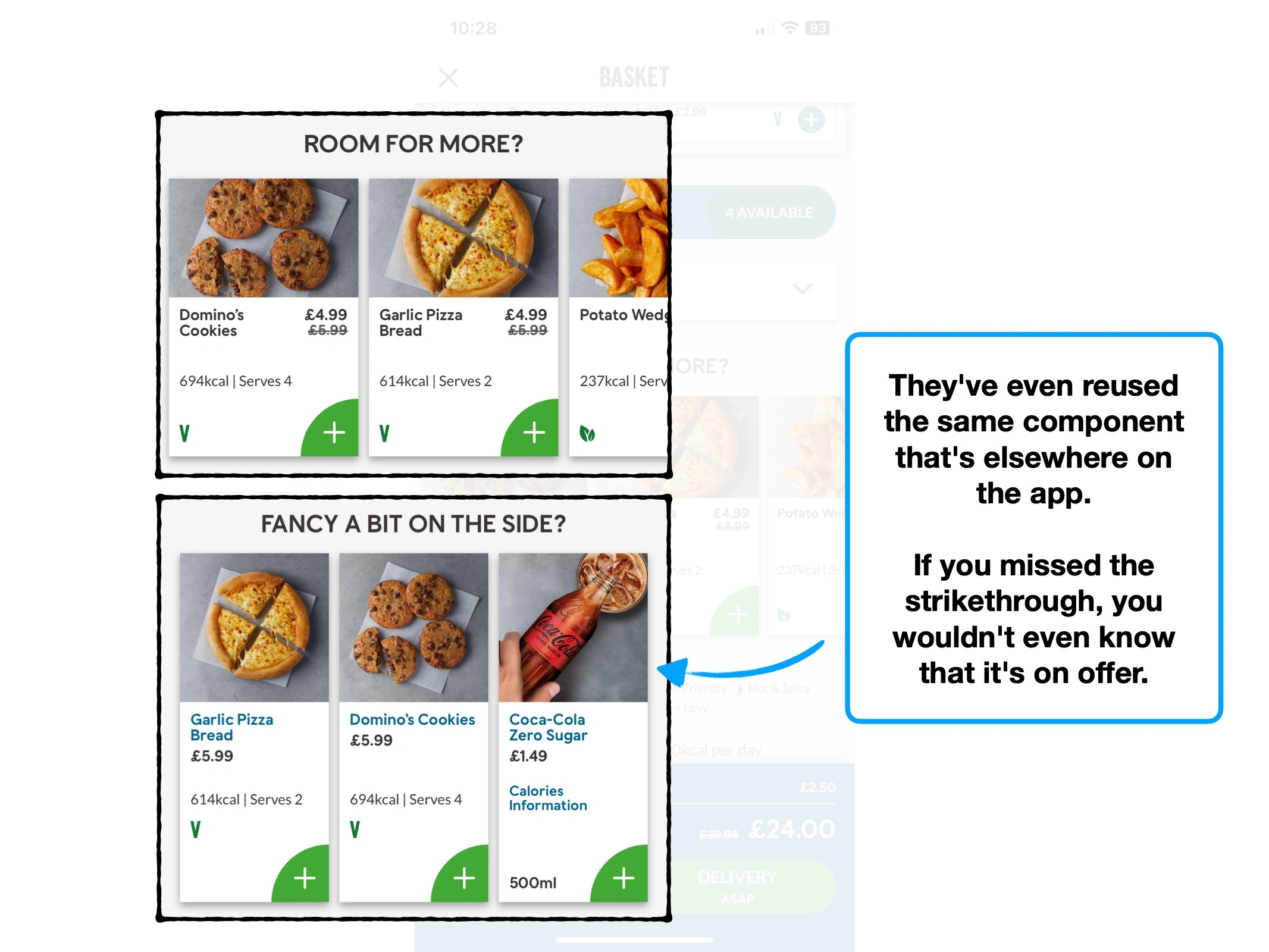
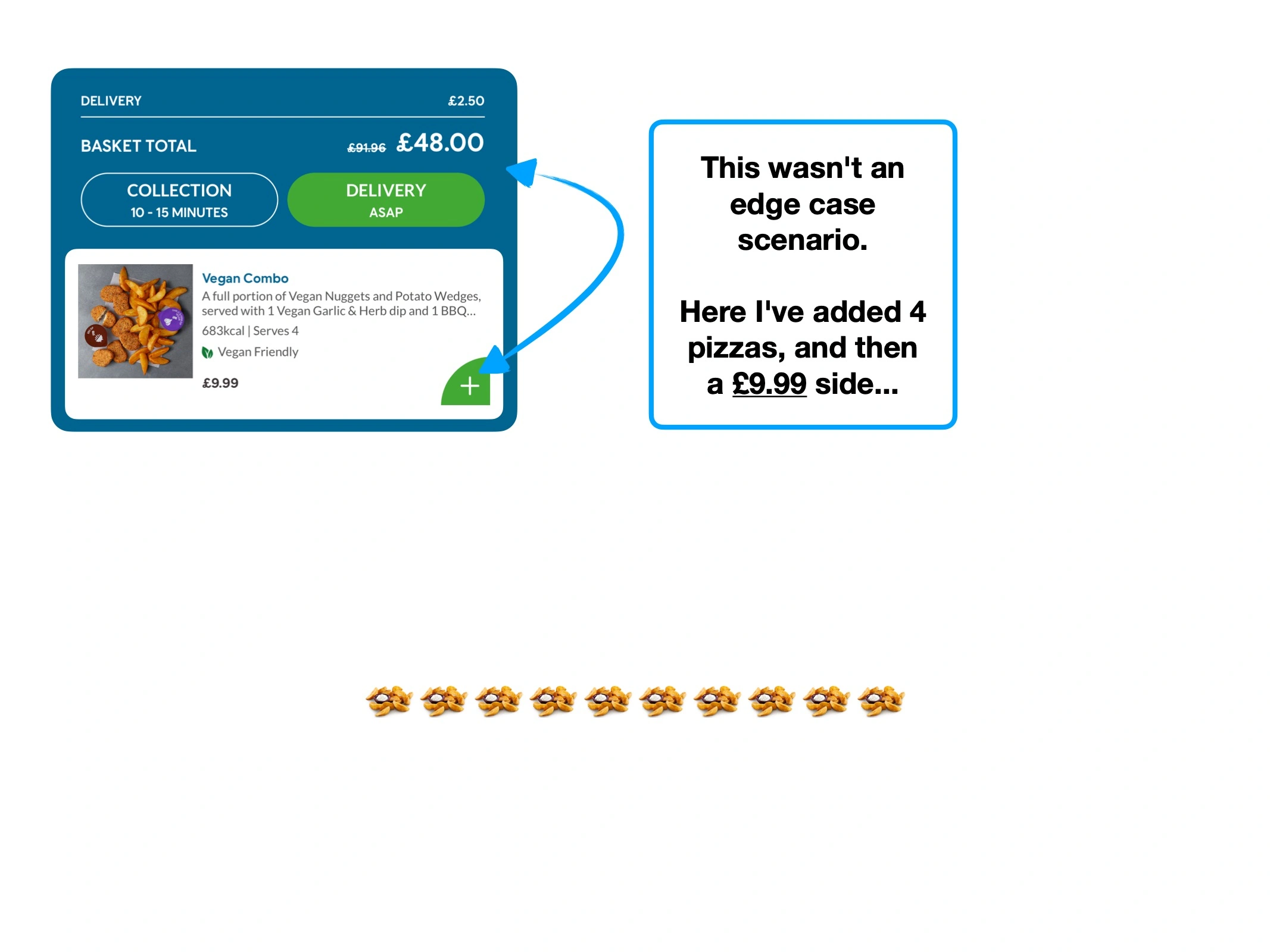
But underneath it all, you're being ripped off.
In 2021, Pizza Hut was caught in the headlines for their 'Deal Bot', which essentially does the same thing.
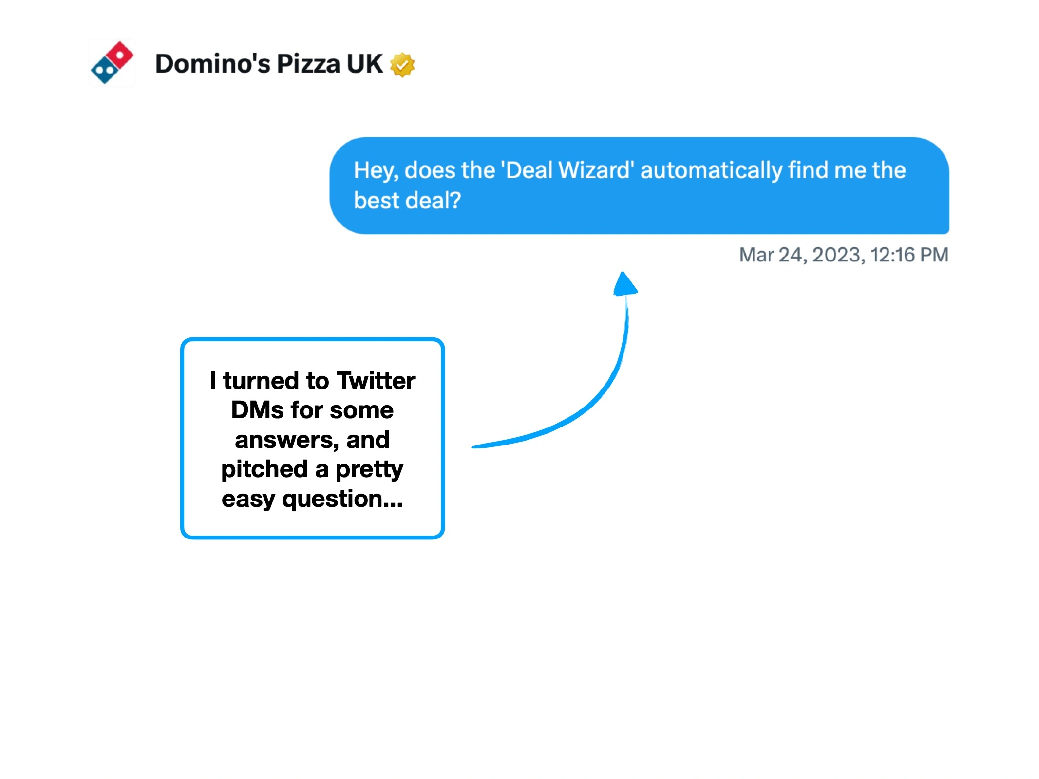
It's not like they're surprised it's happening. Both Pizza Hut and Domino's have been replying to Tweets about this issue for nearly a decade.
Obviously awareness helps, but inherently people are lazy.
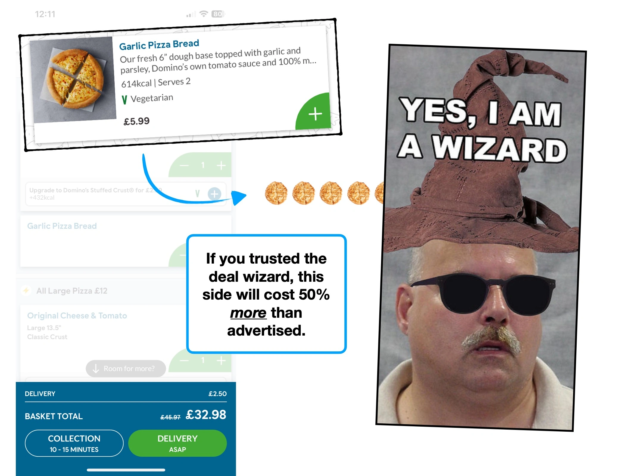
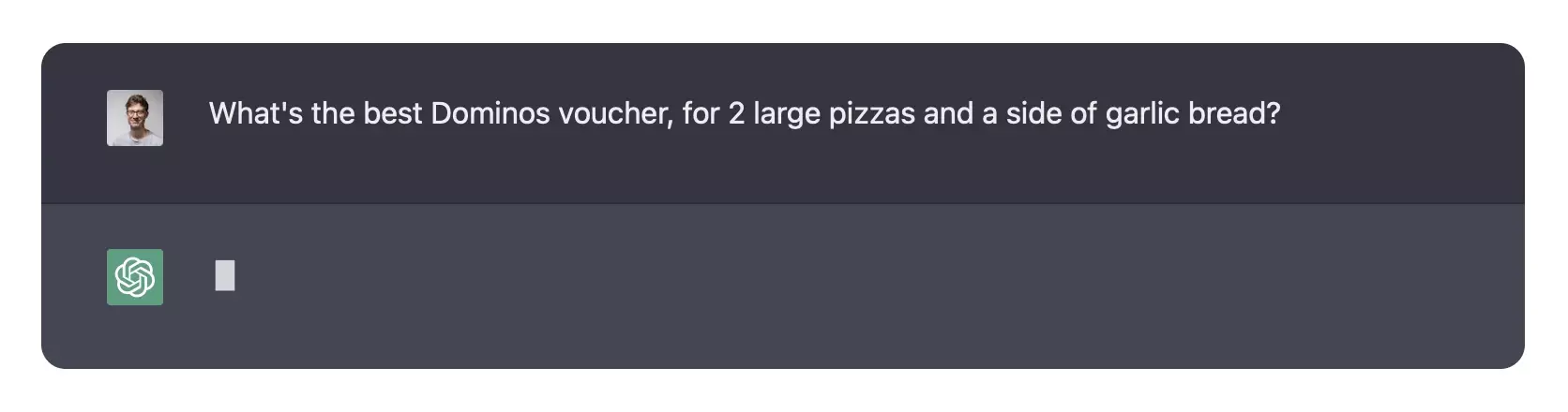
If ChatGPT told you what it thought the best voucher code was, would you trust it?
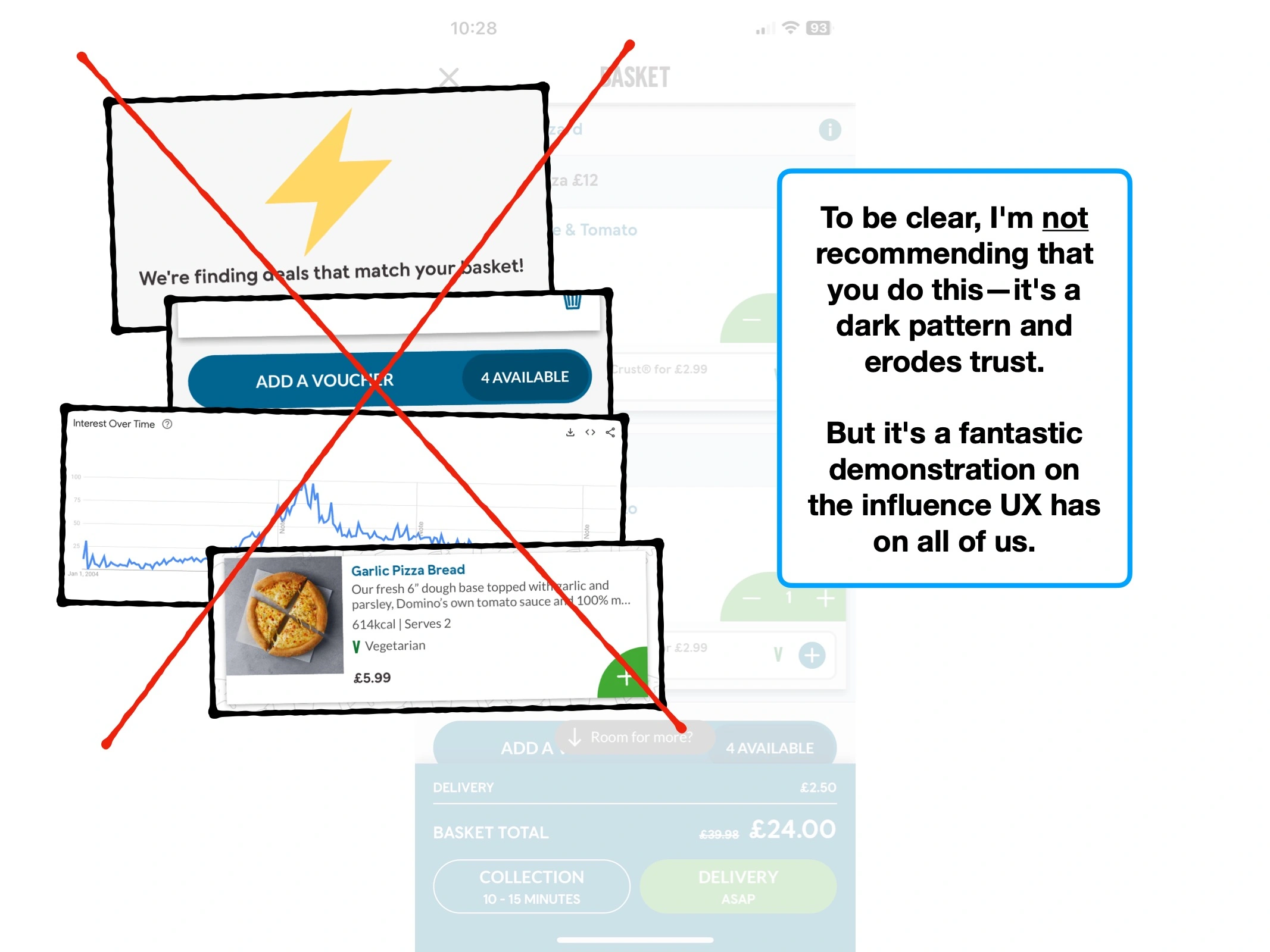
To be clear, employing dark patterns like this is not a strategy that I'd recommend, even if they do work in the short term.
Perhaps, similar to how popular celebrities often get away lightly with bad behaviour, household corporations like Dominos and Pizza Hut are big enough for consumers to be misled, without ramifications.
But a great user experience is built on trust and clarity—and for the vast majority of start-ups, that's paramount.
2. Humanising pizza
Small businesses thrive on personalisation—from handwritten notes, to the implied knowledge that you know who roasted your coffee.
Culturally, we attribute more value to independence, partly because it breaks the mould of being a faceless corporation.
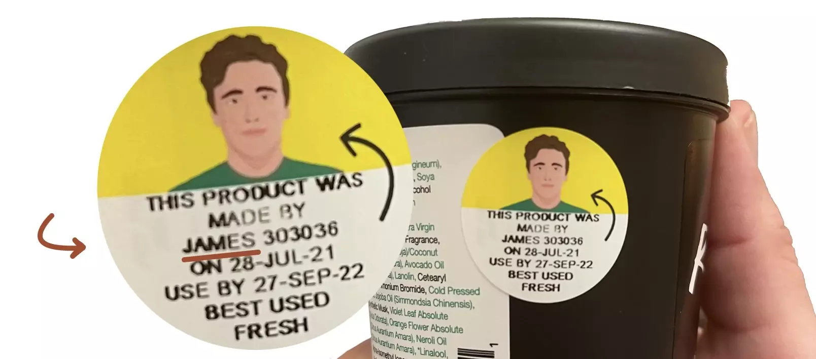
Some brands, like Lush Cosmetics, have maintained this personalisation even as they've grown, by printing stickers of the person who 'made' that item.
In a similar vein, Dominos has invested hundreds of millions of dollars into digital initiatives, including software and back-office technology.
And it's allowed them to humanise the preparation, baking and delivery of pizza, at scale.
When an order is sent to a store, it'll record who is on-shift, and display their name to the customer on their app.
Another dumb (but easy) implementation of this bias, is that I show my face and name at the end of every Built for Mars article.
I want you to know that I researched and wrote this—not because I care for the attributed credit, but instead because it helps to remind you that I'm also just a person, often sat on a barstool in my kitchen.
3. An off-ramp
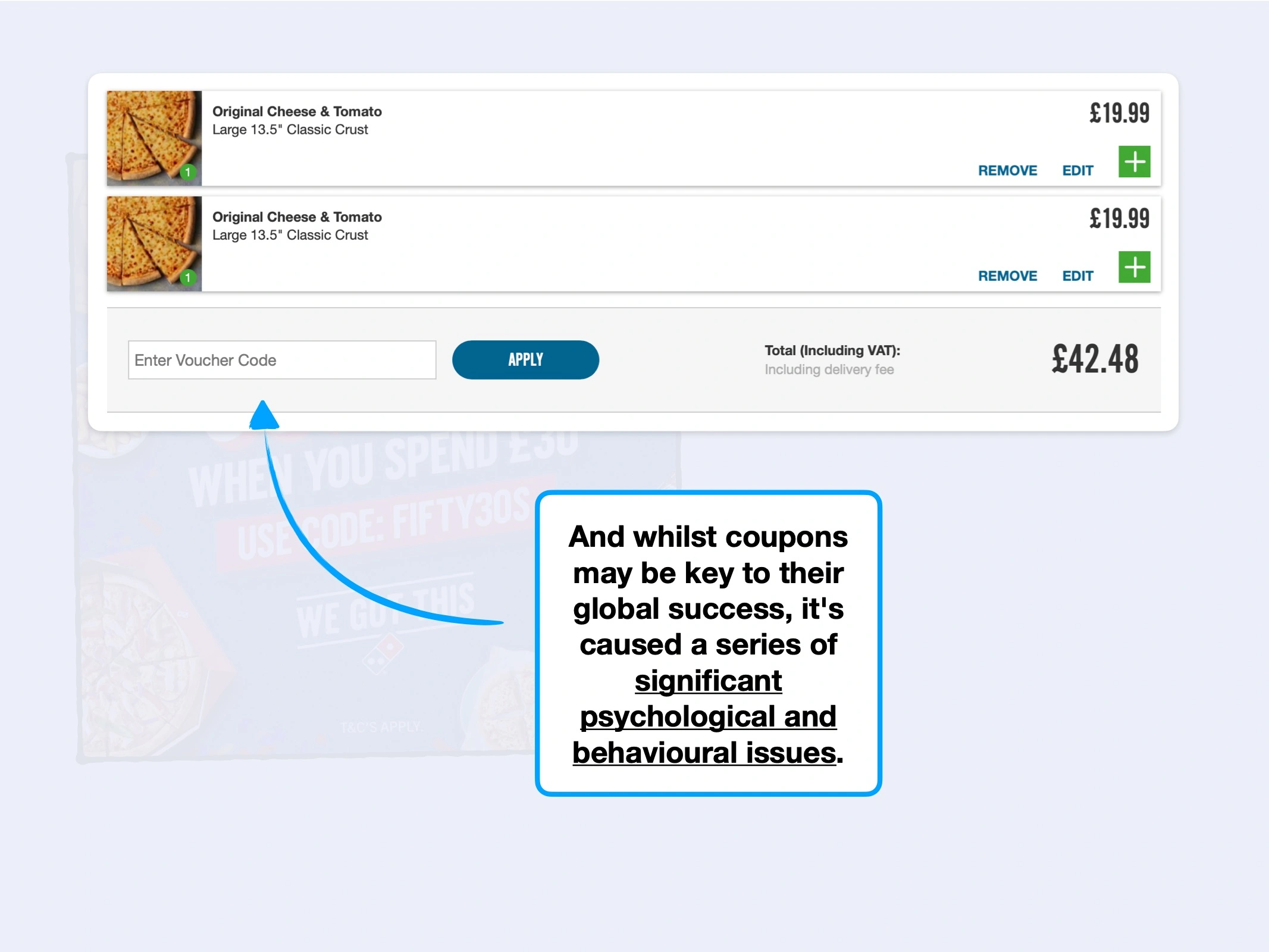
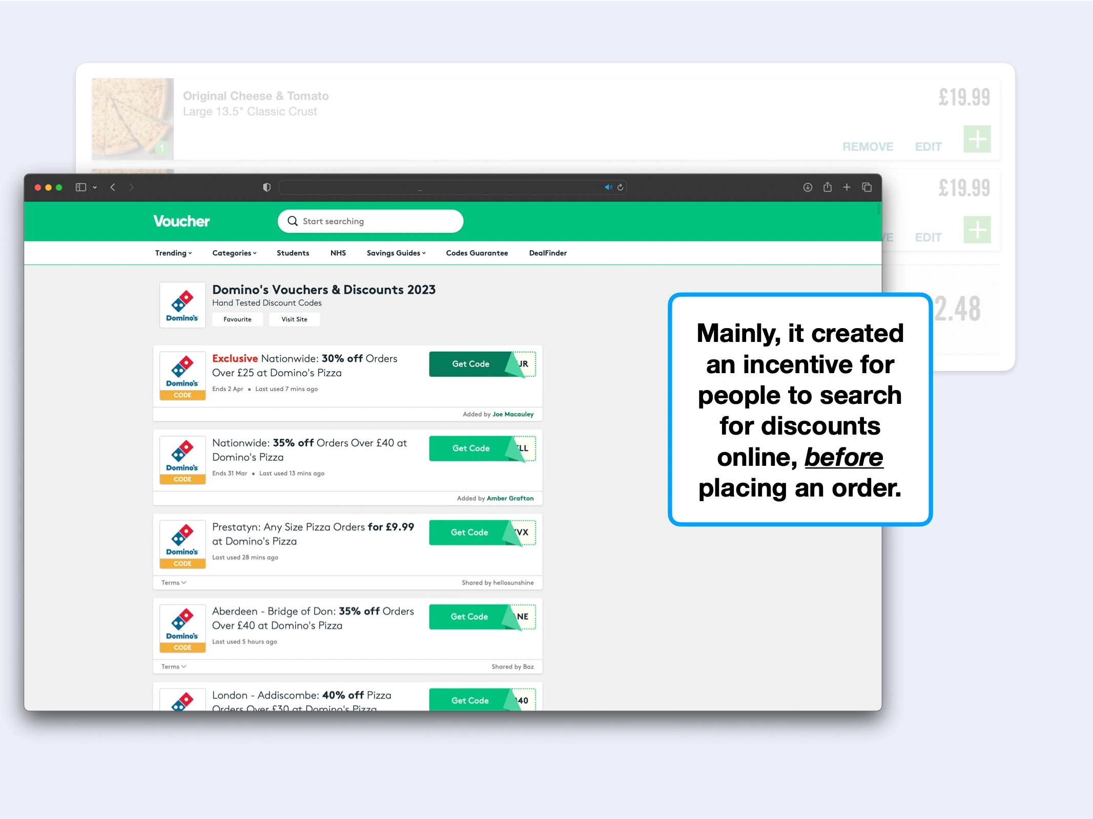
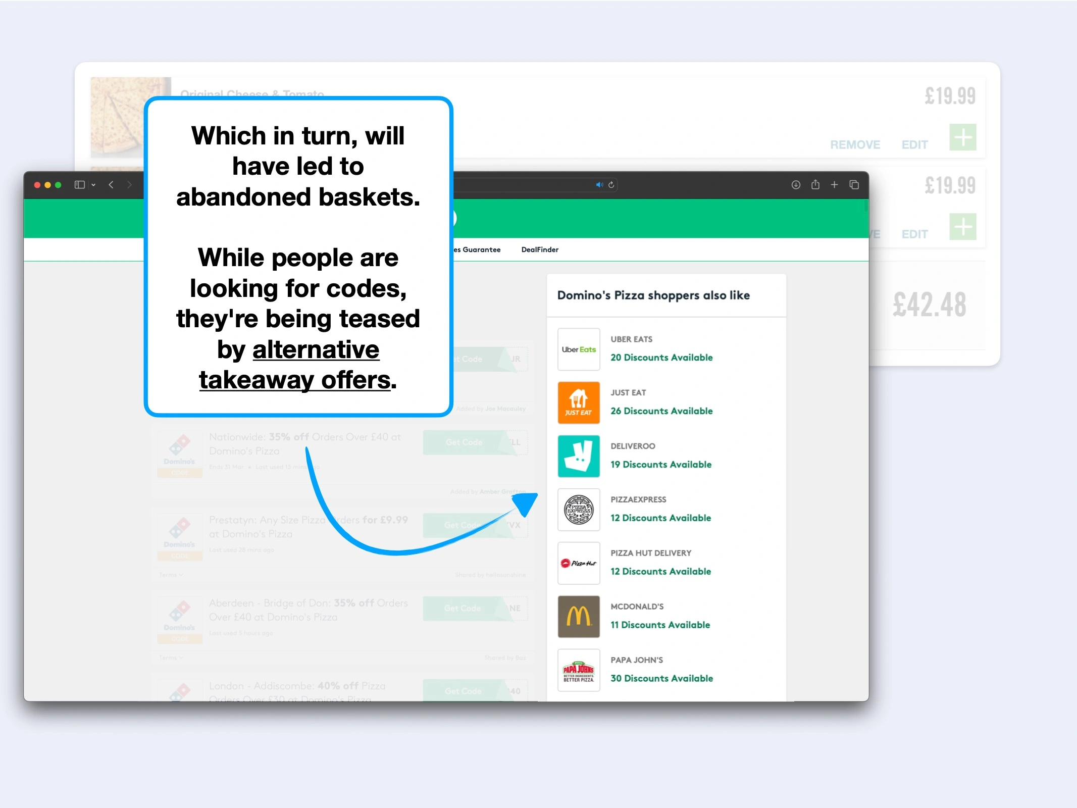
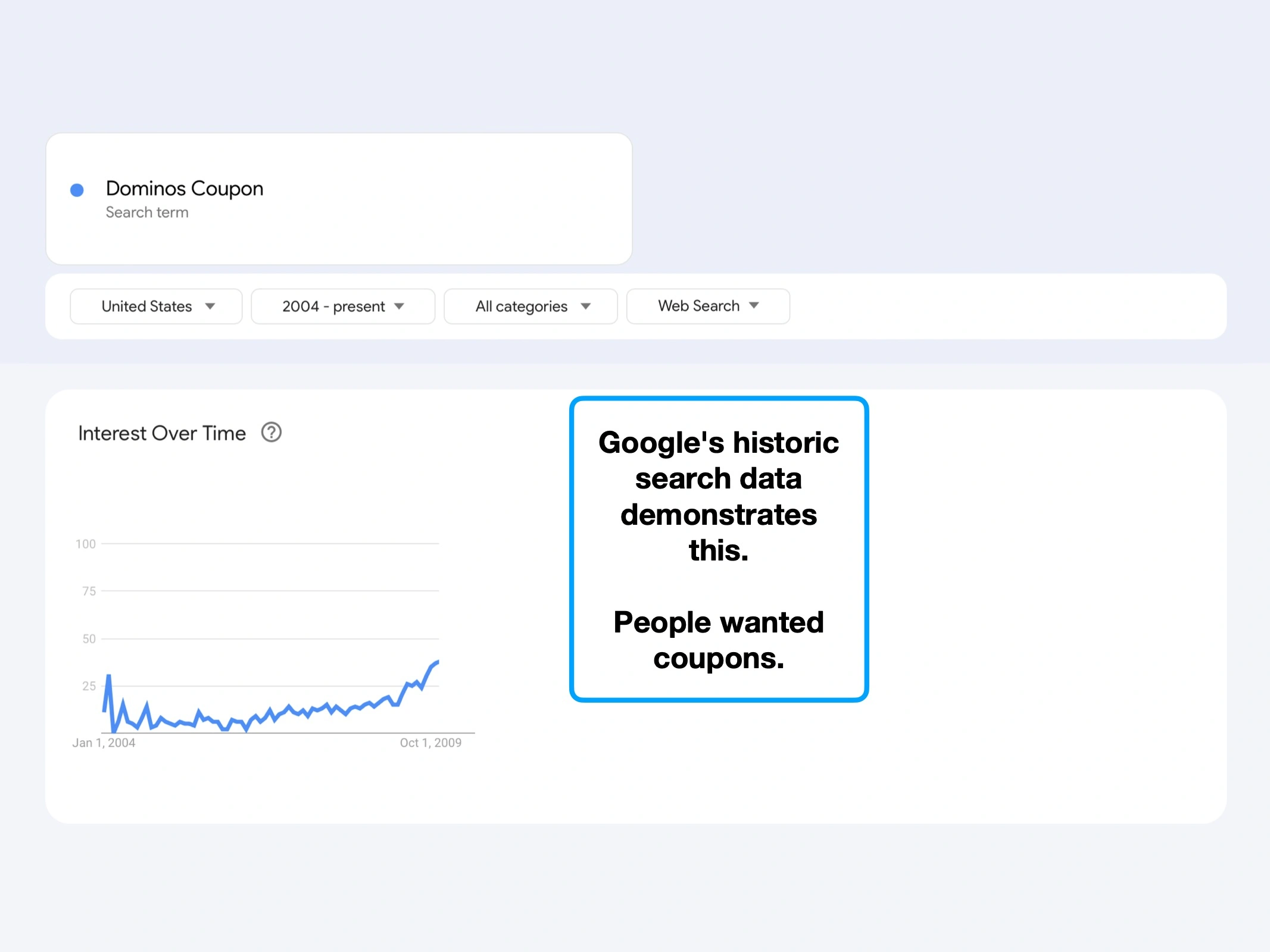
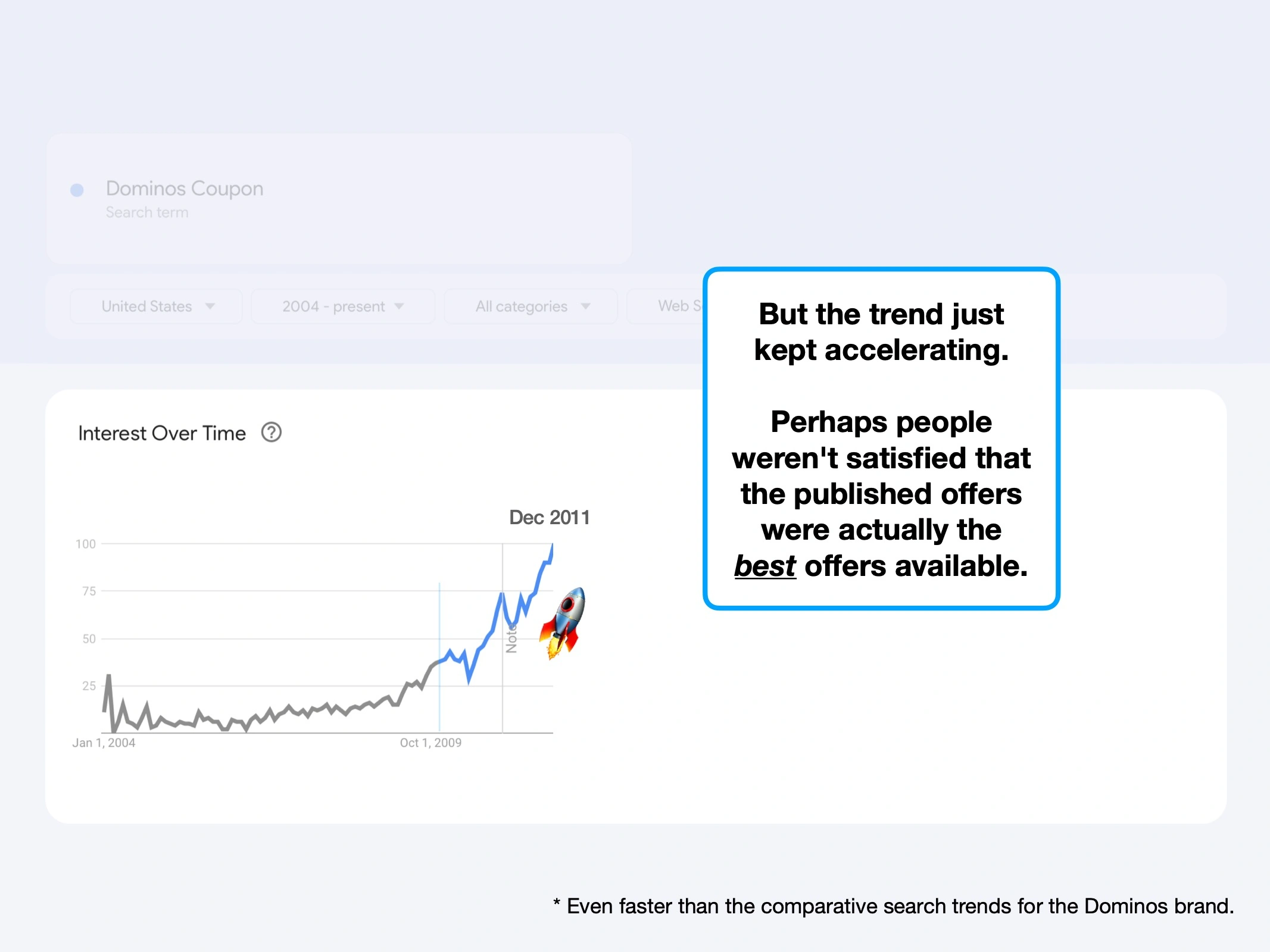
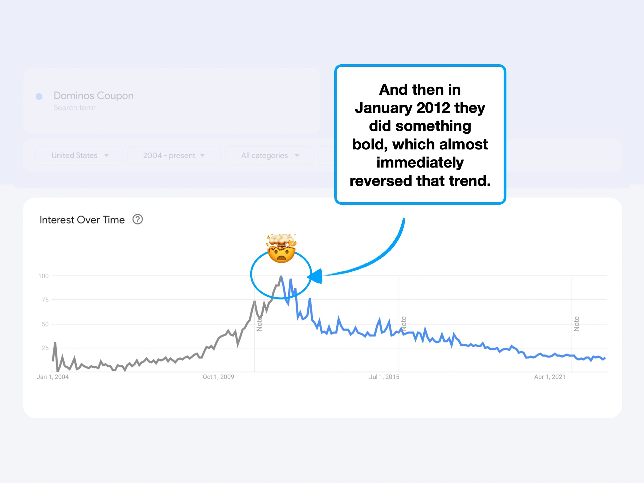
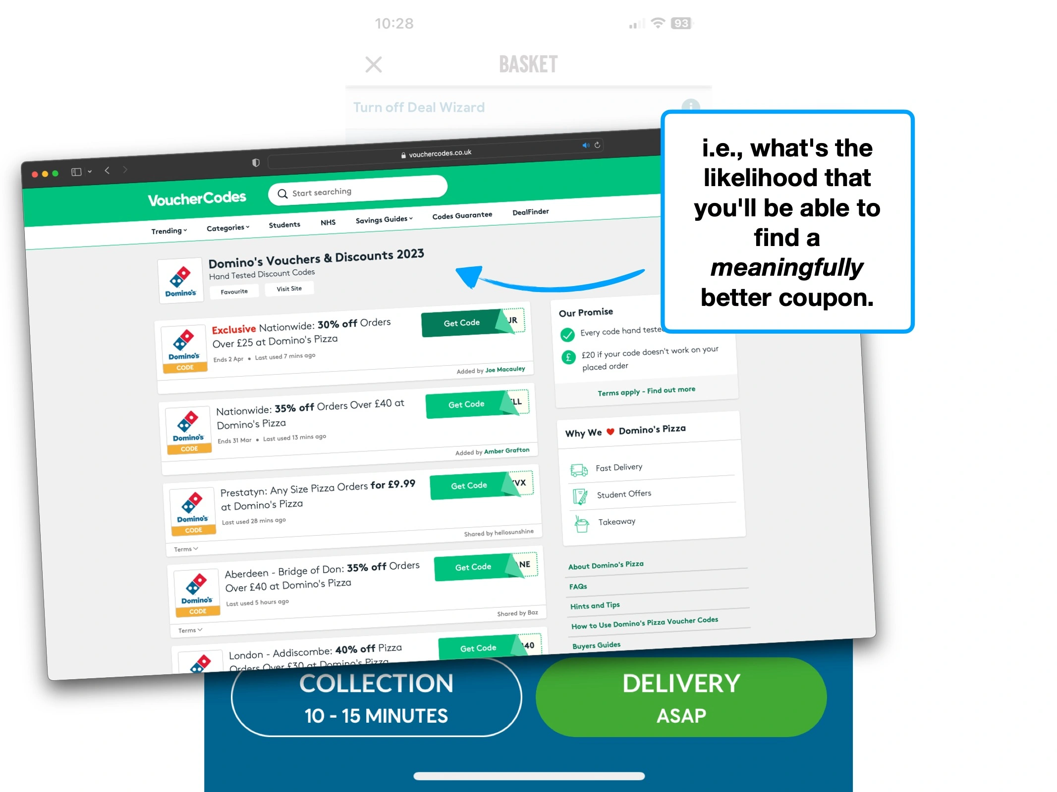
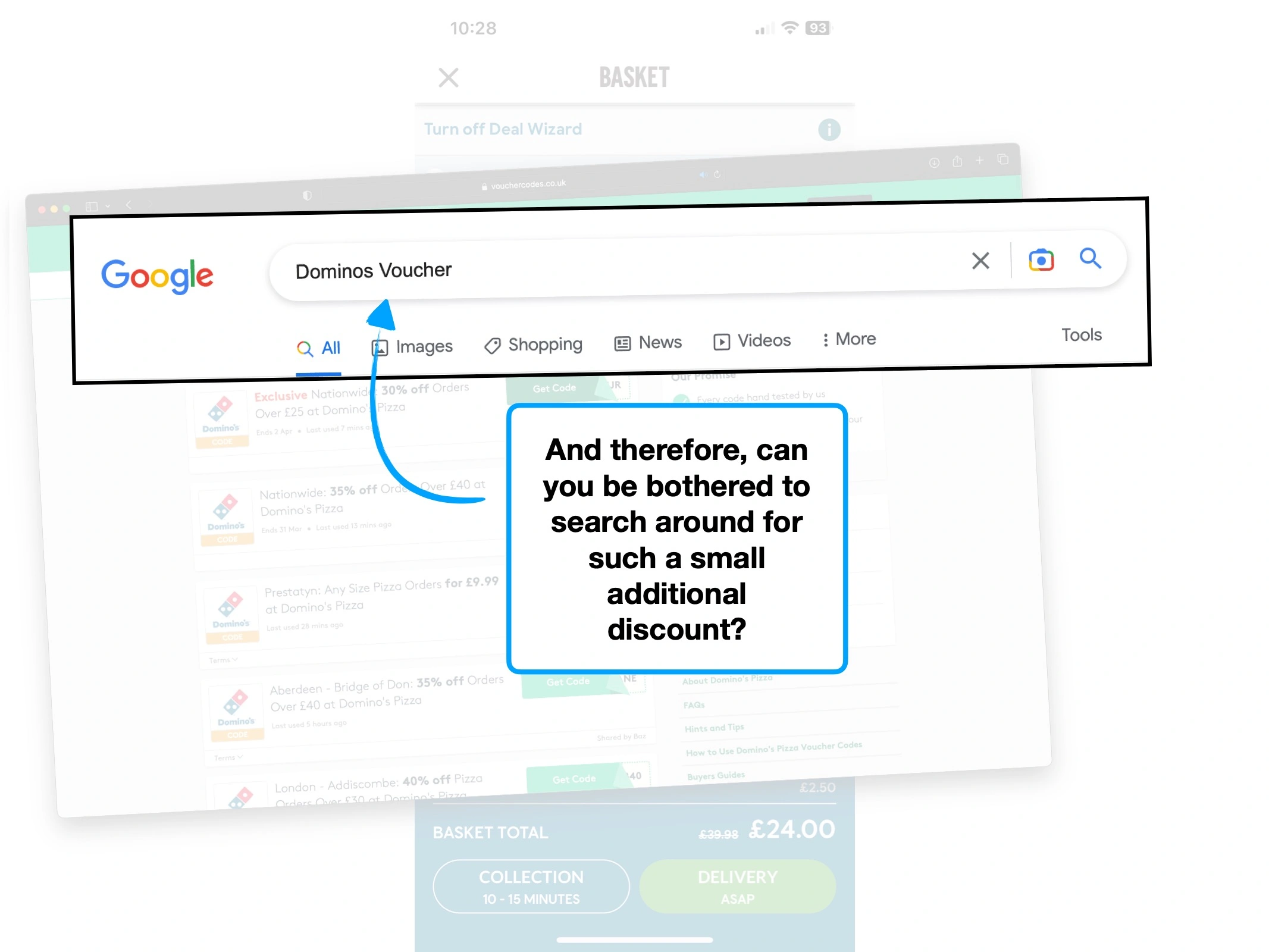
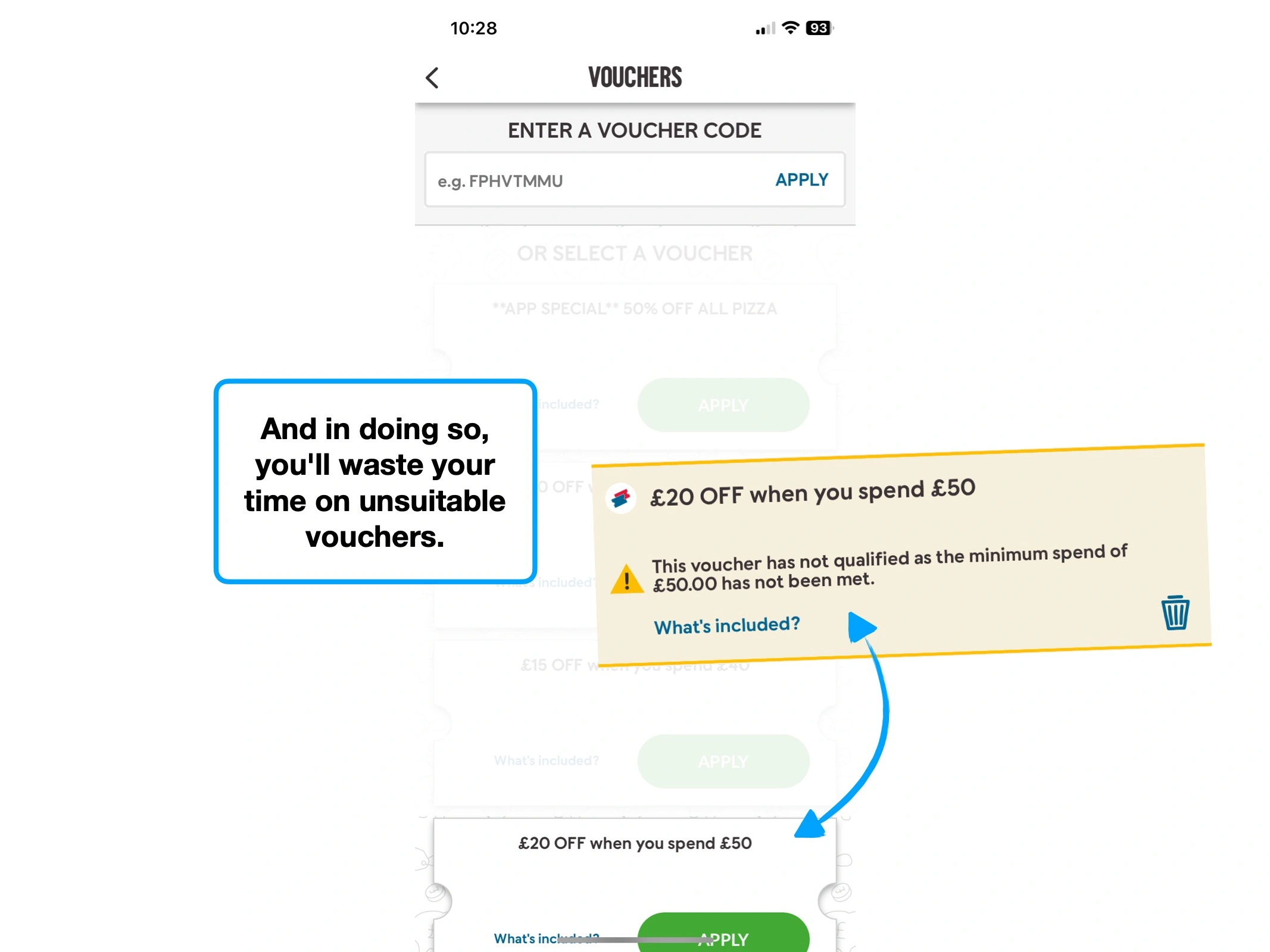
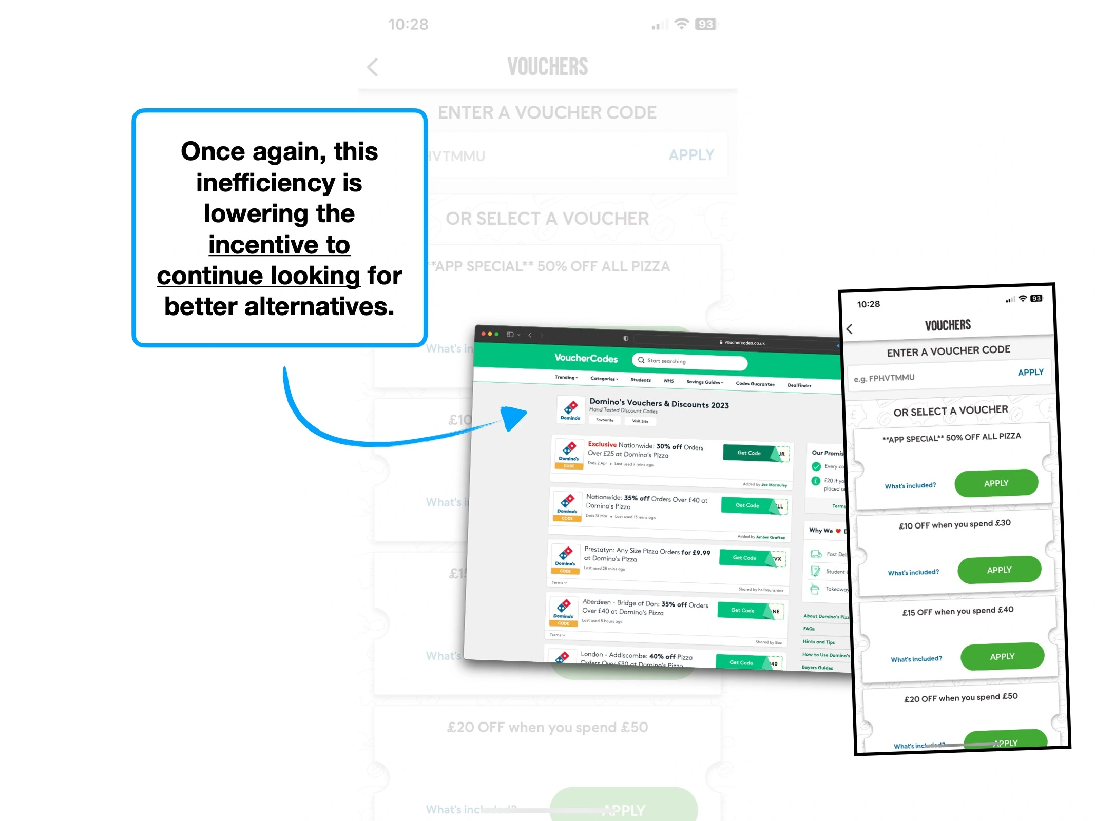
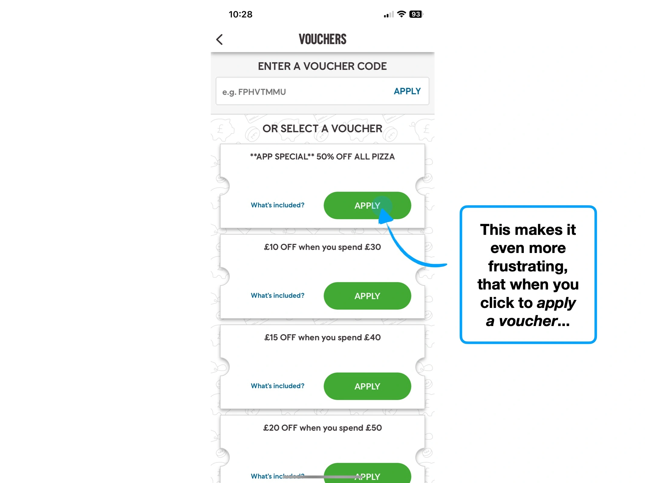
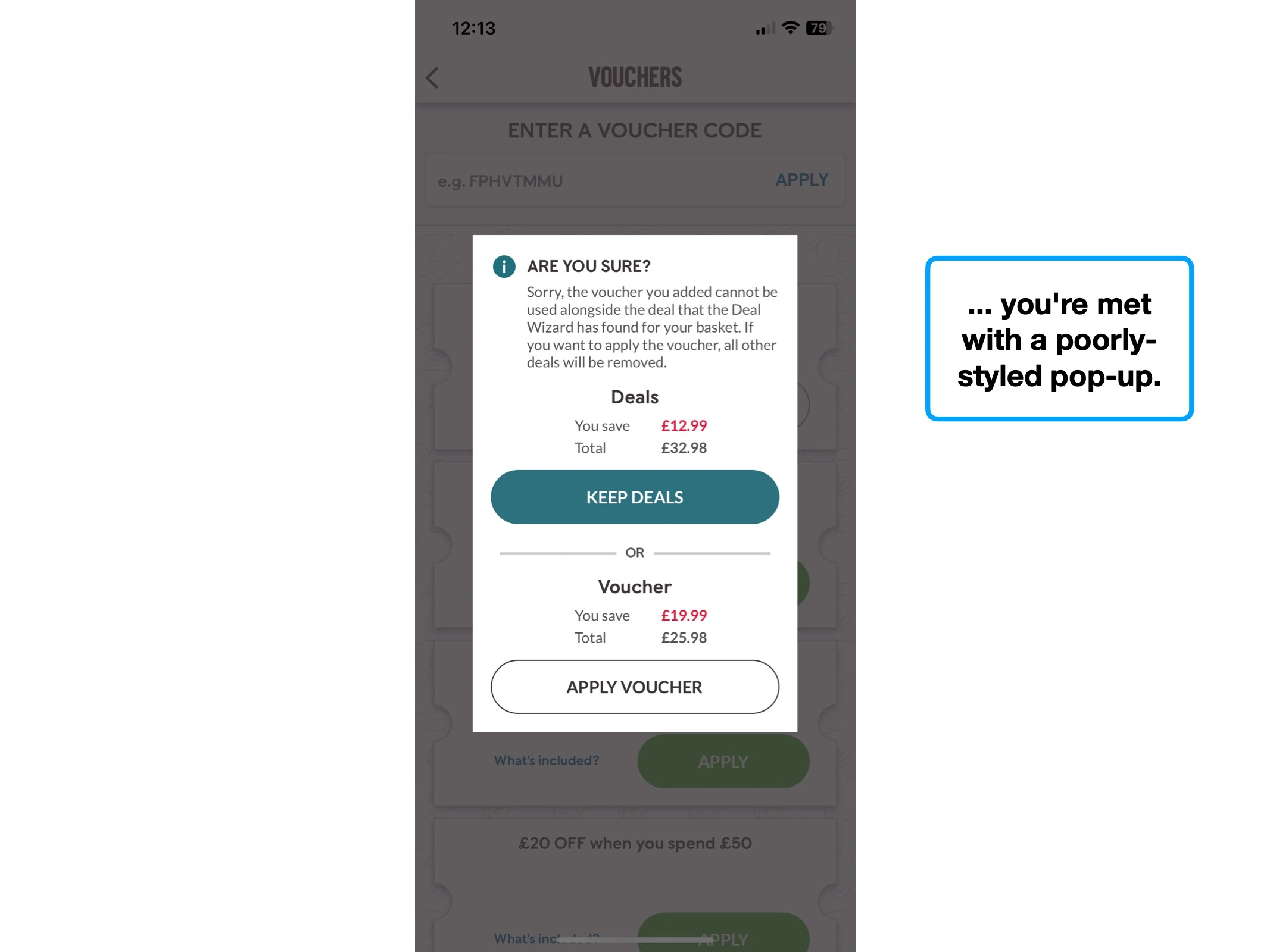
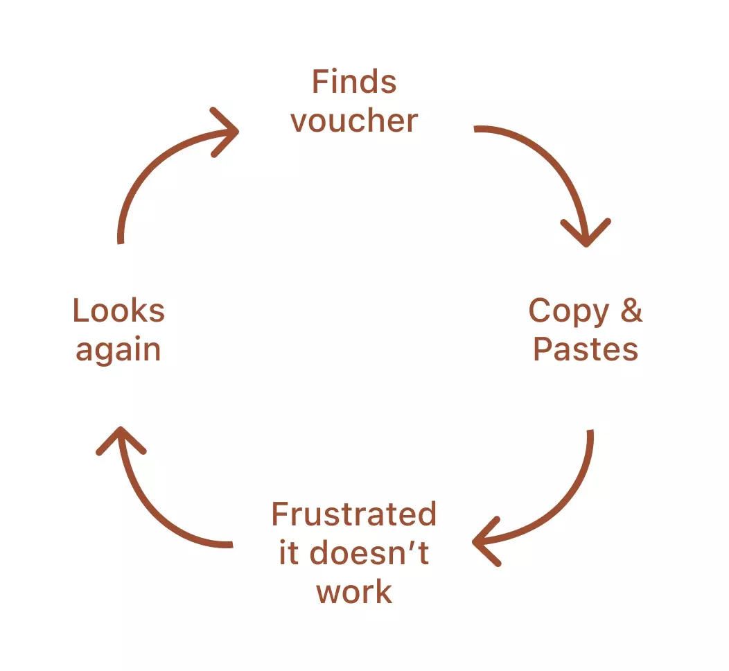
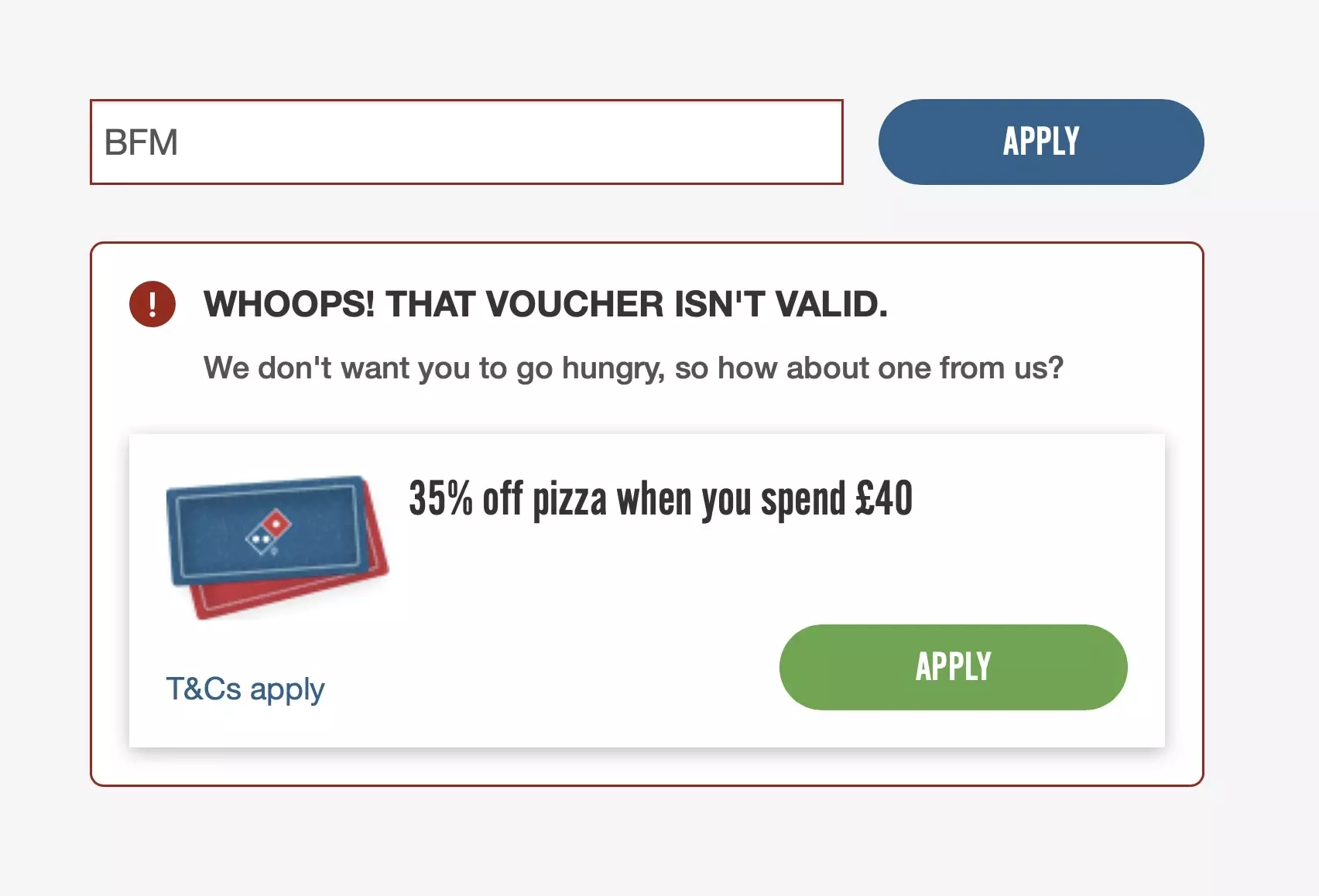
The unavoidable downfall of searching for vouchers online, is that they'll often not work.
You go into the search expecting to copy and paste a code, only to be told that it's invalid. And then you just go back and try another, repeating the process until you find an active one.
Although the pain is primarily felt by the customer, the damage is dealt to the service provider (i.e., Dominos), through the creation of a really negative cycle.
And the key is that this isn't Dominos' fault—the codes may have been uploaded with unclear basket requirements, or fabricated entirely by competitors.
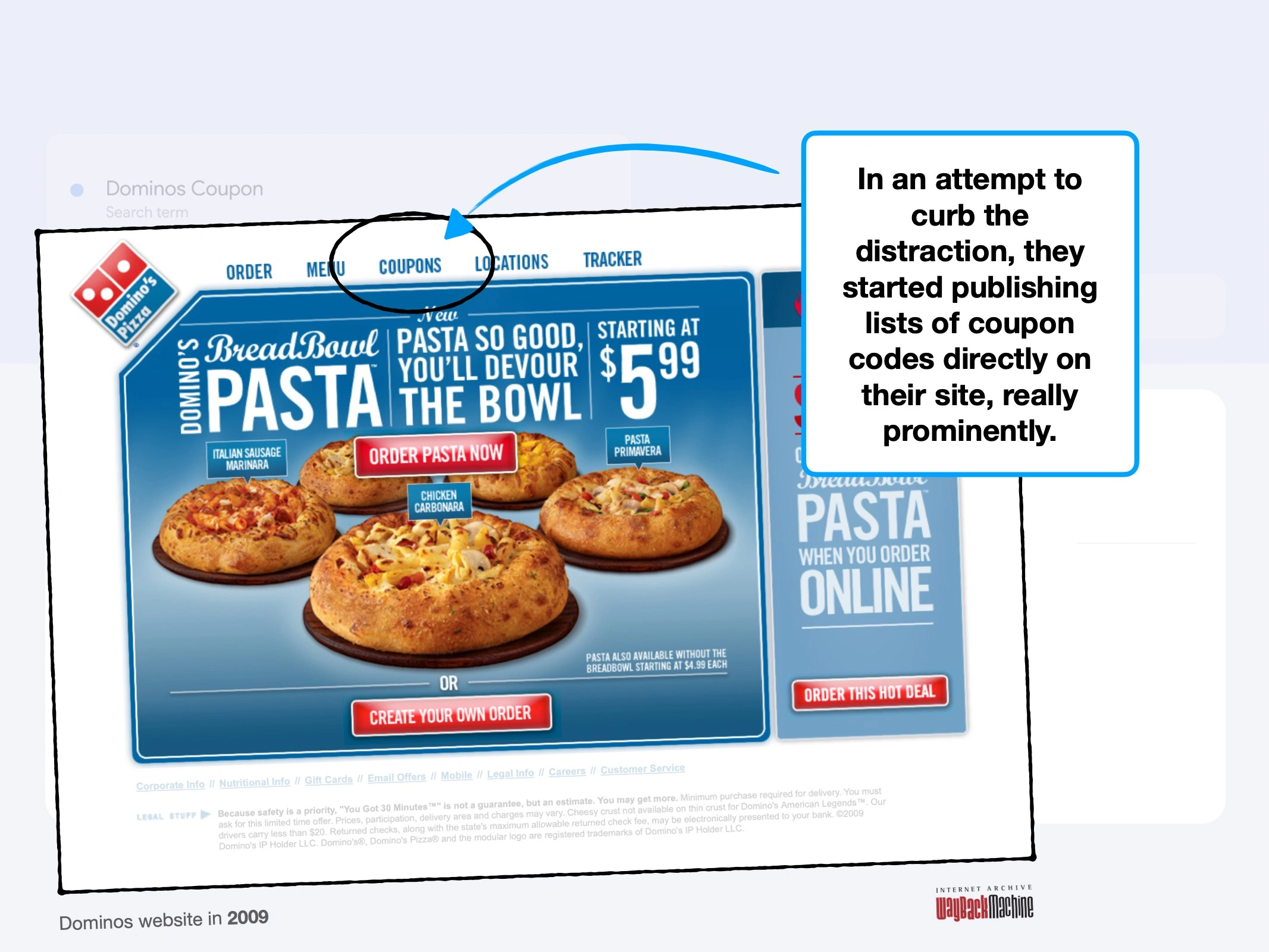
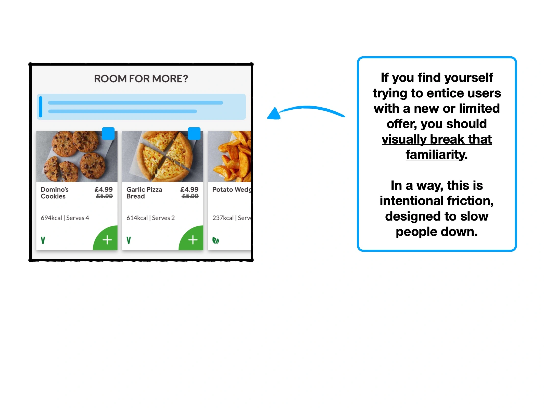
But how Dominos handle this is fantastic: they provide an off-ramp.
Entering an invalid coupon code, will fail (as expected), and then give you a one-click way to apply a one from their site.
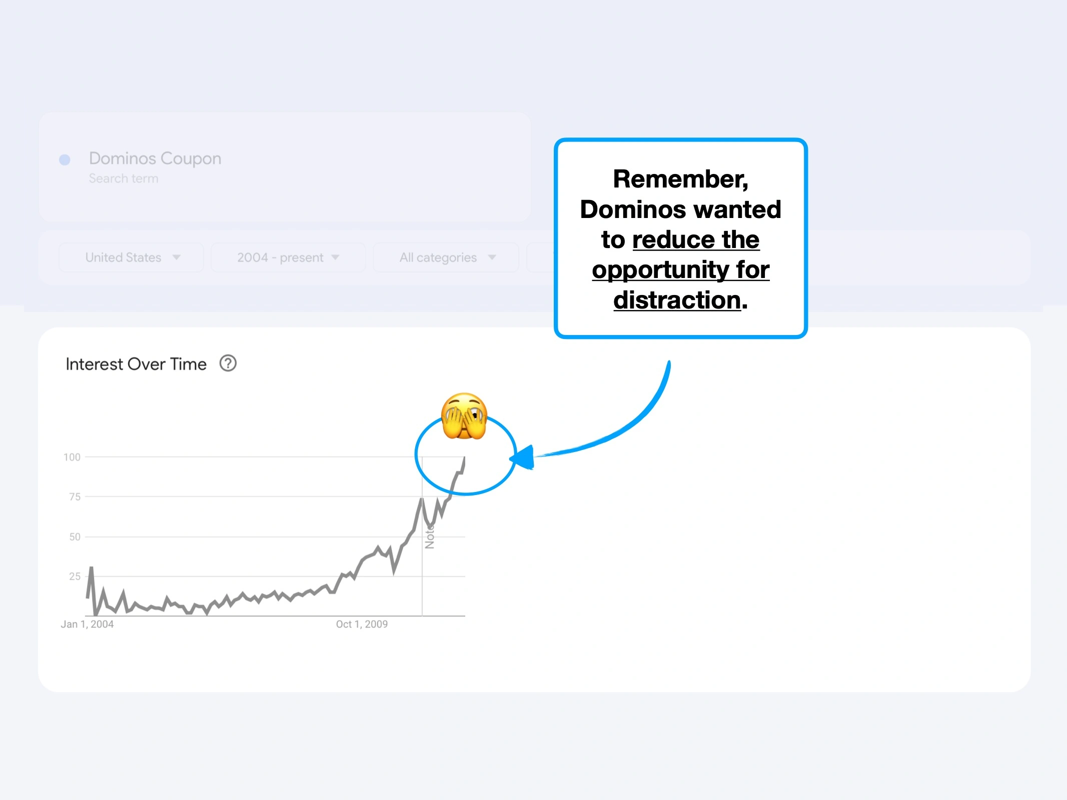
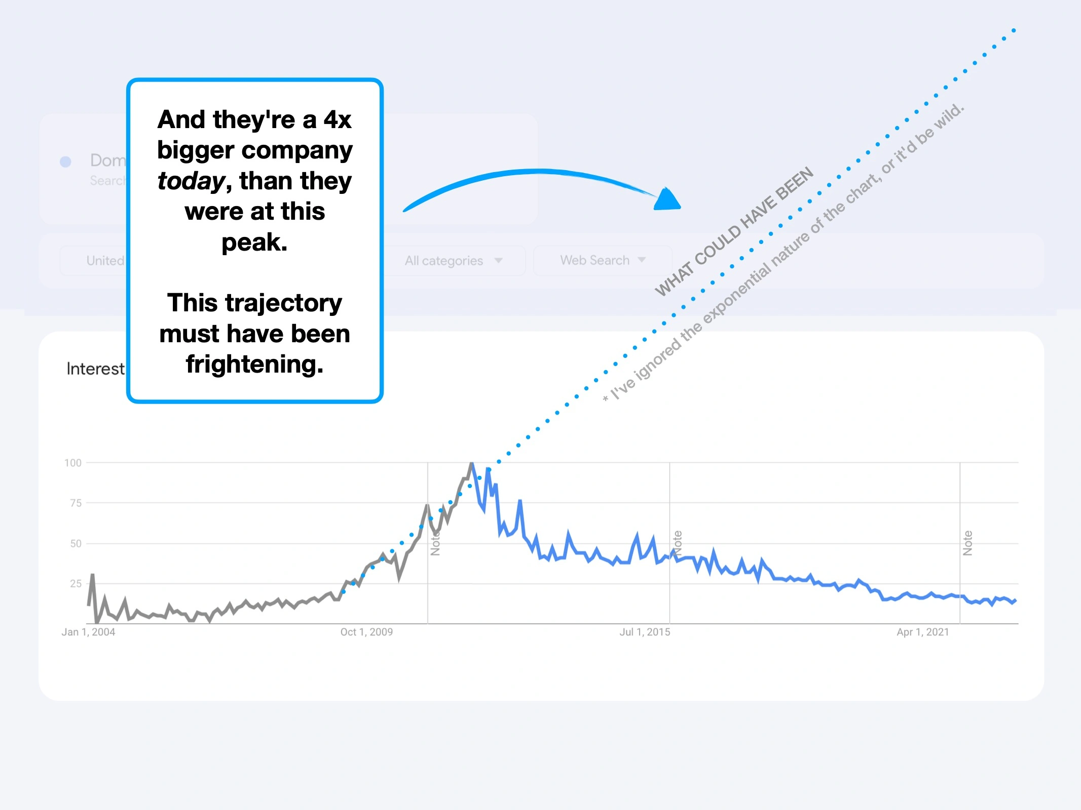
Retention doesn't simply mean keeping people engaged in your product, but also minimising the opportunity for distractions from others, even at a financial cost to you.
For example, if you were offering test drives of a car, would you suggest a route that takes them past a slightly nicer car showroom?
Why users are ignoring your features
Simple techniques to increase feature usage, retention and ultimately alter how users perceive the value of your product.
Hiding complexity to create effortless onboarding
The techniques that Slack have used to create an effortless onboarding flow, and why you might not want to copy them.
The secrets of a $7.08 welcome bonus
The product psychology behind why Robinhood offer new users $7.08 of free stock, and not $10.