

By Peter Ramsey
3 Nov 22
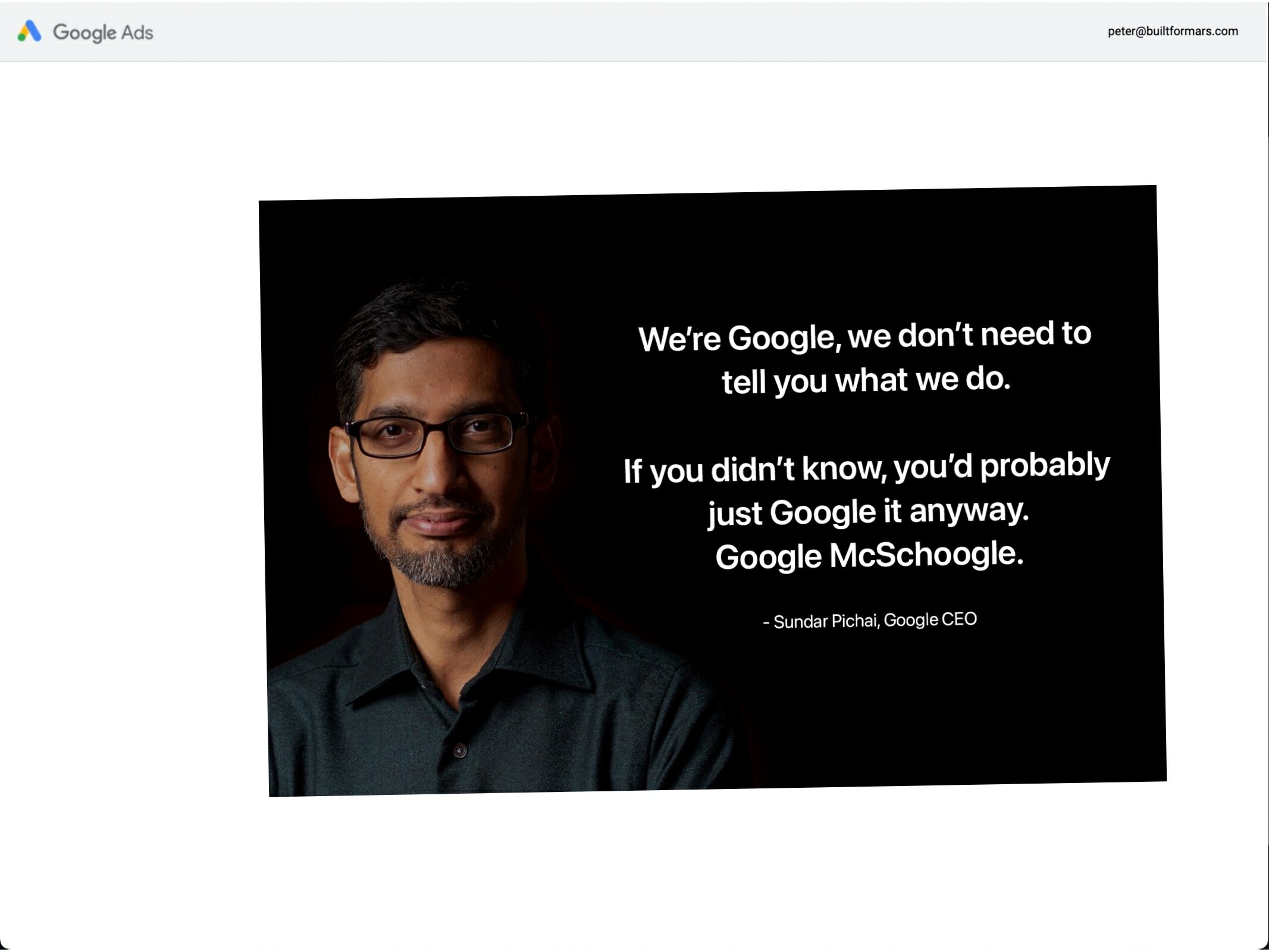
The flaws of an advertising giant
The scale of Google's ad platform is mind-blowing.
Last year, revenue from ads surpassed $200 billion, from more than 1.2 million businesses worldwide.
For Google, decreasing the churn on their ad platform by even 0.1% could generate millions of dollars—creating a strong incentive to optimise.
At this scale, you'd expect Google to have an ad experience so refined that it was comparable to modern art.
Instead, it's flawed, inconsistent and a demonstration that operating at a large scale can create inefficiencies. Everybody can reduce churn somewhere.
Let's jump right in.
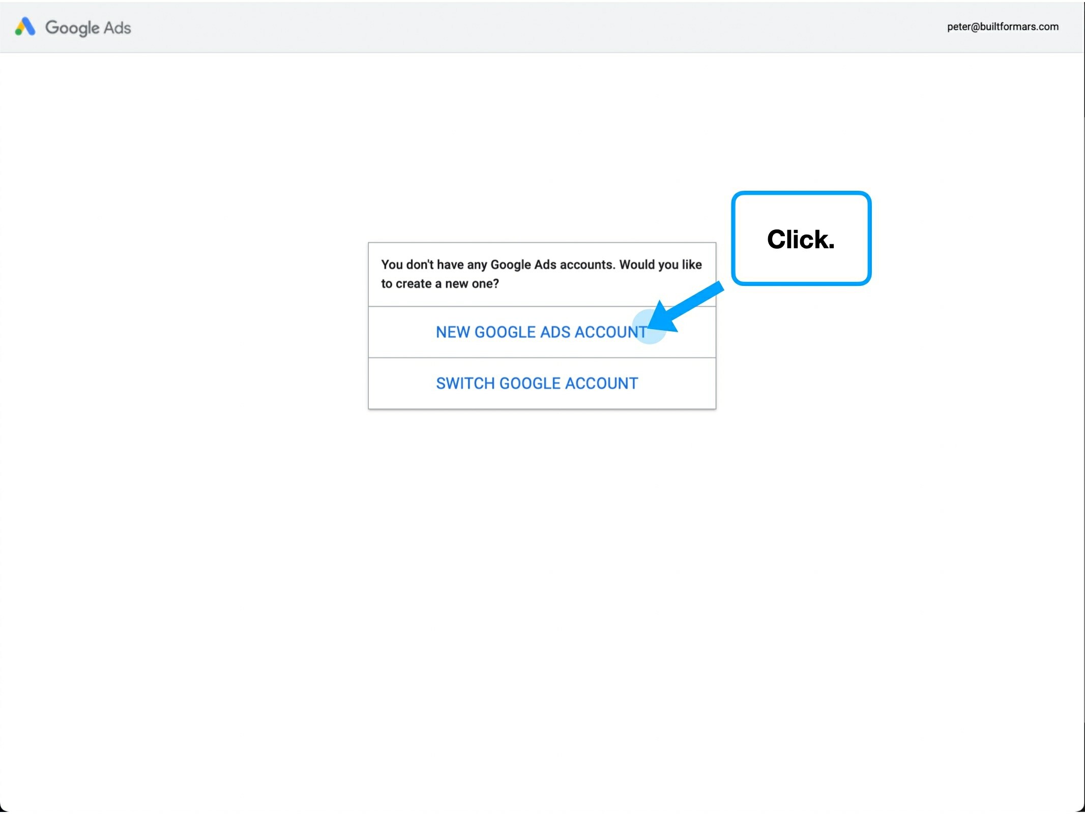
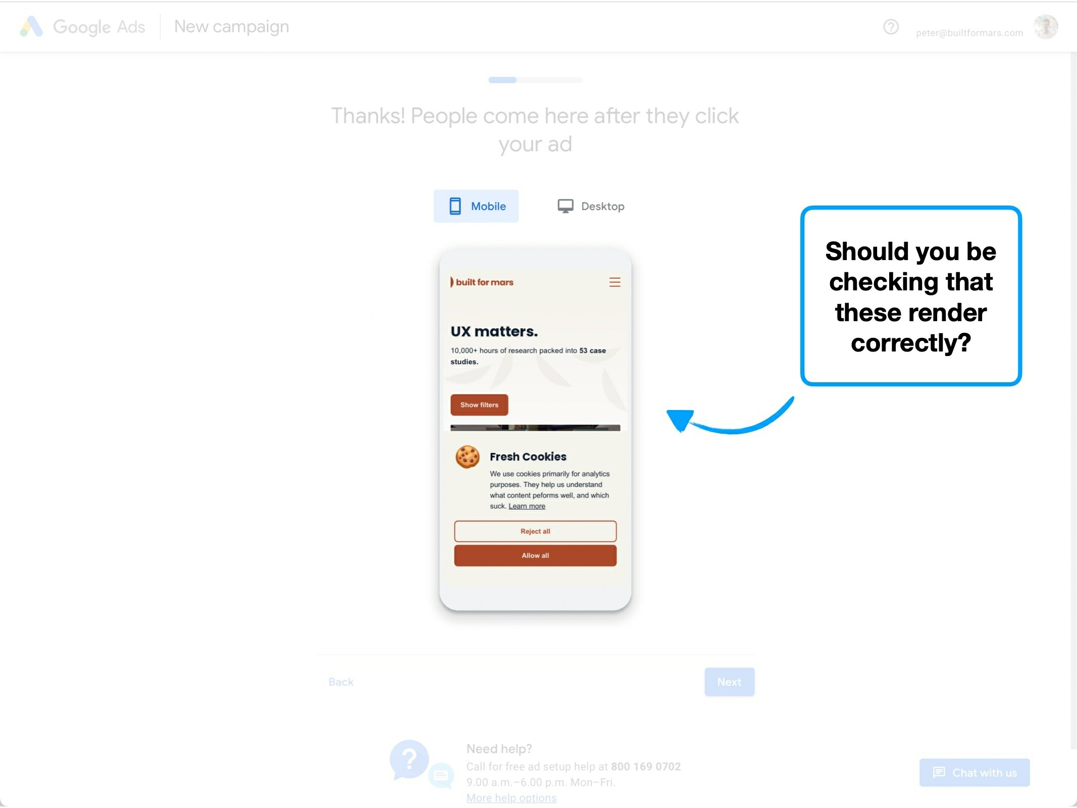
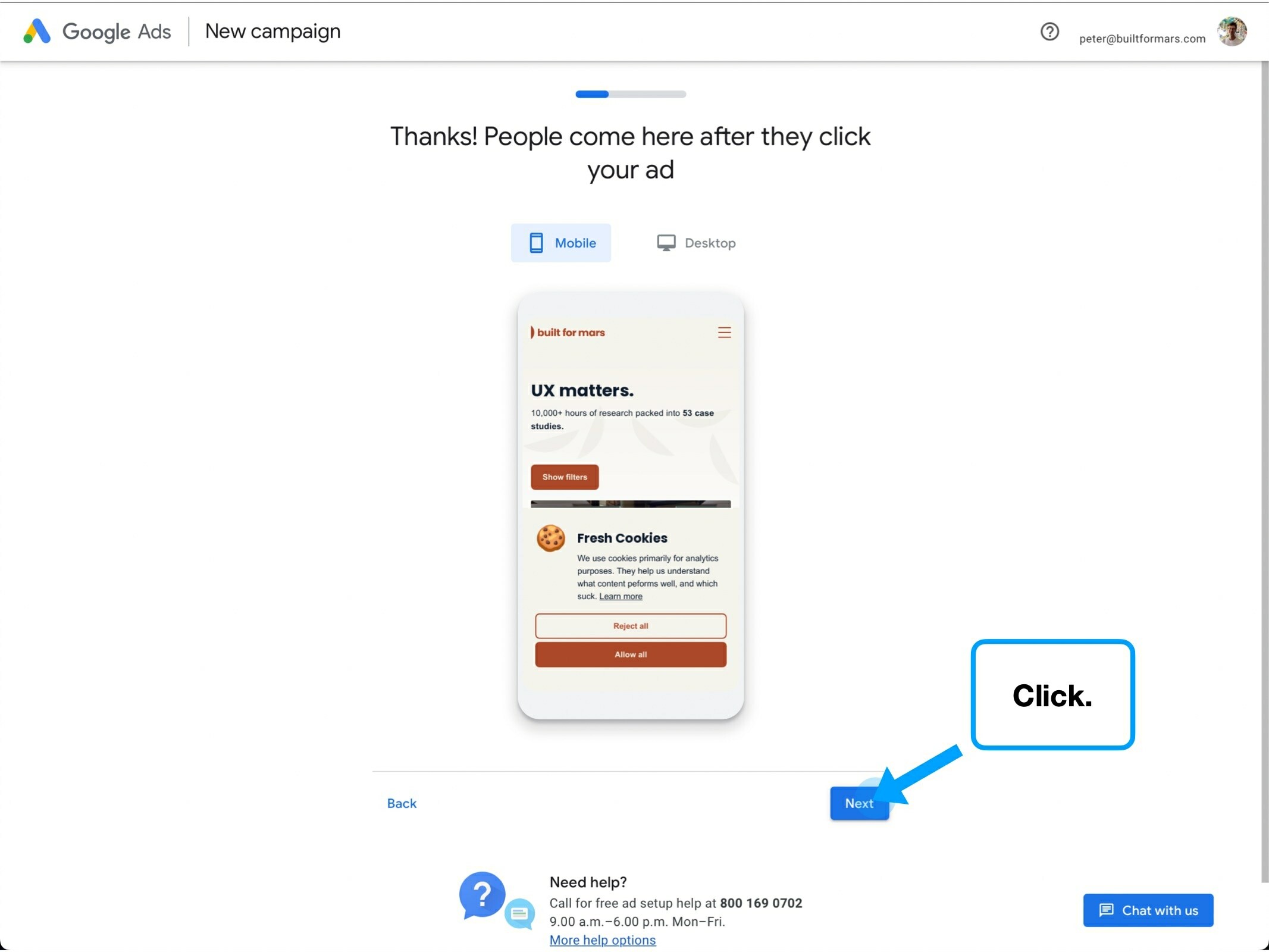
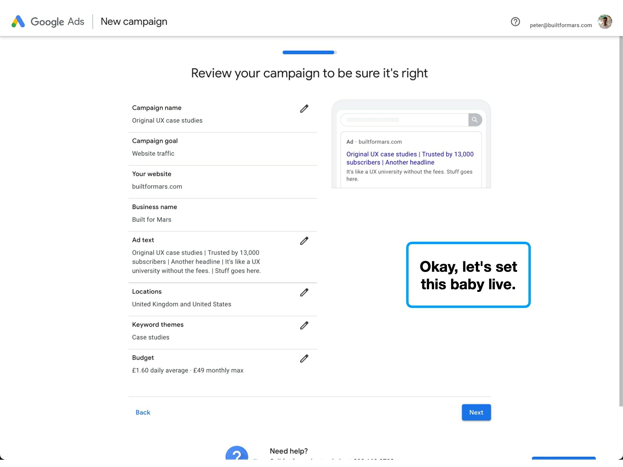
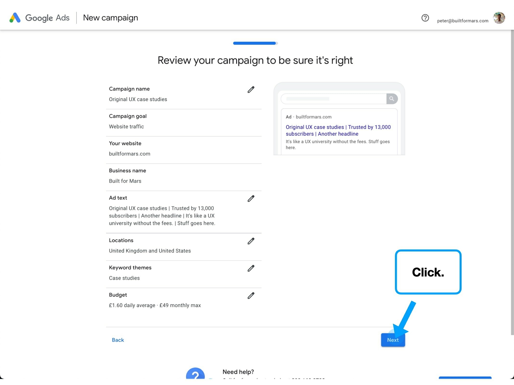
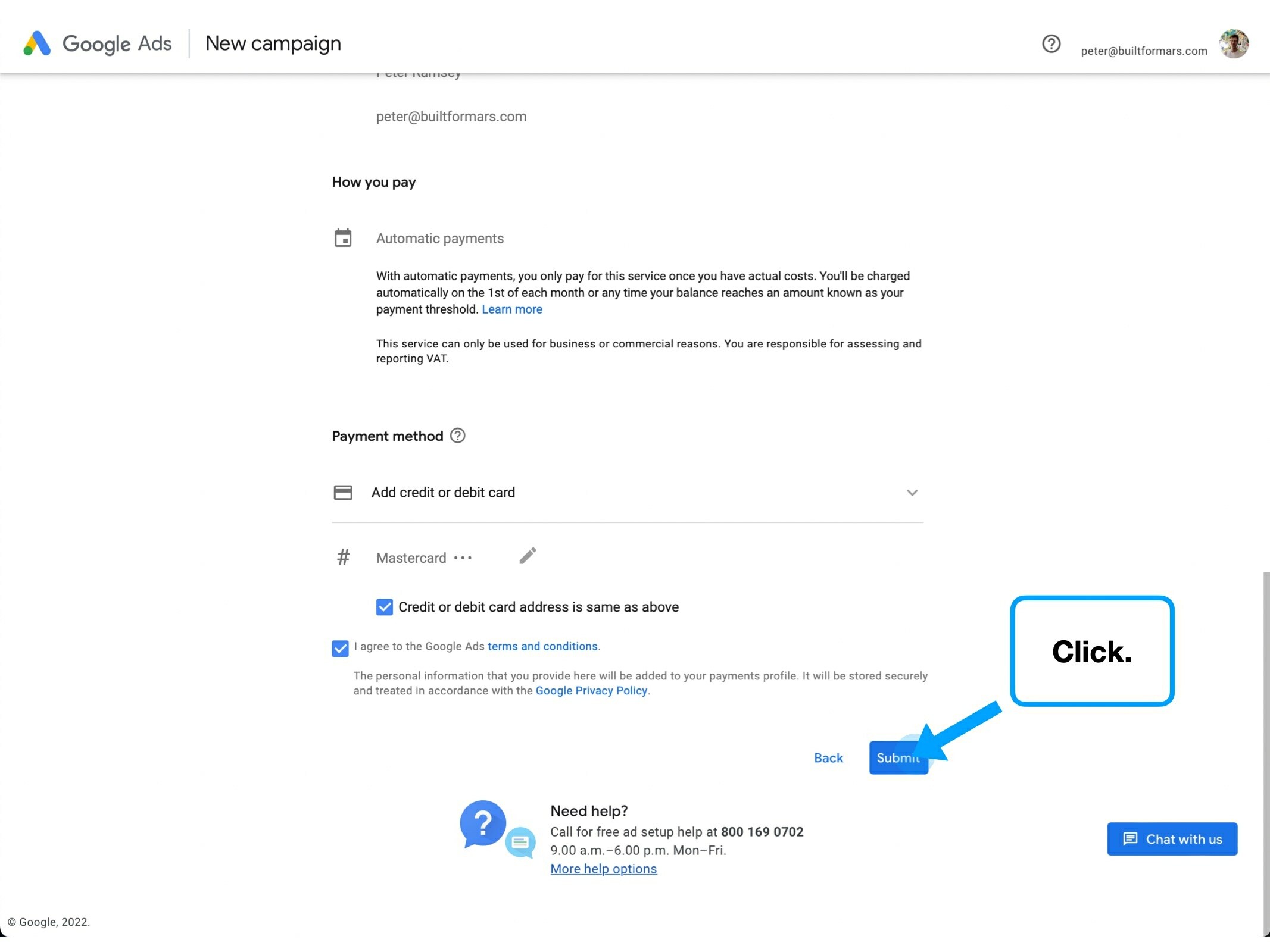
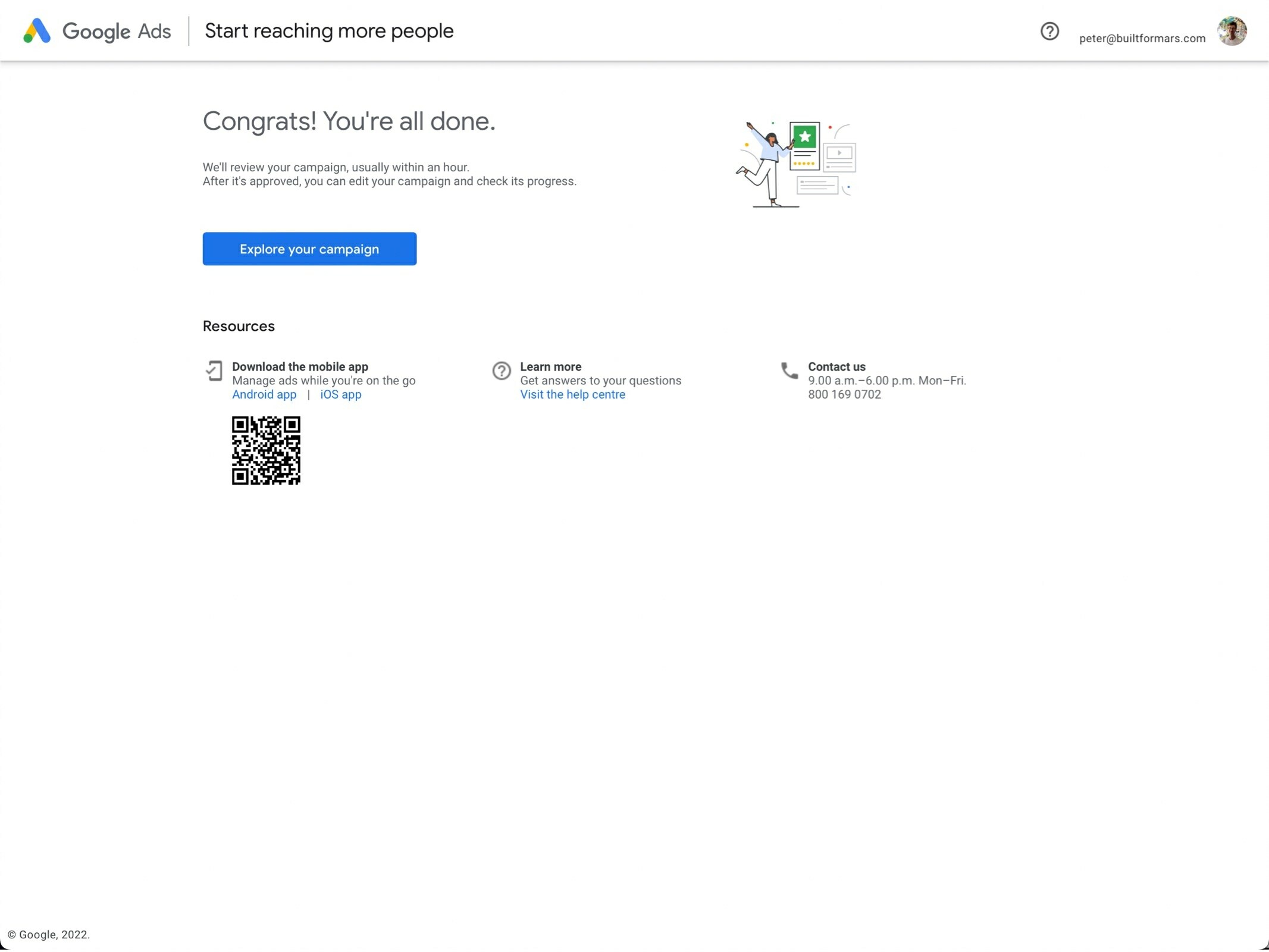
Case study
Please rotate your device to view this slideshow
Note, this won’t work if ‘rotate: lock’ is on in your device settings.
4 key takeaways
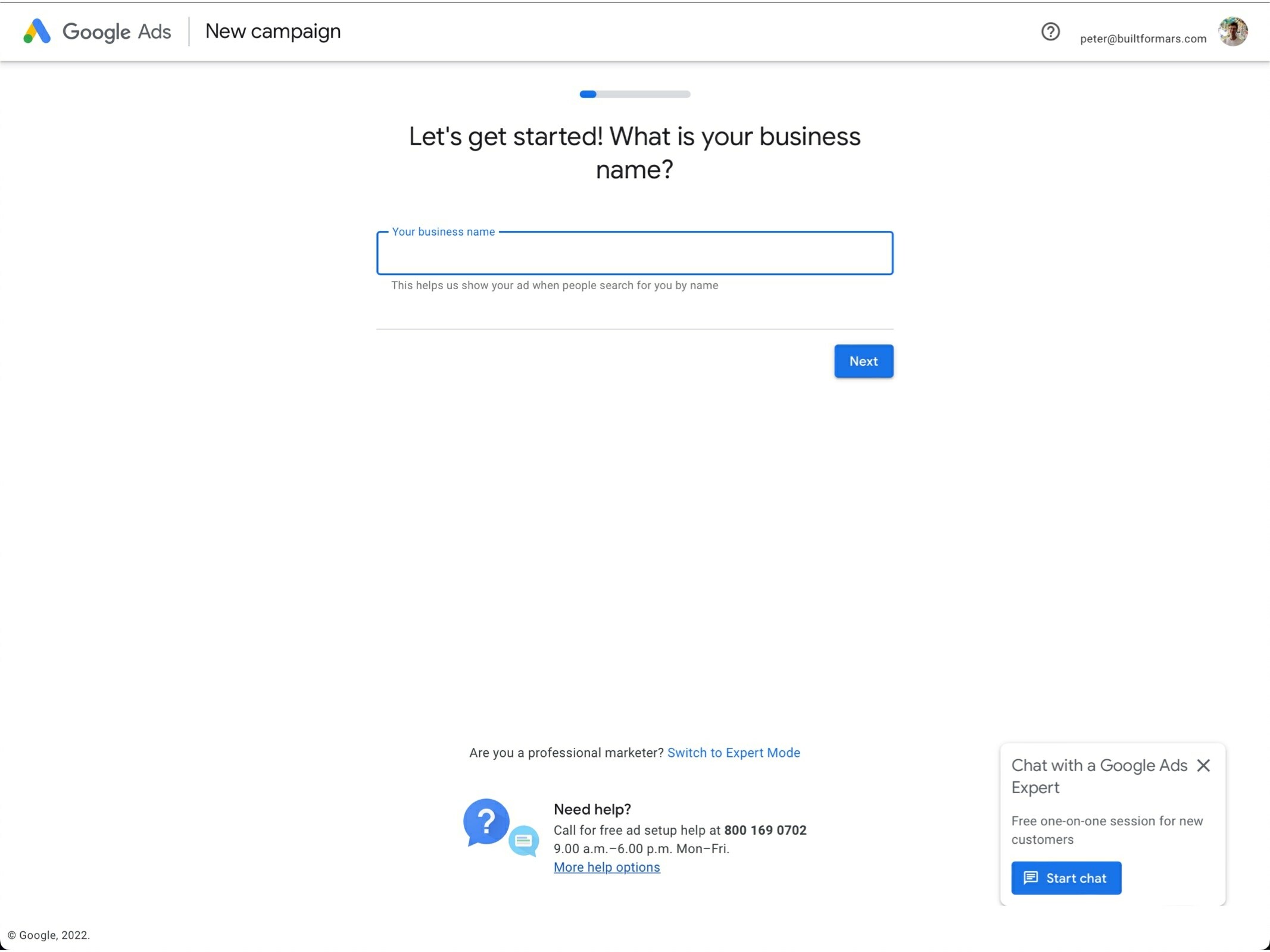
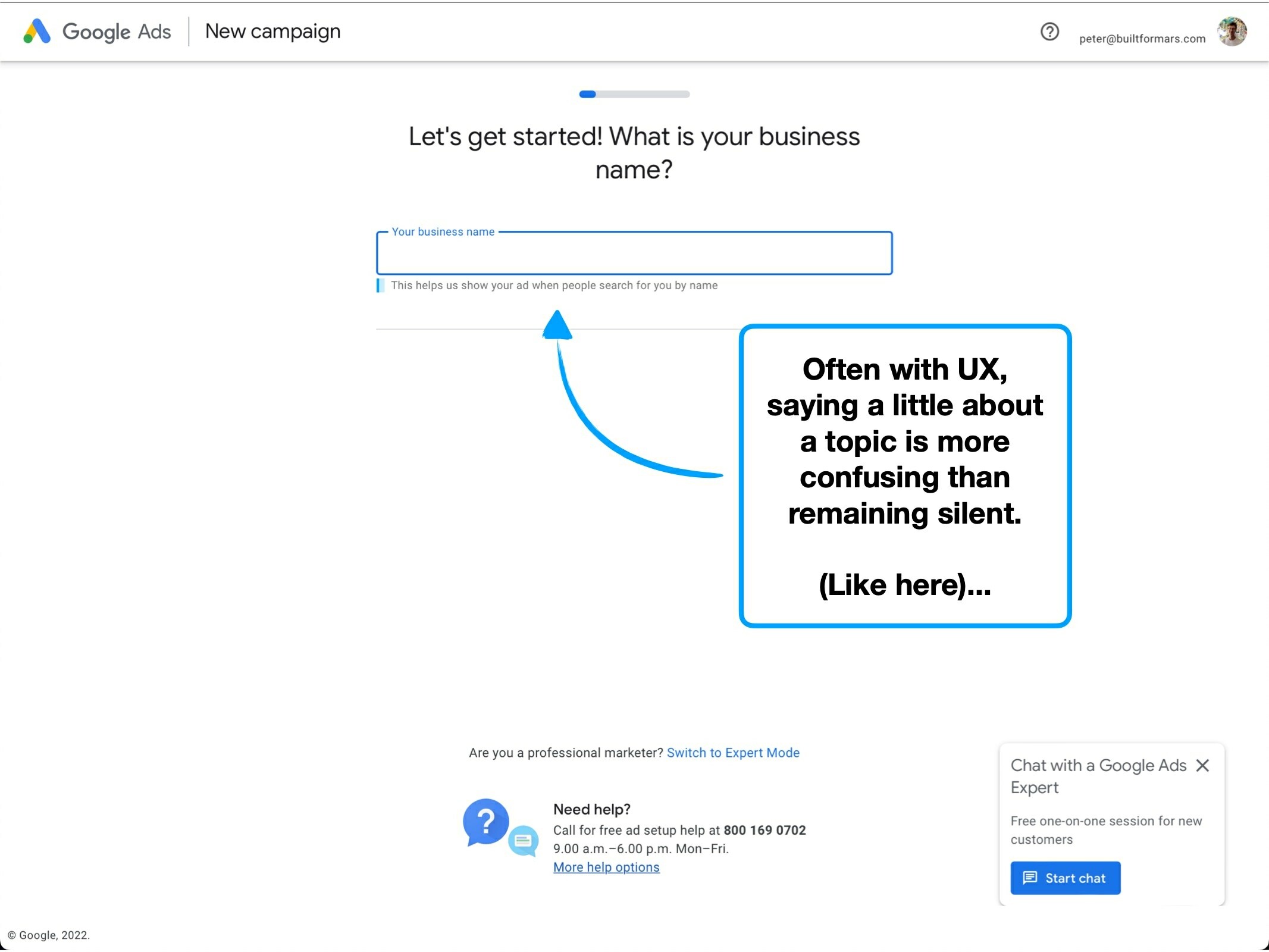
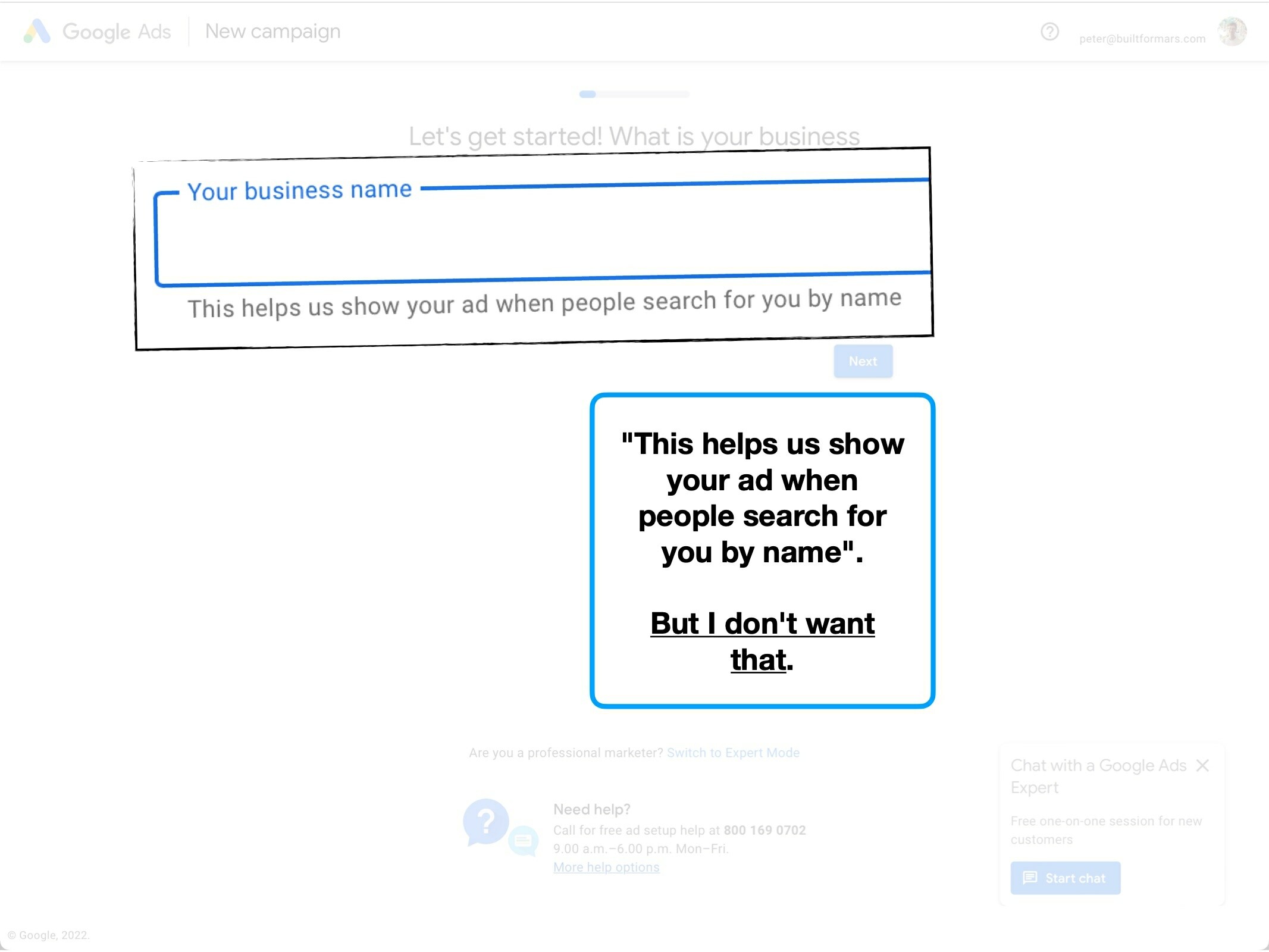
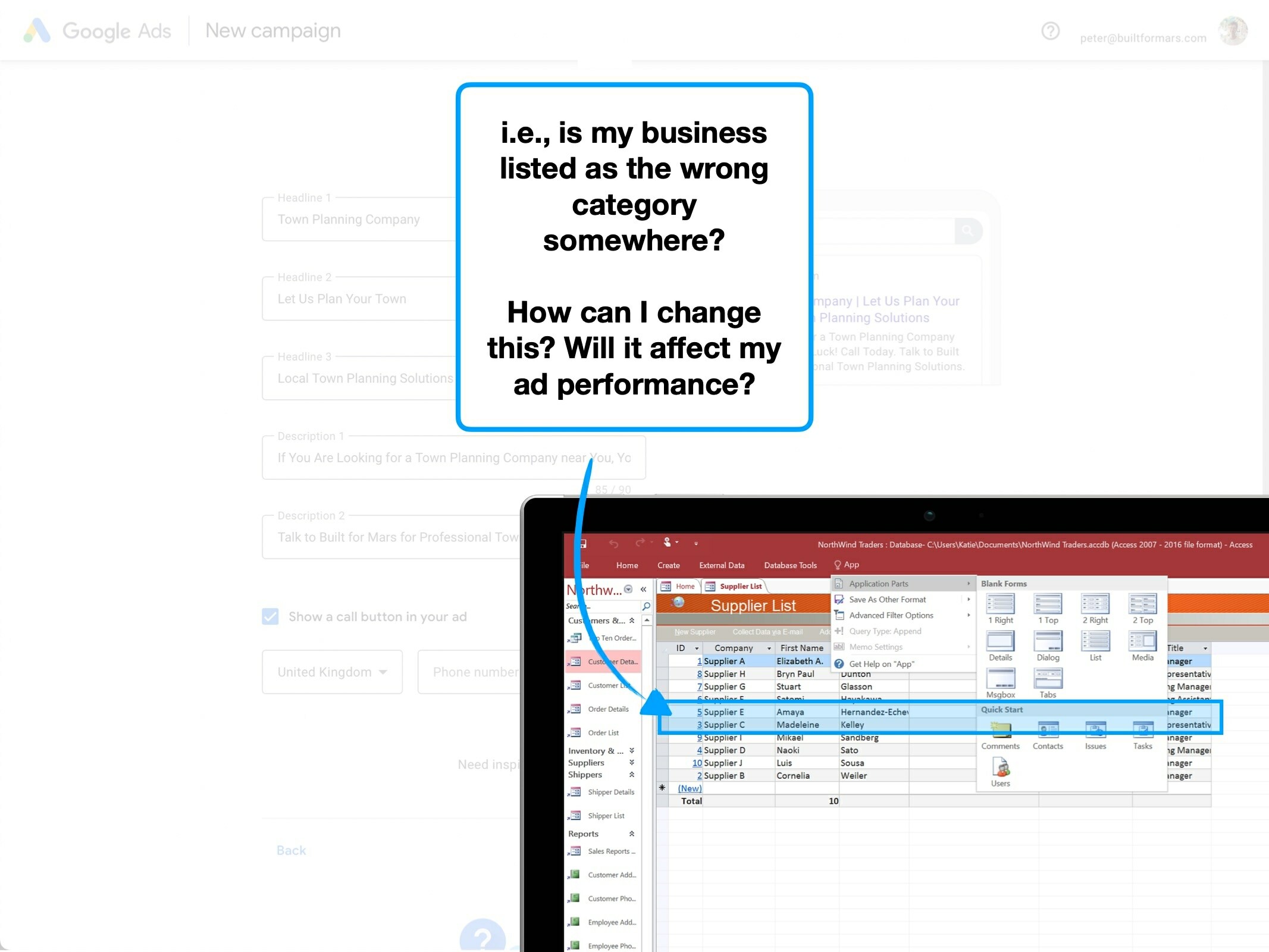
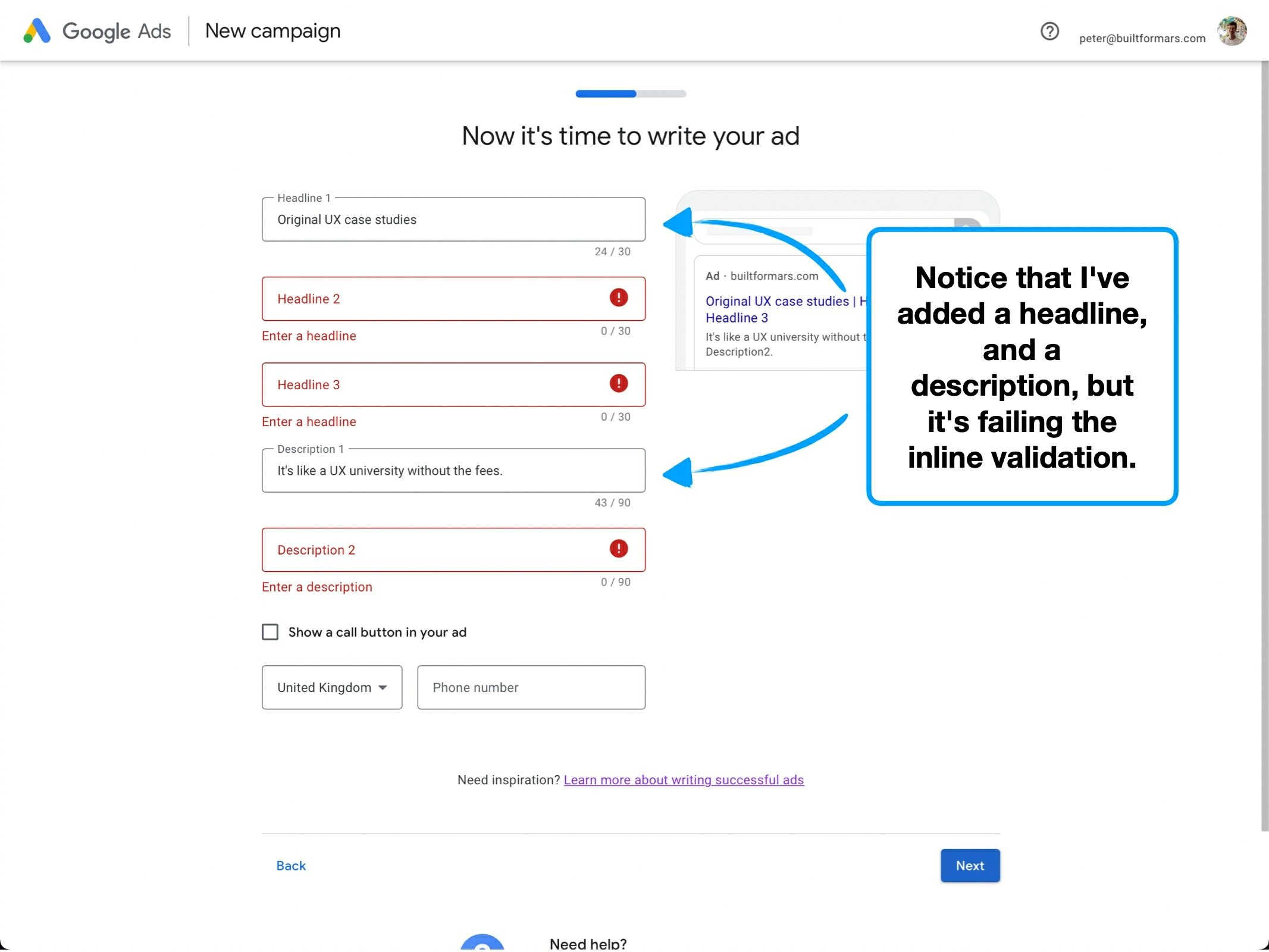
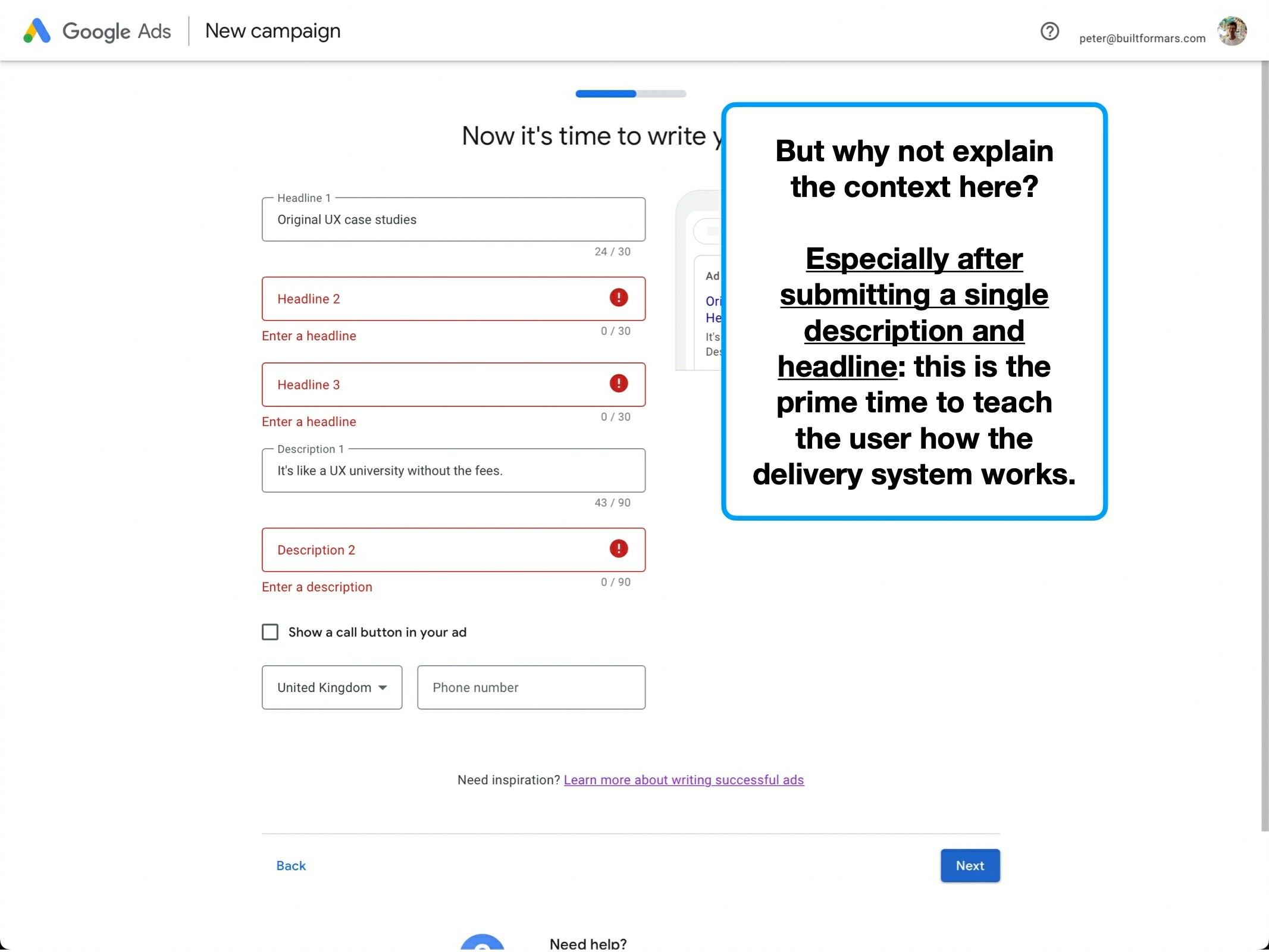
1. Fuzzy context
Imagine that after ordering a coke, the waiter asks: "What size glass do you want? This is just for our notes".
I'd describe this as fuzzy context—it does provide more information, but creates unwanted ambiguity.
The waiter failed to mention that they're participating in an anonymous research survey, and the diner can opt-out. The innocence of the data collection is shrouded by a fuzzy haze of unanswered questions.
Hence the term; 🐨 Fuzzy Context.
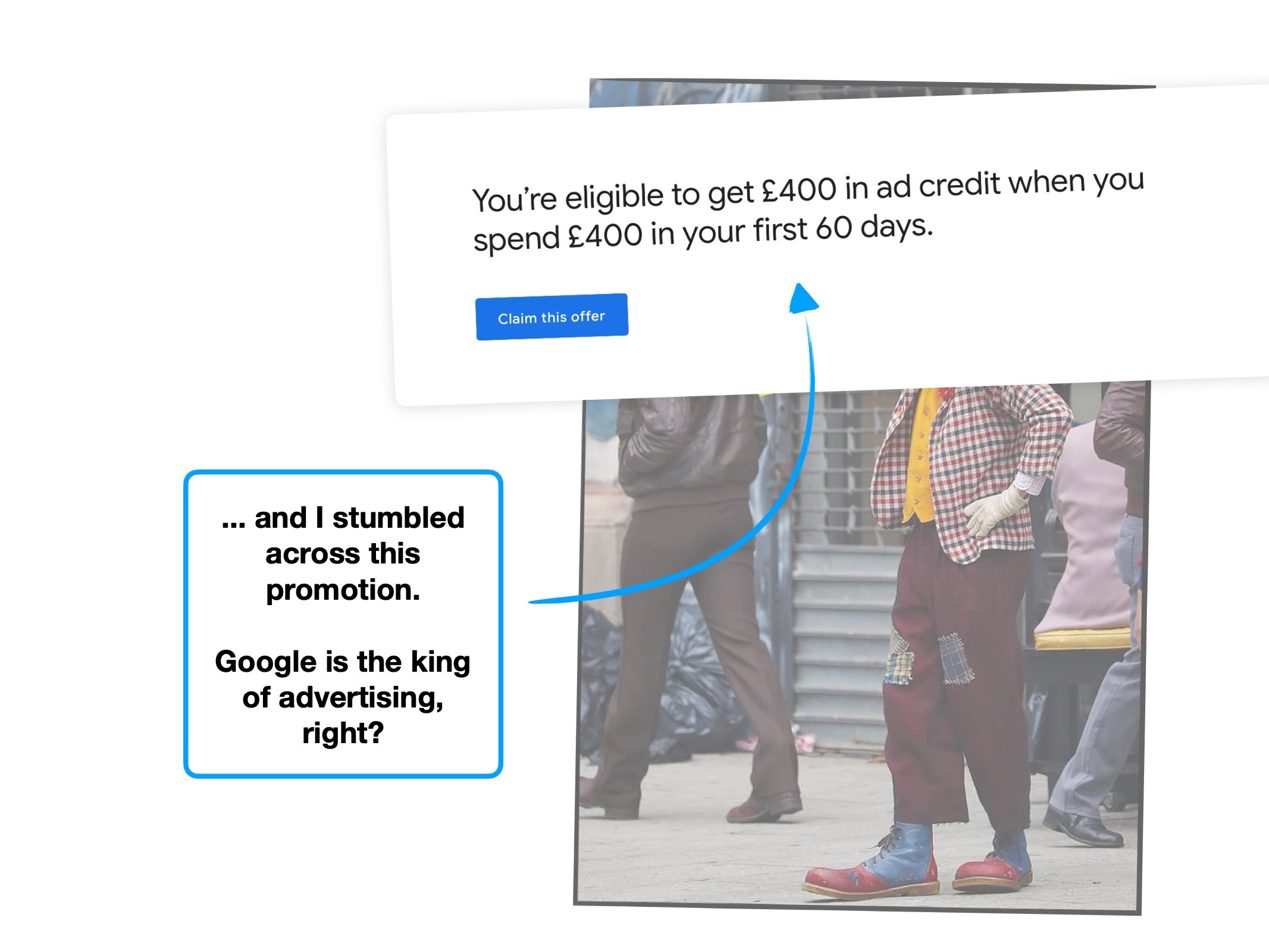
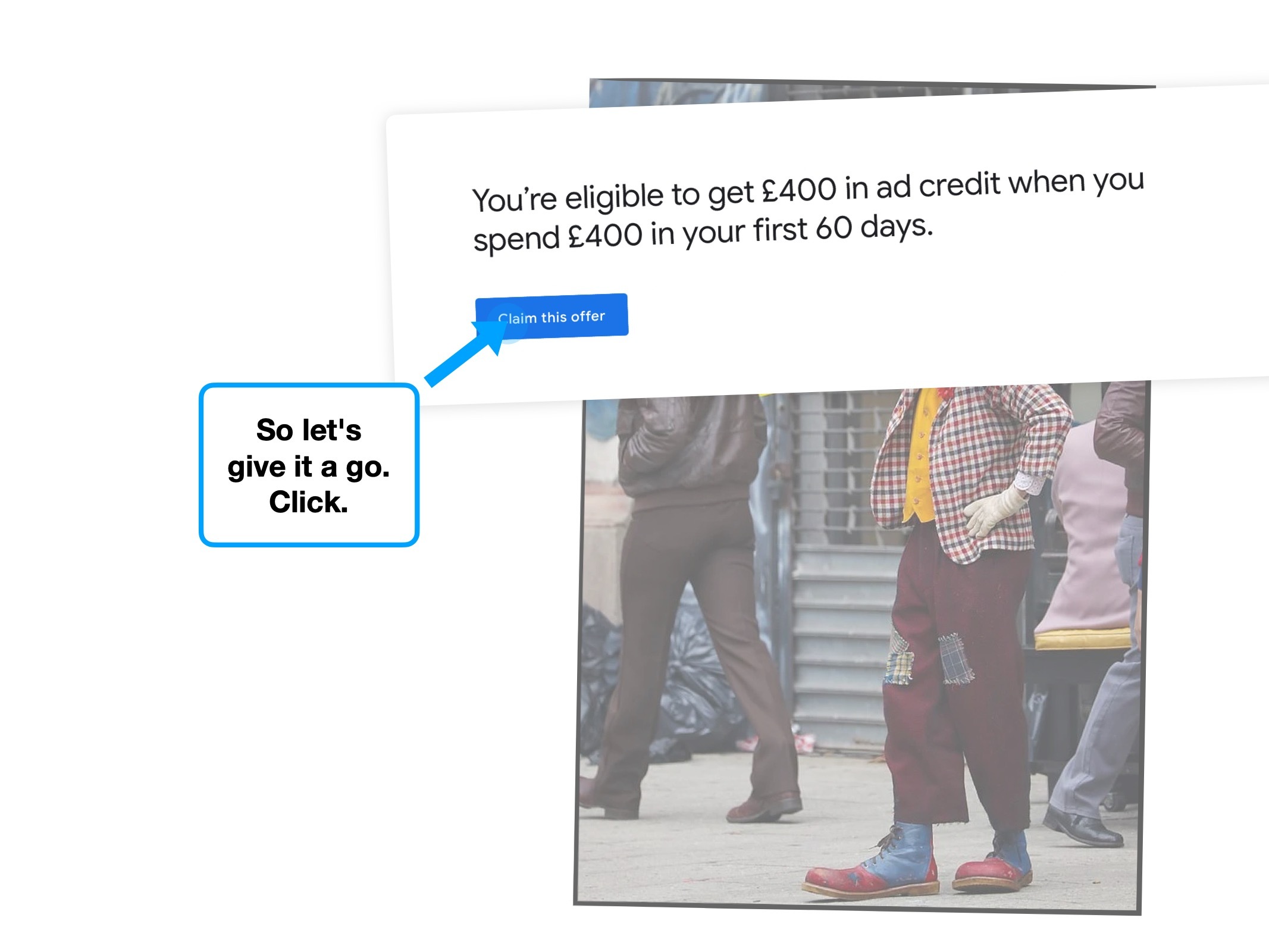
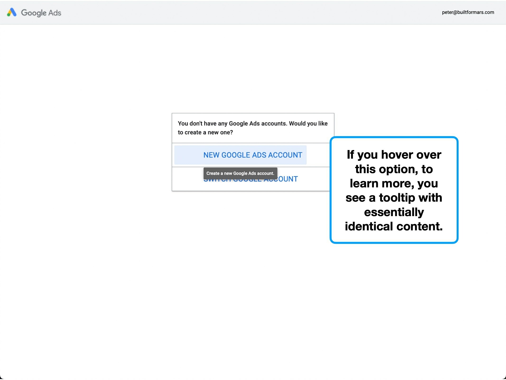
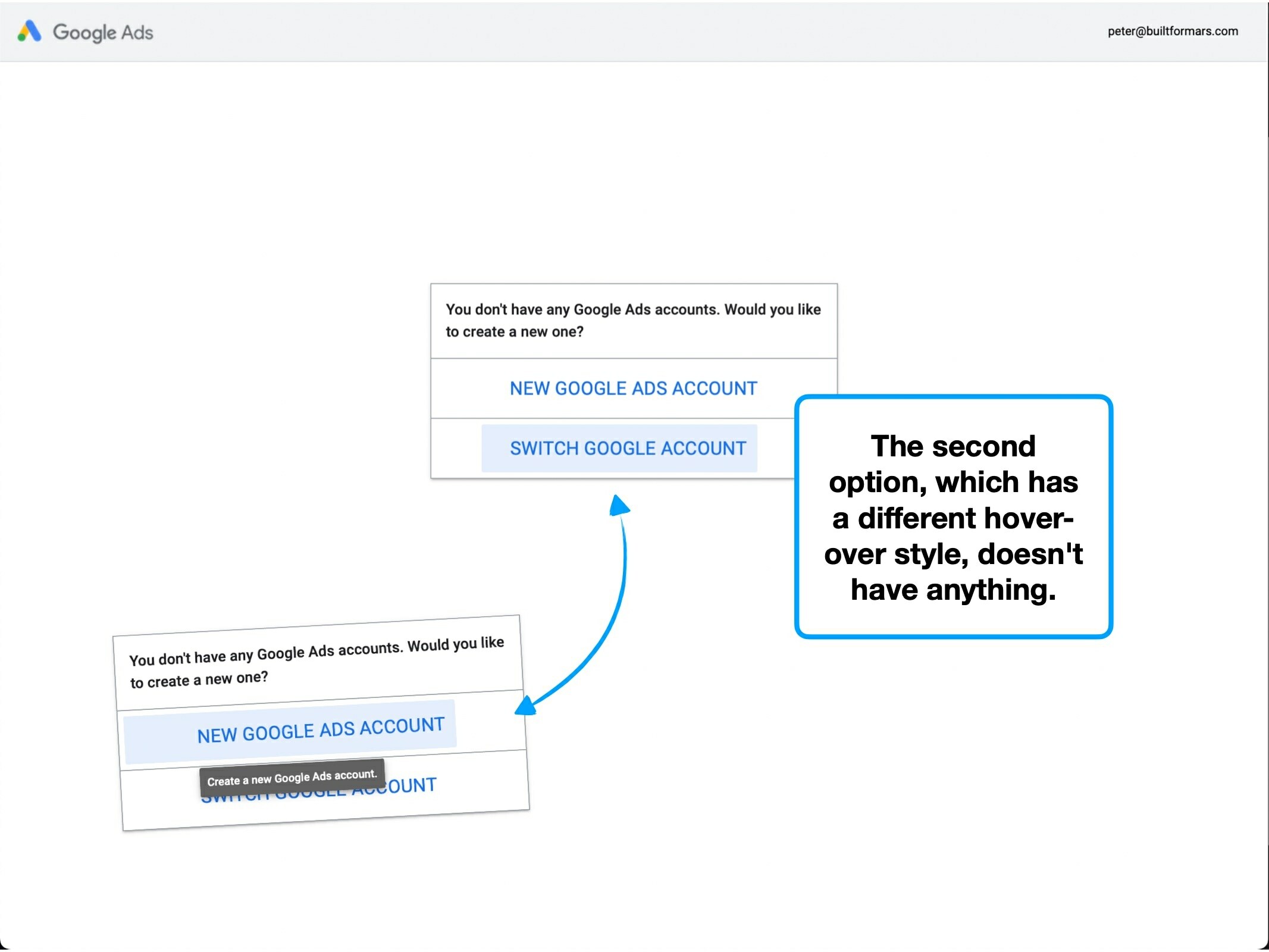
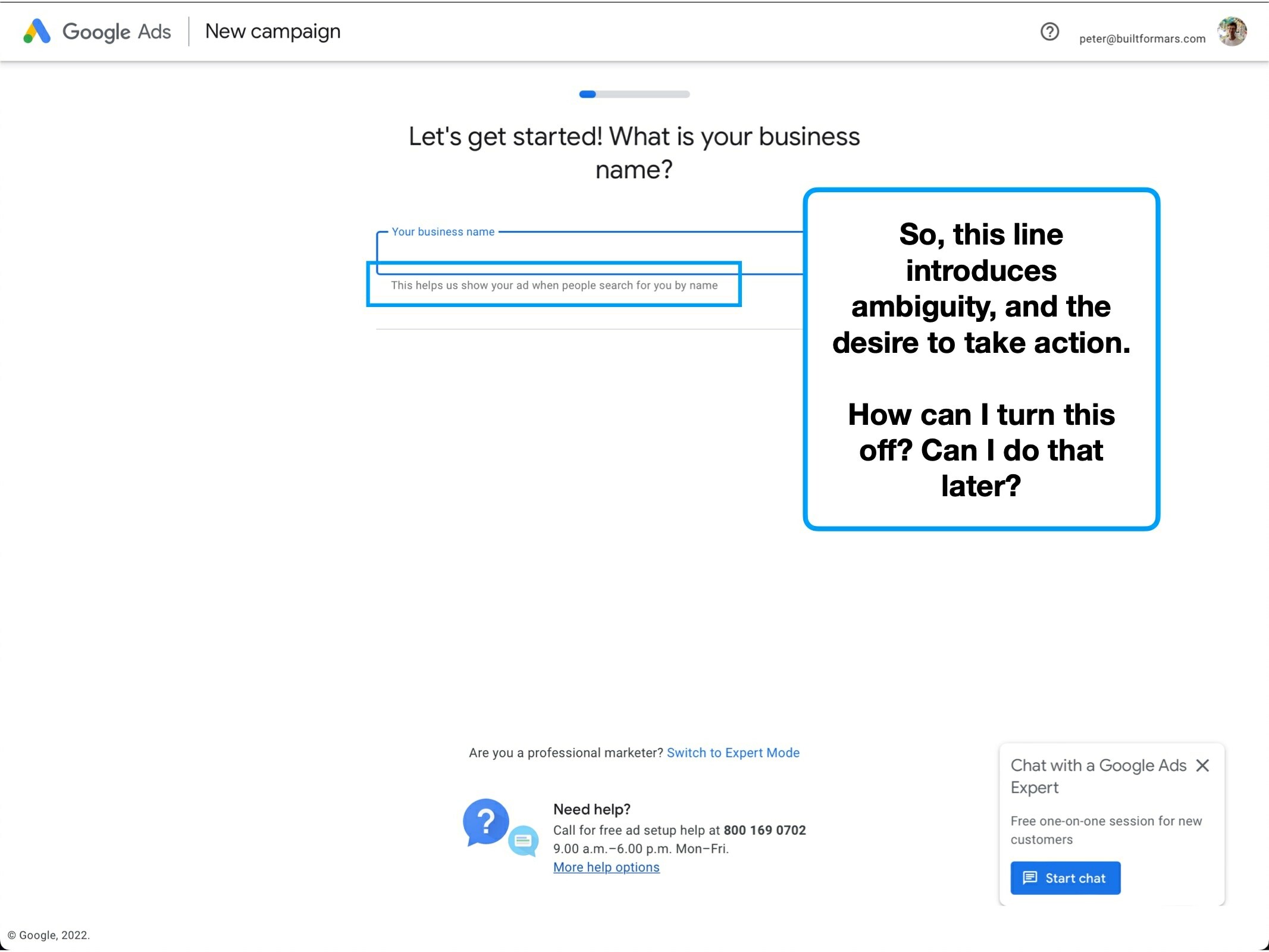
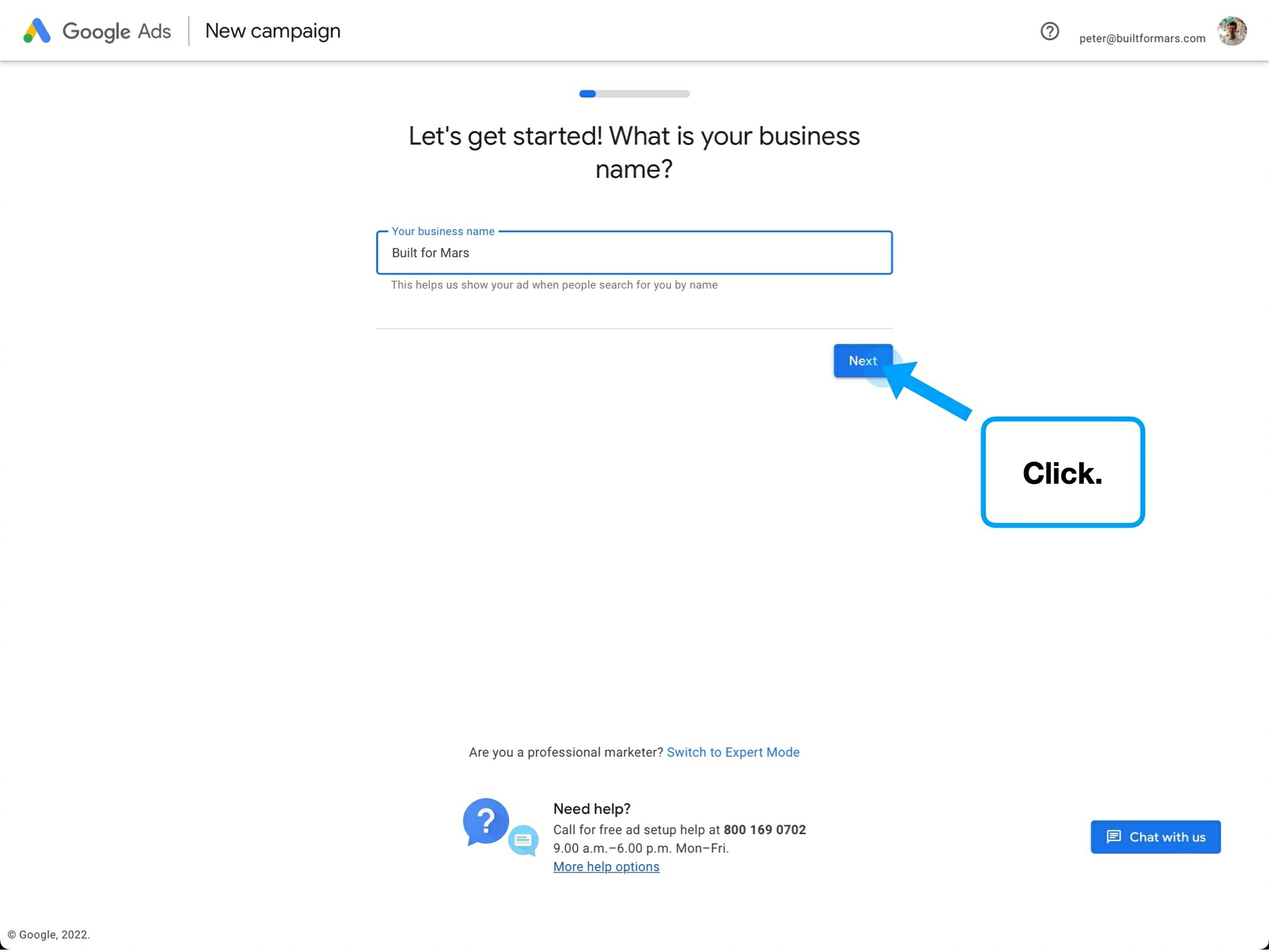
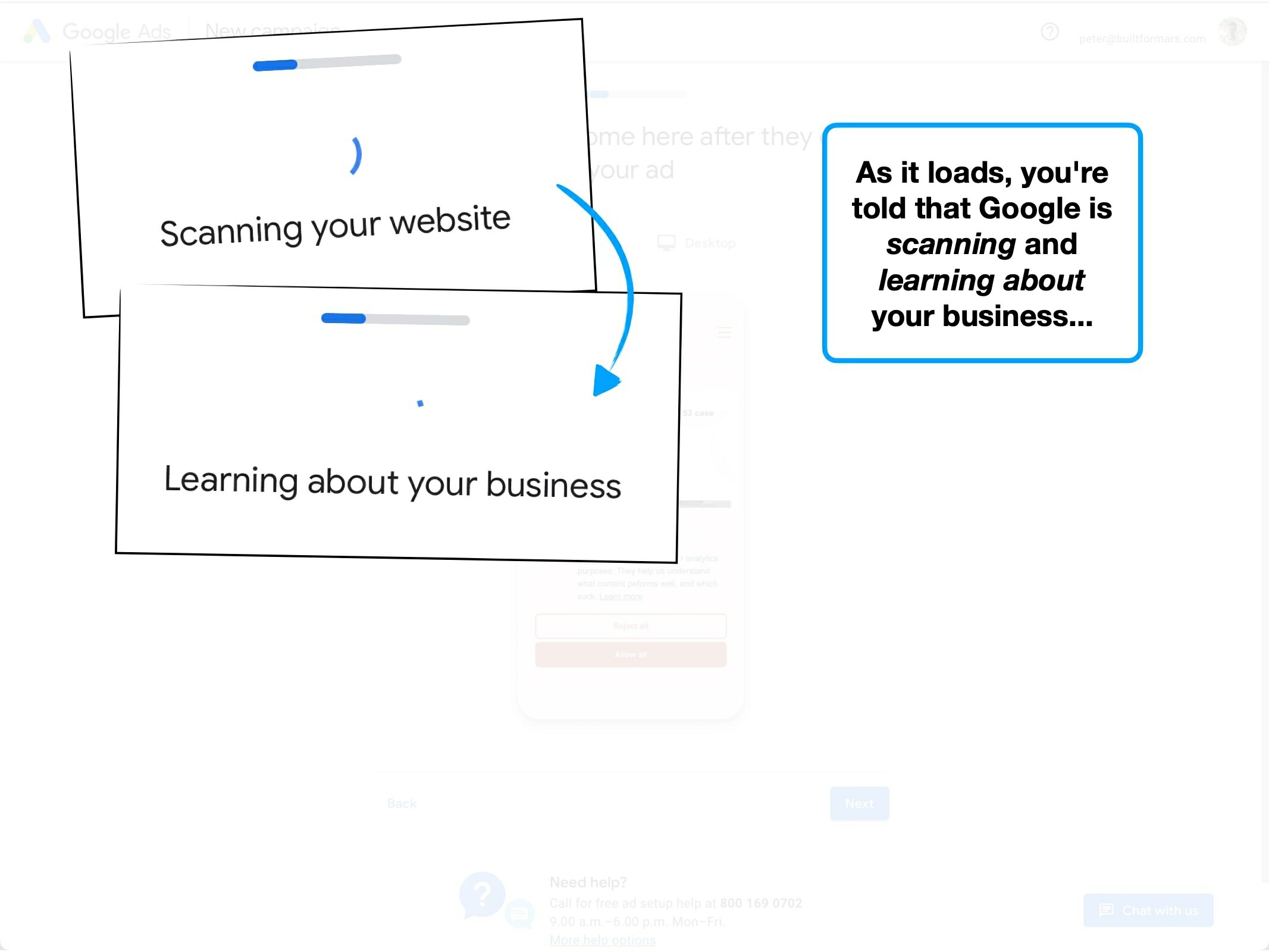
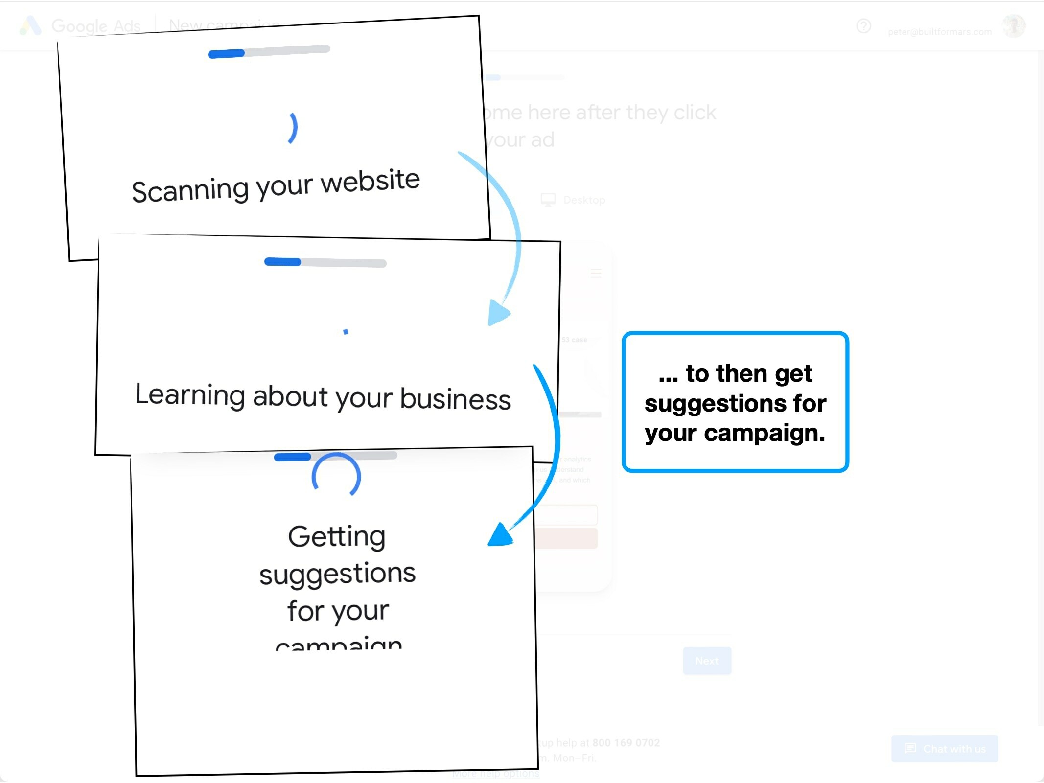
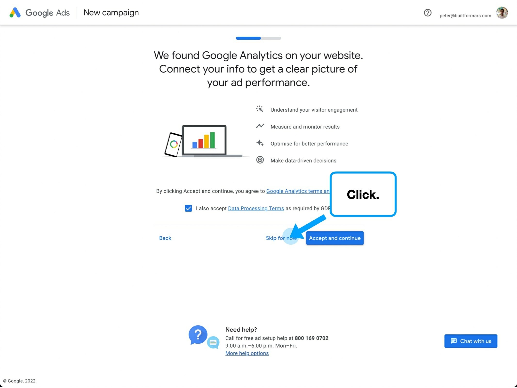
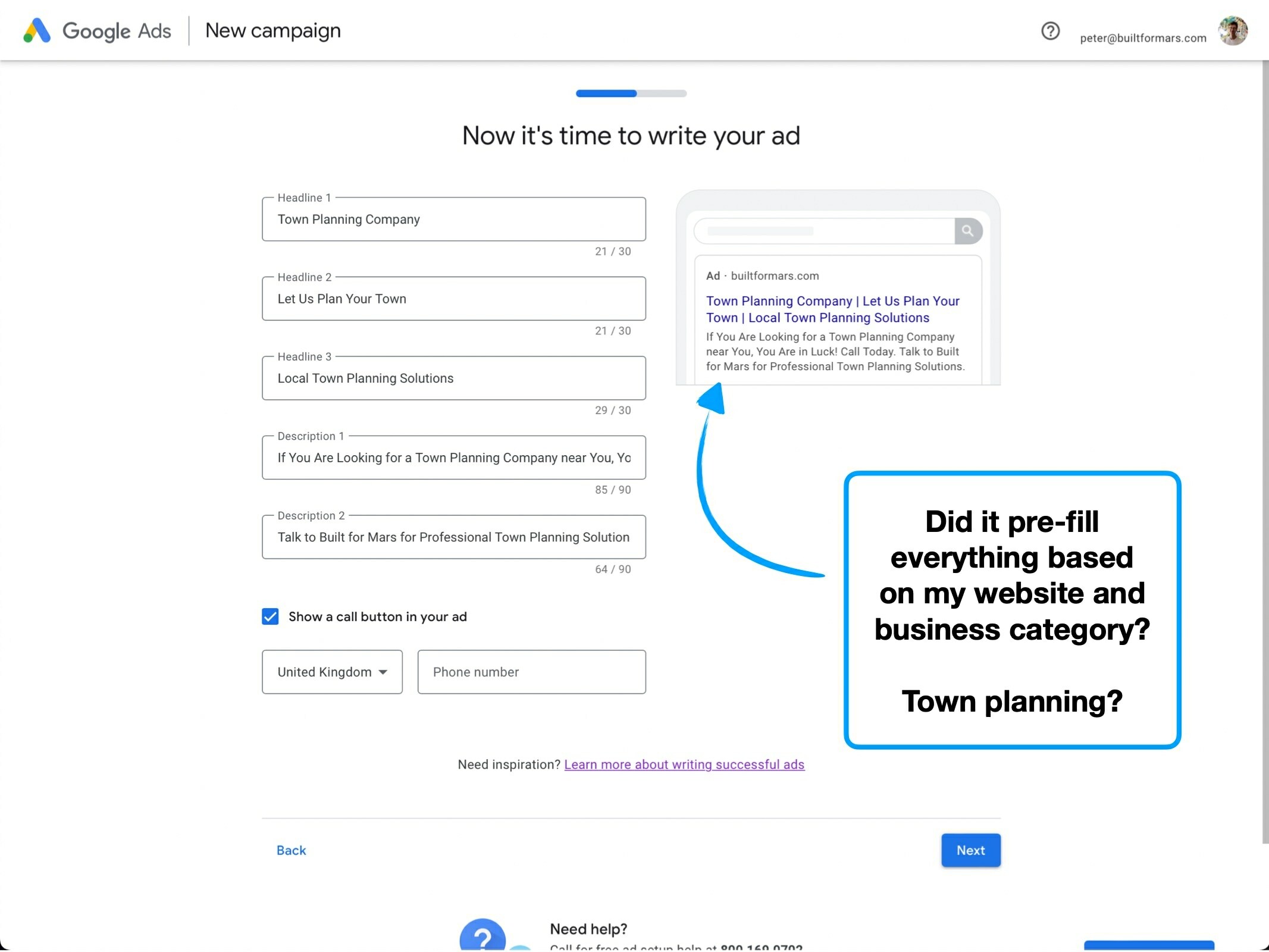
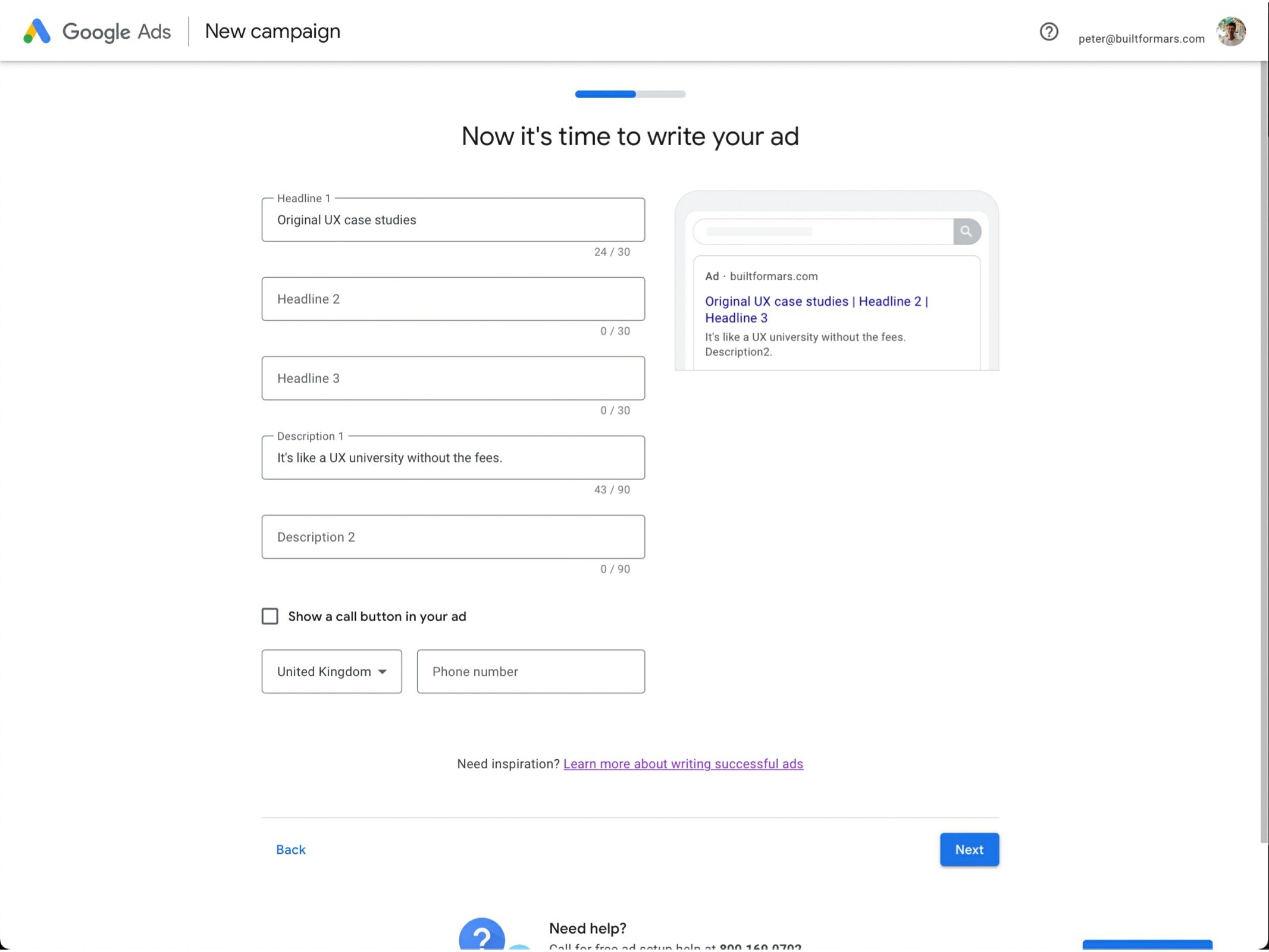
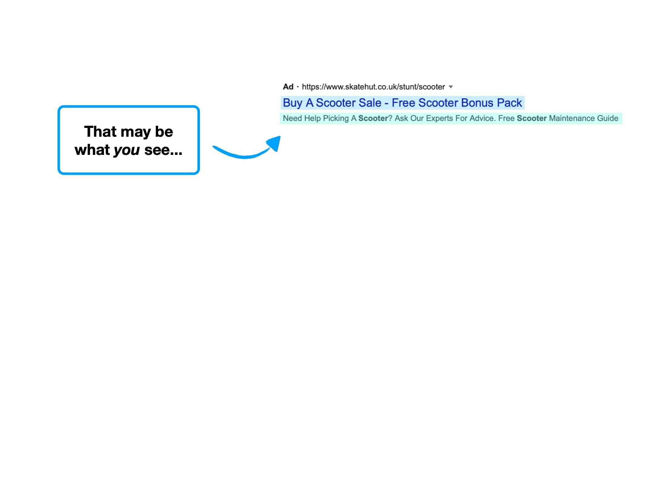
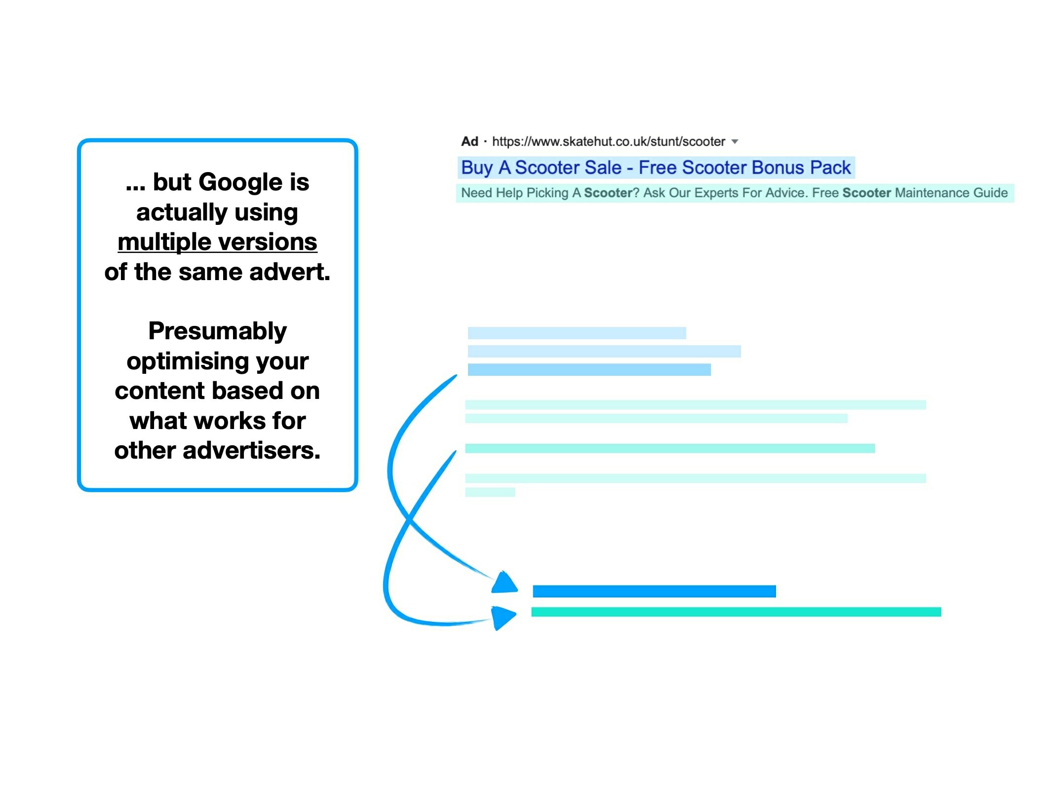
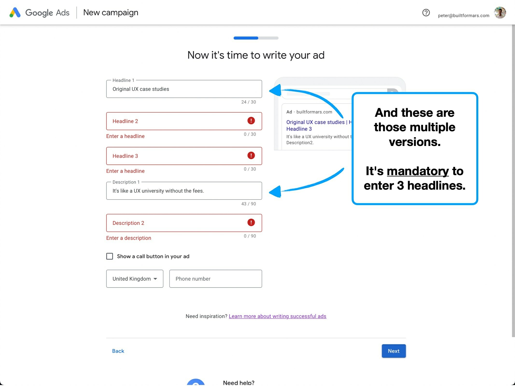
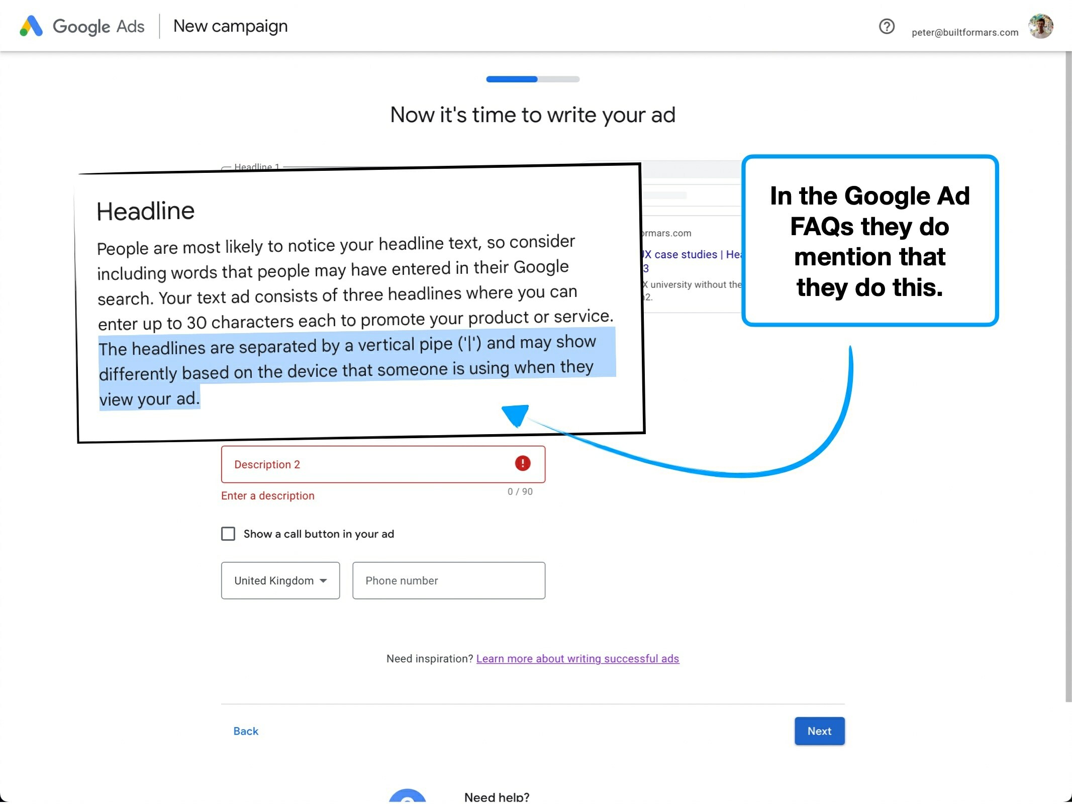
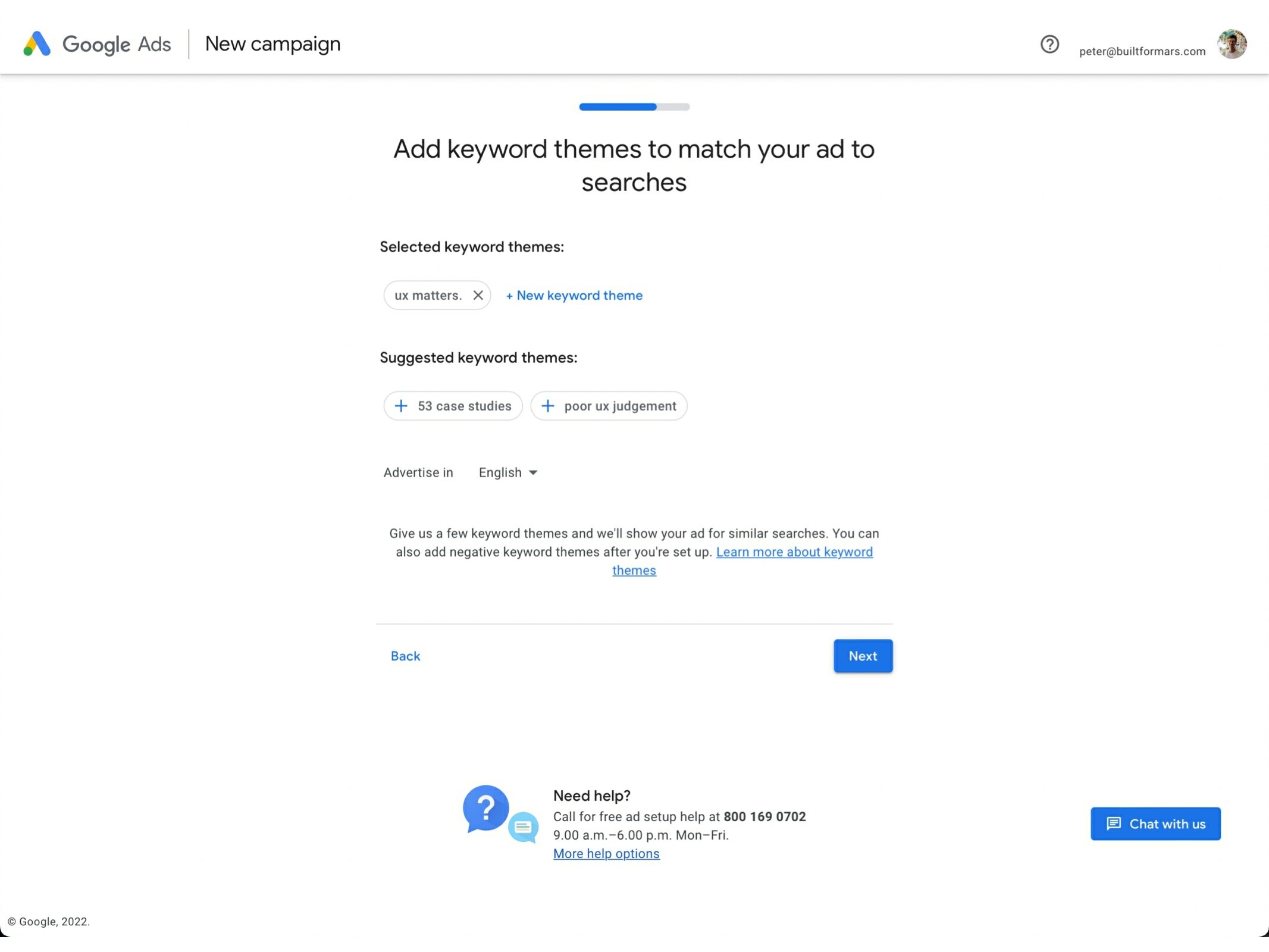
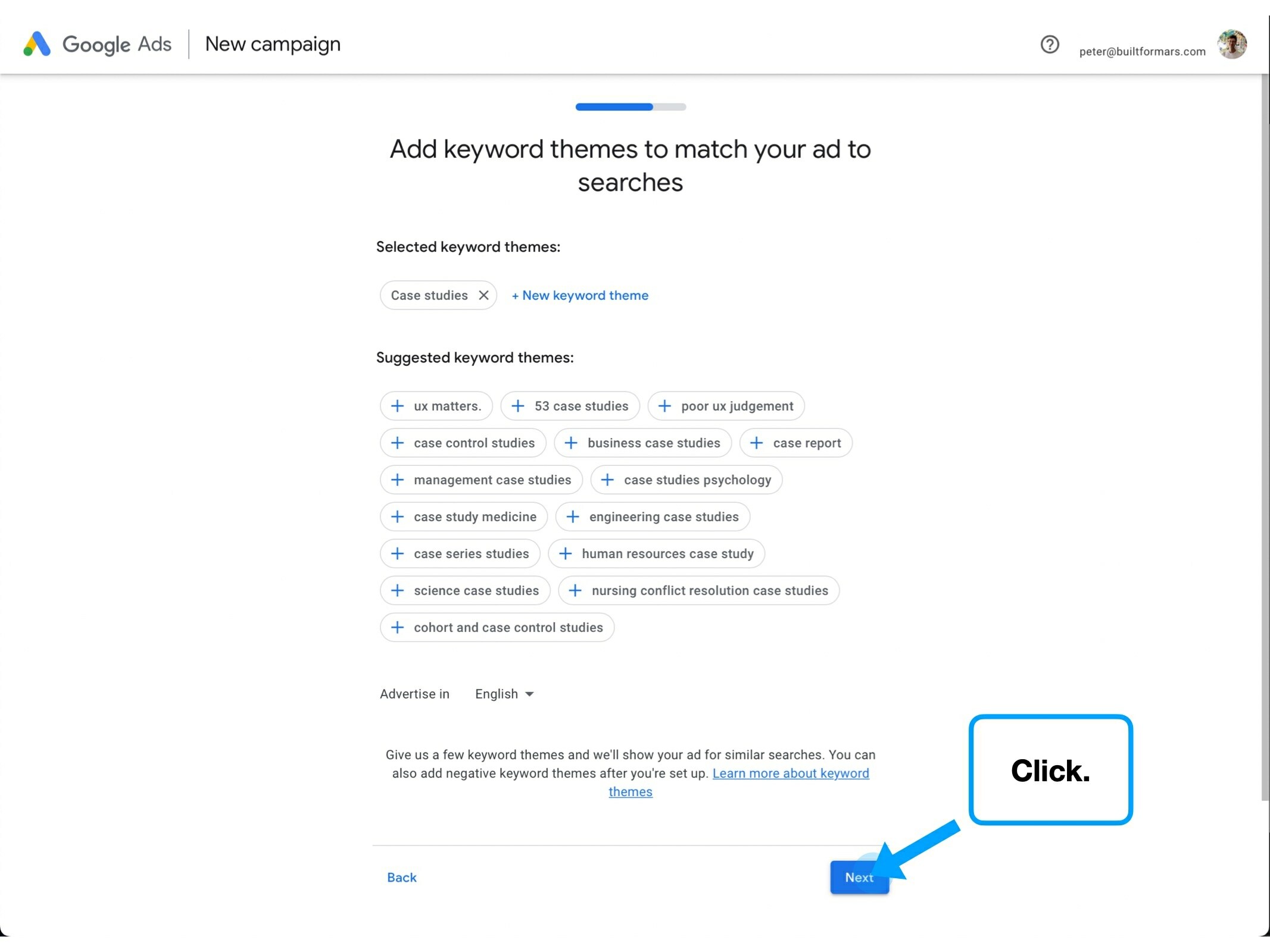
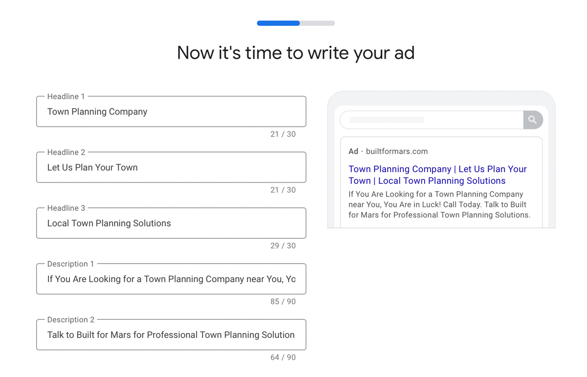
Google are doing this with the following subtitle (the small text below the field):
"Does this mean that I'm paying to advertise when searching for my own business name? Can I turn this off later? Are these keyword clicks included in my estimated CPC? Do I put my business name or my trading name?"
I see this all the time on sign-up flows.
Companies will introduce a concept too early (such as the need to verify their ID), but before the step where they actually provide context for why they need to do it.
The creation of 'fuzzy context' is a non-linear correlation between context given, and follow-on questions not answered.
i.e., from my experience it's roughly an S-shaped curve.
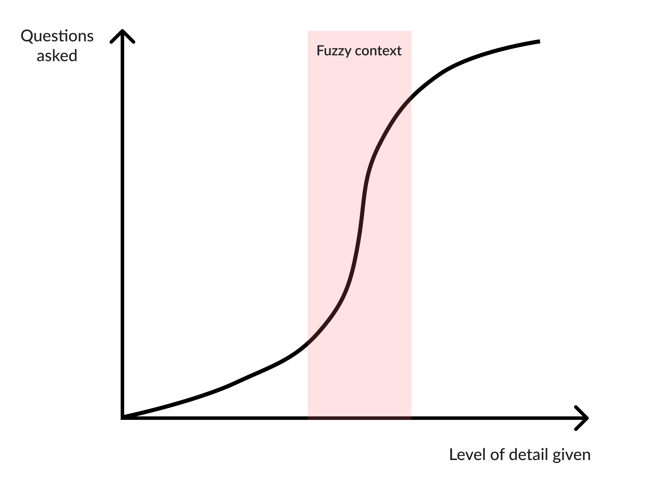
When only a small amount of detail is provided, the depth of the conversation is yet to be revealed, and so the degree of ambiguity is very high.
But after introducing a few of the details, you find yourself very quickly deep in the weeds of the problem—which requires a conscious effort to then reach a 'full' understanding (the red area on my chart).
I do this in real life sometimes too: I'll be recalling a story, casually mention a minor detail, realise what I've done, and then backtrack to add context as to why that detail is relevant in the first place.
The key is to not semi-explain a new concept. Be conscious of what follow-on questions you're creating.
2. A fresh start
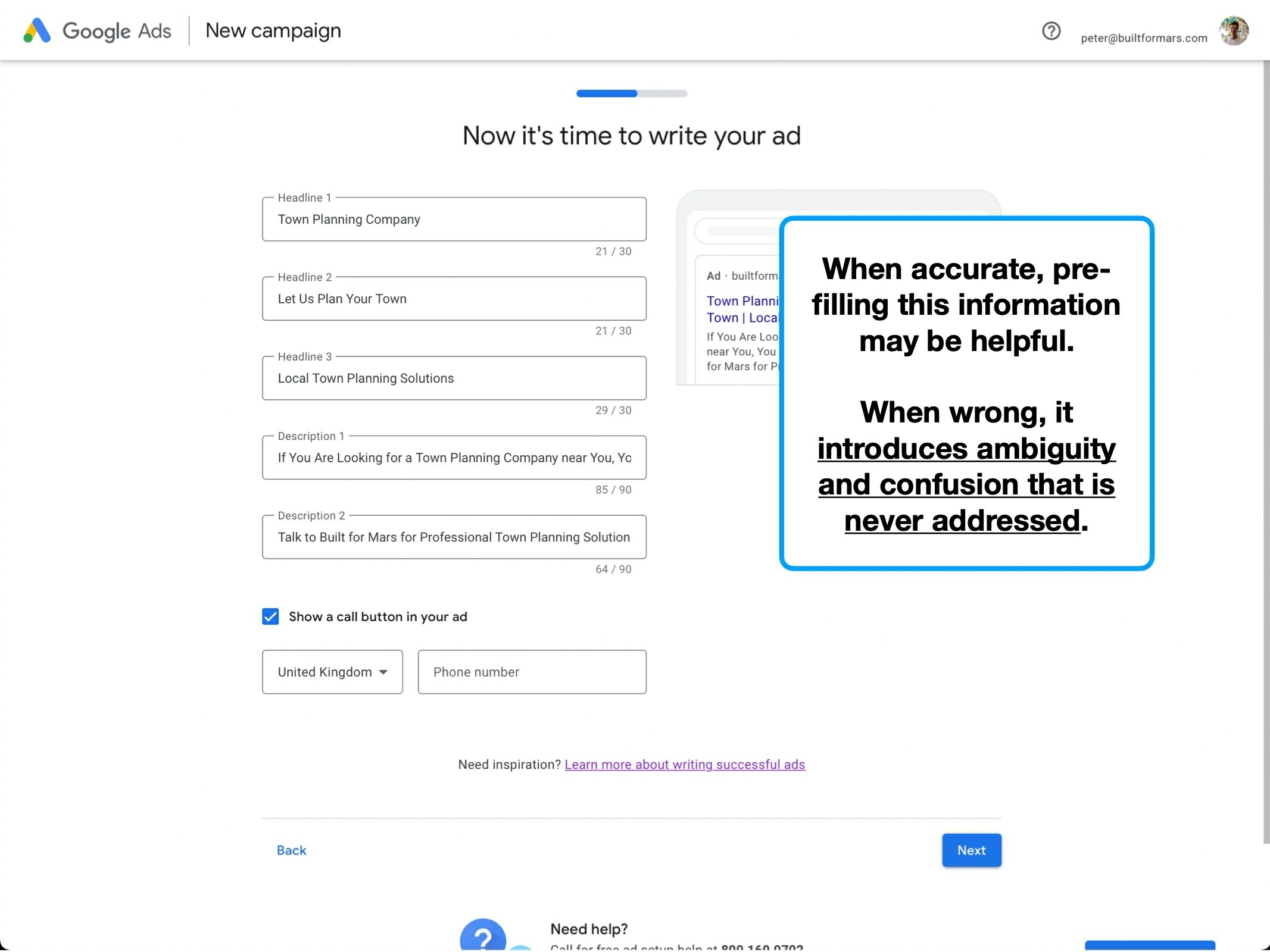
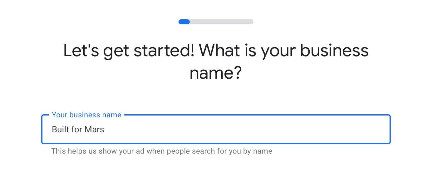
The primary benefit of pre-filling information is that it'll often save the user time and effort.
But there are a few caveats to consider:
✏️
1. Is this going to be edited?
It can often be awkward to edit content that you haven't written, especially if it's split over many fields / pages.
✅
2. Is the information correct?
i.e., how close is the output to what the user would have entered themselves?
🧠
3. Does the act of inputting information serve as an educational tool?
Occasionally the process of entering information teaches the user how to do a particular repeatable task. This is a good reason not to bypass the data entry.
In this instance, creating a Google Ad falls within those first two caveats: the information is going to be edited, and has to be accurate.
i.e., nobody wants you to pre-fill an ad for them, if the resulting performance is terrible.
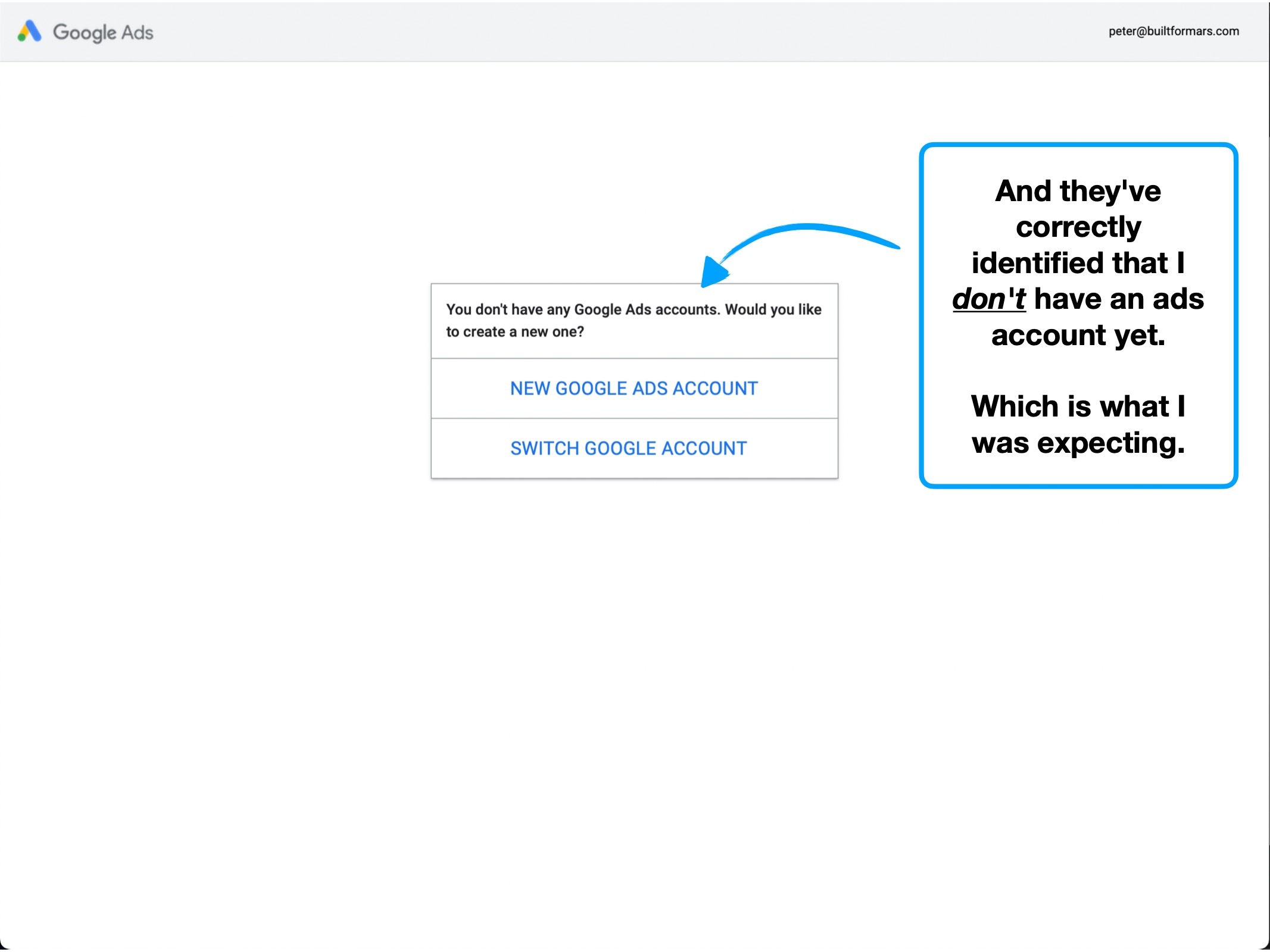
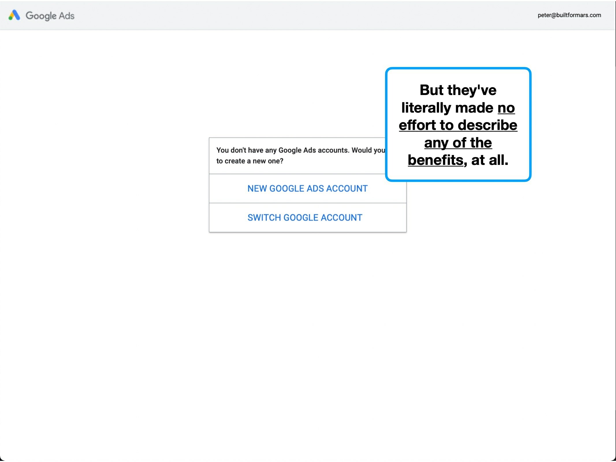
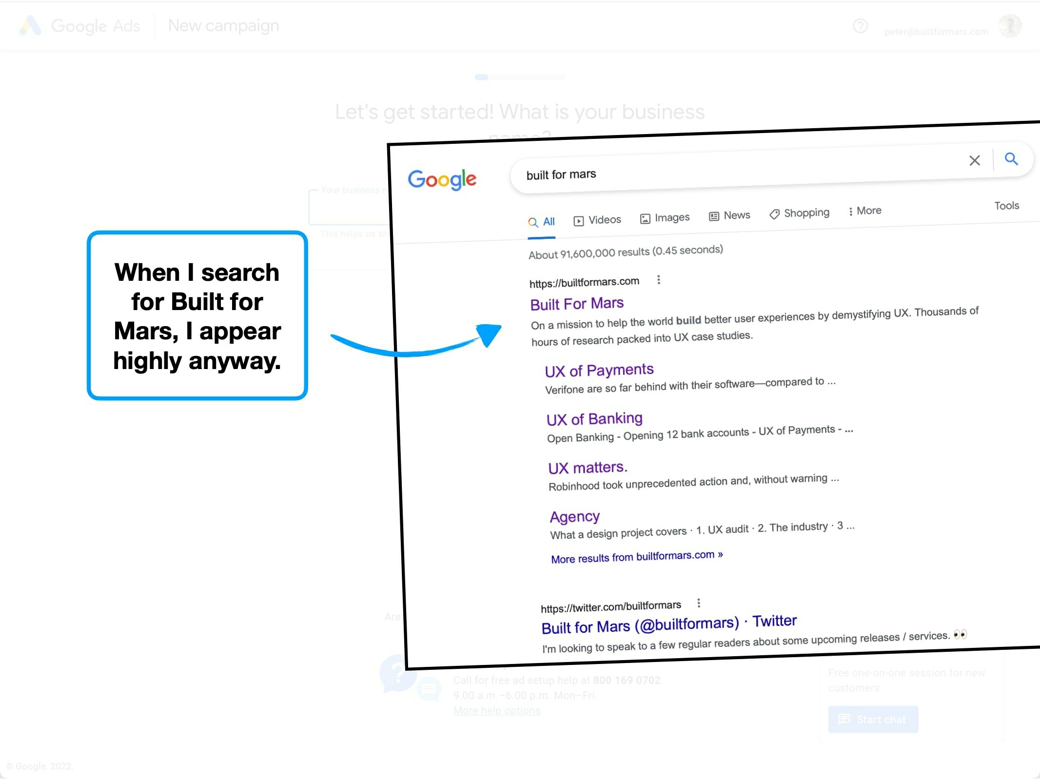
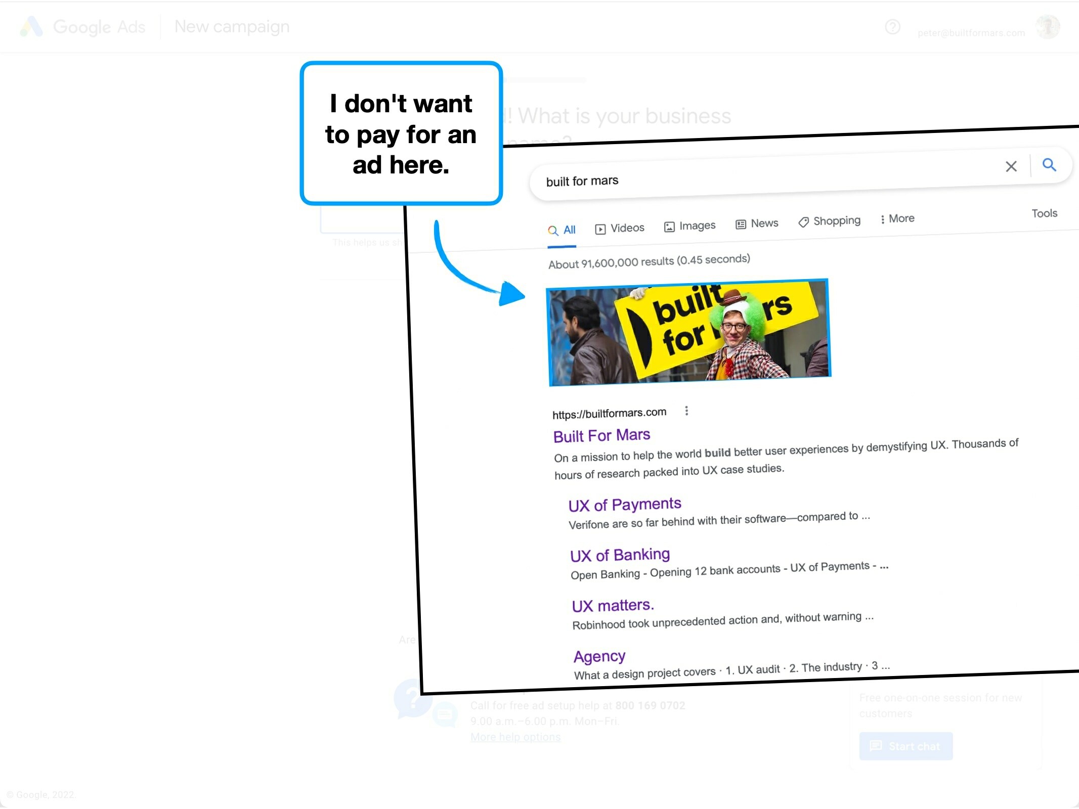
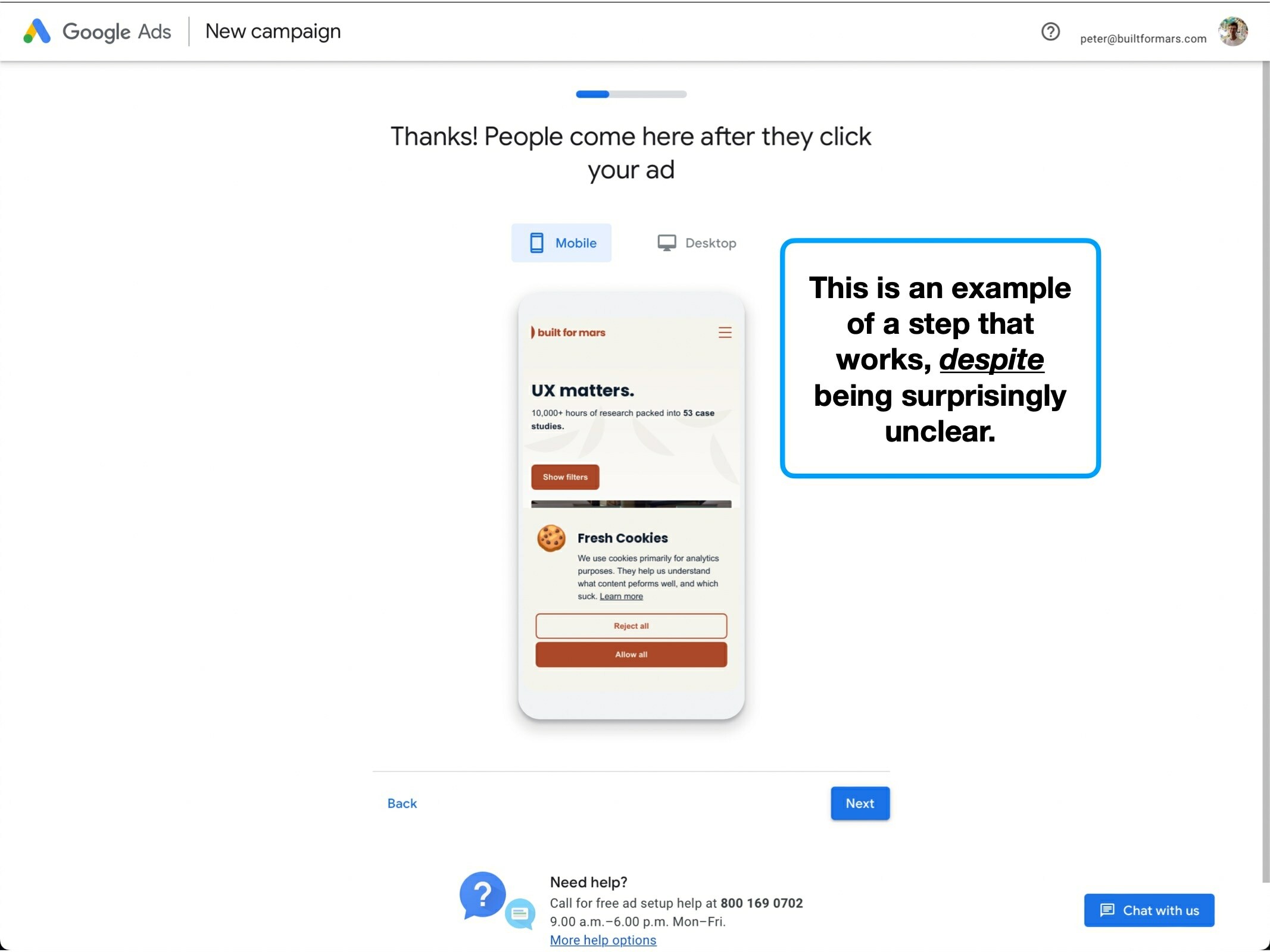
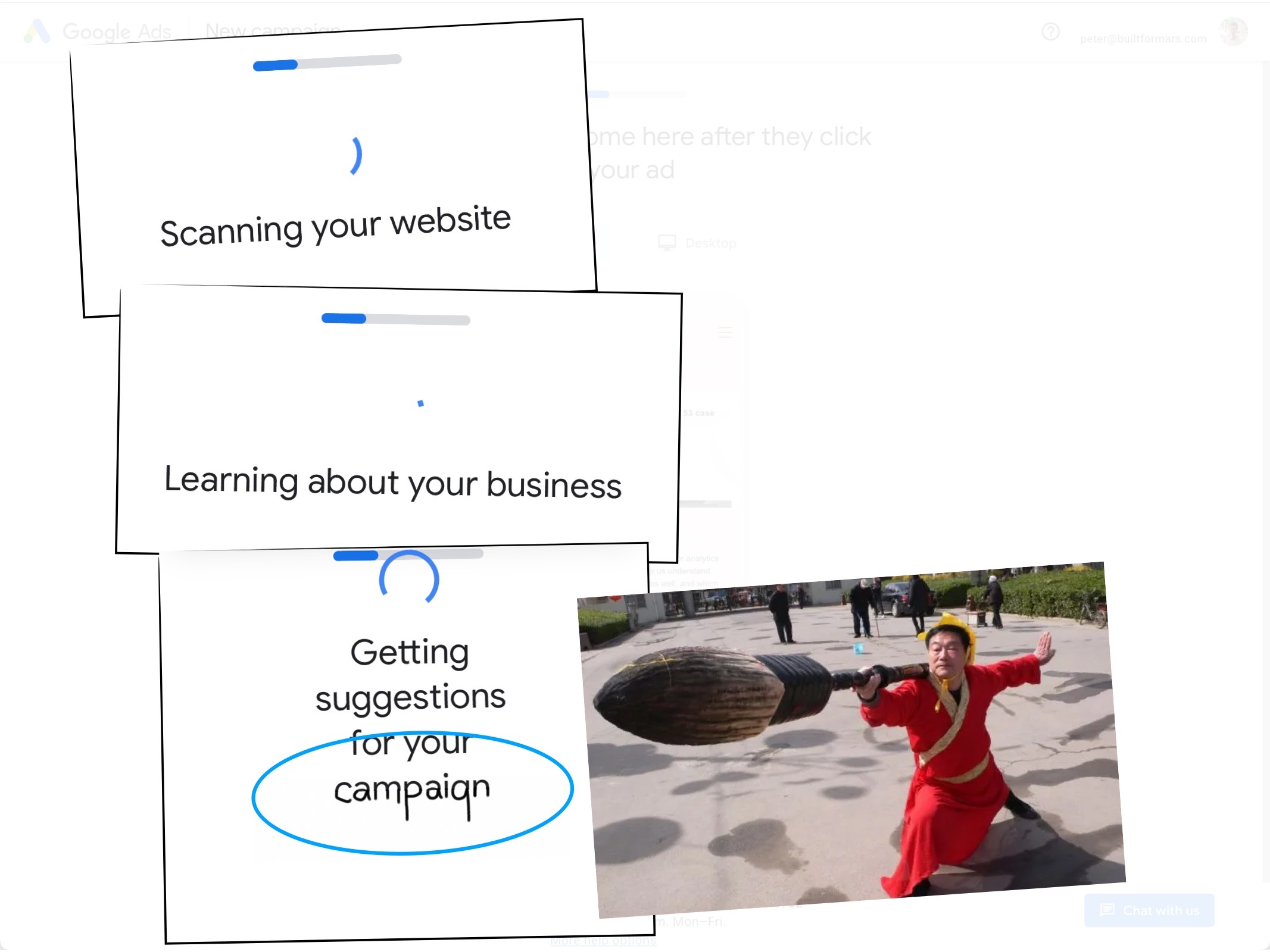
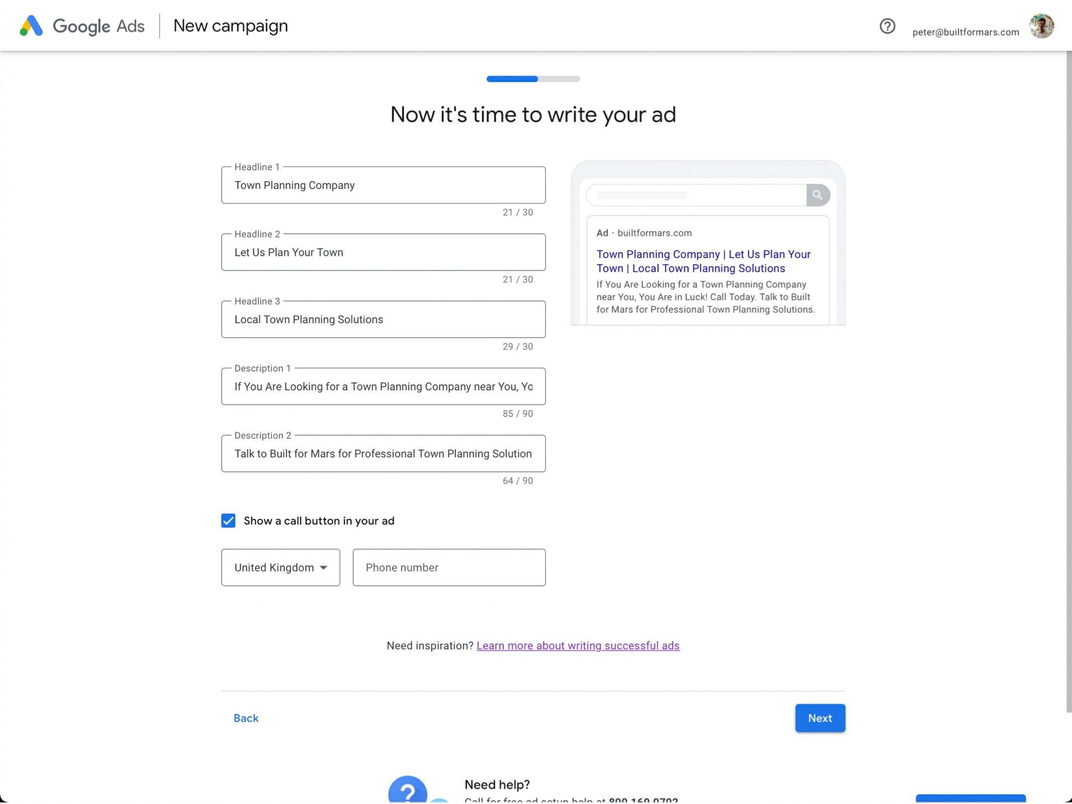
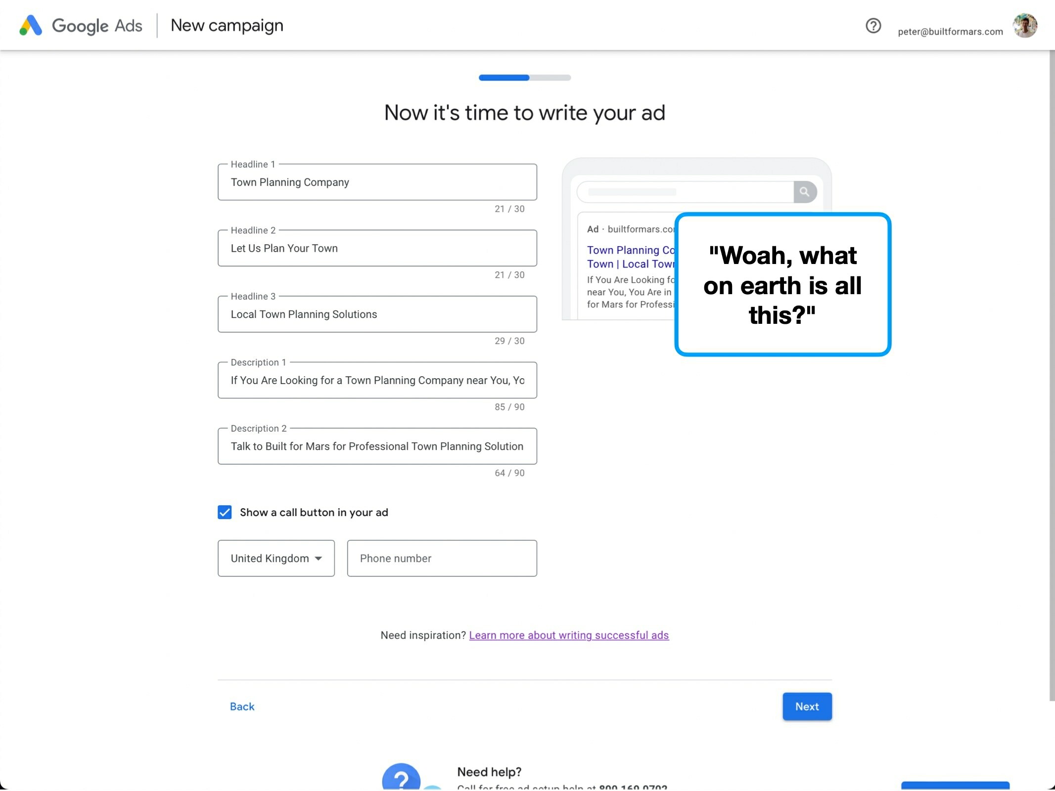
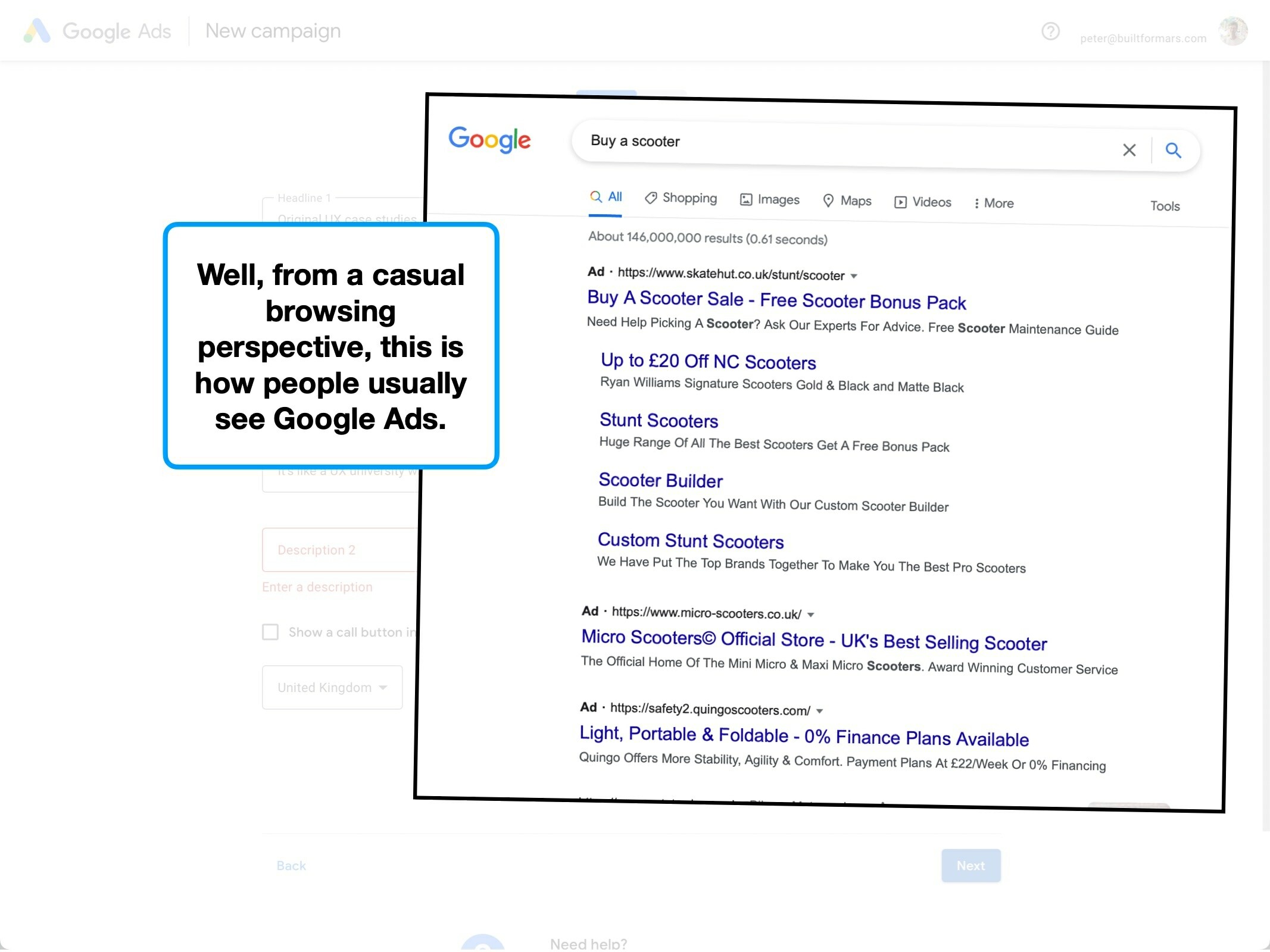
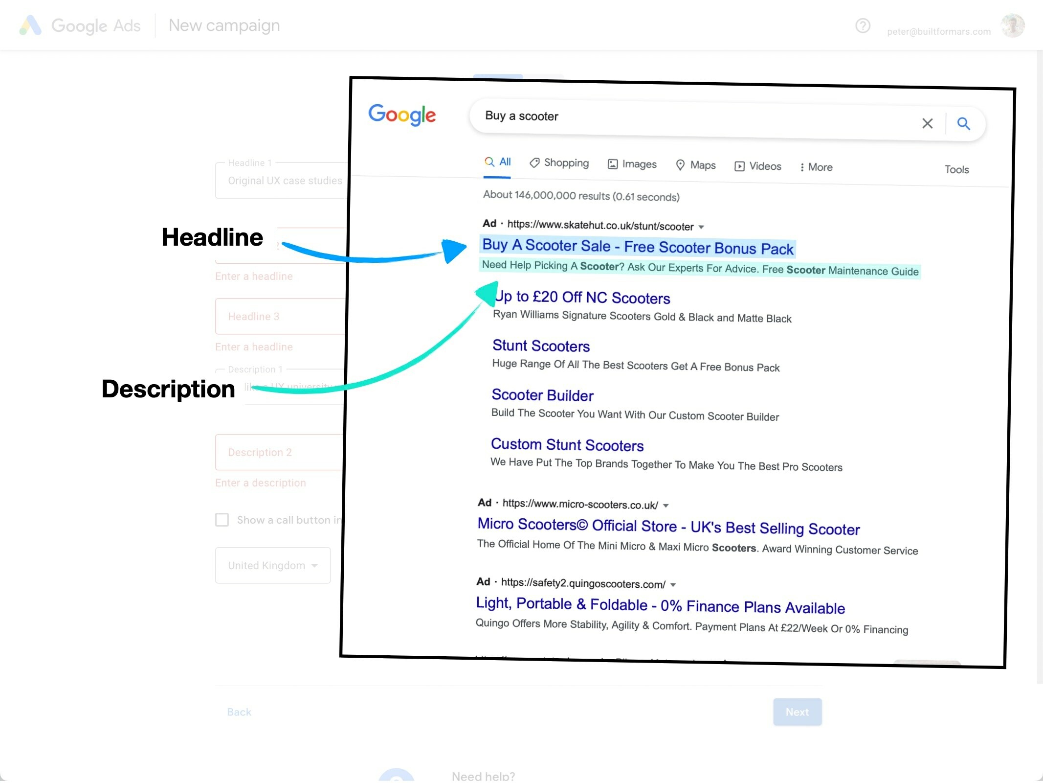
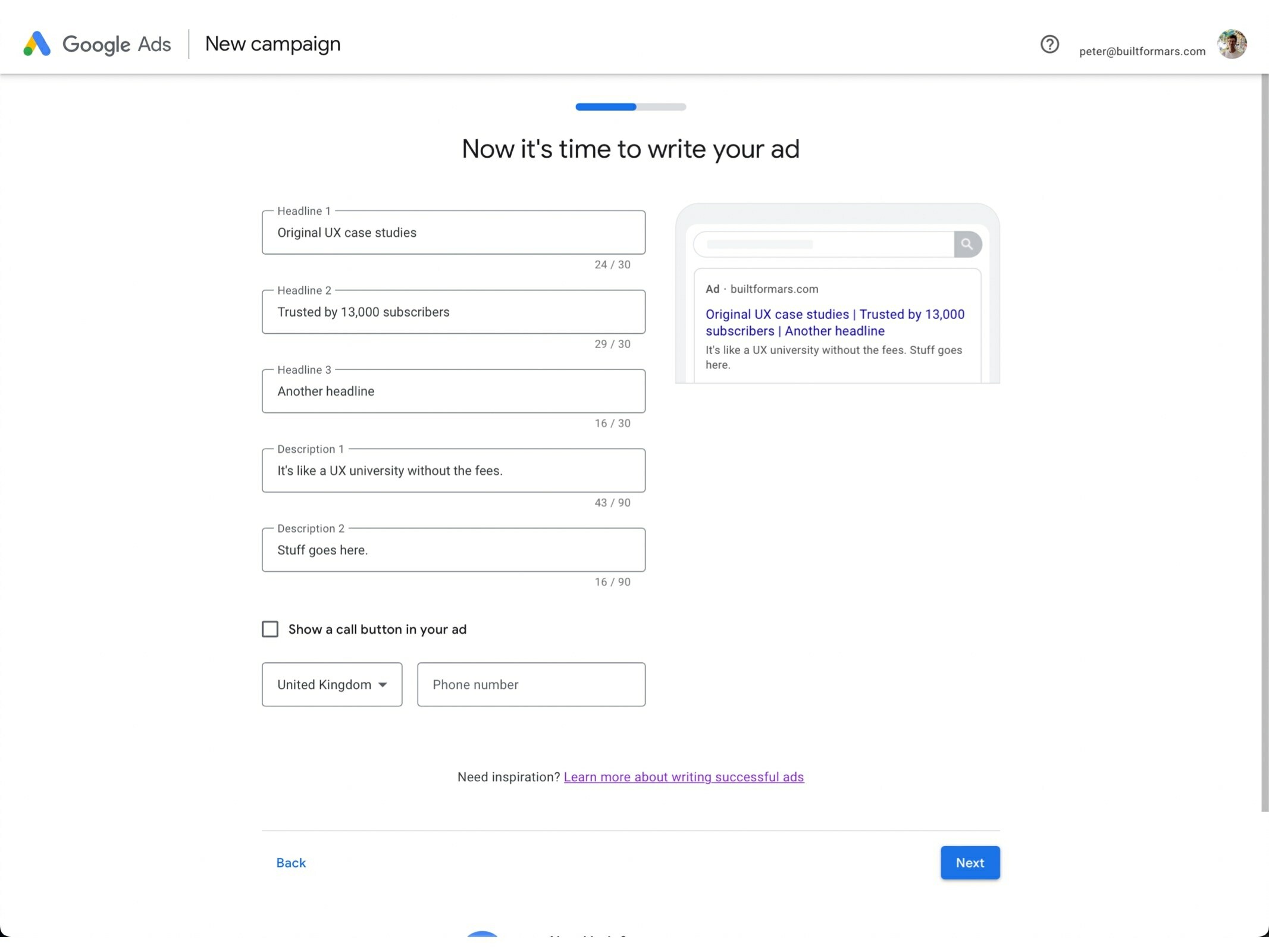
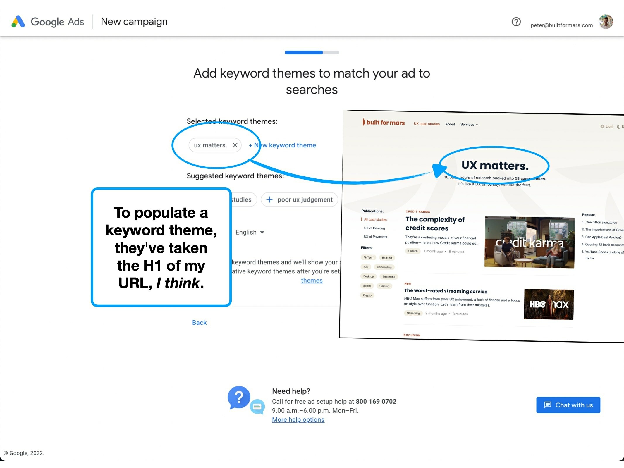
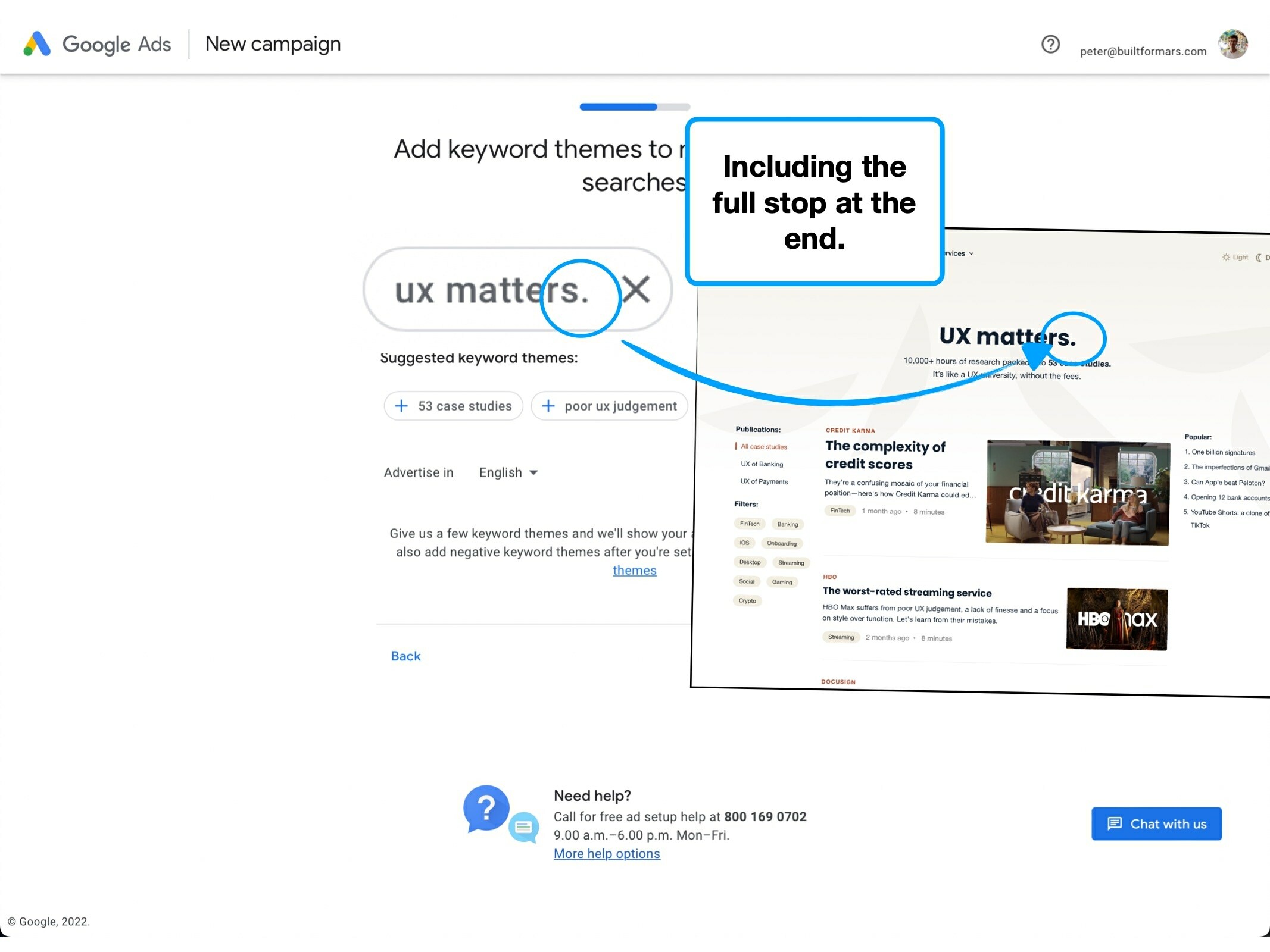
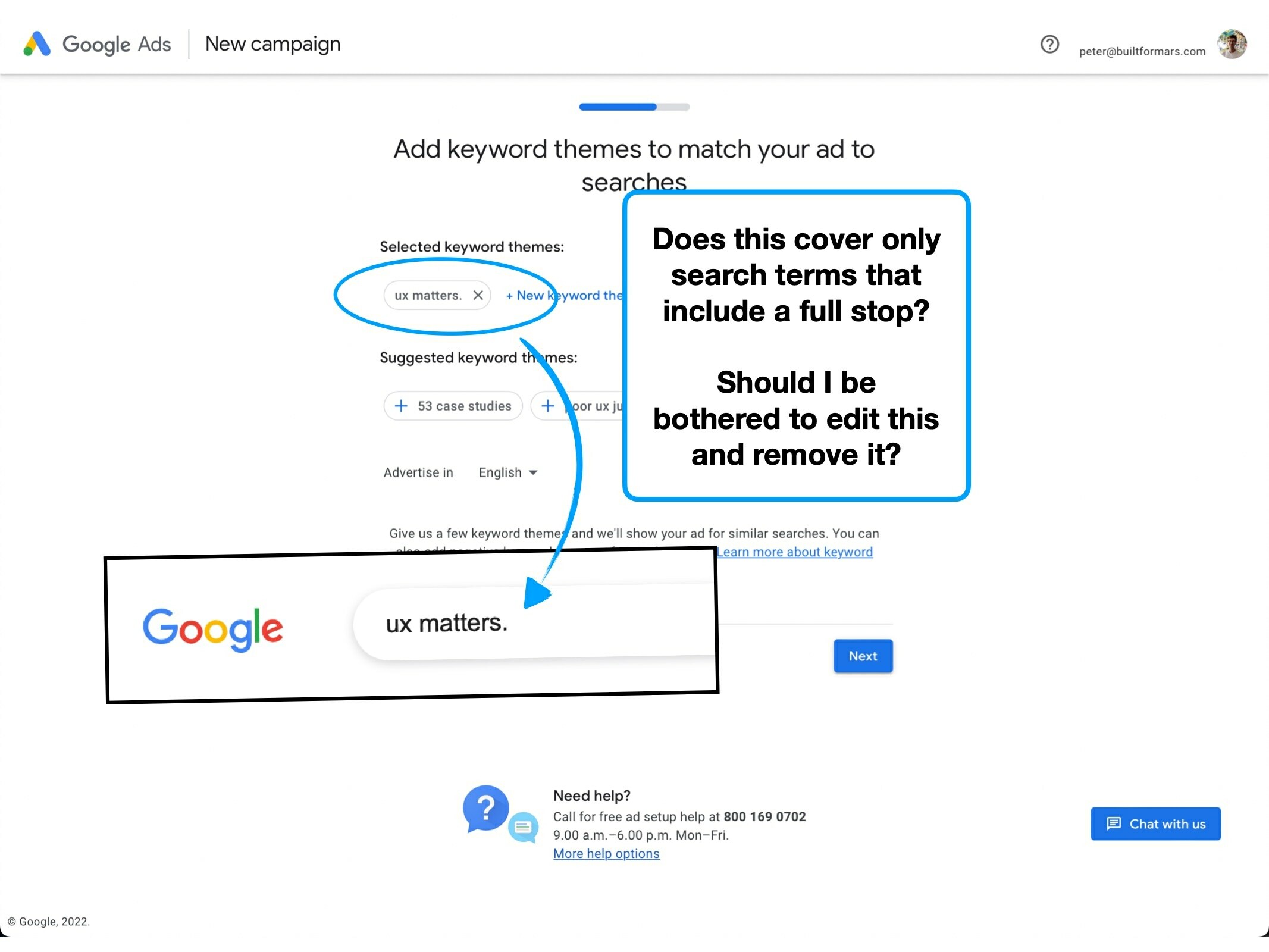
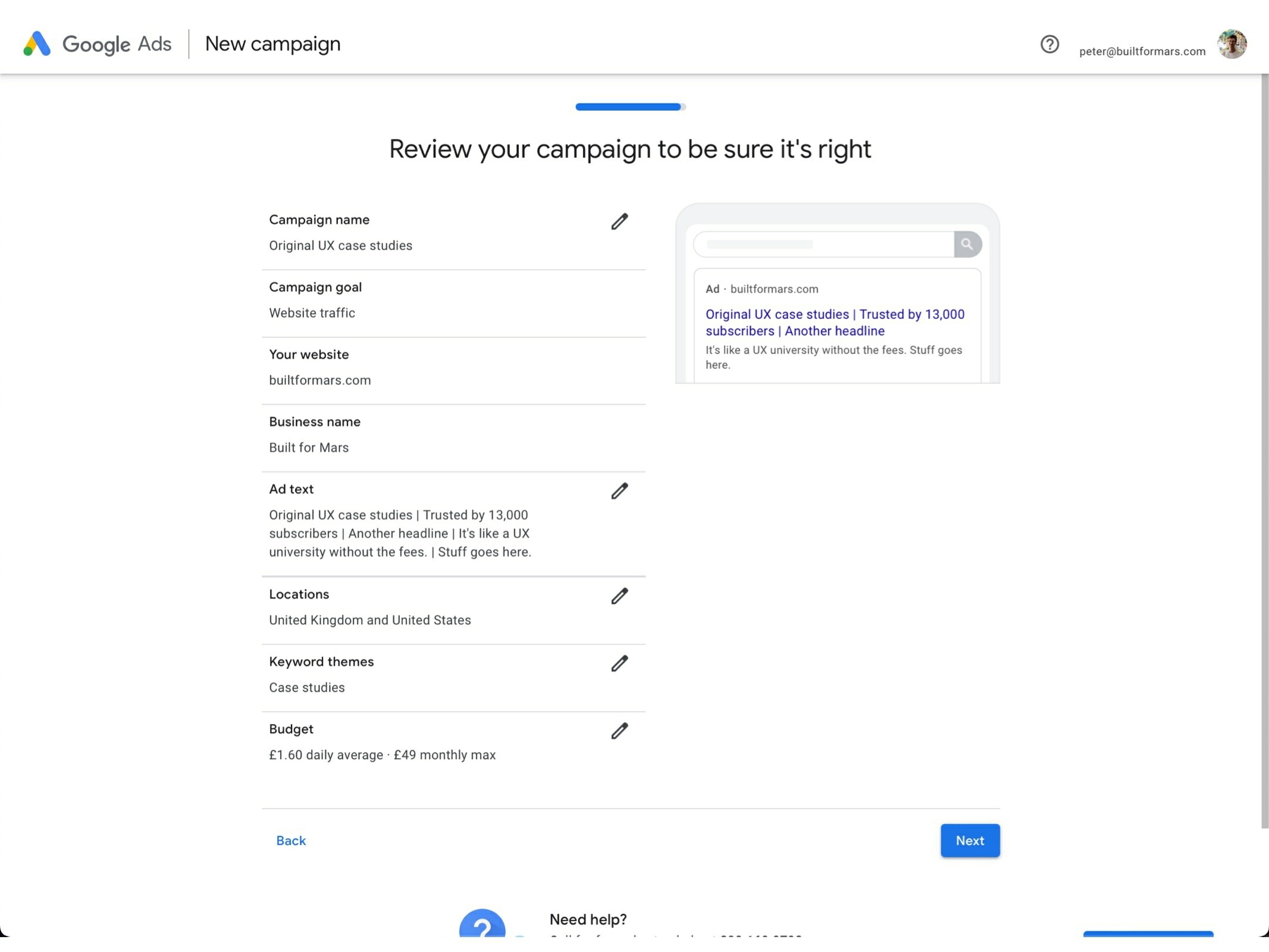
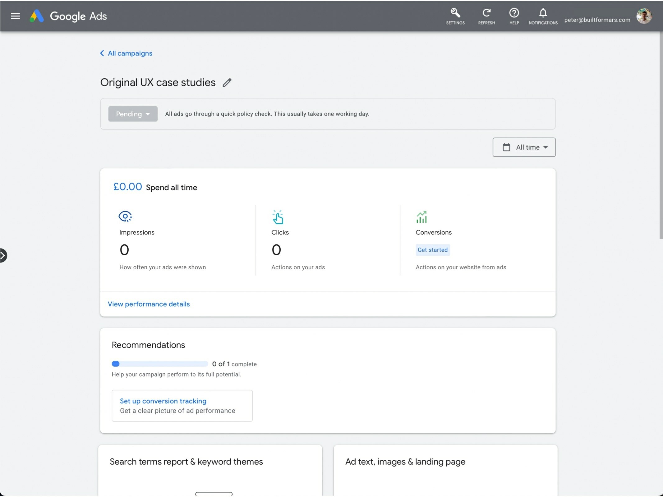
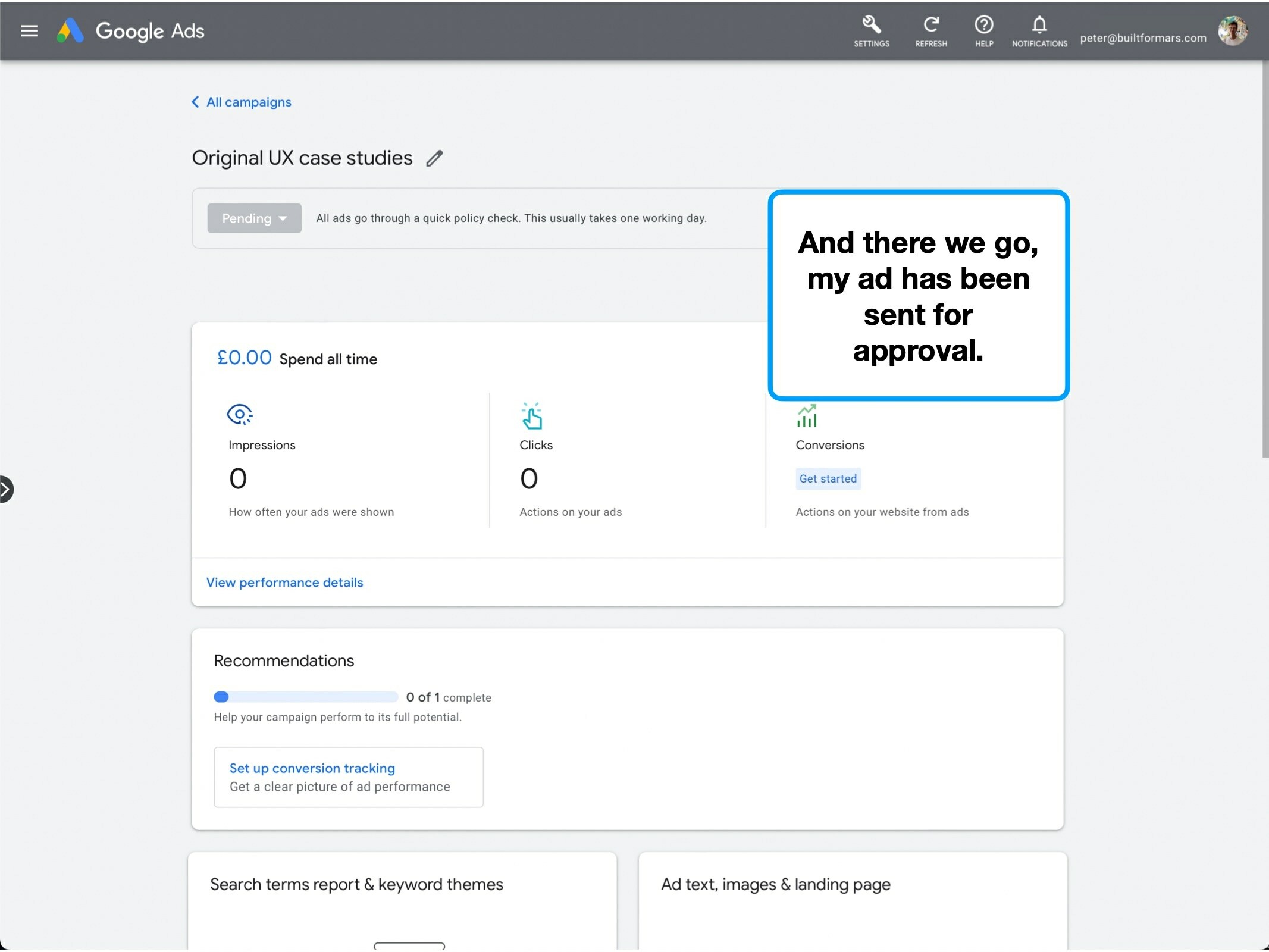
Or, if they get your business purpose totally wrong, which is what happened to me:
To be clear, I'm not suggesting that you should never pre-fill information. But rather that pre-filling as a default, is a risky strategy.
The most punishing thing to get wrong is to be very inaccurate, and have pre-populated lots of fields.
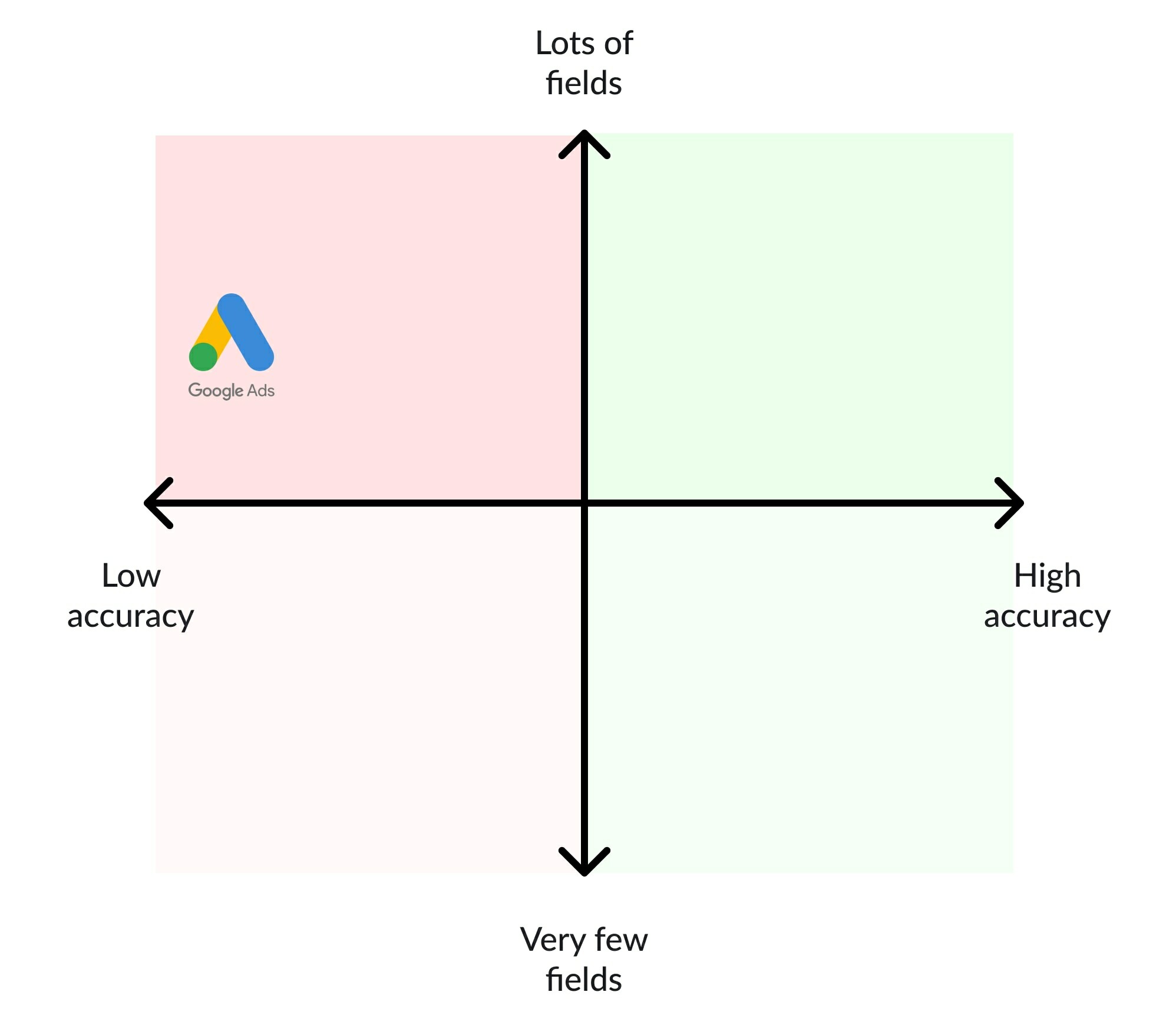
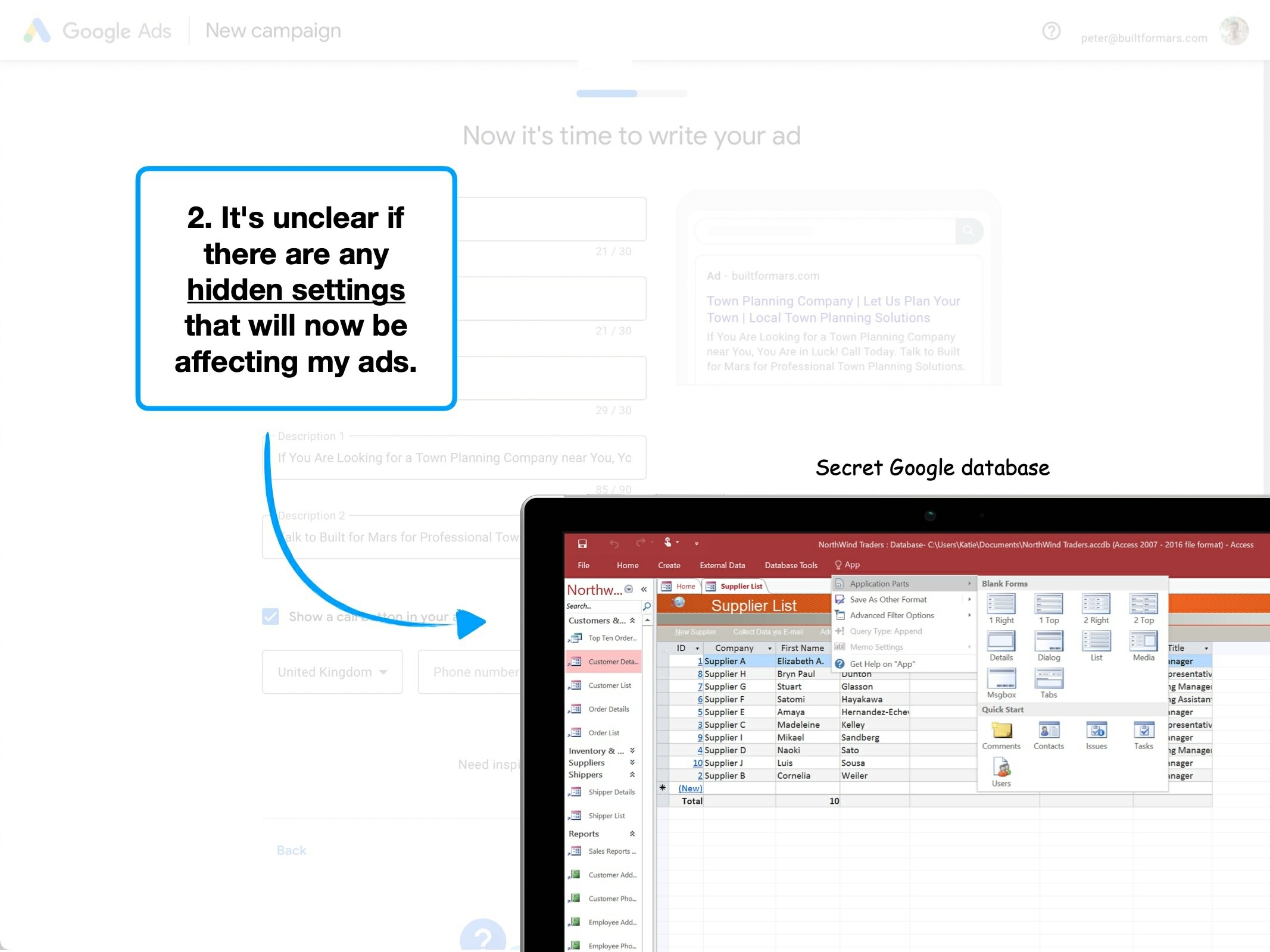
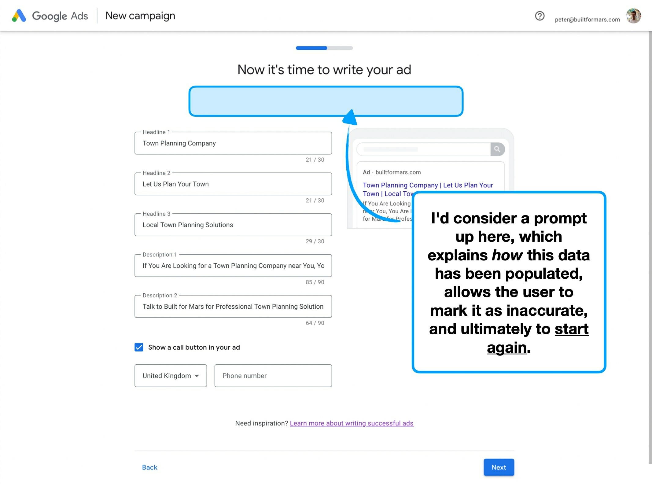
The difficulty for Google (and any company, really), is that it's hard to predict when you'll be correct, or not.
i.e., calculating the significance of false positives is tricky. It's even harder to then predict future errors for totally unrelated customers.
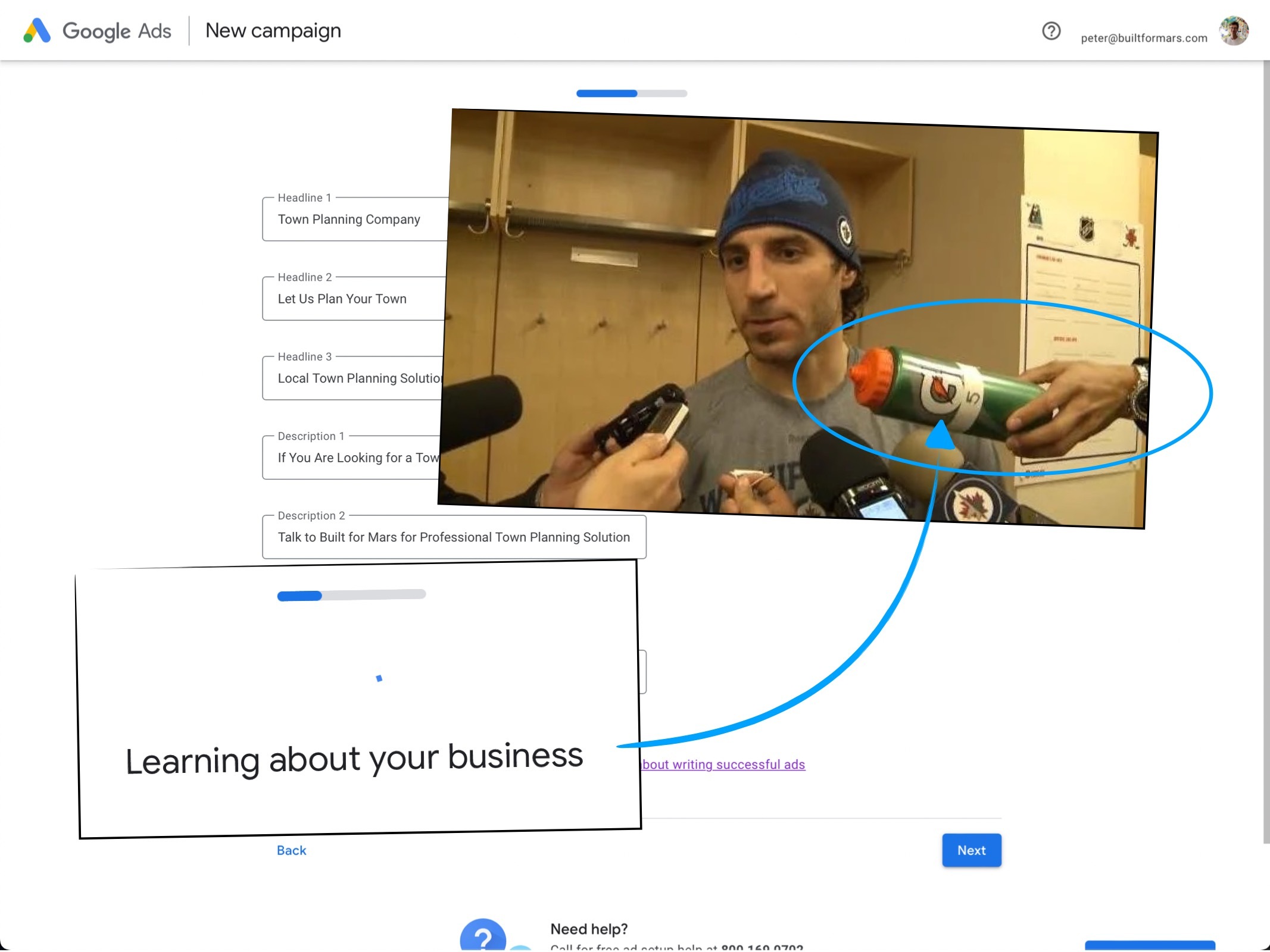
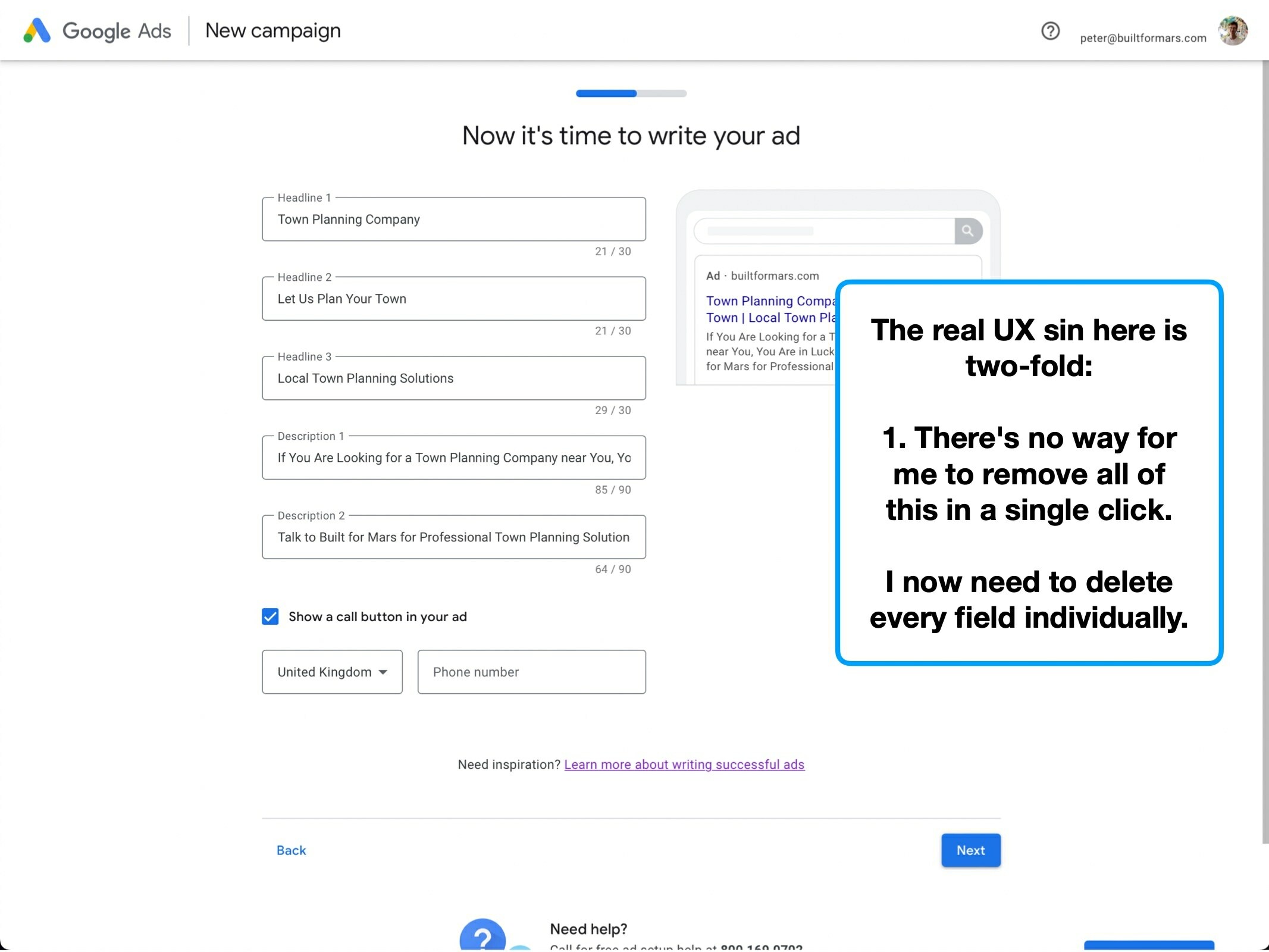
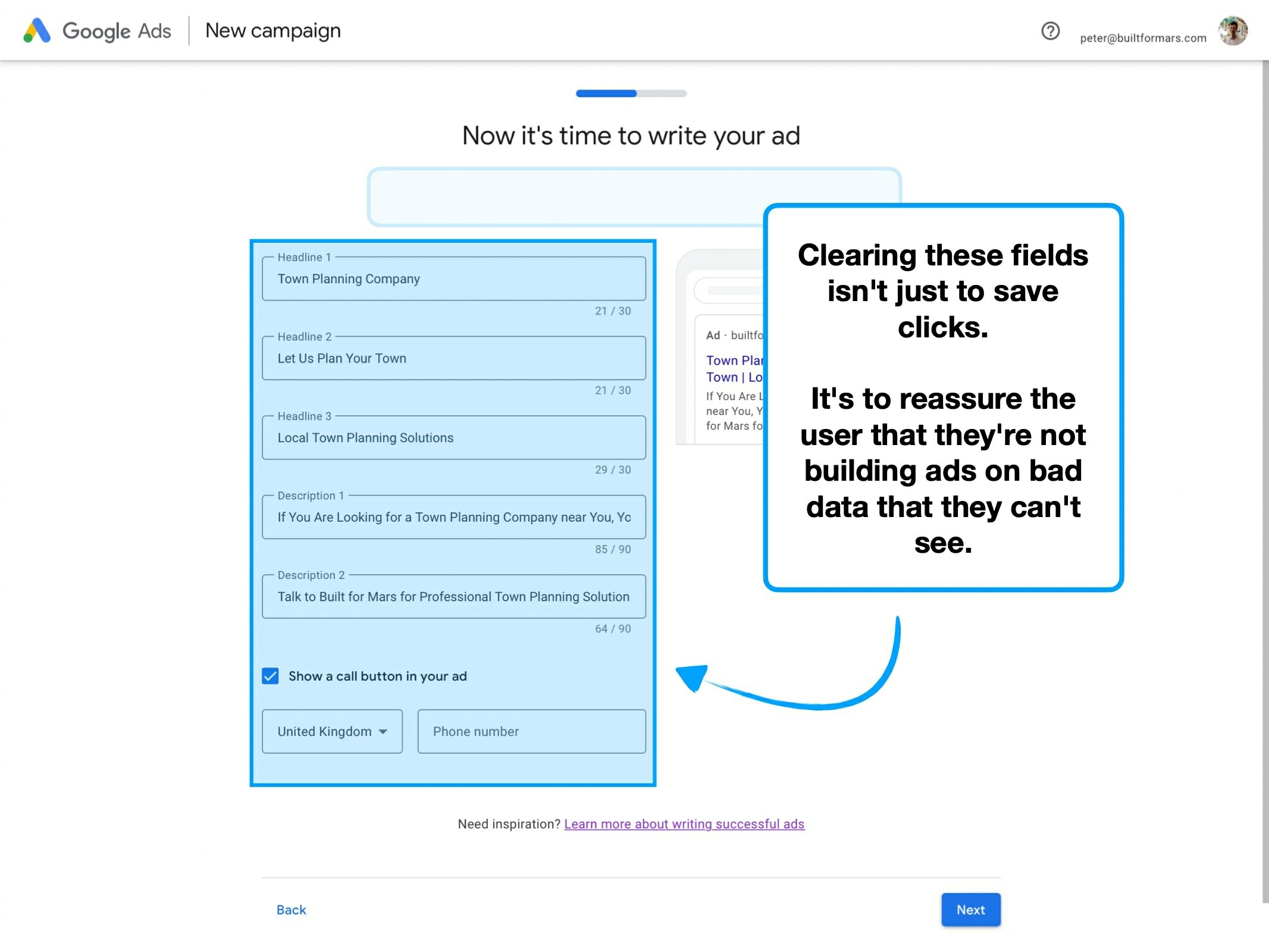
To mitigate this risk, I'd usually recommend a clear prompt to delete all of the data and let the user start fresh.
It both acts as a way for Google to learn when their data-population was incorrect (and useless), and allows the user to start again without penalty.
3. De-risk the click
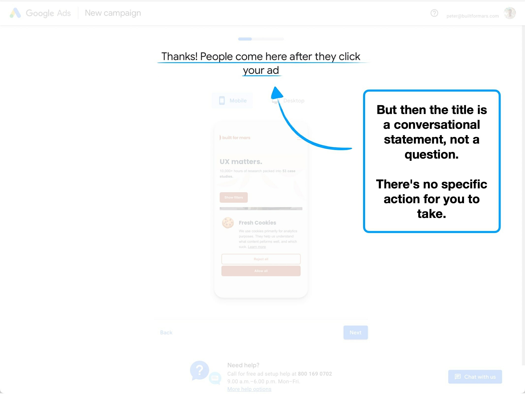
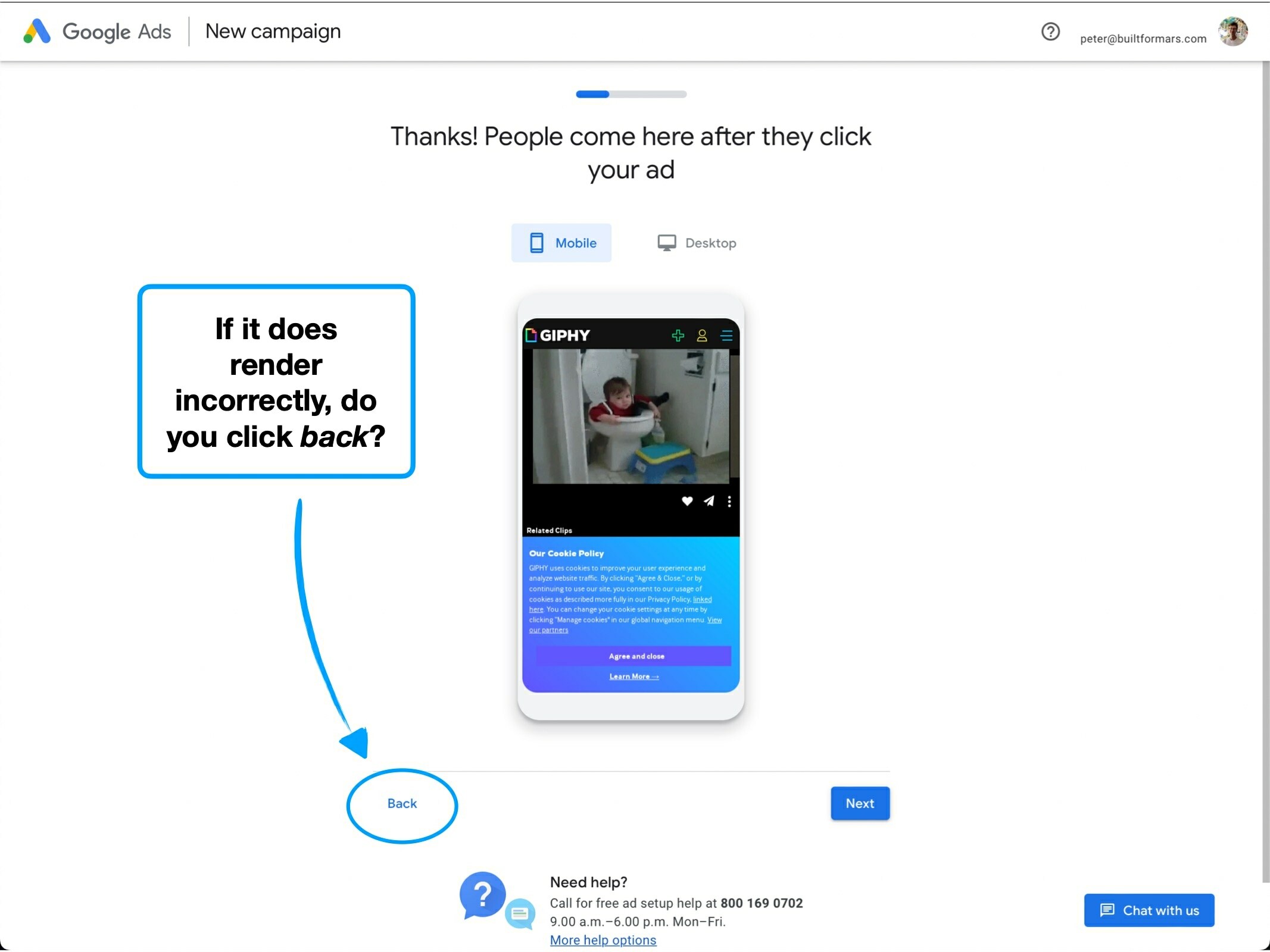
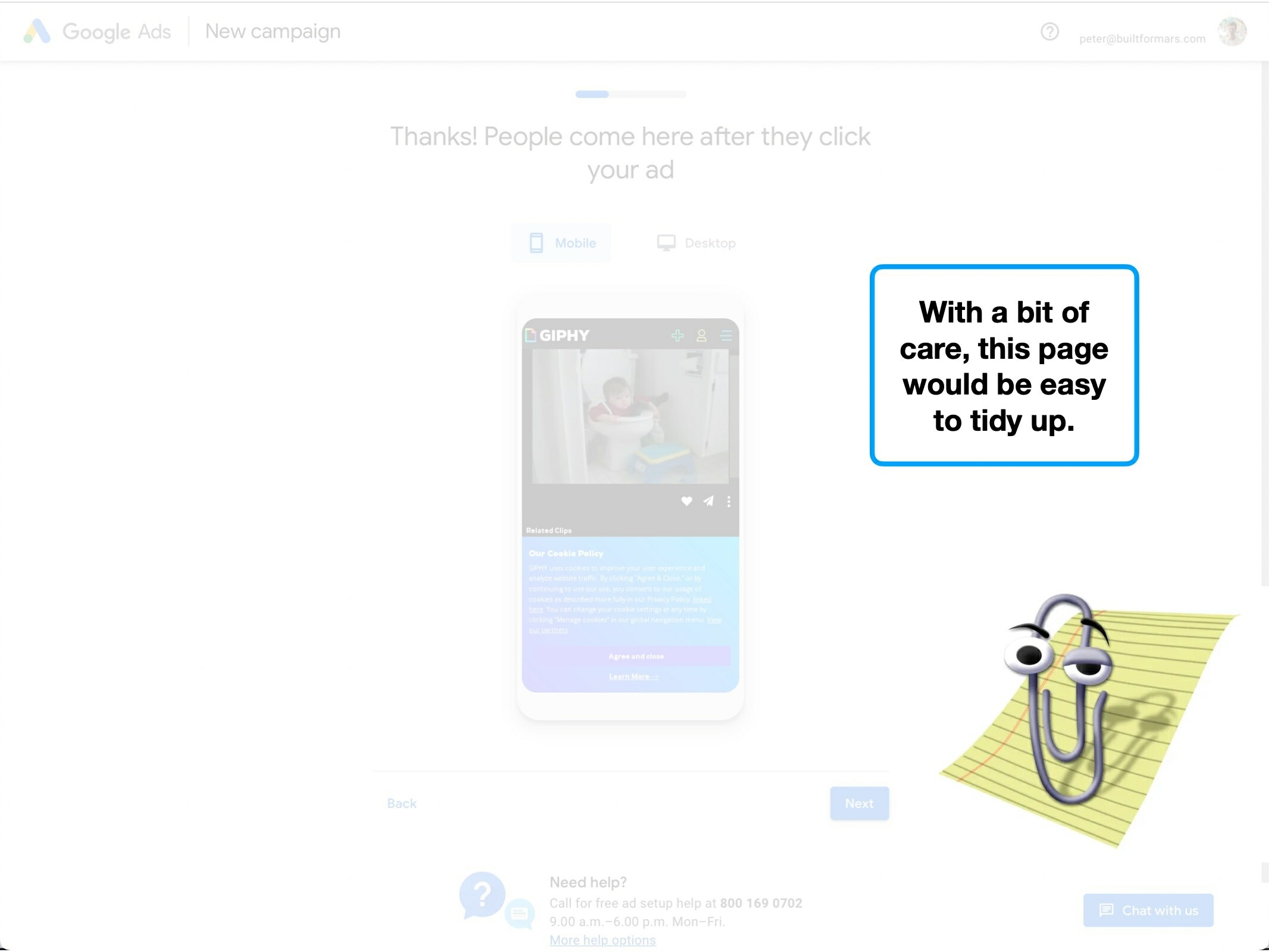
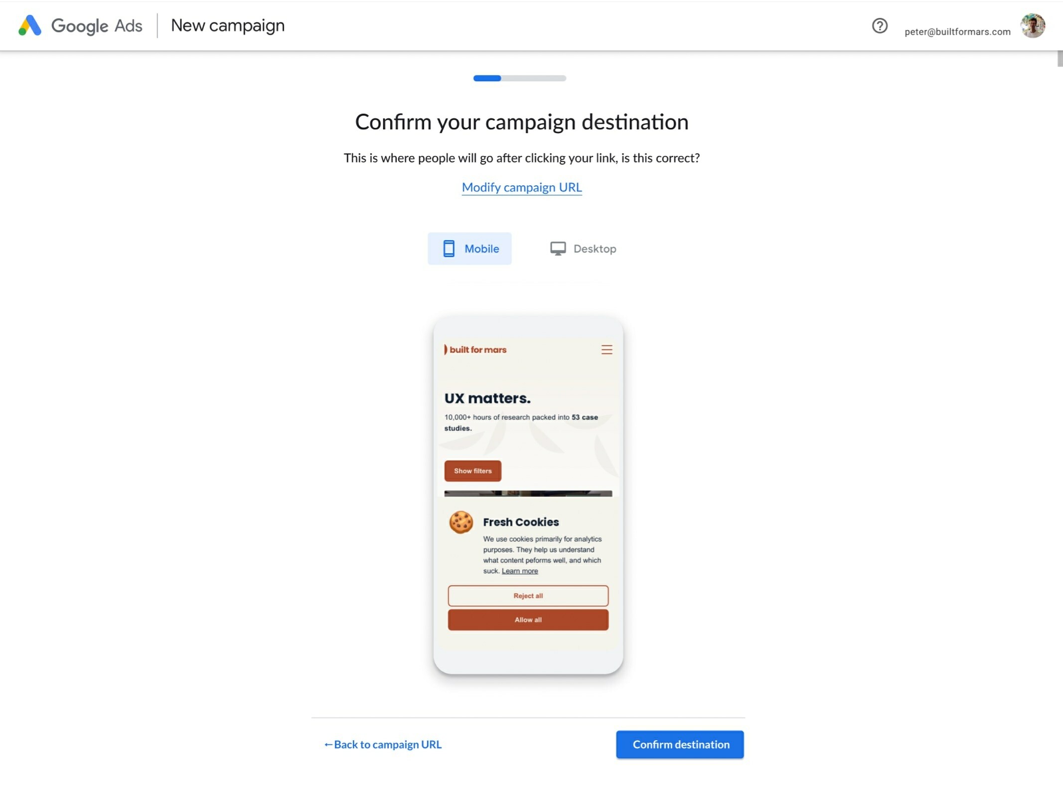
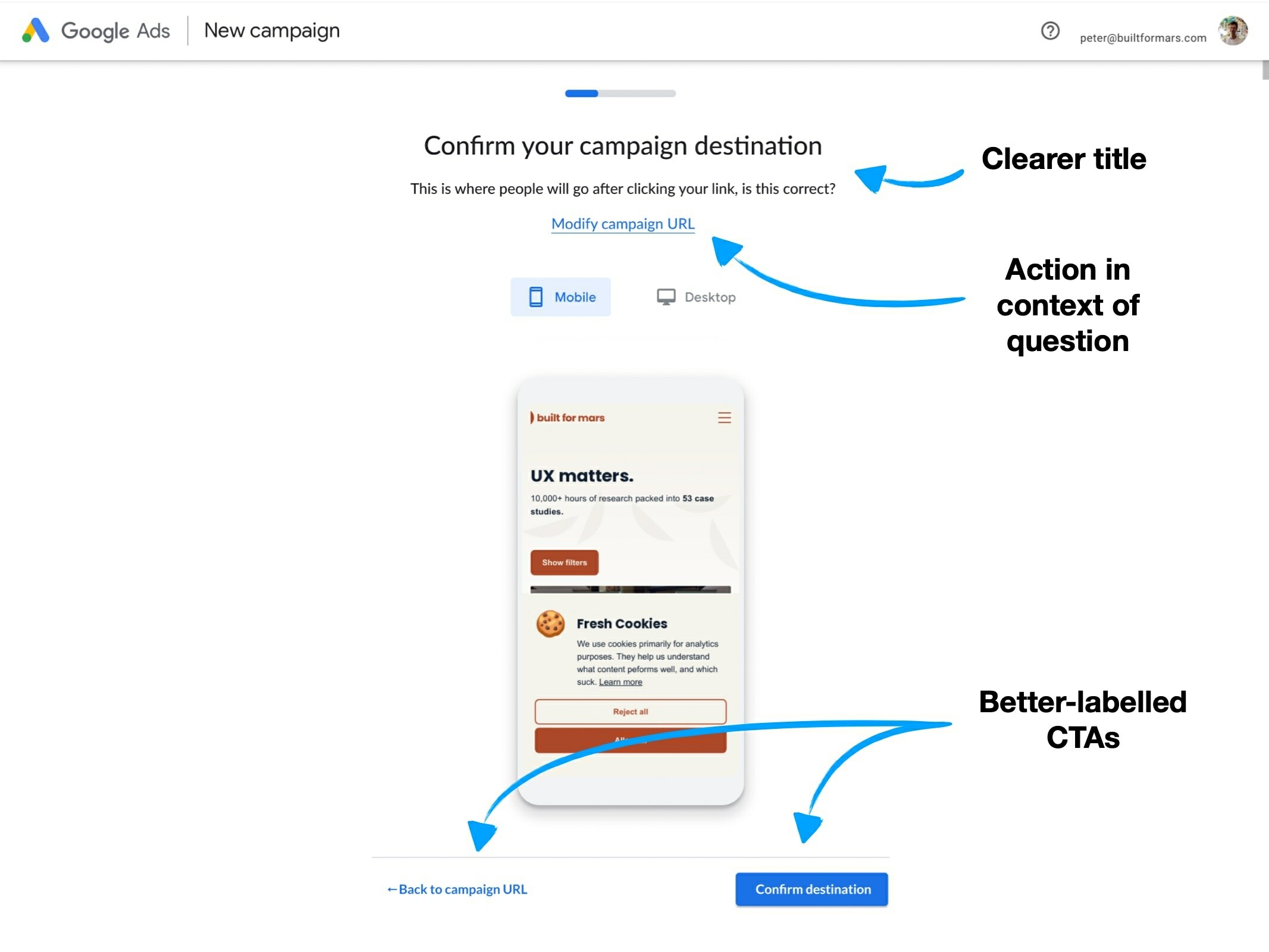
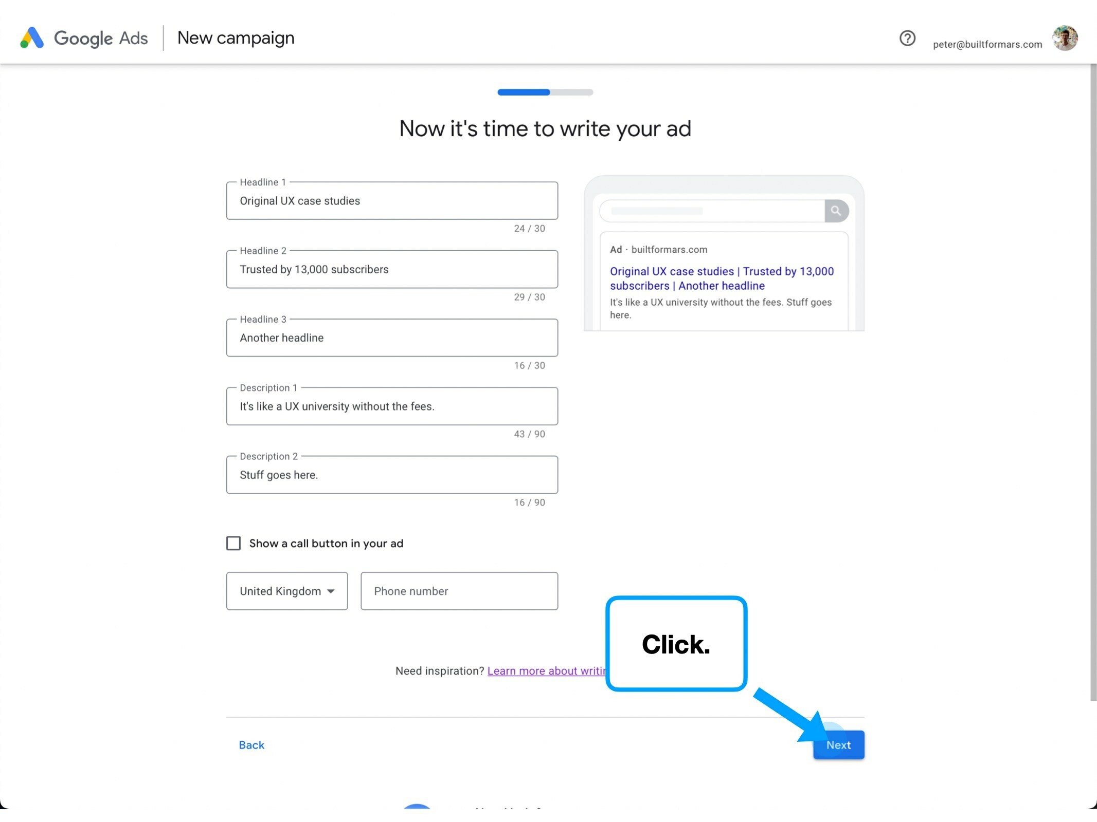
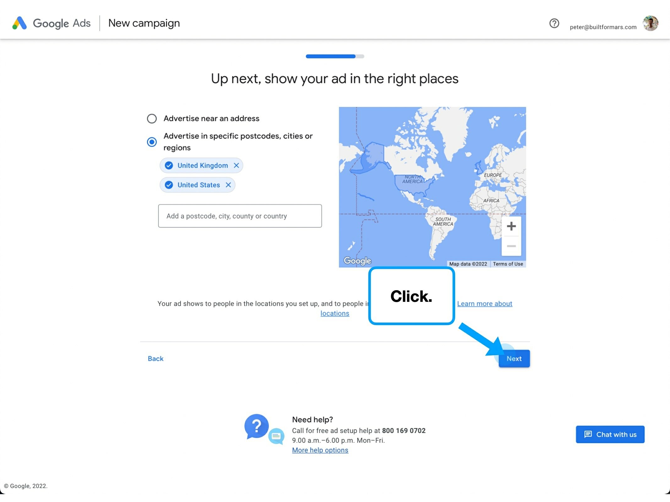
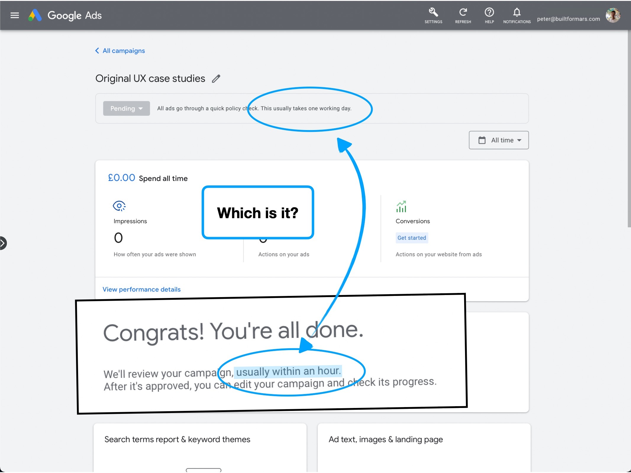
When confirming that your campaign destination URL is correct, you essentially have two choices: back or next.
The problem with a CTA labelled 'back' is that it has different meanings, depending on the implementation—which the user has no implicit understanding of until they try.
Back to your account home? Back one step? Back to the start of a section? Back in black?
Will Back save your progress? Is it intended to be used as a way to navigate mid-process, or simply a way of returning to where you started?
This is why clear actions, and action-specific CTAs are effective at reducing anxiety.
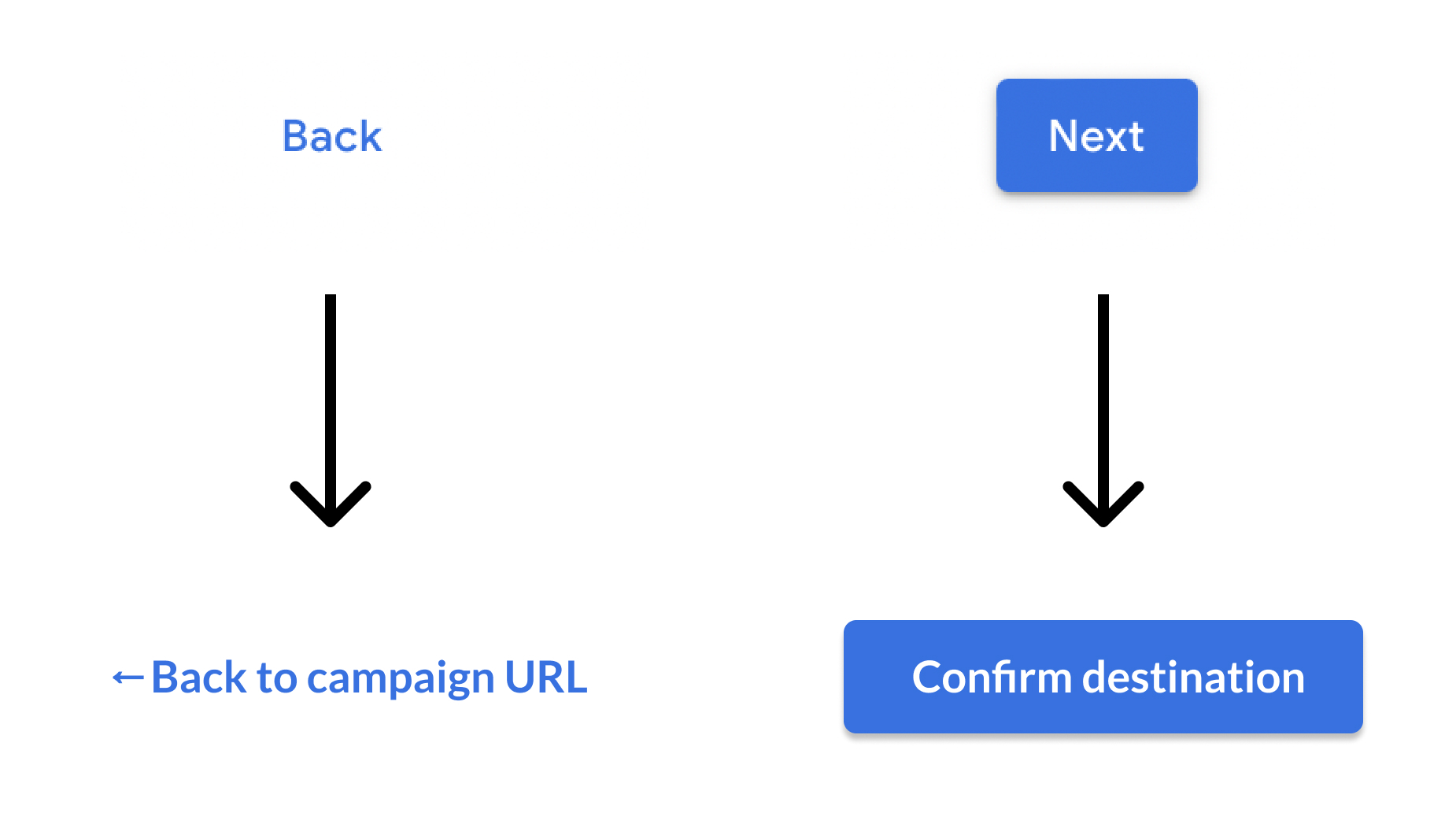
This helps to de-risk the click, which also plays into a user's desire for 🚦 Loss Aversion.
It's also something that you can implement broadly, across many products and services, with very little effort.
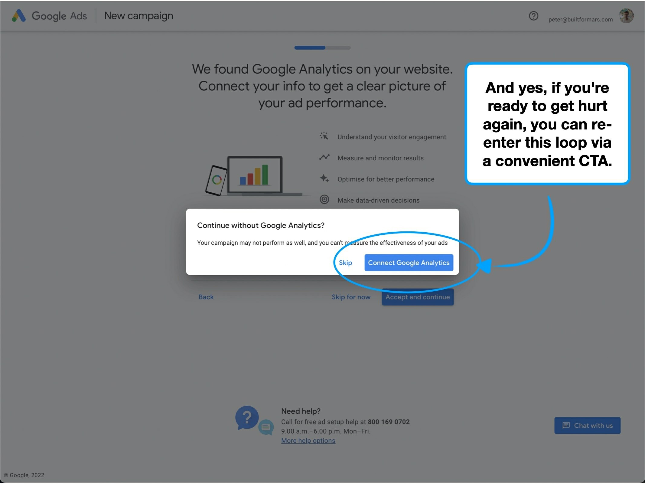
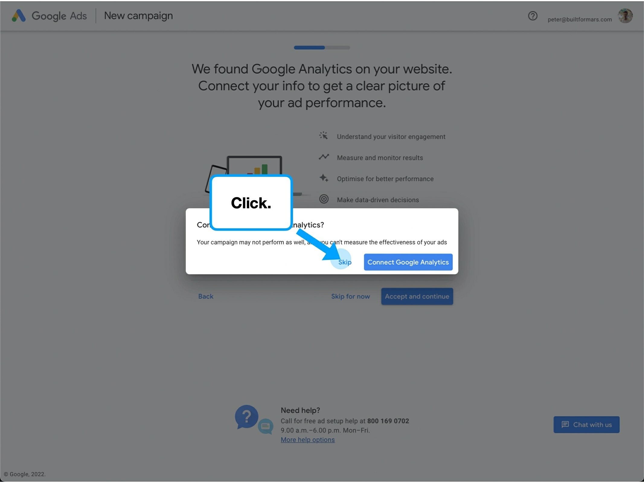
4. An escape route
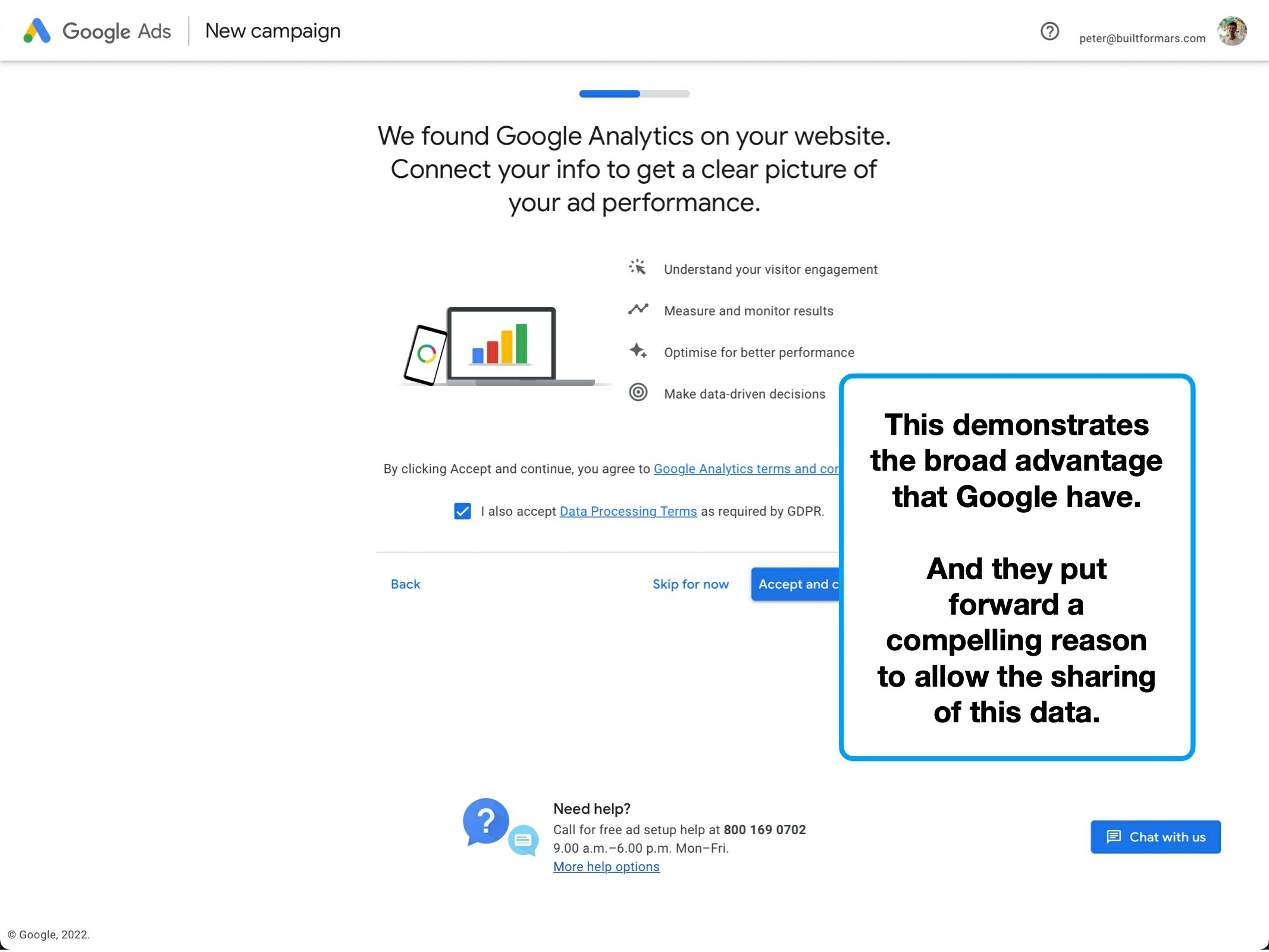
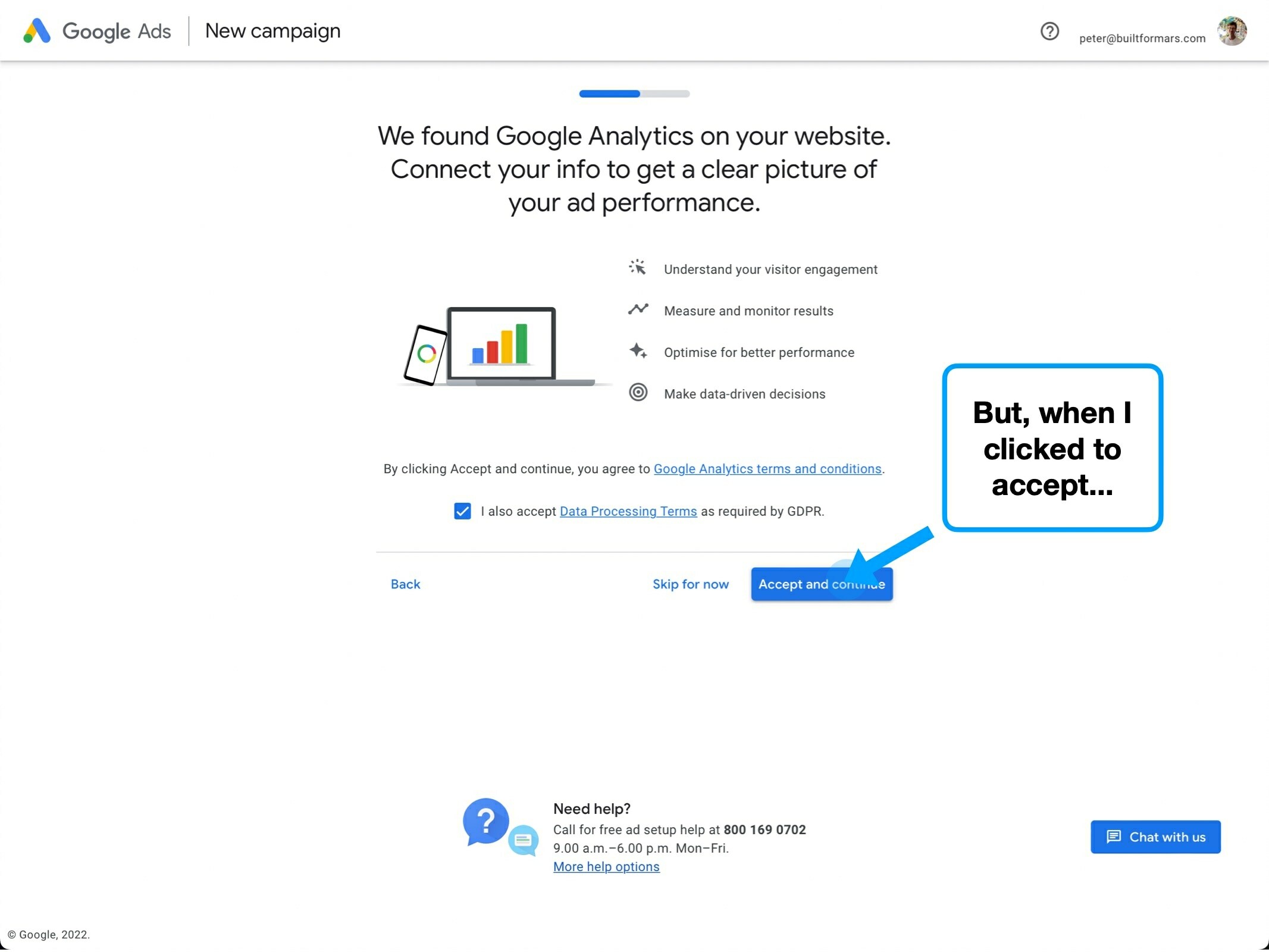
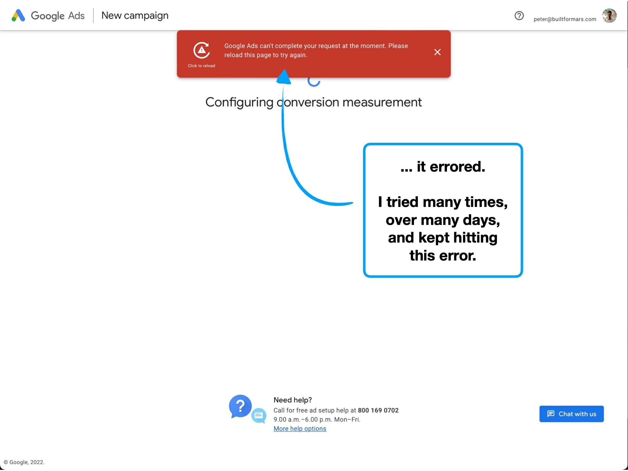
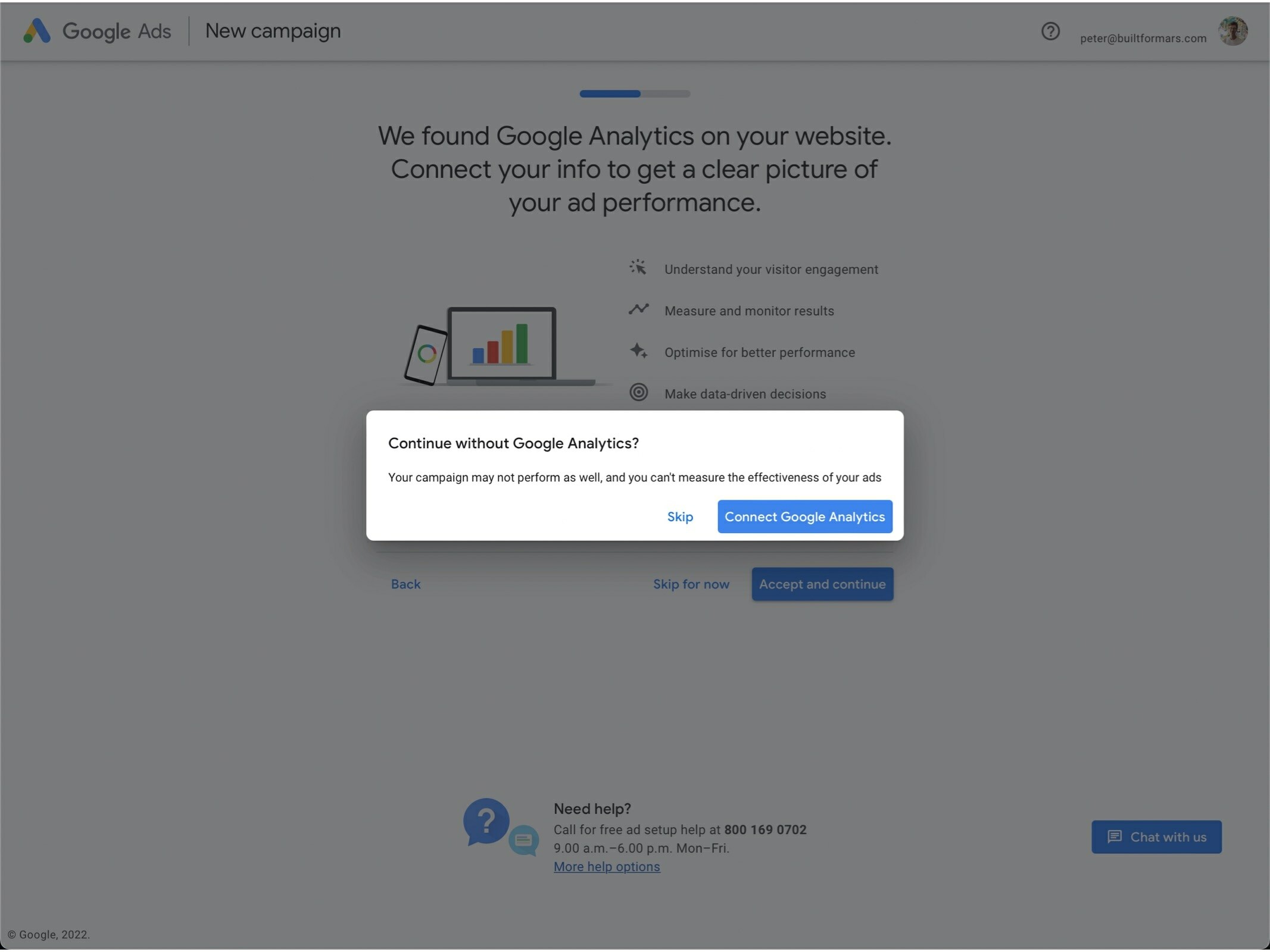
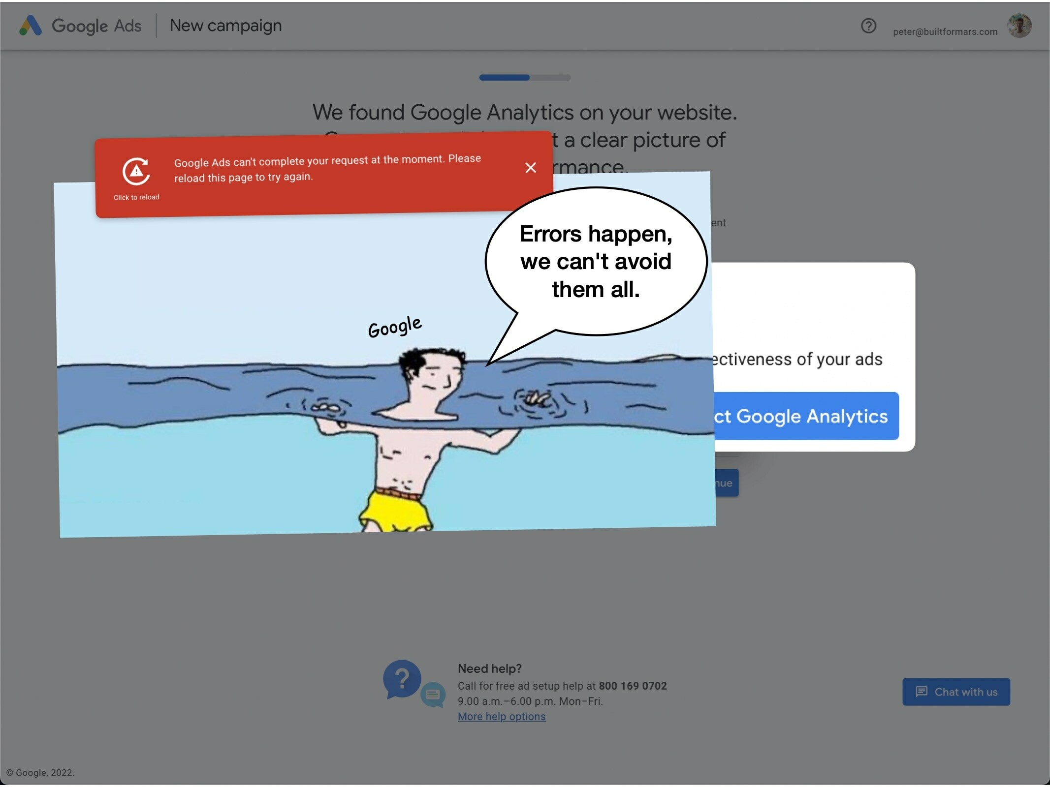
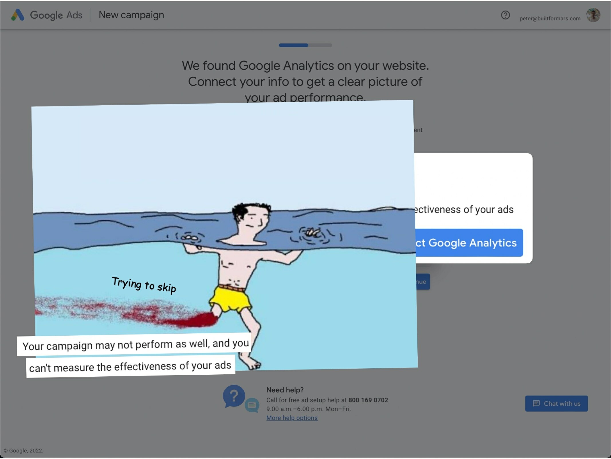
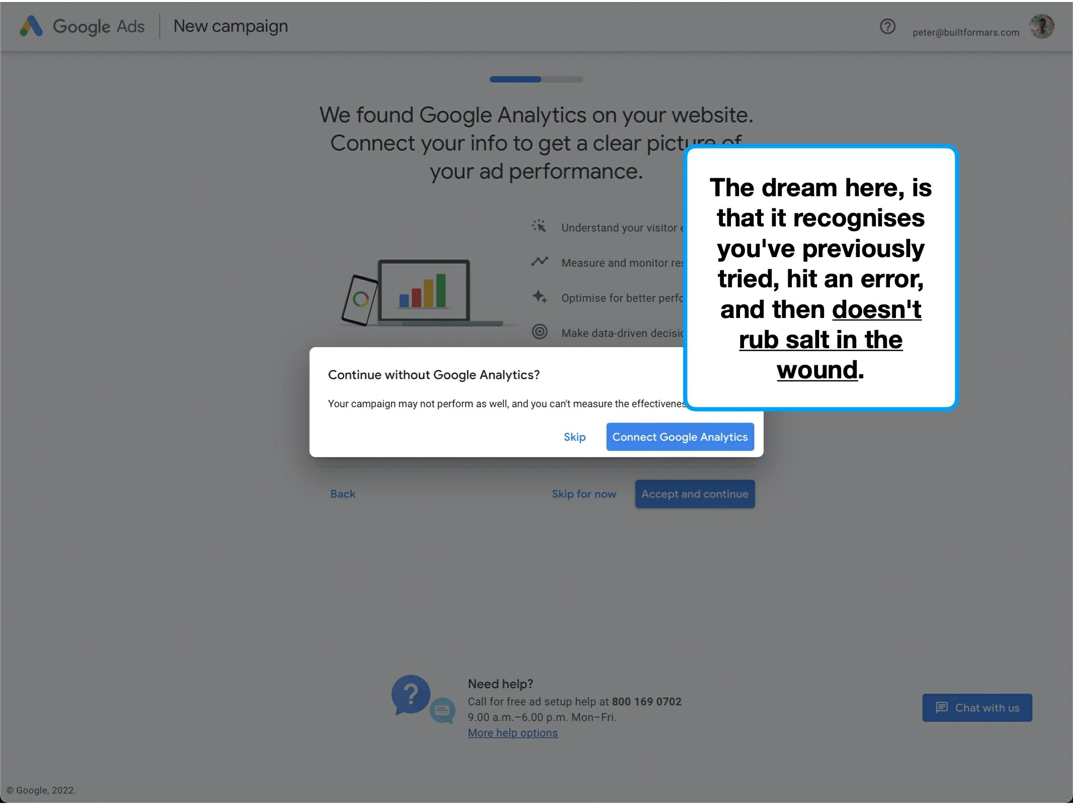
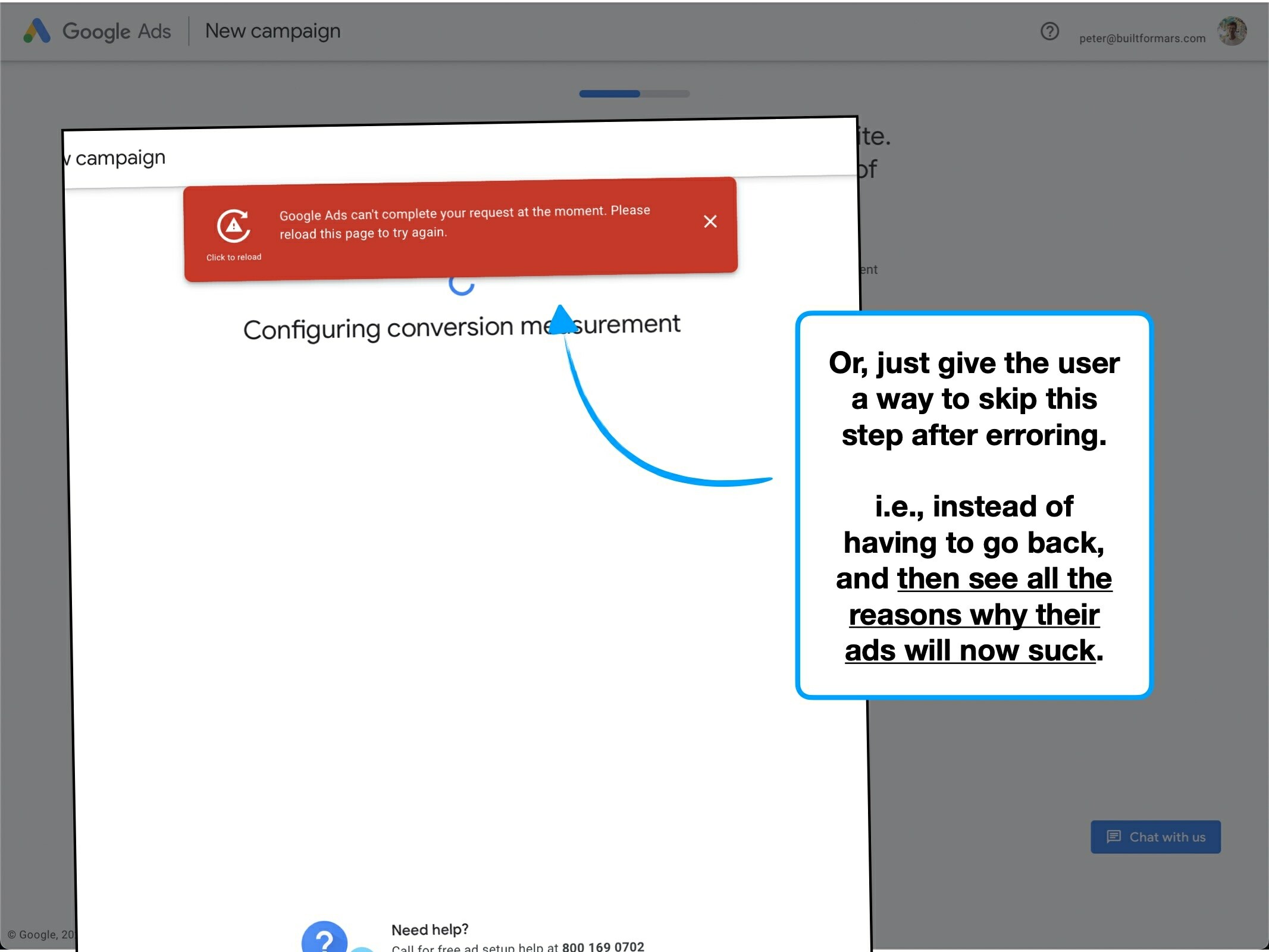
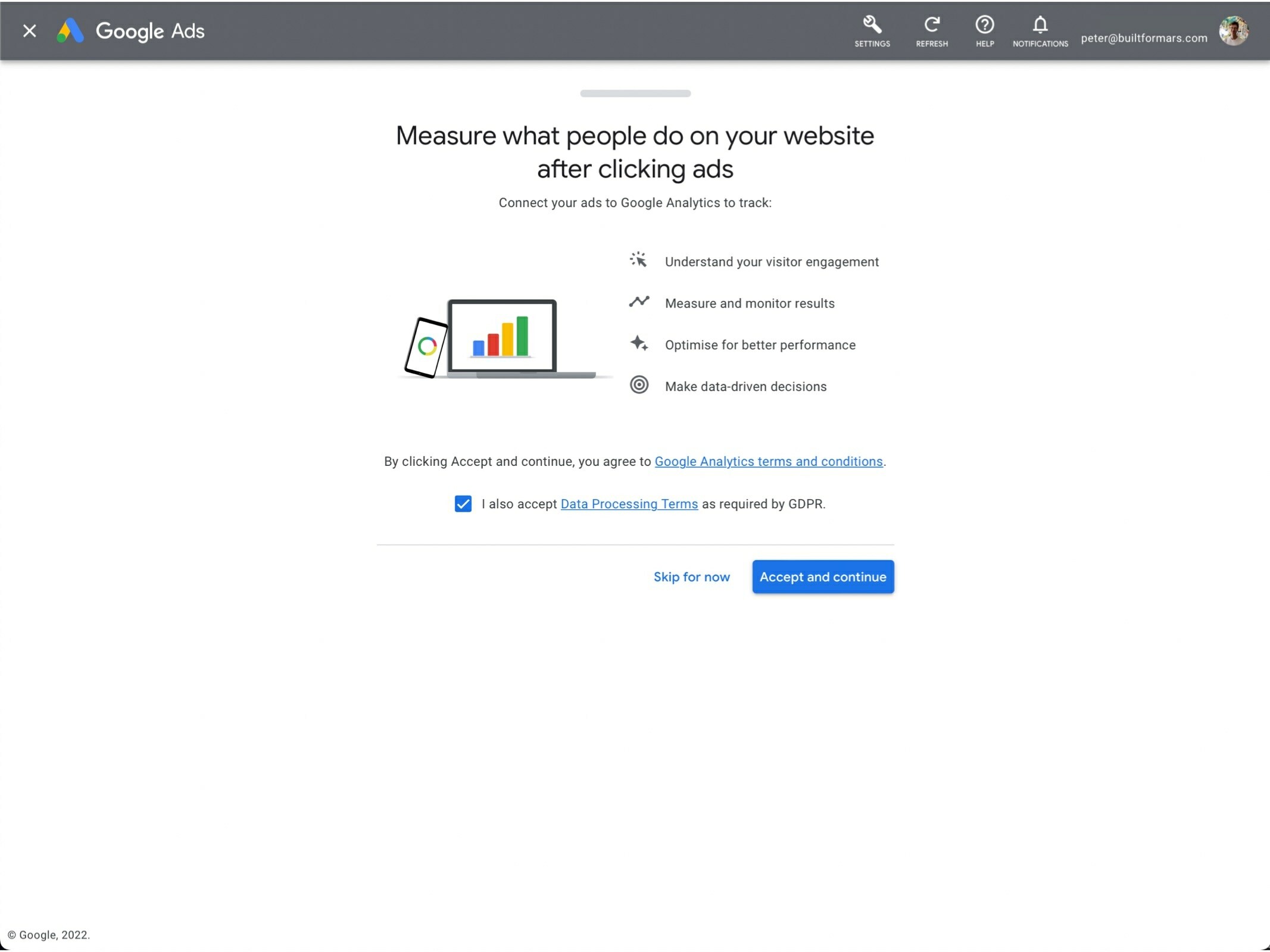
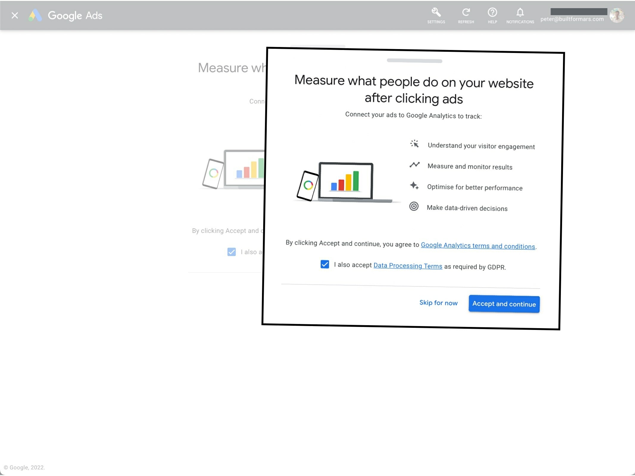
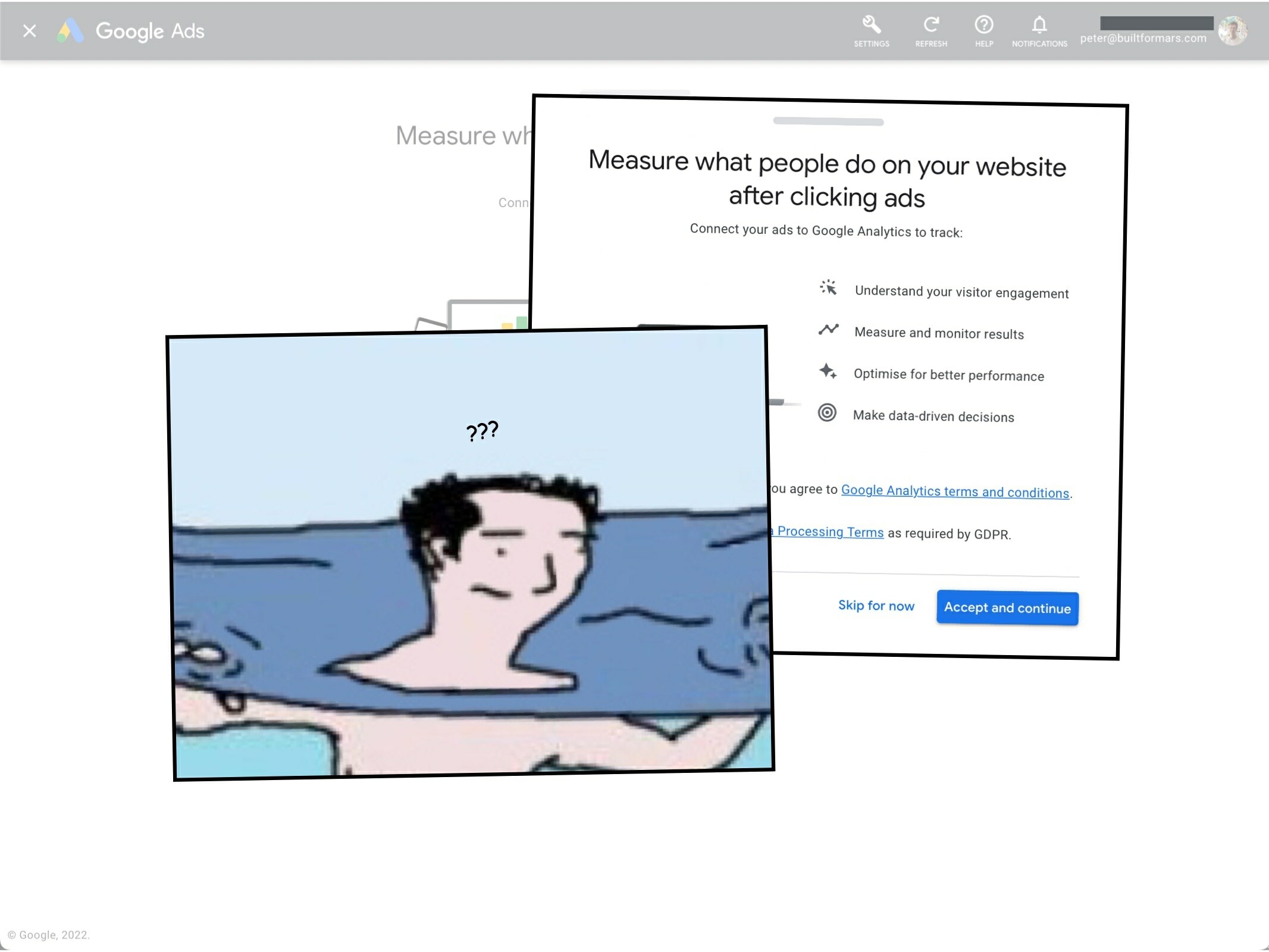
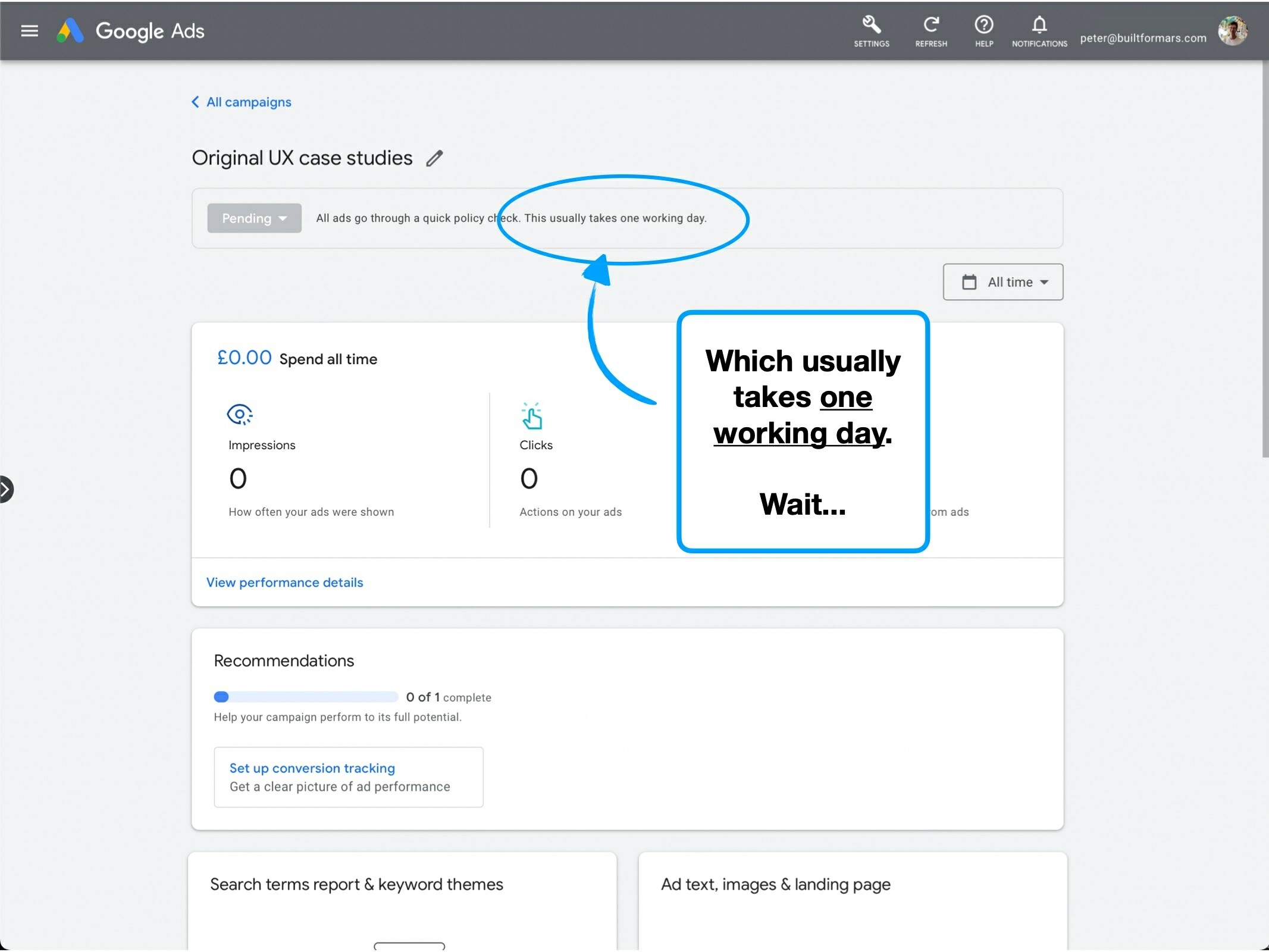
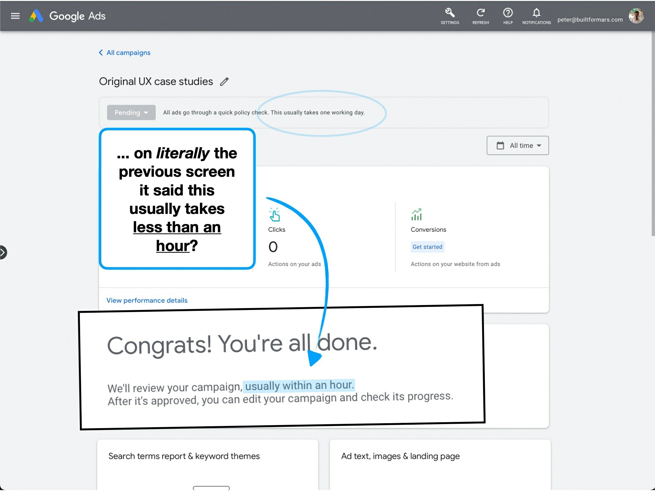
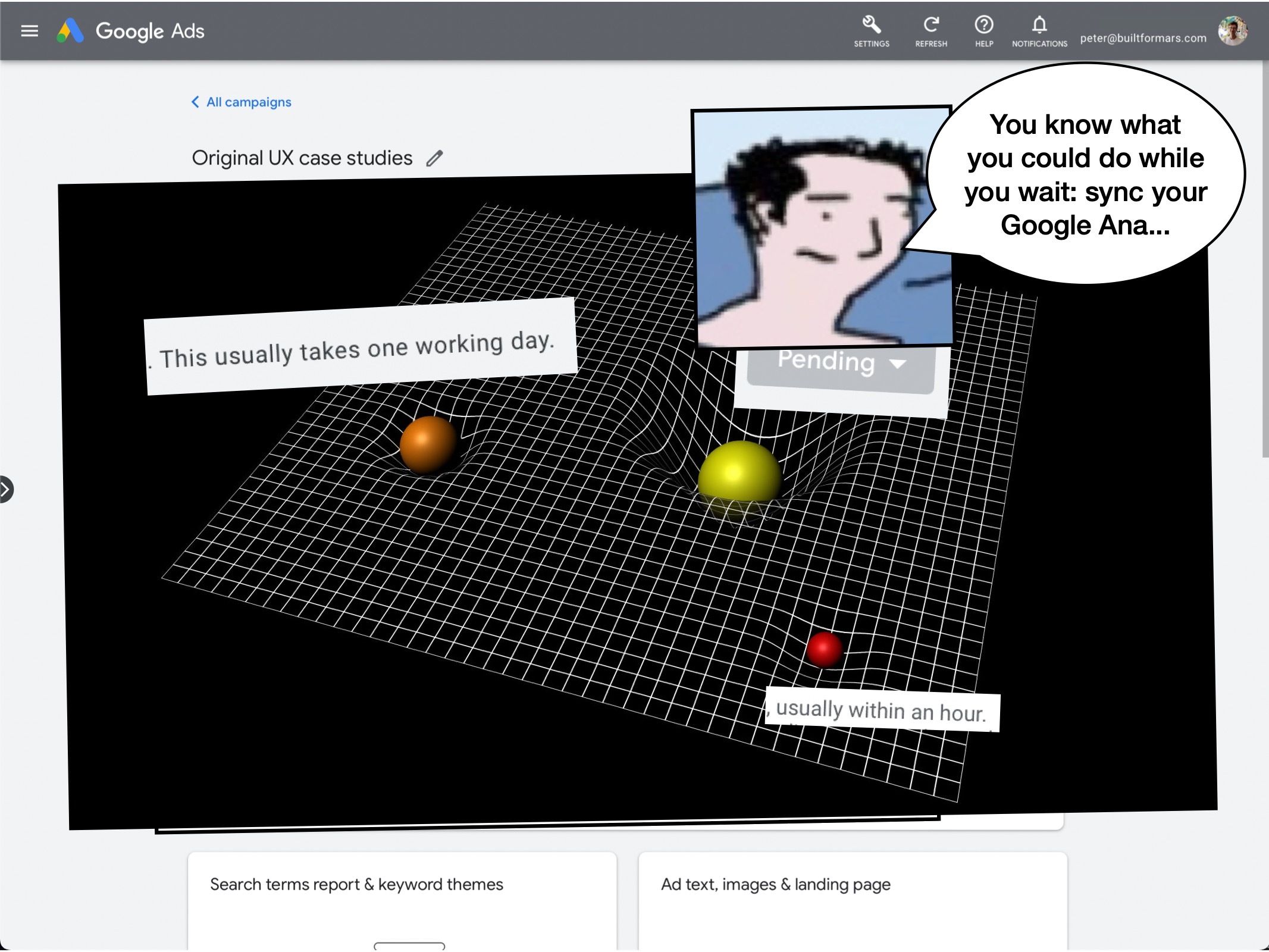
When attempting to connect my Google Ad and Google Analytics accounts—i.e., to track the success of my campaign—I repeatedly hit an error.
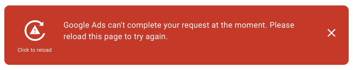
Errors happen and I understand the inevitability.
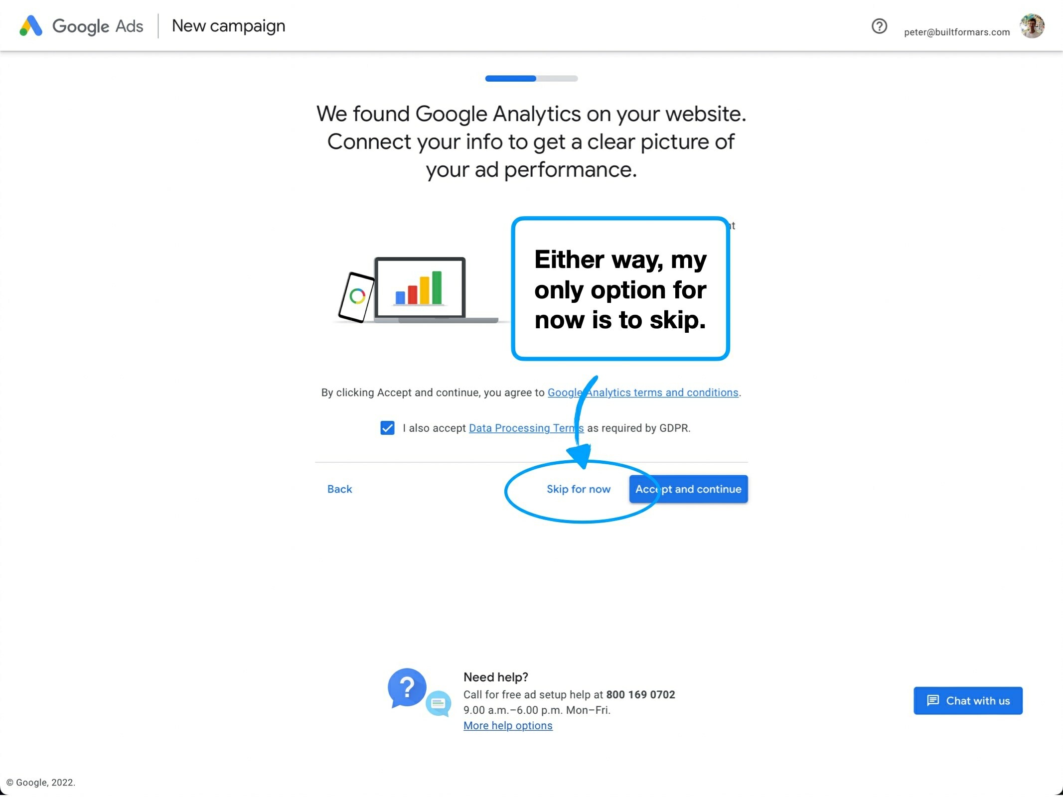
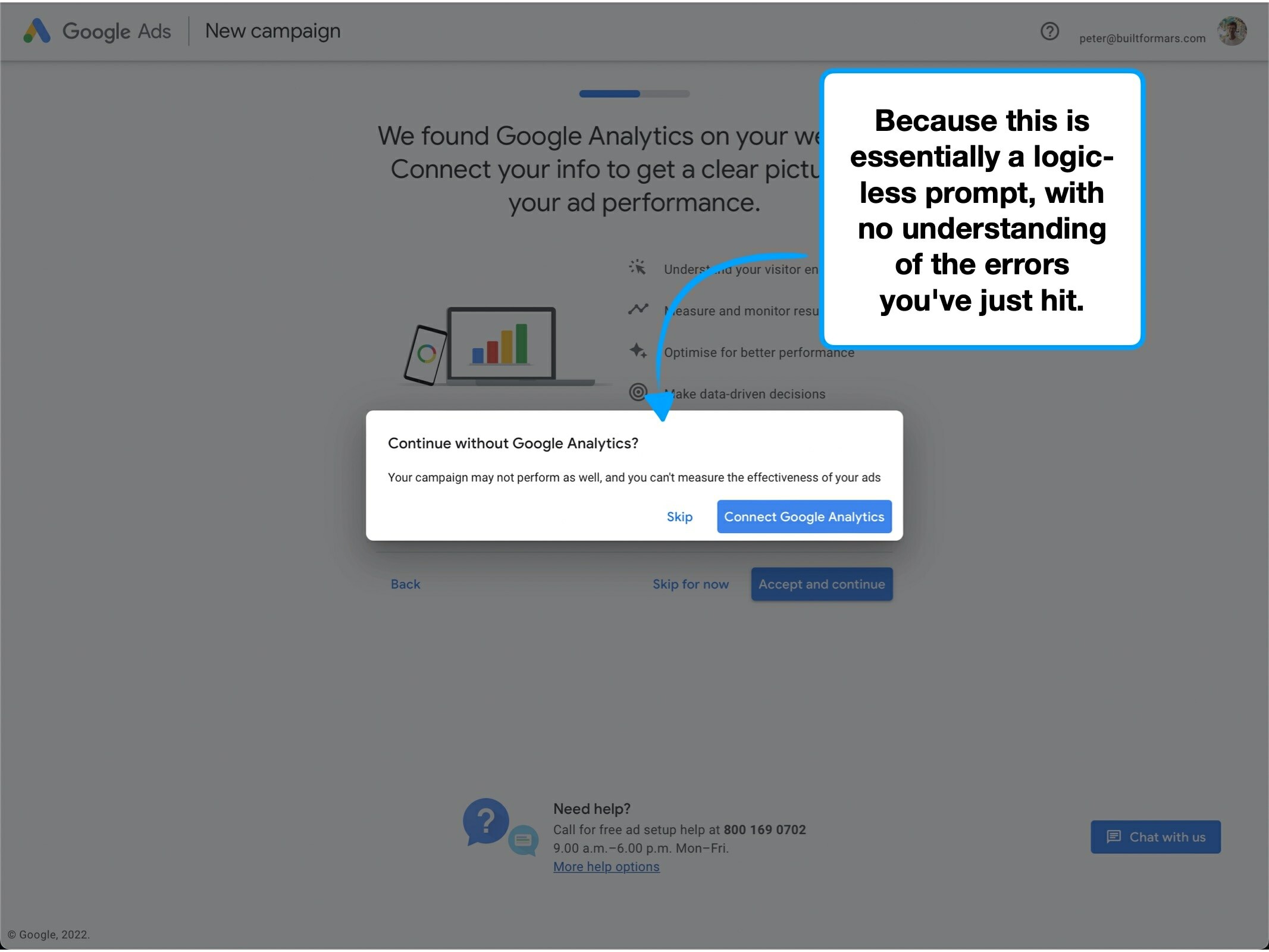
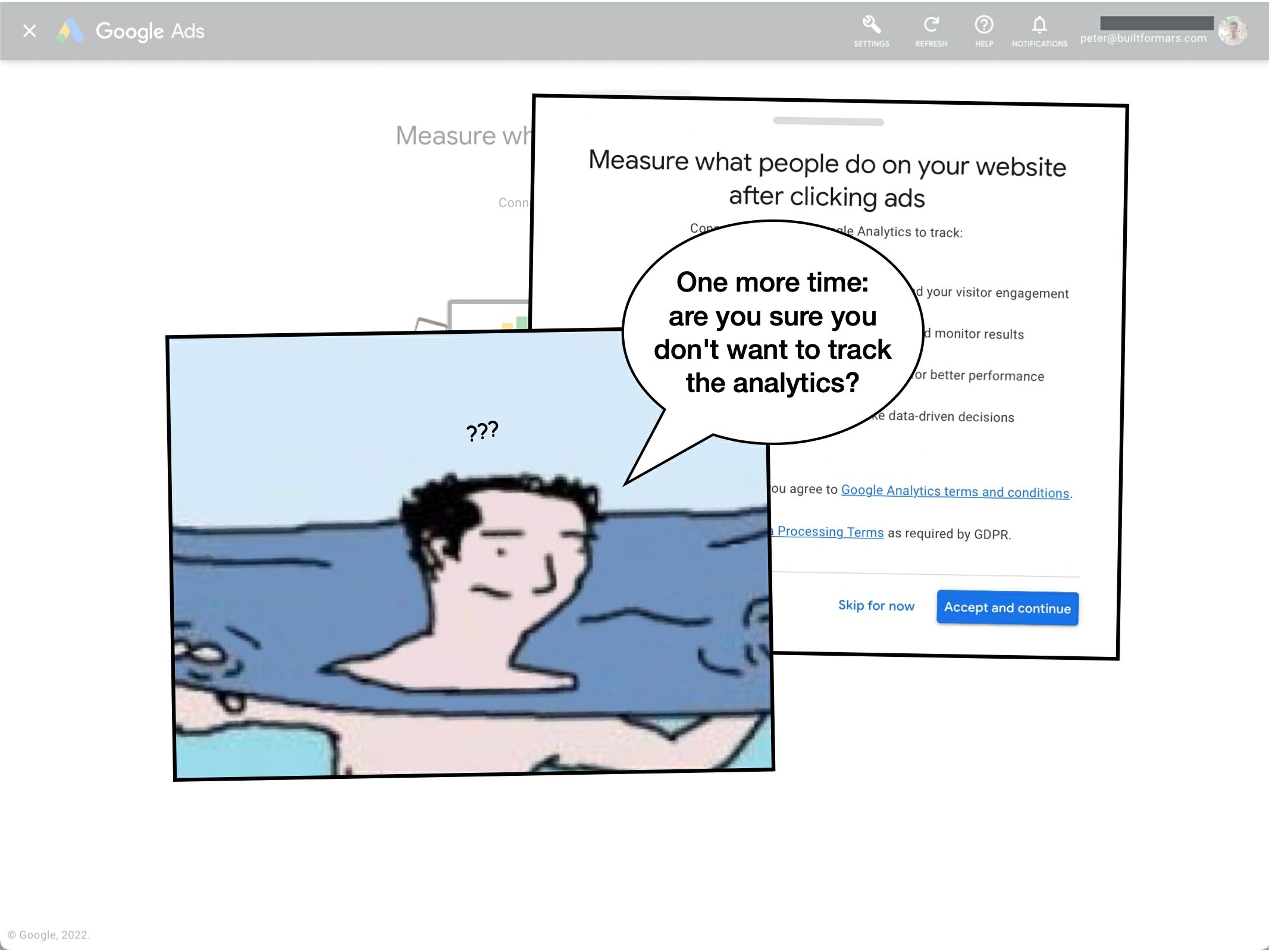
But if you try and skip the integration, you're shown the default 'are you sure?' pop-up.
i.e., despite being unable to continue, you're warned about the risks of skipping—which include underperforming ads.
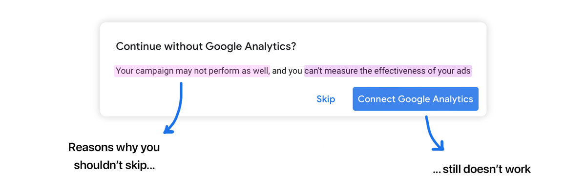
The user is forced to face their new reality: do they still want to invest in a marketing campaign, knowing that the performance will be worse?
It doesn't even matter what the comparative significance of the new reality is—the anchoring bias will make it feel disproportionately worse.
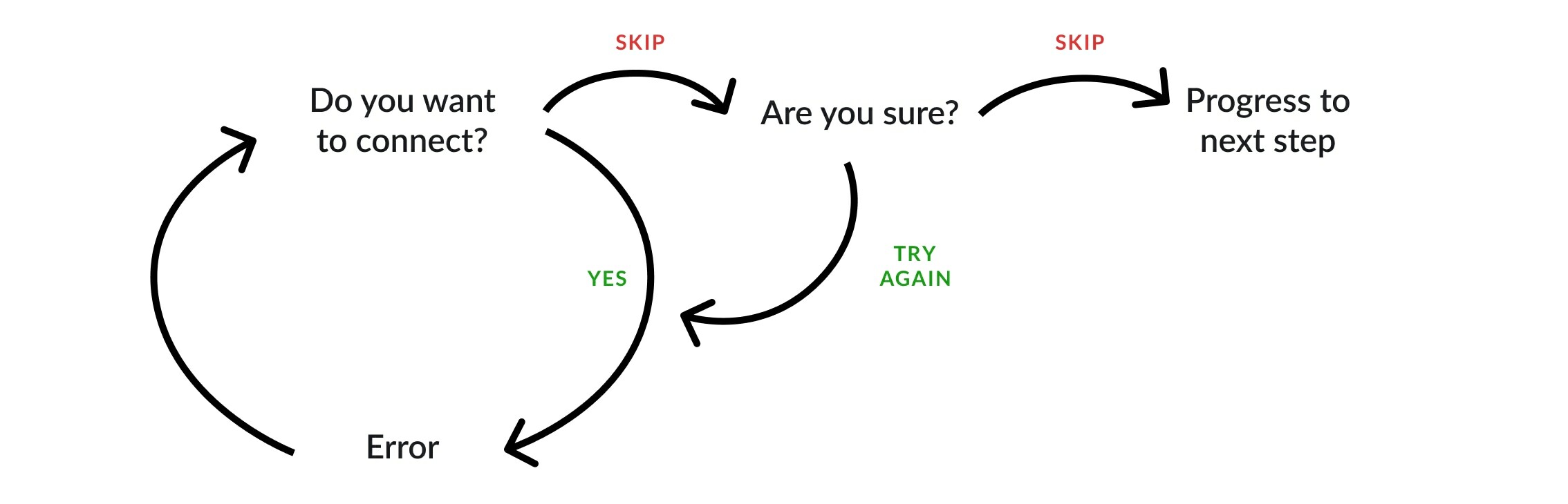
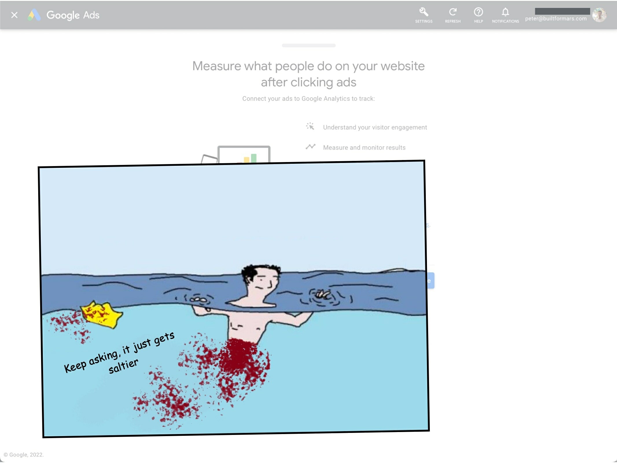
I'm confident that in this scenario, Google could utilise an 'escape route' to decrease churn.
In other words, if the user has just hit an error, provide a means of skipping that step without the warning.
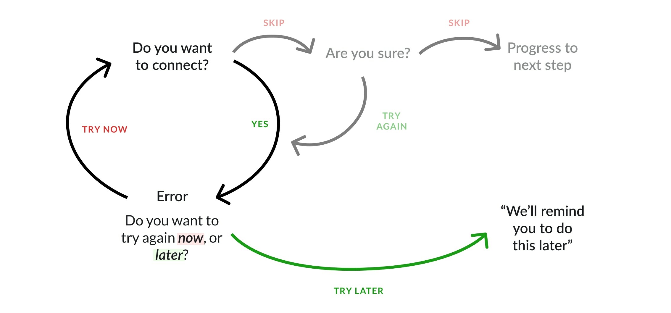
I wouldn't recommend an escape route to every company, for every decision, because they require resources to do well.
But for an ad platform that transacts $200 billion every year, even decreasing the churn on the edge case scenarios becomes meaningful.

Why users are ignoring your features
Simple techniques to increase feature usage, retention and ultimately alter how users perceive the value of your product.
Hiding complexity to create effortless onboarding
The techniques that Slack have used to create an effortless onboarding flow, and why you might not want to copy them.
The secrets of a $7.08 welcome bonus
The product psychology behind why Robinhood offer new users $7.08 of free stock, and not $10.