Search
Popular Filters
Popular Filters

Popular Filters
Popular Filters
By Peter Ramsey
5 Sep 22
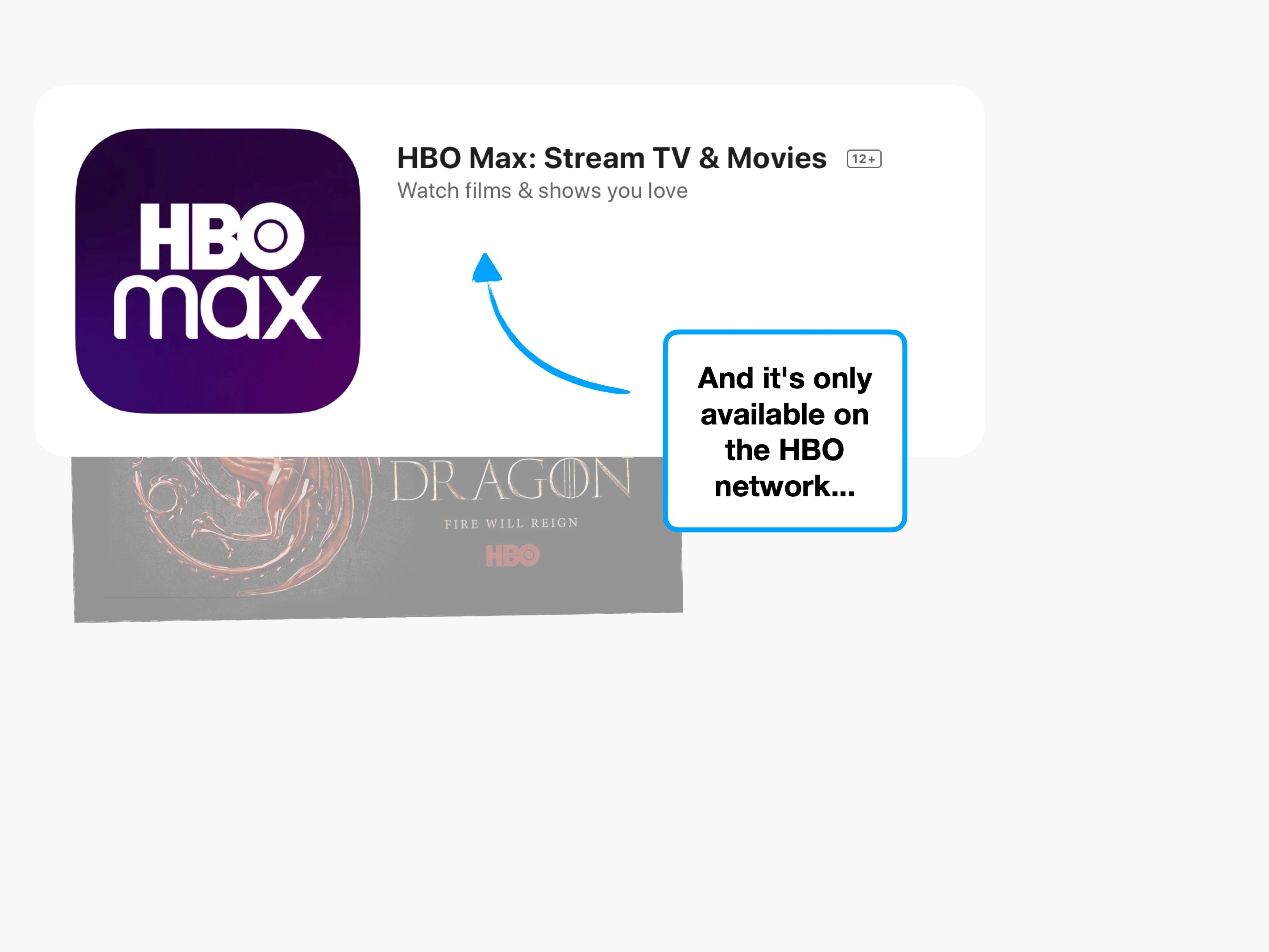
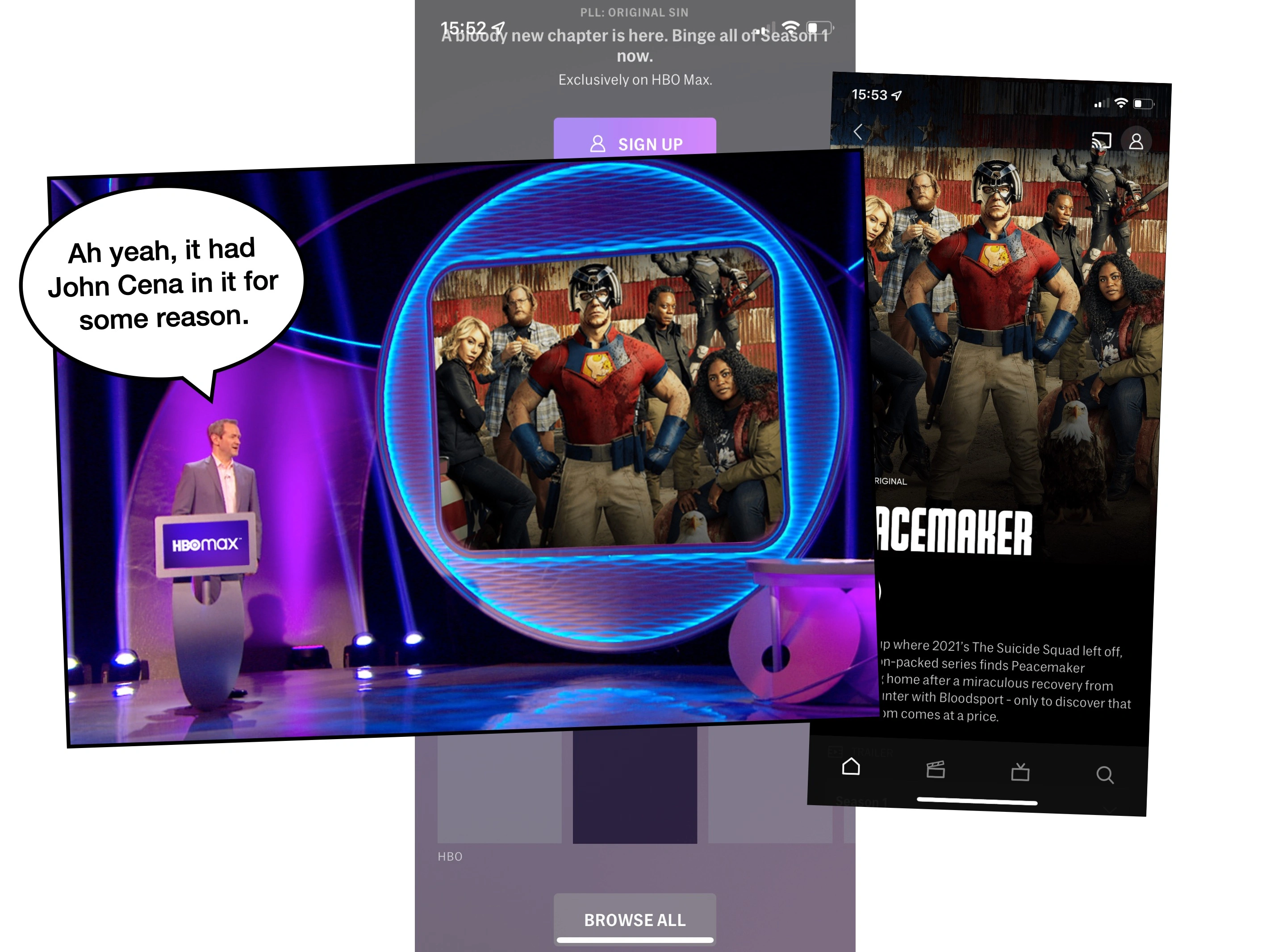
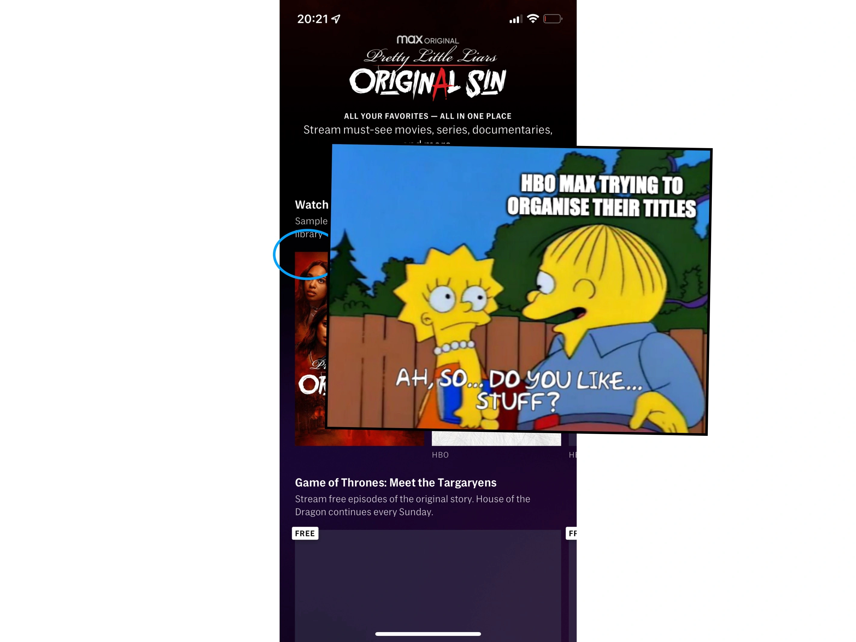
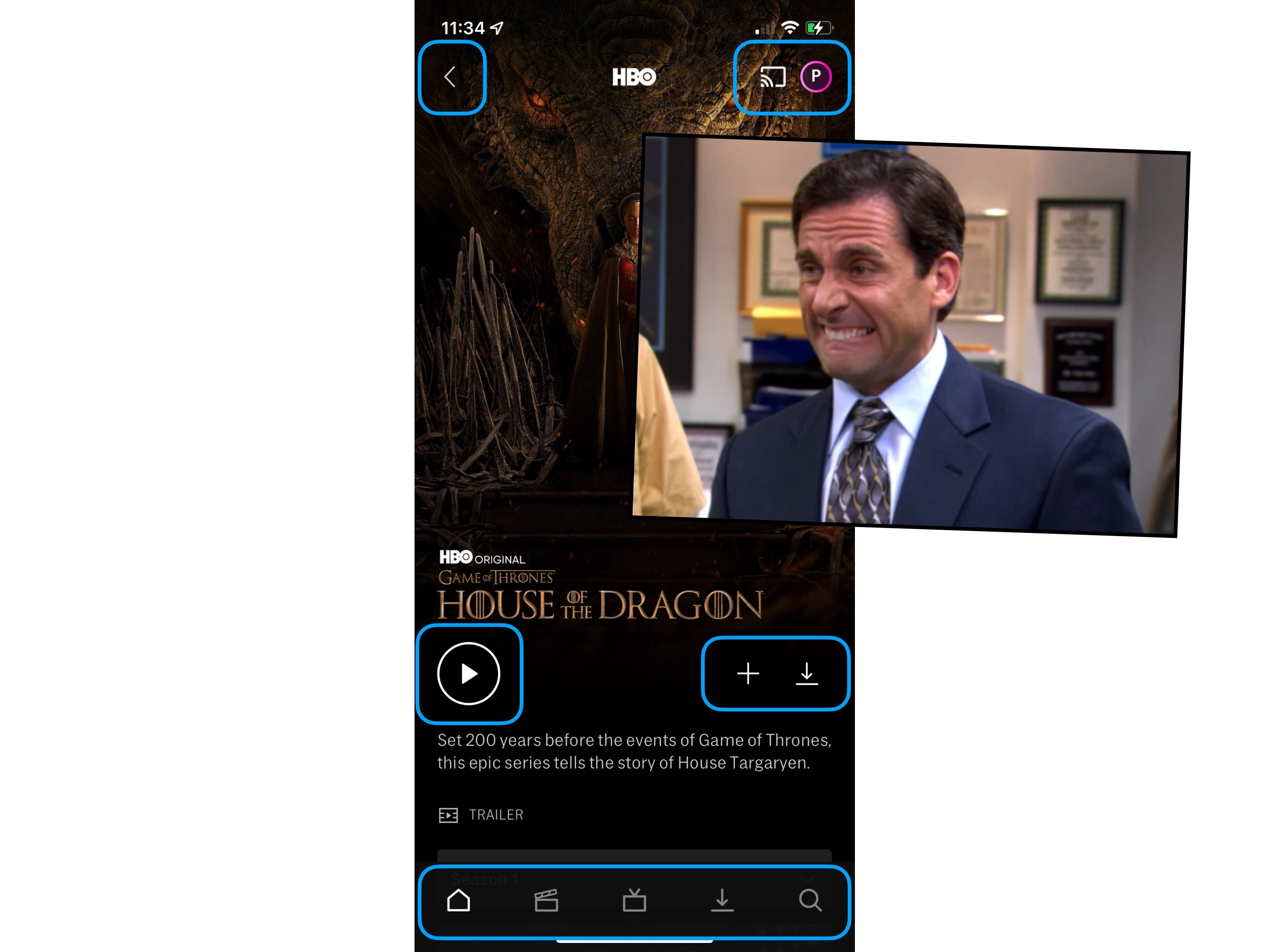
HBO Max; another streaming service battling Netflix, Amazon, Disney and Hulu for your attention.
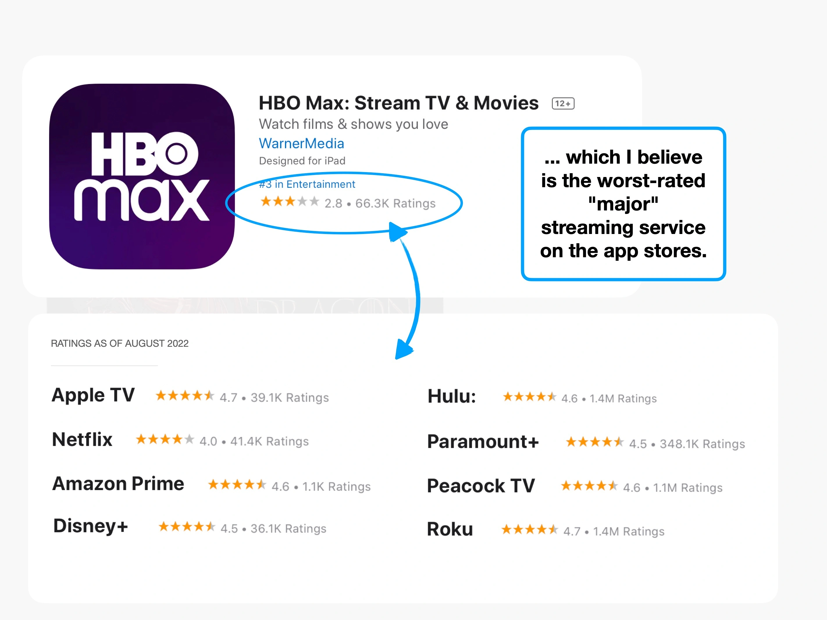
And although they have a catalogue of content that people love—like Game of Thrones—their app is the worst-rated across both the Apple and Google app stores.
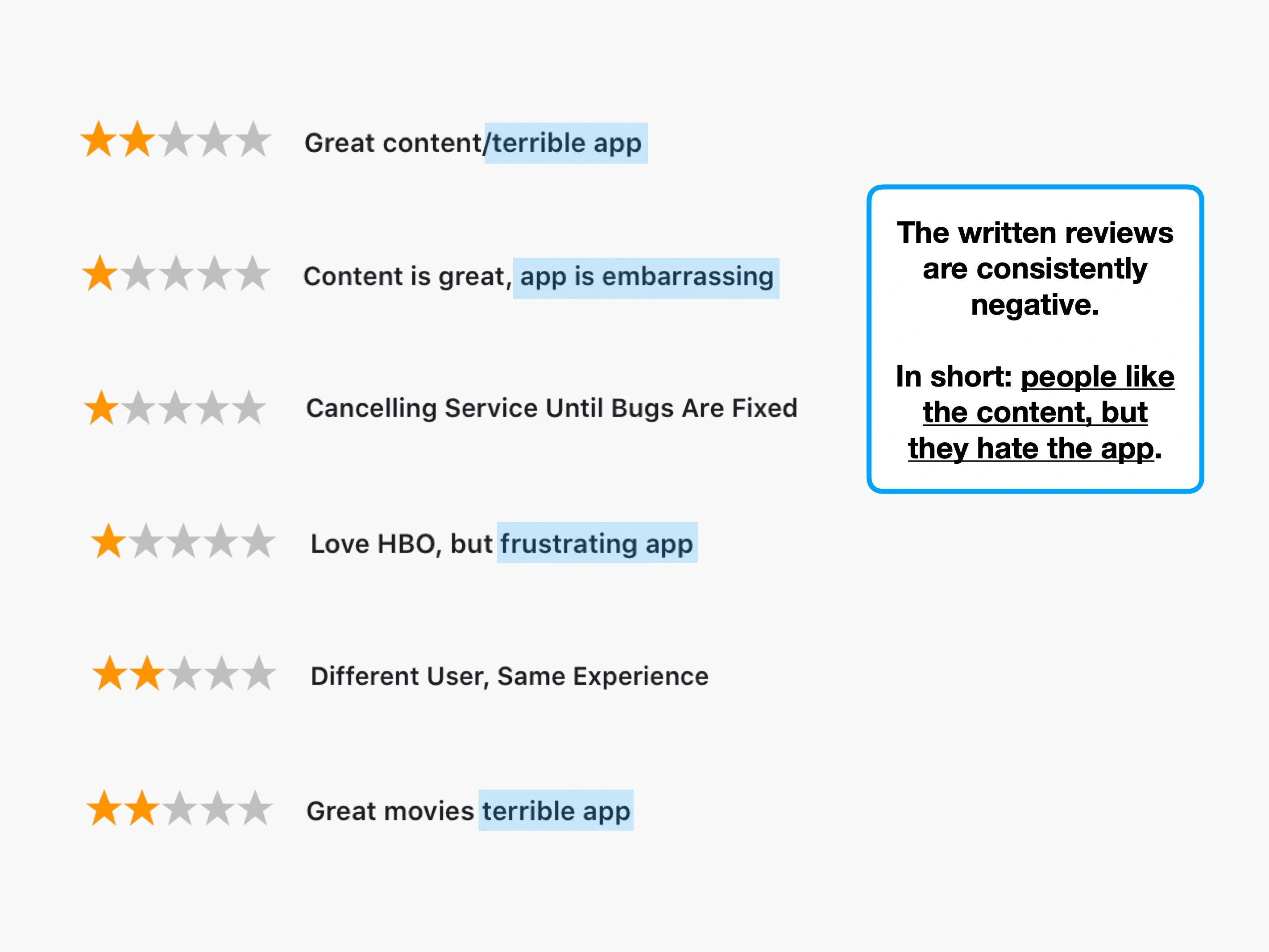
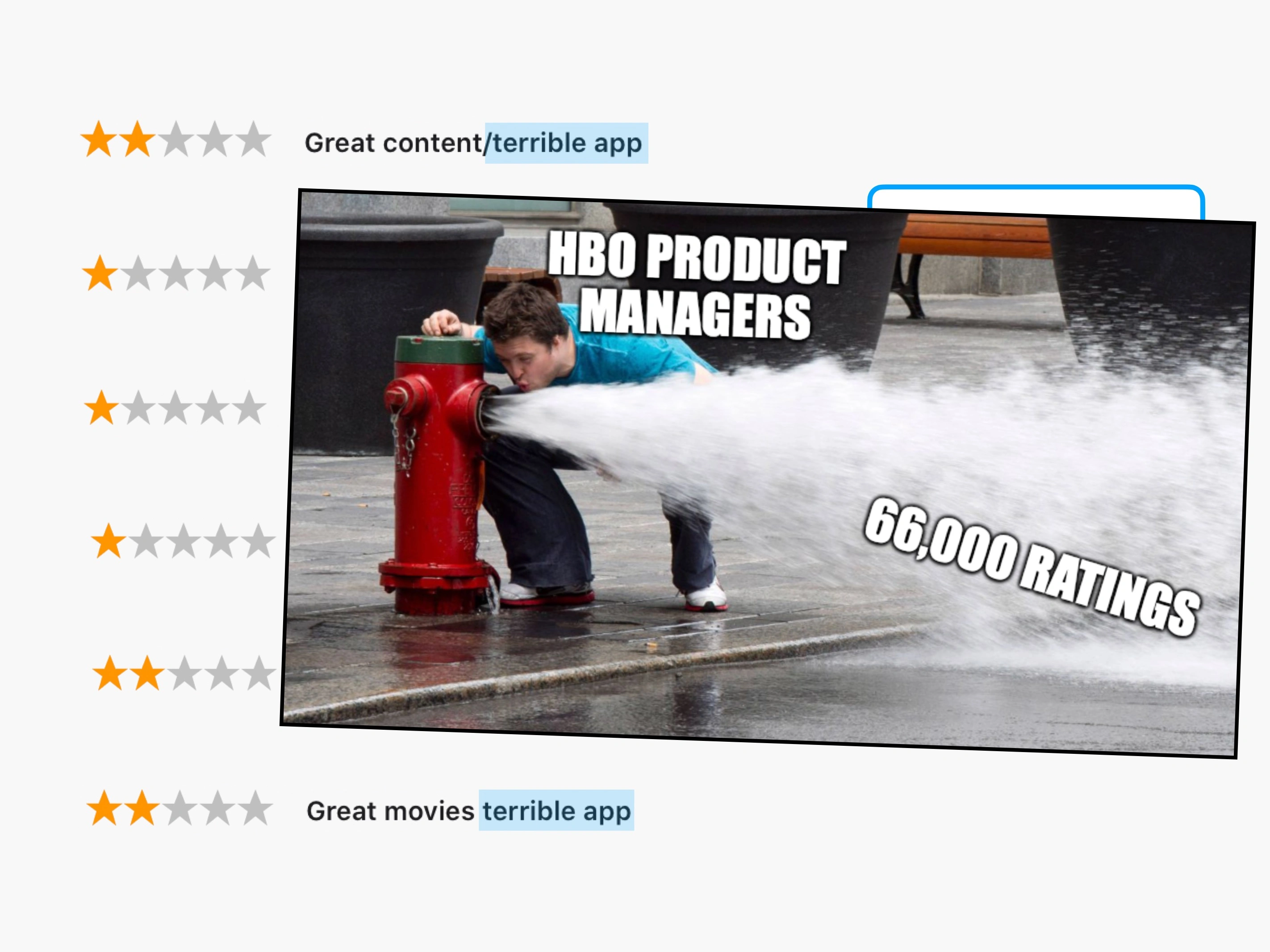
Review on IOS: "Content is great, app is embarrassing"
From what I can tell, that quote is fairly representative of the public consensus—backed up by more than 30 million ratings, across the 8 major streaming services.
Here's how they compare:
Apple store ratings


Avg. rating /5
Google Play store ratings


Avg. rating /5
* This Apple TV result appears to be a mixture of biased ratings, and genuine compatibility problems with unusual Android devices.
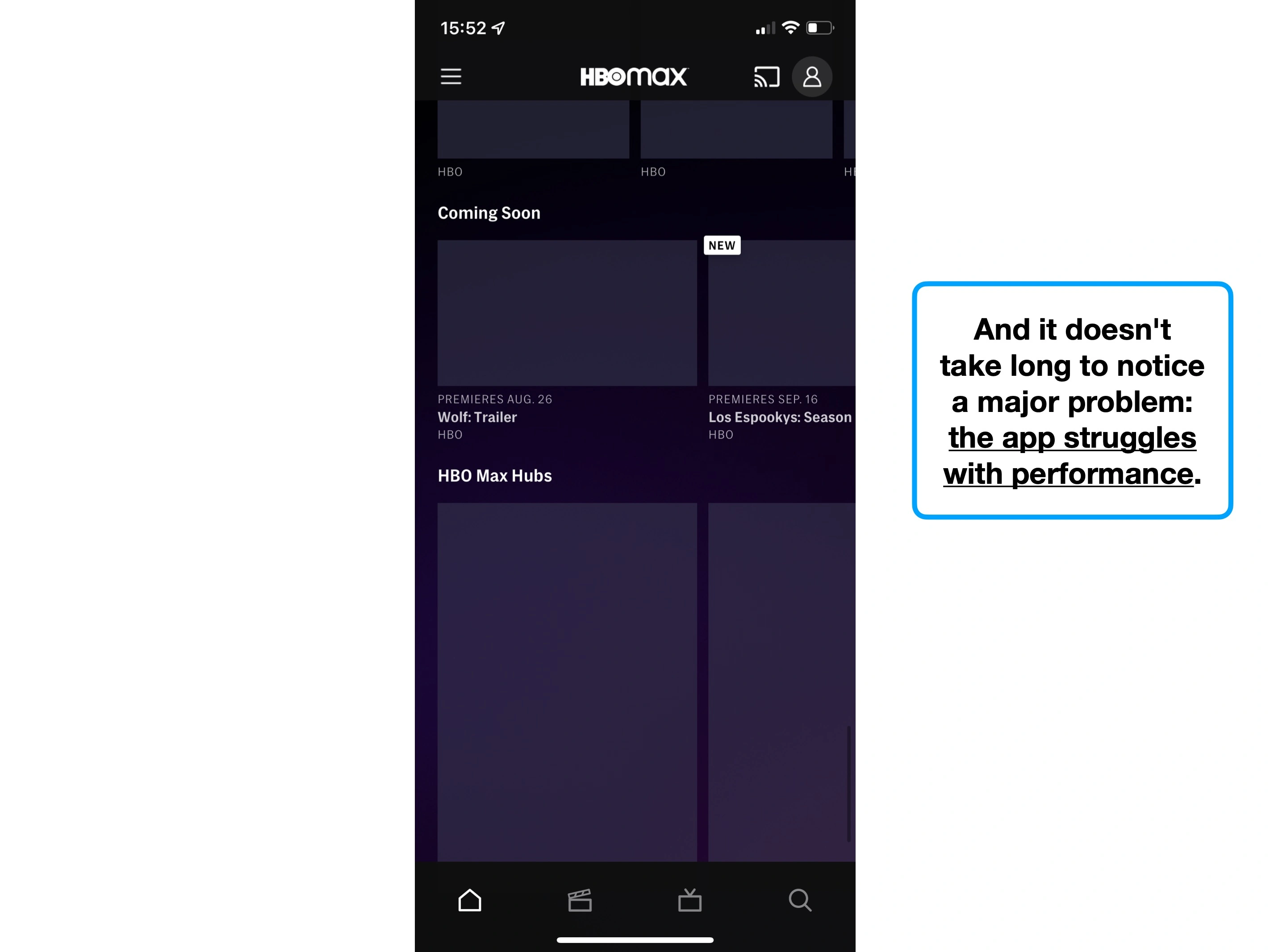
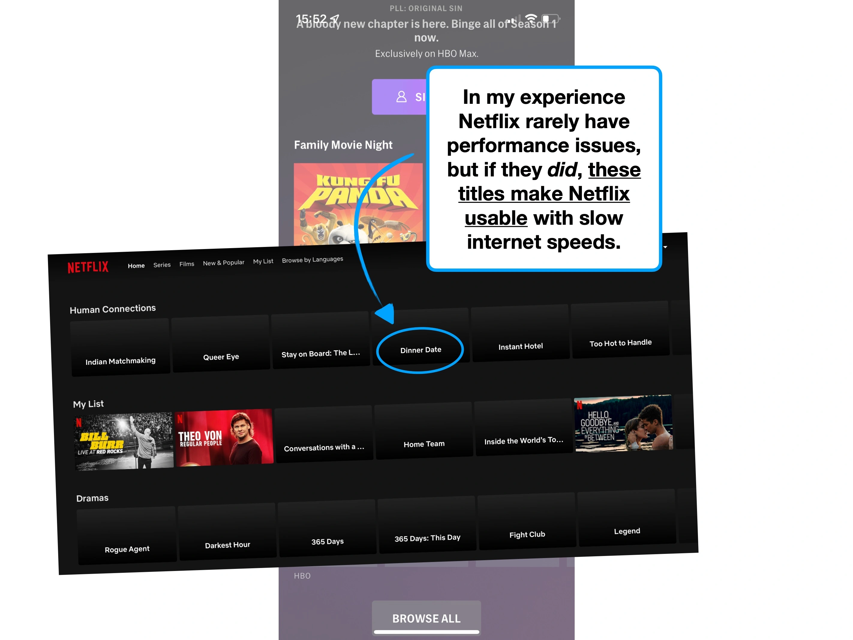
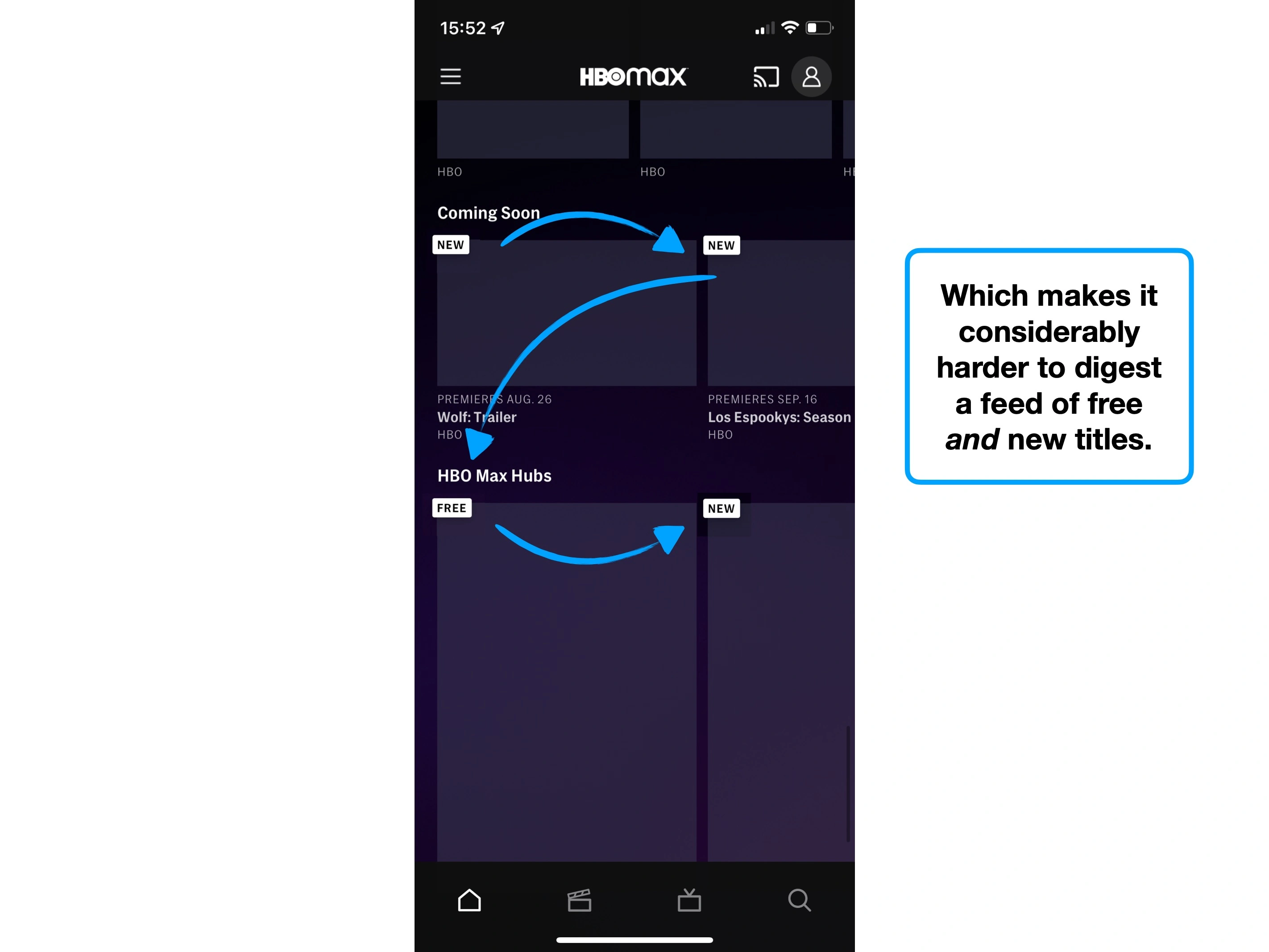
What's interesting though, is that despite surplus user feedback condemning the app, the overall experience is actually quite good.
Instead, as you'll see throughout this case study, the app suffers from poor UX judgement, a lack of finesse and a focus on style over function.
And without that specificity, product managers may be overwhelmed by the volume of negative feedback.
Here's exactly what's wrong, and what you can learn from it.
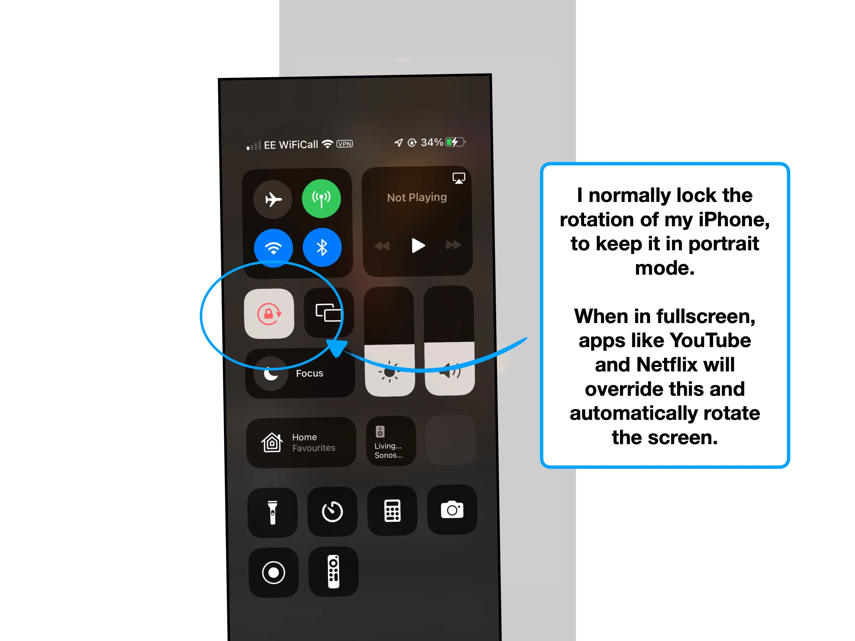
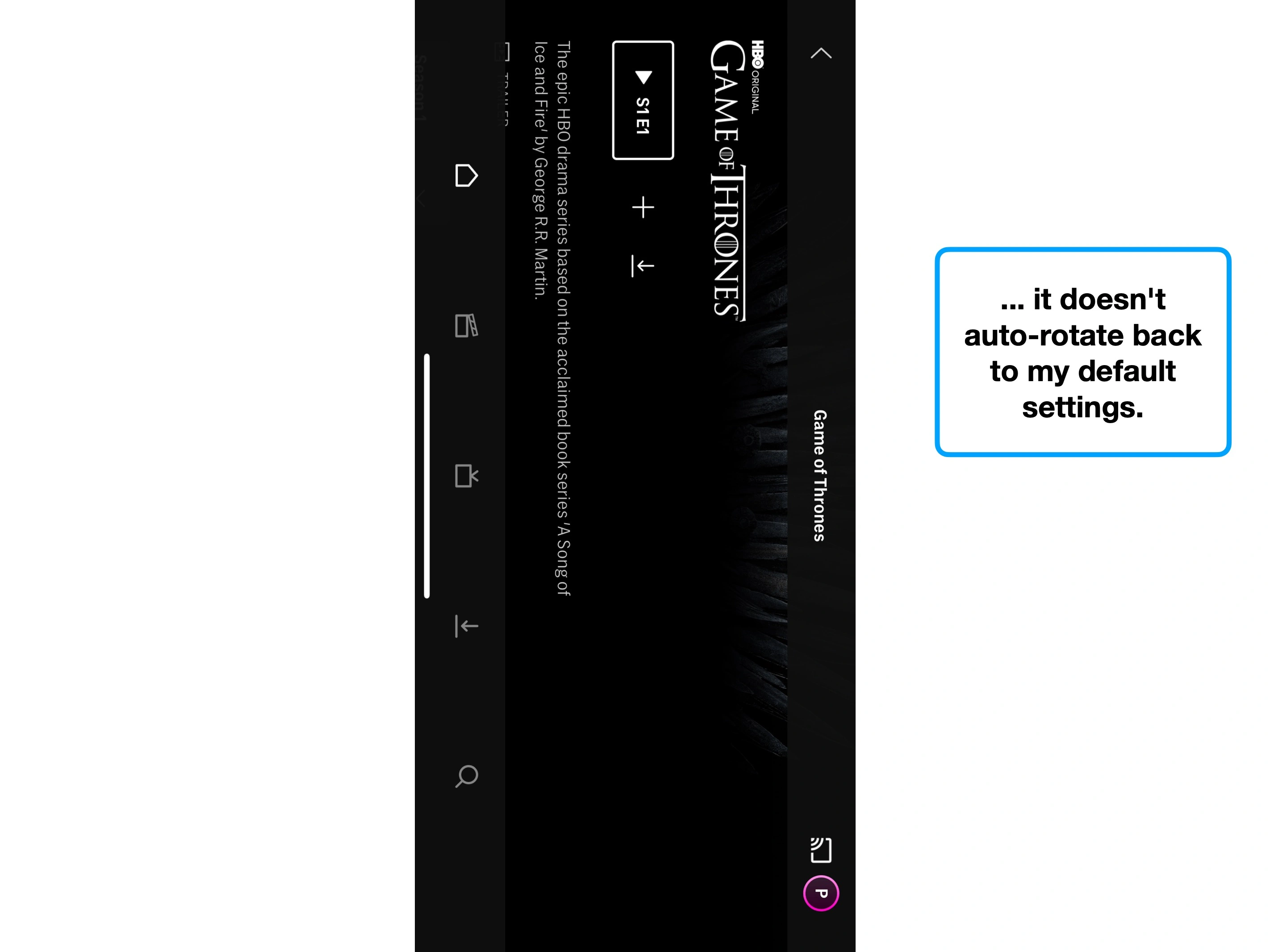
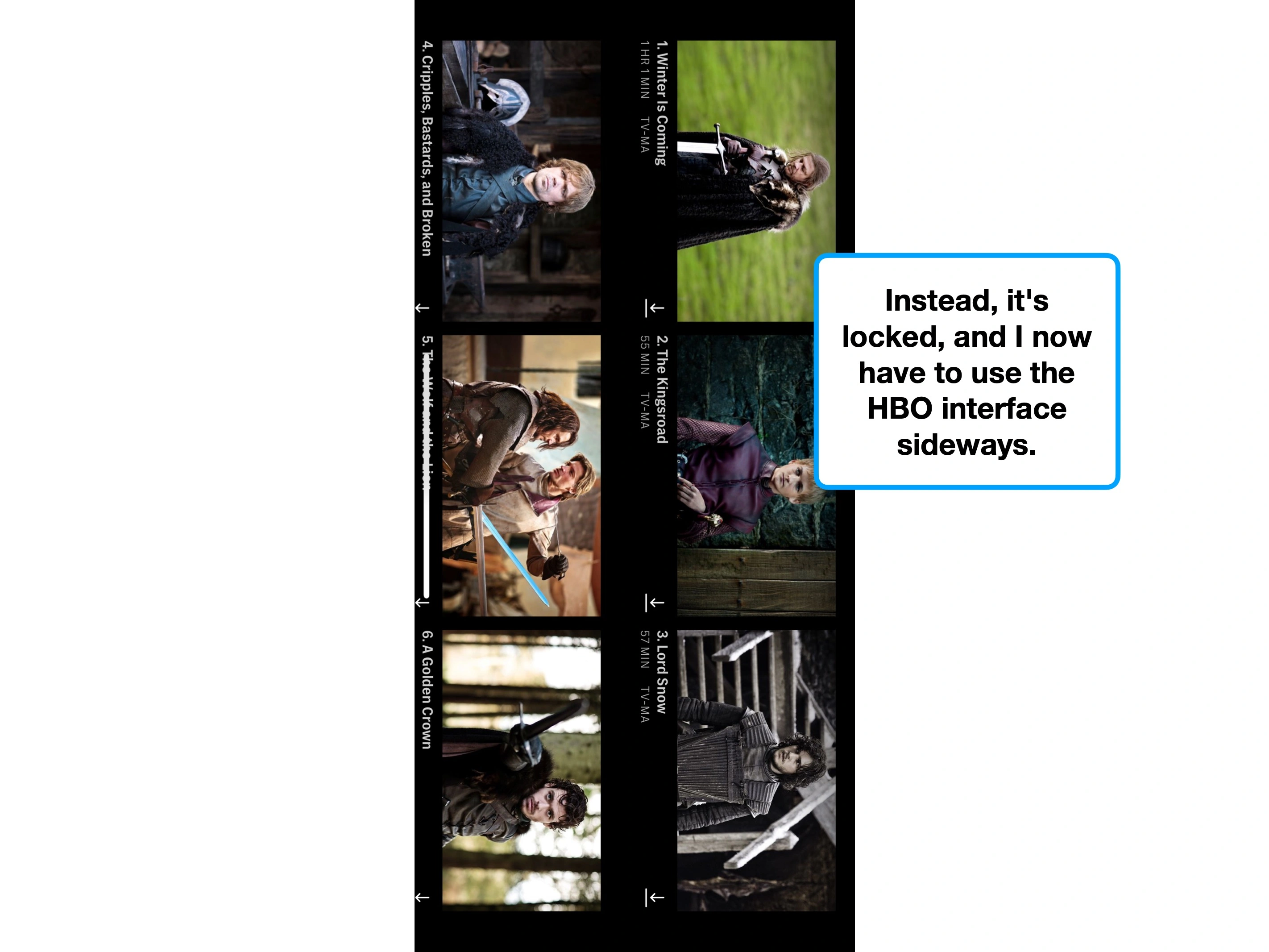
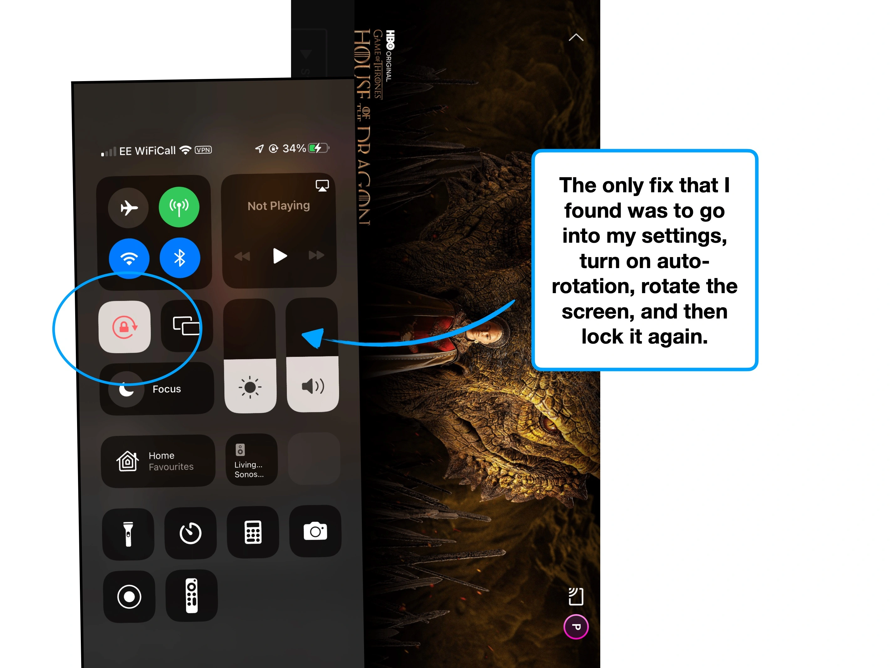
Please rotate your device to view this slideshow
Note, this won’t work if ‘rotate: lock’ is on in your device settings.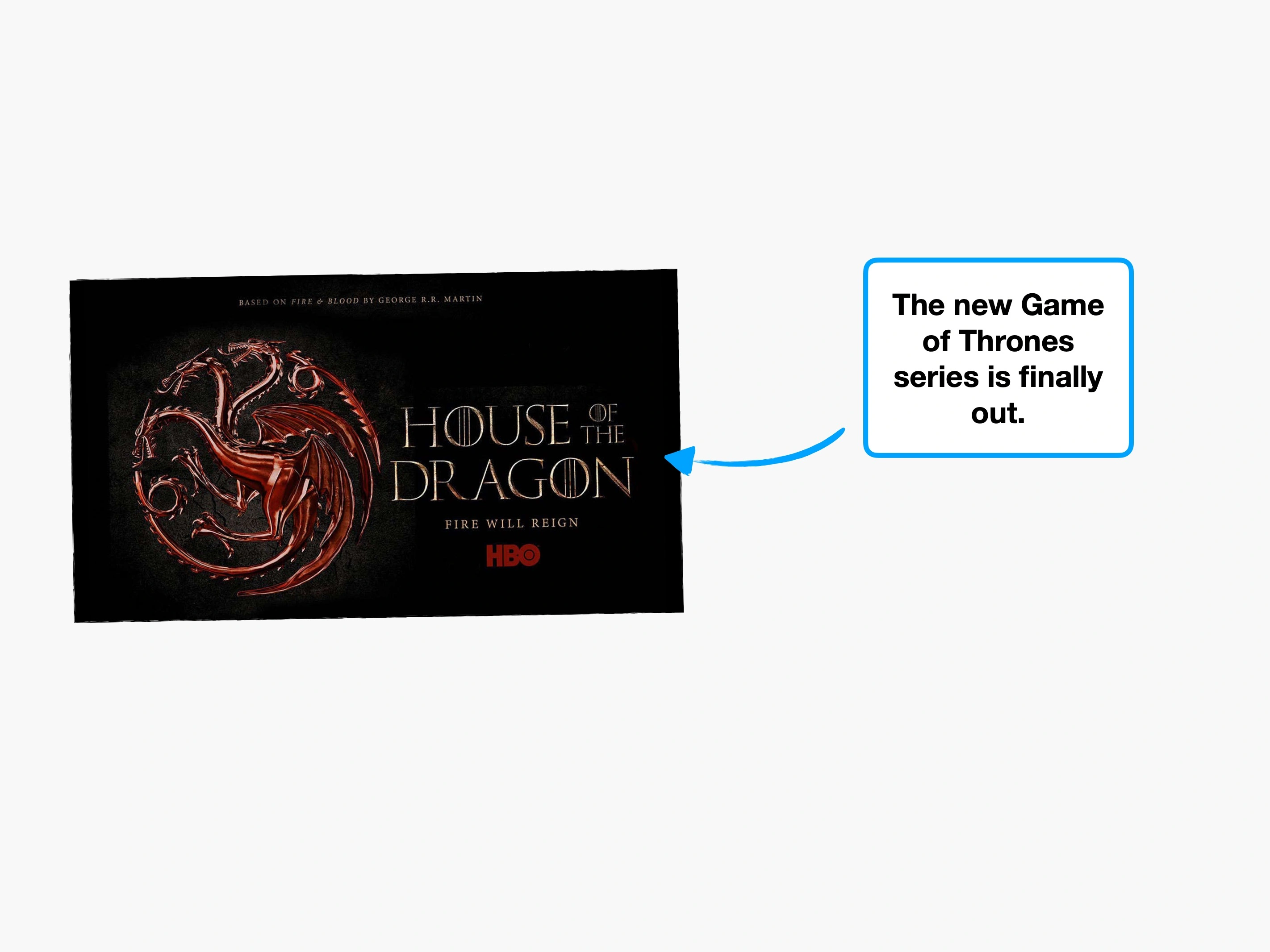
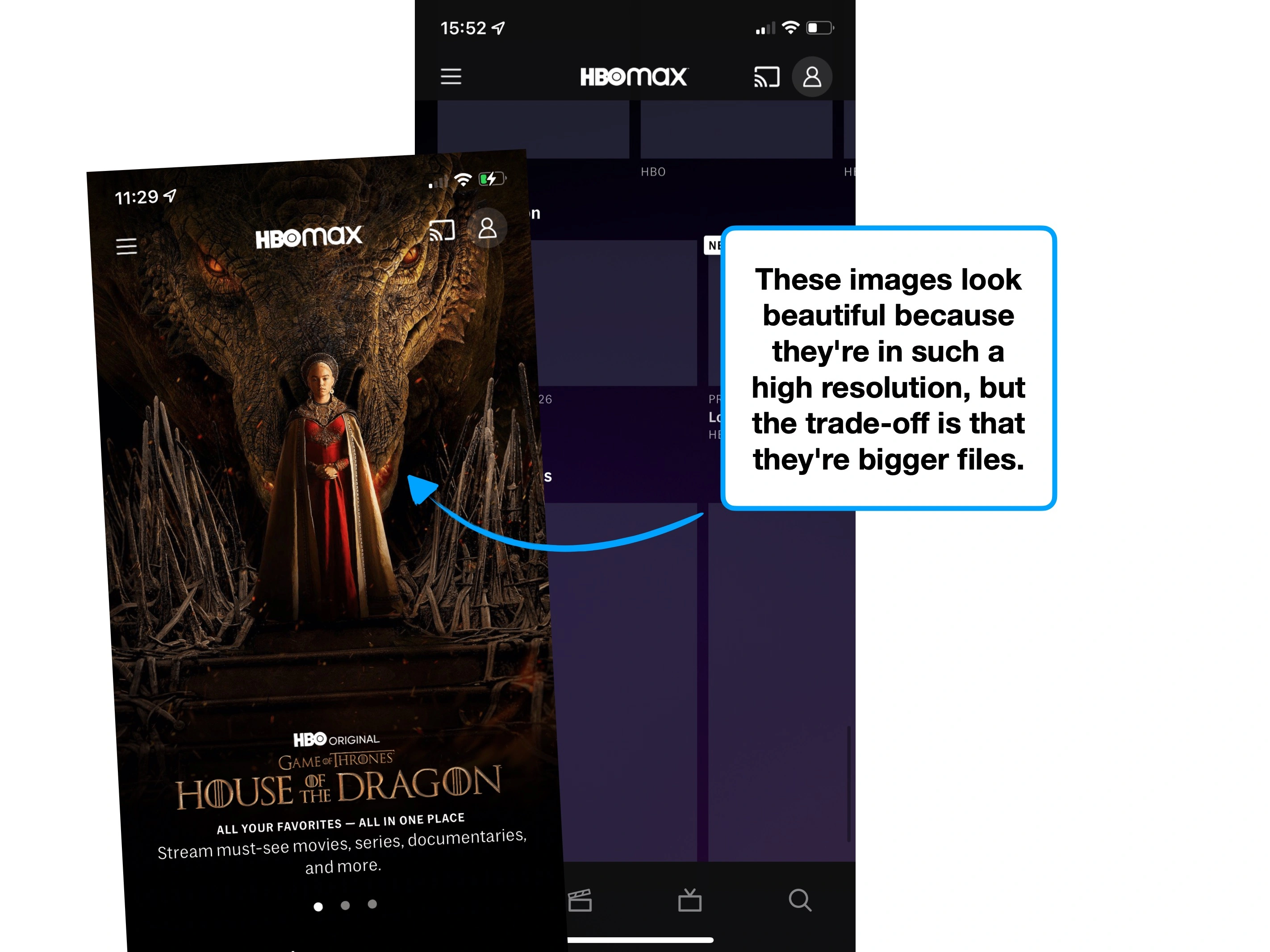

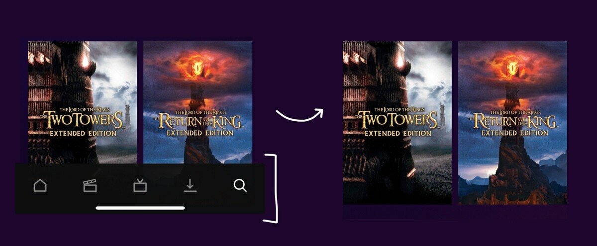
Below are four cover art images for Rick and Morty, with their raw file sizes, across four major streaming platforms.
Would you be able to guess which is which? (Probably not, except HBO).
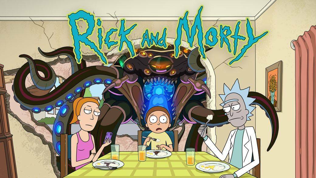

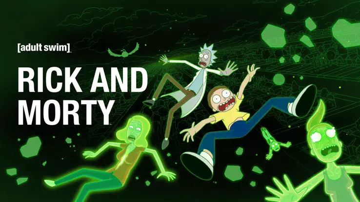
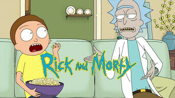
Albeit a crude comparison (because the images are different), it broadly demonstrates just how much larger the imagery on HBO Max actually is.
(From top-left; HBO Max, Amazon Prime, Apple TV and Netflix).
This isn't an isolated example.
Below are comparative raw sizes for three shows: (Big Bang Theory, Friends and Rick & Morty)—in that order.


Image size in KB
On average, HBO's comparative images are more than 4x larger than the industry standard.
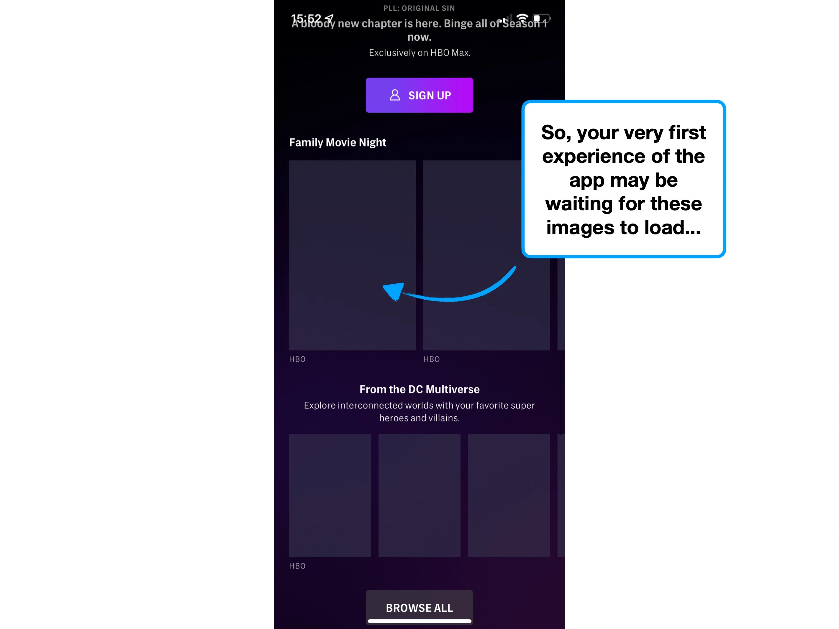
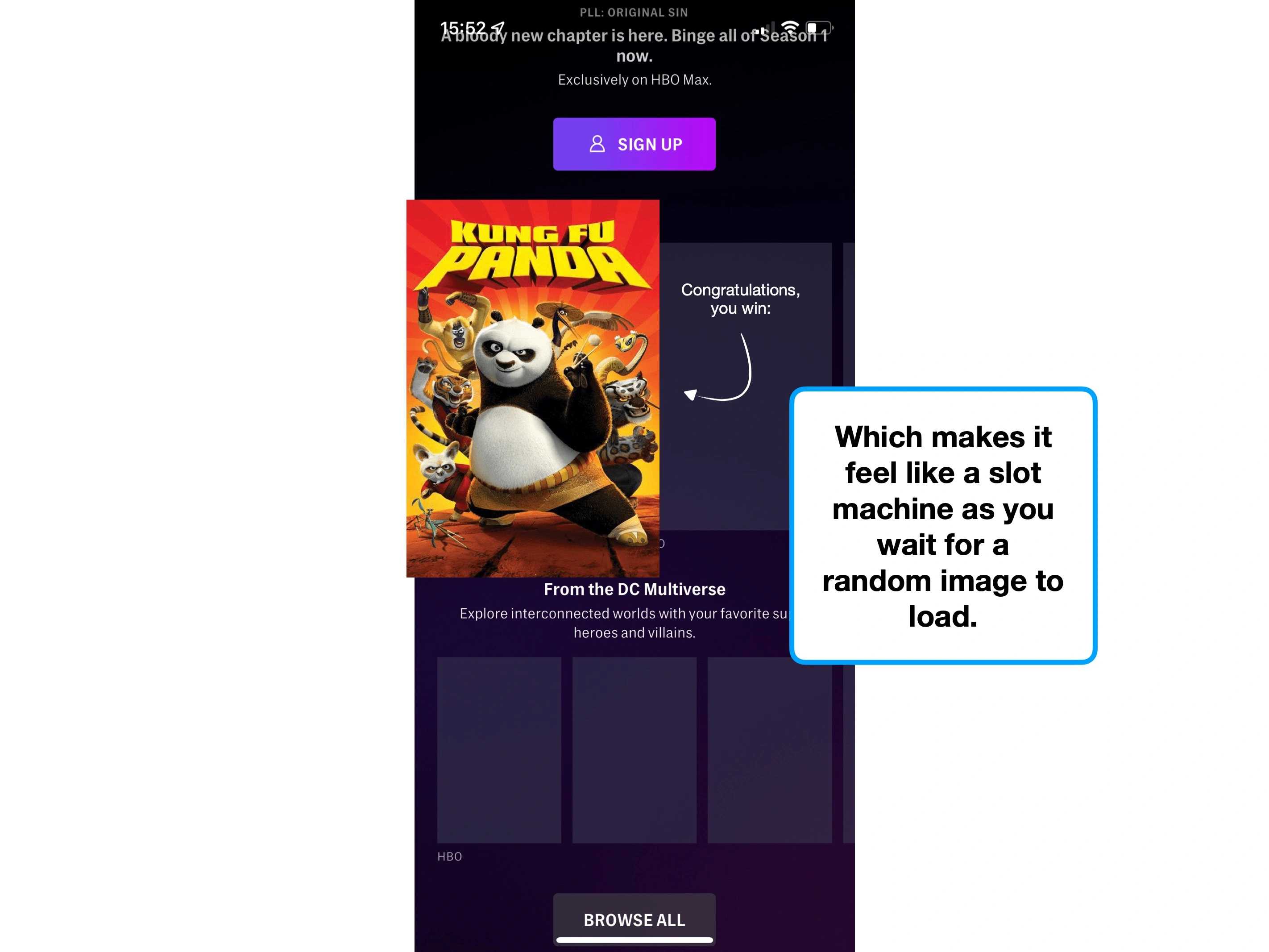
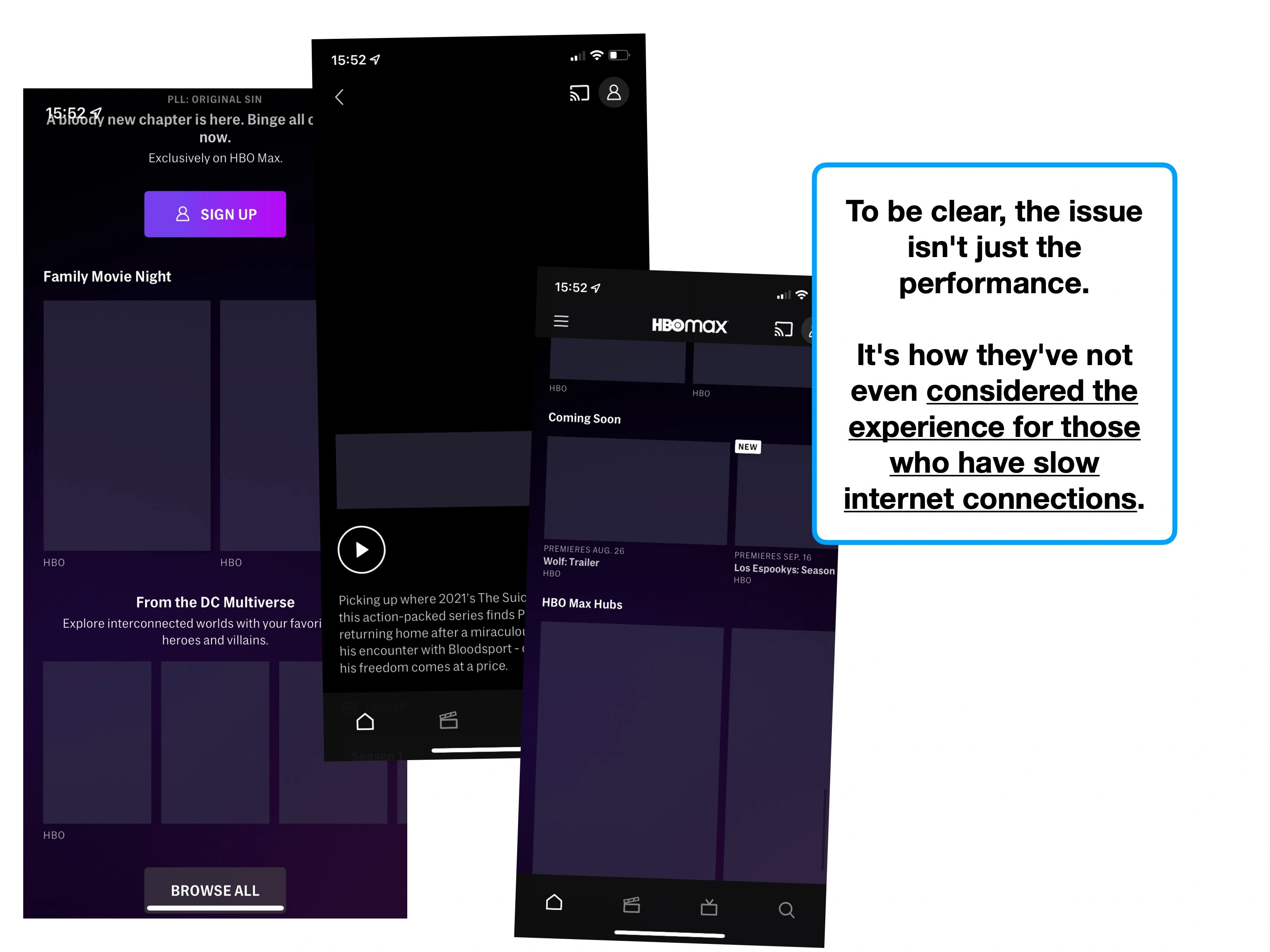
From a UX perspective, it's important to underscore the trade-off that's happening here: high-quality imagery looks amazing, but slow loading times dampen the experience.
There's a principle called the ⚡️ Doherty Threshold, which is often banded around in various forms, but in short states that users enjoy experiences with less than a 400ms latency. On slow internet connections, HBO certainly falls short.
And it's intuitive: people like using things that feels responsive.
But this is a double-whammy, because HBO have also failed to consider what using the app is like without a fast connection.
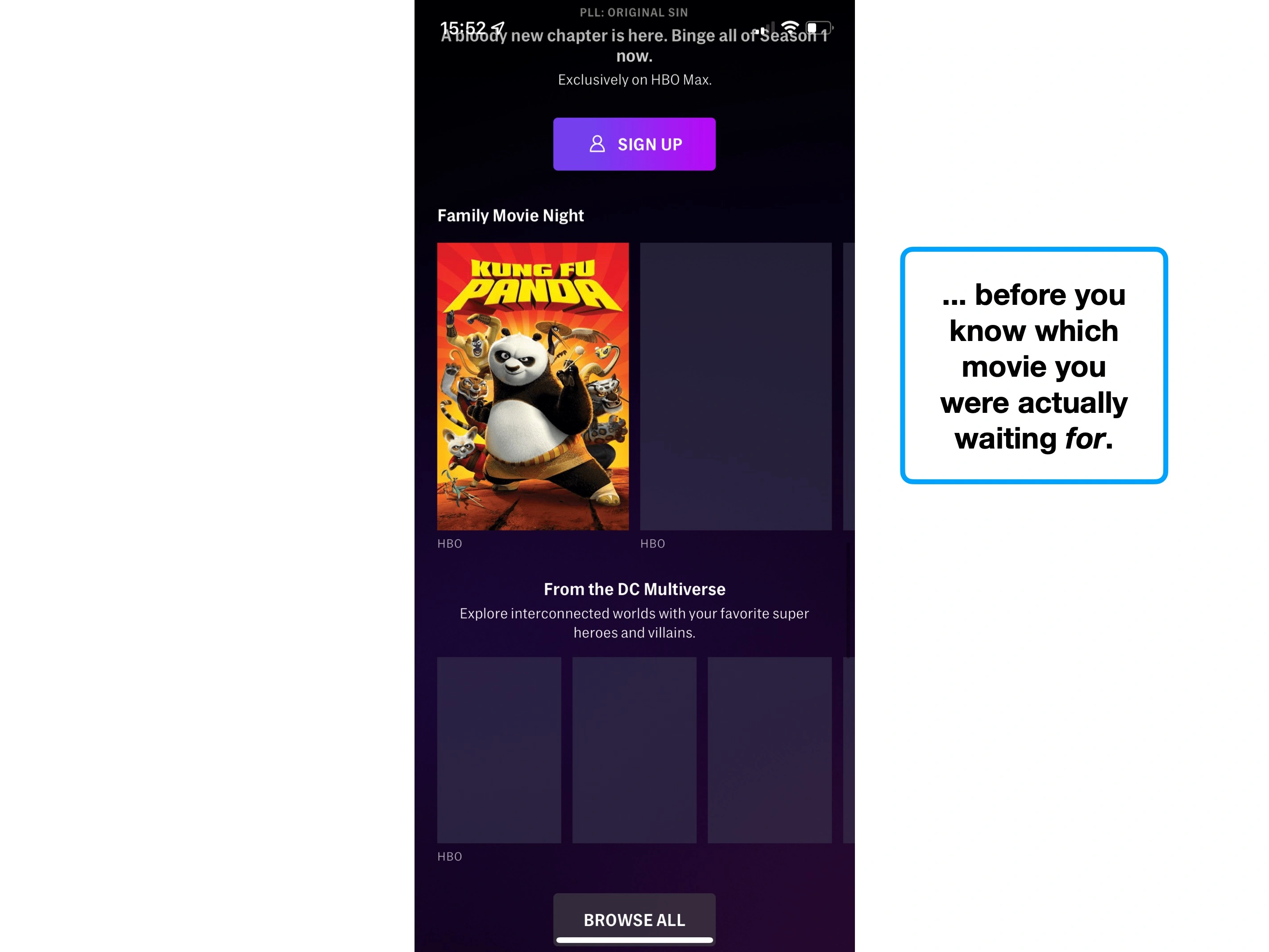
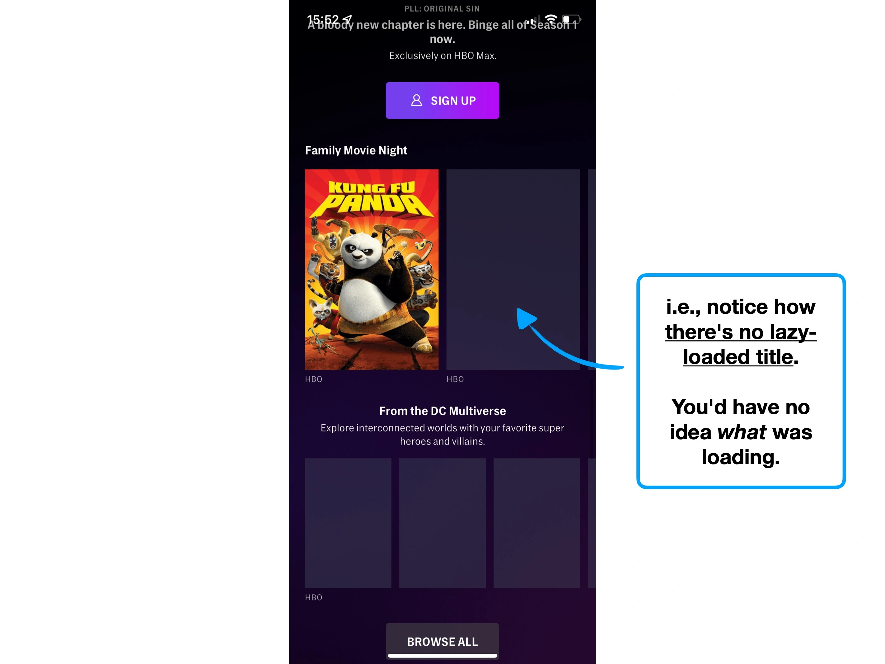
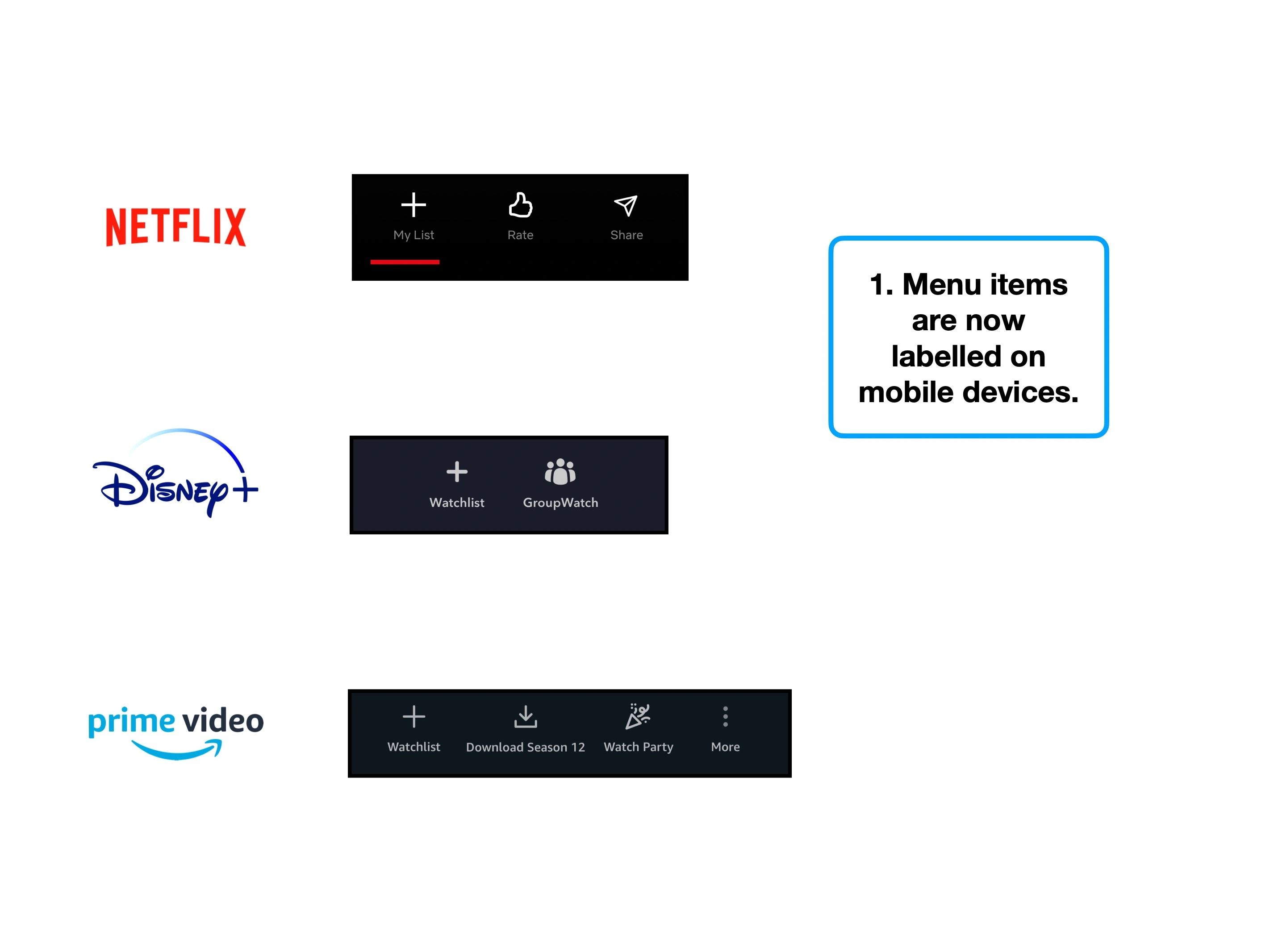
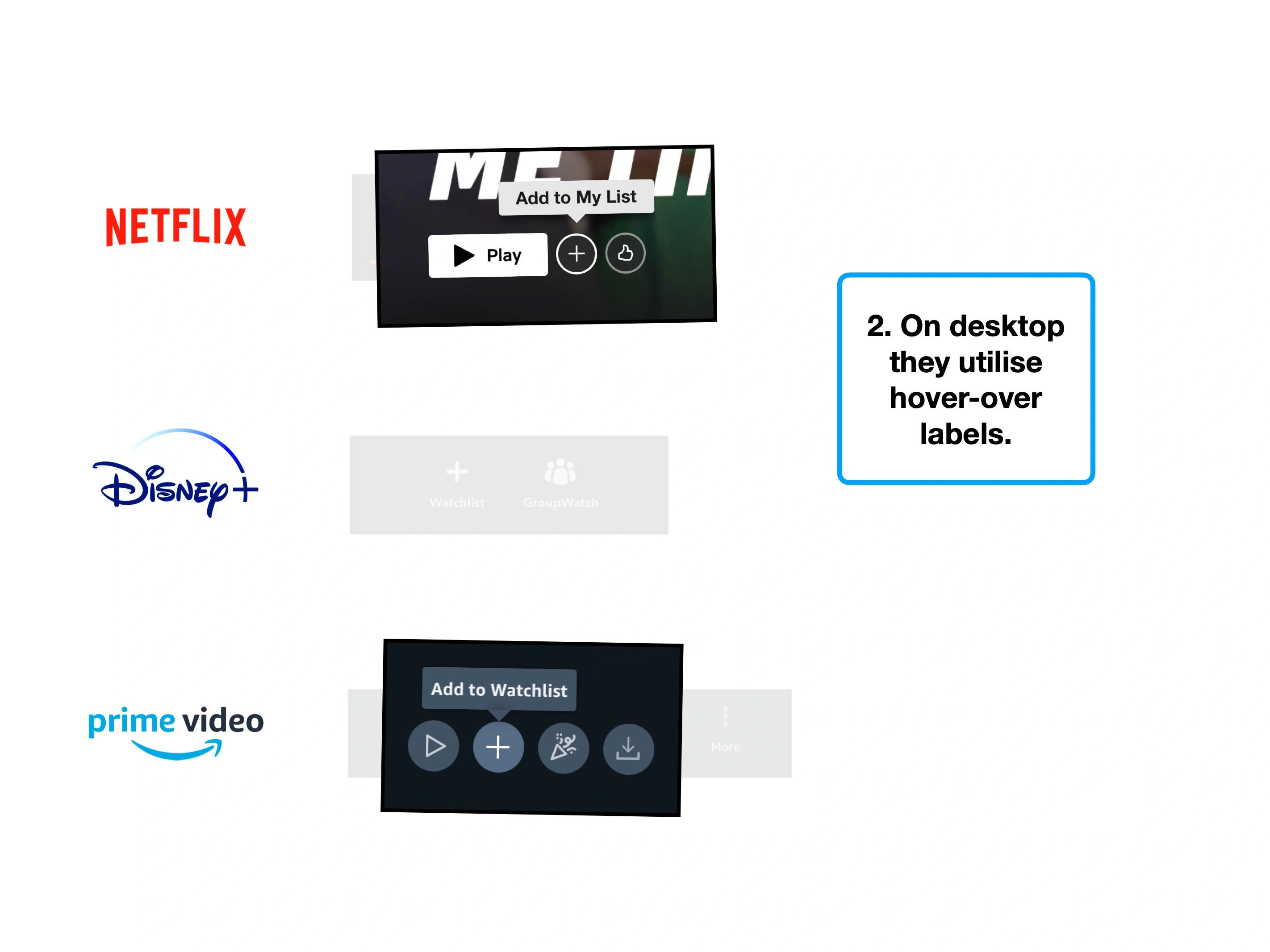
One solution: lazy-loaded labels.
More broadly though, my advice is two-fold:
👌
1. Optimise your file sizes
i.e., through image compression.
⏱
2. Lazy-loaded experience
Consider how people can interact with your product sooner, without waiting for everything to load.
Imagine walking into a supermarket, and finding that most of the shelves are empty. Nobody is working there, but the doors are open, and the lights are on.
Other shoppers appear equally bewildered, so you look up the store's phone number, and give them a call:
💬 "Oh, we're closed forever. We thought we didn't need a sign as it's obvious that nobody is working there anymore. We even cleared most of the shelves".
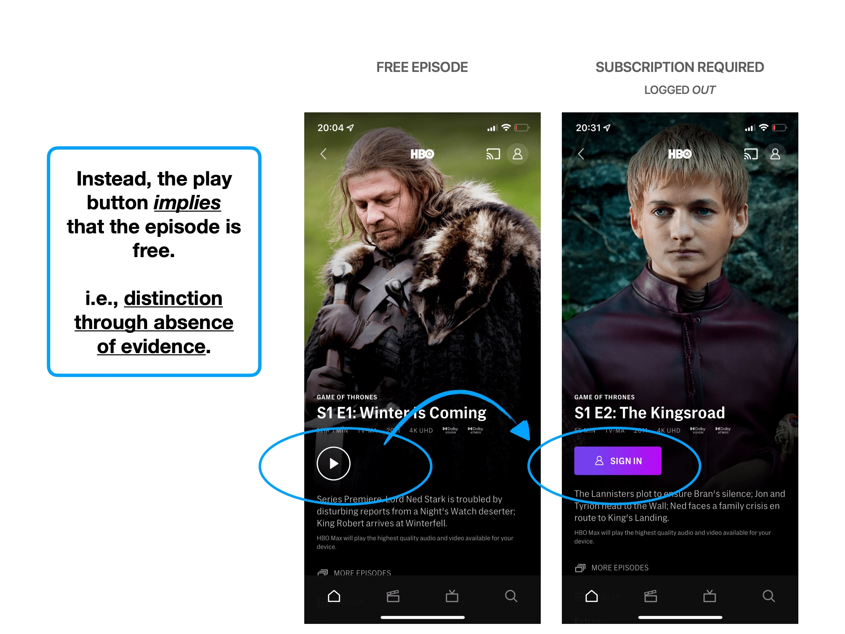
This would be a distinction through absence of evidence.
Or rather: the sign was the absence of workers or product.
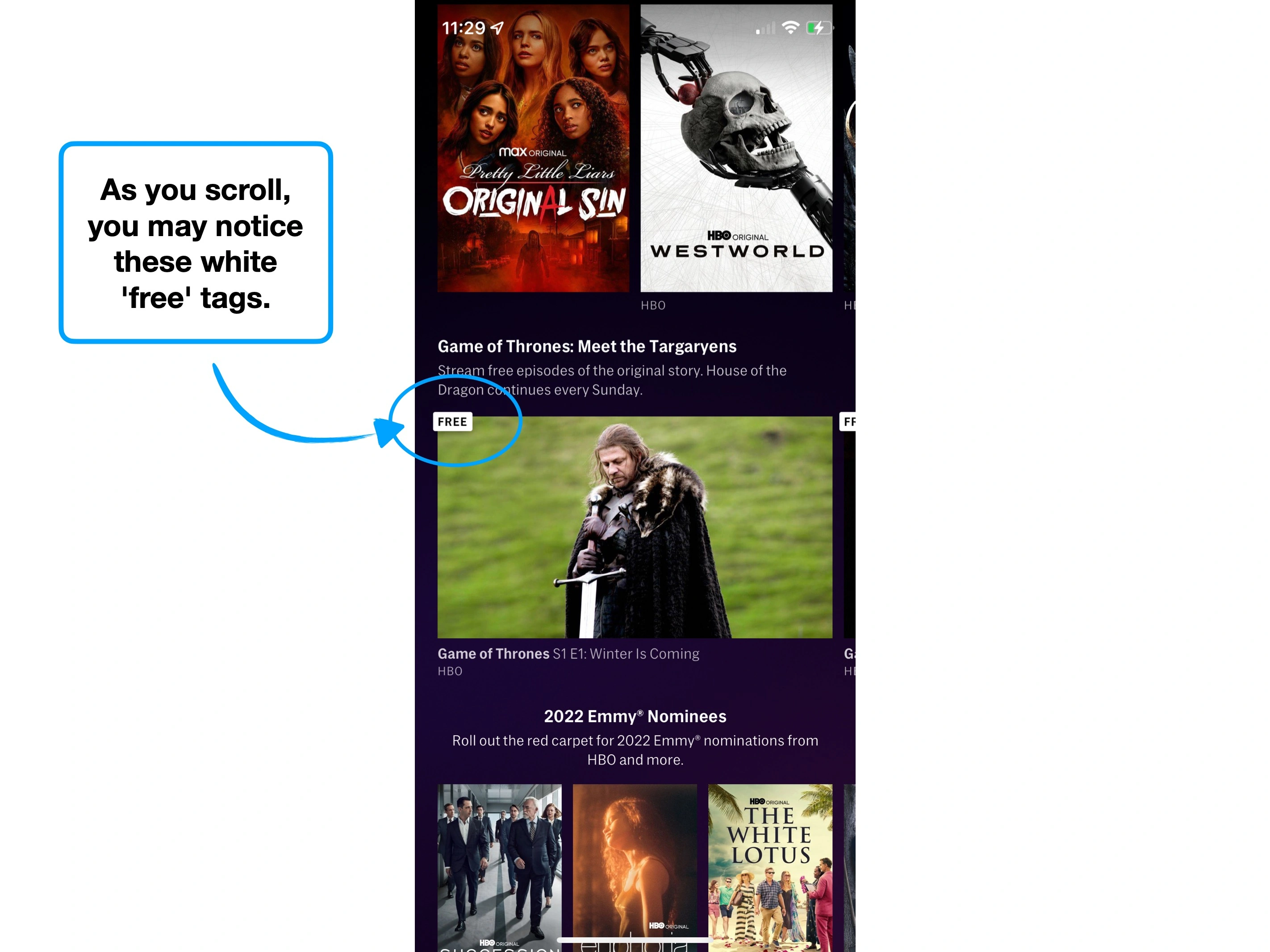
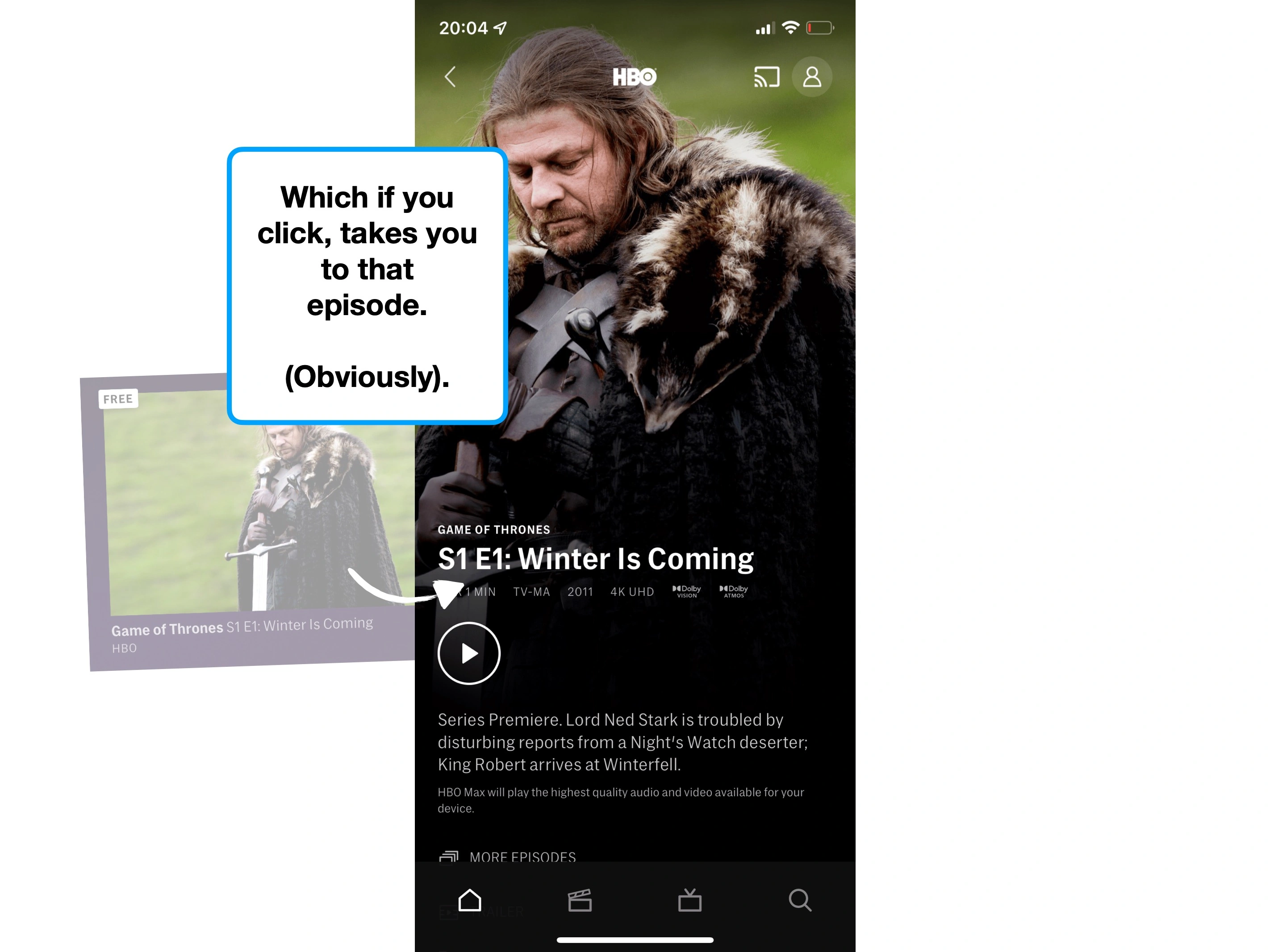
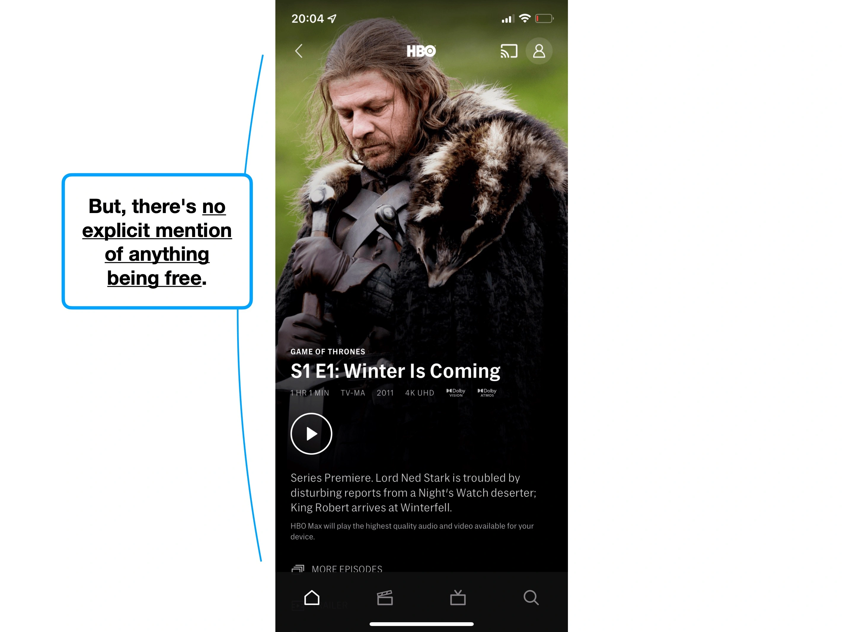
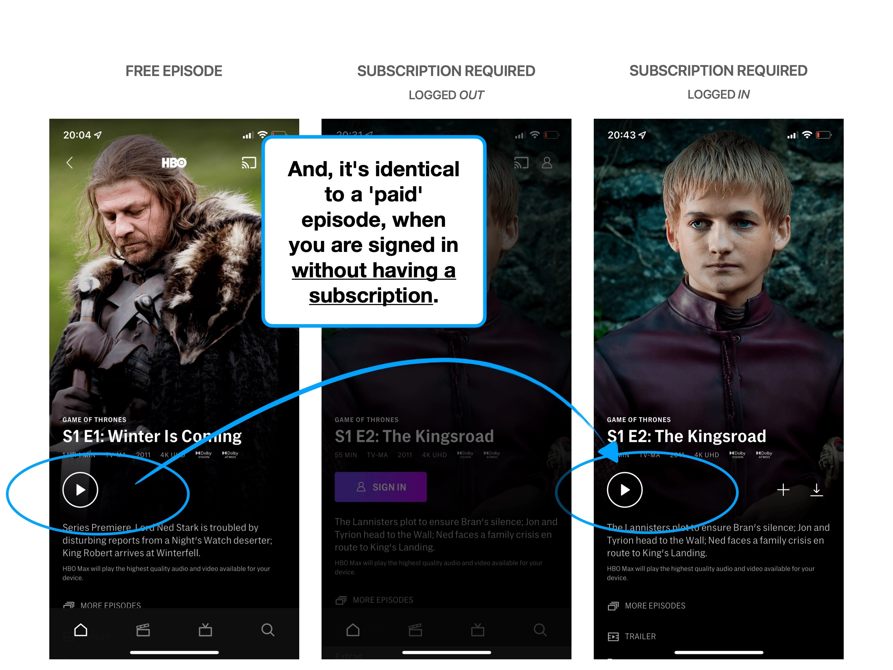
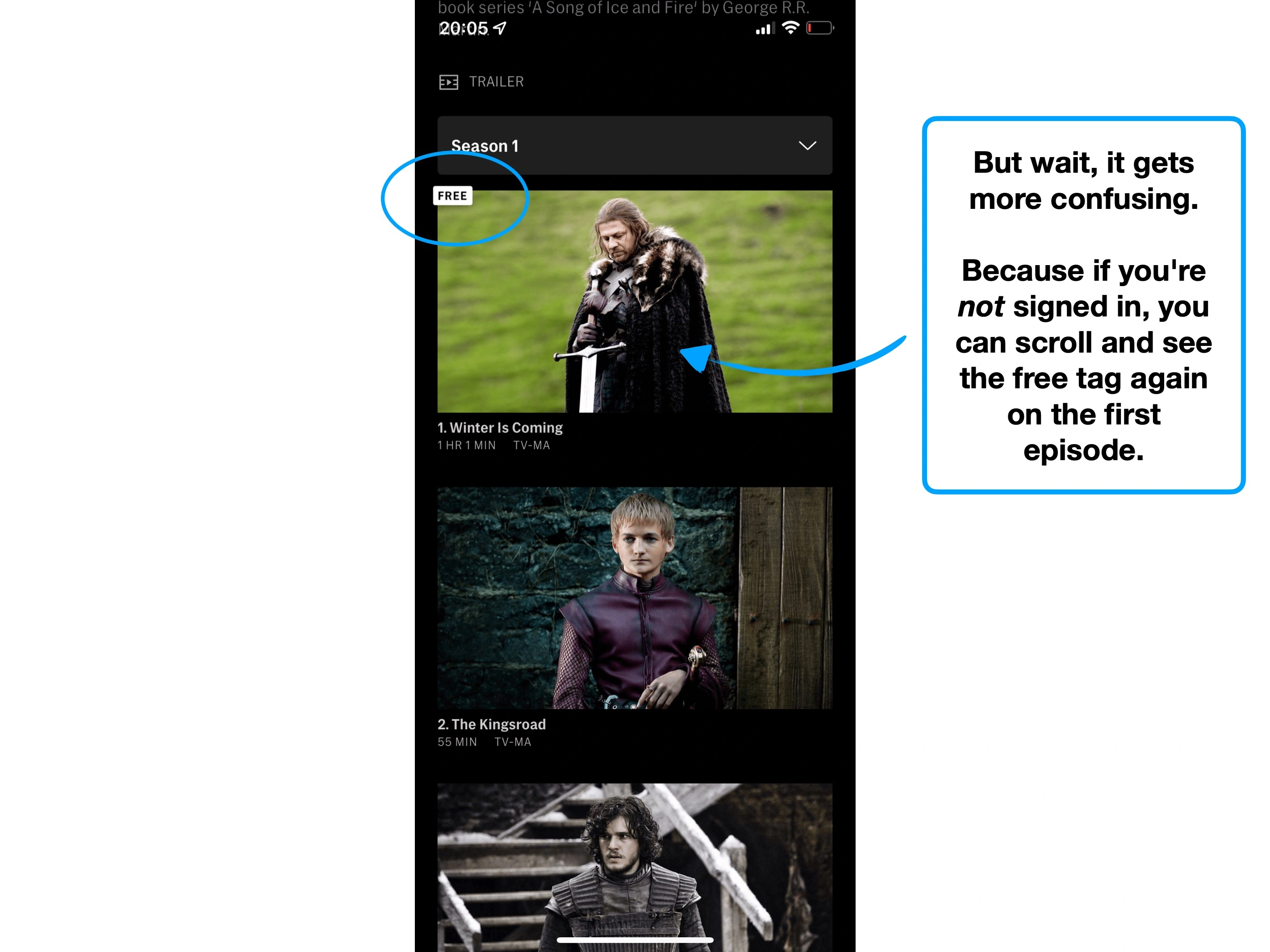
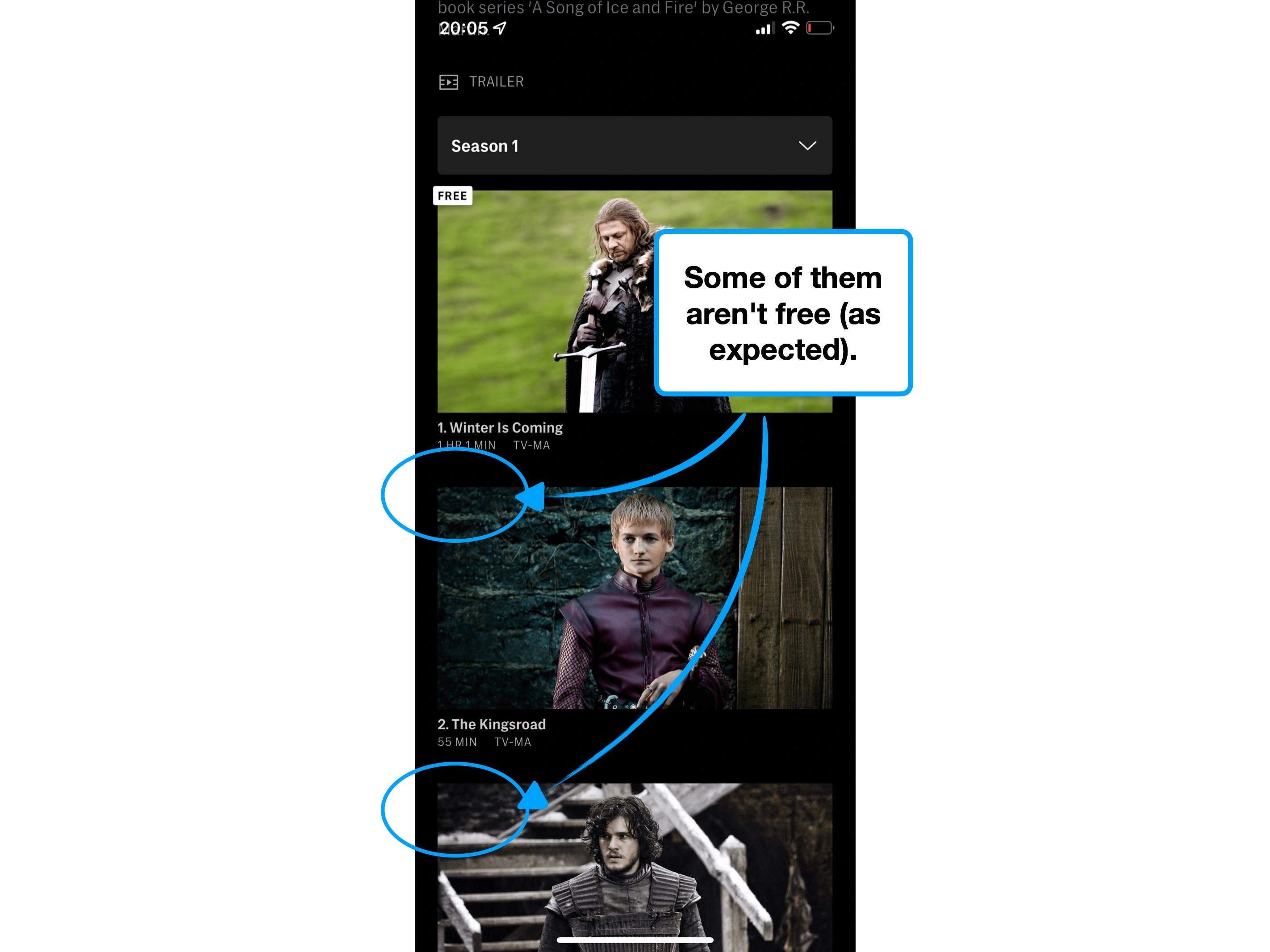
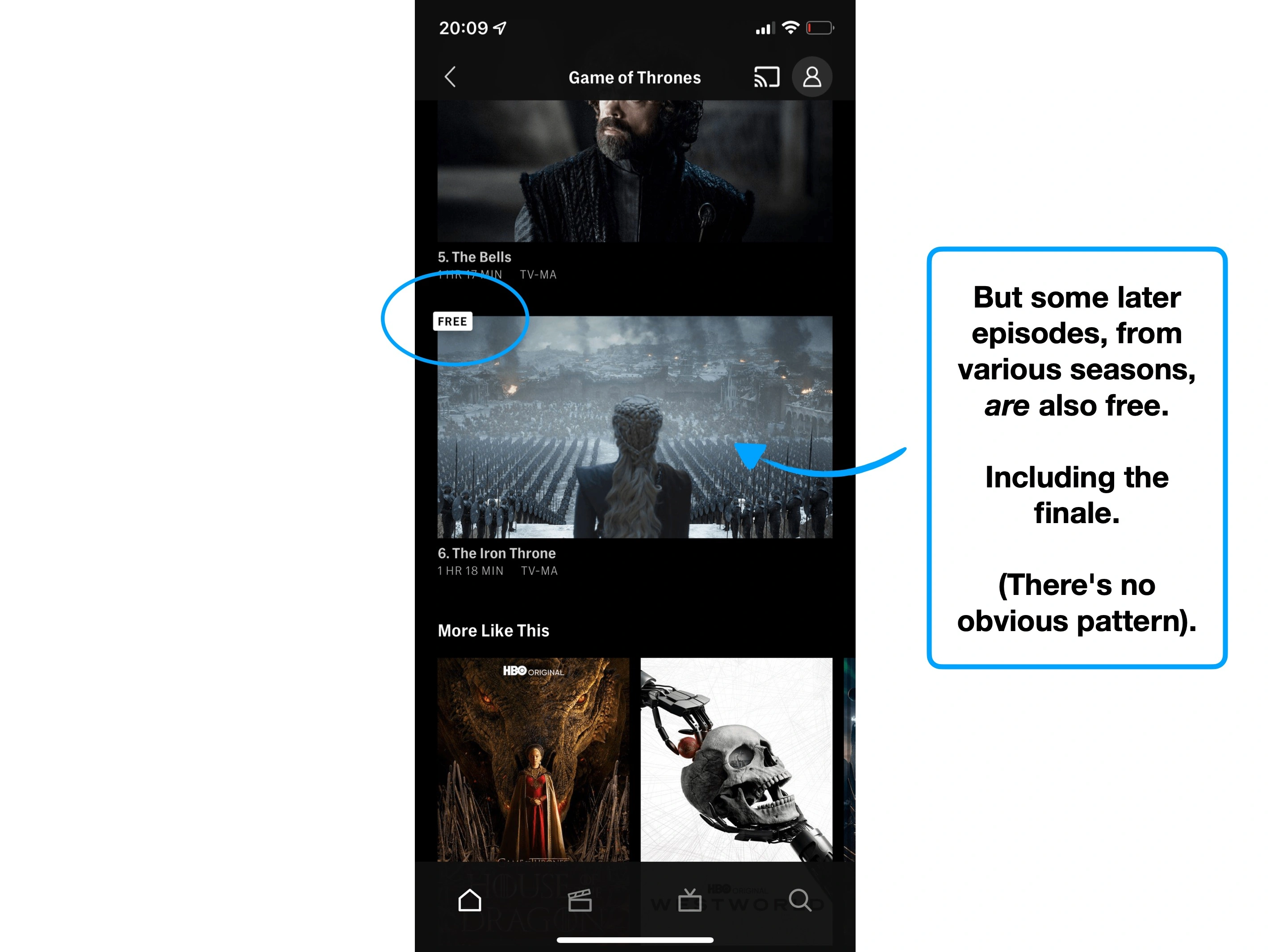
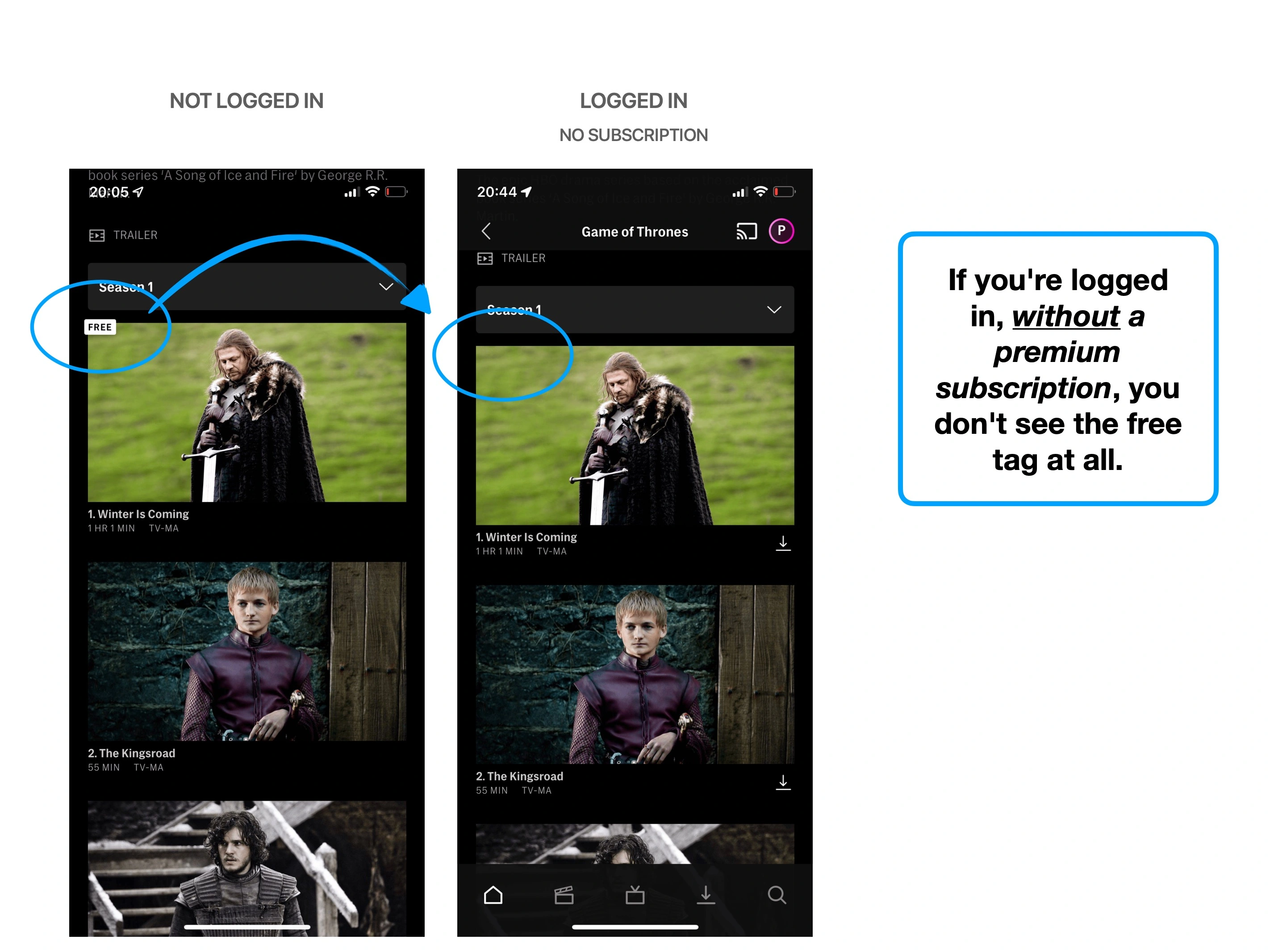
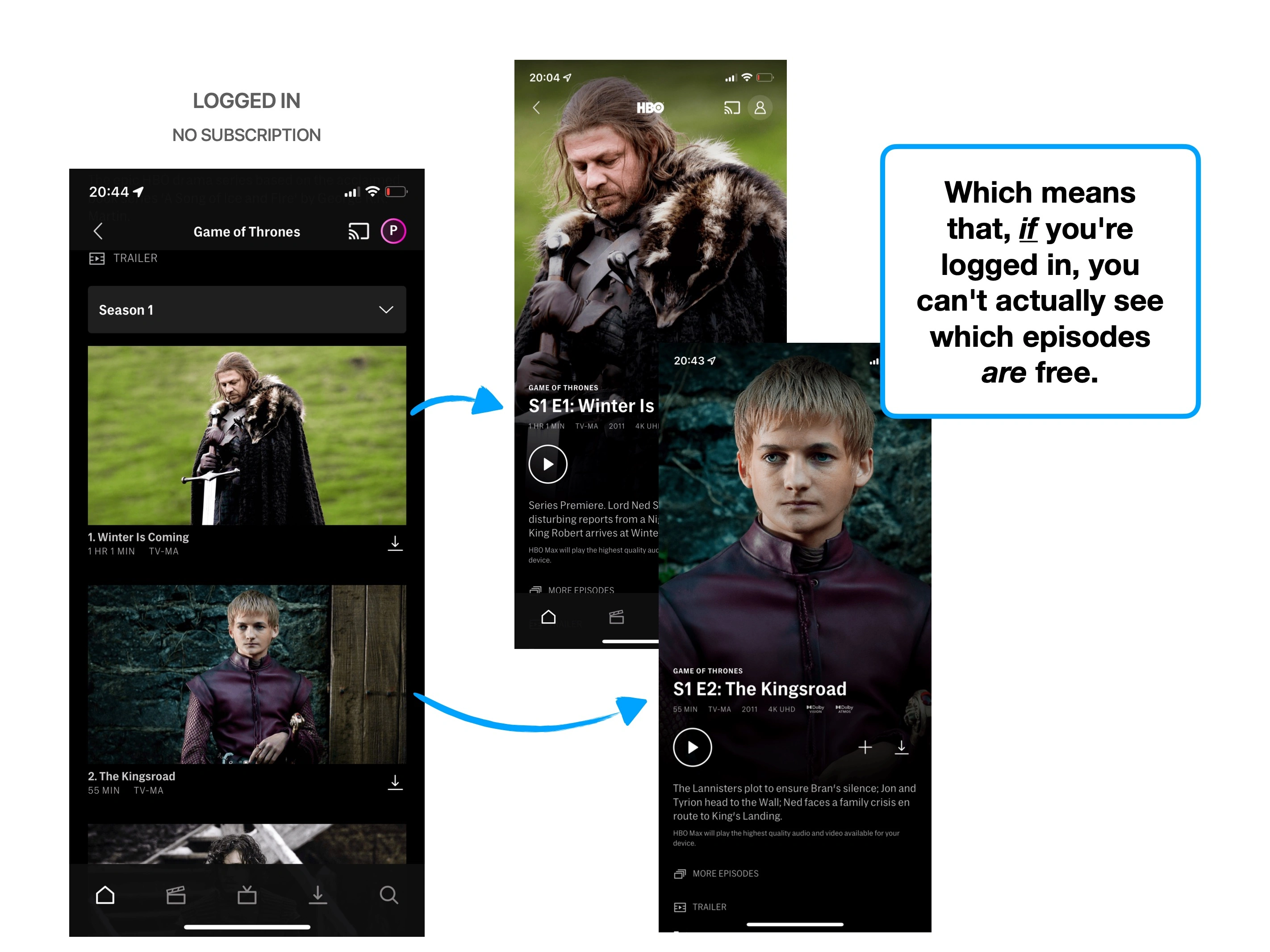
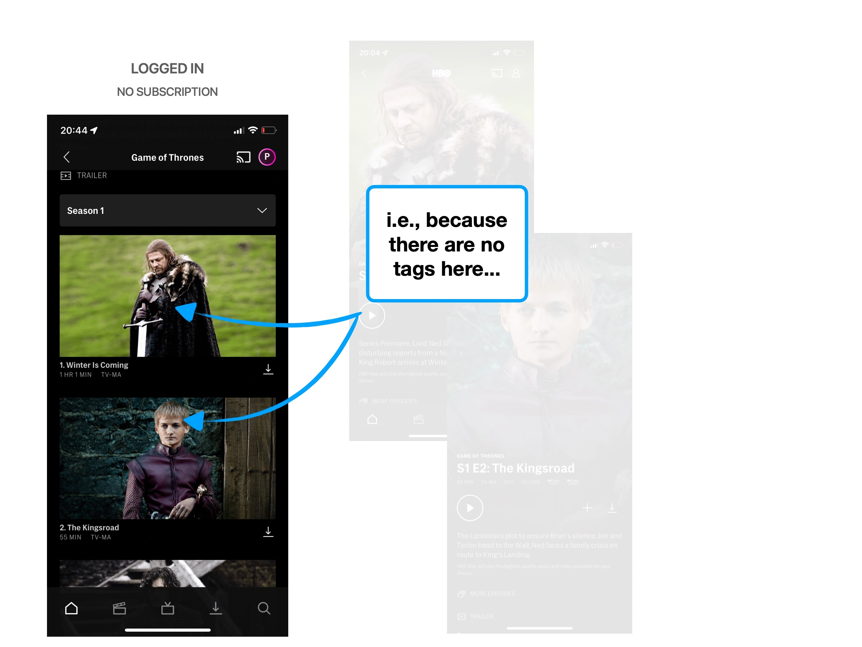
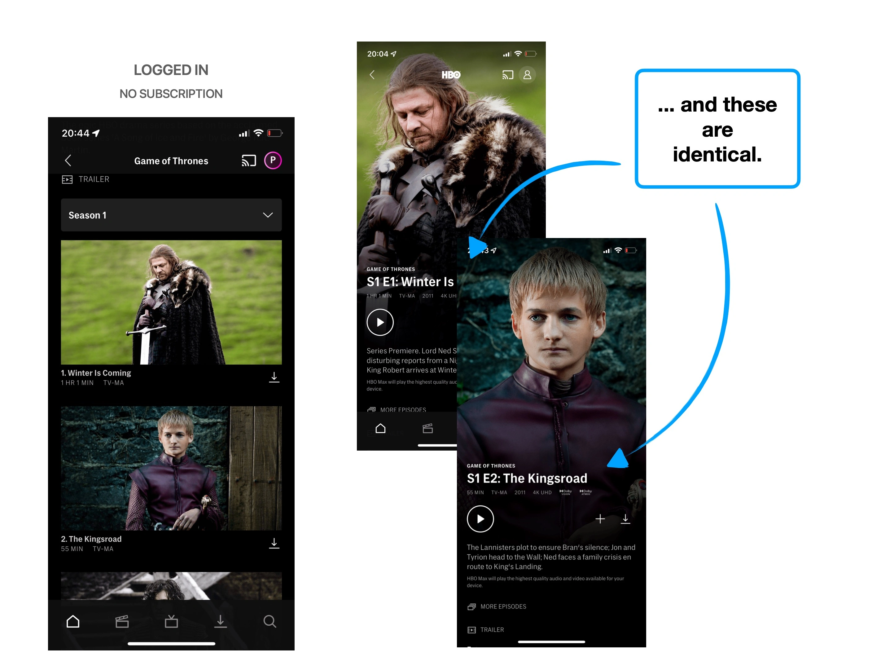
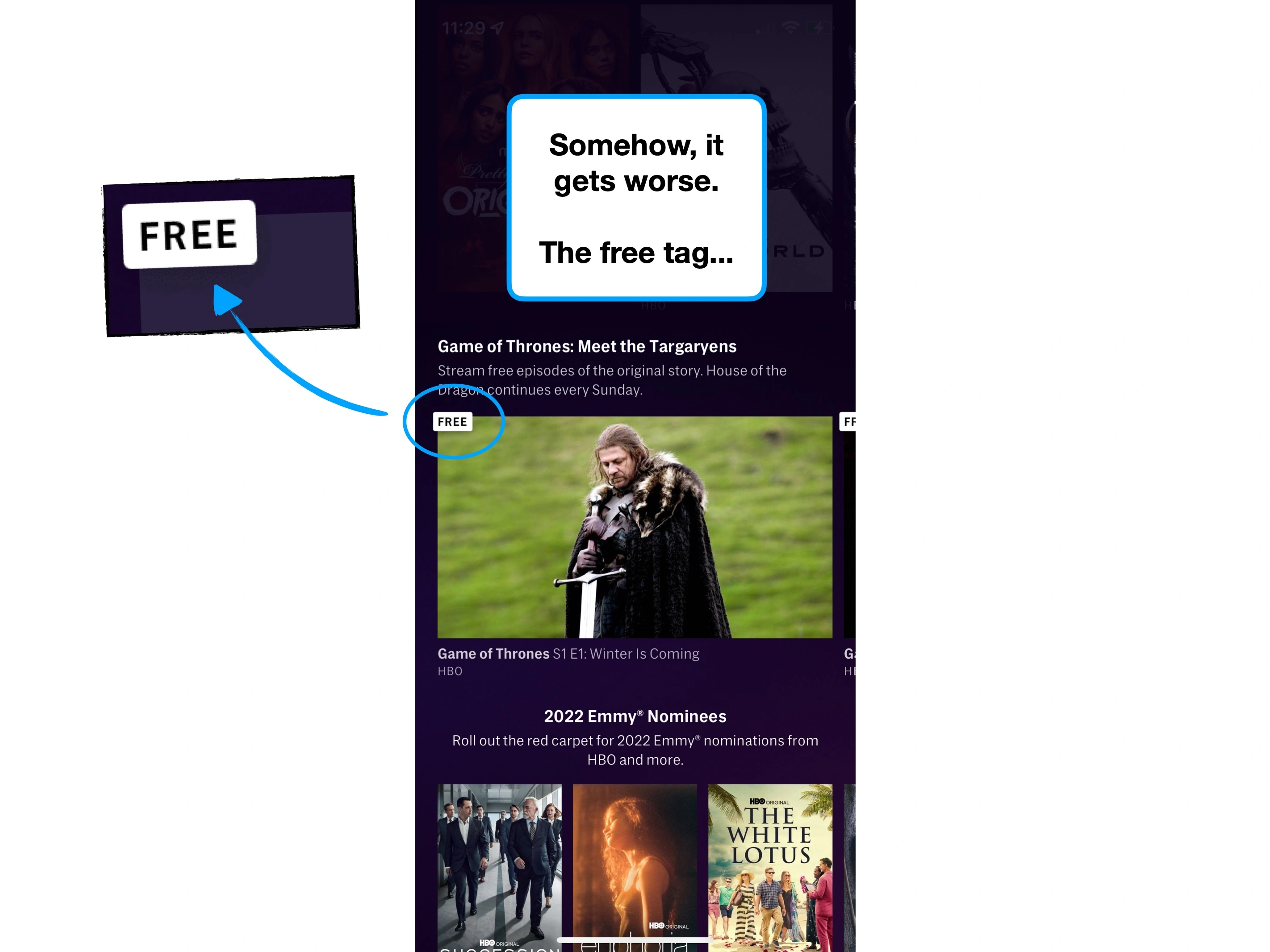
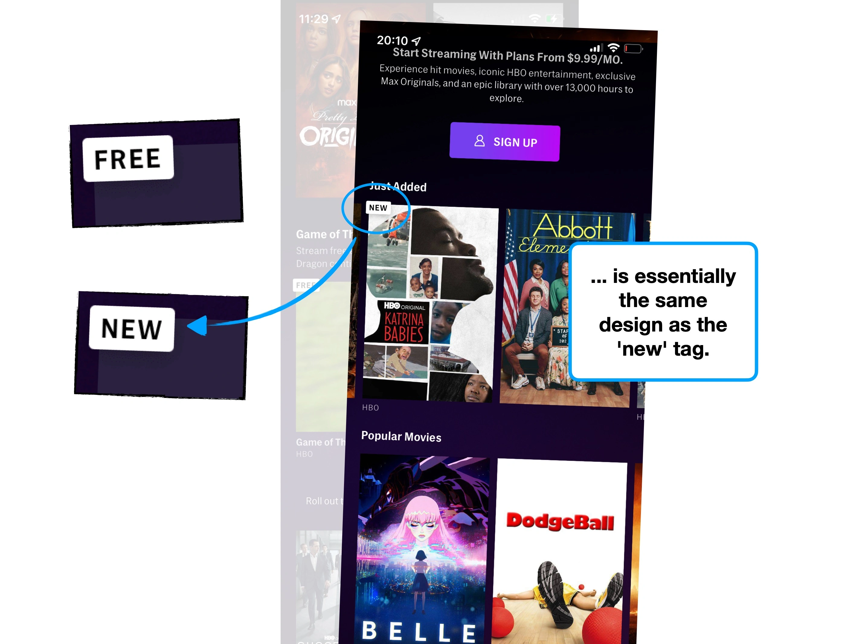
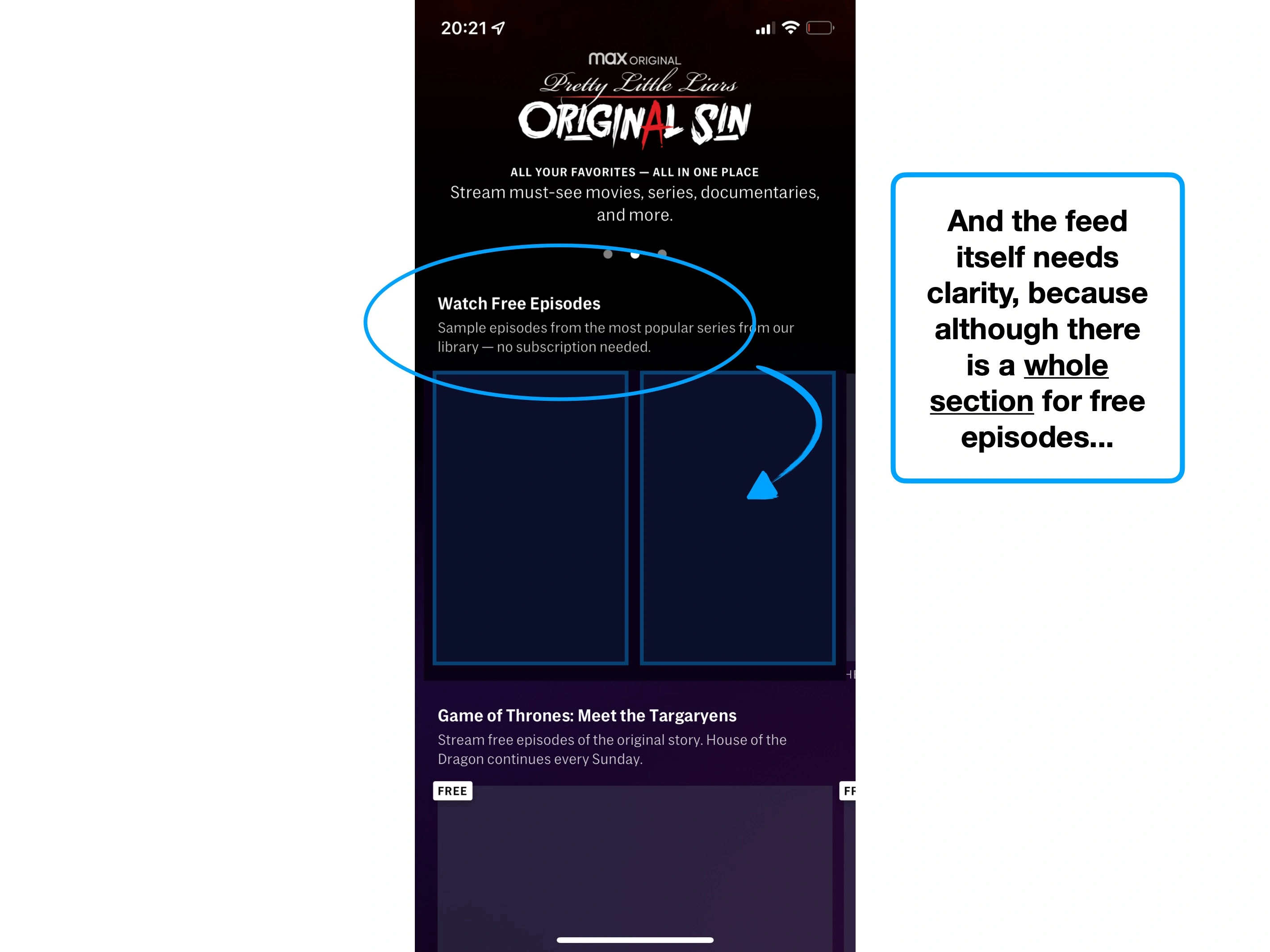
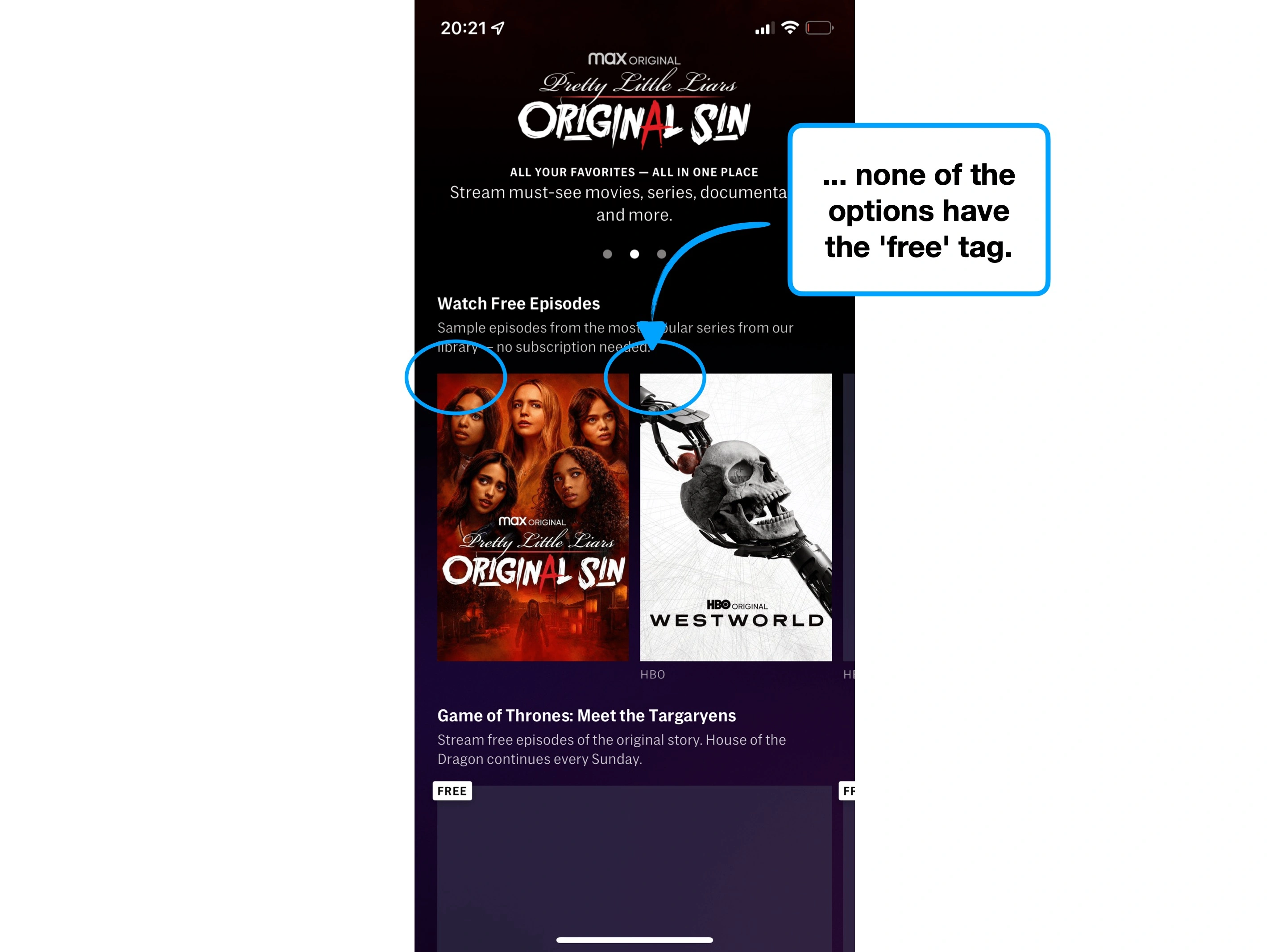
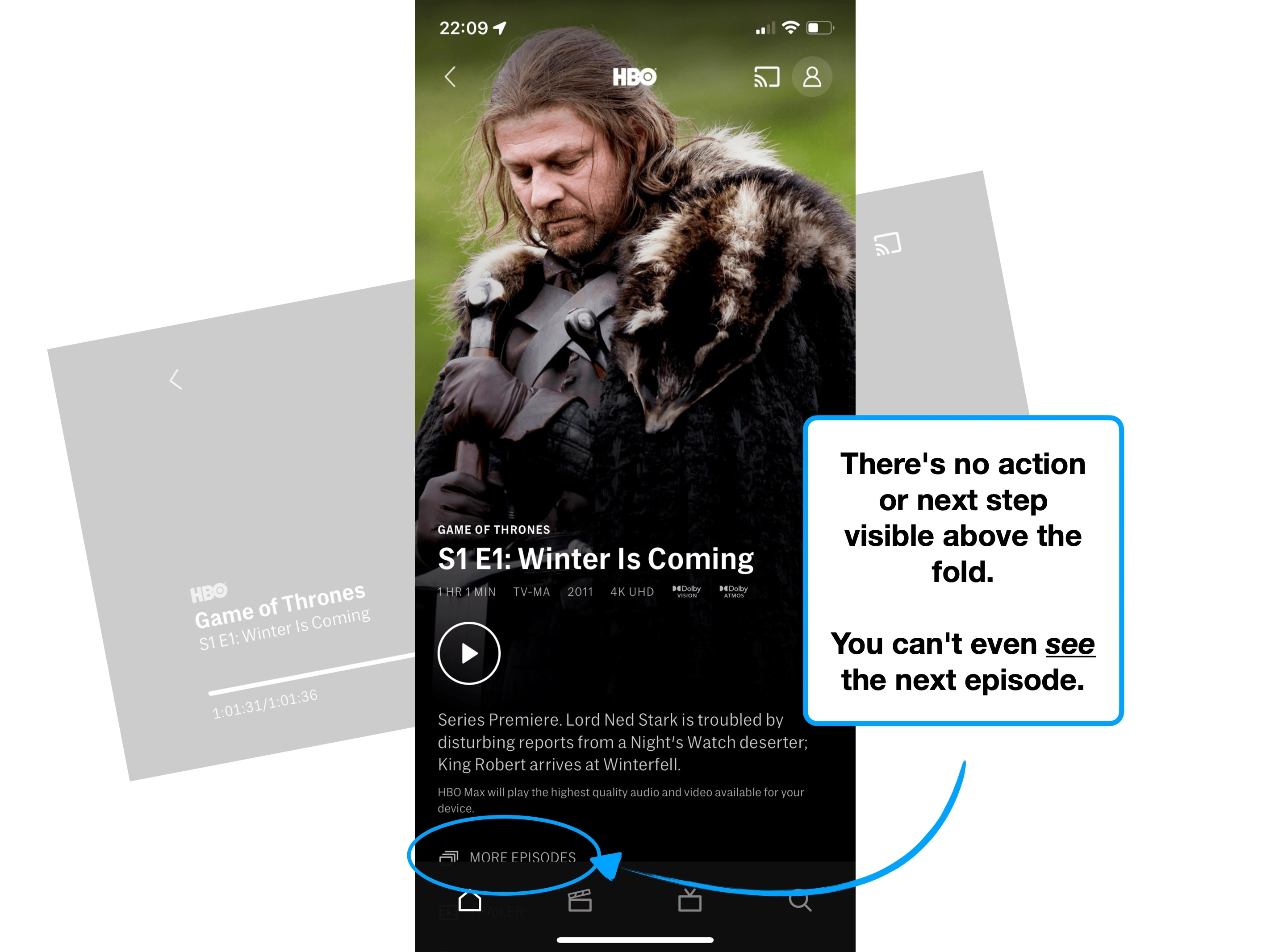
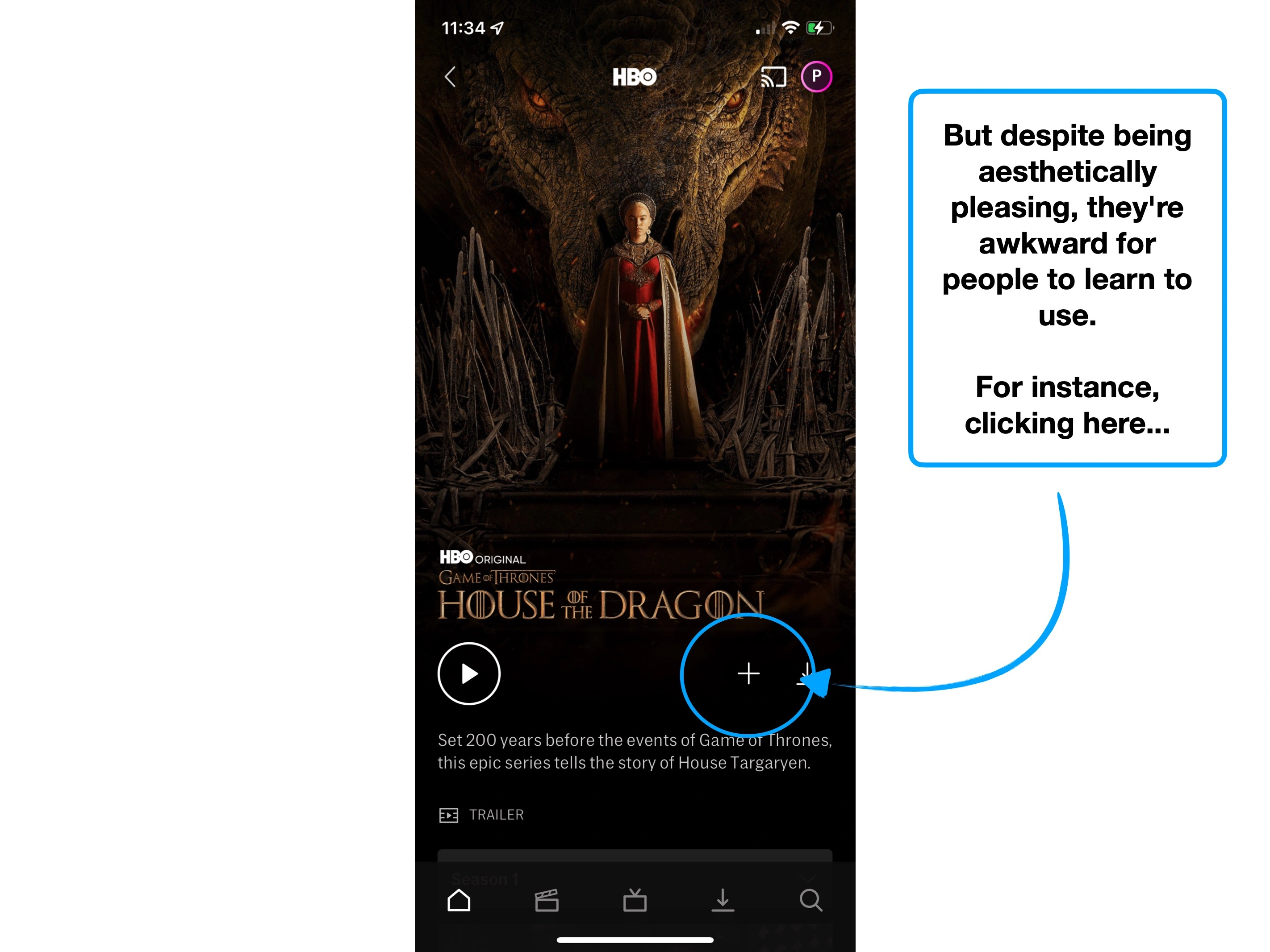
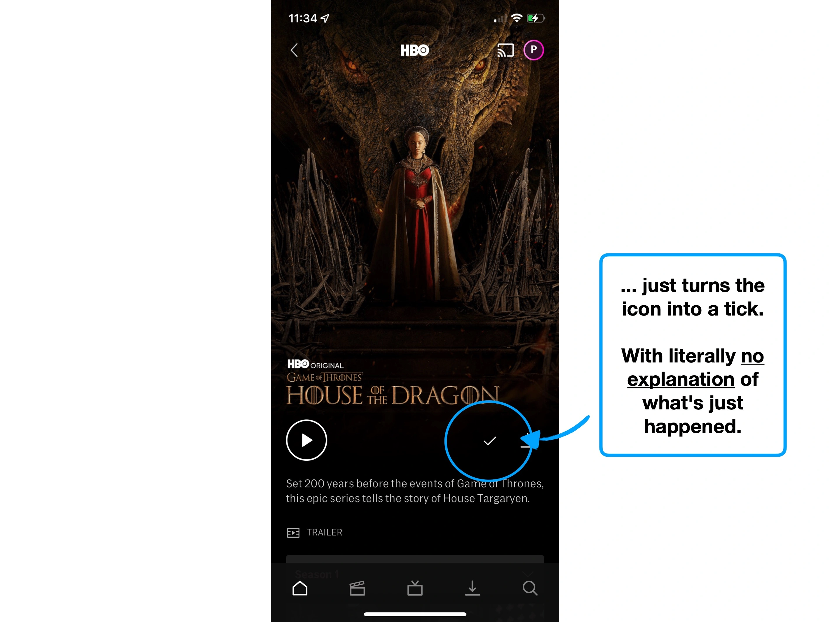
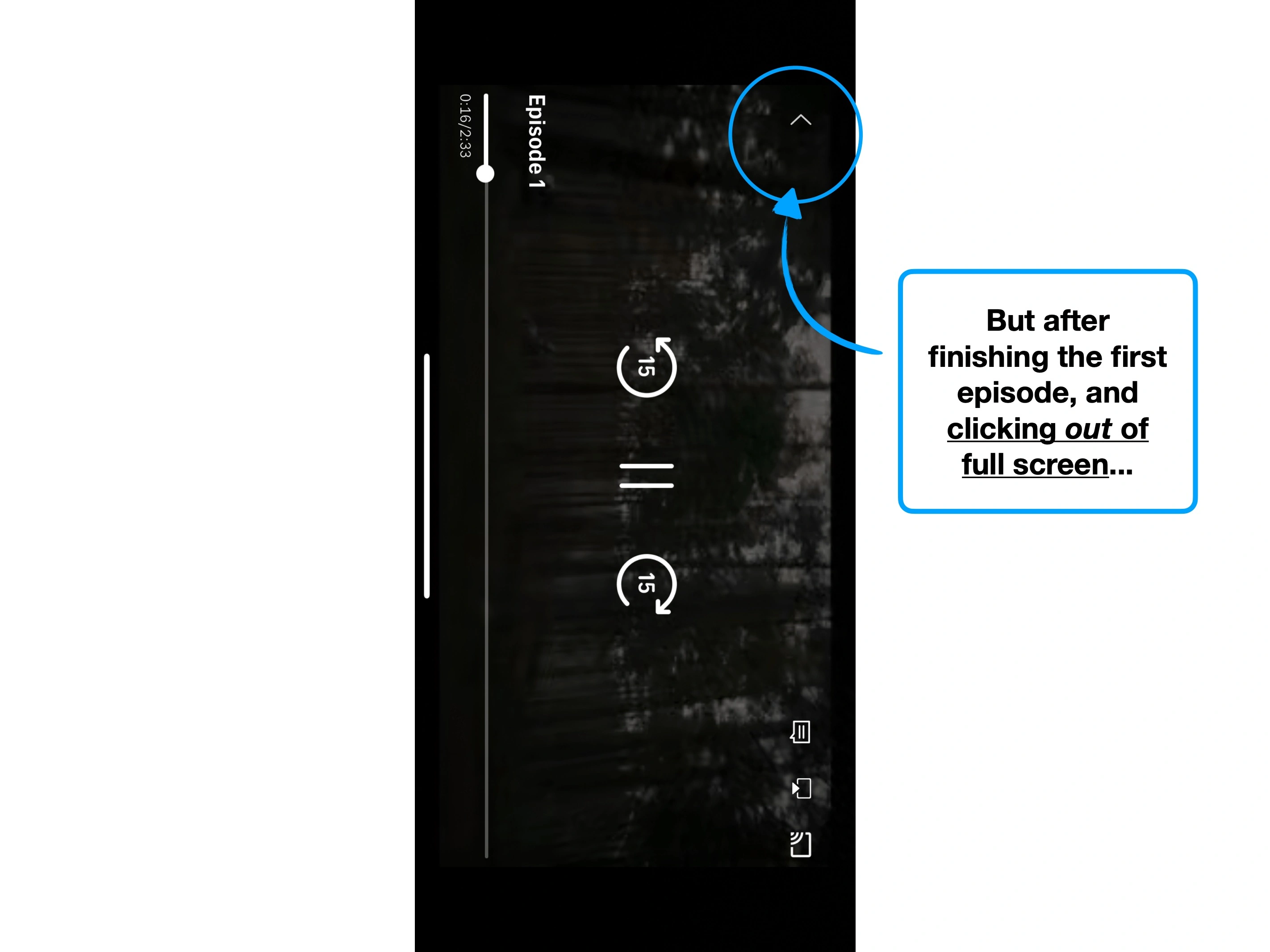
And it's the (flawed) methodology that HBO have used to distinguish between episodes that users can view for free with a trial, and those which require a paid subscription.
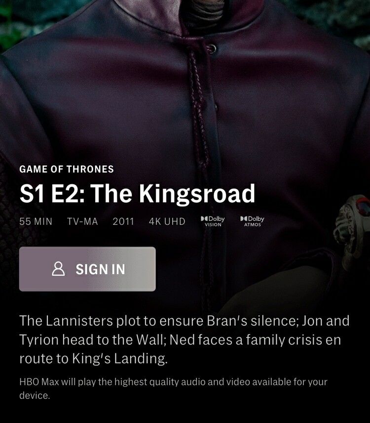
The nuance is this: if you were to just look at the first episode, you'd have no idea that it was different.
Rarely is a distinction through absence of evidence suitable in product development for anything that requires an action. Rather, it's the default for when nothing is of note.
For instance, you wouldn't ever show an "our app is working" notice, but you would show a message when the server is down for maintenance.
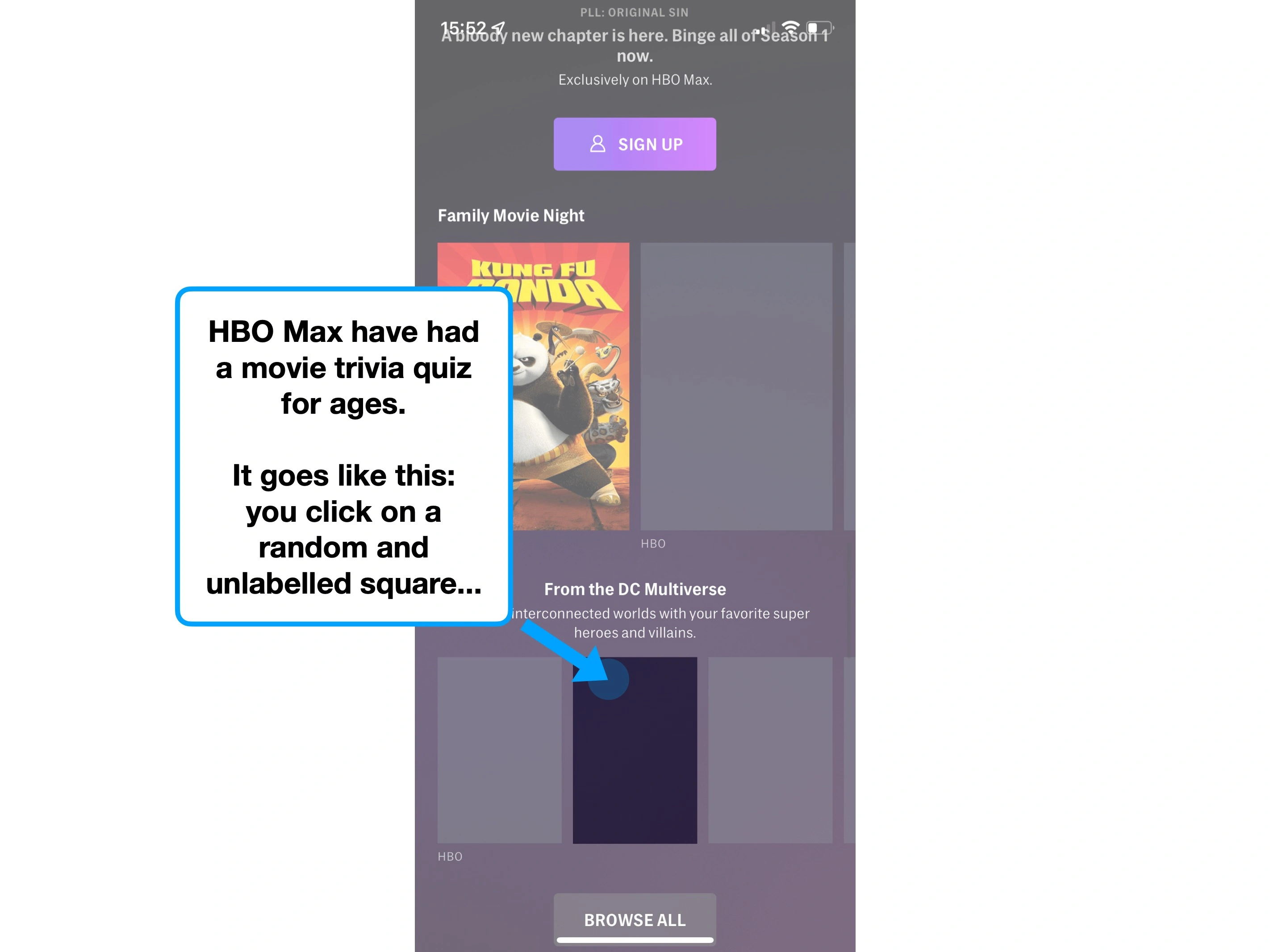
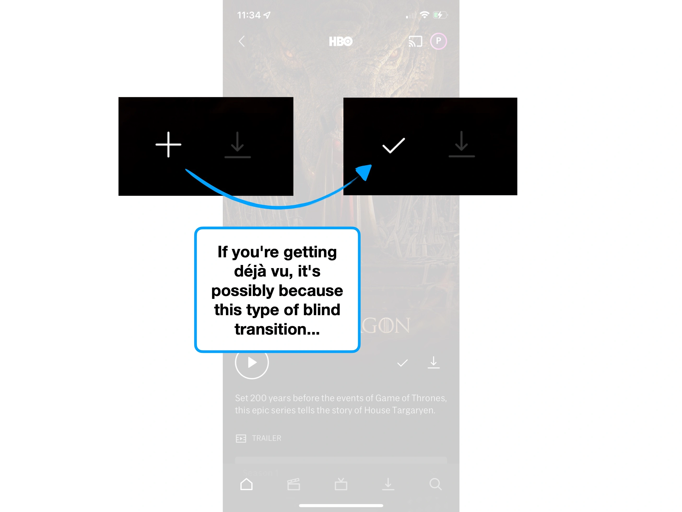
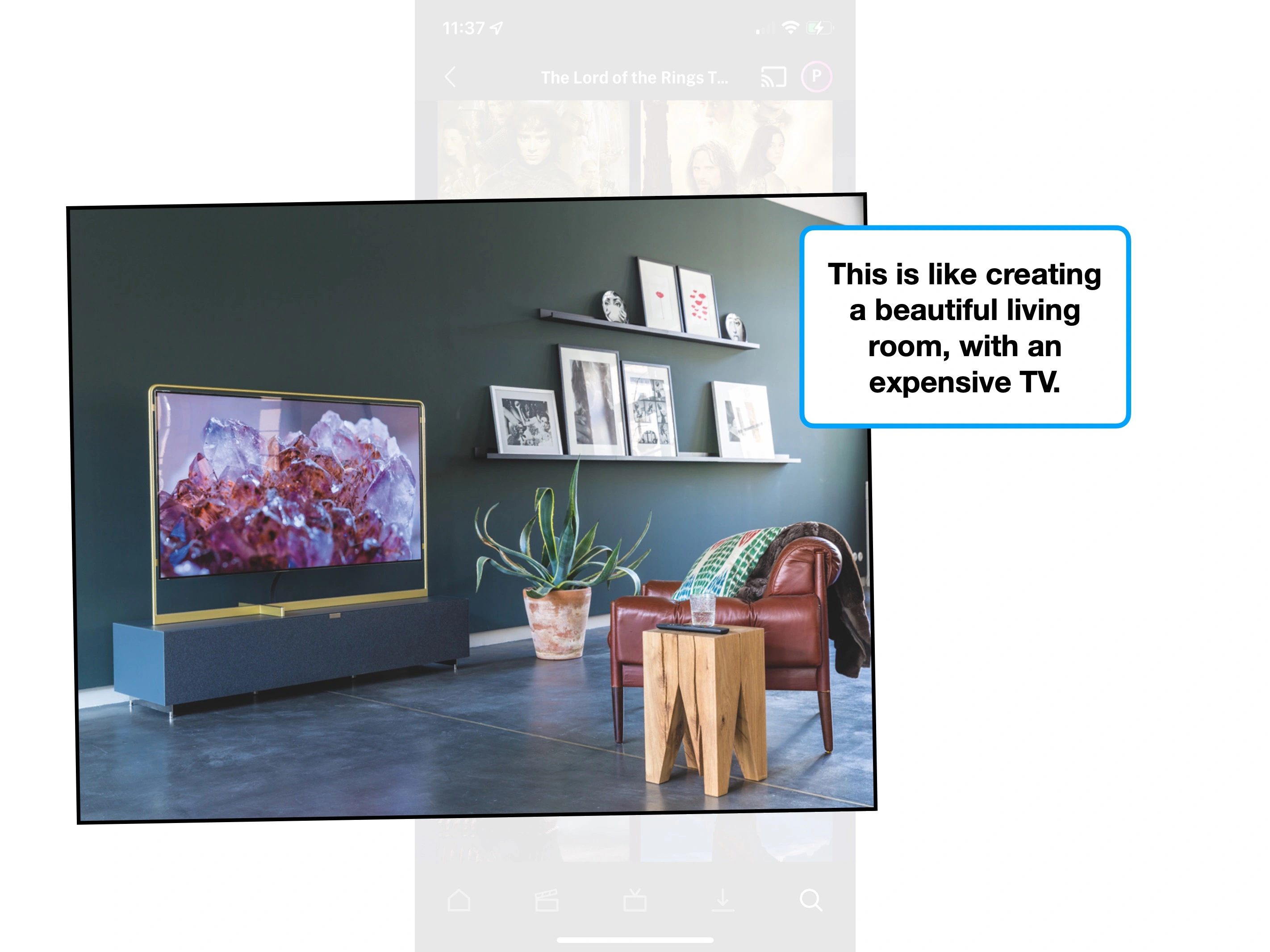
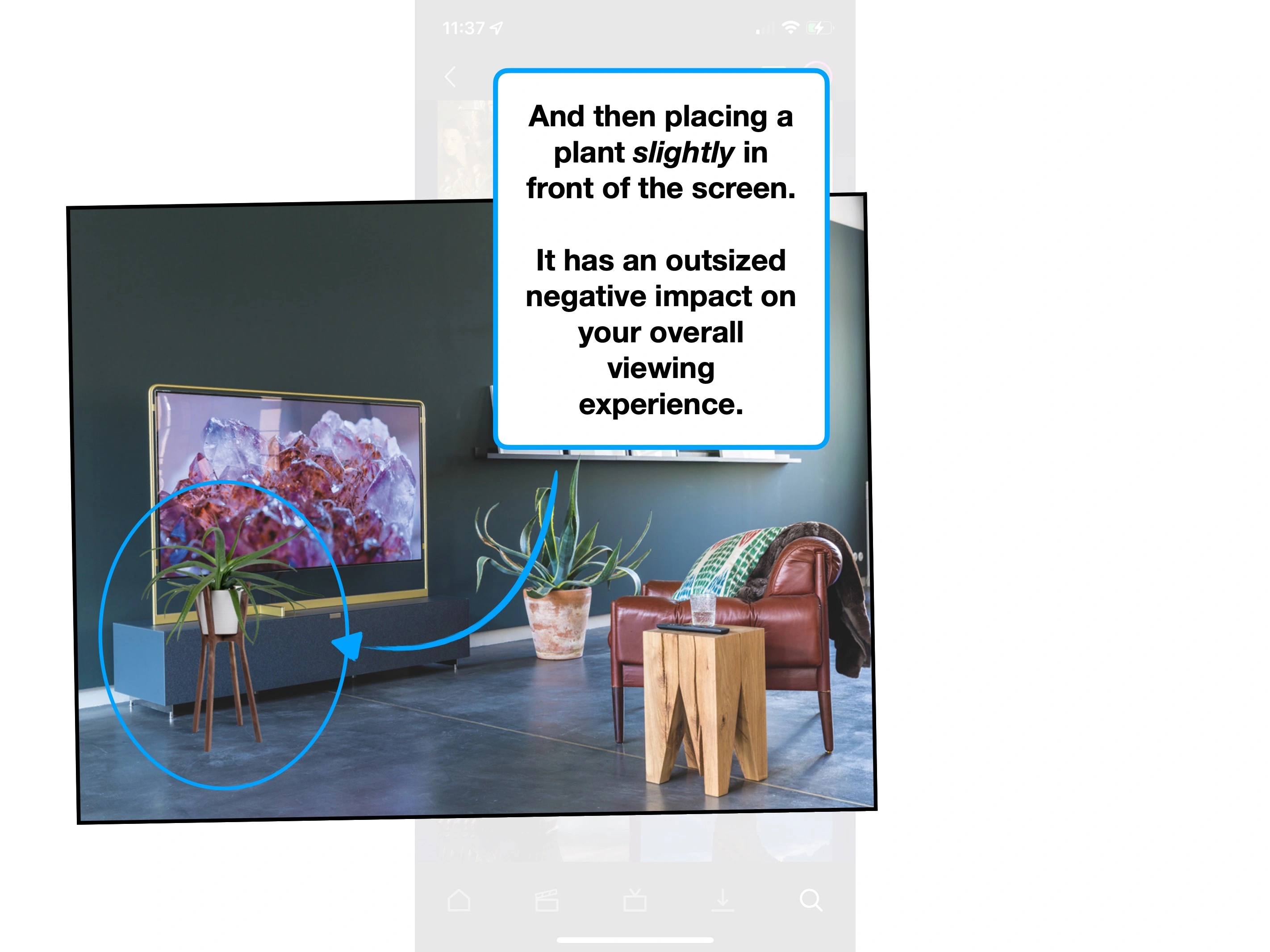
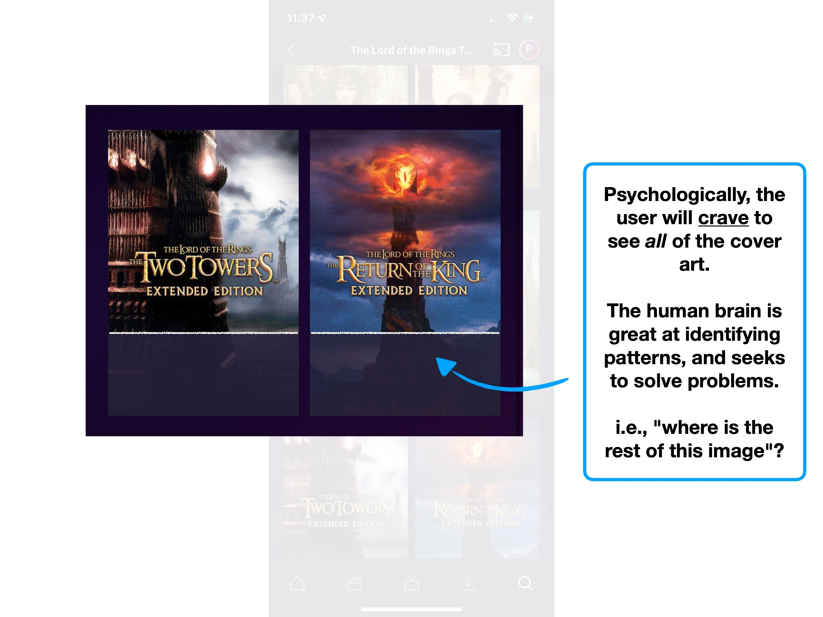
Our brains are well-trained recognition machines, and they crave both patterns to find and problems to solve.
Outliers are quickly noticed, and hard to ignore.
A fly landing on your TV, despite blocking an insignificant proportion of the total screen, creates a major distraction.
When reversed, this psychological bias towards full information can be utilised to keep viewers engaged. This is one reason why it's hard to turn off Catchphrase mid-round (as they reveal the squares).
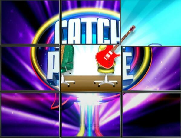
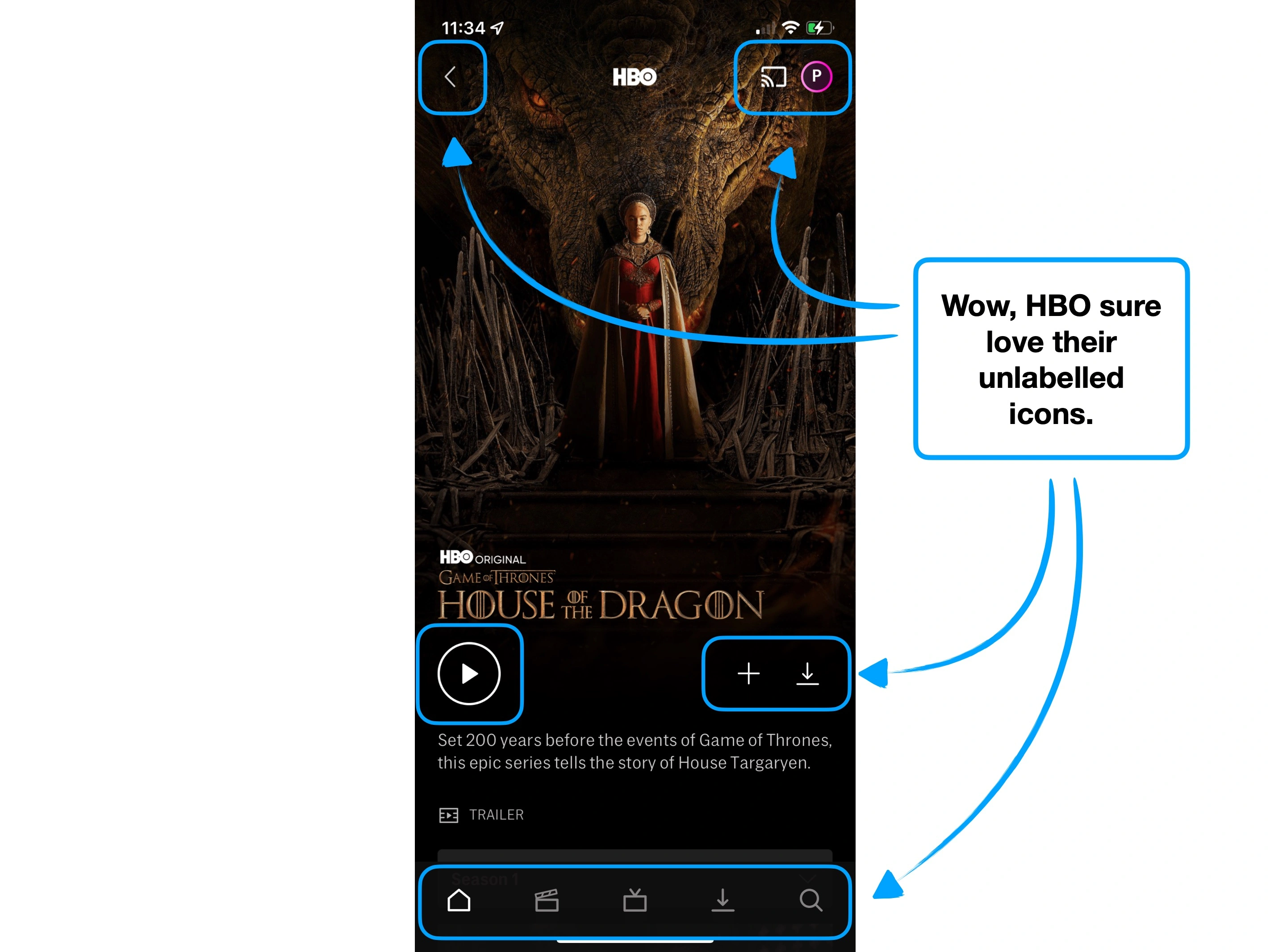
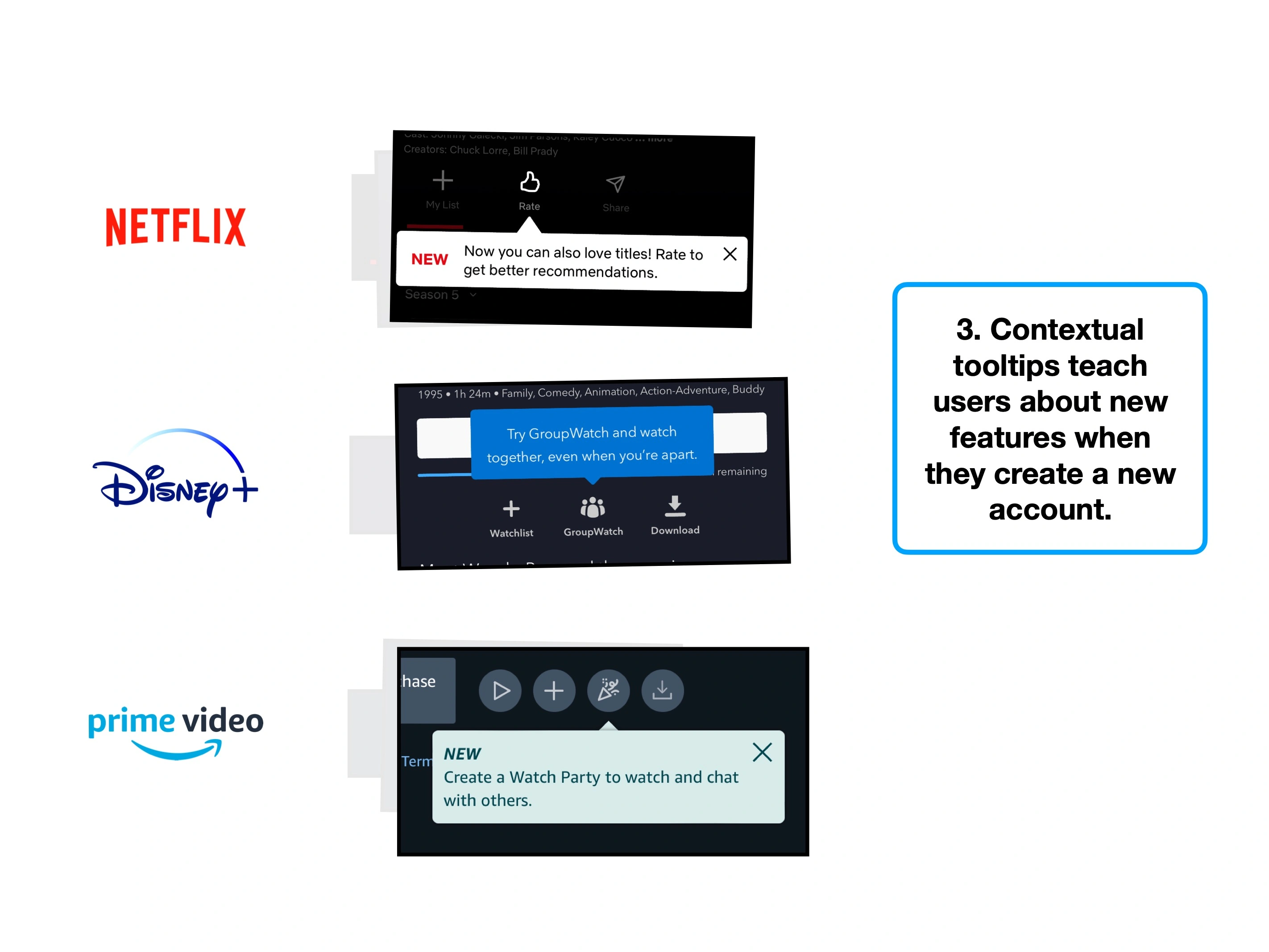
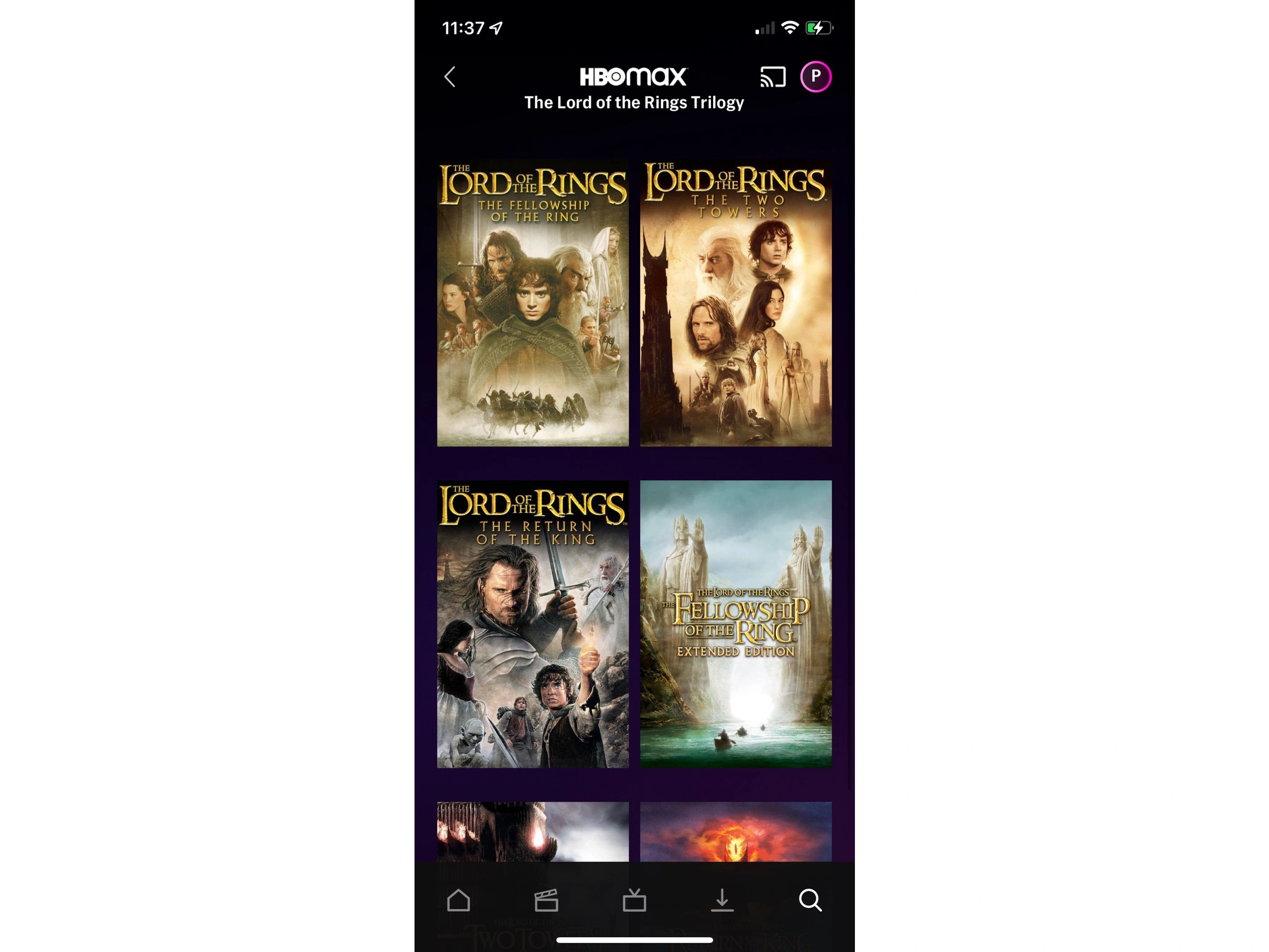
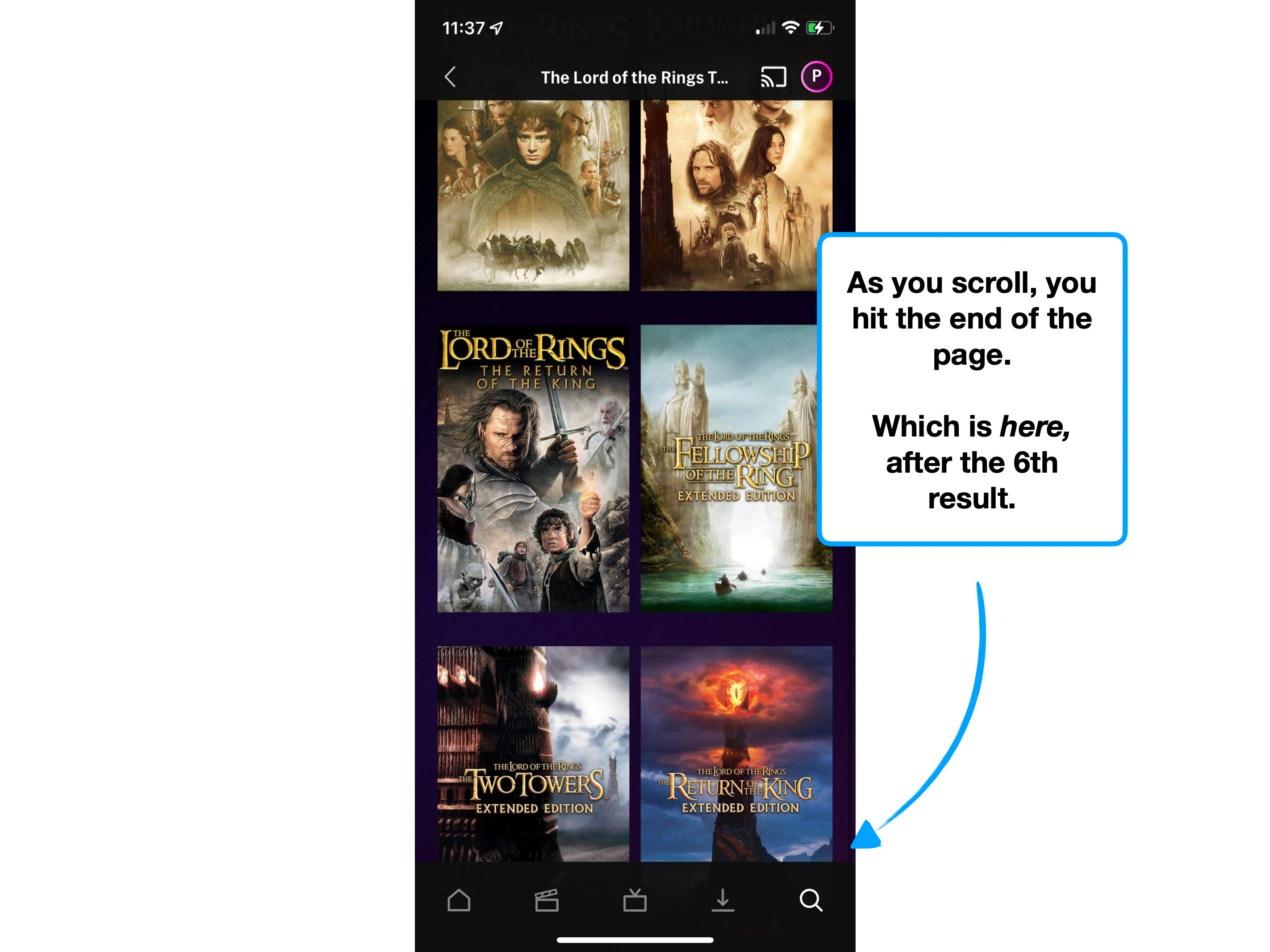
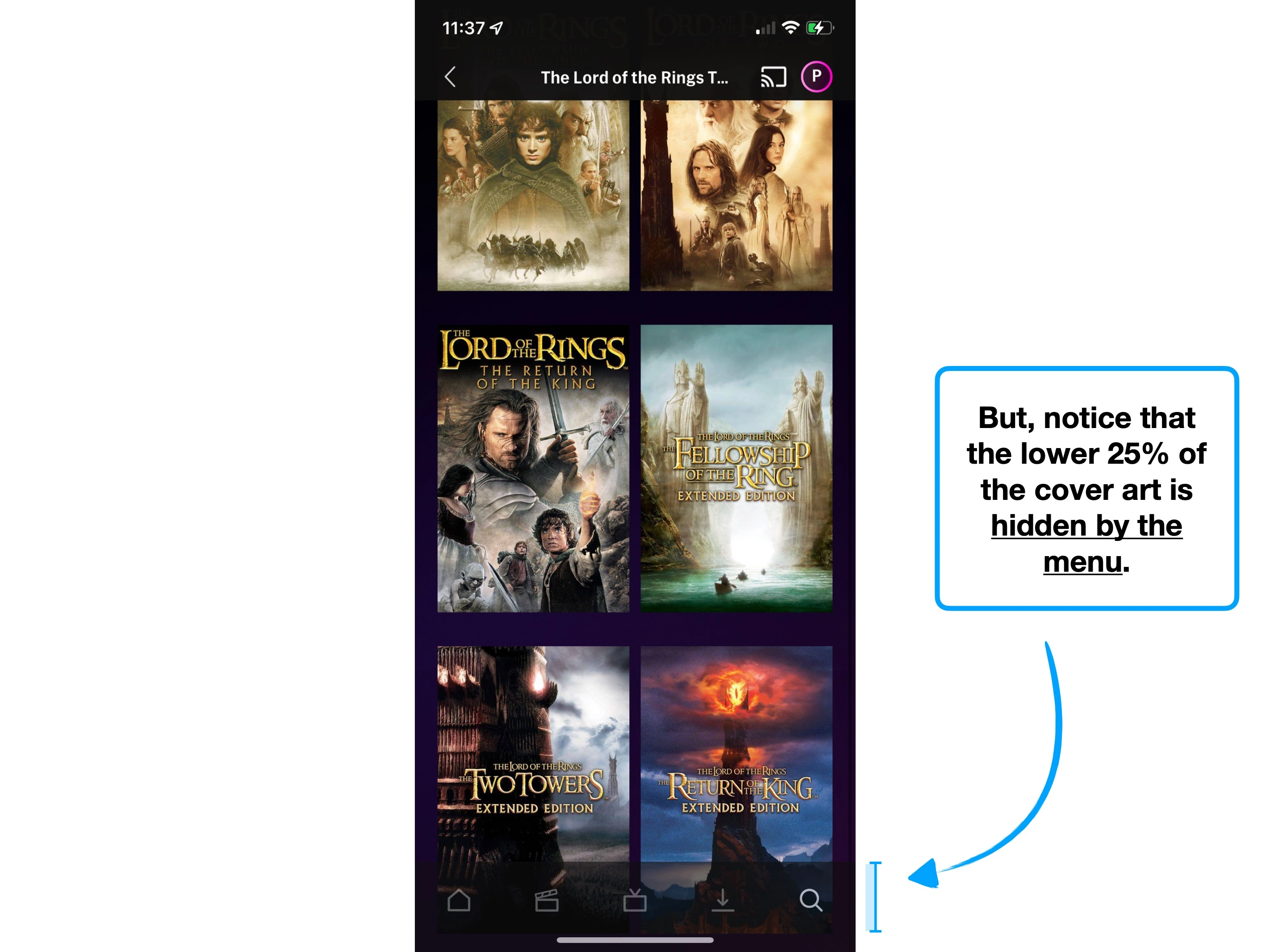
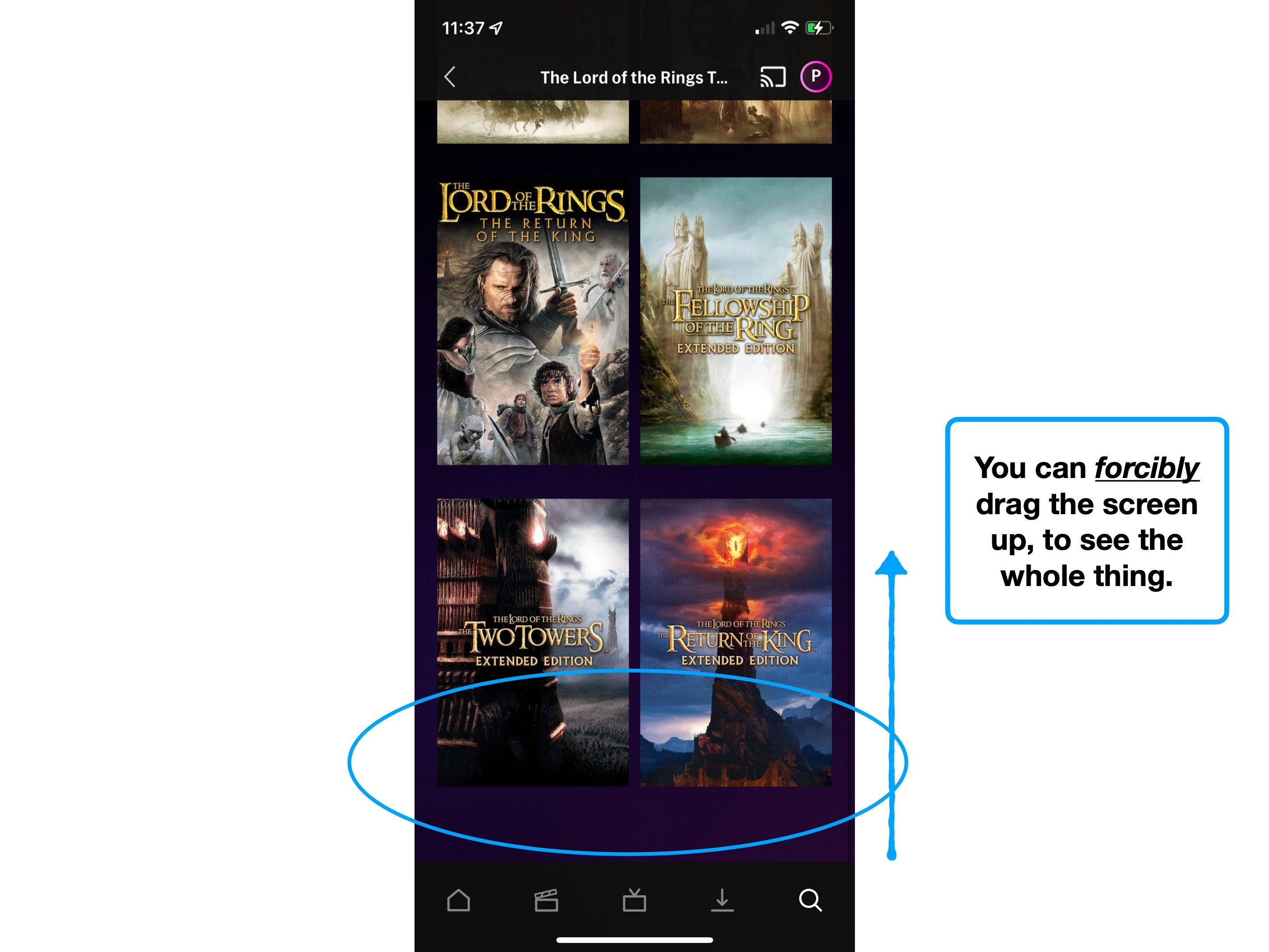
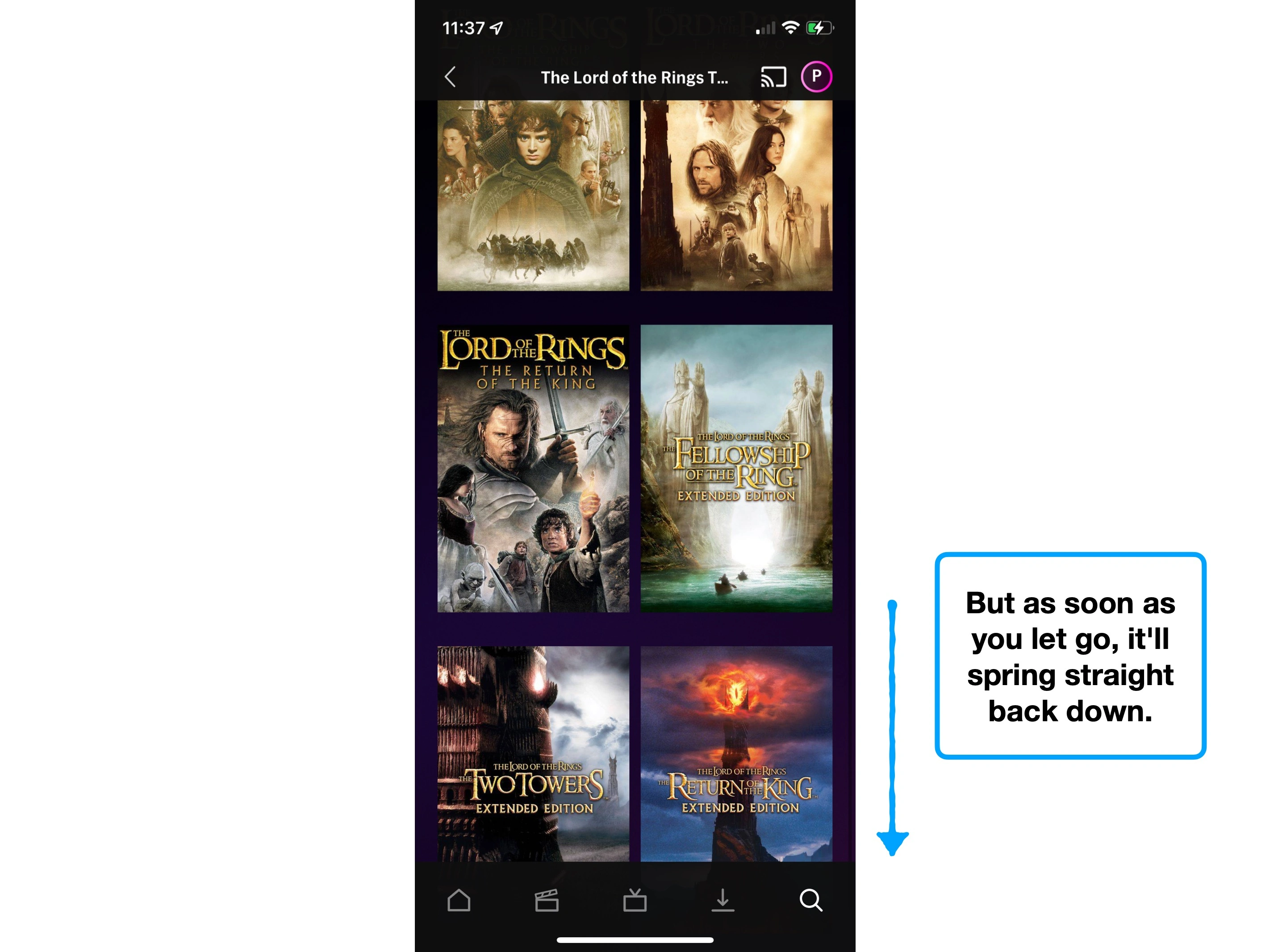
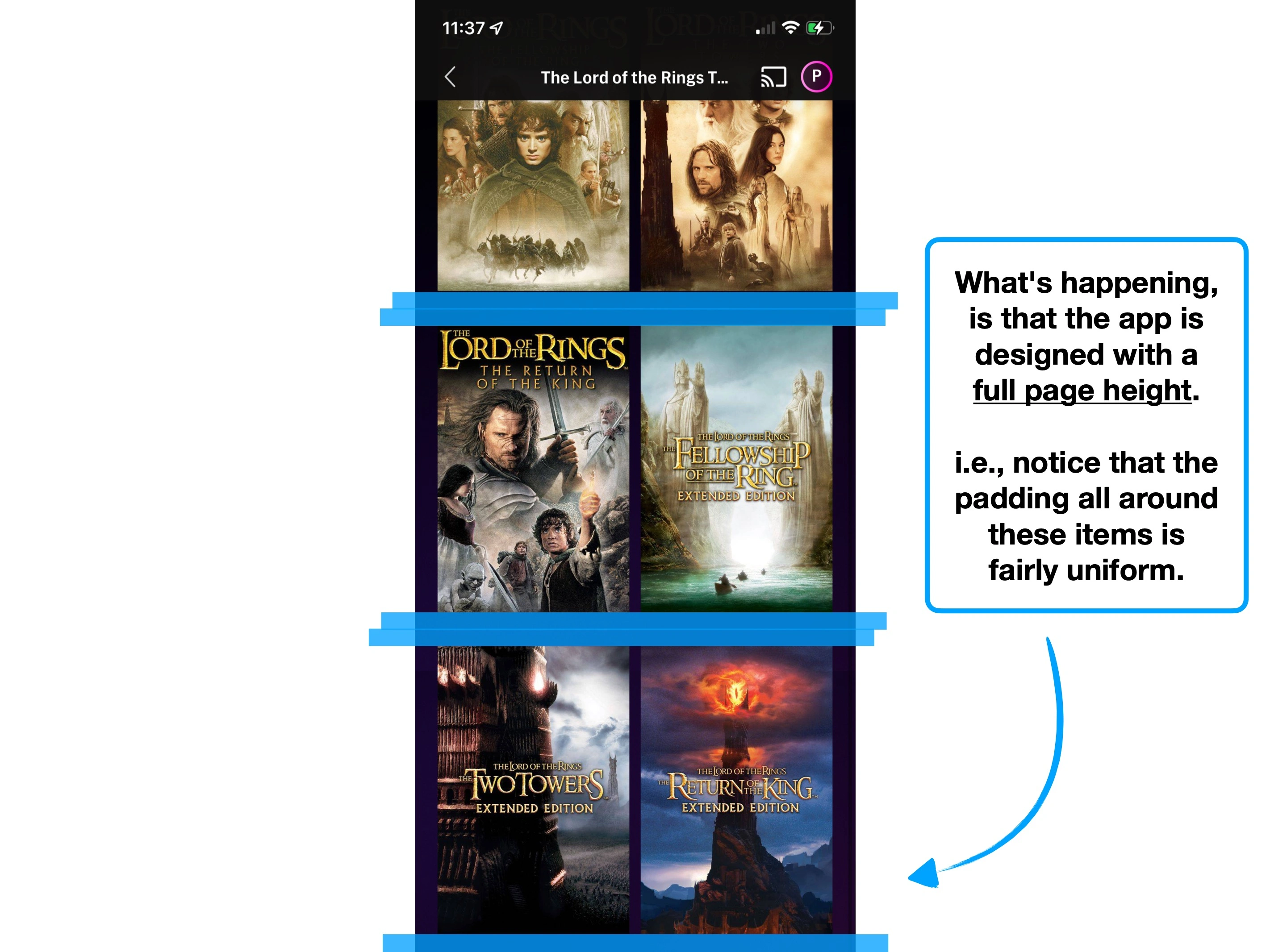
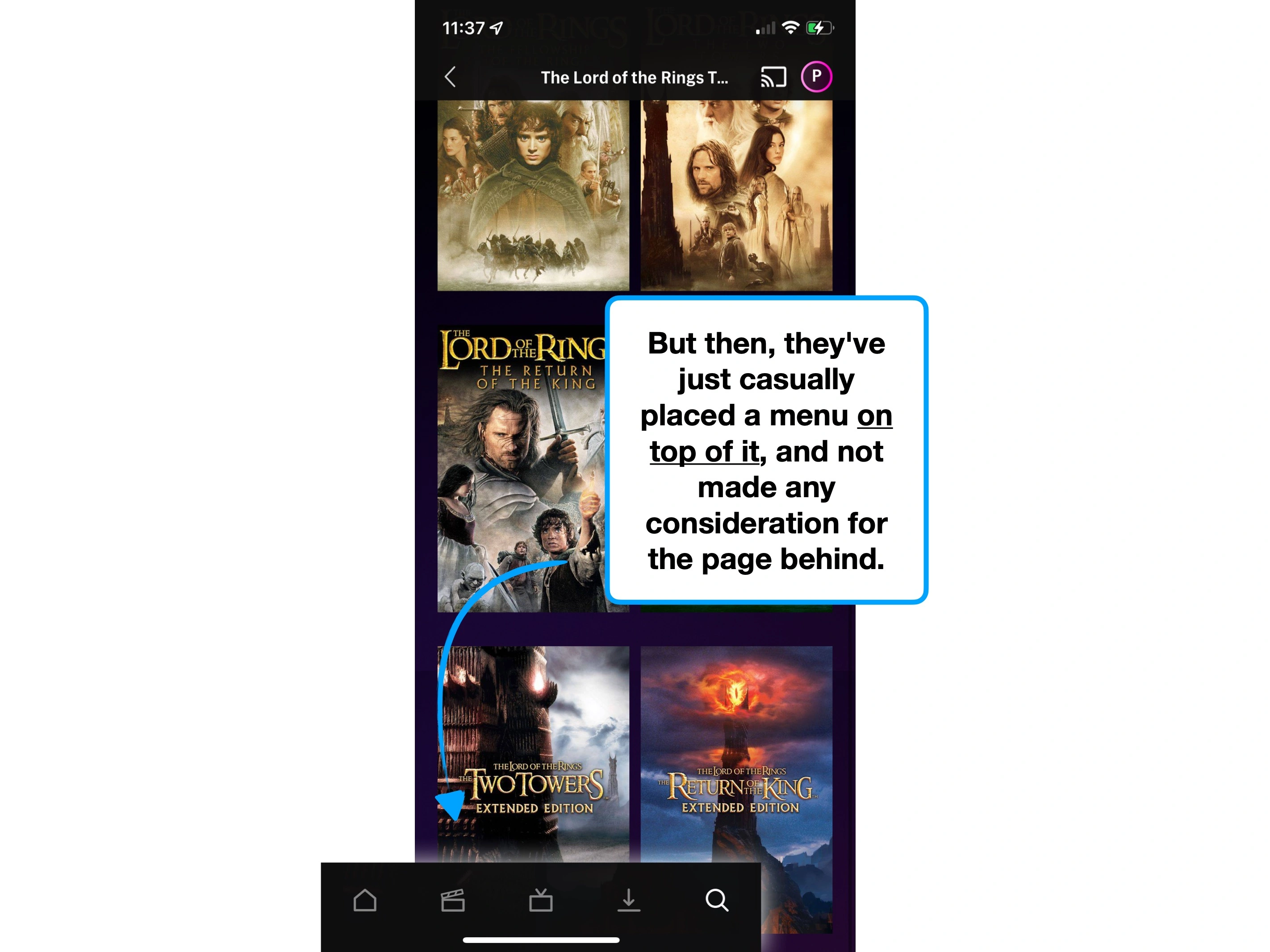
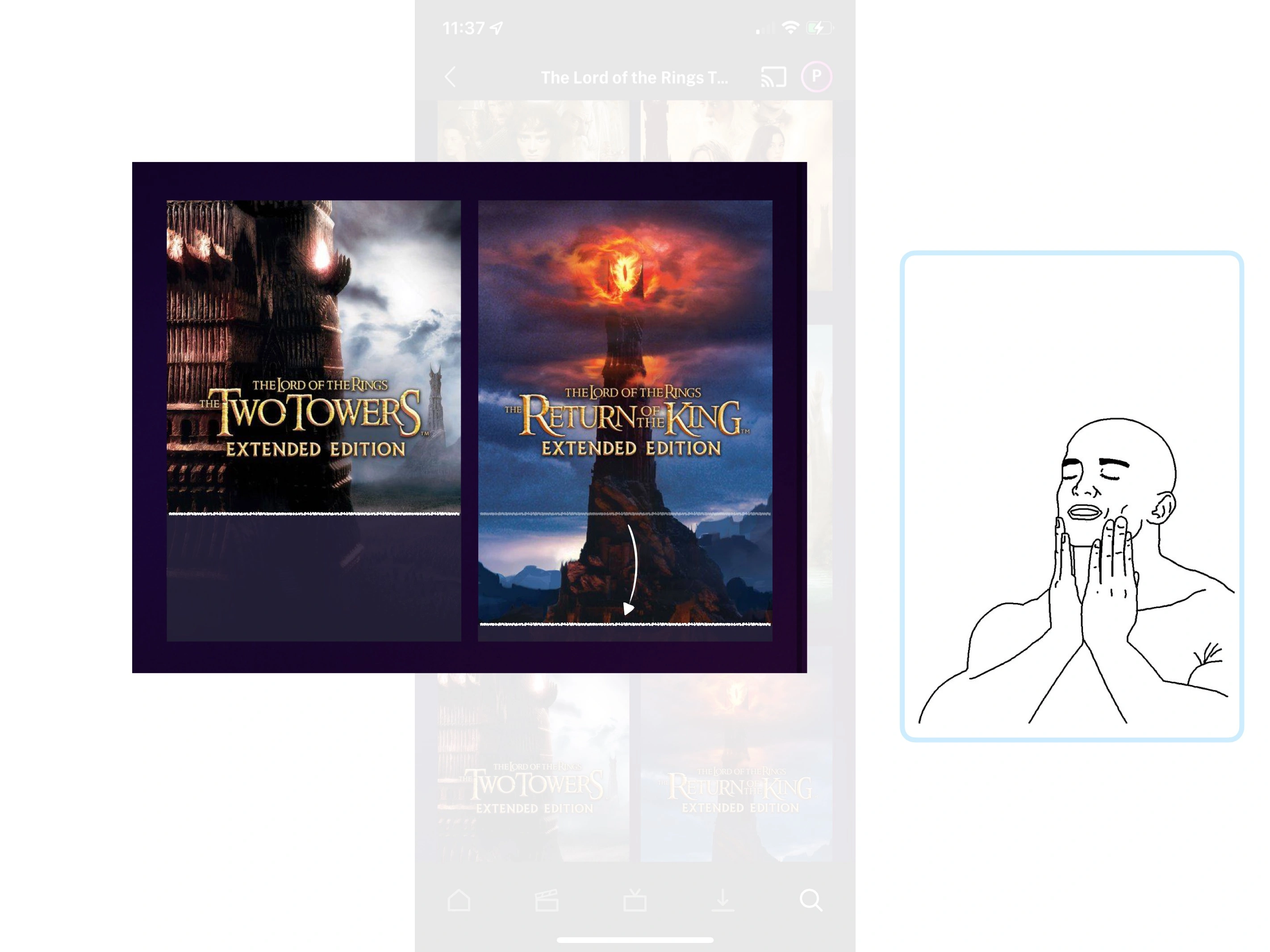
HBO aren't using it to increase engagement though—they've accidentally implemented it due to a poorly-designed sticky menu.
i.e., the final items in any list are partially-covered.
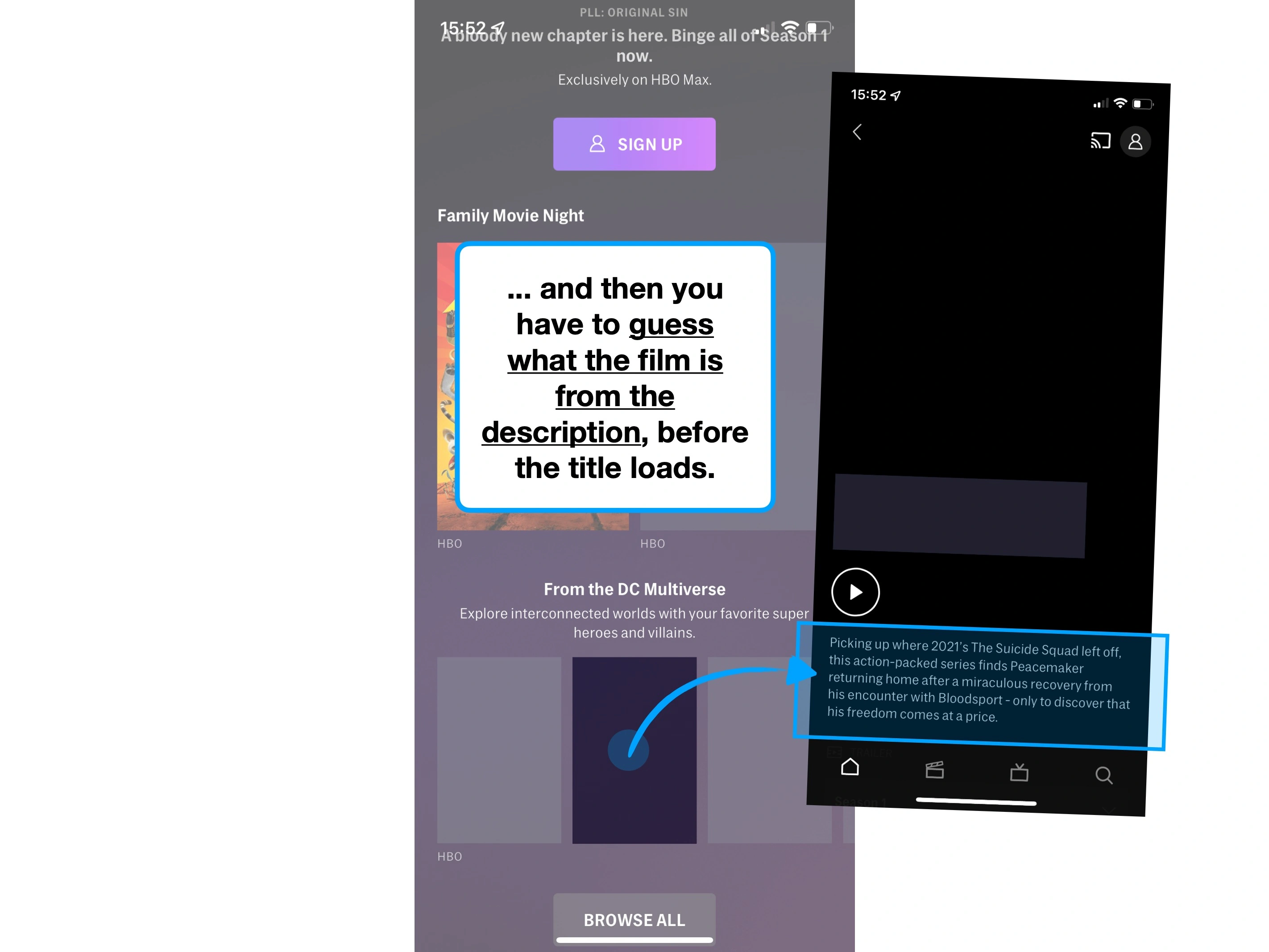
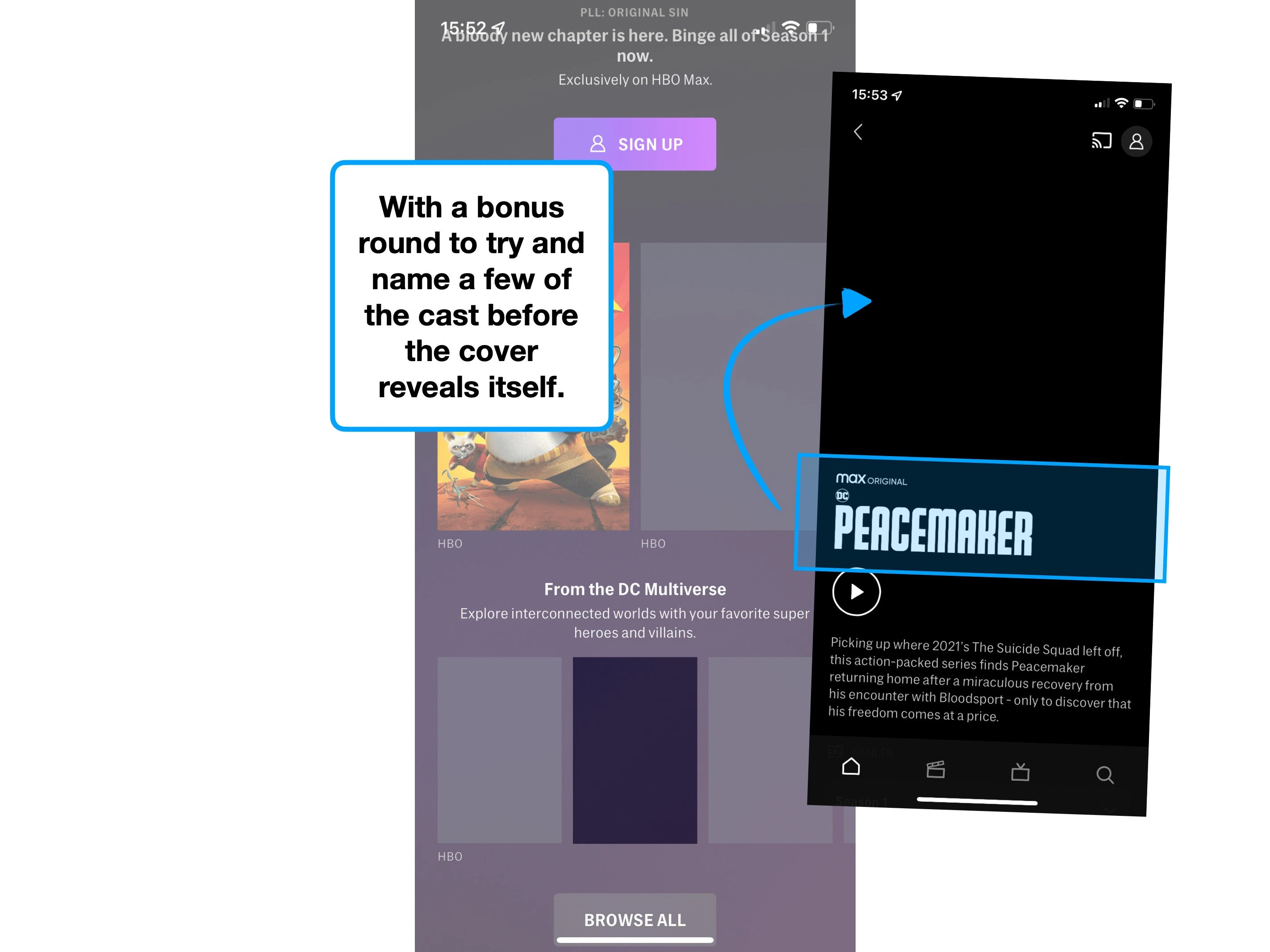
This type of issue is a product manager's nightmare.
The issue is widespread, and will annoy a large cohort of users—but it's not quite annoying enough for people to complain about.
So, how do they learn that the issue even exists?
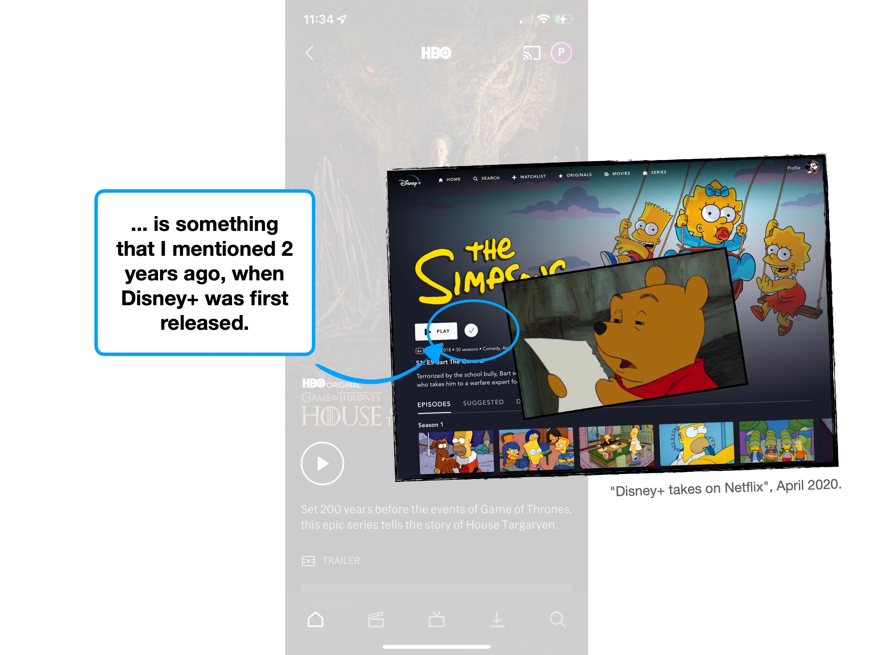
Another example of a silent frustration is a poorly-designed cookie notice. It can be really bad, and almost everyone will forget about it 30 seconds later.
This doesn't mean that it's not a problem: people often remember how they felt using your product, even if they can't recall the specific issues.
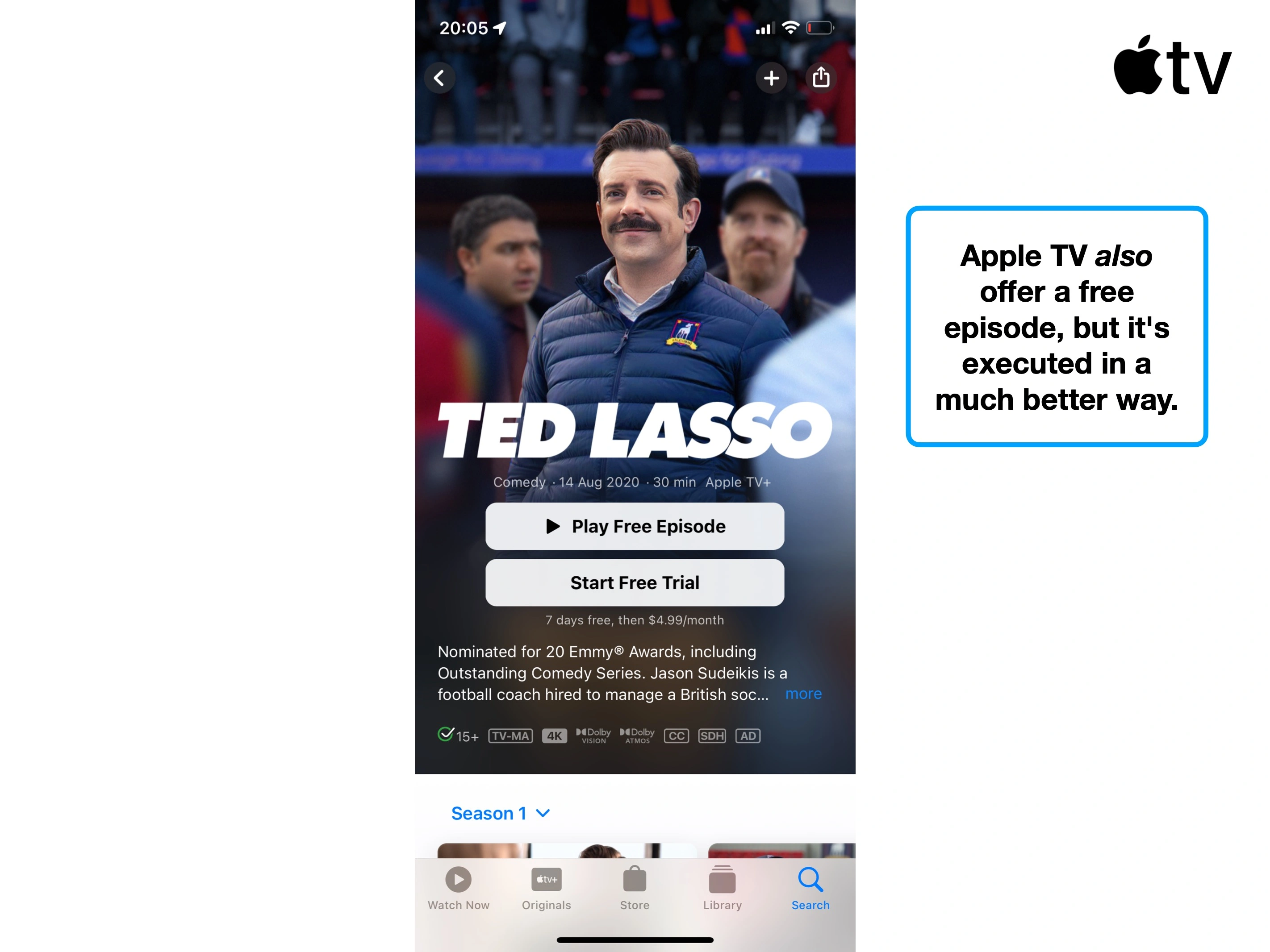
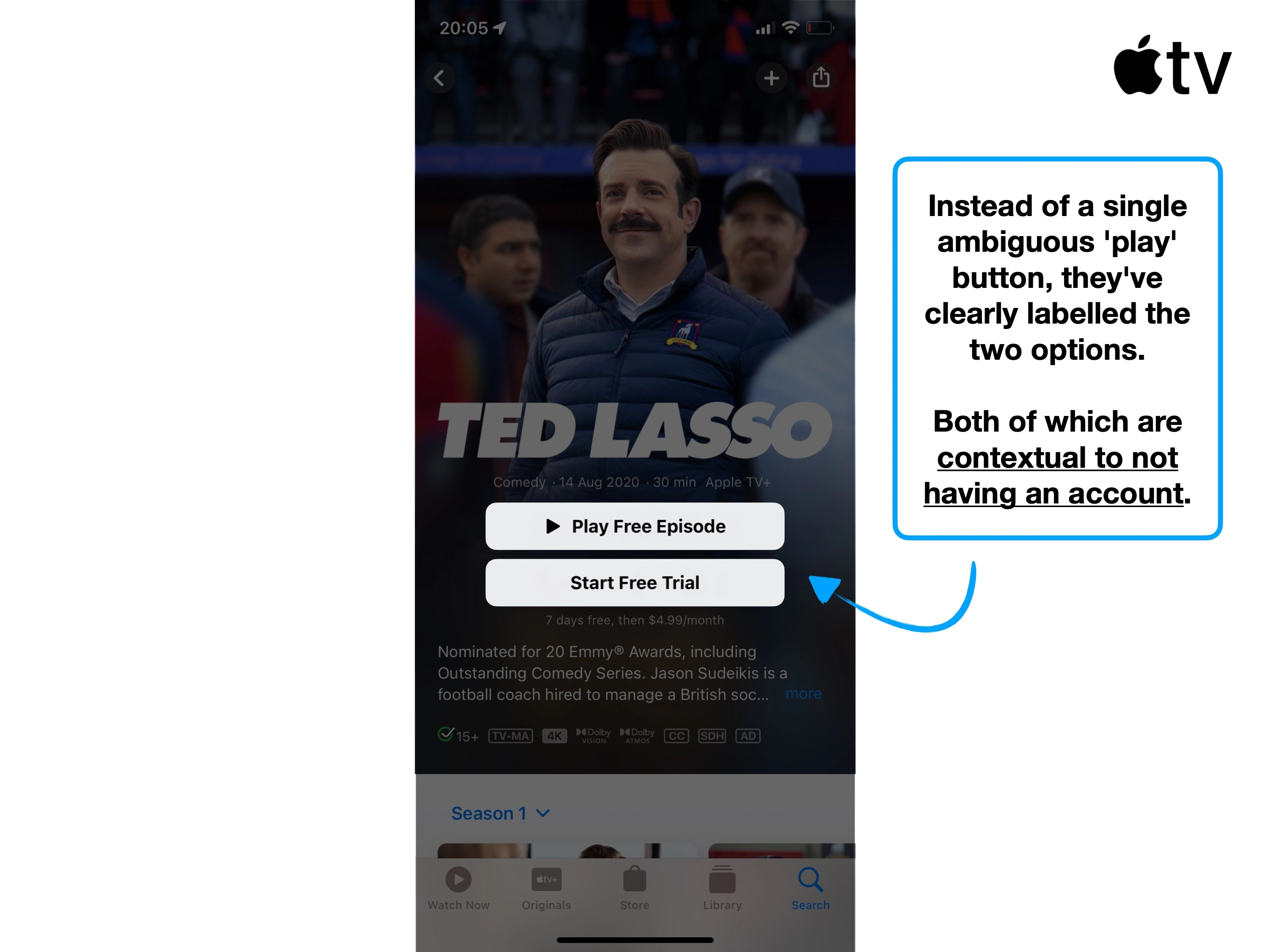
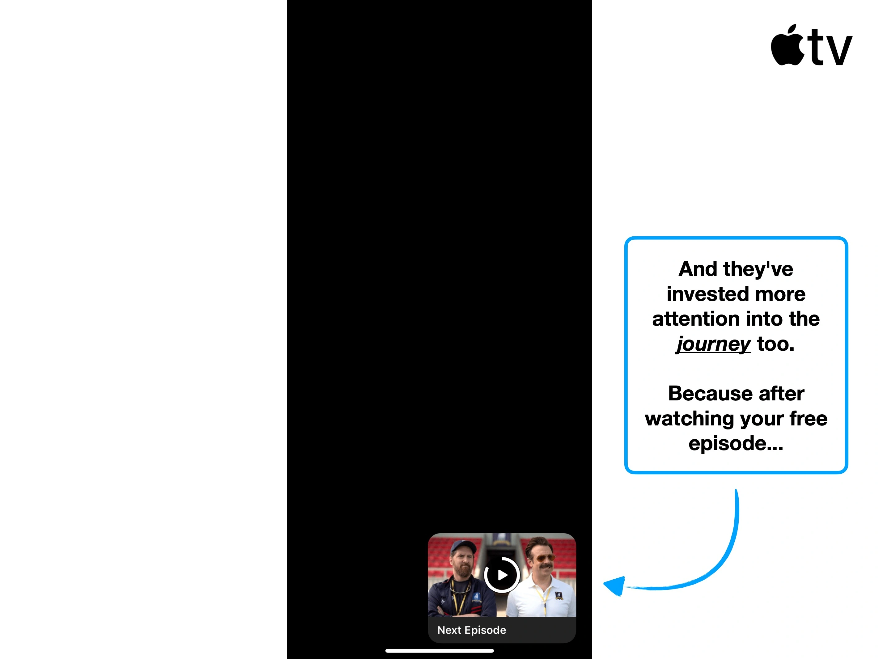
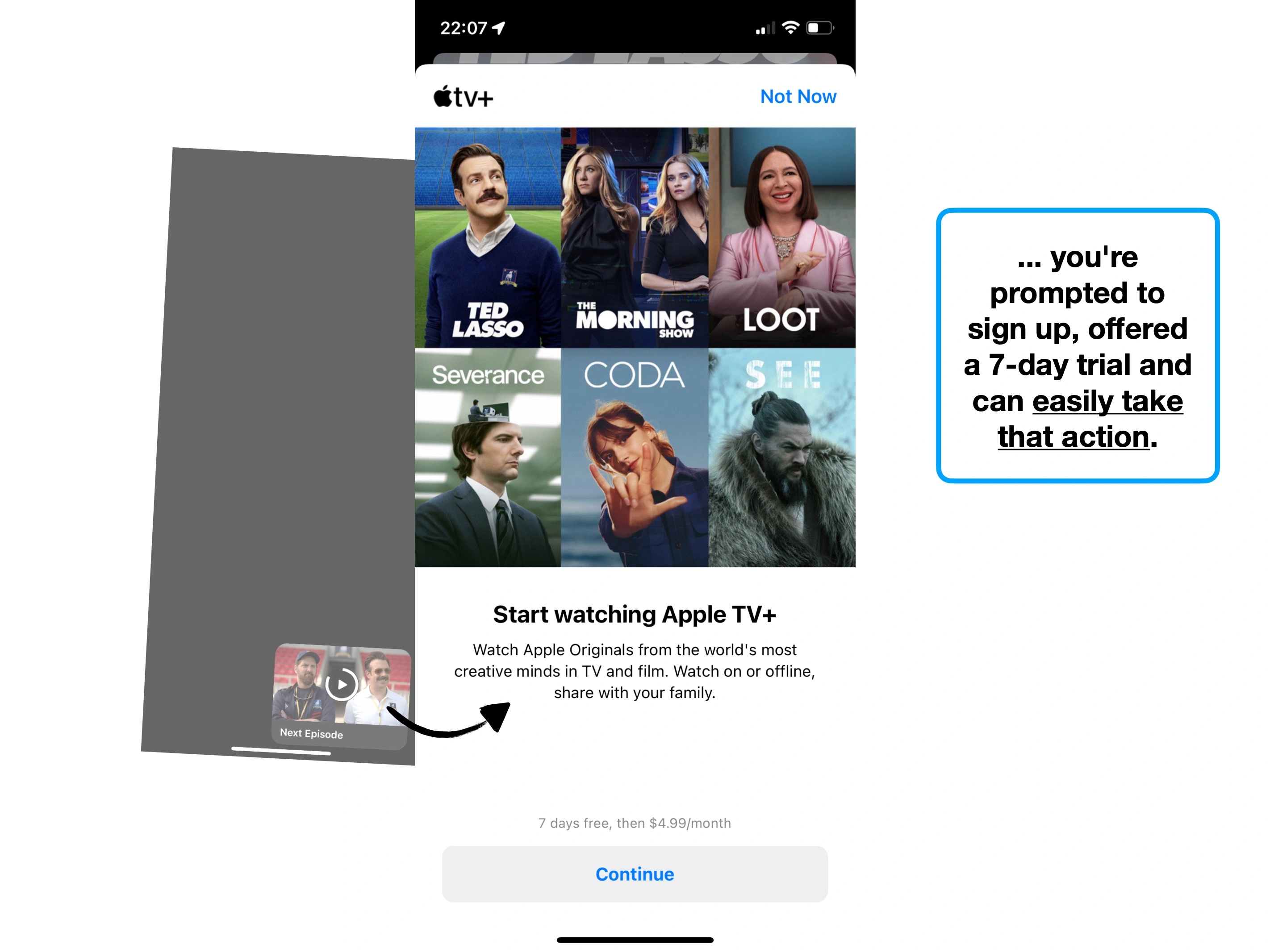
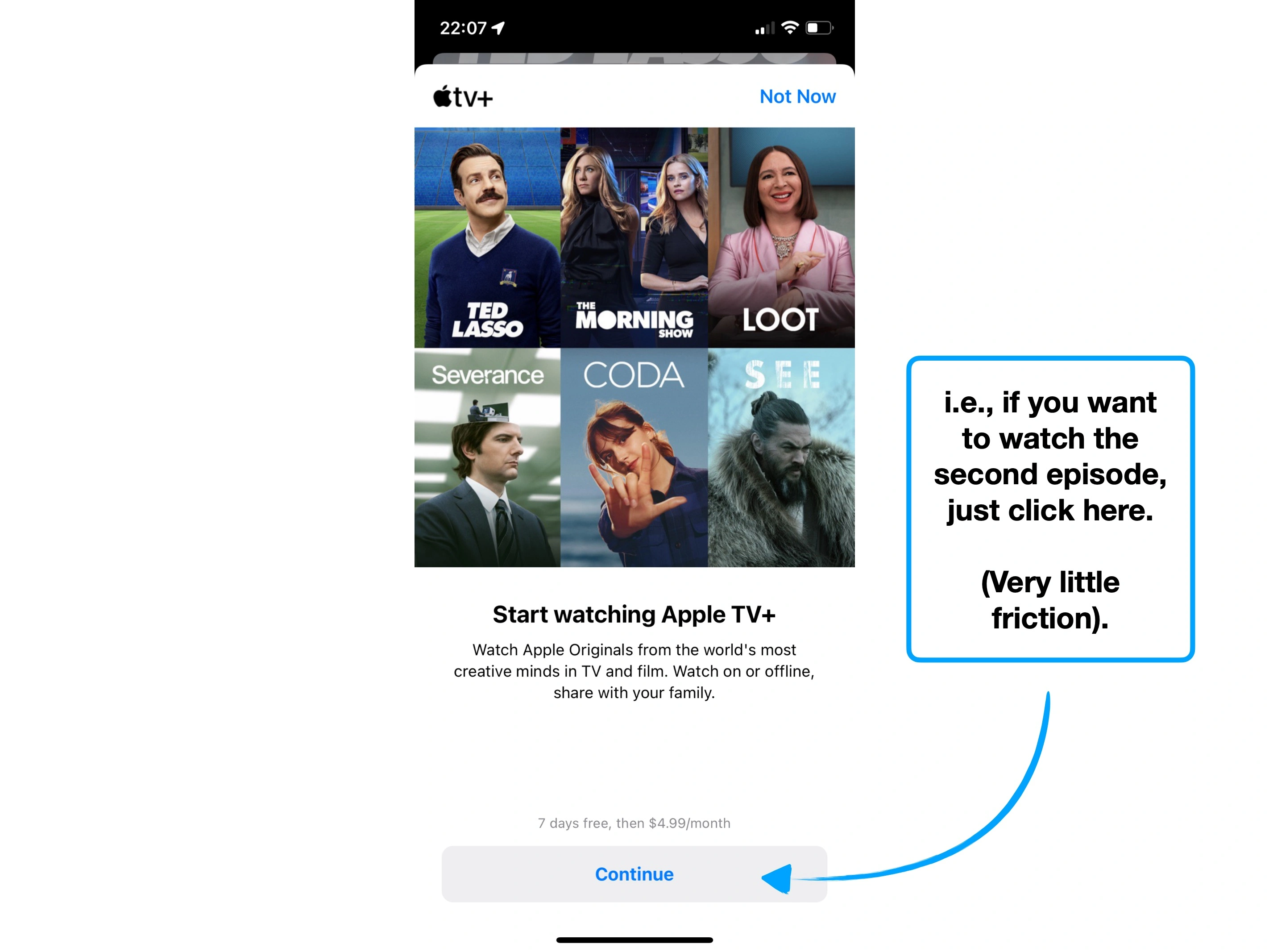
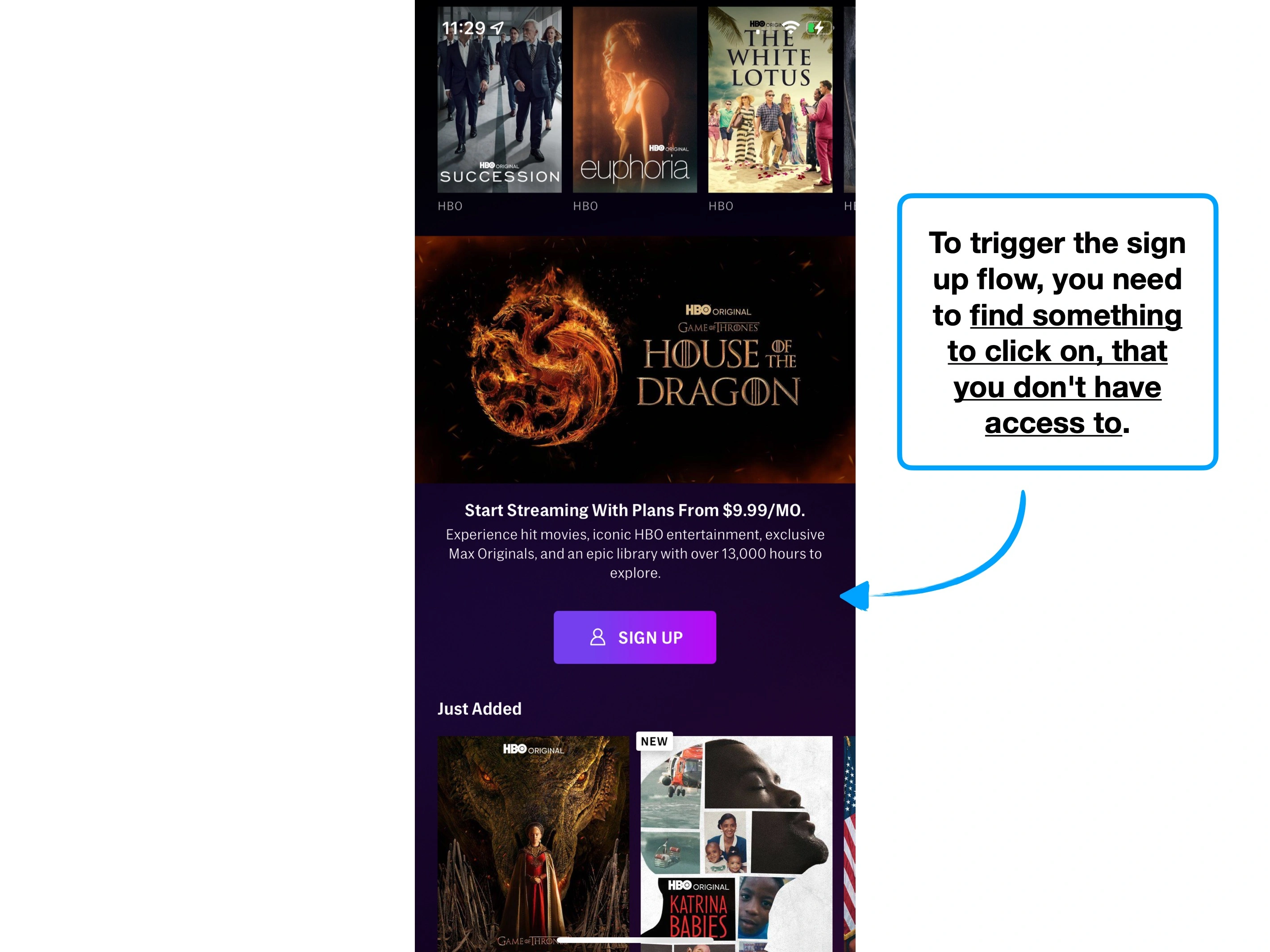
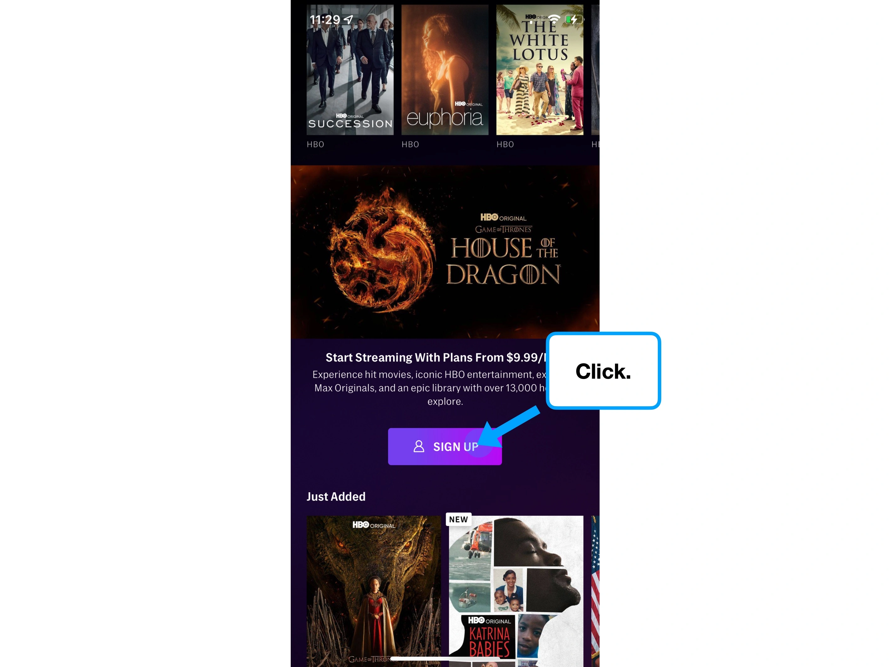
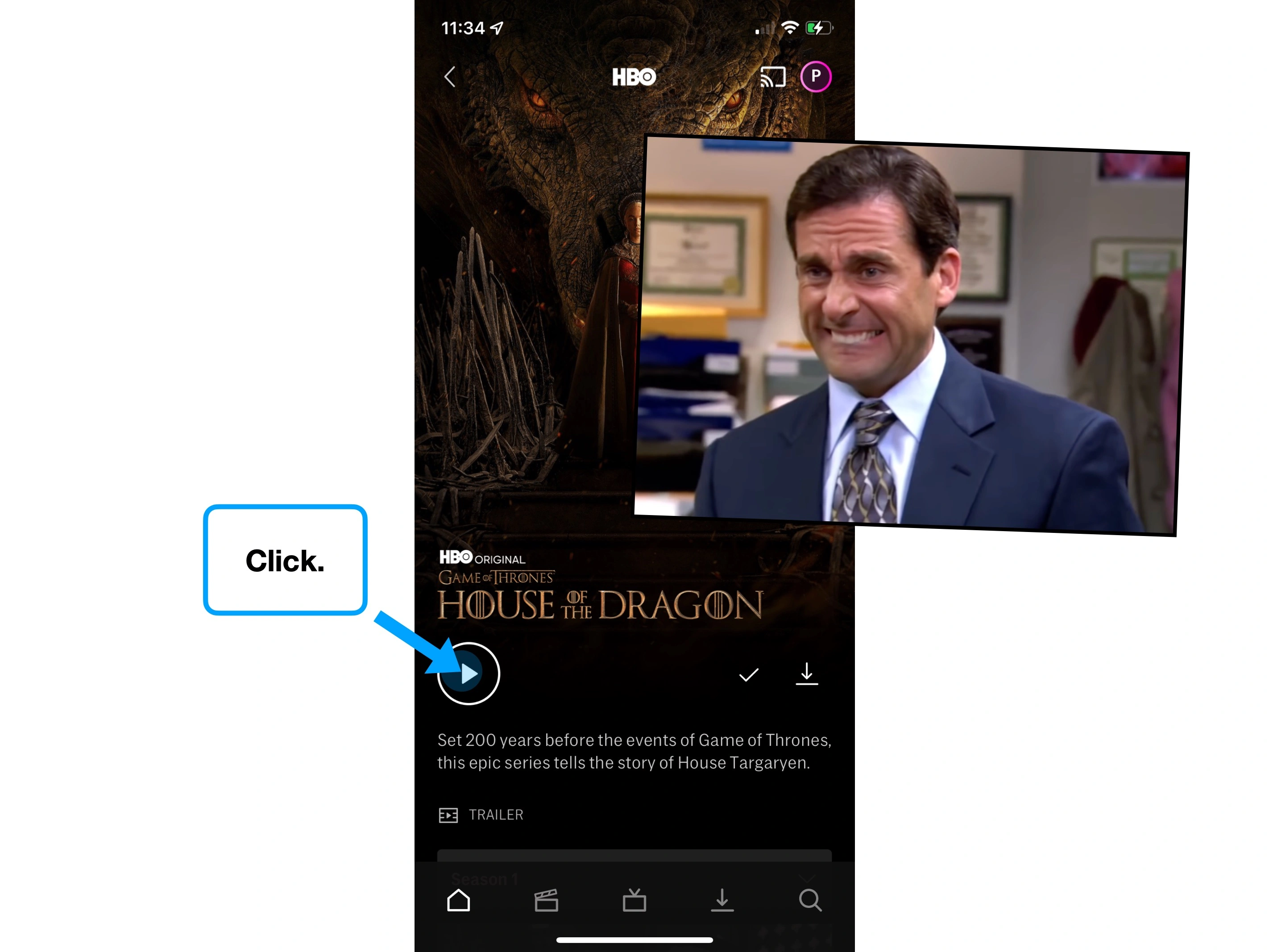
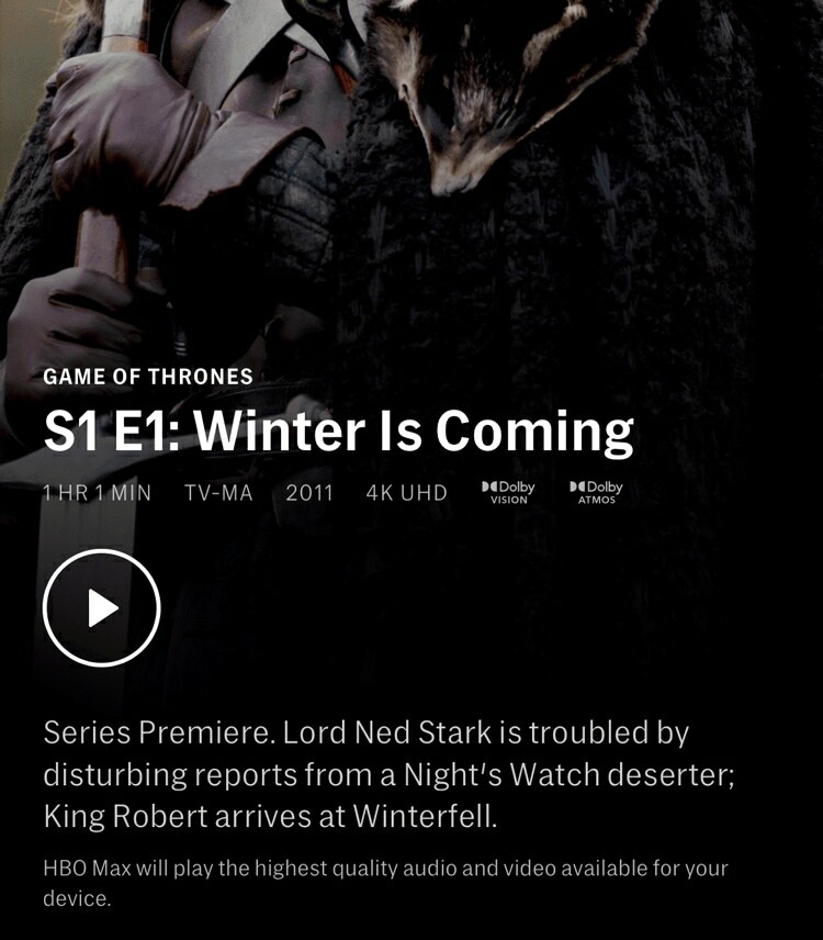
After watching a free episode on Apple TV, you're tempted into playing the next one. There's an auto-play timer, so doing nothing automatically takes that action, after which you're prompted to subscribe.
This is super effective, partly due to the ⛳️ Default Bias, and partly because the experience is delivered on-time, and works really well.
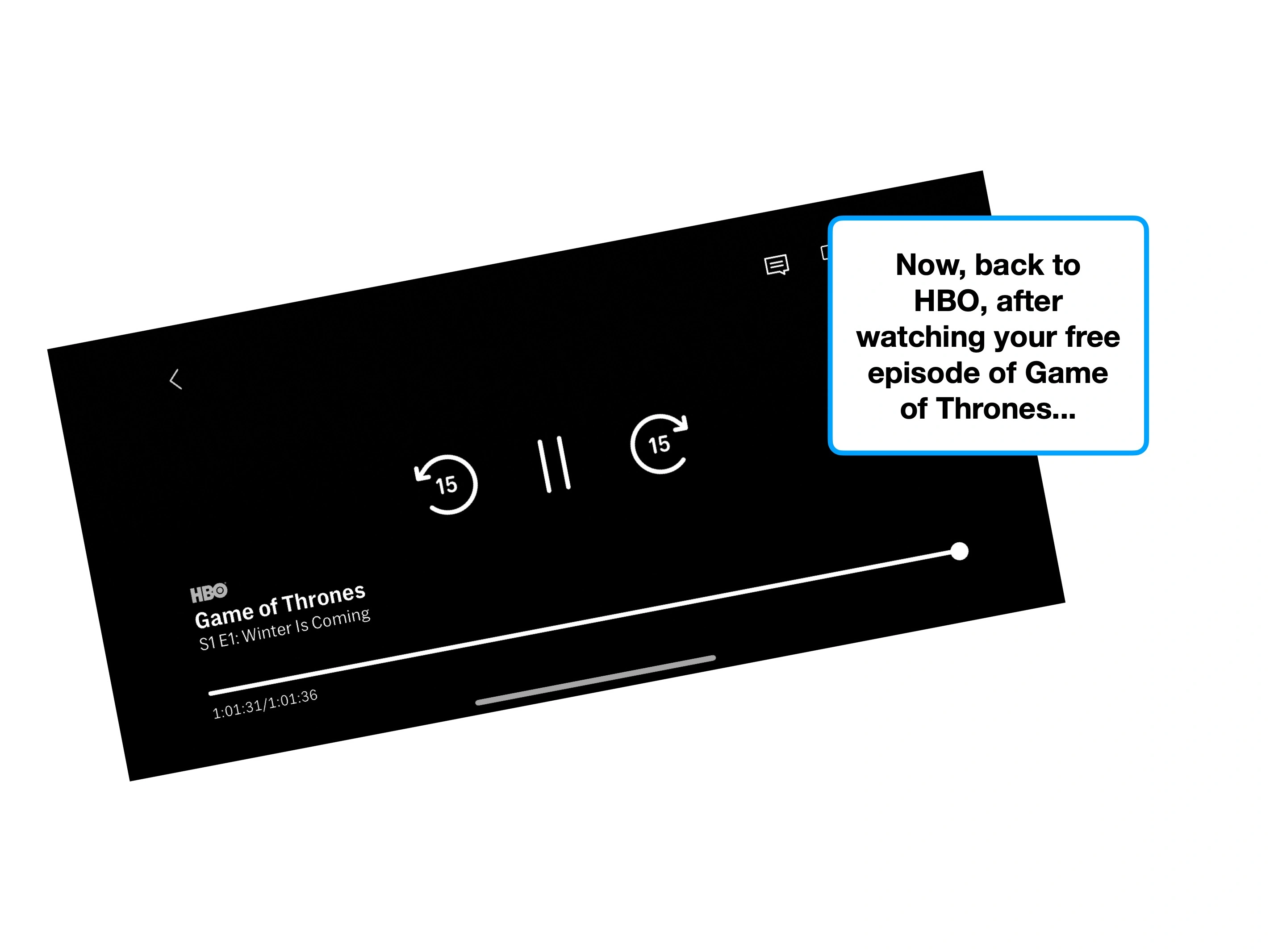
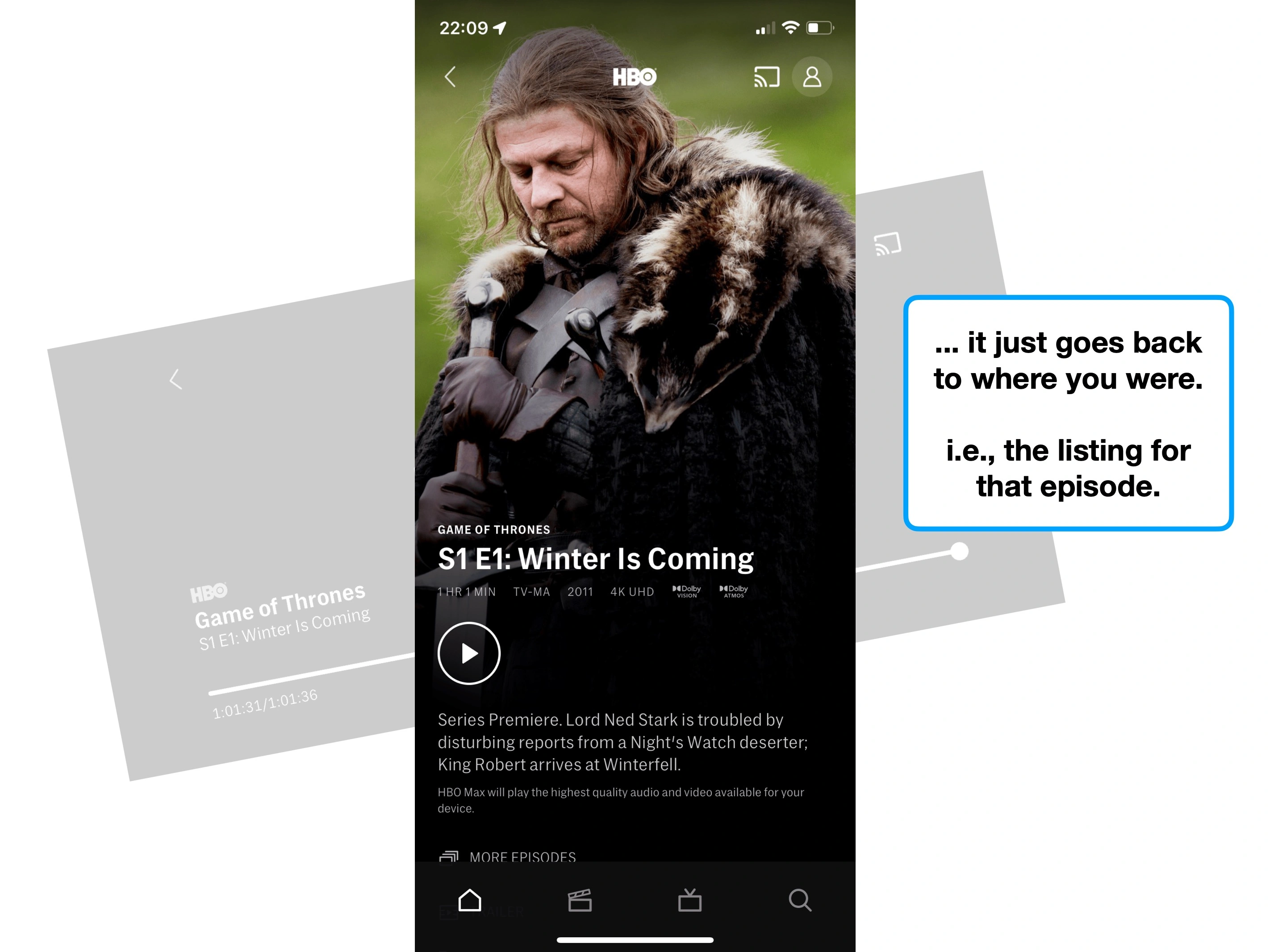
By comparison, HBO Max doesn't really offer a 'journey'. It simply plays the free episode, and then returns you to where you were.
Apple TV
HBO Max
🗂 1. Browsing titles
🗂 1. Browsing titles
▶️ 2. Click 'Play free episode'
▶️ 2. Click 'Play'
👀 3. Watch episode
👀 3. Watch episode
▶️ 4a. Auto-plays the next episode
🗂 4. Back to browsing titles
💸 4b. Prompt user to subscribe
👀 5. Watch second episode
To be clear: the distinction is that Apple TV's 'free episode' is a path (e.g., point A, to B, to C or D), whereas HBO's is a retracing step (e.g., point A, to B, then back to A).
Yes, Apple's execution is obviously better here—but the point that I want to make is that there are situations where a retracing step is preferable.
The nuance, is that the act of subscribing to Apple TV is typically a one-time event. Apple is not trying to teach the user how to subscribe—they're just trying to make it easy to do.
However, if you're teaching the user how to perform a repeatable task, it can be beneficial to use retracing steps, as it helps the user learn how the processes fit together.
For example, this is how the two options may look for another common activity:
Path (A to B to C)
Retracing step
🗂 1. Browsing titles
🗂 1. Browsing titles
➕ 2a. Click 'add to watchlist'
➕ 2a. Click 'add to watchlist'
👍 2b. Added to watchlist
👍 2b. Added to watchlist
📃 3. Land on watchlist
👀 3. Onboarding (modal)
👀 4. Watch movie from your watchlist
🗂 4. Browsing titles
This is an overly simplified example, with strong counter-arguments, but it demonstrates a scenario where your focus is on teaching the user how to do a repeatable task.
The key is to understand what you're trying to achieve in that moment (e.g., to convert a user to a paid plan, or to teach them a skill), and then choose a journey type to compliment that objective.
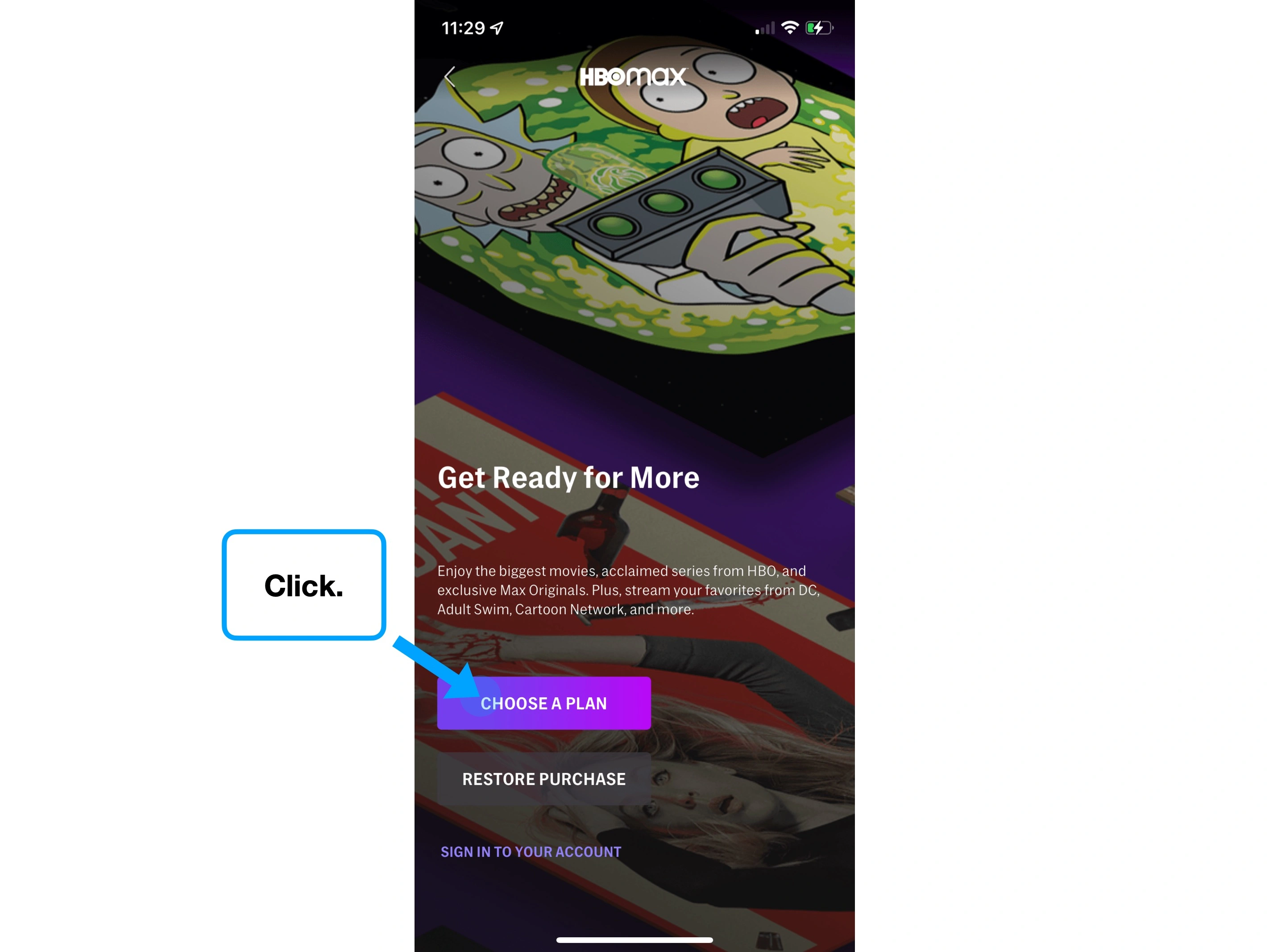
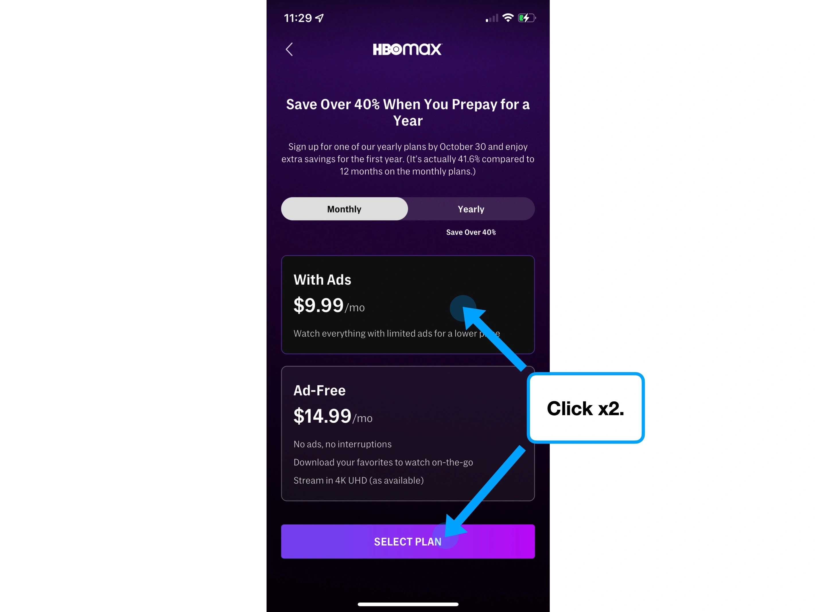
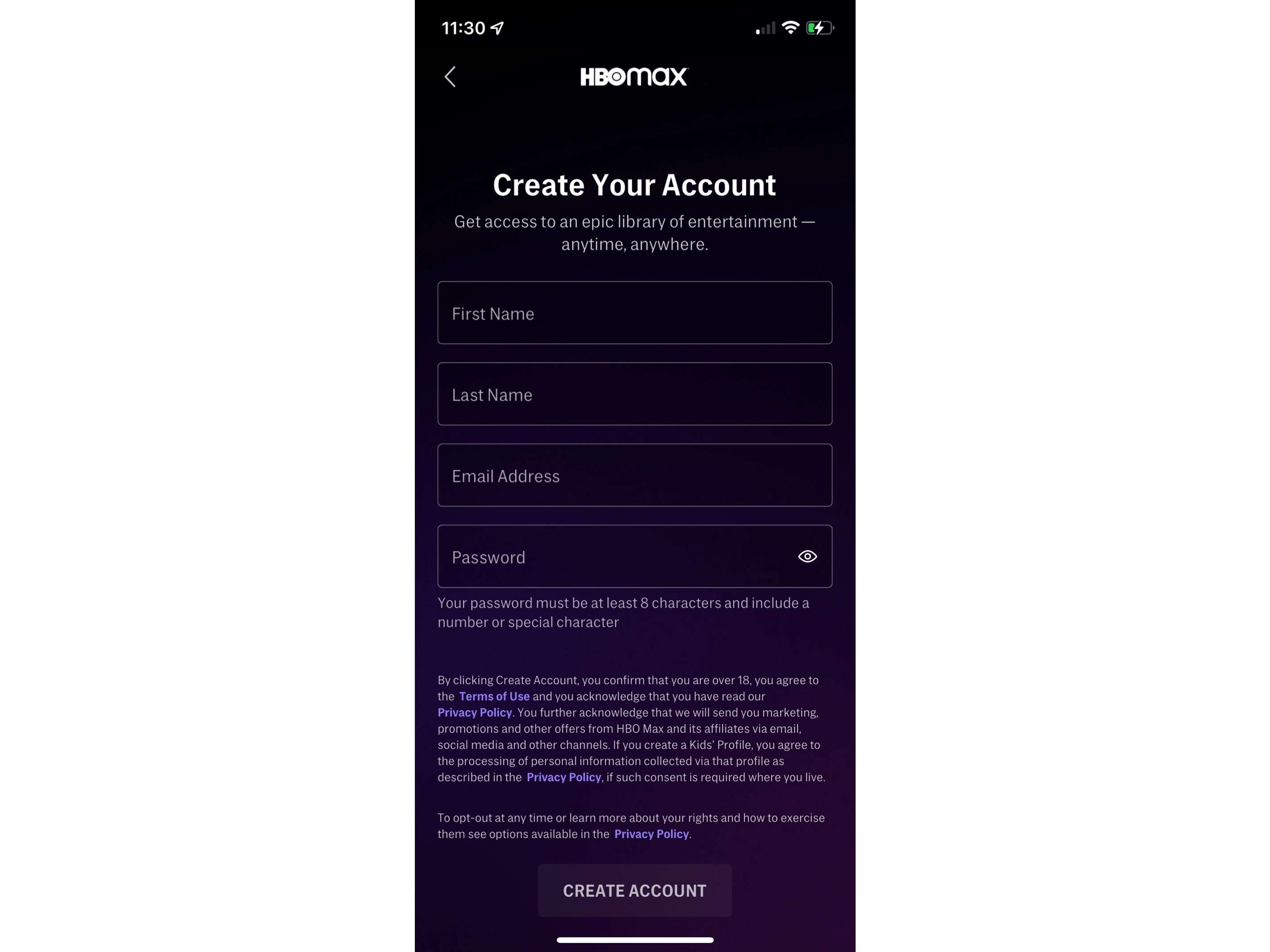
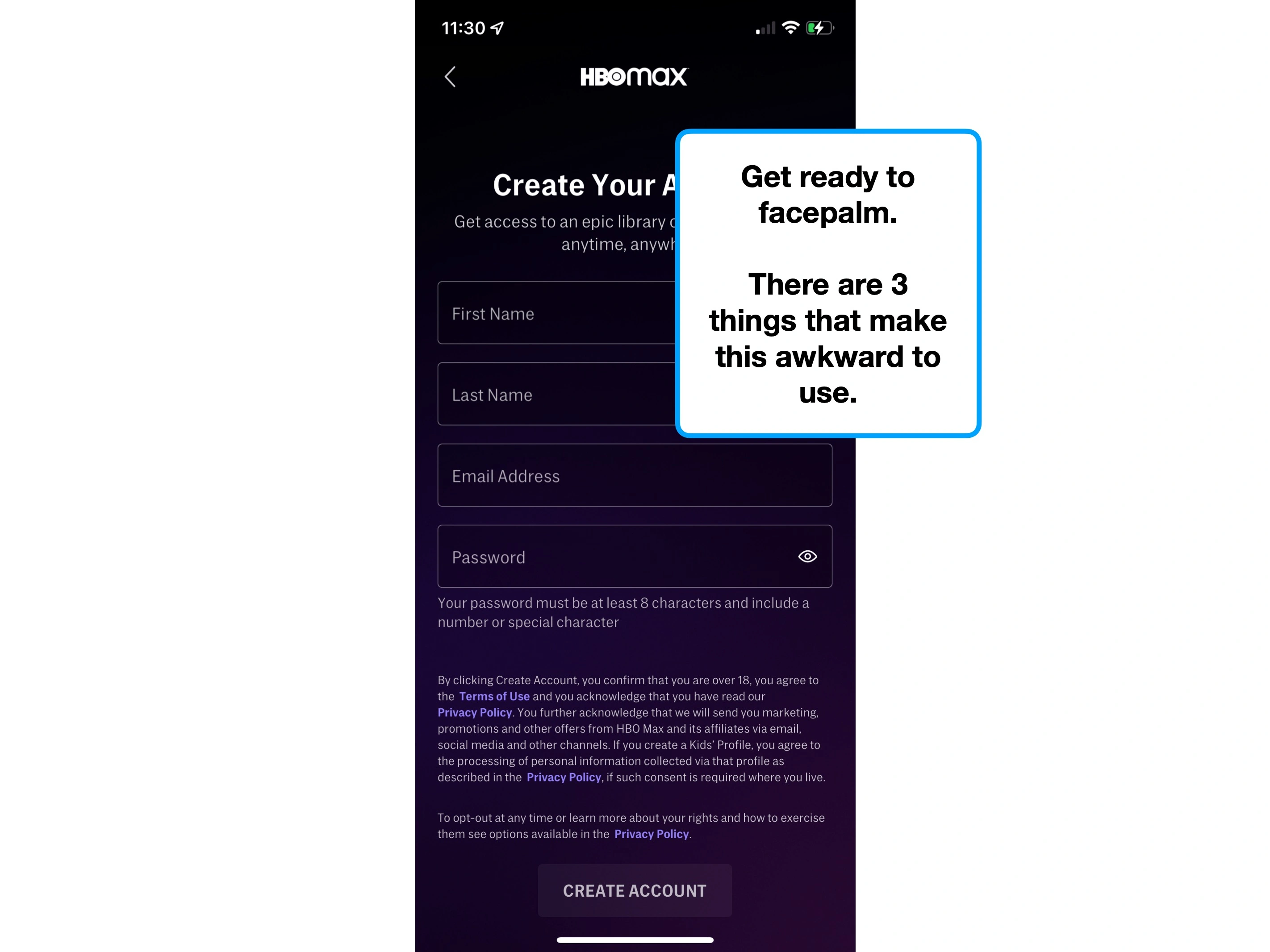
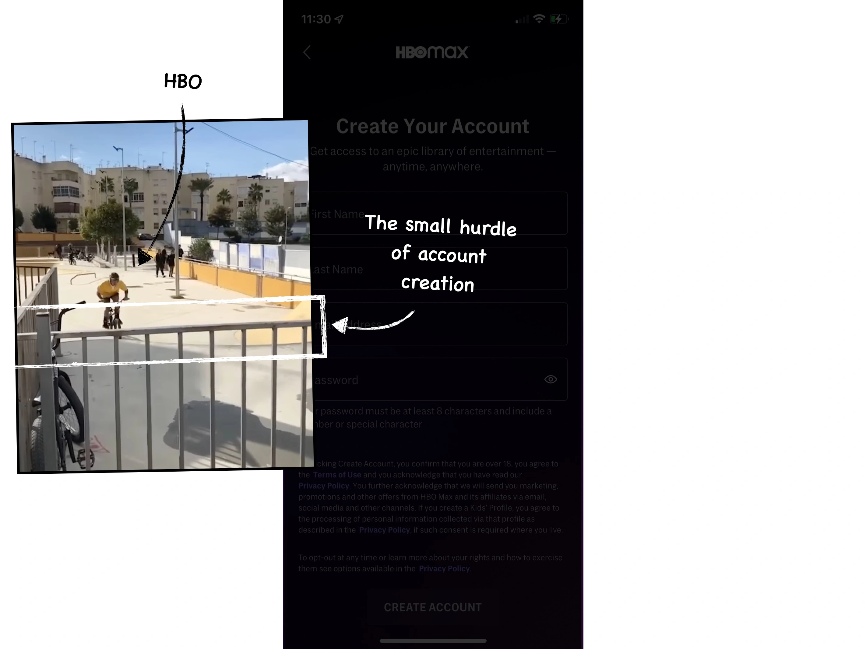
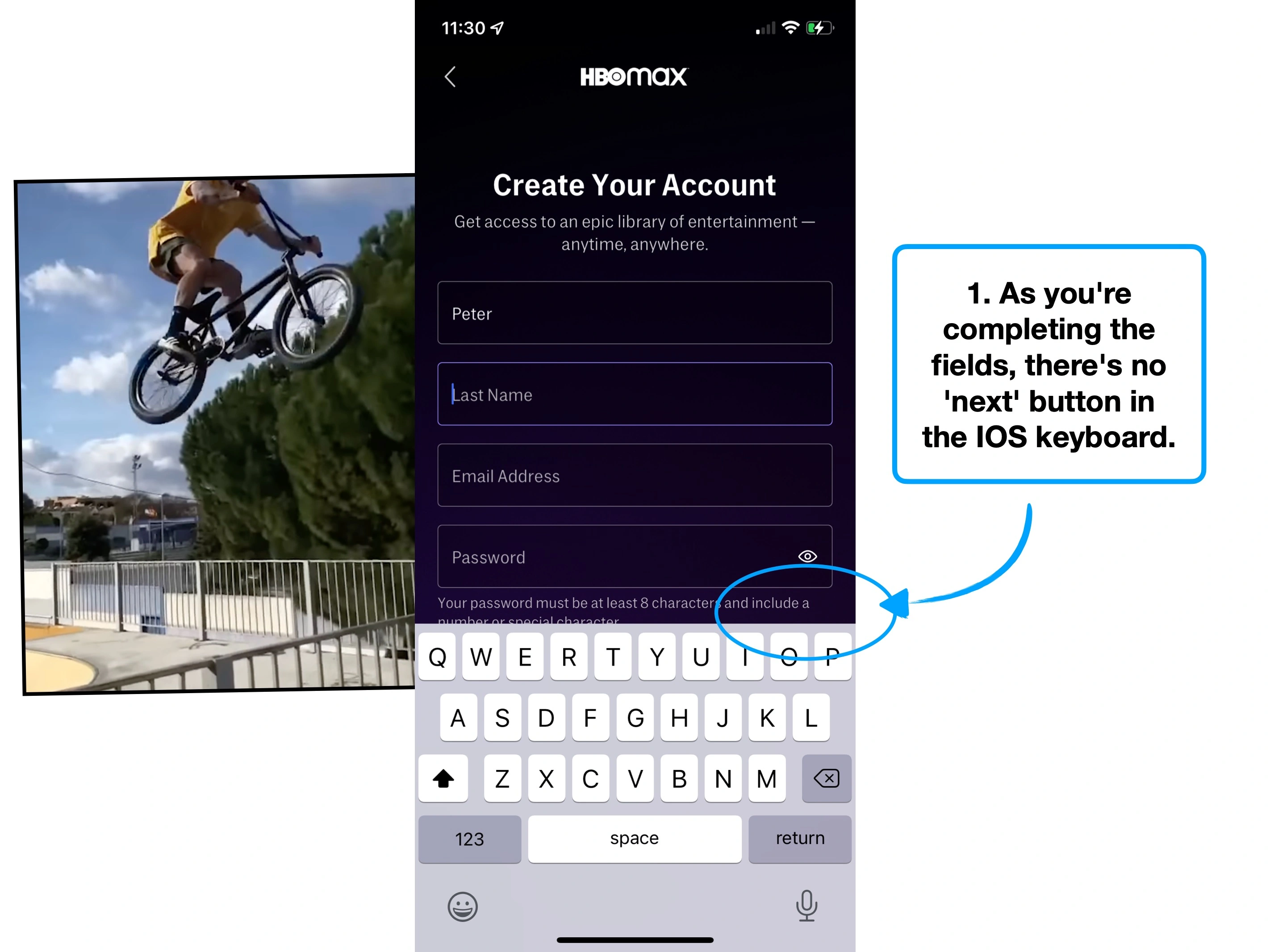
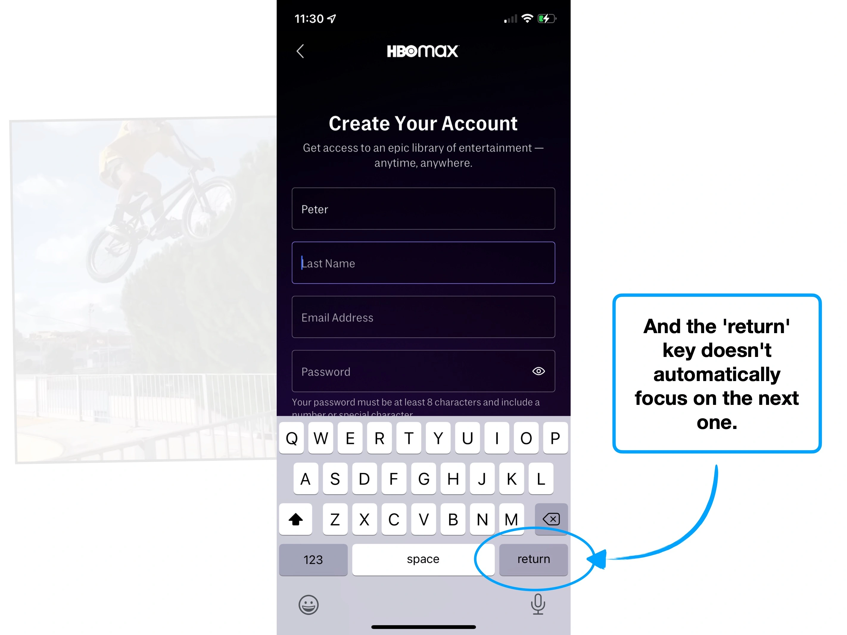
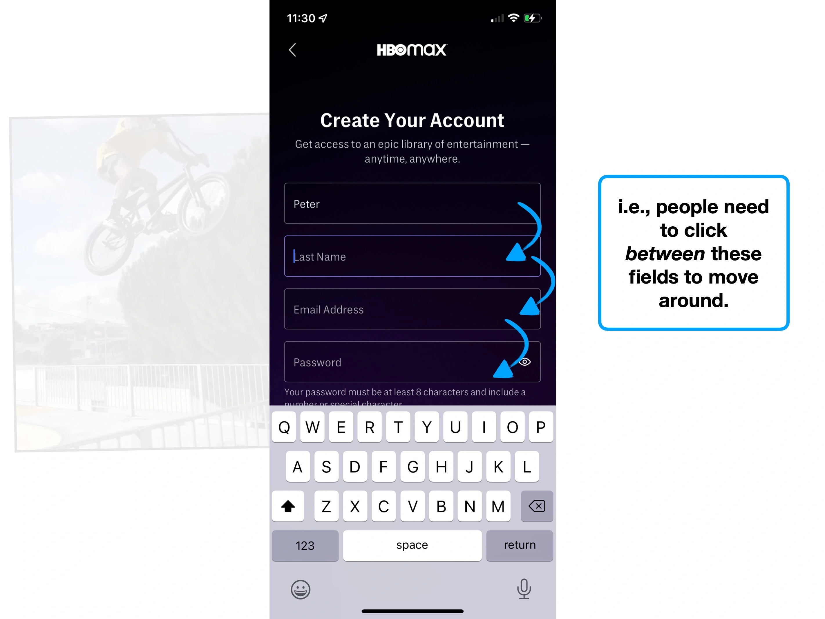
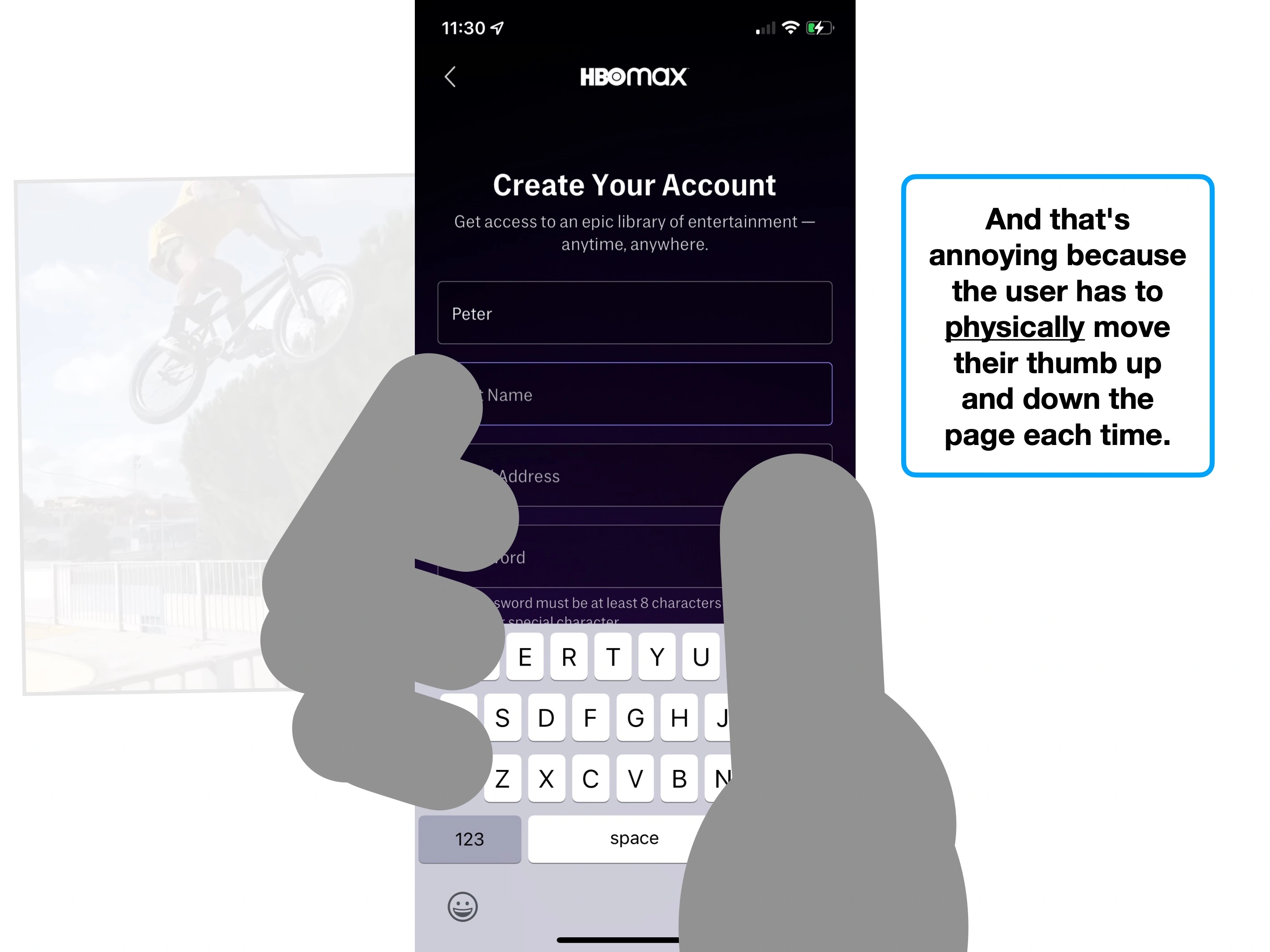
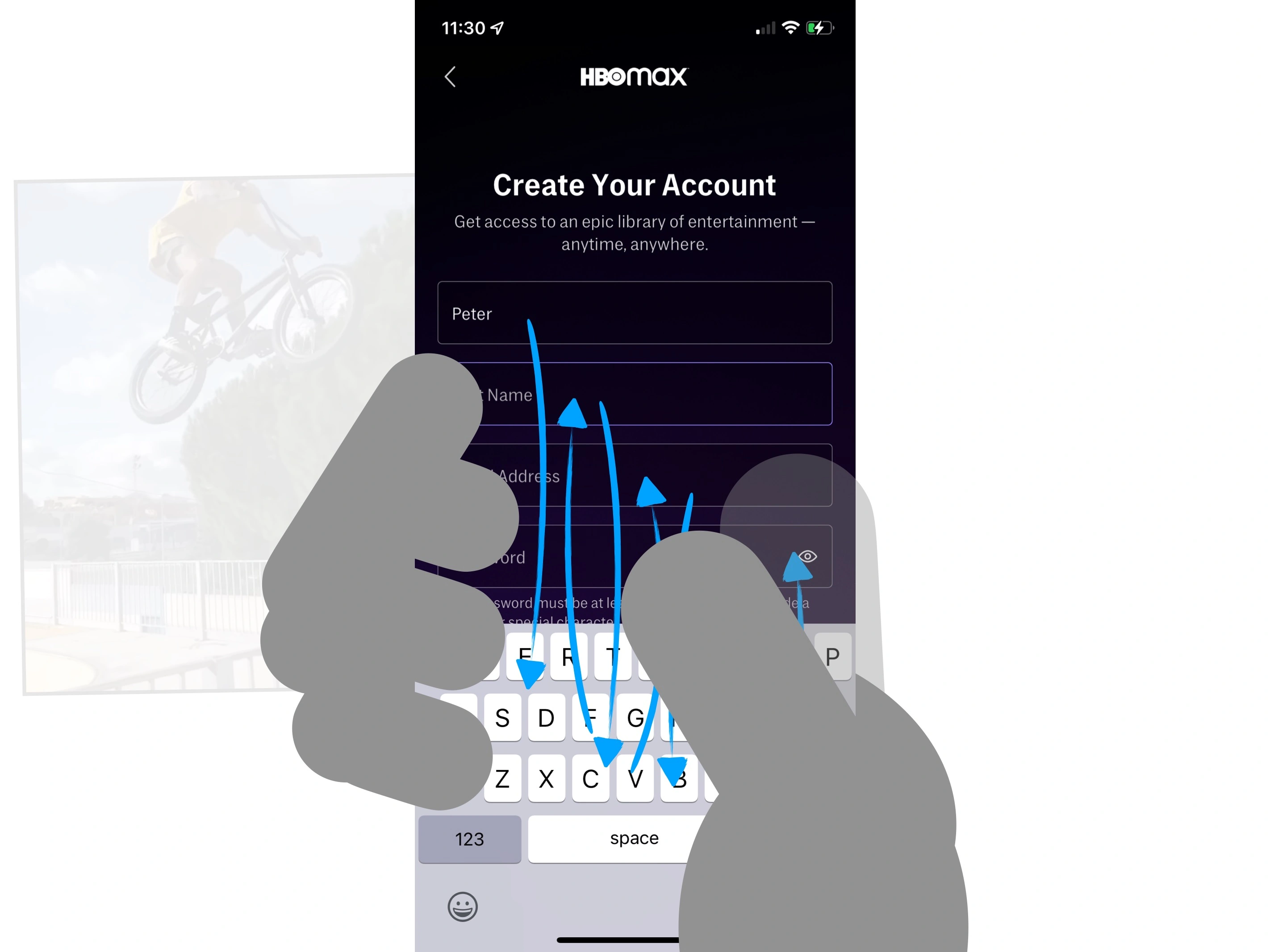
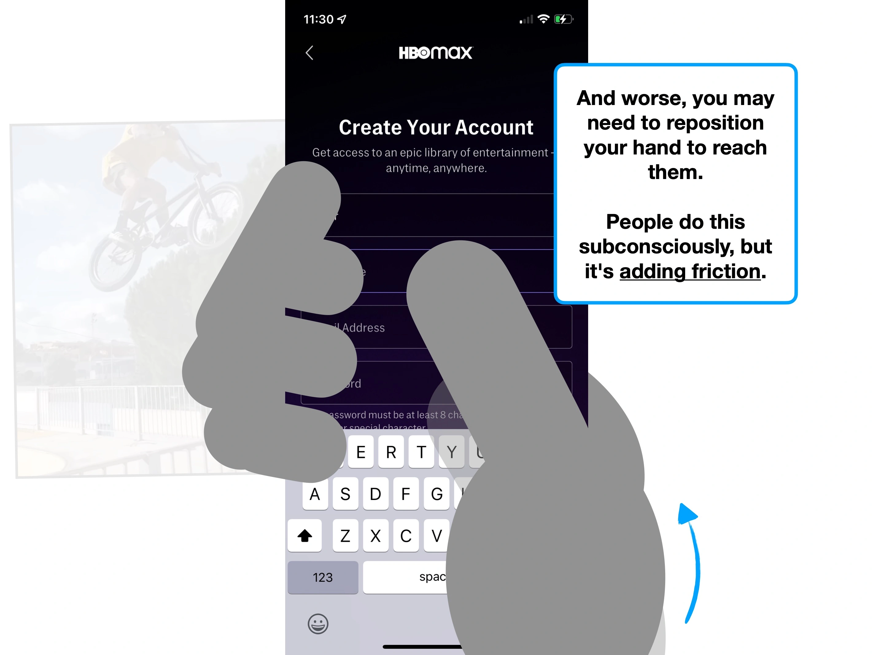
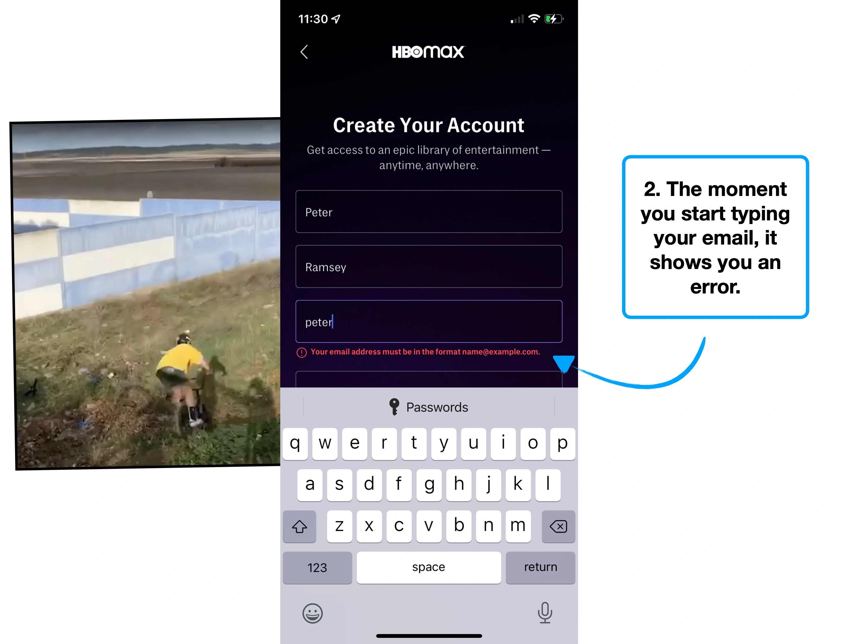
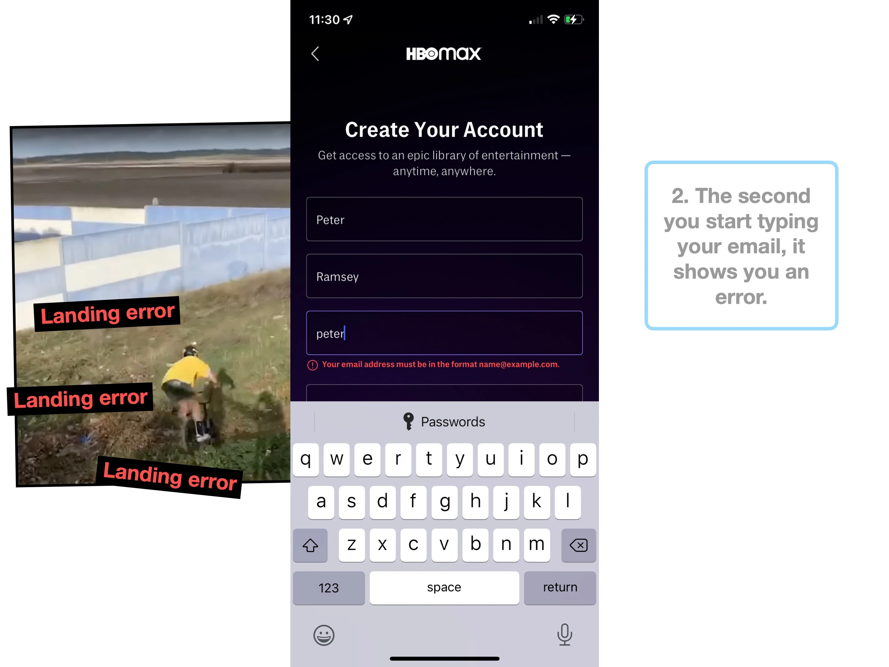
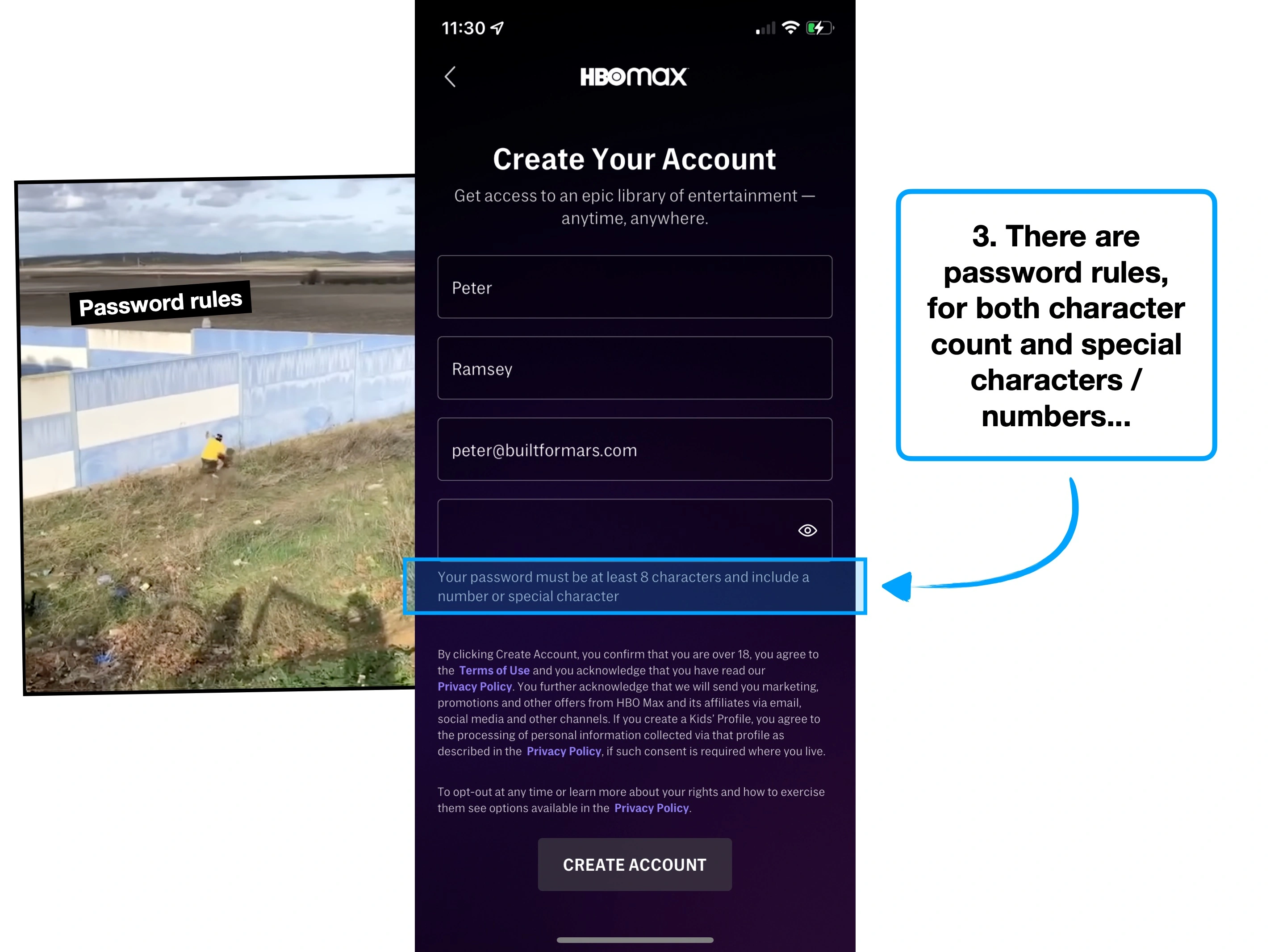
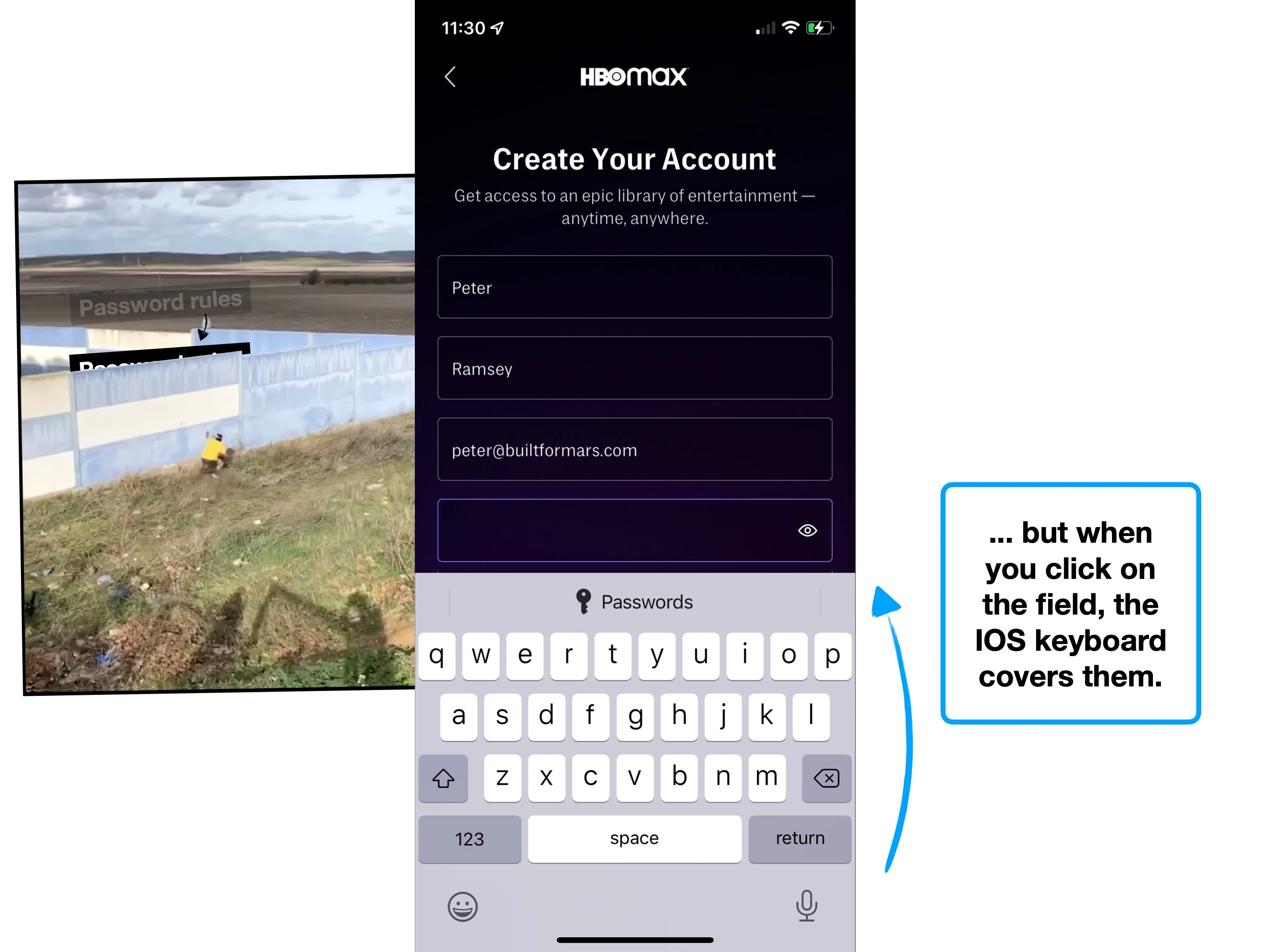
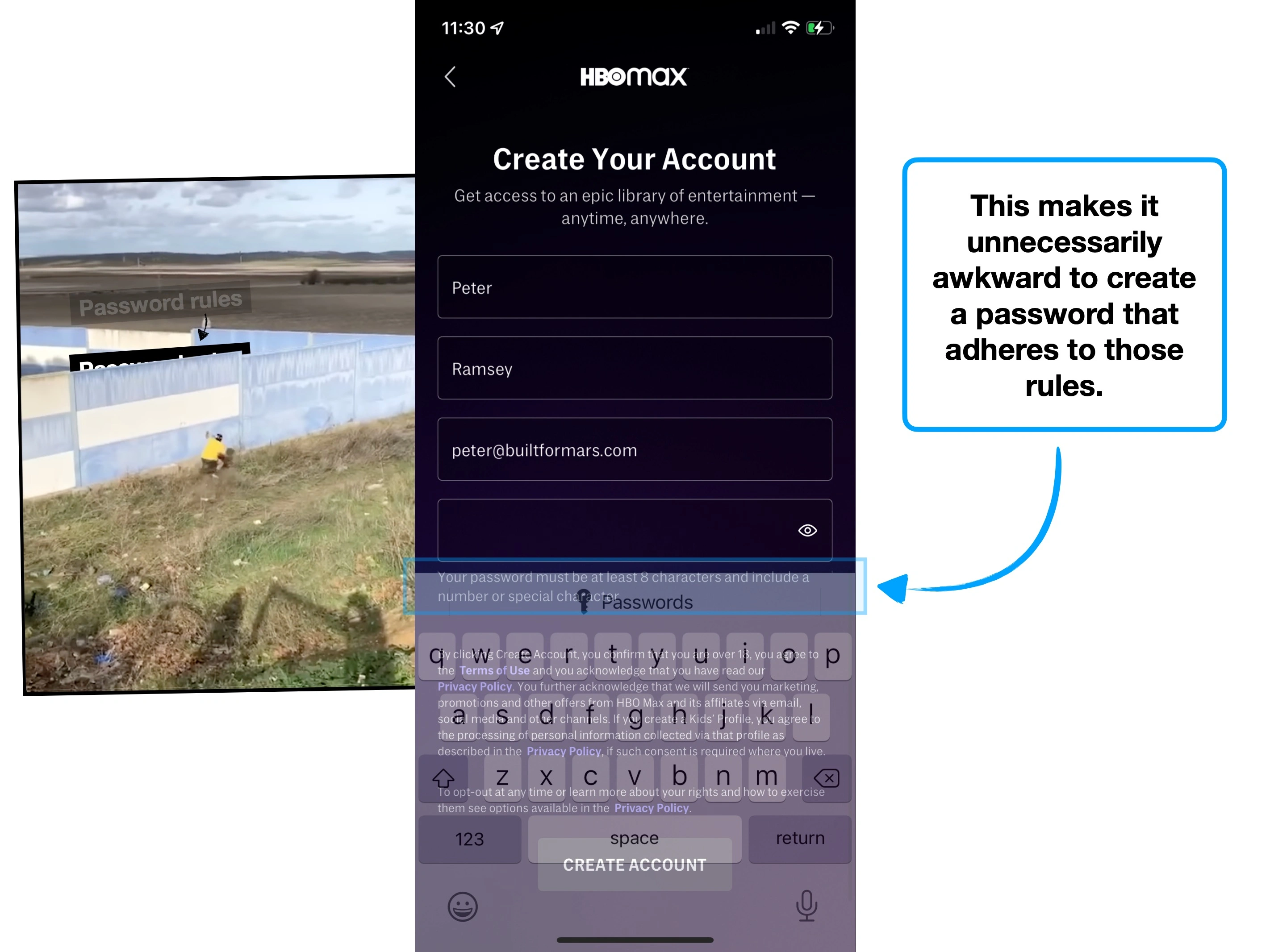
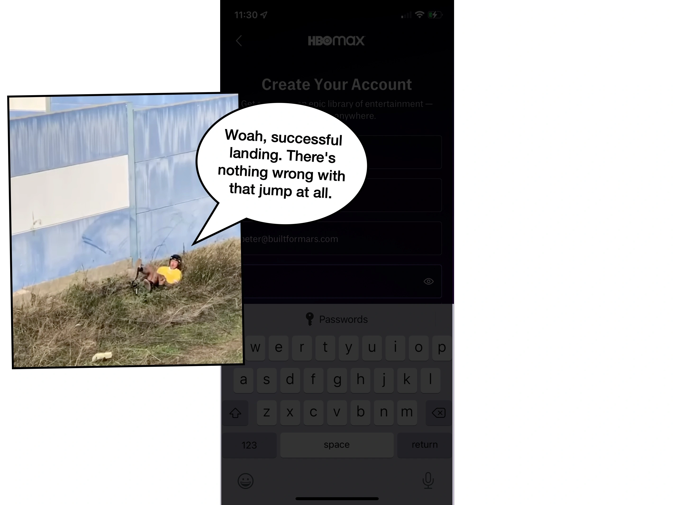
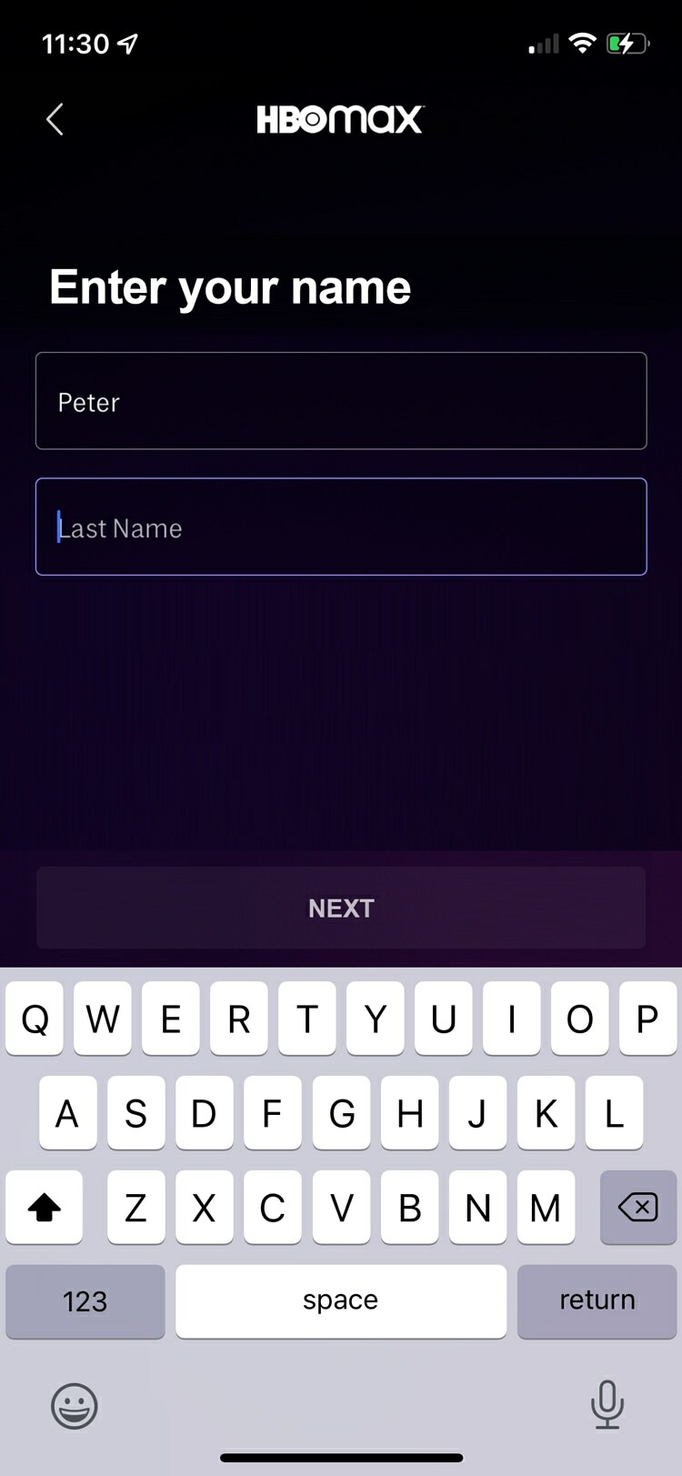
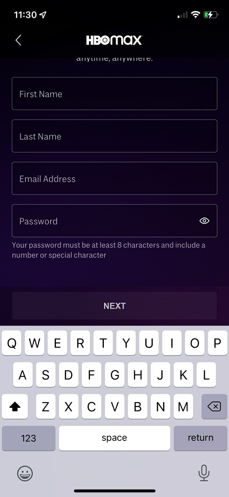
Whilst creating an account with HBO, you hit an avoidable frustration.
The IOS keyboard covers both the final fields, and the CTA.
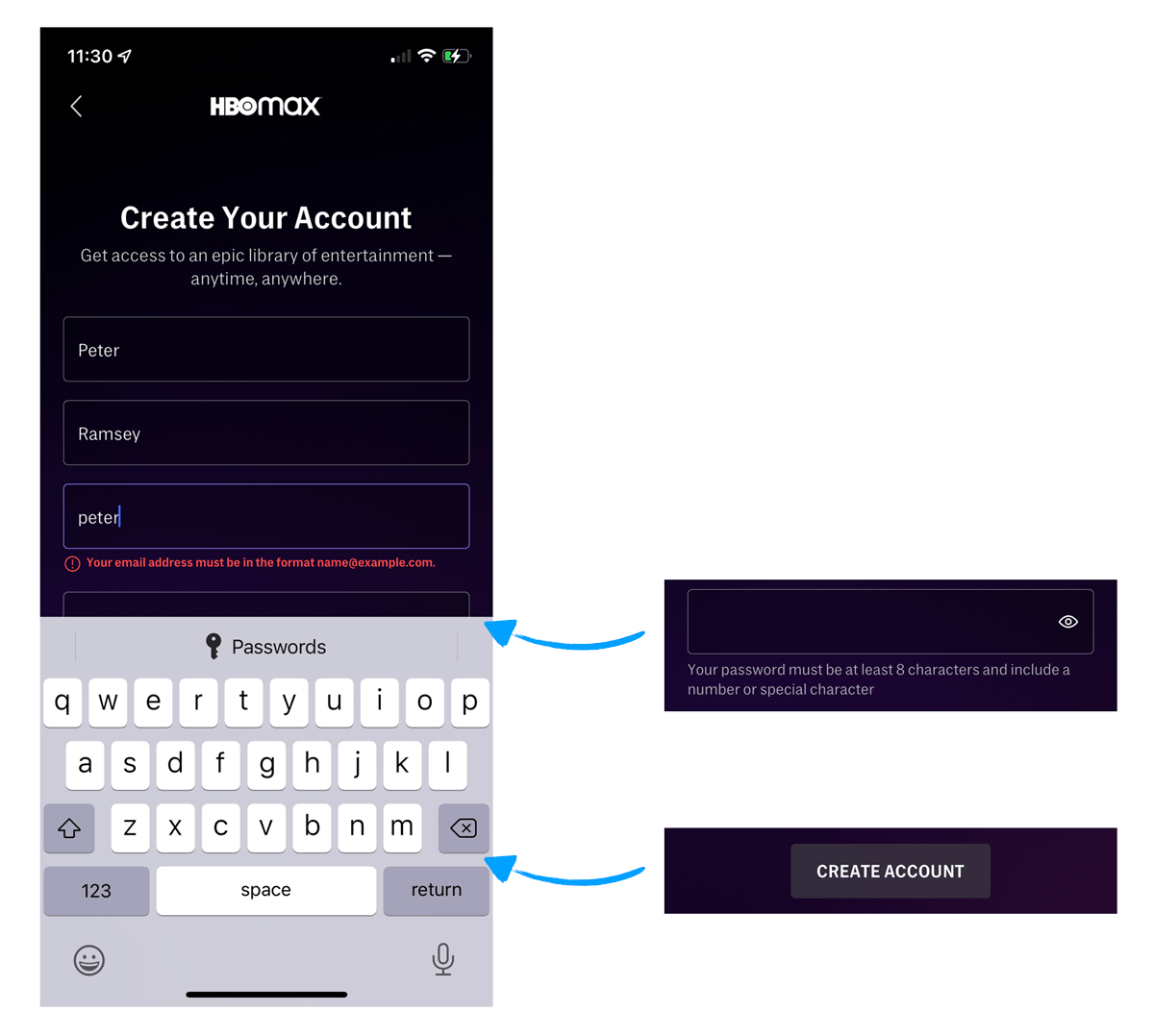
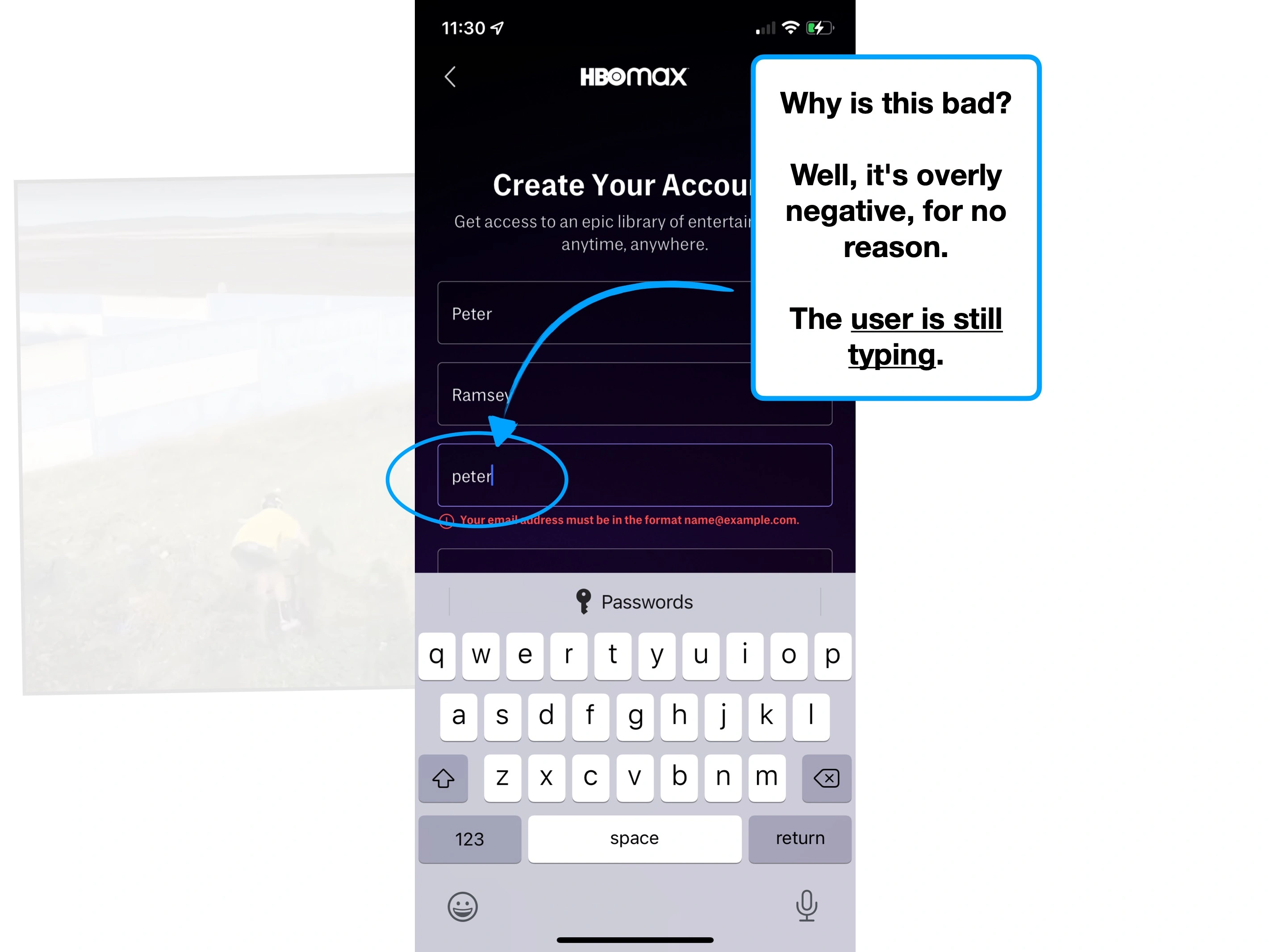
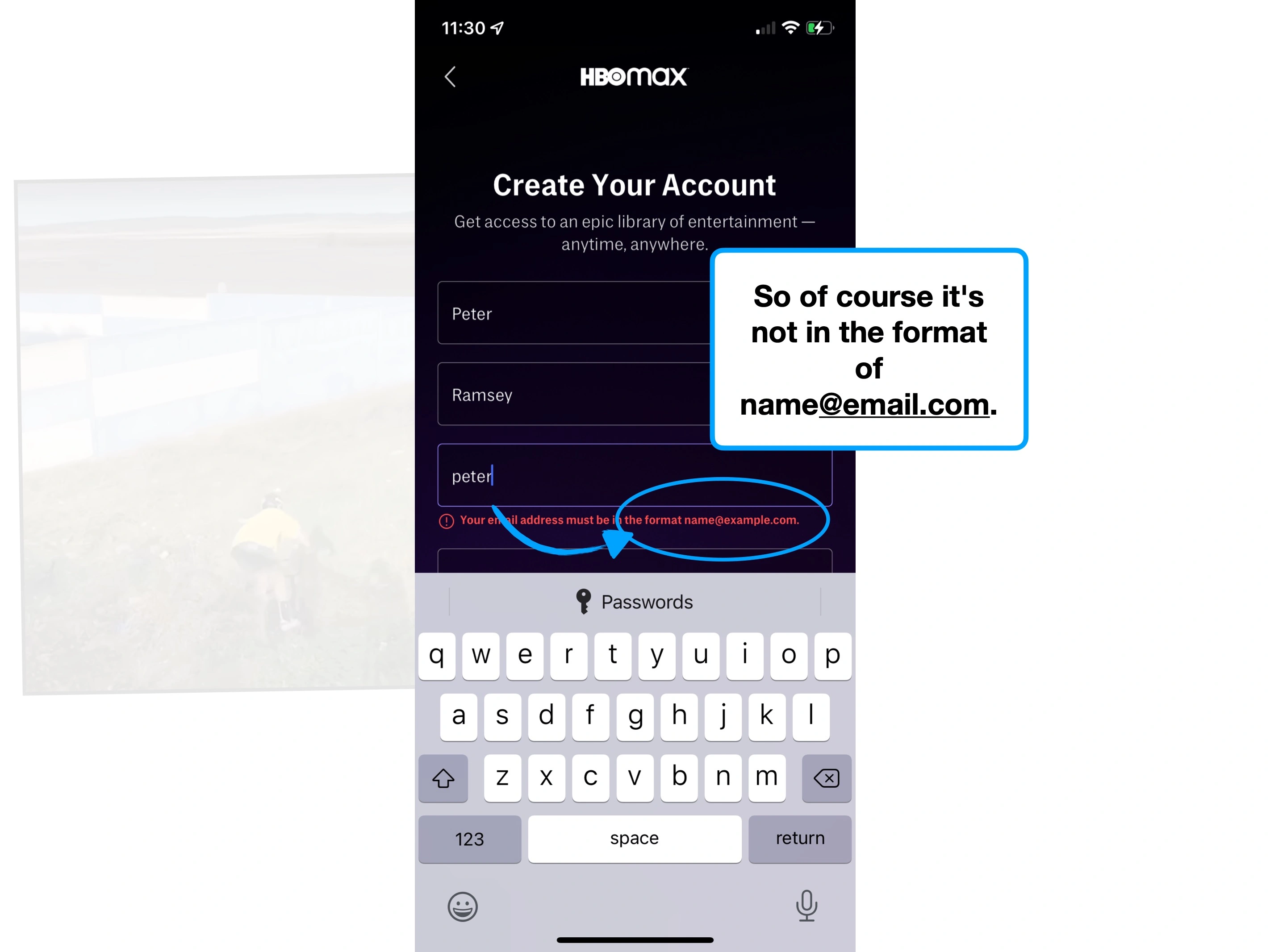
🐛 Bonus issue: After typing 'Peter', it's showing inline validation as an error—implying negativity, despite the user still typing, and the field still being active. Don't do this—instead, show inline validation only once the field is inactive.
It's a really common issue, with a well-telegraphed playbook of how to resolve.
Here are three principles to utilise in this instance:
🍯
Sticky CTA
To maintain visibility on the final CTA.
👀
Auto-focus fields
To make sure fields don't slip behind the keyboard.
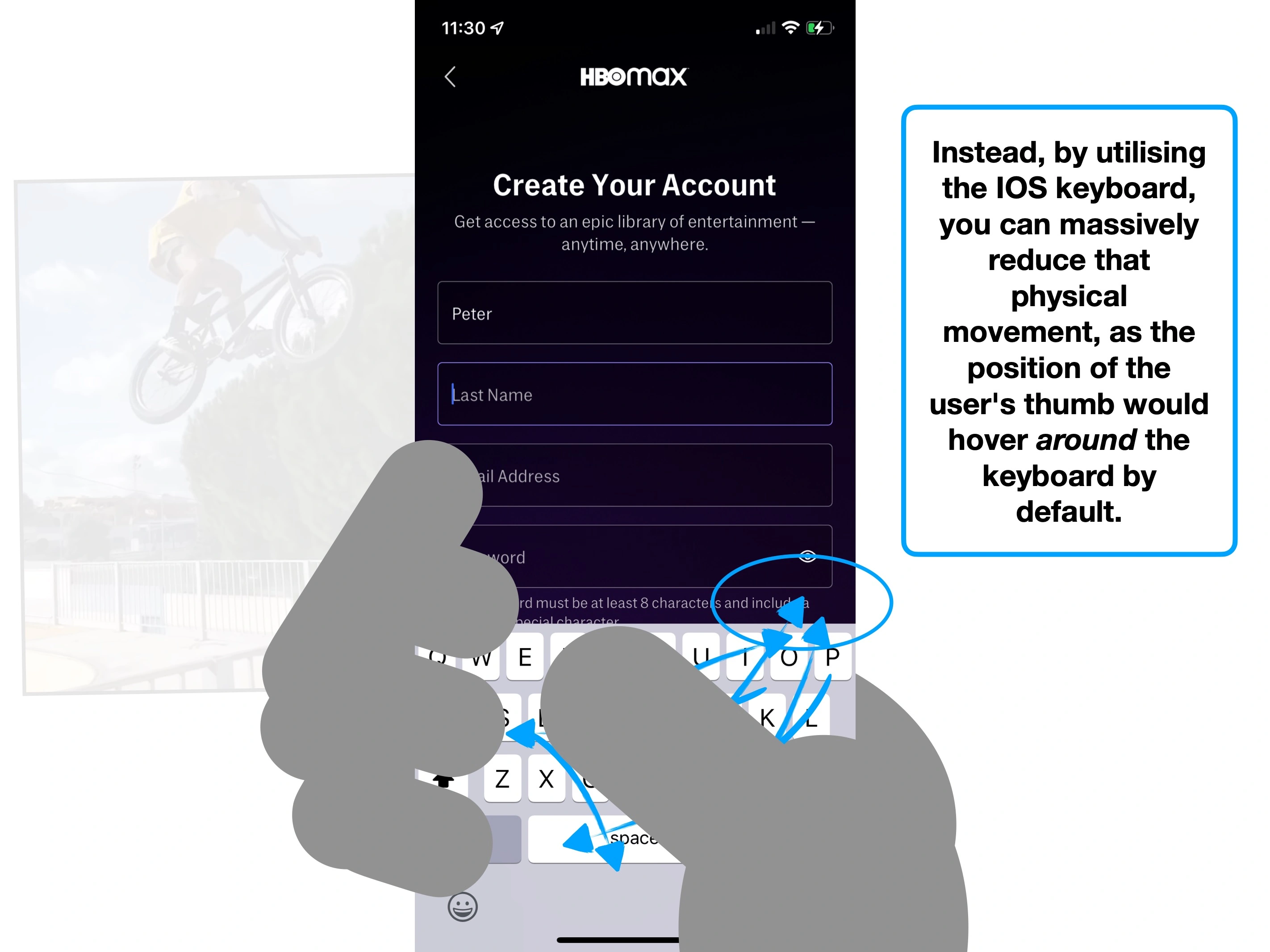
📱
Native keyboard
So the user can move between fields using the keyboard.
This design pattern works with both a single question per page, and multiple fields, by forcing the body content (i.e., the fields) to scroll.
The key is to maintain visibility on the CTA and the fields.
As a reminder: one of the major benefits of building a native application (over a responsive website), is that you have more control—for instance, modifying the keyboard functionality.
Simple techniques to increase feature usage, retention and ultimately alter how users perceive the value of your product.
The techniques that Slack have used to create an effortless onboarding flow, and why you might not want to copy them.
The product psychology behind why Robinhood offer new users $7.08 of free stock, and not $10.