Search

Popular Filters
Popular Filters

Popular Filters

Popular Filters
By Peter Ramsey
28 Feb 23
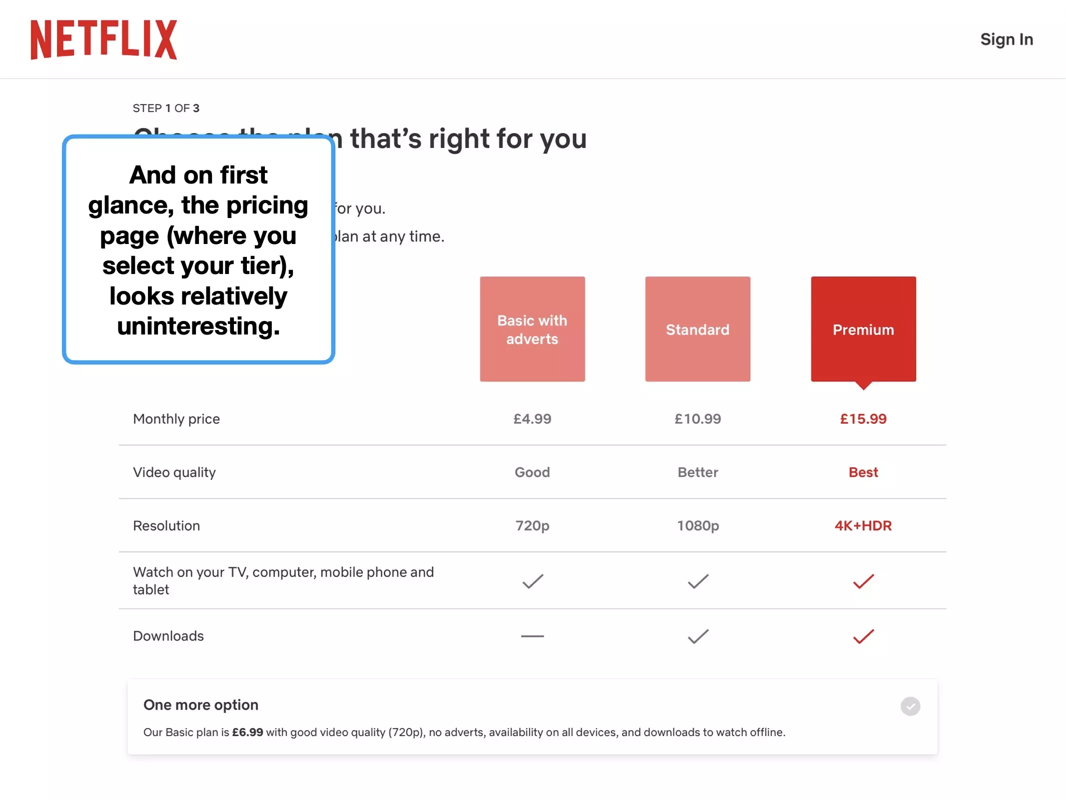
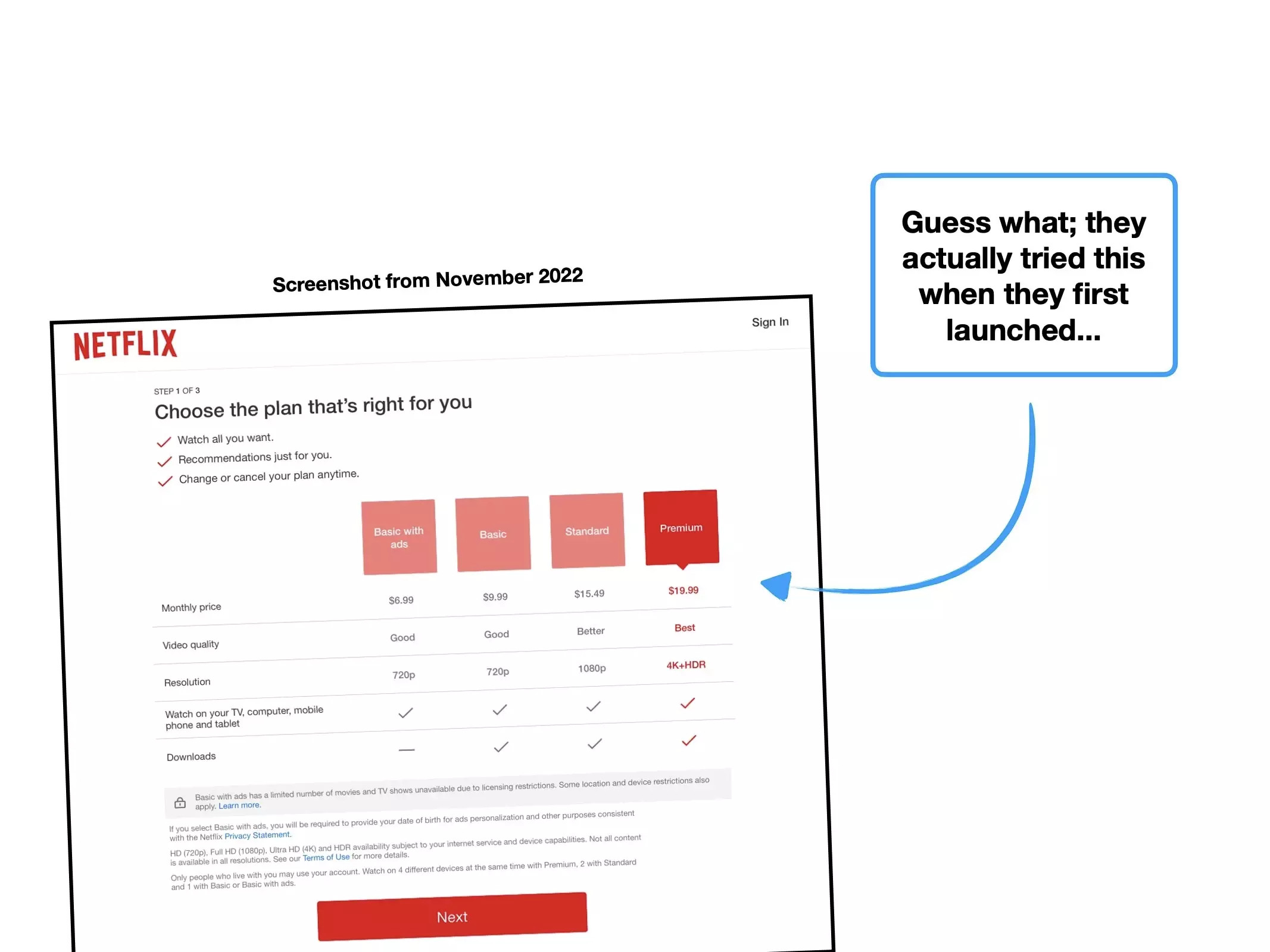
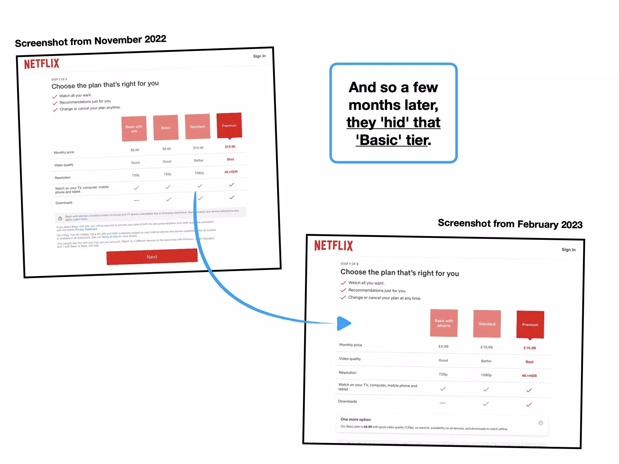
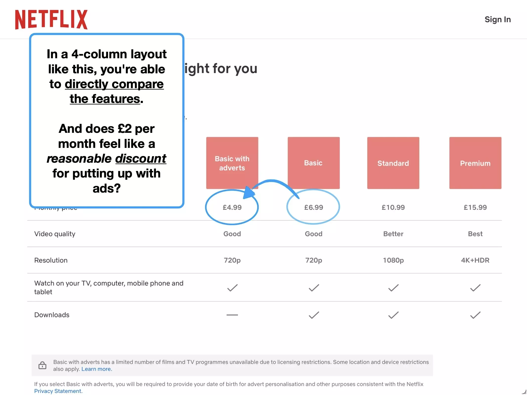
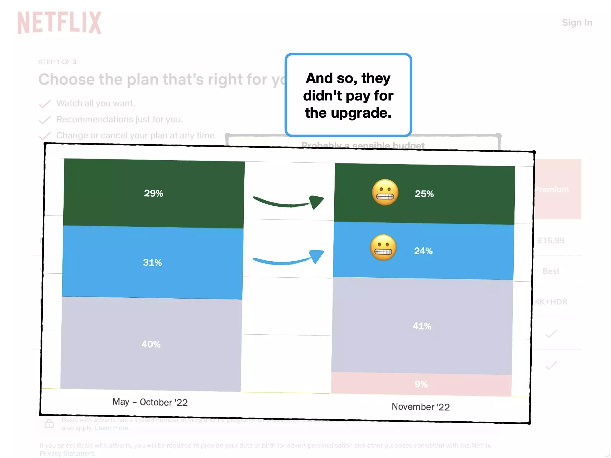
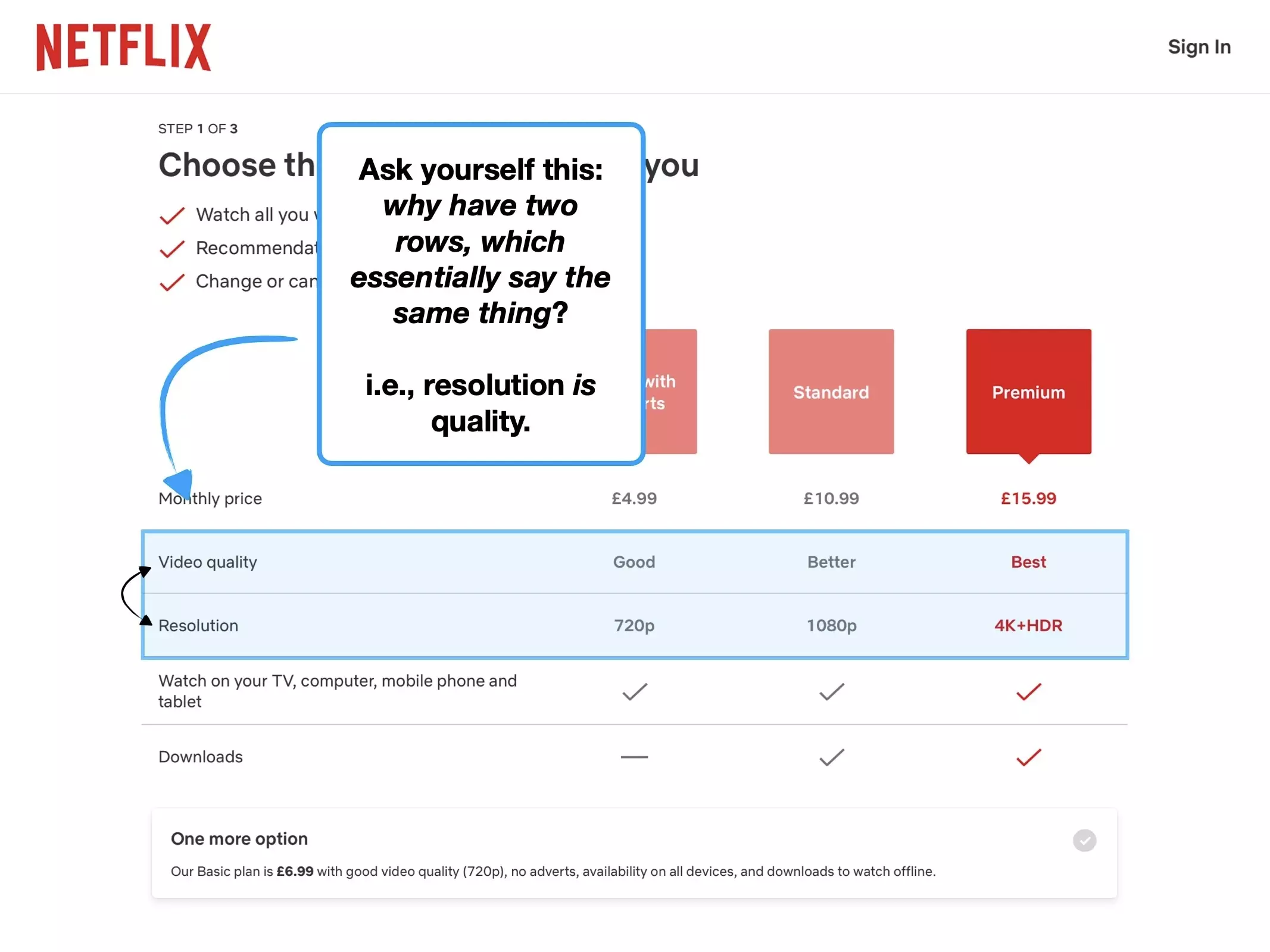
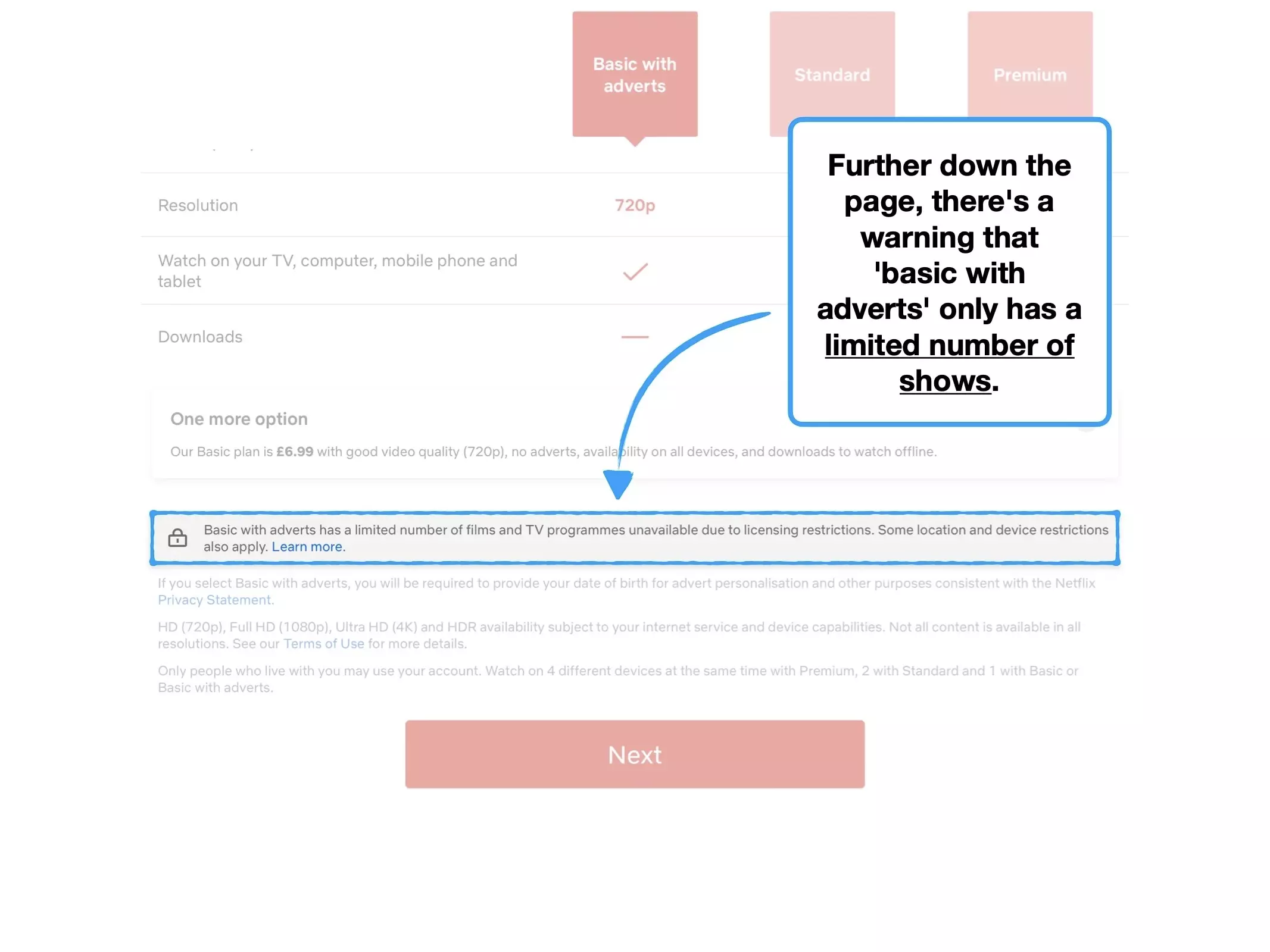
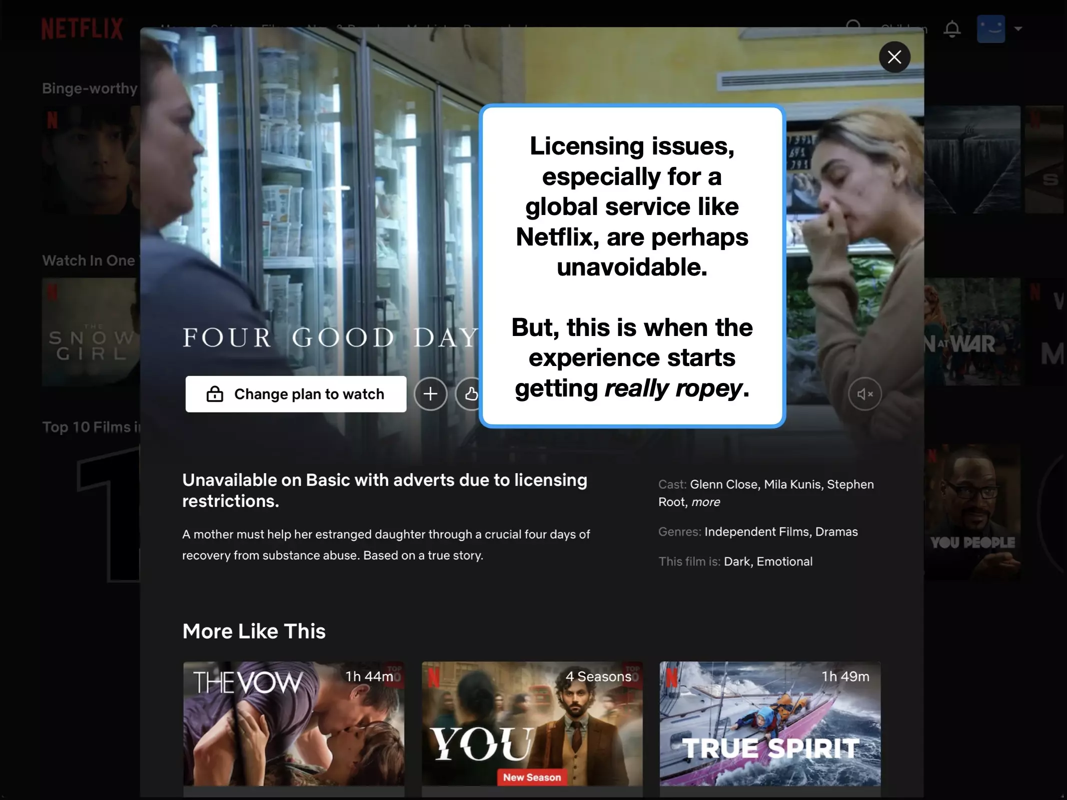
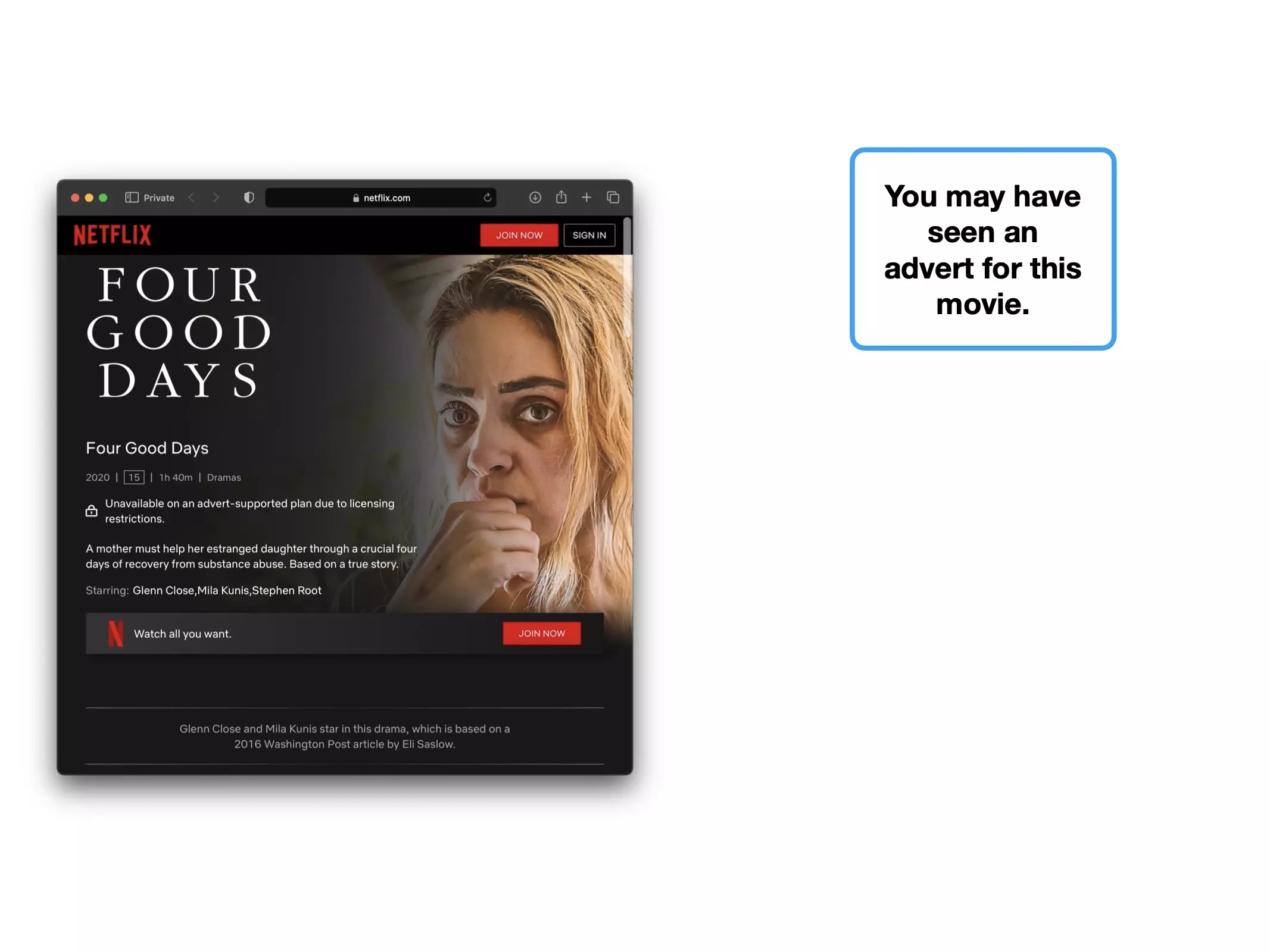
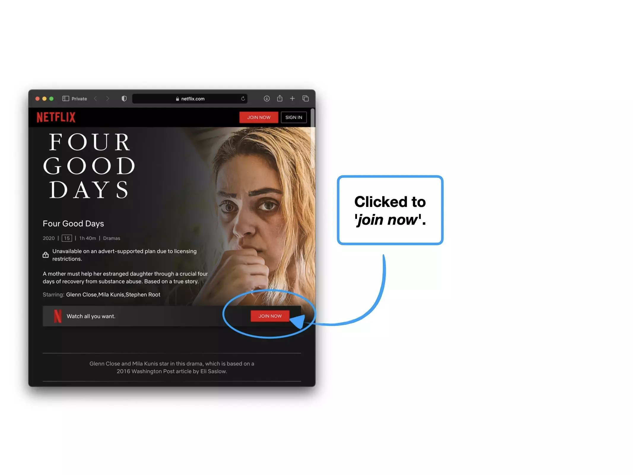
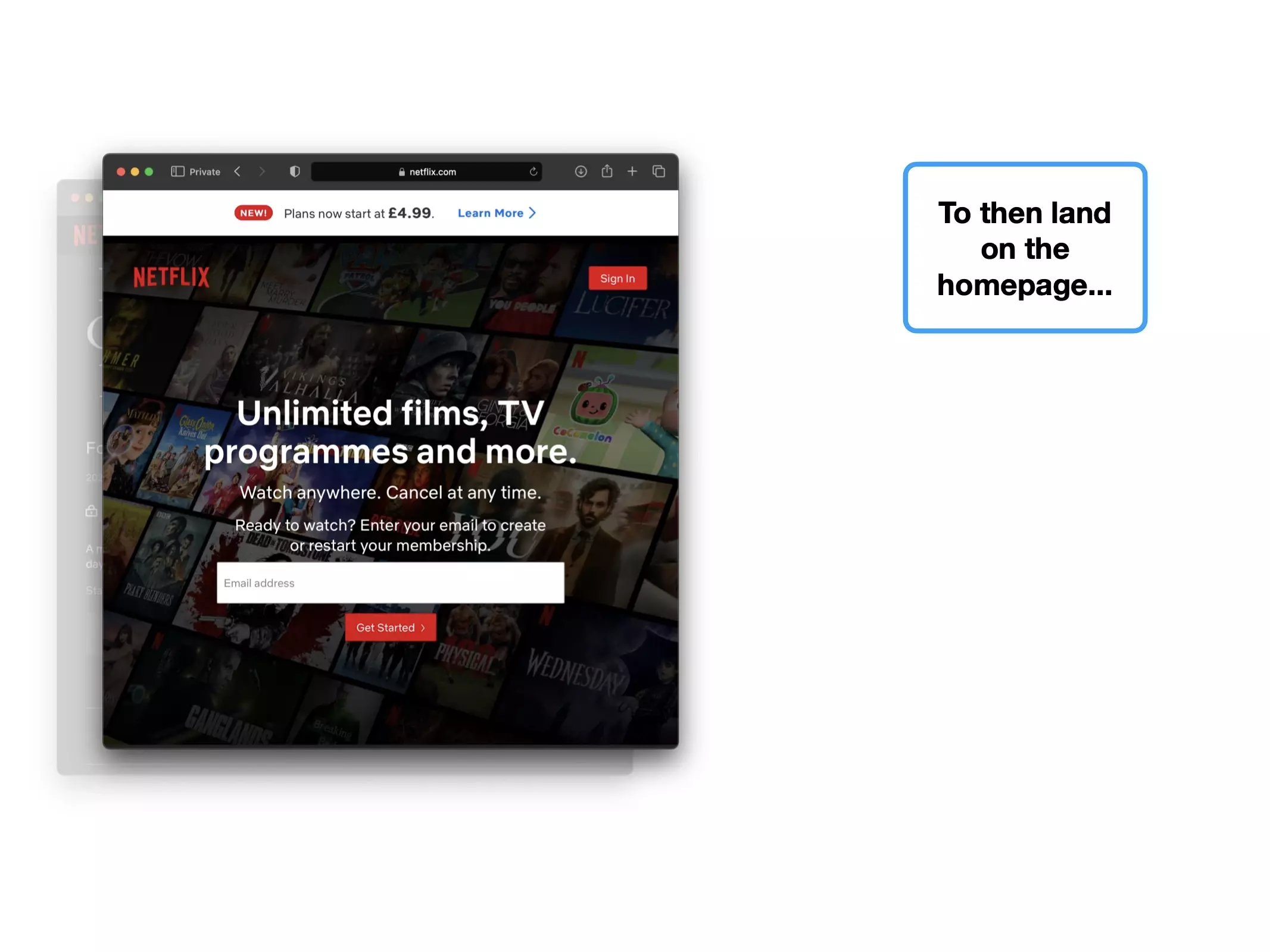
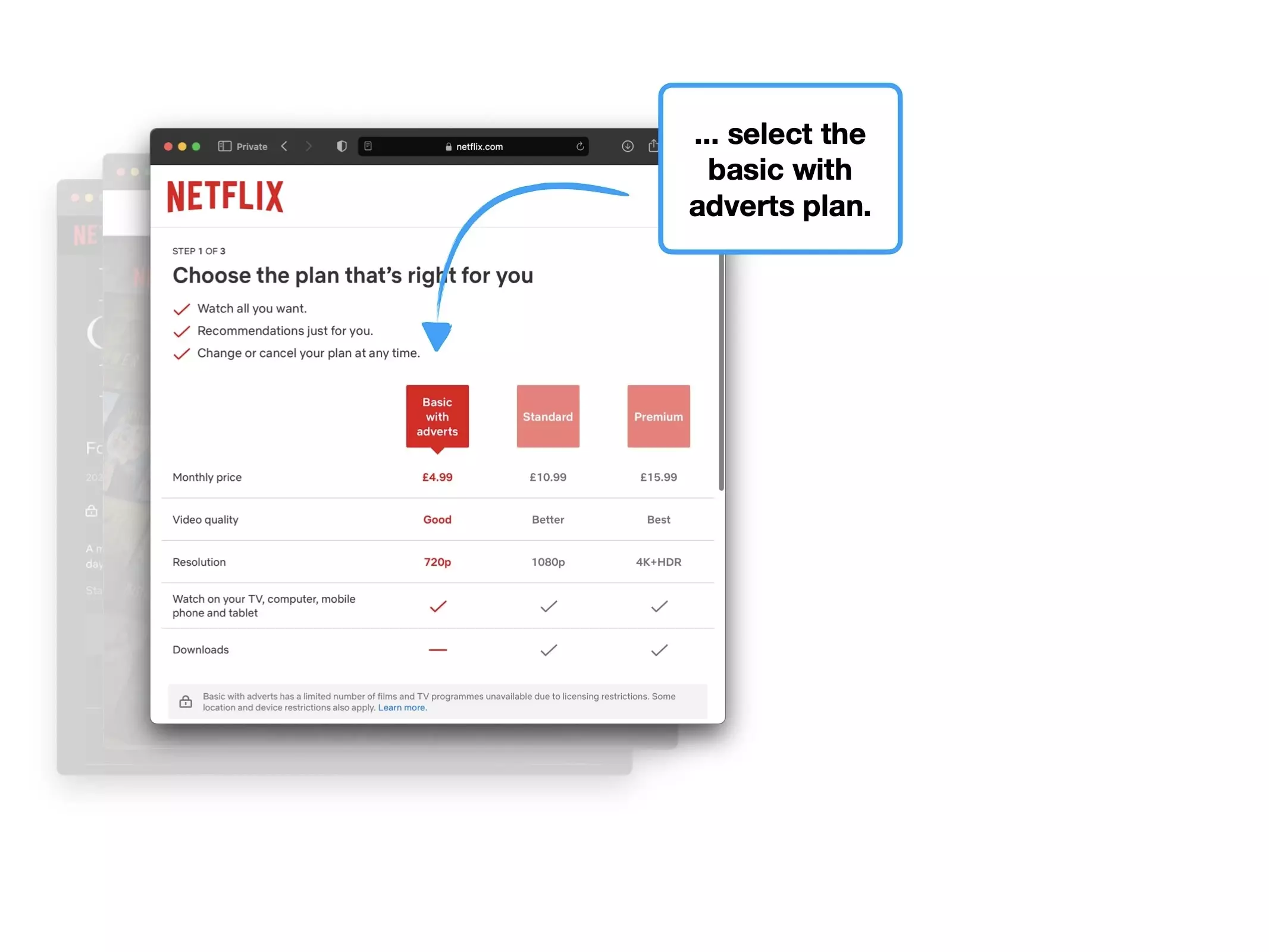
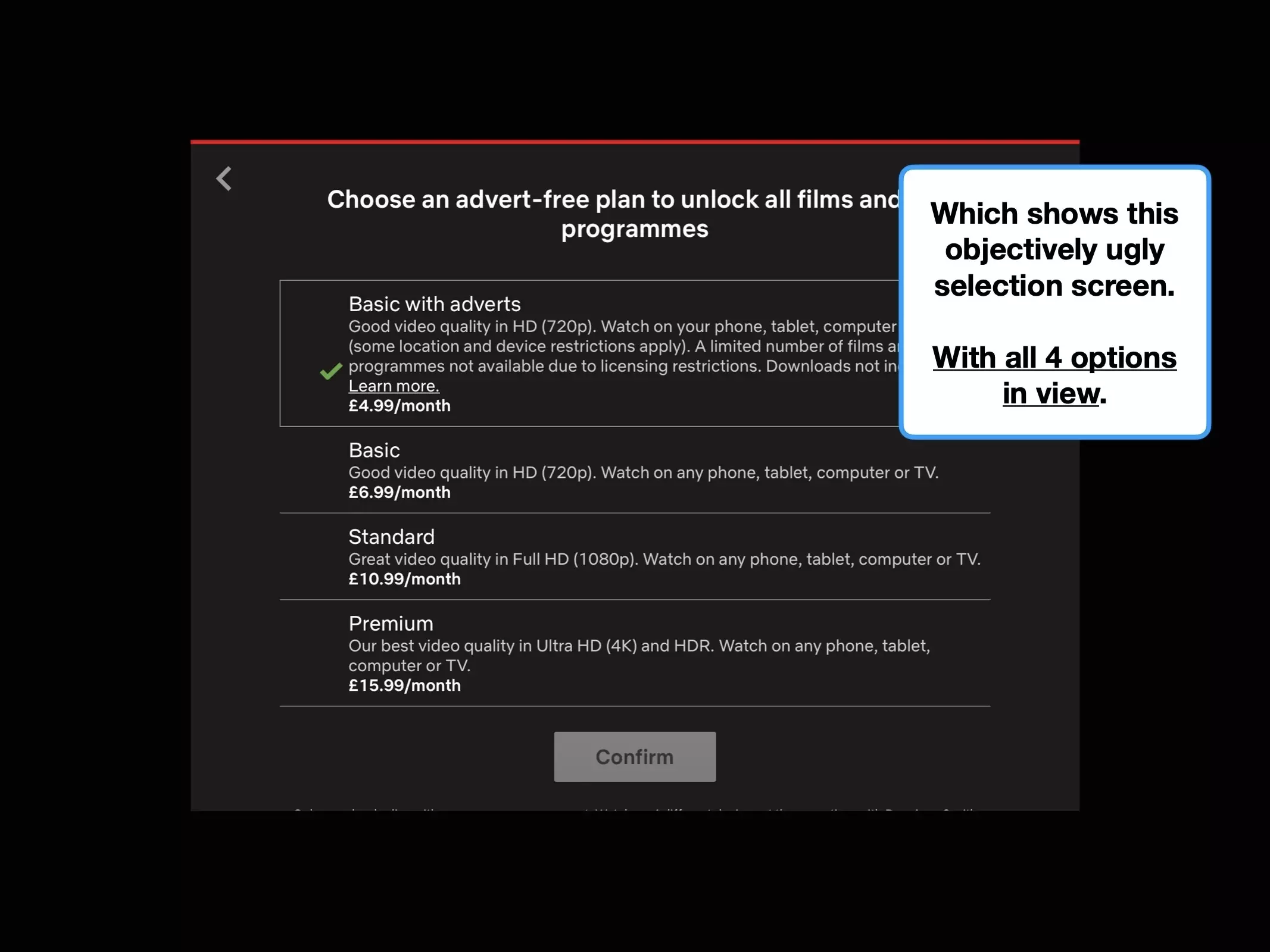
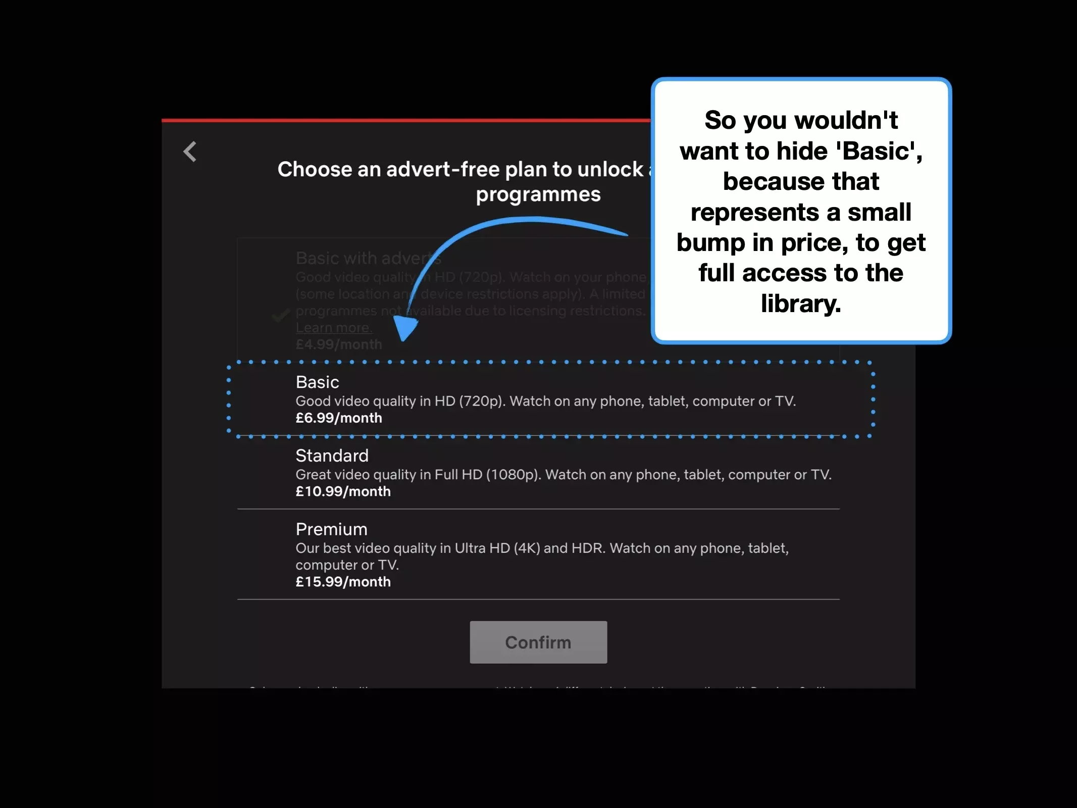
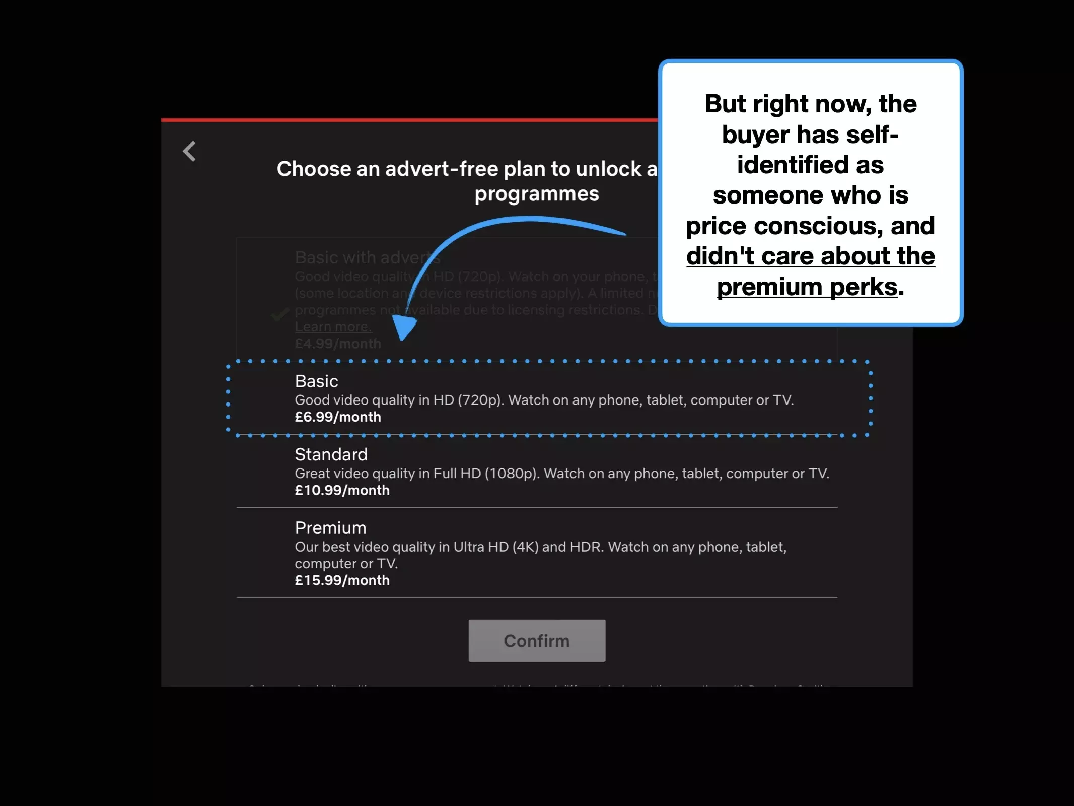
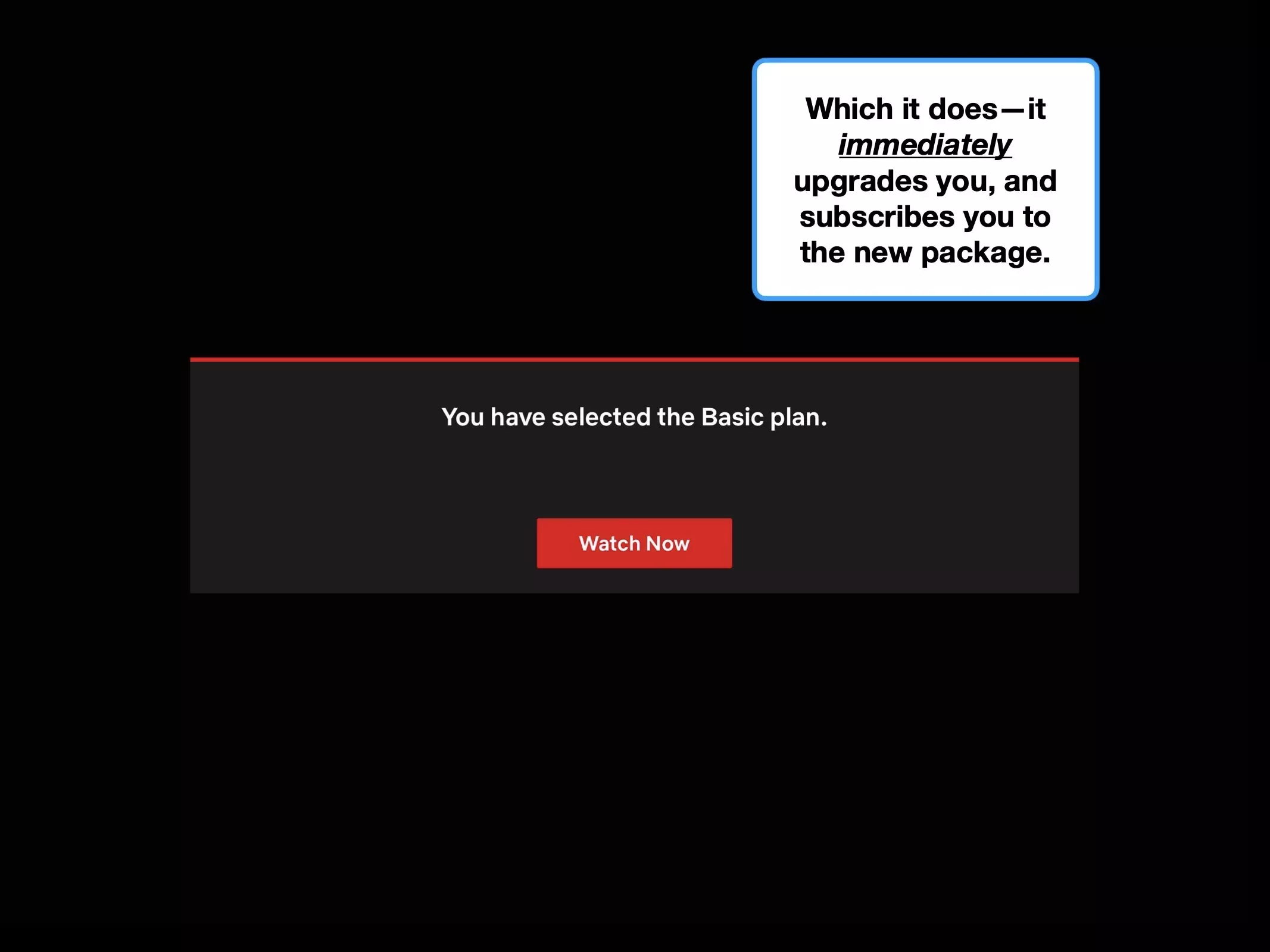
Take up for Netflix's ad-supported subscription was initially slow.
The Wall Street Journal reported that only 9% of new signups opted for it, and of those who were happy to watch ads, 43% had downgraded from more expensive options.
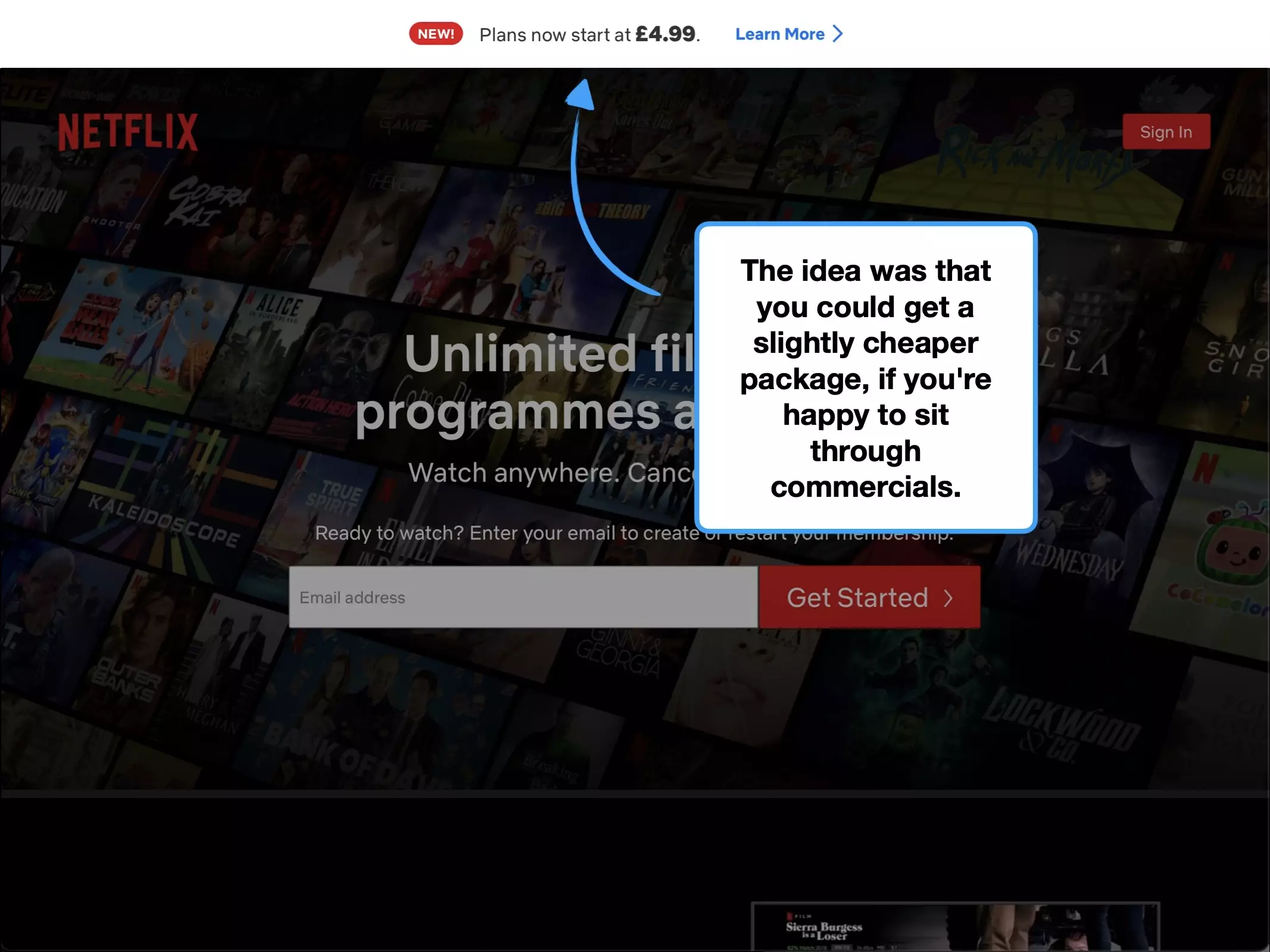
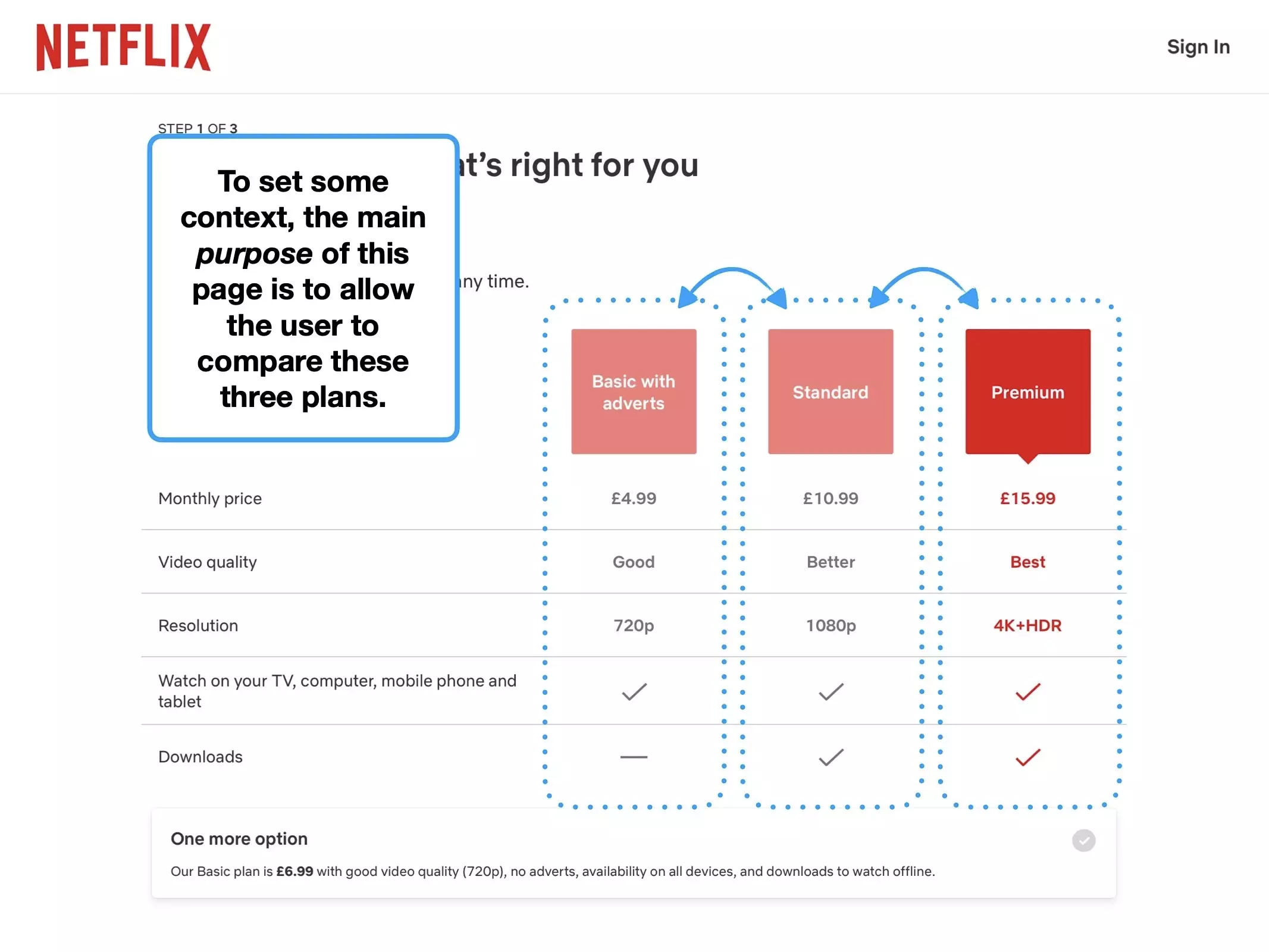
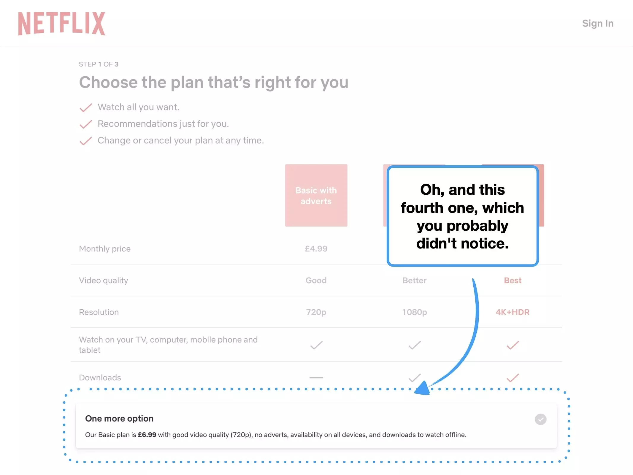
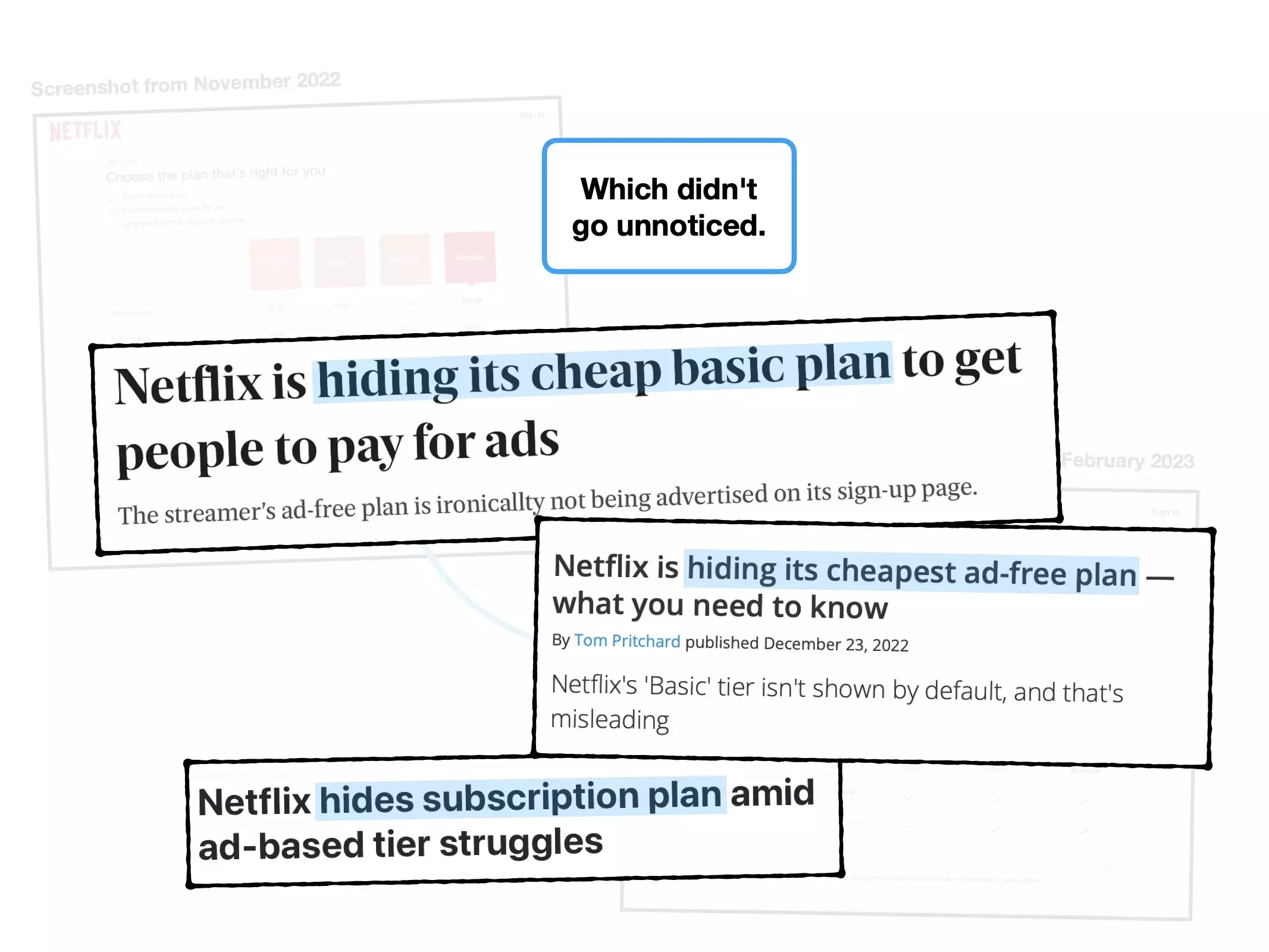
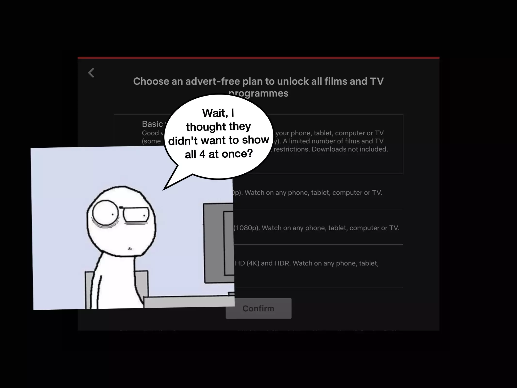
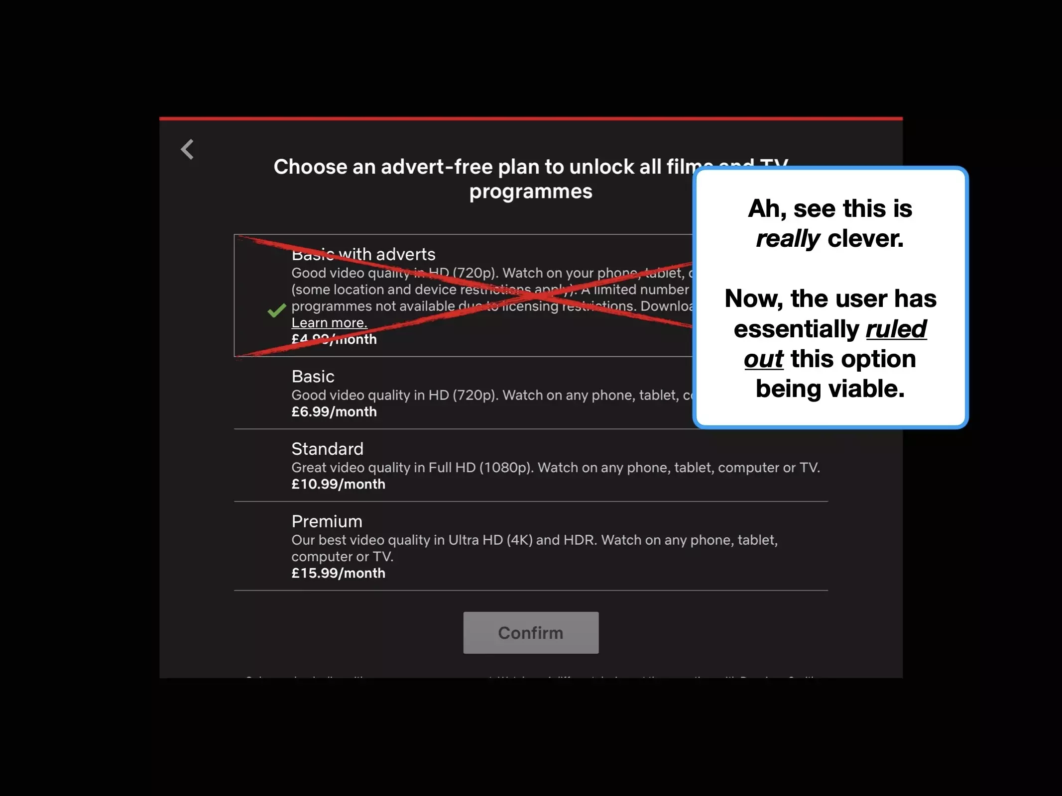
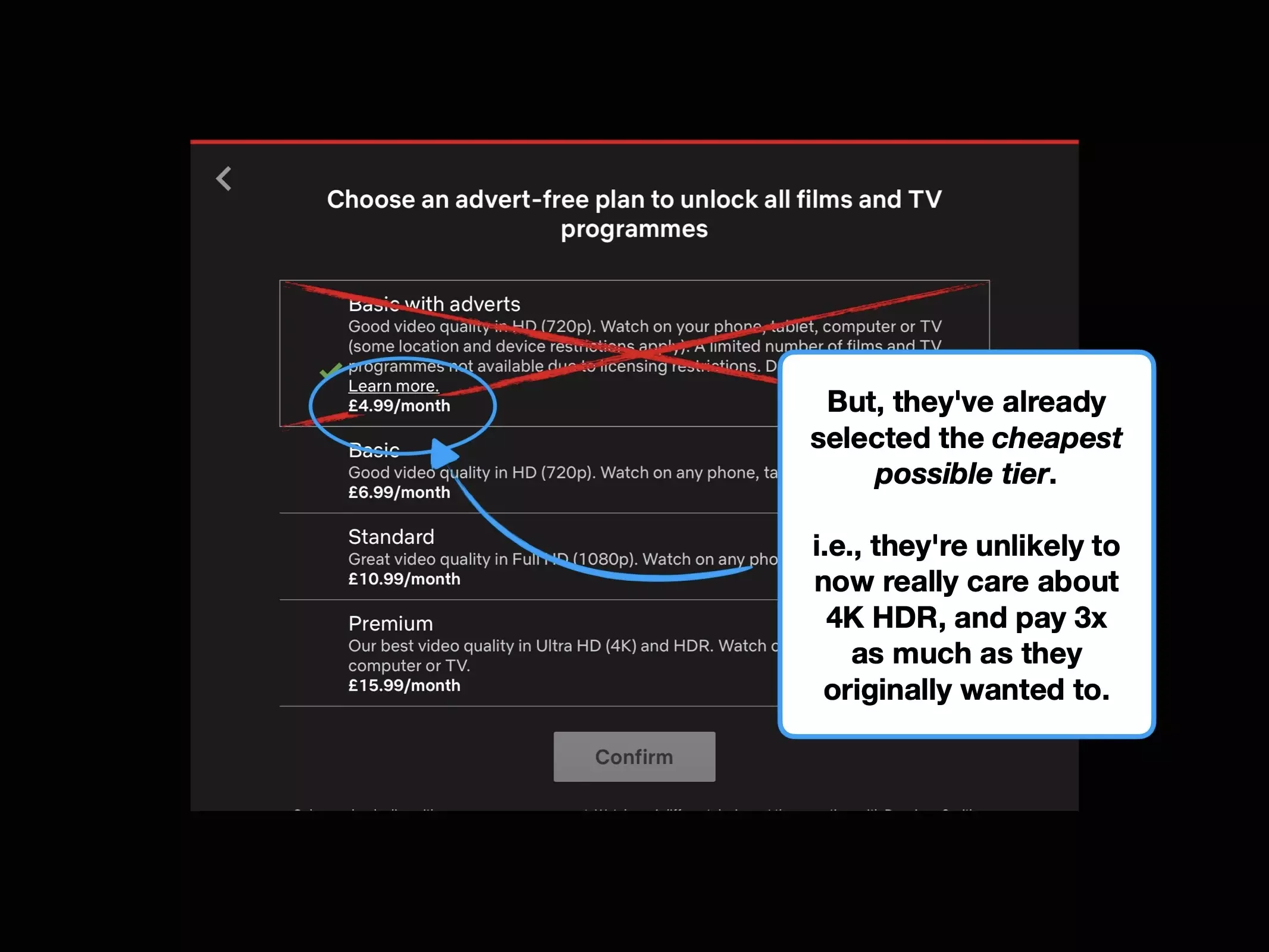
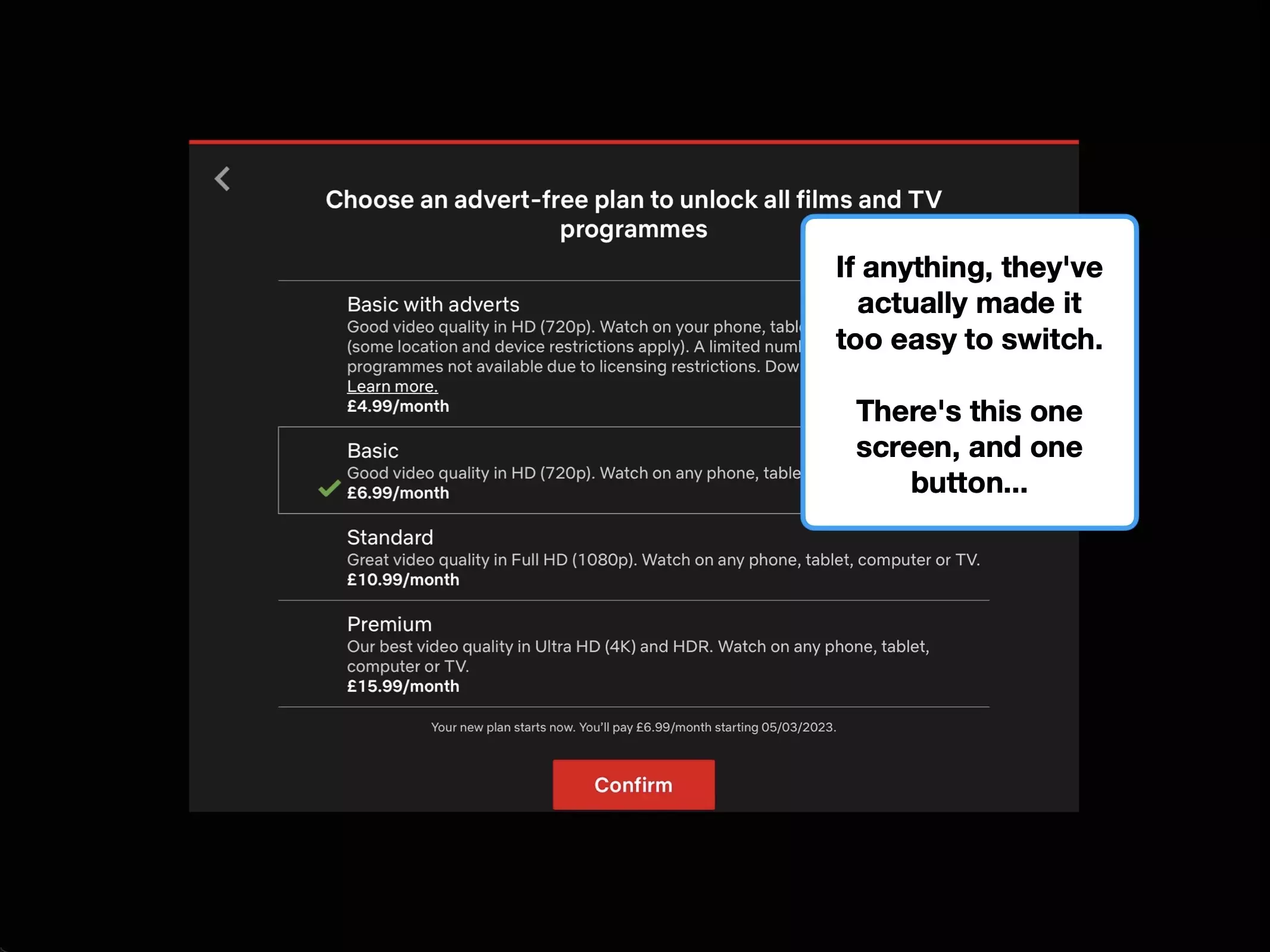
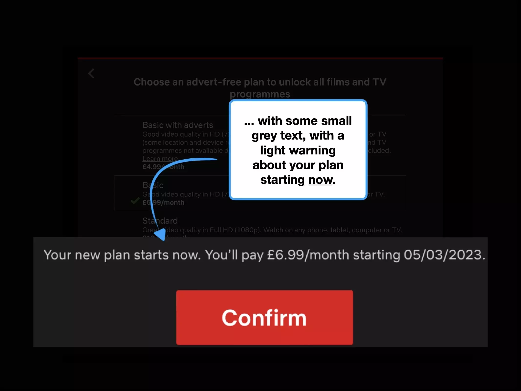
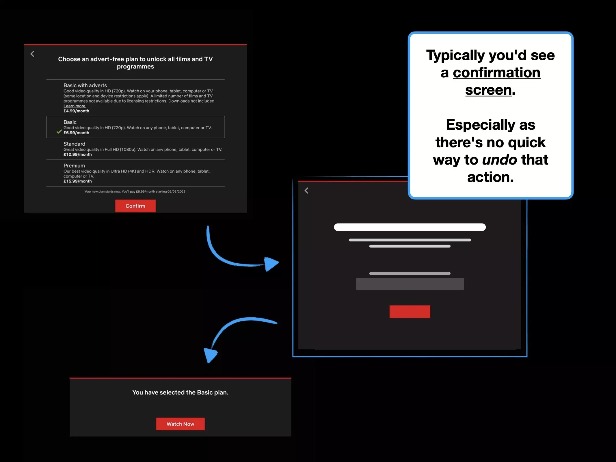
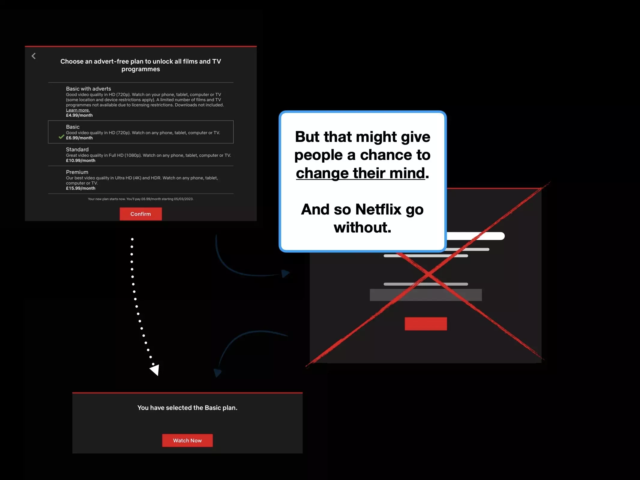
So Netflix made a simple design tweak: to 'hide' one of their most popular packages.
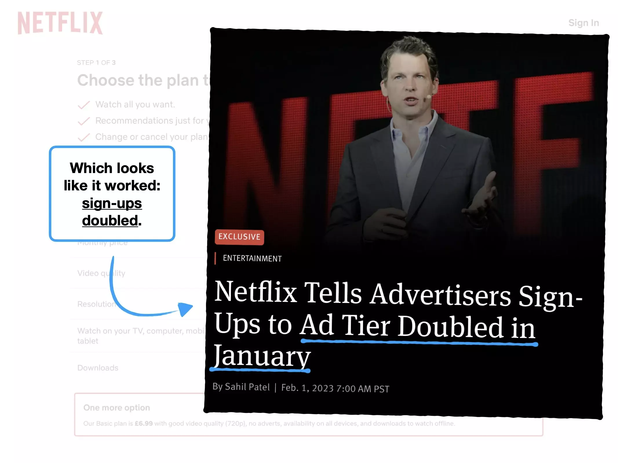
The result: sign-ups to their ad-tier doubled.
This case study demonstrates a masterclass of pricing psychology, and how simple changes (reliant on data and experimentation) can significantly alter the course of your product.
Although before we start, I want to be clear about something: what you're about to see could easily be perceived as a dark pattern.
🖼
🦜
🏋️
🔥
Please rotate your device to view this slideshow
Note, this won’t work if ‘rotate: lock’ is on in your device settings.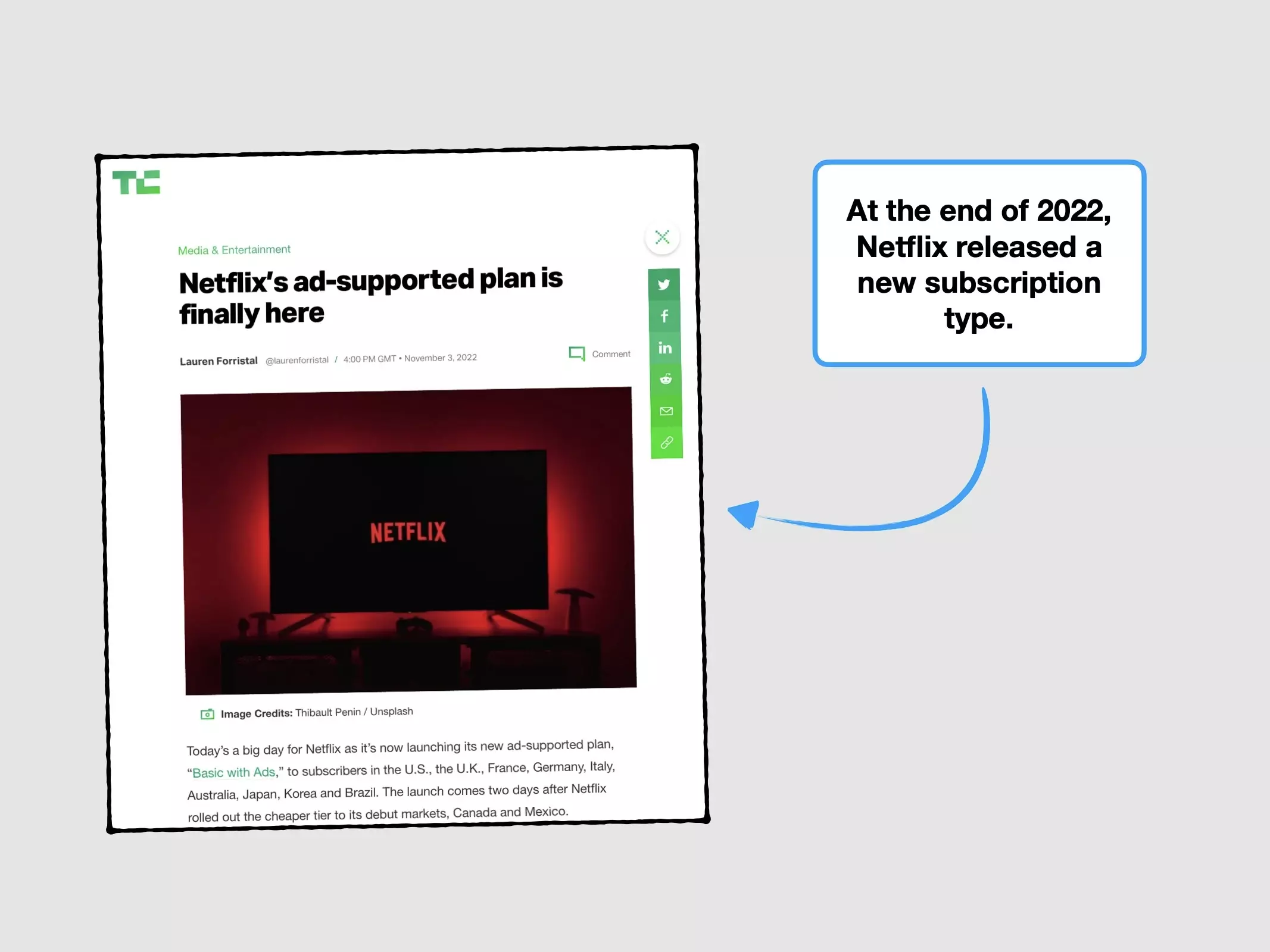
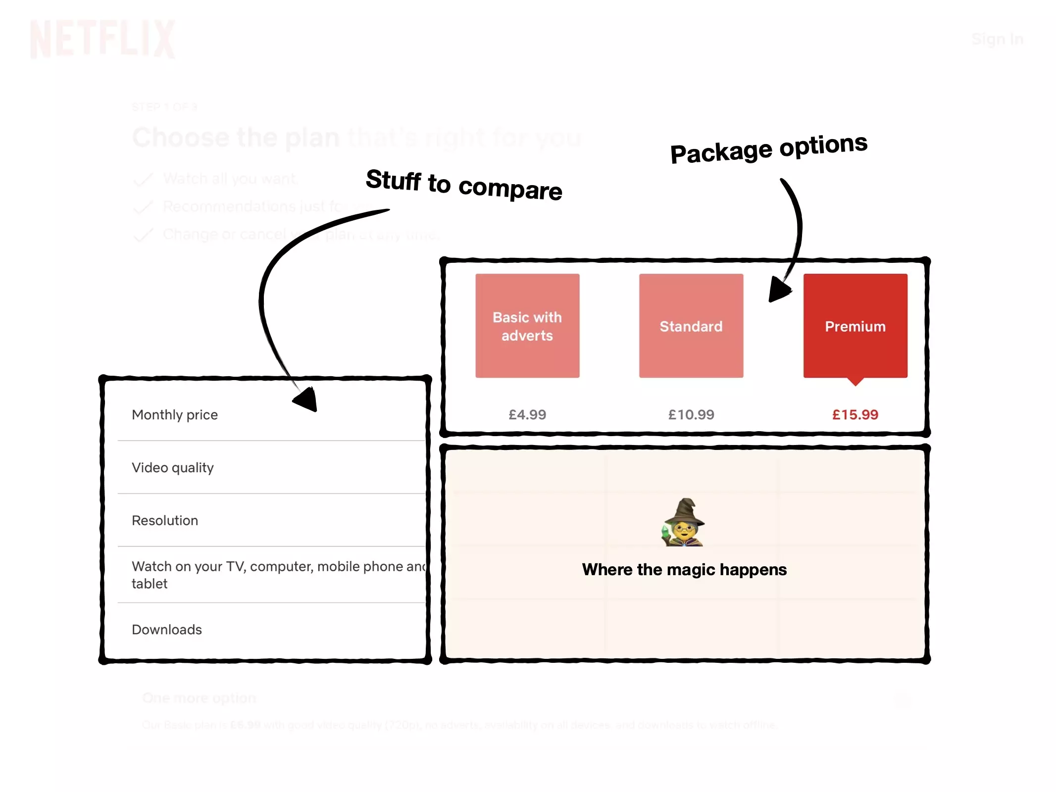
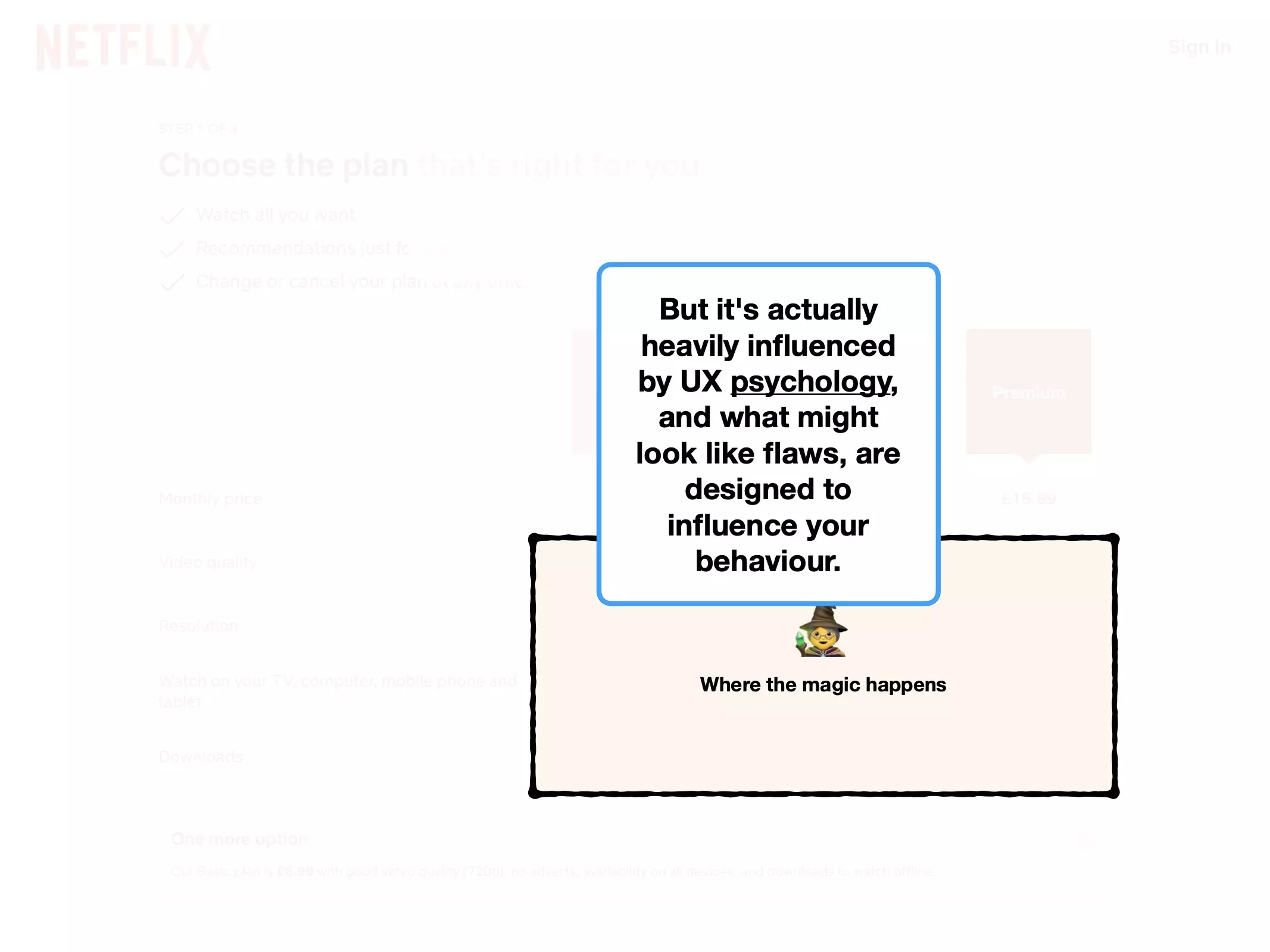
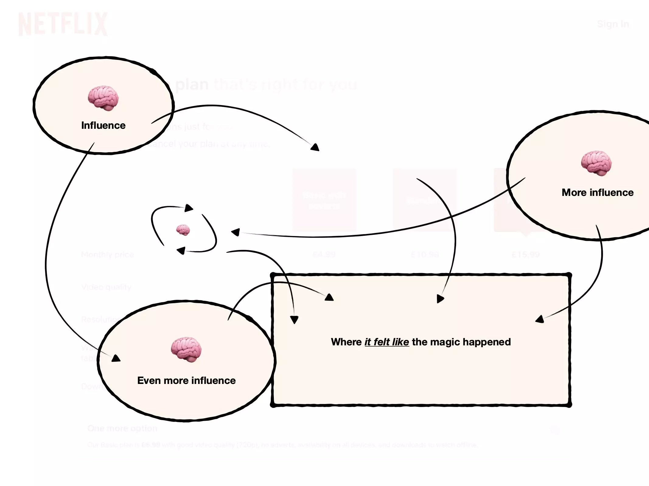
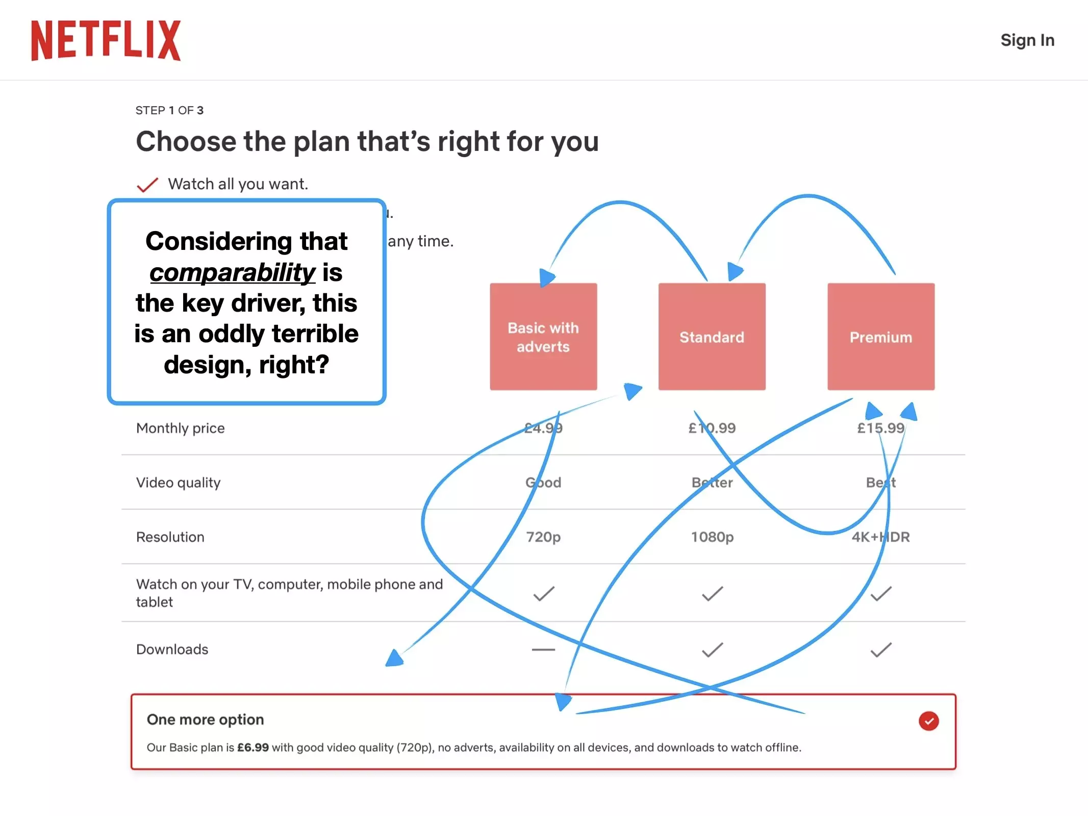
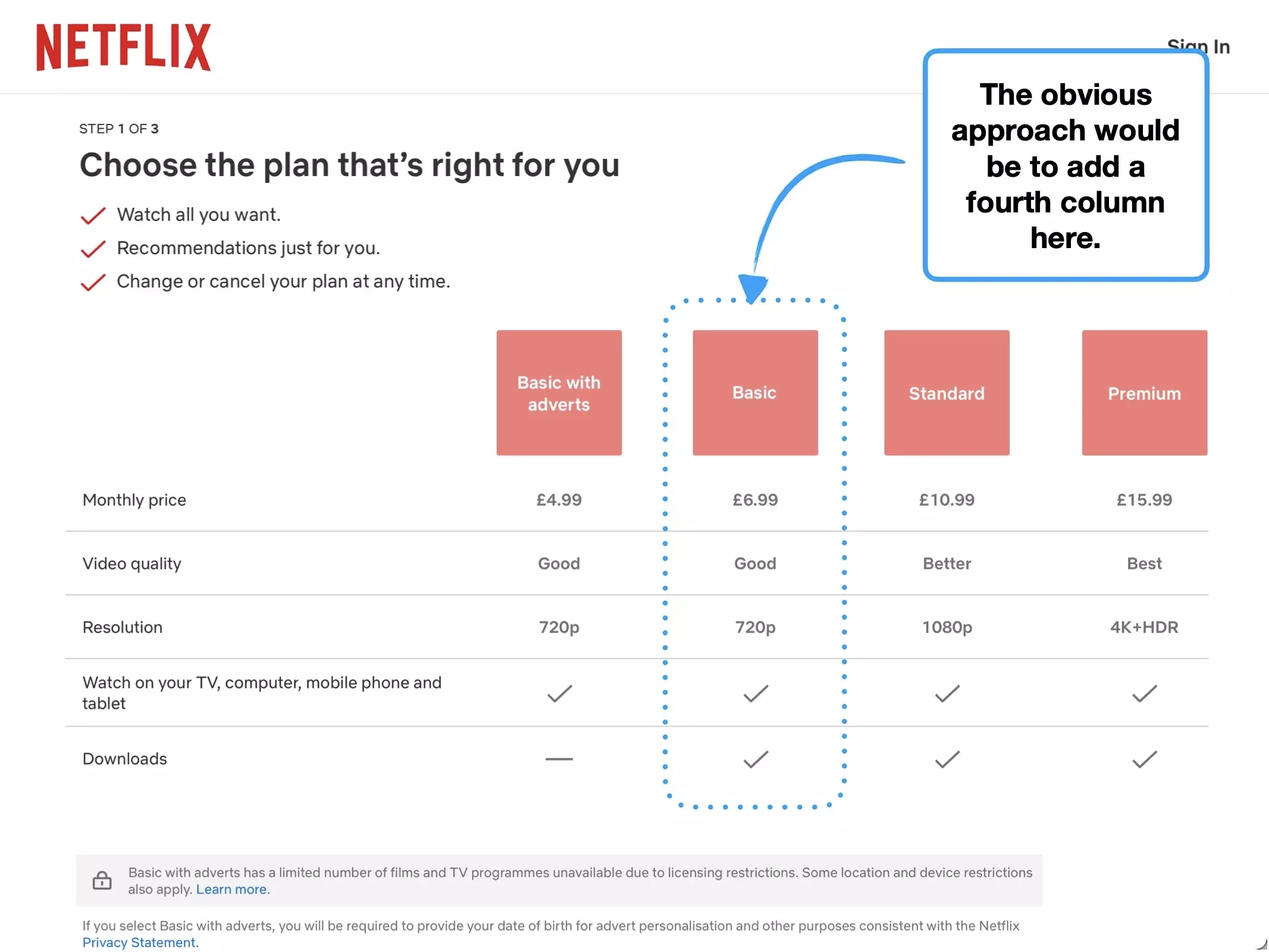
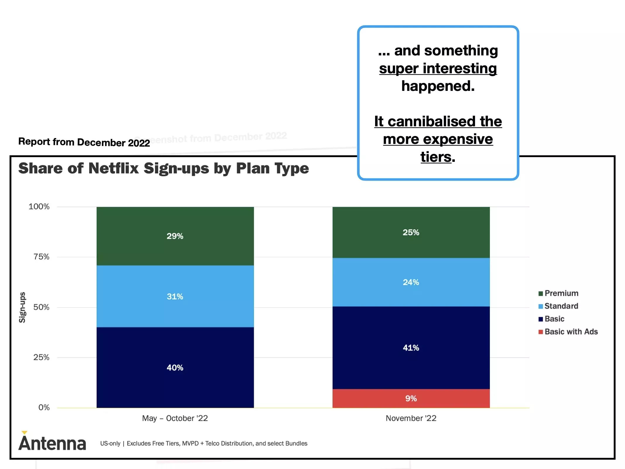
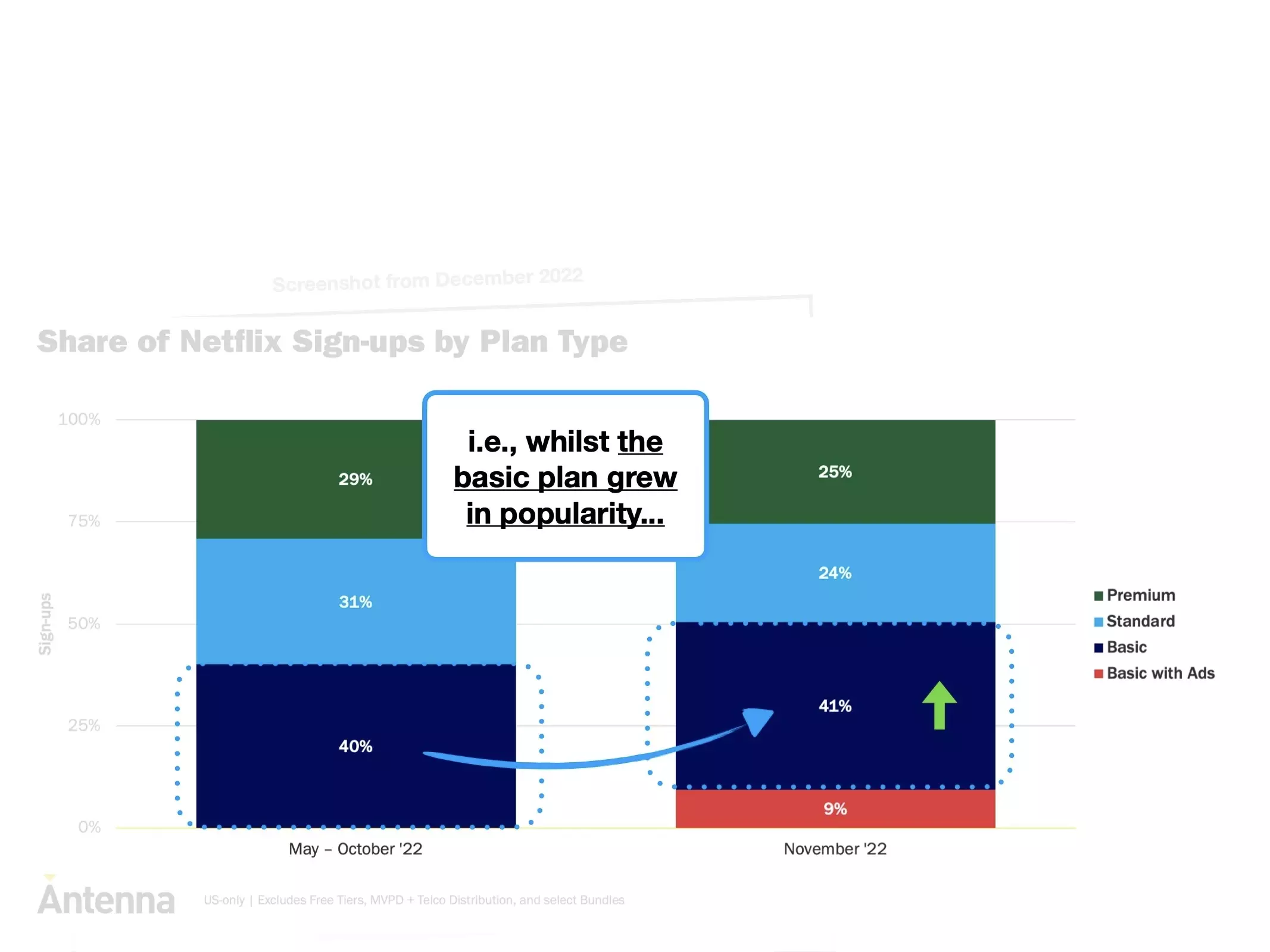
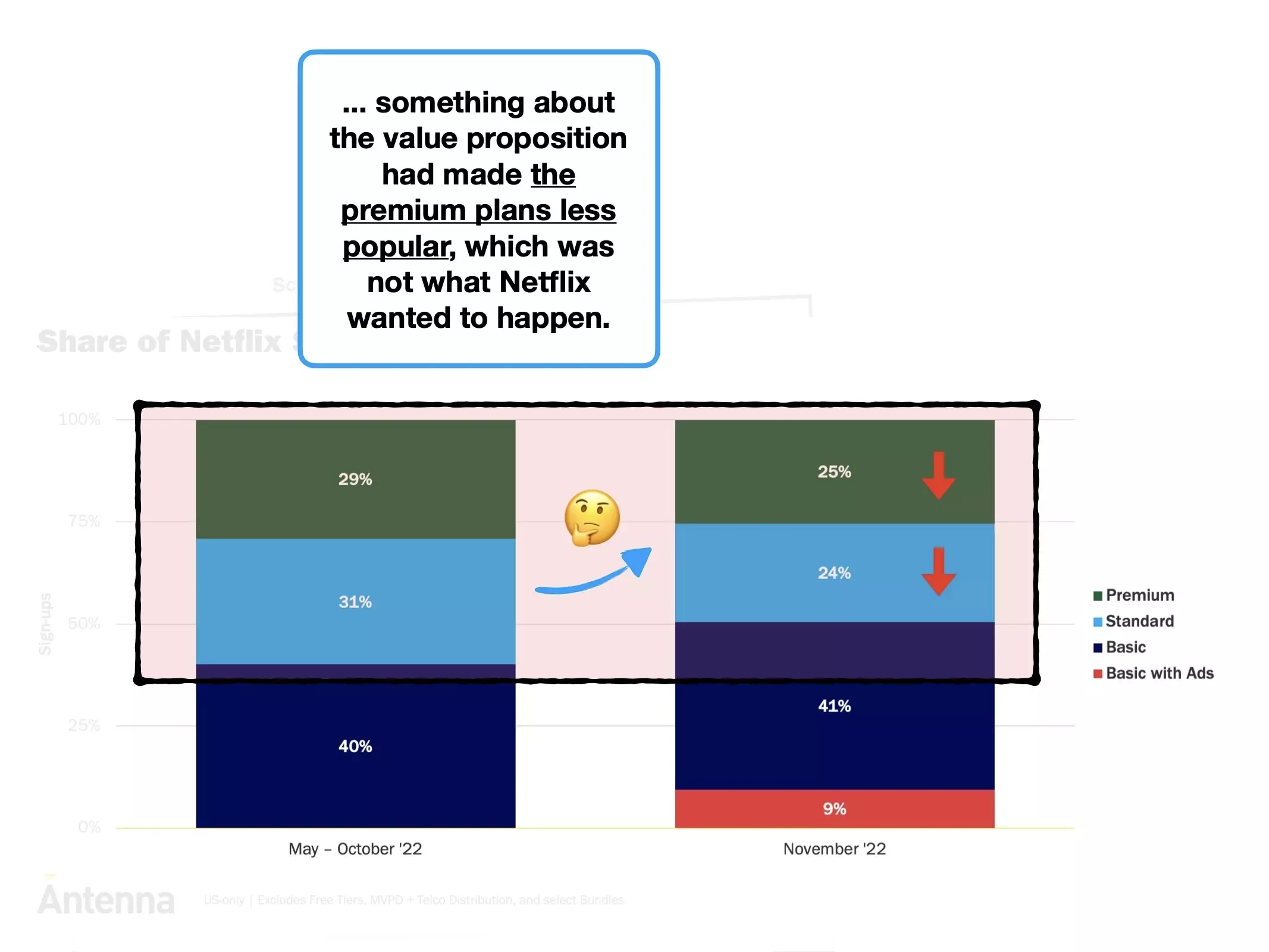
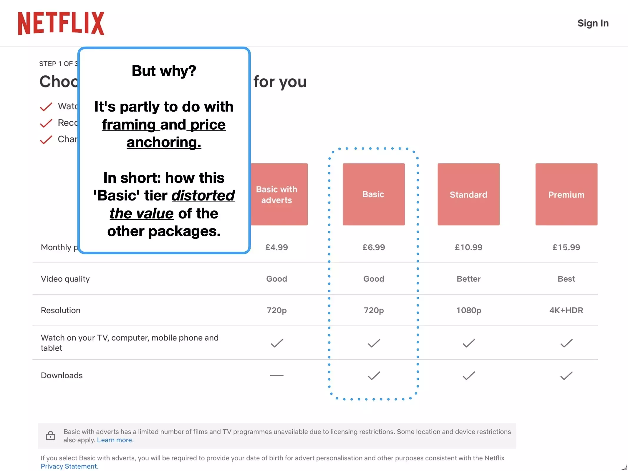

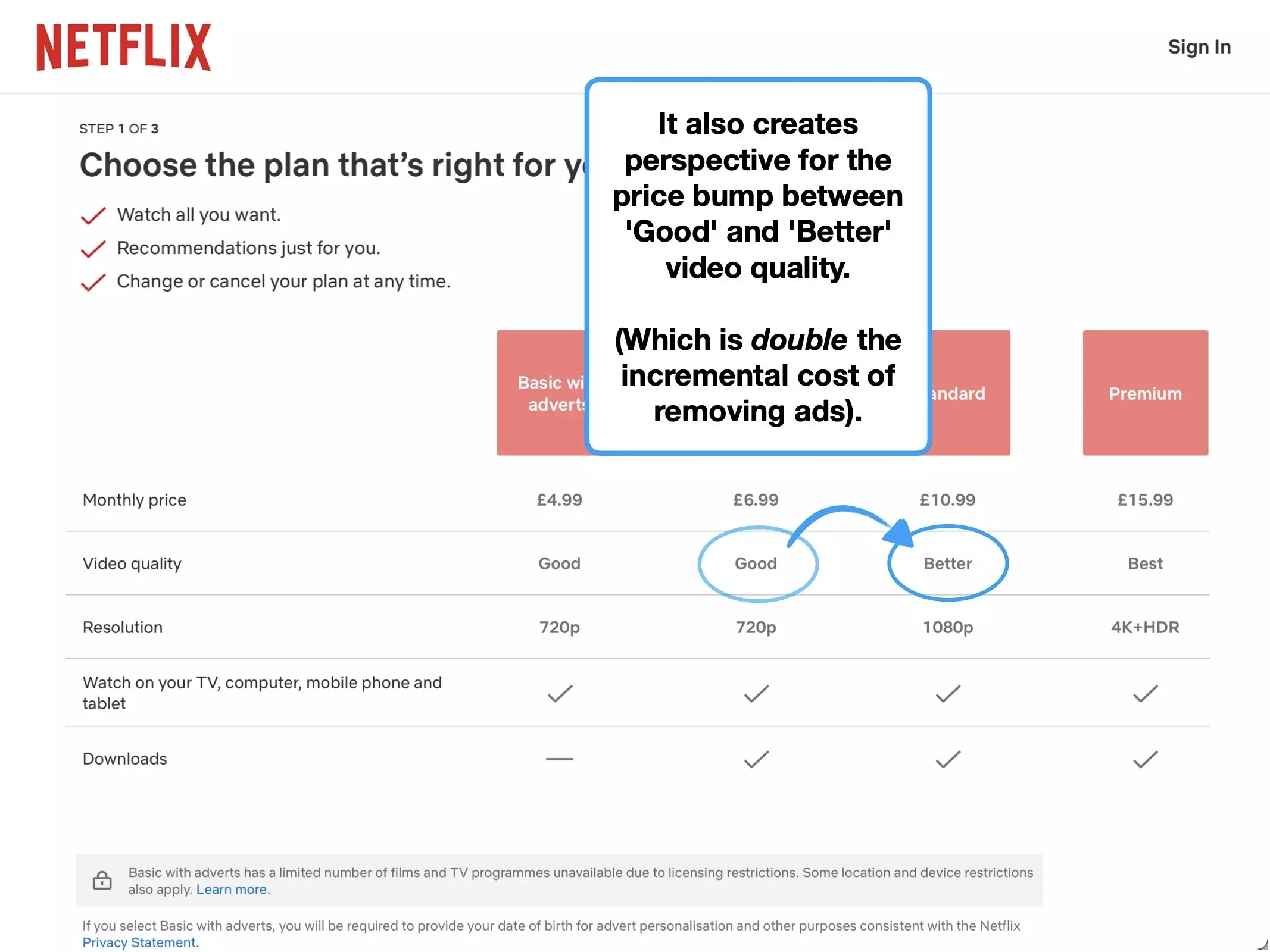
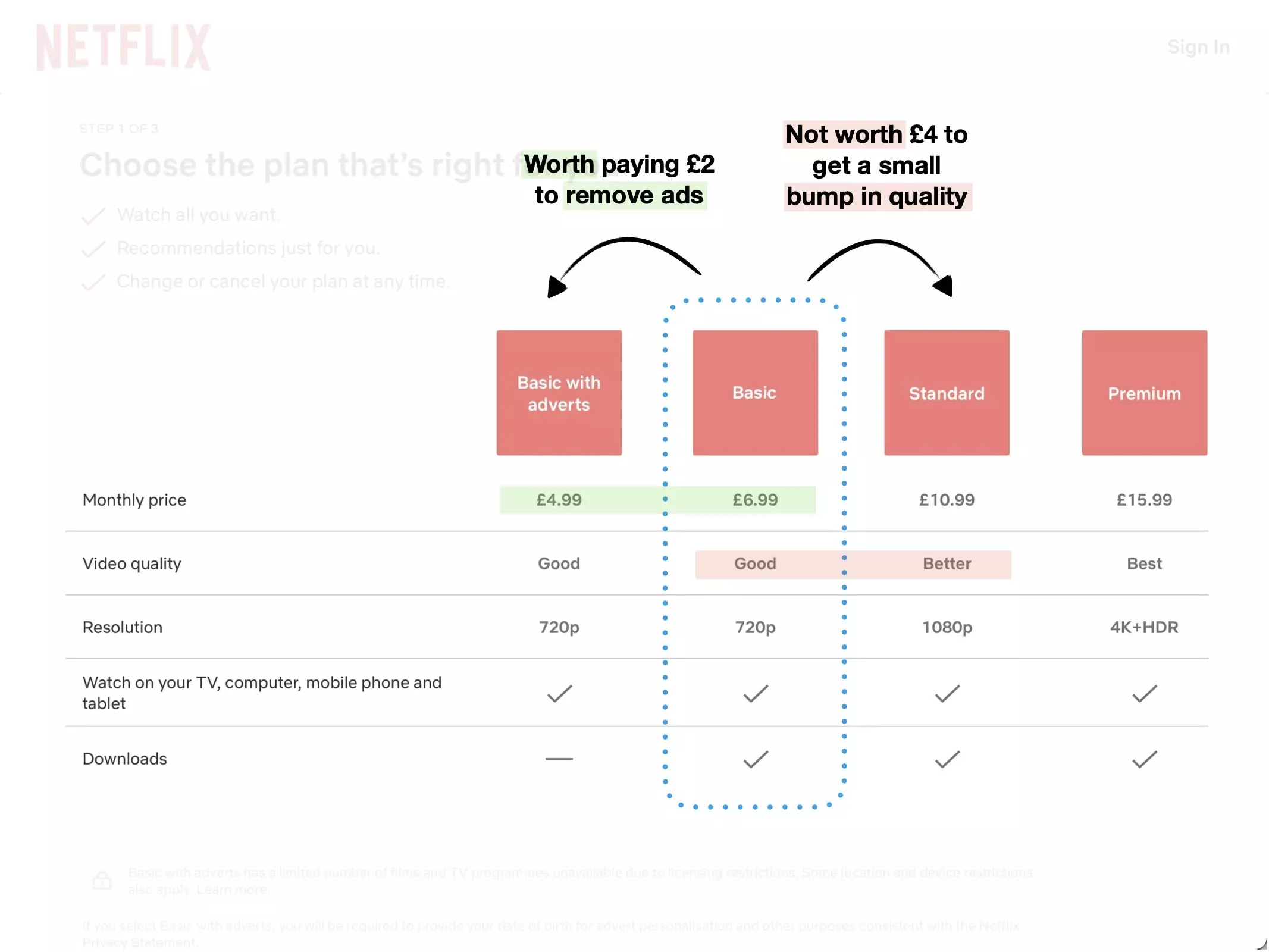
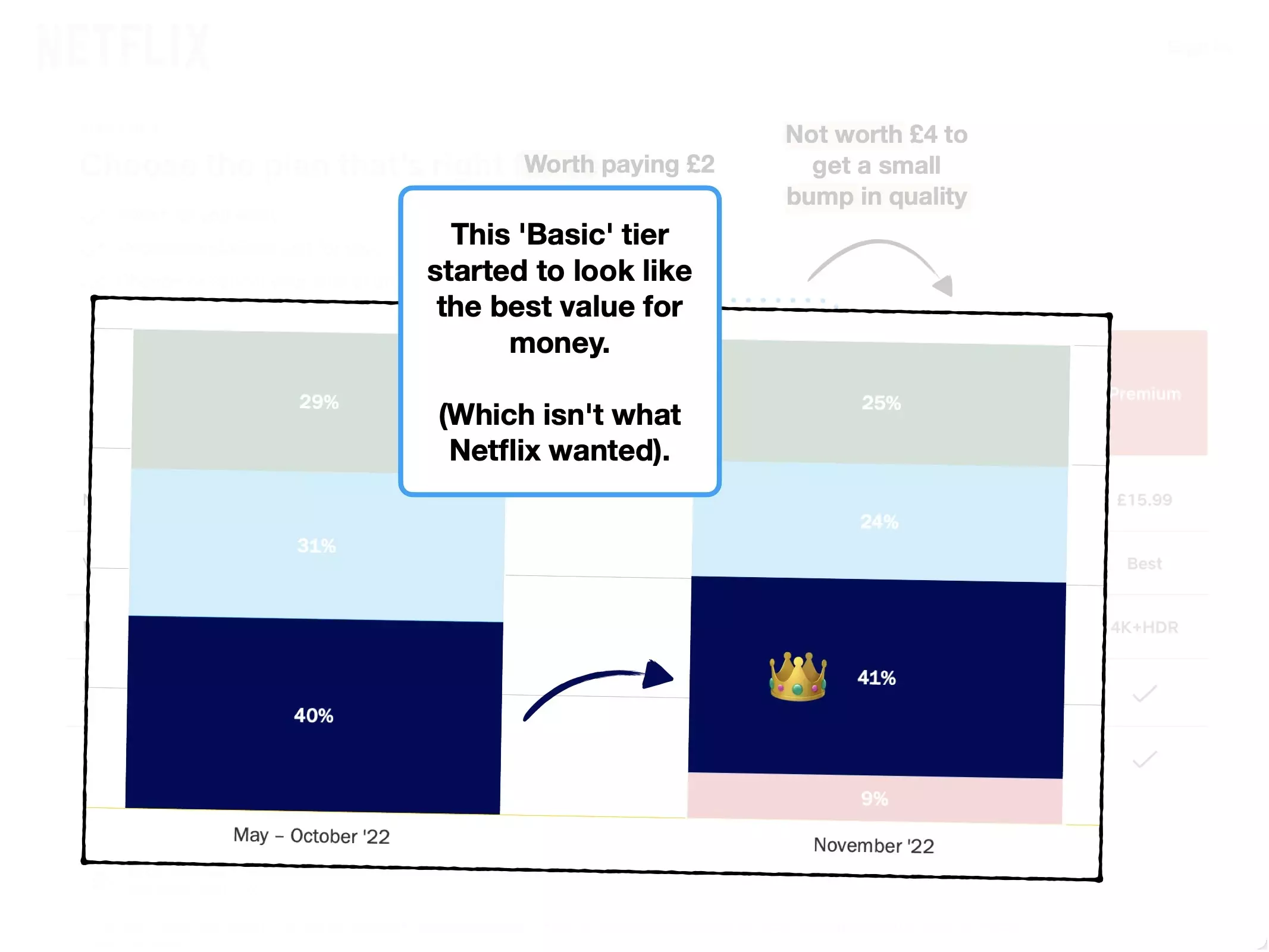
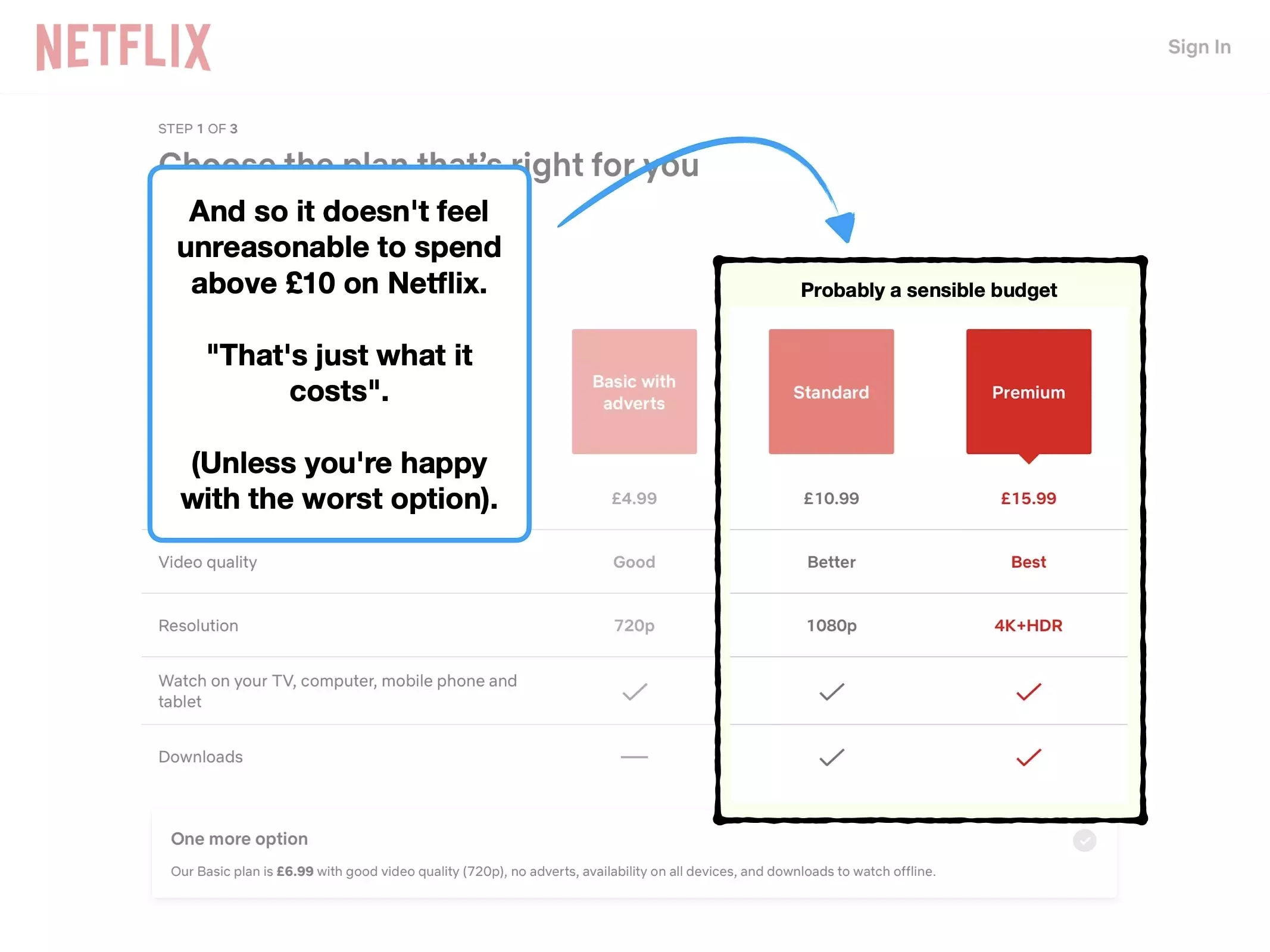
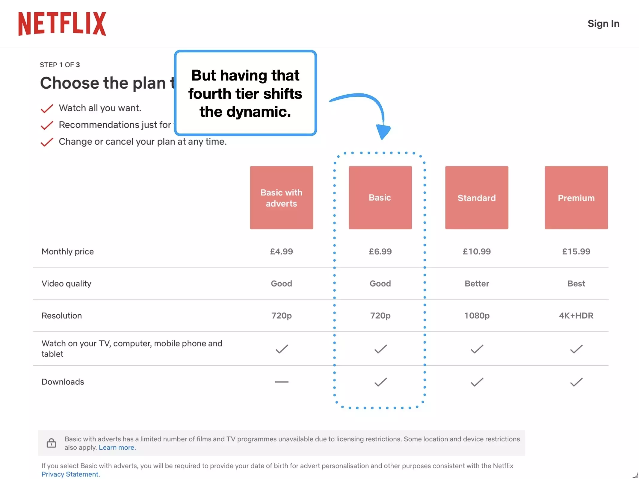
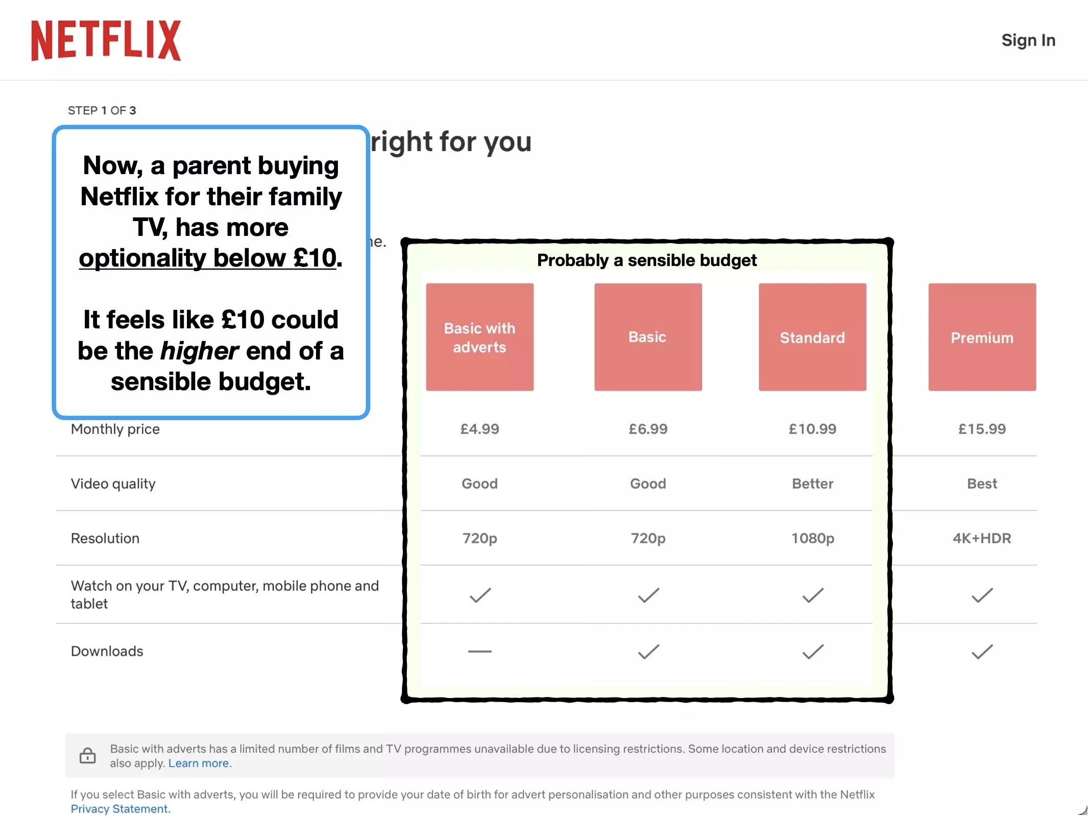
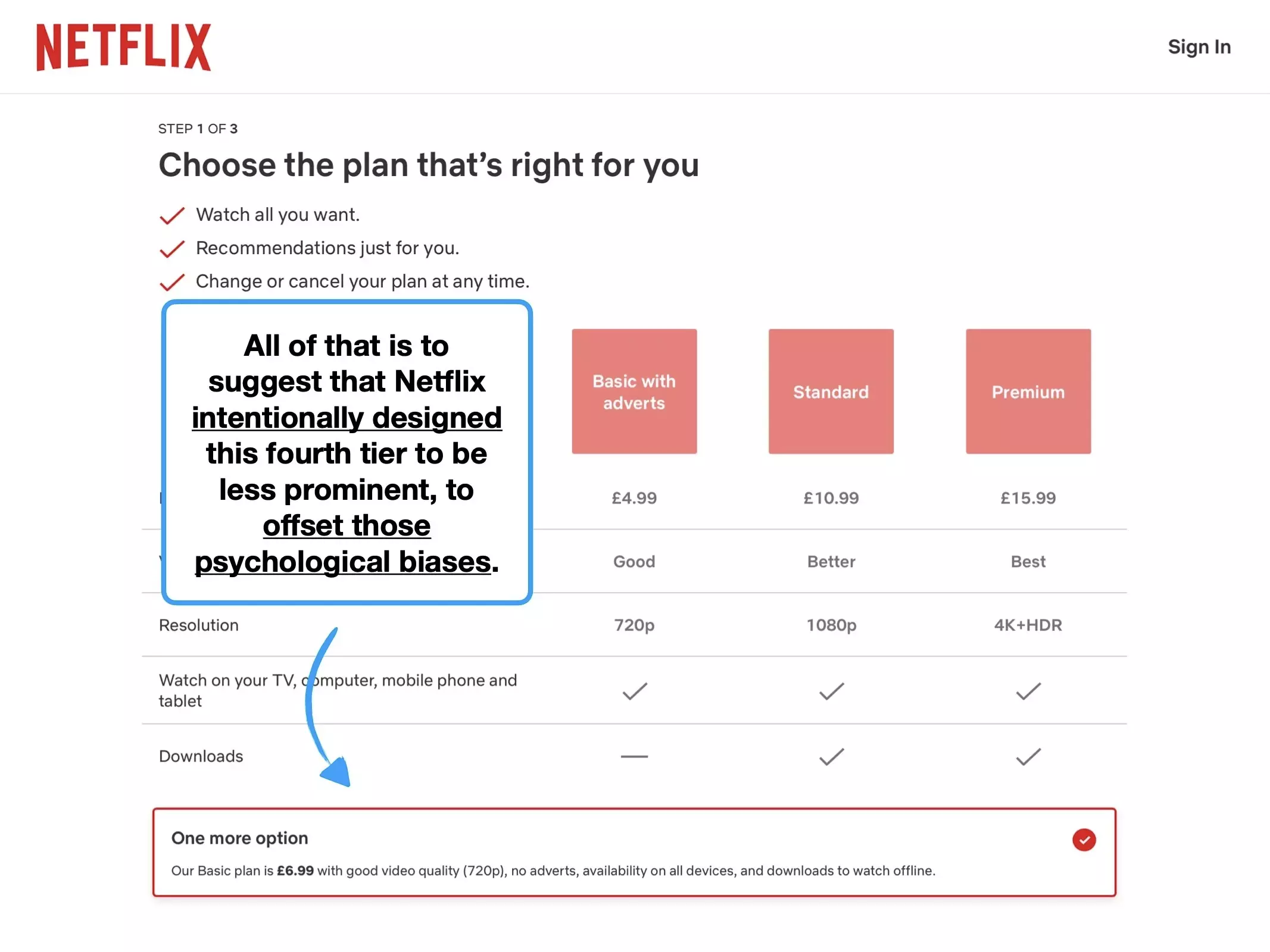
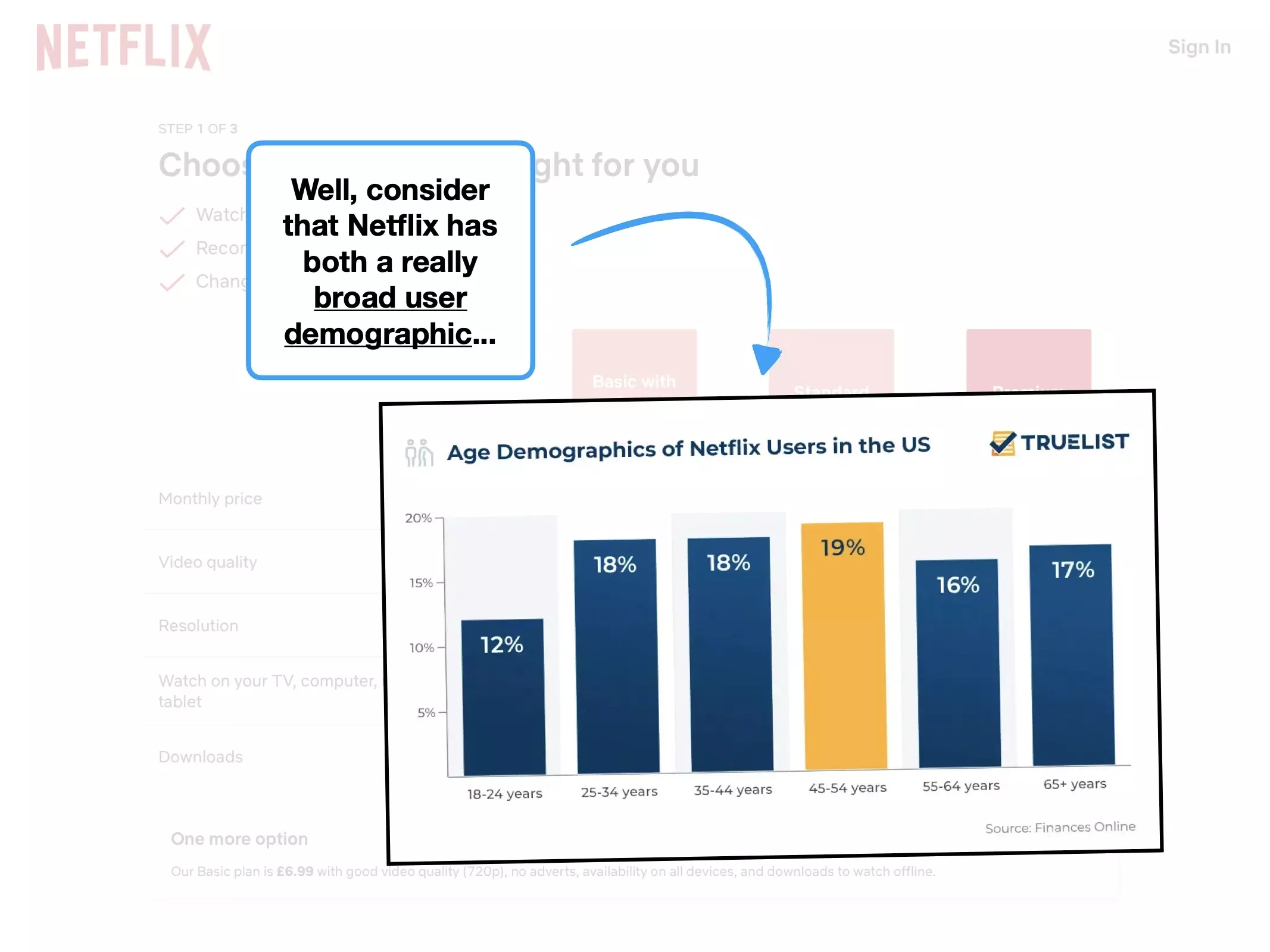
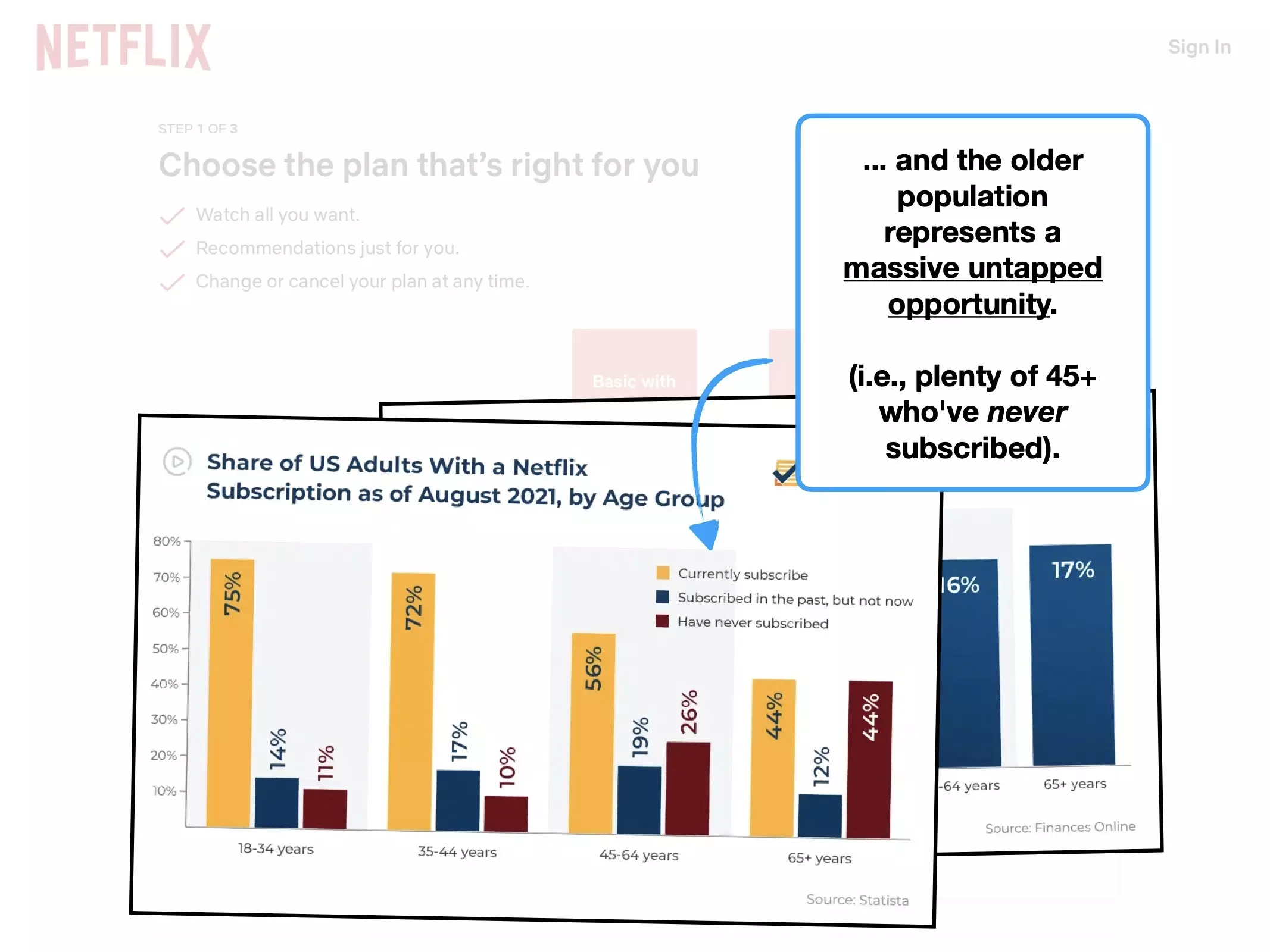
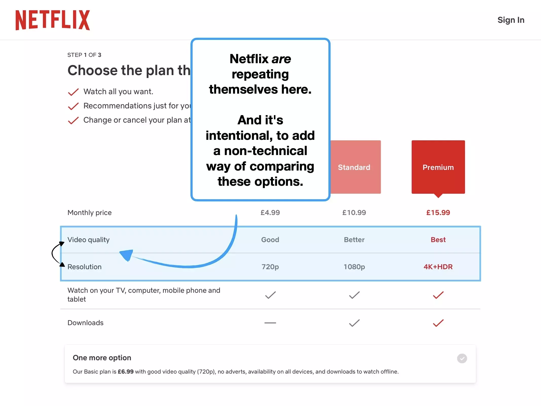
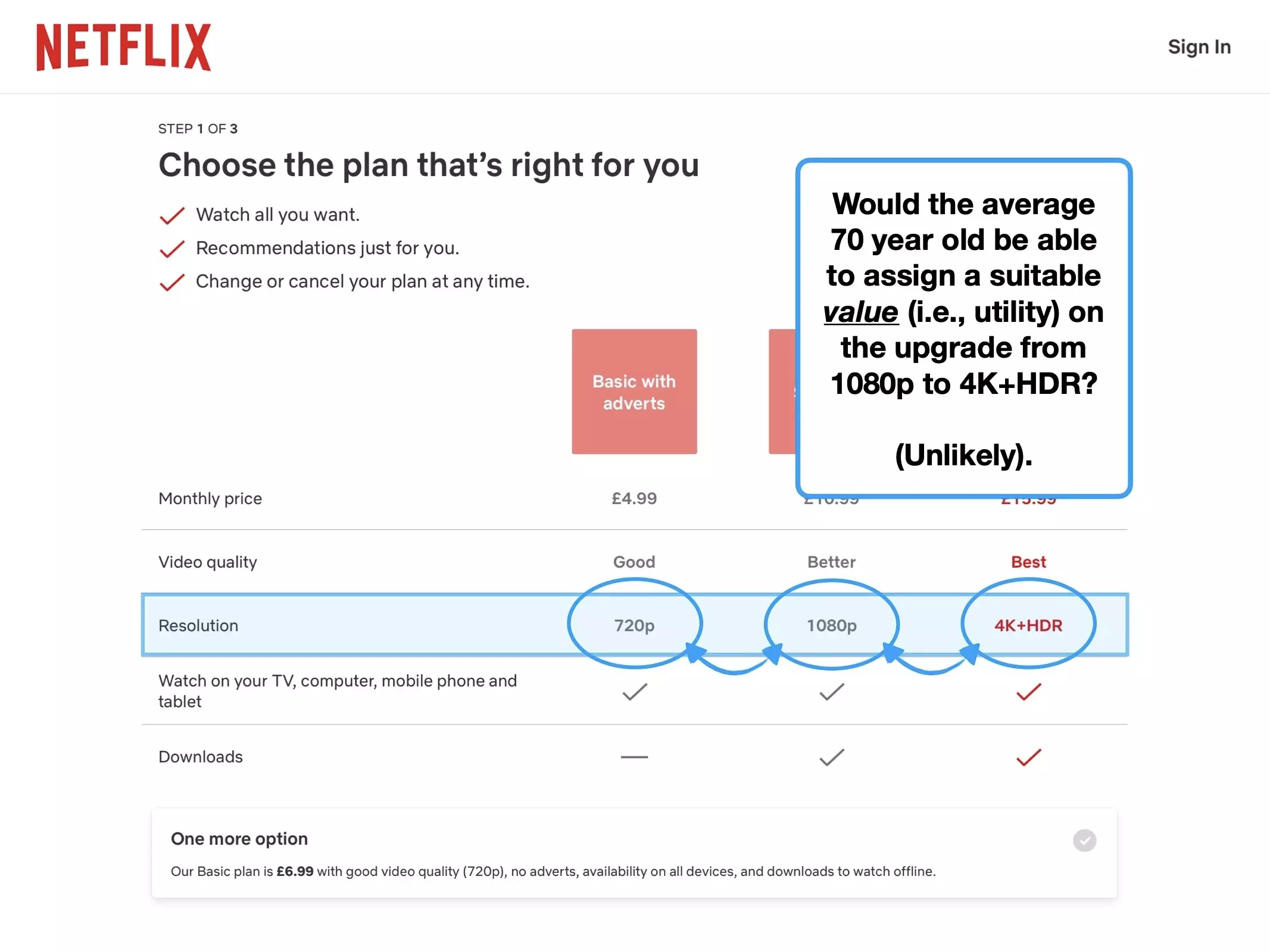
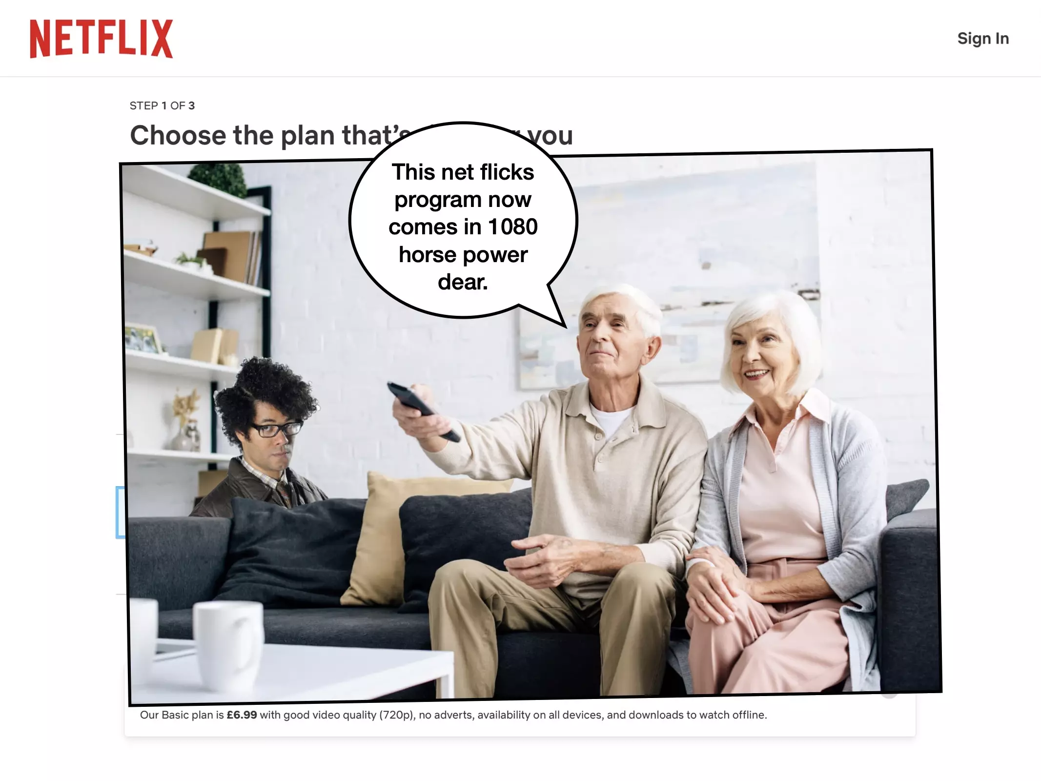
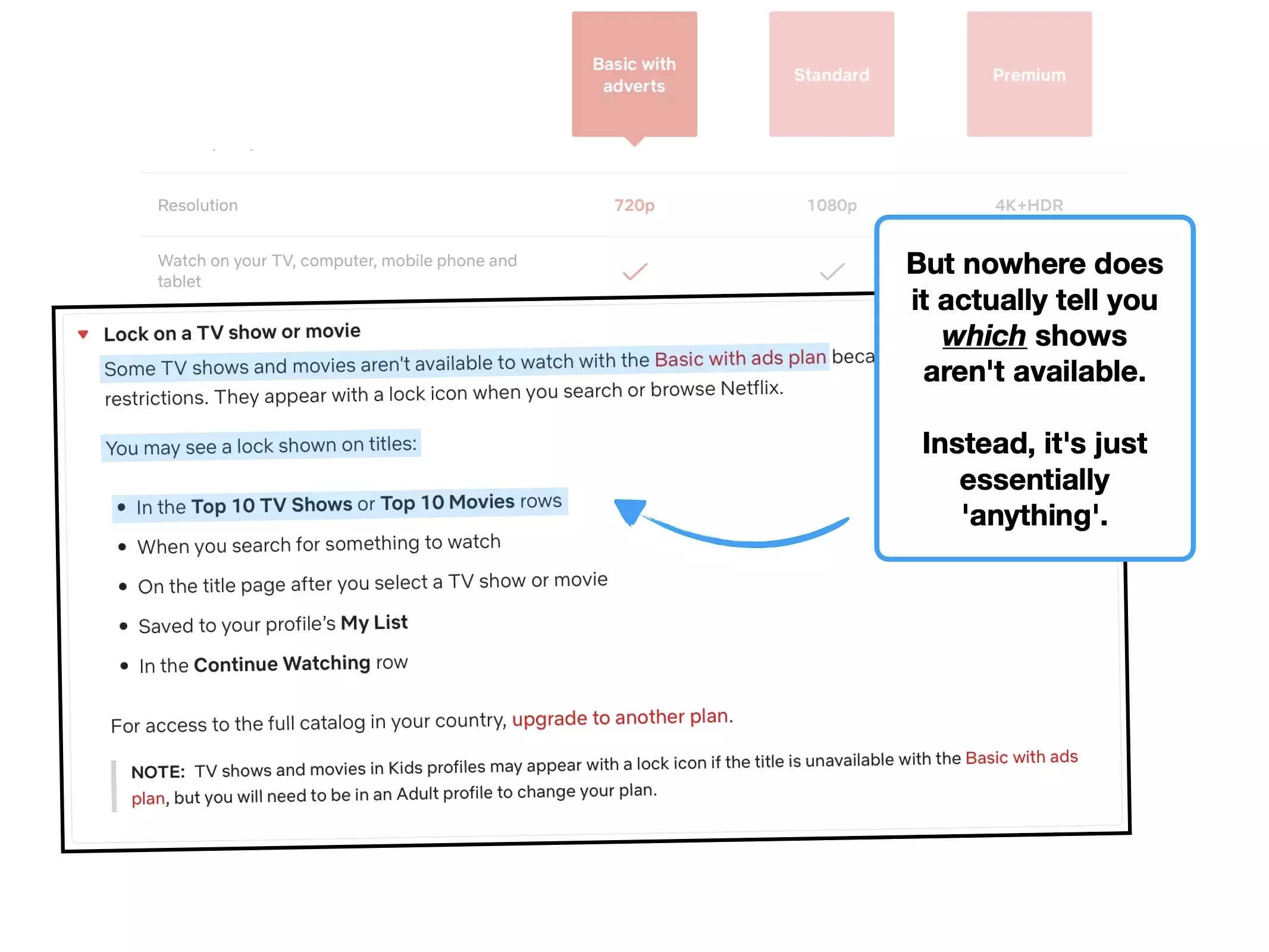
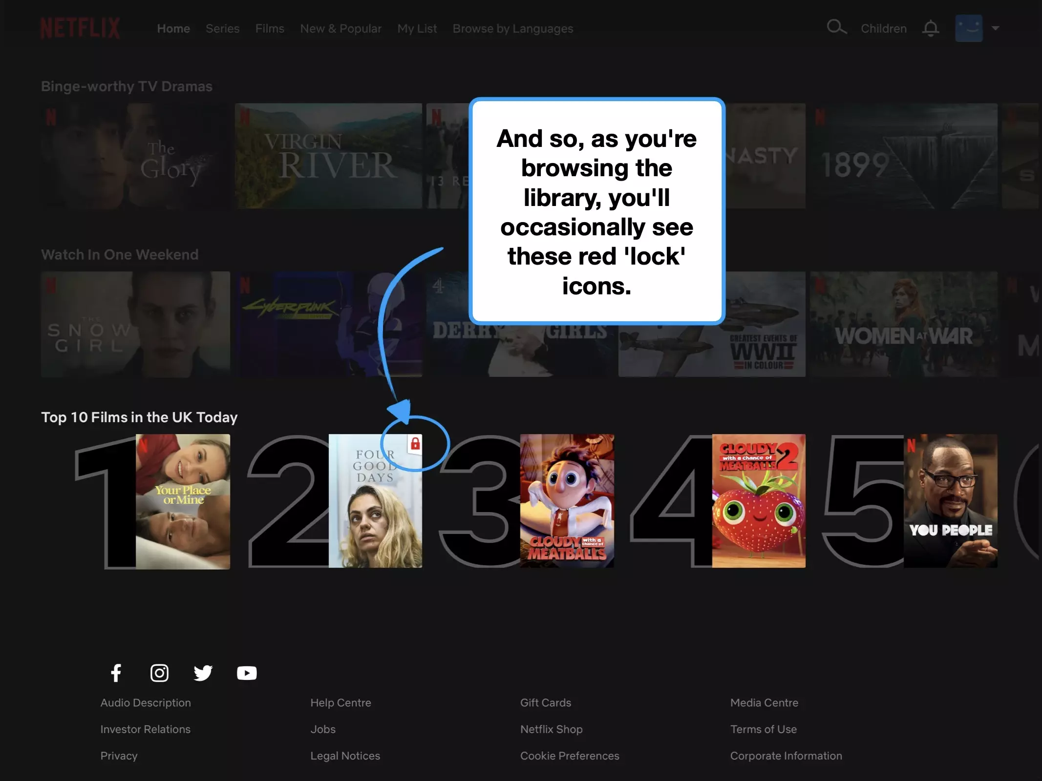
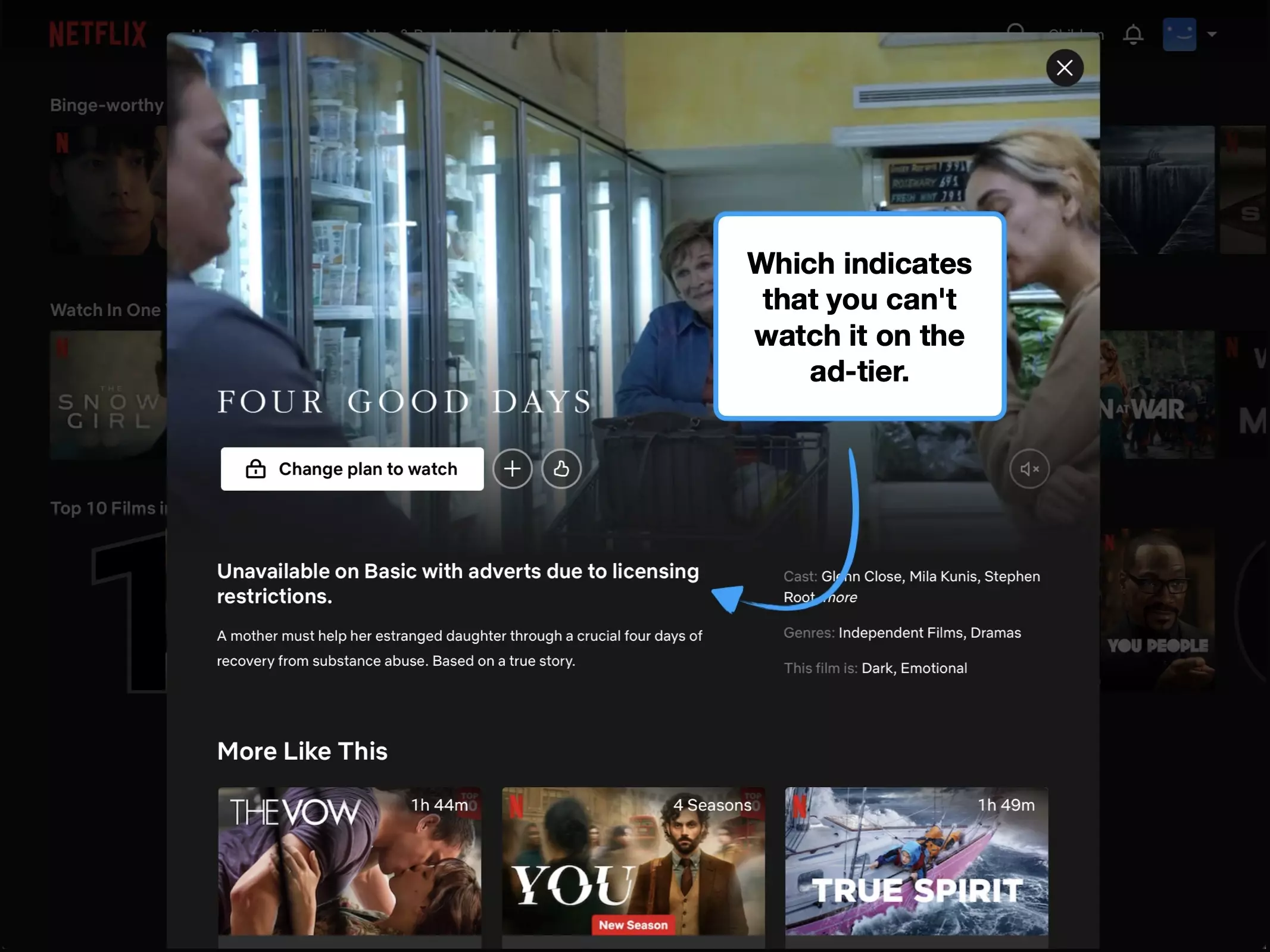
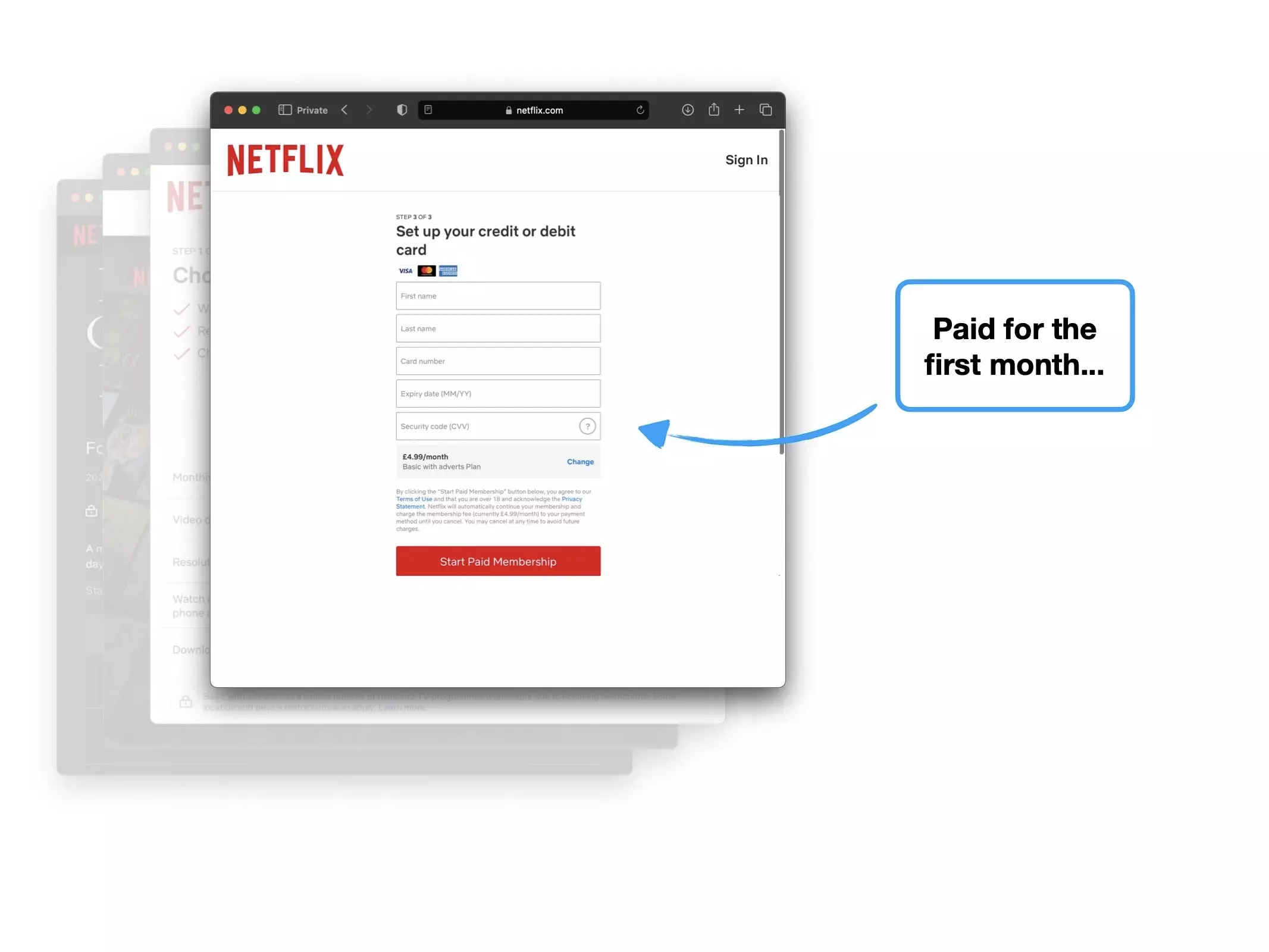
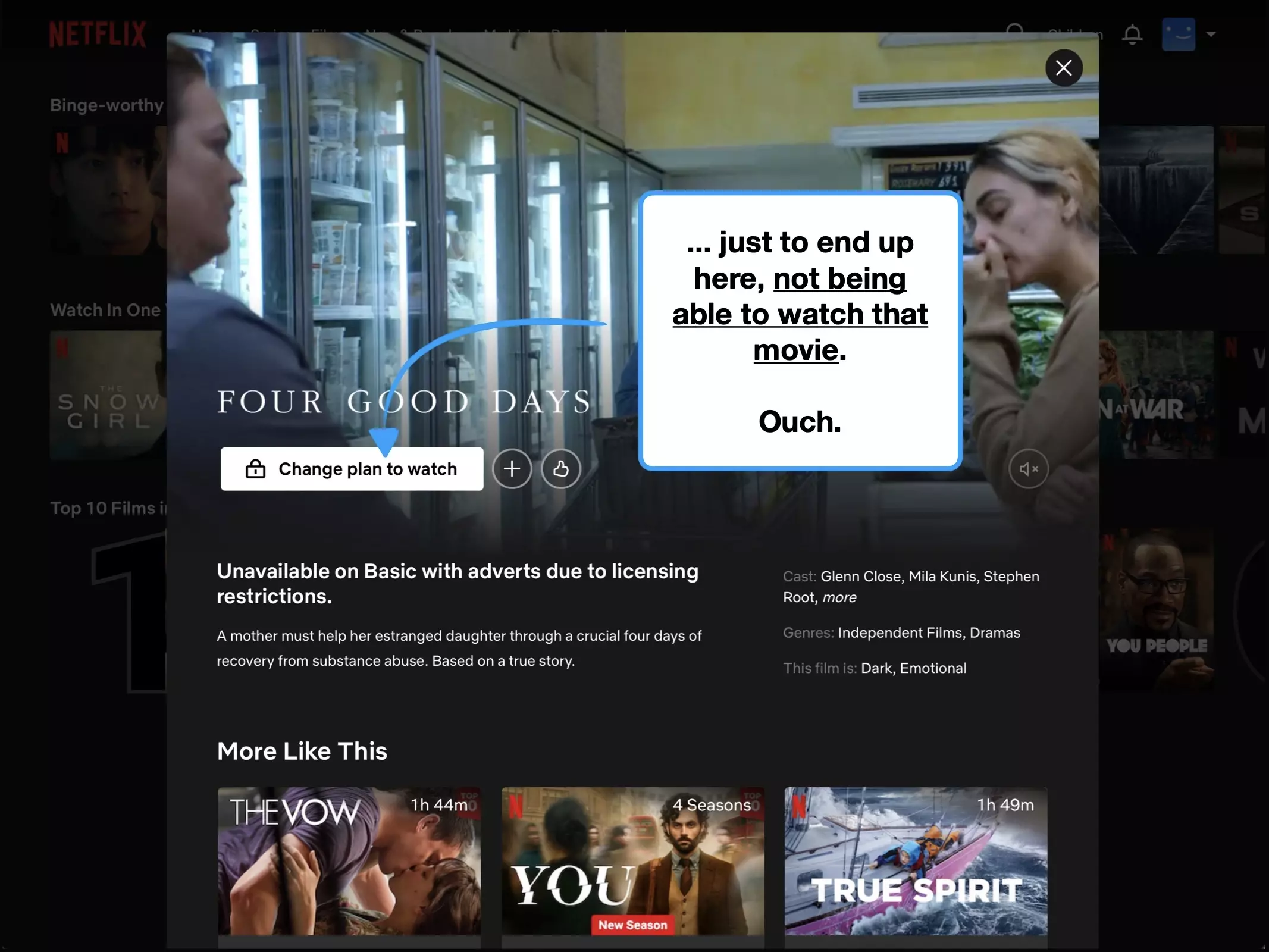
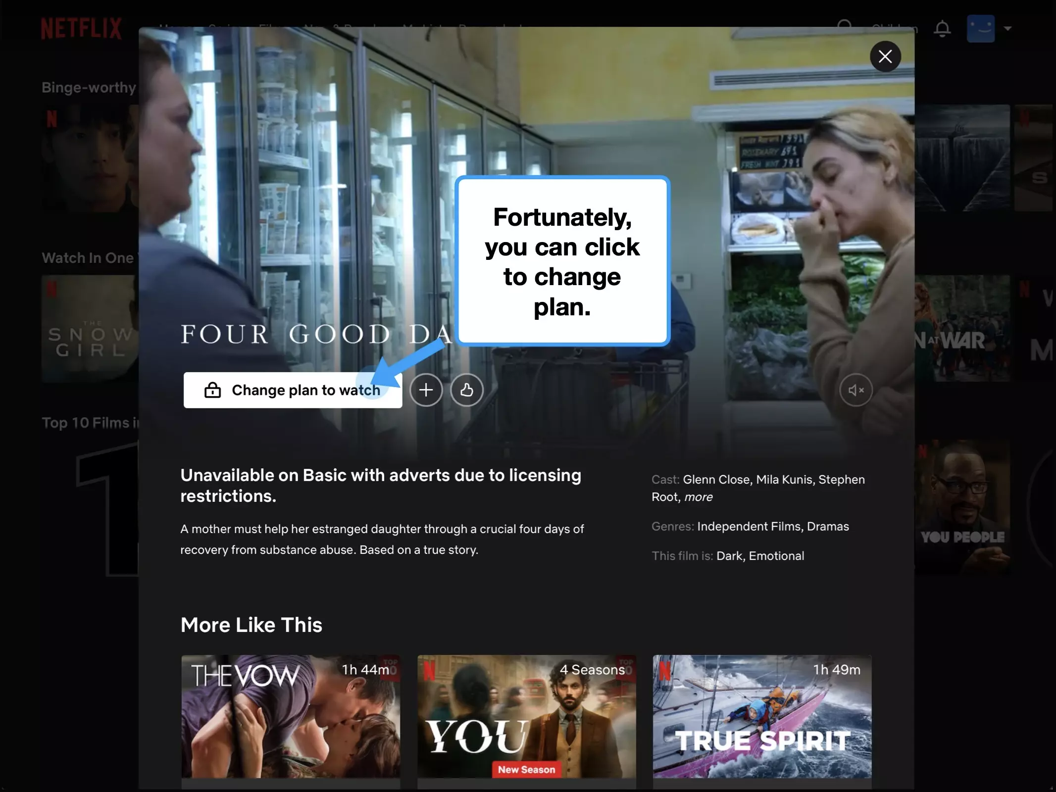

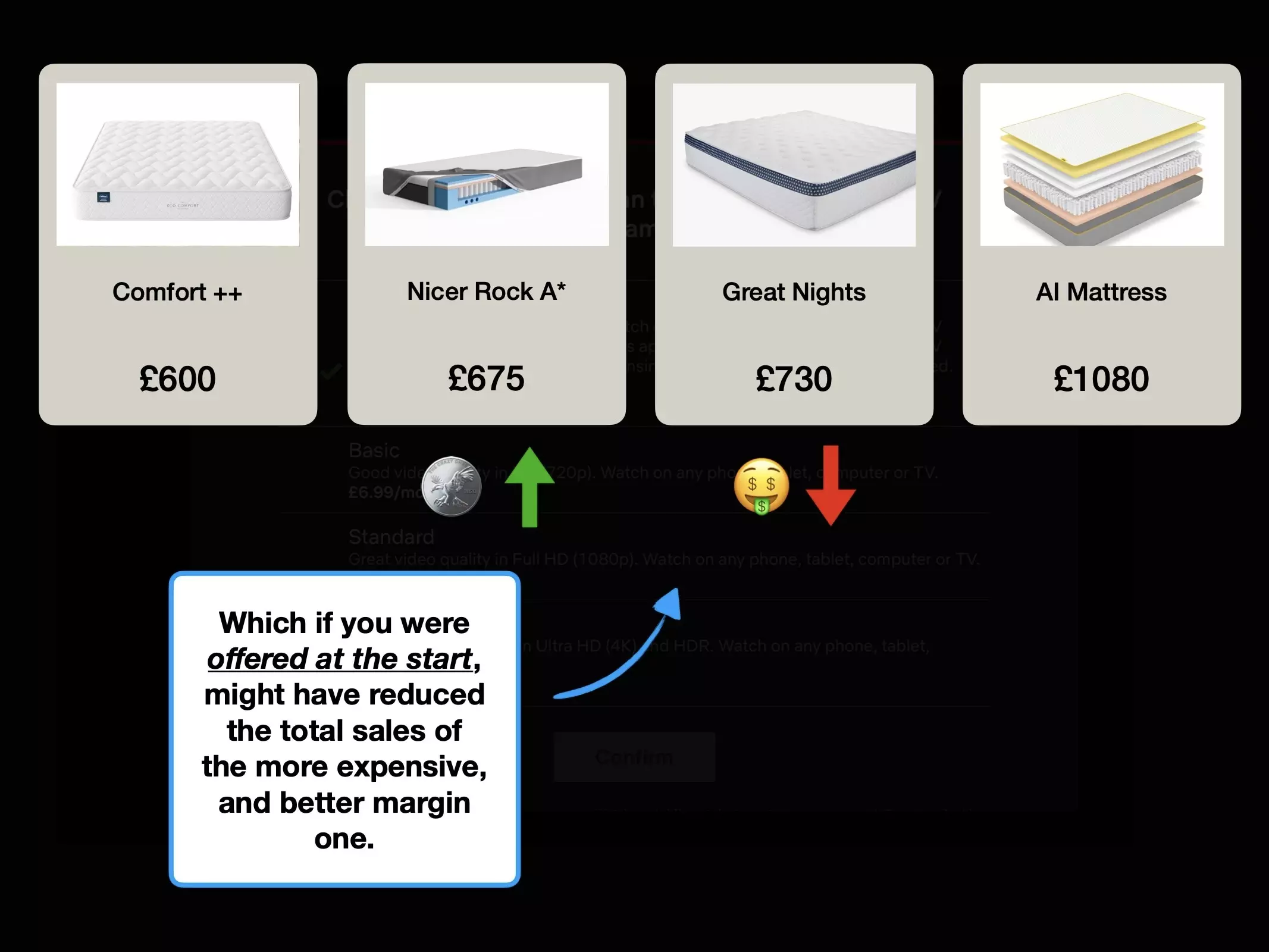
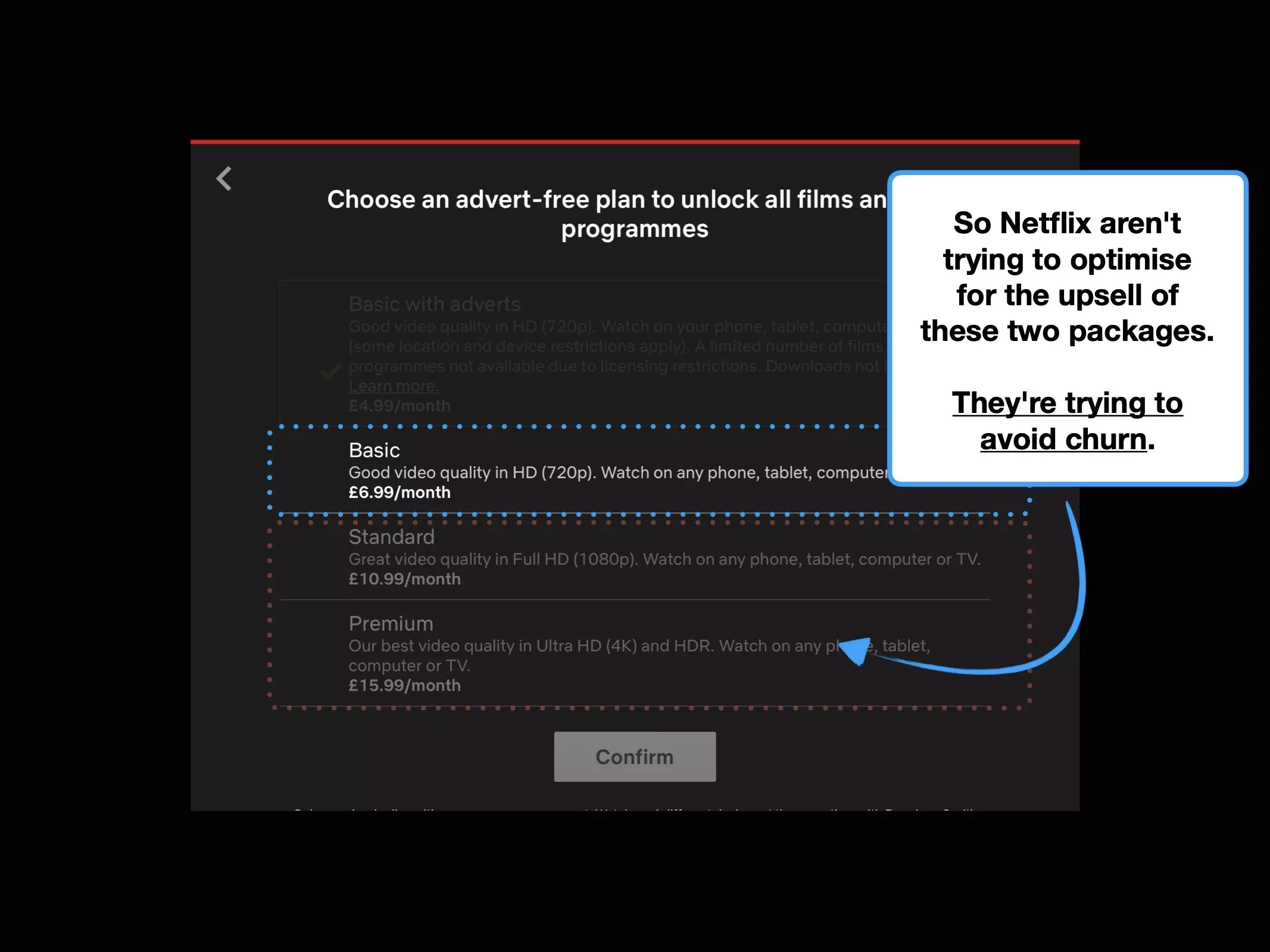
It appears that Netflix was successful in repositioning the comparative value proposition.
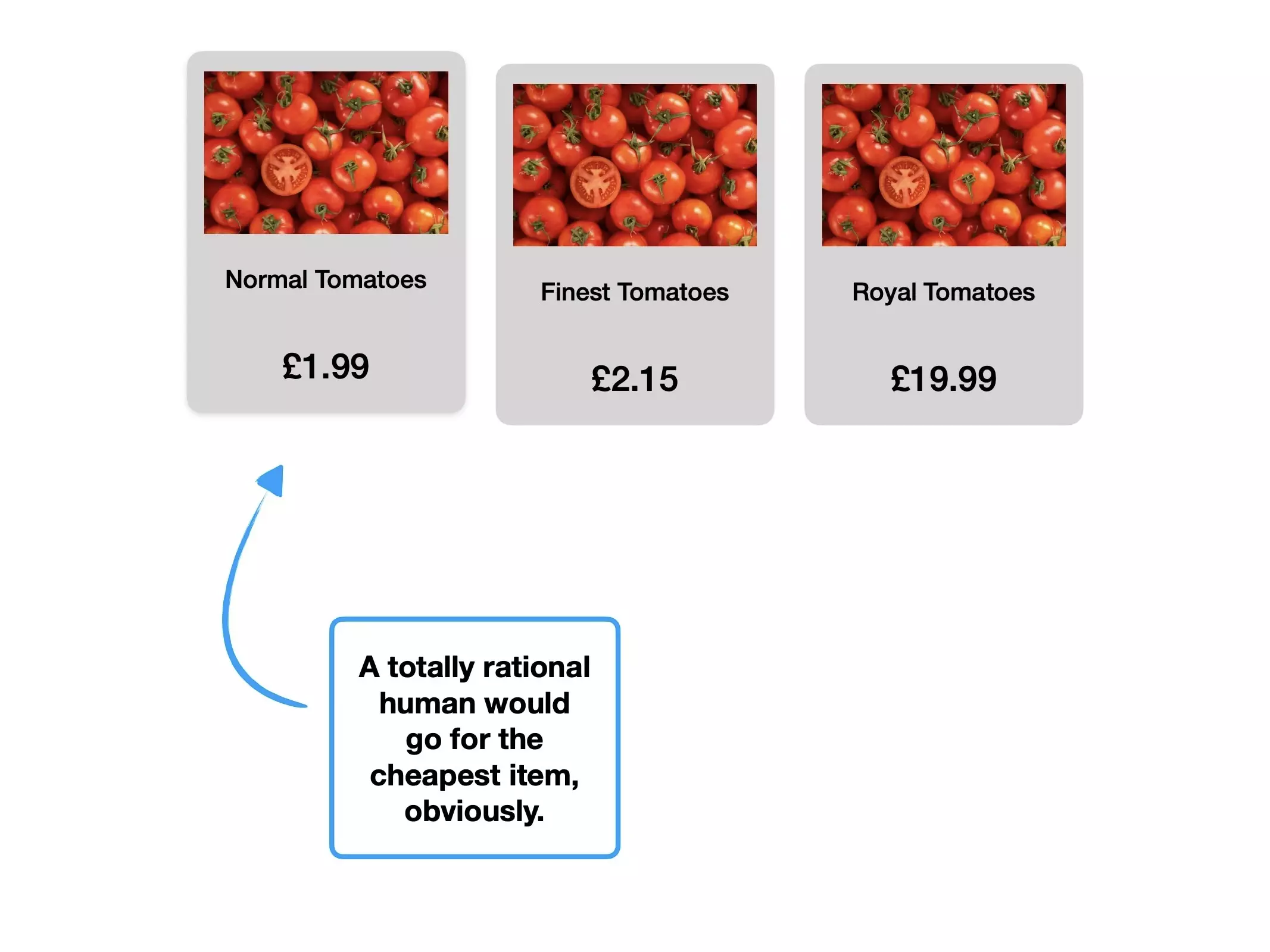
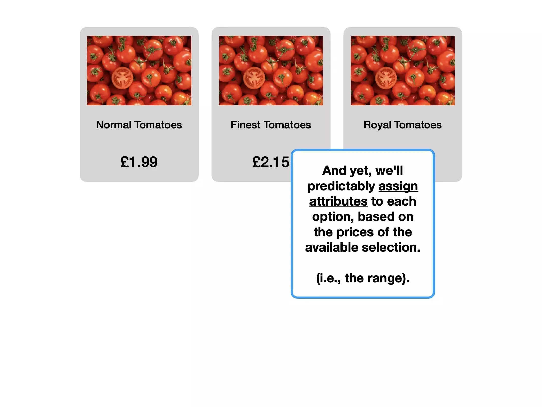
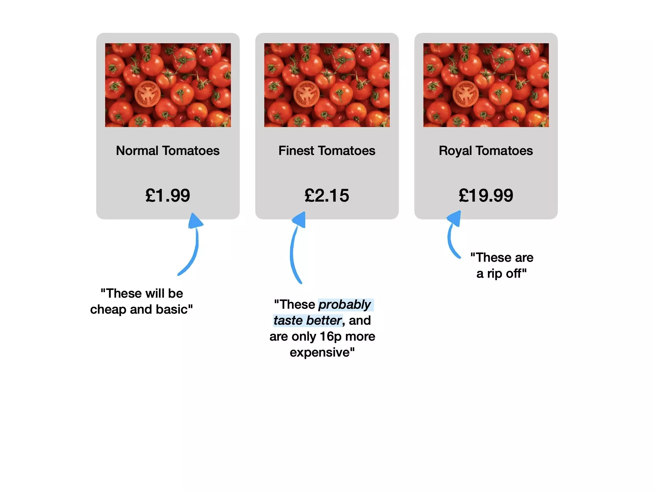
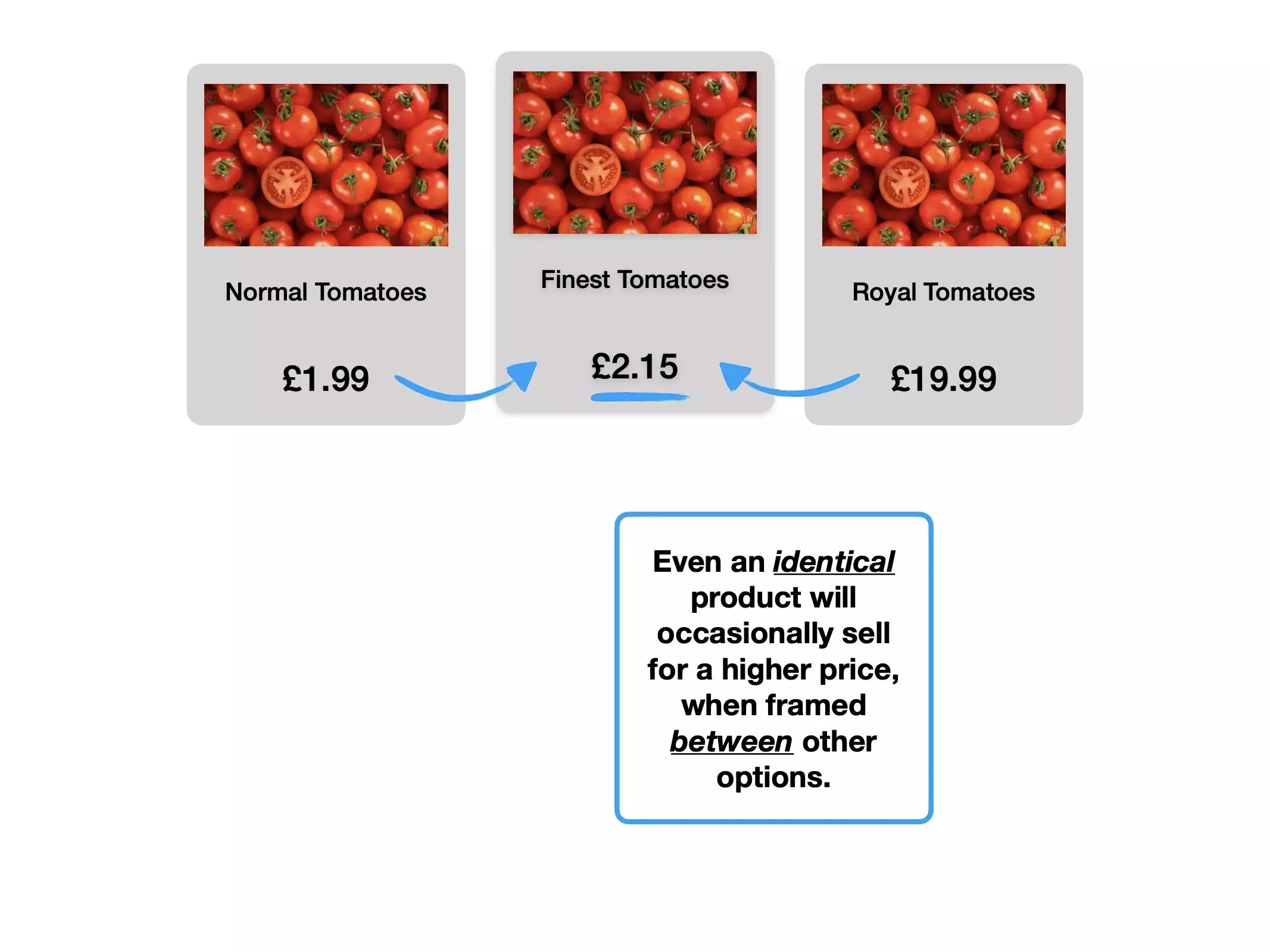
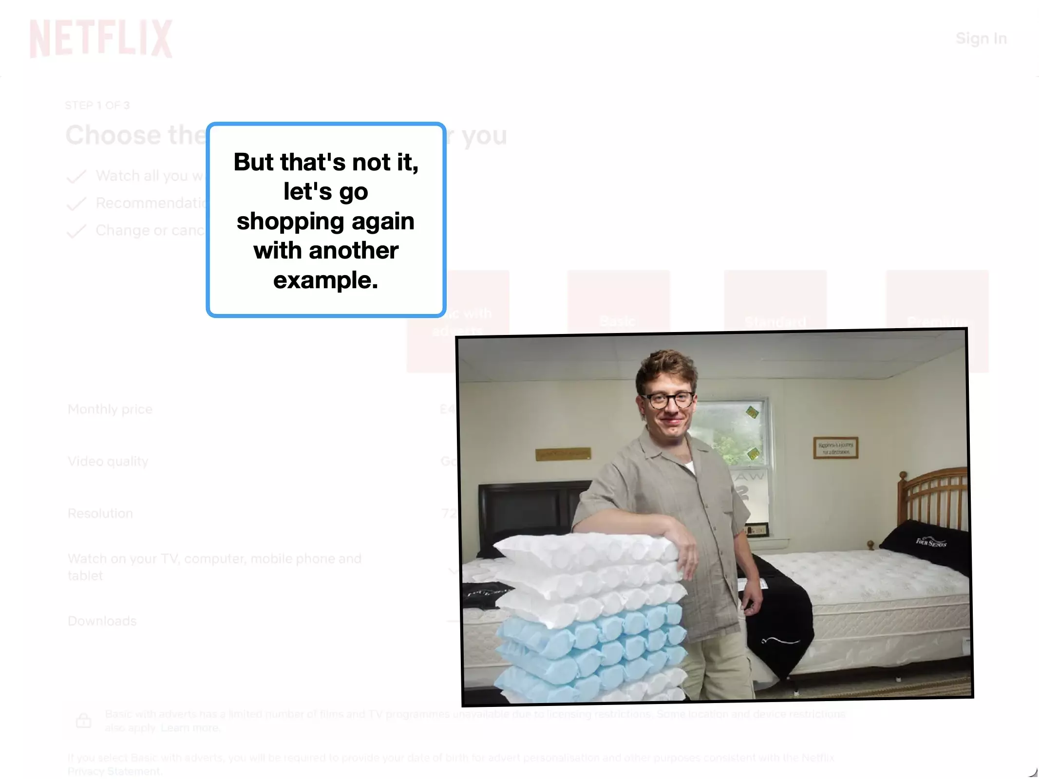
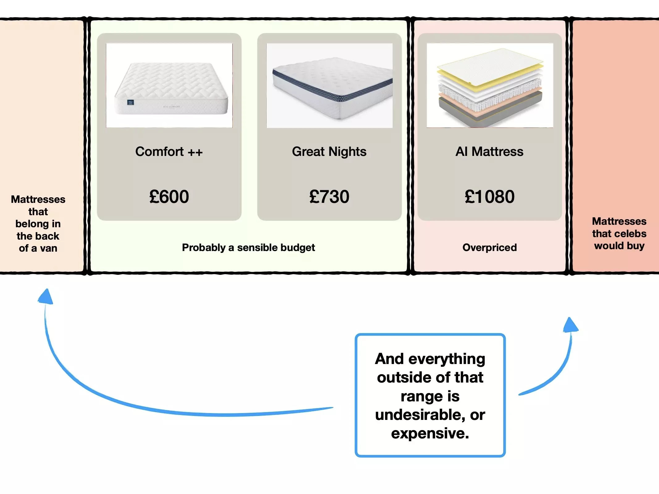
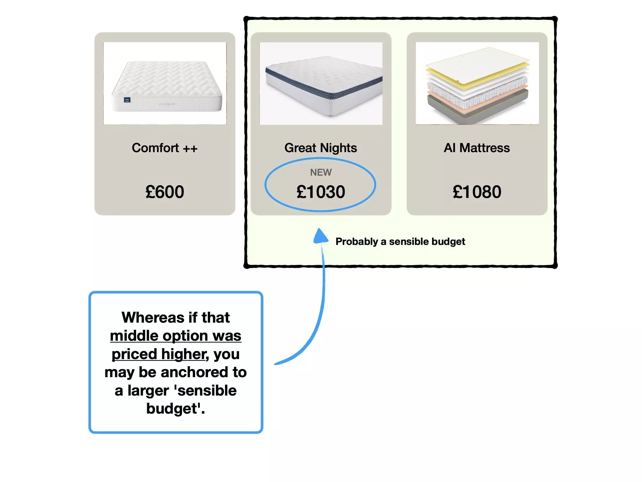
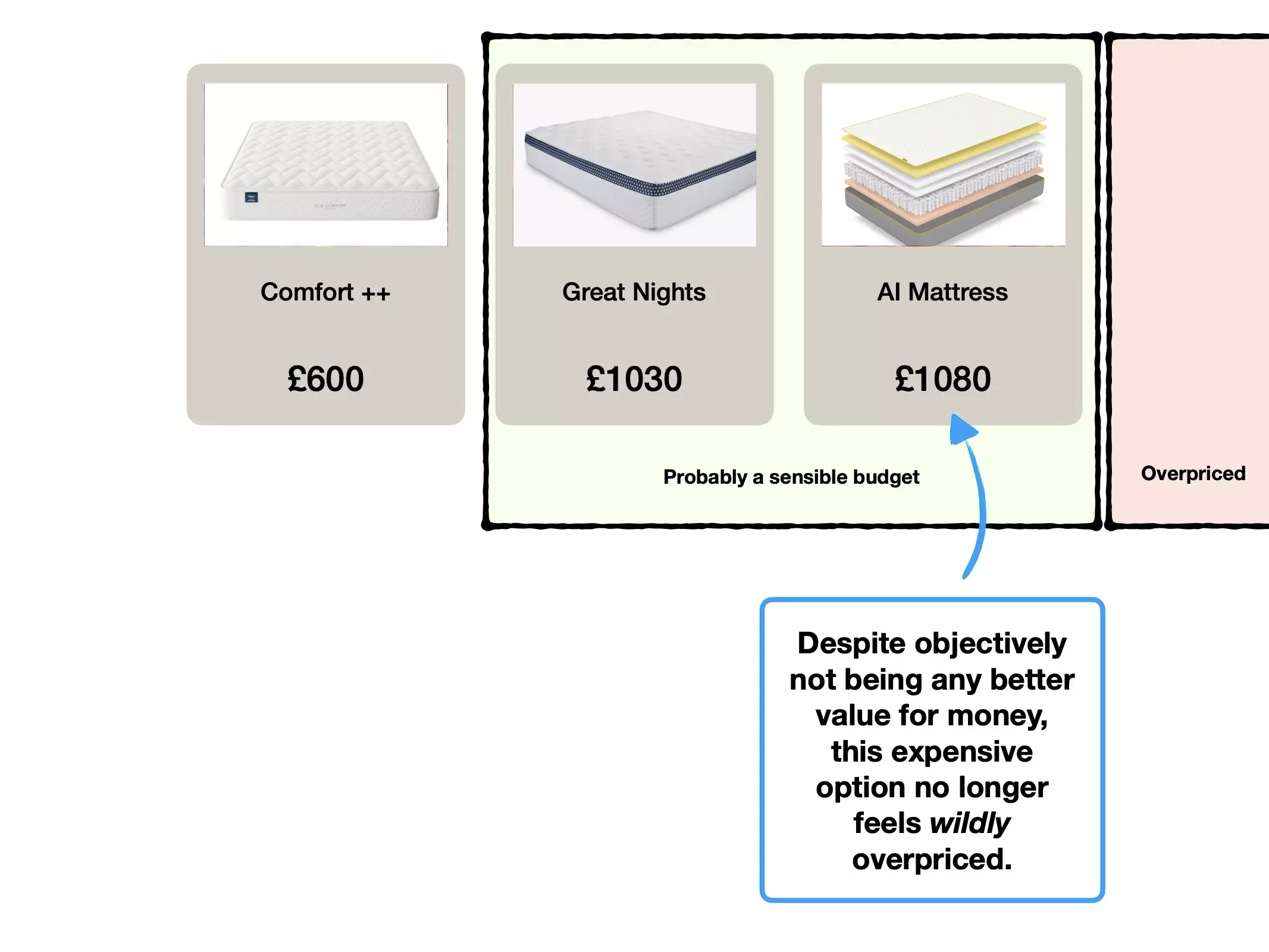
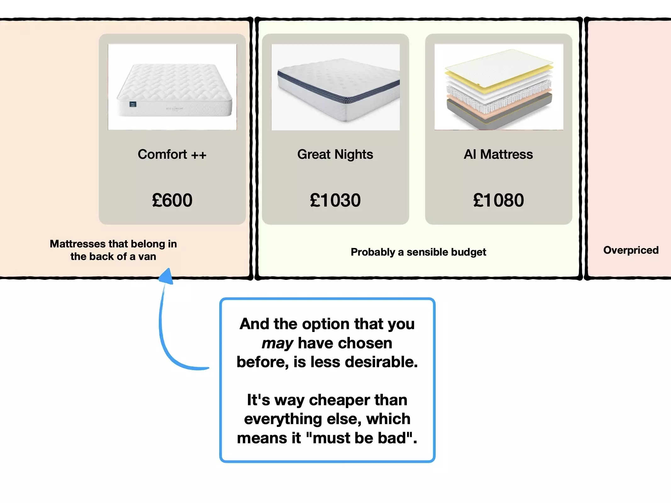
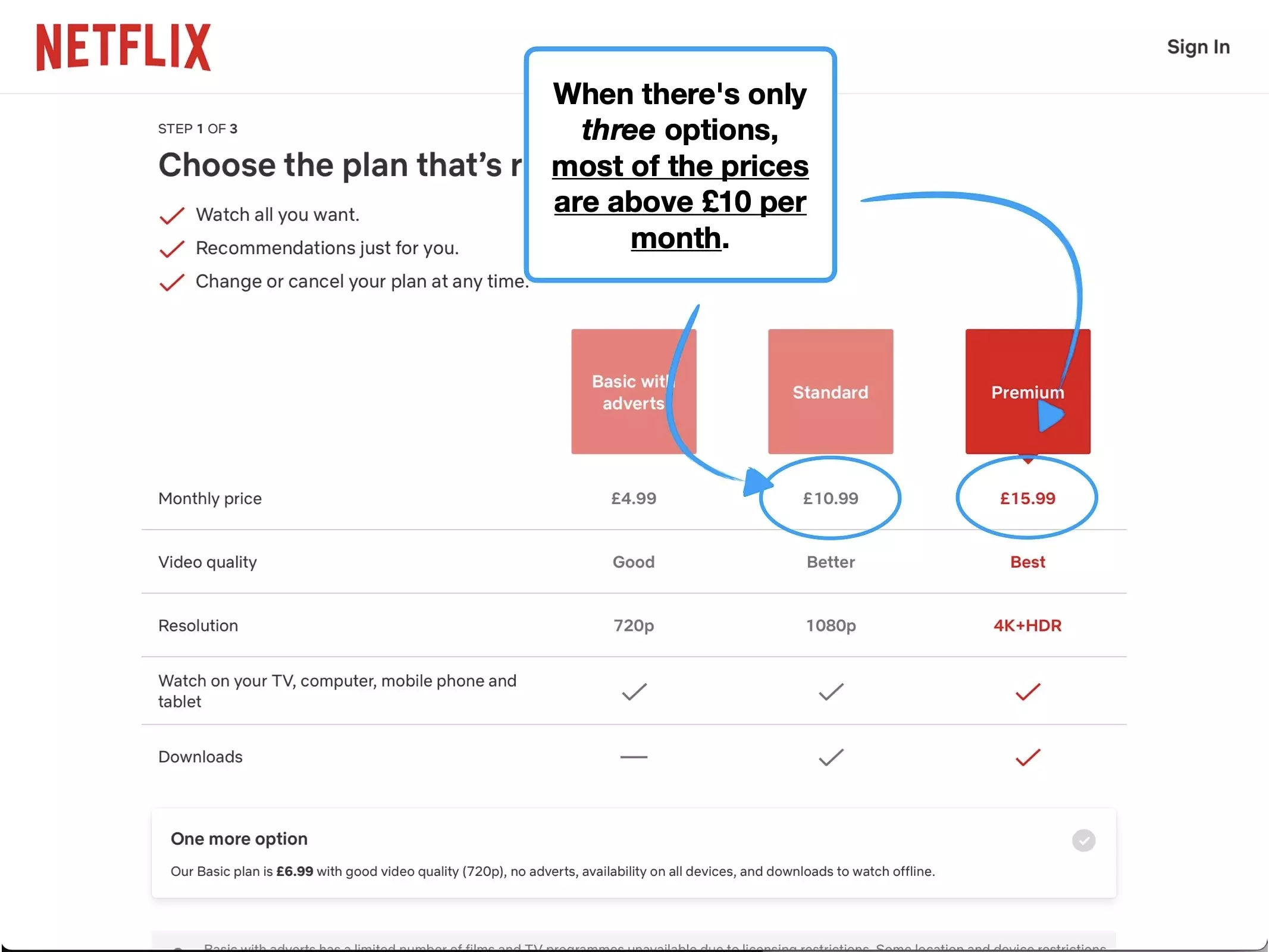
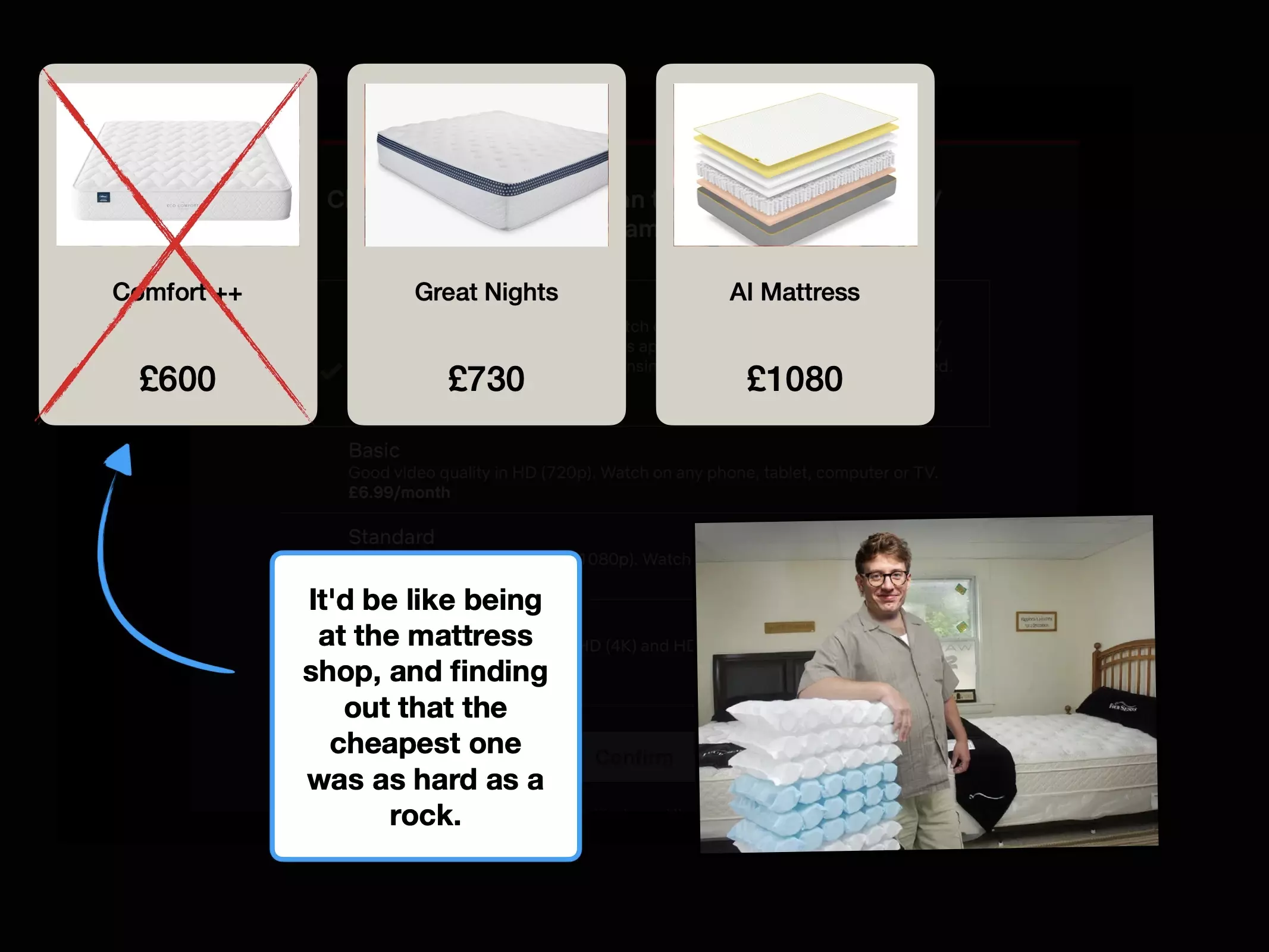
But let's consider another theoretical approach. What would happen if Netflix added an even more expensive plan.
For example: the 'AI-powered' super premium package, for 20x the price of the ad-tier.
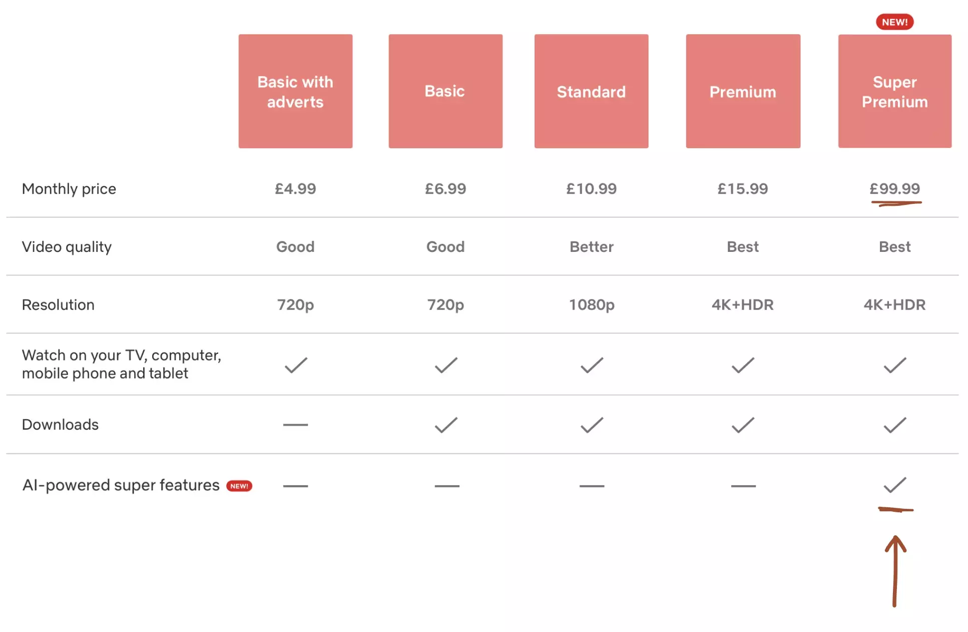
Intuitively, not many people would pay £1200 a year for Netflix. But that's sort of the point.
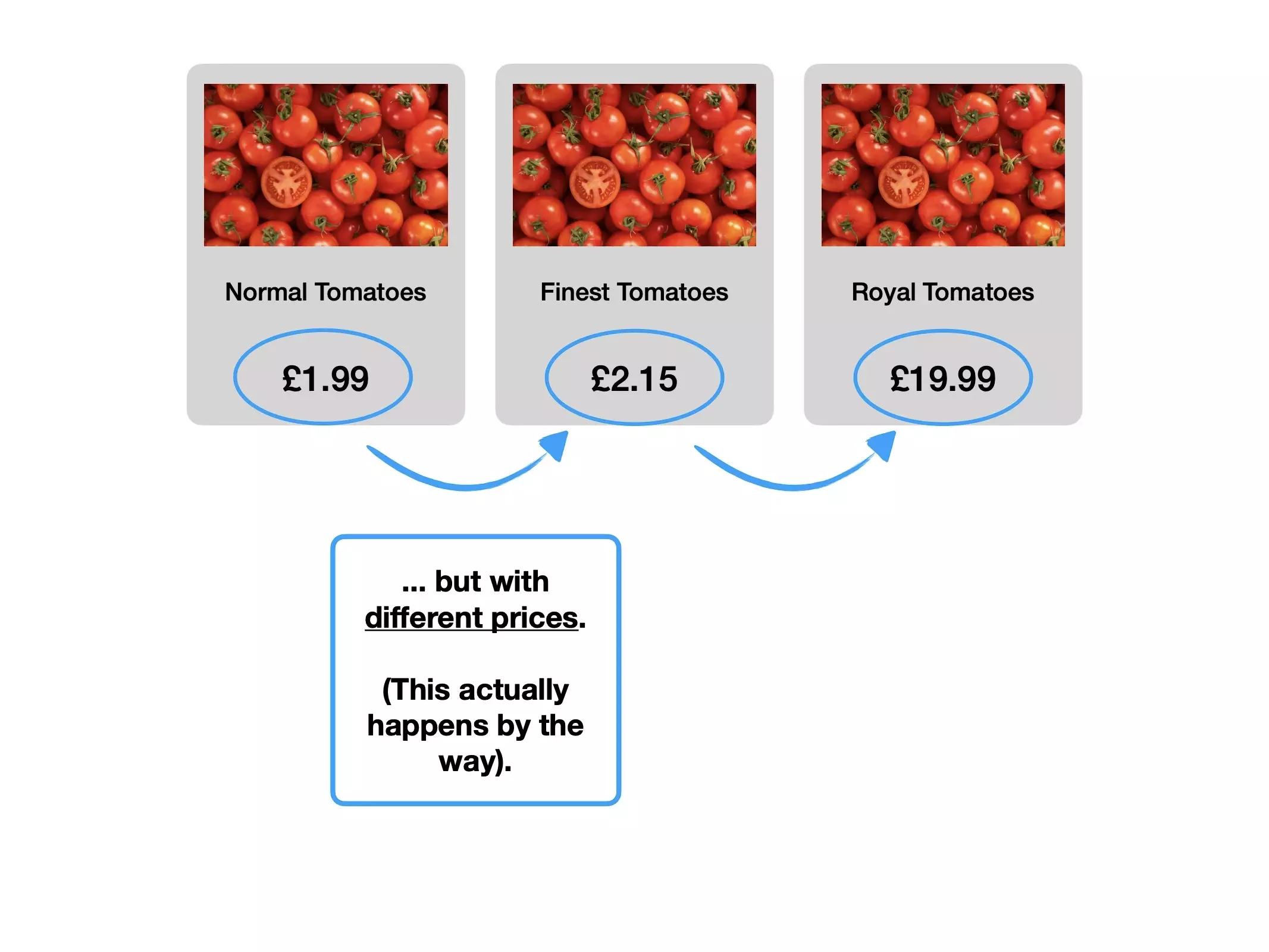
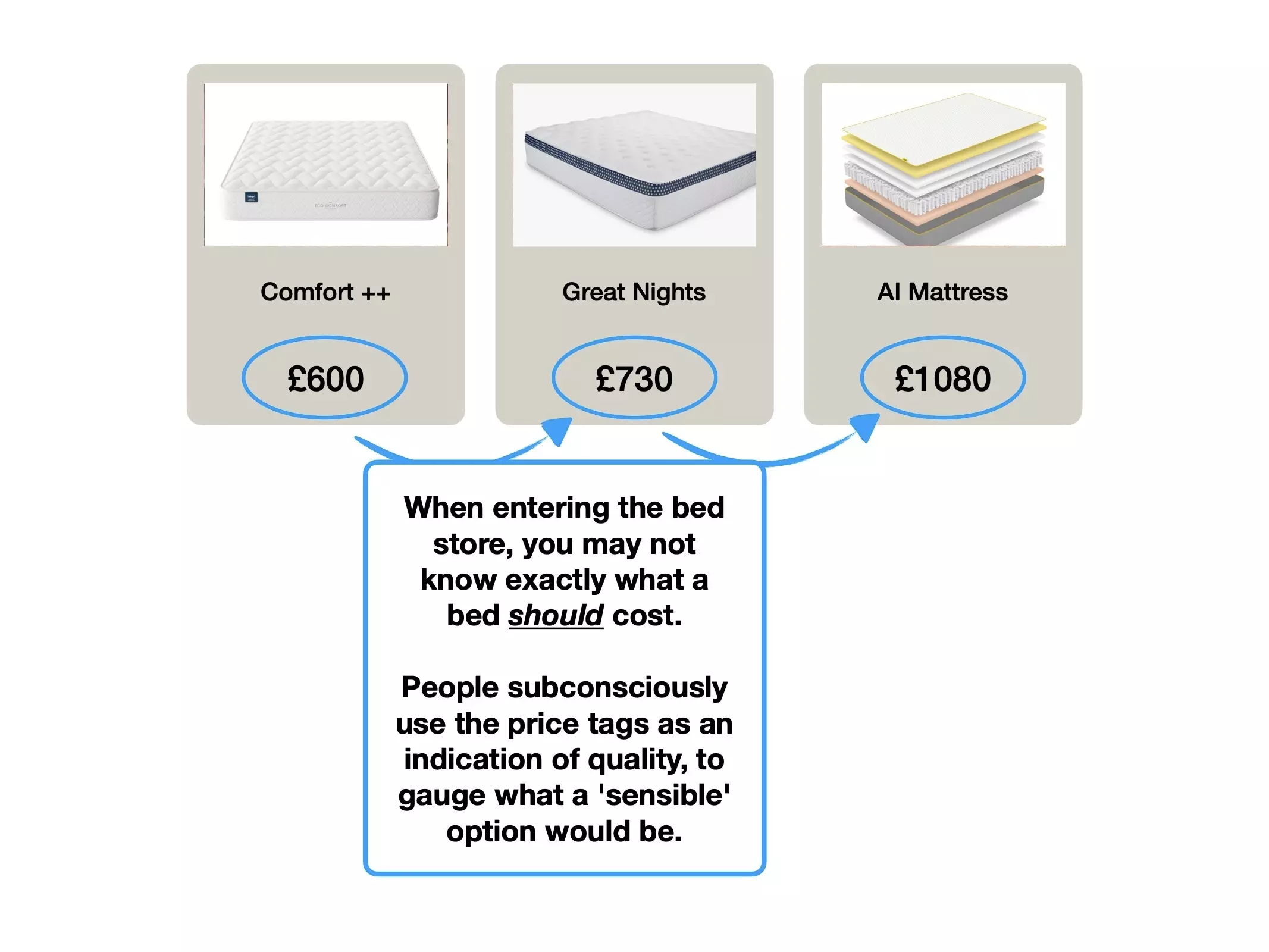
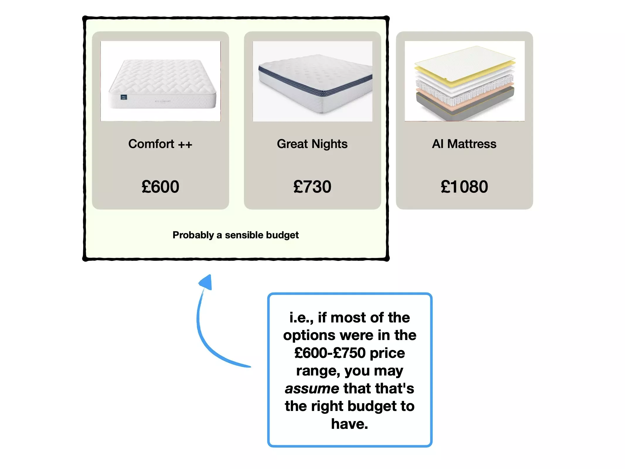
There's a phenomenon called 🦜 The Decoy Effect, where companies will offer an objectively-unsuitable package, with the sole intention of changing your perception of the other options.
This is perception-manipulation to make your 'real' options feel like better value for money.
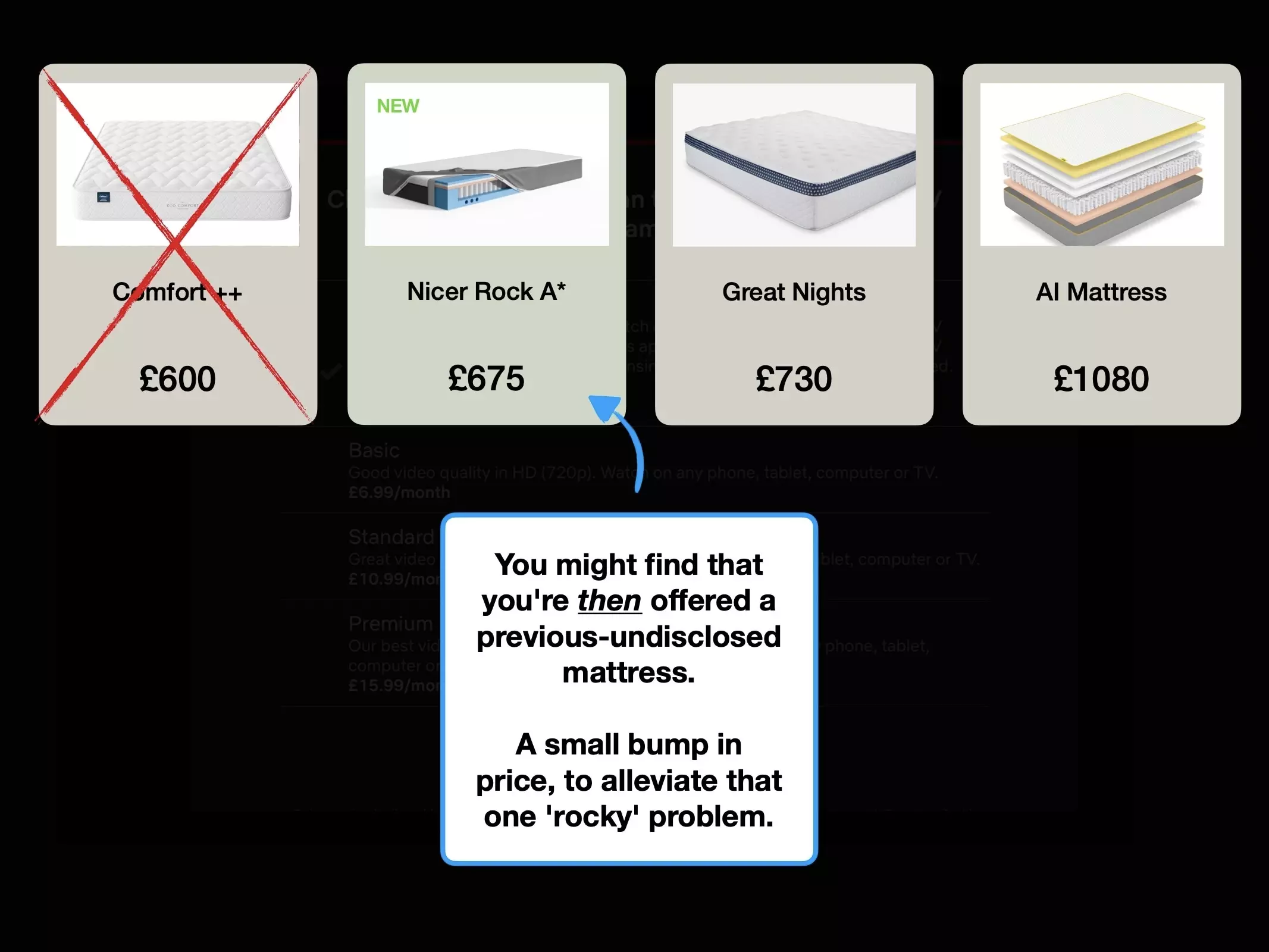
Most companies won't ever admit to utilising a decoy.
But it's become a tactic to release very expensive (and unnecessary) accessories, alongside major product launches.
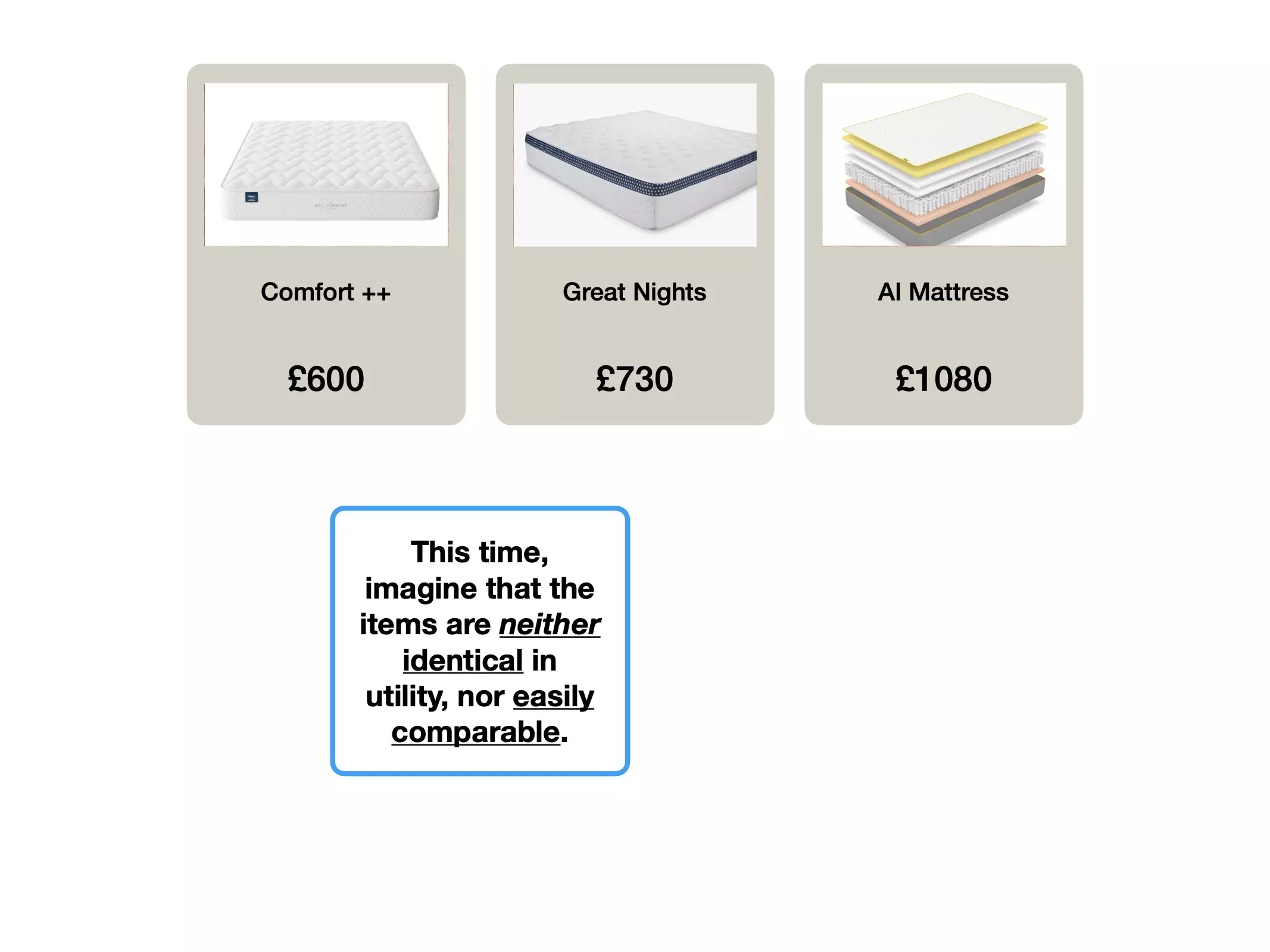
For example, consider the actual value proposition of the following three Apple accessories:
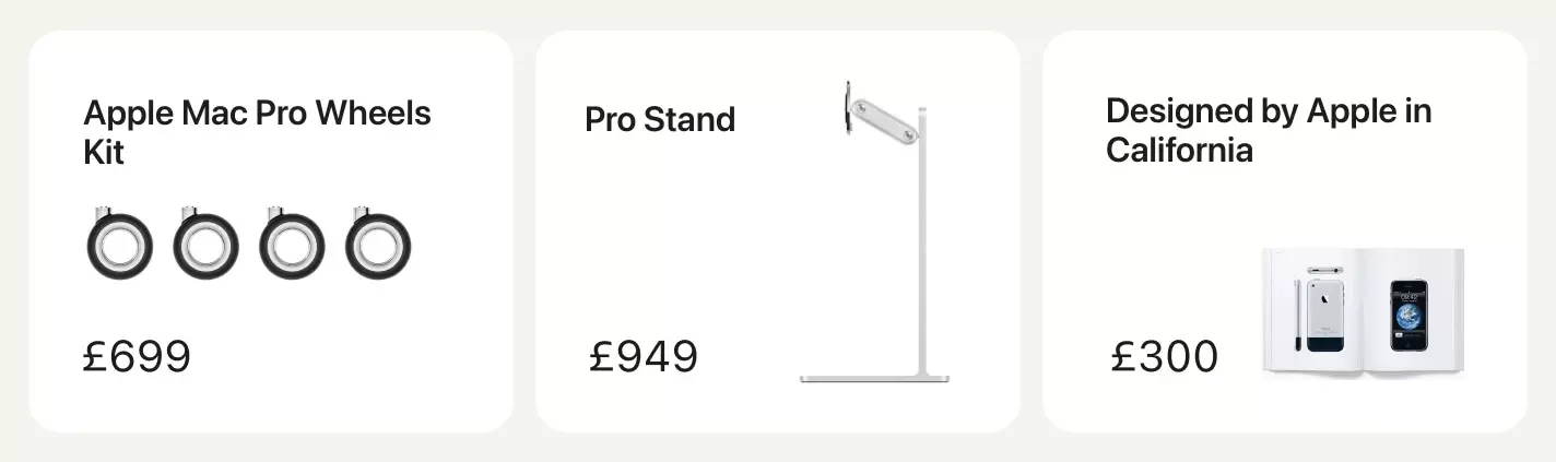
To be clear; these products are both real, and probably beautifully built.
But I want you to examine the subtle psychological benefit, which happens too often to be coincidental.
They help reframe the value for other products.
There's a psychological bias called the 🏋️♀️ Labour Illusion.
It explains why people view products and services more favourably, when they're aware of the effort that was put in to creating it.
This is true of open-kitchen restaurants where you can see the chef shouting at subordinates, coffee beans that you know have been painstakingly roasted in small batches, and even server farms crunching data with complicated algorithms (or AI) on our behalf.
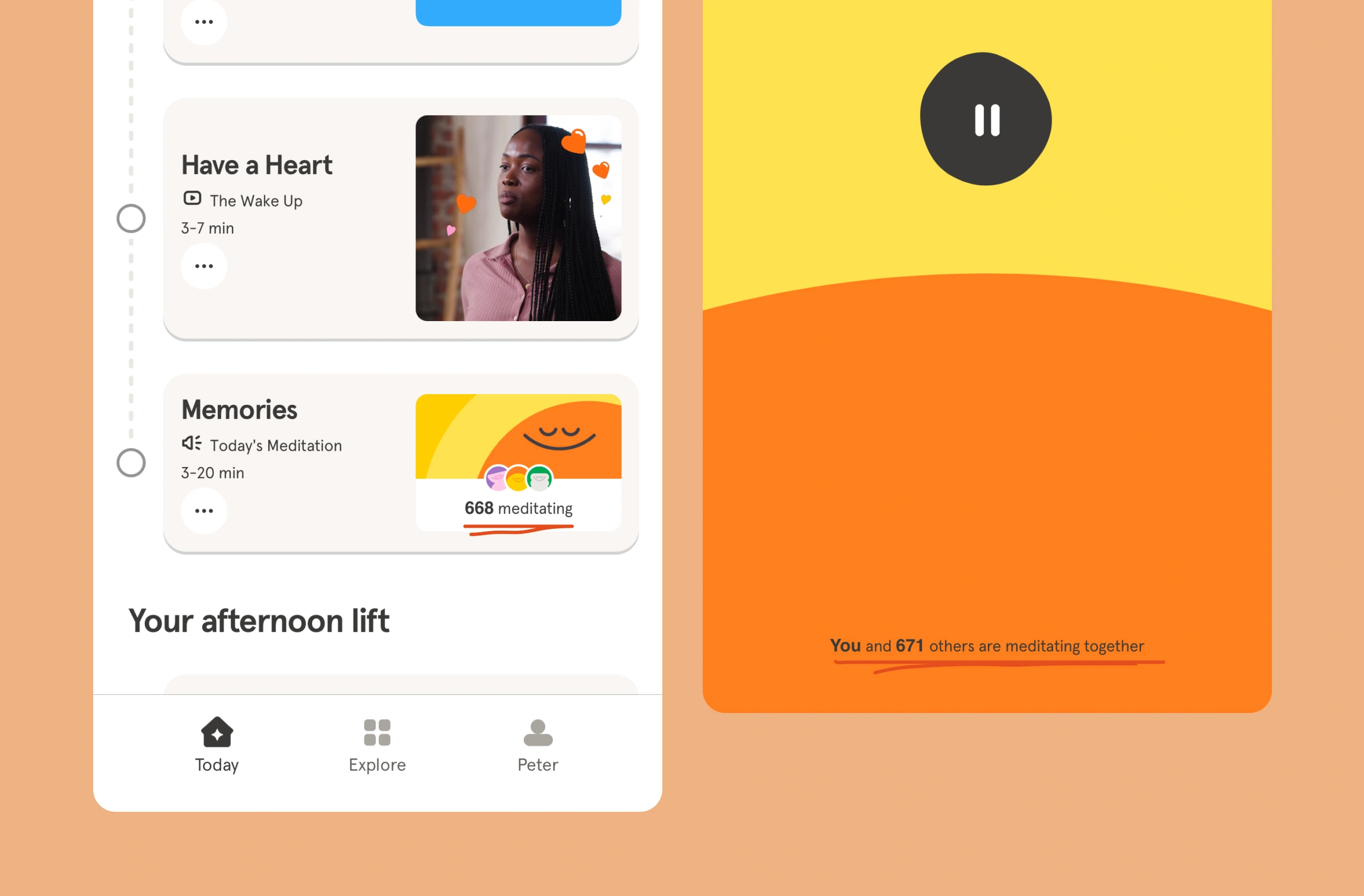
During the onboarding, Netflix will ask you to select at least 3 TV programs or movies that you like, and then show you this spinner:
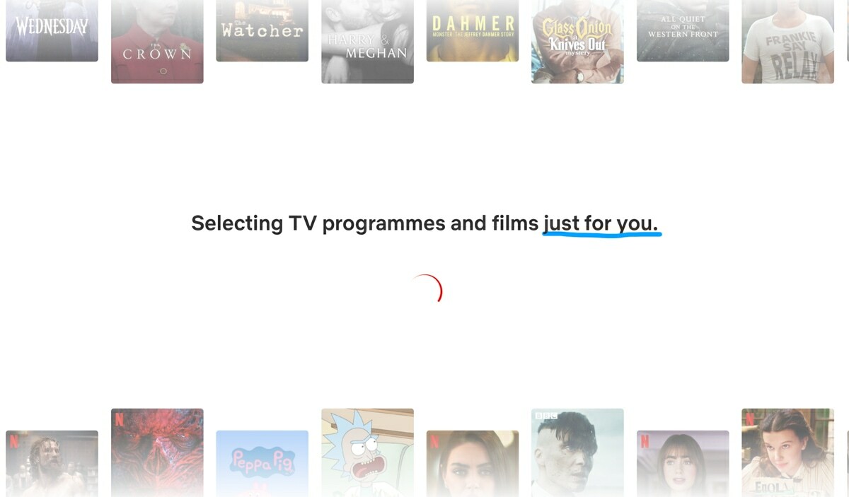
Except, Netflix probably doesn't need a whole 3 seconds to personalise your dashboard—it's likely generated instantaneously, especially given how little it knows about you in that moment.
Instead, it's showmanship, to give you the impression that somewhere, a server is processing thousands of datapoints to personalise an experience "just for you".
Most people have felt the paralysis of scrolling through an expansive library of movies, unable to make a decision.
There's a name for this: 😳 Hicks Law.
In an attempt to loosen this mental bind, Netflix created a feature that would randomly select something for you, called 'Surprise Me'.

Except it didn't work, "usage was very low", and has since been removed.
But what's interesting, is that they've inadvertently created the perfect case study for cohort analysis.
This is because in parallel, they've run a very similar feature on the 'kids' version of Netflix, called the 'Mystery Box', which hasn't been removed.

I have a theory for why this variant may have been more successful: it's the parents making the decision.
'Surprise Me' was a shortcut to find something that you then had to watch. You carried the risk and penalty of it selecting something uninteresting.
But the 'Mystery Box' recognises that the parent is often the decision-maker, and both might not care about which episode of Blippy is selected, nor even be in the room.
The nuance is important. Features may work for one cohort of users, and fail miserably for others.
The important takeaway here is not only that Netflix show an eagerness to experiment with solutions, but also that they have the discipline to remove them after they've failed.
And even better; that they experimented with a variety of solutions, to specific audiences.
It's a helpful way of reframing an A/B test.
Did you run an experiment that outright failed? Or did you mistakenly attempt to measure success from your entire user base, instead of a specific niche who'd actually derive value from the change?

Simple techniques to increase feature usage, retention and ultimately alter how users perceive the value of your product.

The techniques that Slack have used to create an effortless onboarding flow, and why you might not want to copy them.

The product psychology behind why Robinhood offer new users $7.08 of free stock, and not $10.