Search
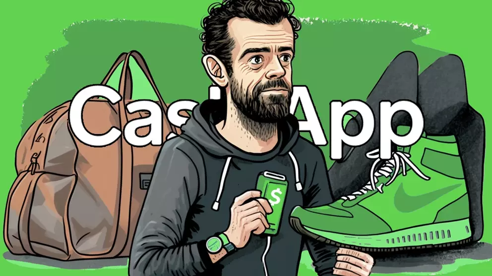
Cash App is a mobile payment service, which was created by Square Inc. back in 2013. Now it has more than 70 million active users, and boldly claims to be the easiest way to send money.
When I read this, I wanted to demonstrate the nuance that's often missing when labelling something as 'easy'—and Cash App provides the perfect example.
There's a difference between something being easy to do, and something which feels intuitive (i.e., easy) for a new user.
Experienced pilots may consider the controls of a cockpit as 'easy'—after all, most of the buttons are within reach. But for everyone else, it's a complicated mess.
With UX, the devil is not just in the detail, but also in the context.
And as you'll see, within the context of learning to use Cash App, it's certainly not the easiest option out there.
🪂
Aim for a soft landing
💸
How not to give away $100
🍕
Deciding what you'll have for dinner is hard
🤝
Breaking the social contract
As a general rule (of, possibly life), you want a soft landing. This concept applies to UX, in the form of 🗯 Context Shifting.
Context-shifting is the process of switching from one 'thing' to another. The role of UX is to lower the cognitive load of that transition.
In other words, to soften the strain of switching tasks.
As an example of a very hard landing, opening the Cash App (app) for the first time immediately asks for your phone number.
(i.e., there's no landing page or welcome screen).
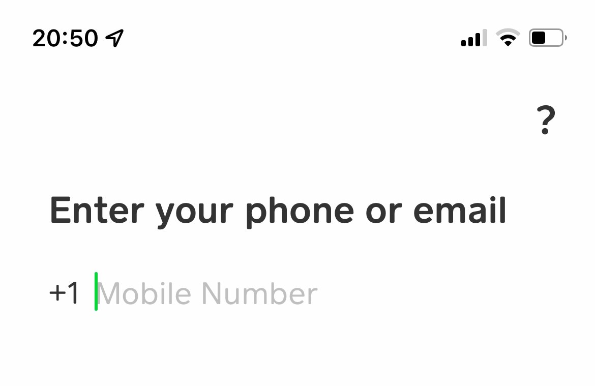
One could reasonably argue that it's obvious that you're creating your Cash App account—but that's not the point.
Most context-shifts are possible, it's about making them softer. And that's why you, almost universally, see a landing screen when you first open an app.
They look like this, and even with a wireframe you can demonstrate their value:
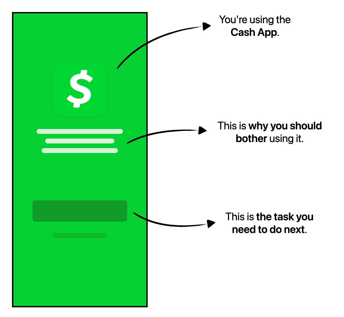
Fitting with the theme of this case study, it highlights an important distinction in UX: you cannot reduce clicks indefinitely without eventually hurting the experience.
As a user, you seldom notice the subtleties that soften your landing—they are often intentionally discrete.
They can be sub-conscious cues to prepare for a context shift, and can be valuable despite adding a click.
Imagine that you've been enrolled in a social experiment, and have been asked if you'd like to receive $100, or nothing.
In front of you are two unlabelled buttons, and you're asked to make your decision.
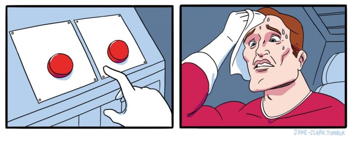
This would undoubtedly be stressful, right? It'd feel like a game of chance.
After making your choice, the observer tells you that regardless of which button you pressed, you were always going to receive the $100.
In other words, there were two inputs, but only one output.
Now, let's consider the inverse of this: you've been posed the same question, but now there is only one button.
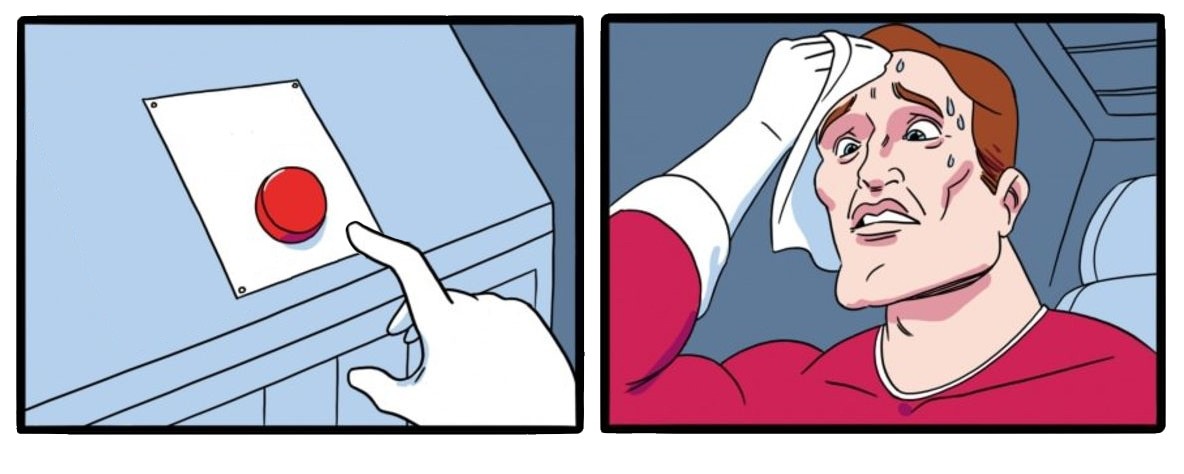
This would be similarly stressful, right? Is there a second button somewhere? Is it an option to not press the button?
Again, you're told afterwards that your input was irrelevant, you always get the $100.
What this thought experiment demonstrates is that the negative emotions are not a direct effect of the outcome, but a byproduct of the decision-making process.
In other words, it matters how a user feels about a decision, not just the outcome of that decision.
The very first screen on Cash App asks you for your phone number or email address. This works for both new and existing users.
In other words, there's only one button, but two possible outcomes: creating a new account, or logging into an existing one.
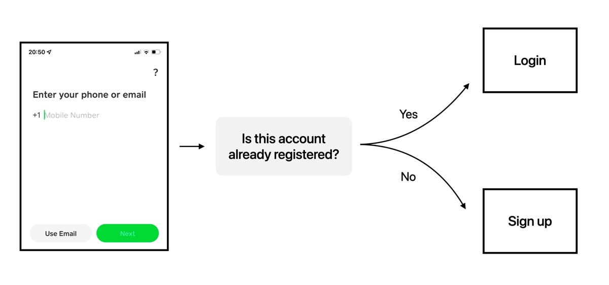
But this kind of approach only works if the user understands that they'll be automatically directed to their required route. And they may not assume that they will be, because there's no context at all.
When Cash App look at the data, this flow will convert very well, because there is only one input—so more or less everyone will press it.
But the data won't have captured the anxiety of the decision-making process.
A recent survey asked 2000 couples about their communication, and found that the average couple argues 156 times each year about what they're having for dinner (and it takes an average of 17 minutes to resolve).
The point is, many people aren't decisive—particularly when tired and hungry.
This partially explains why default options are so influential to build intuitive products: they provide an easy meal option.
Decisions that require creativity are particularly tiresome, and require the user to disengage their autopilot and think.
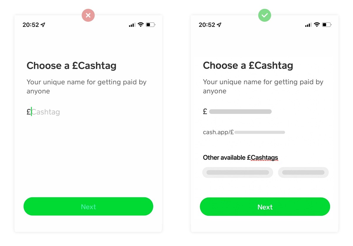
An example of this is showing the user a blank input field, and asking them to create their unique Cashtag.
And this doesn't just require minor creativity, but also critical thinking: they need to pick a username that none of the previous 70 million people chose.
There are two suggestions that could really help reduce the friction here:
✅
1. Pre-fill an available Cashtag
This could be a variant of their full name and/or location.
🧠
2. Suggest alternatives
i.e., other available variations.
With these changes, Cash App would probably find that people spent less time being frustrated by their own lack of creativity.
The flow would feel better.
Although it's never explicitly mentioned, there's a de facto social contract between a product (in this case, Cash App), and it's users.
For example, if Zoom says that they don't record your screen without your permission, then you expect them to not record your screen. The vast majority of the time the social contract remains unbroken, and therefore unnoticed.
And there's no requirement for a social contract to be severe—it can be trivial; such as the promise of a 2-for-1 discount voucher after sign up.
Breaking that social contract may not stop you using the product (i.e., Facebook), but it hurts the user experience at a deep emotional level.
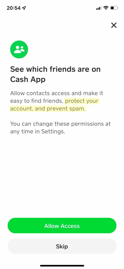
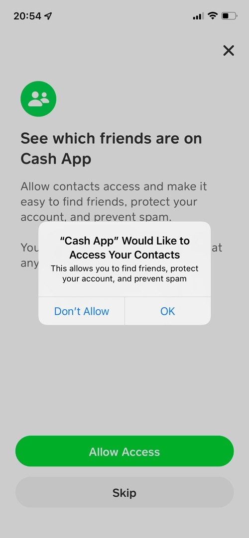
At the end of the Cash App sign-up process, you're asked if you want to provide the application with access to your contacts.
Here, the benefit of sharing your contact's information is that it'll protect your account and prevent spam.
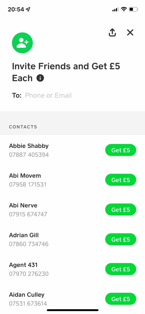
Yet immediately after giving permission, you're prompted to refer all your friends for a financial reward.
There's no mention of the benefits that you were promised—nor did I notice that they were ever mentioned again.
Having seen similar examples unfold at some of the best product teams in the world, I believe this was an honest mistake.
It's typically an oversight from product teams, who's focus is primarily on improving conversions, not the psychological joy of the experience.