Search
Threads was built in 6 months, by (supposedly) a team of less than 20 employees, and after it's first week had 100 million users—making it the fastest growing app ever.
It's unsurprisingly really. Meta have a track record for shipping, scaling and monetising products to billions of users.
They seem to have a playbook for cloning popular social features, with both Stories and Reels being more successful than Snapchat and TikTok, respectively.
In an attempt to reverse-engineer this secret Meta-sauce, I recorded and analysed the product as it evolved over it's first two weeks.
In this study, you'll see exactly why their launch strategy was so effective, and the UX theory behind the experiments that they've been running.
There's plenty to take inspiration from, so let's dive right in.
💡 Slideshow tip: you can use the keyboard to navigate on web.
Clearly Threads has a unique advantage, in that by tying itself to Instagram, they've massively reduced the effort required to start using the app.
It may help to quantify just how much friction (steps / clicks) has been removed because of this decision.
To create a basic Twitter account takes 3x as many clicks as joining Threads.
And that's without any personalisation (e.g., profile photo, interests, topics).
For a more accurate comparrison, creating a new Twitter account, and completing your profile—which would be in parity to Threads—takes 5x as many clicks.
But still, it's a crude (and unfair) benchmark to set.
Meta are able to keep the Threads onboarding so stripped back, because they've limited the scope to only being accessible with existing Instagram accounts.
Once they start allowing other types of sign-up (which the head of Instagram confirmed they're working towards), they will very likely need to add new steps in, to learn about their users.
And that's really the lesson for product-builders here: don't get caught up releasing features you don't need, which complicate a process that could otherwise be simple.
On that topic, let's talk about the 'personalisation survey' on Twitter—it feels outdated.
They have so much great content on the platform, and could showcase this in a variety of engaging formats (video, text, images, audio spaces), posted directly by some of the most interesting and influential people in the world.
And yet, before you've seen any of this, you're expected to invest time into manually selecting 'things' that you're interested in, without much context of what impact it'll have on your experience.
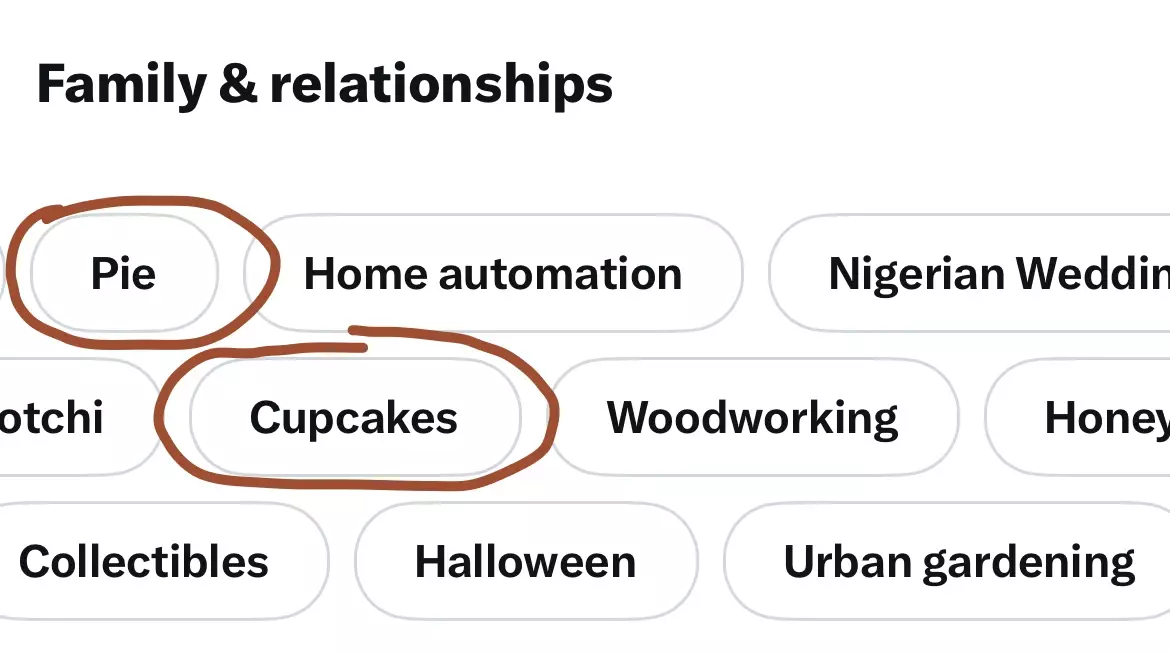
These are arbitarily categorised into things like 'Pie' and 'Cupcakes', which confusingly belong in a parent category of 'Family and relationships'.
If you go into your profile settings right now, you can even see what interests have been automatically tagged based on your activity.
For reference, I've been using this Twitter account almost daily for 11 years.
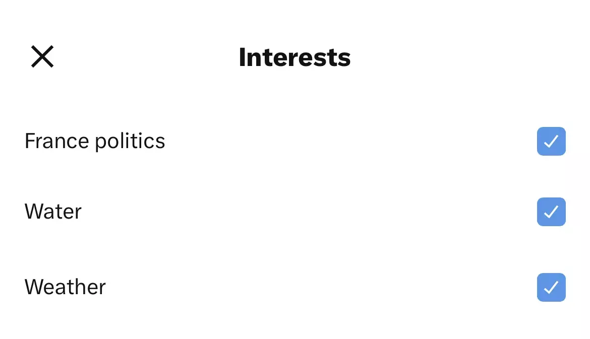
To be clear; this is a totally viable concept (that Threads may need to copy), but it's executed poorly.
To demonstrate the possible breadth of this technique, here are four similar onboarding challenges, in products that aren't social networks, and which don't rely on other user's content:
🚴♂️
Strava suggesting initial cycle routes
i.e., based on the type of rider you are (terrain preference, exertion level, distance, time of desired cycle).
🥁
Spotify suggesting new music
i.e., improving the new user experience, without any historic listening data.
🍟
Uber Eats helping you place an order
i.e., learning a taste profile, without relying on previous orders.
📹
Netflix showcasing their collection
i.e., demonstrating to new users that there is a library of titles that they'll actually be interested in.
Most product teams should be thinking about how they can personalise the experience for their users.
And for the vast majority of you reading this, that doesn't mean implementing ChatGPT, or some sophisticated machine learning engine: think simpler.
Aspire to create an enjoyable process for users to interact with, which allows them to identify the experience that they'd like to receive.
In addition to the A/B tests that I've outlined in the slideshow, Threads have been routinely tinkering with the app, in very small ways.
These changes have the hallmark of nudges to encourage the users into taking an important action (e.g., posting content, or following others).
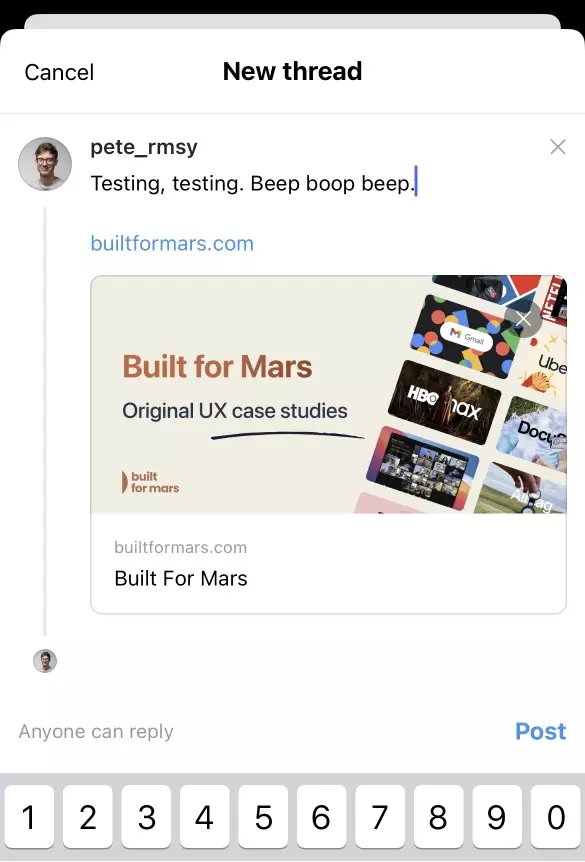
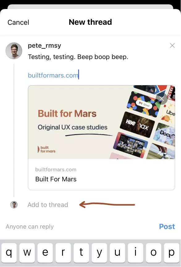
Perhaps they noticed over the first few days that not many people were leaving a series of posts (i.e. a thread).
So, they added a small written prompt.
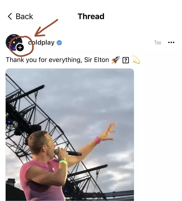
I imagine that in an attempt to make following accounts easier (a metric that they would have optimised for), they added this small follow icon inside posts.

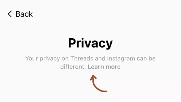
Even font sizes (pressumably to improve readability / accessibility) were optimised live, with real users.

In my opinion, this was the most impressive aspect of their launch.
The whole methodology behind Built for Mars (and when I work privately with product teams), is that small incremental improvements compound quickly.
I've helped more than 100 teams over the last 4 years, and I've only ever suggested a full redesign about 3 times. It's very rare, and usually unnecessary.
You absolutely can, and should, sweat the small stuff.
Only time will tell if Threads is as successful as Stories or Reels. But in the meantime, it's inspiring to watch an experienced product team iterate in public like this.