The free trial toggle
Flo have a “free trial” toggle on their pricing page, which is a clever way of getting the user to take an action and make a decision.
Browse real free trial designs from Flo, Canva, Asana and Breethe, including opt-in toggles, trial timelines and offers that change when users decline.
Updated: 23/09/2026, view all 1,490 examples
Flo and Komoot make users toggle trials on
Canva promises a reminder before trials end
Breethe offers 30 days when 7 isn't enough
Flo have a “free trial” toggle on their pricing page, which is a clever way of getting the user to take an action and make a decision.
When trialing Canva, you'll see a clear timeline of what happens next, including a promise that you'll get a reminder 7 days before your trial ends.
If you're on the Asana free plan, and you click to create a project type that is only available for premium members, you'll see a button to start a trial without a credit card.
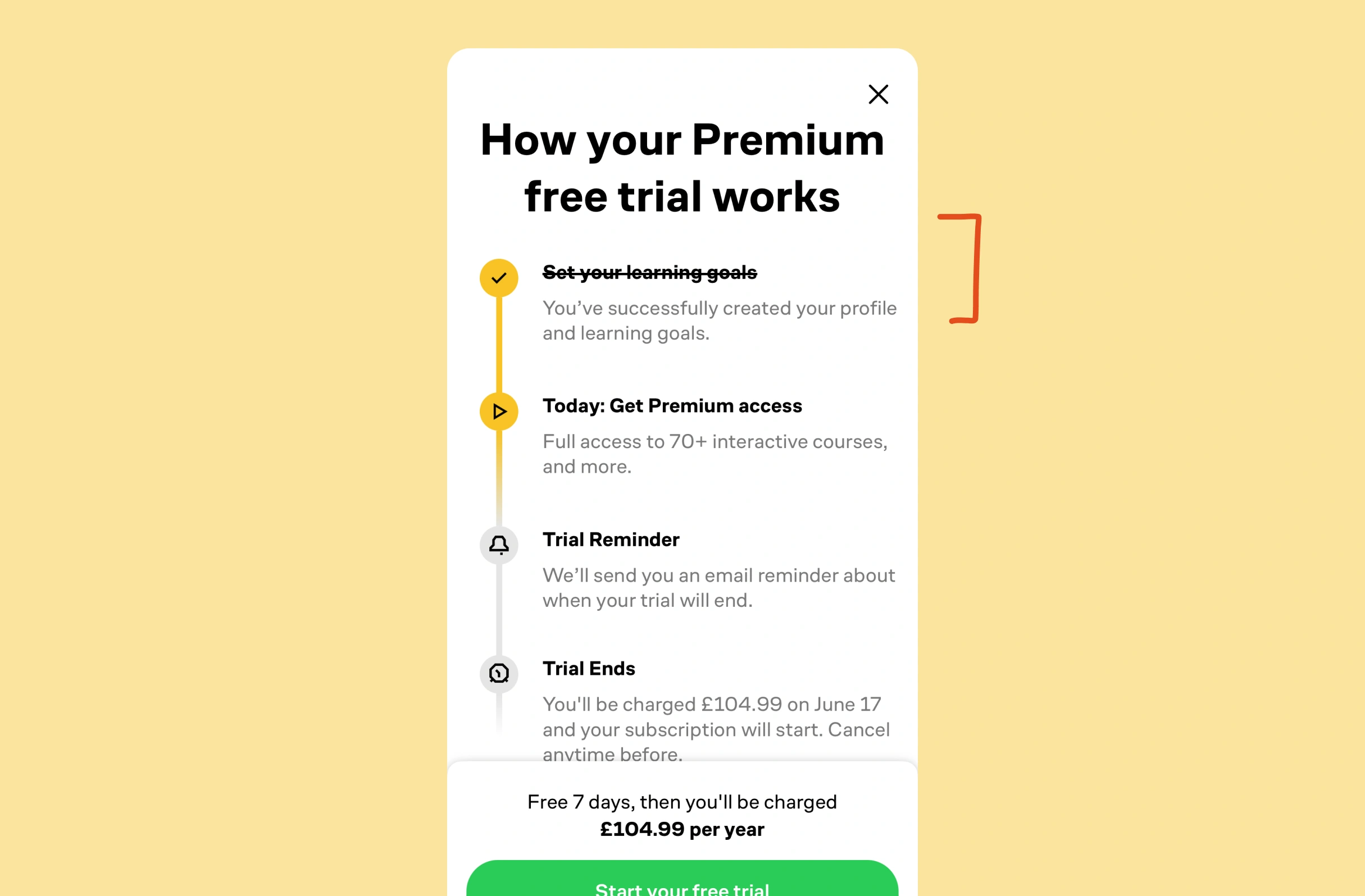
Brilliant will frame the trial process by including a completed step (setting your goals), encouraging you via the Foot-in-the-door effect.
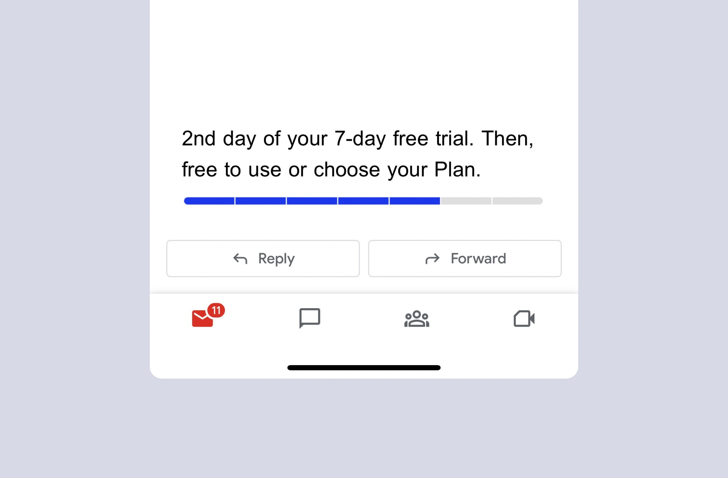
During your 7-day trial of Timestripe, your emails will include a clear progress bar showing how much longer you have left.
If features can be coded in minutes, thoughtful design is what wins
Get the free content when it's released, straight to your inbox, no account required
"An exceptional resource for learning how to build habit-forming products that people love."

"I’d never met anybody who looks at usability and UX the way I do until I met Peter. Only he’s smarter."

"The completest view of the psychological underpinnings of human behaviour that I’ve ever seen."

"What a nice idea! Christopher Alexander would be proud to see patterns collected like this."