UX Content
  • Case Studies
  • UX Bites
  • Cheatsheets
  • Psychology
BFM+
  • Instant Feedback
  • MCP
  • Figma Plugin
  • Tiers & pricing
  • Free newsletter
  • Log in
Other
  • Archive
  • About
  • Help
  • Changelog
Services
UX audits

A complete audit of your user experience, delivered in a format that you can't ignore.

Book an audit

Built for Mars Ltd is a company registered in England and Wales (Company No. 12731987).

Account
  • Log inAccess your library and activities
  • SubscribeUnlock all features and access to the library
Learn from the best companies in the world

A library of content that even non-designers find interesting.

Subscribe todaySubscribe today
Structured learning
  • UX BootcampEnroll in a 5-week bootcamp
  • PathwaysCreate custom learning Pathways to work towards any goal, industry or topic
  • CollectionsBrowse Case Studies by key topics
  • QuizzesTest your knowledge
Explore the library
  • Case StudiesSlideshows that are packed with research
  • UX BitesReal examples of design magic
  • CheatsheetsQuickly level up in a particular area
  • Product PsychologyLearn the essentials
  • NewsletterGet research straight to your inbox
  • CompaniesBrowse by company
Learn from the best companies in the world

A library of content that even non-designers find interesting.

Subscribe todaySubscribe today
Tools to help you
  • AI InsightsUpload screenshots of your design, and get instant feedback from our AI
  • MCPAccess the entire library from your favourite agent
  • Figma pluginAccess our AI tools, and our entire library, directly from Figma
One-to-one help
  • UX AuditsThe fast-track for growth
Includes tools that help you ship better products

Learning never stops, but sometimes you need a little more.

Subscribe todaySubscribe today
Log inSubscribe today
Home
Design Examples
Cancellation Flow Examples: How Apps Reduce Churn
Design Examples

Cancellation Flow Examples: How Apps Reduce Churn

See how companies like Uber One, Strava and Opal handle cancellation flows, featuring savings reminders, tailored retention offers and Loss Aversion framing.

Real world examples:

Updated: 23/09/2026, view all 1,482 examples

Examples on Built for Mars include
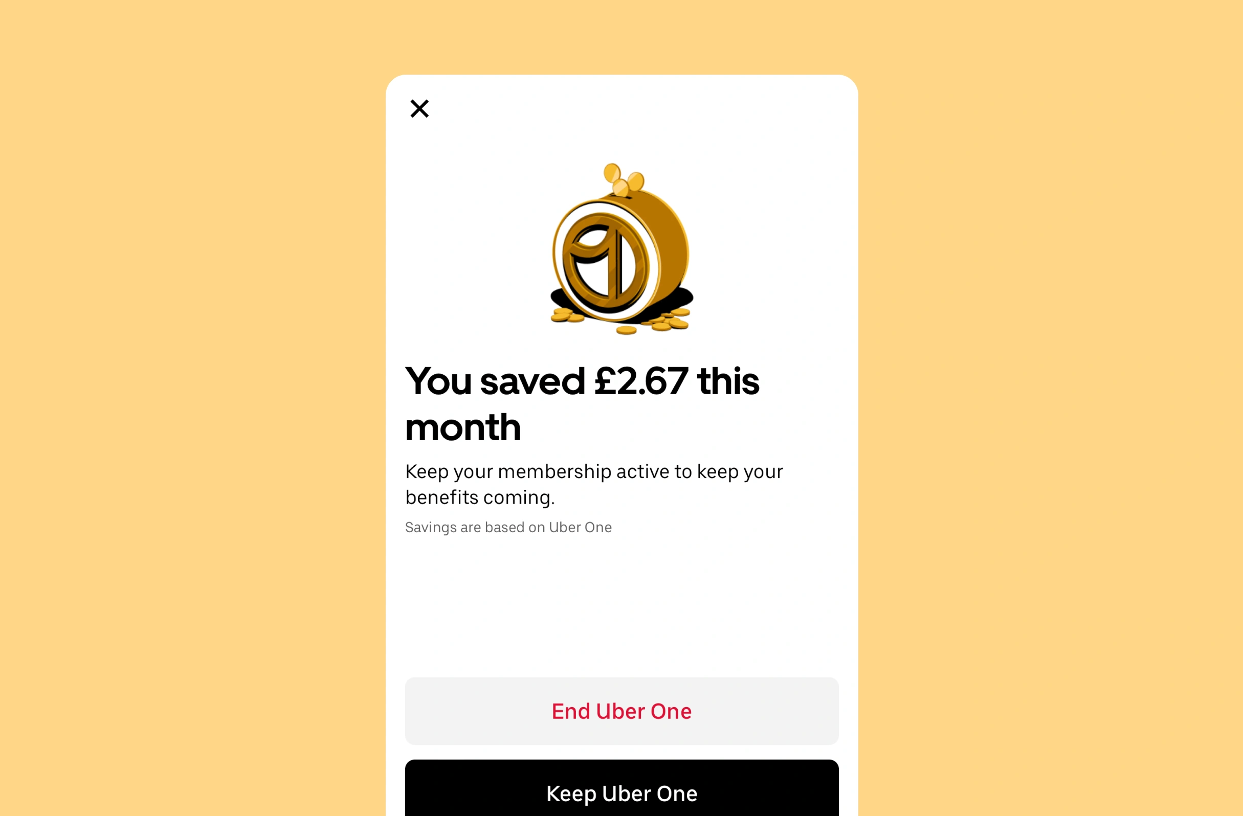
  • Uber One shows monthly savings at cancel

  • Breethe tailors its offer to cancel reasons

  • Opal offers 'unblock all' when you delete

UX Bite:
ClearSpace logoClearSpace

Reducing freemium churn

After reaching the limits of the free tier, Clearspace gives you an option to upgrade, or to swap your new selection for an older one.

Reducing freemium churn

More context:

This helps deliver a little extra value instead of people just backing out of the upgrade prompt (i.e., it may reduce churn).

#534
View UX Bite
UX Bite:
Opal logoOpal

Contextual app events

As an anti-churn measure, Opal has a contextual "unblock all apps", with a motivational message, if you go to delete their app.

Contextual app events

More context:

For context, Opal is an app that blocks other apps, for focus.

They know that people might just delete their app, instead of modifying all the blocking settings, and so this is a way to reduce unnecessary churn.

#546
View UX Bite
UX Bite:
Uber logoUber

An anti-churn tactic

If you go to cancel Uber One, they'll remind you how much money you've saved so far that month.

An anti-churn tactic

More context:

This is clearly likely to reduce churn, if the savings is above (or near to) the monthly subscription fee.

#563
View UX Bite
UX Bite:
Breethe logoBreethe

Dynamic sign-up offers

Breethe will ask you why you've rejected the free trial, and then dynamically improve your offer.

Dynamic sign-up offers

More context:

e.g., if you say that 7 days isn't enough, they'll up it to 30.

#859
View UX Bite
UX Bite:
Strava logoStrava

Reframing your goals to reduce churn

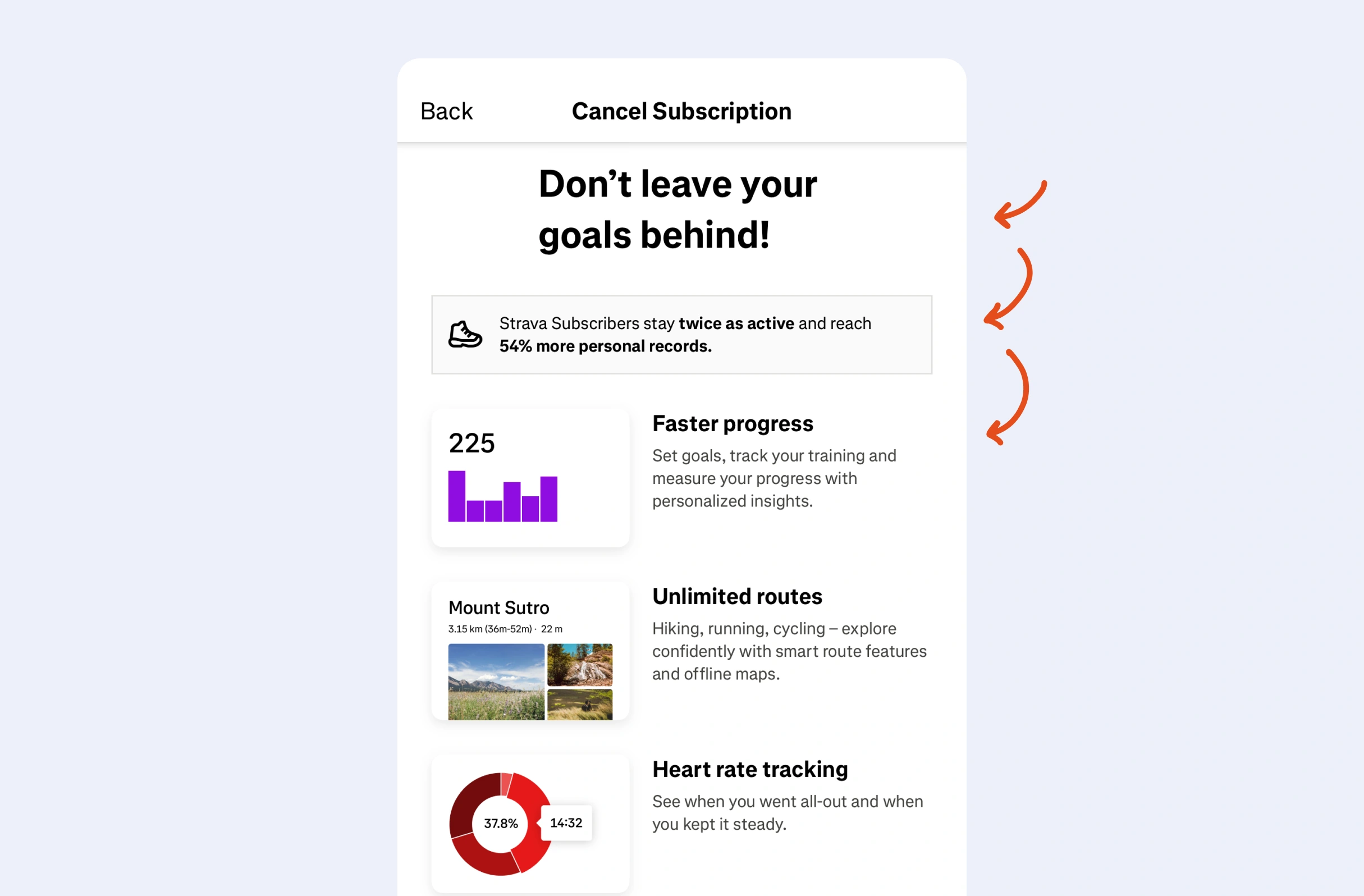
If you go to cancel your subscription, Strava will use both Loss Aversion and Framing to remind you about your goals.

Reframing your goals to reduce churn

More context:

i.e., "don't leave your goals behind, Strava will help you make progress more likely, and faster".

#969
View UX Bite
UX Bite:
Runna logoRunna

Getting back on track

Subscribe to unlock this example
Plans start from £8 per month
Subscribe to unlock#903
Preview
UX Bite:
Nibble logoNibble

Anti-churn notifications

Subscribe to unlock this example
Plans start from £8 per month
Subscribe to unlock#342
Preview
The UI displays a large white "S" centered on a solid purple-blue background, with no additional text, logos, or interface elements visible.The UI shows a stylized "M" logo with teal, cream, and red color blocks on a dark blue background. No text or markings are highlighted or underlined.The image shows a circular blue gradient pattern with a darker blue center, fading to lighter blue outward; no UI elements, text, or highlights are visible.

There are more than 1400 UX Bites like this

Subscribe to BFM+

If features can be coded in minutes, thoughtful design is what wins

  • Unlock the entire library
  • Create custom UX courses
  • Access our AI tools
£8/monthbilled annually
See the benefits
or, wait for the free stuff

Join the free newsletter

Get the free content when it's released, straight to your inbox, no account required

"An exceptional resource for learning how to build habit-forming products that people love."

The UI contains the yellow book cover "HOOKED" by Nir Eyal in the bottom right, with black text in a white box with blue borders stating "COMPLETELY REVISED AND UPDATED."
Nir EyalAuthor of Hooked

"I’d never met anybody who looks at usability and UX the way I do until I met Peter. Only he’s smarter."

Photo: site-map sketches with pen annotations, yellow sticky notes and folder of labeled cards, black phone cord, red book cover reading "DON'T MAKE ME THINK".
Steve KrugAuthor of Don't Make Me Think

"The completest view of the psychological underpinnings of human behaviour that I’ve ever seen."

Circular avatar: smiling man, navy jacket, blue‑checked shirt, blurred green bg. Overlays: red EA badge lower-right; black square with white up‑left arrow.
Bing GordonKleiner Perkins & EA

"What a nice idea! Christopher Alexander would be proud to see patterns collected like this."

Profile picture of a man with medium-length hair and stubble wearing a grey hoodie and dark jacket. Two app icons overlay bottom right: yellow Asana and blue Miro.
DHHHey! & Basecamp

FAQs

What makes a cancellation screen actually change someone's mind?

Personal, concrete value outperforms a generic list of benefits. For example, Uber One shows how much you've saved that month, which works best when the figure is near or above the subscription fee. Strava uses Loss Aversion and Framing to remind you of your goals, though showing the user's specific goal (e.g., 'your goal was to run 10k') would make it far stronger.

Is it worth asking users why they're cancelling?

Only if the answer changes what happens next. As an example, Breethe asks why you rejected the free trial and, if 7 days isn't enough, extends the offer to 30. Fixing the problem at the moment of churn, even at a cost, usually beats losing the customer for good, and it generates useful data.

Why do users cancel free trials they're still enjoying?

Many trial cancellations come from anxiety about forgetting to cancel before being charged. Nibble addresses this directly by telling users they'll get a notification 2 days before billing. Restating the service's benefits on the same screen would give people a second reason to stay.

Does churn only happen through the cancel button?

No. People delete apps, back out of upgrade prompts or drift away after a break. For instance, Runna offers to rearrange or skip missed workouts when users return after inactivity, without defaulting to 'work harder to catch up', so the habit is easier to restart.

What can a free tier offer when users hit its limit?

A second option besides upgrading keeps people getting value instead of simply dismissing the prompt. This is what Clearspace does when you reach the free tier limit, letting you swap your new selection for an older one.

How should you treat users who back out but haven't decided?

Hesitation is often Decision Fatigue rather than a firm no, so a way to defer can prevent churn. For example, Klima offers a reminder in 7 days when users back out of a carbon offset pledge.