🍟
Context Craving
In many situations, people will crave context and clarity rather than efficiency.
Featured in 1 UX Bite
Similar psychology:
Likely impacts:
Last updated: 03/11/2026
How to utilise this in your designs
During loading and success states for a booking, you could mention the specific details chosen, e.g., the destination, so users have the context to feel sure it worked.

Example from Trainline
Before someone books parking, try warning them if it looks like a double booking, so they don't have to wonder whether they've been charged twice.
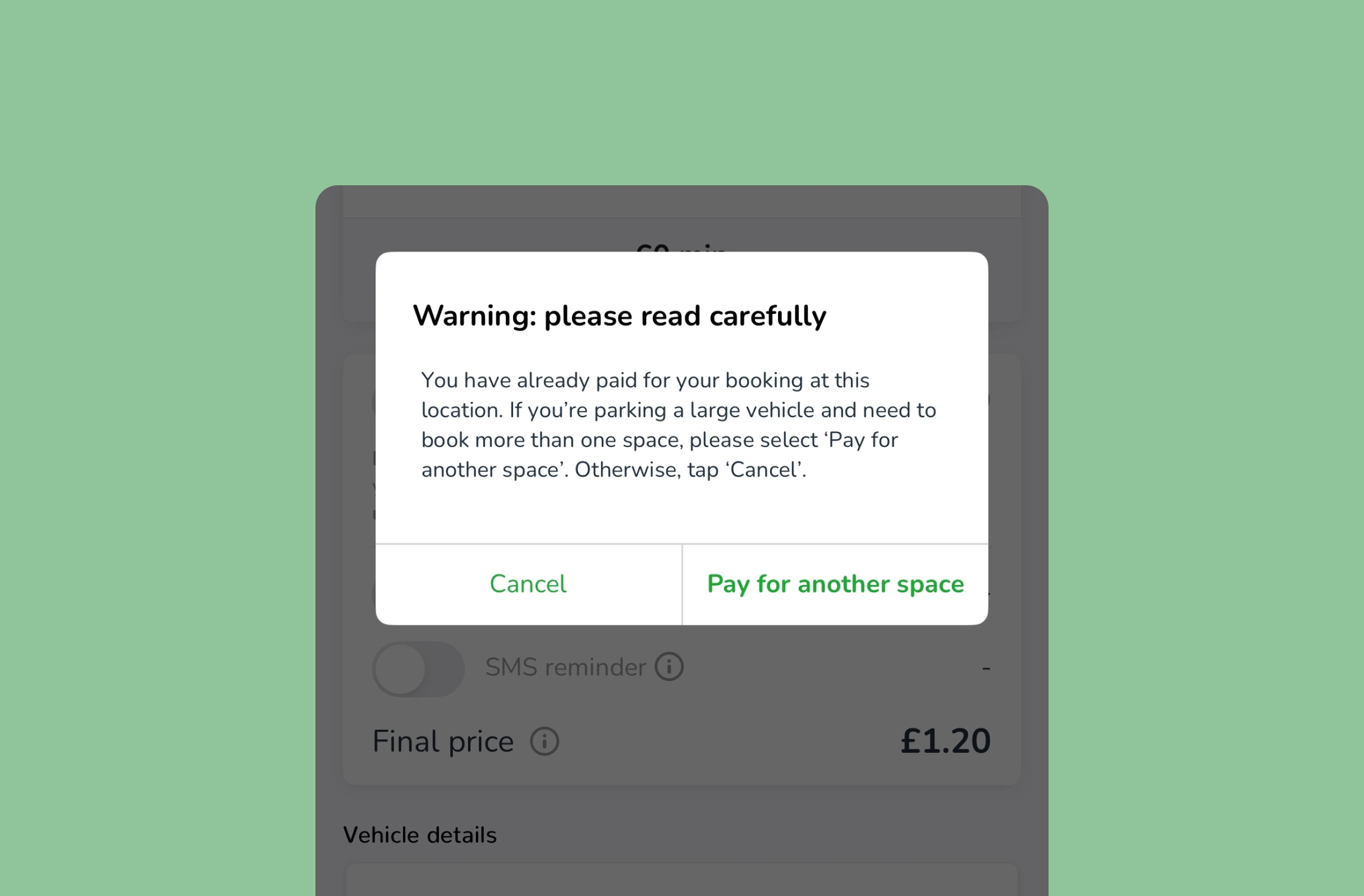
Example from JustPark
When an action quietly triggers something for other people, it may help to state who will be notified automatically, so users know exactly what happens next.
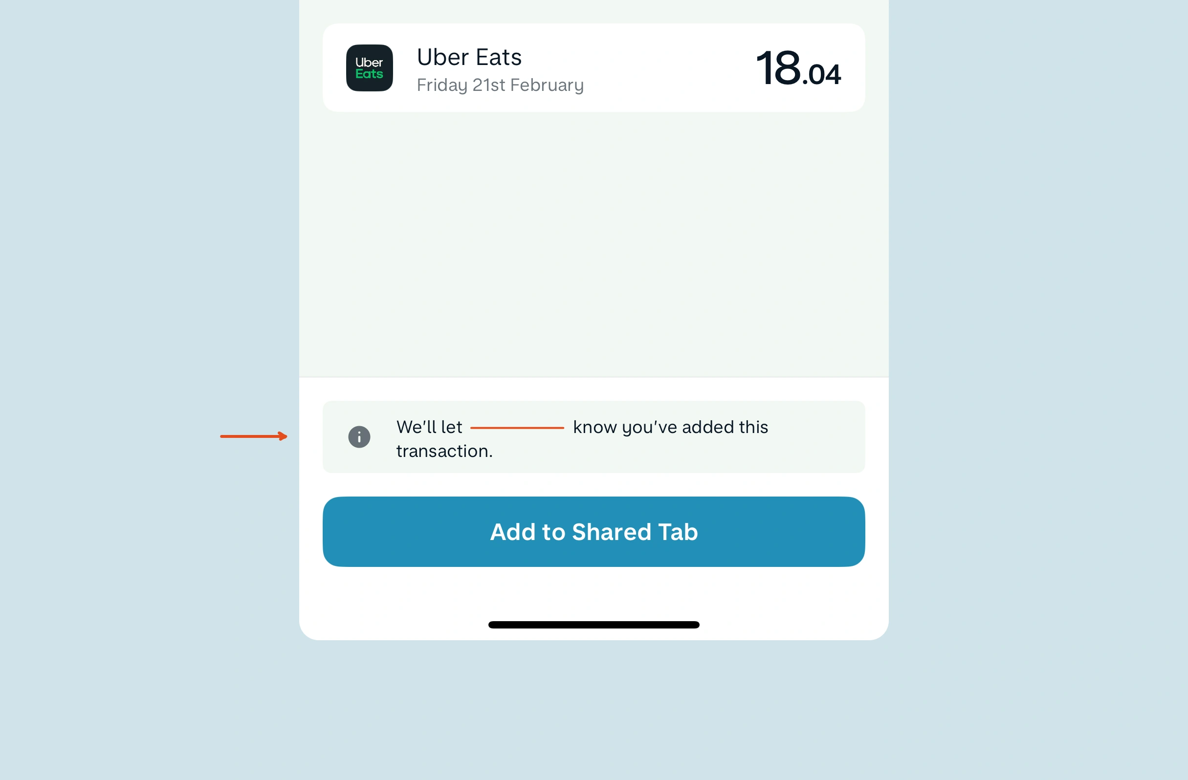
Example from Monzo
If your service is having network issues, consider adding an FAQ for each type of user to the error screen, giving them the context they crave on whether their orders are safe.
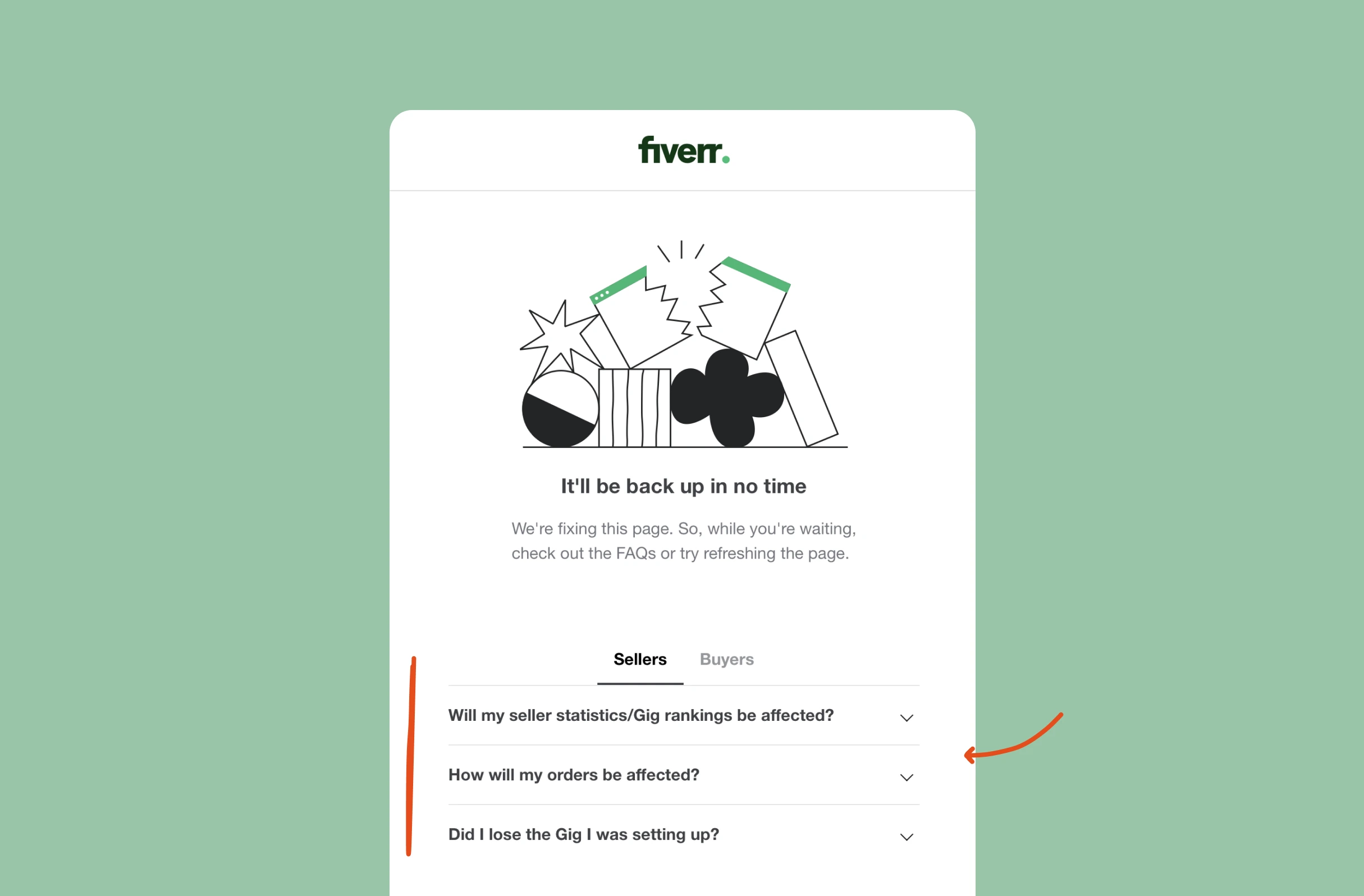
Example from Fiverr
For purchases people can't see beforehand, e.g., seats, one option is to show an approximate view by zone, so they know roughly what they're getting before they pay.

Example from StubHub
Possible impacts
Giving people the context they crave, e.g., who will be notified or what happens after they pay, could reduce anxiety at moments where they'd otherwise hesitate.
Explaining what a choice or change actually means, at the moment it's made, may help users understand the product better than a faster but unexplained flow.
Clear context before users submit, e.g., a warning that a booking looks like a duplicate, might reduce mistakes and help people enter the right details first time.



Written by Peter Ramsey
Published: