UX Content
  • Case Studies
  • UX Bites
  • Cheatsheets
  • Psychology
BFM+
  • Instant Feedback
  • MCP
  • Figma Plugin
  • Tiers & pricing
  • Free newsletter
  • Log in
Other
  • Archive
  • About
  • Help
  • Changelog
Services
UX audits

A complete audit of your user experience, delivered in a format that you can't ignore.

Book an audit

Built for Mars Ltd is a company registered in England and Wales (Company No. 12731987).

Account
  • Log inAccess your library and activities
  • SubscribeUnlock all features and access to the library
Learn from the best companies in the world

A library of content that even non-designers find interesting.

Subscribe todaySubscribe today
Structured learning
  • UX BootcampEnroll in a 5-week bootcamp
  • PathwaysCreate custom learning Pathways to work towards any goal, industry or topic
  • CollectionsBrowse Case Studies by key topics
  • QuizzesTest your knowledge
Explore the library
  • Case StudiesSlideshows that are packed with research
  • UX BitesReal examples of design magic
  • CheatsheetsQuickly level up in a particular area
  • Product PsychologyLearn the essentials
  • NewsletterGet research straight to your inbox
  • CompaniesBrowse by company
Learn from the best companies in the world

A library of content that even non-designers find interesting.

Subscribe todaySubscribe today
Tools to help you
  • AI InsightsUpload screenshots of your design, and get instant feedback from our AI
  • MCPAccess the entire library from your favourite agent
  • Figma pluginAccess our AI tools, and our entire library, directly from Figma
One-to-one help
  • UX AuditsThe fast-track for growth
Includes tools that help you ship better products

Learning never stops, but sometimes you need a little more.

Subscribe todaySubscribe today
Log inSubscribe today
Home
UX Glossary
Selective Attention

👀

Selective Attention

Focusing on something specific.

Featured in 4 UX Bites

Similar psychology:

Pattern Matching
Specificity
Delegated Decisions

Likely impacts:

Attention & Interest
Complexity & Understanding
Last updated: 03/11/2026

How to utilise this in your designs

When users select items to delete, you could fade everything else and highlight only the selected items, so their selective attention lands on what they're about to lose.

Notifications inbox. Tapping the bin icon reveals checkboxes on each promotional message with "Cancel" and "Delete" buttons; "Delete" stays disabled until a message is selected, then becomes active.
Example from
T Mobile logo
T Mobile

When someone hovers over a 'skip' button, try making the nearby line explaining your recommendation glow, so it catches their attention as they decide.
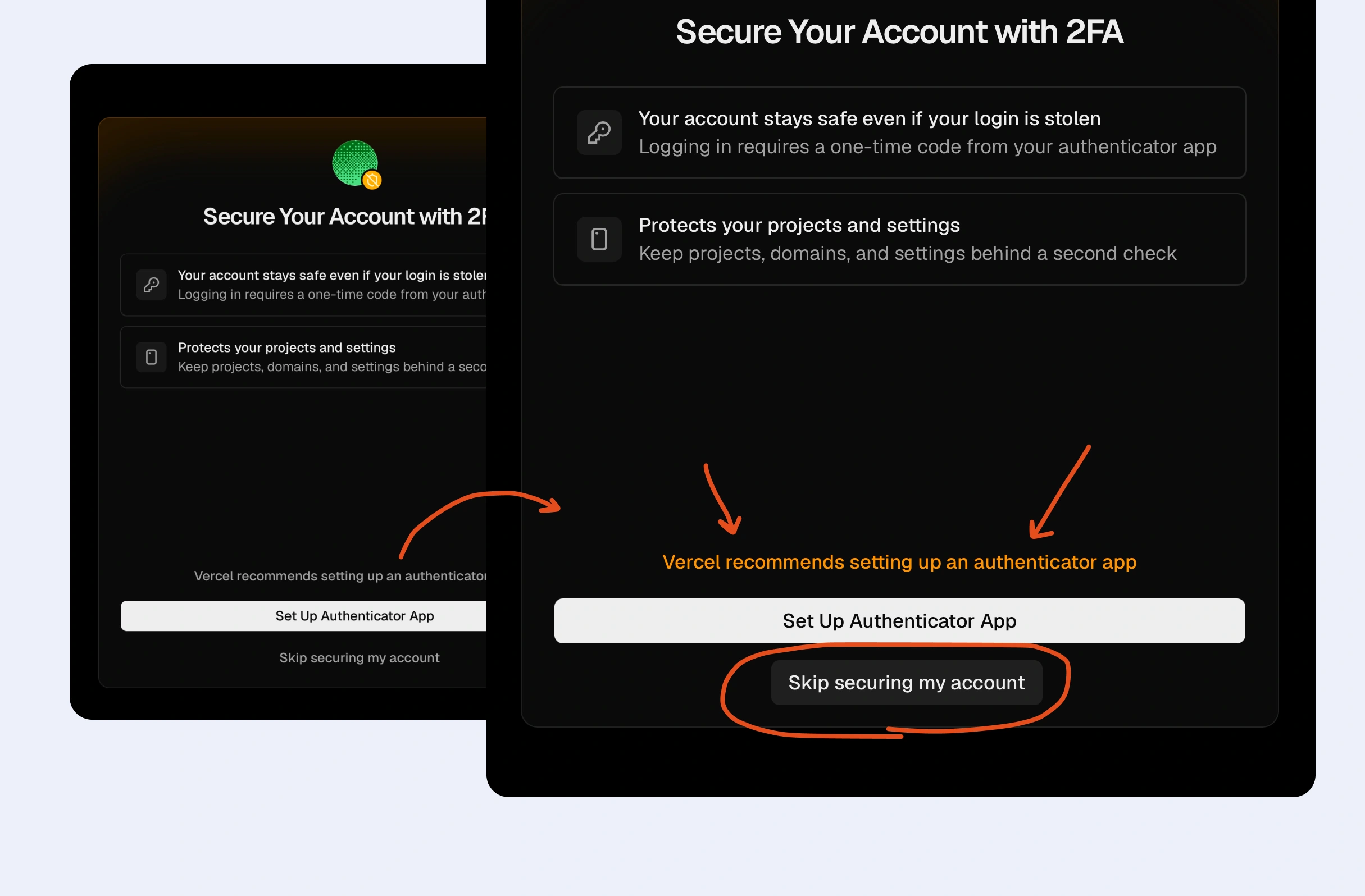
Two-factor authentication set-up prompt. Hovering over the "Skip securing my account" link makes the "recommends setting up an authenticator app" message above "Set Up Authenticator App" stand out, nudging users away from skipping.
Example from
Vercel logo
Vercel

When asking users to add money, one option is to request the amount first and load in the other payment details afterwards, so their focus stays on one thing at a time.
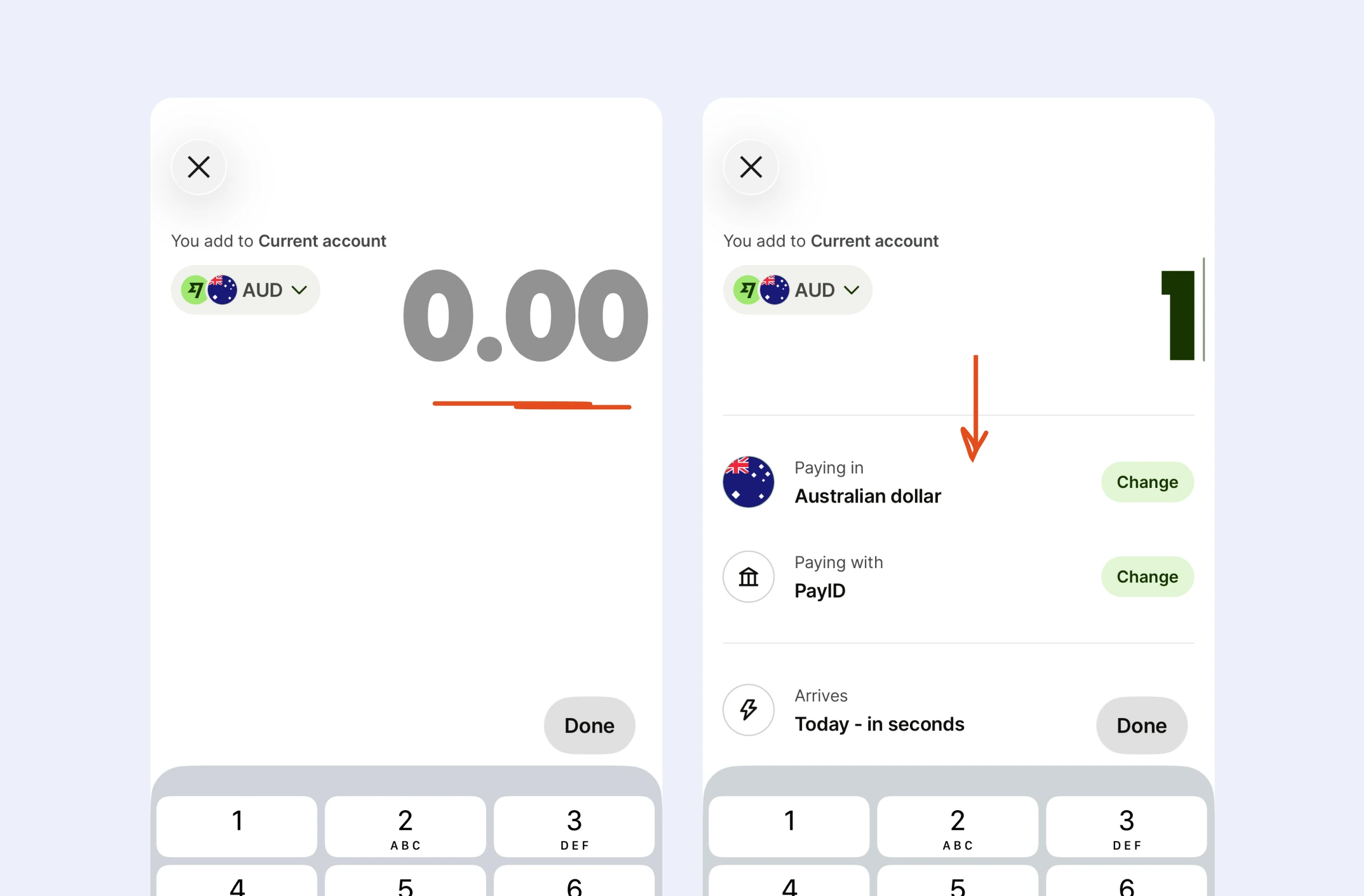
Payment screen for adding money to an account. The amount field starts empty at "0.00"; typing a digit reveals payment details below: "Paying in" currency, "Paying with" method, each with a "Change" button, plus arrival time.
Example from
Wise logo
Wise

When a screen has nothing set up yet, e.g., no filters applied, consider showing a literal arrow pointing at the control to tap, drawing attention straight to it.
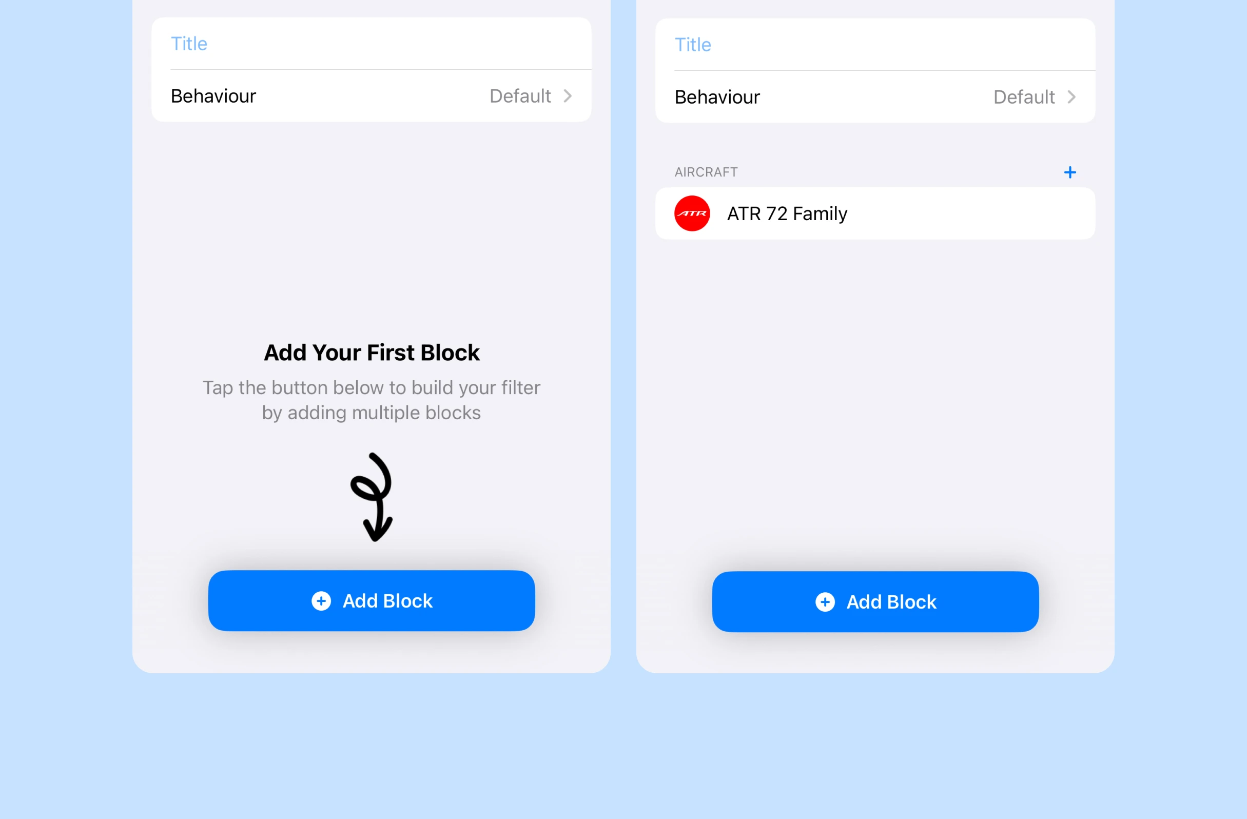
Empty state for building a custom filter. "Add Your First Block" prompts tapping "Add Block"; afterwards, an "Aircraft" section appears listing "ATR 72 Family", with the button still available for more blocks.
Example from
Plane Finder logo
Plane Finder

If an order is going somewhere far from the user's current location, it may help to show a warning on the payment screen, where their attention already is before paying.
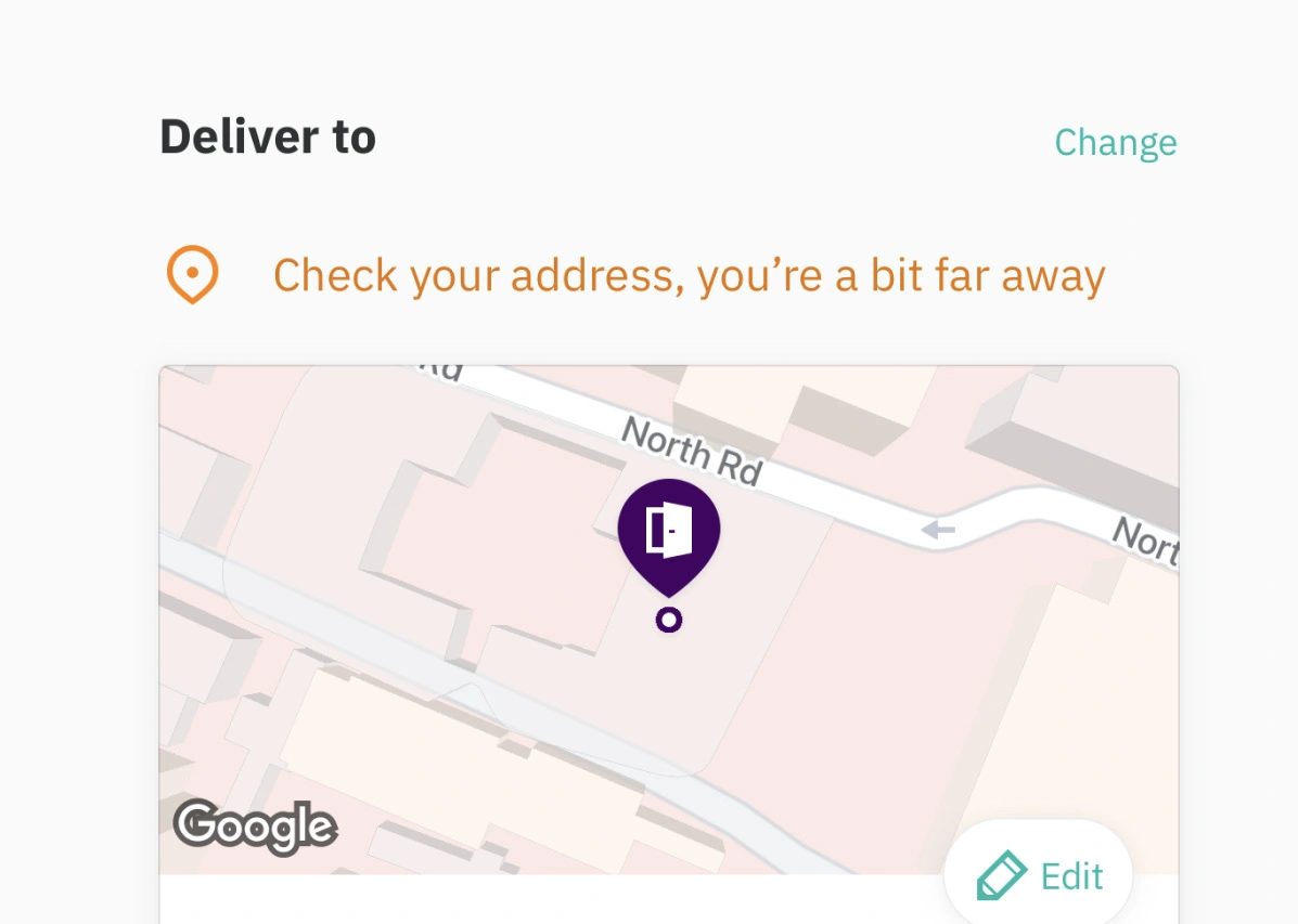
Food delivery checkout. Under "Deliver to", a location warning reads "Check your address, you're a bit far away" above a map pin, prompting the user to "Change" or "Edit" a delivery address that doesn't match their current location.
Example from
Deliveroo logo
Deliveroo

Possible impacts

Fading competing elements and highlighting what matters could steer users' selective attention to the key action or message, making it more likely to be noticed.

As seen in:
T Mobile logo
T Mobile
Focusing your attention on deleted items
Vercel logo
Vercel
Wait, we recommend this

Revealing one step or detail at a time could help users focus on what matters now, which may make complex flows easier to understand and reduce missed details.

As seen in:
Posthog logo
Posthog
Handoff during setup
Google Maps logo
Google Maps
Listen to your detour
Profile photo. A circular headshot of a smiling young man with short tousled hair and round glasses, suitable as an author avatar or user profile picture. No interface elements are shown.

Written by Peter Ramsey

Consultant to 100+ companies

Published: 18/08/2023