


By Peter Ramsey
23 Nov 23
The billion dollar missed opportunity

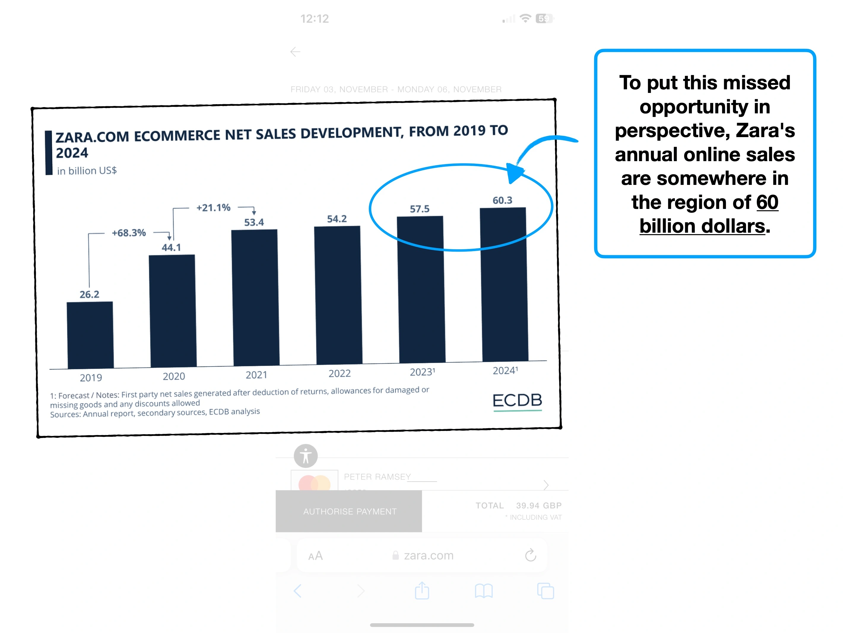
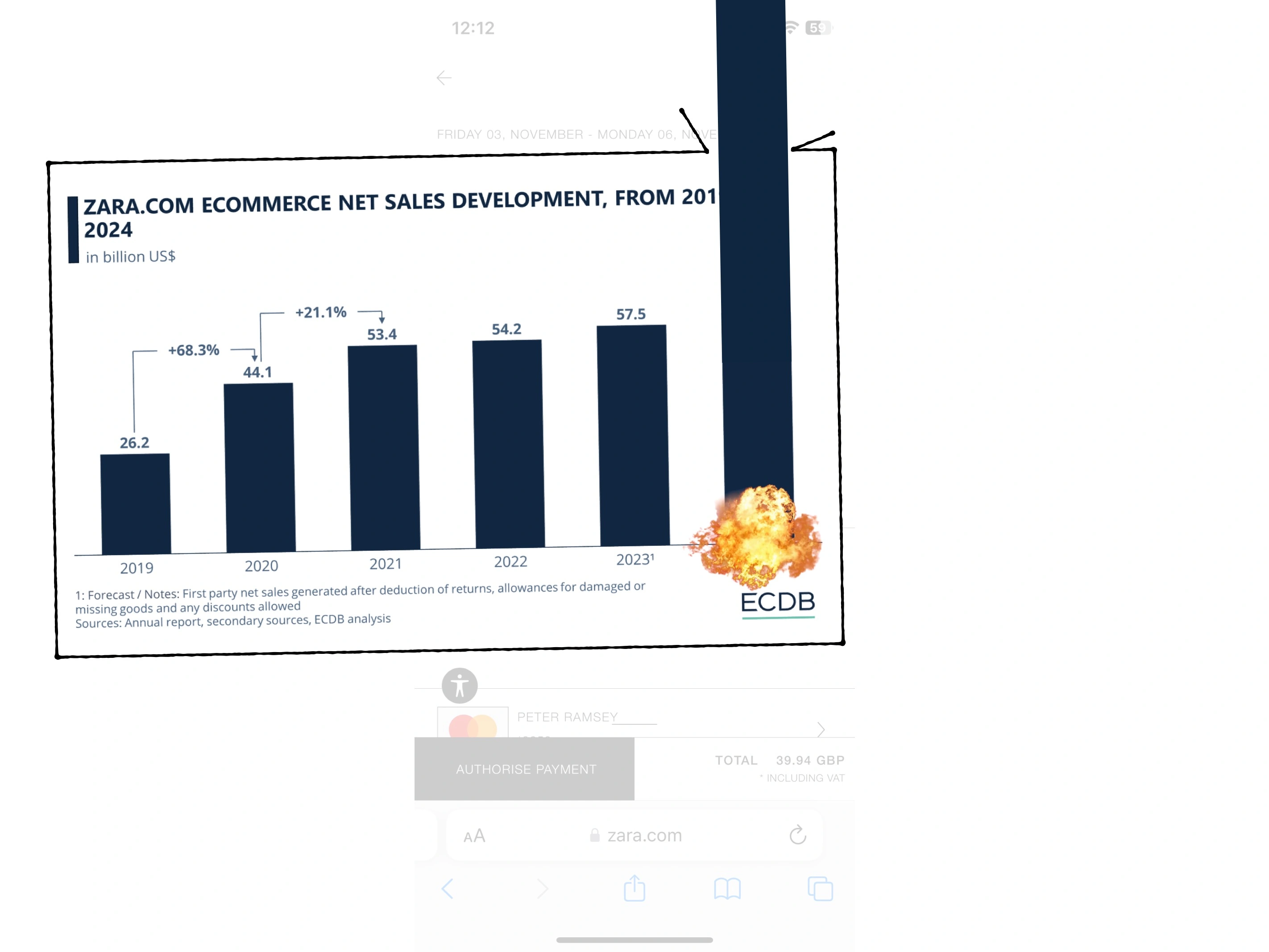
Zara generates about $60 billion annually in online revenue, whilst closing physical stores.
Their future is online, and yet, they've built perhaps the worst online shopping experience I've ever used.
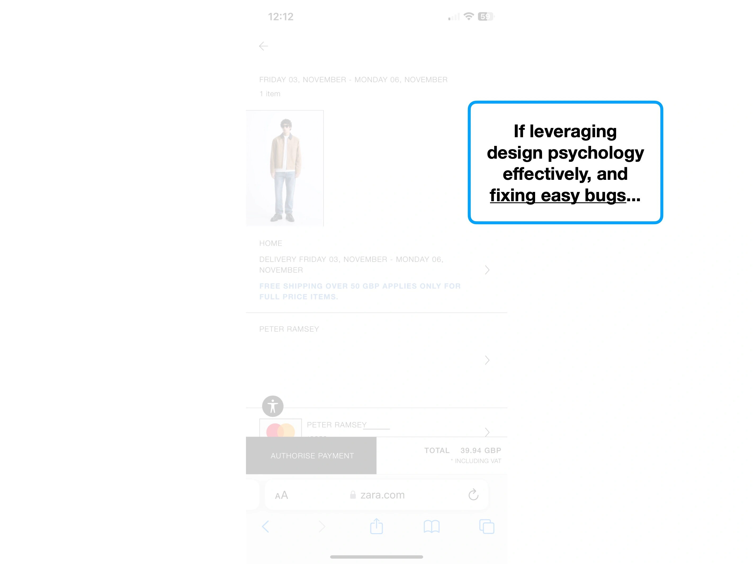
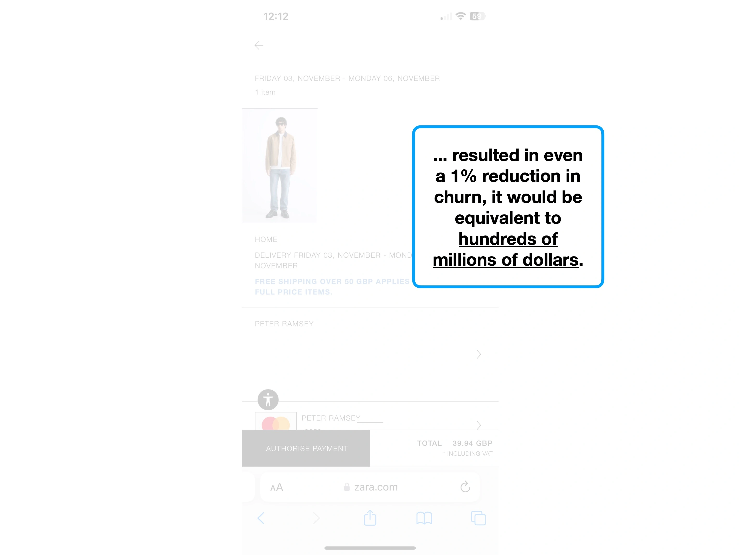
Considering the sheer scale of their business, reducing their churn, or improving their average basket size by a single percentage point, would mean additional revenue to the tune of hundreds of millions of dollars.
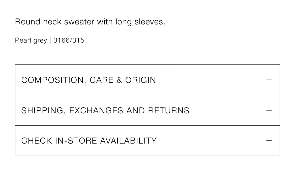
Zara should have a product team obsessively optimising, experimenting on, and seeking feedback about their entire checkout process.
Every incremental improvement would yield a ridiculous return on investment.
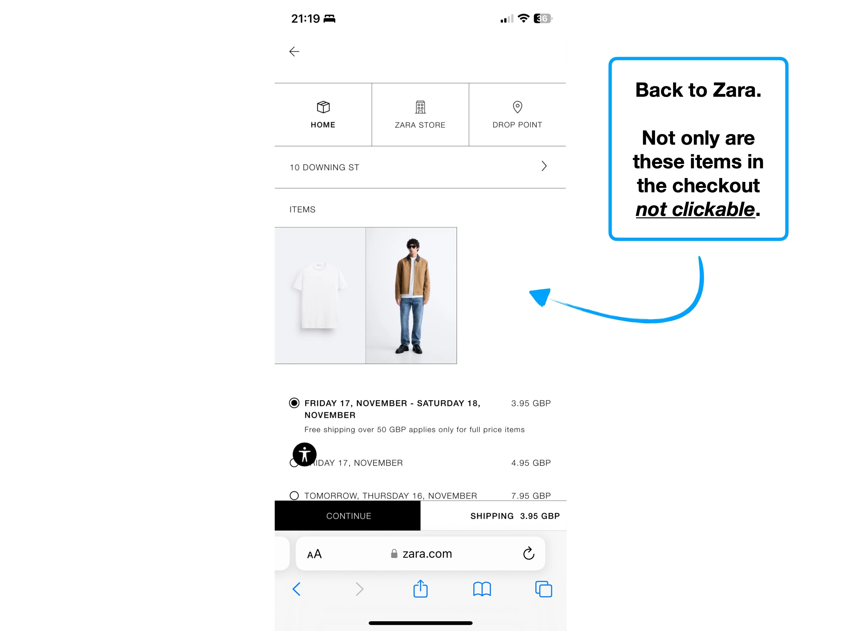
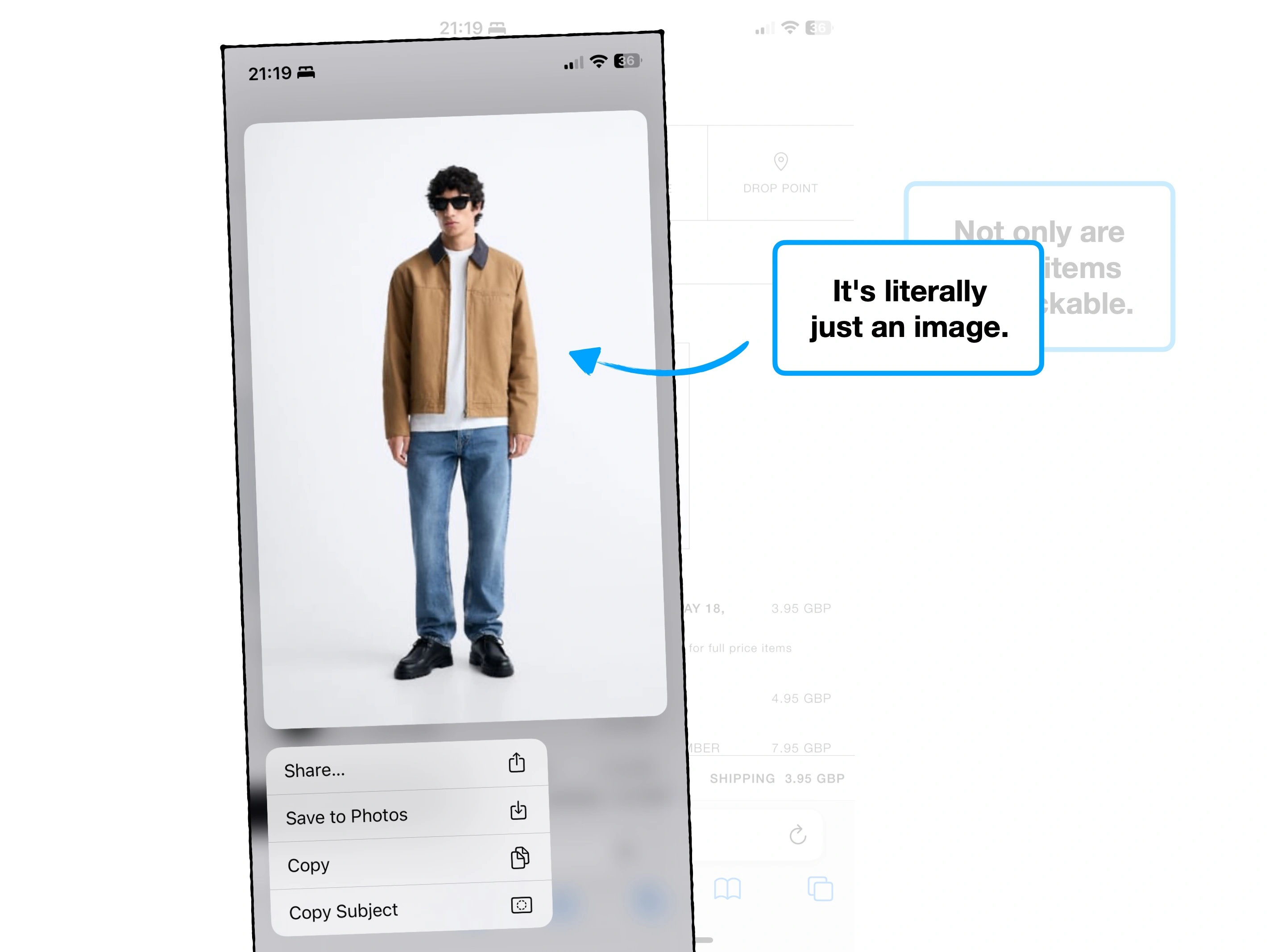
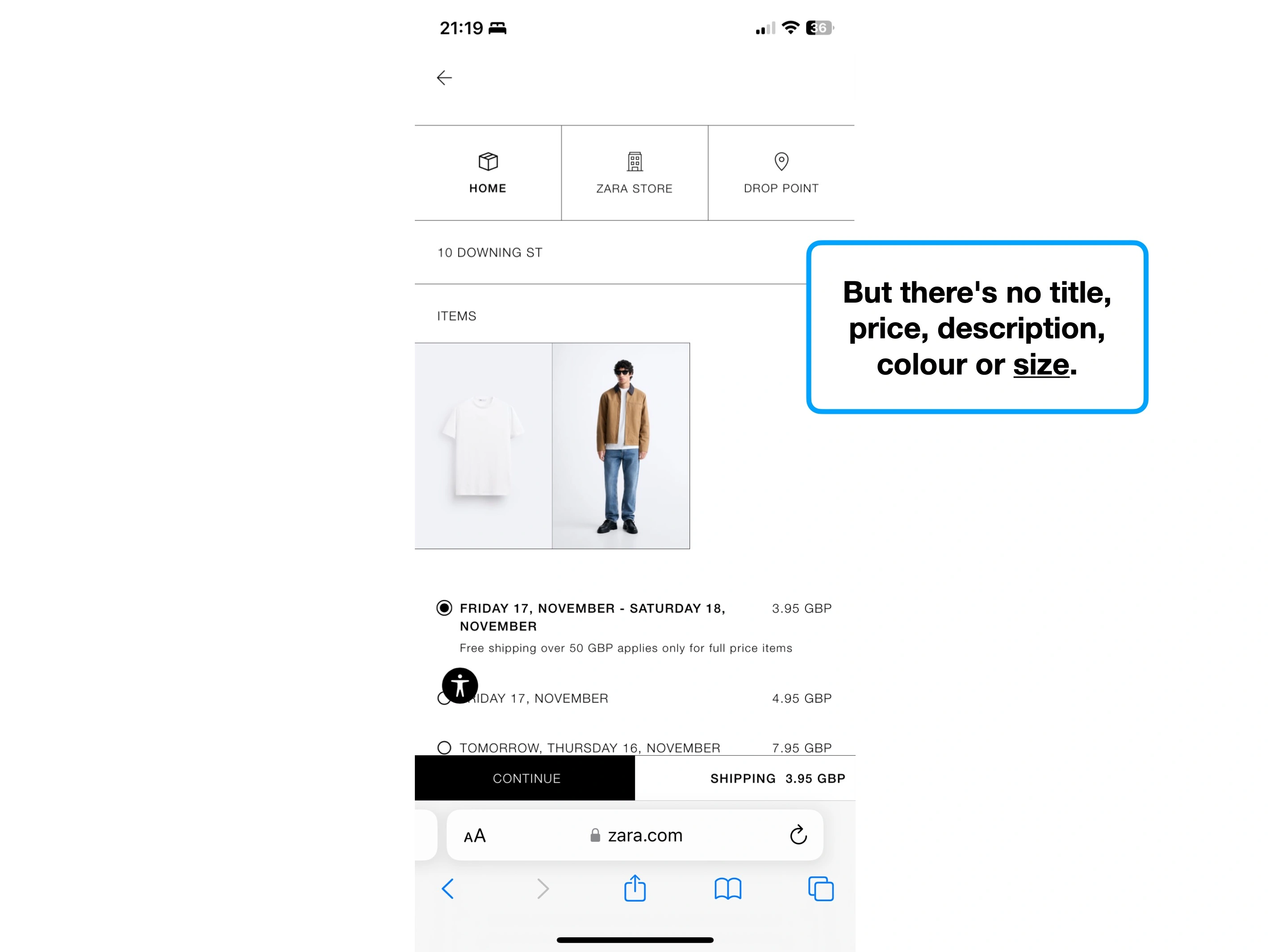
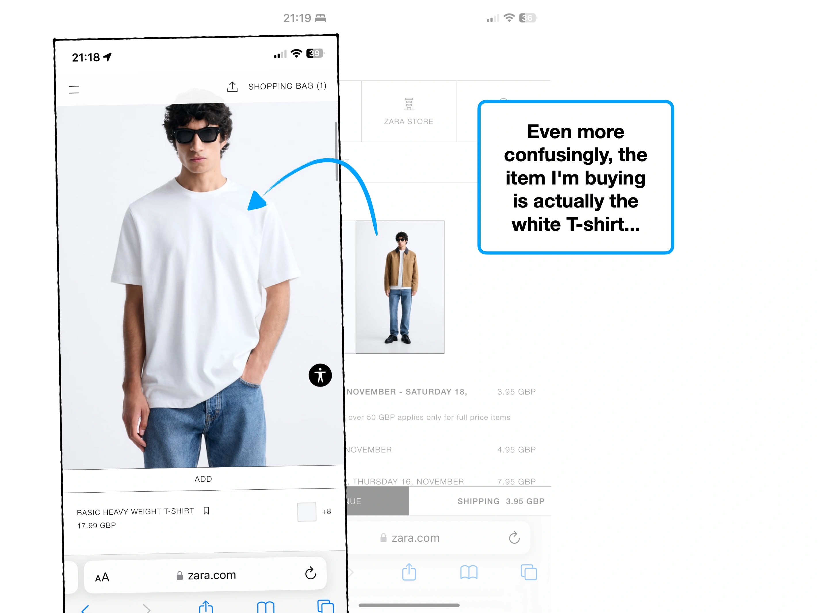
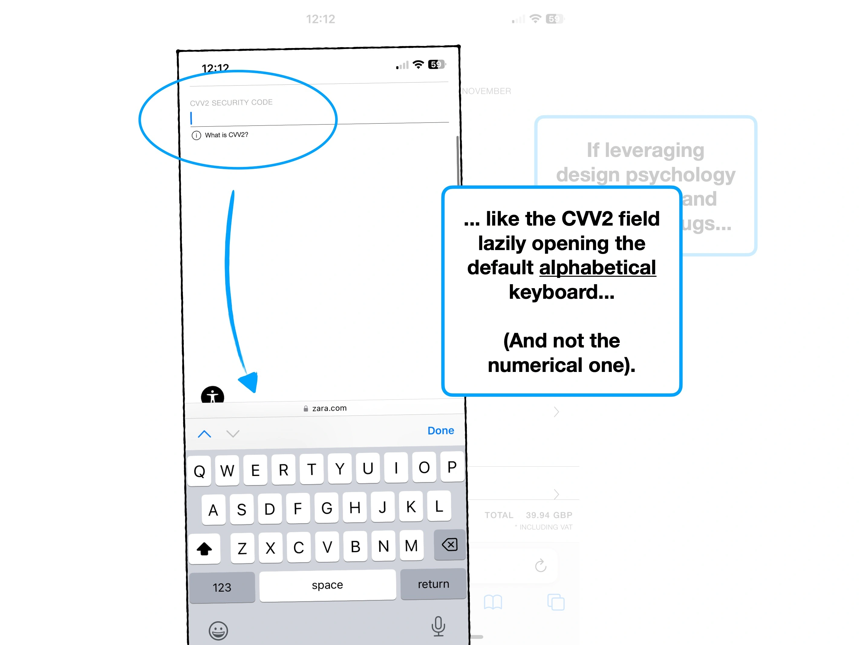
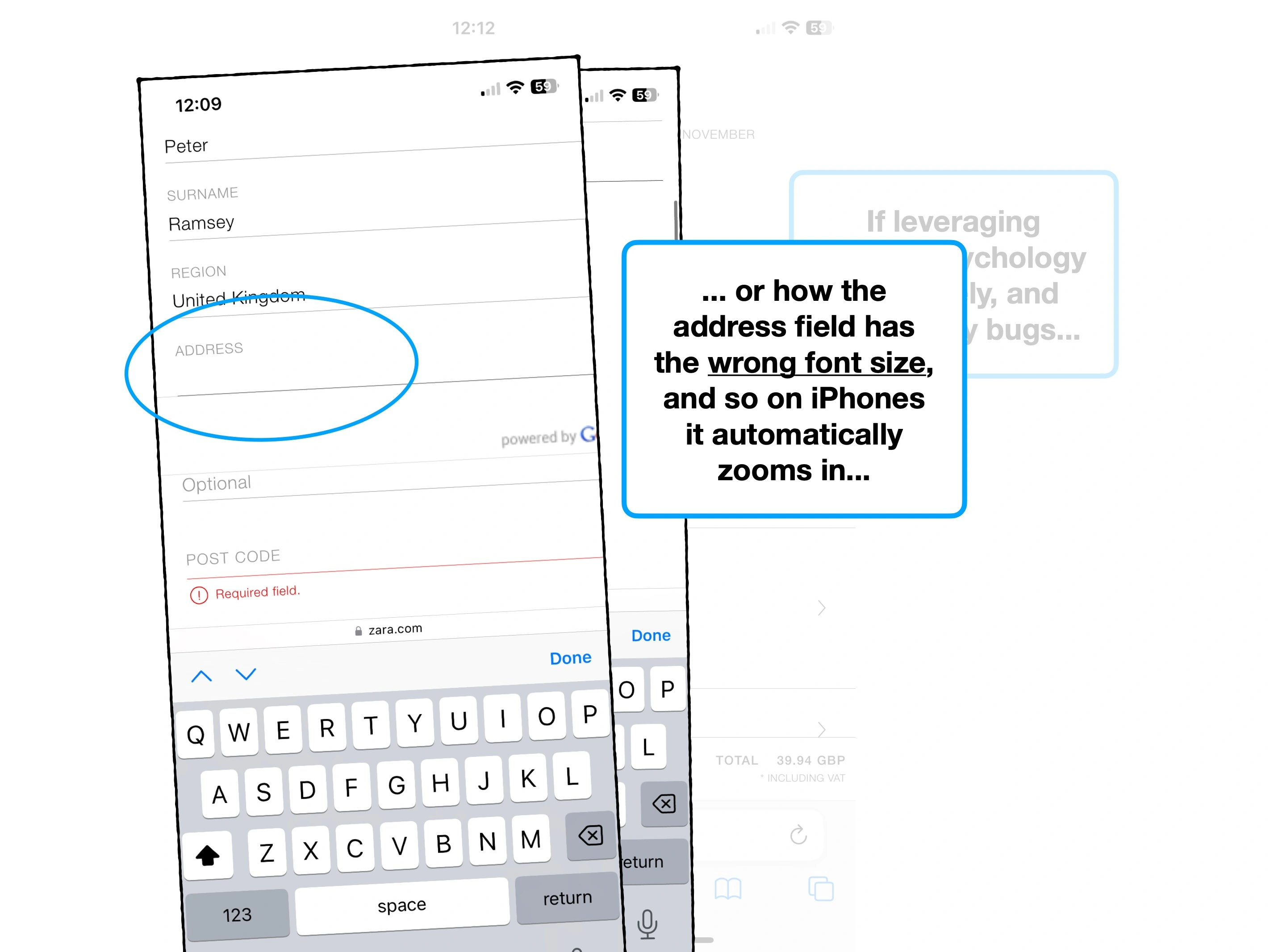
And yet, it's borderline unusable, littered with bugs and full of missed opportunities.
Hold on to your faux fur hats for this one, it's about to get bumpy.
Case study
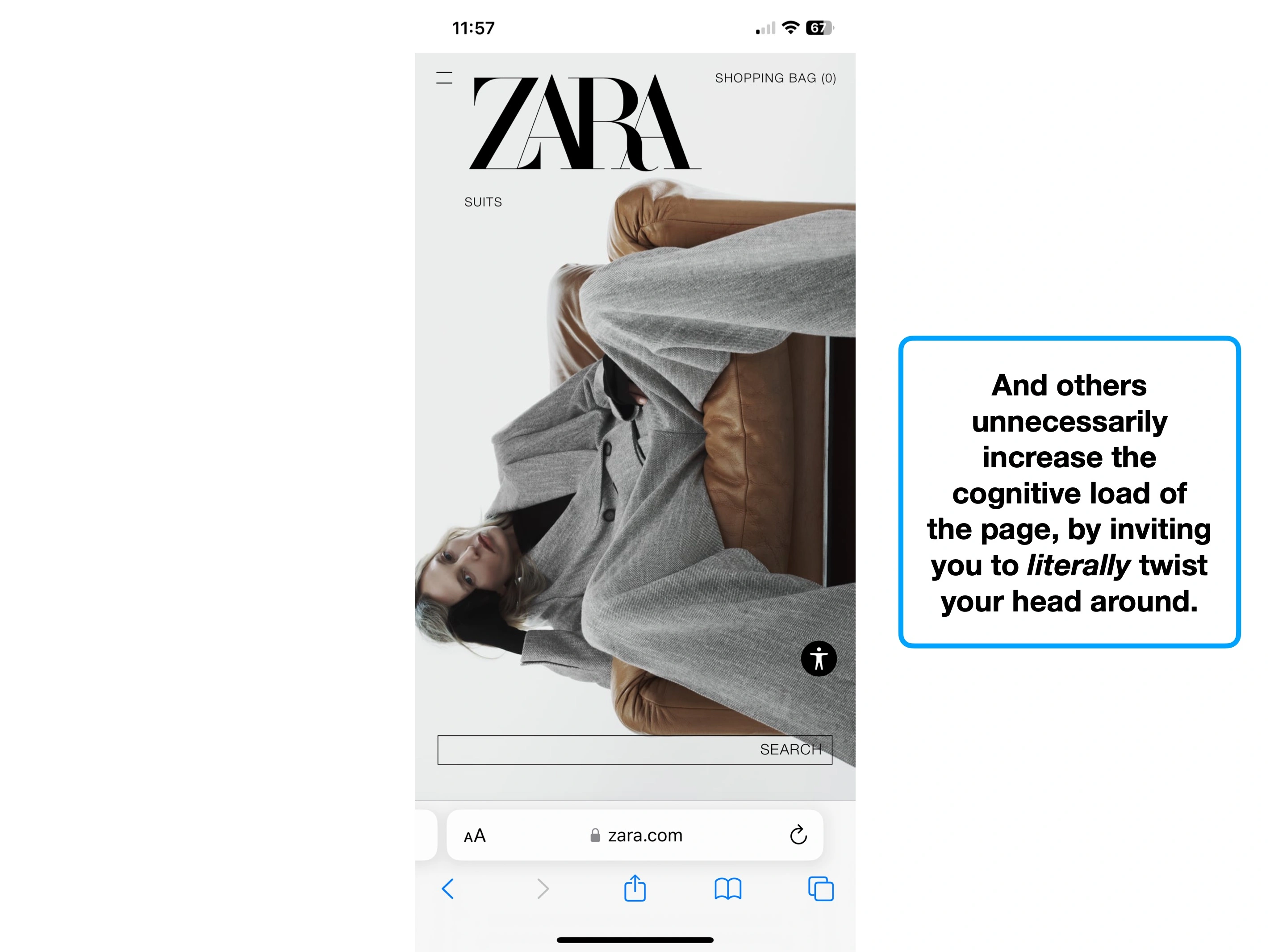
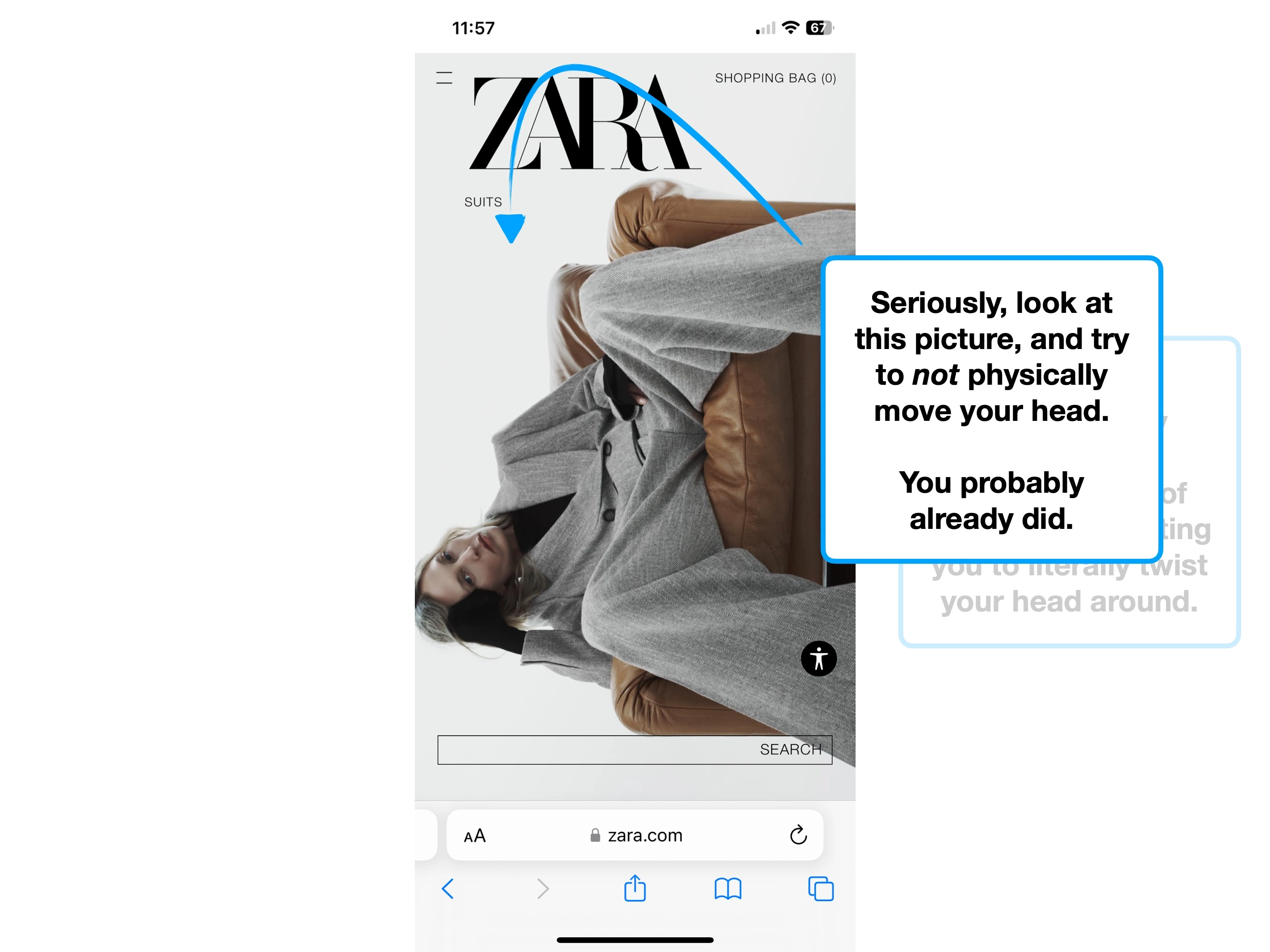
Please rotate your device to view this slideshow
Note, this won’t work if ‘rotate: lock’ is on in your device settings.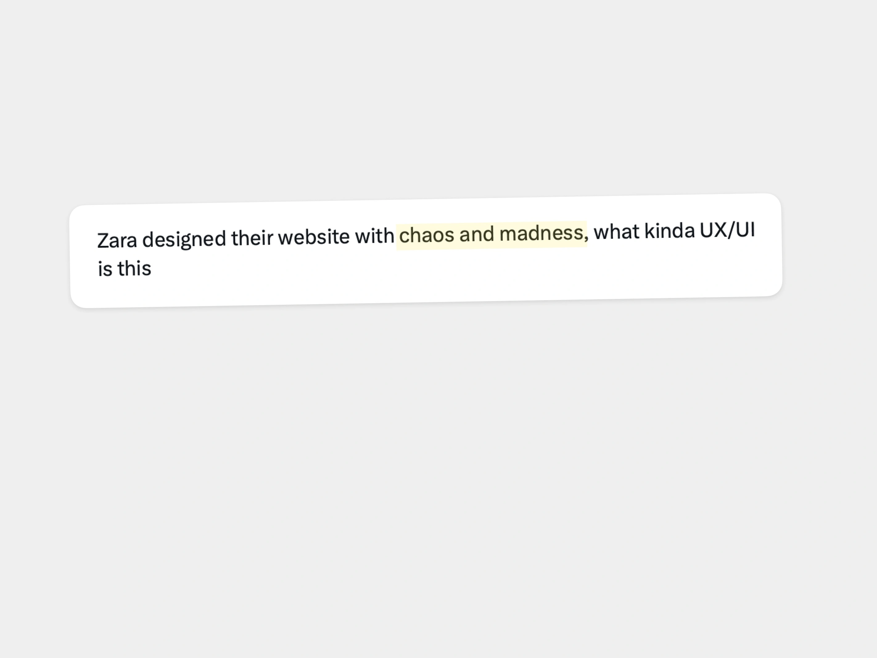


Key UX takeaways
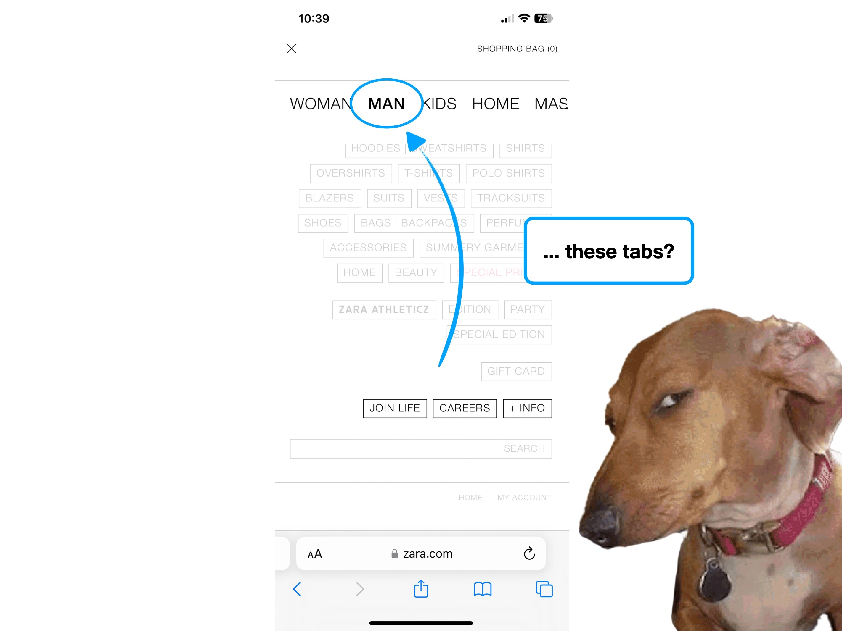
1. Fashion > ease
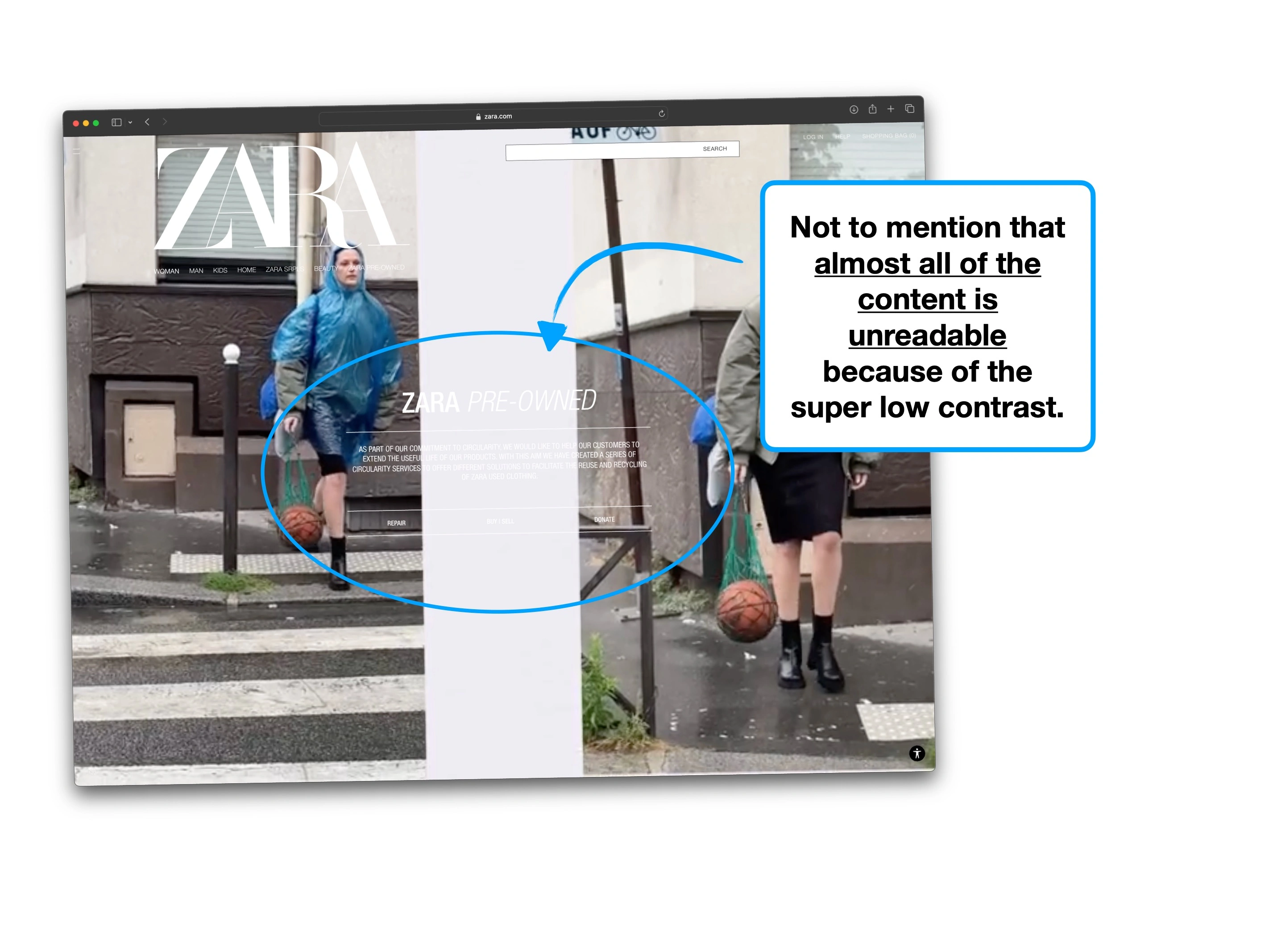
Where else to start, other than the extraordinary 🧠 Cognitive Load.
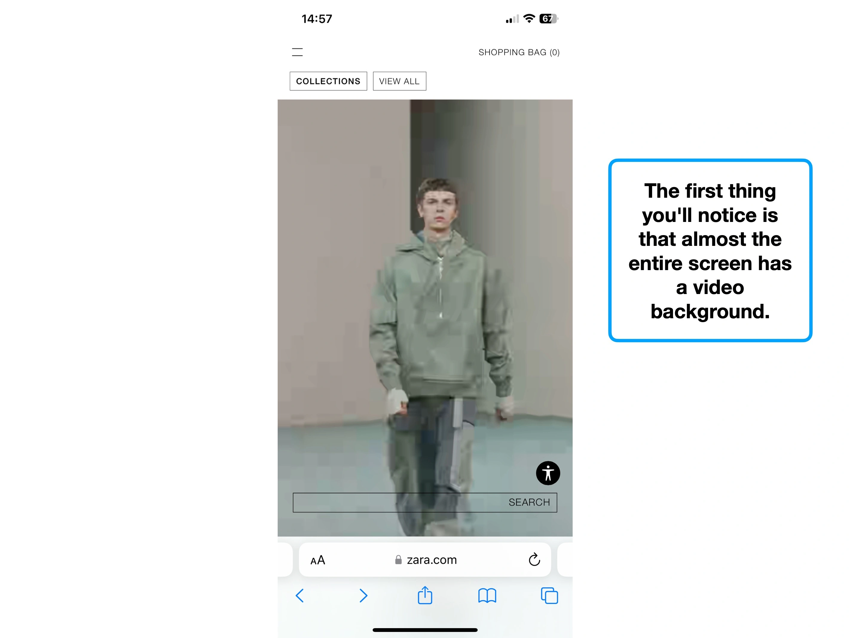
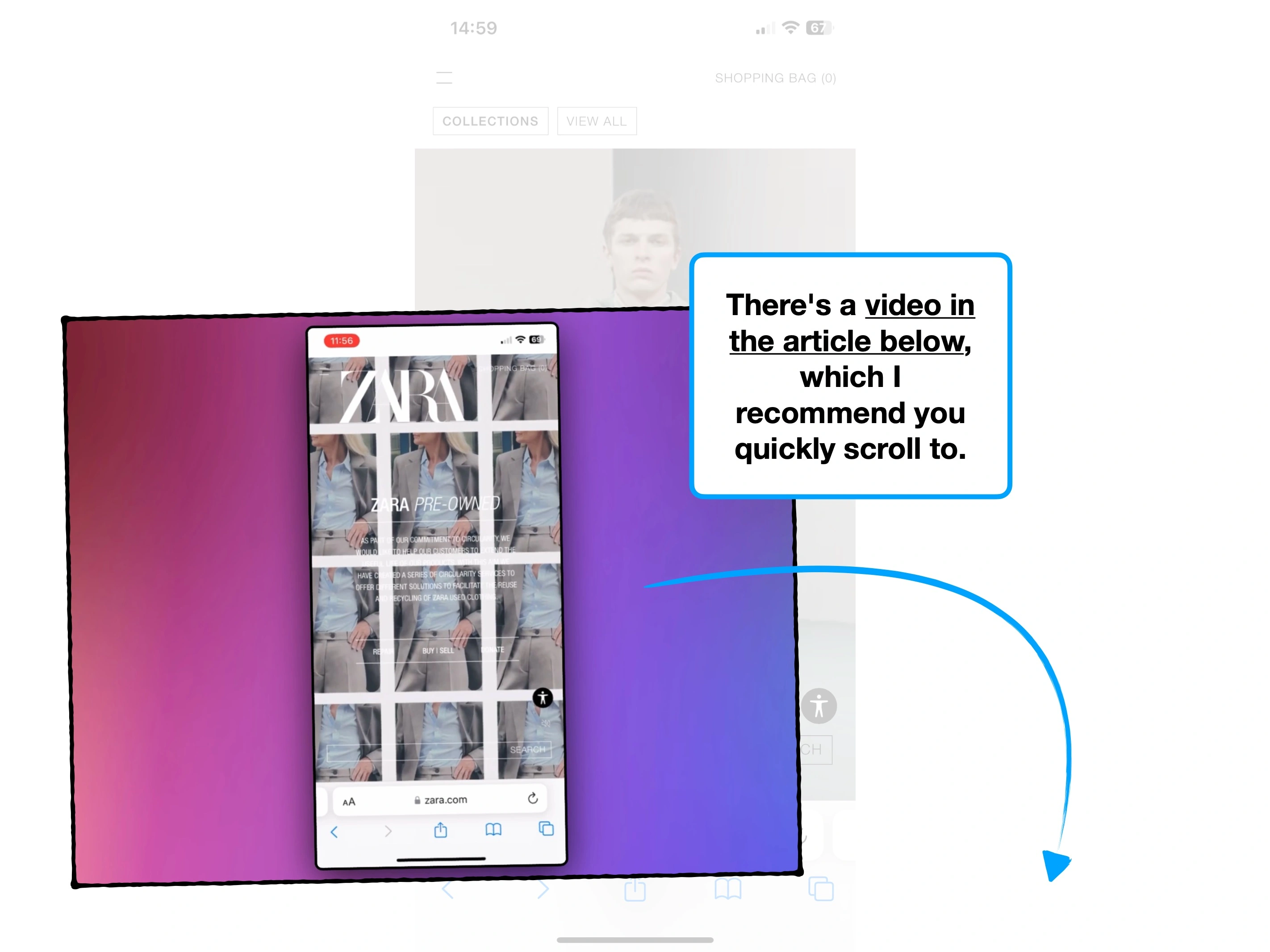
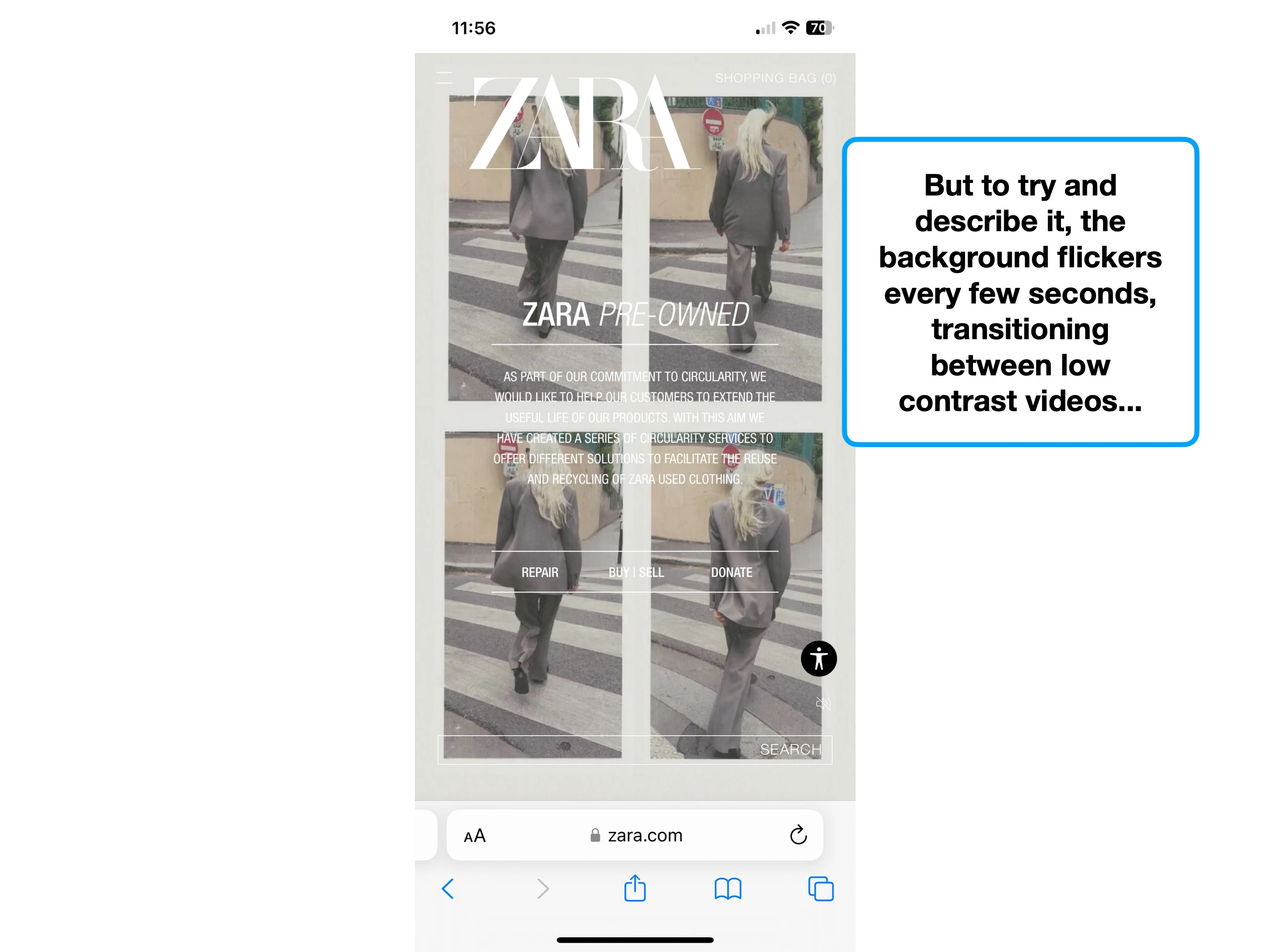
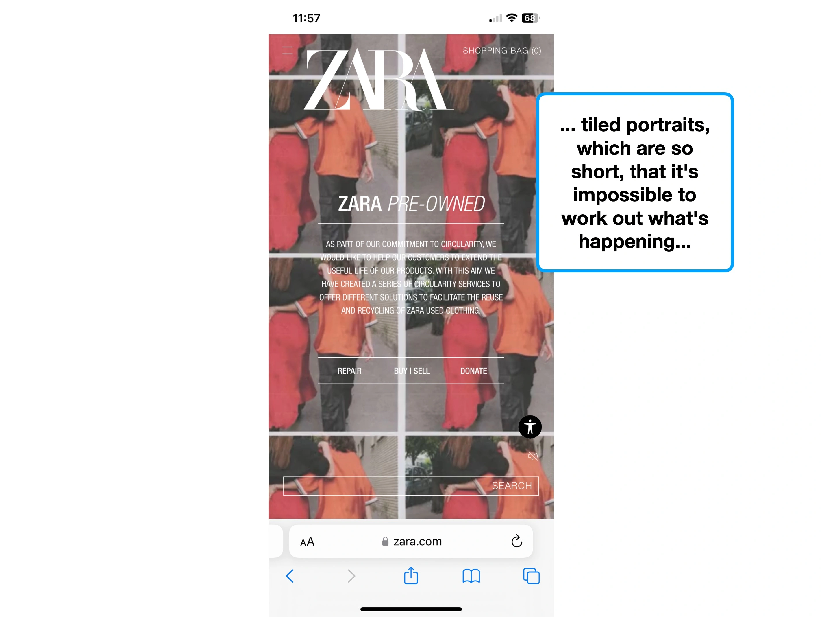
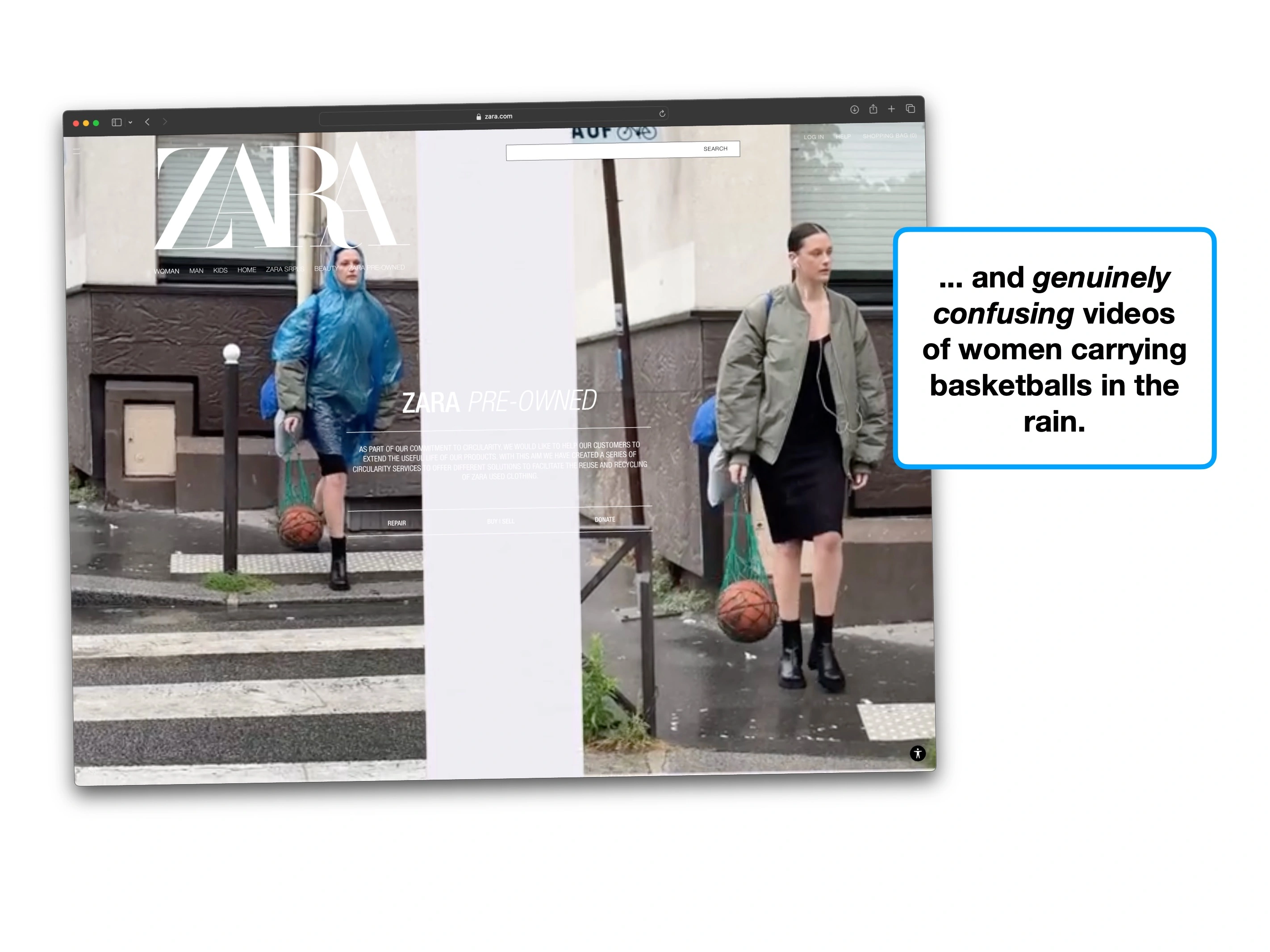
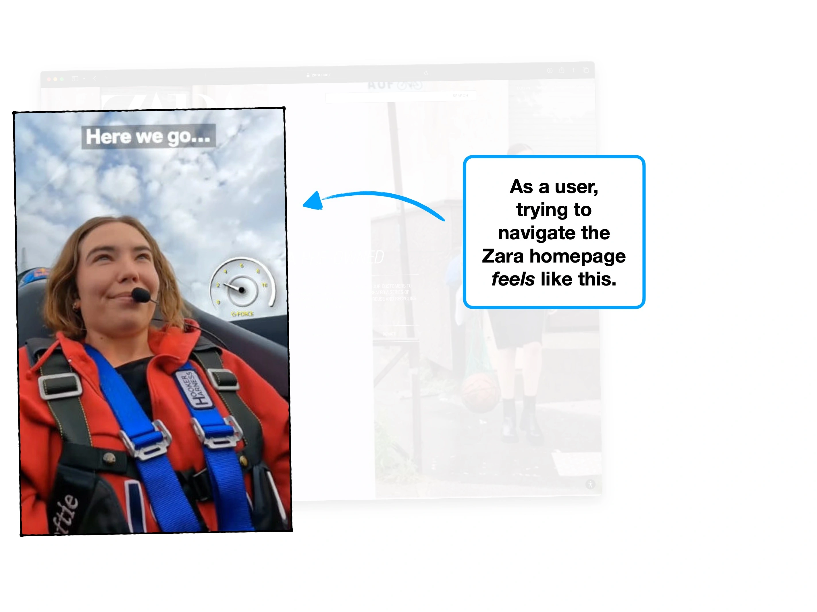
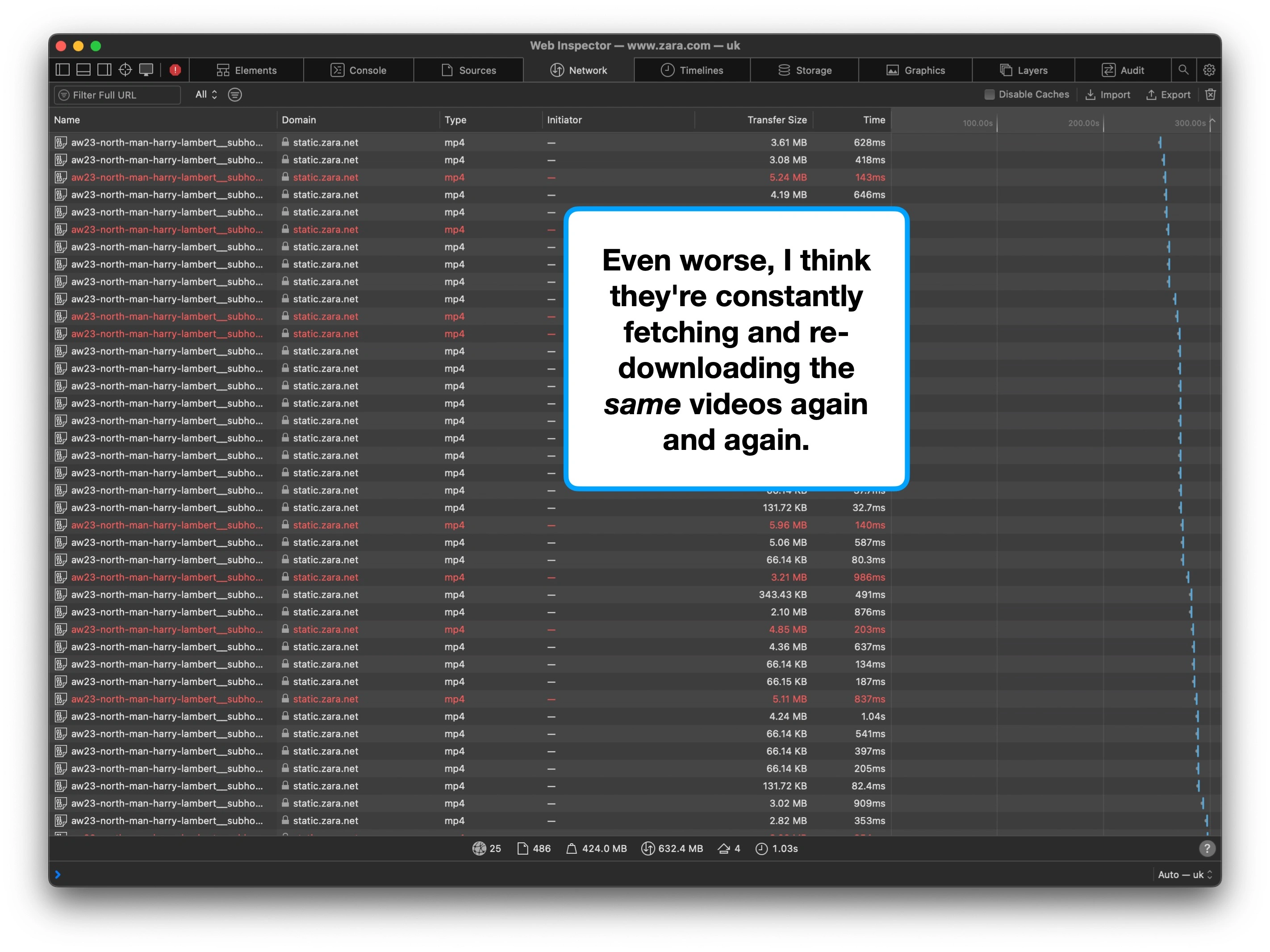
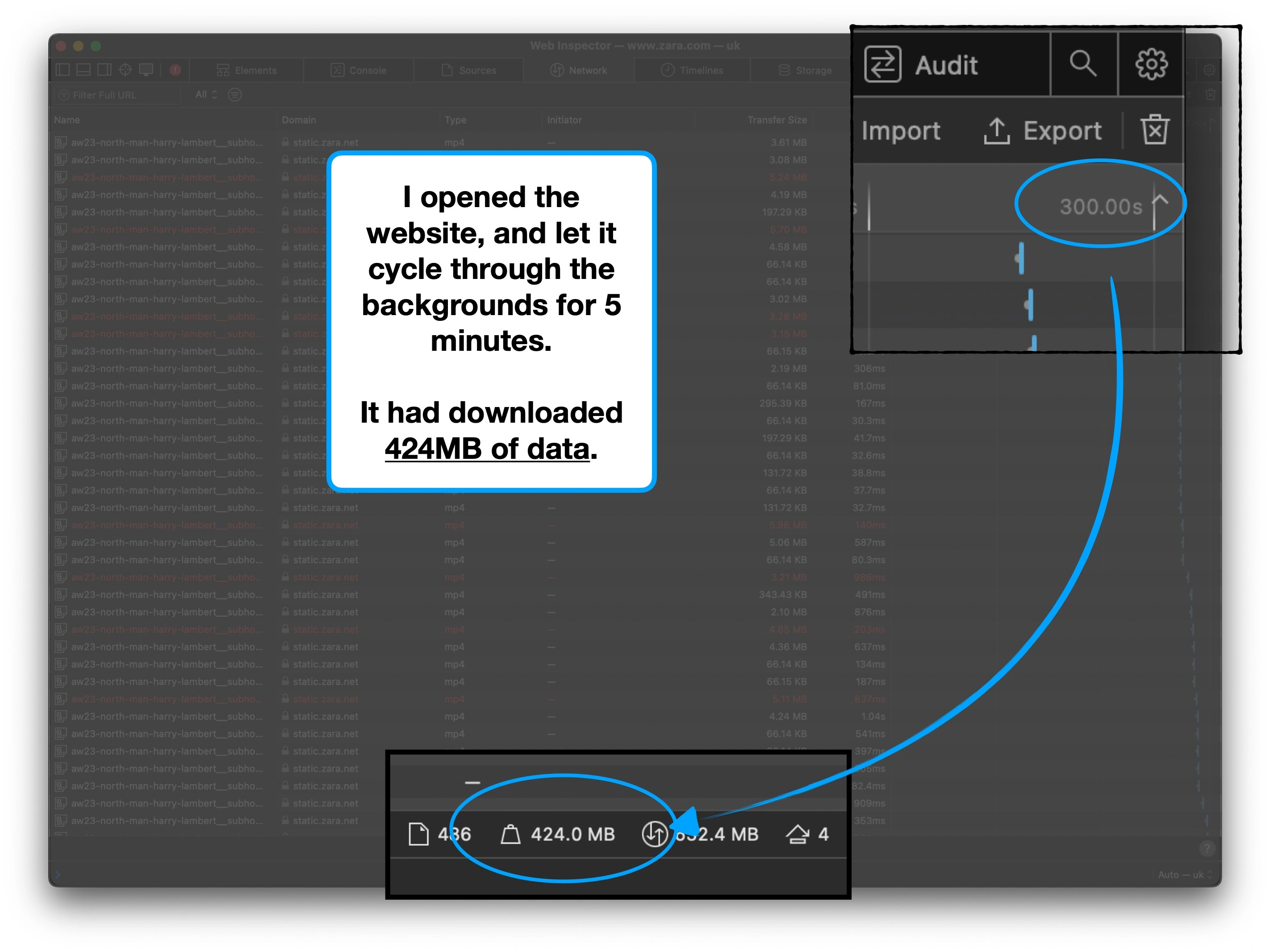
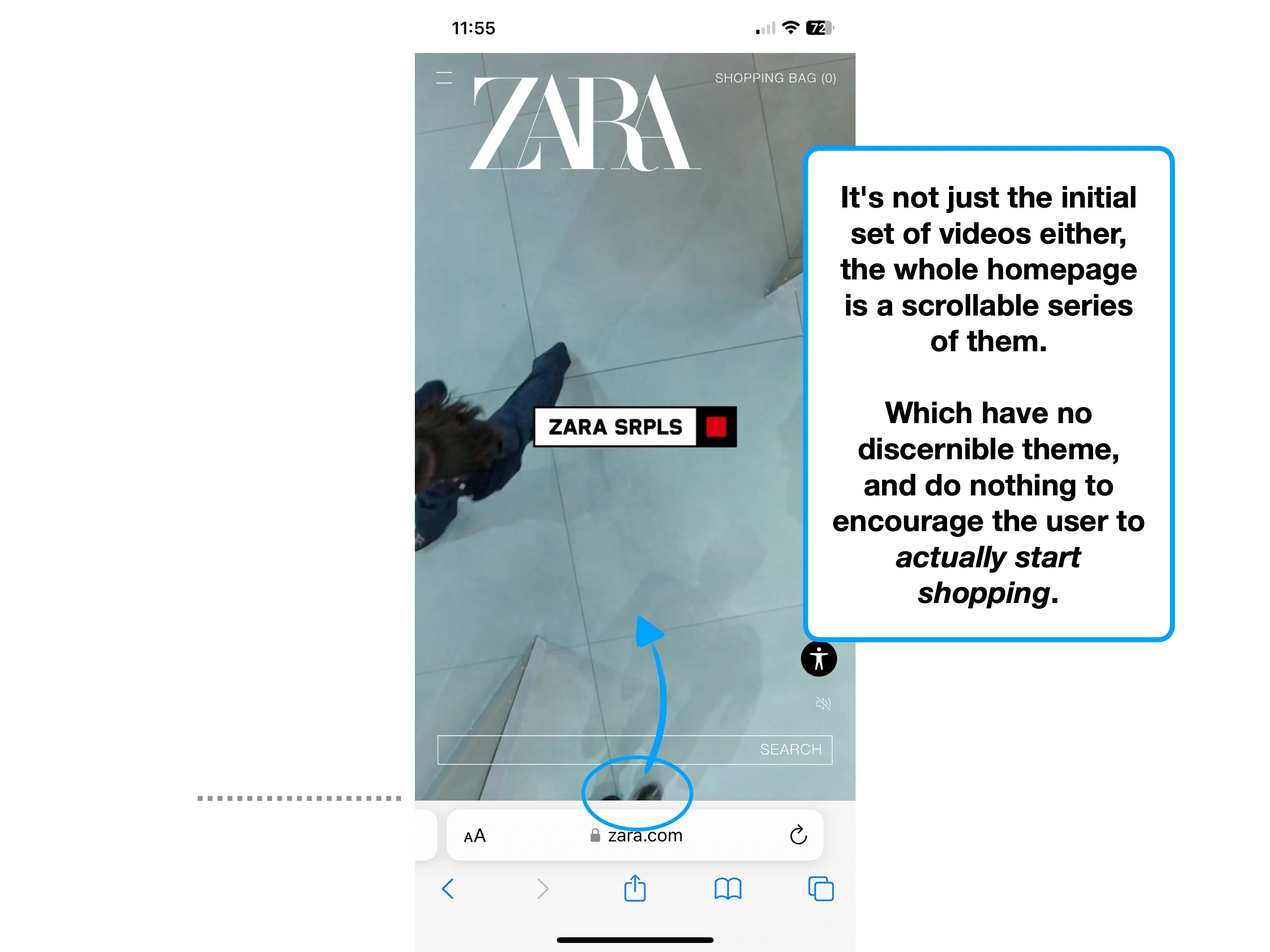
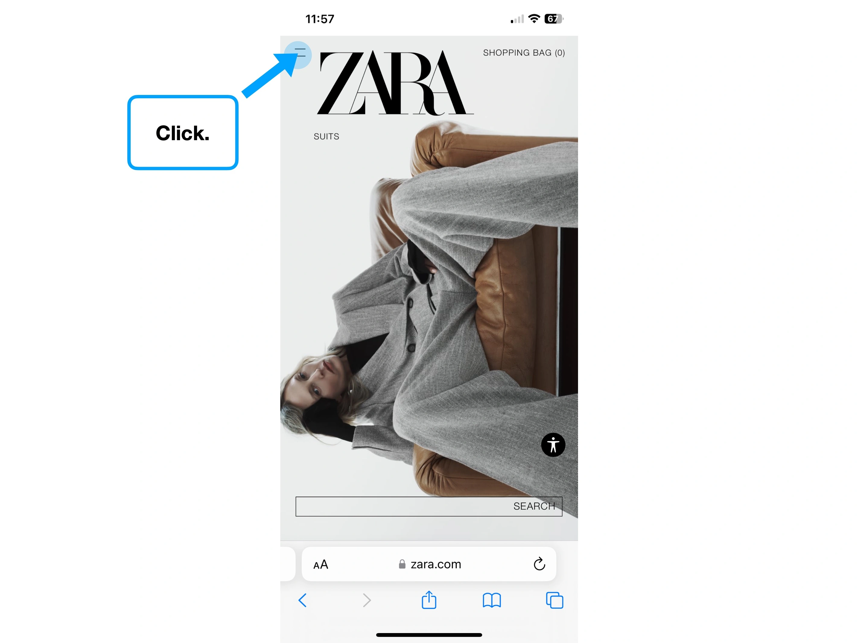
Below is a screen recording of their homepage, which hasn't been sped up or edited in any way.
As a challenge, try and read the text.
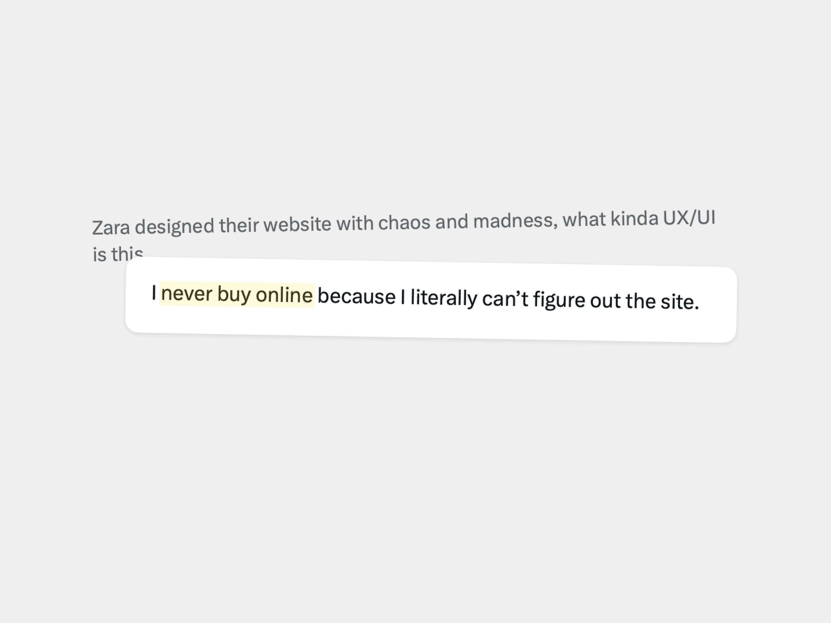
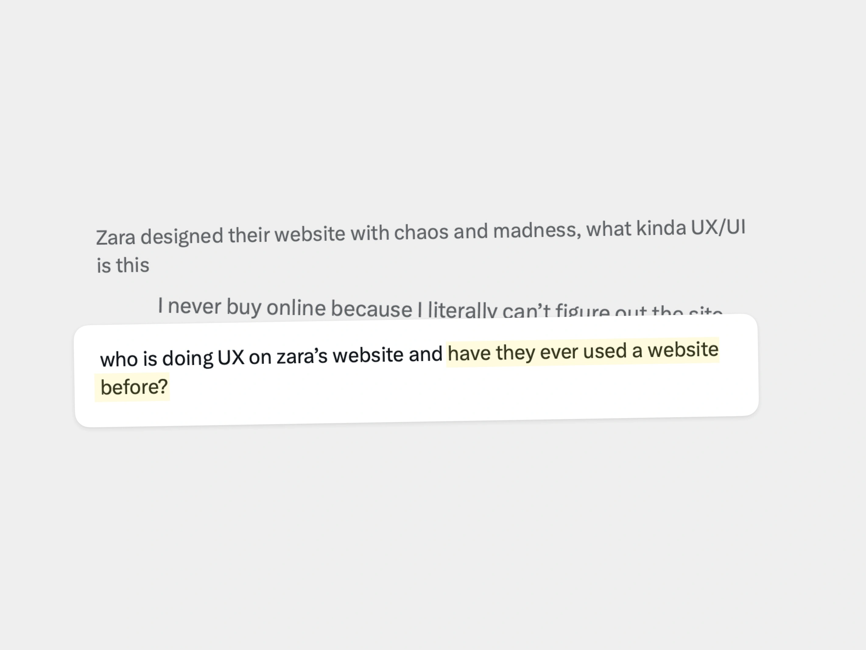
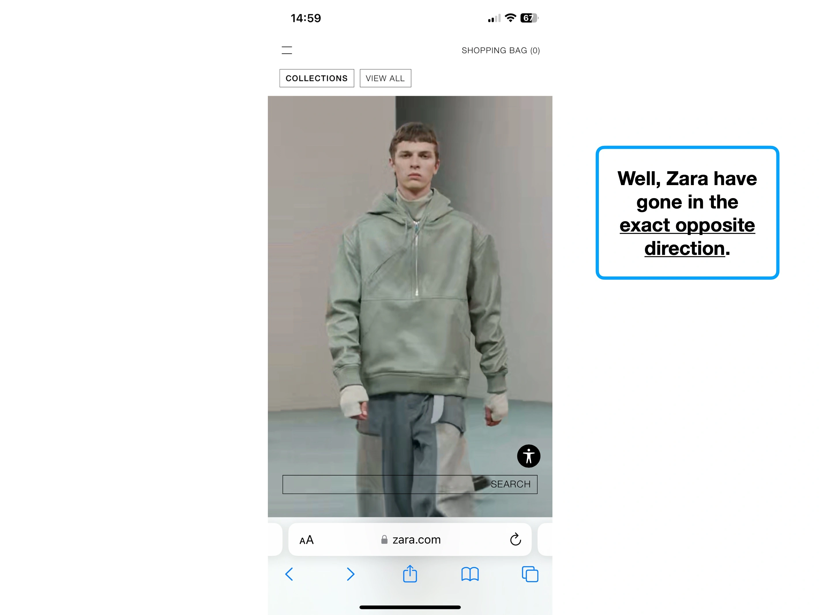
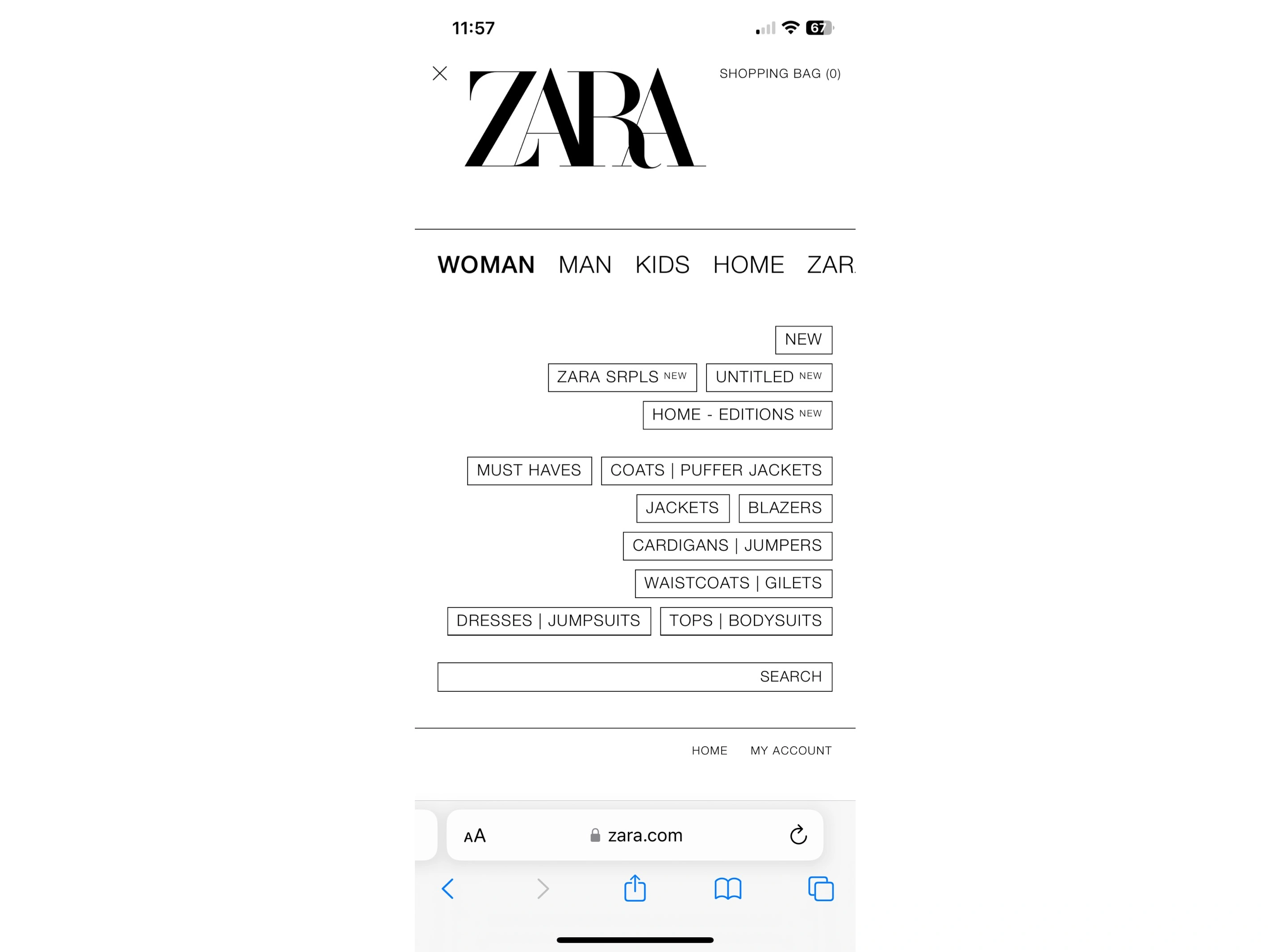
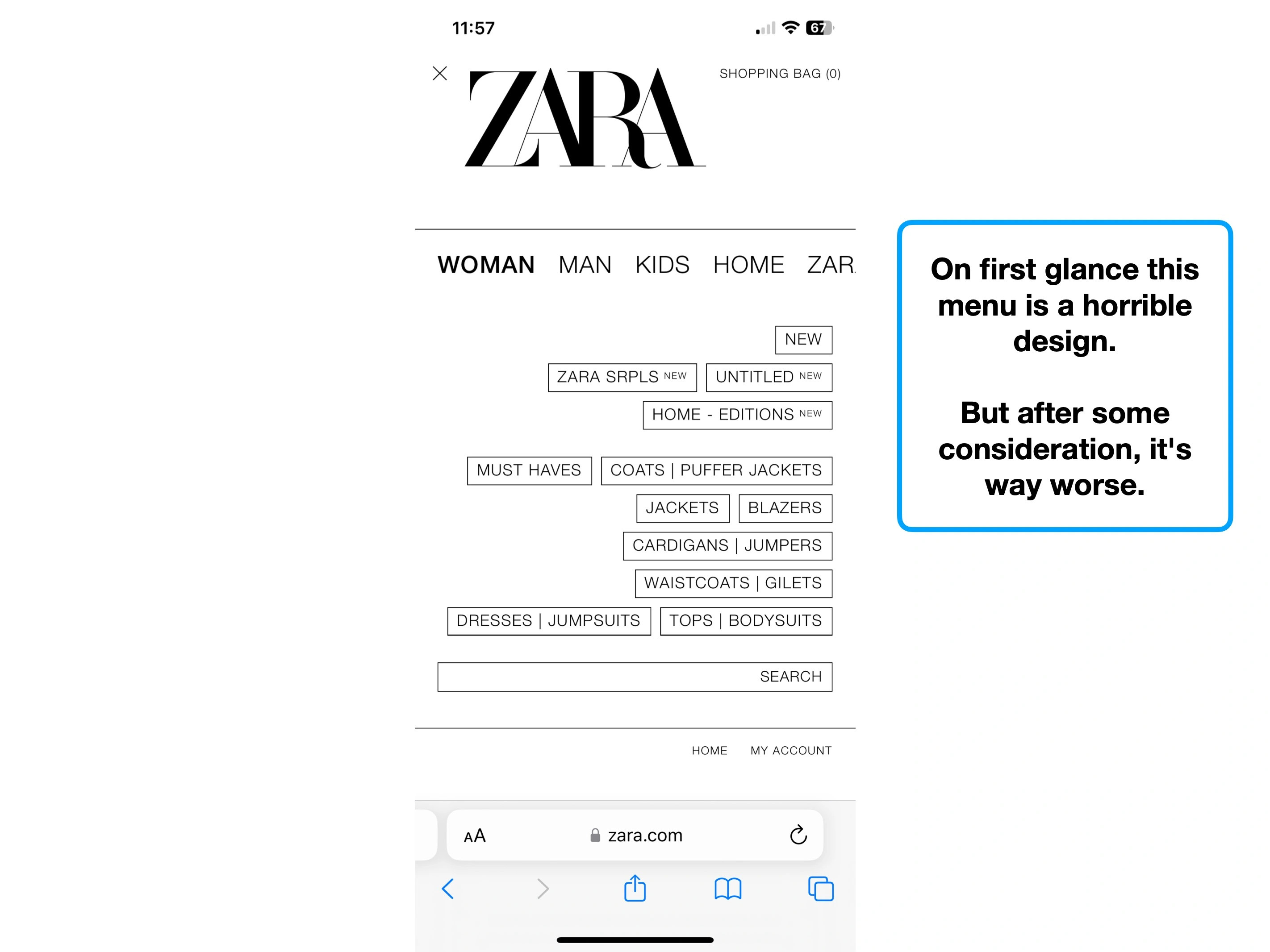
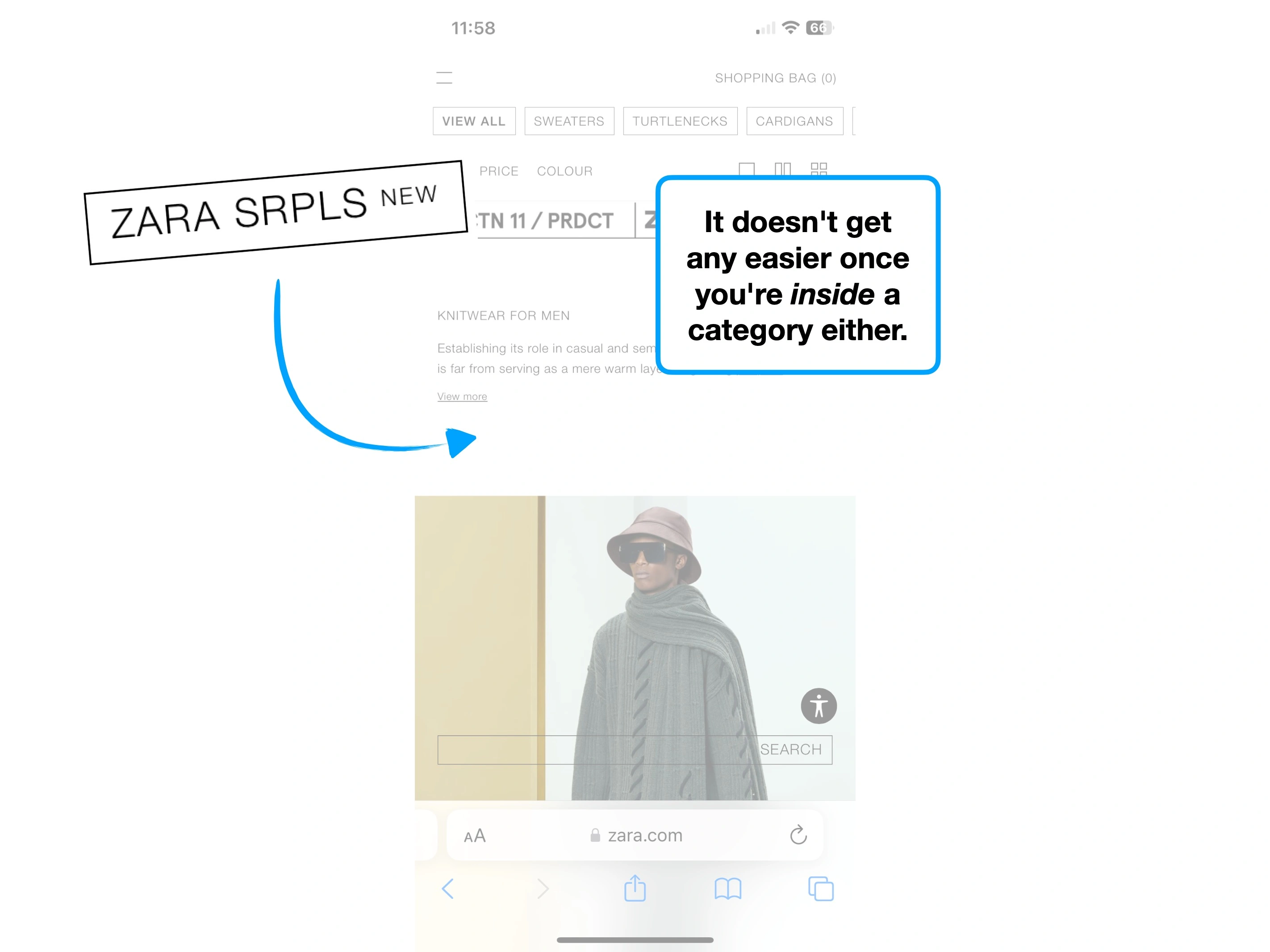
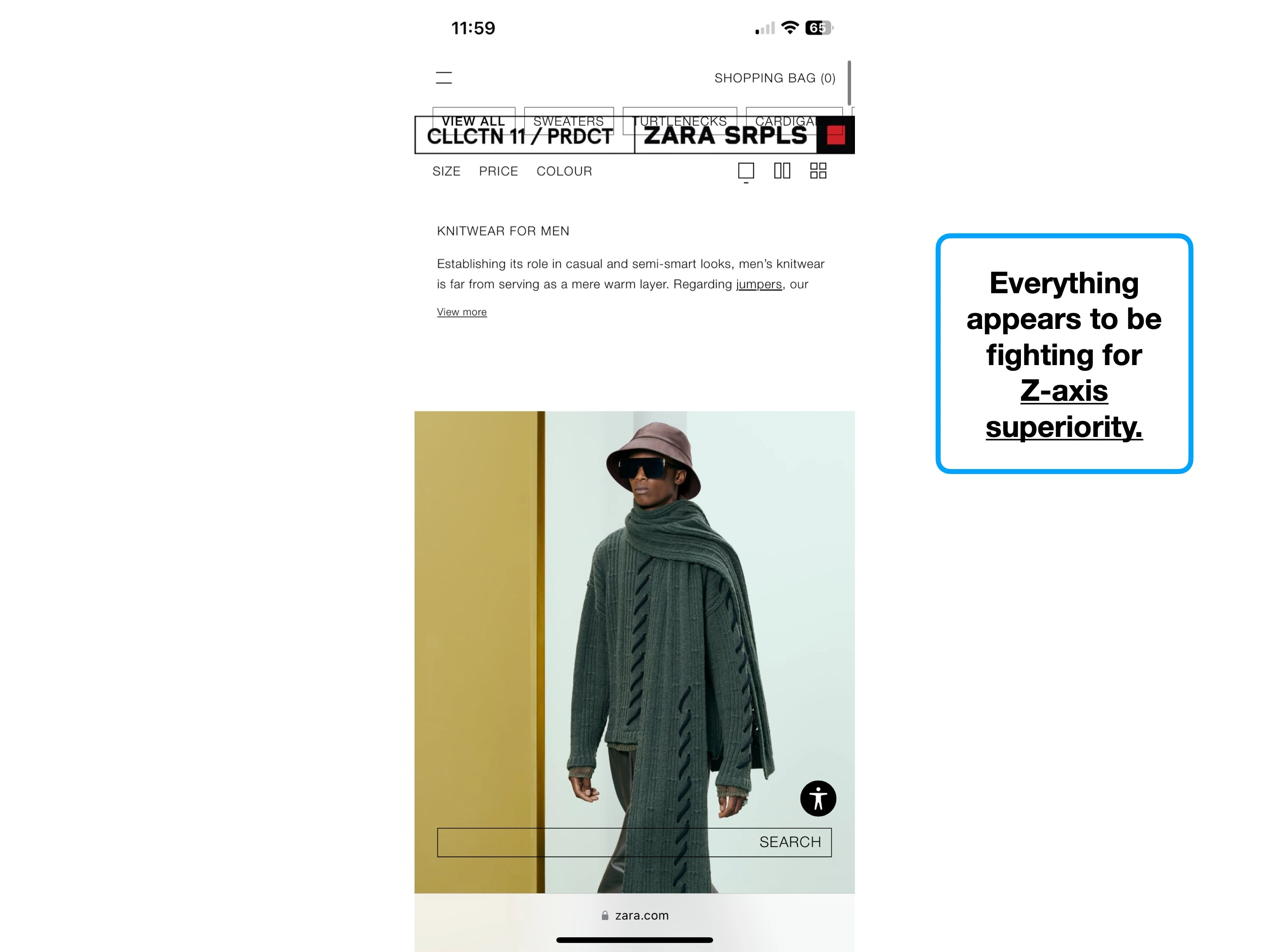
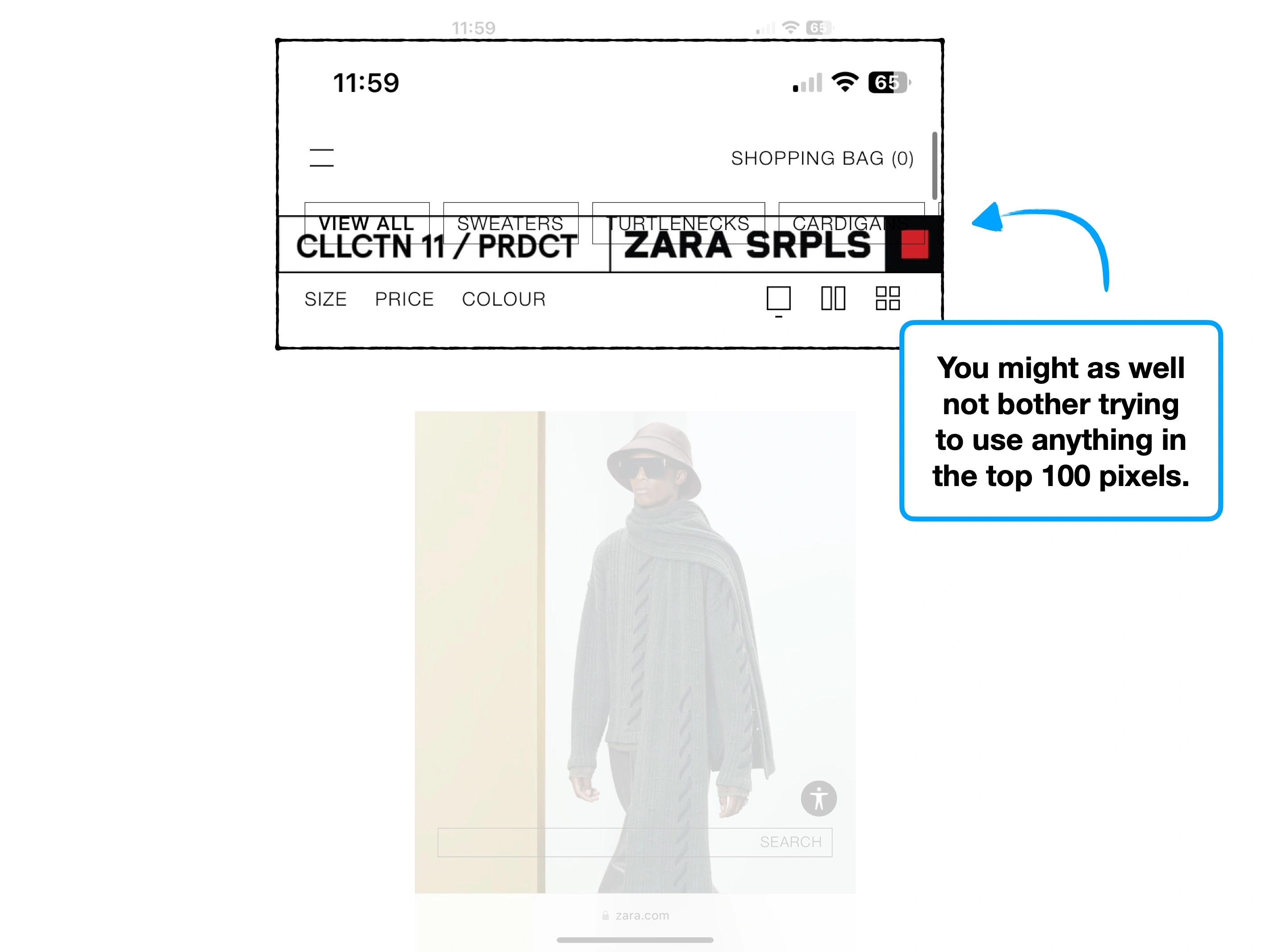
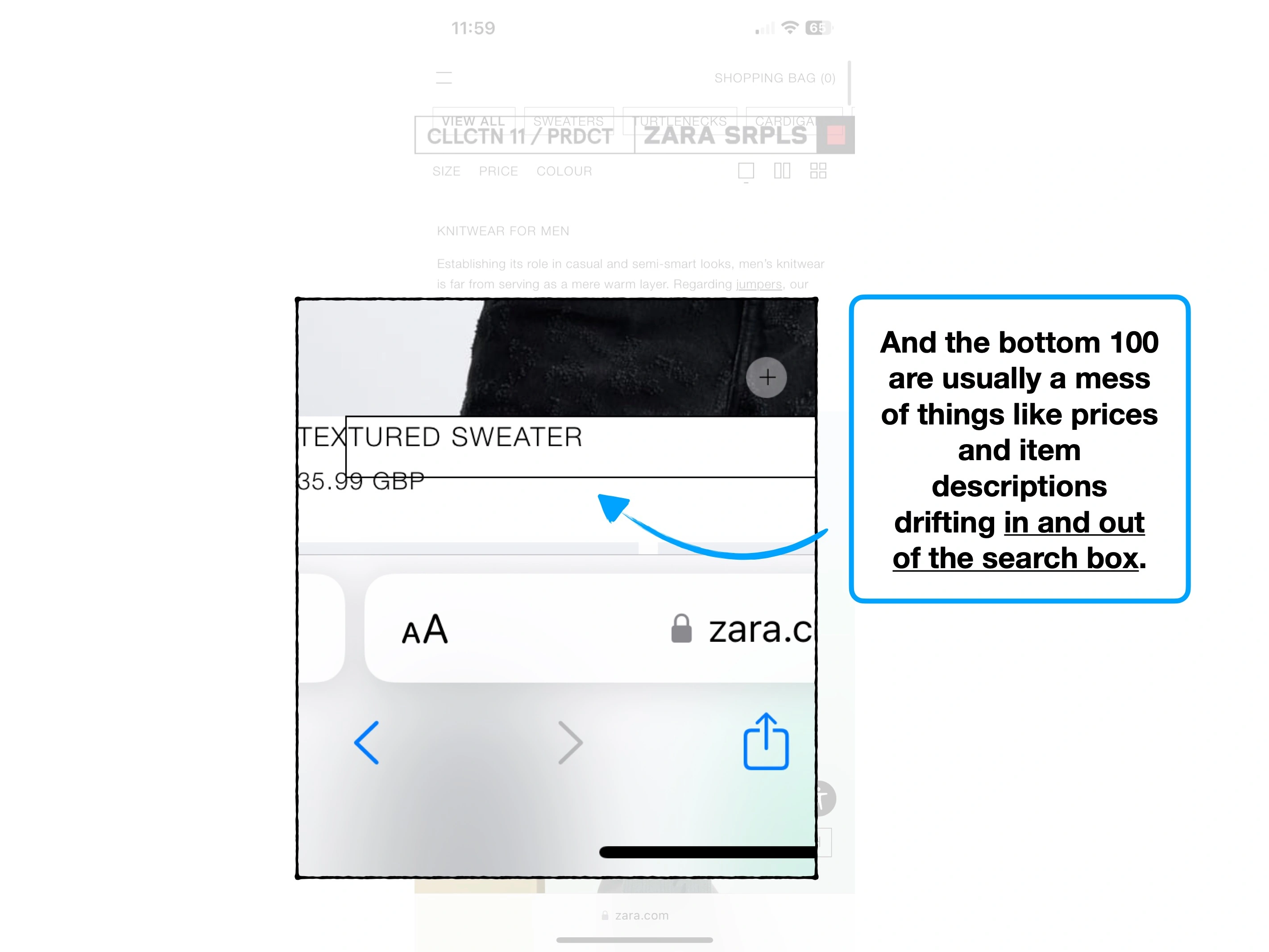
Let's be clear; this is a digital interpretation of a fashion brochure, and it suffers in almost every way.
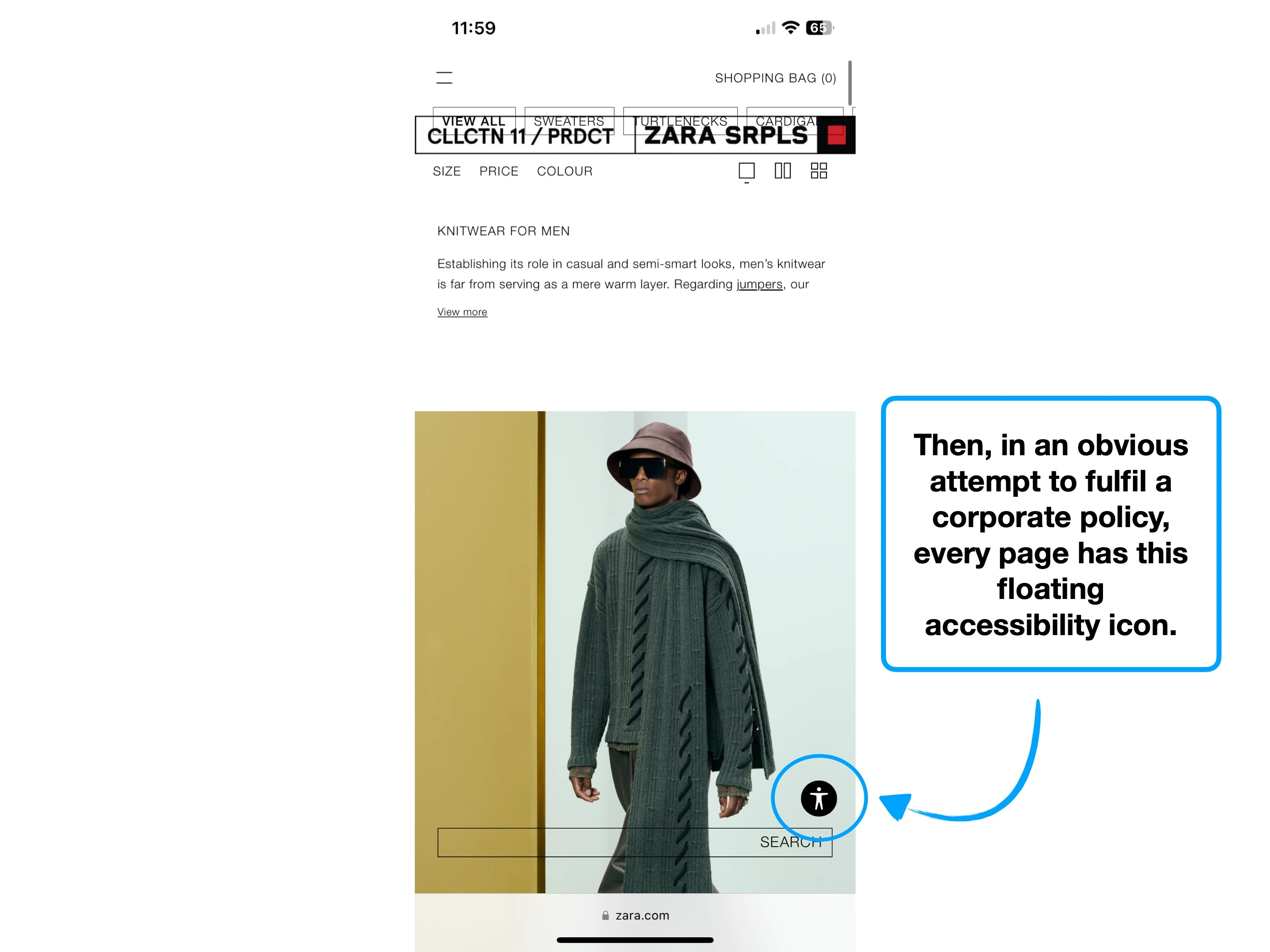
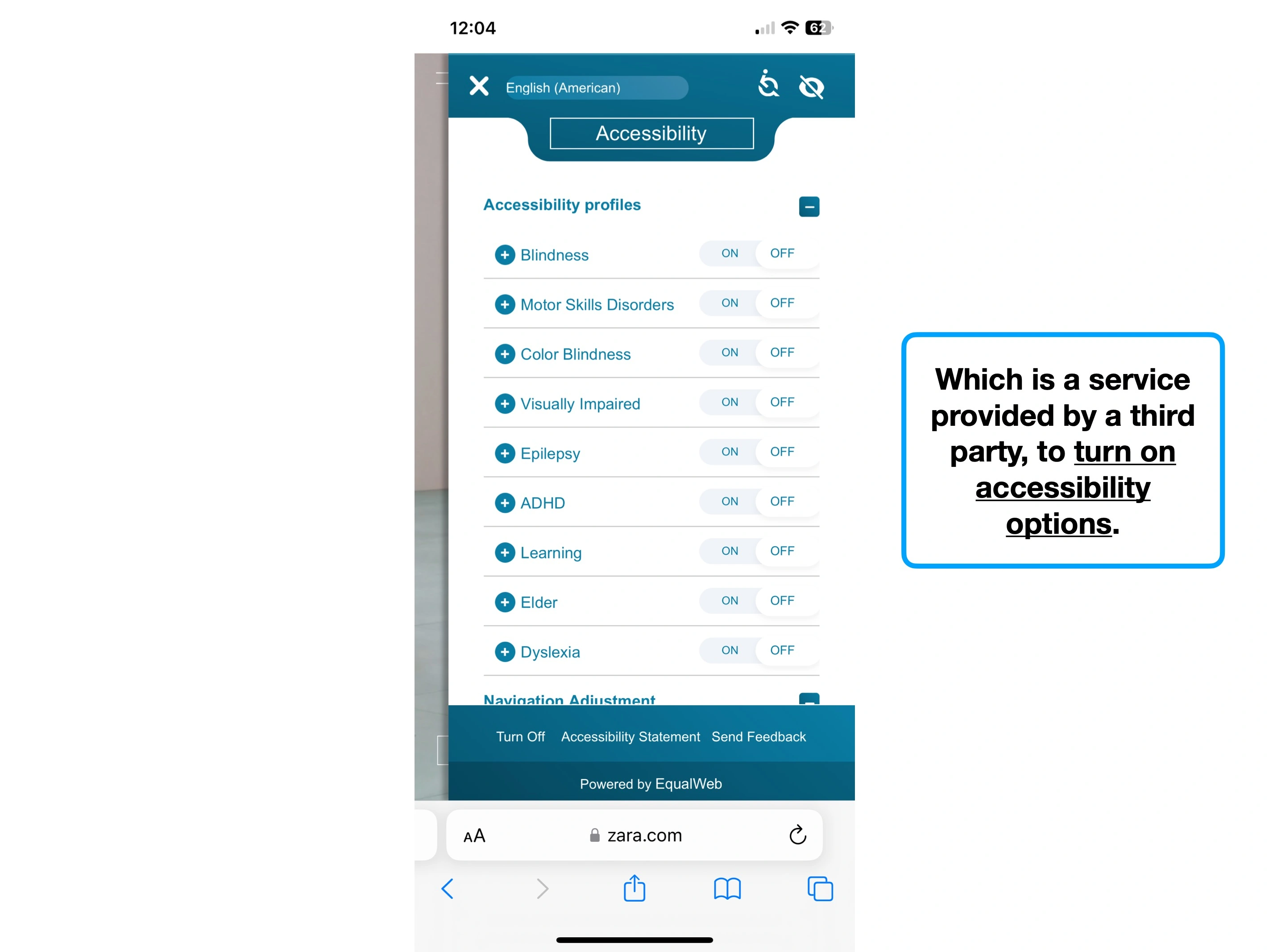
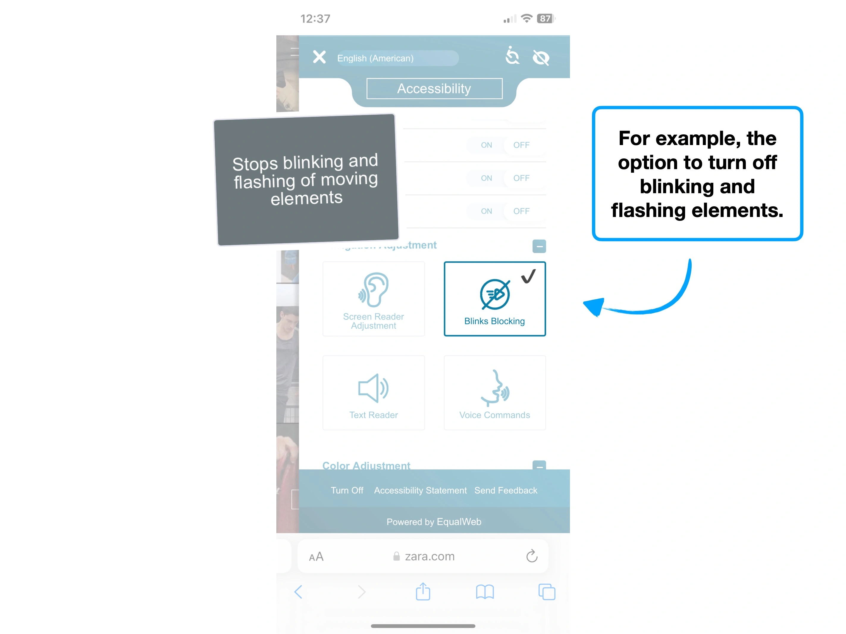
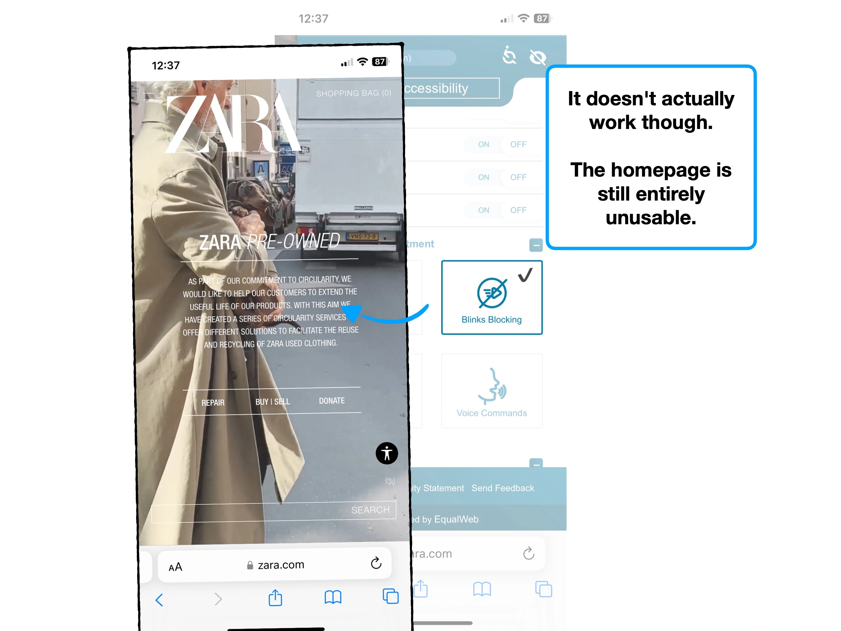
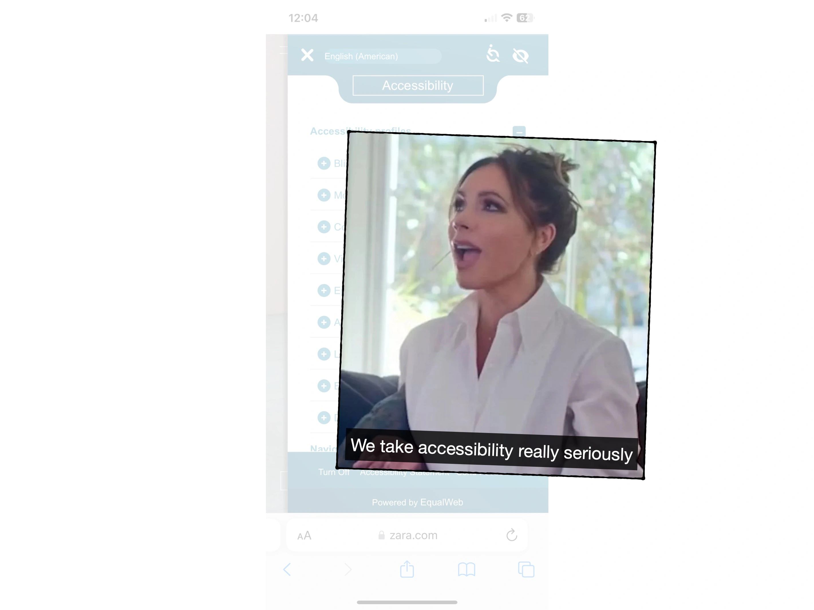
It's barely readable, it's distracting, it's unnecessary and it's constantly fighting common sense and accessibility, in the pursuit of being on-brand.
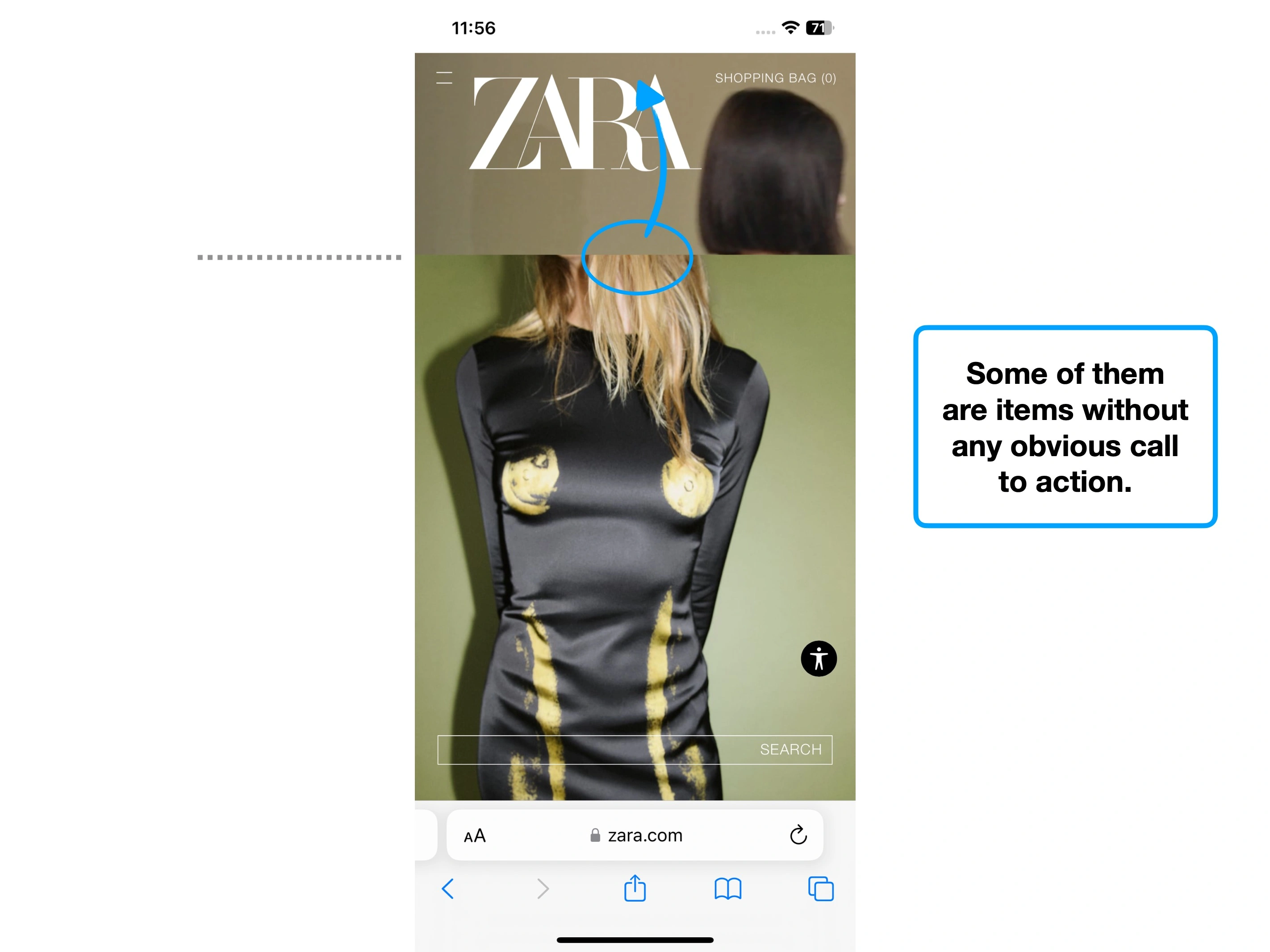
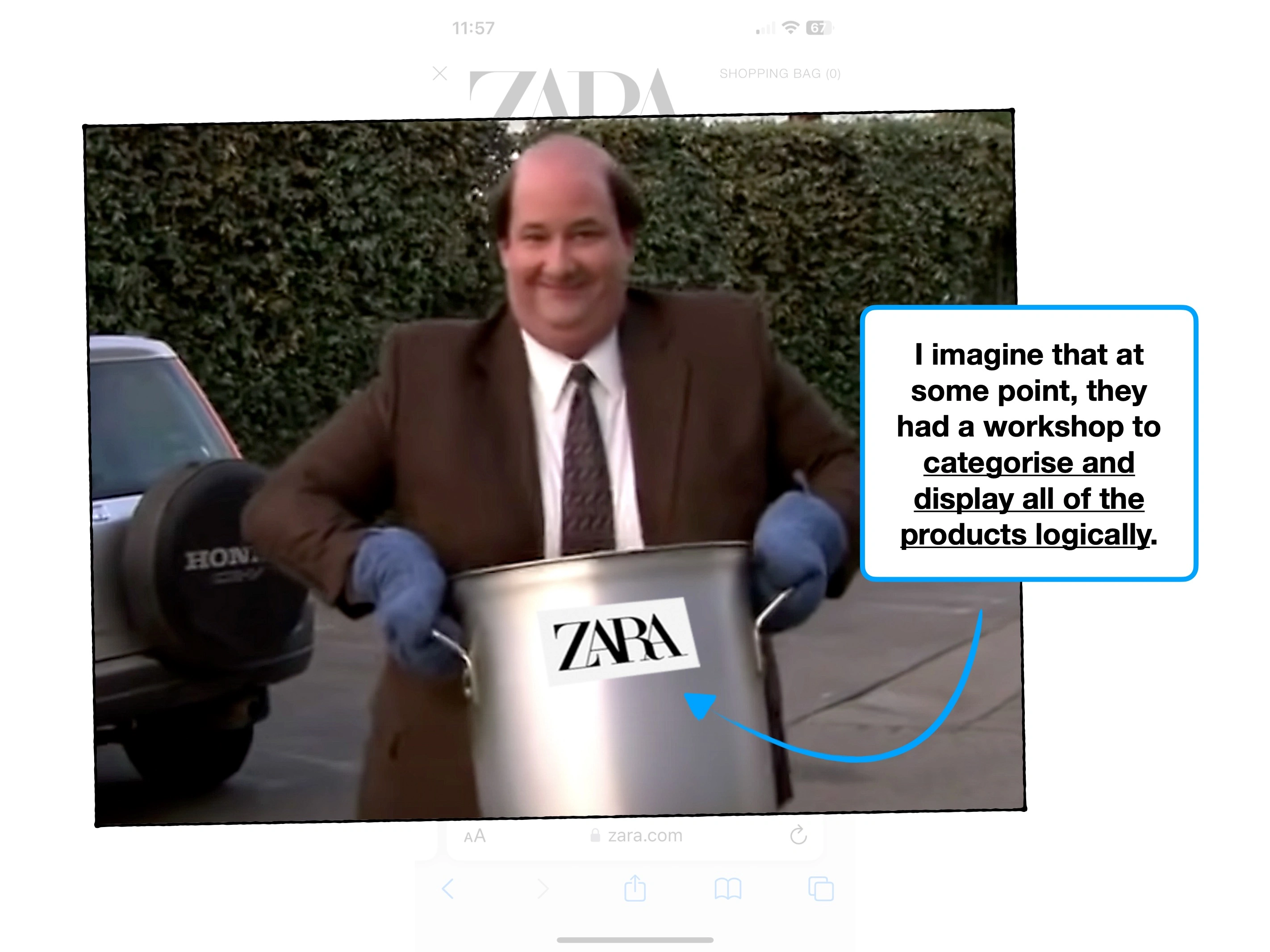
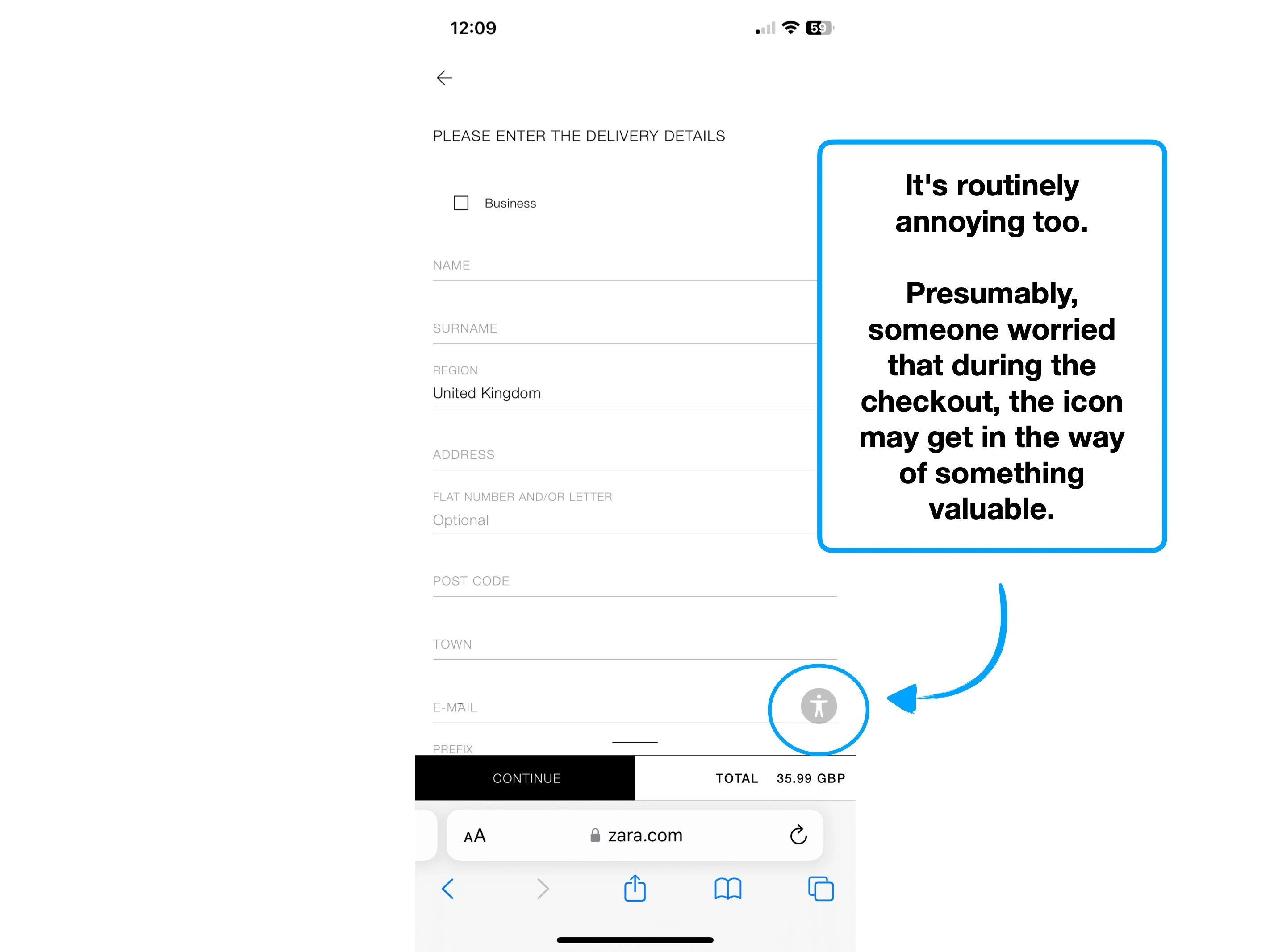
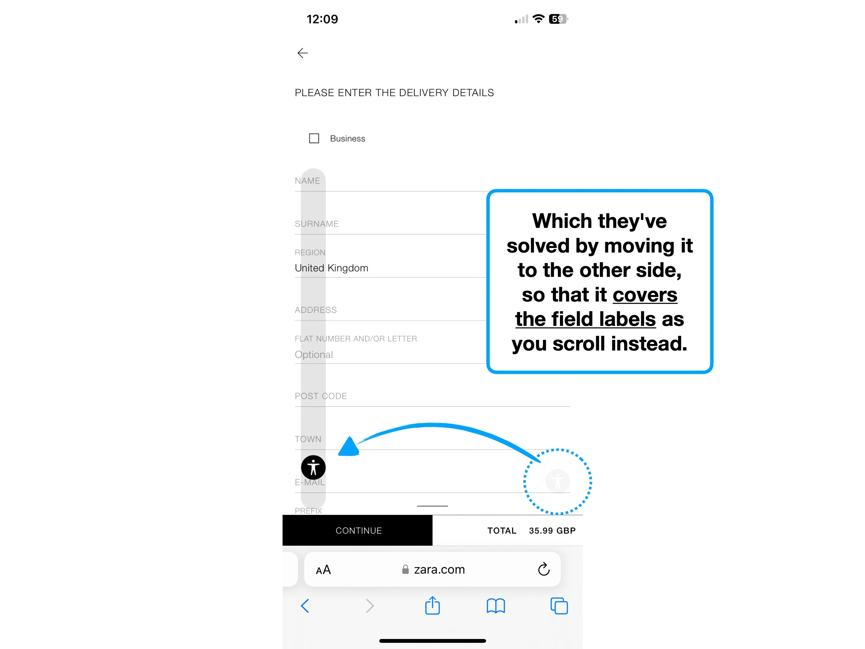
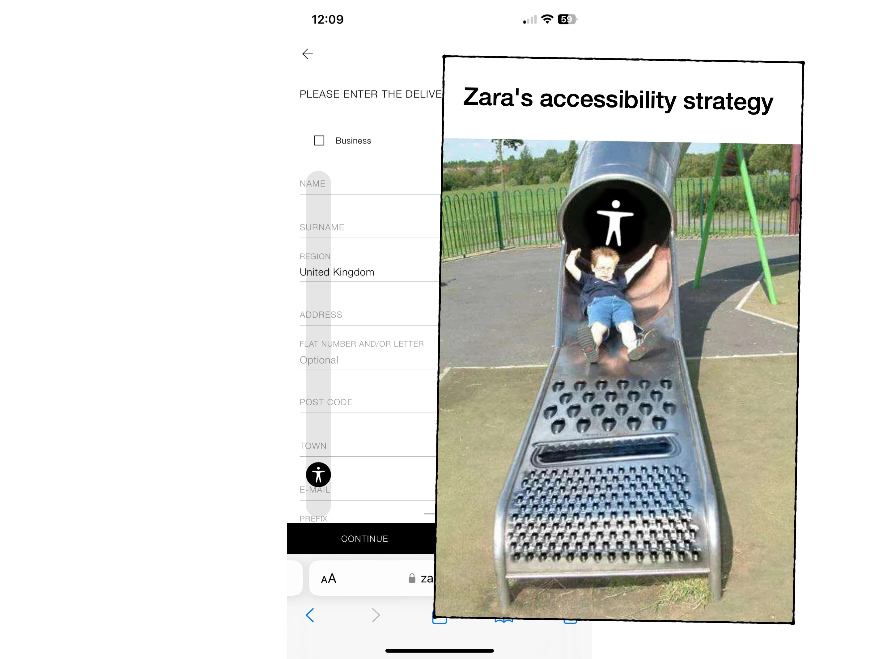
It'd be hard to justify that allowing key components to overlap, as shown in the screenshots below, has been built with user experience in mind.


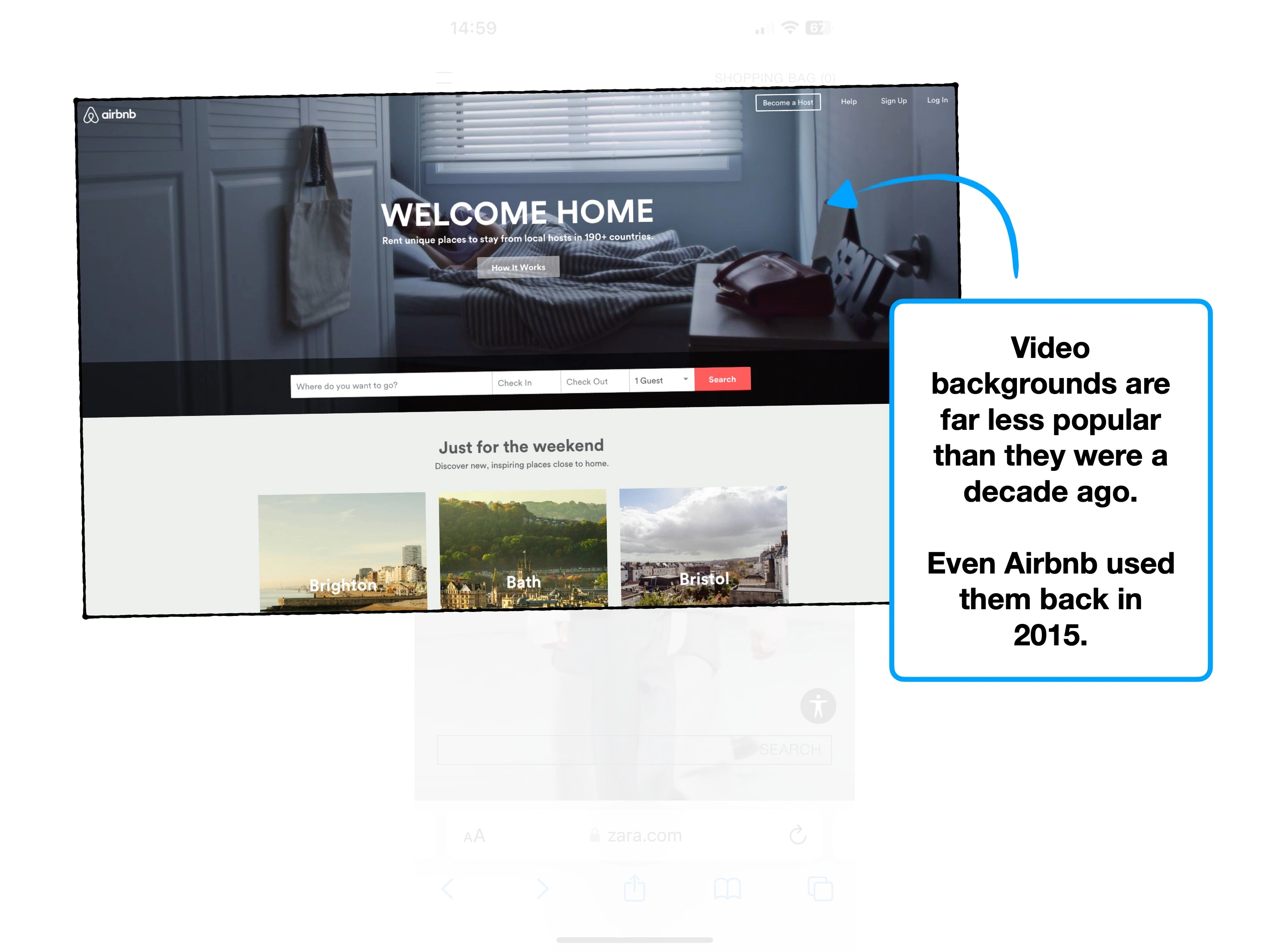
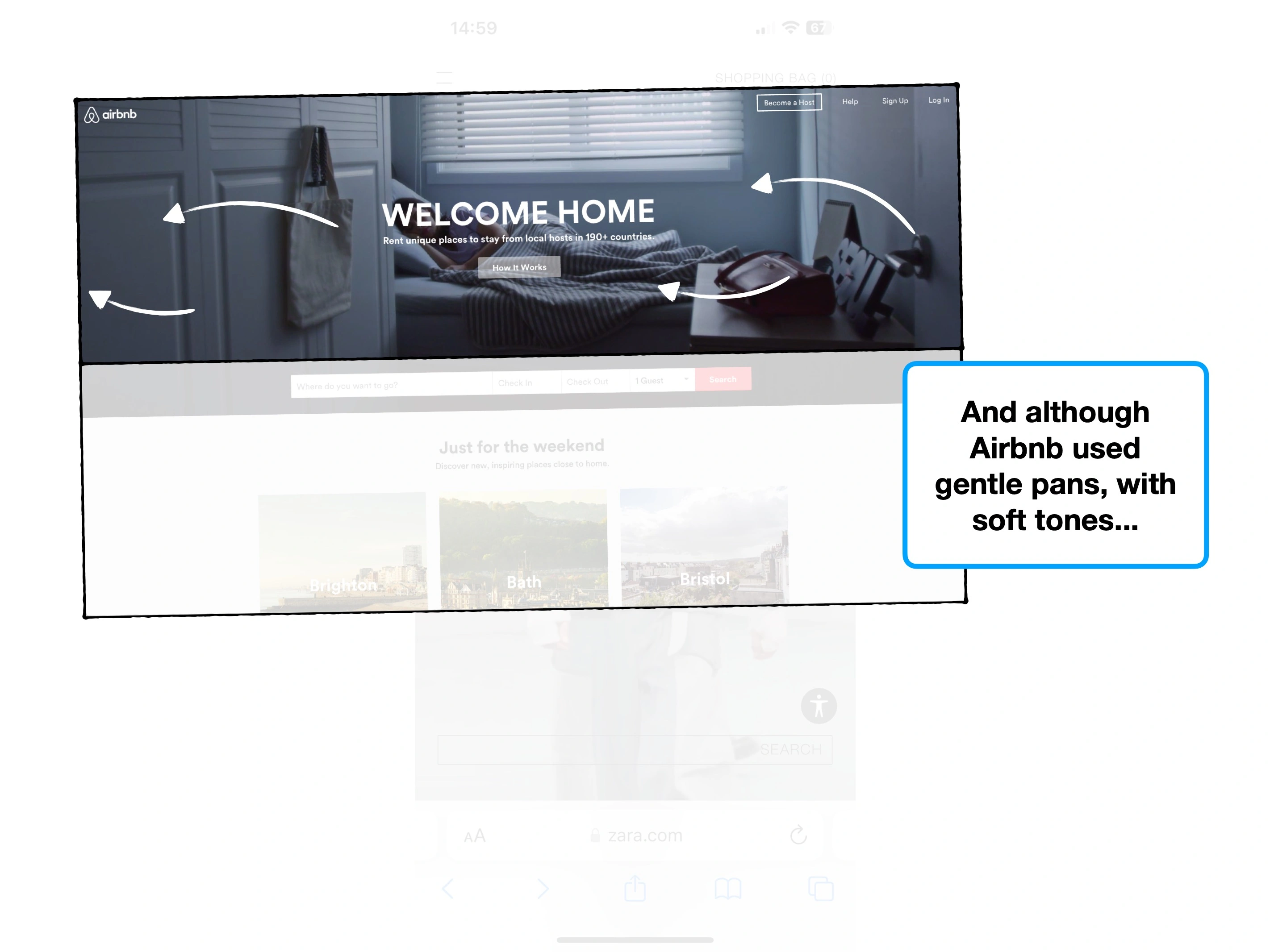
The takeaway here, is that overly-stylised designs tend to be harder to use. And it's okay to lean on what feels familiar, and works well.
Trends change, fashion changes, and your homepage changes, but design principles rarely do, because they're rooted in human biases.
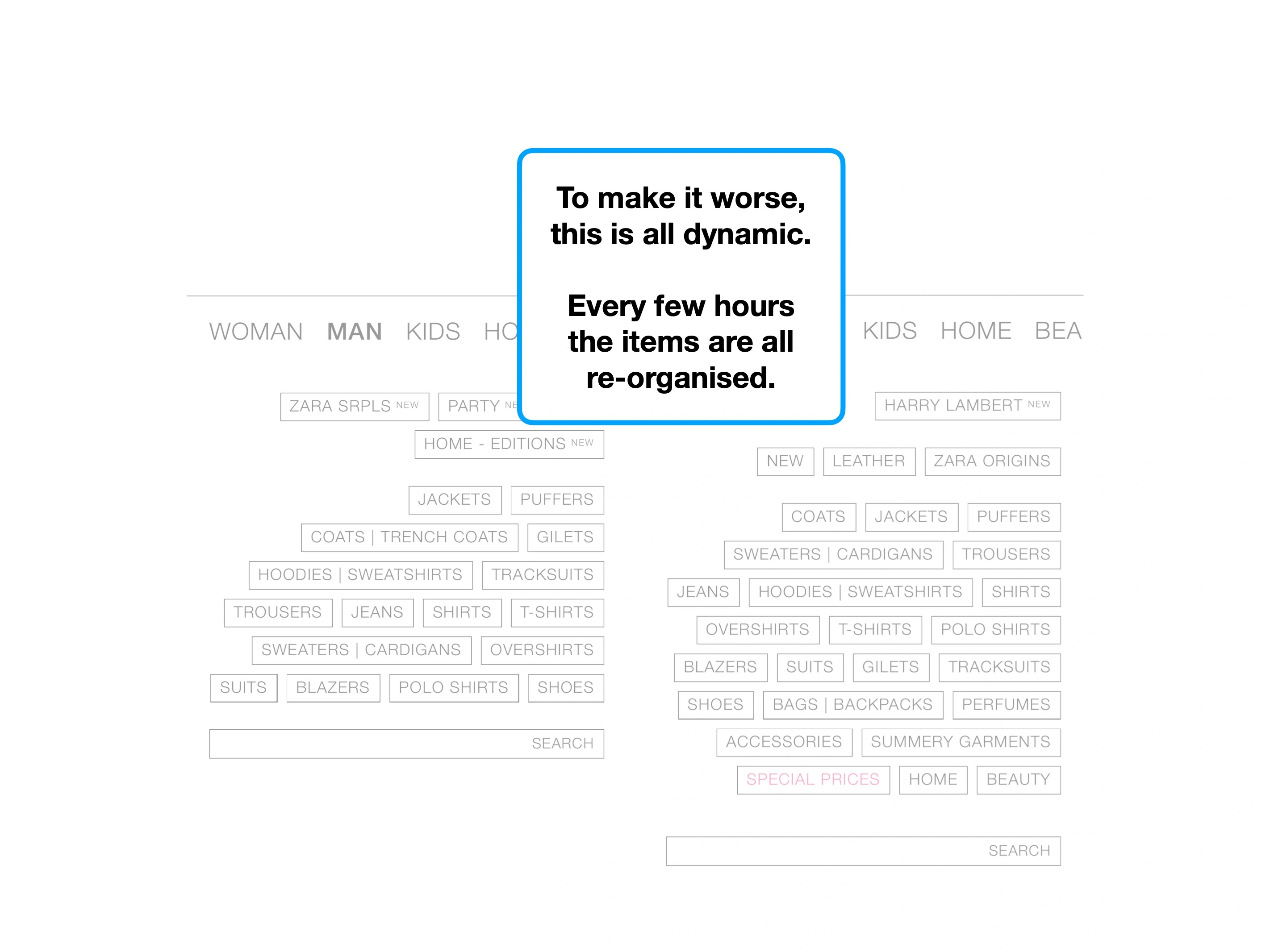
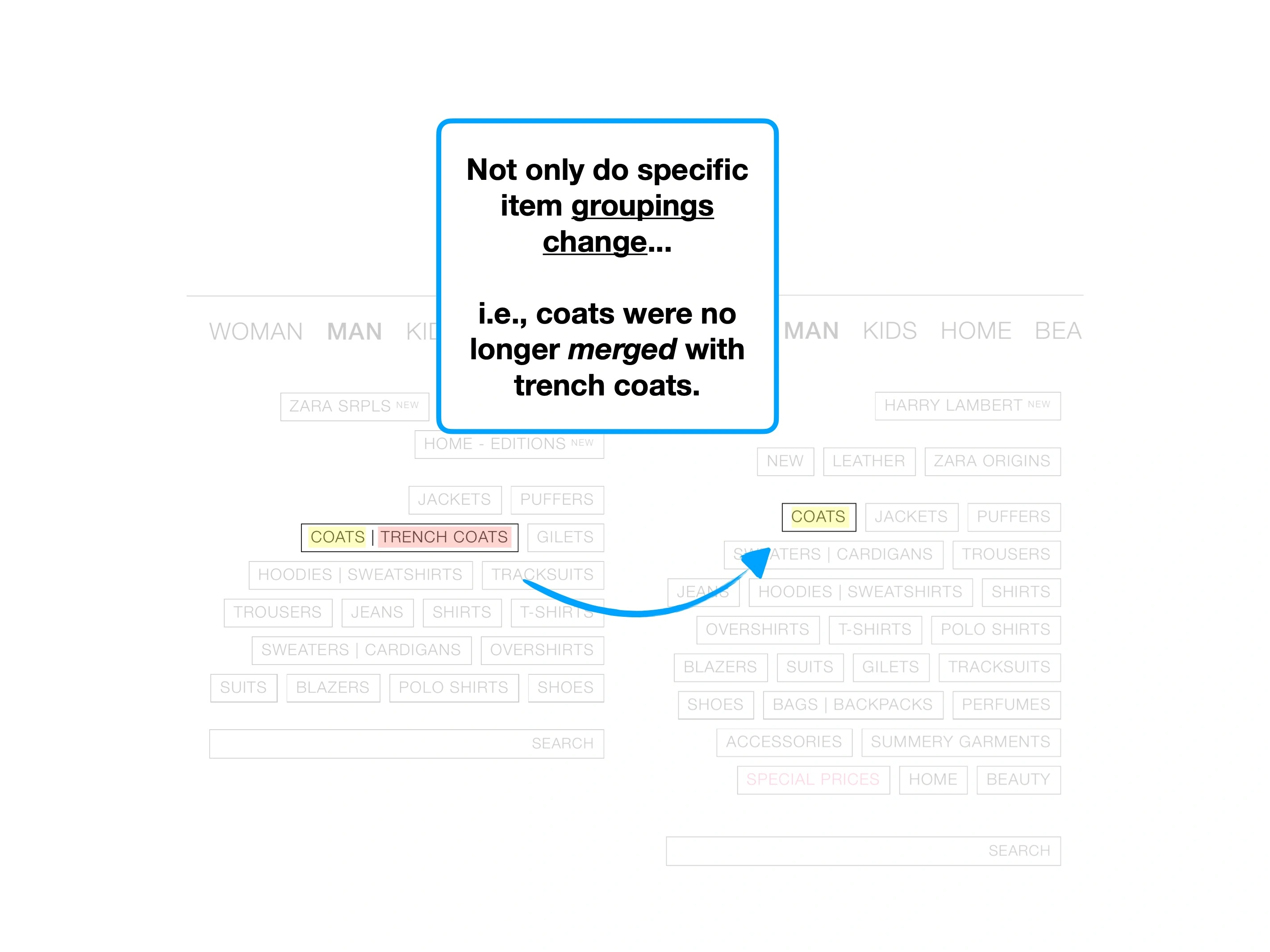
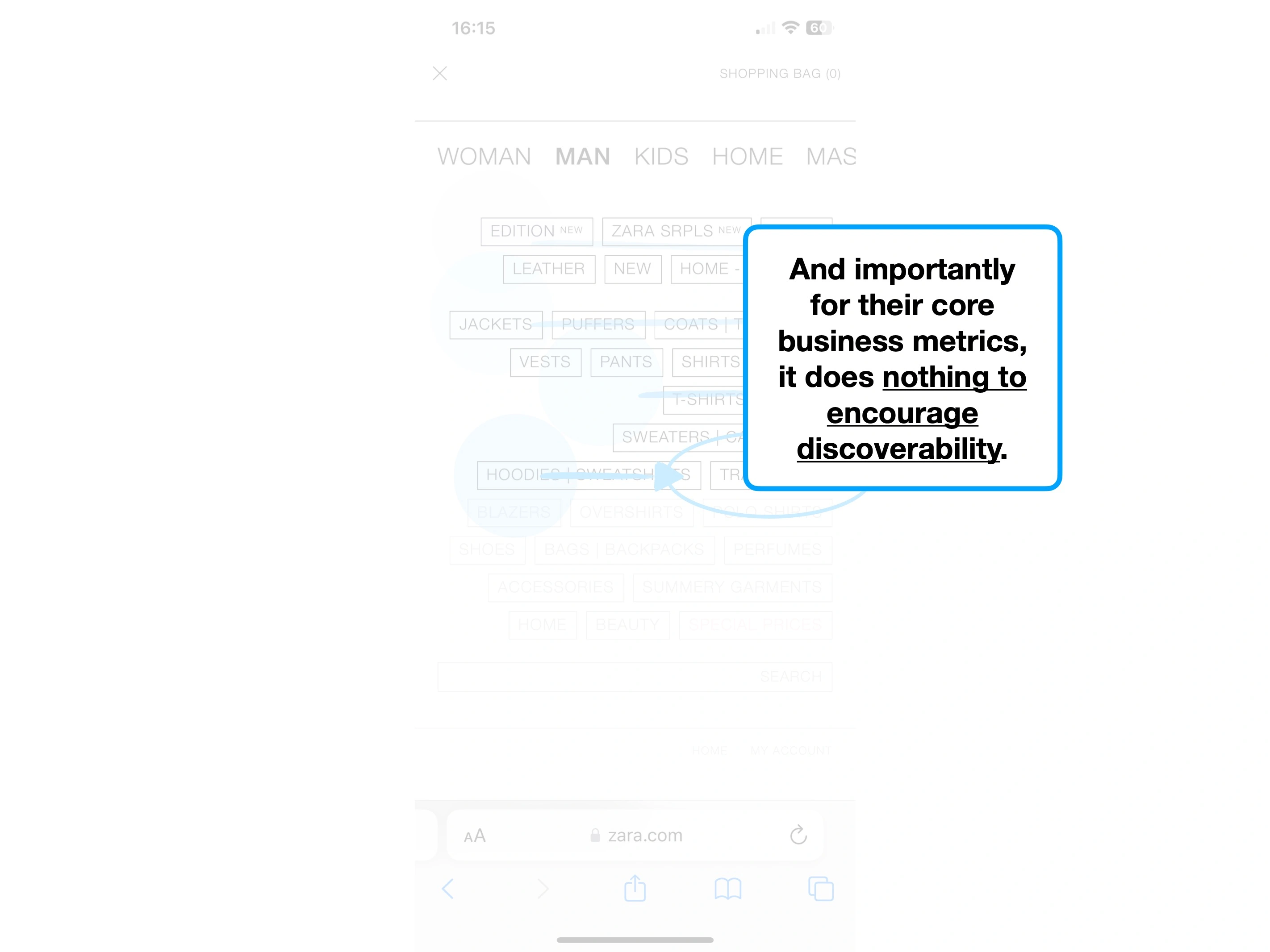
2. Nothing matters
In design, hierarchy creates order.
In turn, this helps people sift through millions of pixels in an instant, and optimise what they should care about the most.
i.e., where they should focus their attention.
It's why titles are more prominent, why we use formatting in text, and why buttons are coloured.
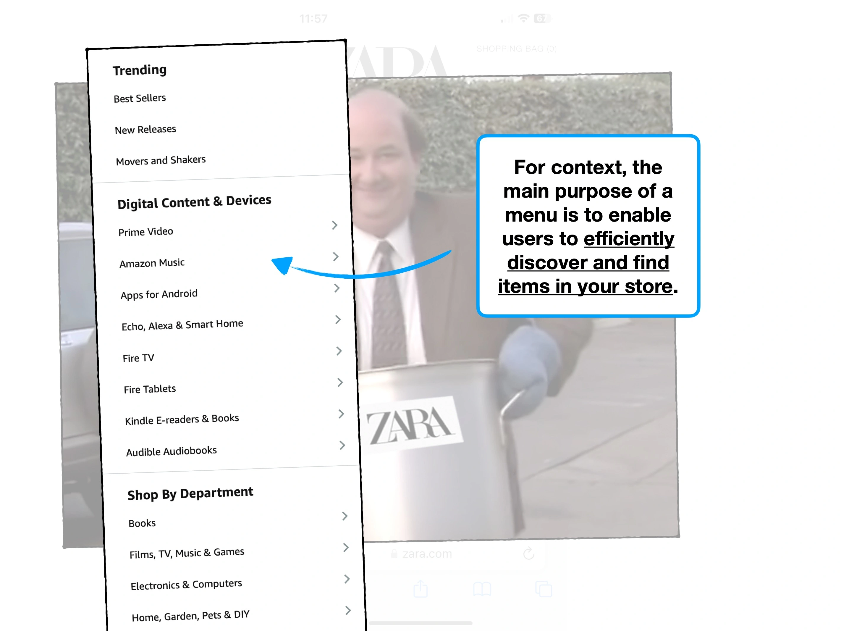
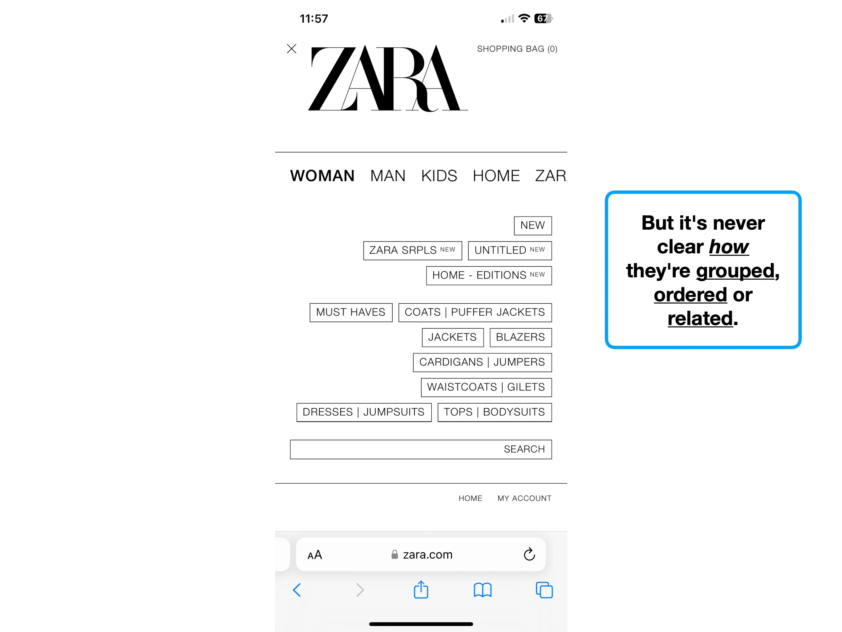
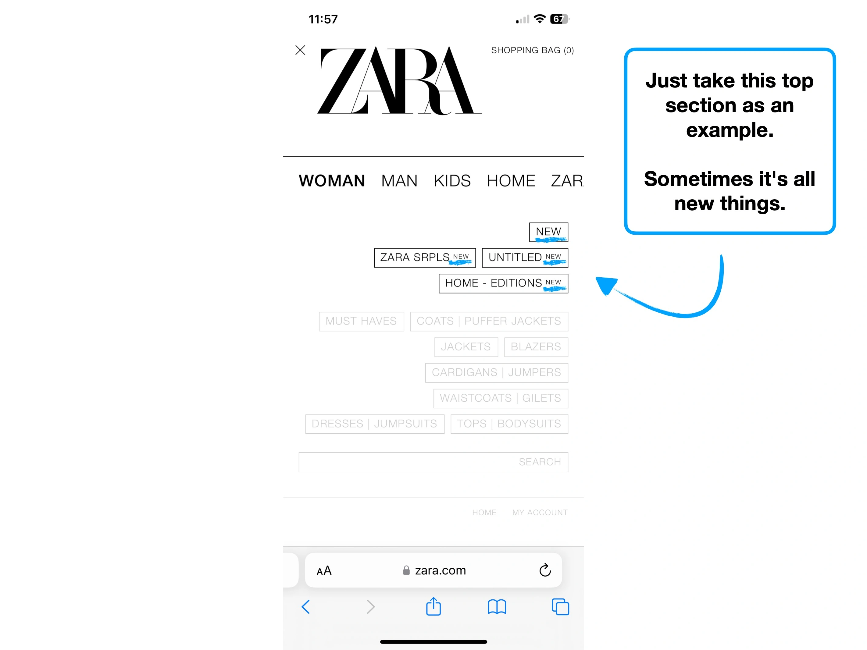
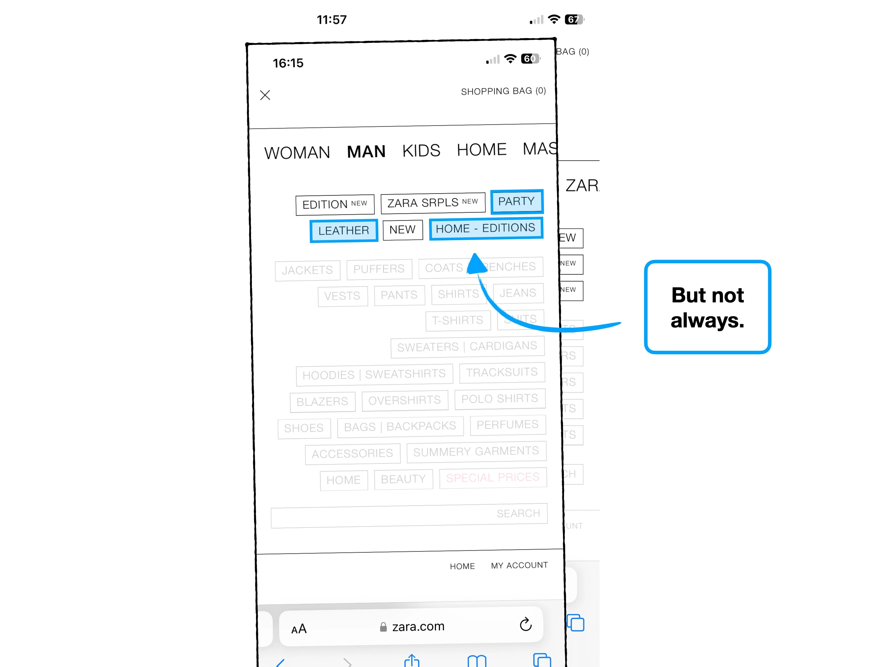
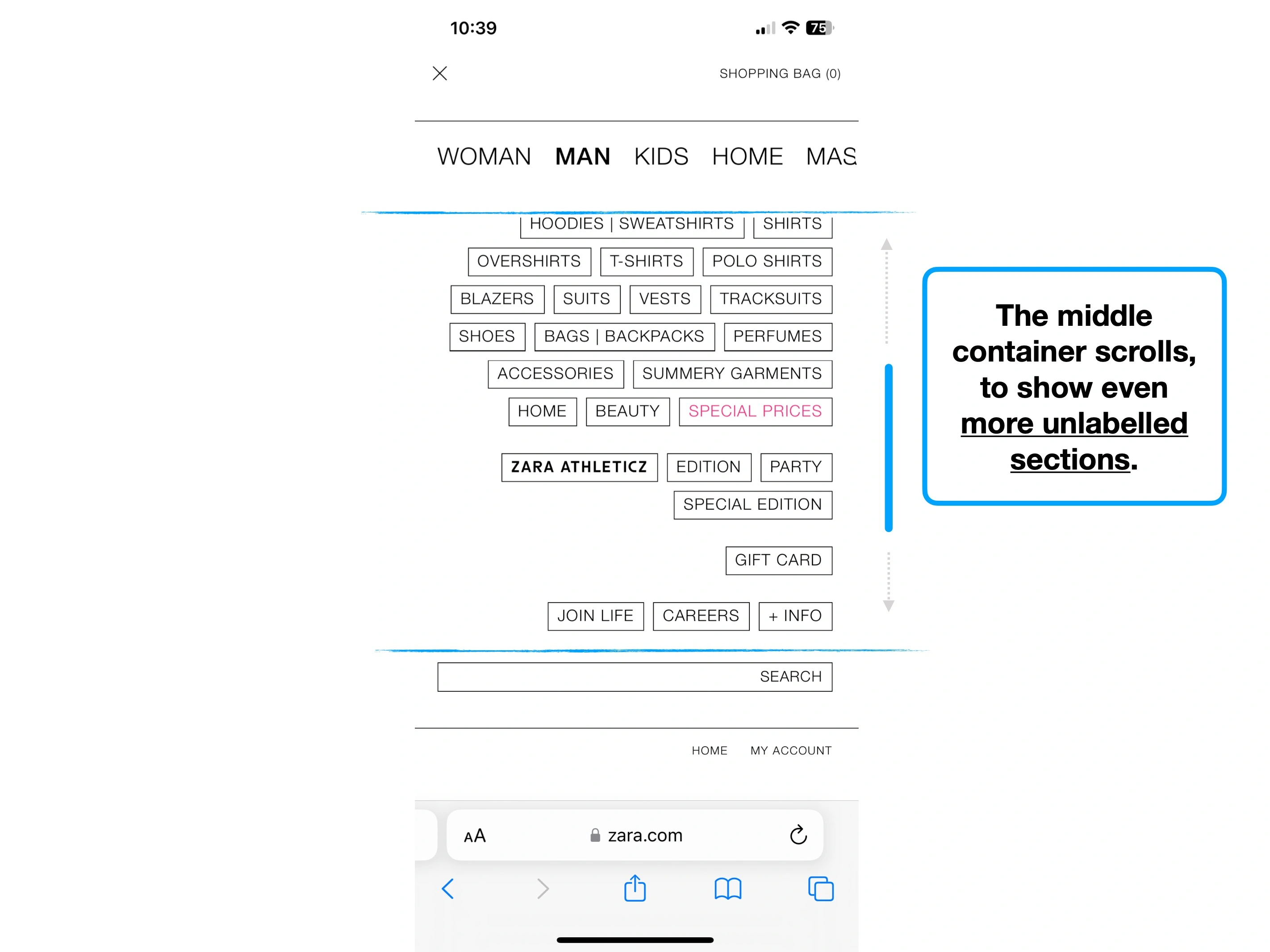
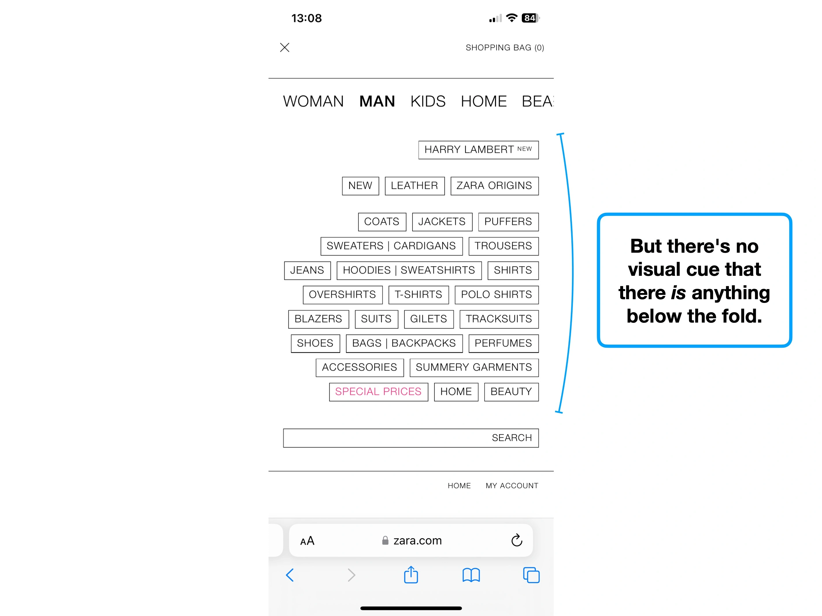
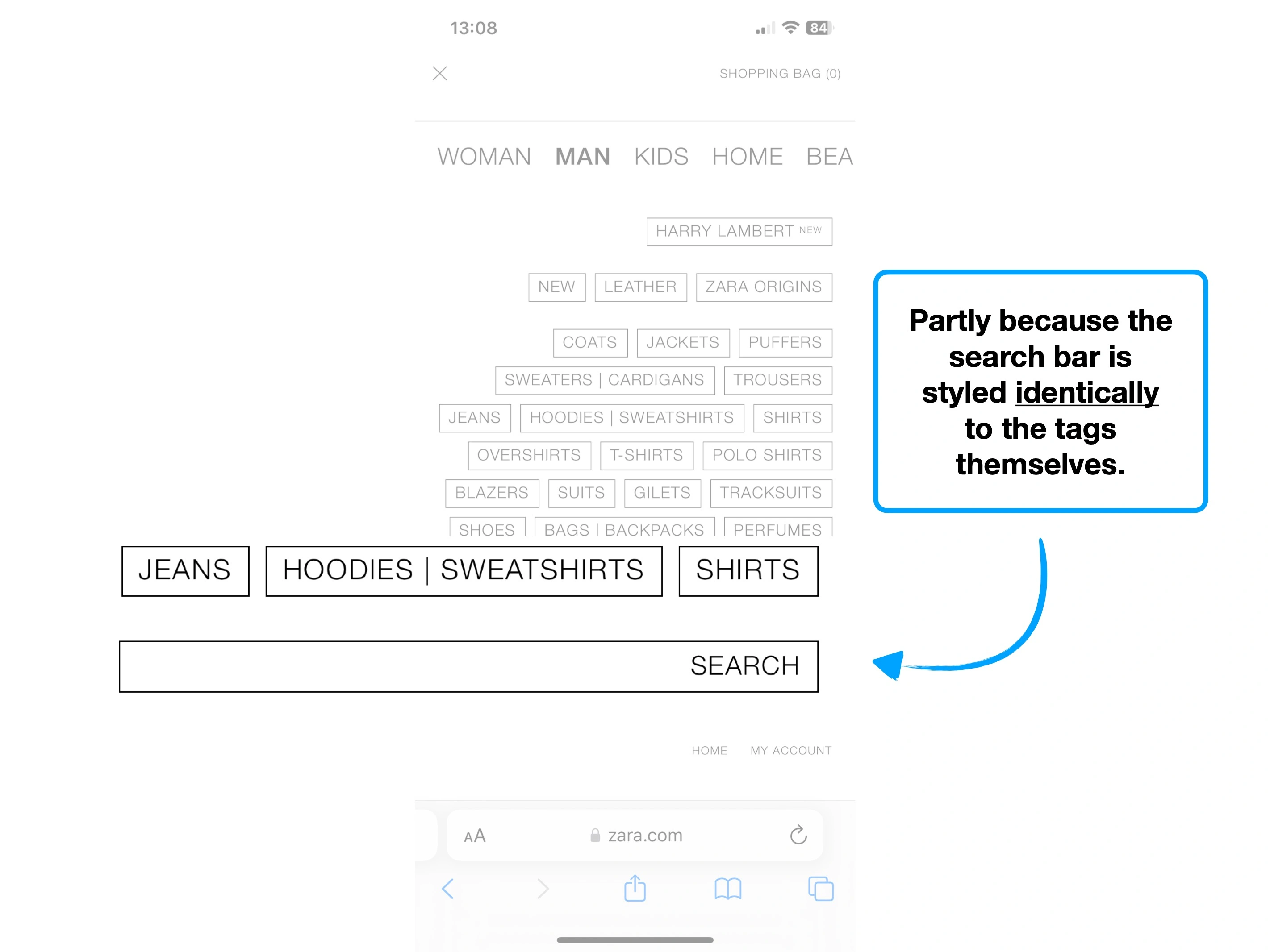
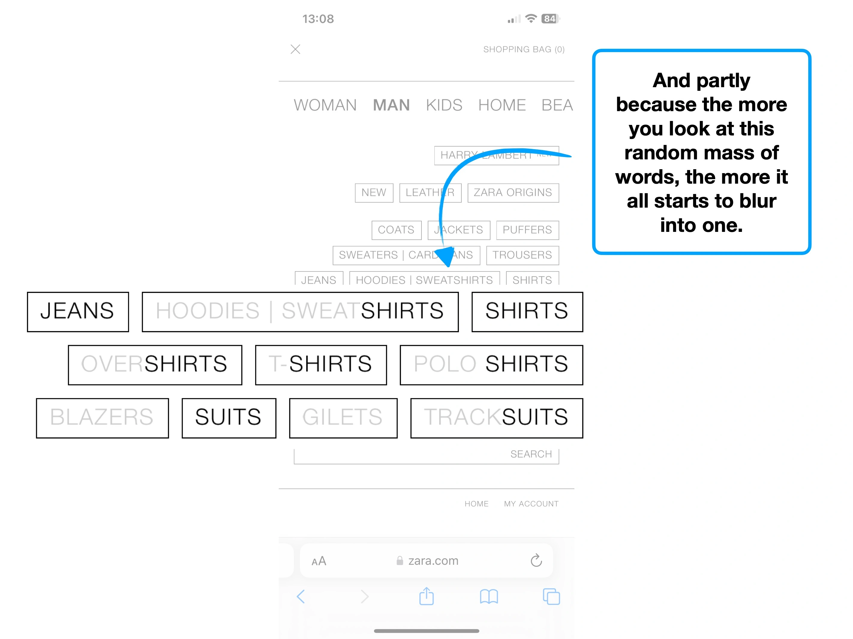
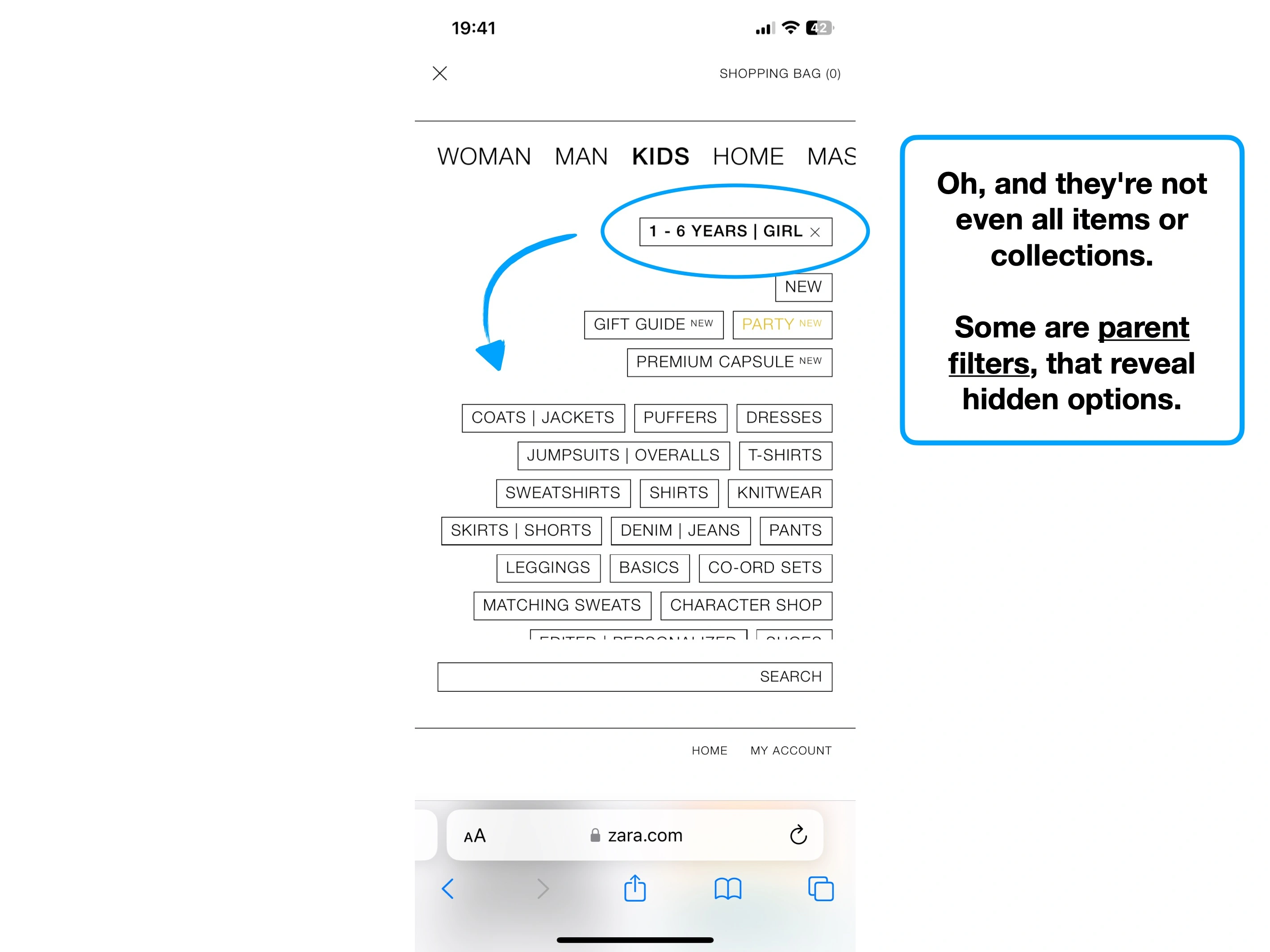
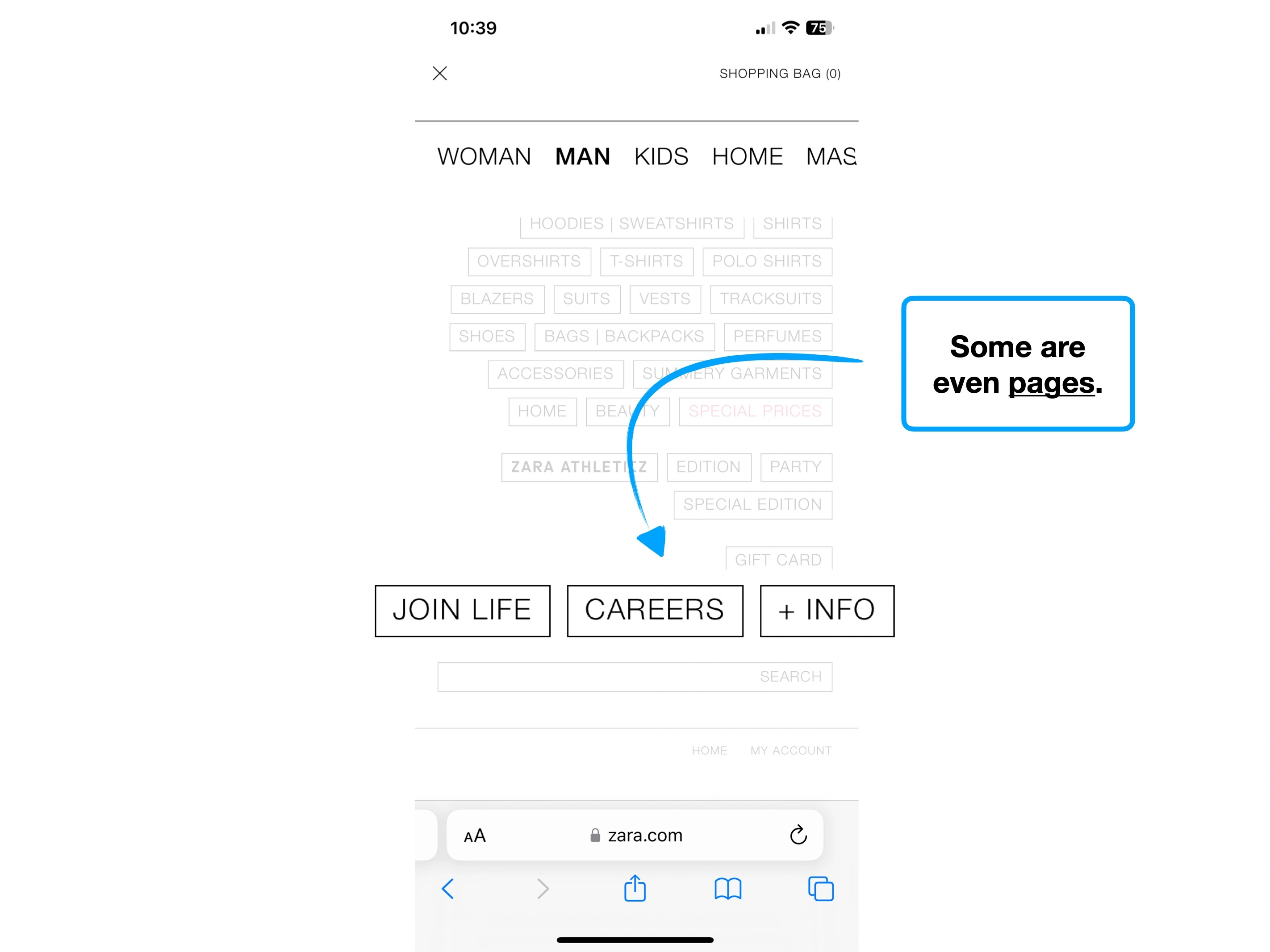
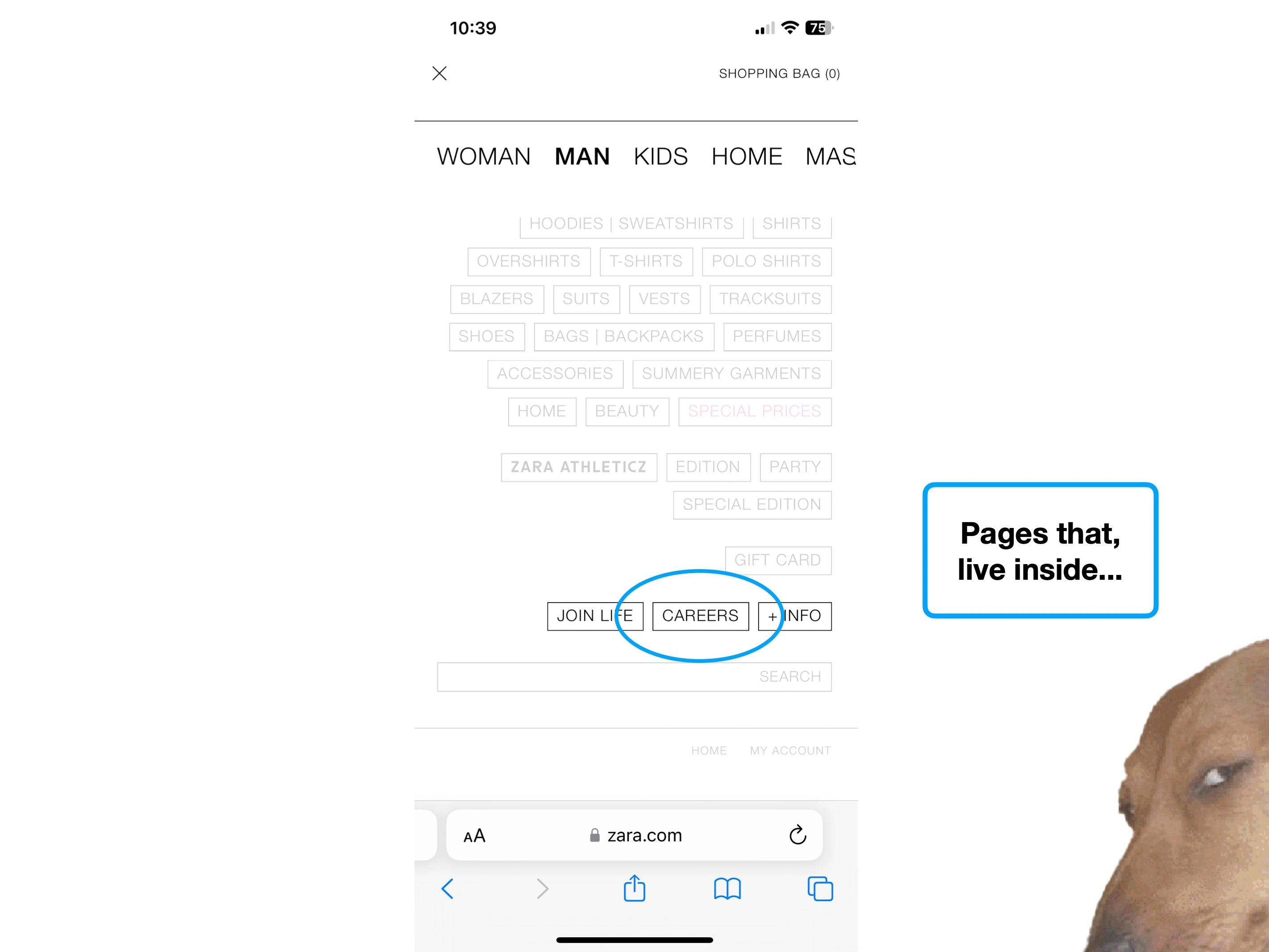
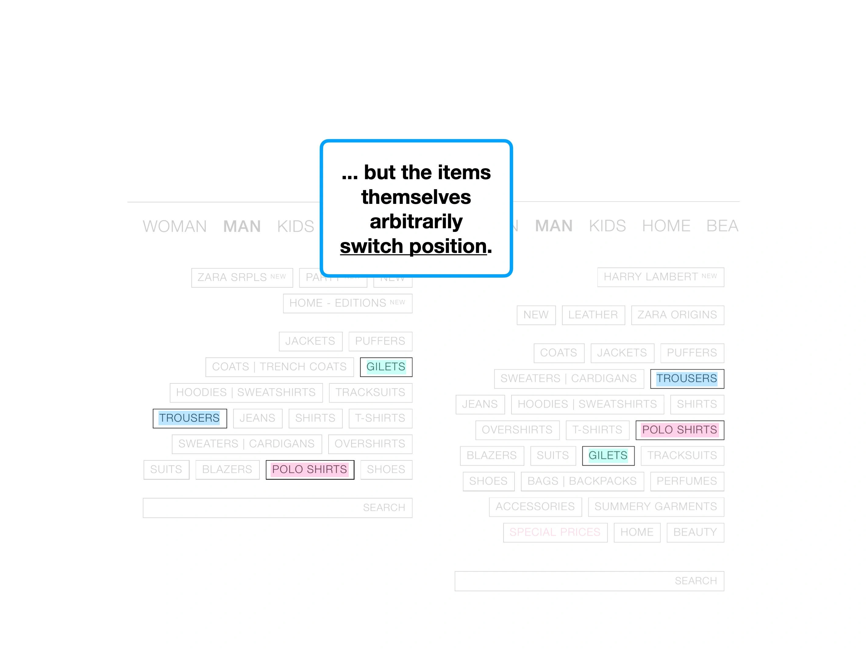
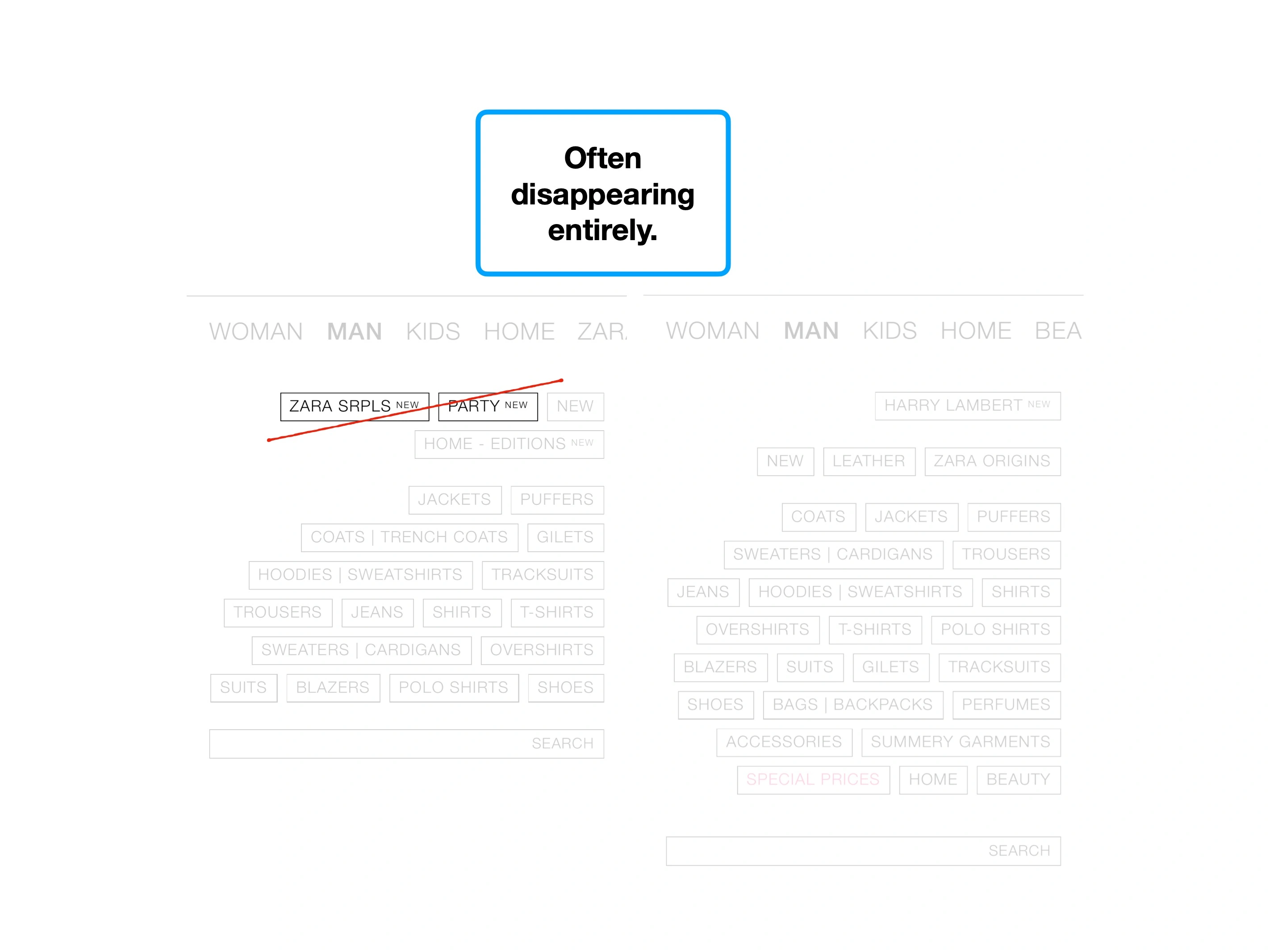
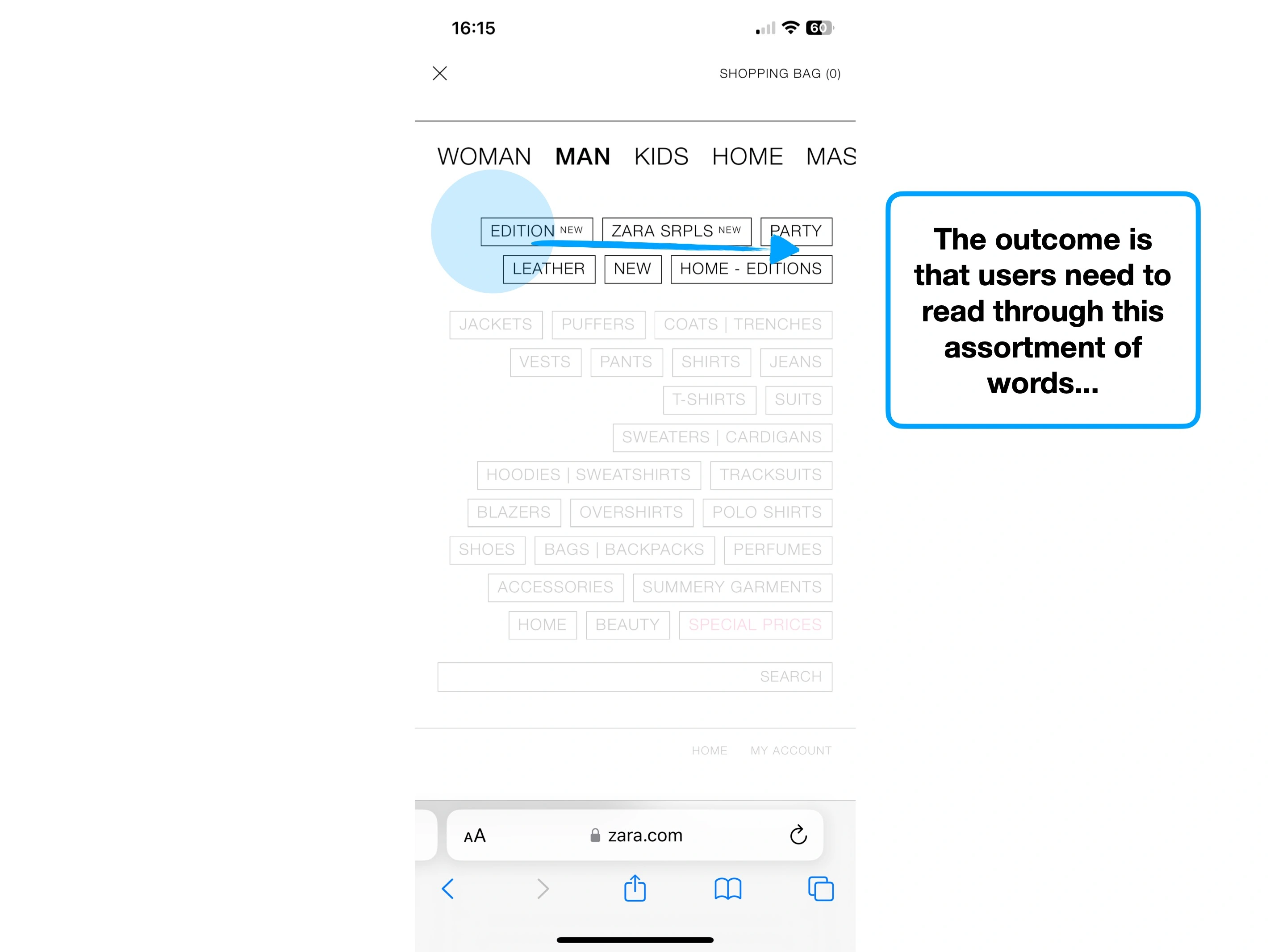
The problem with Zara, is that because everything looks the same, nothing matters more than anything else.
For example, what stands out below? Do you want to interact with anything you see?
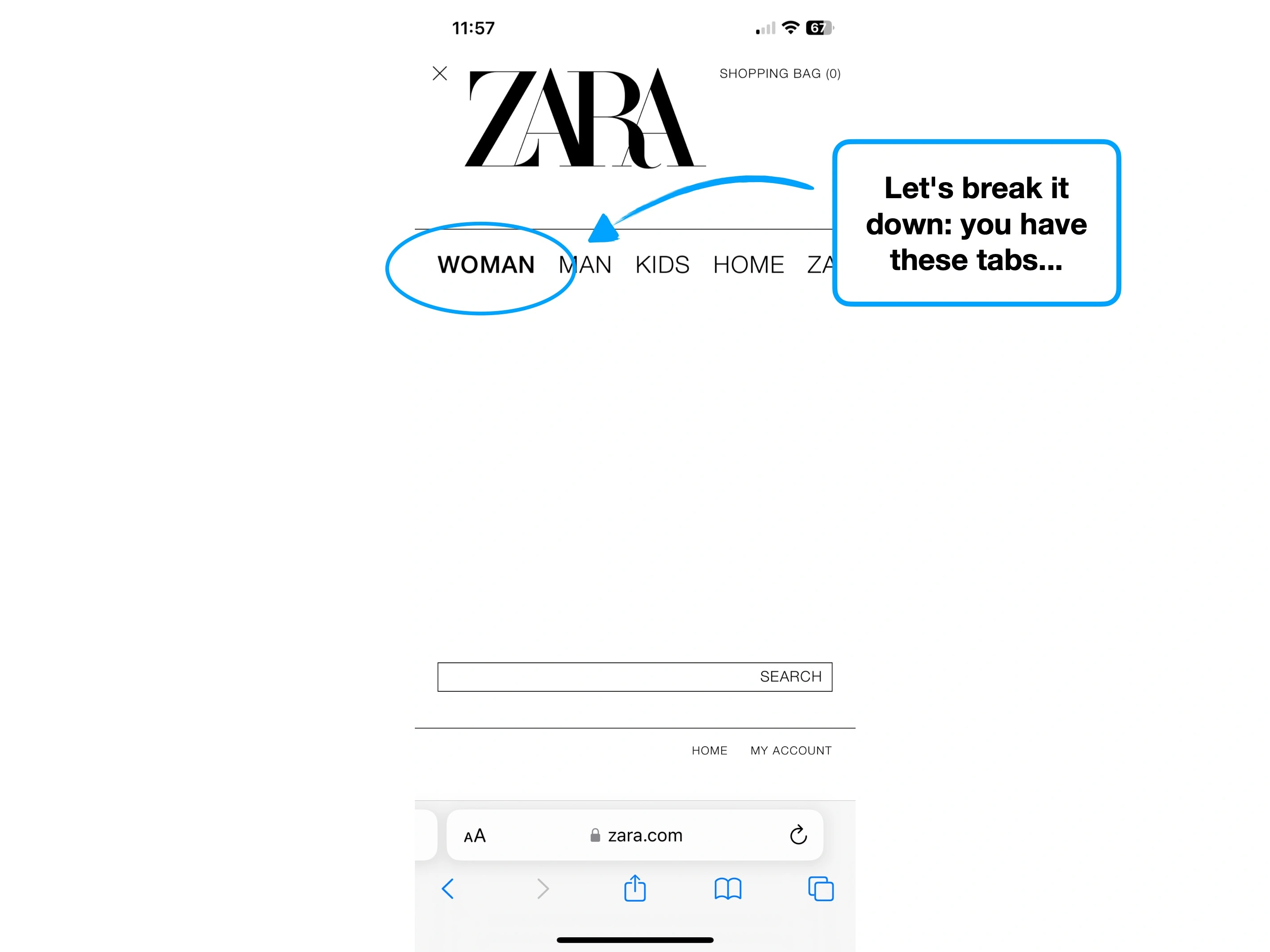
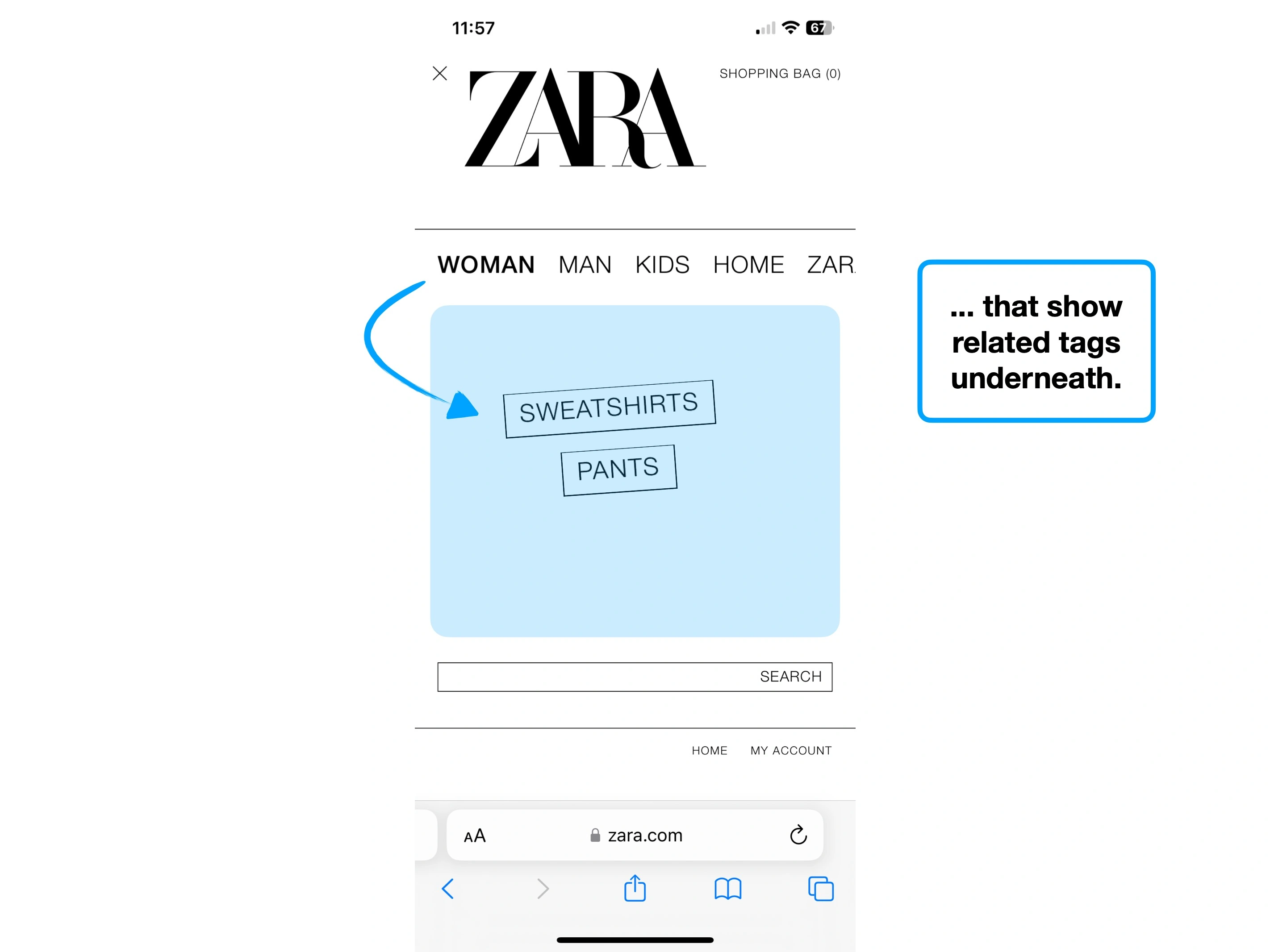
Tags, filters & search
Add to basket
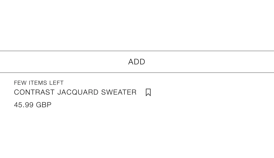
Product sizes
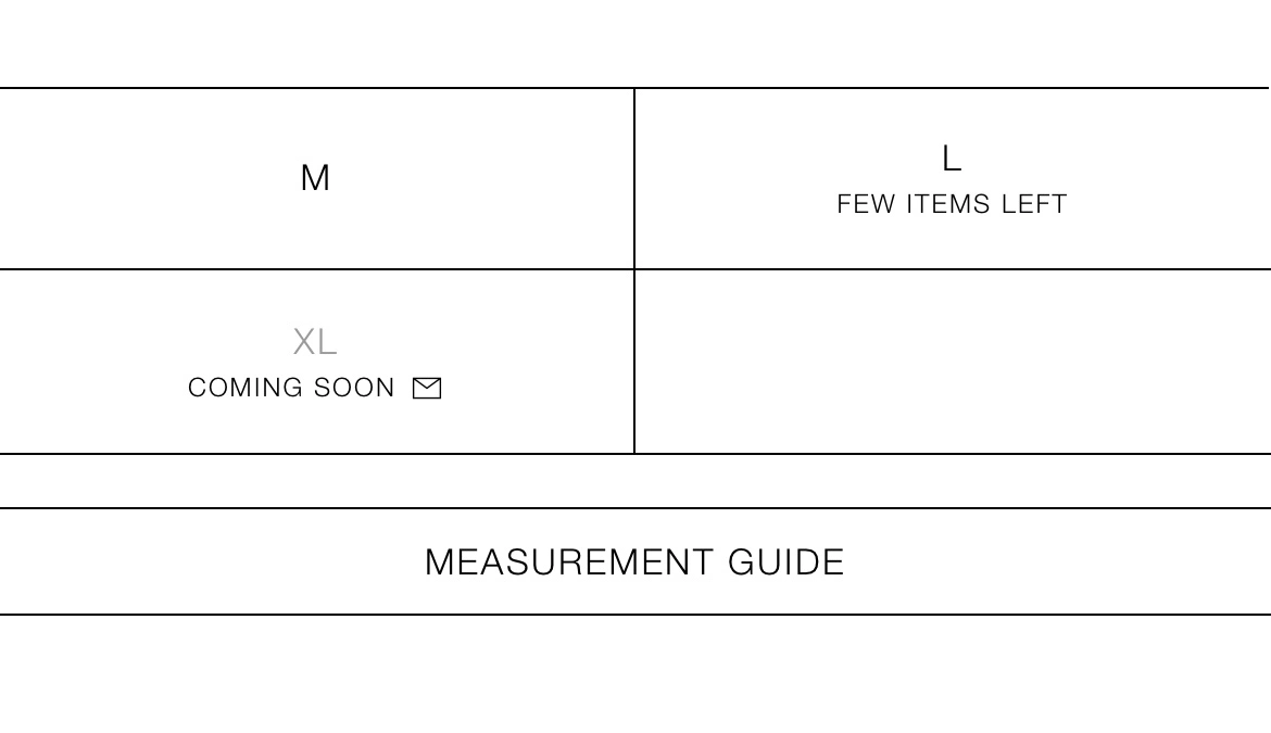
Errors
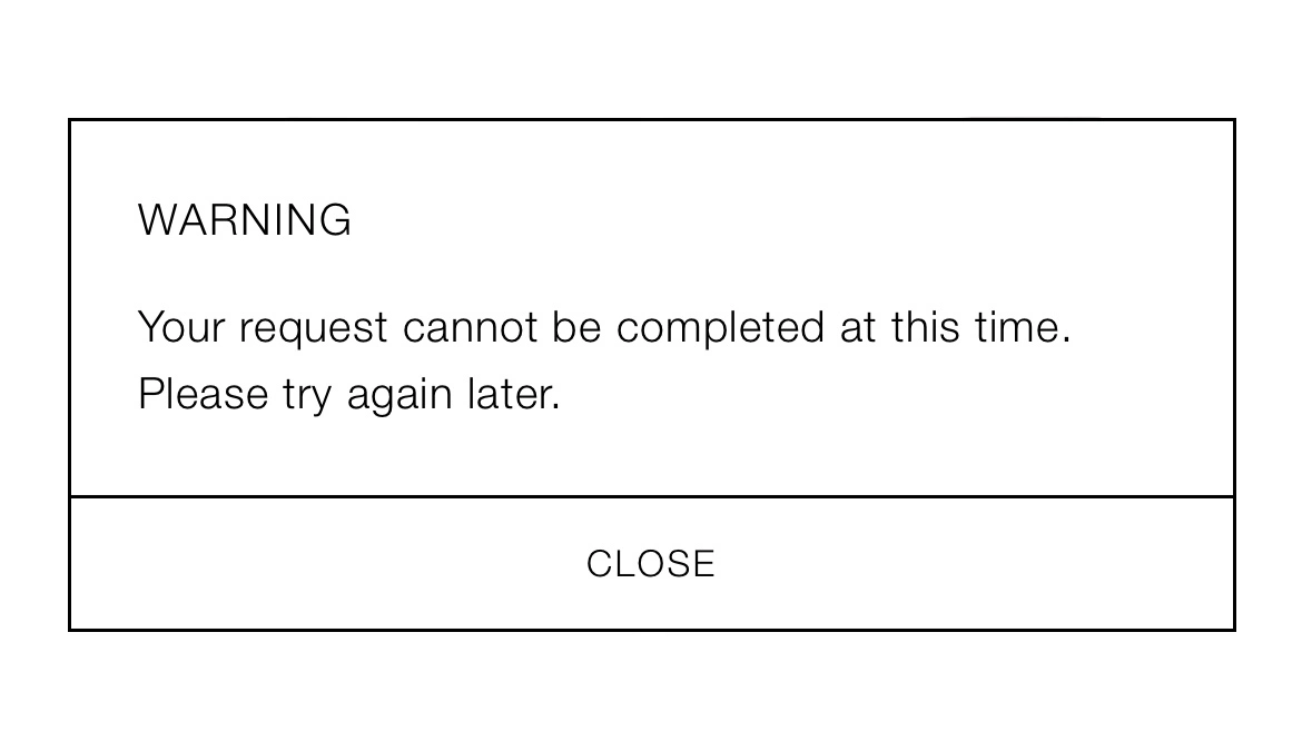
Logging in
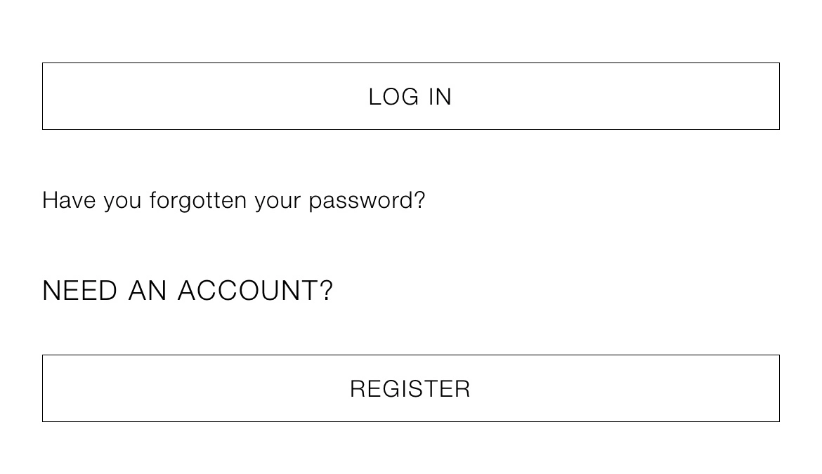
FAQs
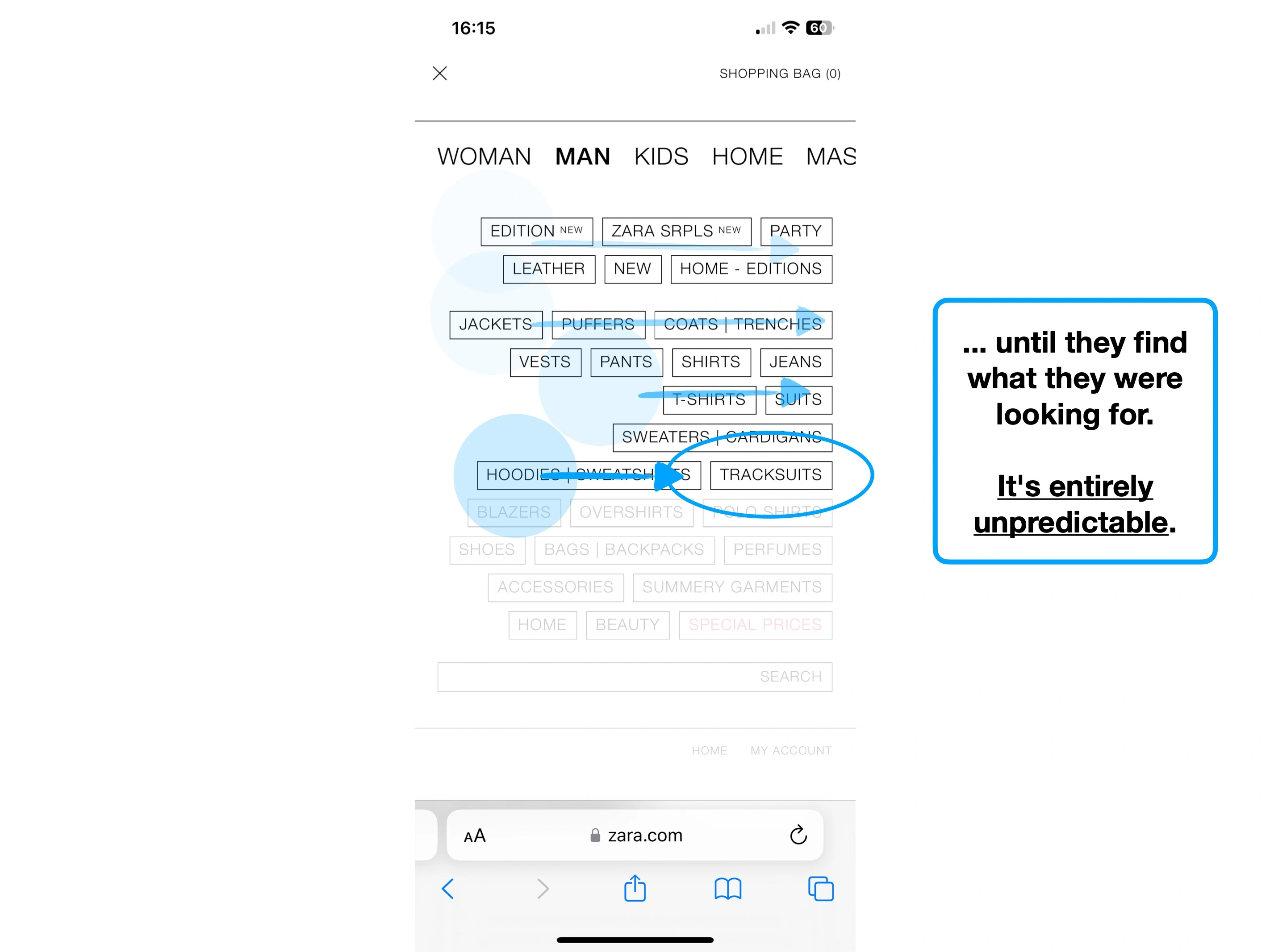
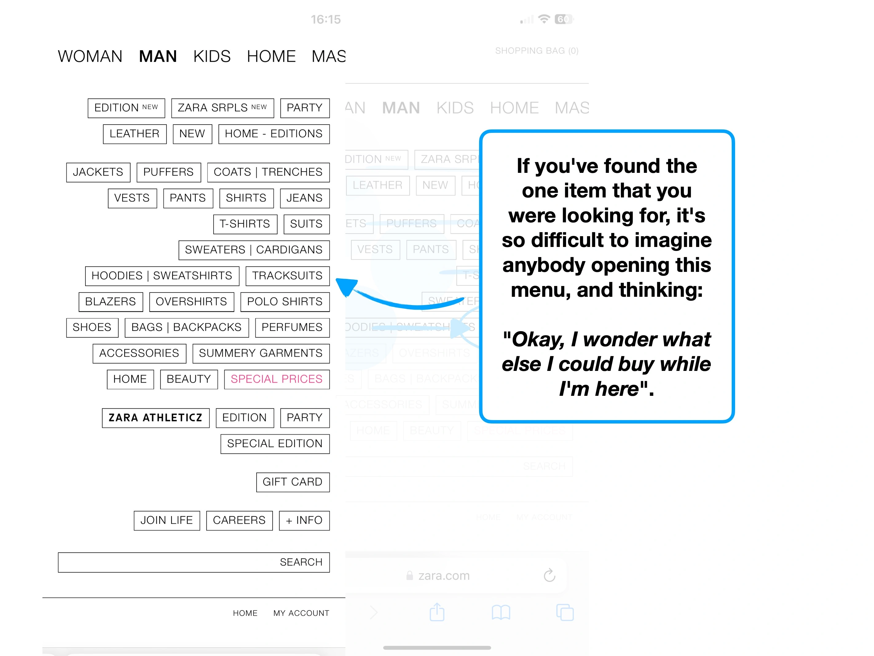
An even harder challenge (now you've scrolled), would be to try and recall what a specific component looked like, or what differentiated it from anything else.
The inefficiency and lack of enthusiasm (that I certainly feel) is due to a type of 🕶 Content Blindness.
Our brains seek shortcuts without permission, often just deciding to ignore much of what we see.
This is why it's fundamentally difficult to build muscle memory, when every action, label, field and box looks the same.
Nothing appears to be worthy of remembering.
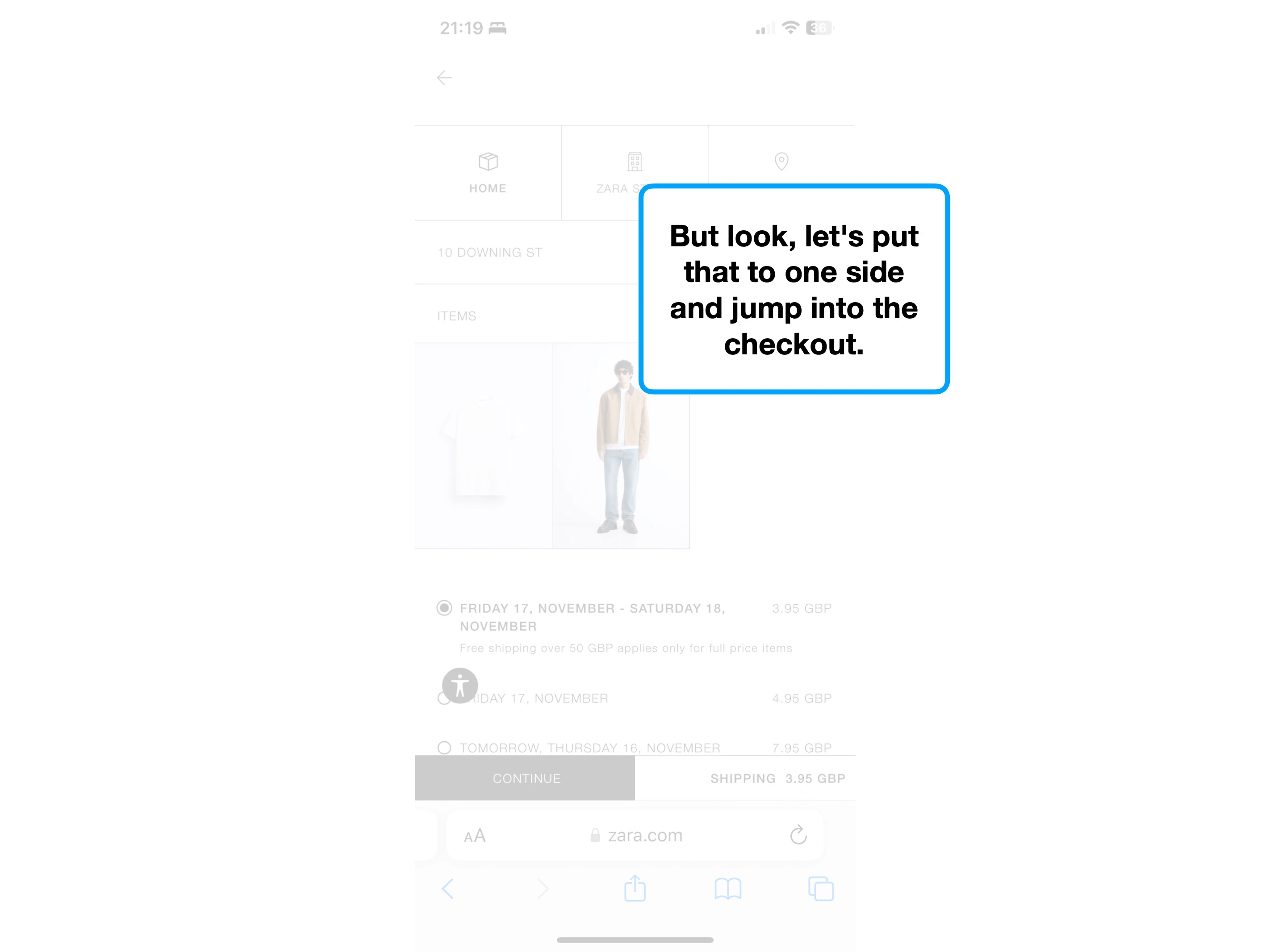
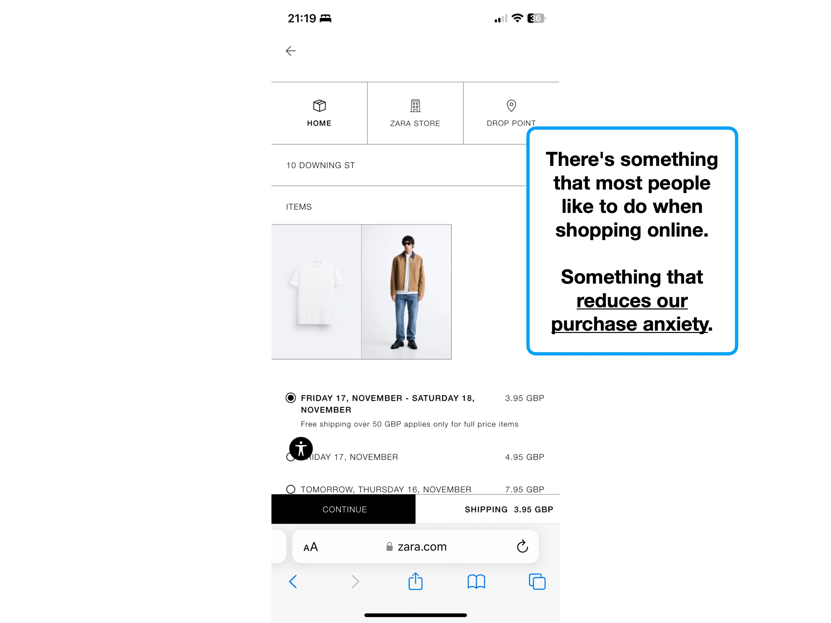
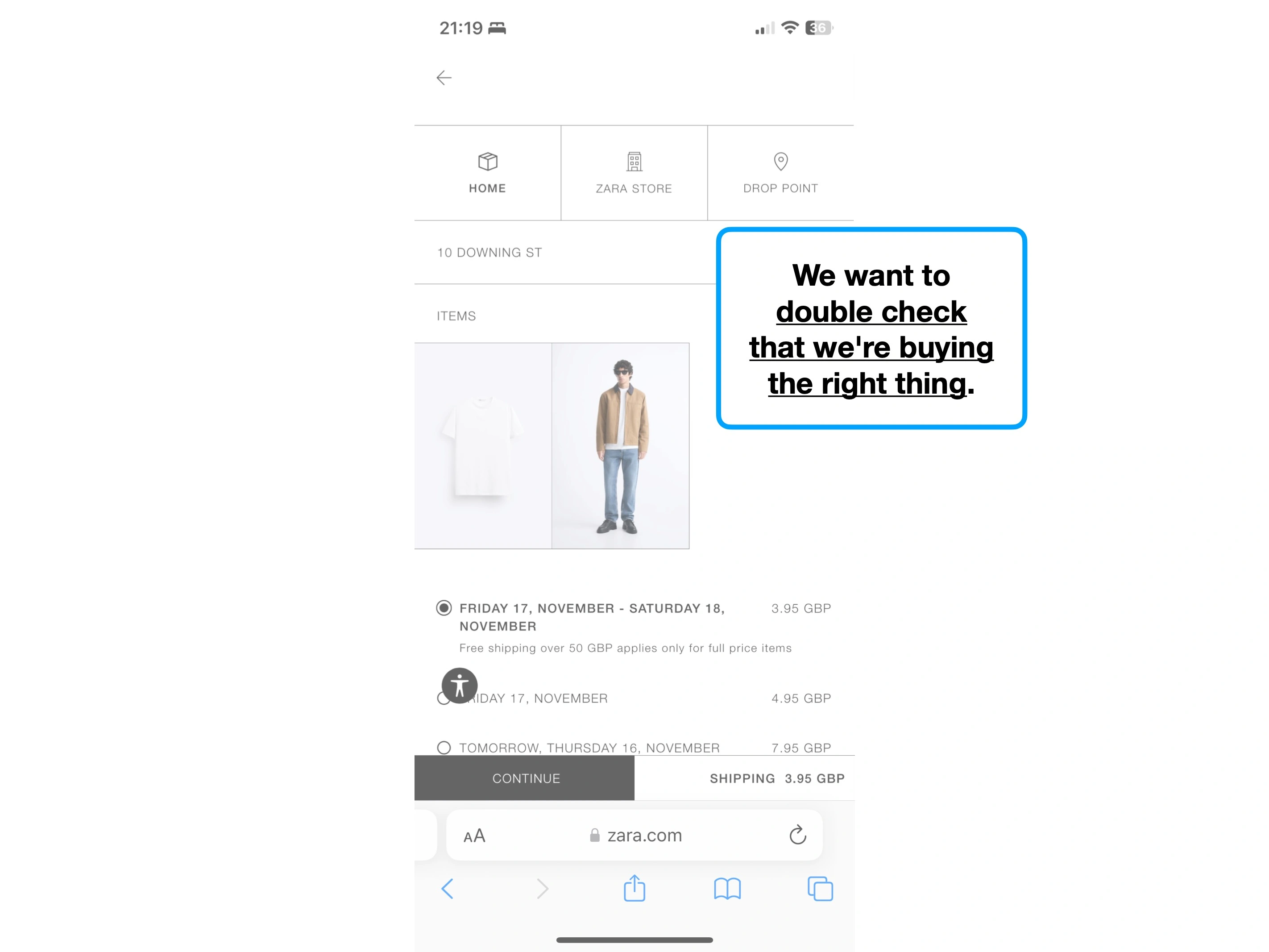
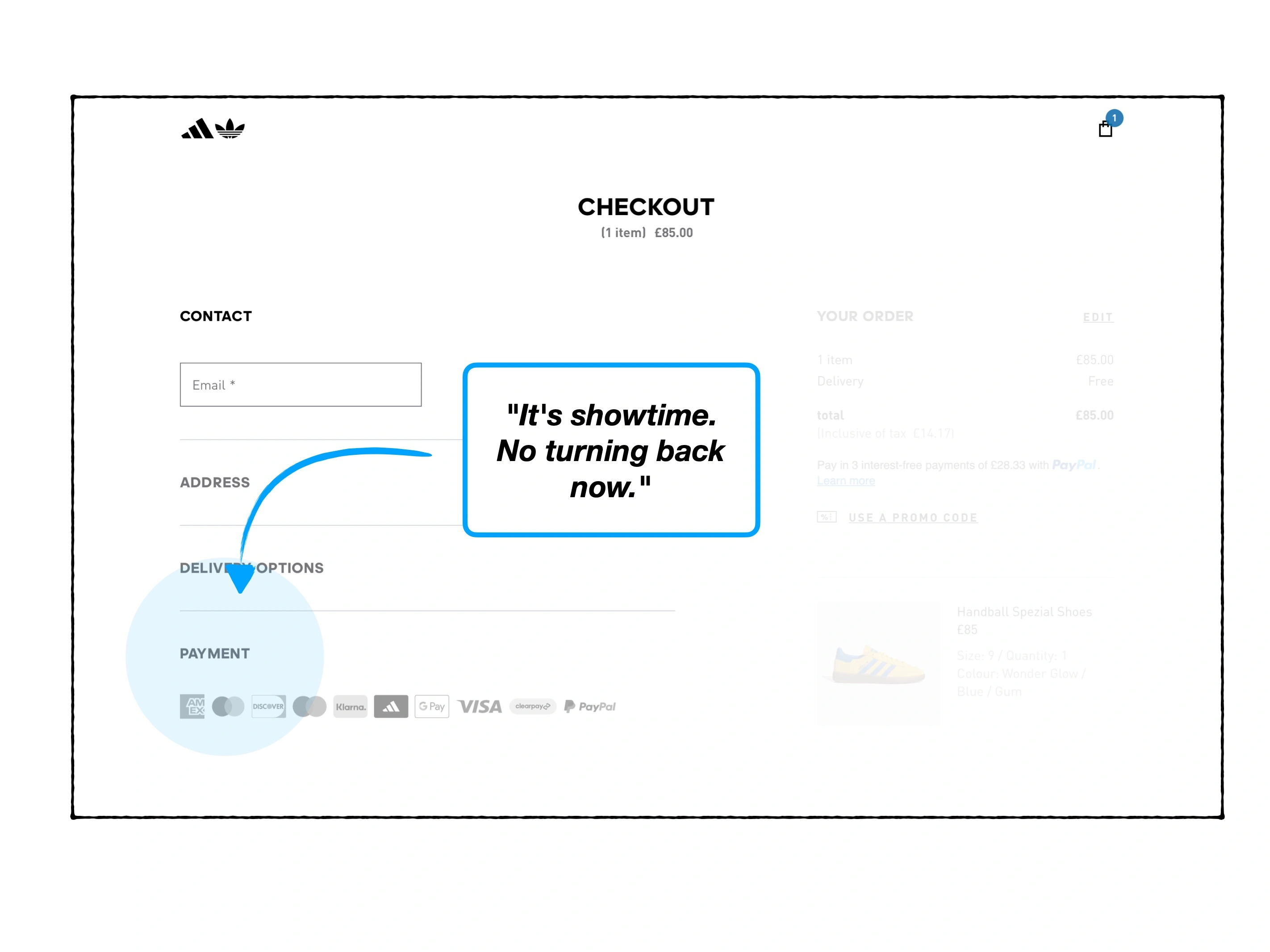
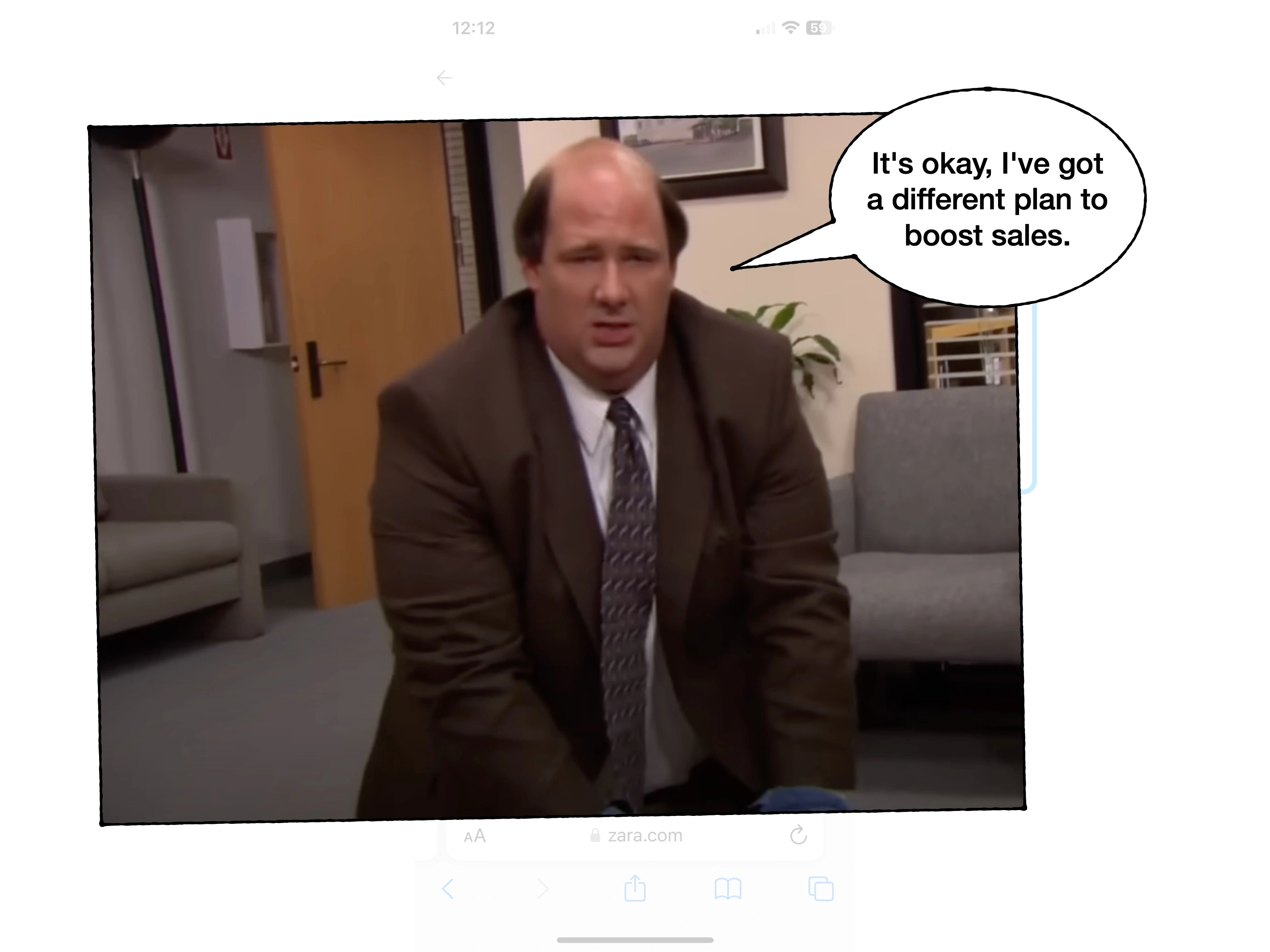
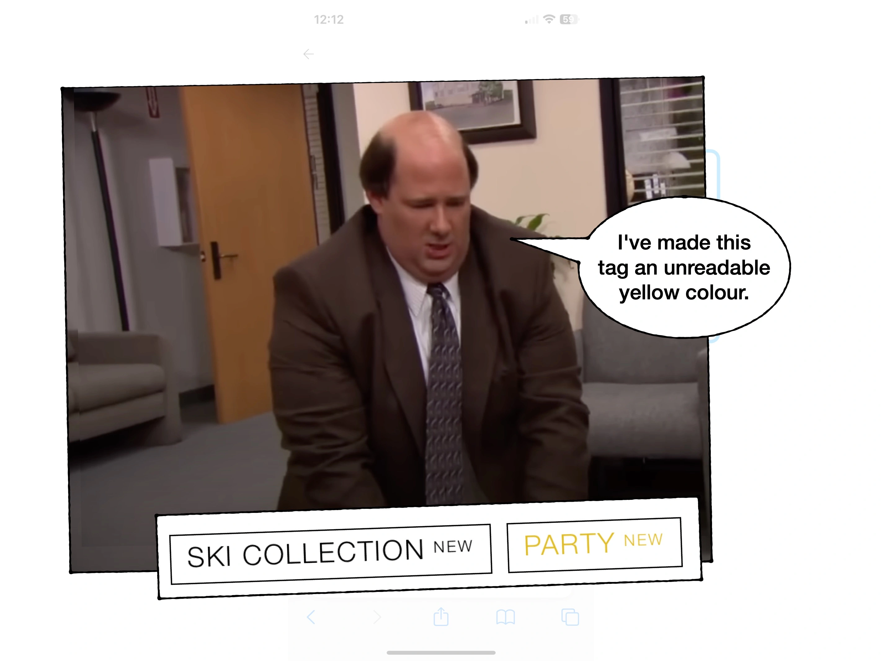
3. Yeah, that'll do
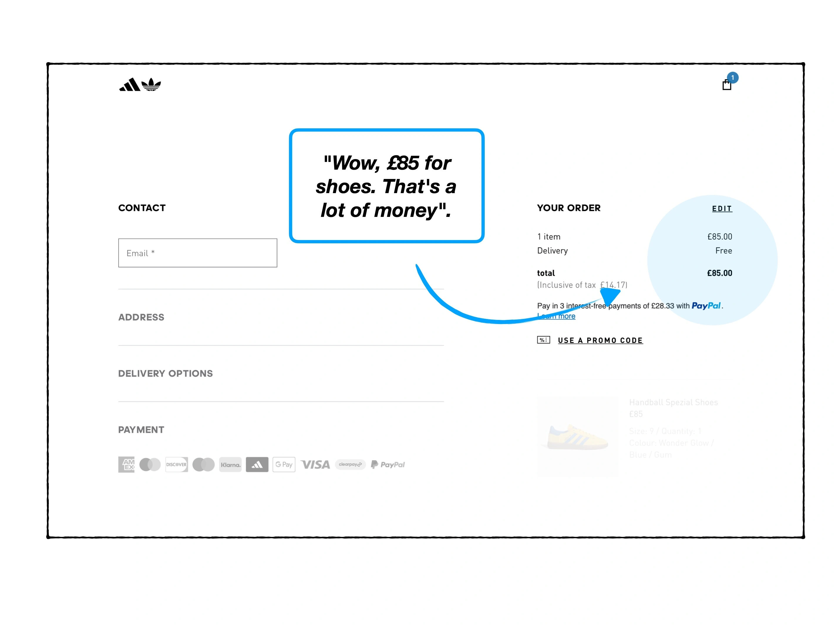
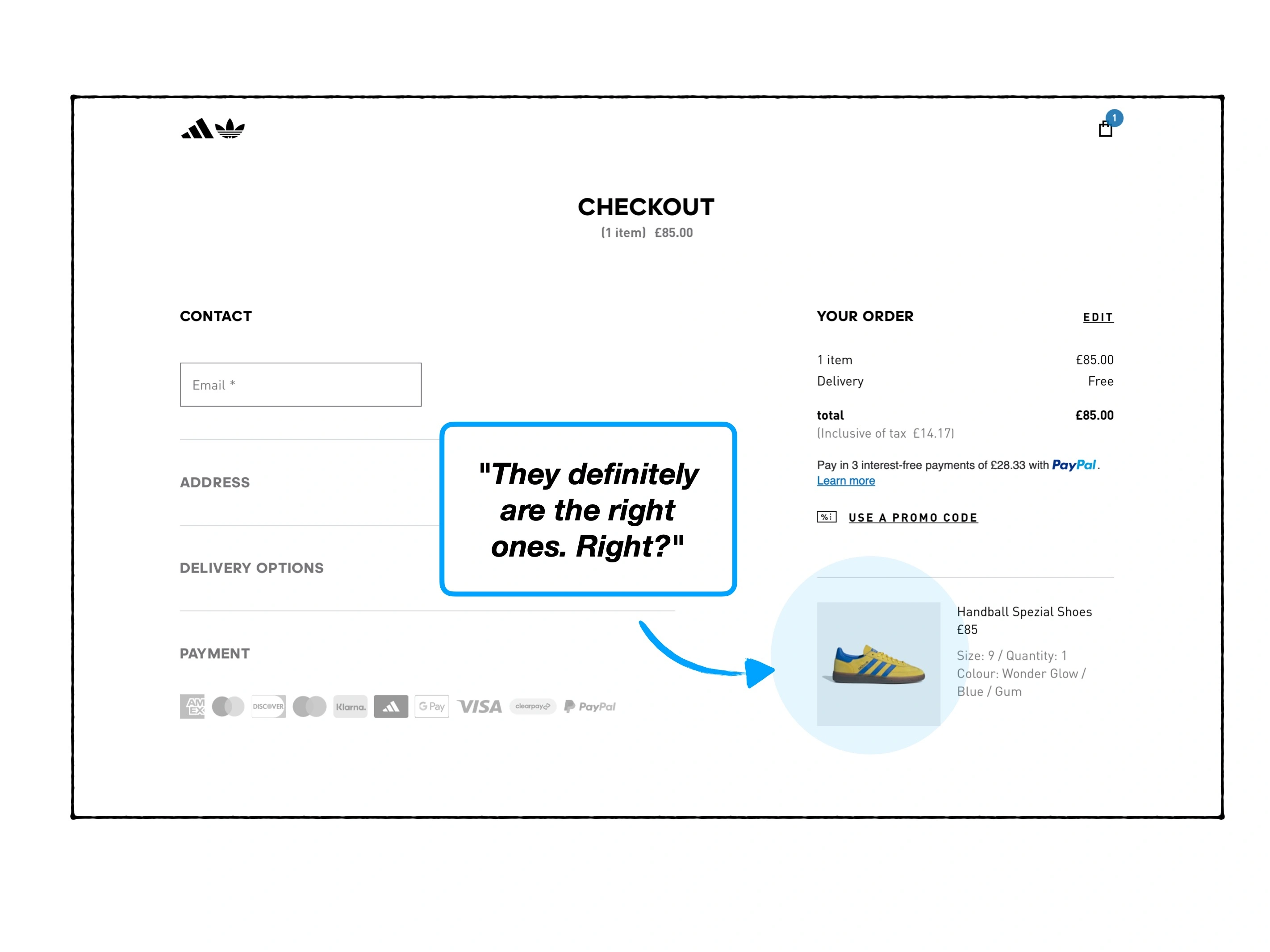
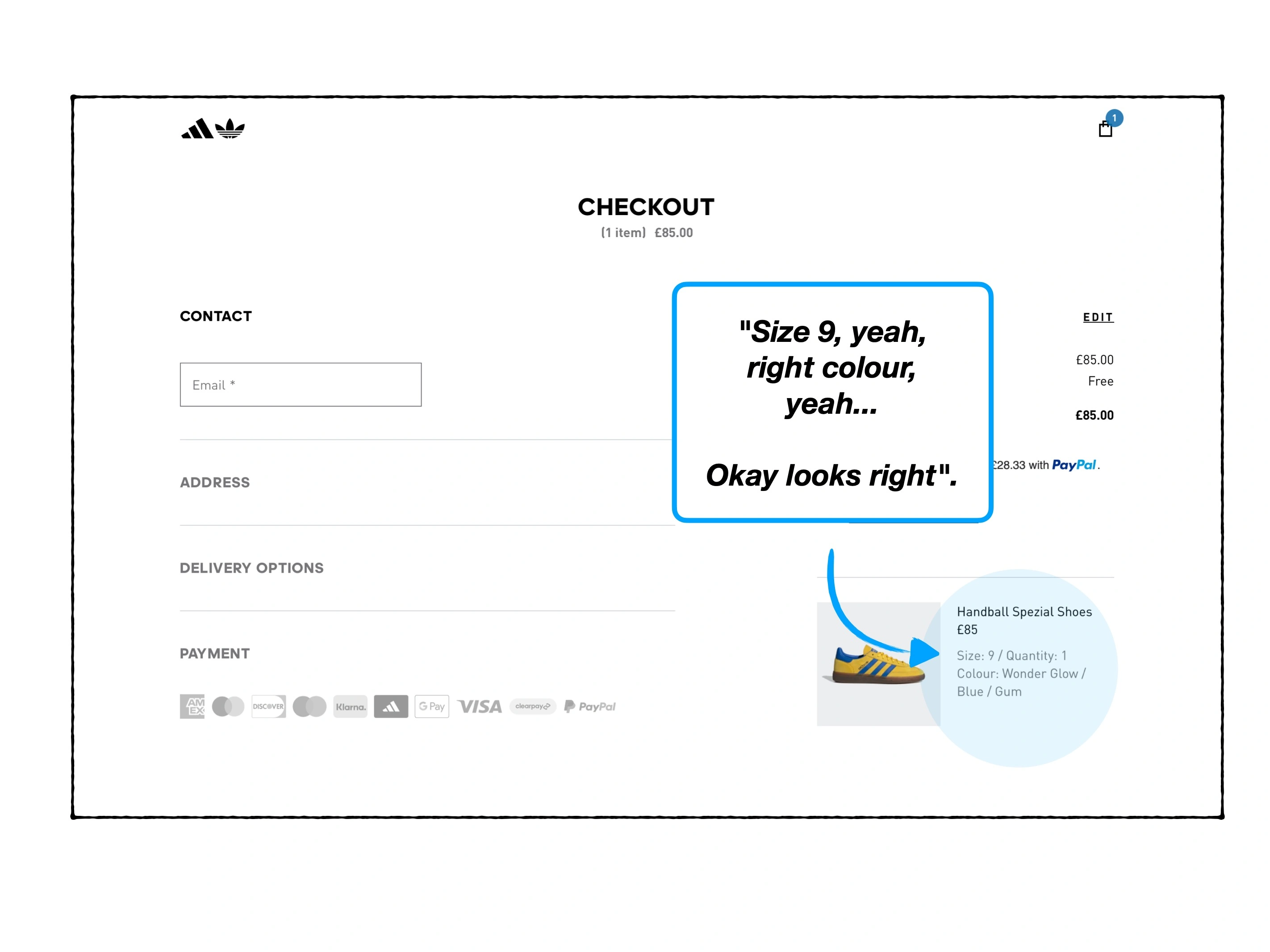
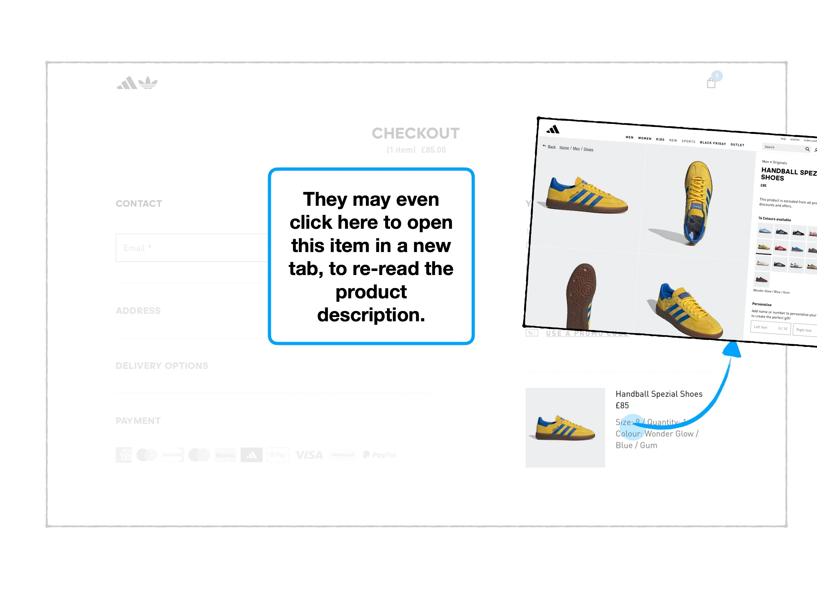
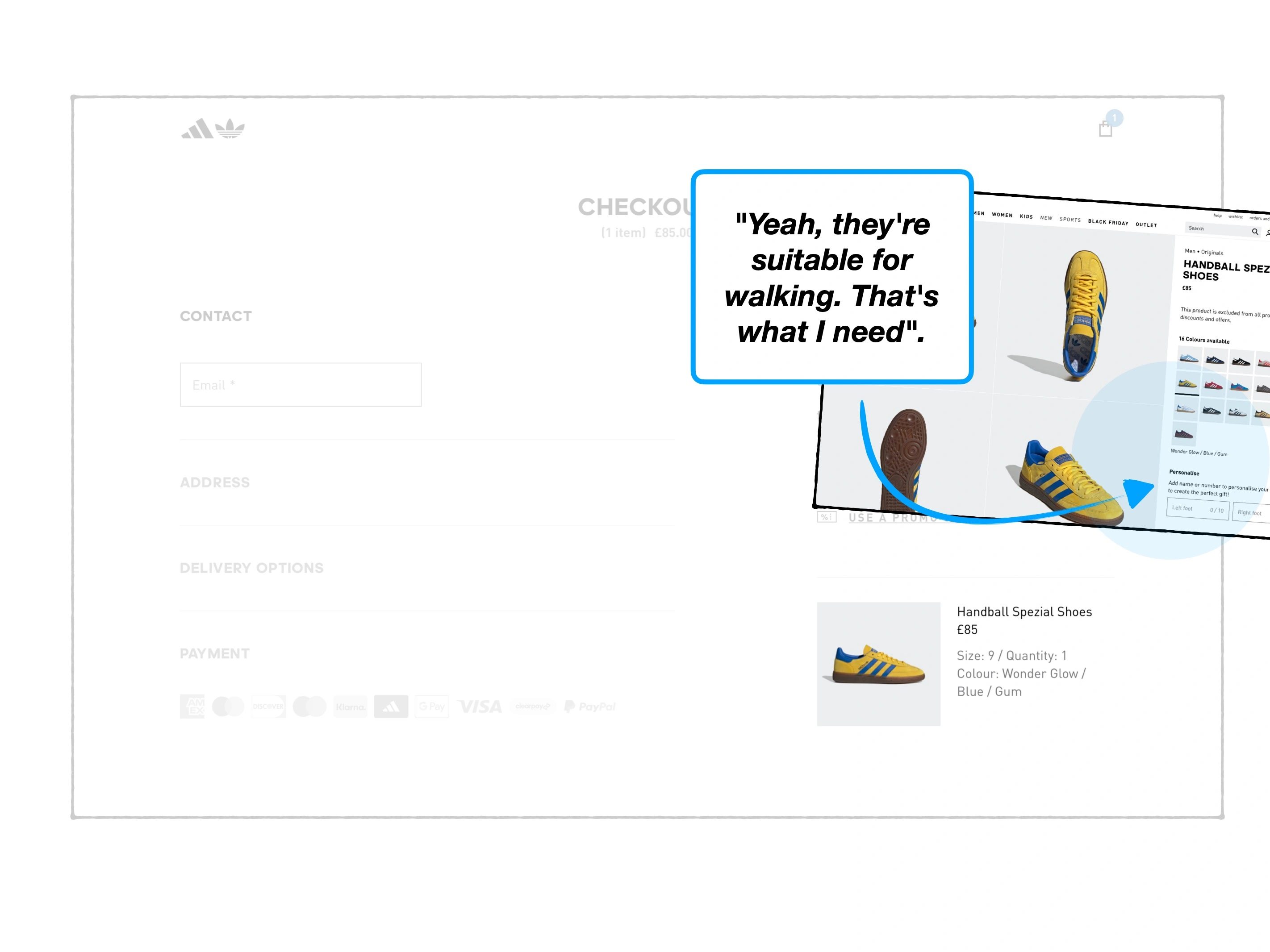
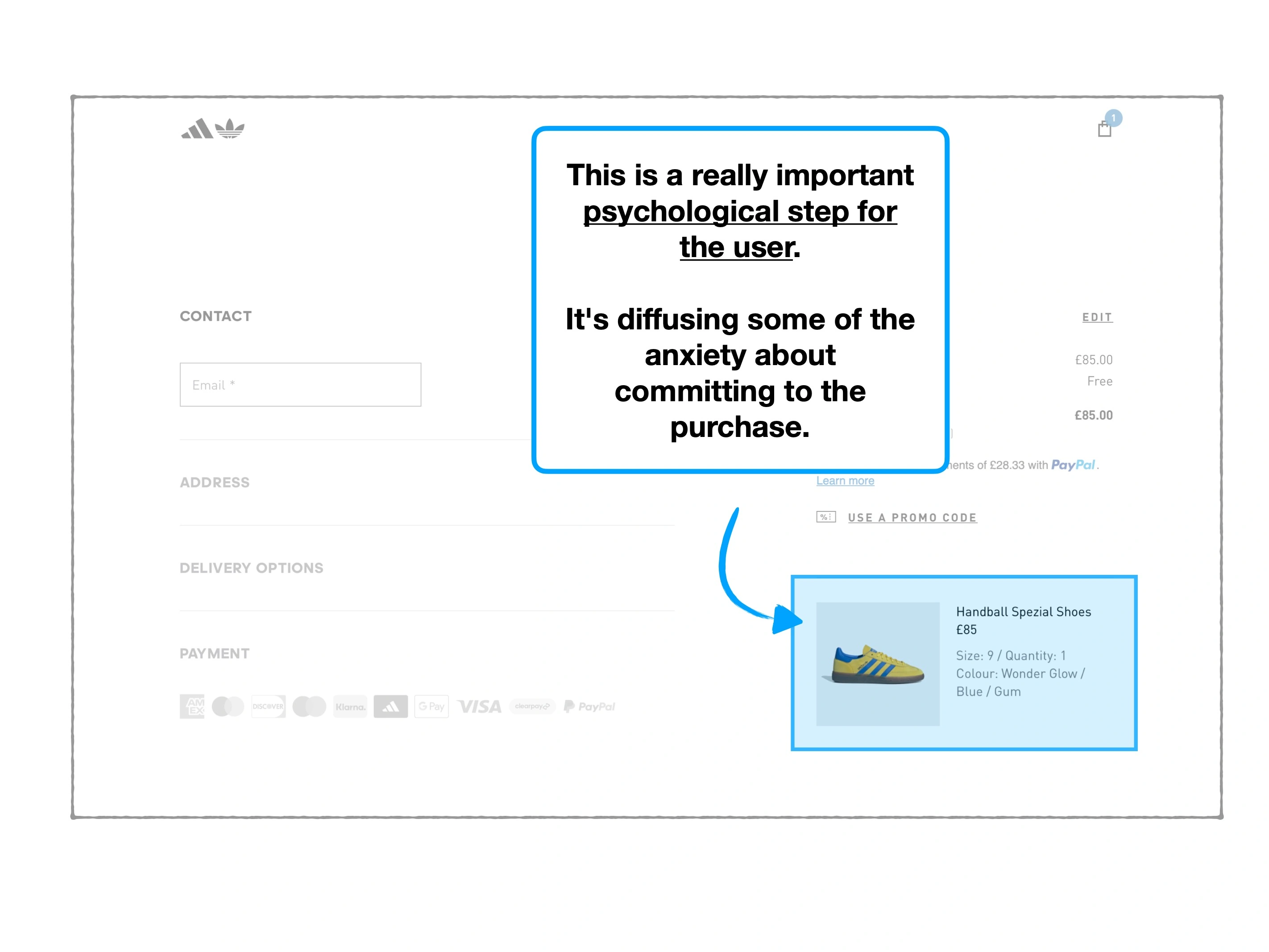
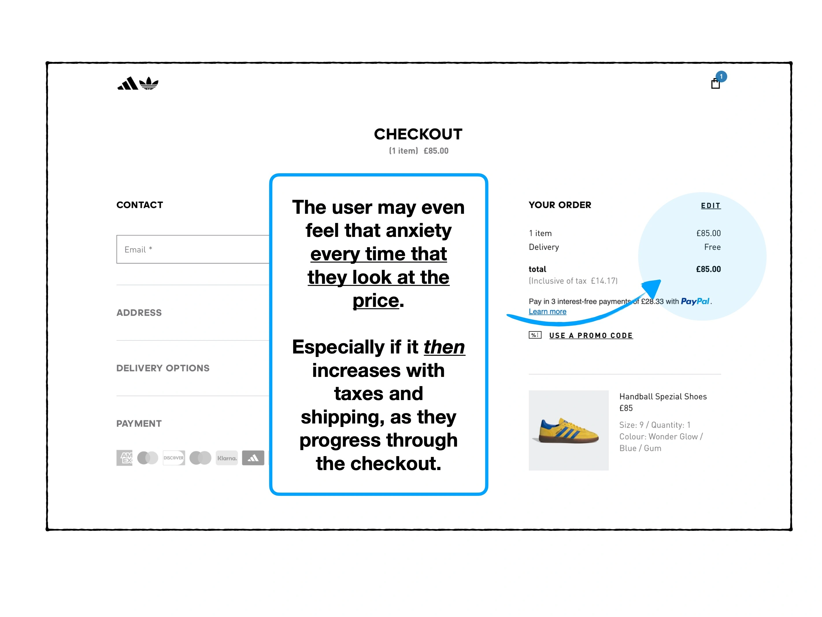
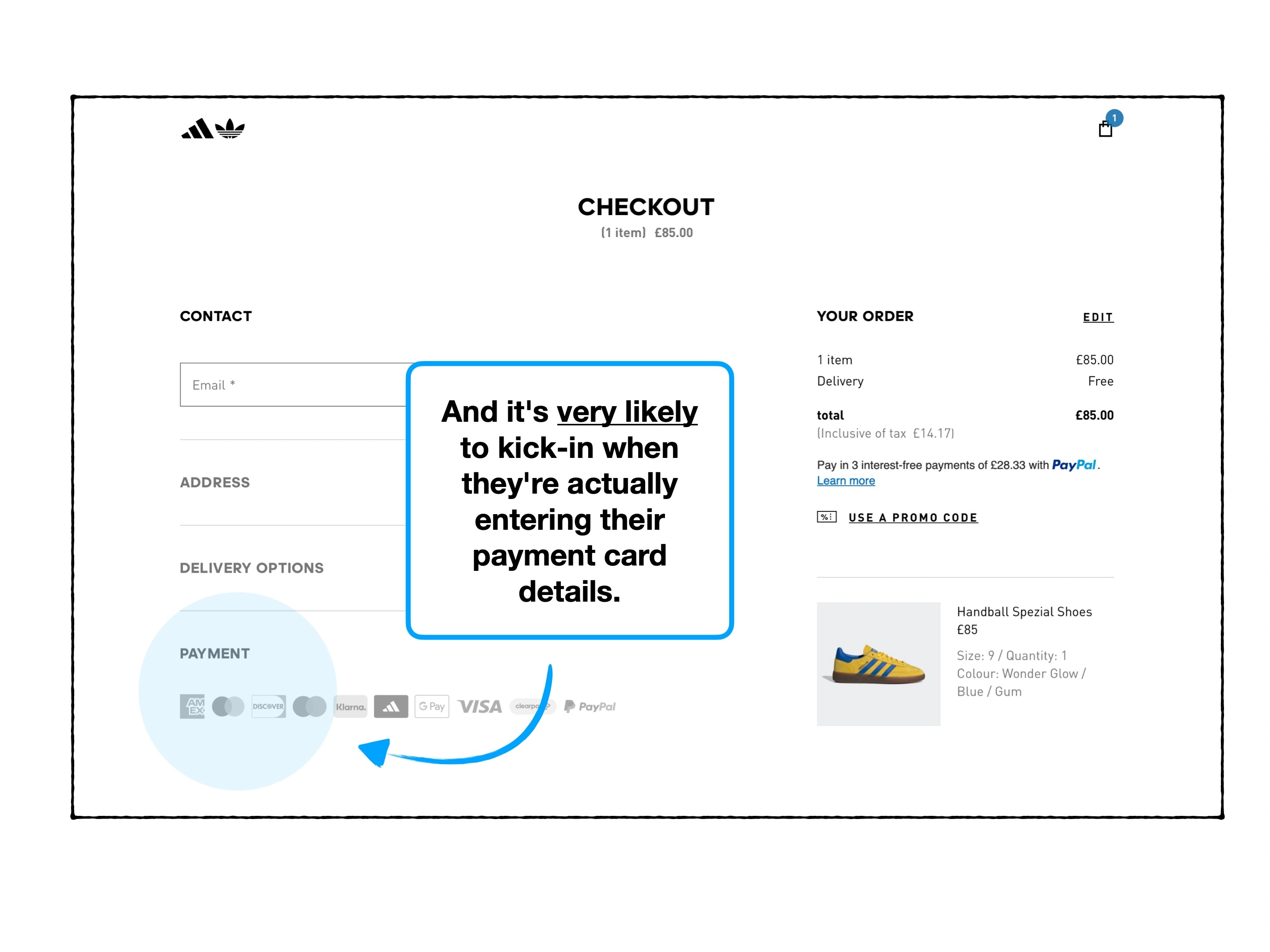
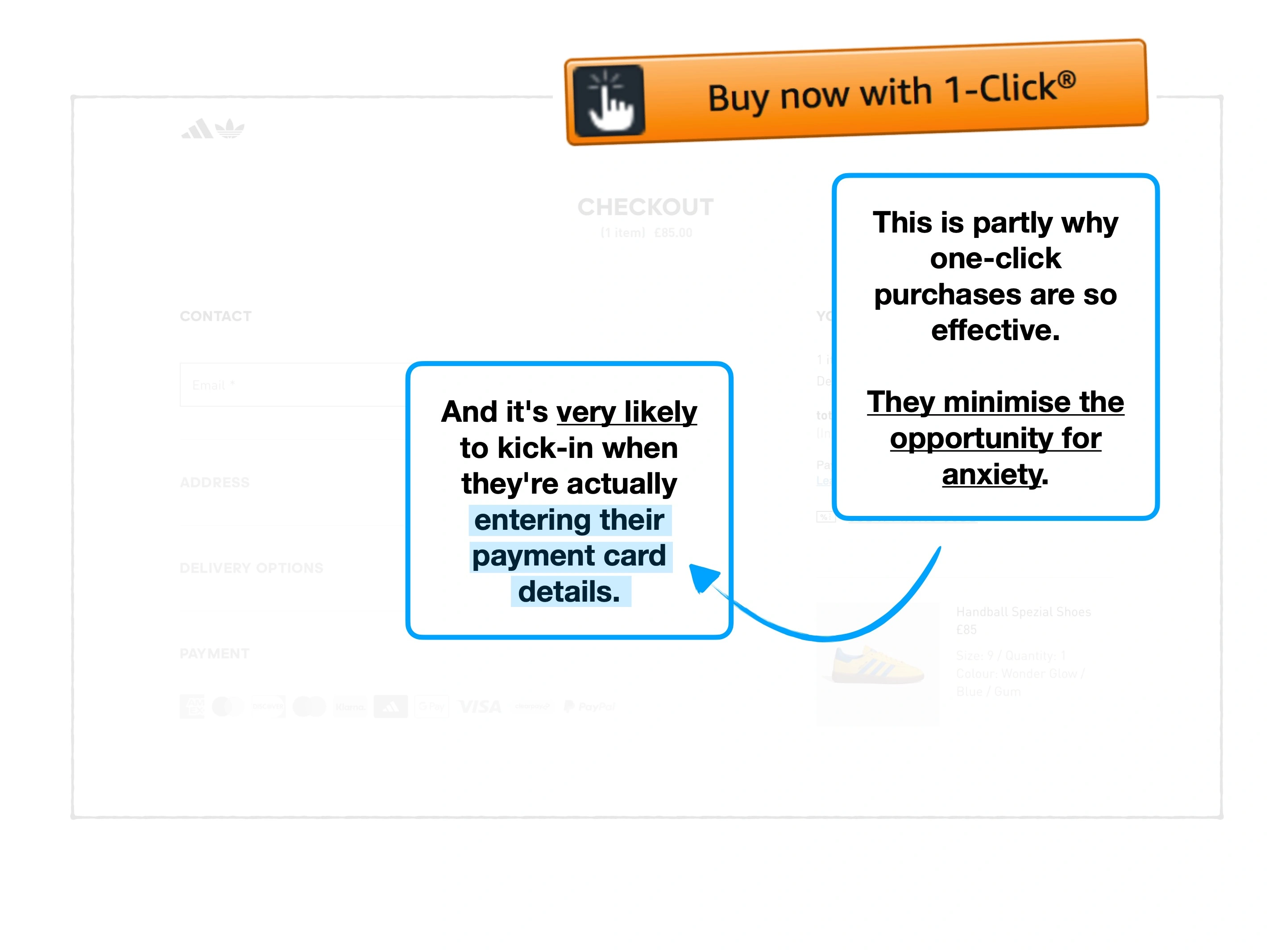
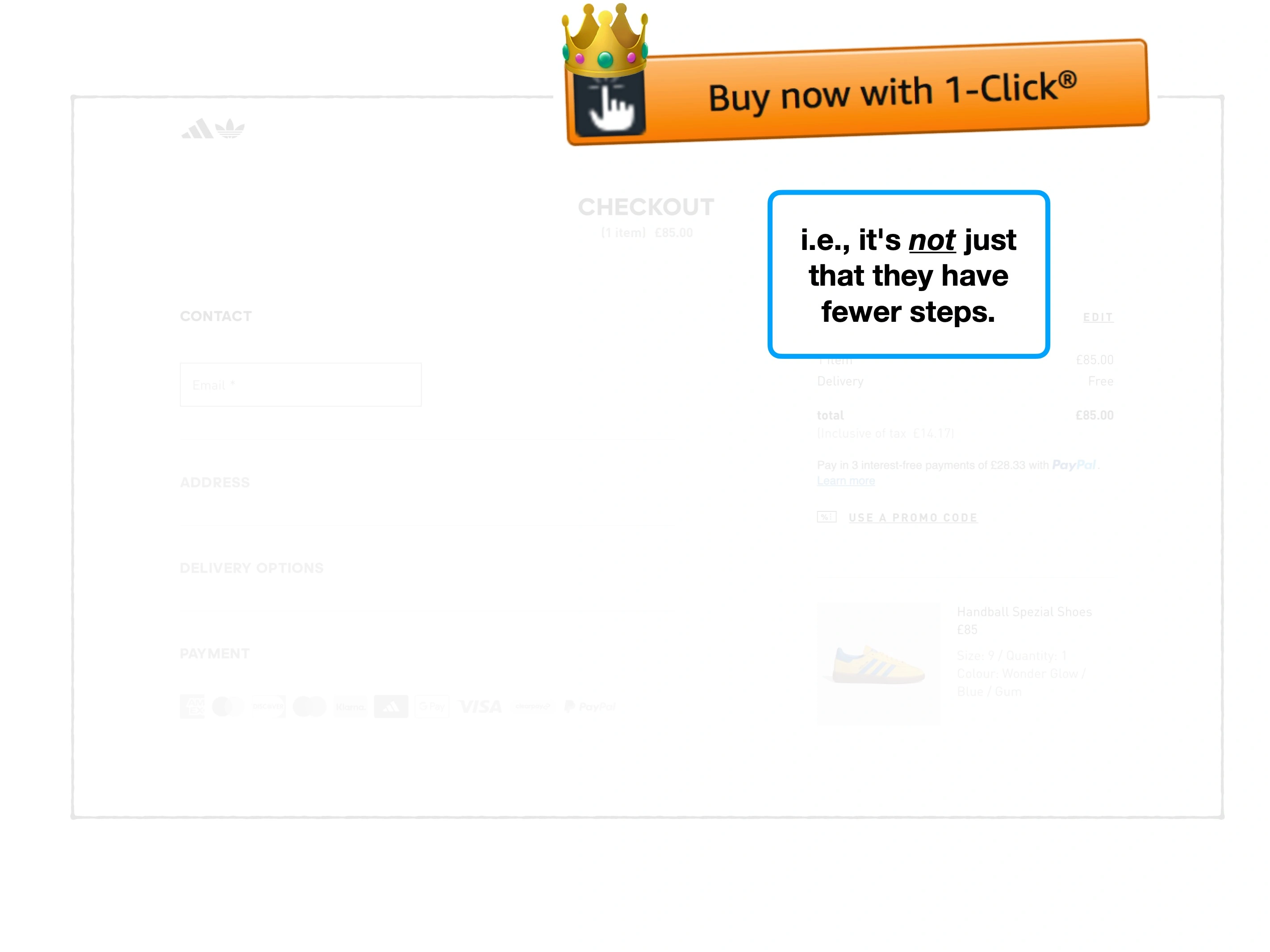
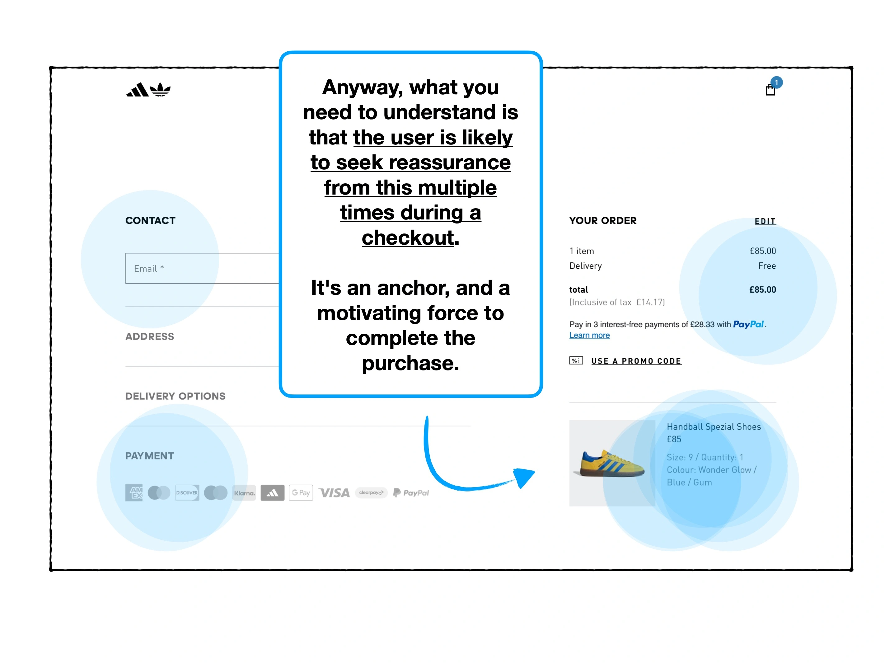
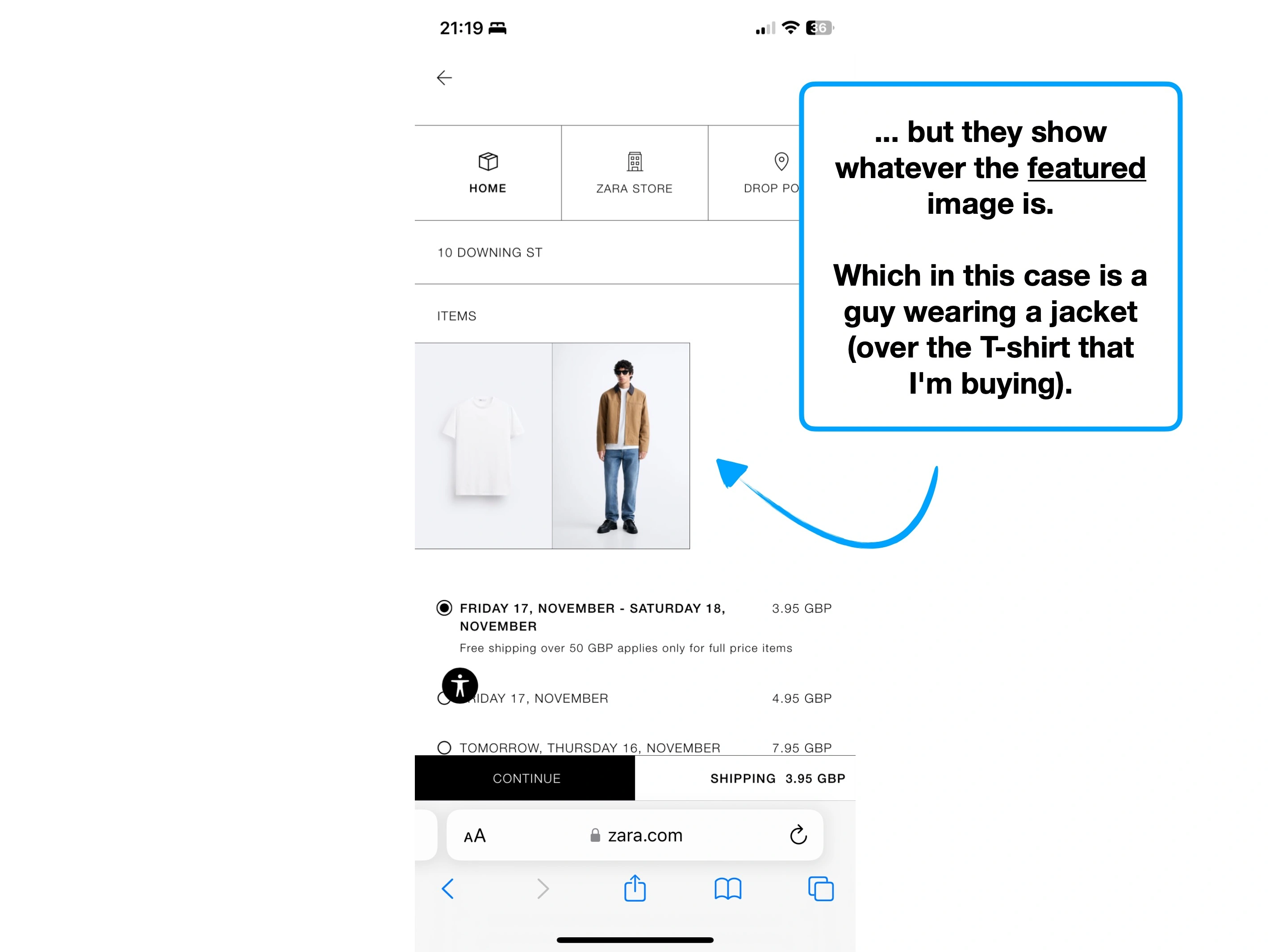
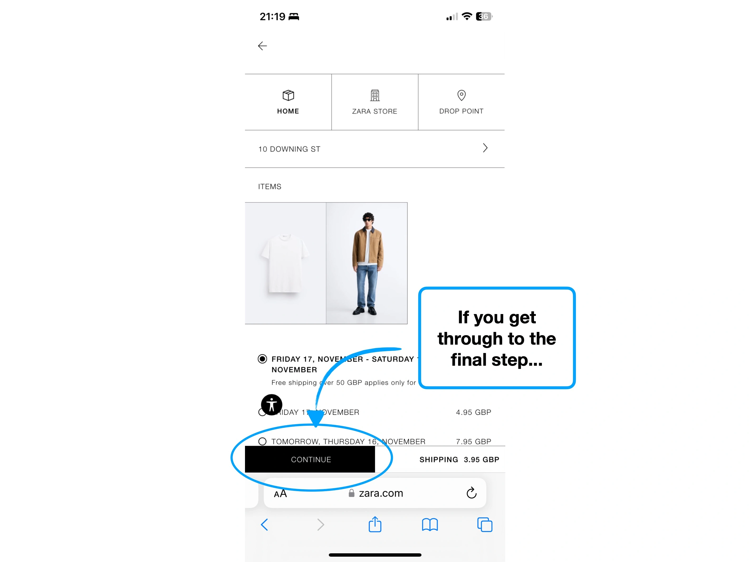
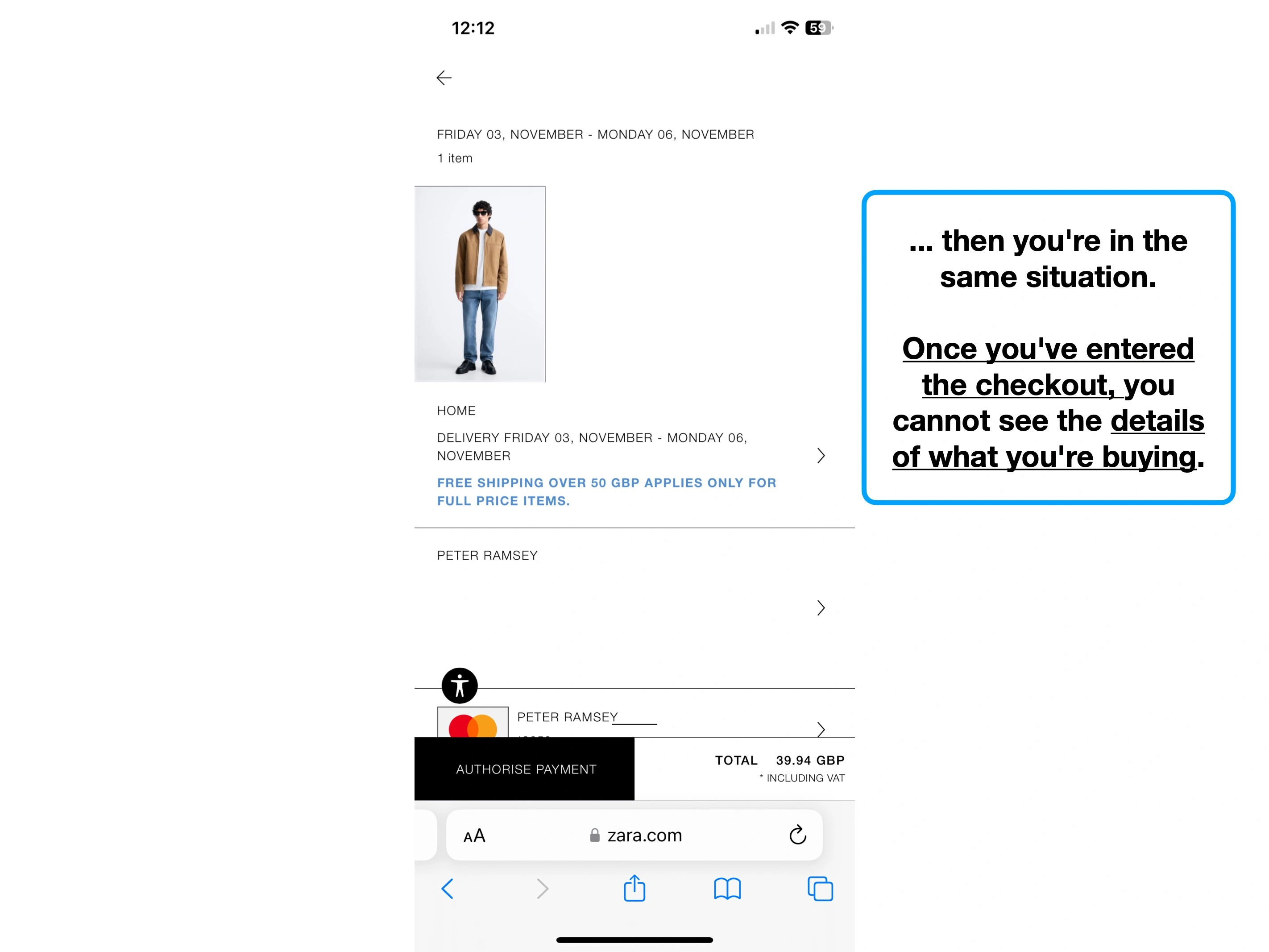
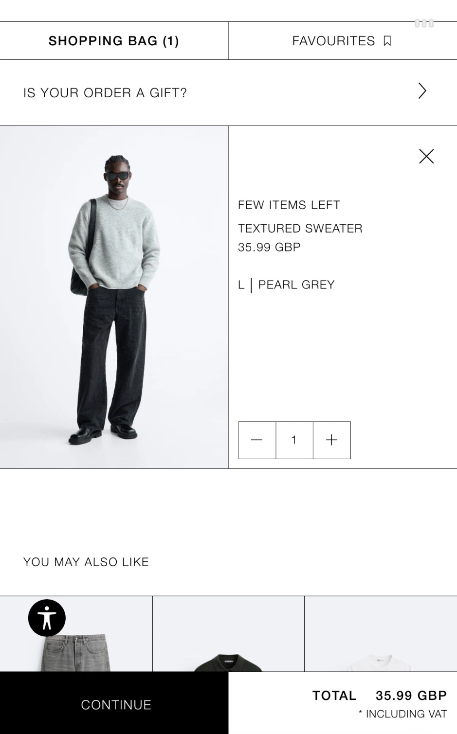
You're looking at your basket, checking that you still want everything there, and nothing has accidentally slipped in.
It all looks fine, so you click to proceed to checkout.
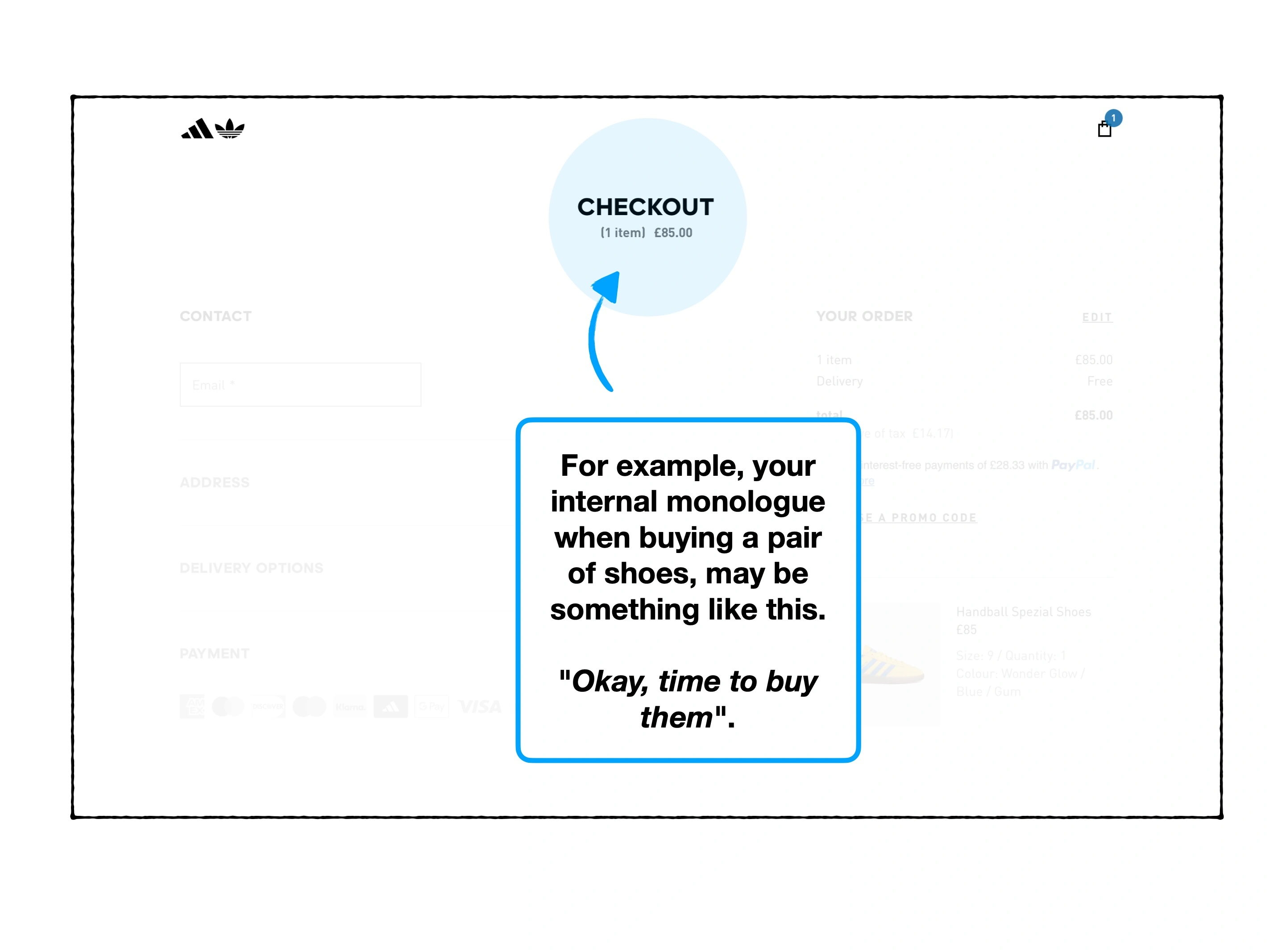
You're then greeted with a spinner: "saving changes".
But what changes? Nothing has changed. In fact, I don't want anything to have changed.
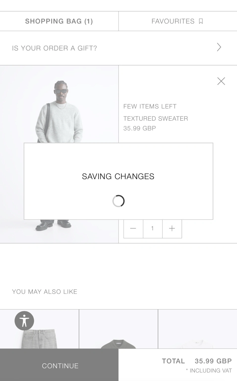
I imagine that this is simply a lazily-implemented label. It's perhaps functionally correct at a database level, but bears almost no resemblance to what the user wants to, or believes is happening.
Which is a shame, because loading labels can be both accurate, and additive to the broader experience.
This is, ironically, one of the times where you can let personality shine.

Aside from the animated dancing bird (which is fantastic in this context, but very hard to replicate), the content subtly does three important things:
⌛️
1. Clarity and context
It's loading a course (i.e., an actual lesson), not another dashboard.
💪
2. The Labour Illusion
The term "building" insinuates that "work" is happening, in a more visual way than "loading" would.
⭐️
3. Social proof
Reminds the user that 40 million people are also learning spanish on Duolingo.
Almost nobody would see "saving changes", and panic to the point of churning.
But these small moments matter, because they're both a missed opportunity to do something better, and because they accumulate throughout an experience.

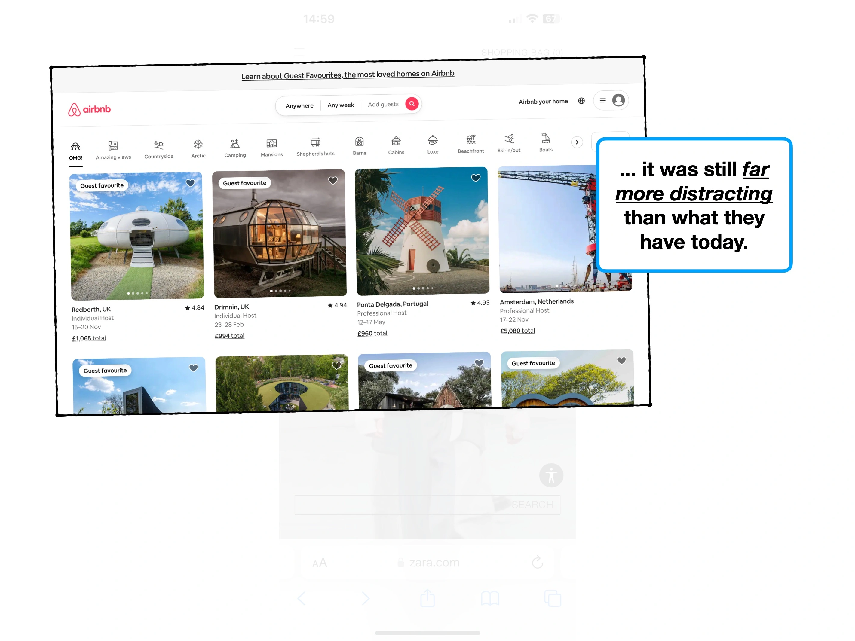
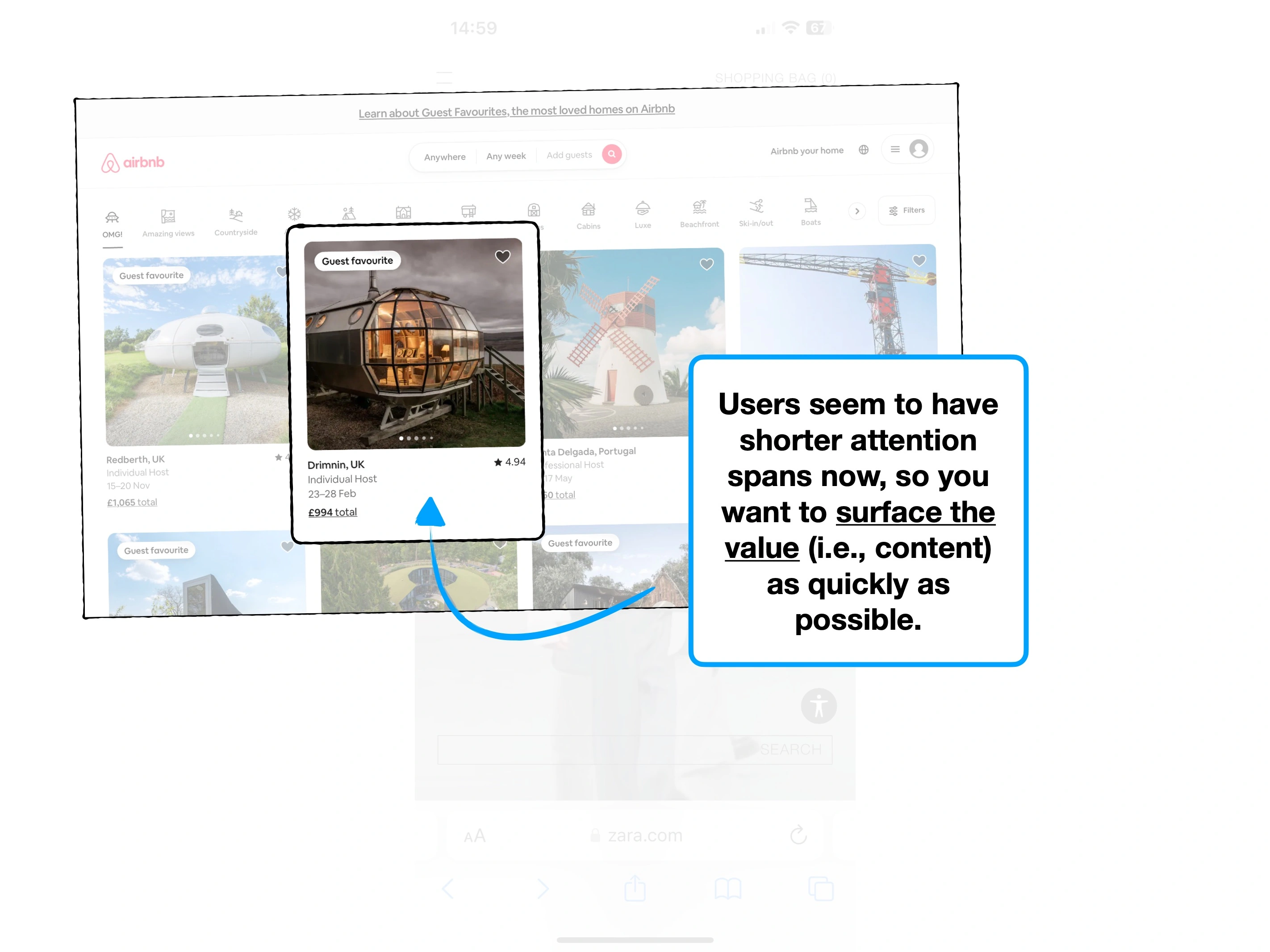
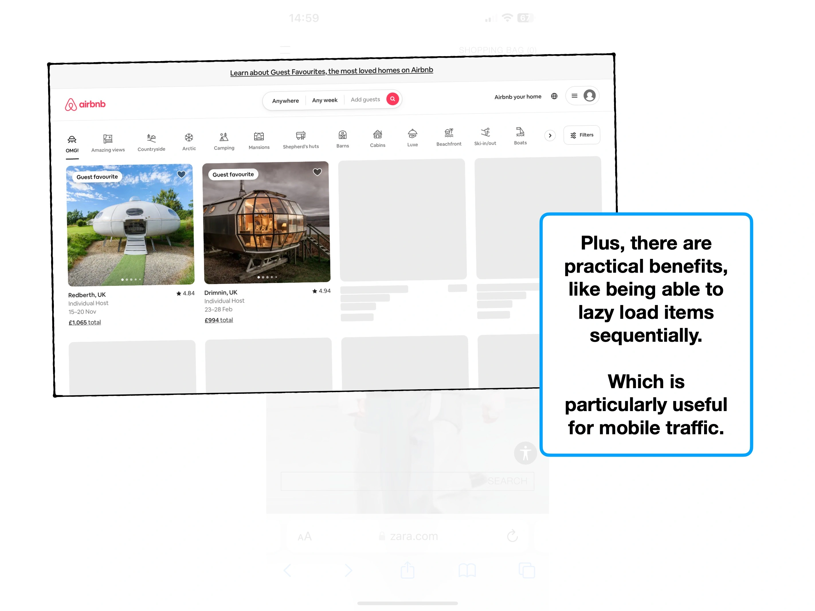
Why users are ignoring your features
Simple techniques to increase feature usage, retention and ultimately alter how users perceive the value of your product.

Hiding complexity to create effortless onboarding
The techniques that Slack have used to create an effortless onboarding flow, and why you might not want to copy them.
The secrets of a $7.08 welcome bonus
The product psychology behind why Robinhood offer new users $7.08 of free stock, and not $10.