UX Content
  • Case Studies
  • UX Bites
  • Cheatsheets
  • Psychology
BFM+
  • Instant Feedback
  • MCP
  • Figma Plugin
  • Tiers & pricing
  • Free newsletter
  • Log in
Other
  • Archive
  • About
  • Help
  • Changelog
Services
UX audits

A complete audit of your user experience, delivered in a format that you can't ignore.

Book an audit

Built for Mars Ltd is a company registered in England and Wales (Company No. 12731987).

Account
  • Log inAccess your library and activities
  • SubscribeUnlock all features and access to the library
Learn from the best companies in the world

A library of content that even non-designers find interesting.

Subscribe todaySubscribe today
Structured learning
  • UX BootcampEnroll in a 5-week bootcamp
  • PathwaysCreate custom learning Pathways to work towards any goal, industry or topic
  • CollectionsBrowse Case Studies by key topics
  • QuizzesTest your knowledge
Explore the library
  • Case StudiesSlideshows that are packed with research
  • UX BitesReal examples of design magic
  • CheatsheetsQuickly level up in a particular area
  • Product PsychologyLearn the essentials
  • NewsletterGet research straight to your inbox
  • CompaniesBrowse by company
Learn from the best companies in the world

A library of content that even non-designers find interesting.

Subscribe todaySubscribe today
Tools to help you
  • AI InsightsUpload screenshots of your design, and get instant feedback from our AI
  • MCPAccess the entire library from your favourite agent
  • Figma pluginAccess our AI tools, and our entire library, directly from Figma
One-to-one help
  • UX AuditsThe fast-track for growth
Includes tools that help you ship better products

Learning never stops, but sometimes you need a little more.

Subscribe todaySubscribe today
Log inSubscribe today
Home
UX Glossary
Serial Position Effect

🏁

Serial Position Effect

When presented with a list of things, people are better at remembering the first and last items, than those in the middle.

Similar psychology:

Pattern Matching
Specificity
Delegated Decisions

Likely impacts:

Attention & Interest
Complexity & Understanding
Perception of Value
Purchases
Last updated: 03/11/2026

How to utilise this in your designs

With a long 'Get Started' checklist, you could place a 'remind me later' option at the very top, where the primacy effect means people see it before drifting off mid-list.
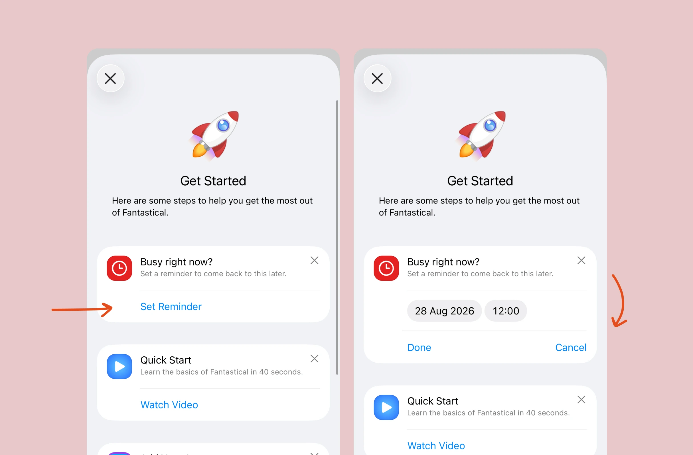
Onboarding checklist. A "Busy right now?" card offers "Set Reminder"; tapping it expands the card inline with date and time selectors plus "Done" and "Cancel", letting users schedule a reminder to return to setup later.
Example from
Fantastical logo
Fantastical

Try tucking advanced items into a collapsed section of an onboarding to-do list, so fewer steps sit in the middle of the visible list, where they're most easily lost.

Onboarding checklist. Below the "More Stuff" tasks, a collapsed, dimmed "Advanced Stuff..." section has an expand arrow; tapping it reveals further tasks such as "Customize your Launchpad", "Add a Plan to a task" and "Add your first Space".
Example from
Stuff logo
Stuff

When stock of something a user might want runs low, one option is to flag it at the very top of the feed, among the first things people see and remember.
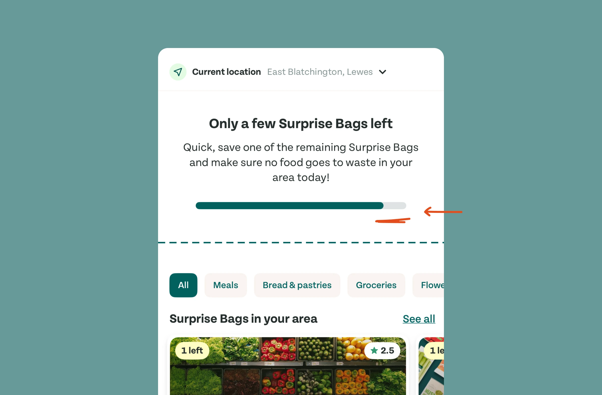
Home screen for surplus food. A "Only a few Surprise Bags left" banner urges saving food from waste, with a nearly full progress bar showing how few bags remain locally, creating scarcity and urgency.
Example from
Too Good To Go logo
Too Good To Go

In an endlessly scrolling feed, consider periodically breaking it with markers showing how far someone has gone, so the long middle doesn't blur into one.
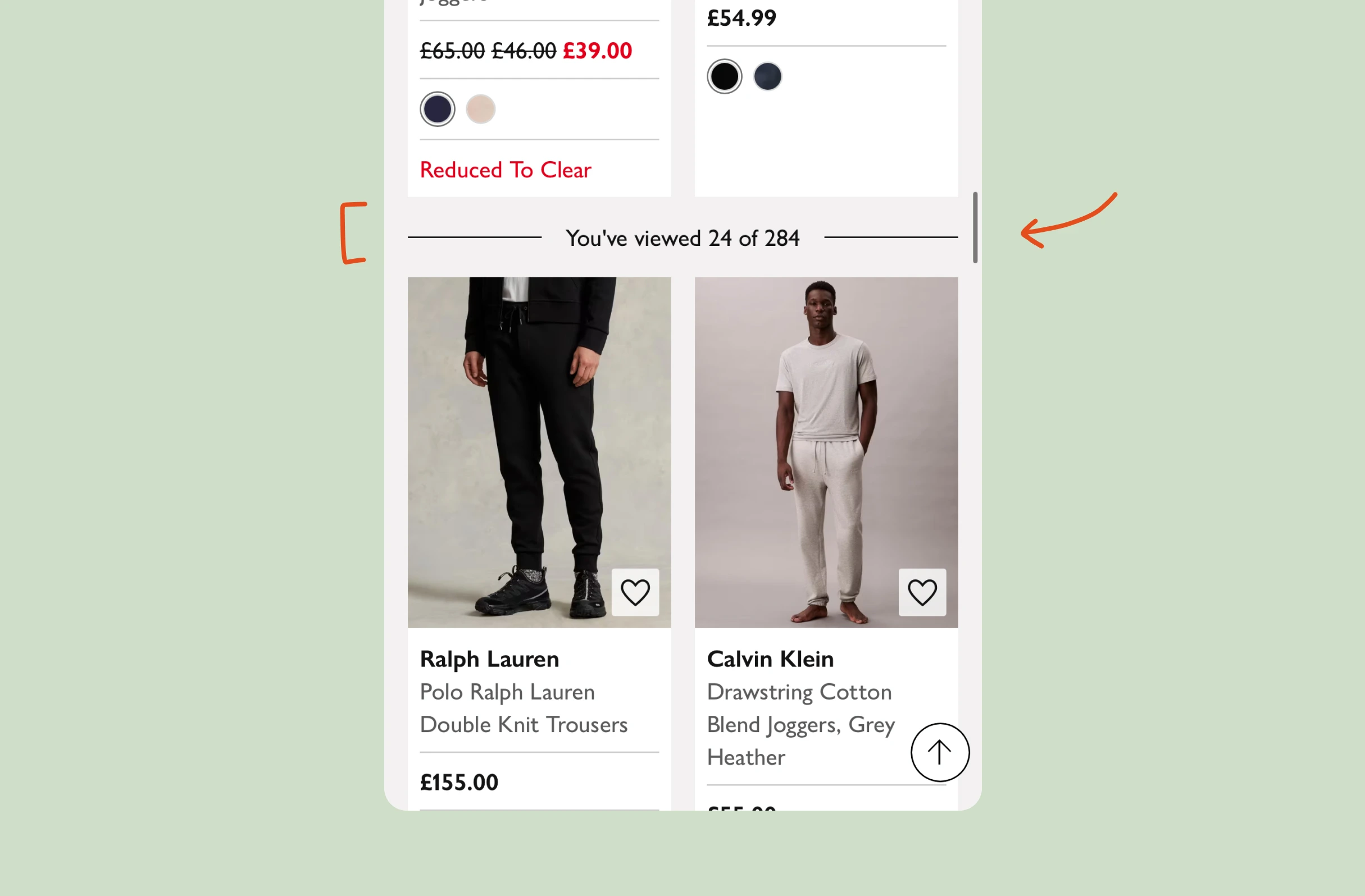
Fashion browse page. While scrolling the product grid, an inline divider reads "You've viewed 24 of 284", showing progress through the results as more products load continuously.
Example from
John Lewis logo
John Lewis

Possible impacts

Putting the most urgent or compelling message at the top of a feed or list could draw more attention to it, as people tend to notice and remember the first items.

As seen in:
Too Good To Go logo
Too Good To Go
Only a few left

Keeping lists and onboarding steps short might help users understand them, as fewer items end up in the middle, where people remember the least.

As seen in:
Stuff logo
Stuff
Hiding the advanced onboarding
John Lewis logo
John Lewis
You are this far

Leading with the most compelling feature, rather than building up to it, could raise perceived value, as the first item sets the reference point for judging the rest.

As seen in:
Posthog logo
Posthog
Gathering feedback within the product
Blinkist logo
Blinkist
Suggest these titles in one tap

Placing the strongest pricing tier or offer first or last on a page may increase purchases, as the serial position effect makes these the most memorable positions.

As seen in:
Too Good To Go logo
Too Good To Go
Only a few left
Profile photo. A circular headshot of a smiling young man with short tousled hair and round glasses, suitable as an author avatar or user profile picture. No interface elements are shown.

Written by Peter Ramsey

Consultant to 100+ companies

Published: 04/09/2023