Similar psychology:
Last updated: 03/11/2026
How to utilise this in your designs
When an action takes longer than about a second, you could show a short message saying it's still working, so people wait rather than panic clicking elsewhere.

Example from Figma
Try loading the text and key details before heavy images, so people on slow connections can still choose something without waiting for high-resolution previews.
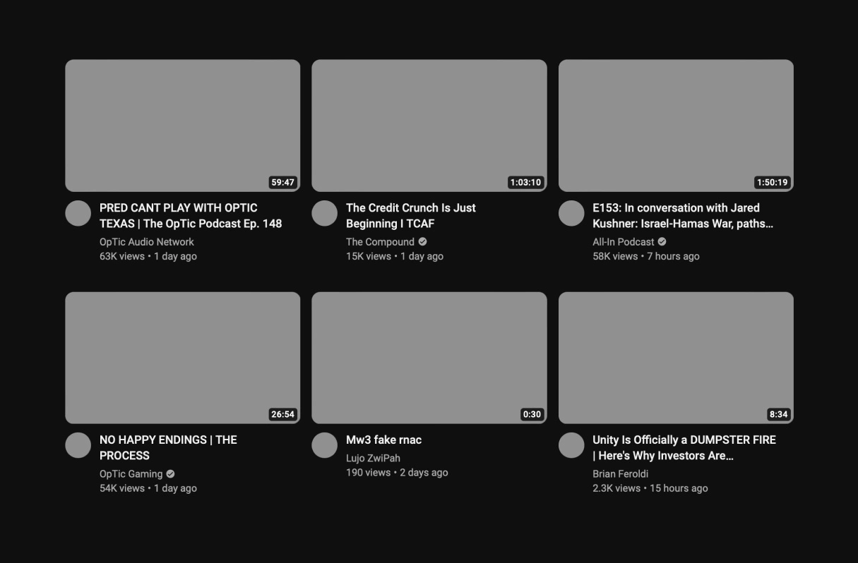
Example from YouTube
One option is to load a few results, then fetch more as soon as someone swipes to the second, so the next ones are ready before they reach them.

Example from ChatGPT
For long setup or sync tasks, consider a progress bar plus a note that it's safe to go do something else, so people know they needn't watch it finish.

Example from Apple
On long loading screens, it may help to show a riddle for people to think about, so a wait well beyond the Doherty Threshold feels less boring.

Example from Gojek
Possible impacts
Responses slower than the Doherty Threshold can make people doubt anything is happening, which might increase churn as some give up and leave mid-wait.


Responding within about 400 milliseconds, or giving people something to read during longer waits, could help keep their attention from drifting.

Acknowledging every tap straight away could reduce frustration, as people see their action registered and don't tap again or wonder if it's frozen.
An interface that keeps pace with users, within the Doherty Threshold, may feel smoother and more enjoyable to use than one that leaves them waiting.

Written by Peter Ramsey
Published: