Skills you'll build
What to do when a user's 'first use' is a test
Changing behaviour is hard (it's easier to lean into it)
Why you might build features that are only seen once
There’s an overwhelming number of AI-powered note-taking apps.
Practically every piece of productivity software now has one built in.
So, how do people choose between them?
I doubt many users are benchmarking the transcription accuracy. Instead, they'll just try one, and make a judgement on how it feels.
This means that your first recording probably isn't a real meeting, it's a test.
"Testing, hello hello, testing, blah blah blah".
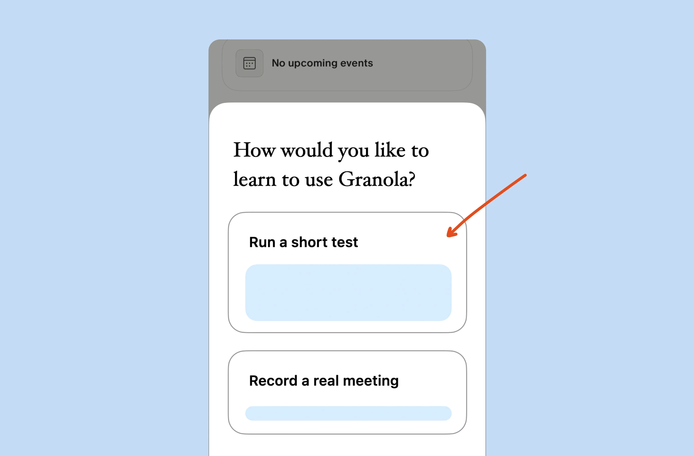
Granola doesn't just waste this moment—its lack of onboarding makes it backfire.
Here are two ways they could fix that.
Key takeaways
1. Go with the flow
As a general rule of thumb, it’s more effective to cater to people’s instinctive behaviour, rather than to try and outright change it.
For example:
Do you remember what you did when you opened Google Earth for the first time? It was probably to search for your own house, or where you grew up.
A boring residential street (that’s updated once every few years) hardly demonstrates the full capability of Google Earth.
So, they could either try and change this, by steering you into looking for a specific landmark, or they could lean into it and make it even easier to find your old bedroom.
In practice, what does this look like?
Take the video conferencing tool Whereby, as an example.
They know that after creating a meeting, new users will want to test the experience, so they make it easy for you to do that.
Just scan the QR code to join the meeting from your mobile. You get to see the experience from both sides, before inviting someone else.
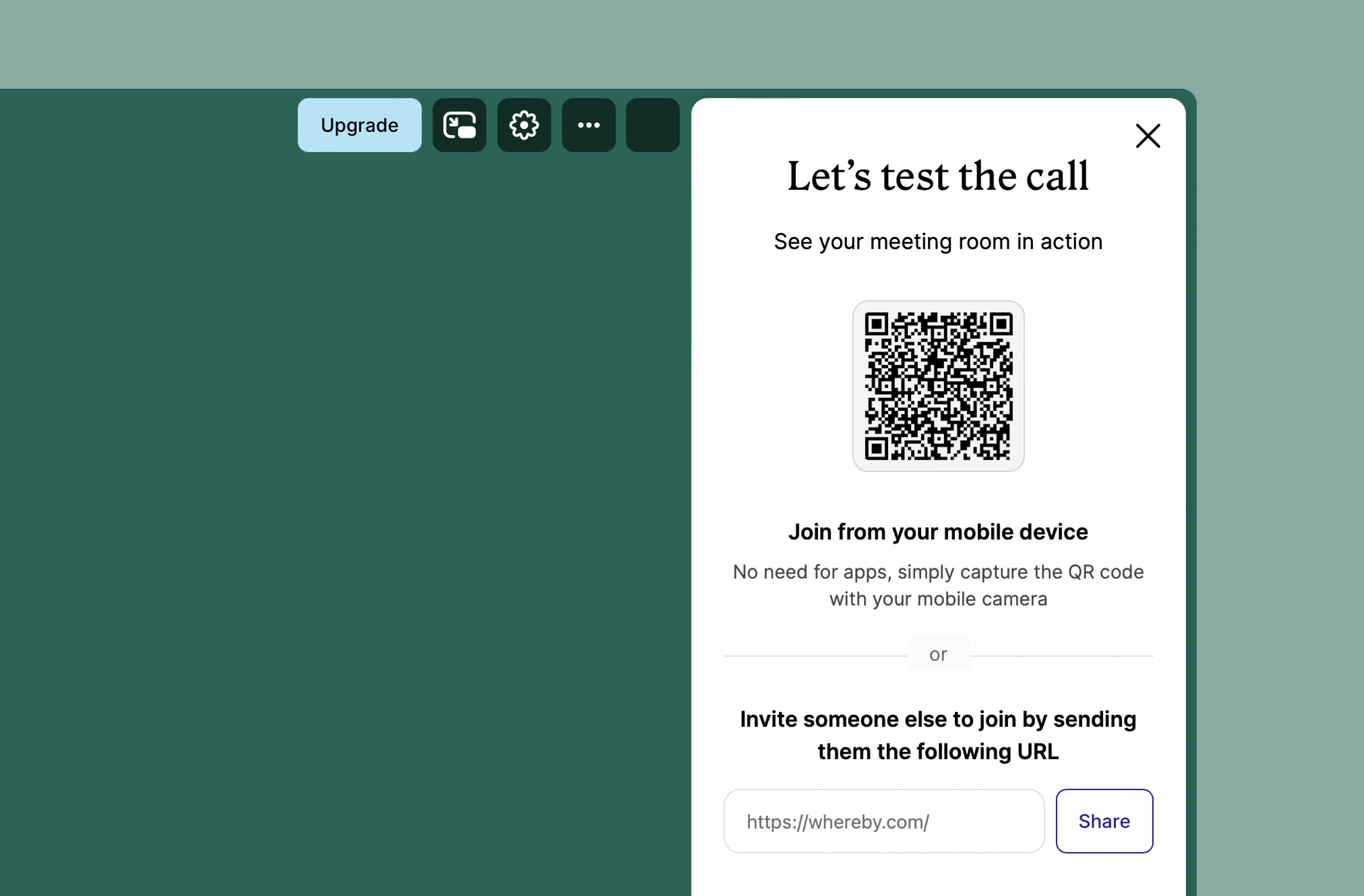
With Granola, we saw how new users likely want to record a test, before trusting it with a full conversation—it’s the same principle.
2. Give it a test mode
On their desktop app, Granola shows you a live transcript.
So leaving it out of the iOS app is a choice (or trade-off). Why would they do that?
One possible argument is that displaying it on a smaller device, particularly one that’s placed in the middle of a conference table, is too distracting.
If you knew that everything you said was appearing on screen in words, like magic, it’d be tempting to watch it. This would kill the flow of the conversation.
That's a fair trade-off for everyday use, but a new user is in a different position. They're seeking reassurance.
This is why a one-time test experience can help bridge this gap.
It's like showing your users a lite version of your product, just to satisfy their initial behaviour. Which is exactly what children's toys often do, like Elmo here:
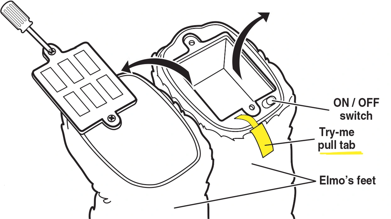
These pull tabs hold the toy in a "try me" mode, allowing children to hear how it sounds, or get a rough idea of what it does, without cycling through all of the functionality.
3. But, it'll only be seen once?
Inside product teams, someone has to rally the decision-makers to commit resources to a feature that will only be seen once. That’s a hard sell.
But the first session in an app is disproportionately influential in how it feels, especially in an industry with so much competition.
And there’s a second-order benefit too, which might tip the balance.
This is a product that people naturally use in groups. It should grow organically via word of mouth.
If you record a meeting with four others, and then follow up with incredibly detailed notes, they might give it a go too.
But you know what’d be the complete opposite of that? Someone fumbling around awkwardly, making noises into the microphone, unsure if it’s working, only to get a meaningless summary.
Toy makers will create a mode that only has a benefit on the shop shelves, because that's where the decision gets made.
App designers should too—except because these apps are free to download, their store would be the first session.



Unlock the entire library of content like this
Subscribe to BFM+
If features can be coded in minutes, thoughtful design is what wins
- Unlock the entire library
- Create custom UX courses
- Access our AI tools
£8/monthbilled annually
or, wait for the free stuff
Join the free newsletter
Get the free content when it's released, straight to your inbox, no account required
"An exceptional resource for learning how to build habit-forming products that people love."

"I’d never met anybody who looks at usability and UX the way I do until I met Peter. Only he’s smarter."

"The completest view of the psychological underpinnings of human behaviour that I’ve ever seen."

"What a nice idea! Christopher Alexander would be proud to see patterns collected like this."


Written by Peter Ramsey
Part of:
Published: