Skills you'll build
Why praise isn't an Aha moment (and what is)
How "muddling" stops people finding your best features
Techniques for reducing the cost of trying something new
I can see the appeal of live streaming on Twitch.
In 2021, a guy who calls himself “Asian Andy” made $16,000 in a single night. He just slept in front of a camera, allowing donations to disturb his sleep.
These case studies take a huge amount of work. And so, enticed by the idea of making money while lying down, I tried it for myself.
I was hoping for an aha moment. Twitch never gave me one.
They gave me something else.
Case study
What Twitch gets wrong
1. A common misunderstanding
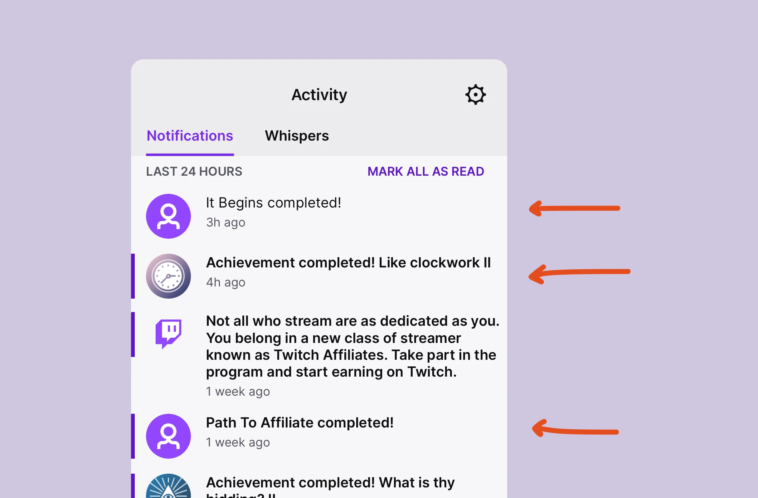
Occasionally, after ending a stream, Twitch will present you with a badge. Initially, this is likely to be something almost patronising, like having 7 viewers.
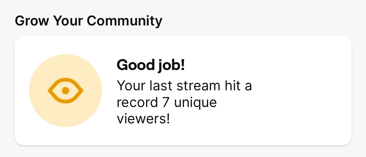
This looks a bit like an Aha! Moment, except it isn’t.
The point of one isn’t to create an enjoyable moment, or to make people feel great about themselves.
Instead, the “Aha!” refers to suddenly rewriting the future expected value of a product. It’s the moment in which somebody goes “ah, if I do this, I will get that”.
Unlocking random badges and achievements only increases the expected value if the user believes that it will happen again.
And the truth is that most people’s first streams will be rubbish: awkwardly chatting to the one person who accidentally stumbled across their channel. Or worse, just performing to nobody.
So the real Aha! Moment here wouldn’t be “you had 7 viewers”, it would be: “that was a start, but here’s how we can help you get to 100 viewers”.
But Twitch celebrates the wrong thing, and so the future expected value doesn't change.
This causes users to 'muddle'.
2. We muddle
Steve Krug, the author of the classic book Don’t Make Me Think, has a superb way of describing how people use digital products: we muddle through them.
His point is that people rarely work out the objectively best way of using something. Instead, we try a few things, and then stick with a way that works for us.
We get so comfortable with this habit that our workarounds feel the same as mastery, and we’re often unaware that there are more efficient behaviours right in front of us.
For example, you’ve probably looked at your TV remote control thousands of times.
But do you know what the four coloured buttons do?
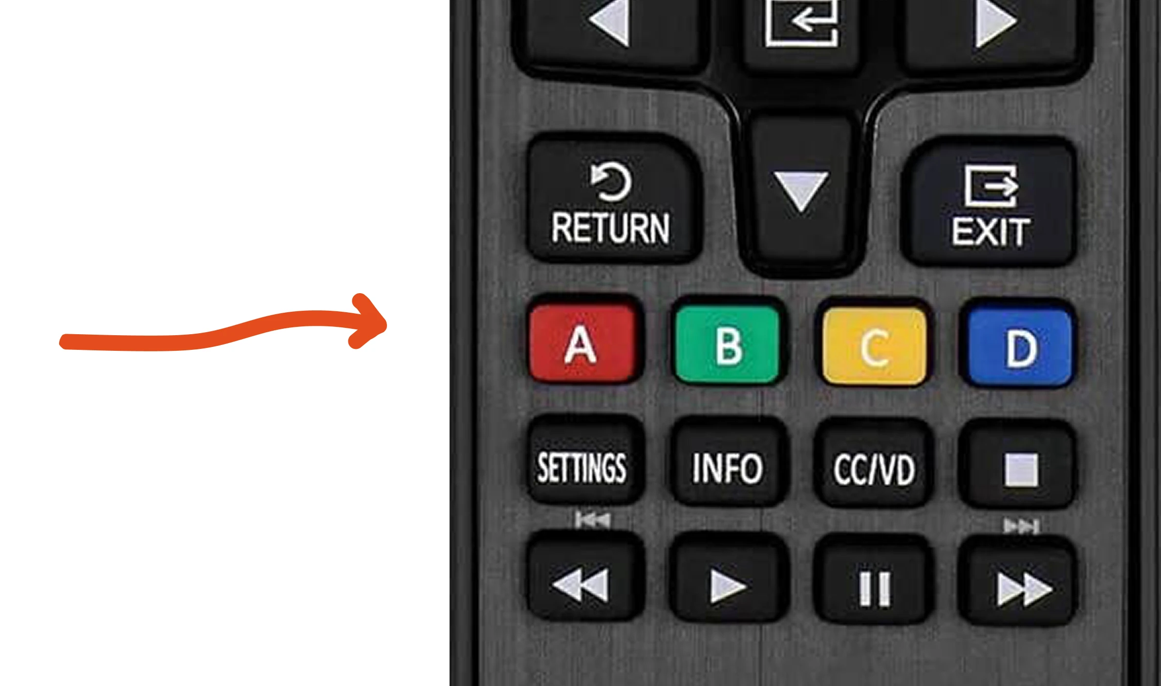
I certainly didn’t.
They’re contextual shortcuts. While I was streaming my Xbox, one of them ejected my disc. But because I’d found another way of doing that action, I’d never bothered to try and learn an alternative.
Even now I know about this shortcut, I won't try and remember it.
That is muddling.
The trap that Twitch falls into is assuming that people will be curious enough to learn all of the advanced features through trial and error. They won’t, especially if they find a workaround first.
As a result, there will be advanced features that users never try. Things that would otherwise elevate their streams.
Luckily, there is one trick for motivating people to explore more…
3. Reducing the cost of failure
I genuinely deleted my own messages during my first livestream.
Those tiny icons are punishing.
Look how small they are compared to an iOS app icon:
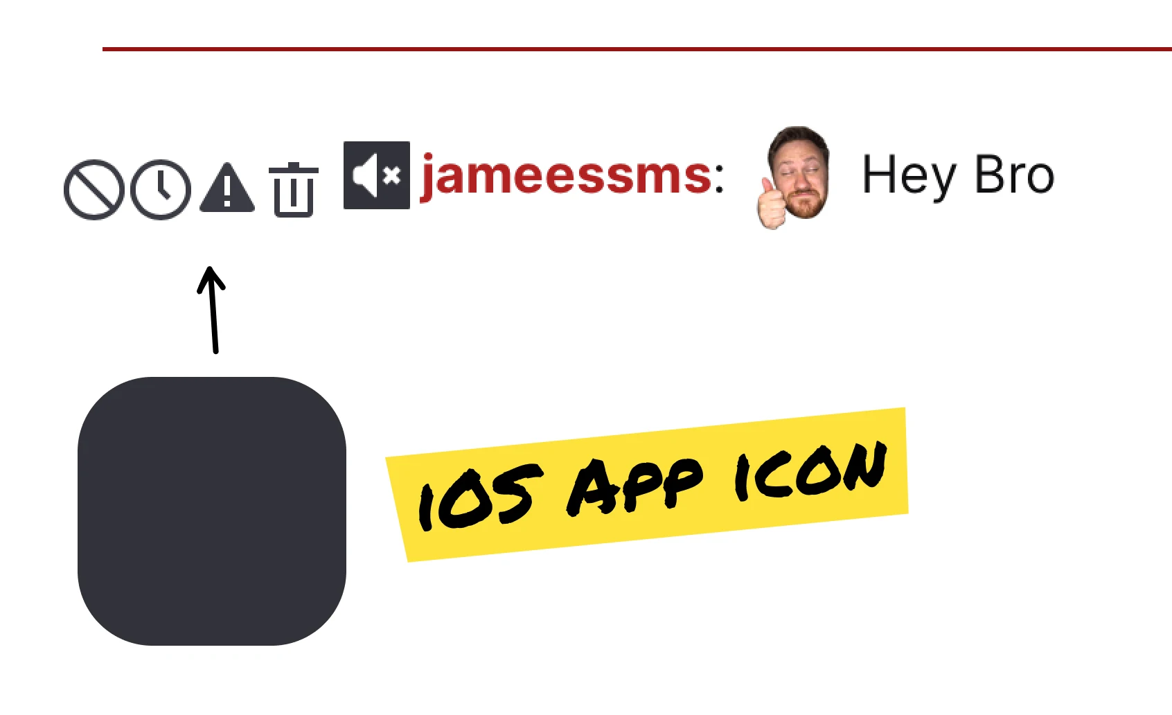
With this in mind, why would streamers risk turning on features that they don’t know? They could kill the momentum that they’ve worked hard to gain.
So, the question then is this: how do you get people comfortable enough to try new features?
One technique is to reduce the cost of failure—i.e., the opposite of what happened to me with those deleted messages.
This is the principle behind all sandboxes. You want people to be able to mess around, and try new ideas, without the risk that they’ll permanently block their first five followers.
Twitch could have a sandbox that simulated a bustling livestream, full of donations, subscribers and messages.
On a smaller scale, they could also just add context between actions.
For example, instead of an empty state simply explaining that you cannot start a raid, they could explain what a raid is, and allow people to learn about that one feature in the moment.
If you want people to explore, reduce the cost of failure.



Unlock the entire library of content like this
Subscribe to BFM+
If features can be coded in minutes, thoughtful design is what wins
- Unlock the entire library
- Create custom UX courses
- Access our AI tools
£8/monthbilled annually
or, wait for the free stuff
Join the free newsletter
Get the free content when it's released, straight to your inbox, no account required
"An exceptional resource for learning how to build habit-forming products that people love."

"I’d never met anybody who looks at usability and UX the way I do until I met Peter. Only he’s smarter."

"The completest view of the psychological underpinnings of human behaviour that I’ve ever seen."

"What a nice idea! Christopher Alexander would be proud to see patterns collected like this."


Written by Peter Ramsey